|
| Group |
Round |
C/R |
Comment |
Date |
Image |
| 28 |
Jan 18 |
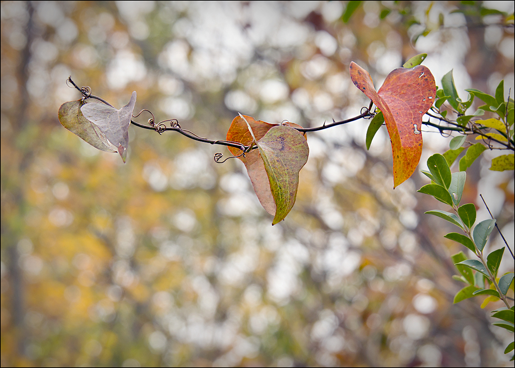
Reply |
Alice, I like the background in the first image better, with the effects, and perhaps you could lower the brightness of the pink on the wall on the right. I like the first image crop better too, just might want to decrease the brightness of the white part of the wall on the right. Good eye to notice this old brickwork surrounded mostly with white! |
Jan 27th |
| 28 |
Jan 18 |
Reply |
Good idea to bring the brightness of the orange on the right down a bit. Thanks. |
Jan 27th |
| 28 |
Jan 18 |
Reply |
Yes Alice, although I didn't measure anything. I bought a large bottle of soap bubbles from the store, poured out about 1/4th or 1/3rd of a cup into a small bottle, added a dash of glycerine (maybe 1/2 tsp. or so), about 1/4th tsp. sugar, and about a teaspoon of corn syrup. Stirred it up, and that is what I used. So far, this concoction has worked the best. There are various recipes online, and primarily these are the ingredients some of them give to add, so I used a tad of each. |
Jan 27th |
| 28 |
Jan 18 |
Reply |
Thanks Steve. It was harder to do than I expected. |
Jan 27th |
| 28 |
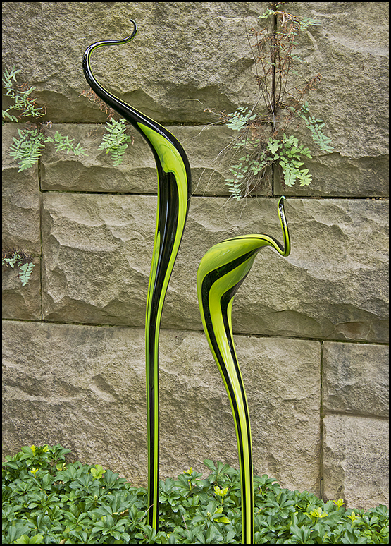
Jan 18 |
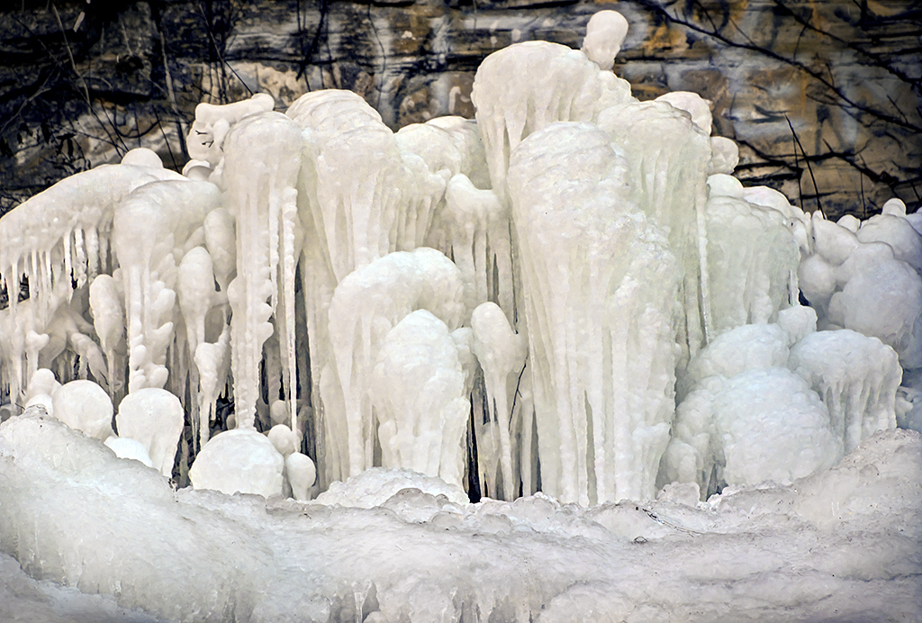
Comment |
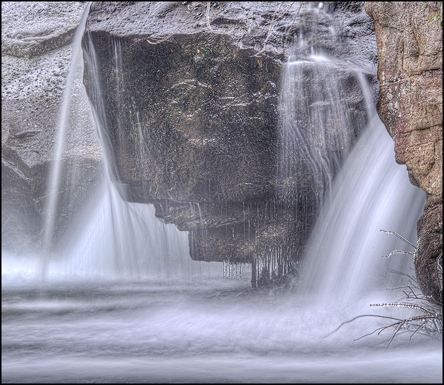
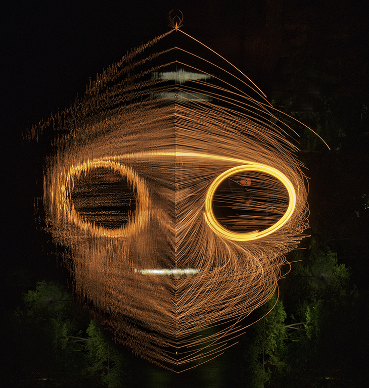
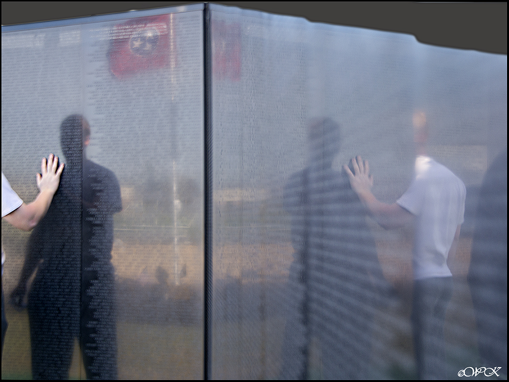
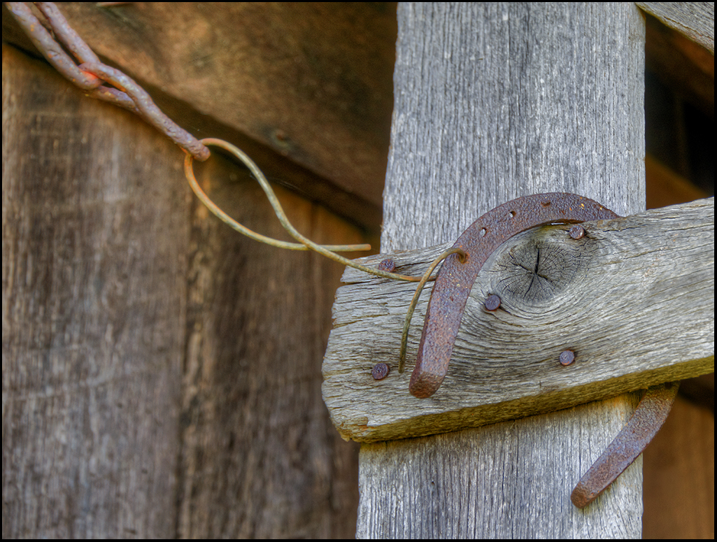
I agree with Kathy's assessment........the effects you made to the image look good. I also don't know what this could be, except that if it was a furnace, the inside doesn't seem to be black enough? Instead of cropping some of the image on the right, I might have a tendency to darken the white, as having the wall there gives the image depth, as does having the background stuff on the left of the subject. Good placement of the focal point. |
Jan 16th |
| 28 |
Jan 18 |
Reply |
Lovely arrangement, but could you not have moved them temp. out of the way? I know that sometimes that is not possible, or not allowed. |
Jan 16th |
| 28 |
Jan 18 |
Reply |
Thanks Kathy, and I did try to somewhat equalize the colors, but there is more work to be done in that area. Thanks for the input! I agree. |
Jan 16th |
| 28 |
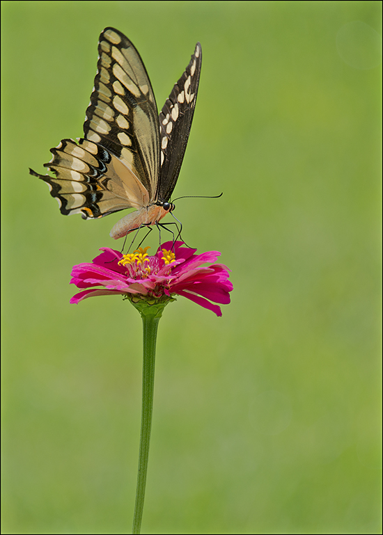
Jan 18 |
Comment |
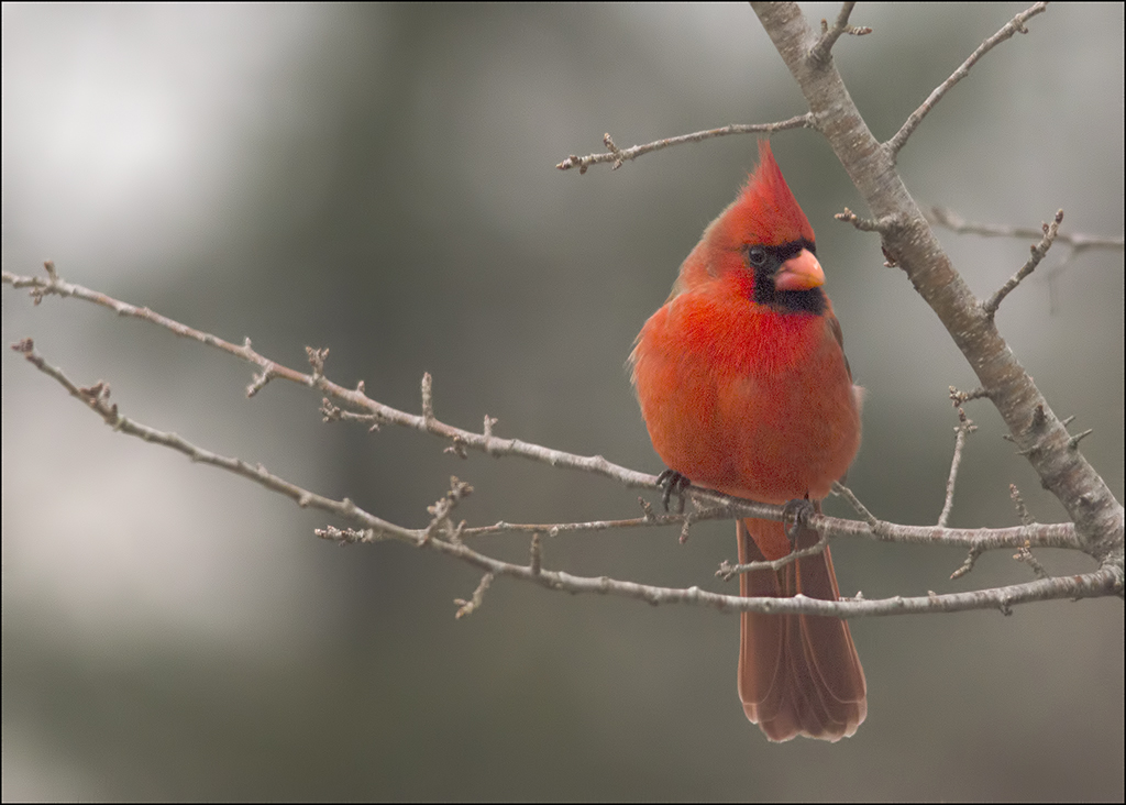
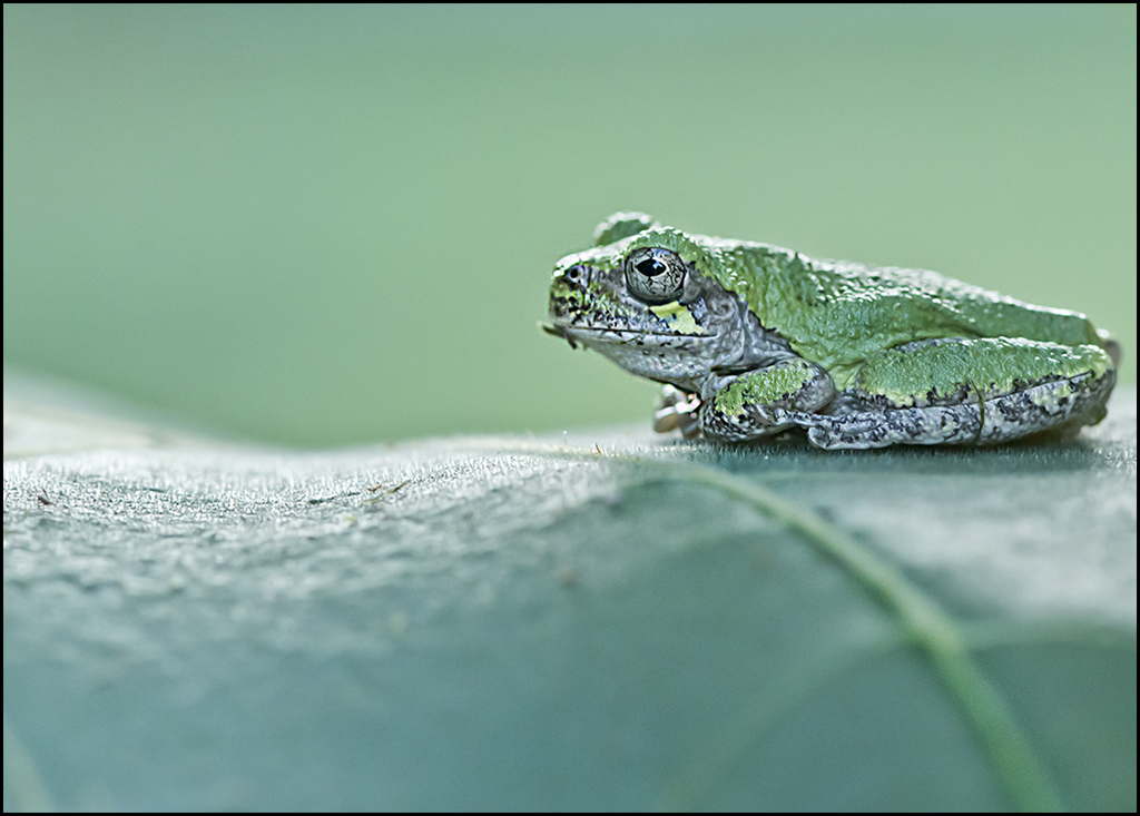
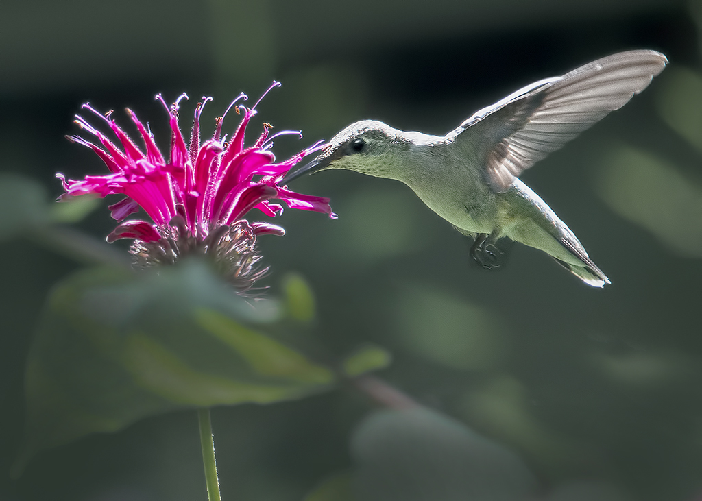
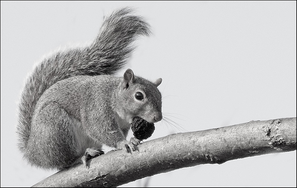
I don't think you needed a fill lite, maybe could have tried a large reflector, but this image is good as is. Cute pose, good dof at subject, and good story-telling image as well. |
Jan 13th |
| 28 |
Jan 18 |
Comment |
I really like the tones and colors in this image. Also, sharpness throughout the image is something you don't often see in today's portraits. It works well with this one. |
Jan 13th |
| 28 |
Jan 18 |
Comment |
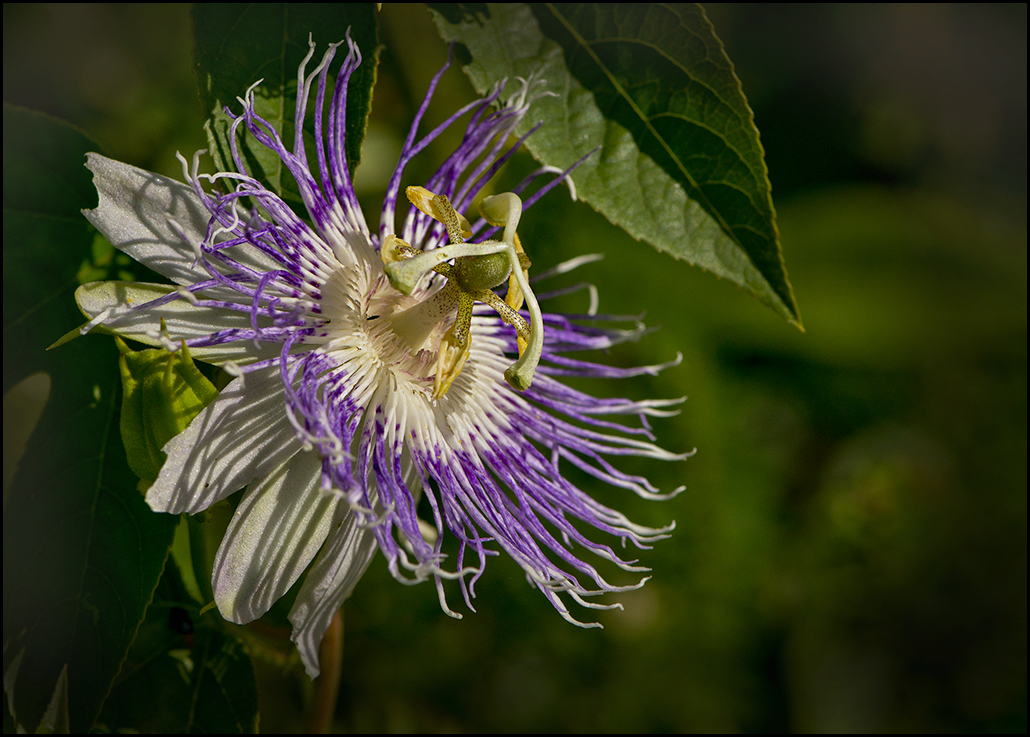
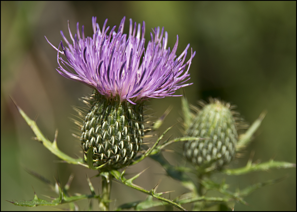
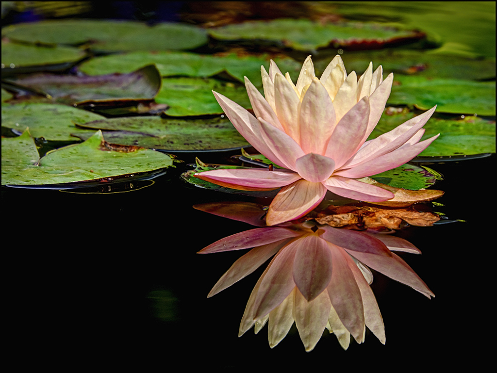
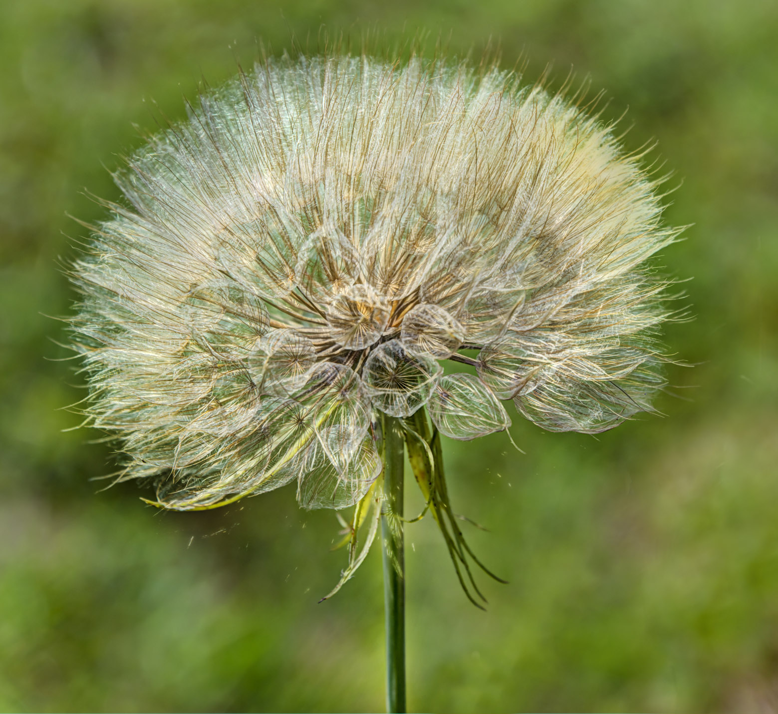
Wow Kathy, nice shot, especially with the dof. I find the flower a little distracting, but wonderful image anyway. Nice post-processing. |
Jan 13th |
| 28 |
Jan 18 |
Comment |
Harry looking fellow. Well-taken and well-done. |
Jan 13th |
5 comments - 6 replies for Group 28
|
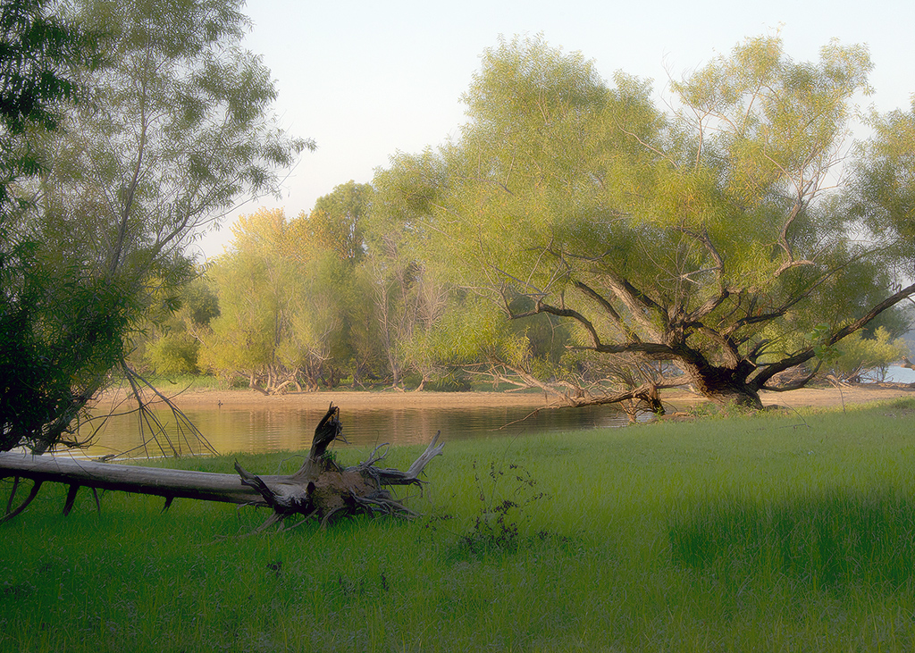
| 46 |
Jan 18 |
Reply |
thanks for the suggestions Gary. I'll have to try it. |
Jan 6th |
| 46 |
Jan 18 |
Comment |
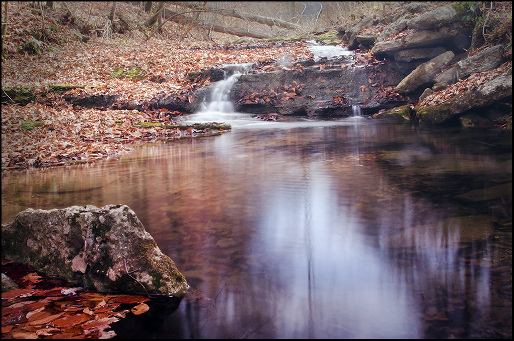
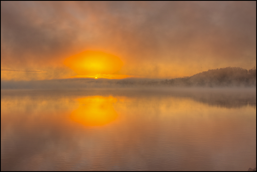
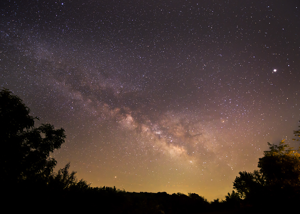
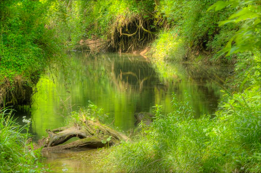
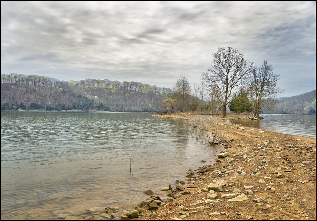
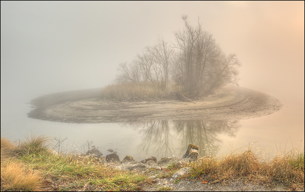
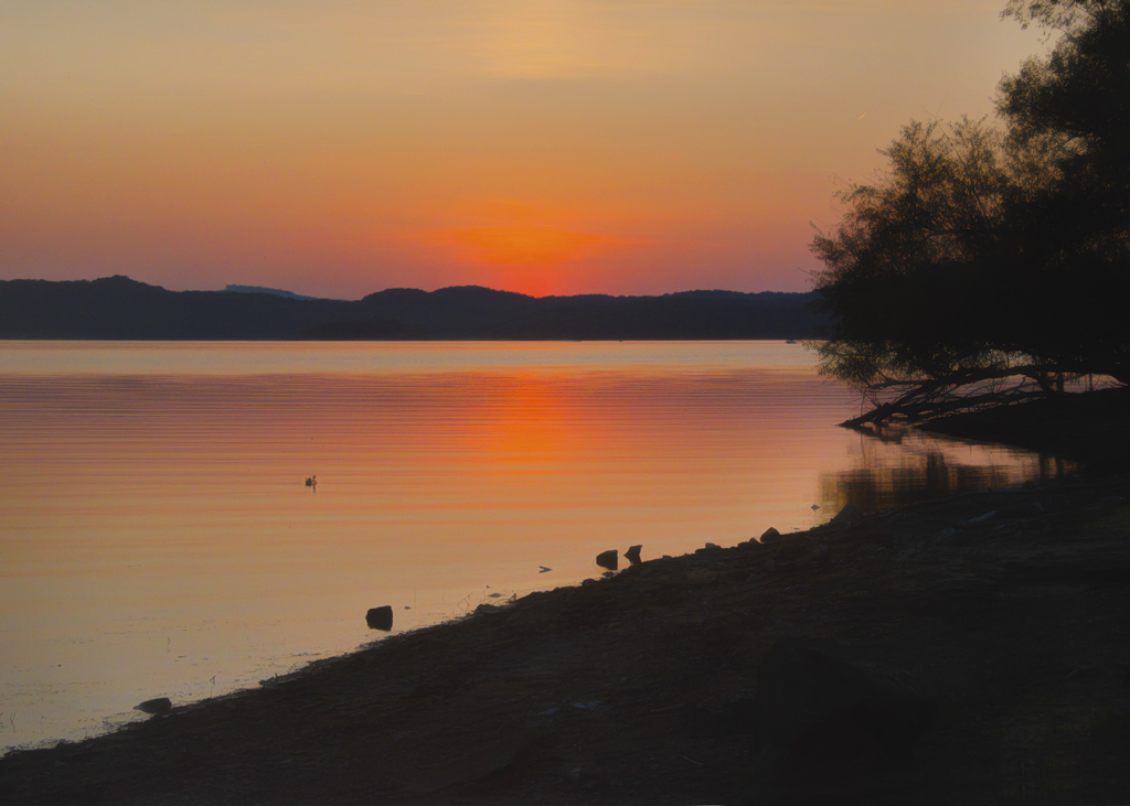
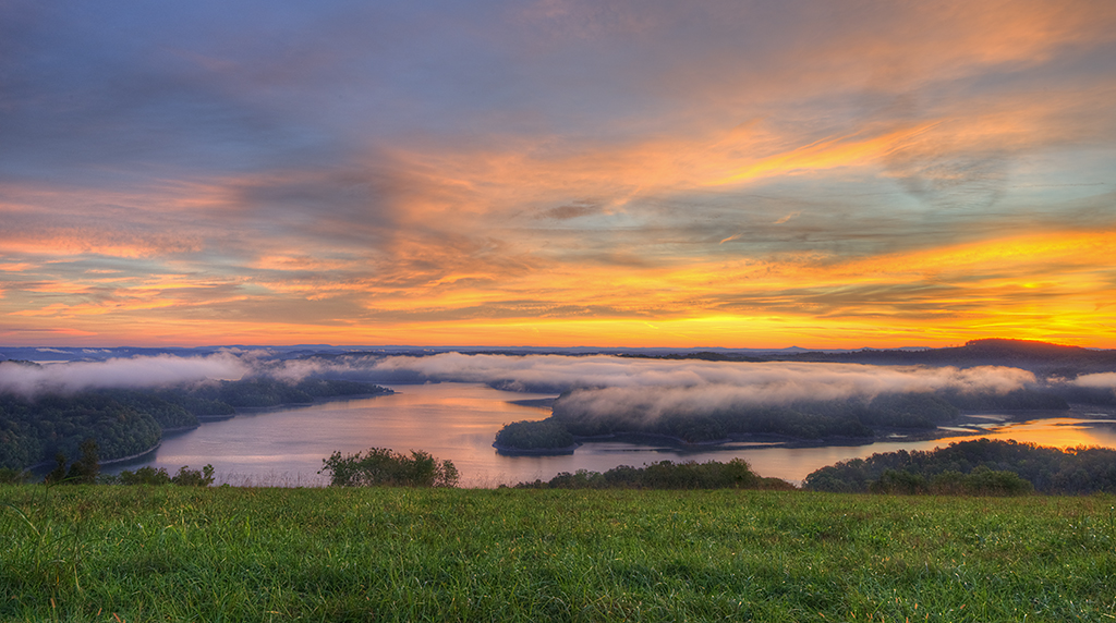
Wonderful image, and I have no suggestions for improvement. If the lake is missing, no one but you would know. However, there is a technique you can use, and that would be to simply move the camera down, and shoot three more hdr images just below the first shot. You end up working with a lot of images, but when you stitch them all together, your camera will have covered much more of the scene. Did you have the camera on portrait for these shots? Simply turning the camera sideways will increase the amount of capture too. |
Jan 5th |
| 46 |
Jan 18 |
Reply |
Thank you Walter, and you are correct. Richard's suggestion might be all that would be needed. Yes, images do need a focal point most of the time. Thanks for your comments. |
Jan 5th |
| 46 |
Jan 18 |
Reply |
Thank you Richard for your review and wise counsel. I see what you are saying, and will try it. |
Jan 5th |
| 46 |
Jan 18 |
Comment |
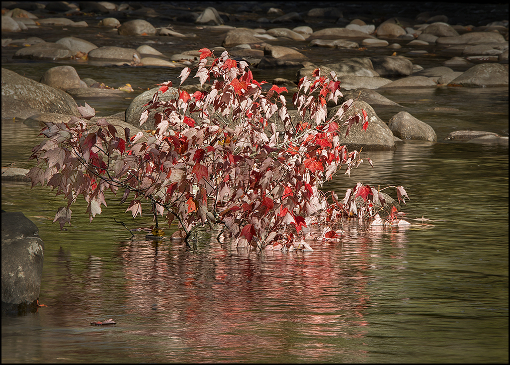
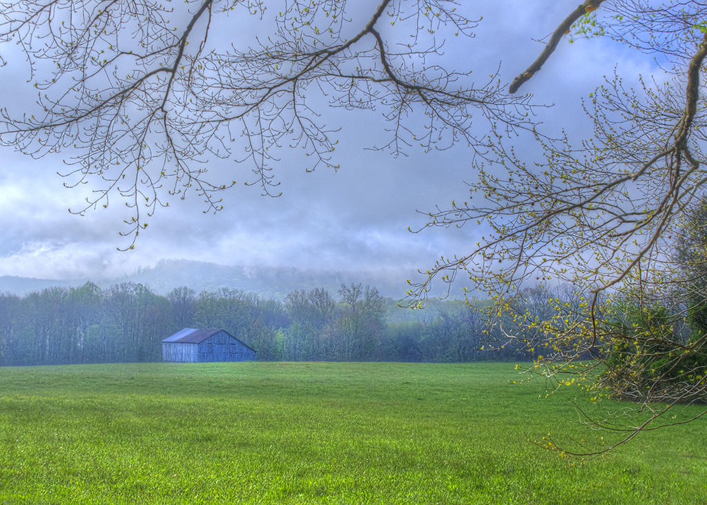
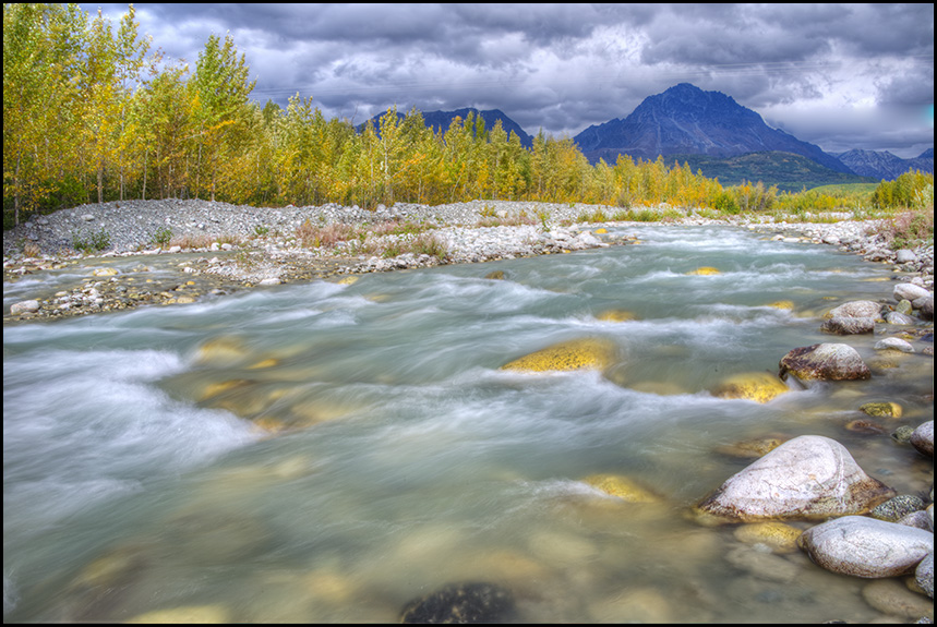
Wonderful composition and depth of field. I might have a tendency to leave just a tad more room on the sides, and to further mute some of the leaves at the bottom, but that is just my preference. Wonderful shot and well-presented. |
Jan 5th |
| 46 |
Jan 18 |
Comment |
Well-composed shot although I might have a tendency to trim off a little on the right. Like Walter said, good eye for seeing a shot in part of a display. That is a talent for sure. |
Jan 5th |
| 46 |
Jan 18 |
Comment |
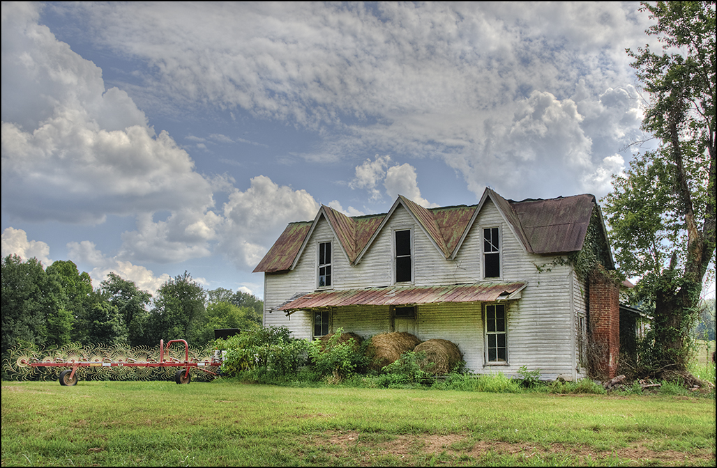
I like how you straightened the building and brought out the shadows and details in the building. I find the halo around the top of the building distracting. You might consider replacing the sky, or selectively darkening the whites of the sky that fall around the top of the building. Could you imagine the upkeep it would take to live in a house of this size!! The style reminds me a little of the builtmore. |
Jan 5th |
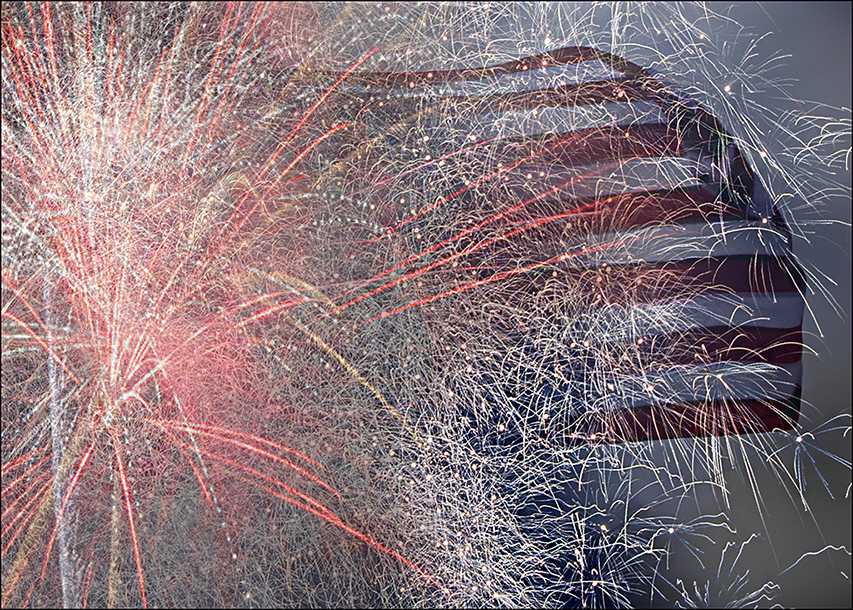
| 46 |
Jan 18 |
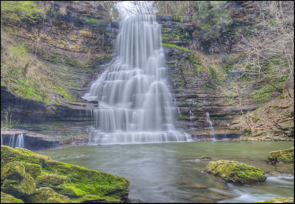
Comment |
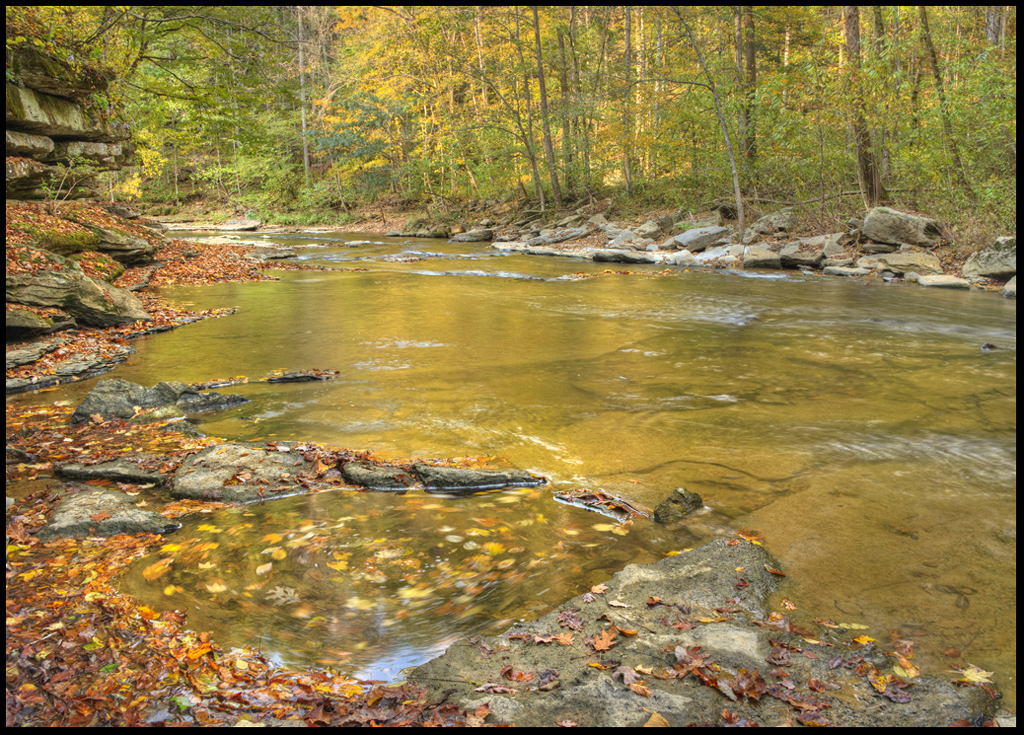
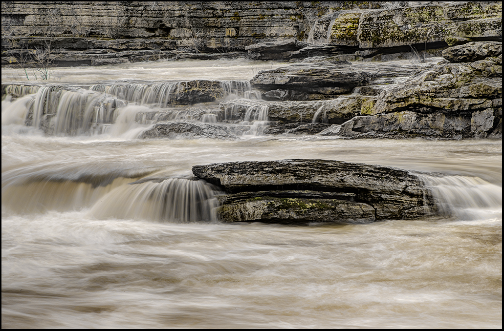
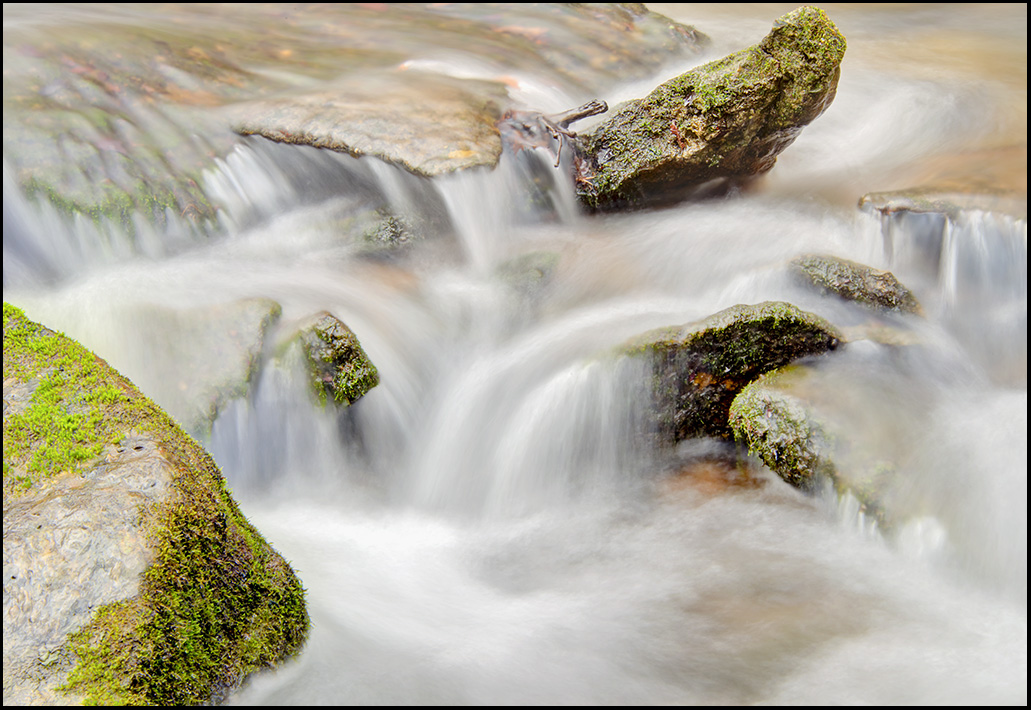
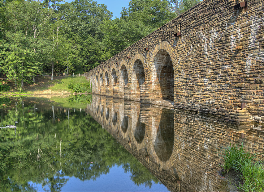
Subtle changes, but quite effective. Thanks for the detailed explanations. Well-done. It's interesting what you have to say about water and the effects of combining three images. Thanks for the tip. |
Jan 5th |
5 comments - 3 replies for Group 46
|
10 comments - 9 replies Total
|