|
| Group |
Round |
C/R |
Comment |
Date |
Image |
| 28 |
Dec 17 |
Comment |
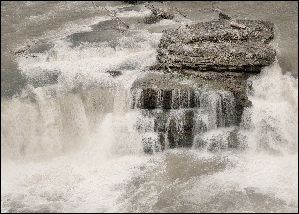
What did you find that was intriguing about this process? If it was the fire, then you might consider cropping so that the flame is the focal point in the image, heavy crops on left right and top. If it is the entire process, showing the smoke, some of the tools, and the flame and paddle, that I suggest that you accomplished it well. The only thing I might consider would be to darken the brightness of the tools that are oof in the background because they pull a bit at the eye. At the same time, you might consider using a small brush stroke to brighten the smoke trail (dodge tool), but let it be subtle. I would try the burn tool in PS to darken the background lights. Good job, and I agree, glass blowing is fascinating to watch. |
Dec 5th |
1 comment - 0 replies for Group 28
|
| 46 |
Dec 17 |
Comment |
Richard, I tried my suggestion above, and found that I did not like it as much as both Gary and Jeffrey's crop. It takes too much away from the picture. But, for whatever's it worth, here it is. I think Gary's crop gives emphasis to the light and windows, and Jeffrey's improves the image by simplifying. Both are nice. And, yes, I found myself straightening the walls as well. I like the windows, textures and lighting of this image a great deal. |
Dec 10th |
 |
| 46 |
Dec 17 |
Reply |
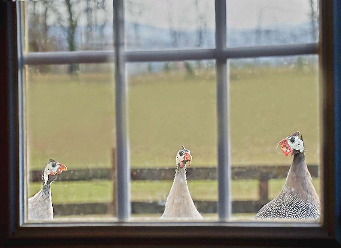
Thank you Gary and you helped the image quite a lot. Yes, I was thinking about showing the mountains in the background and keeping the little heads looking in the door smaller, as they were when I saw them. Thanks too for your explanation of what you did. |
Dec 5th |
| 46 |
Dec 17 |
Comment |
It's fun to work on an image and try different things. Right off, the entire image looks way too soft, or out of focus, but checking the originals, they each look to be in focus, so I'm not sure what happened in the process. I like how the heavy shadow of the cross meets the eye near the bottom left of the photo, and I would bring it down even lower, with just a slight amount of space left between the end of the photo and the beginning of the shadow.....same on the left side. I would somehow emphasize this shadow as it leads the eye nicely to the cross, which needs to be even lighter and more readable if possible, and much sharper, then at that point, the bright star like sun catching the eye. I don't see the star like sun as being a distraction, but more as fitting into the picture with balance, but I might lighten the sky a bit to fit more with the remainder of the image. Perhaps you could attempt to process the image 3 (darkest) as a stand alone image to see what you come up with. This is a picture that you could do several things with as trials (move the star, lighten the sky, darken slightly the star, different crop, lighten or darken various areas of the image, strengthen the cross by making it more readable, etc.) Thanks for posting an interesting image that makes us think more than usual! |
Dec 5th |
| 46 |
Dec 17 |
Reply |
Thank you Richard. I realize that there is much to be done yet with this image, and I value your input. |
Dec 5th |
| 46 |
Dec 17 |
Comment |
No suggestions for improvement in this image. I like the lines, colors, and crop. It might be nice for the clouds to have more definition, but sometimes that is just not possible. Well-done! |
Dec 5th |
| 46 |
Dec 17 |
Comment |
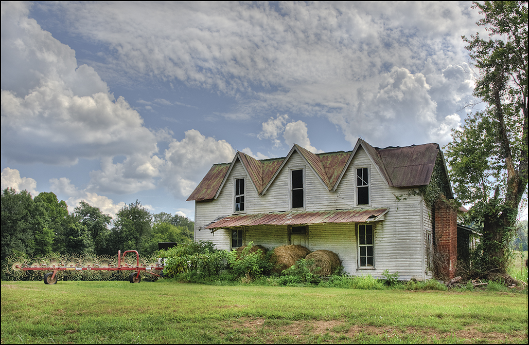
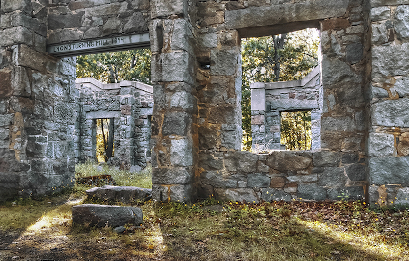
Well-executed shot with lots of details, depth, and tonal range. You might consider a different crop (entirely up to you), leaving out the third window on the left, leaving the other doorway and windows to be the focal points. This might strengthen the image. Also, consider a crop that would reflect the same or near ratio as either one of the windows or the doorway. This has the potential of being a very strong image, especially with the light paths coming in through the openings, leading down toward the front of the picture. |
Dec 5th |
| 46 |
Dec 17 |
Comment |
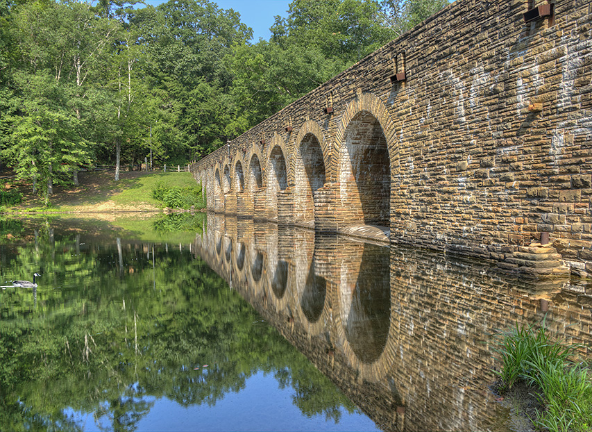
Wonderful, well-generated image. It depends on what you want to show or stand out in this image, and that is up to each of us to determine for ourselves. If the main subject is to be the covered bridge and the reflection, I might consider a landscape crop, or at least removing part of the sky and most of the foreground. If this is a documentary or scenic, with colors, textures, and everything in this scene being equally important, you have done a wonderful job. The image is balanced, excellent colors, with lots of interesting details. But, I see the possibility of two pictures, one being the foreground and the other the background bridge and reflection. I once read that an excellent picture usually has several smaller pictures within it, and this is true in this image. (I have found for me this is sometimes true and sometimes not). Technically excellent work, and thanks for the explanation! I have tried to train my eye to look for 'level' any time I view an image with water, and am wondering if it would look more natural with the water being rotated to level even if it would place the top of the bridge at more of an angle. Great job with your editing! |
Dec 5th |
5 comments - 2 replies for Group 46
|
6 comments - 2 replies Total
|