|
| Group |
Round |
C/R |
Comment |
Date |
Image |
| 28 |
Sep 17 |
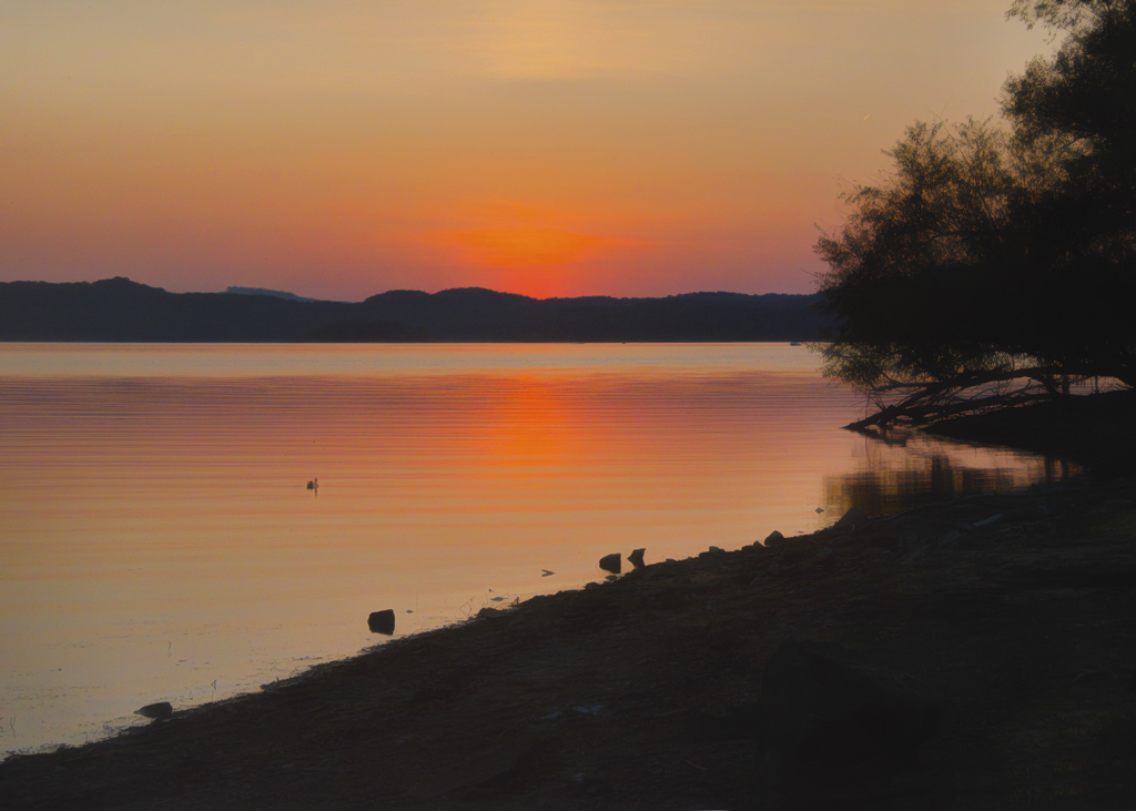
Comment |
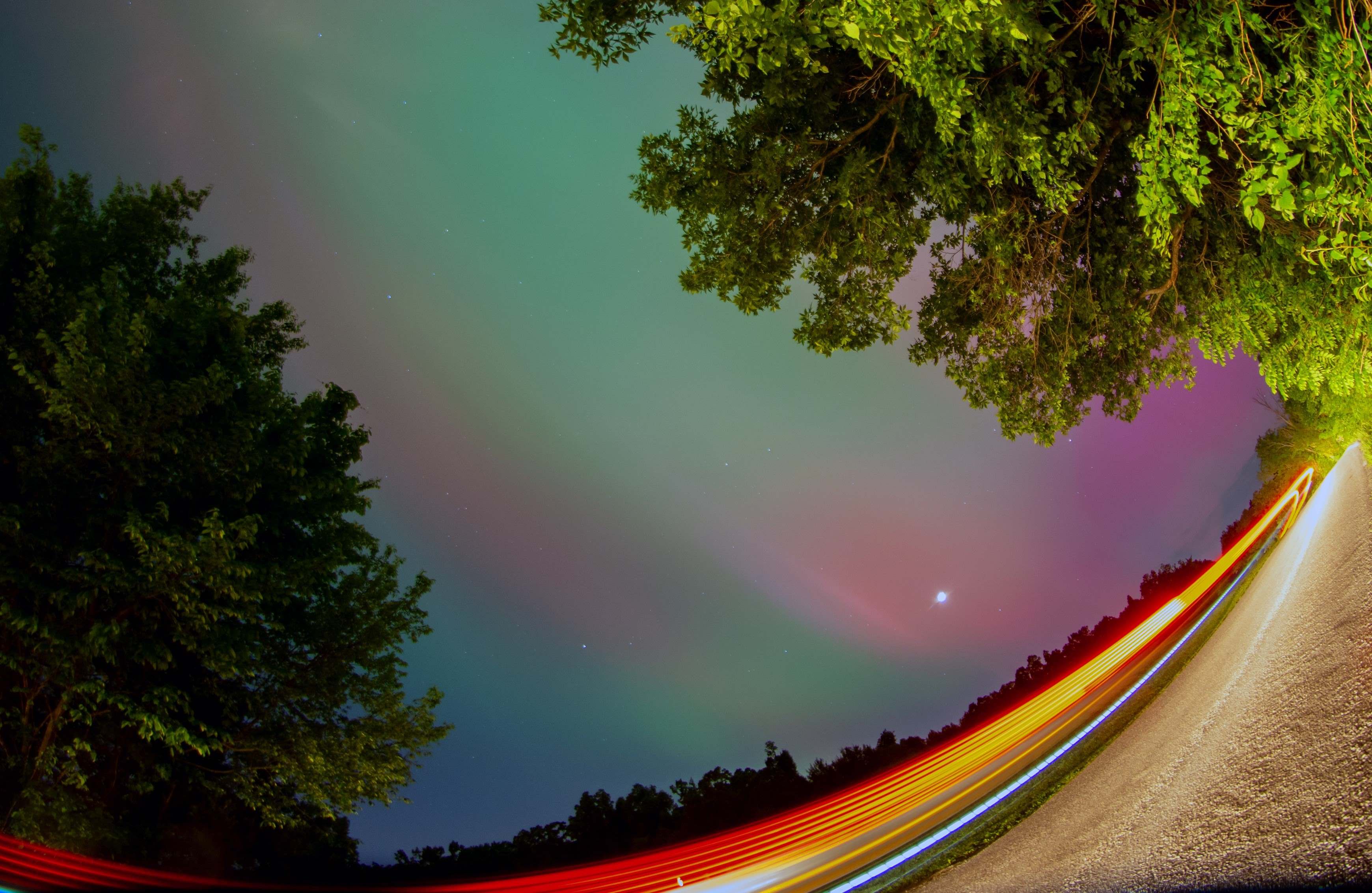
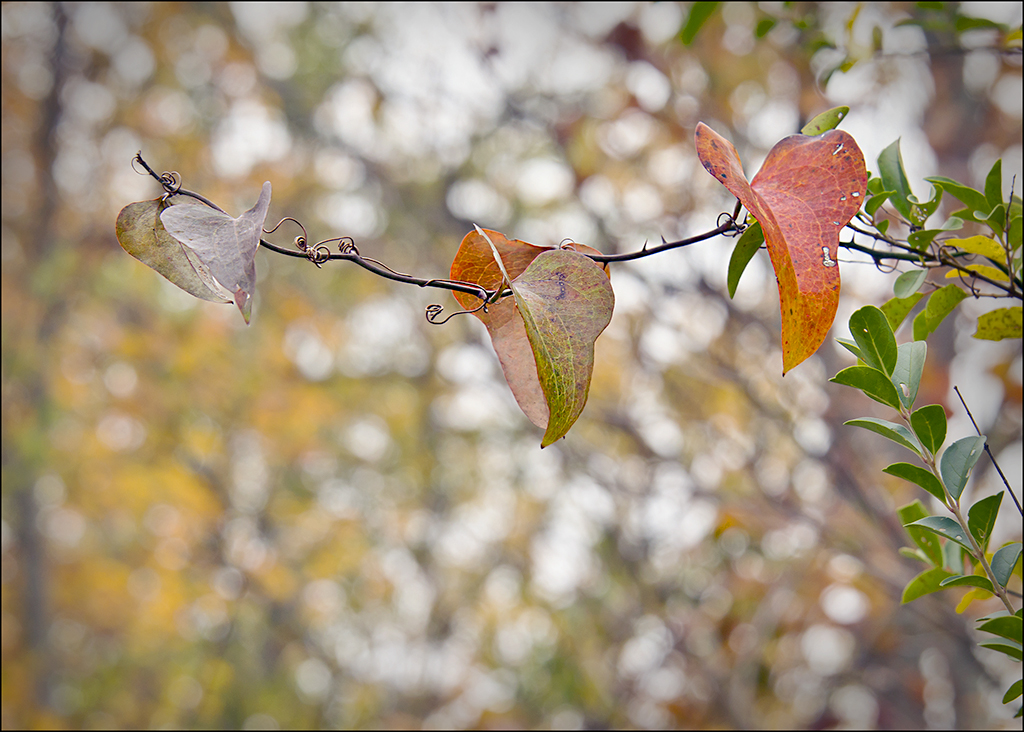
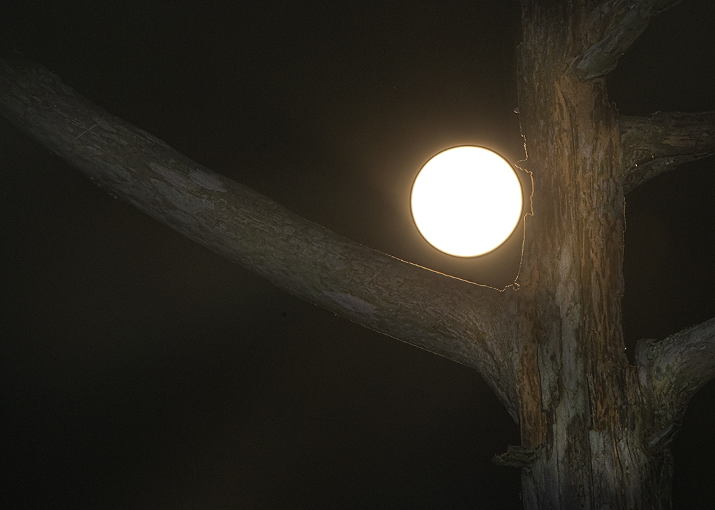
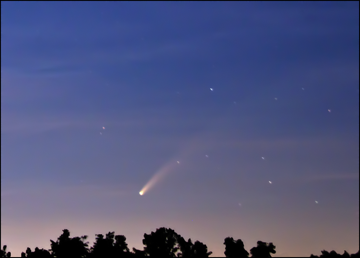
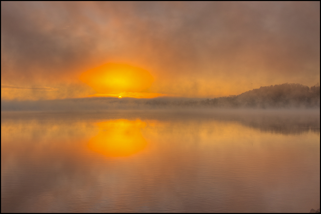
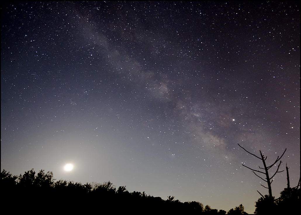
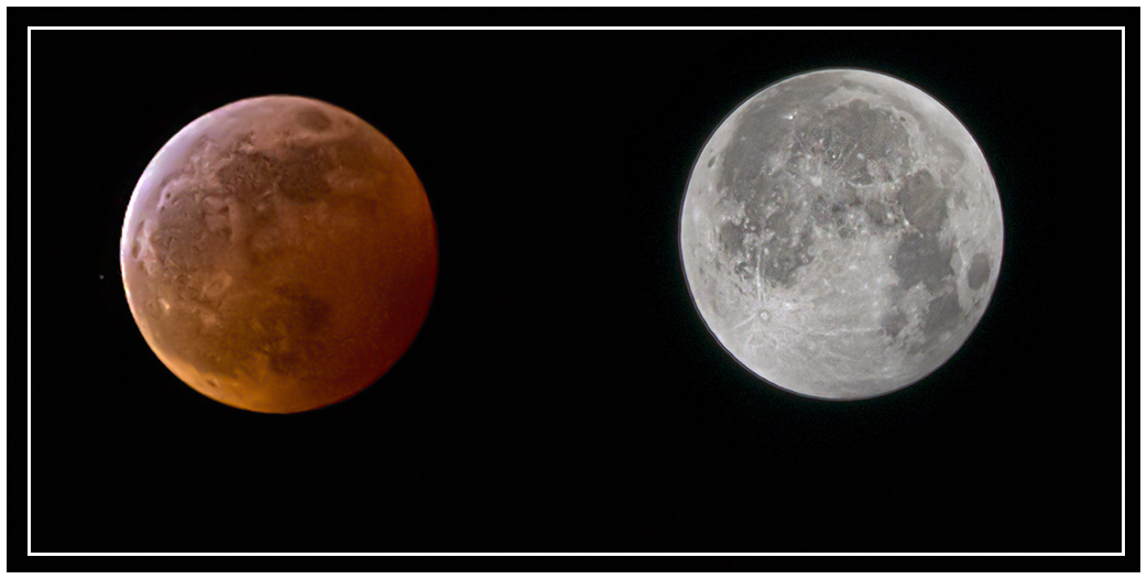
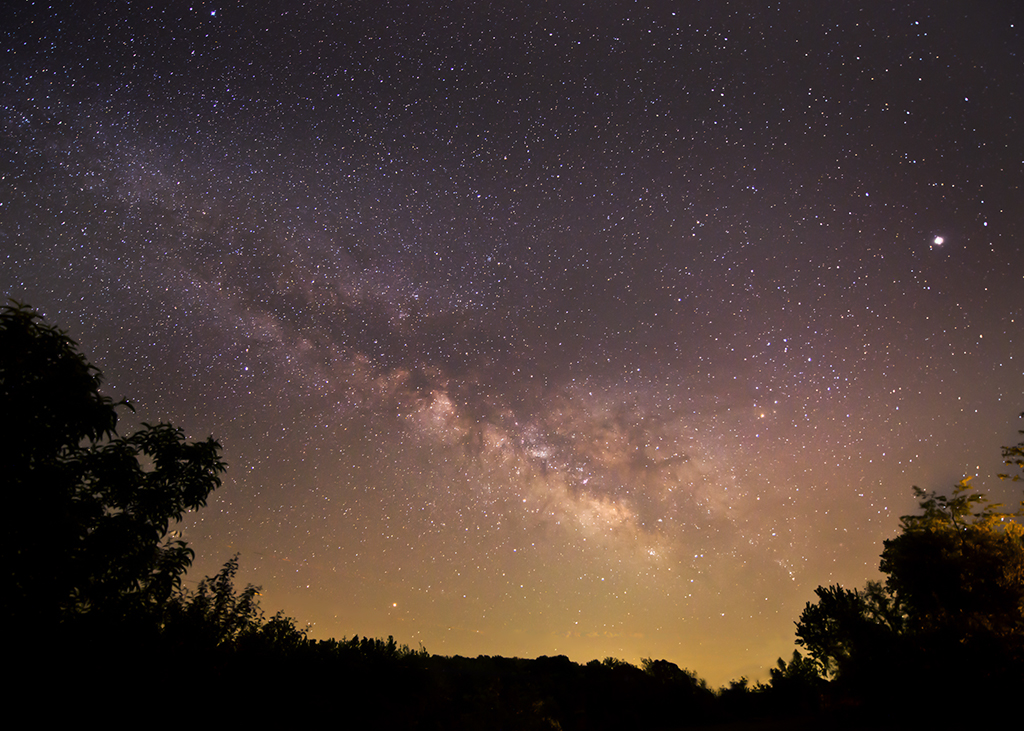
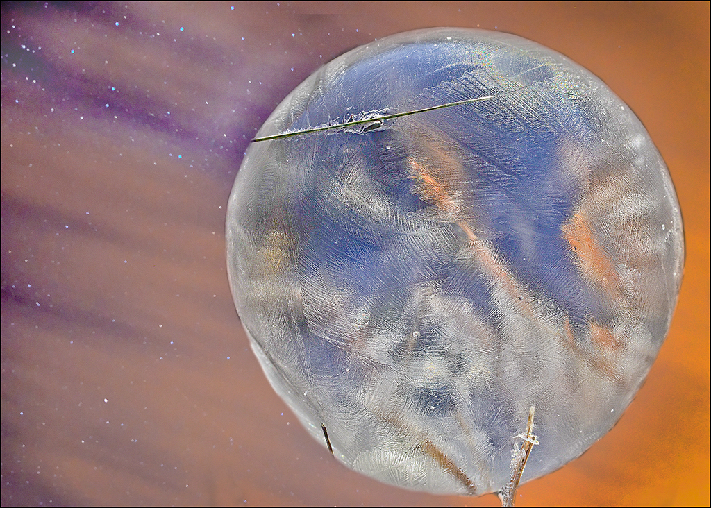
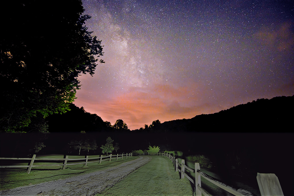
To me, the value of this image is the colors, so I do not suggest cropping. However, there are a couple of spots of dust in the sky that could be removed by cloning. It would have been nice to have the moon not so close to the edge, but from experience, I know this is not always possible. You shot this at 85mm, and perhaps you could have increased the lens to be a wider image and then have the moon not at the edge of the image. I have added a little to a photo (copy and paste) at the top or sides if more room is needed. Good job in lightening a dark picture, and in adding the nice sunset colors. |
Sep 30th |
| 28 |
Sep 17 |
Comment |
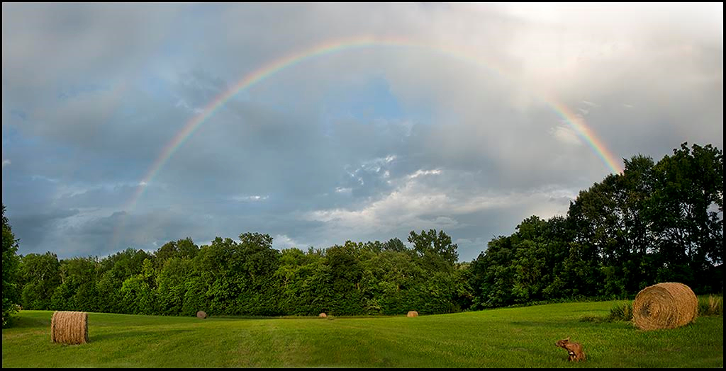
Wow, what an image! I like the original best, and would do nothing to it, unless it would be to selectively lighten/darken areas...play around with the dodge and burn tools a bit. The sky being a different shade in the original gives it a bit of a real life feeling. I agree with Kathy, the final image is just a bit much on the yellow. You might try a frame of darker color? Love the composition. |
Sep 30th |
| 28 |
Sep 17 |
Reply |
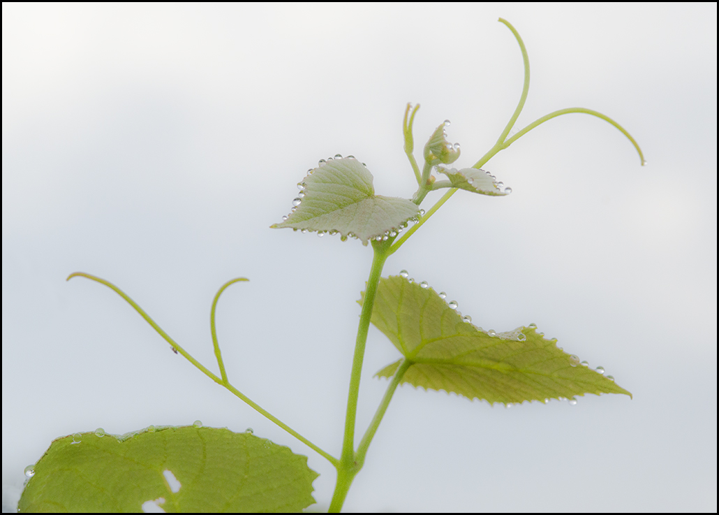
Thanks for the suggestion, I'll try it. If I keep the leaf, I should at least clone in the holes in it!! |
Sep 30th |
| 28 |
Sep 17 |
Reply |
Thanks Steve |
Sep 30th |
| 28 |
Sep 17 |
Reply |
thank you Alice for the suggestion. |
Sep 30th |
| 28 |
Sep 17 |
Reply |
Thanks Shelia. That works too I think! |
Sep 30th |
| 28 |
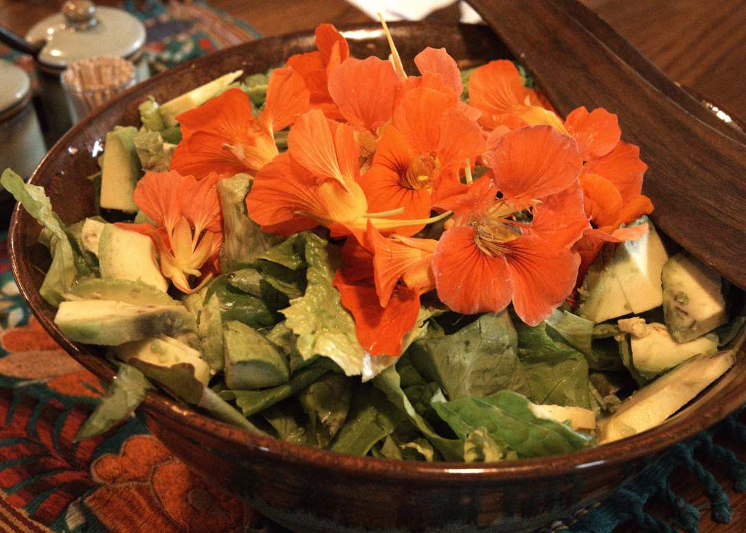
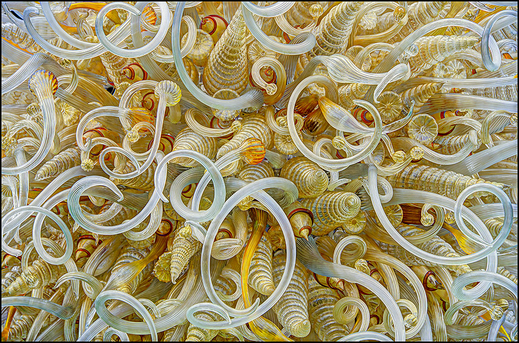
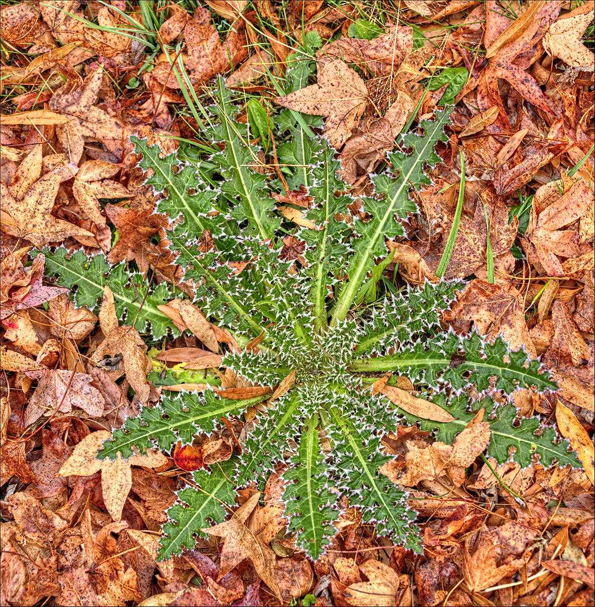
Sep 17 |
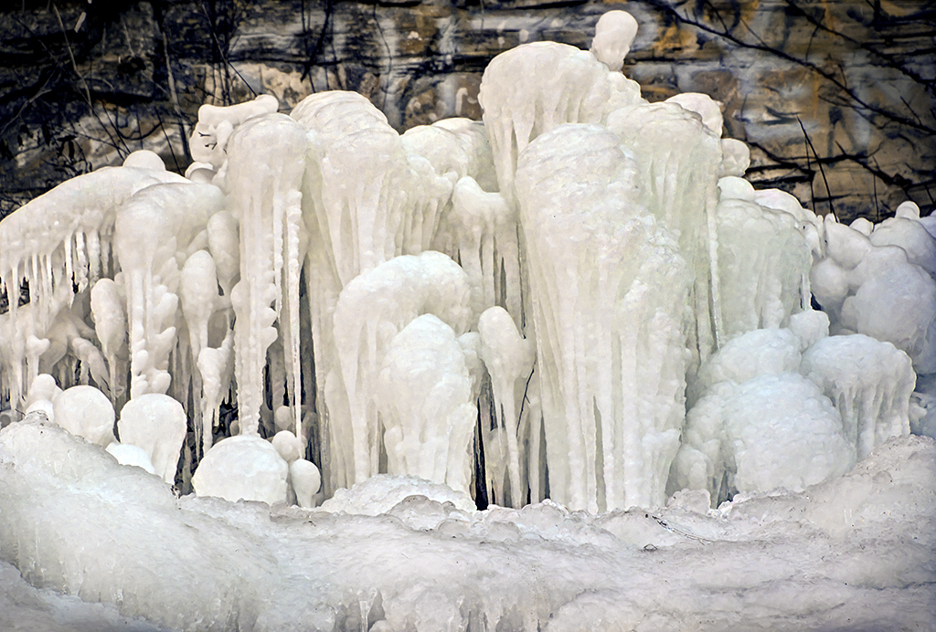
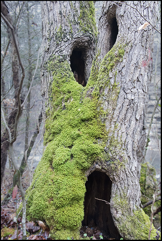
Comment |
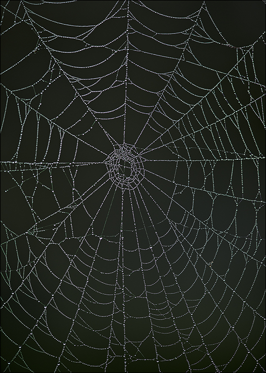
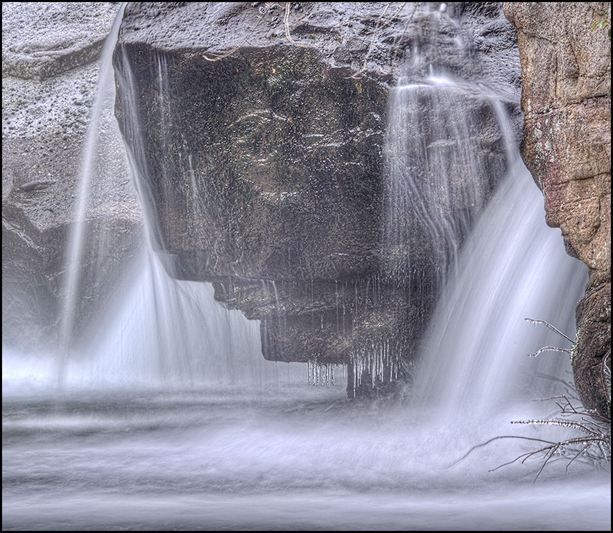
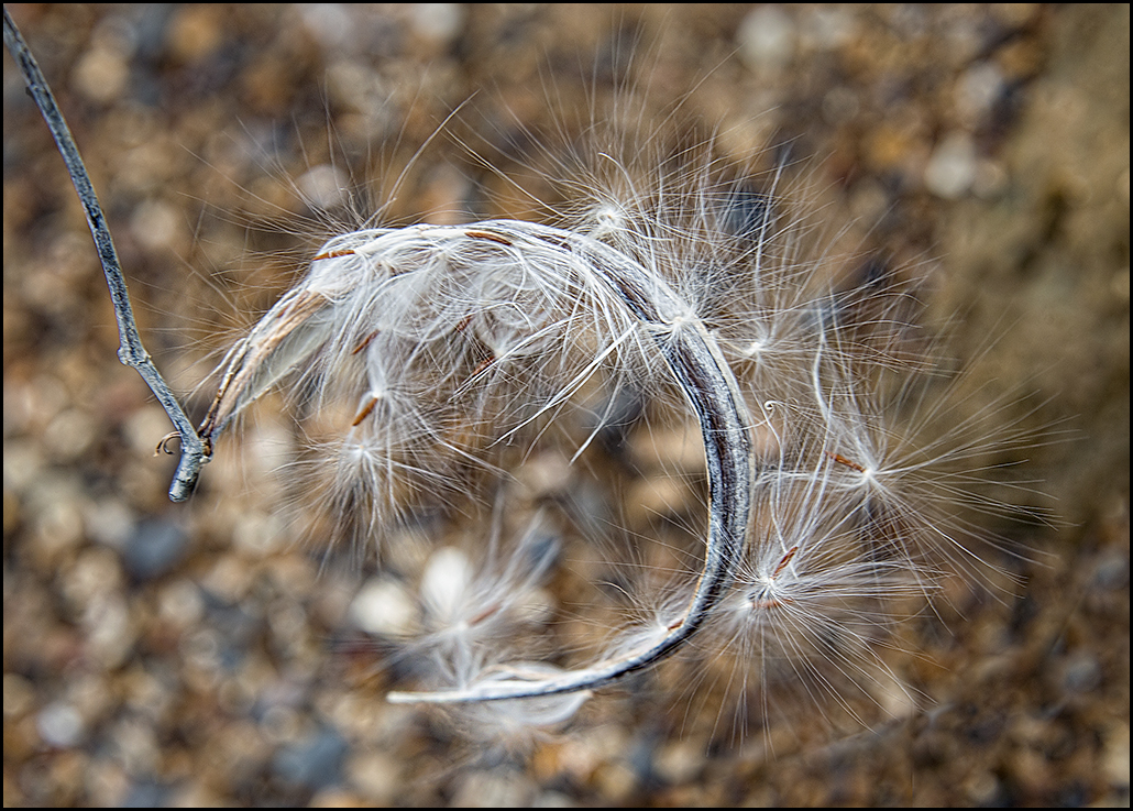
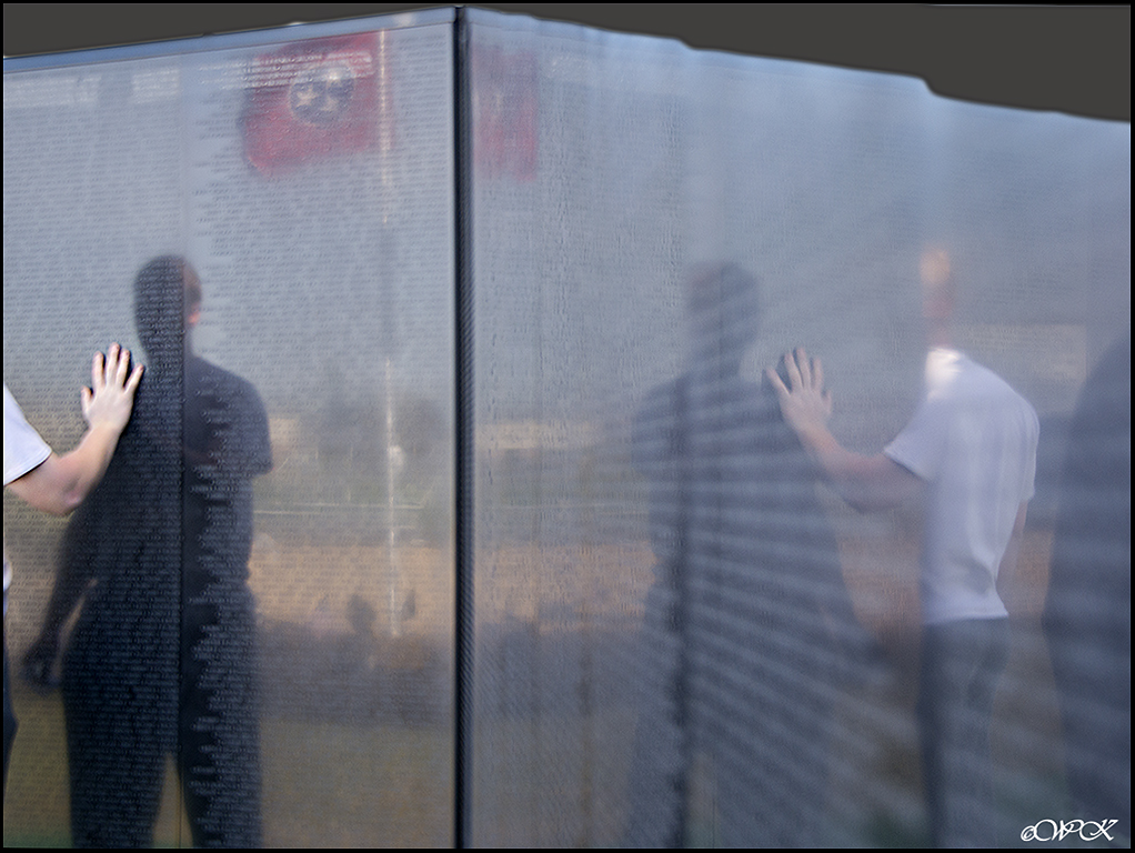
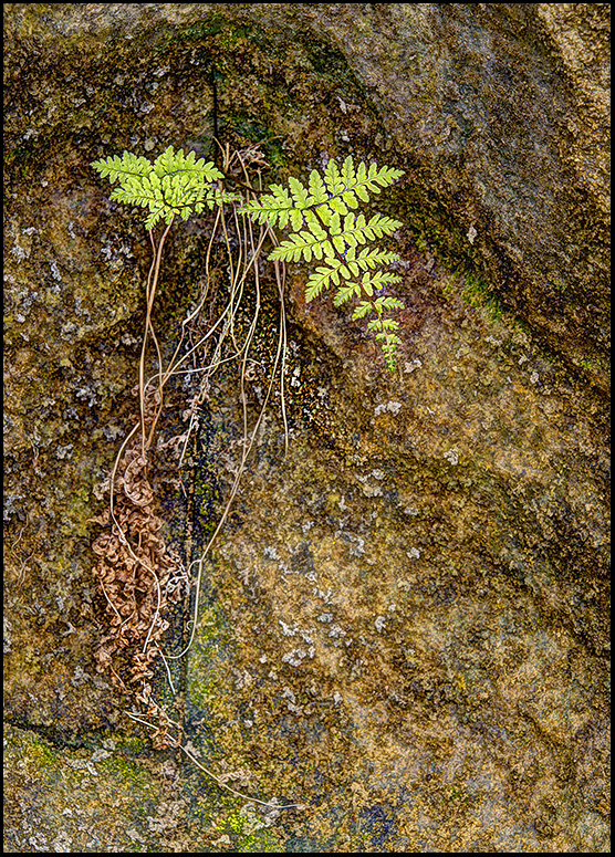
I would change nothing about this image Kathy, unless it would be to remove the small plaque near the middle. I LOVE the textures that show up here, and the simplicity of the image. Square is good! Your phone camera caught a lot of the details, I'm impressed! |
Sep 21st |
| 28 |
Sep 17 |
Comment |
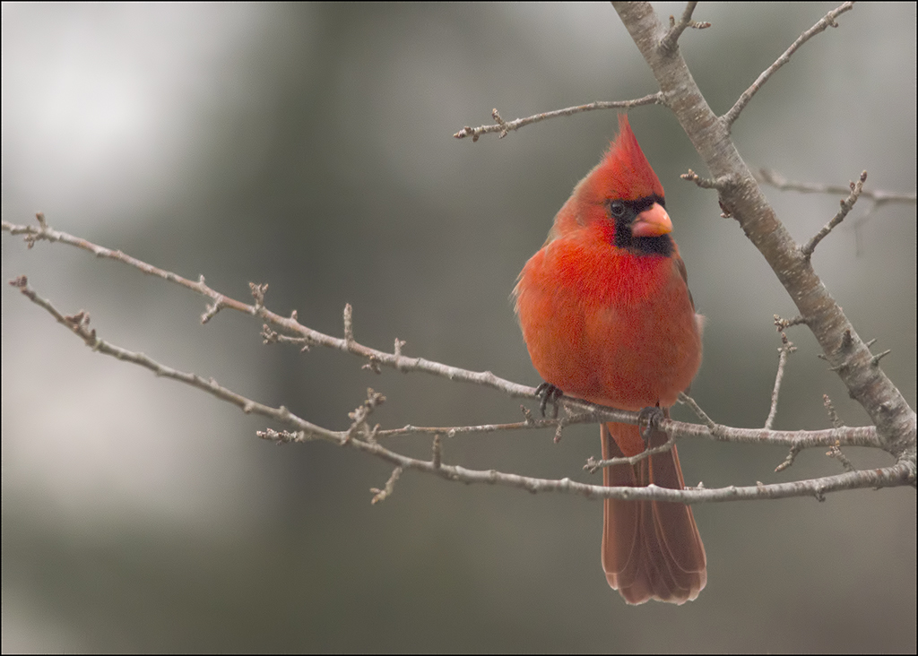
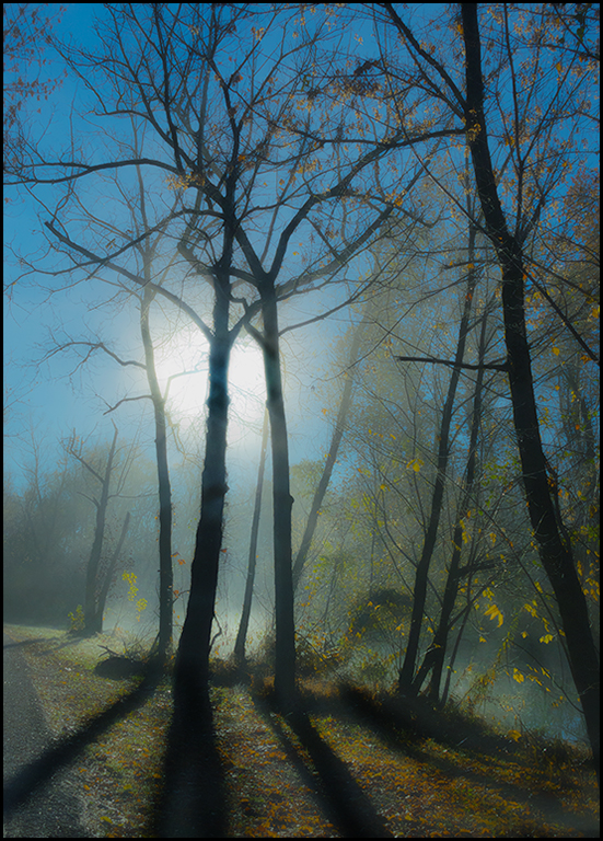
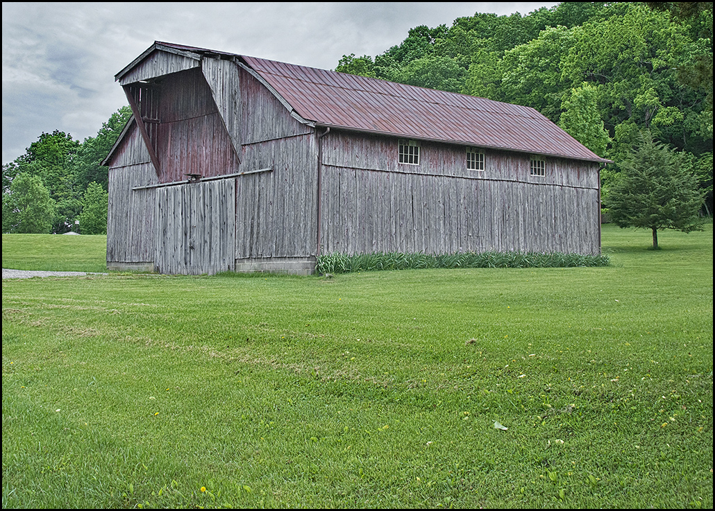
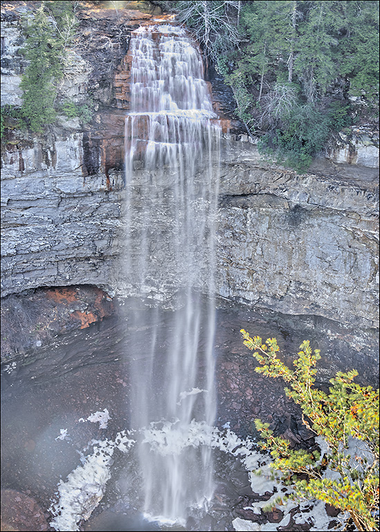
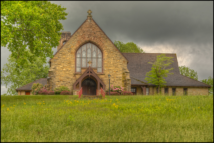
Absolutely beautiful shot Tom. What a perfect place to set up this type of shot! Two things I might change were this my image. I would remove the streetlight that shows up in the window, leaving the leaf foliage, and for a border, I suggest the darker red of the stairs wood as a more muted border. I like your lighting set-up, and with the low ISO, it is a brilliant image! If you wanted to try, might crop some from the left and the top and still have a wonderful composition. |
Sep 21st |
4 comments - 4 replies for Group 28
|
| 46 |
Sep 17 |
Reply |
Thanks Jeffrey. |
Sep 30th |
| 46 |
Sep 17 |
Comment |
Nice catch! When looking at your originals, I really like the middle image in color, and realize that i do find the border distracting. You might consider a slight crop on the right, to remove some of the details of the chair, and perhaps from the bottom, giving more emphasis to objects on the table. Otherwise, the b&w works for me, as well as the correctly exposed colored one. I like the addition of a bit of sepia color. People in the shot might have been too much. Well-done. |
Sep 21st |
| 46 |
Sep 17 |
Reply |
Thanks Richard. I like to go for the natural look, perhaps with just a tad of enhancements with the hdr's. |
Sep 21st |
| 46 |
Sep 17 |
Reply |
Good question Gary. I have tried several times to use lightroom, and have had it on my computer for a few years now. The cataloguing and how lightroom deals with the images has actually prevented me from using it. Lightroom does do all that CR does, and perhaps does it a little easier and in a couple of cases a little better. Habit, I would say more than anything else is why I use camera raw. Being so used to it, and not feeling like I need anything else is probably the primary reasons, along with the fact that I have my own cataloguing system that seems to work ok, and I just don't want to tackle the complicated system that LR provides. Lightroom is a great program, and most of my friends use it almost exclusively. No, CR does not permit more local toning, and the two programs do essentially the same things. |
Sep 21st |
| 46 |
Sep 17 |
Comment |
I agree with Richard about moving just a bit to the right, so the mast in be background is hidden behind the pole. Good eye for catching a whimsical sign! I would have a tendency to shoot two images of this, one with nothing in it except for the sign, and one with some of the boats in the background to give an idea of where and how ridiculous a sign like this would be on a pier, so no, the boats being present do not bother me. I like the American flag in the background, and in photomatix you can selectively determine a part of the photo to reduce the ghosting, which should work well for removal of the ghosting around the flag. Sorry I didn't get the images all loaded in the correct orientation. I'll see if I can fix that. |
Sep 21st |
| 46 |
Sep 17 |
Comment |
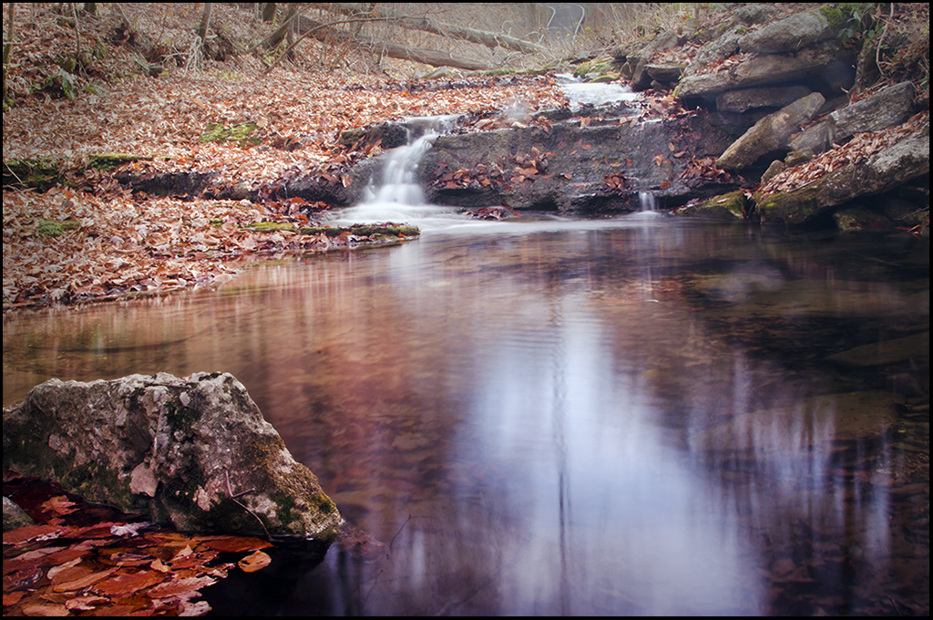
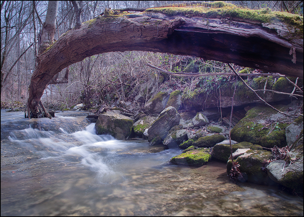
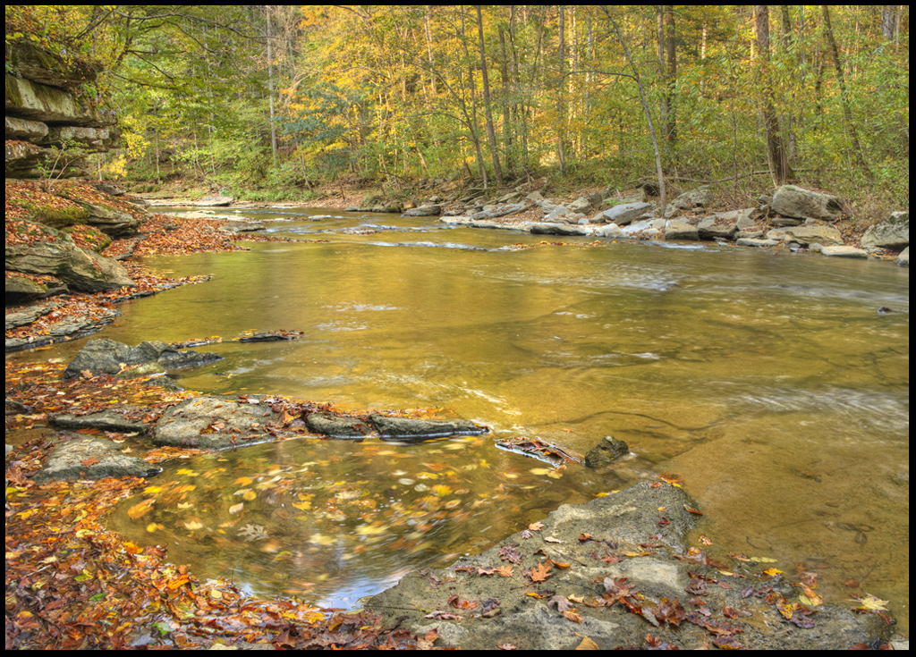
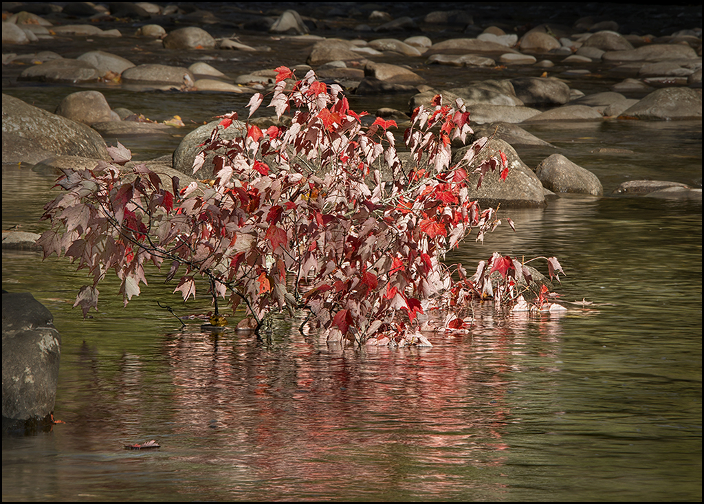
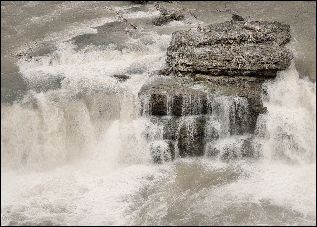
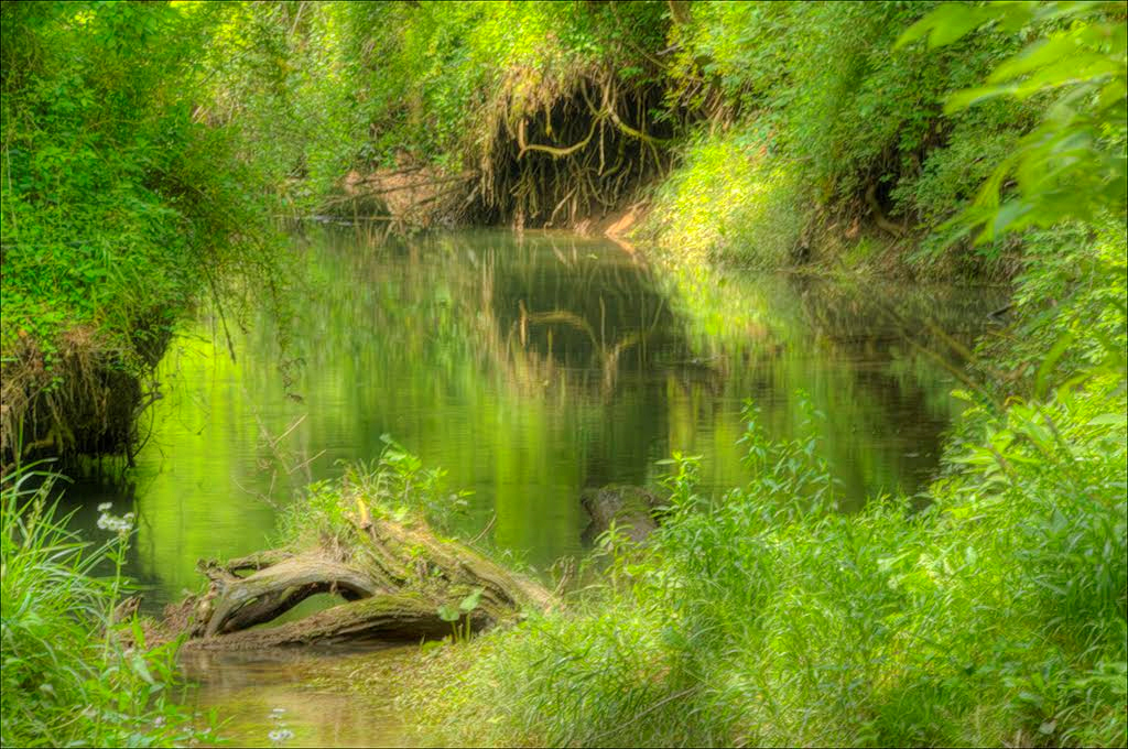
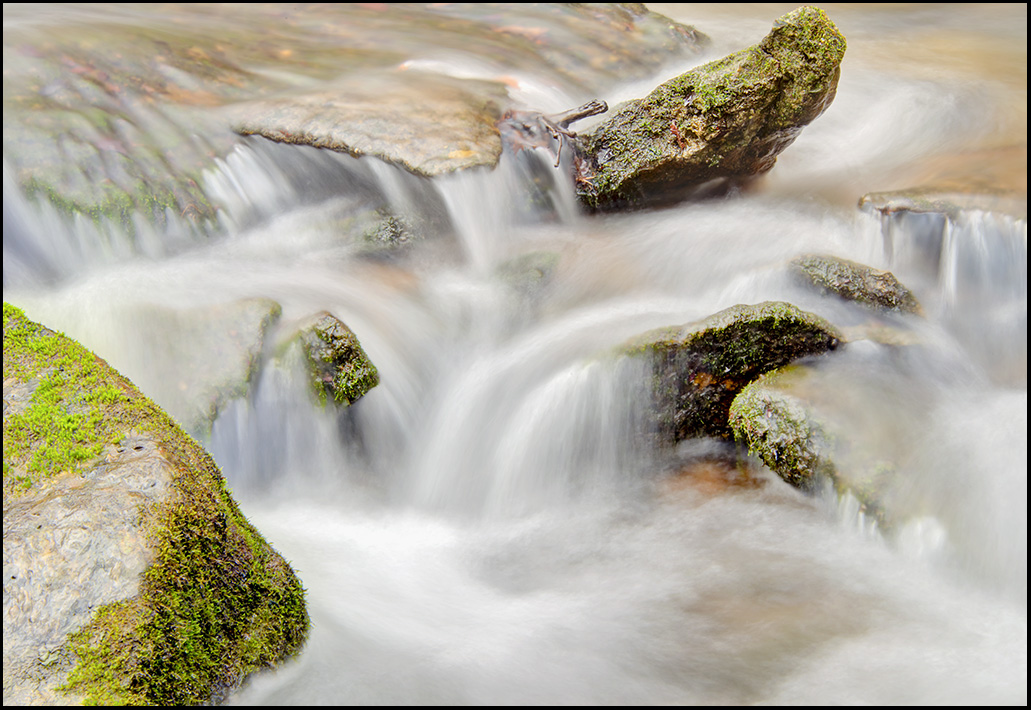
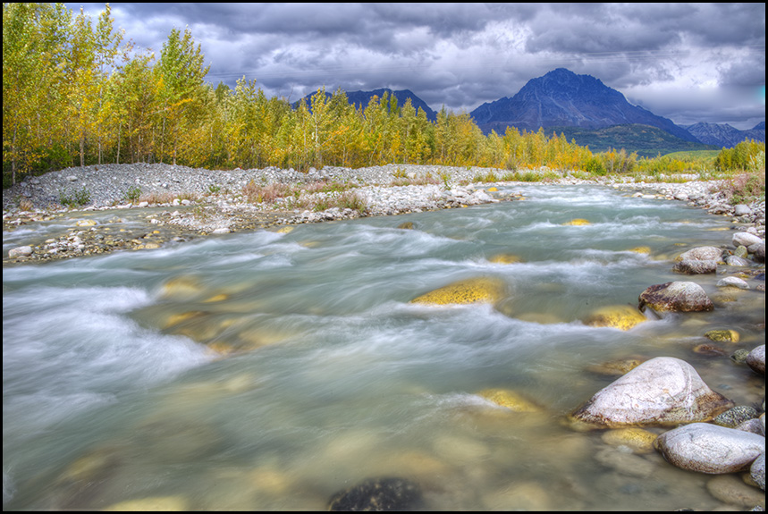
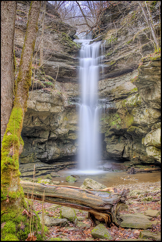
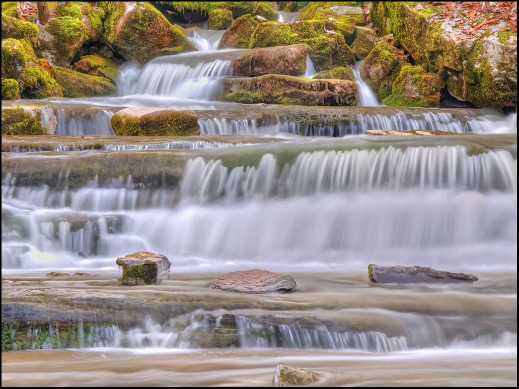
What a beautiful spot to capture Richard! I agree with Jeffrey, the bright spot in the background catches the eye more than the stream, which has just the right amount of softness and movement! I also like the foreground rocks as they are. You could clone out the over exposed spots in the background, or you could do a heavy top crop and end up with a pano, but then you would loose those lovely white birch in the background. Guess I would selectively work on darkening the lighter areas of the background. This is a lovely spot, and difficult lighting to work with. Wonderful catch of movement of the water, and lovely moss on the rocks. |
Sep 21st |
| 46 |
Sep 17 |
Comment |
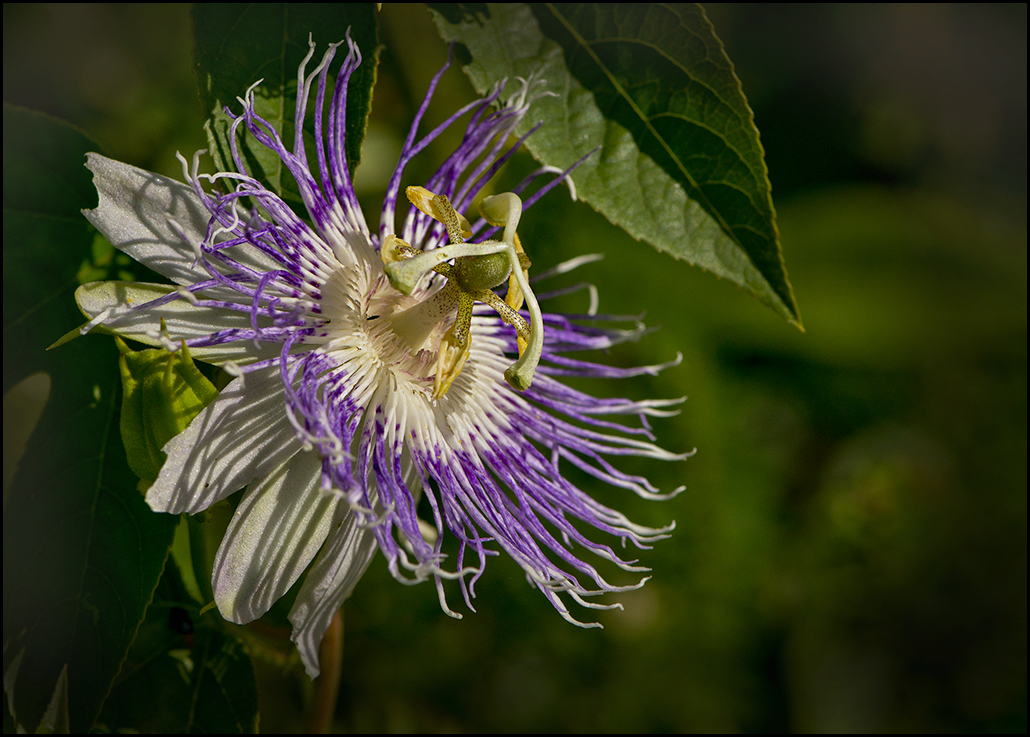
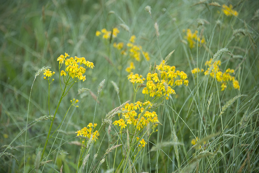
Gary, what a wonderful image, and thanks for the explanation! I also have been trying out similar depth of focus ideas with scenics, and have had varying results. What a great place to use this type of focus stacking. If this were my image, the only thing I would have a tendency to do would be to crop off just a tad bit more from the bottom, to get the idea of looking over the flowers instead of looking at them as the part of the image that catches the eye first. There are probably several ways you could accomplish reducing the importance of the flowers in the foreground, cropping being only one of them. However, this is a wonderful shot, and very good job to accomplish sharpness throughout the image! Thanks for your detailed info. |
Sep 21st |
4 comments - 3 replies for Group 46
|
8 comments - 7 replies Total
|