|
| Group |
Round |
C/R |
Comment |
Date |
Image |
| 6 |
Mar 21 |
Reply |
Thanks Stuart for stopping by for the visit. It great to to have comments from members from other groups. |
Mar 15th |
| 6 |
Mar 21 |
Comment |
Thank you Larry for stopping by and I appreciate your comments. |
Mar 13th |
| 6 |
Mar 21 |
Comment |
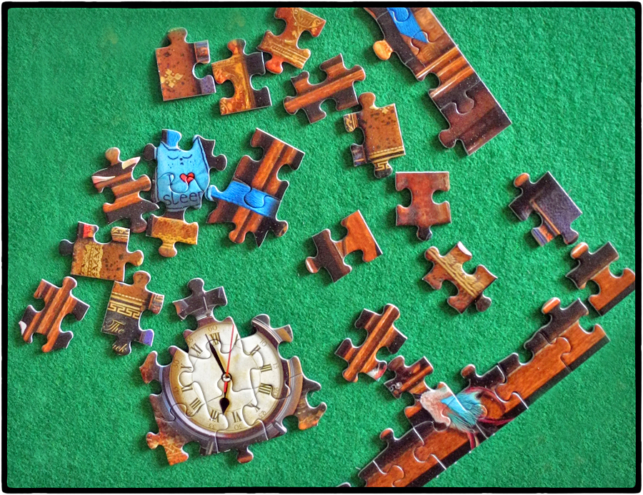
Hi Janet, Interesting image. I like the background color and lighting for this works well. I also like the shadows along each puzzle piece which makes each piece stand out giving depth to the image. When I look at this image my eye goes immediately to clock (wish it wasn't upside down) but then me eye goes back to the straight edge pieces that form a V-shape. These two lines tend to lead my eye out of the image. I feel the image might work better without these hard lines or arrange them so they keep the eye in the image.
I did a flip with this and now I can read the clock and I really like this arrangement. I also feel the V-shape edge pieces actually helps to keep my eye in the image. |
Mar 8th |
 |
| 6 |
Mar 21 |
Comment |
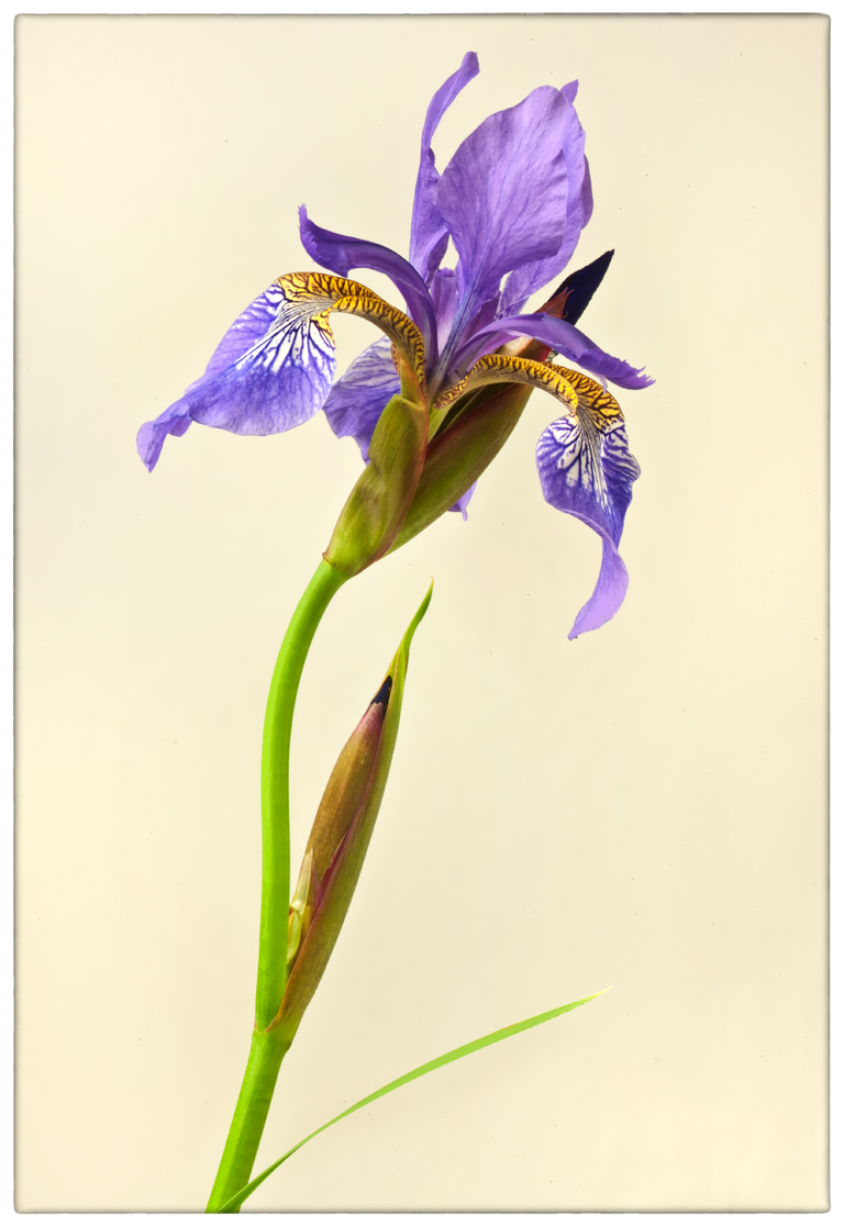
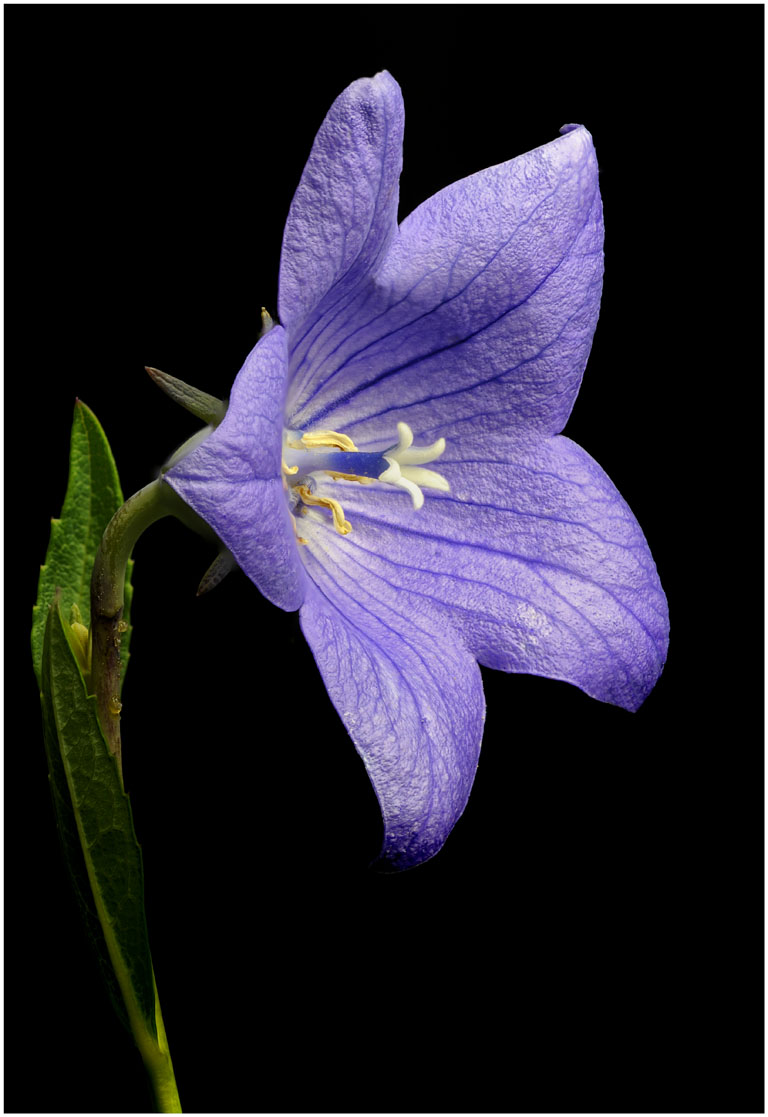
Hi Tracy, I agree with Janet and Charissa on this image.
I like the crop Janet made so the image is not a bullseye. I like how sharp the image looks, you did good with this. I too feel there are too many dark tones in this. I would like to see this in its original color.
I have found water works on some flowers and not so well on others. I feel if you mist a flower make sure there's enough water to make the droplets larger. Mist to a point where some drops begin to fall off, this makes the flower look natural. If the droplets are not large enough especially in B&W they can look like dust. I find side lighting works best to light up the droplets which I feel is important. You have to play around with the lighting. I feel the flower would have more impact in color.
If you have this image in color send it to me and I will post it, I would like to see both. |
Mar 8th |
| 6 |
Mar 21 |
Comment |
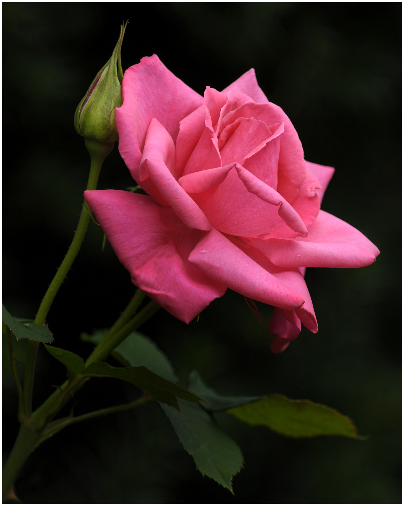
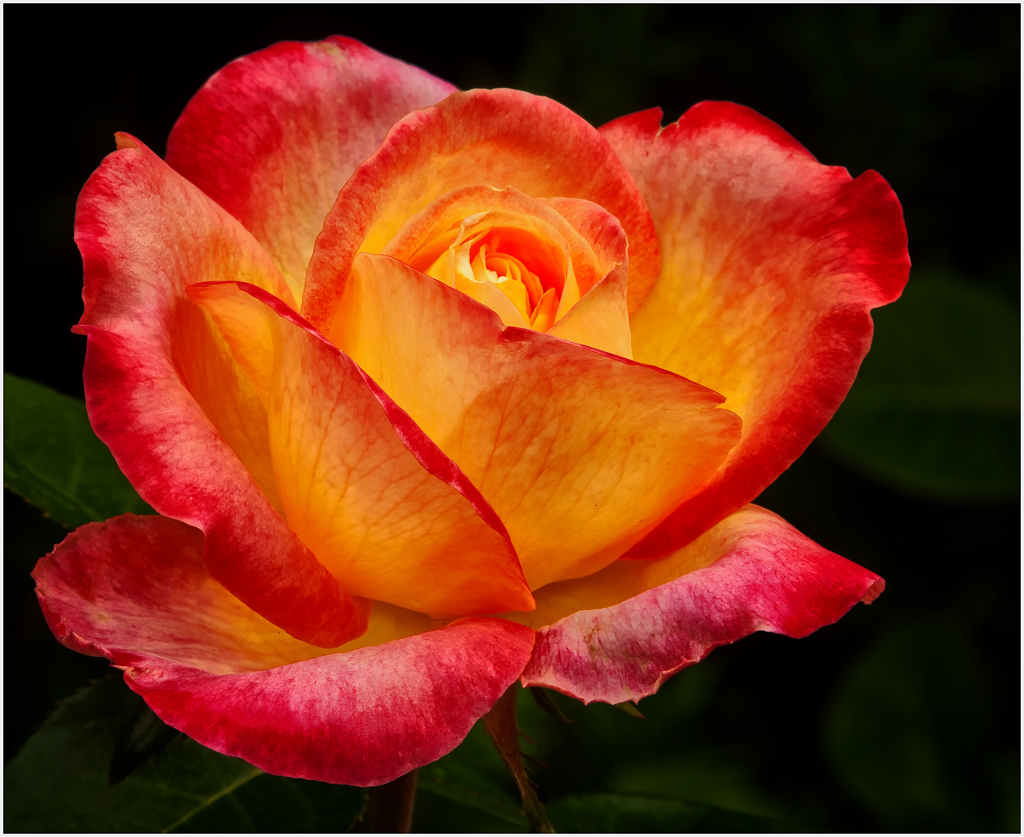
Hi Charissa, I think you did good. I have several Lensbaby lens and I find them a bit hard to get what I call a successful image. For me there's a bit of learning curve. It's kind of like doing black and white. You have to develop an eye for what will work. With Lensbaby there's a small area that's sharp, that's what they are designed to do and that's the look with Lensbaby.
I feel this rose is a rather difficult subject to be successful with due to its color. There's a lot of white in the petals around the edges which draws my eyes to these areas in this image. Kind of a distraction. I also feel the center, the subject in this image, is too much of a bullseye, and not as sharp as it needs to be. I feel with Lensbaby there needs to be more room around the flower with the flower on one side.
I do feel you were successful with the sense of calm.
One of the best with Lensbaby is Kathleen Clemons, check out her work, it's very good.
|
Mar 8th |
| 6 |
Mar 21 |
Comment |
Thanks Janet and Charissa for your comments. Yes I noticed the boards on a slight slant but if you look closely you will notice the large staple on the right side of the hasp is slightly higher than the large staple on the left. The hasp is not level, it's higher on the right. Now add the shadow and it really gives the illusion of not being straight, which it isn't. I kind of broke the rules with the idea the image reflects something very old with things not so straight from things settling over time.
I did straighten it some but I'm not sure if it is still straight. |
Mar 8th |
 |
| 6 |
Mar 21 |
Comment |
I really love the colors in this flower and like the composition. Like what you did with the background. I find what the oil paint filter did to the image distracting to my eye. I like the original much better. I took the original and did a little work on it. I removed a small white triangle on the lower right corner. I then removed the vertical green stalk on the right and applied some structure using Nik software which brought out more detail. I cleaned up several other things. I really like the resulting image. I just feel the main image is a bit overworked. Your painterly image has great colors and nice impact. I will be interested how the other members feel. |
Mar 6th |
 |
6 comments - 1 reply for Group 6
|
| 65 |
Mar 21 |
Reply |
Hi Peter, Yes, I removed the last flower so there would be a little more room and not have a flower so close to the edge. |
Mar 26th |
| 65 |
Mar 21 |
Comment |
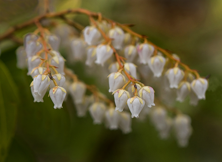
Hi Nancy, I an visiting from group 06. This is not Lily of the Valley, I know the flower looks like it but this is a shrub. Japanese Andromeda with a scientific name of Pieris japonica.
I made some changes to the image. I cropped some off the top and bottom and some off the right side. Darkened the background some and removed the first flower on the left. Added structure using Nik software which brought out more detail. I like how several flowers are sharp and show detail in each group of flowers. I don't feel all the flowers need to be sharp to make this image successful. I did a flip, which I like. With out the flip I feel the eye is brought into the image but moves out of the image on the right side. With the flip I feel it has better composition and keeps the eye in the frame. What do you think of the changes? |
Mar 11th |
 |
1 comment - 1 reply for Group 65
|
7 comments - 2 replies Total
|