|
| Group |
Round |
C/R |
Comment |
Date |
Image |
| 6 |
Feb 19 |
Reply |
I totally understand what your saying. The image takes on another dimension, our imagination. You have said it well. We're on the same page. |
Feb 19th |
| 6 |
Feb 19 |
Comment |
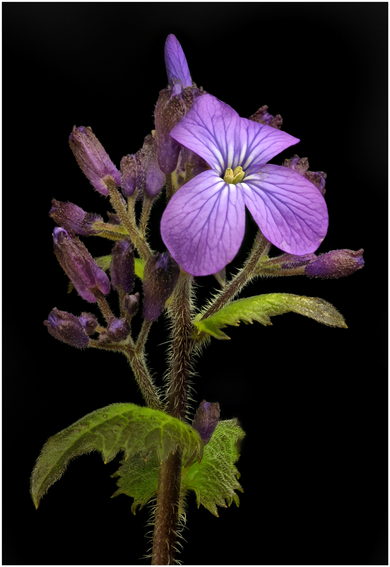
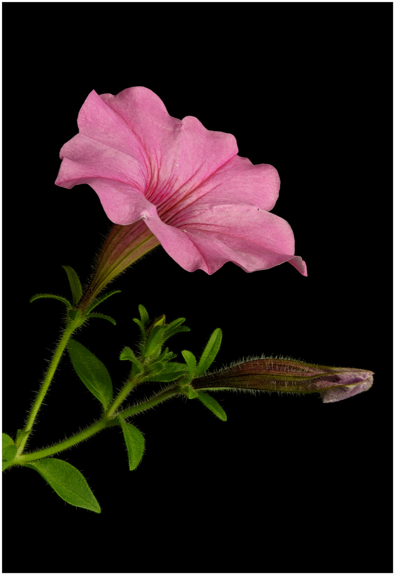
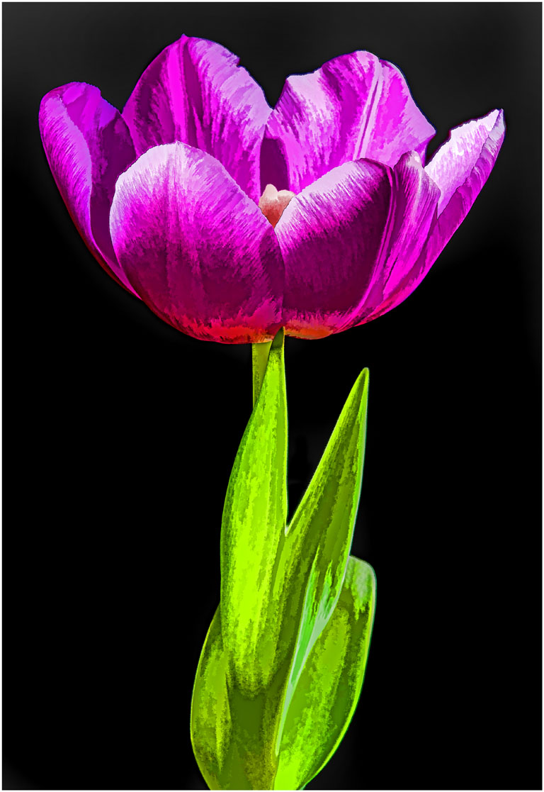
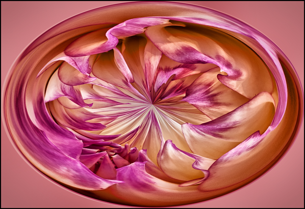
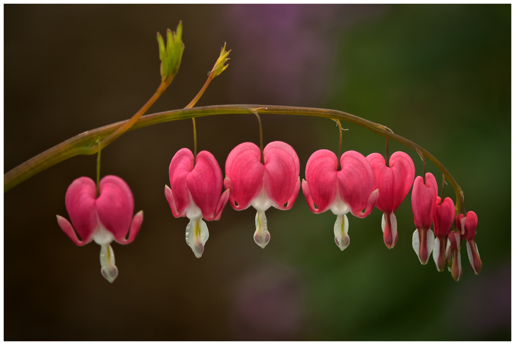
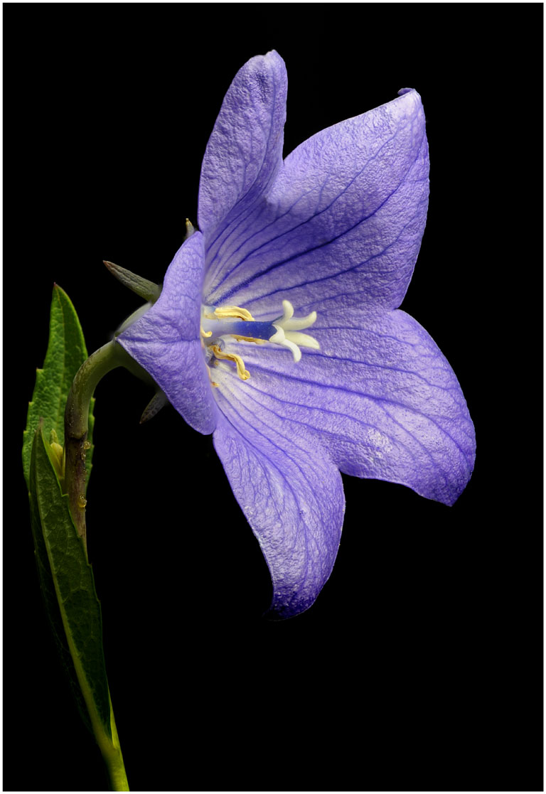
I appreciate all the interesting comments about this image. I think its quite interesting how in the horizontal composition the stem and the leaves become a much more important part of the whole composition. They take on more of an important role in presenting the main player, the tulip, than the vertical image. To my eye I feel the horizontal becomes more of an art form. I know we all see things different and that's ok. There's no right or wrong about this. Can anyone else see this? Sometimes how we present an image can be more important than the capture and the technical part. Does that make any sense? |
Feb 18th |
| 6 |
Feb 19 |
Comment |
I like the last crop Stuart Ord did. I might even crop down from the top in to the edge of the petals like it is on both sides. To my eye it just lacks the wow factor. |
Feb 18th |
| 6 |
Feb 19 |
Reply |
I agree with Tom. There are two separate subjects in this image. You have to decide which you are going to go with. |
Feb 17th |
| 6 |
Feb 19 |
Reply |
Thanks Mark for your nice comments. Miss you at SWMCCC. |
Feb 14th |
| 6 |
Feb 19 |
Reply |
I have a black acrylic piece (Plexiglas) I will use flat and put flowers on to get nice reflections but I do not use it as a background. Its 24" square. I love my black polyester cloth I use for a background. My other backgrounds II described work well. |
Feb 14th |
| 6 |
Feb 19 |
Reply |
When doing close-ups and macros I feel the background is everything. The subject may be great but if the background is a major distraction the image does not make it.
When I'm out in the field and I find a subject I want to shoot, it's most important to me to check the background first. Move around until the background is right. If the background is not right I will move on or do a macro so to eliminate the background. I may use one of my backgrounds I have made at little cost. The background is everything.
My black background is a 6' X 6' polyester fabric. I like polyester because lint does not stick to it. I picked it up probably 40 years ago. I love it. The other backgrounds I use are made on mat board. I took a full sheet of mat board, cut it into four 16 X 20 boards. I purchased Design Master craft (florist) paint. The paint dries quick and has no shine to it (florists use the paint to color flowers). I use off white mat board. I purchased several colors of green, one is hunter green, paint both sides making them different. You can make any color or color combination you want. The paint comes in all colors. You have to learn how to paint them, you don't want them one solid color. They must look real and work very well. Be careful when using a background on how the light hits the background. If its in direct sunlight, shade the background from the sun. I sure don't have all the answers but I hope this helps. That's what these groups are all about.
|
Feb 13th |
| 6 |
Feb 19 |
Comment |
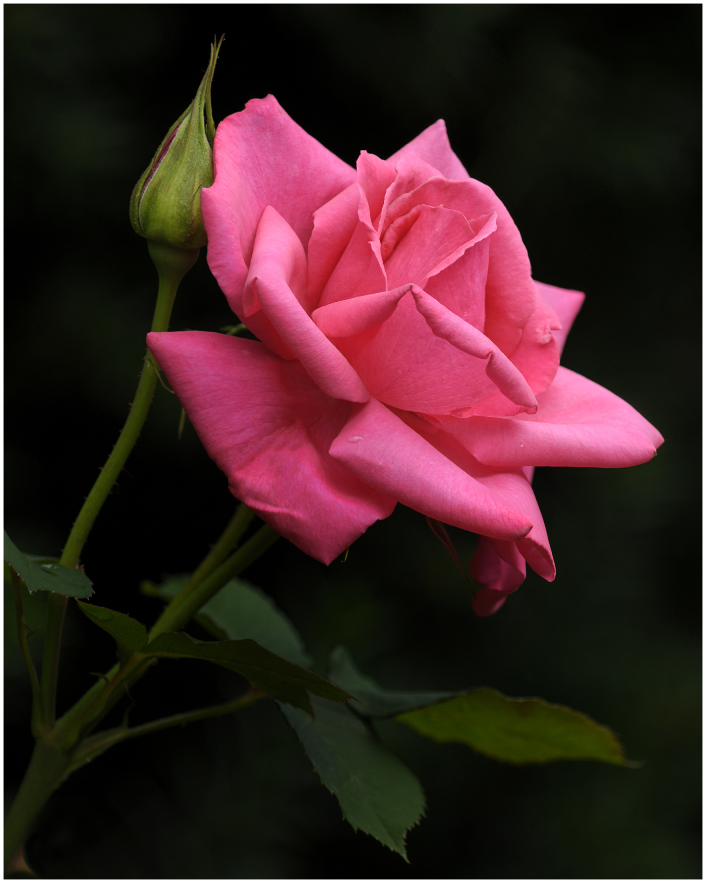
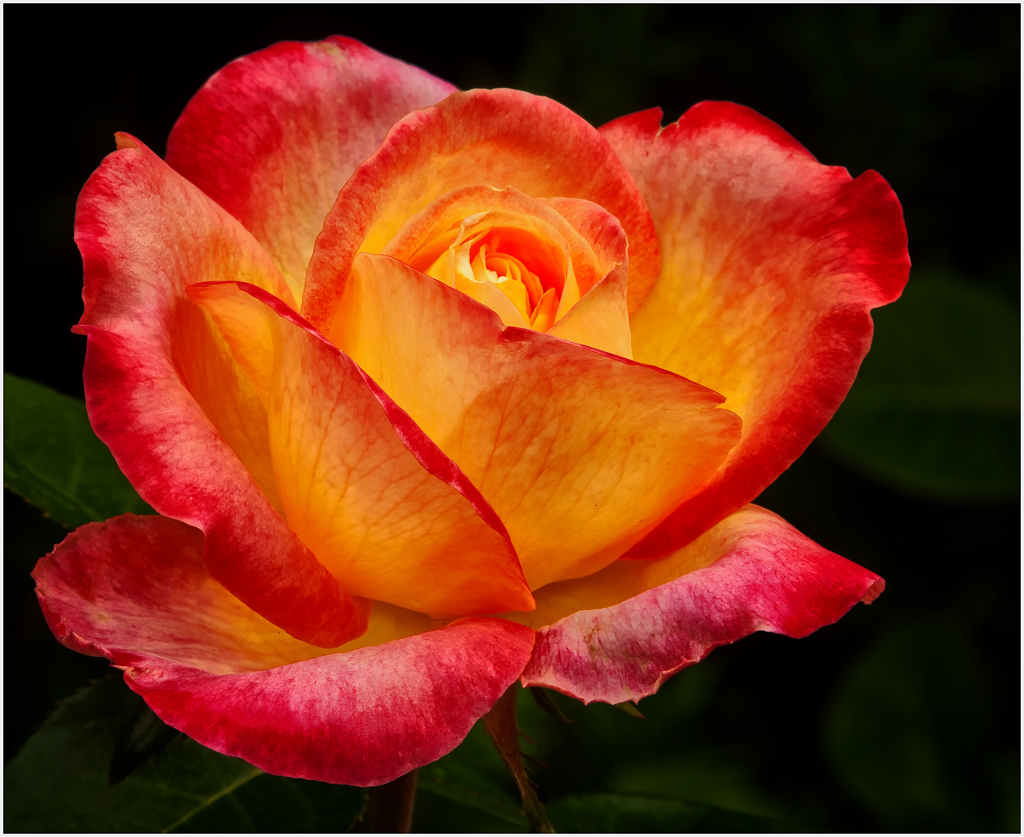
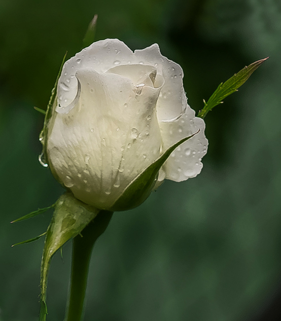
I agree with Janet on this image. I made almost the same changes as Janet did. I made the changes several hours ago and then when I looked at her cropped image it is almost the same as mine.
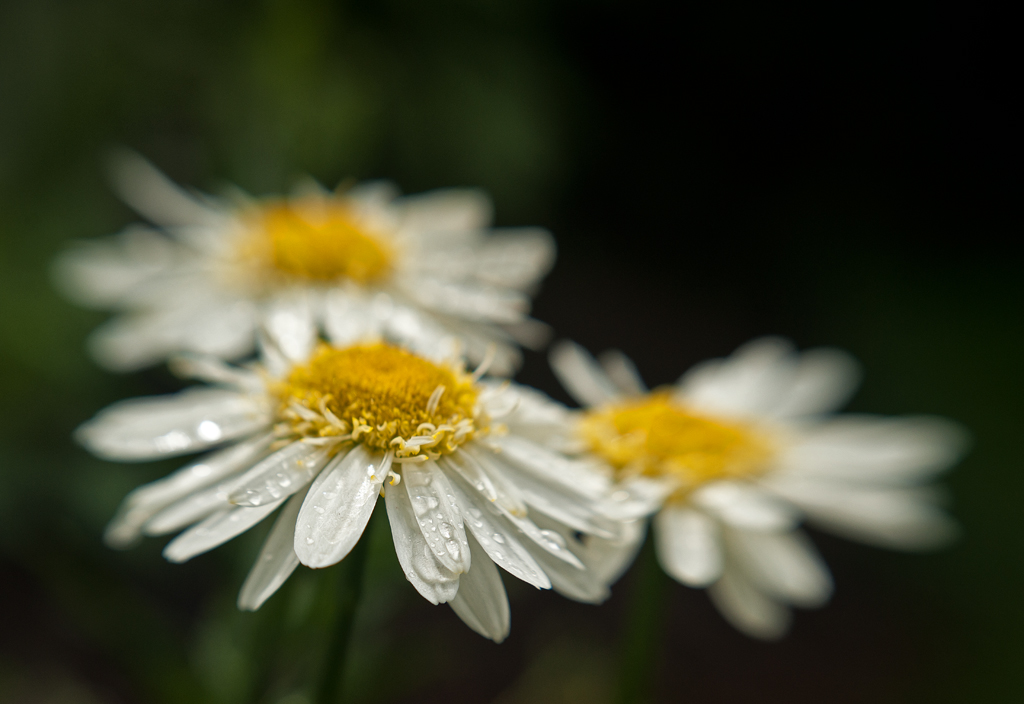
I feel there are too many distractions with the water drops on the leaves. I also feel the background somewhat distracting. I did rotate the rose some to the right and then made the crop. Added about 60% structure only to the rose to bring out the water drops and give them more definition. I too feel the rose has enough detail and is well done. |
Feb 9th |
 |
| 6 |
Feb 19 |
Reply |
I don't think it has anything to do if a person is right or left handed. Most people read from left to right. The instant you look at an image with out being aware of it you look at the image from left to right. This is why many images are much easier to look at and will score better if you keep this in mind. Its all part of art and composition. If you look at works of art by artists that paint landscapes you will see this. |
Feb 4th |
| 6 |
Feb 19 |
Reply |
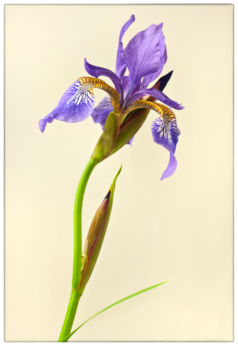
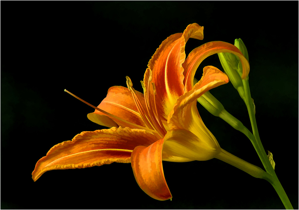
I think this works well both ways. I kind of felt the tulip was just a slight bit heavy on the left side in portrait. I felt being in the horizontal position, it had a very nice line using the stem, to bring the eye into the image and to the tulip. I did shoot this in the portrait position, the tulip was standing on its own. Its a matter of taste I feel it works both ways. |
Feb 4th |
| 6 |
Feb 19 |
Comment |
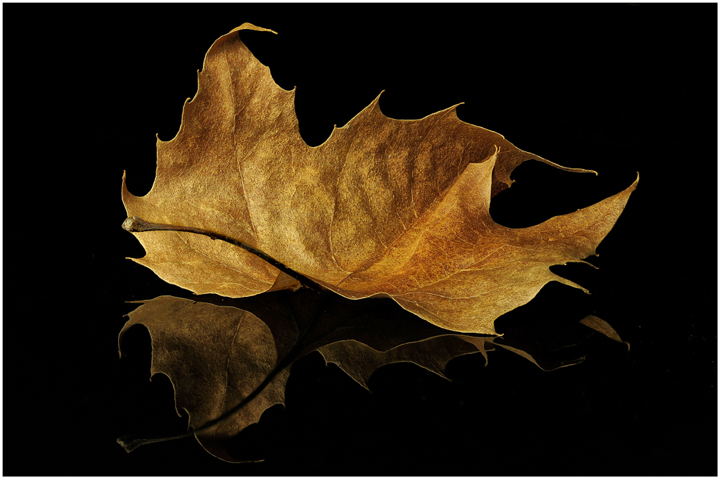
Its so good to have you in our group. Welcome!
Love your first image. Lots of detail and textures to study and appreciate. Love the rainbow of colors in the bottom half. Looks sharp.
I feel the picture is the bottom two-thirds of the image. I cropped off the top third, then using Nik I gave the image more contrast which brought out more color. I then added structure 40% giving the image a more crisp look. Cloned out the small bottom corners to remove the small black corner on the right and the gray corner on the left. Hope you like it. Your first image is a great image. |
Feb 3rd |
 |
| 6 |
Feb 19 |
Comment |
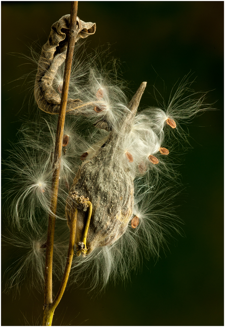
Stuart - I really like you have done here, very interesting. I like all the shapes. Nice composition with a nice diagonal coming in from the lower left. I like how my eye travels into the image around the coil and back to where I started. I like what it does with the eye. Great lighting, love the highlights in the coil. Interesting shadows which add a great deal to the image. Nice sharp image. |
Feb 3rd |
| 6 |
Feb 19 |
Reply |
I have said this before but its worth repeating. Its important to watch the red channel of the histogram when shooting reds. Reds will get blown out much sooner than whites. When reds are blown out, the reds will bleed together with no detail in the reds. They end up as red globs. I checked your image on the histogram and it looked good. It was close, and I feel it helped by backing it back a little. |
Feb 3rd |
| 6 |
Feb 19 |
Reply |
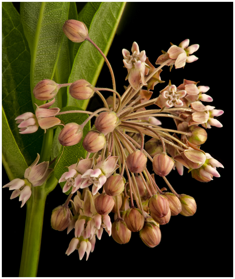
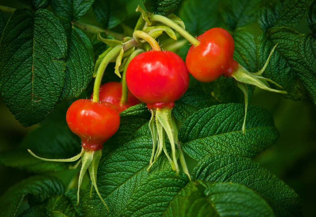
Thank you, Janet. This was a rather interesting arrangement. This is just the way the leaves naturally grew. They were attached to the stem just the way you see them. I did not have to arrange them. When I shop for flowers I spent quite a bit of time looking for something unusual. |
Feb 3rd |
| 6 |
Feb 19 |
Comment |
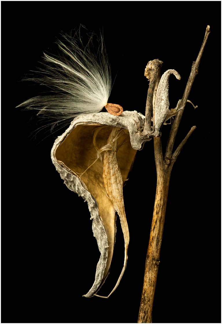
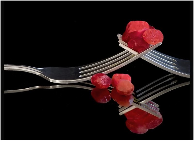
Janet, I think you did good on this. This image to my eye is tack sharp and you used a TRIPOD. It doesn't get any better than that. I like the thin white frame around the image. When using a tripod and nothing is going to move I would use a ISO of 200. If you do this again, I would move the three seeds in front of the fork to the right in front of the solid part of the fork. The part of the fork that touches the surface of the acrylic. This would give the image better balance. The image is very heavy on the left side. The two berries on the left front give the illusion they are sliding down to the left.
I flipped the image and removed some saturation from the red seeds. I like the fork handle on the left. It brings my eye into the image and then moves to the red seeds. I think this makes a little better composition. It's still heavy on the one side. I really do like the image, I think you did great. The image has great impact. |
Feb 2nd |
 |
6 comments - 9 replies for Group 6
|
| 76 |
Feb 19 |
Comment |
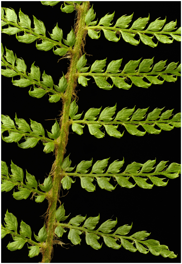
I also used the burn tool on several leaf edges that to my eye were a little bright. |
Feb 22nd |
| 76 |
Feb 19 |
Comment |
I used PS Elements, used the spot healing brush and clone tool to remove the stem. Used NIK software to tone down the bottom leaf and darken around the edges and apply the thin border. A good polarizer is a must for me. If you use one you need learn how and when to use it. I use one almost 100% of the time. |
Feb 22nd |
| 76 |
Feb 19 |
Comment |
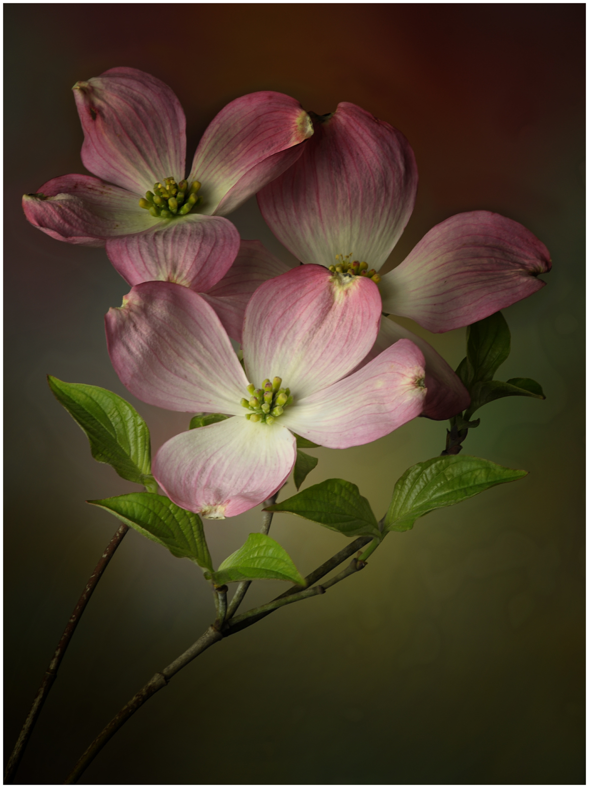
I love the color and feel, this a beautiful image. There's lots to like about this image. This has such a nice clean look and feel. The diagonal stem in the upper left corner to my eye is a distraction. I removed that stem and toned down the leaf on the bottom that had some glair on the surface. I also darkened the edges some and put a thin border on the image. I use a polarizer on all my flower shots. Most leaves and stems have a waxy surface so they reflect light causing flair. There's no program that can do for your images what a polarizer can do. I don't know if you use a tripod, if you don't you should. I have been shooting flowers for many years. For just getting into flower photography your doing great. |
Feb 21st |
 |
3 comments - 0 replies for Group 76
|
9 comments - 9 replies Total
|