|
| Group |
Round |
C/R |
Comment |
Date |
Image |
| 6 |
Nov 18 |
Comment |
Hi Janet, considering the conditions you had to capture this image, I think you did really good. I like the view from the bottom of the insect lots of nice detail. I like the original image best, don't like the crop. Great background and nice lighting. Great image to do a study with. I agree a little more depth of field would be nice. I do like the image. I have a little business in the summer doing bee control for customers. I get all the hard ones. I do get stung some but that's part of the business. I am licensed by the state. |
Nov 12th |
| 6 |
Nov 18 |
Comment |
Great shot. Beautiful background. I think a vertical might work nice there may be a bit of too much negative space. I feel some vignette might also add to the image. Nice capture! |
Nov 9th |
 |
| 6 |
Nov 18 |
Comment |
I totally agree with Janet. Great detail in the main subject but too many distractions. The out of focus area on the lower right, the background and the phone all distract from the main subject. |
Nov 9th |
| 6 |
Nov 18 |
Comment |
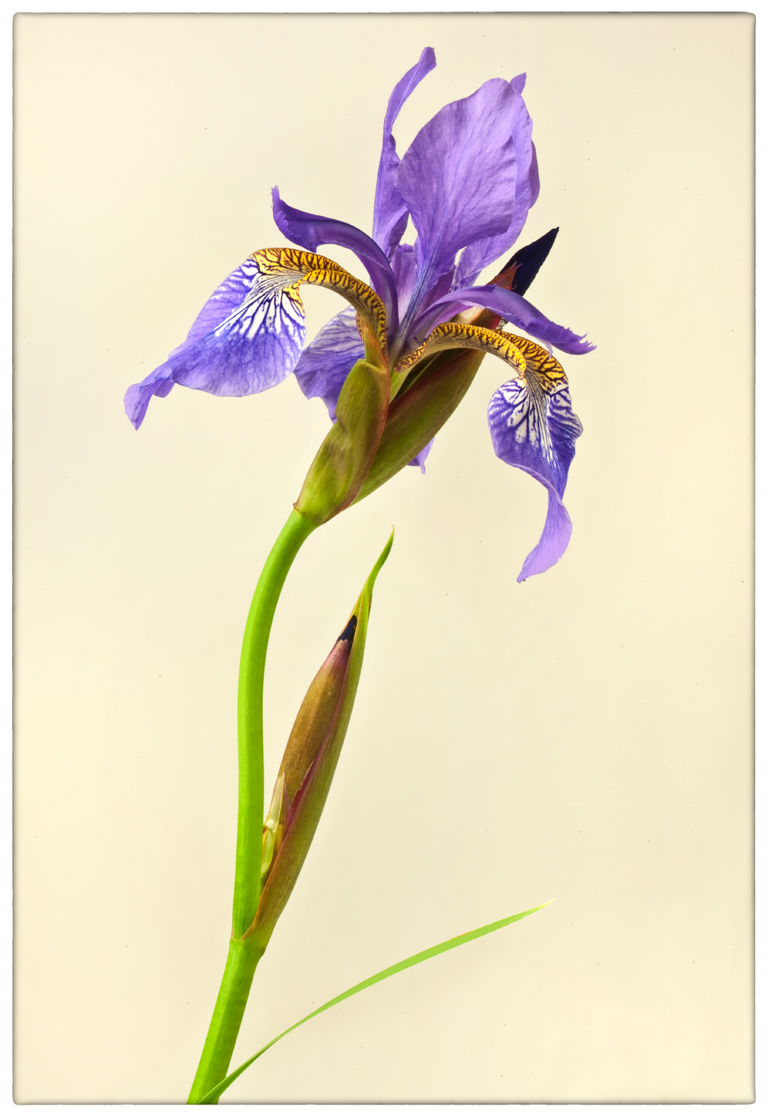
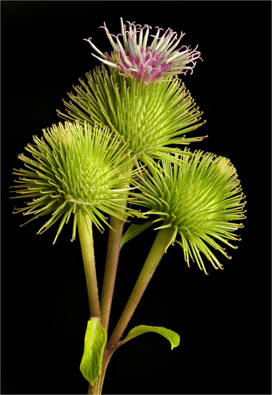
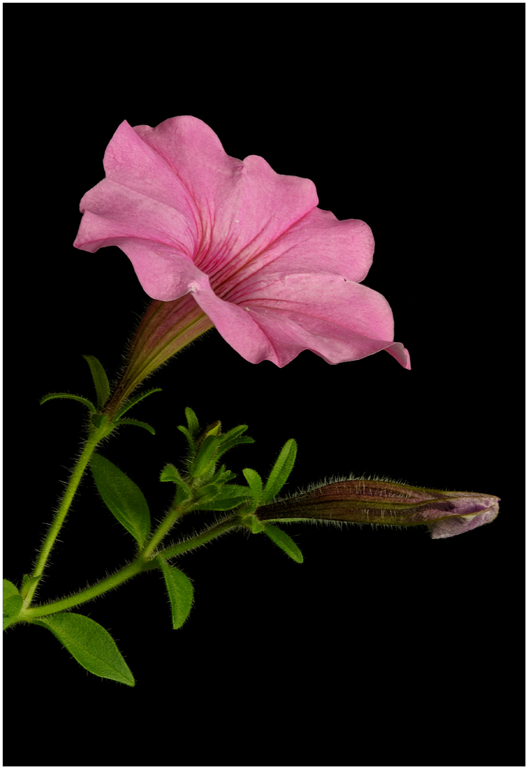
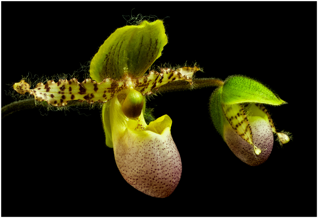
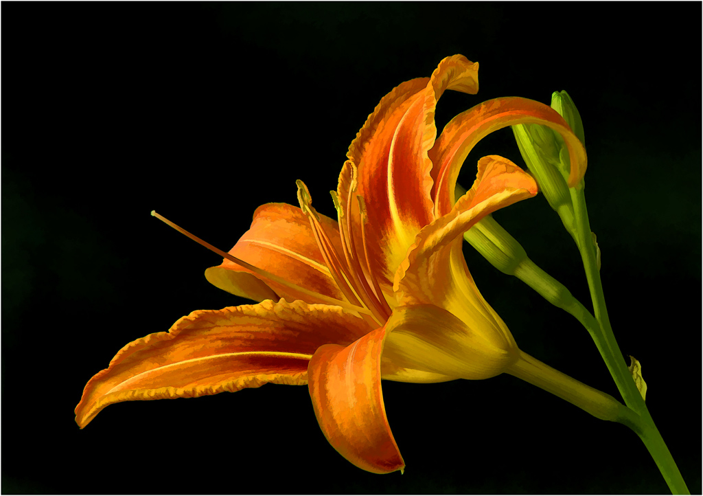
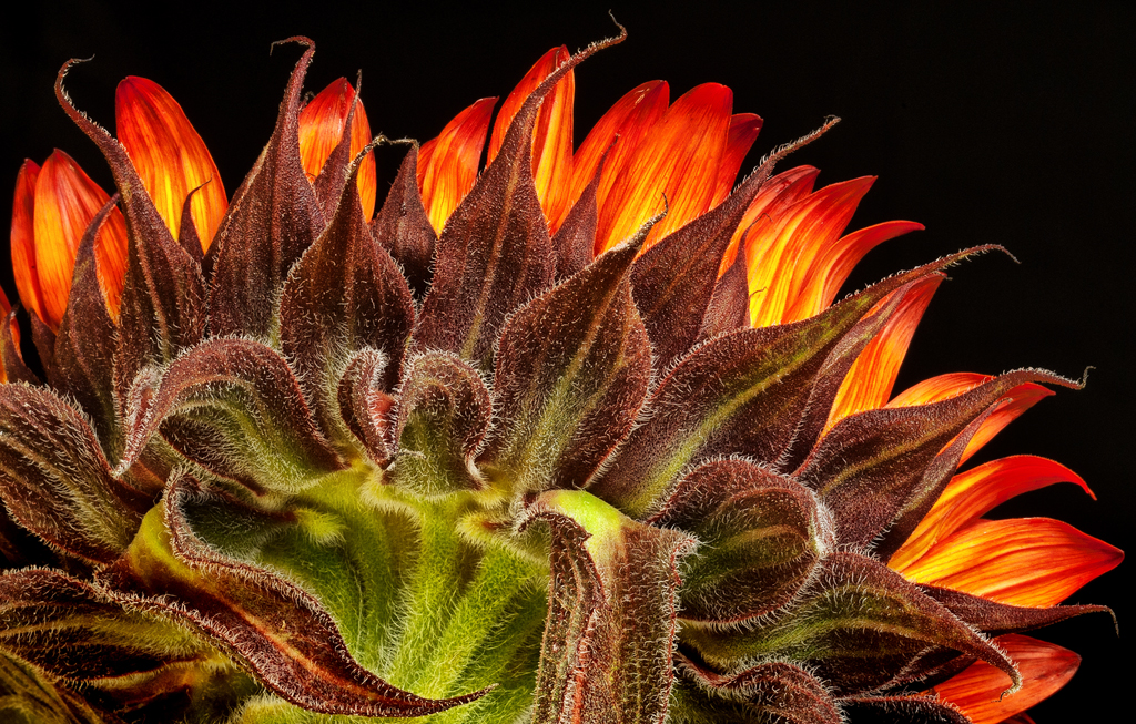
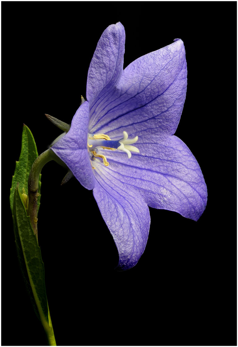
A great image. There's lots to like about this image. Love the background. I think you did a great job with Helicon Focus. Have no idea why you would shoot at f-32? That's contradictory for the reason to use Helicon Focus. Image looks sharp. I flipped this and cropped some off both sides. I like the stem coming up from the left side and cropped that side so my eye can't drift back through to the background. I brightened the two bottom petals and added some structure. Nice shot, Tom |
Nov 3rd |
 |
| 6 |
Nov 18 |
Reply |
Thanks, lots of interesting information. |
Nov 2nd |
| 6 |
Nov 18 |
Comment |
Again, welcome to Groupe 6. Very sharp image from front to back. I would like to know how many images are in this stack and how you go about taking these images and your particular process. Good to see you did well in competition. For me the coin on top may be a little close to the edge. To my eye I find the lines in the background a little distracting. I think the coins on a nice black cloth would really look nice. It's a good idea, in a situation like this, to change off to different backgrounds and see which works best. I also wish the coins were turned so the words and the images could be better appreciated by the viewer. The image is very sharp and you did a good job with Helicon Focus. Good to have you in our group. |
Nov 2nd |
| 6 |
Nov 18 |
Comment |
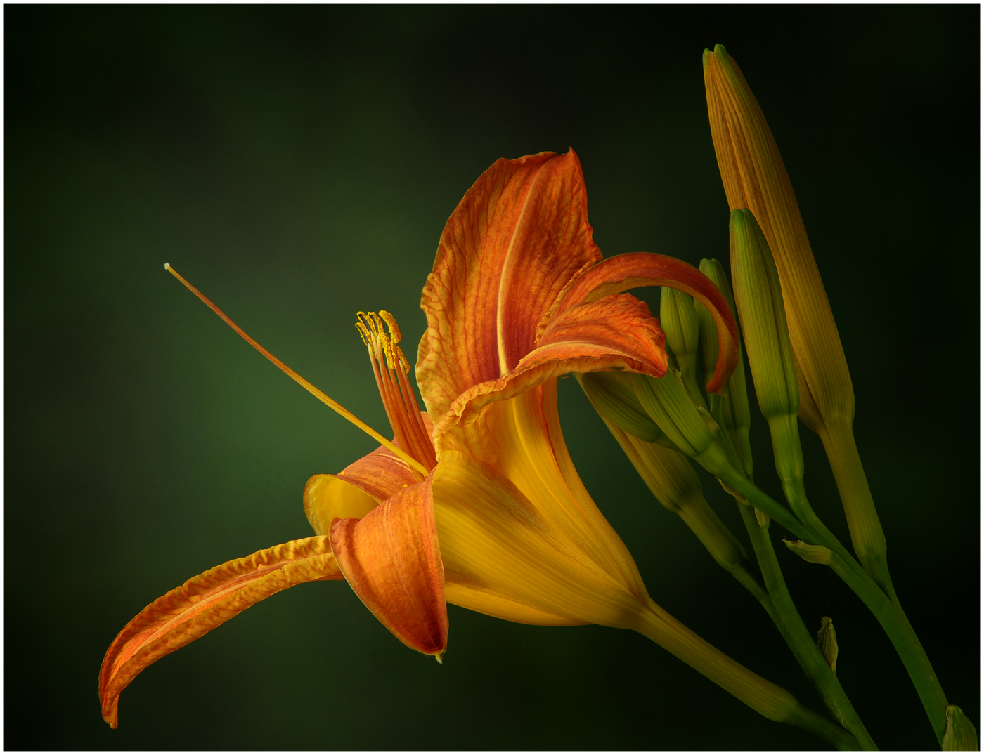
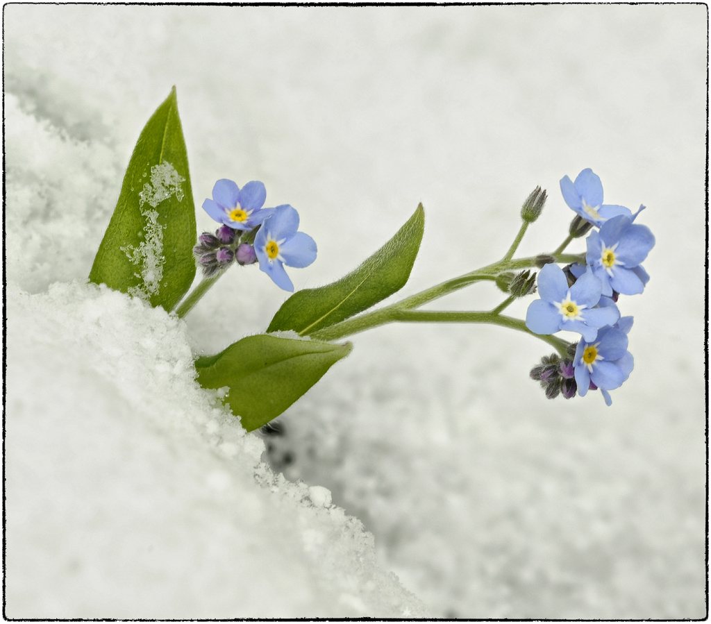
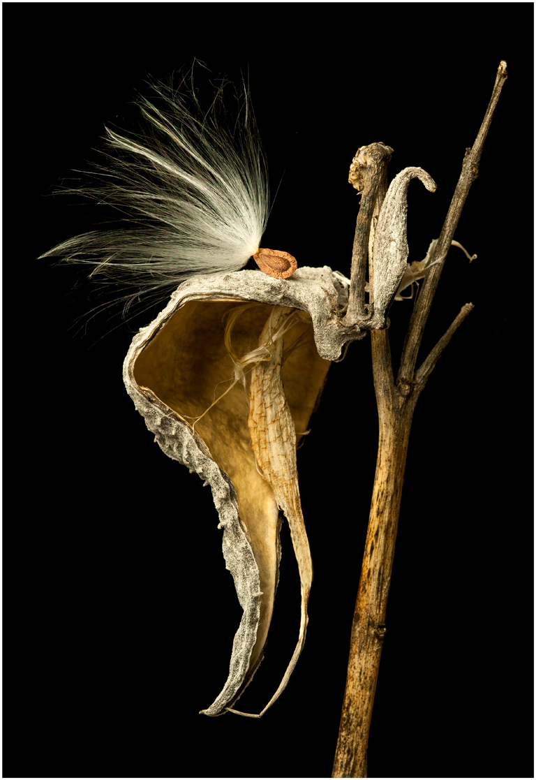
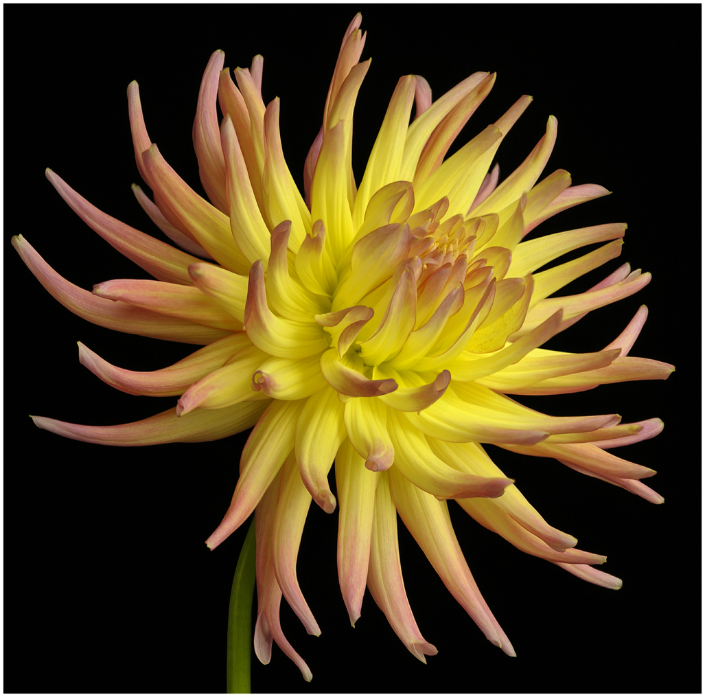
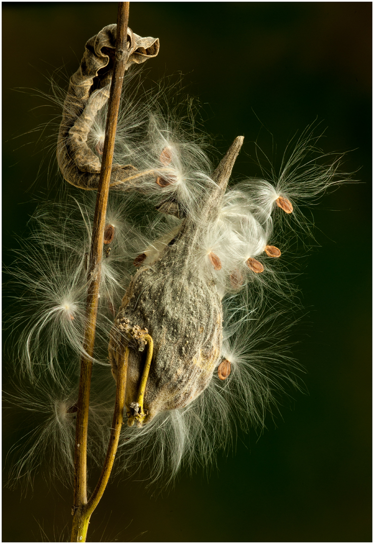
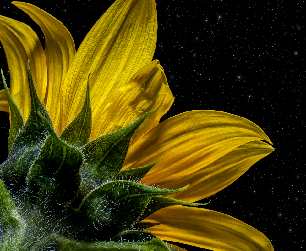
Hi Melissa, Nice image this month. Nice composition with the diagonal coming from the lower left corner just the way most people read a picture. Very nice out of focus background having a nice contrast with the main subject. When I first viewed this image I thought it was snow on this plant. I only wish this had more depth of field. To my eye the tip of the plant is sharp but the main area to the left, with the larger white area, is not sharp. This is where my eye ends up when I view this image and I feel it needs to be sharp with more detail. Perhaps you should have shot at f-22 which would give you much more detail in this area. Another tip is try to have the sensor parallel with the main plant stem, as much as possible, when you have a very limited DOF when shooting macro. Of course Helicon focus would be great in this situation. Having said all of that, this is a very pleasant image to look at. Good to see your using a tripod. |
Nov 2nd |
| 6 |
Nov 18 |
Reply |
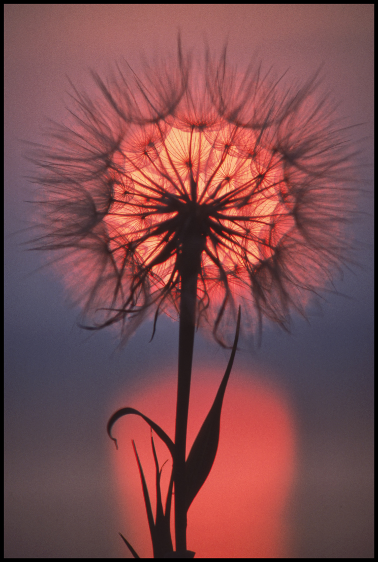
Enjoyed reading your comments. This was kind of a last minute thing. I picked these just last week before the rain destroyed them. Never took pictures of these before. I do like the crop you made, we will have to see what others think. |
Nov 2nd |
6 comments - 2 replies for Group 6
|
| 60 |
Nov 18 |
Comment |
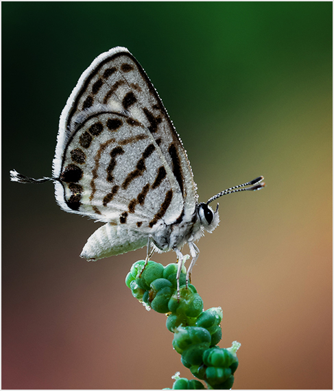
Hi, I'm from group 6, I made some changes to your image which to my eyes helps the image a lot. Here we go. Rotated the image 90 degrees to the right. The following changes were made with NIK software. Darkened the light spot in the upper left. Darkened the butterfly to give more color saturation, it was about 1/2 stop overexposed. The image is equally divided between the butterfly and the flowers. The subject is the butterfly so I cropped the bottom half off the image. Too much space is used for the flowers in the image with the stems are distracting. I finally put a thin frame on the image. I hope you like the changes I made. I feel you have a nice image here. |
Nov 16th |
 |
1 comment - 0 replies for Group 60
|
7 comments - 2 replies Total
|