|
| Group |
Round |
C/R |
Comment |
Date |
Image |
| 5 |
Jun 18 |
Comment |
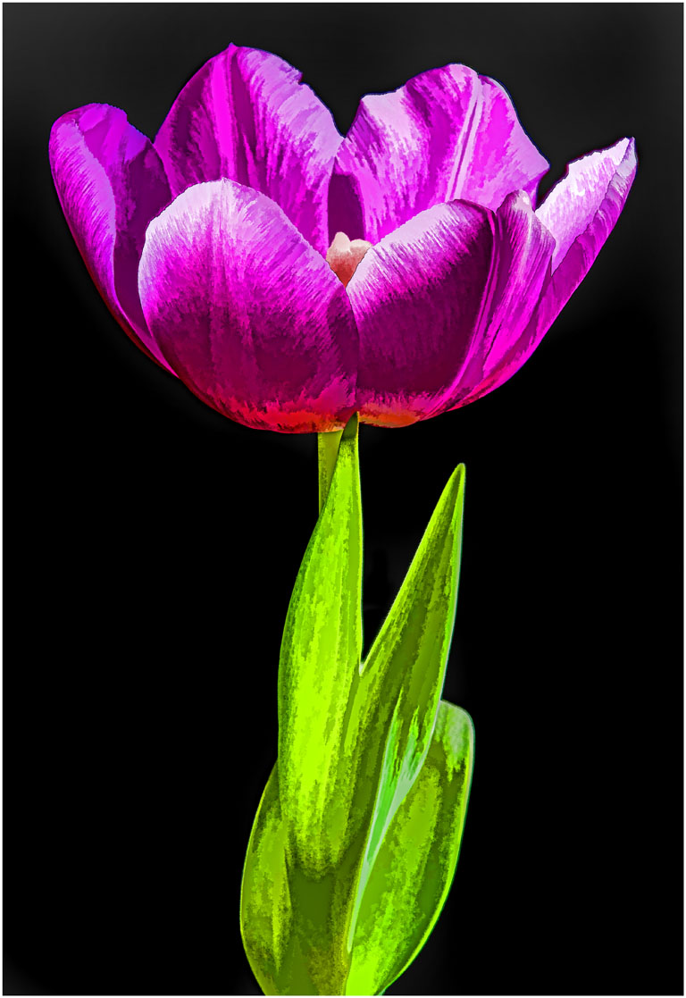
Hi, I'm Dick from group 6. I agree with Barb and like how sharp the main tulip is in this image. I would like to see more of the tulip on the left by moving to the right. I feel it needs to be more of a secondary player in the image and composition. This would also move the main tulip off center and do away with the empty space on the right and help the composition. I would also darken the light areas on the foliage a little. Crop a little off the top to keep my eye from wondering in the background. I would flip the image and using NIK gave the image 48% structure which really made the rain drops pop. I hope you like what I did. |
Jun 18th |
 |
1 comment - 0 replies for Group 5
|
| 6 |
Jun 18 |
Reply |
I did not mask out the background. |
Jun 26th |
| 6 |
Jun 18 |
Reply |
This is a little different style or approach in the art world. In this case you don't include all of each flower, you let the minds eye complete the image parts. This does not always work but I think it does here. It takes the right grouping and the right angles to work. |
Jun 24th |
| 6 |
Jun 18 |
Reply |
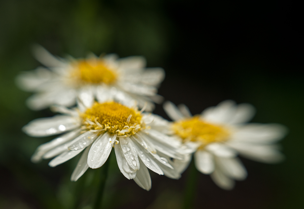
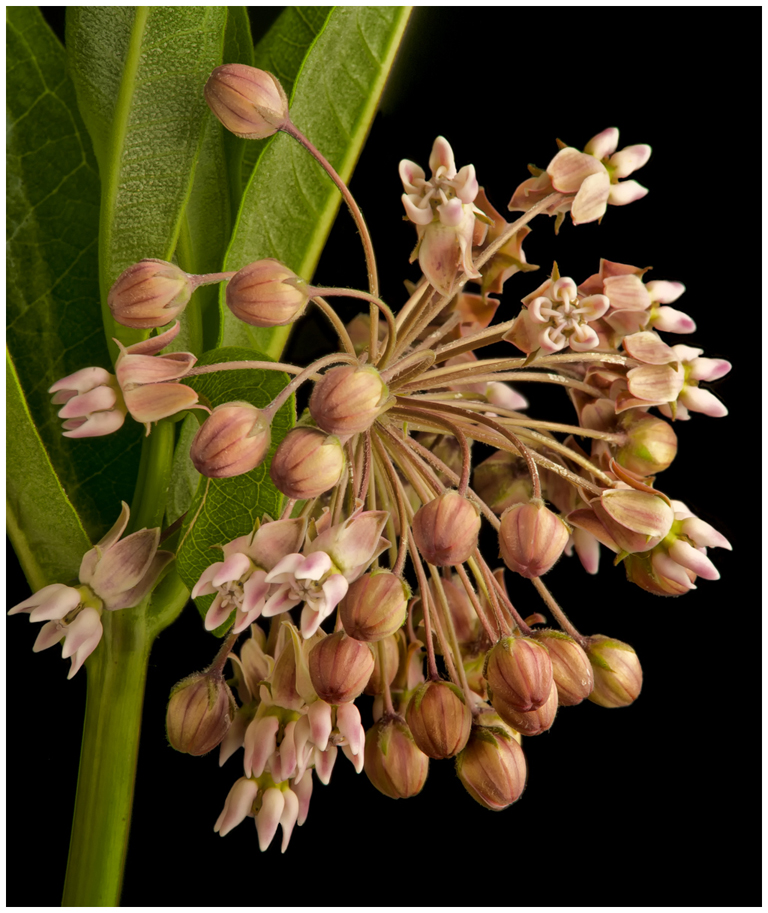
Its like art, it all depends on who's looking at the image. I like to include very out of focus flowers in the background when I can, if they work, and do not distract. They can be very important and contribute to the total composition. It shows the environment around the main subject and complements the main subject. I feel it fills the empty space in the upper right corner and adds additional interest to the shot. They must be very much out of focus to work. Some of my best shots and winners have had very out of focus flowers in the background. Like I said it depends on who is viewing the image. I feel its good either way. |
Jun 23rd |
| 6 |
Jun 18 |
Reply |
This one has a darker background. What do you think? |
Jun 23rd |
 |
| 6 |
Jun 18 |
Reply |
Hi Tom, I do not have a rail. If you look at the bulletin board, I explain how I do my stacks. It was posted on 8-14-2016. Nothing fancy. |
Jun 22nd |
| 6 |
Jun 18 |
Reply |
The other thing you must remember, to get the same image size as I did on the sensor you would have to be about 9" away with a 60mm macro lens. Now your DOF is back to .2" the same as my lens. Using a 60mm macro lens 30" away you would have the whole pot of flowers in the image. Not the same as I had, one flower and parts of two others. |
Jun 18th |
| 6 |
Jun 18 |
Reply |
Yes that would be right at f-8 at 30" with a 60mm lens. The important thing here is where you place your focus point to get the needed DOF in front and behind this point and have the flowers sharp from front to back. You would have to be careful with the background to keep it out of focus. |
Jun 17th |
| 6 |
Jun 18 |
Reply |
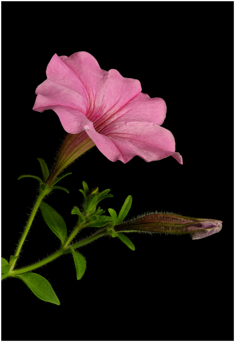
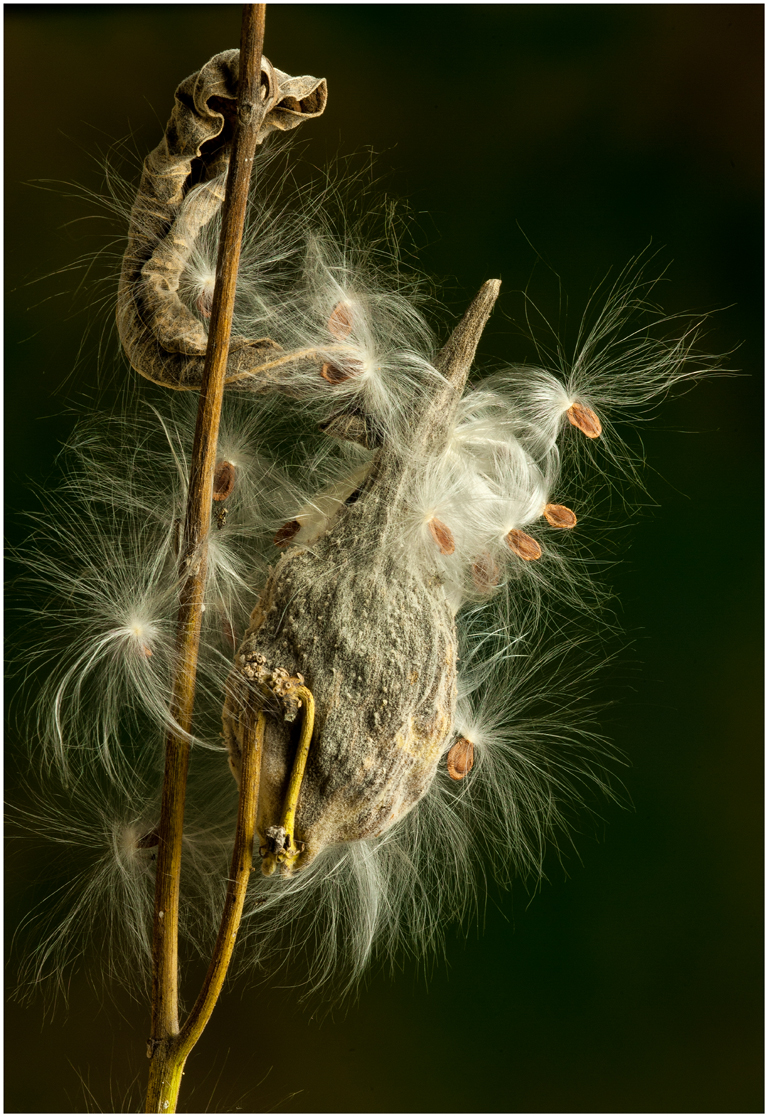
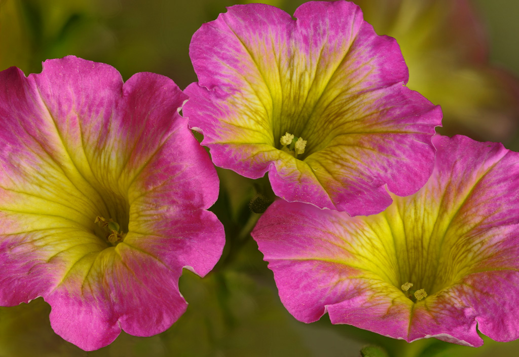
Interesting comment about maybe needing more shots to be stacked to get more detail. I have more than enough shots to get plenty of detail in this image. I shot this with my 200 macro using my Nikon D-700 and was 30 inches from the subject to my sensor. The DOF with this information was .2 inches per shot. Near limit 29.9" and far limit 30.1" so a total of .2" with each shot. When doing macro or very close-up work the DOF is 50% in front and 50% behind your focus point this is important to know. These petunias had very small flowers, 1.25" across and .75" to the anther (the head of the stamen). I just measured them, so .2 inches times 24 = 4.8 inches of DOF I could have had. When shooting a stack you must overlap each shot so I did not end up with 4.8" but I certainly had more than enough sharp area in this image. I really did not need to shoot 24 images if you do the math. A good web site to figure your DOF when shooting like I did for this image is www.dofmaster.com After going back and checking every thing I did to make this image I feel there is plenty of DOF to have detail on the anthers and the stigma in this flower. I certainly appreciate your comment. There's much we can learn from our images if we want to learn. That's why its important to comment early so we can have good discussion. |
Jun 16th |
| 6 |
Jun 18 |
Comment |
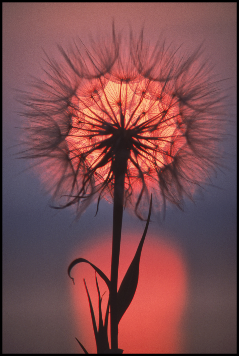
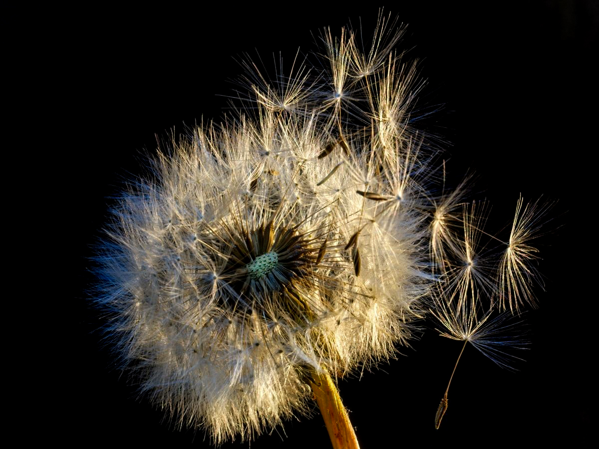
Hi Tom. I agree with Janet and love the seeds that appear in flight. I darkened the background and I feel it really makes the dandelion pop even more. Darkened the stem some, lightened the center some and the single seed on the lower right. You do have a great shot here. |
Jun 14th |
 |
| 6 |
Jun 18 |
Reply |
Thanks for the positive feed back. |
Jun 14th |
| 6 |
Jun 18 |
Reply |
I do like the border in this image. I feel the width is just right, not too heavy. I would keep it. |
Jun 14th |
| 6 |
Jun 18 |
Comment |
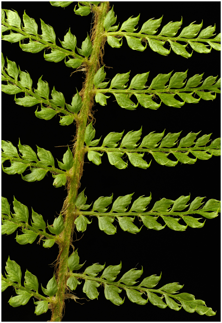
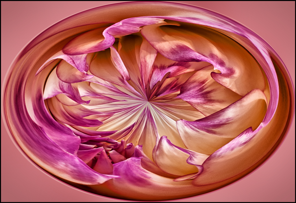
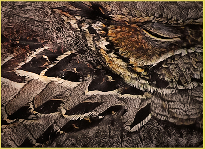
Lots of nice repeating shapes, lines and colors in this image which makes it work. Not an image easy to capture. To my eye the image is not sharp to give the image the detail and impact it needs. I will guess this was hand held. Using Nik software I added contrast (27%) and structure (51%) which I feel helped the image a lot. Then I flipped the image which I feel makes the image easier to read and improves the composition (Your composition I feel was right on but I do like it flipped). This I'm sure was not a not an easy shot. I would love the chance. |
Jun 13th |
 |
| 6 |
Jun 18 |
Comment |
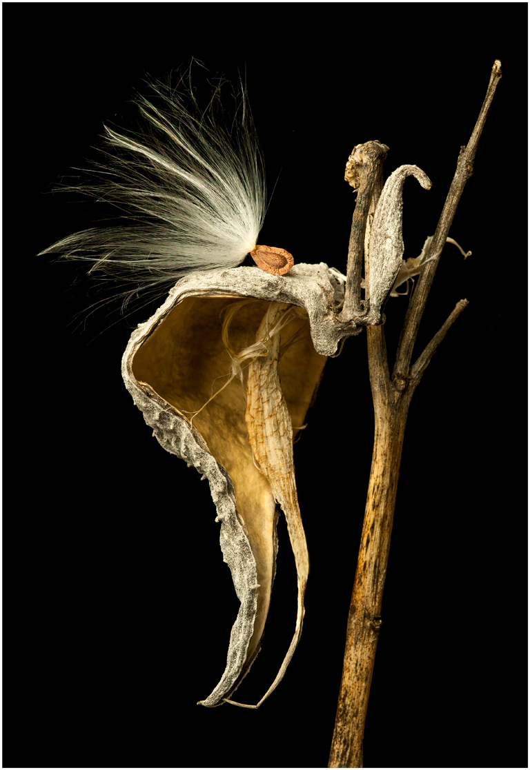
Interesting image. Looking at the original there were may items to shoot here. To my eye I would like to see less of the items around the subject or more of them. There are three areas, one on top, left side and bottom that are a little hot. There's also a blue line on the right that is distracting. |
Jun 12th |
 |
| 6 |
Jun 18 |
Comment |
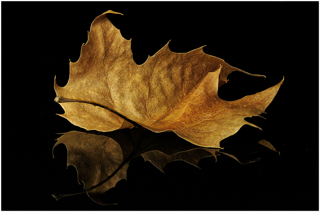
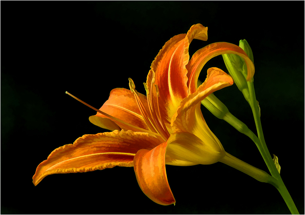
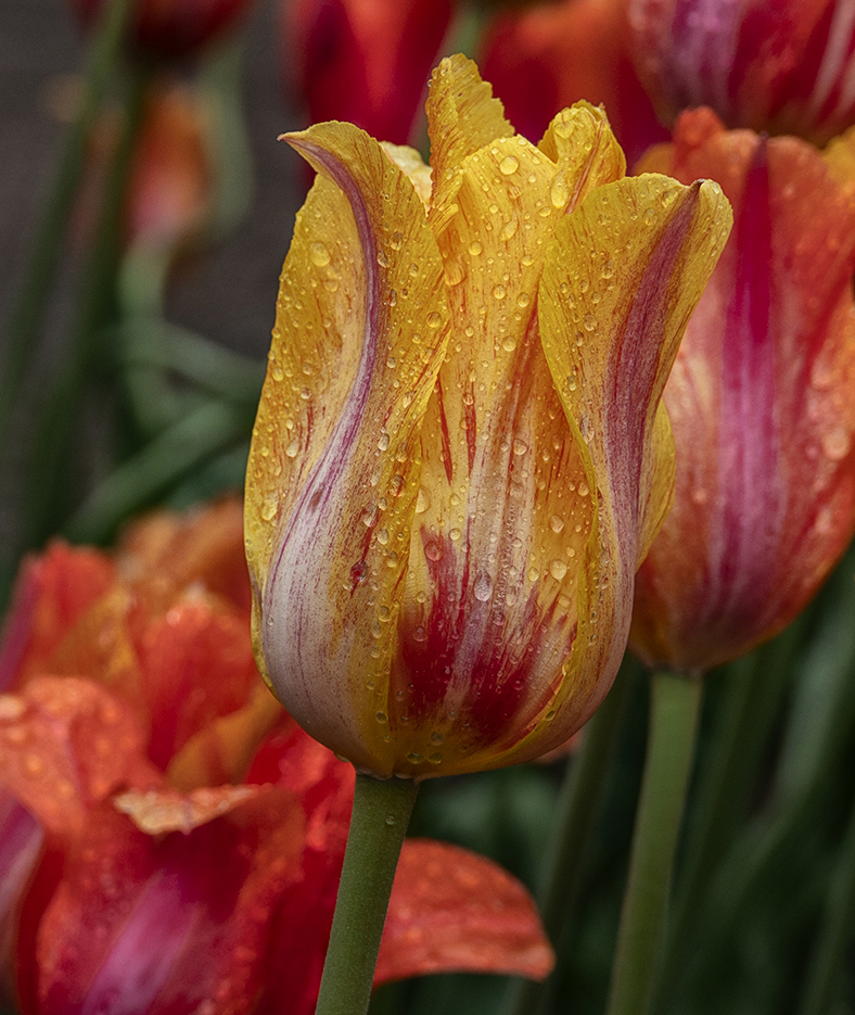
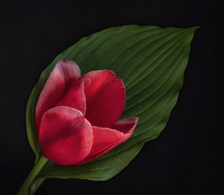
Tom this a beautiful image. Nice composition, nice diagonal. Love the background. I would crop some dead space off the left side. I added some structure (41%) using NIK really added some nice detail and sharpness to the tulip and the leaf (Hosta). It is a beautiful image without my help. Very nice. |
Jun 12th |
 |
| 6 |
Jun 18 |
Comment |
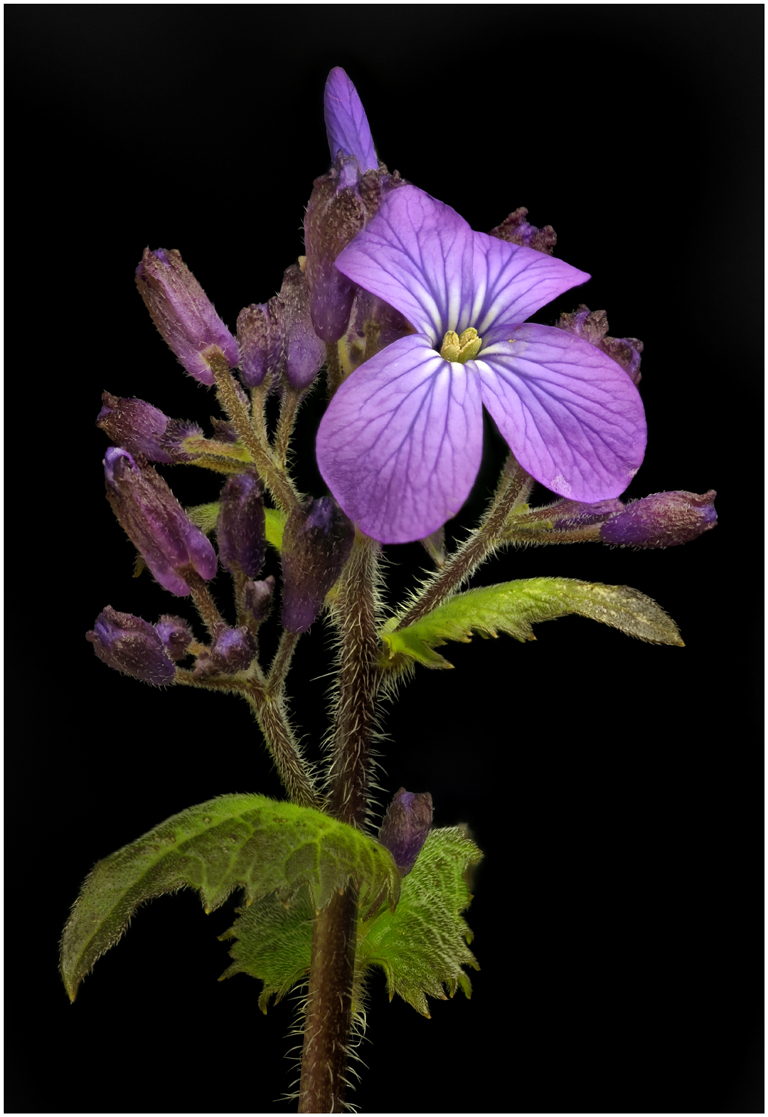
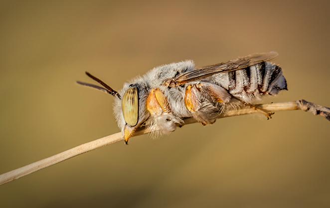
I very much like the composition in this image. Nice diagonal line coming in from the lower left corner. Great background that goes well with the color of the bee. I feel the image could be cropped some on all sides to get remove some dead space. The eye appears a little hot to me, using Nik I darkened the eye some. I feel the image is not as sharp as it could be. The hair on the bees back, front of head and by the front leg does not look sharp. Maybe f-11 or more would help. I added some vignette which I feel helps to make the bee stand out a little more and give a little more separation from the background. Great image. |
Jun 12th |
 |
5 comments - 10 replies for Group 6
|
6 comments - 10 replies Total
|