|
| Group |
Round |
C/R |
Comment |
Date |
Image |
| 30 |
Sep 18 |
Comment |
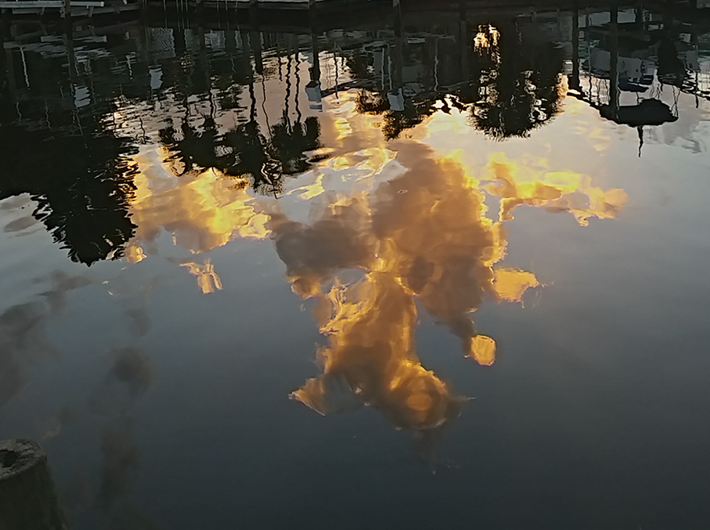
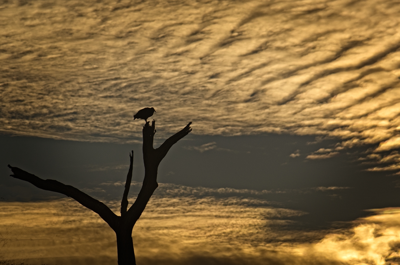
The addition of color to this image really makes it pop. And the clouds are great! You managed some nice framing with the branches in the LHS.
The "lean-back perspective" raised by Stephen is most interesting. I had not heard the term before, but it is quite fitting. The question is where the line lies between perspective and distortion. Perhaps it is our eye, as Robert diminished the "distortion" to his comfort level. I seem more at ease there too. The 14mm lens is not present in my brain! |
Sep 18th |
| 30 |
Sep 18 |
Comment |
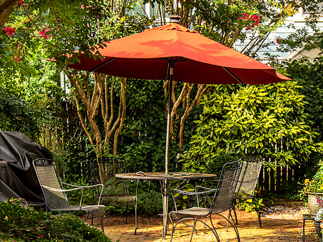
Leonid, in my opinion you have elevated a quite nice image to a real conversation piece. The preservation of the color in the umbrella against the b&w is very effective and makes the piece, Well done! |
Sep 18th |
| 30 |
Sep 18 |
Reply |
Ah Judy! Ever the PP wizard. I love your suggested changes to Leonid's most interesting work. In particular, I applaud the carry over of the dress print to the painter's sleeve. |
Sep 18th |
| 30 |
Sep 18 |
Comment |
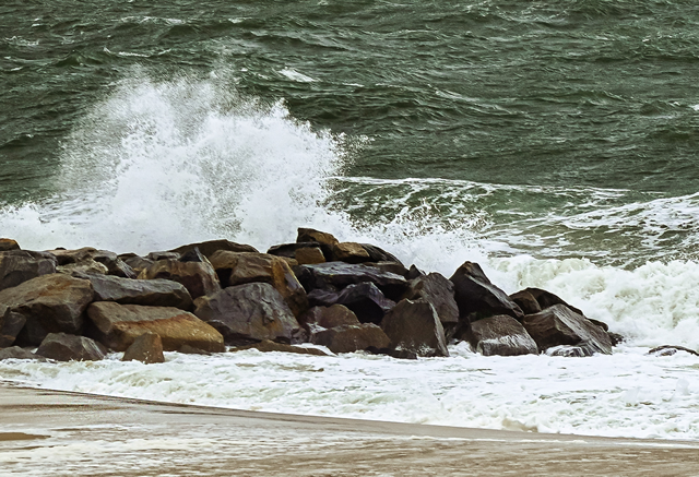
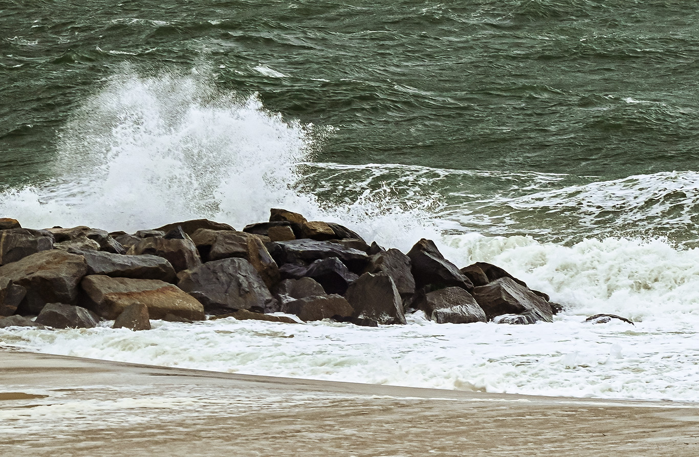
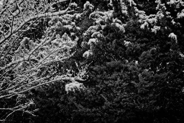
Very nice image, Robert. I particularly like the framing of the droplets ny the spruce branches. I agree with the suggested cropping of the buds on the RHS insomuch as they are out of focus anyway and appear to be in the foreground.
There are a couple of macro photographers that specialize in the "water droplet photography" using the droplet as a fisheye lens to capture flowers, flags, etc. residing closely behind. I have tried this setup, but without success. |
Sep 18th |
| 30 |
Sep 18 |
Comment |
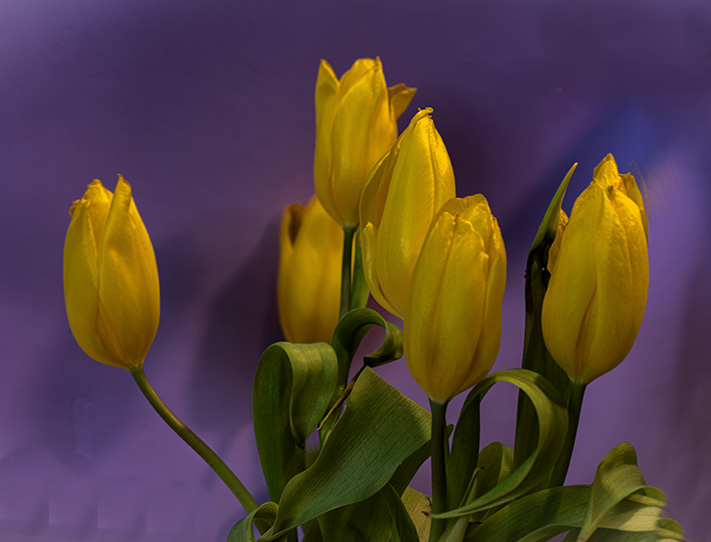
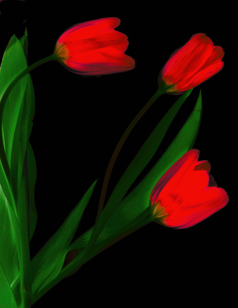
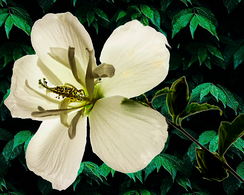
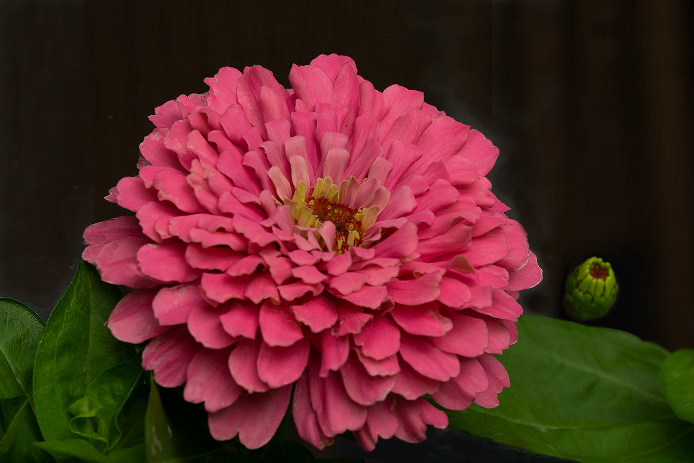
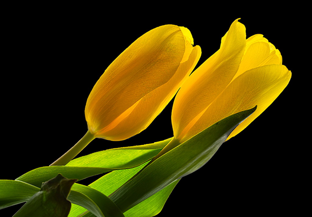
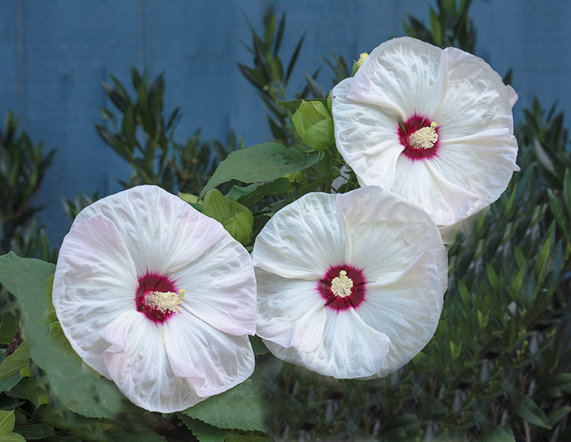
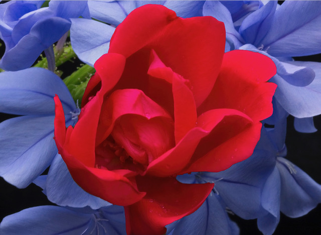
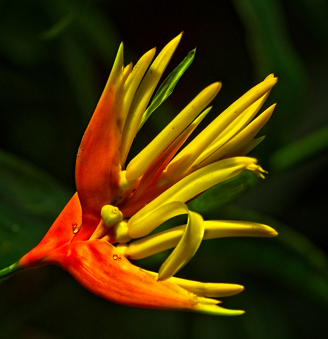
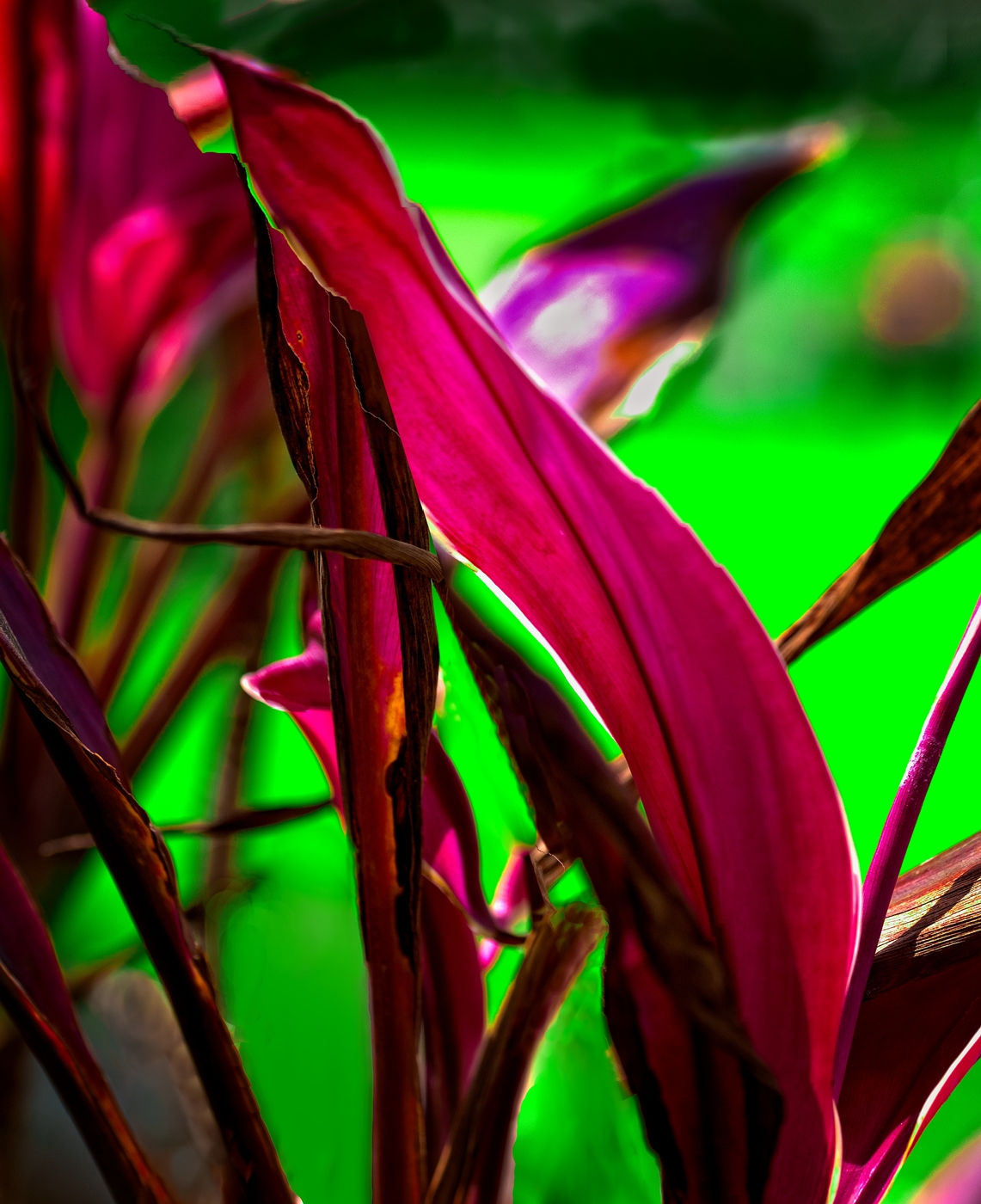
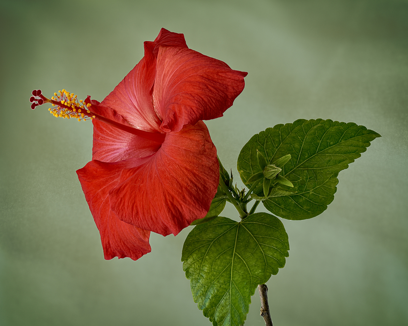
I like the flowers in this image, particularly the two on the left. The green blurred background is also effective. I would like to see a little reduction in exposure on the right hand flower and some sharpening to define the petals. I think the overall image could also benefit from cropping the lower half of the image as the lower half adds little to the overall impression. |
Sep 8th |
| 30 |
Sep 18 |
Comment |
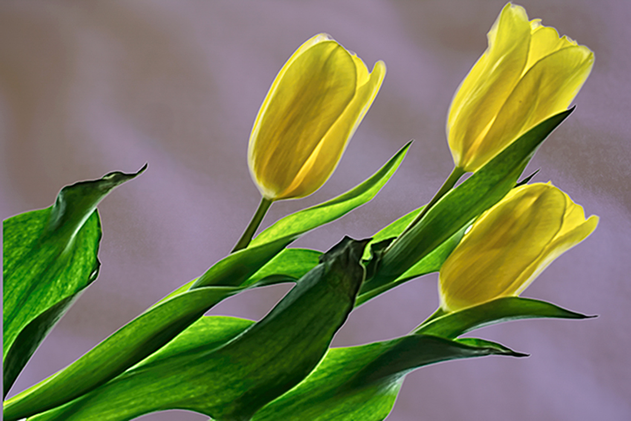
Outstanding photograph, Judy. I have nothing to add to the above comments. |
Sep 8th |
| 30 |
Sep 18 |
Comment |
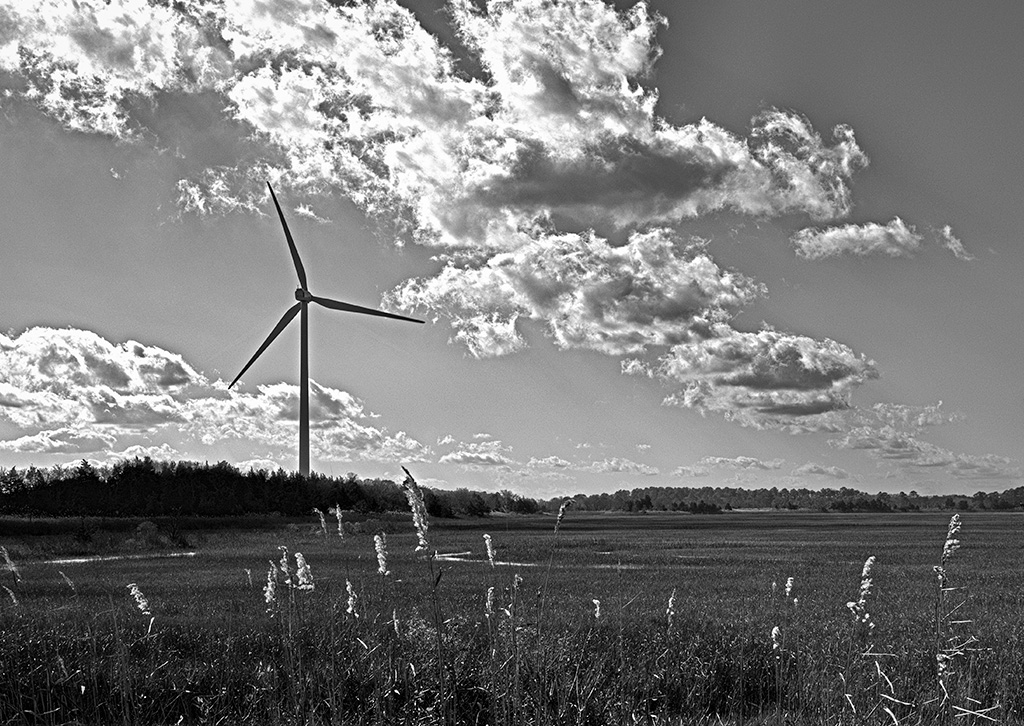
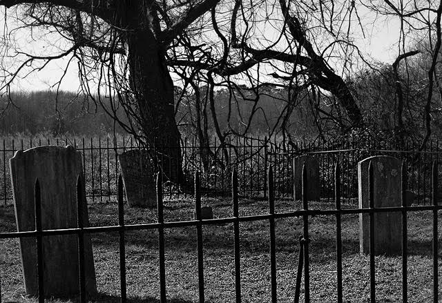
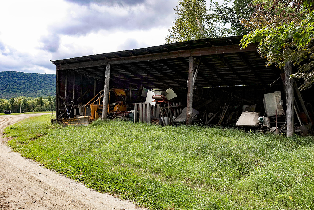
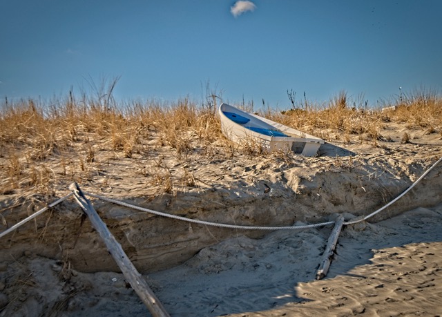
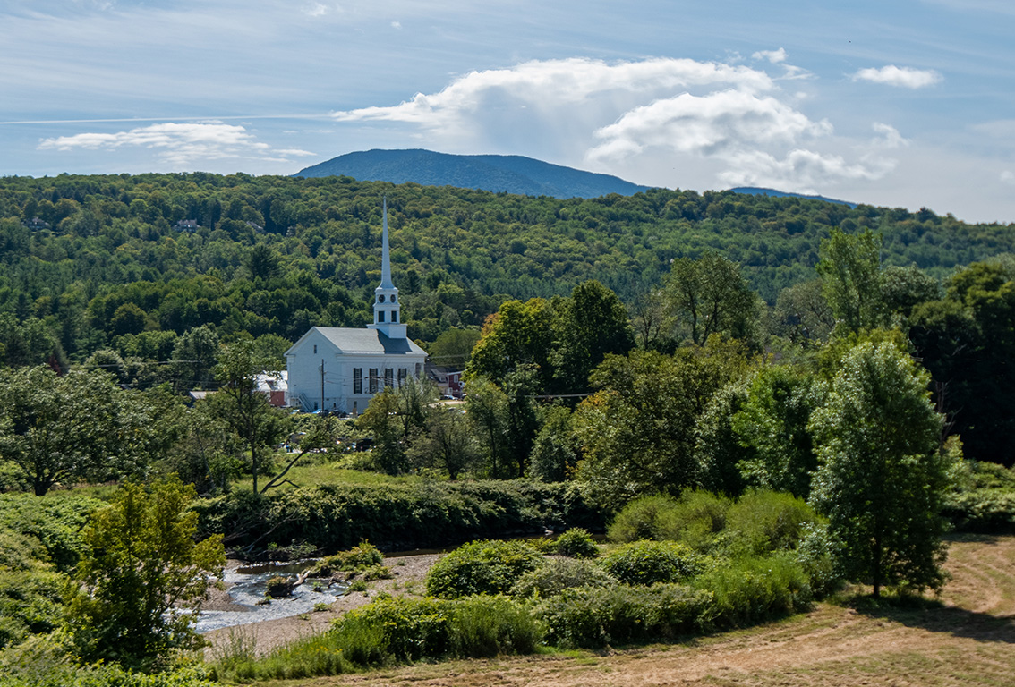
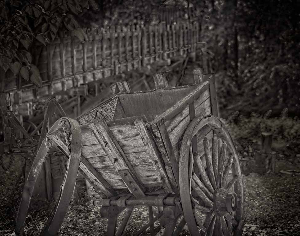
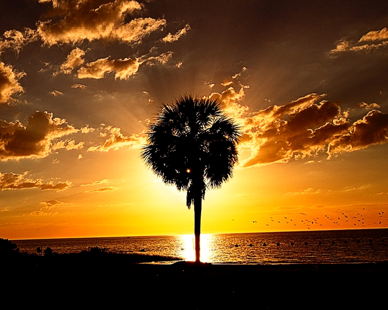
I like the composition and agree that the image would benefit from increased illuminatiom and sharpness of the cloud cover and main subject. |
Sep 7th |
| 30 |
Sep 18 |
Reply |
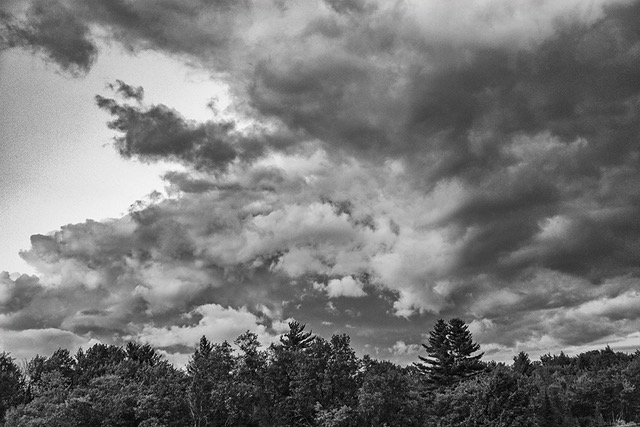
I always count on you, Robert, to provide some new thinking about an image! The B&W does produce an interesting image! Very different and attractive, but more dramatic than the color version that I submitted. Yours has a sharp luminescent mask/infrared quality in my mind. |
Sep 7th |
| 30 |
Sep 18 |
Reply |
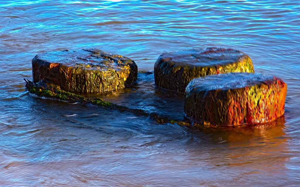
Dorinda: This is the sort of image that one can tinker with a lot - generating different effects. Yours are nice! |
Sep 7th |
6 comments - 3 replies for Group 30
|
6 comments - 3 replies Total
|