|
| Group |
Round |
C/R |
Comment |
Date |
Image |
| 30 |
Apr 18 |
Comment |
Very interesting comment, Robert. I have noticed how a particular image looks much more or less attractive depending upon the size of the print. I don't know why, but it does. |
Apr 28th |
| 30 |
Apr 18 |
Comment |
I don't have any problem with the background. For me, the grey bland concrete makes the colors in the necklace and her dress stand out more vividly. Like Dorinda, I am a little uncomfortable with the hardened look on her face.
As to Roberts point, in my opinion, there is room in photography both for realistic depictions and wildly altered reality. In my camera club we have a photo entry category called "Nature" and in that category, no alterations other than cropping are permitted. In another category, called "Creative and Imaginative" anything goes. I enjoy participating in both categories. Even in science, Robert, a large sector of the profession is actively engaged in making new molecules that don't exist in nature.
I like Mark Twain's attitude: "truth can always be improved upon." |
Apr 18th |
| 30 |
Apr 18 |
Comment |
I like Dorinda's suggested crop insomuch as the original seems to contain too many images for my liking. I also like your move to monochrome for this image. But the combination of the two changes strikes me as resulting in too severe a contrast. There seems to be lacking mid-tones and interesting detail that I liked in the original you provided. It is hard for me to know how much detail all that cropping might leave you to work with. Increasing the brightness of the column and the George on top is definitely an improvement making the column seem more in harmony with the clouds. |
Apr 18th |
| 30 |
Apr 18 |
Comment |
I love the geometry at work here. The shadow grid on the floor of the hallway places a strong emphasis on the geometry in my mind. The sky adds some needed color and I would keep it (and the additional triangle it brings with it). I would also keep the grey ledge at the bottom that, along with the grey beam at the top, adds a side to the frame. Your added grey frame on the outside contributes to the geometric composition. Very nice composition, Judy. |
Apr 18th |
| 30 |
Apr 18 |
Comment |
I have no useful comments to add to the above with which I concur. |
Apr 18th |
| 30 |
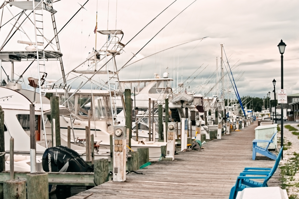
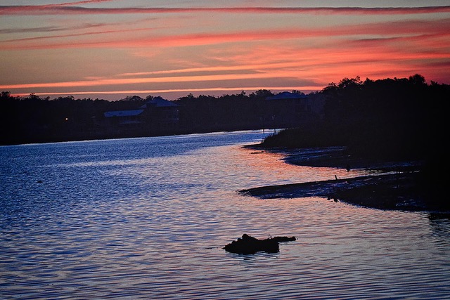
Apr 18 |
Comment |
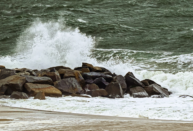
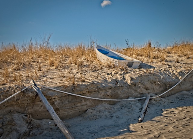
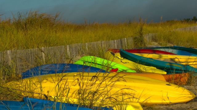
This is an excellent photograph in my view. I especially like the depth conveyed by including the shore images in the background. The aperture you selected keeps in focus the boom extending toward us and the entire boat. The wake adds another interesting dimension, conveying the action in a dramatic way. Well done on this! |
Apr 18th |
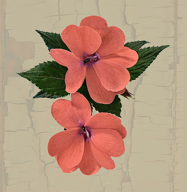
| 30 |
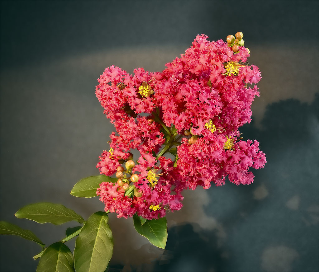
Apr 18 |
Comment |
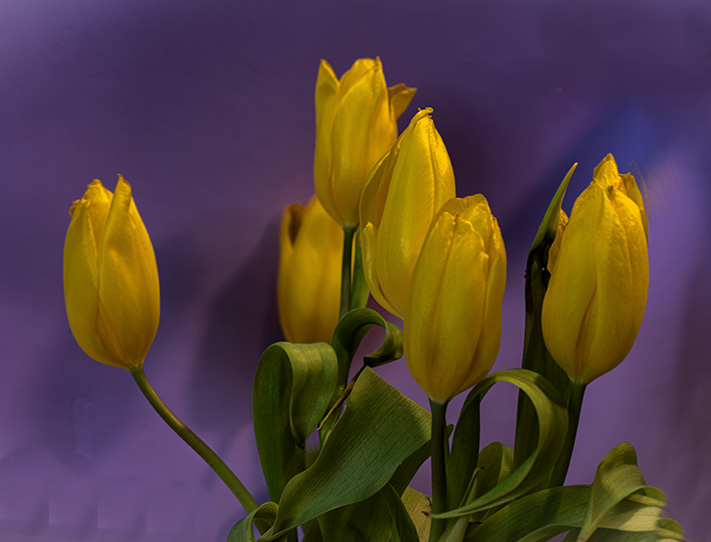
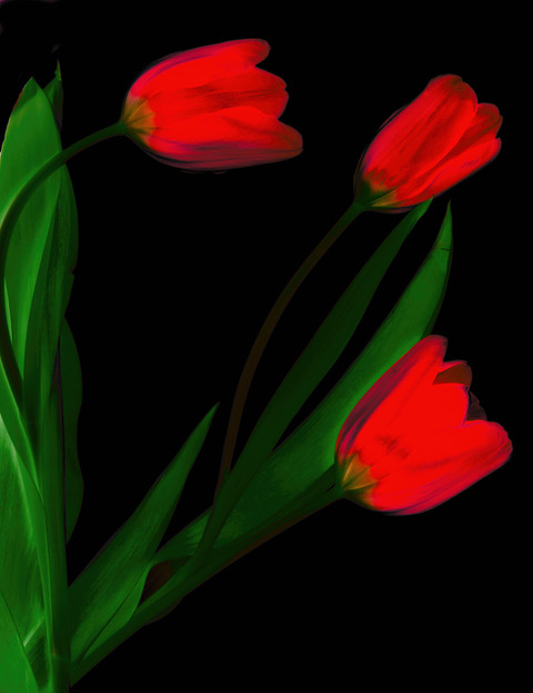
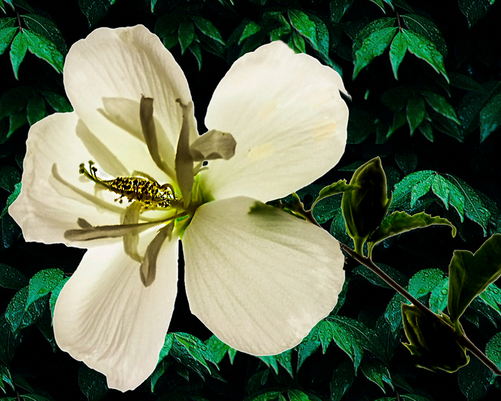
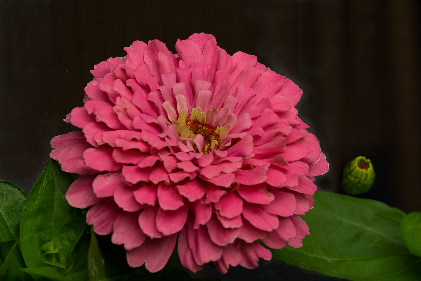
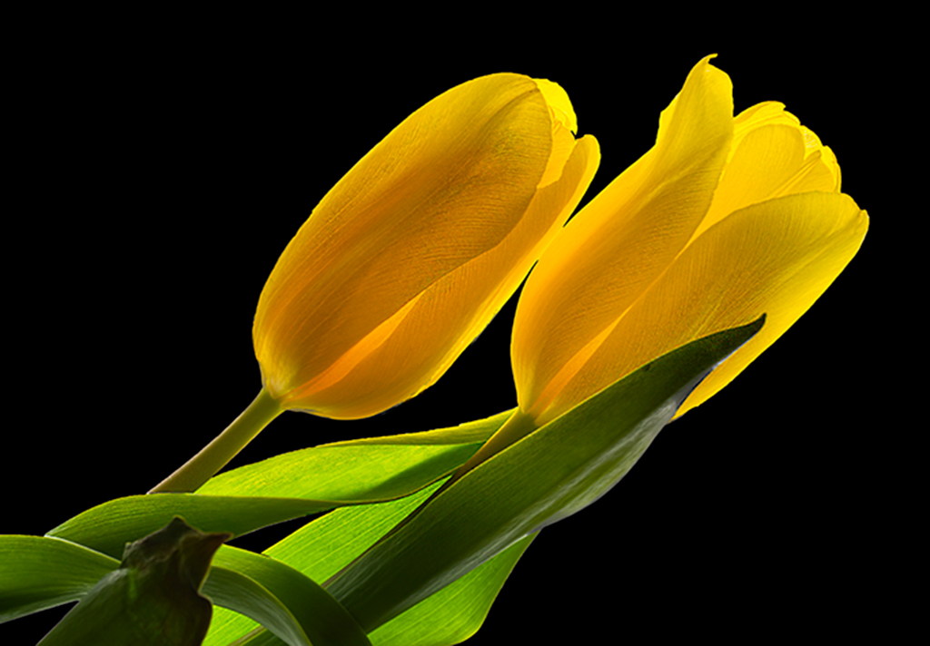
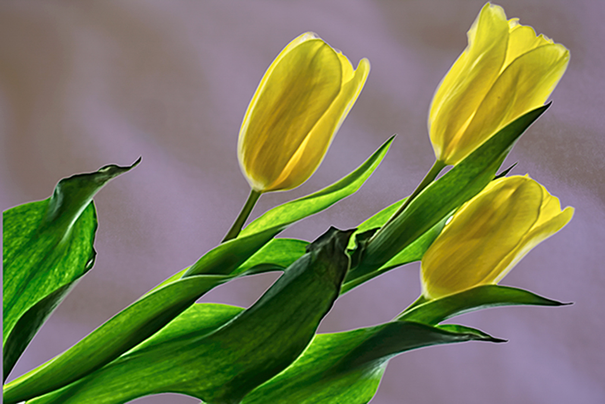
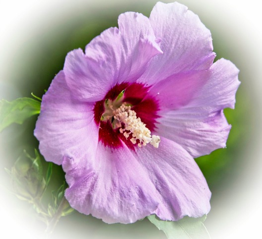
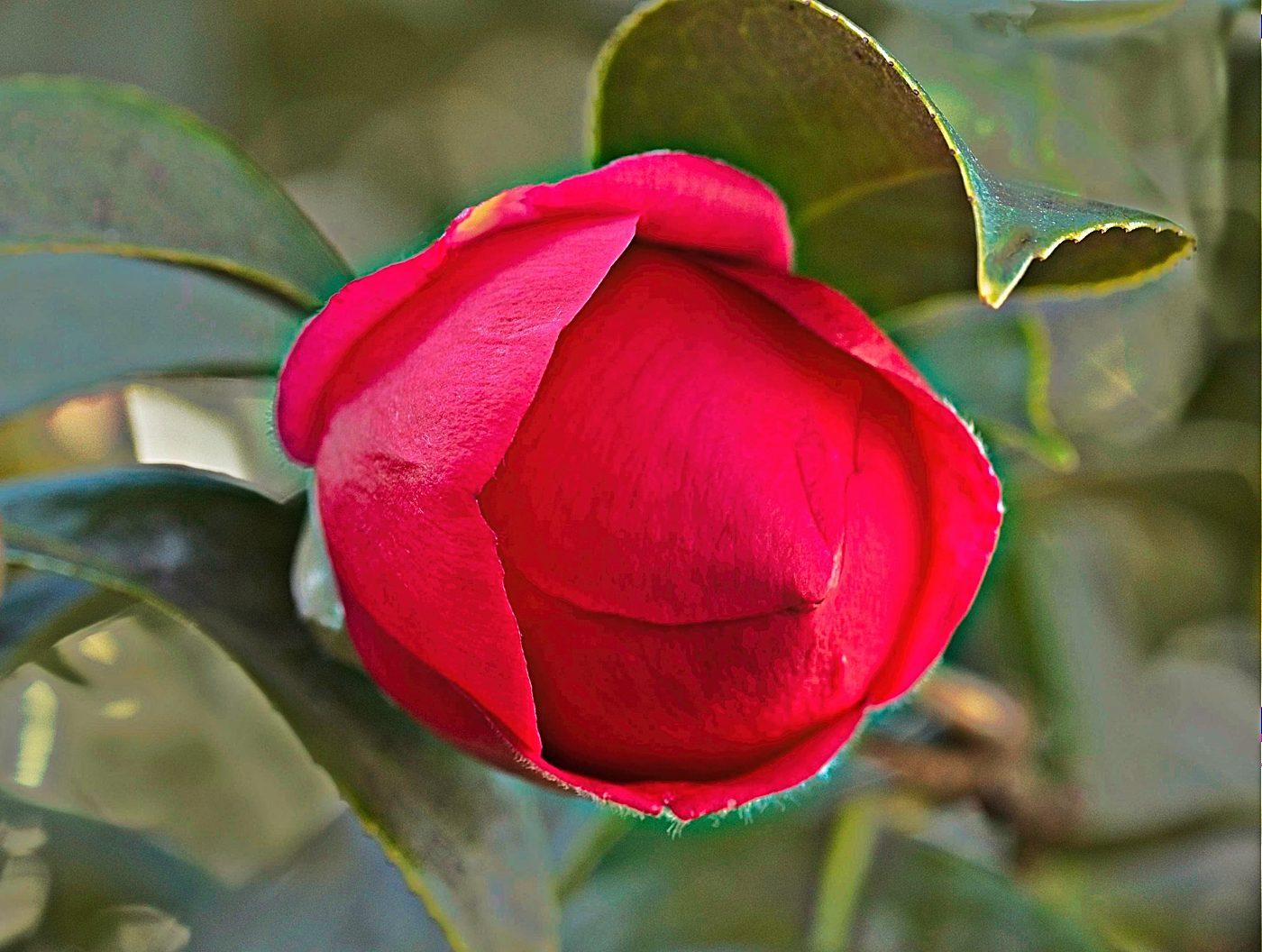
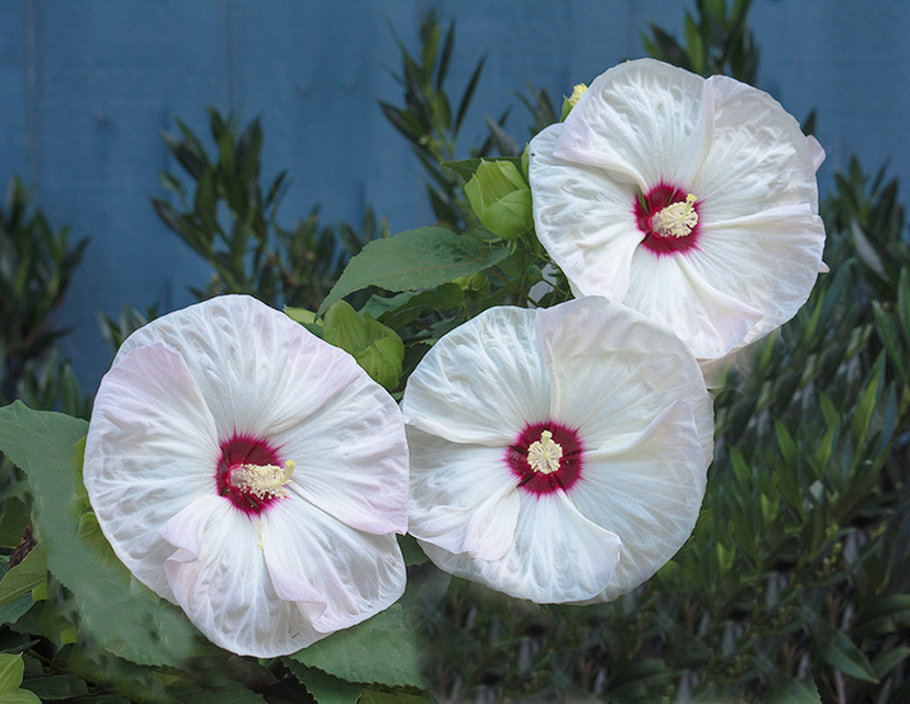
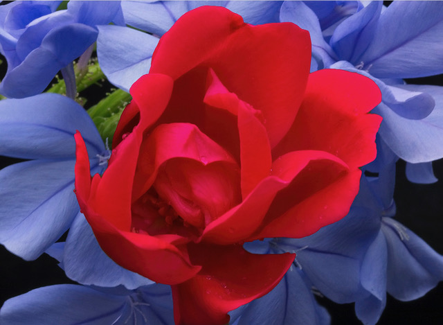
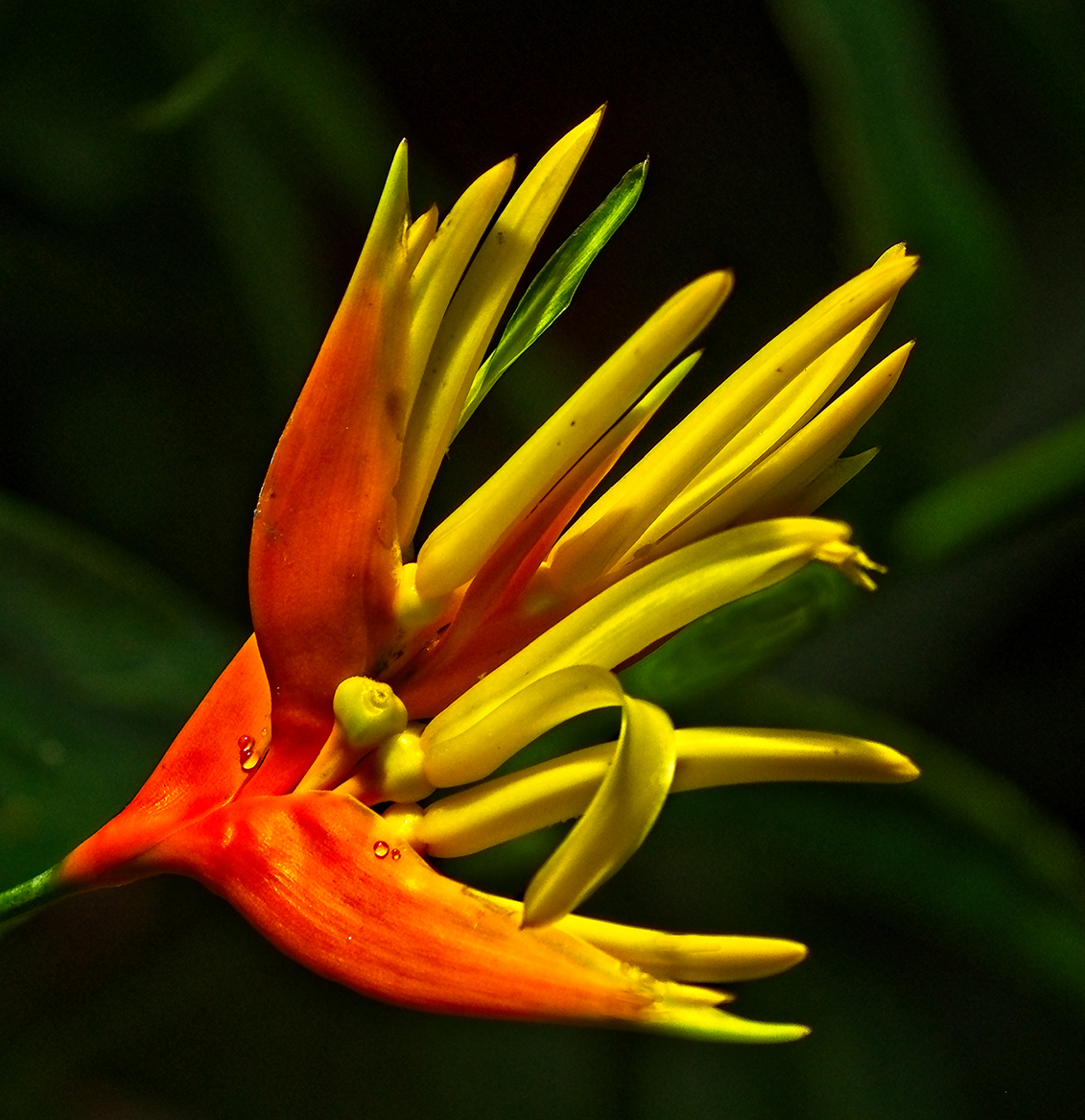
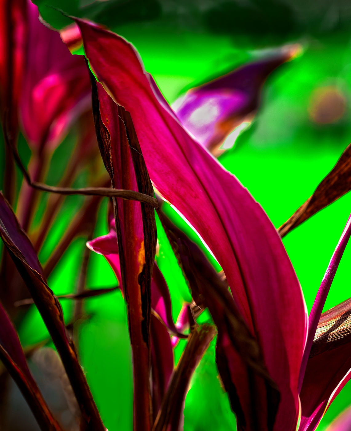
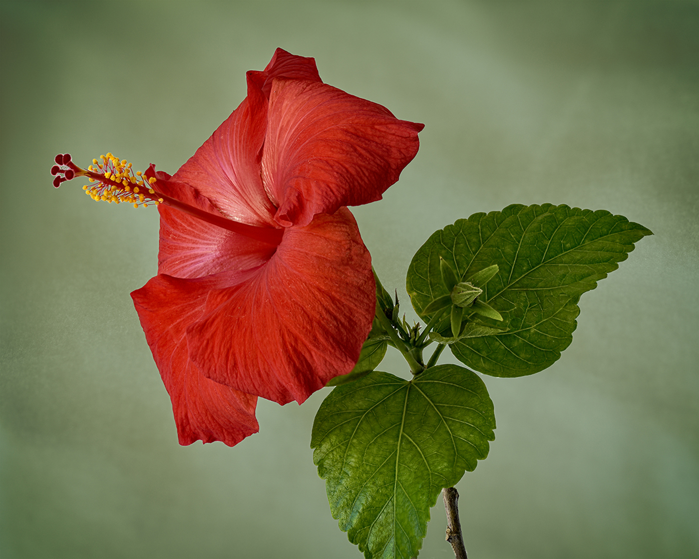
I love what you have done here - converting a ho-hum flower image into a real eye treat. Yes, the outlying petals are somewhat blurred, but that makes the image, in my view. Indeed, I think increasing the blur on the outside leading to the sharply focused petals in the center would enhance the effect. Sure works for me! |
Apr 16th |
7 comments - 0 replies for Group 30
|
7 comments - 0 replies Total
|