|
| Group |
Round |
C/R |
Comment |
Date |
Image |
| 24 |
Oct 22 |
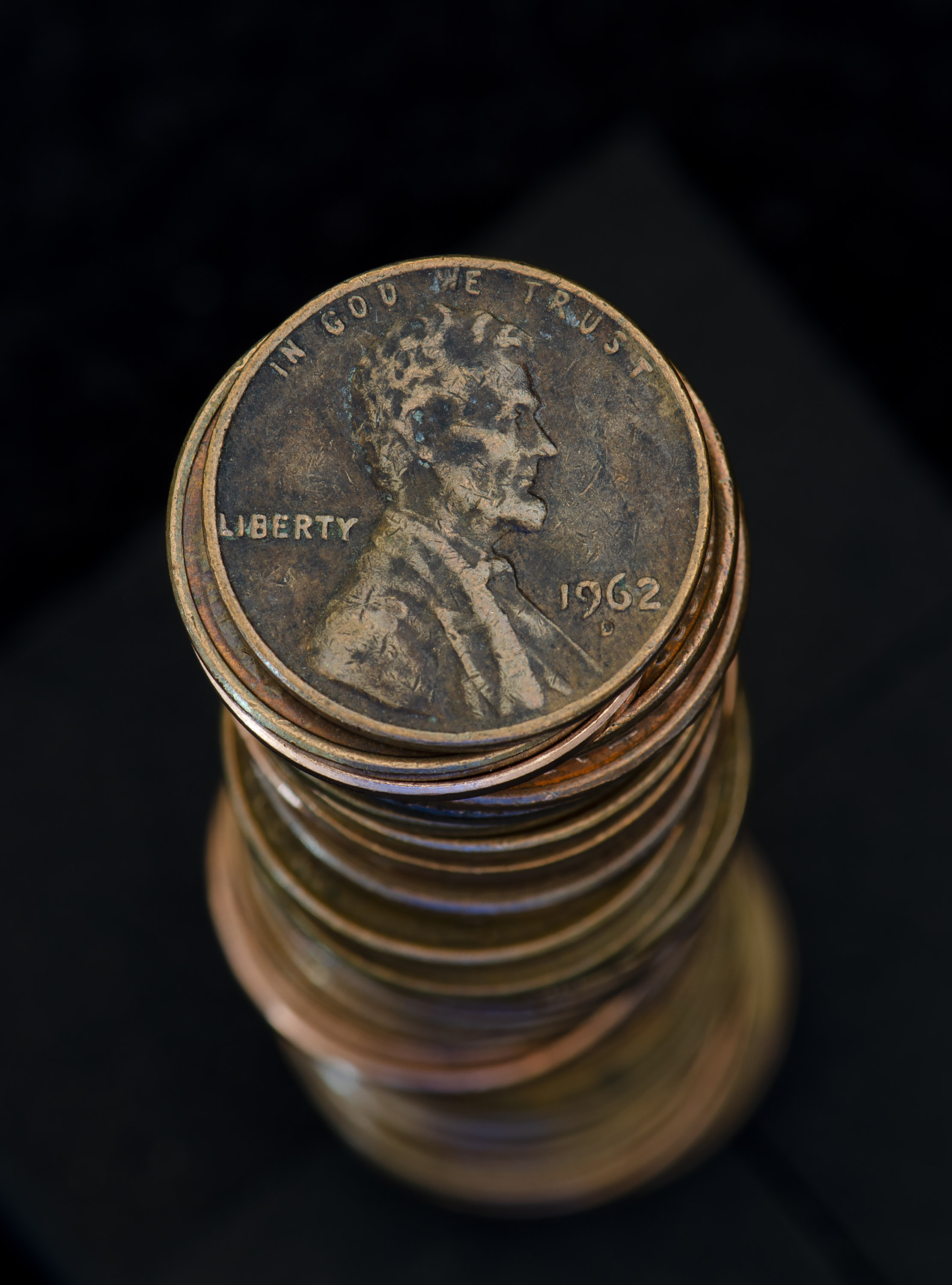
Reply |
Thanks Tom I like the extra crop. Its one of the images that after you post it, you can see all the improvements that can made.. |
Oct 19th |
| 24 |
Oct 22 |
Comment |
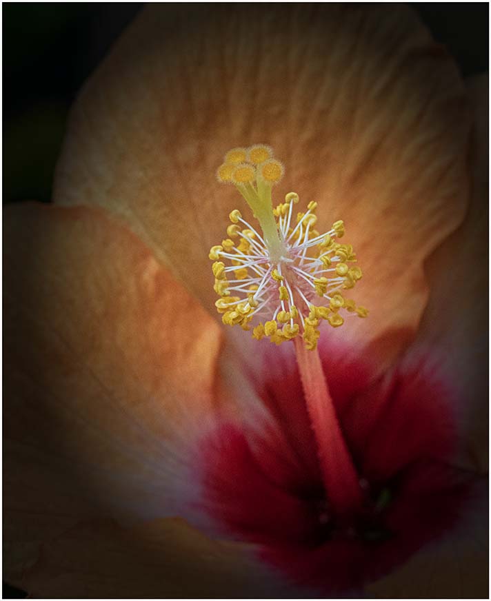
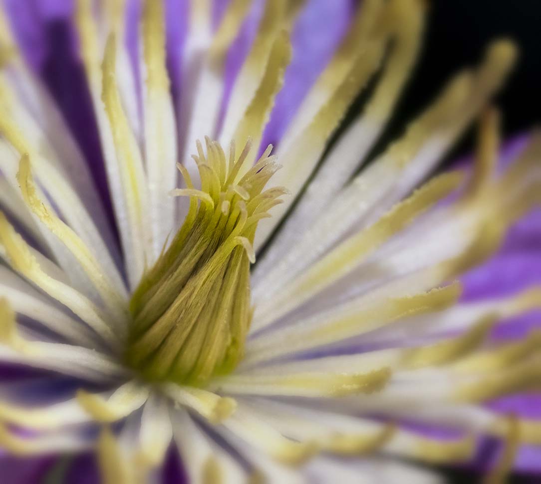
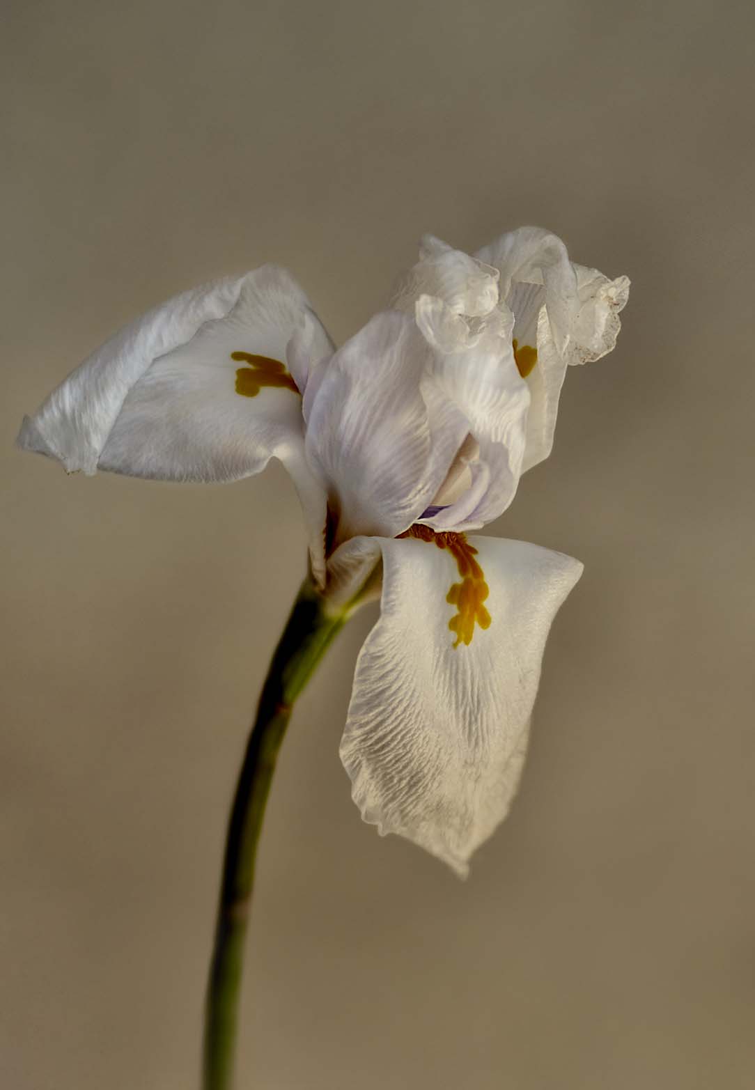
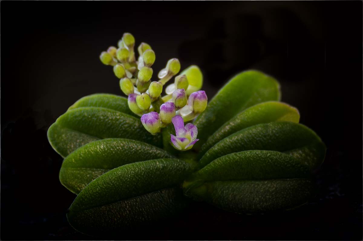
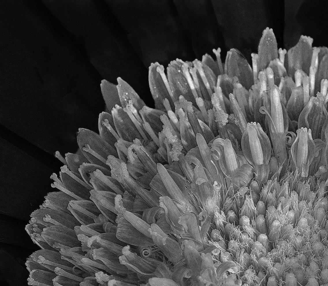
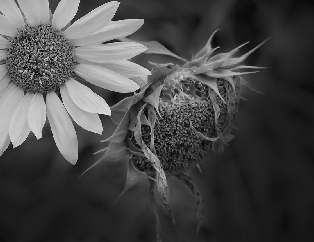
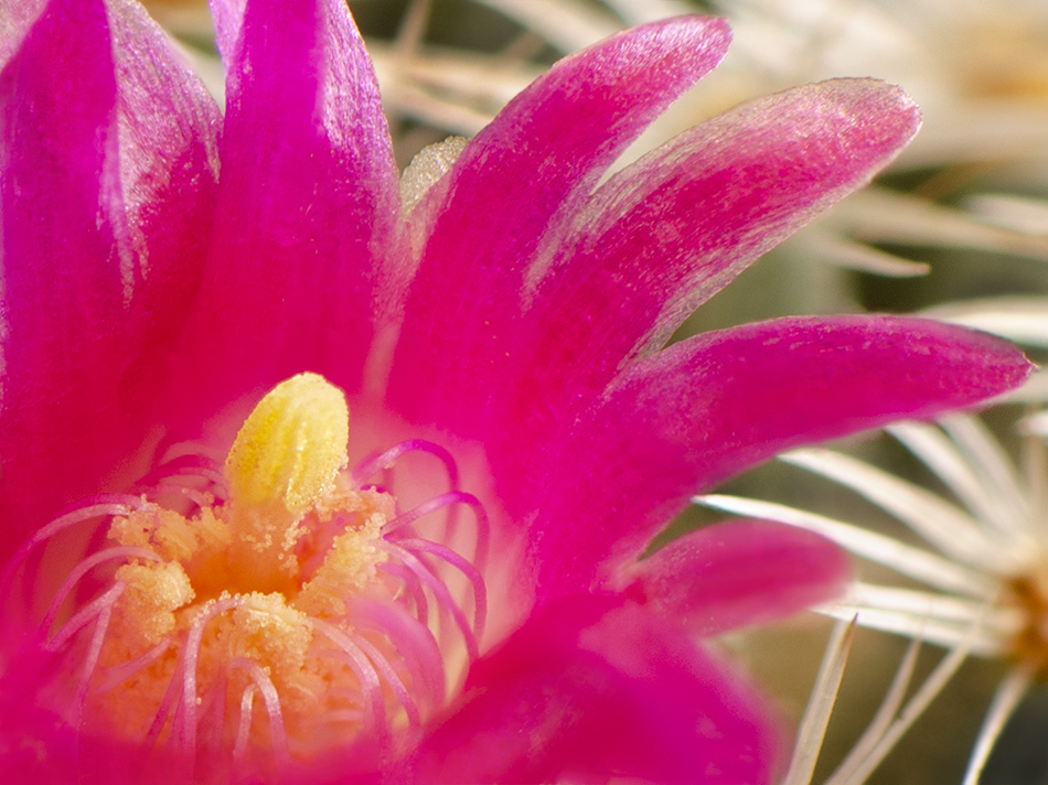
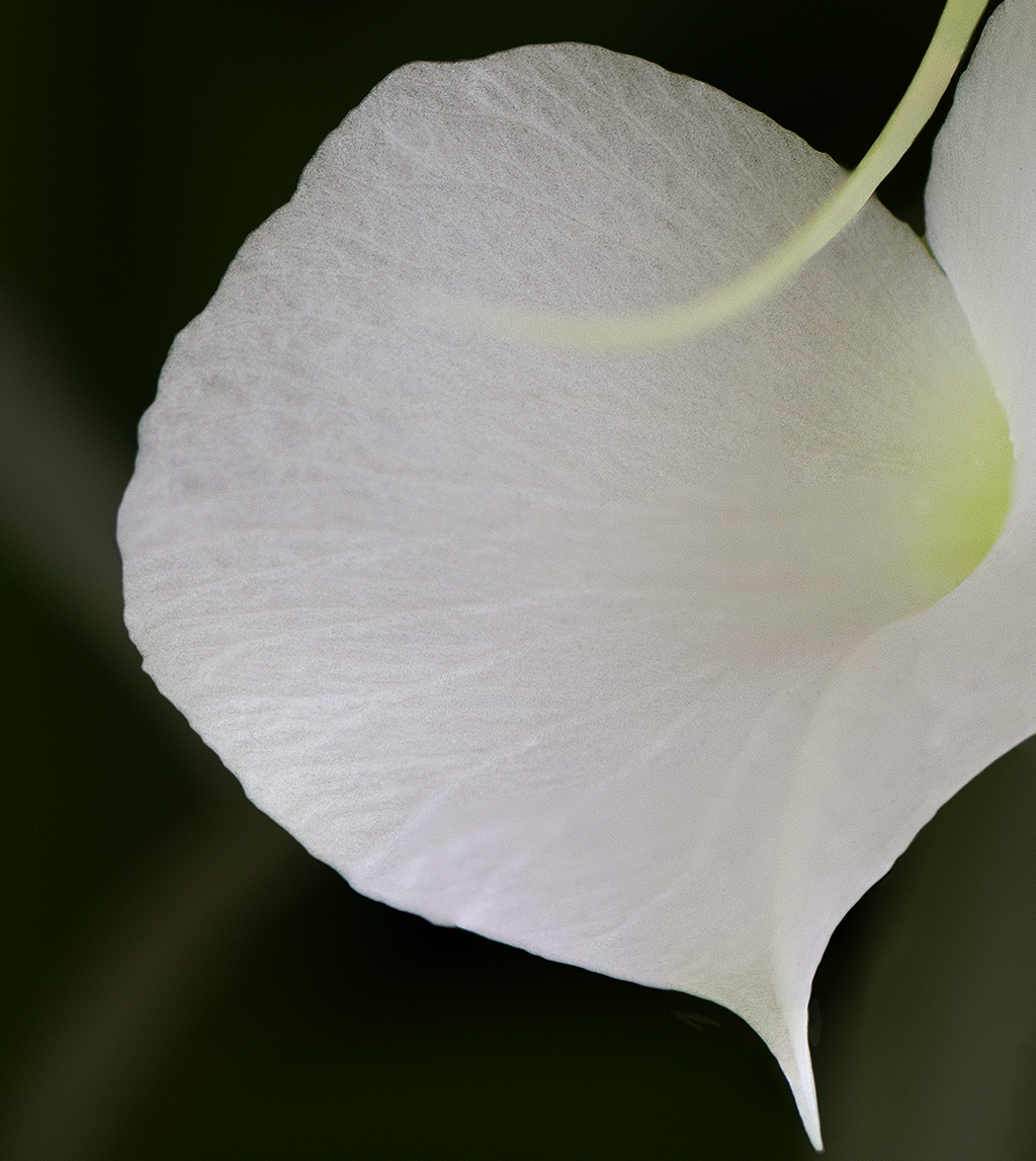
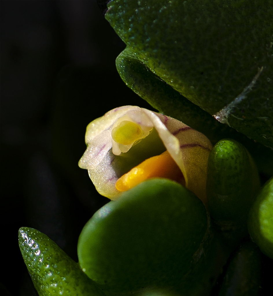
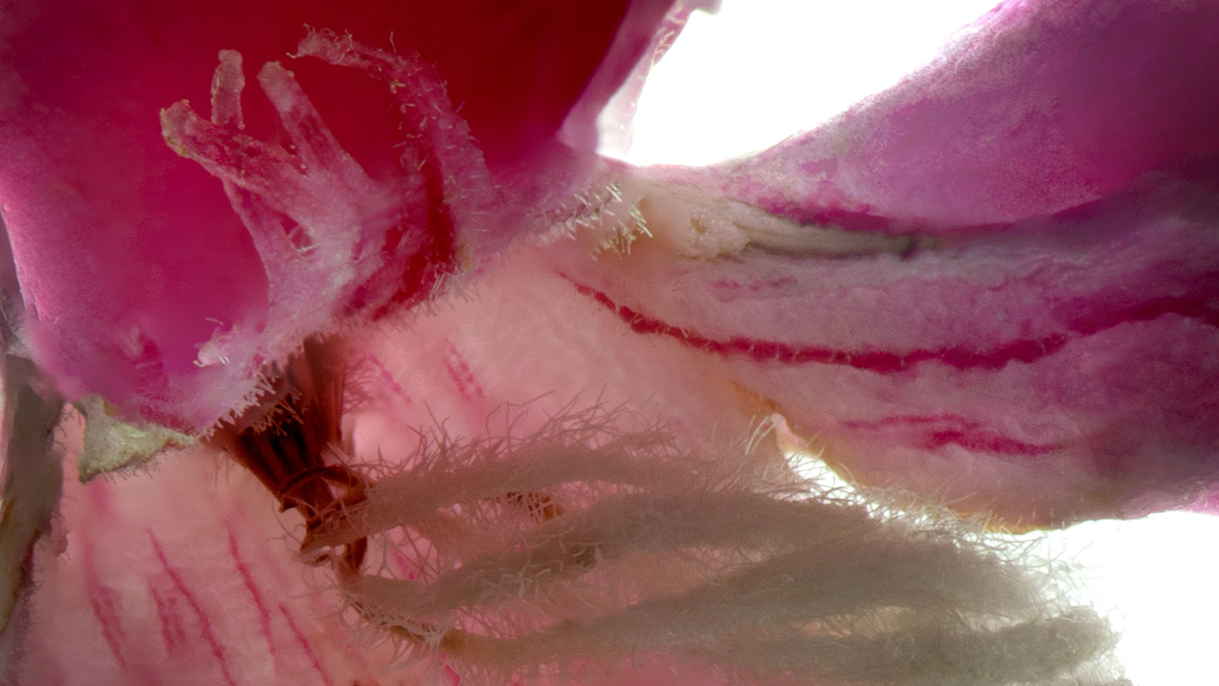
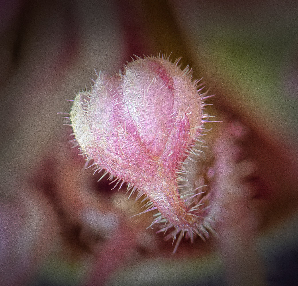
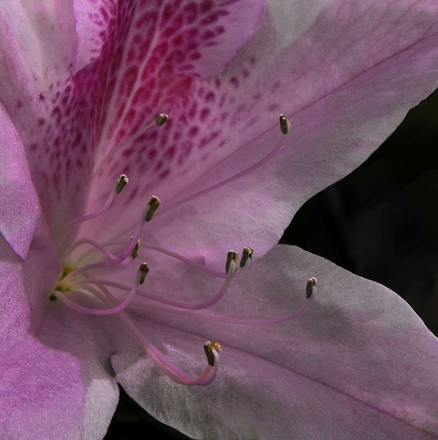
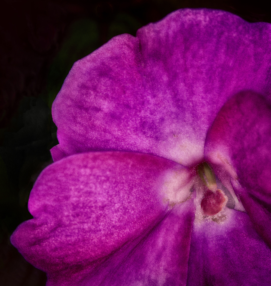
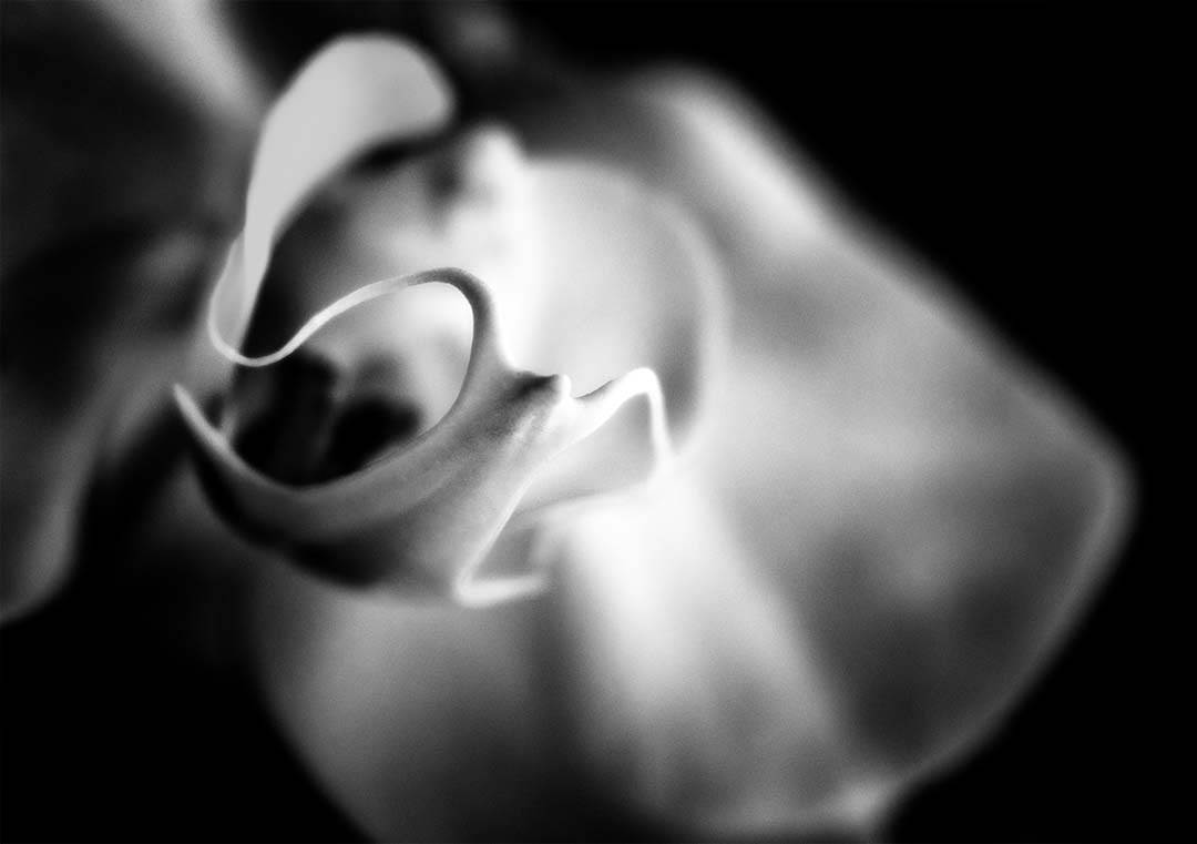
The clarity and focus on the sepals and pistils are nicely done. I like the composition but agree with Lance that some of the dead space can be removed brining more focus to the center of the flower. The color is really nice as well. Regarding the background, I think Bev is correct in that it's a little bland, but as you well know that's easy enough to fix with a texture, or the brush tool to change the color. Overall this is a very nice image. |
Oct 18th |
| 24 |
Oct 22 |
Reply |
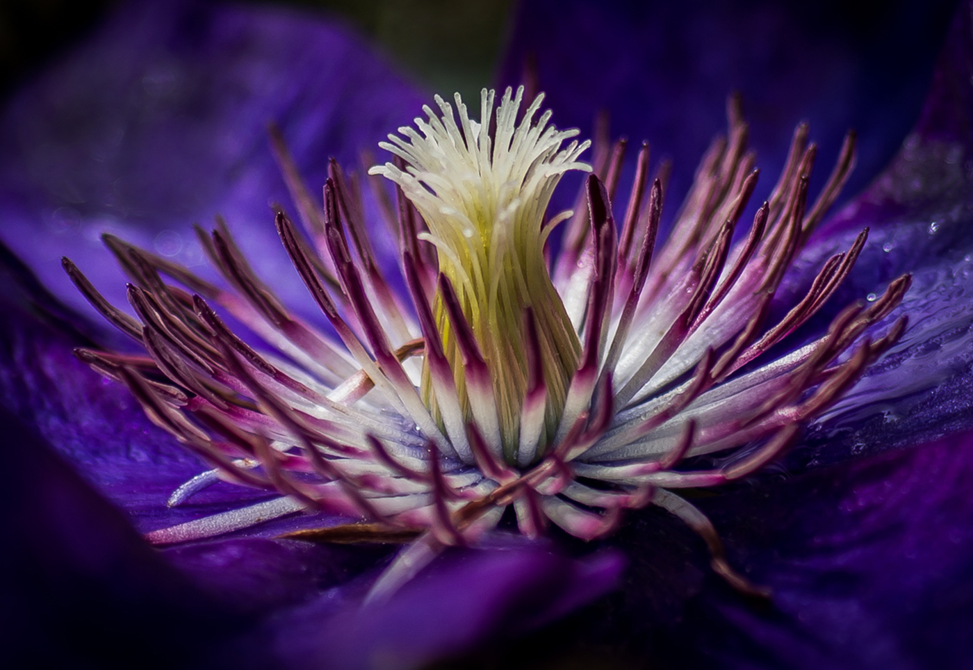
I like what you've done here.
|
Oct 18th |
| 24 |
Oct 22 |
Comment |
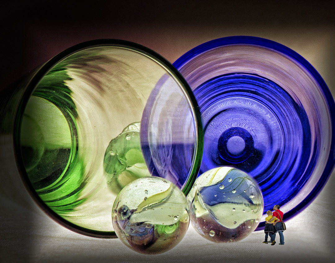
I believe (almost) anything that sparks creativity is worthwhile. While taking flower shots I Incorporated some miniature figures (chubby sunbathers) and found it helped me to stretch my creativity.
As for this image, I find it very interesting that something botanical in nature can be viewed as almost architectural. You've made me curious to see the color version. |
Oct 18th |
| 24 |
Oct 22 |
Reply |
Thanks Bev! |
Oct 17th |
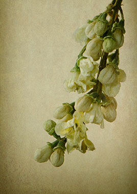
| 24 |
Oct 22 |
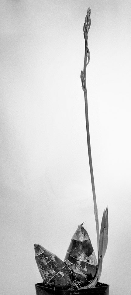
Comment |
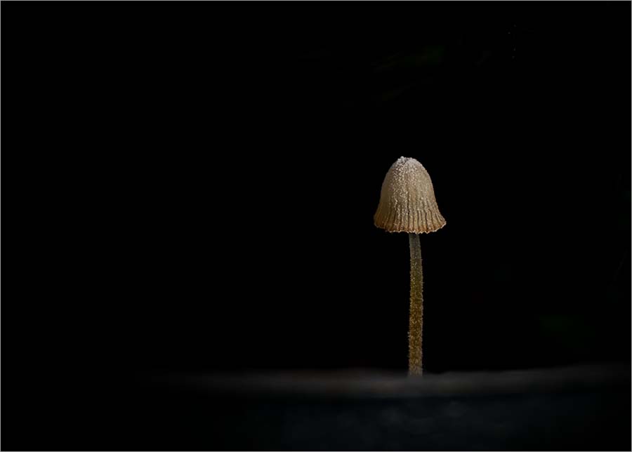
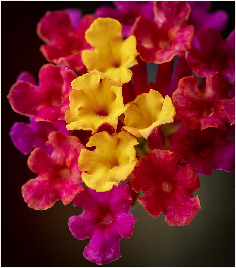
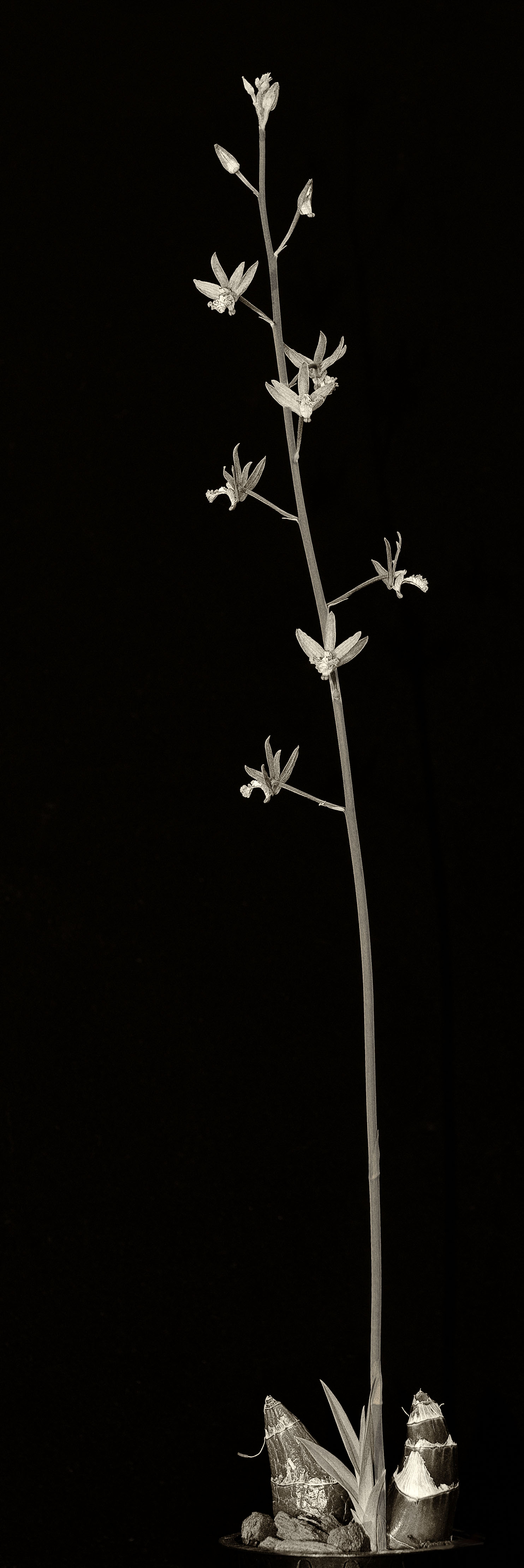
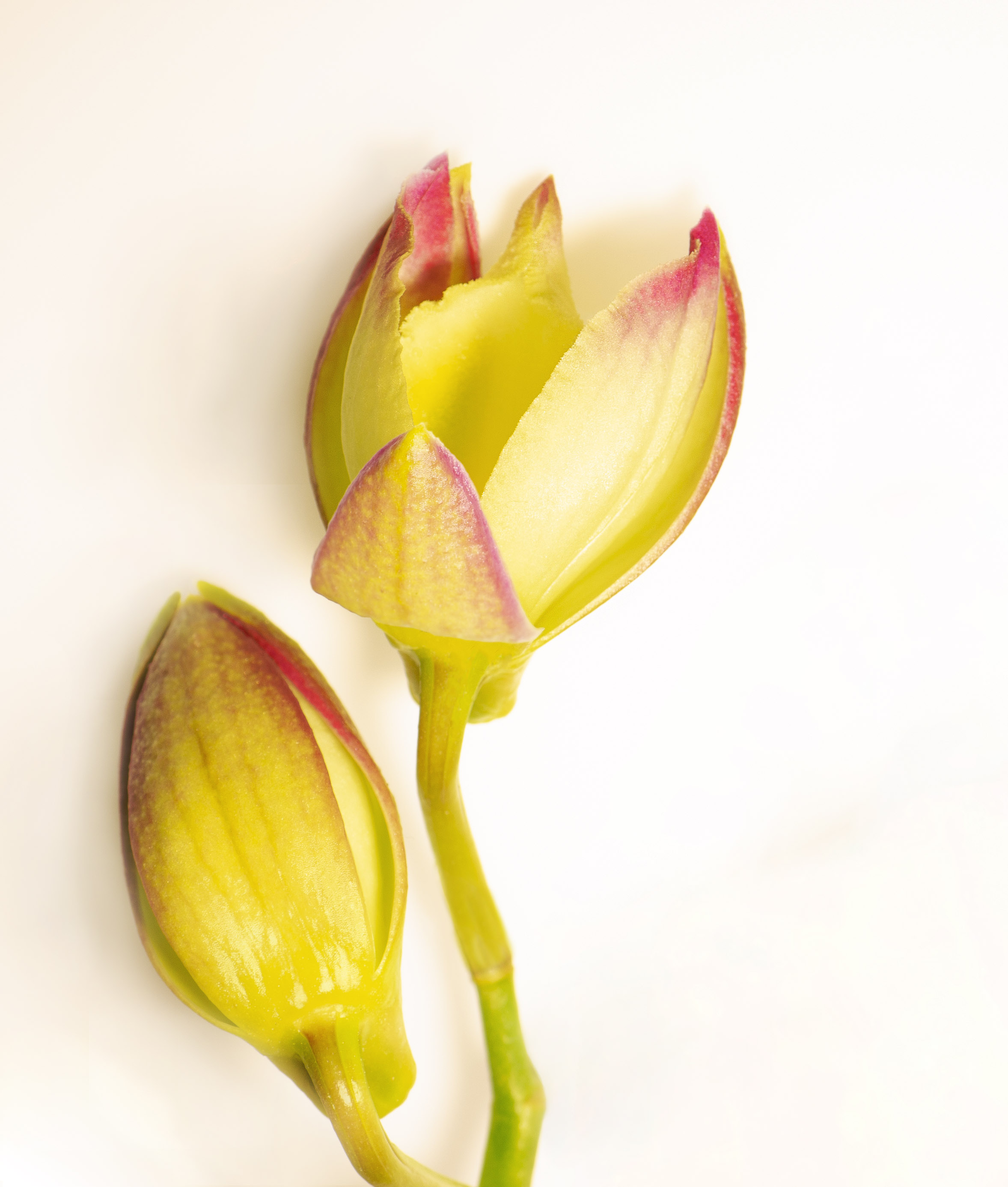
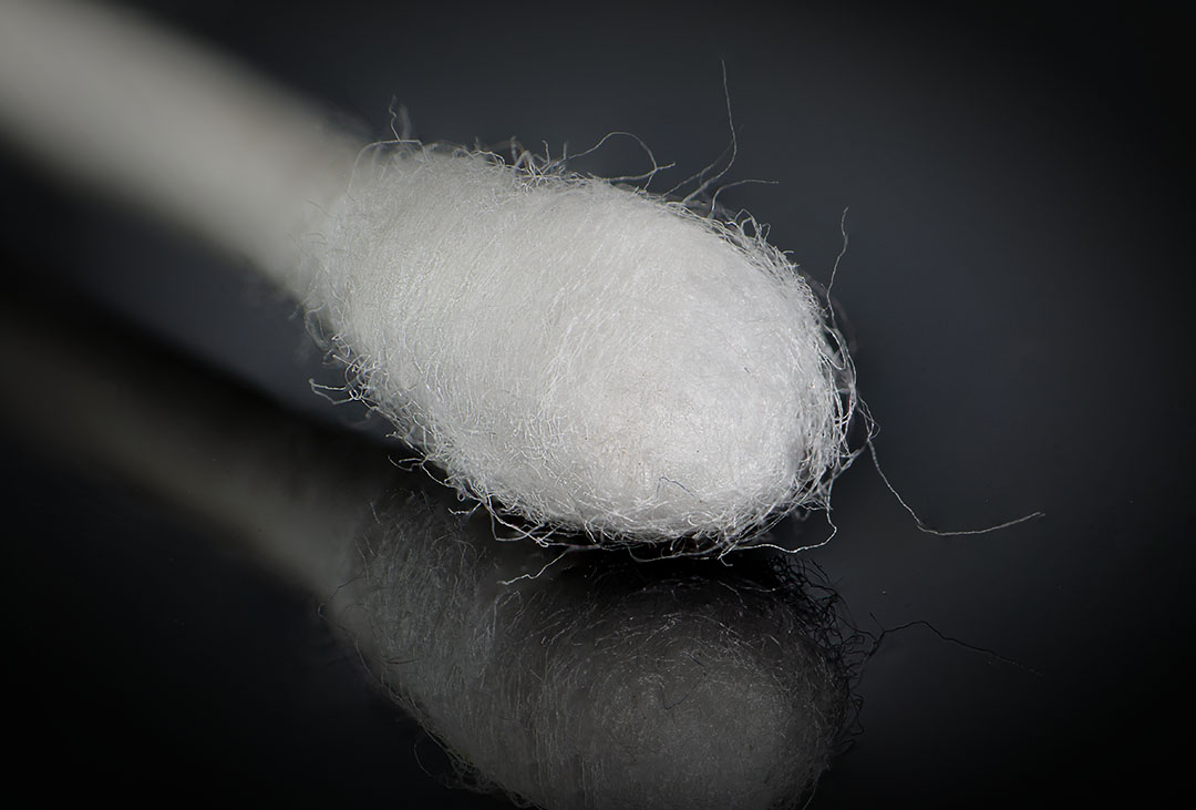
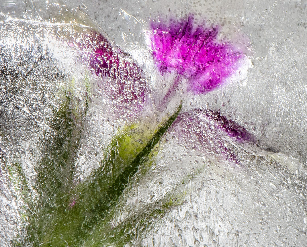
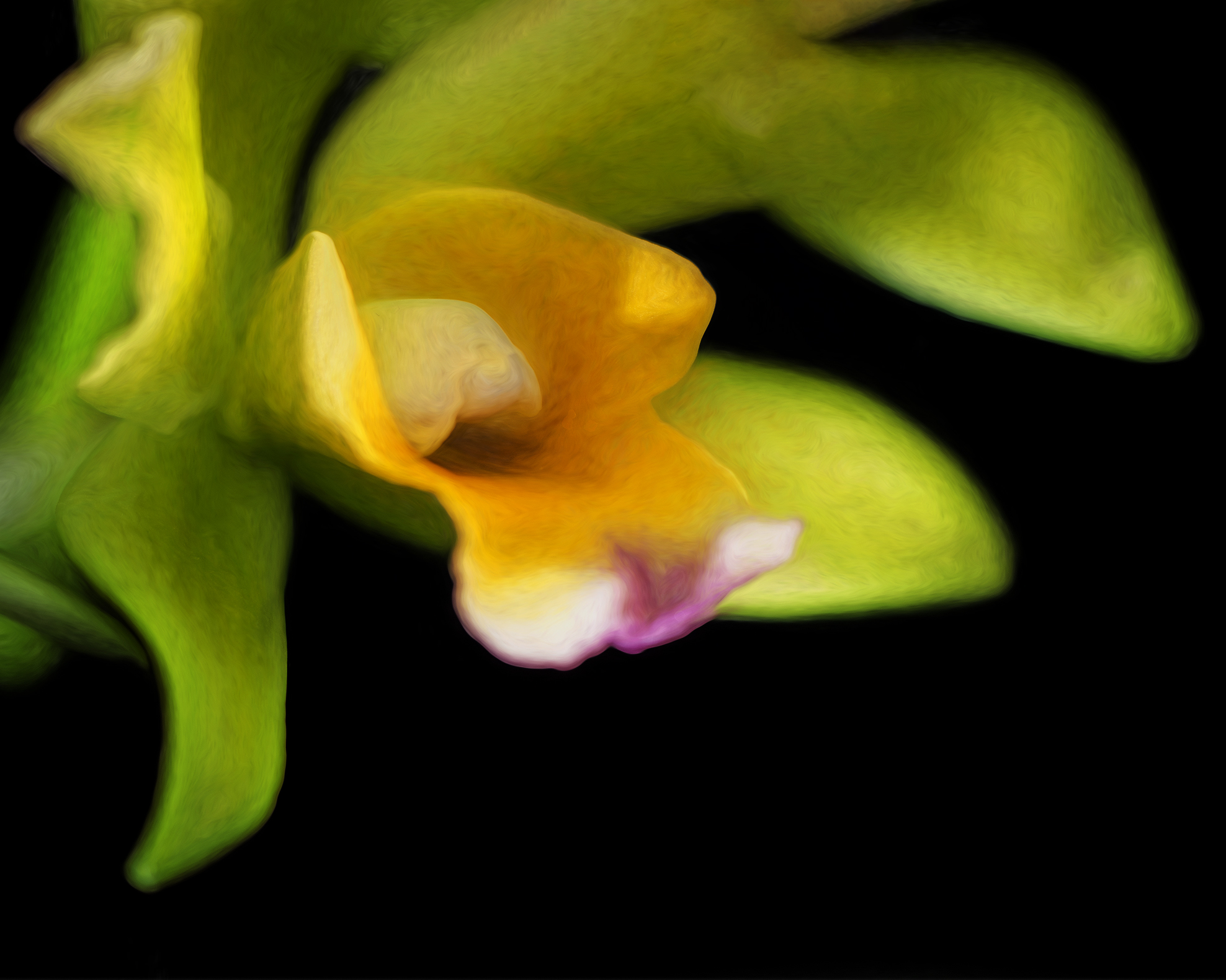
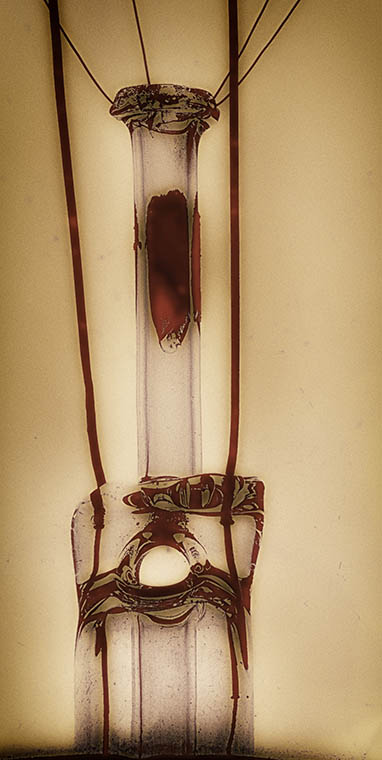
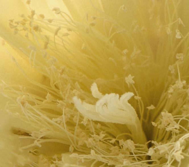
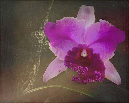
Since I don't know what crepe ginger looks like, I can't comment on what this is, but the colors are nice and bold. The shape is great and I like how you darkened the background. Good job on the psychedelic hippie Batman. Almost makes a person want to break out the lava lamp... |
Oct 12th |
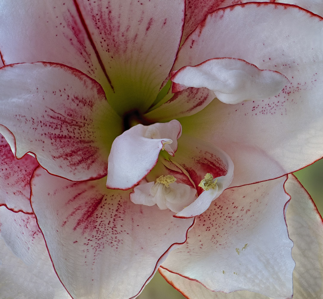
| 24 |
Oct 22 |
Comment |
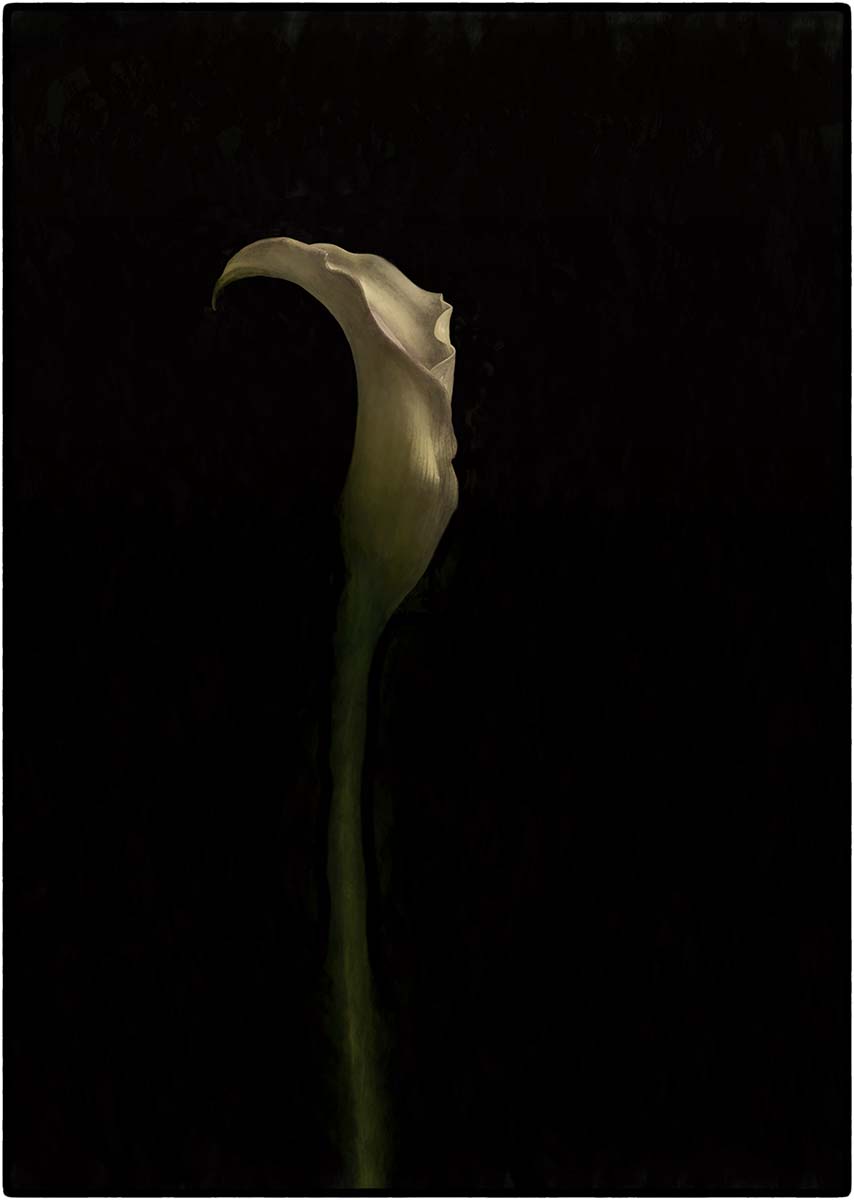
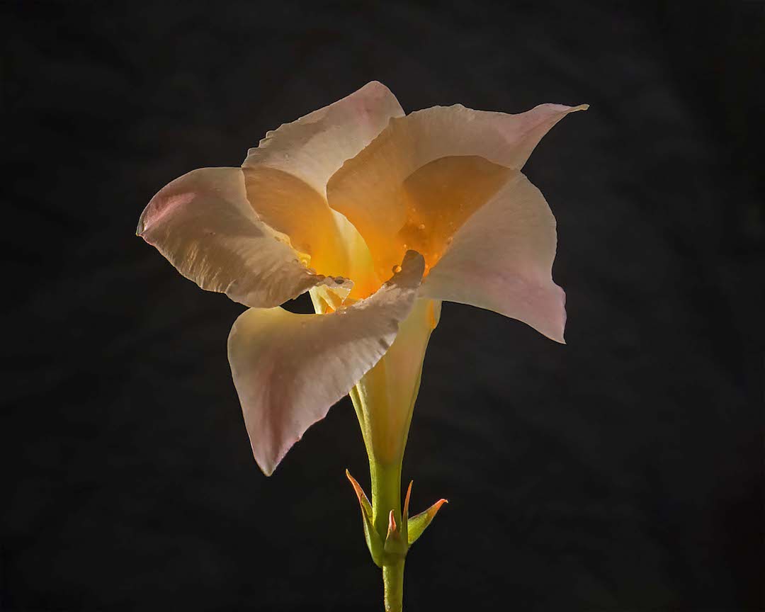
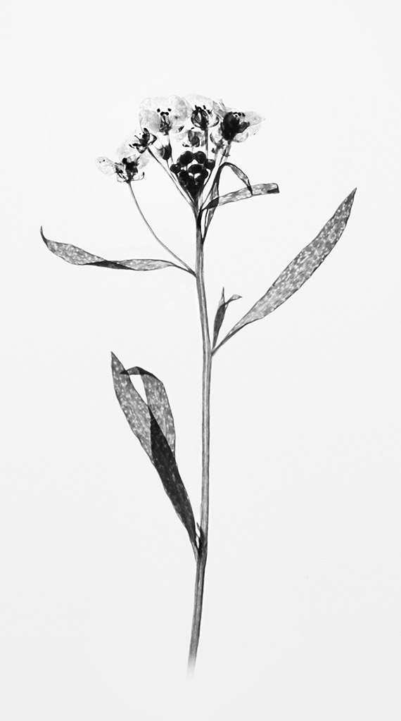
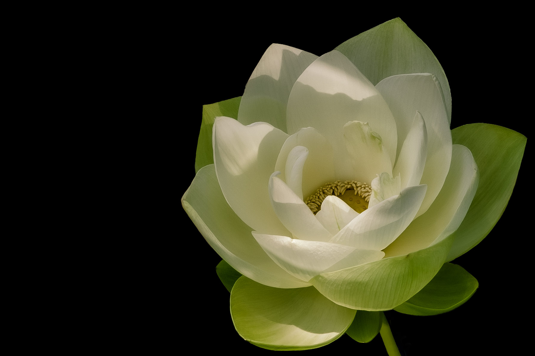
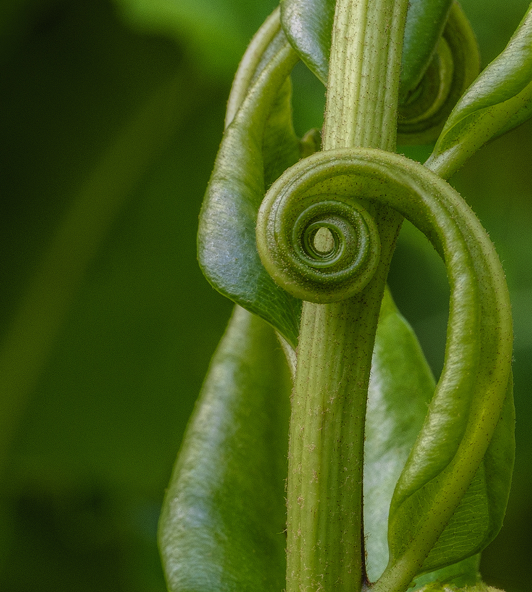
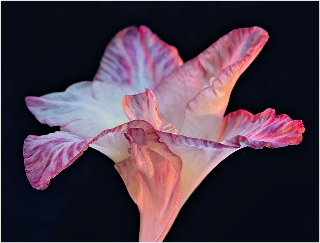
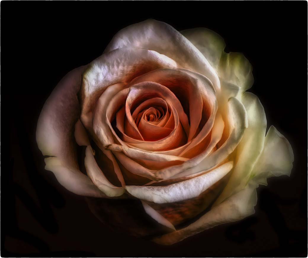
Beautifully done! Your post-processing is spot on and has accentuated the flower to it's finest. The composition is pleasing and the bent stem gives the image a different twist (pun intended.) I wouldn't change a thing. |
Oct 12th |
| 24 |
Oct 22 |
Comment |
The image is nicely coordinated with the texture chosen and I think the center orientation works. Might consider lightening up the top a bit since I find it a little dark. Overall I like the color palette. |
Oct 12th |
5 comments - 3 replies for Group 24
|
| 32 |
Oct 22 |
Comment |
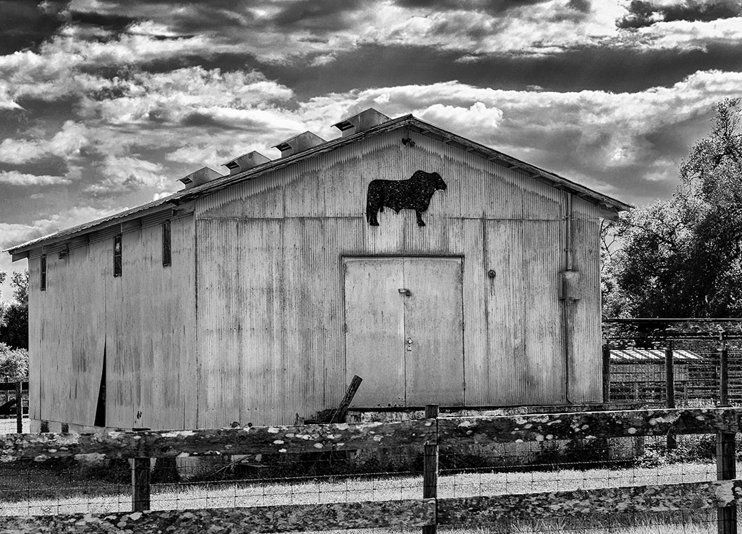
I can't add anything that hasn't already been mentioned, except that I never realized that the "modern" roof is the piece that makes these old buildings look less than authentic. Loved visiting Bodie...you're fortunate to be so close. |
Oct 26th |
| 32 |
Oct 22 |
Reply |
Paperwork piles have no natural enemy so they grow wild and free. |
Oct 26th |
| 32 |
Oct 22 |
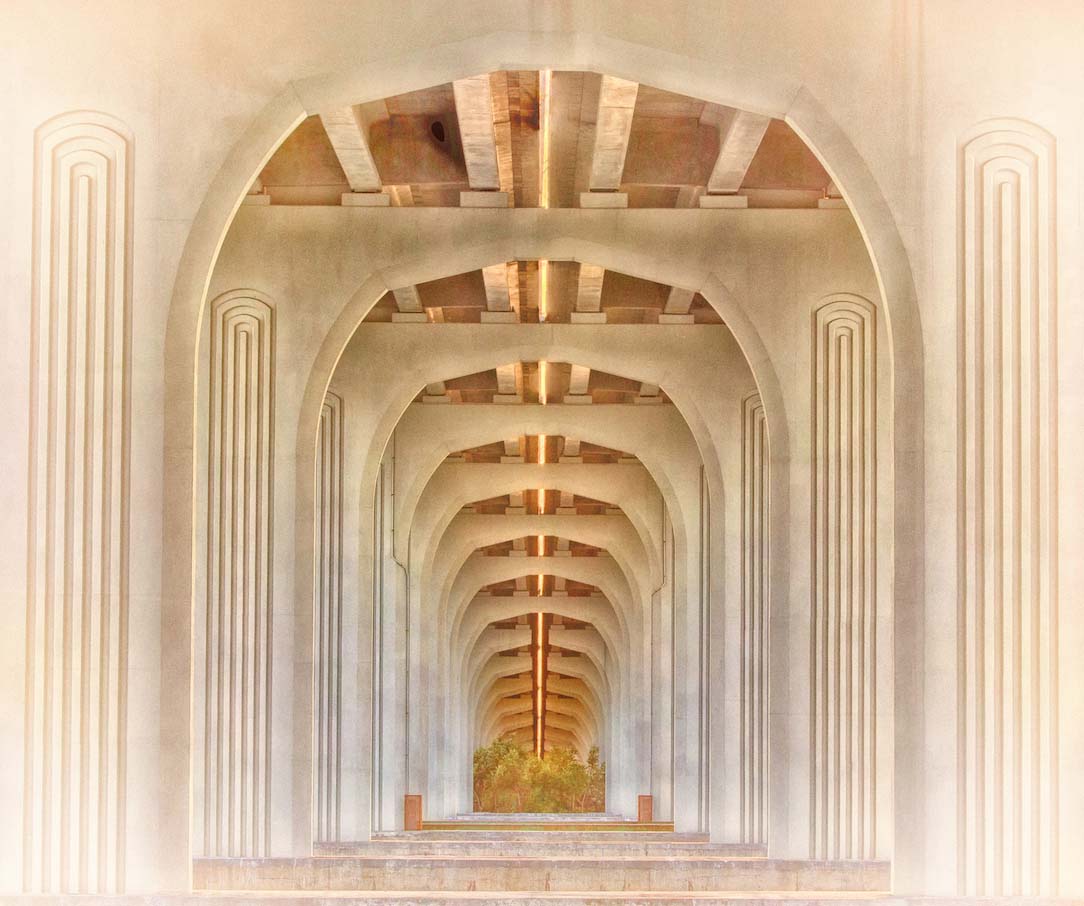
Comment |
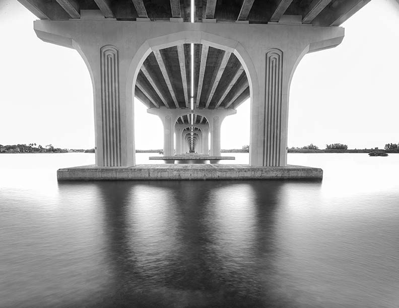
Your handling of the light is really well done as is your complete image from entry to the exit on the bridge. As for the graffiti, I too think it's awful. You have captured the texture of the wood and the feel of another time. As Stephen mentions, I too enjoy the various historical images you present. Moving from the northeast where that kind of history is abundant to Florida where the history is so different, make me appreciate your various images. |
Oct 24th |
| 32 |
Oct 22 |
Reply |
You have no covered bridges in GB? |
Oct 24th |
| 32 |
Oct 22 |
Comment |
In agree with Diana that it is appalling how many have died in the name of freedom. A consistent risk. This is a good image with its leading lines and graves lined up leading you onward to a place you believe will show you more of the same. My grandfather fought in WWI, my father in WWII and have nothing but respect for the military and their families. |
Oct 24th |
| 32 |
Oct 22 |
Comment |
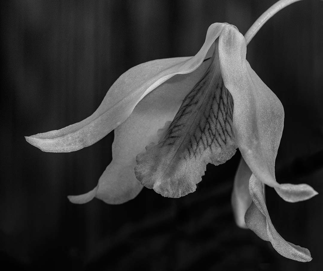
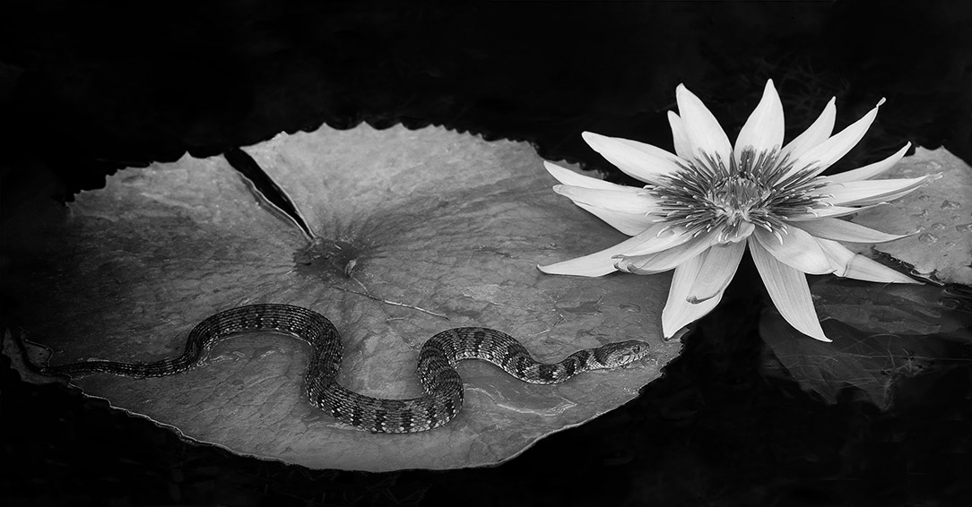
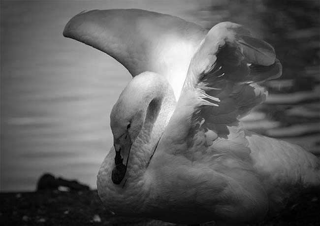
Pointing the flowers downward and converting to black and white to me, sets a somber mood reminding me of flowers past even though they're still alive. The ability to evoke emotion in an image is an image well done. Why I saw something different than the rest if the group I can't say, but I congratulate you on a very well presented image. |
Oct 24th |
| 32 |
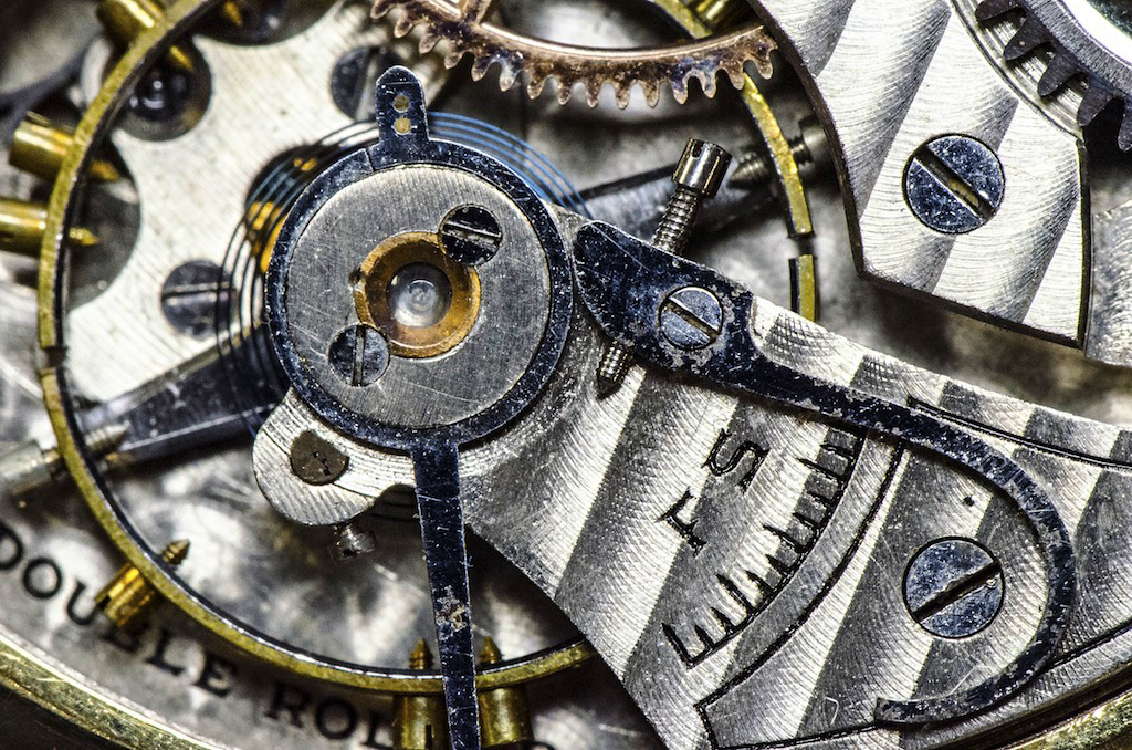
Oct 22 |
Comment |
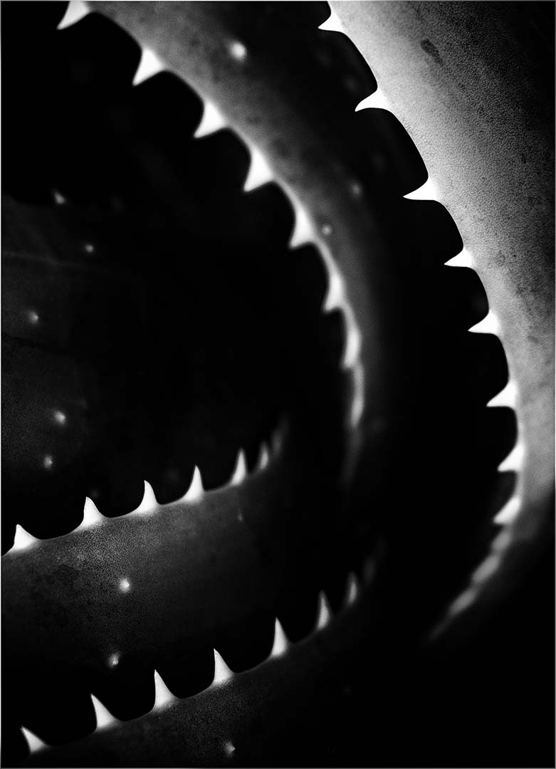
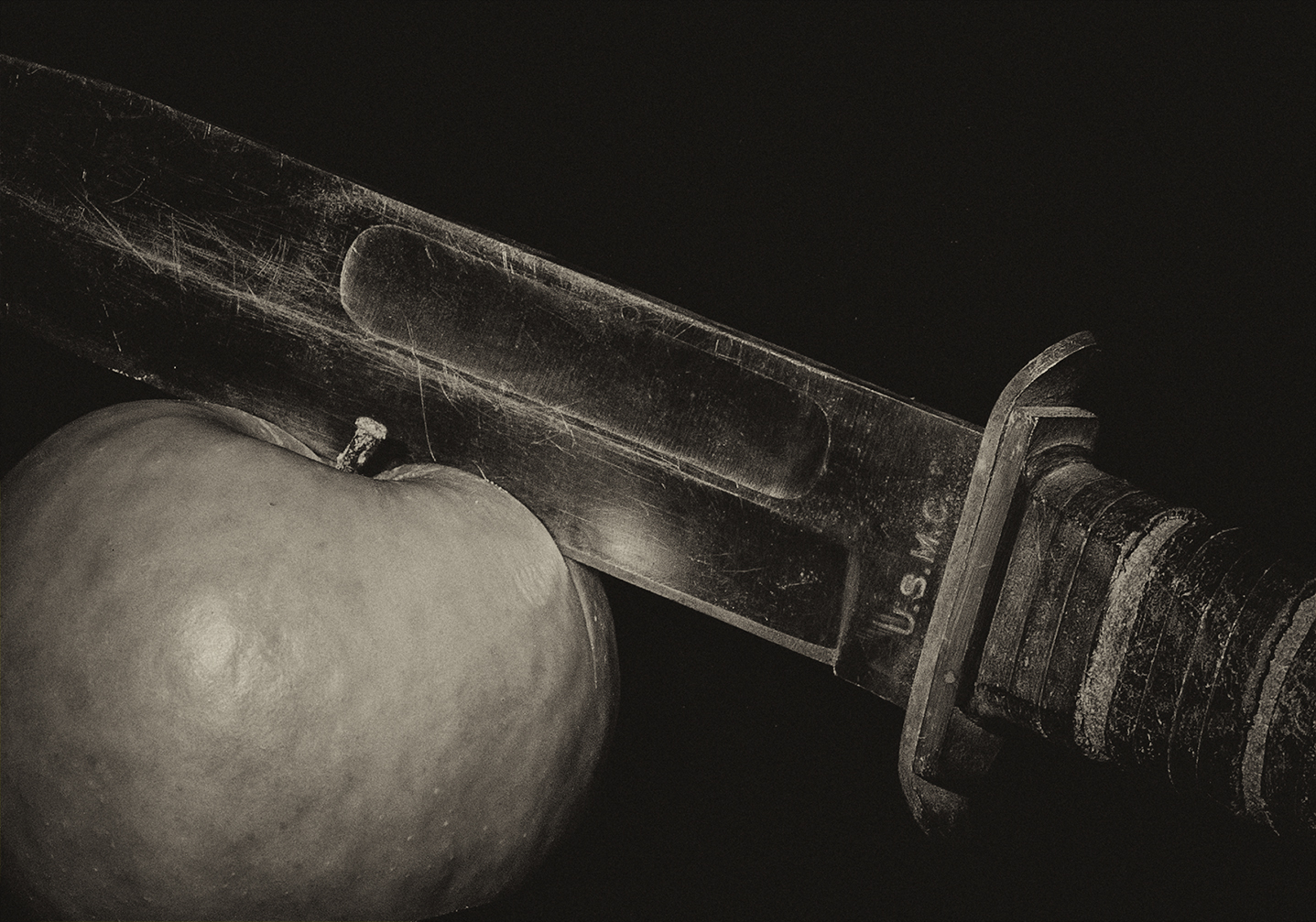
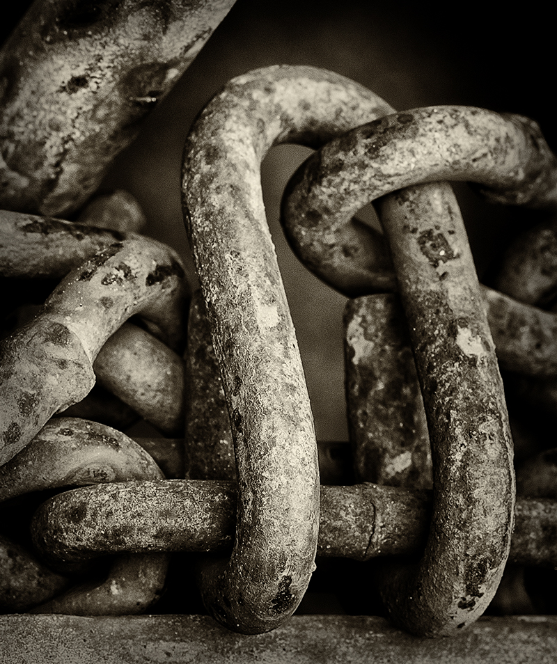
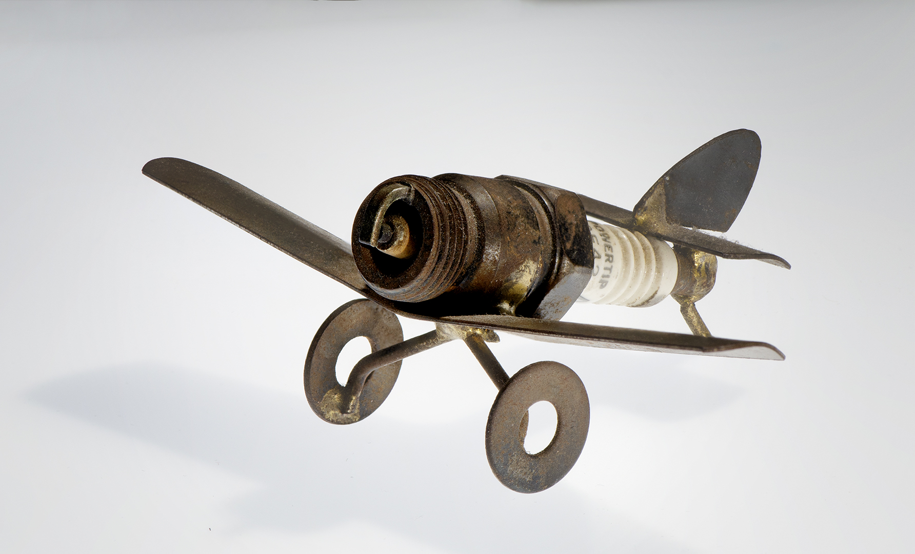
This is a good image that allows imagination even with static items such as wrenches. The way they lead you back to the center through both the curvature on the upper right along with the lines formed by the wrenches in the upper left is nicely done. You may have not arranged it, but you had the vision to see it. Nicely done! |
Oct 24th |
| 32 |
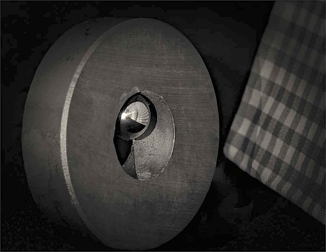
Oct 22 |
Reply |
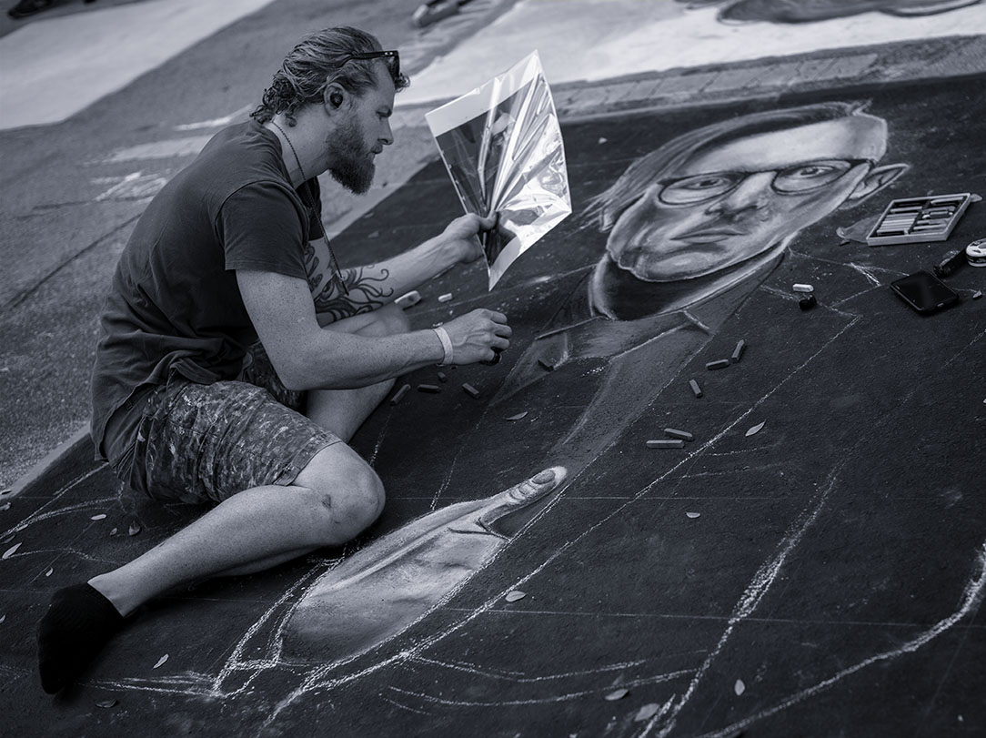
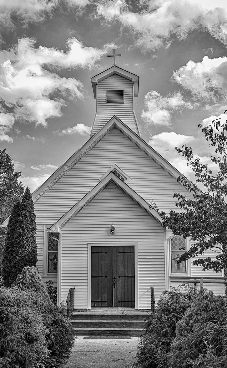
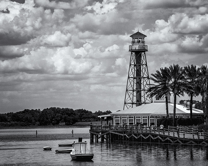
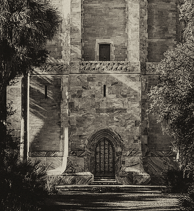
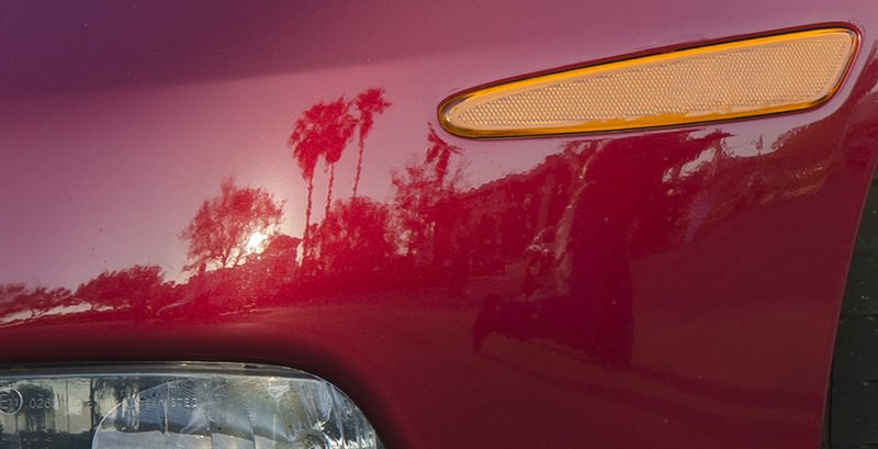
The actual magnet is about 3 inches across. I tried to reflect different things, but I found a small consistent pattern worked best. It didn't occur to me to be the reflection. As a side note, thank you for the feedback last month on the church image. Very helpful. |
Oct 12th |
| 32 |
Oct 22 |
Comment |
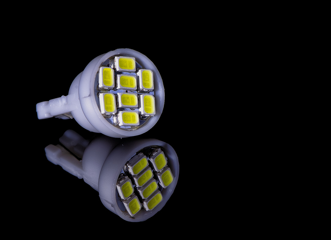
I love it! The graphic nature of the image is great, the tonality, and the white background is perfect. Your idea to donate the images to the store was great. I agree with Wes that I wouldn't change a thing. |
Oct 6th |
6 comments - 3 replies for Group 32
|
| 79 |
Oct 22 |
Reply |
I was an ICU nurse and ran an ER. Glad you understand the vision this image can create.... |
Oct 26th |
| 79 |
Oct 22 |
Comment |
Love the movement of this image and the colors. I too would consider removing the brighter strip on the left so my eye wouldn't be drawn away from the tree trunk. I like the way you've composed the image - the off center trunk doesn't bother me. We all agree that printing on aluminum would really make this pop. |
Oct 18th |
| 79 |
Oct 22 |
Comment |
Although I do see the dancers, the predominant impression I get is a beating heart. Perhaps it's my medical background. That said, I'm not sure how I feel about this image. I do find it interesting how each of us see different things in images, particularly those considered abstract. Karl is correct in saying this image is so very dynamic and screams in its space. |
Oct 18th |
| 79 |
Oct 22 |
Comment |
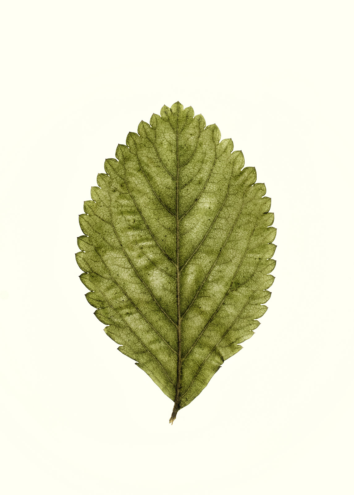
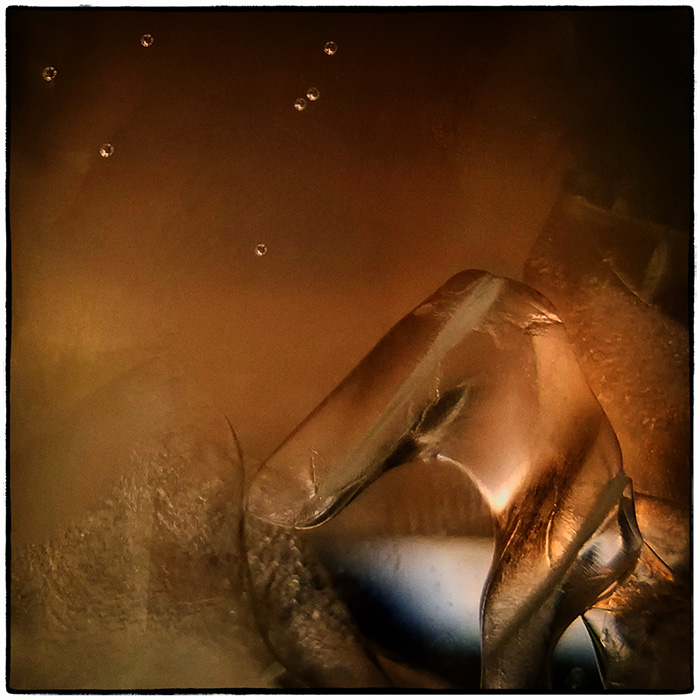
Judith, I appreciate the sky coming through the leaf as a concept, but I think to make the concept work, you would need a more transparent leaf to provide context. The sky sections look more like unruly highlights than sky. The blue anchors the leaf, but I think a boarder would do just as well. I like the way you captured the black spots on this poor old leaf. He looks like he's had a rough go. |
Oct 18th |
| 79 |
Oct 22 |
Comment |
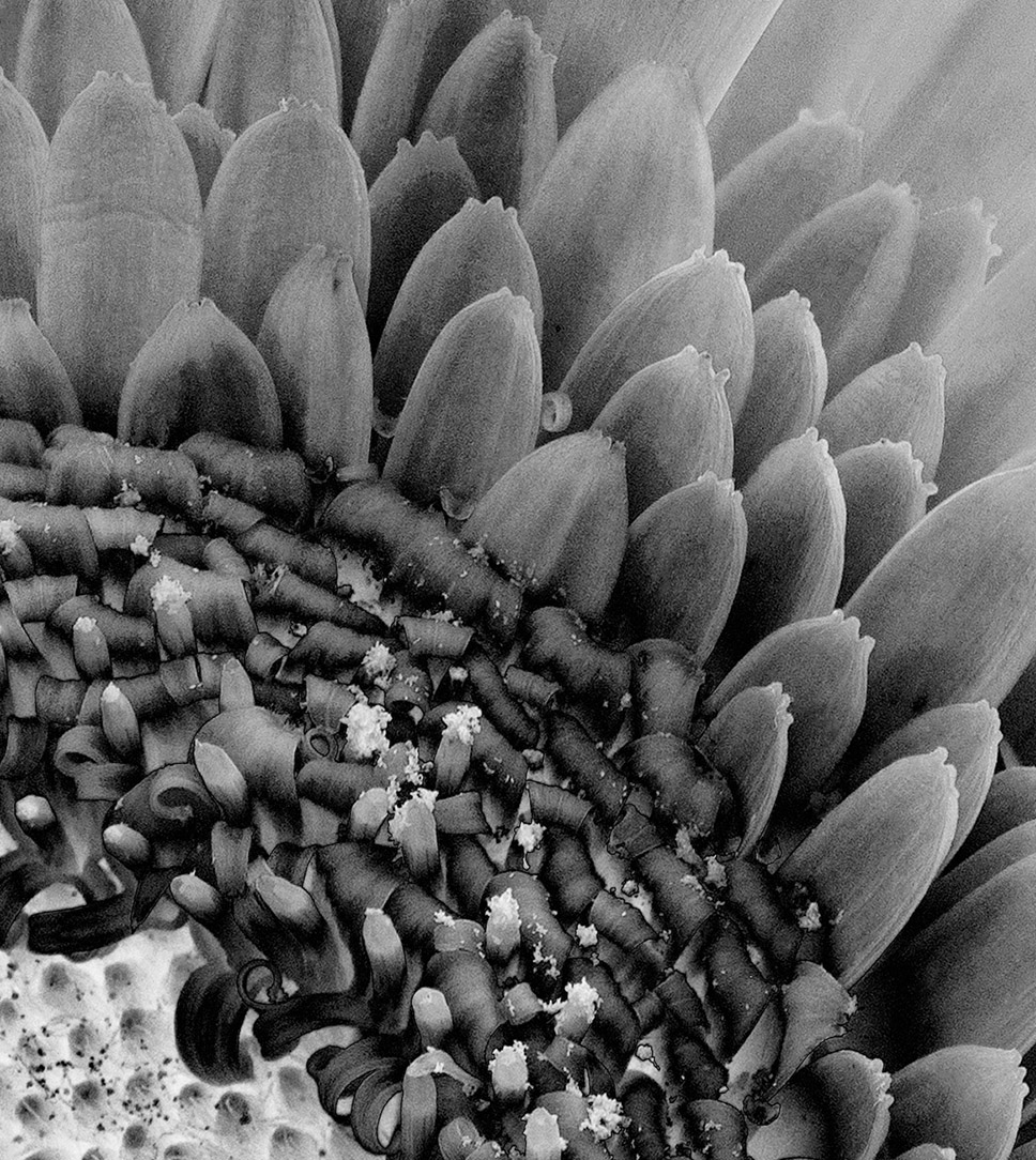
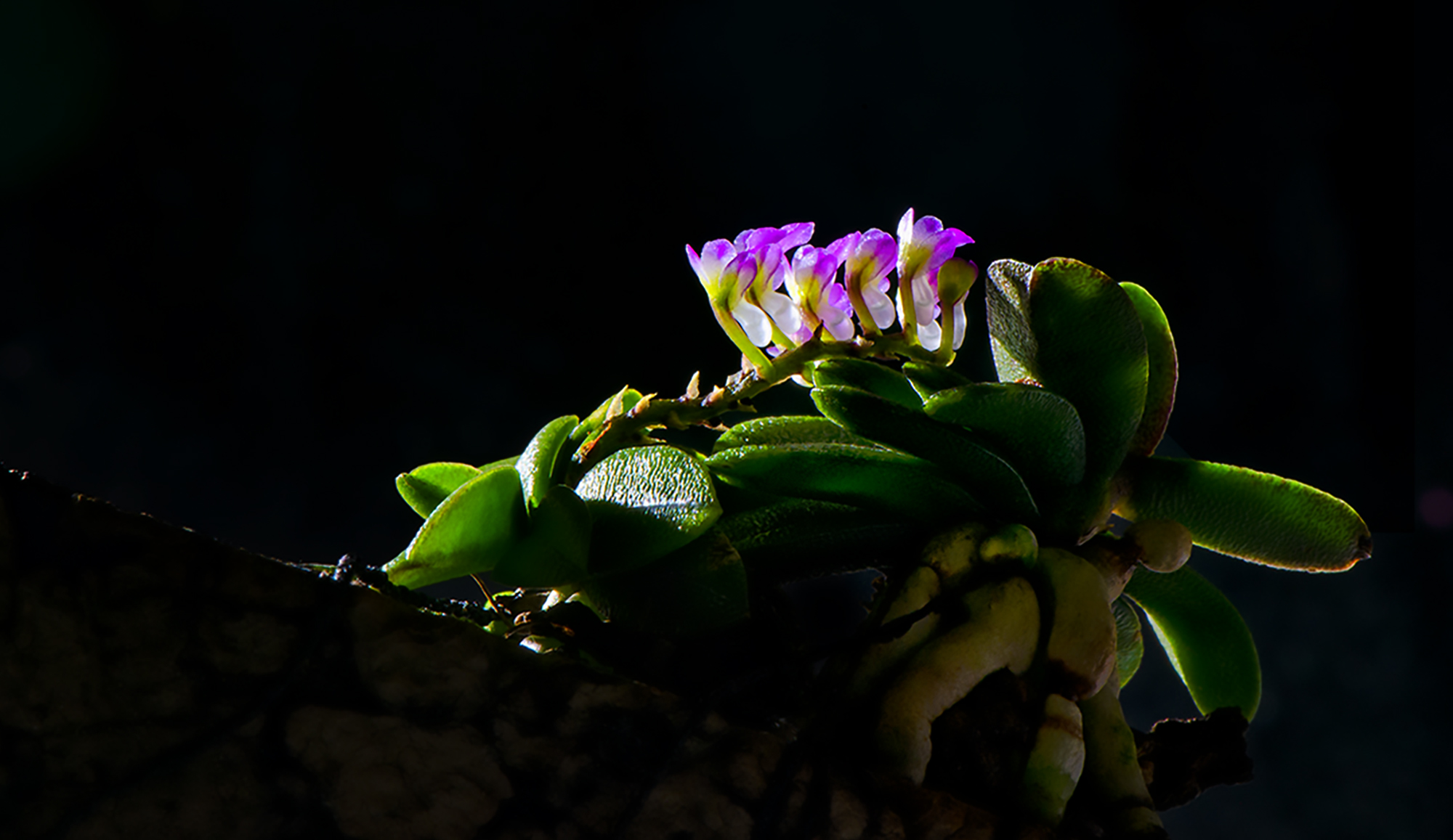
Hi Peter. Longwood Gardens is a special place where you can get lost in photography for hours. Although increasing the saturation was needed, I find the image to be too saturated. I agree that a full leaf anchors the image. Your composition is well done and focus on the center of the flower is good. |
Oct 17th |
| 79 |
Oct 22 |
Comment |
This is a wonderful composite. With drop photography, there's an element of patience along with a steep learning curve, and of course the hundreds upon hundreds of images. The dancers are beautifully positioned as is the center star of the show. I'm not sure of the double exposure, although to take it out would diminish the "flow" of the dress (?) as she turns. Colors are great as is the background. I applaud your results. |
Oct 14th |
| 79 |
Oct 22 |
Reply |
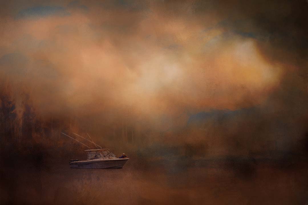
Thank you! Yes the reflection is absolutely what was needed. I've done maybe 2 composites before this - my usual mode is macro flowers so this is another world to me. The texture was free from Jai Johnson and it was time consuming getting the boat to look natural. |
Oct 14th |
5 comments - 2 replies for Group 79
|
16 comments - 8 replies Total
|