|
| Group |
Round |
C/R |
Comment |
Date |
Image |
| 6 |
Aug 22 |
Reply |
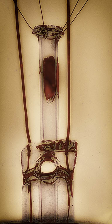
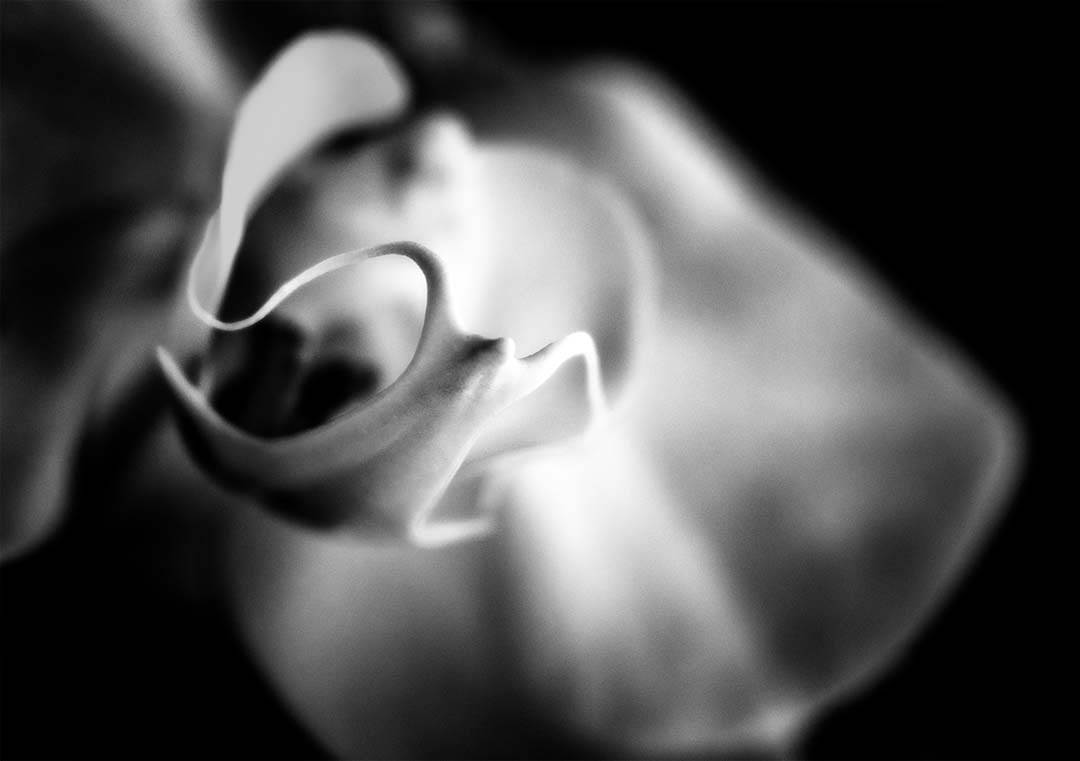
The technique for using the Lensbaby is quite different. I too am big on using a tripod for my photography so hand held can be challenging, but necessary for Lensbaby. It's true that the wind doesn't seem to be as much of a factor and once you hit your focus spot, it may even help with the blurred edges. While I still feel the "pull" of a tack sharp image from front to back, I'm happy with the Lensbaby as it's challenged me to expand into something different. |
Aug 22nd |
| 6 |
Aug 22 |
Reply |
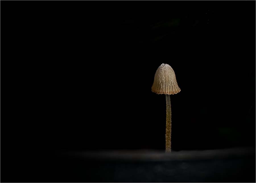
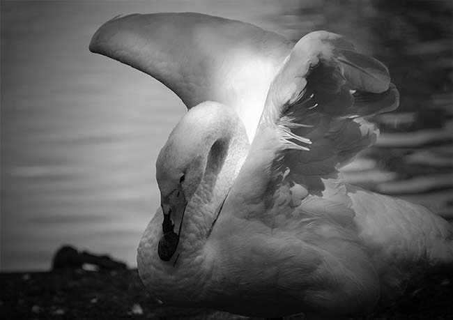
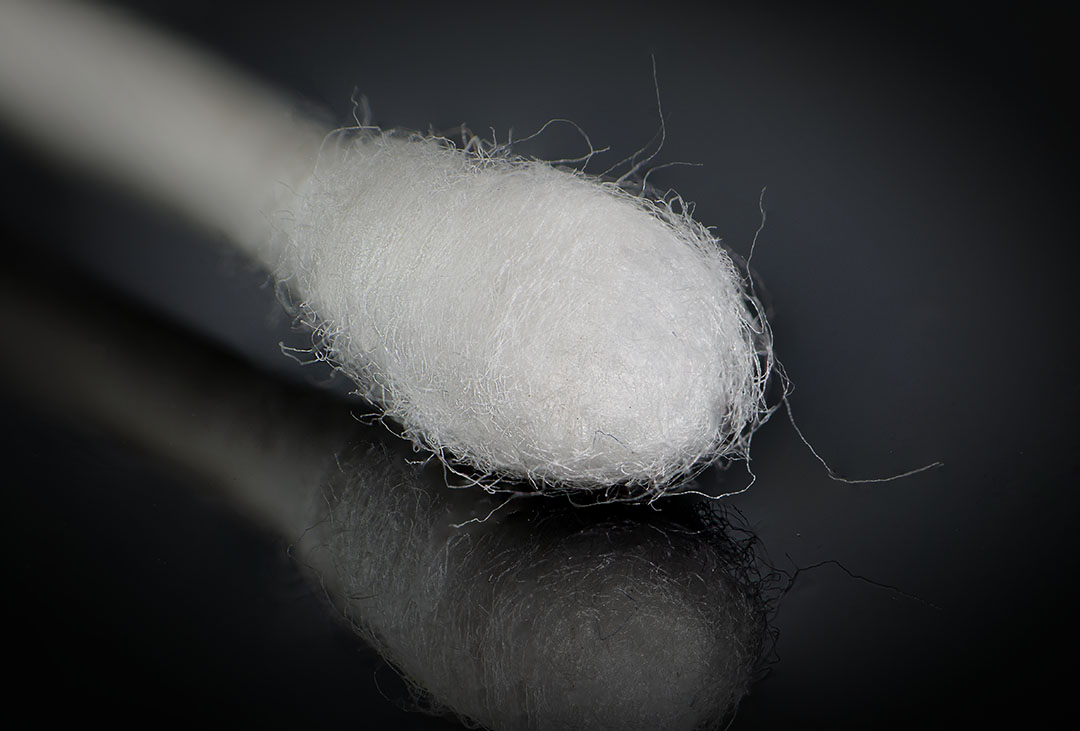
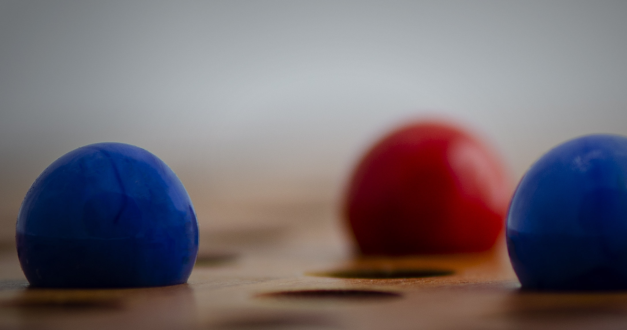
I almost always shoot with an ISO between 125 and 400. For this image I was at 200. Aperture was f/4, and shutter speed 250. With the lensbaby, I keep my settings on the camera the same, but change the aperture on the lens. That way I can remember the settings since we don't get the metadata. I found that if I can't get the "right" spot in focus, I move closer, then farther away, until I get the spot I want. Not very scientific, but it seem to work. |
Aug 18th |
| 6 |
Aug 22 |
Comment |
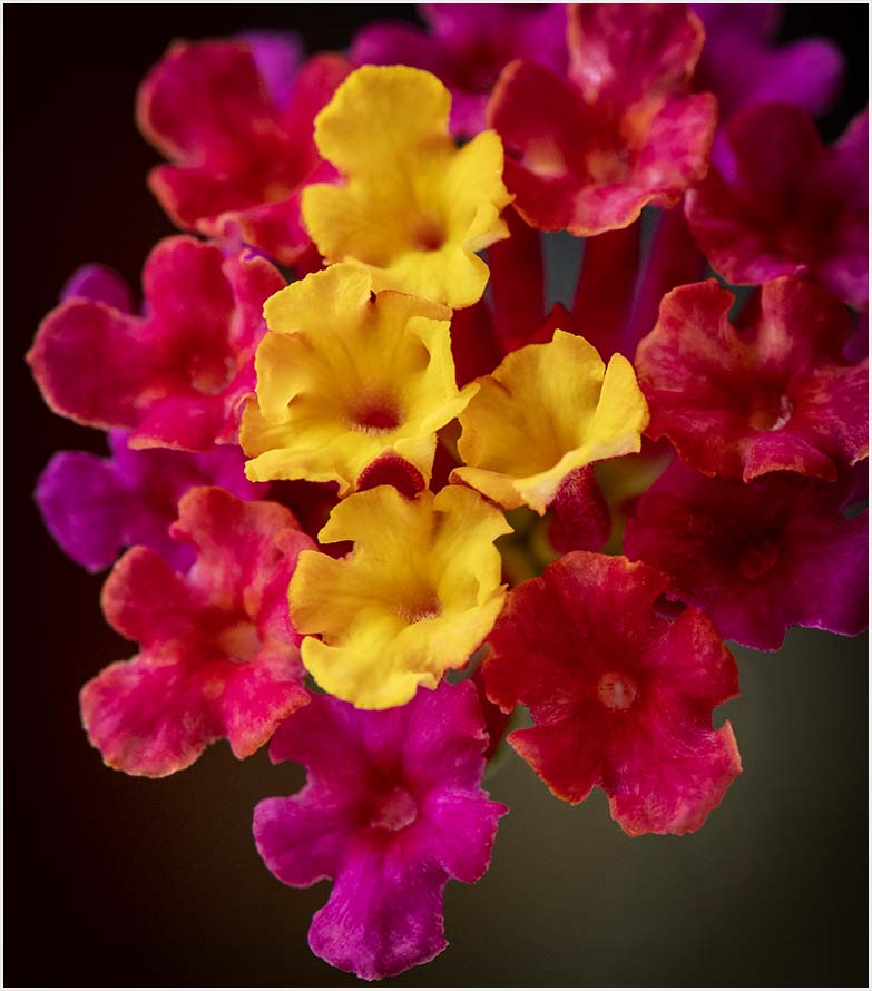
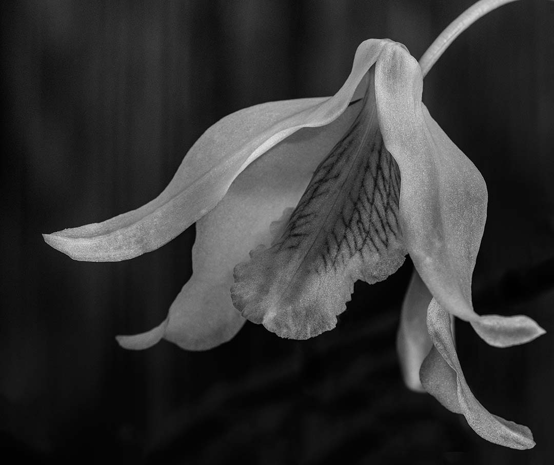
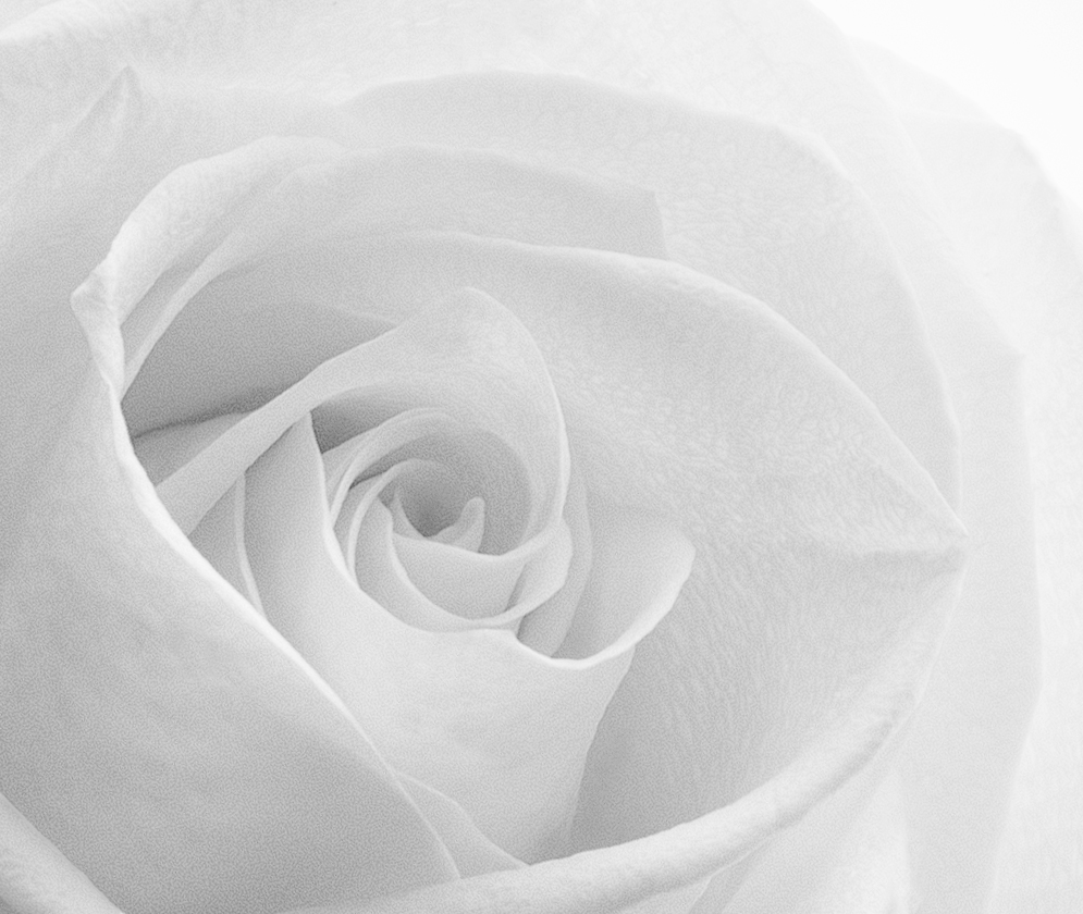
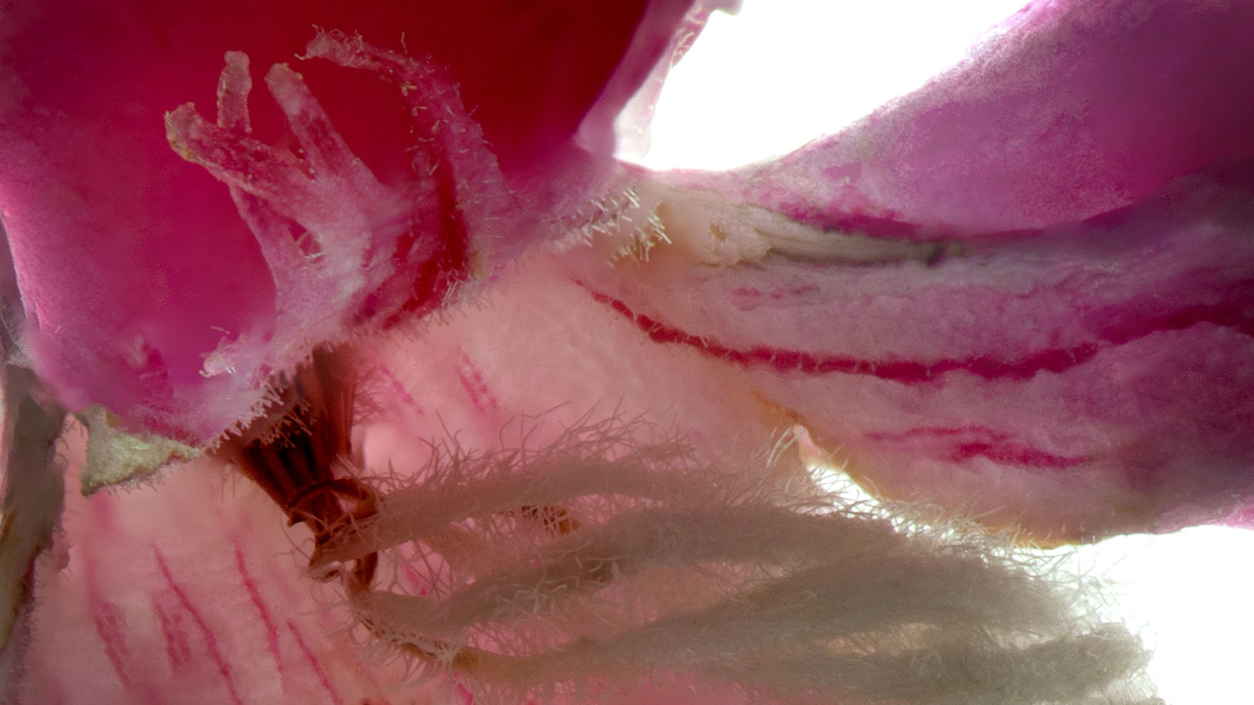
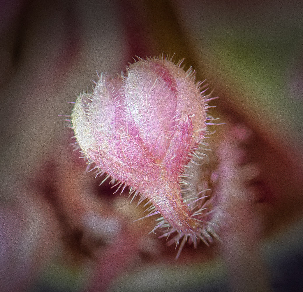
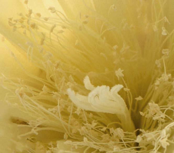
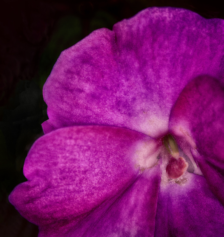
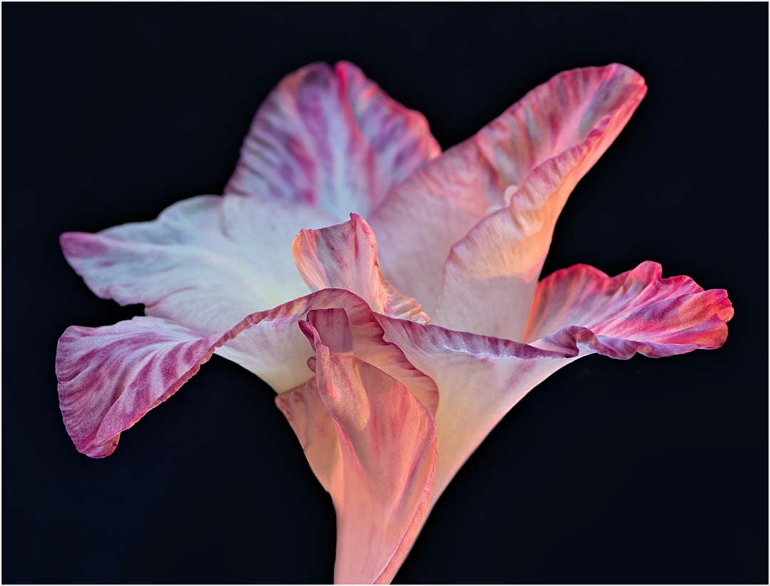
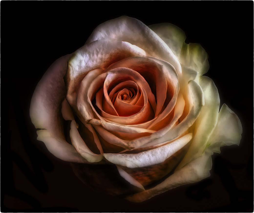
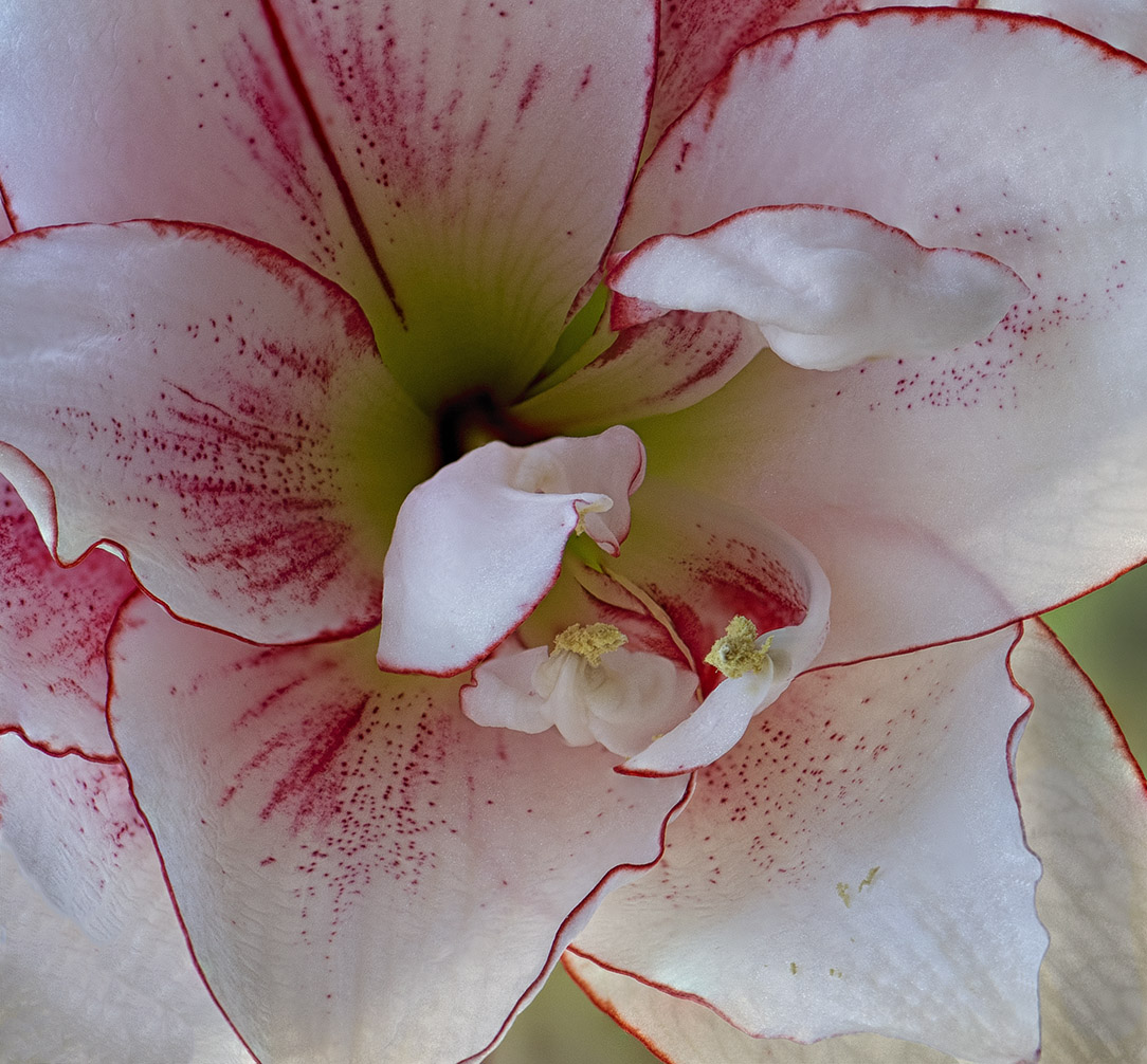
This is a nice shot. I too have the Sol45, but have used the lenbaby85 more frequently. The softness of your image is soothing and pleasant. I might like a little more room on the top right, but that's a minor observation. If this image were mine, I would probably add a bit more color even if were only to the inner portion of the petals. The diagonal composition suits the rose well. |
Aug 16th |
| 6 |
Aug 22 |
Comment |
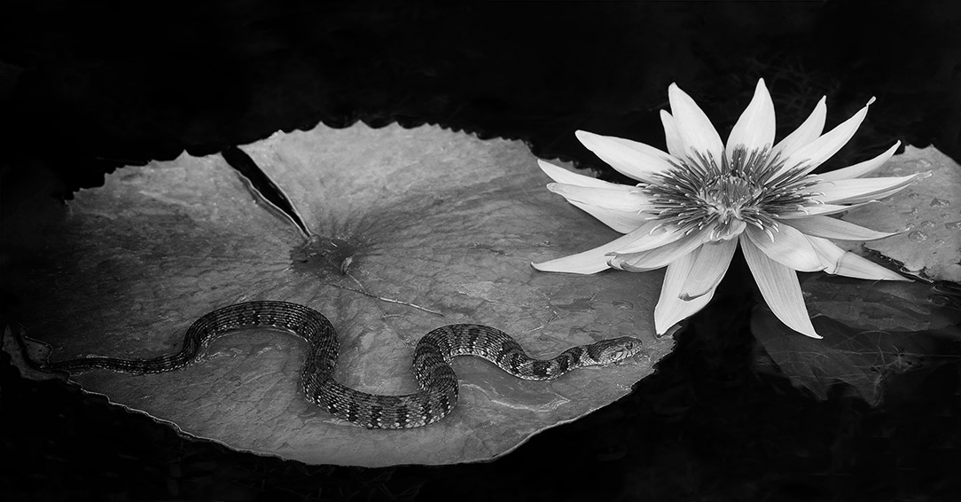
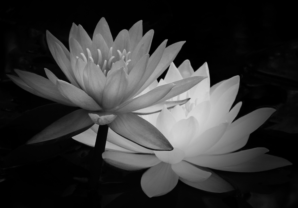
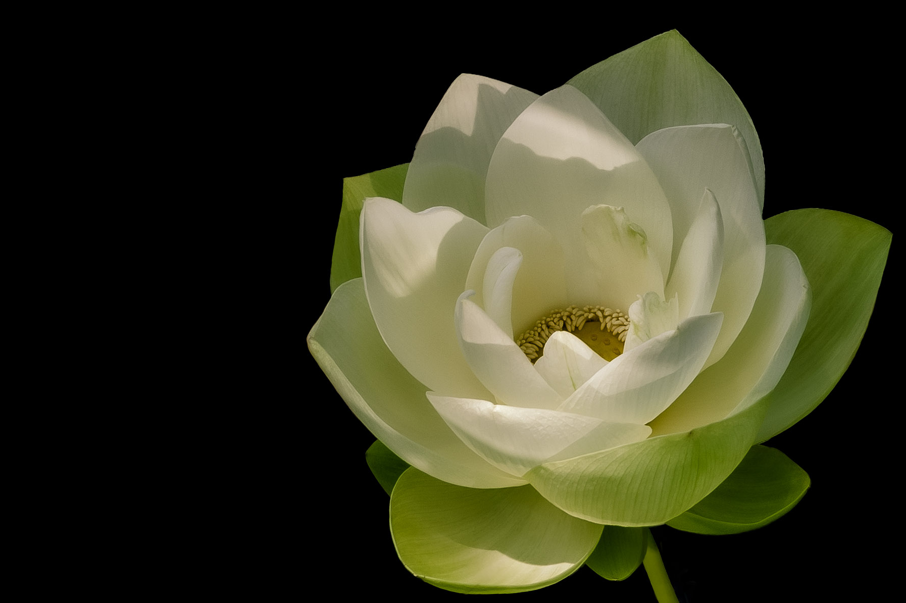
Hi Barbara. This is a beautiful waterlily. We have a waterlily festival every year here in Florida and it's always a challenge to get them looking their best. The black background is perfect for this lovely pink flower. If this were my image, I would probably push back the black on the tip of the top leaf. The other thing I would do is to crop the bottom and left side just a bit to remove some of the green leaf as I find it distracting. Congratulations on a great composition and beautifully sharp image! |
Aug 16th |
| 6 |
Aug 22 |
Reply |
I shoot Nikon as well. Do you find the 200 is more versatile? |
Aug 16th |
| 6 |
Aug 22 |
Comment |
This is a nice image and I enjoy the different tones in the color scheme. Your composition is well done. I do think the harshness of the light lends itself to creating hot spots, but they aren't enough to cause significant distraction. Nice shot. |
Aug 16th |
| 6 |
Aug 22 |
Comment |
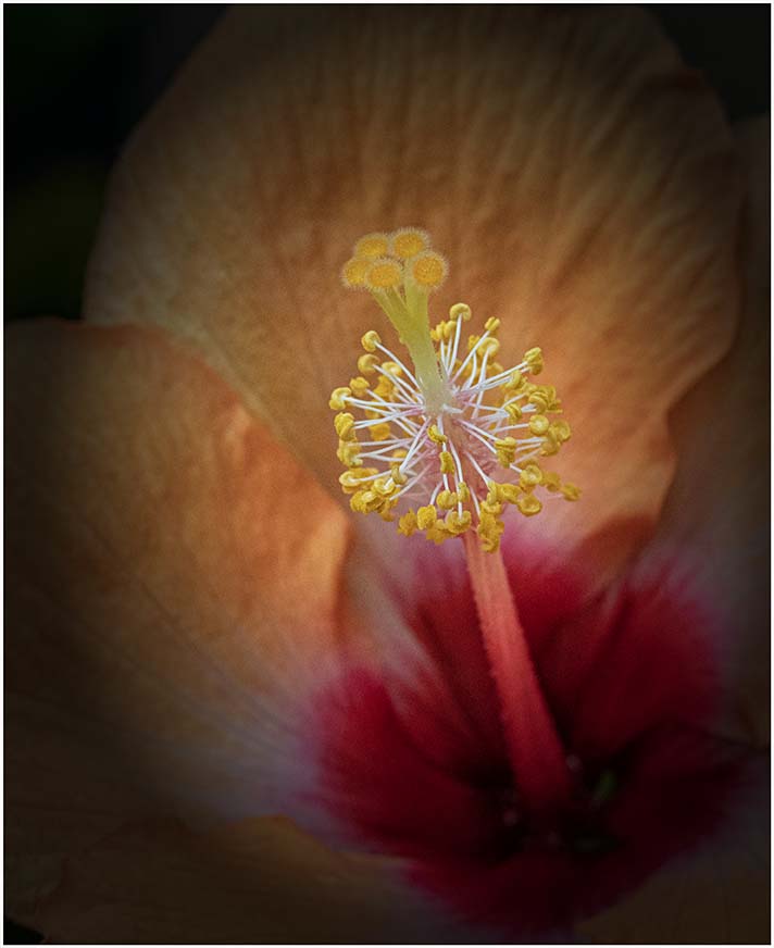
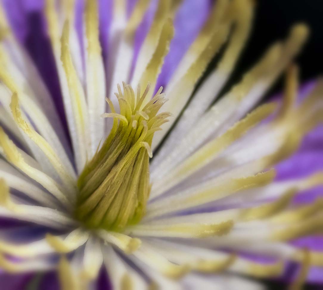
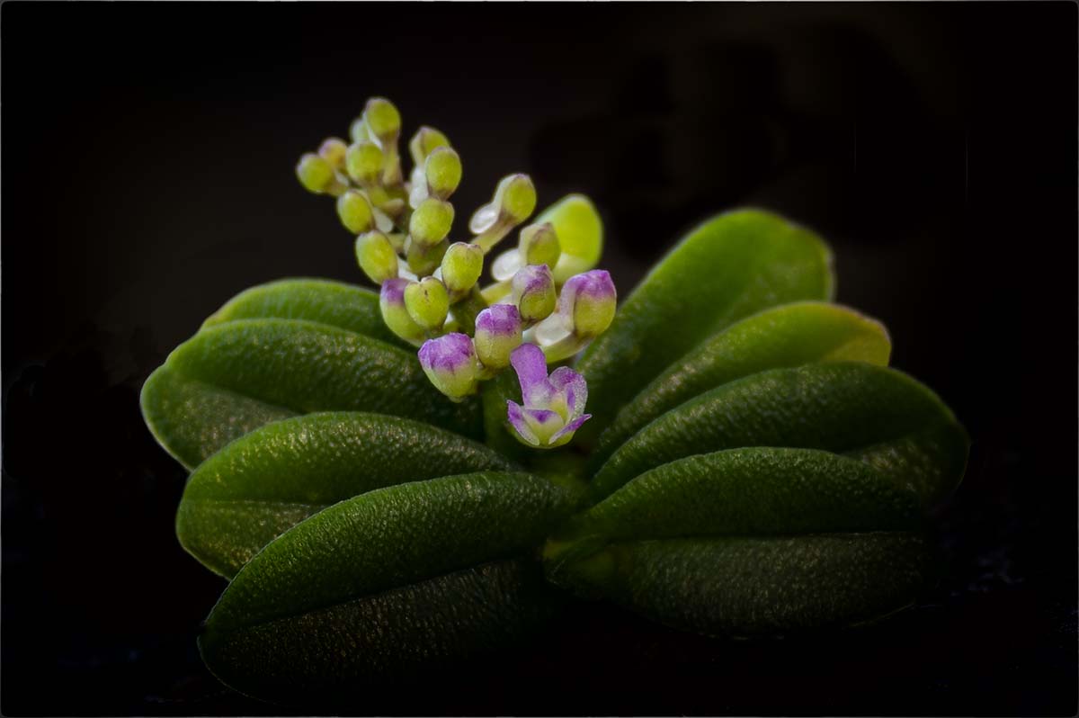
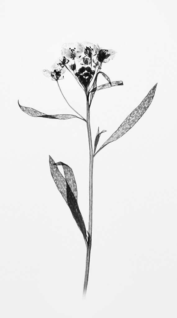
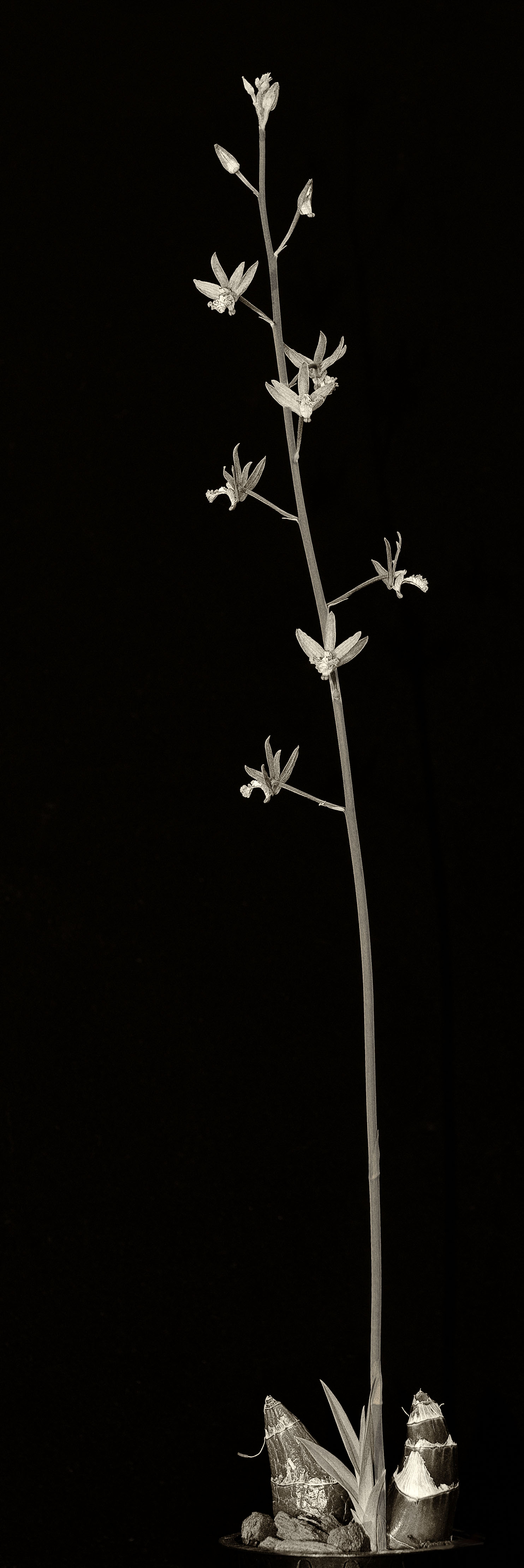
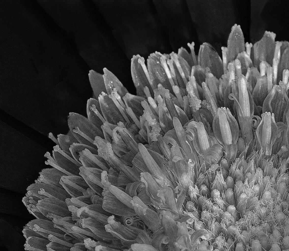
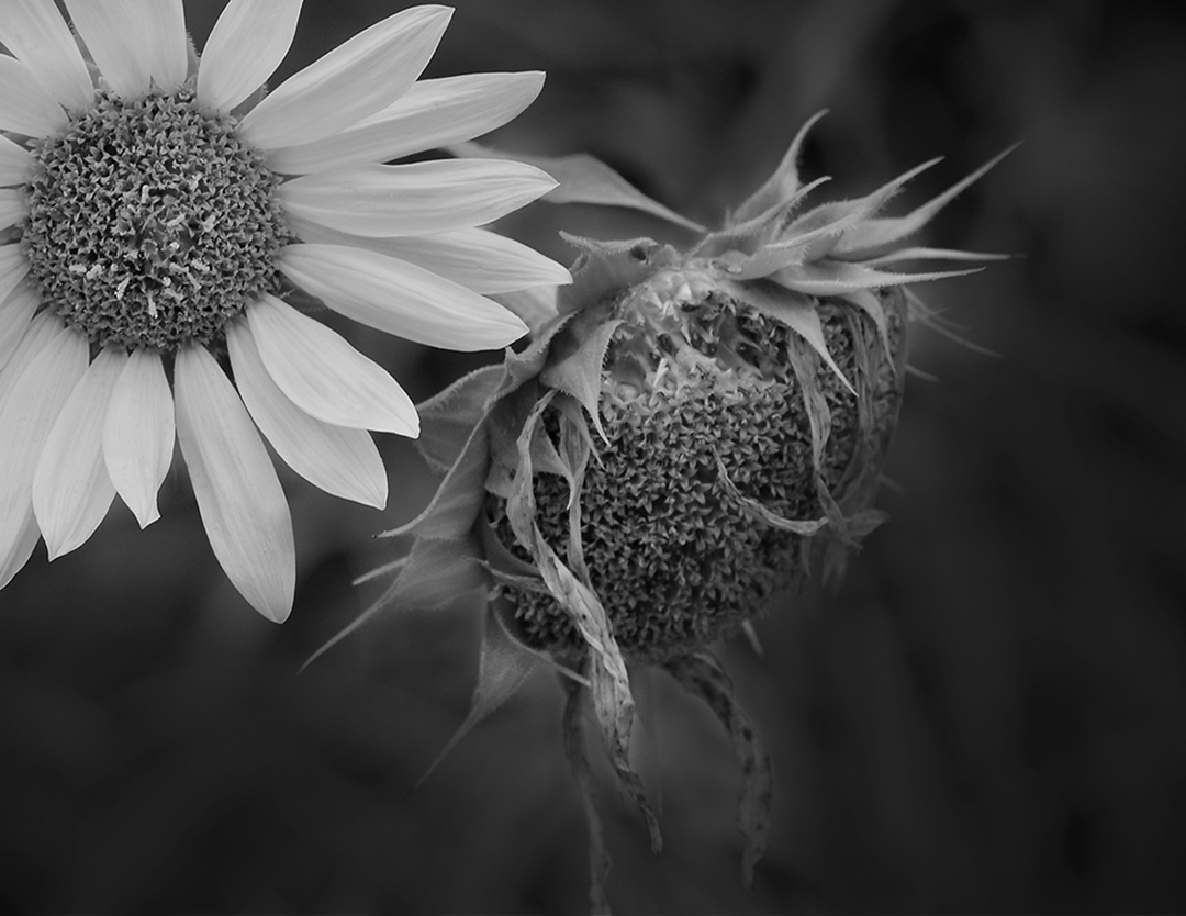
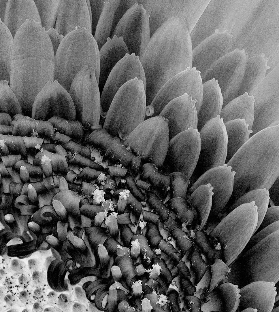
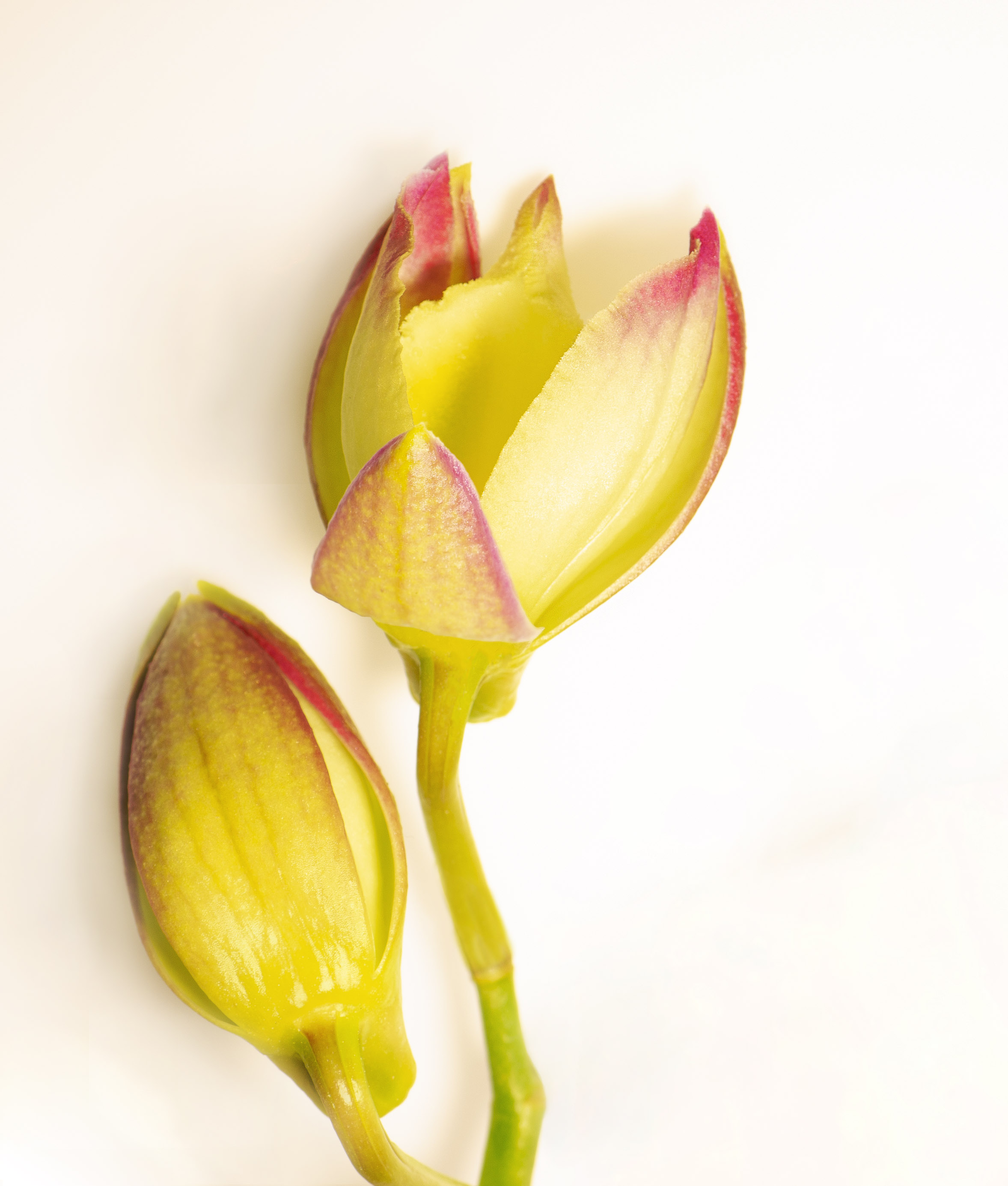
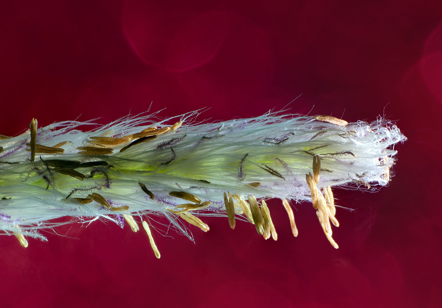
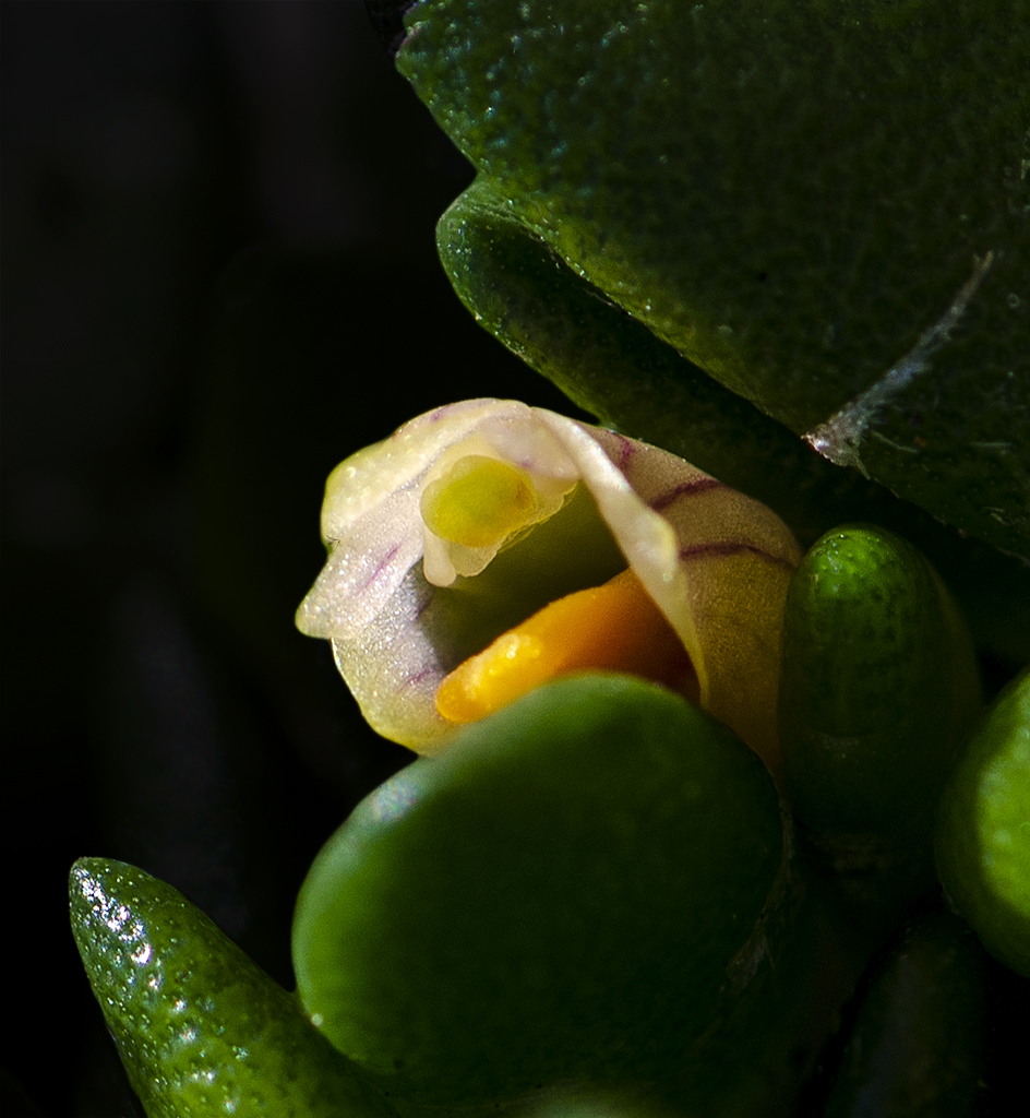
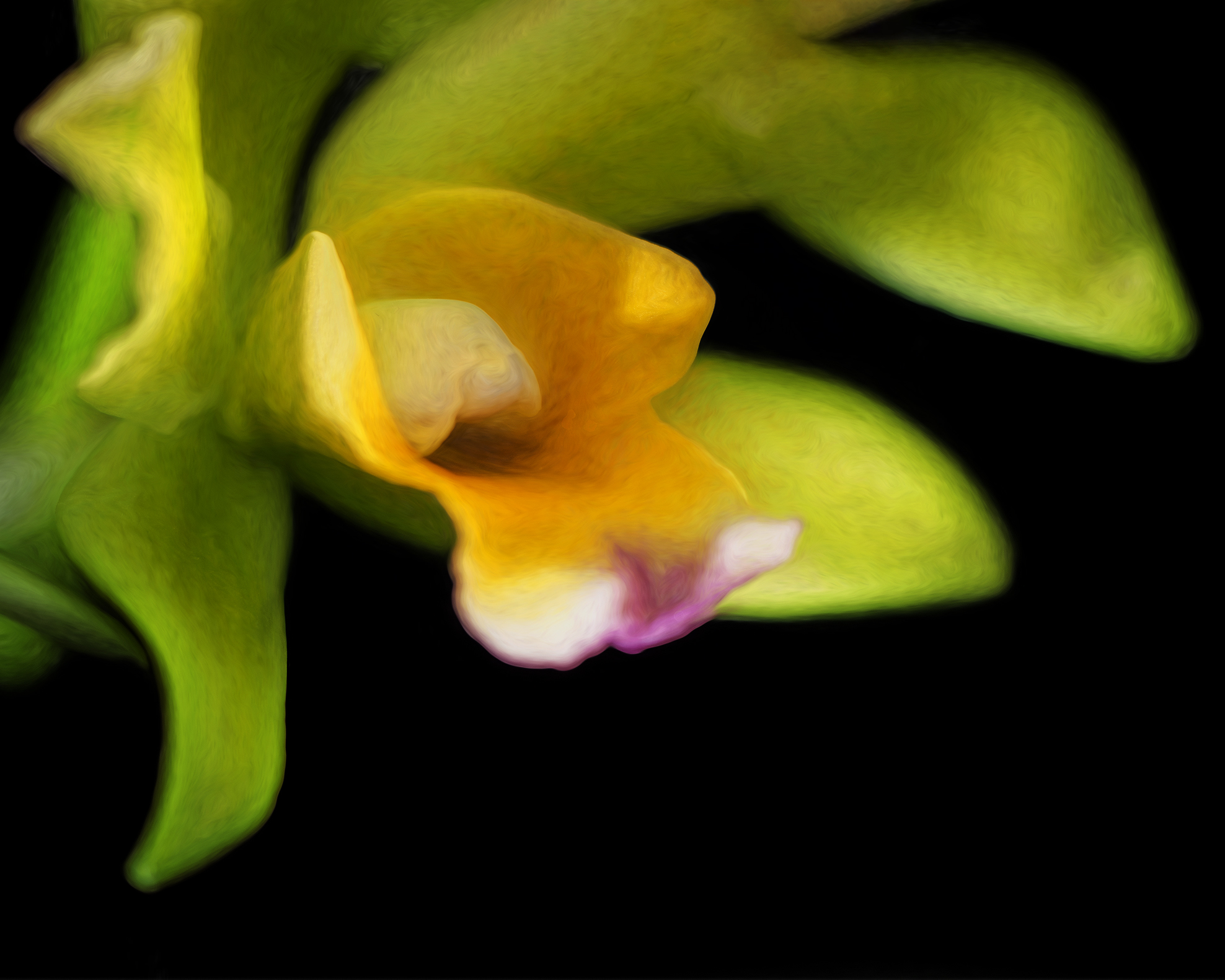
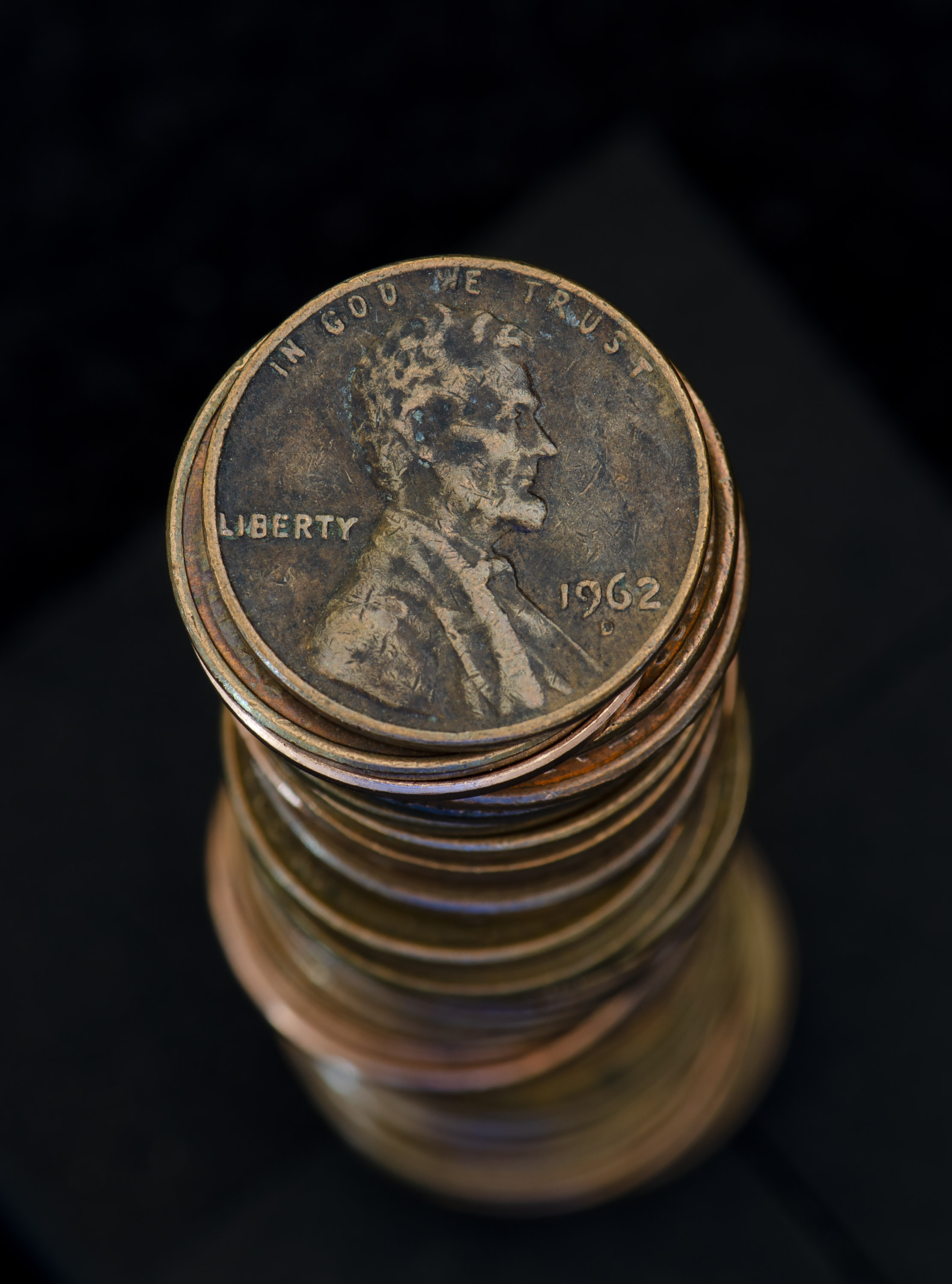
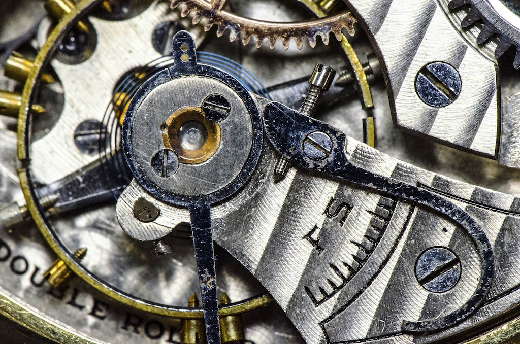
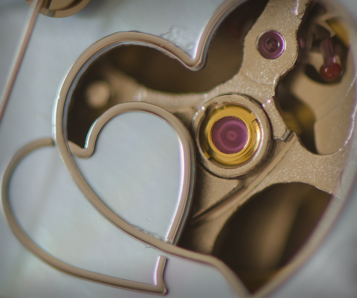
The background here is perfect in showcasing the flower. I think the bilobed stigma really enhance the image because of the color, but also because of their rounded shape. The straight lines of the petals, the roundness of the stigma, within an overall triangular flower shape. Nicely done! I was going to ask you if you had photo stacked the image, but then I saw f/32. You are using the Nikon 105?
|
Aug 16th |
| 6 |
Aug 22 |
Reply |
Thank you Barbara. Just as I'm about to give up on the lensbaby, I get a good shot. Perseverance....
|
Aug 15th |
| 6 |
Aug 22 |
Reply |
Thank you! |
Aug 15th |
4 comments - 5 replies for Group 6
|
| 24 |
Aug 22 |
Reply |
Thanks Lance! |
Aug 15th |
| 24 |
Aug 22 |
Comment |
This is a very nice image. Well thought out and unique. I like that the light isn't coming straight from the corner. The minimalistic nature works really well and gives the image a serene feel. If it were mine I might remove the left lower flower as it pulls my eye away from the blossom a bit. Still, I find this to be really well done - great job! |
Aug 10th |
| 24 |
Aug 22 |
Comment |
This is really nicely done. The position of the poppy is unusual and gives the image a unique look. The way you captured the light on the petal ruffles creates s sense of delicate transparency. The white spot at the base of the sepals brings the eye up. Really nicely done! |
Aug 9th |
| 24 |
Aug 22 |
Reply |
I agree that the background doesn't do anything to enhance then flower. I really like the texture and what you created, although I wonder if it might be too bright. Of course I'm not much of a risk taker on backgrounds. |
Aug 9th |
2 comments - 2 replies for Group 24
|
| 32 |
Aug 22 |
Comment |
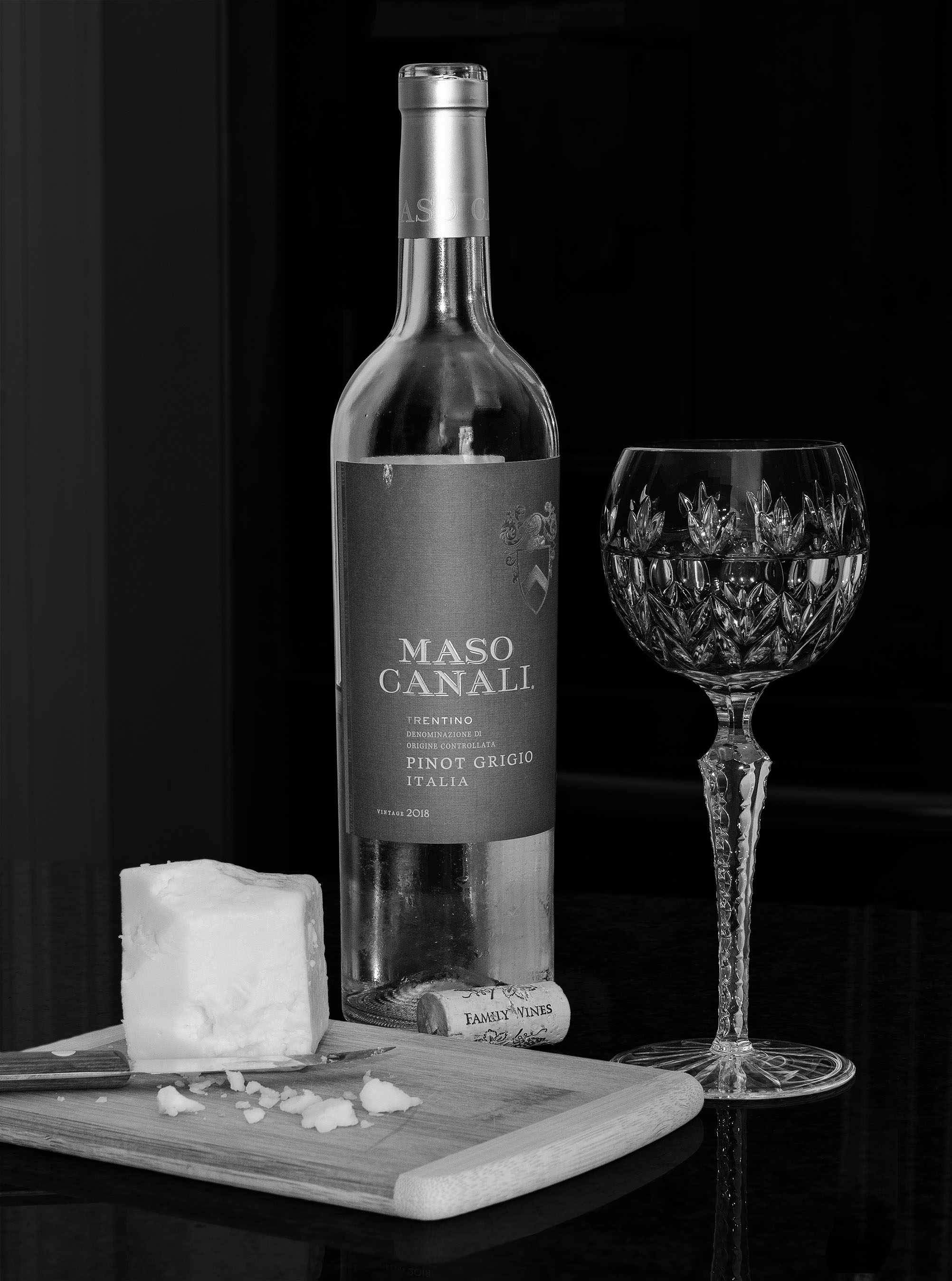
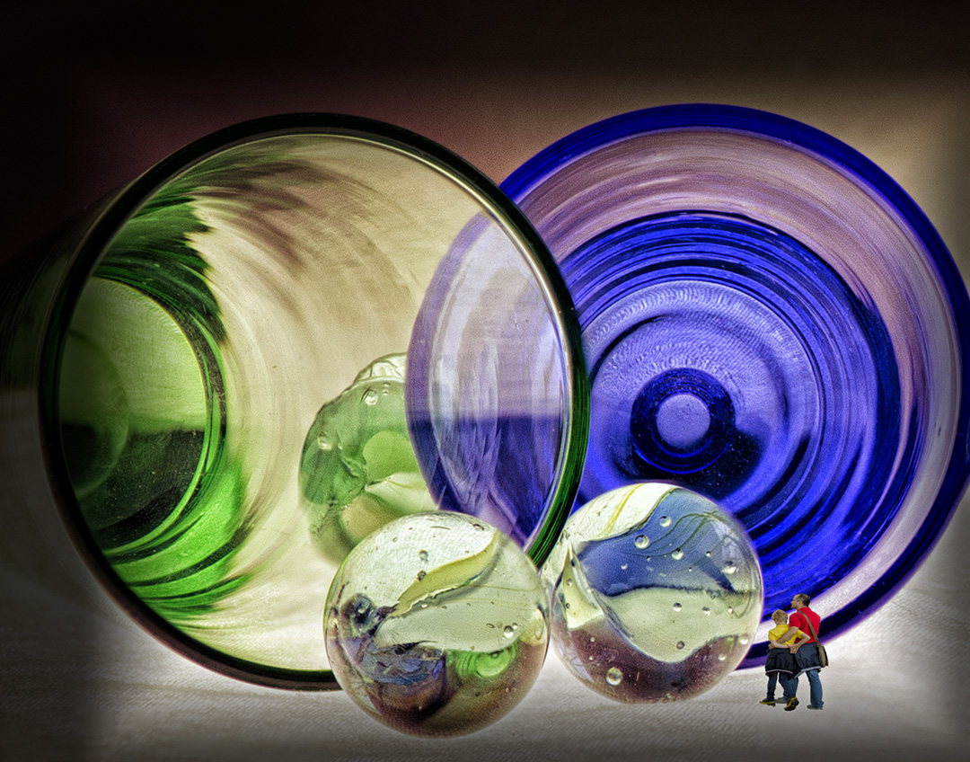
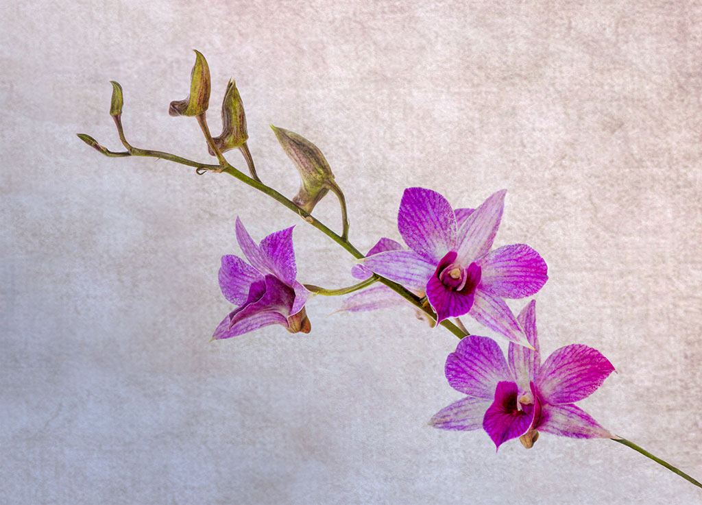
The glass vase is lovely. I agree with the comments about the edge of the table being distracting so I would crop out or darken that area. The orchids seem to be a little soft and bright forcing my focus to the vase.
I too grow orchids so I do know how some can be real divas. Others bloom consistently with little fuss. |
Aug 16th |
| 32 |
Aug 22 |
Comment |
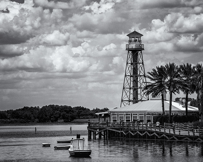
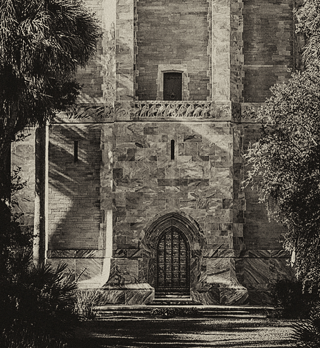
I do like this shot in monochrome. It's hard to imagine the architecture here so I was glad you posted the outside of the tower. The image itself is a bit crooked, but I could tell there was a window. As Diana mentions, the texture of the walls is very well captured. The clouds add a nice component. |
Aug 16th |
| 32 |
Aug 22 |
Comment |
I think the image only cropping out the baby strollers is strong as it provides a sense of place and tells a story of solidarity. The presented image depicts the agreement of a sentiment that resonates without barriers of gender, race or age, so perhaps it tells a slightly different story. Monochrome is the better choice here in my opinion. |
Aug 16th |
| 32 |
Aug 22 |
Comment |
I like the six eyes as well, but the backpack between the man's legs bothers me. The only way I can imagine getting rid of the bag would be to use content-aware-fill in photoshop, then make some local adjustments. I'm not even sure that would work well. The fence in the background seems to coordinate with a multitude of time periods so I actually like it, and your choice of sepia is good. It's an interesting image that keeps the eye entertained. |
Aug 16th |
| 32 |
Aug 22 |
Reply |
It was a fun outing. |
Aug 16th |
| 32 |
Aug 22 |
Reply |
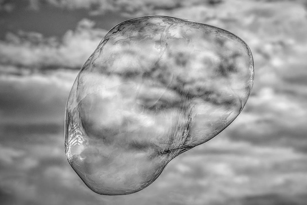
MoMA is The Museum of Modern Art on West 53rd in Manhattan NY. My bubble would be much too cliche... |
Aug 16th |
| 32 |
Aug 22 |
Comment |
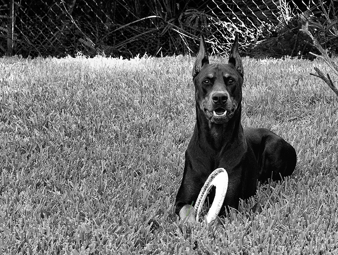
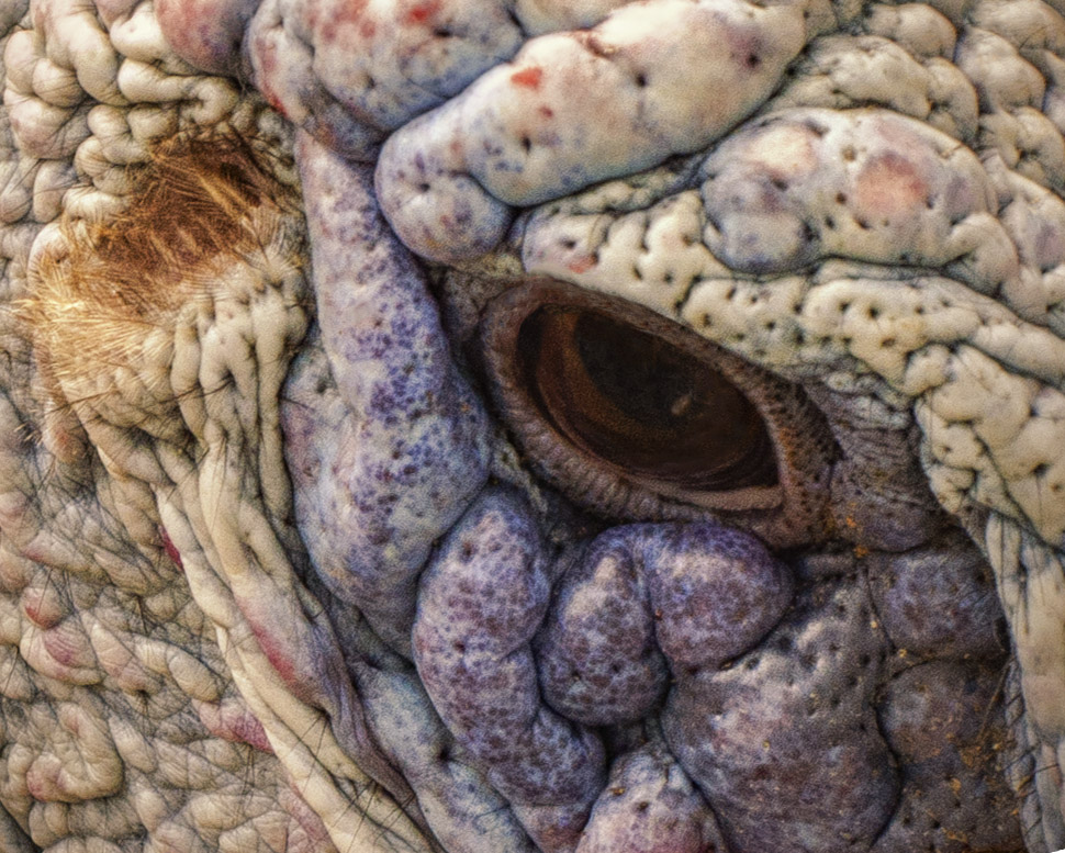
This is a good image of a dog. I find they're very difficult to photograph even when they're your own. I agree with the suggestion to lighten the ear, but I do like the black and white version as much if not more than that in color. As an avid dog fan and owner of 3, the essence of a dog is who they are rather than their breed. This image brings forth Murphy's personality as at least we humans would perhaps interpret it. He looks fidgety and impatient with the whole process, but Murphy "allowed" you this image. The sharpness of the fur, eyes and ears are well done and IN like how you captured his slightly rounded shape. Nicely done! |
Aug 15th |
| 32 |
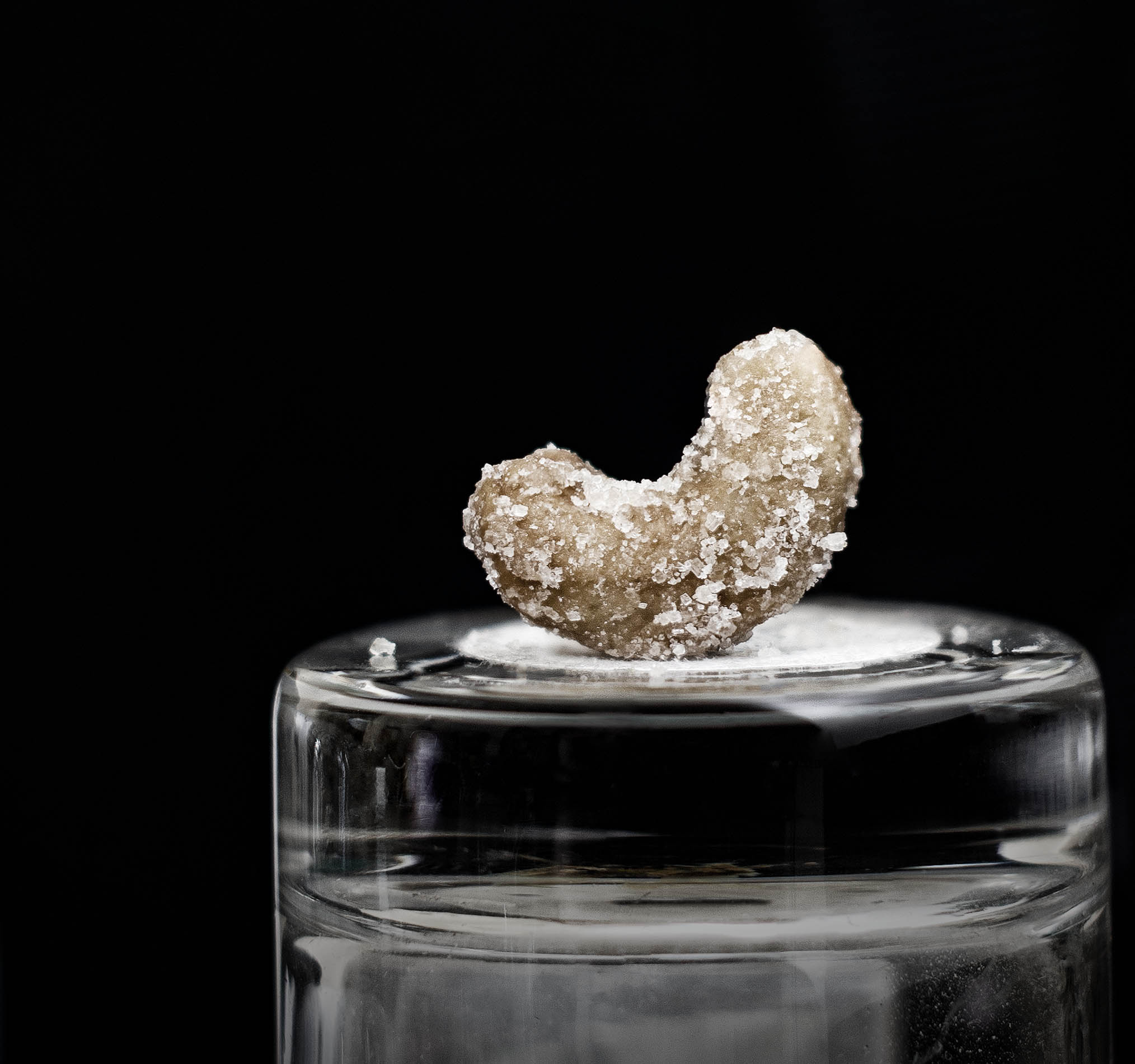
Aug 22 |
Reply |
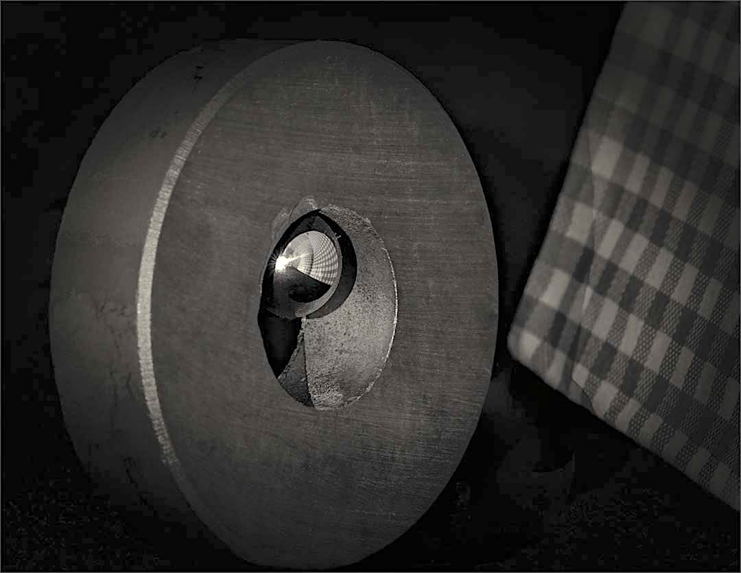
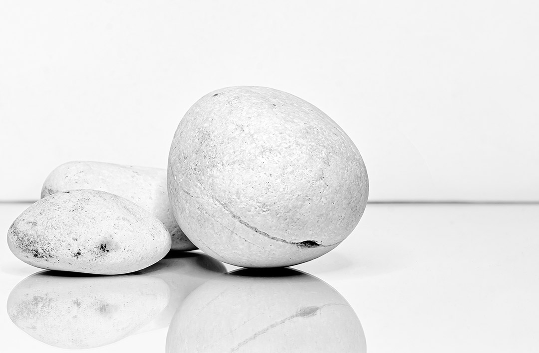
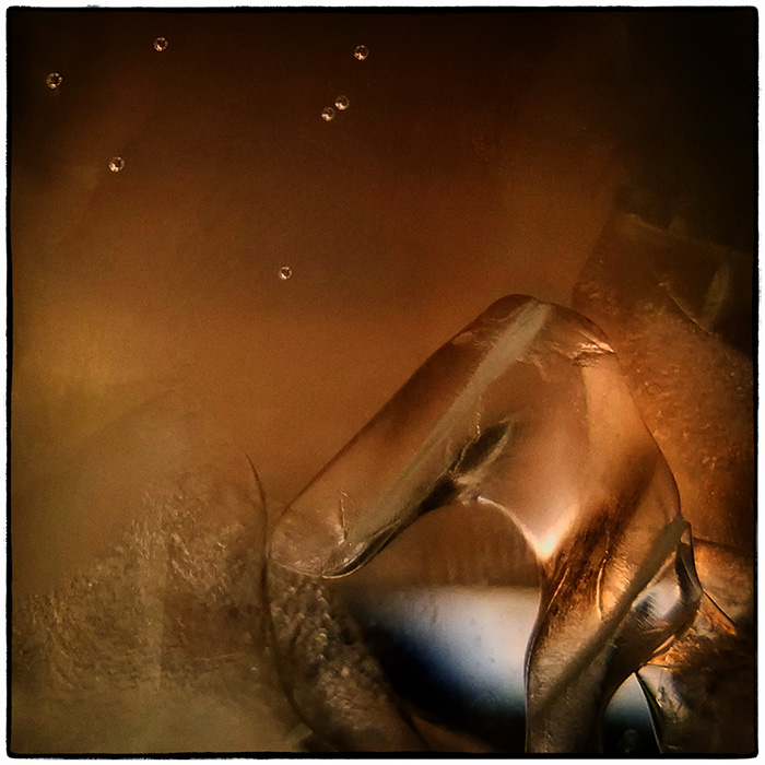
Ha! It does look like a potato. I thought it might be interesting to use in a composite at some point. It was so odd in mono that I felt compelled to send it in for comment. |
Aug 7th |
5 comments - 3 replies for Group 32
|
| 79 |
Aug 22 |
Comment |
This image brings my thoughts to hands reaching to up to heaven with the hand of heaven reaching down to offer help and sustenance. If it were my image, I would think about placing the arm with the tomatoes in the center as Karl has done and ensure all the arms were in the same tonal range, but leave the image vertical. The tomatoes are great - in many cultures the tomato is representative of good luck, love and fertility. This is a very creative piece. Really well done. |
Aug 28th |
| 79 |
Aug 22 |
Comment |
I love the reflections and I do see the snake being challenged by the spears of the enemy. The lower right doesn't hold a lot of interest; maybe cropping off some of the bottom of the image would be better. Overall, the colors are great and the way the water moves brings a very dynamic feel tot he image. |
Aug 28th |
| 79 |
Aug 22 |
Comment |
This is quite an interesting image. At first glance, it appeared to me to be an empty olympic sized pool, but then moving outward, I really had to look around and change my perspective. An aerial view of a construction site perhaps? I like the off-center composition, the color and the overall presentation. I do agree with the comments regarding the cloth on the left. Nice job. |
Aug 28th |
| 79 |
Aug 22 |
Comment |
This is an amazing image. Your composite work is so well done. The incense is the perfect piece that adds the element of time slipping away. I don't mind the background as is, but I would consider dressing up the table a bit as Gerald suggests. Congratulations on a great image. |
Aug 28th |
| 79 |
Aug 22 |
Comment |
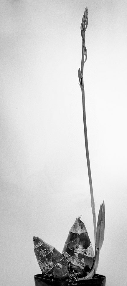
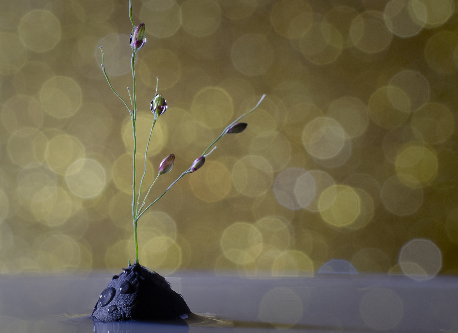
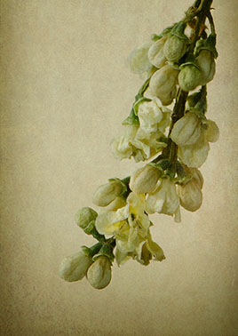
Hi Judith. This is an interesting portrayal of an obviously sturdy plant. I too like the minimalistic nature, but not too much a fan of the yellowish tone. The texture captured is very nicely done and I think the horizontal flip is fine. |
Aug 28th |
5 comments - 0 replies for Group 79
|
16 comments - 10 replies Total
|