|
| Group |
Round |
C/R |
Comment |
Date |
Image |
| 32 |
Nov 21 |
Reply |
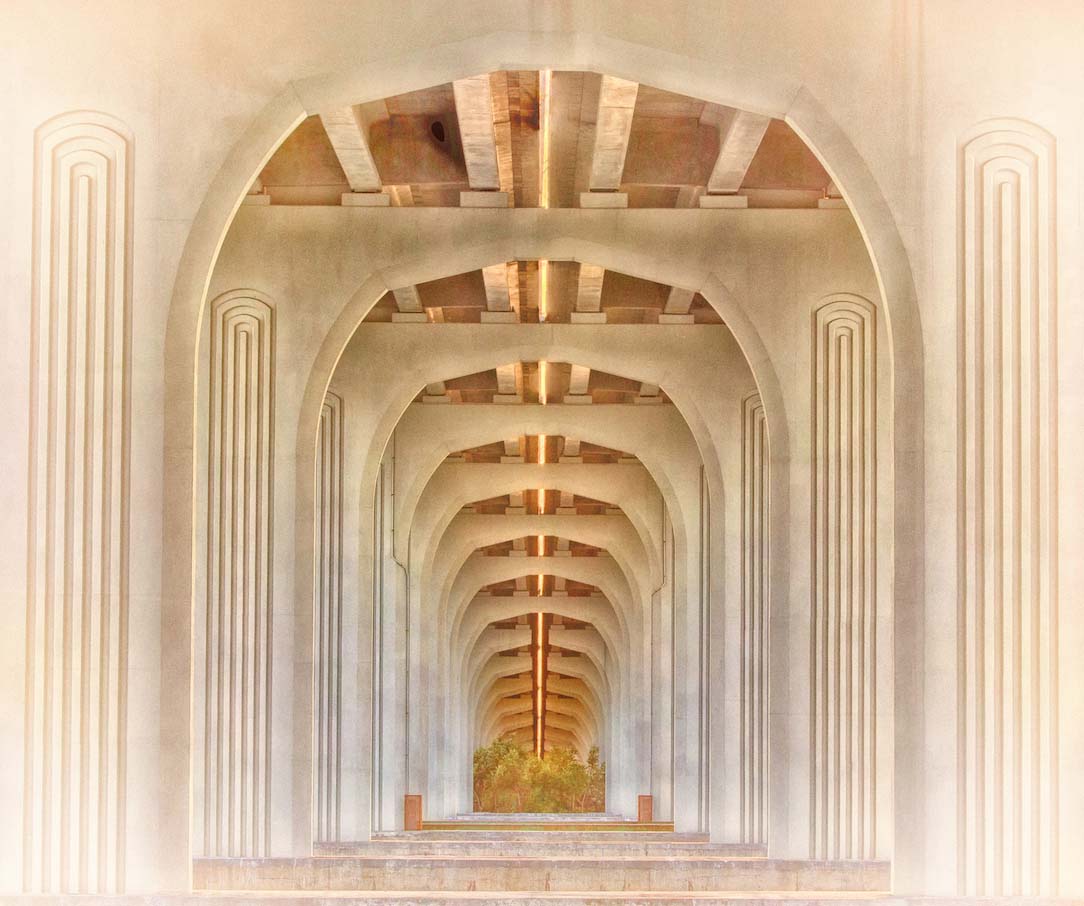
Oh I bet it is expensive real estate. Reminds me of several renovations in the parts of NJ that sit directly across from the NY skyline. Old factories being beautifully renovated sitting beside big developer's multimillion dollar condominiums with huge walls of windows in each. |
Nov 26th |
| 32 |
Nov 21 |
Reply |
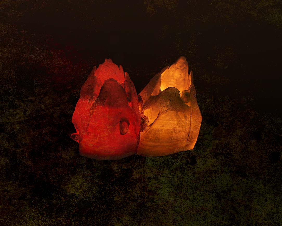
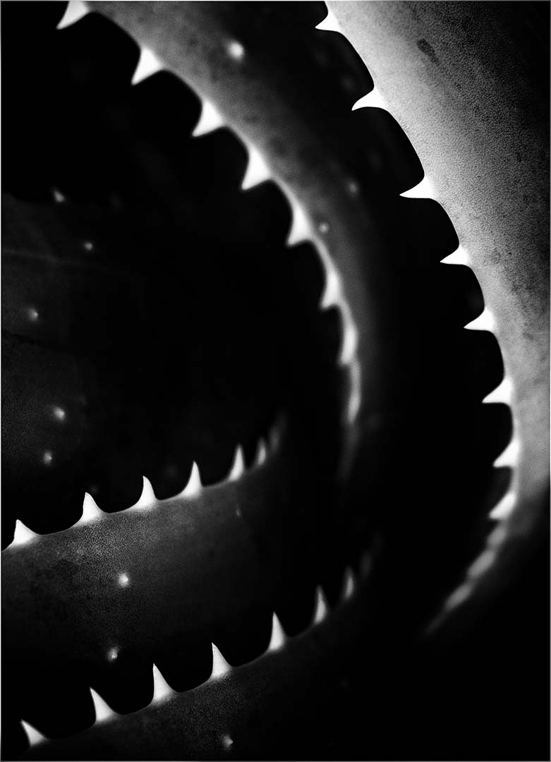
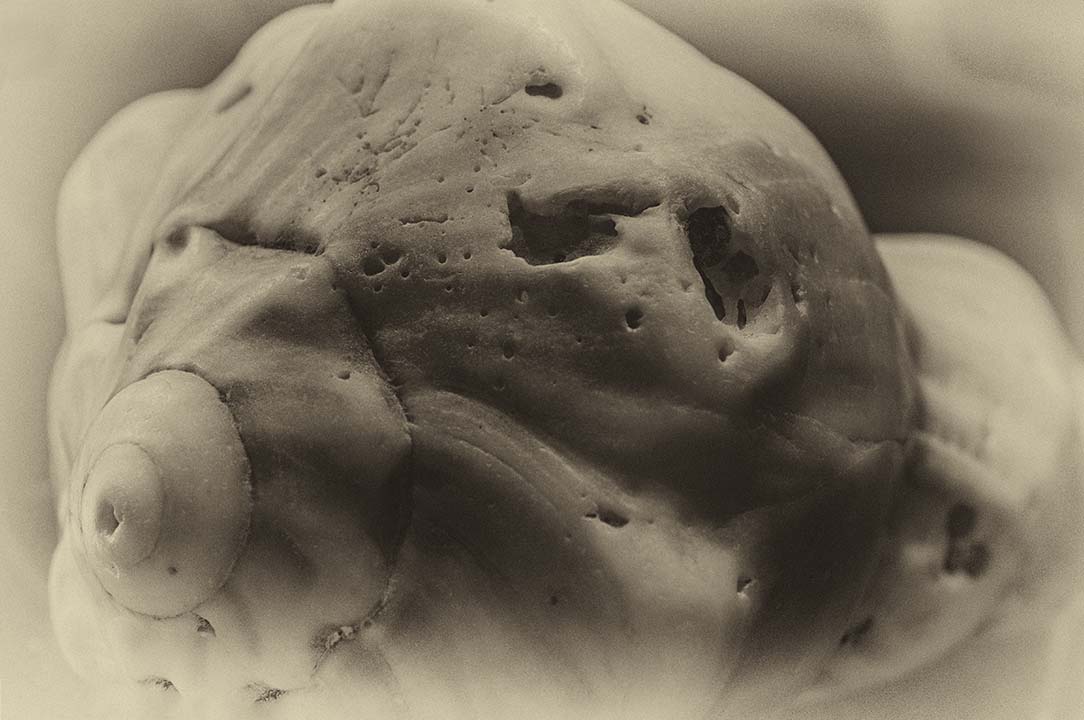
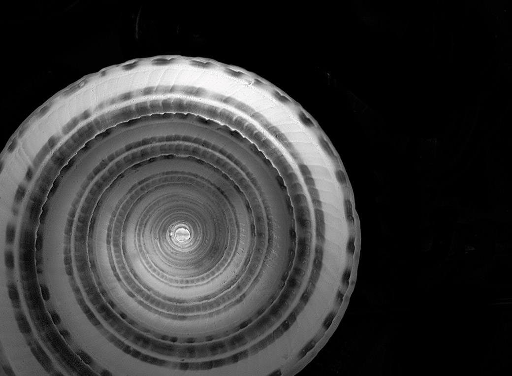
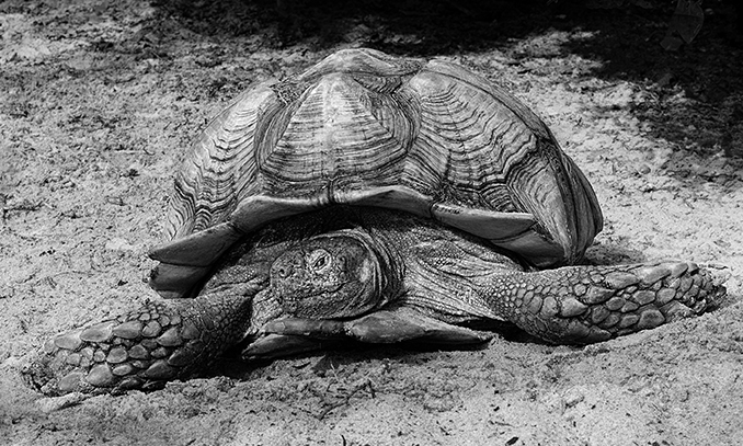
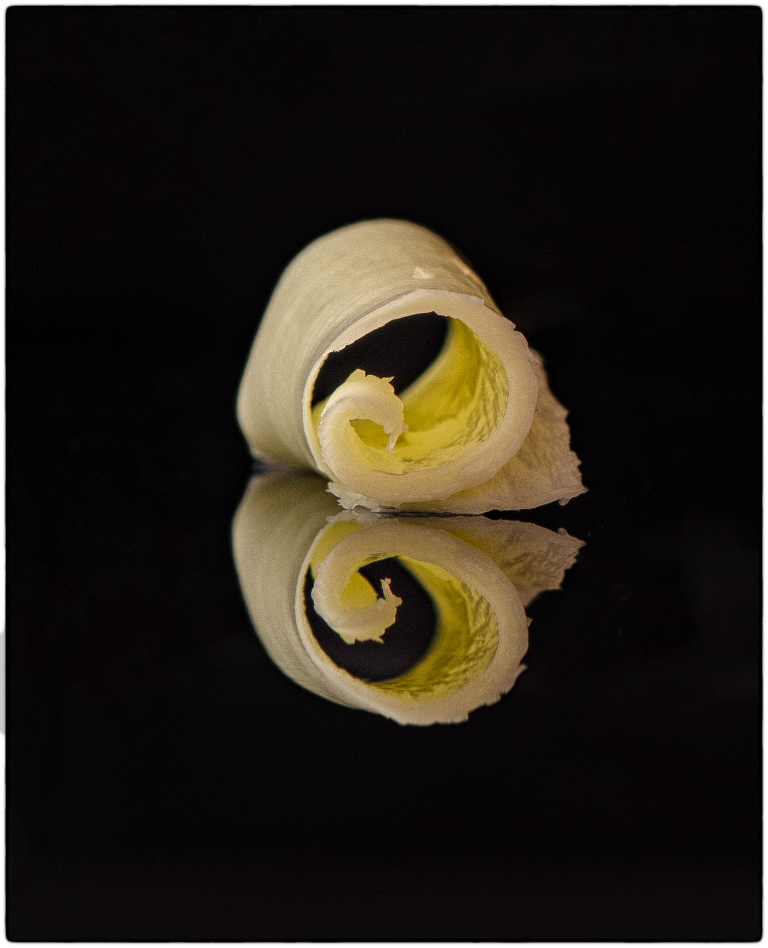
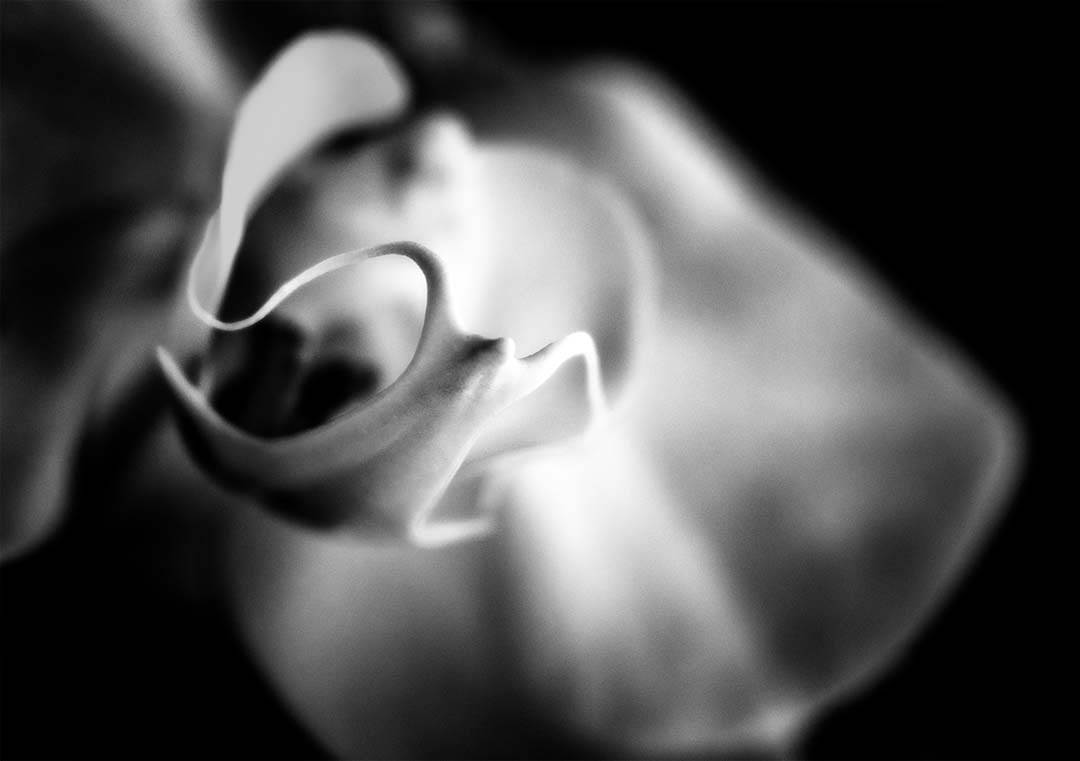
I did crop off the bottom because the shell abruptly stops in mid-circle. I tried it several ways but this rendition seemed to be the best. Admittedly I made an attempt to darken the top of the shell, but i was seeing too much grey. I could have played with the tonal ranges, but didn't know if this image was worth the time. |
Nov 26th |
| 32 |
Nov 21 |
Reply |
Yes the bottom of the shell gave the image a disjointed feel because it was uneven. I tried to add a thin white border, but the way I had processed the image didn't allow me to get it right. Don't know what I did of course so I couldn't correct it�� |
Nov 26th |
| 32 |
Nov 21 |
Comment |
This image is very disturbing to me. The new construction seems so out of place compared to the old factories and warehouses. I can see why some people are not in agreement with the renovations. To my eye it seems very busy and almost too much to process. I'll go out on a limb here and suggest cropping out the two buildings on the left as they seem overpowering to me. Just a thought. |
Nov 26th |
| 32 |
Nov 21 |
Comment |
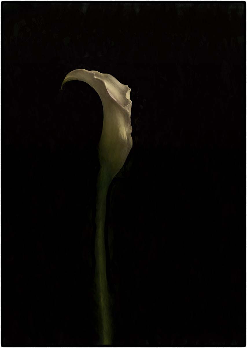
This is an image I would have taken as well. I agree that keeping the image darker adds to the feeling of mystery - the viewer asking what's inside and the story of the people that lived here when the house was alive. Some additional contrast would perhaps accentuate the foliage and texture of the old wood, but overall this is a good capture although somewhat sad. Seems as though this was a grand house at one time long ago. |
Nov 26th |
| 32 |
Nov 21 |
Comment |
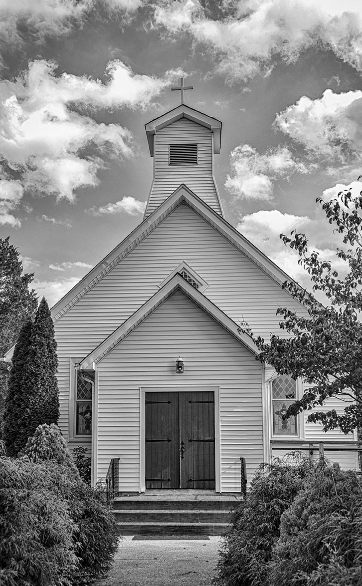
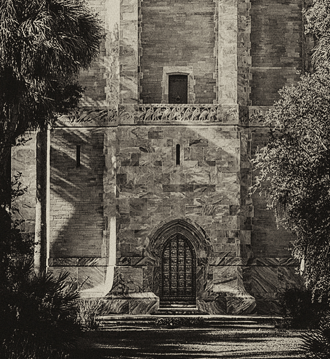
This is a very nice image. Composition is great, and I too like the framing of the leaves at the top. I find the sky too stark so I would be tempted to try and add some gentle cloud wisps. The steeple is amazing and indeed high. |
Nov 26th |
| 32 |
Nov 21 |
Comment |
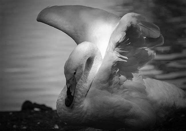
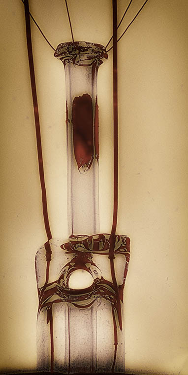
This is a moving image that has high impact. I agree with the above comments that there's some excess noise in the image and the bird is a bit distracting. Overall though, the amount of little white flags combined with your chosen angle provides a perspective that is very thought provoking. |
Nov 26th |
| 32 |
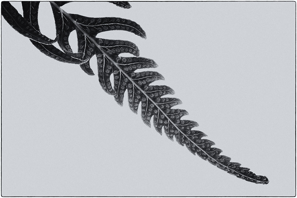
Nov 21 |
Comment |
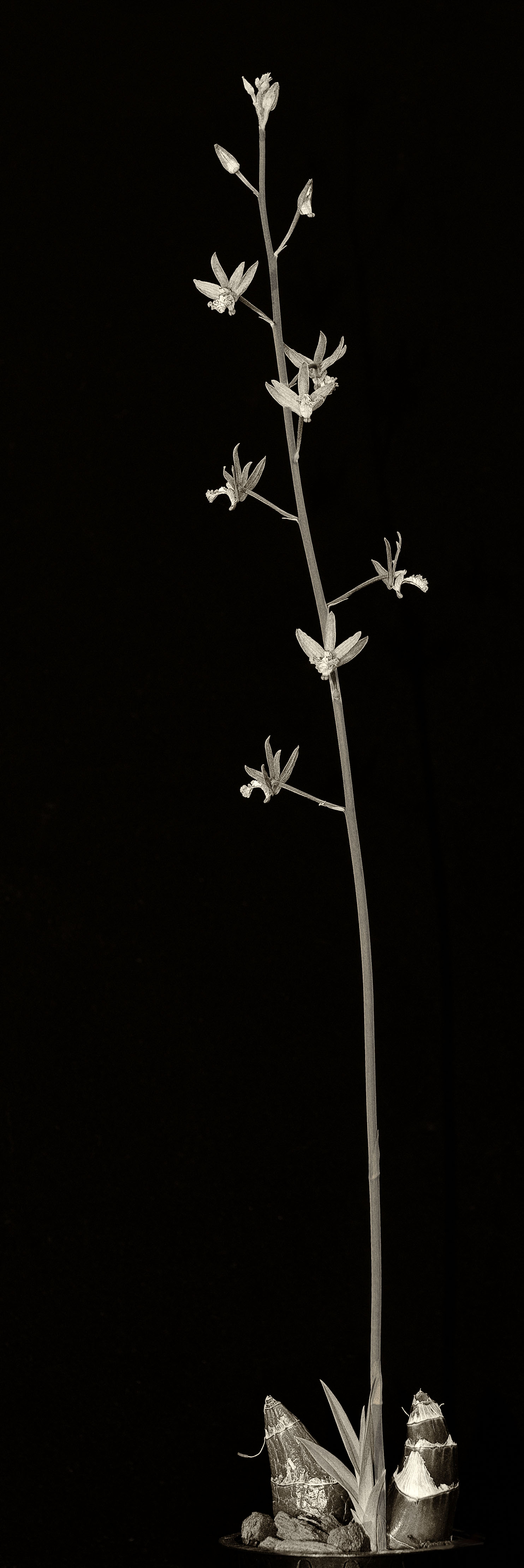
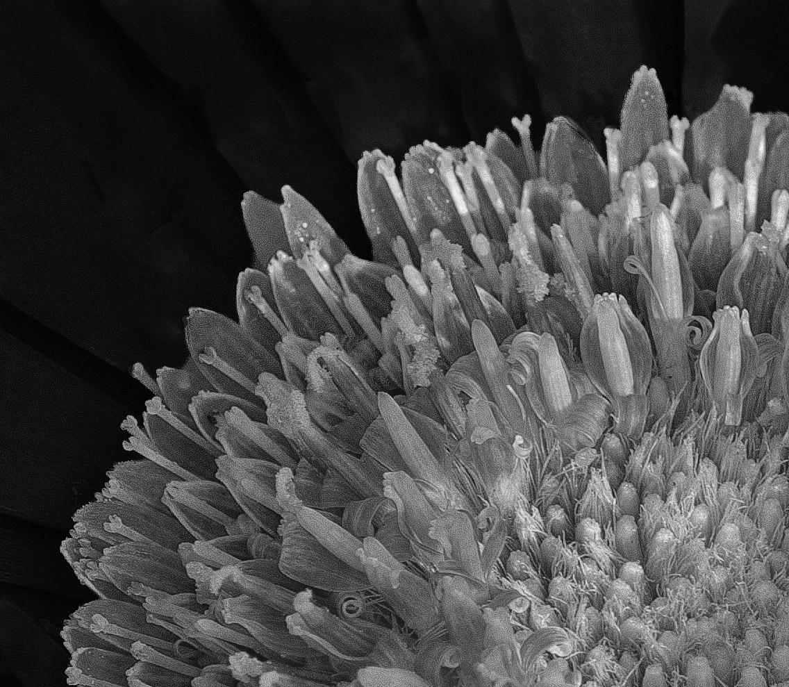
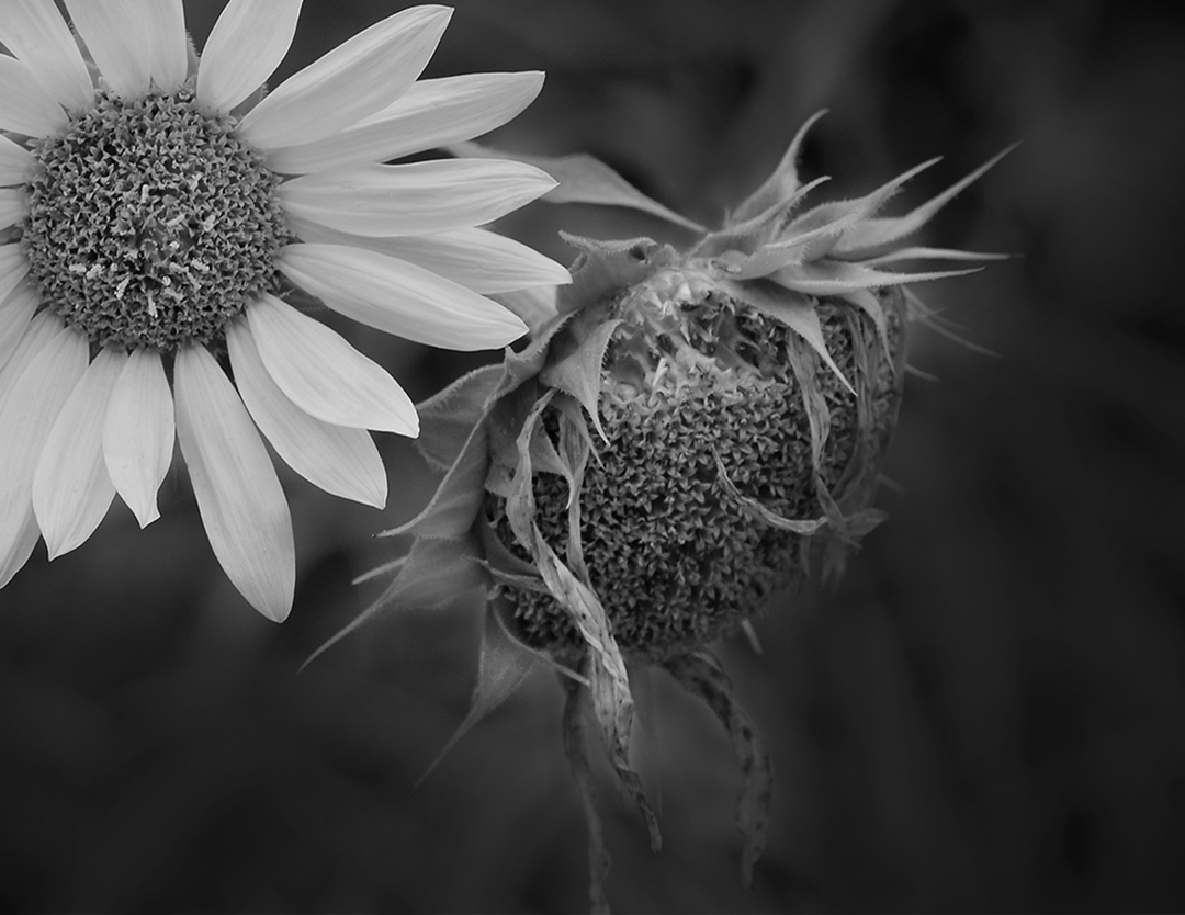
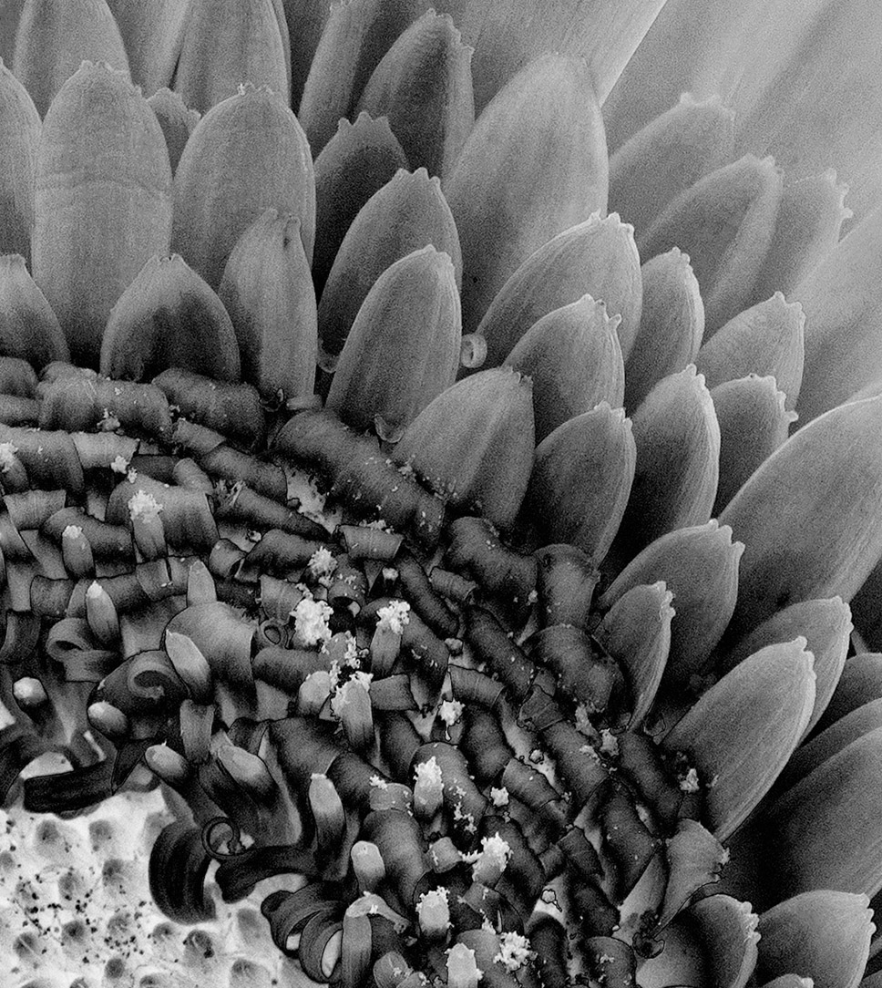
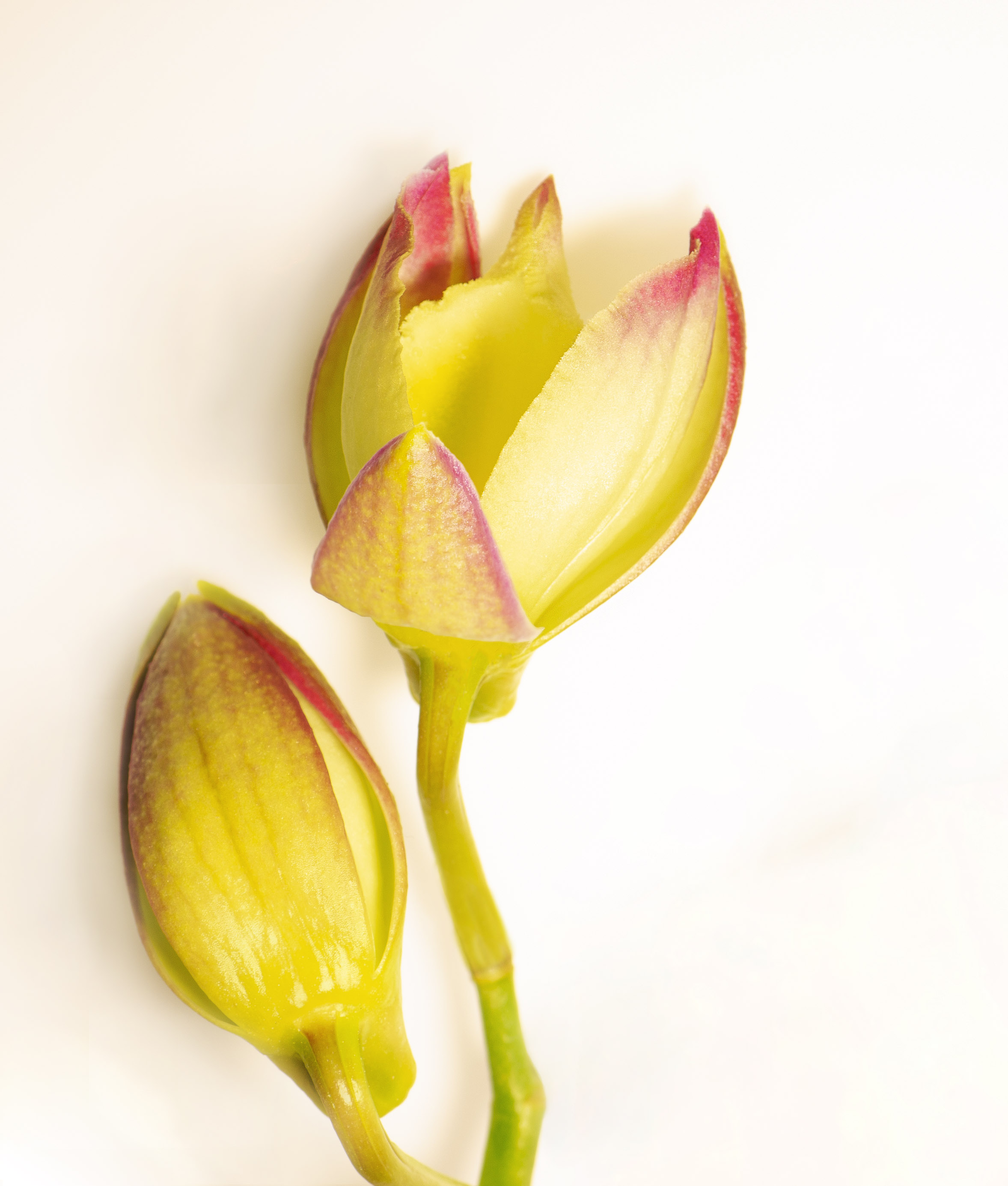
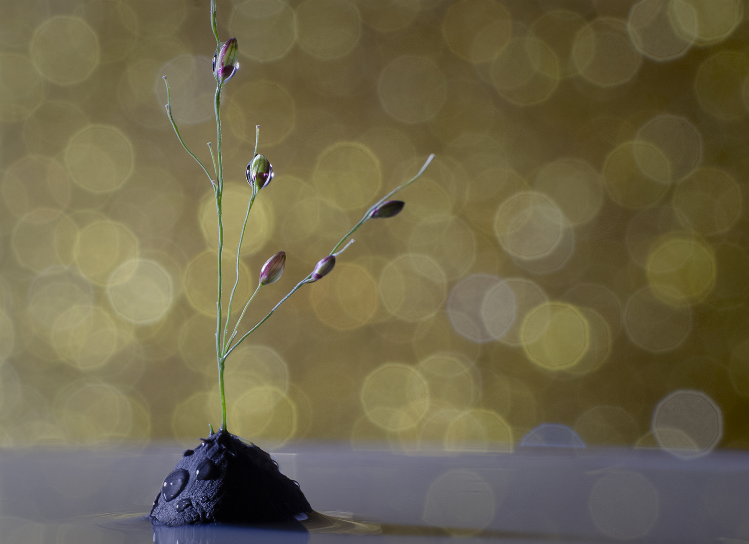
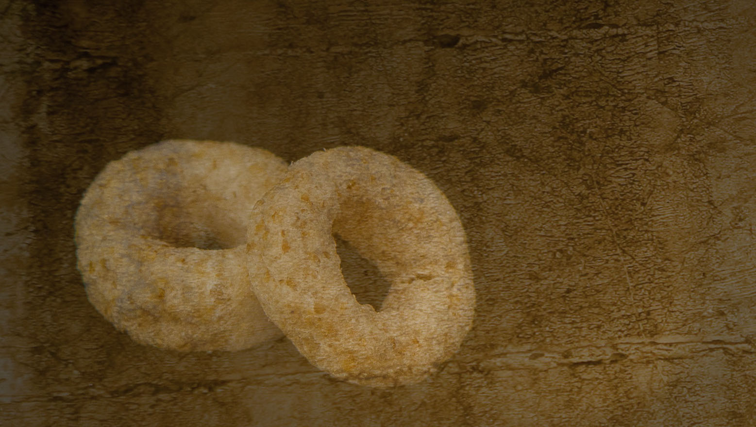
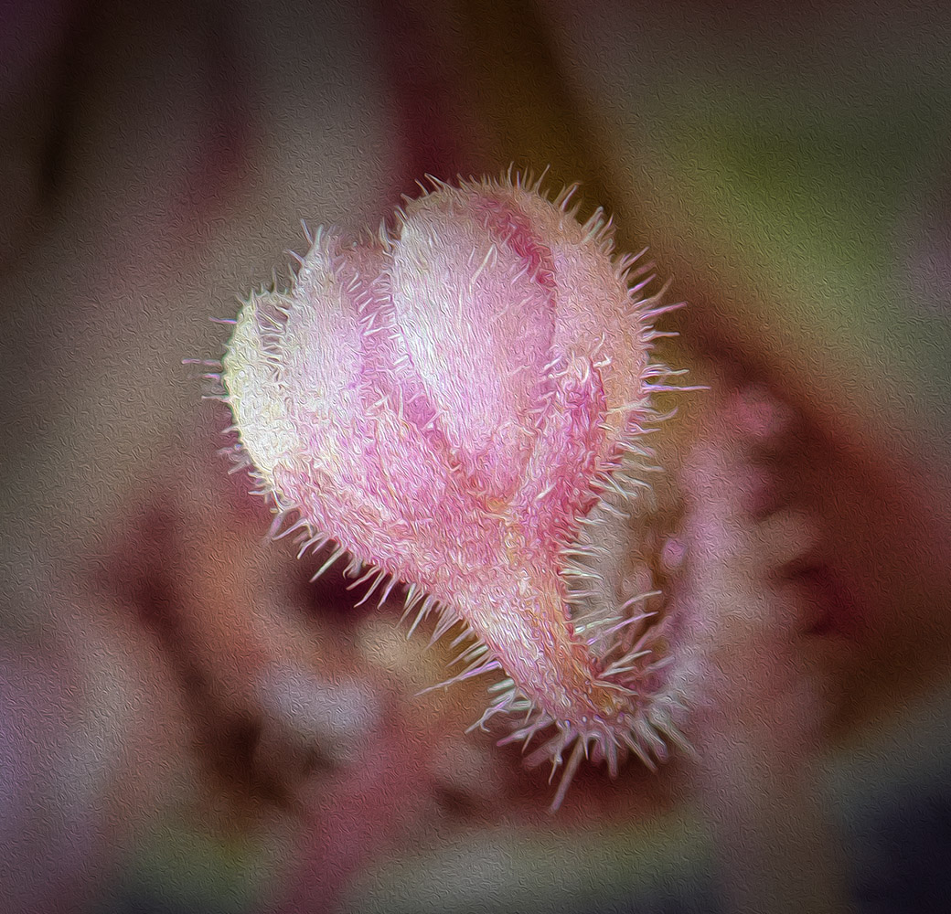
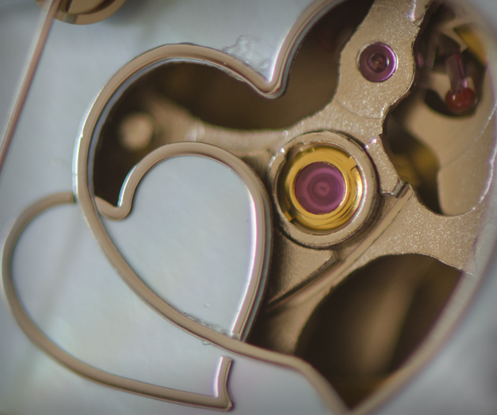
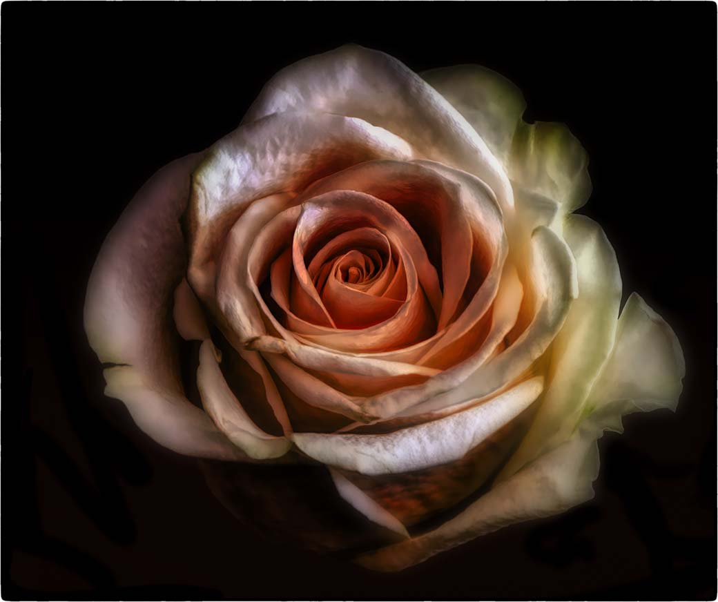
This is a unique idea and you've done it well. A tripod is always helpful for photo stacking. Only 2 or three more shots would have helped bring a little more focus to the front flower pods (?). No handle for the magnifying glass doesn't bother me at all. I think you've made a really nice image. |
Nov 26th |
| 32 |
Nov 21 |
Comment |
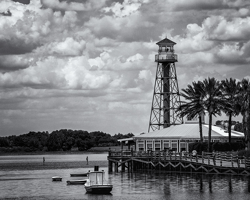
This is a very pleasant image. The sky is not distracting to me as I think there's enough of a separation between it and El Capitan. A little more contrast might be helpful here, but as for the water, I think the dark portions are dark enough. I agree with the comments already made about the border. Depending on how you'll use the image you might decide to leave it in, but it would be more subtle if it was 2 to 3 px thick. |
Nov 25th |
6 comments - 3 replies for Group 32
|
| 65 |
Nov 21 |
Reply |
Thank you Peter! |
Nov 16th |
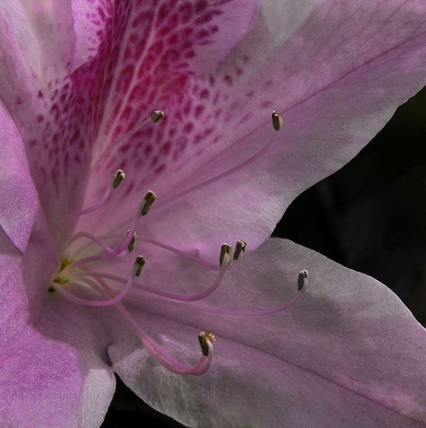
| 65 |
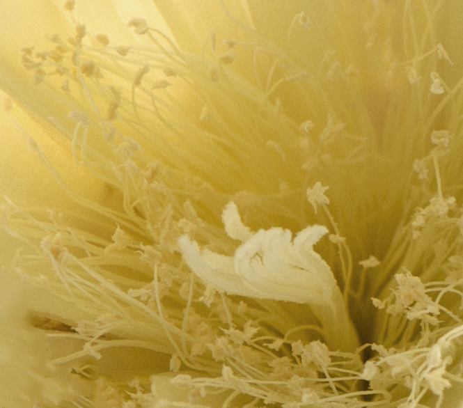
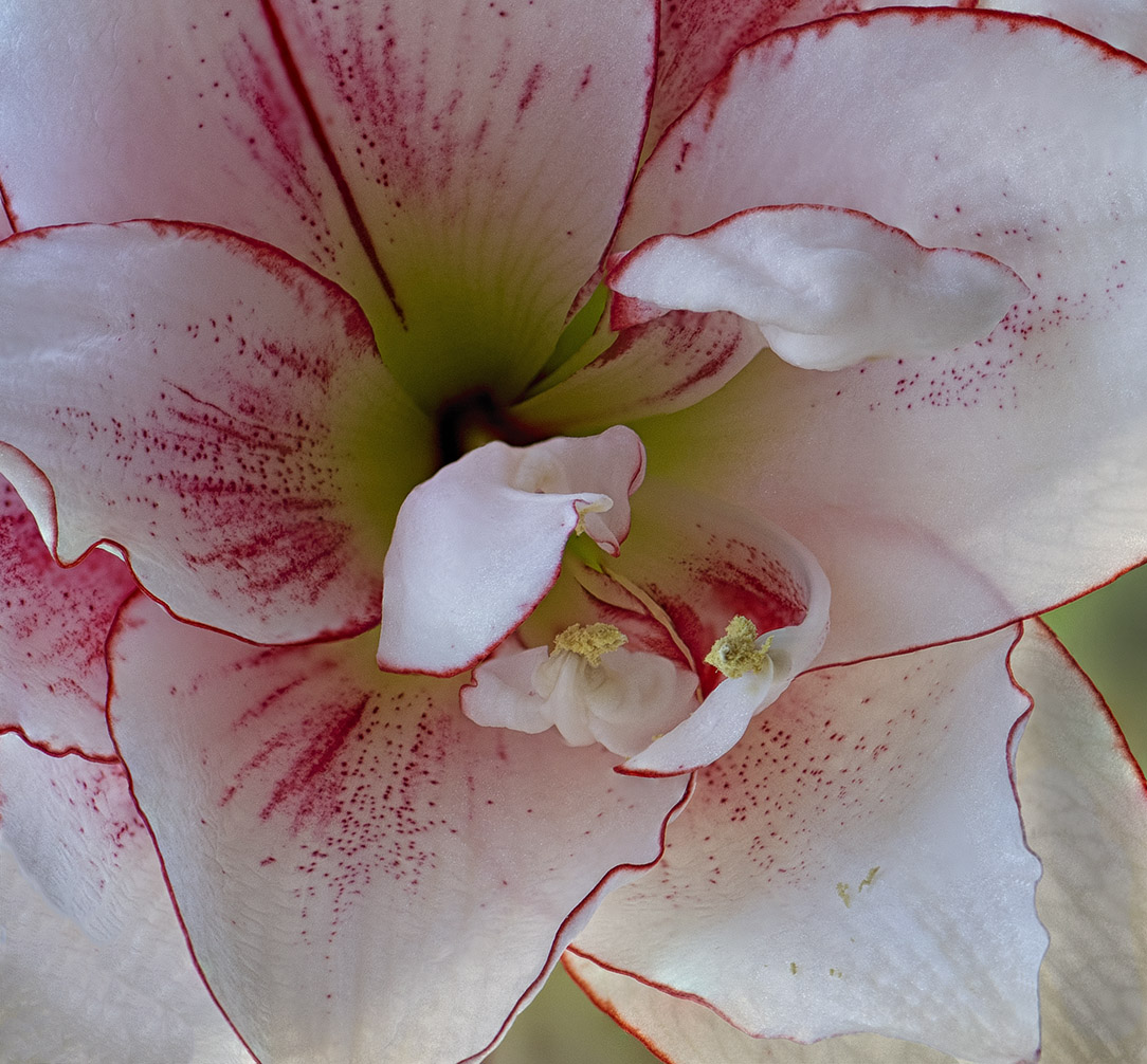
Nov 21 |
Comment |
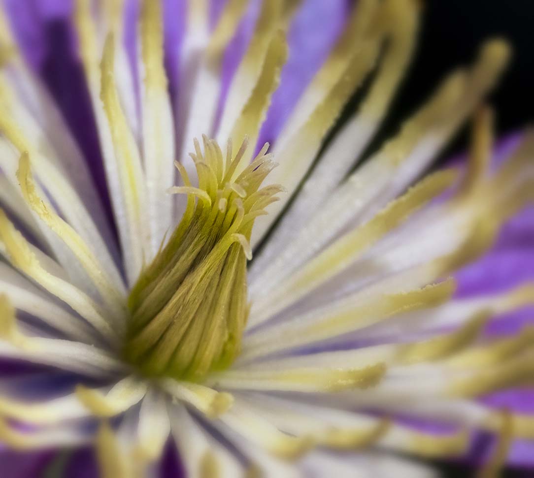
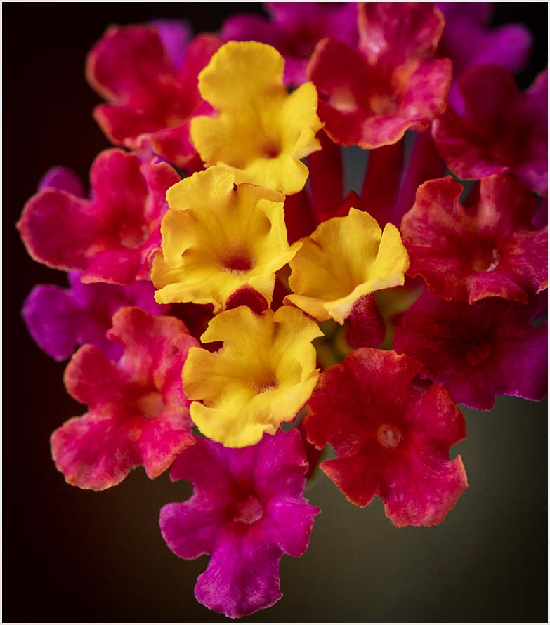
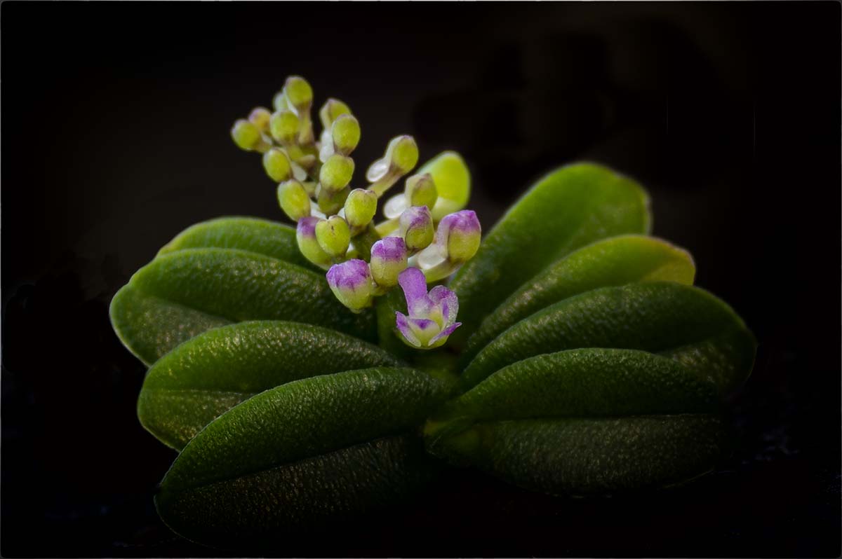
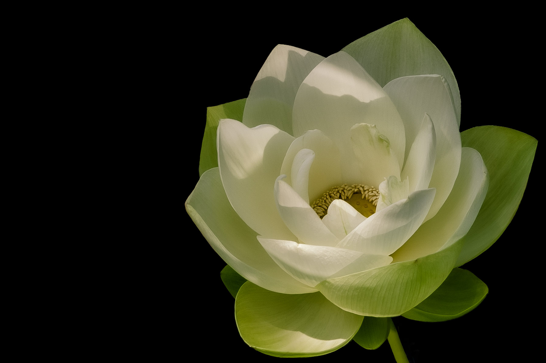
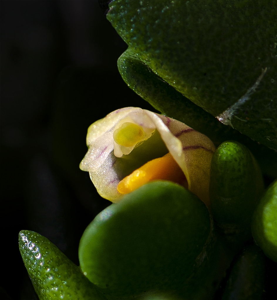
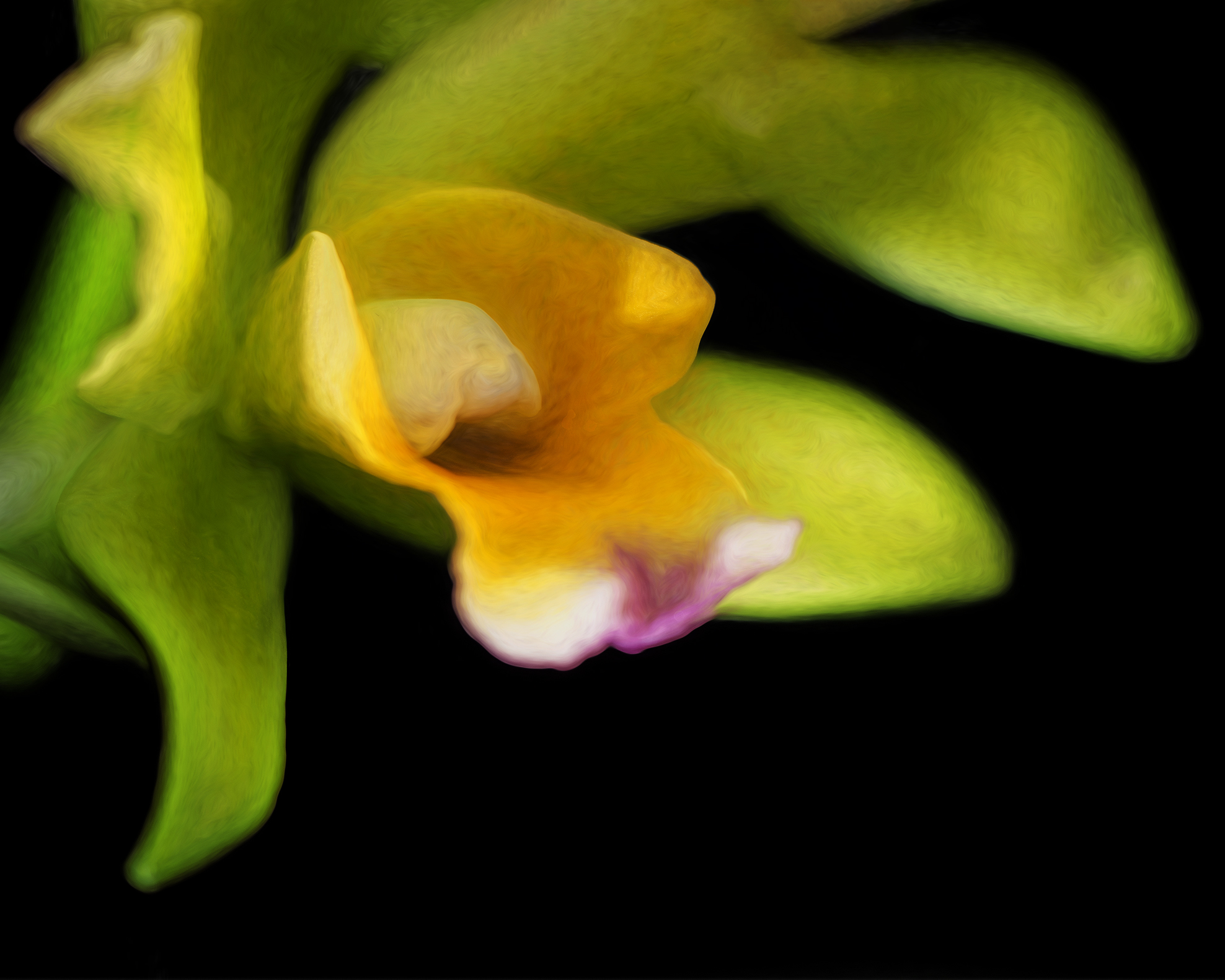
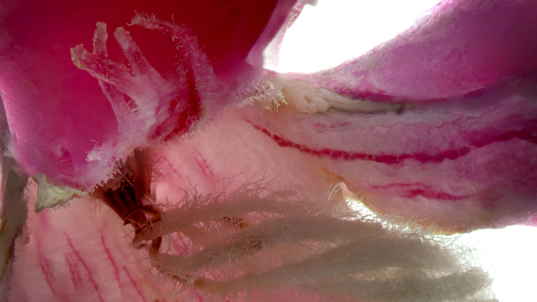
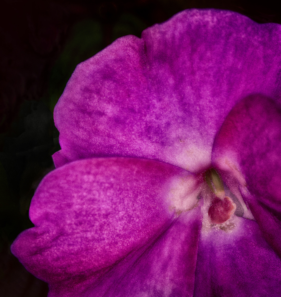
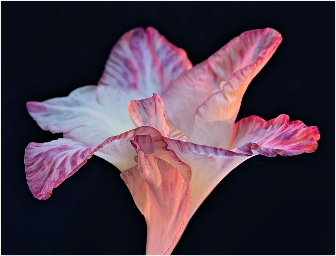
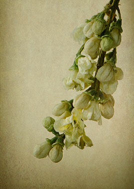
I do like these little blooms and their happy, well balanced color palette. In my opinion, the top right petal that seems to be looking upward helps to make the image more dynamic as does the overall composition. I would be tempted to bring down the brightness of the background flowers on the left as they seem to pull some of my attention. Such a nice image. |
Nov 13th |
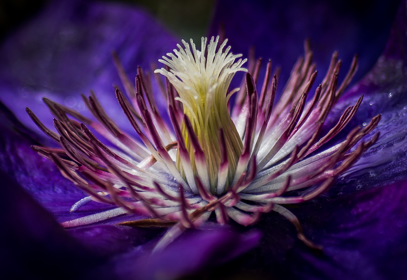
| 65 |
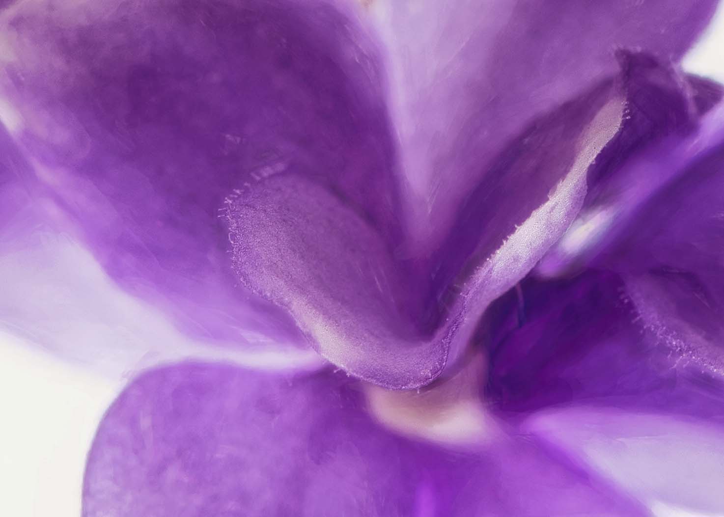
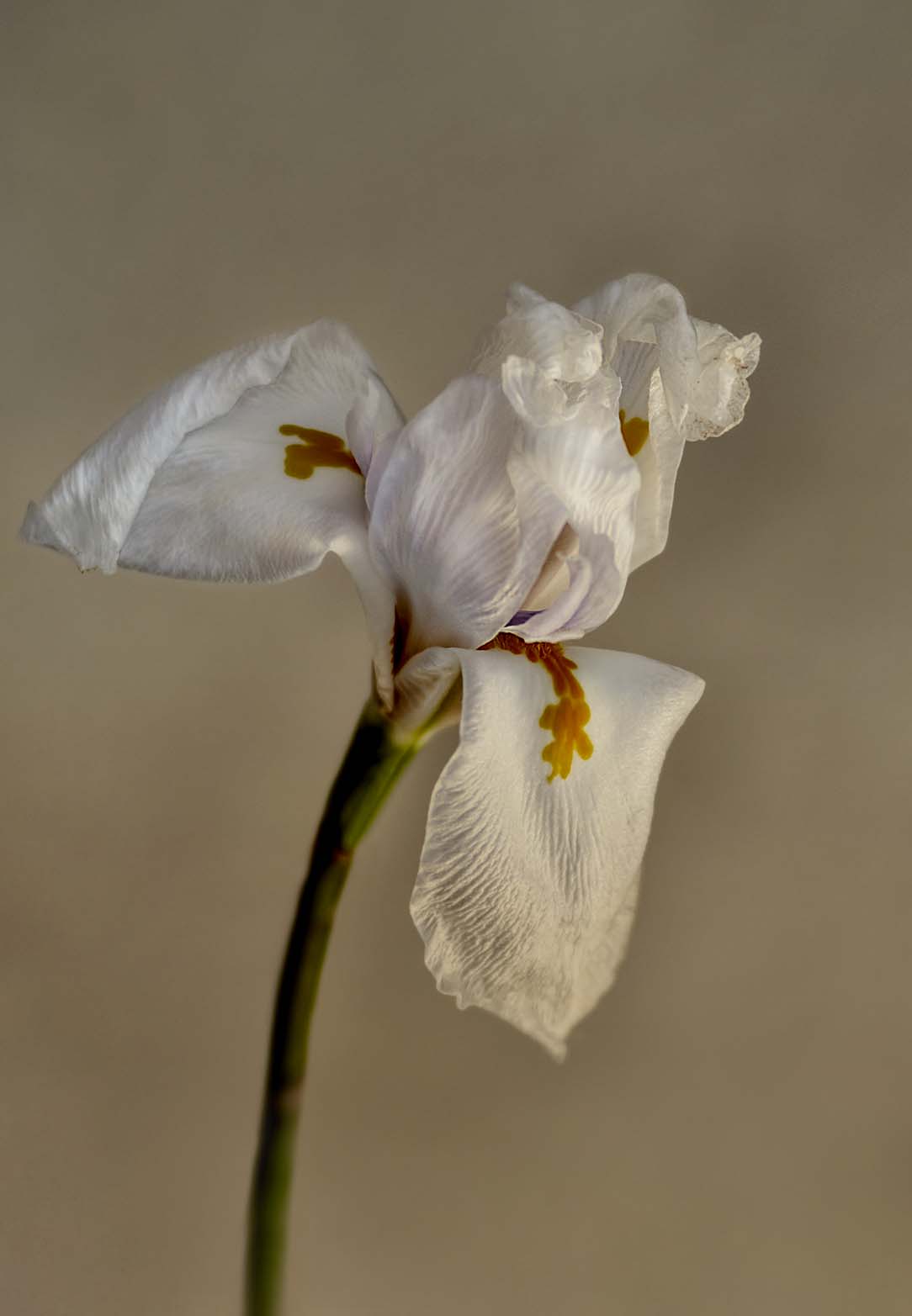
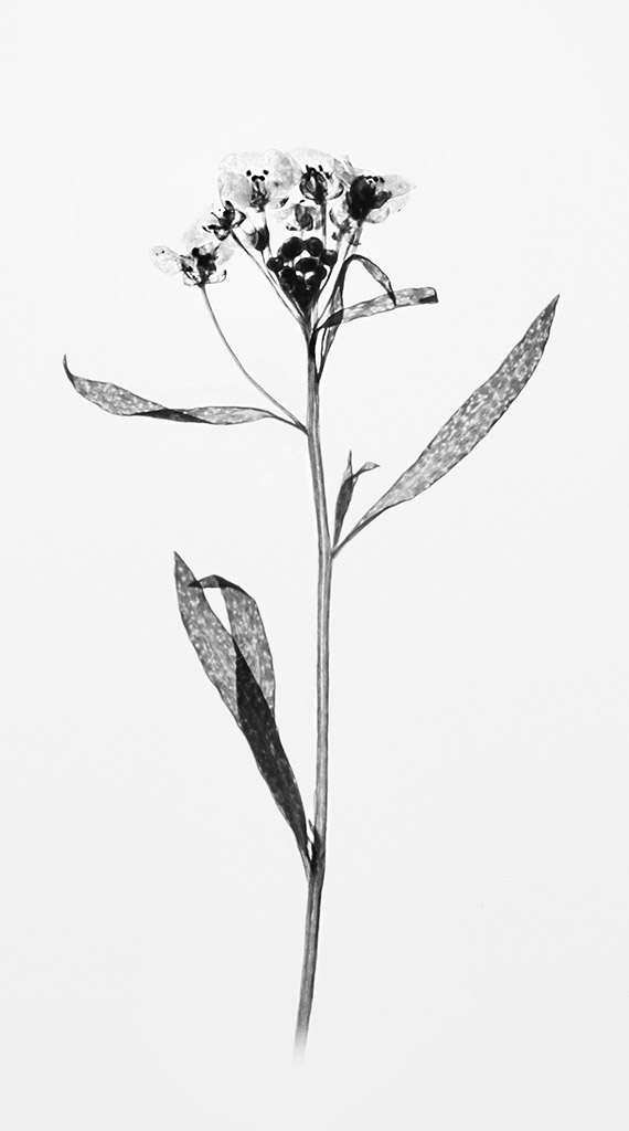
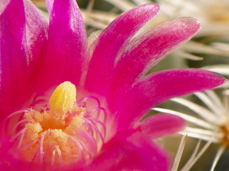
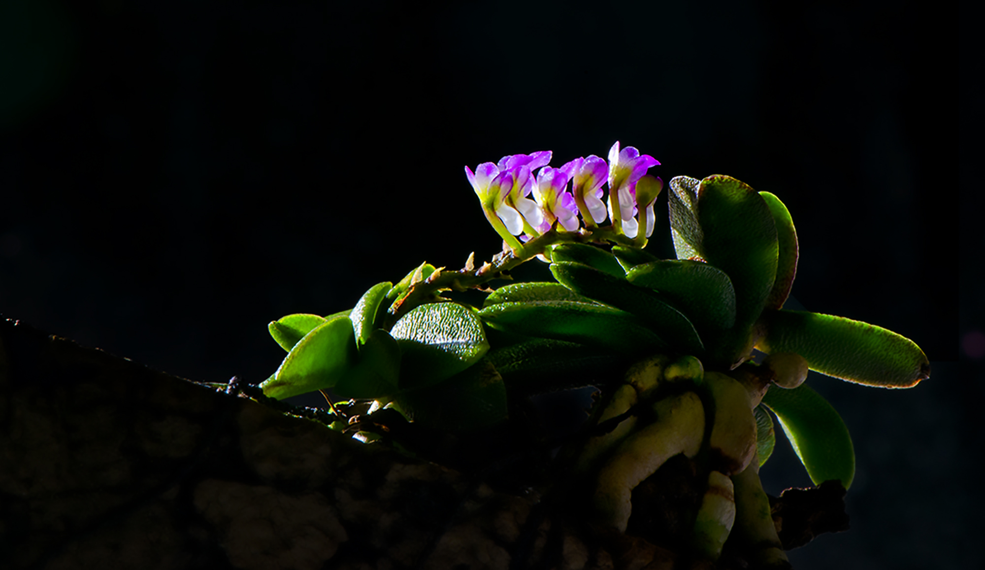
Nov 21 |
Comment |
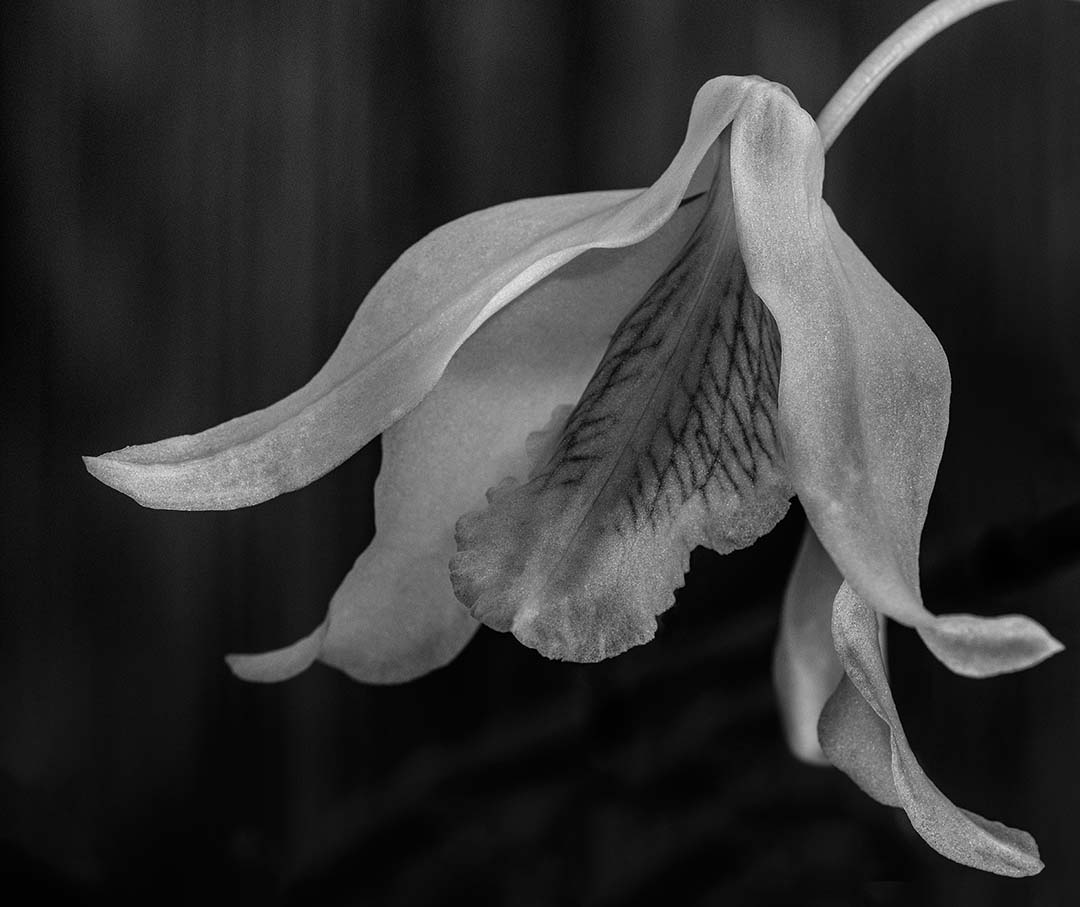
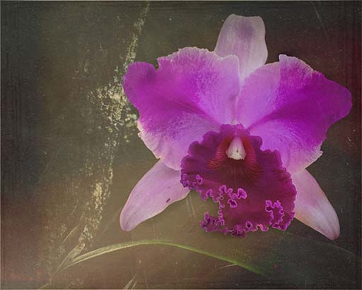
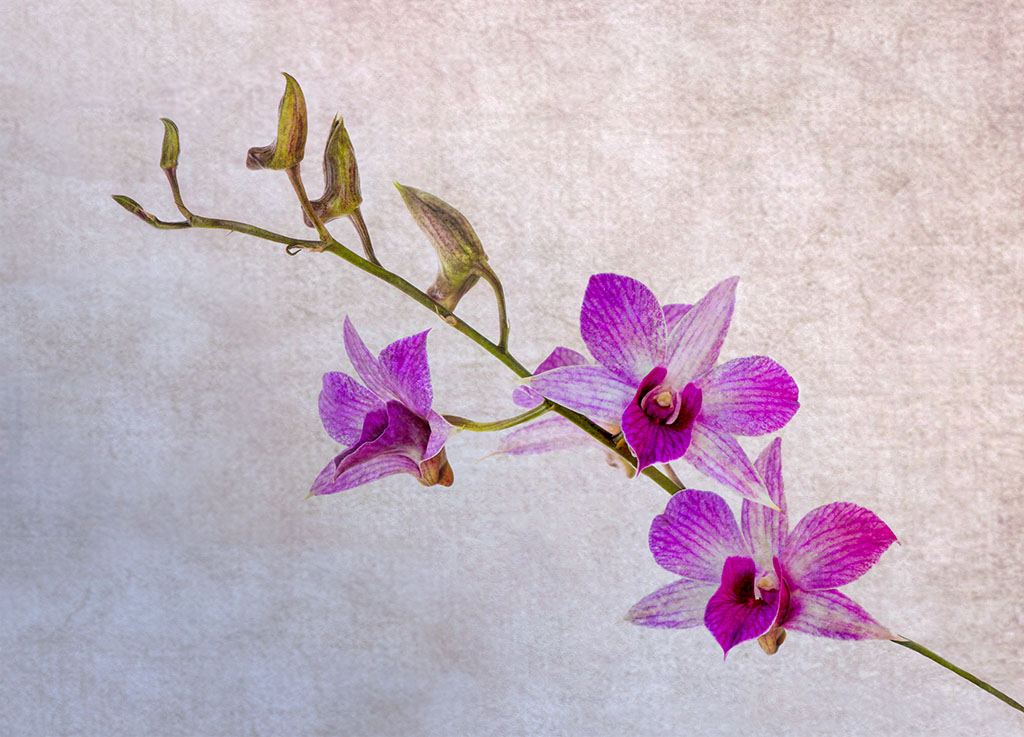
I agree that the petals blend into the background. I can see the more subtle shades on my monitor, but I think that more separation is needed so the image becomes more versatile. As for the color version, I had a very light lavender background which complimented the image, but fro some reason the image was disjointed. I lost the subtlety because the flowers seemed to be "in your face". |
Nov 13th |
2 comments - 1 reply for Group 65
|
8 comments - 4 replies Total
|