|
| Group |
Round |
C/R |
Comment |
Date |
Image |
| 32 |
Oct 21 |
Reply |
Thanks Diana. Yes he's done several YouTube videos. I like his presentations because he's so detailed. |
Oct 26th |
| 32 |
Oct 21 |
Comment |
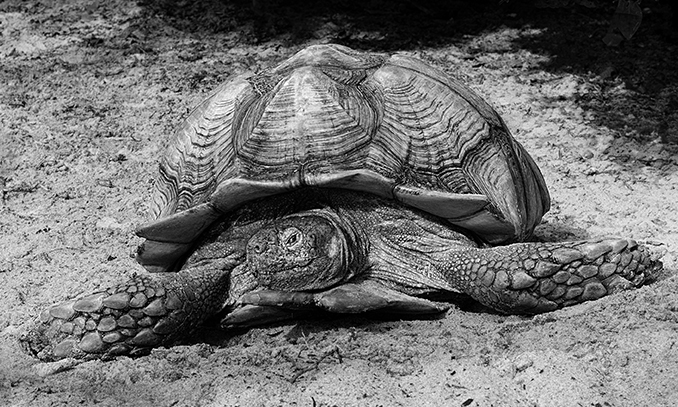
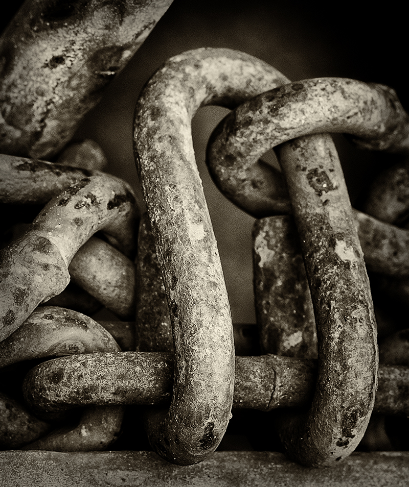
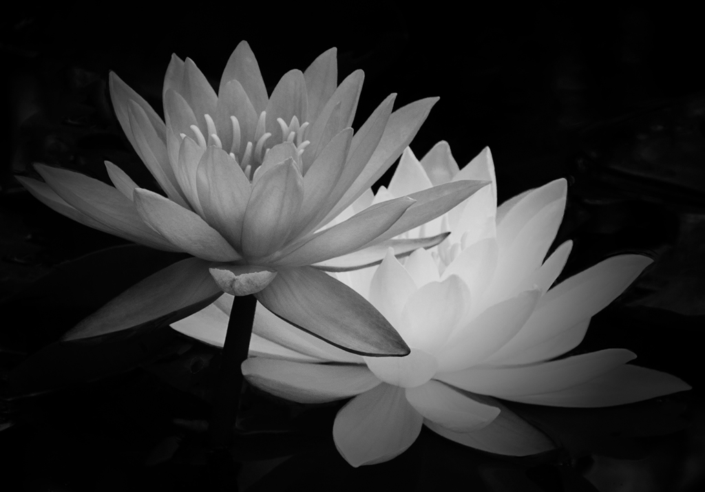
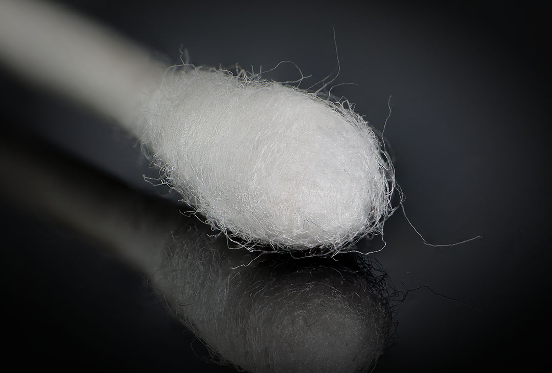
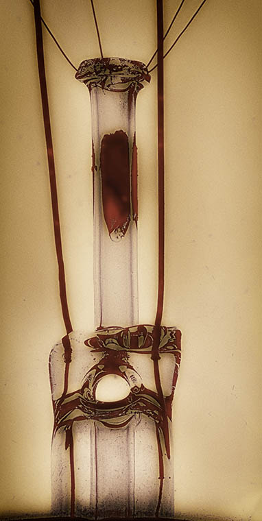
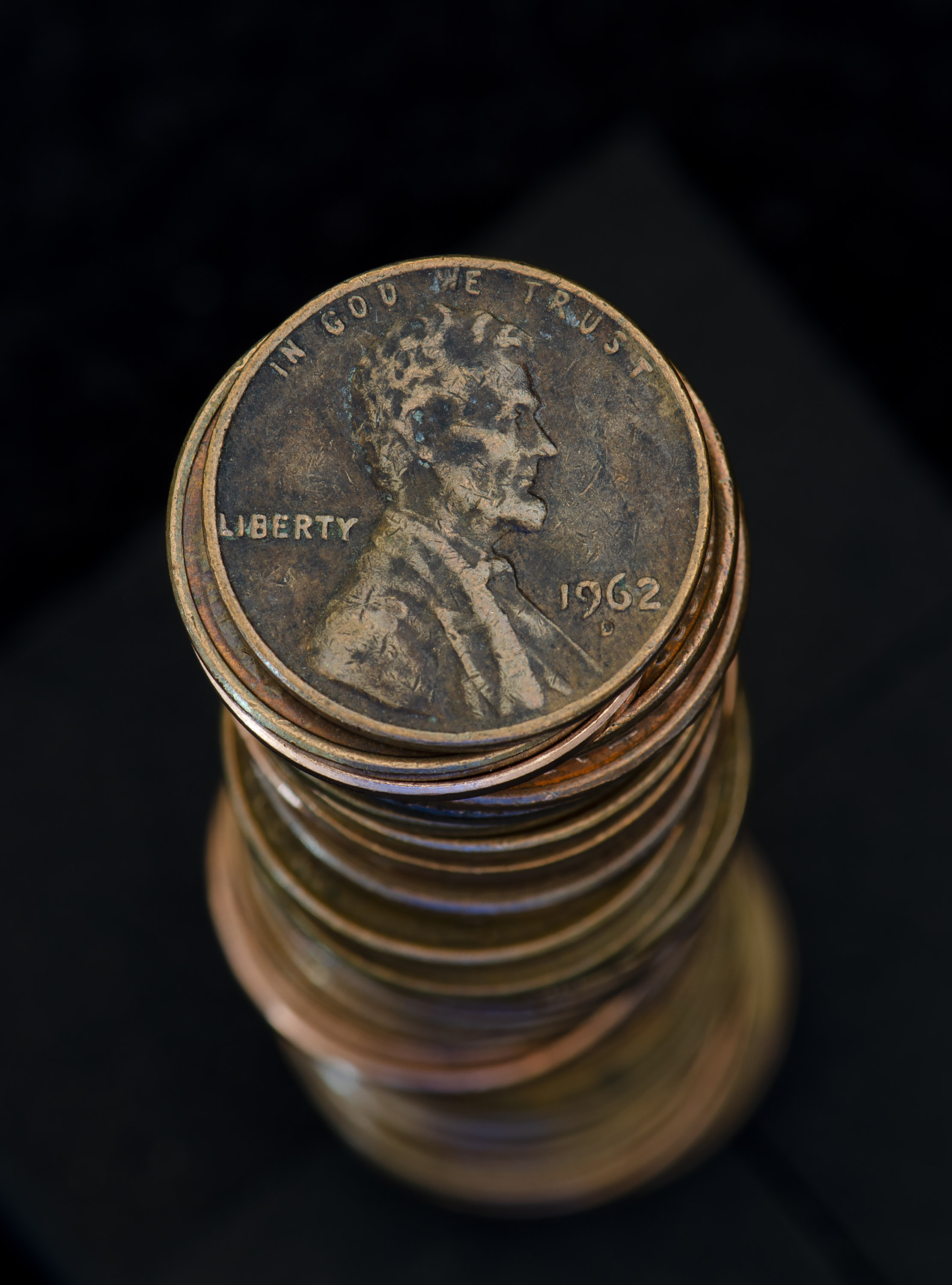
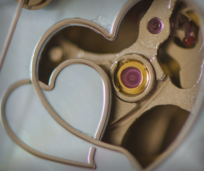
The overall image is very good; there's a lot of detail, yet the oil from use over the years provides a smooth feel. The tight crop looks good. Really nice. |
Oct 12th |
| 32 |
Oct 21 |
Comment |
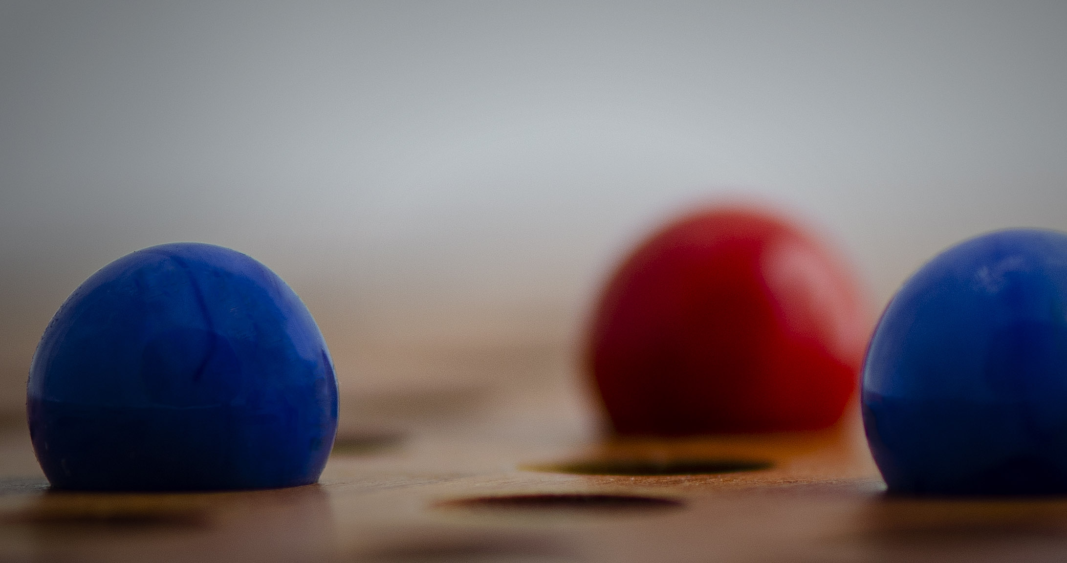
I agree with Stephan's comments. The crop cuts the road off too soon to appreciate the curve. As for competition, I too have the same issue - my ideas about what is compelling doesn't coincide with what they believe is compelling.
|
Oct 12th |
| 32 |
Oct 21 |
Comment |
This is a nice image and I enjoy the feeling it invokes. Reversing the image is a good idea as it takes the channel out of the center and leads the eye inward without a harsh stop. |
Oct 12th |
| 32 |
Oct 21 |
Comment |
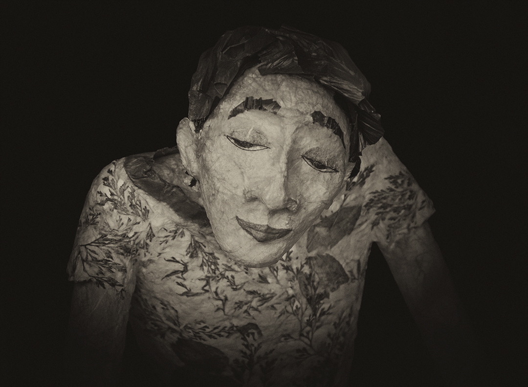
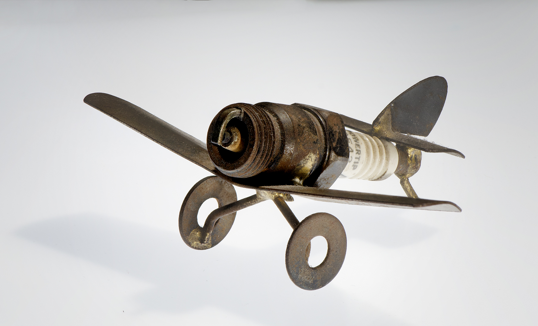
Nicely done! I really like the look on the man's face - he looks so happy and excited to "see" the camera. You made a perfect choice using him. I agree that adding a bit of light to the side of the bellows would provide dimension and increase interest. Composition is well done. |
Oct 10th |
| 32 |
Oct 21 |
Reply |
Thanks Wes. I really enjoy this type of photography, with a post-processing technique I don't mind doing. I'm working on a series because I was invited to do an exhibit in a gallery in town. |
Oct 10th |
| 32 |
Oct 21 |
Reply |
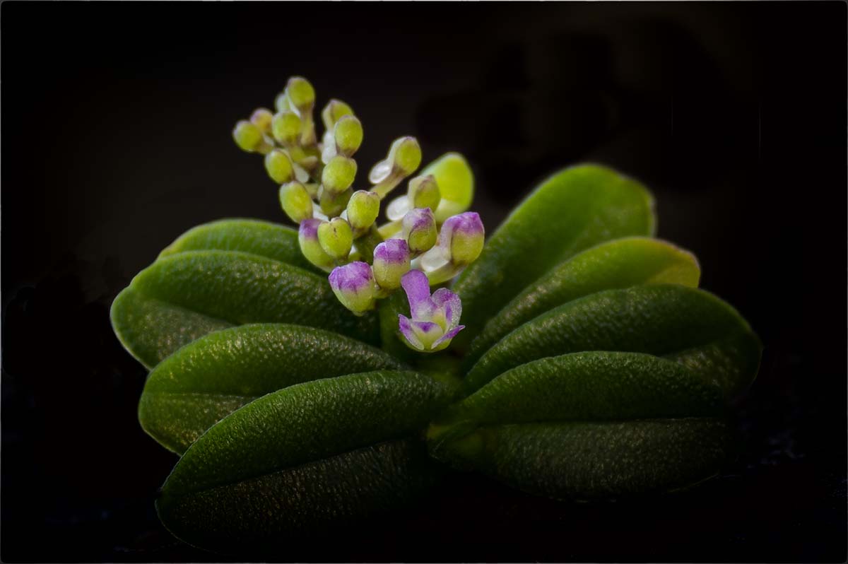
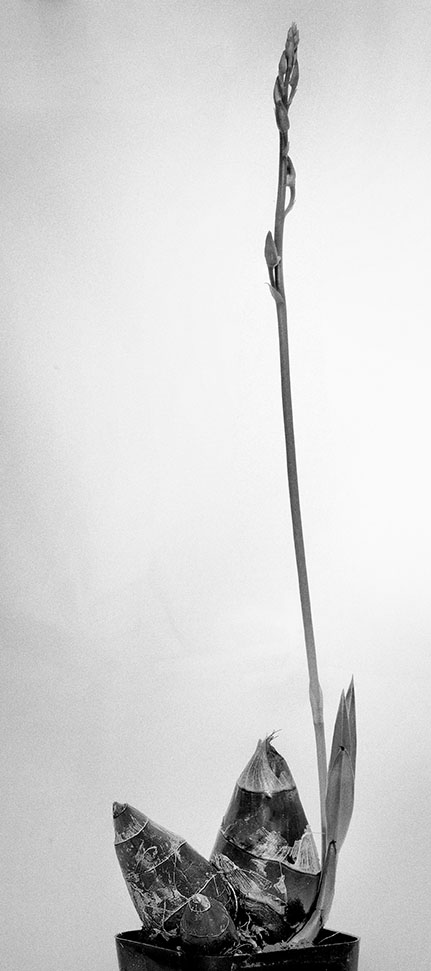
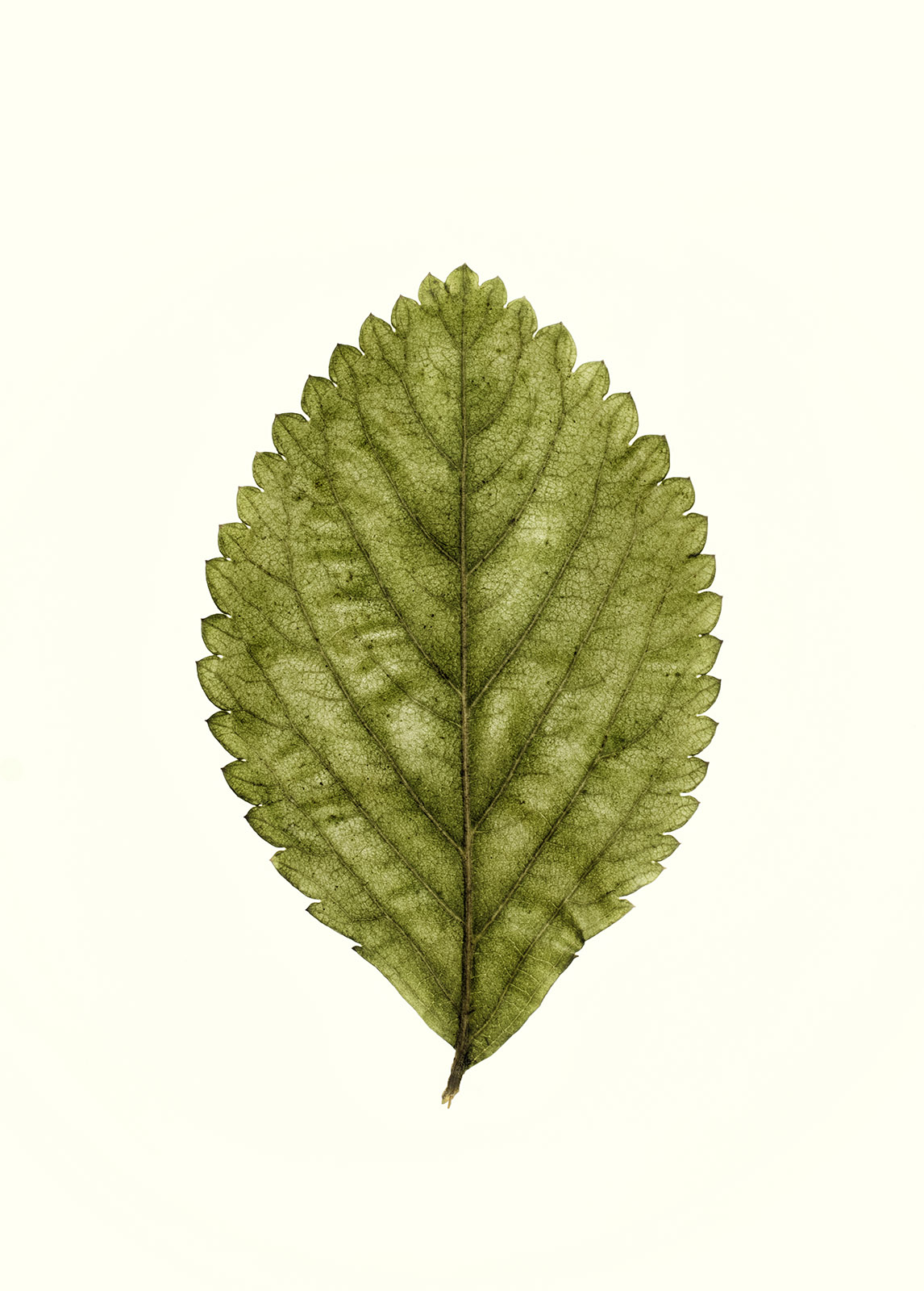
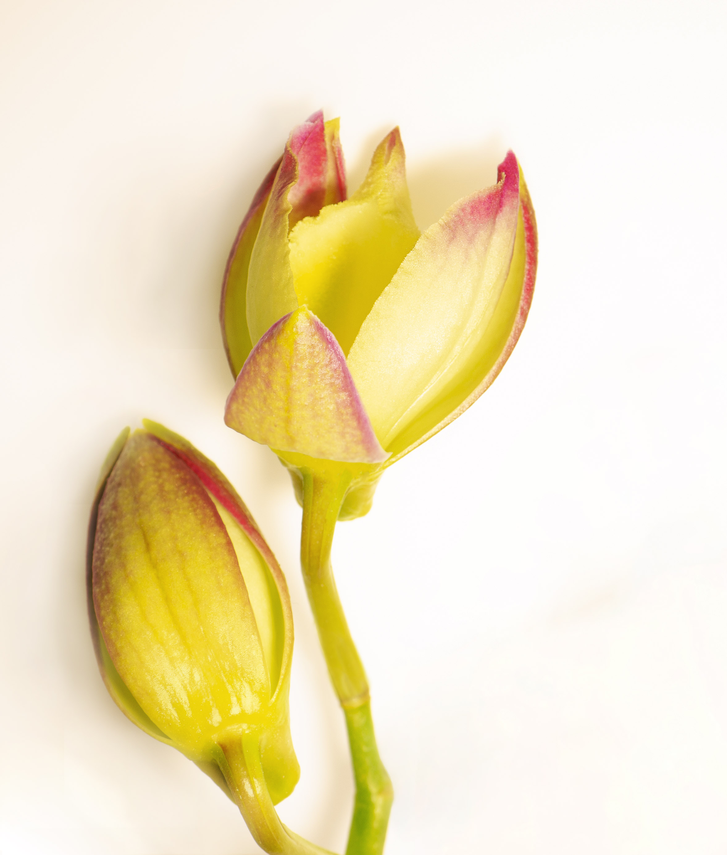
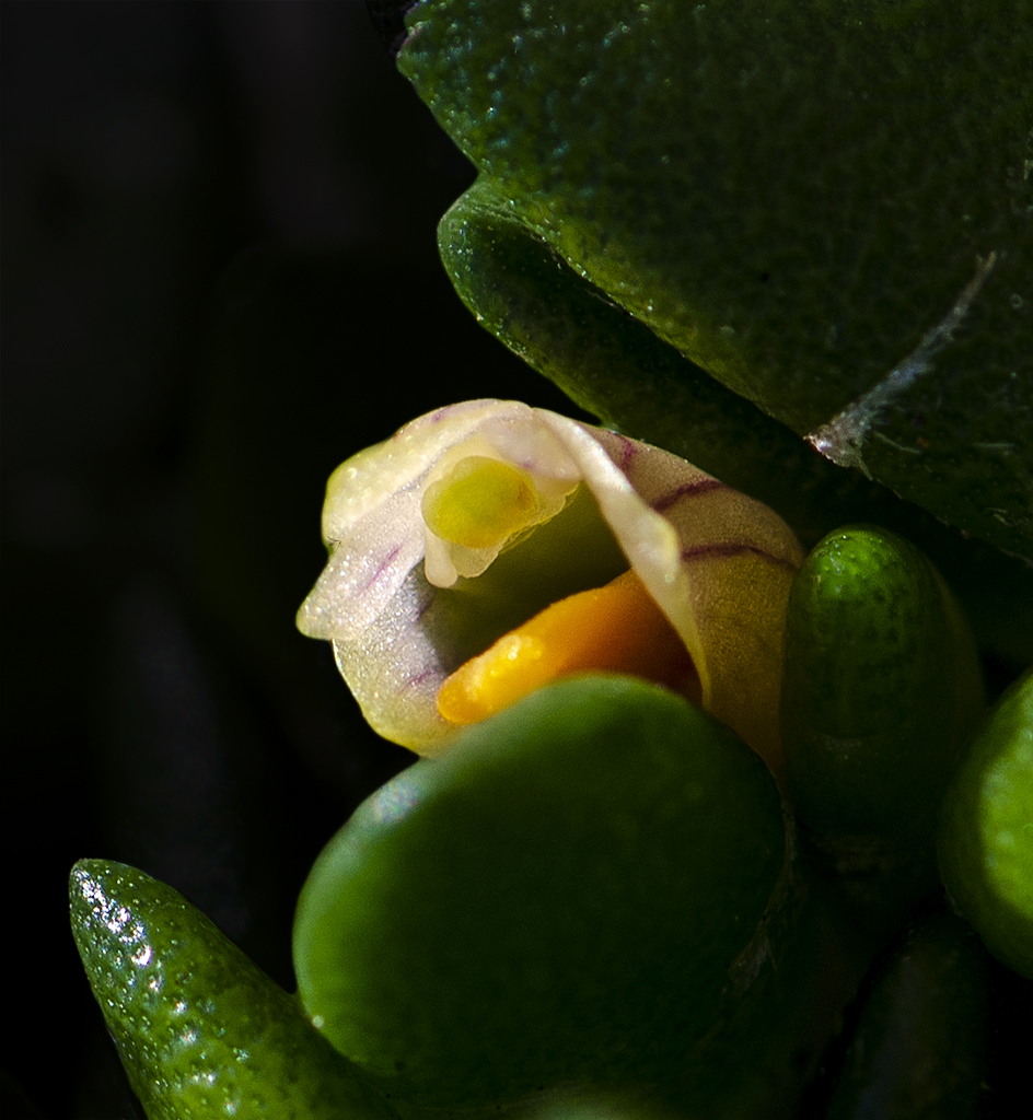
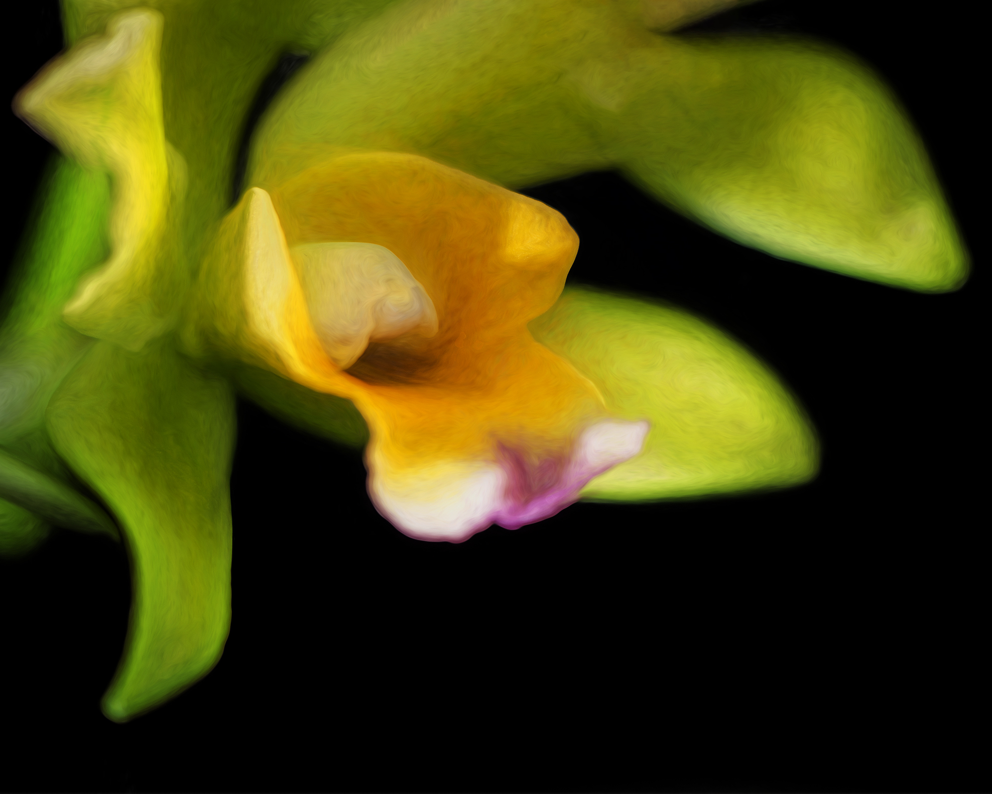
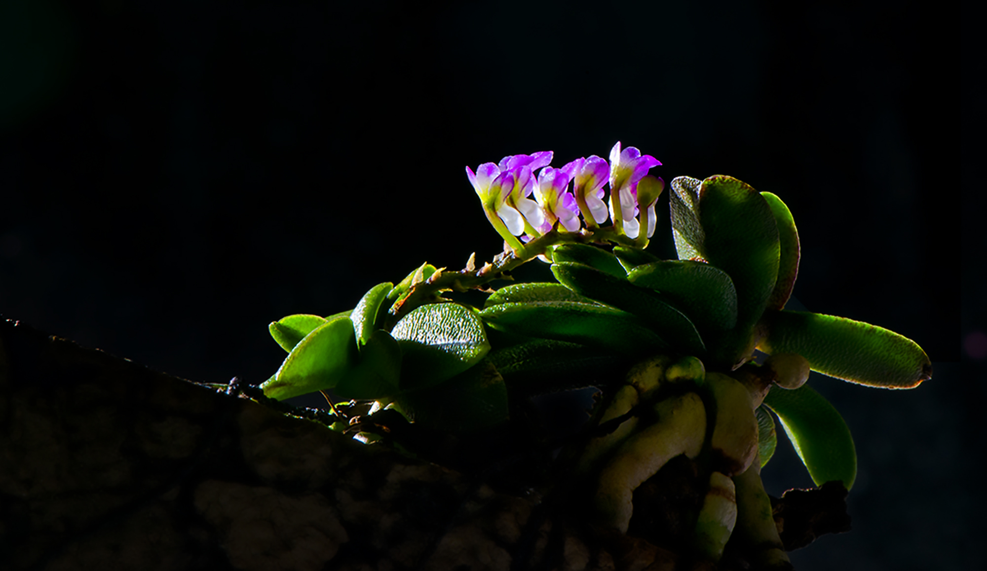
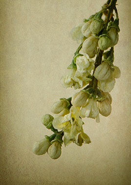
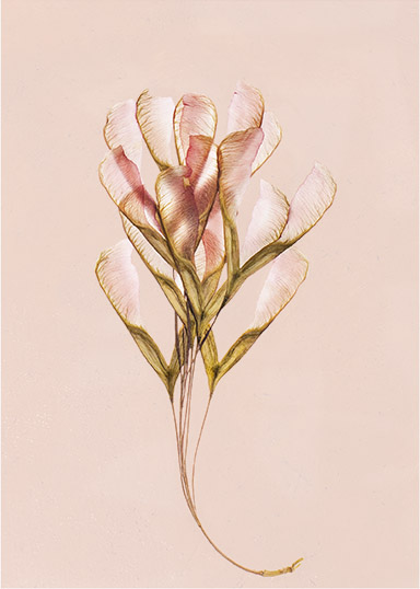
Thanks Stephen. I like both, but I lean toward the color version as well. By glare do you mean the inner aspects of the two lower leaves aren't defined quite enough? I've attached another version where I added a color background. It's cement that I converted to a color that seem to coordinate with the leaves. |
Oct 10th |
 |
| 32 |
Oct 21 |
Comment |
I agree that the outfit and the pose are both charming. Often in pictures of grandchildren, you see snapshots or standard cliche photos. This is different, interesting, and cropped well. The monochrome rendition is nice, and I like the crop. The mirror does provide context. As for contrast I'm going out on a limb here, but I think it's fine the way it is. Nicely done! |
Oct 10th |
| 32 |
Oct 21 |
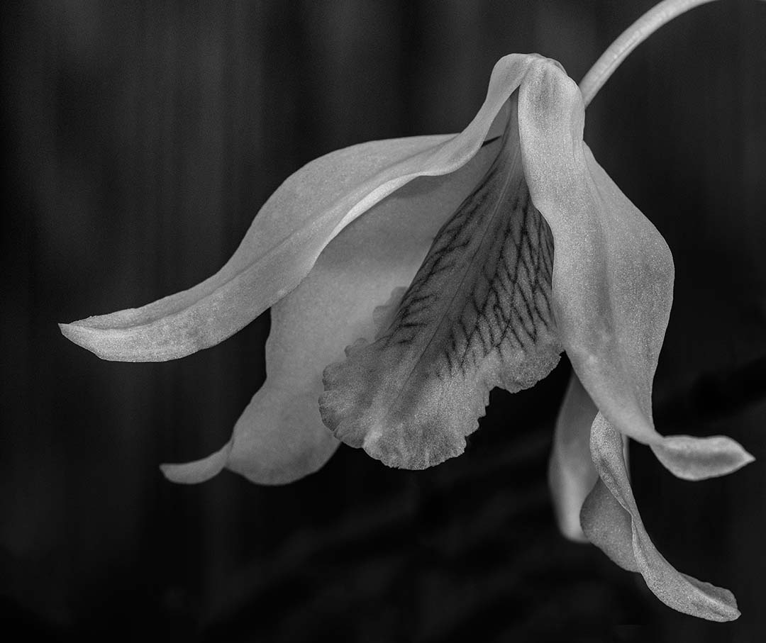
Comment |
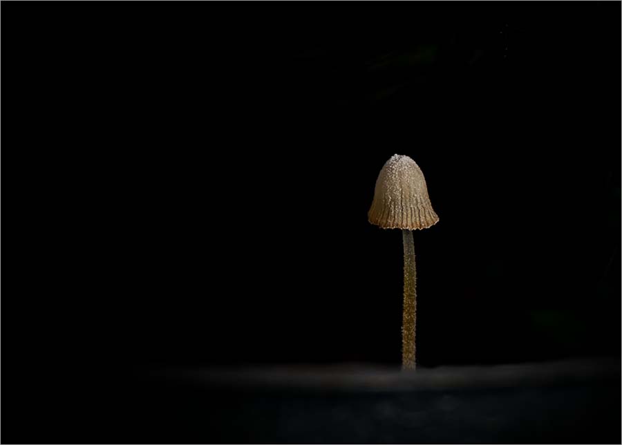
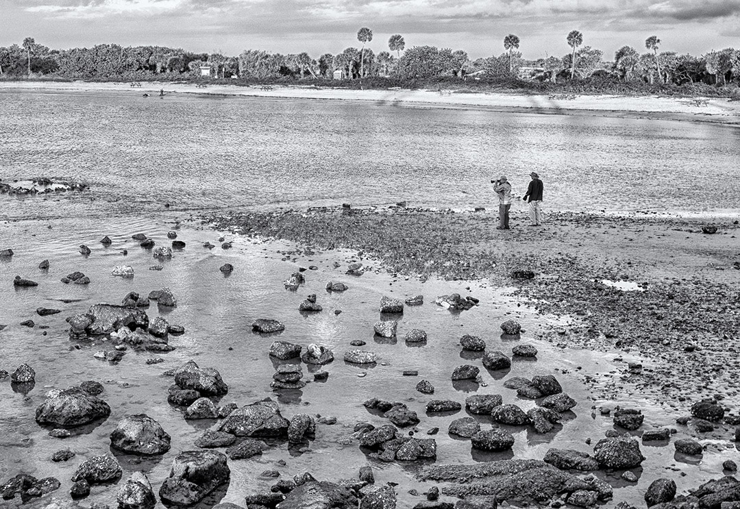
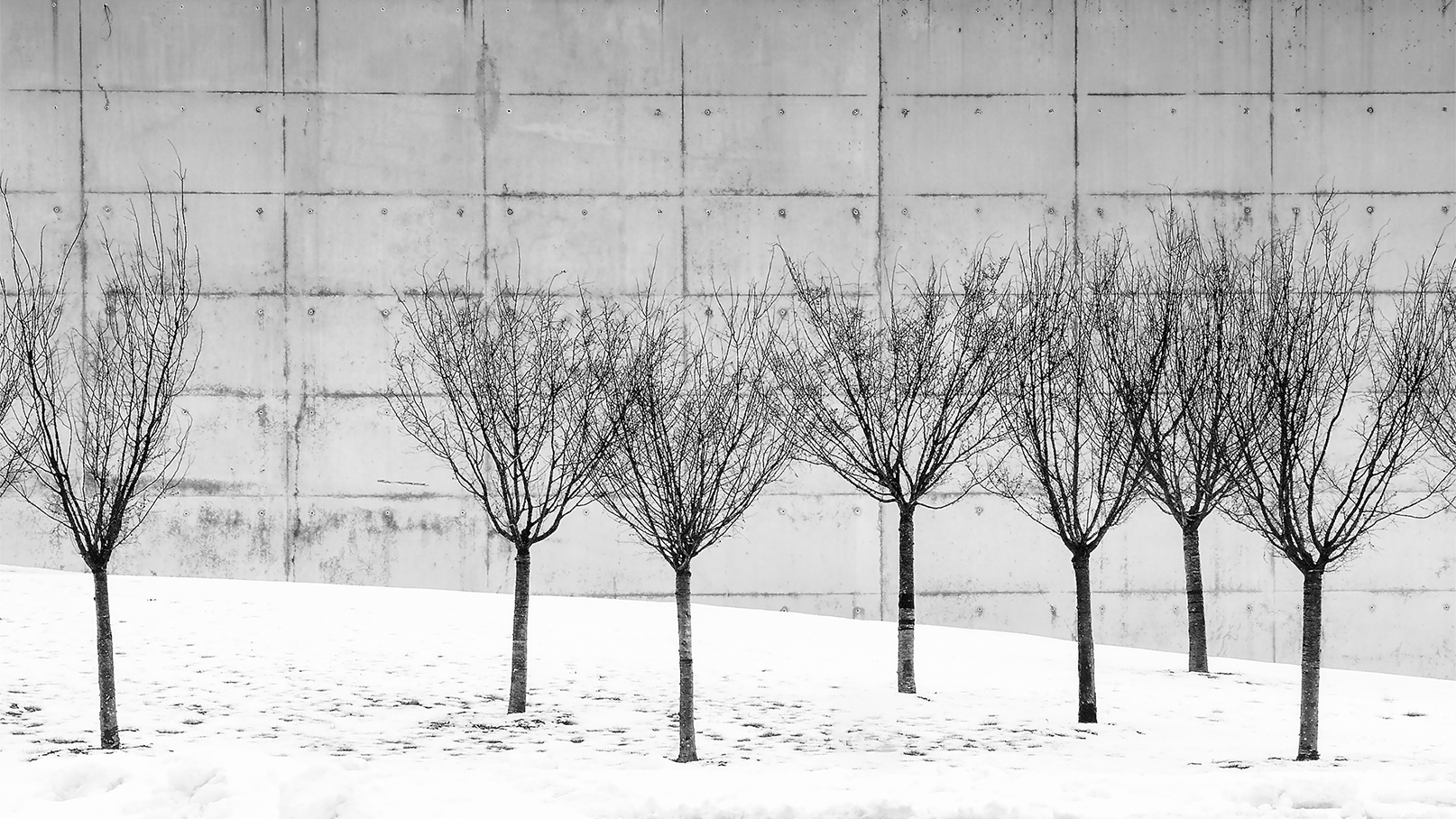
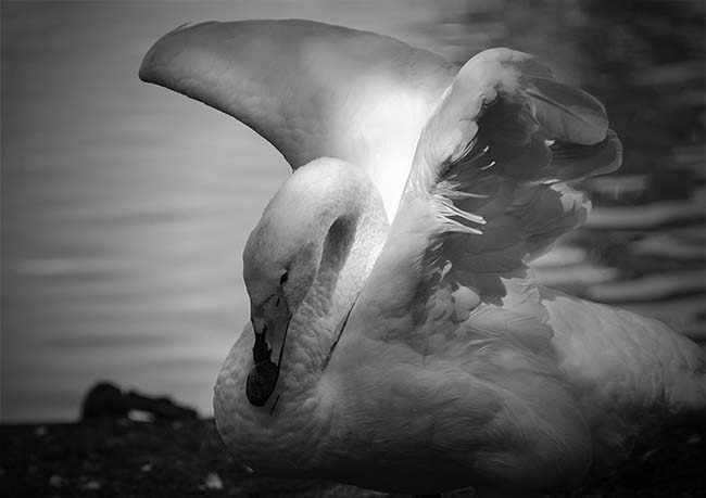
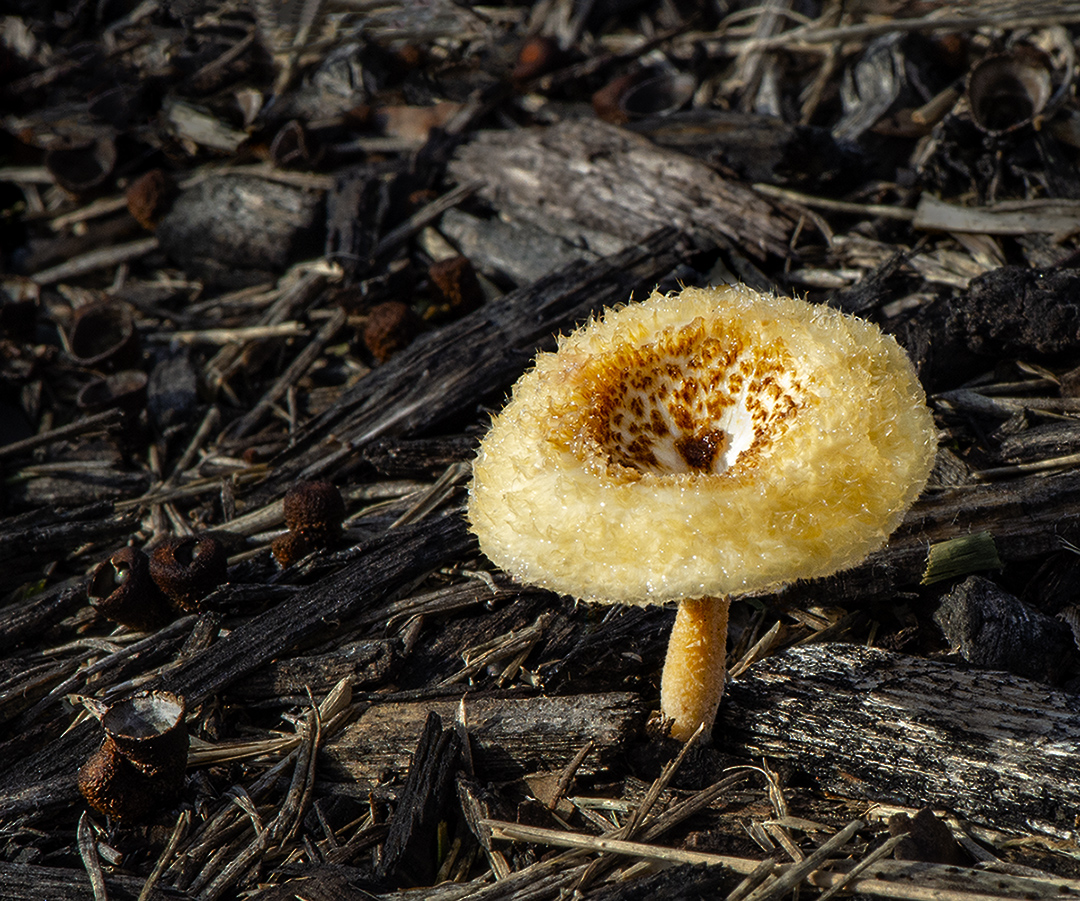
I thought this was infrared before I read your description. I like the image and while I agree that the dark sky looks good, the halo effect around the set of trees is a little distracting. It really feels like you go back in time standing in the grassy field and following the fence line which you captured very well. |
Oct 10th |
6 comments - 3 replies for Group 32
|
| 65 |
Oct 21 |
Reply |
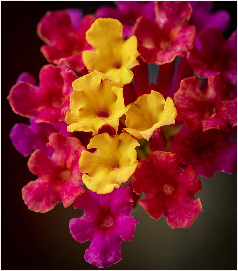
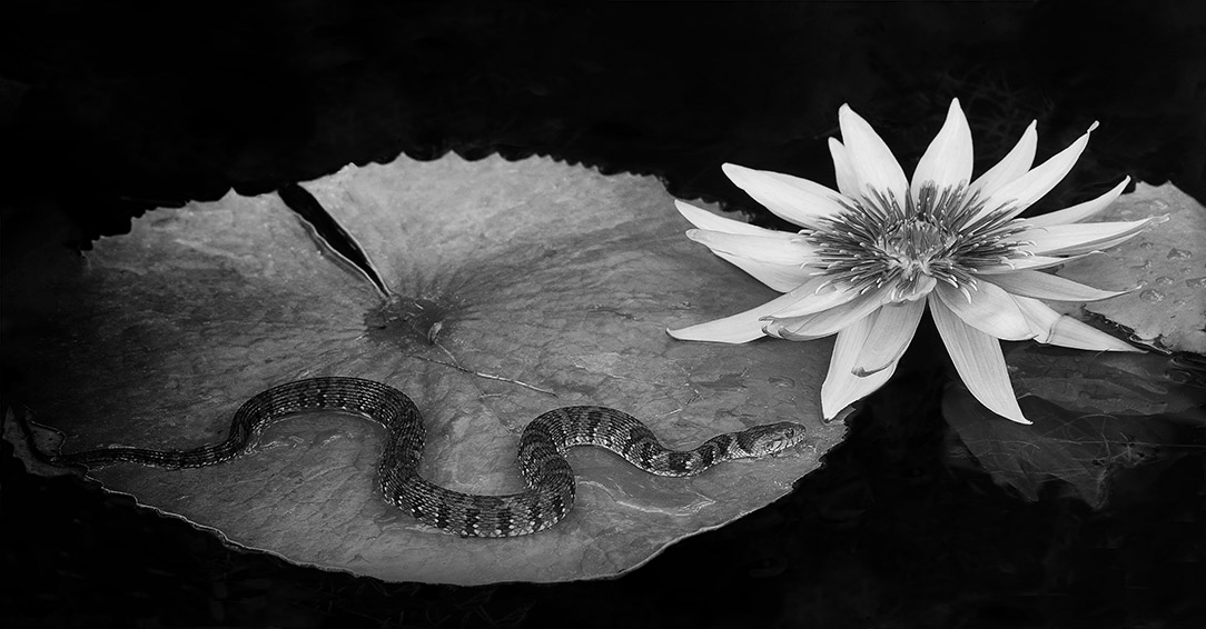
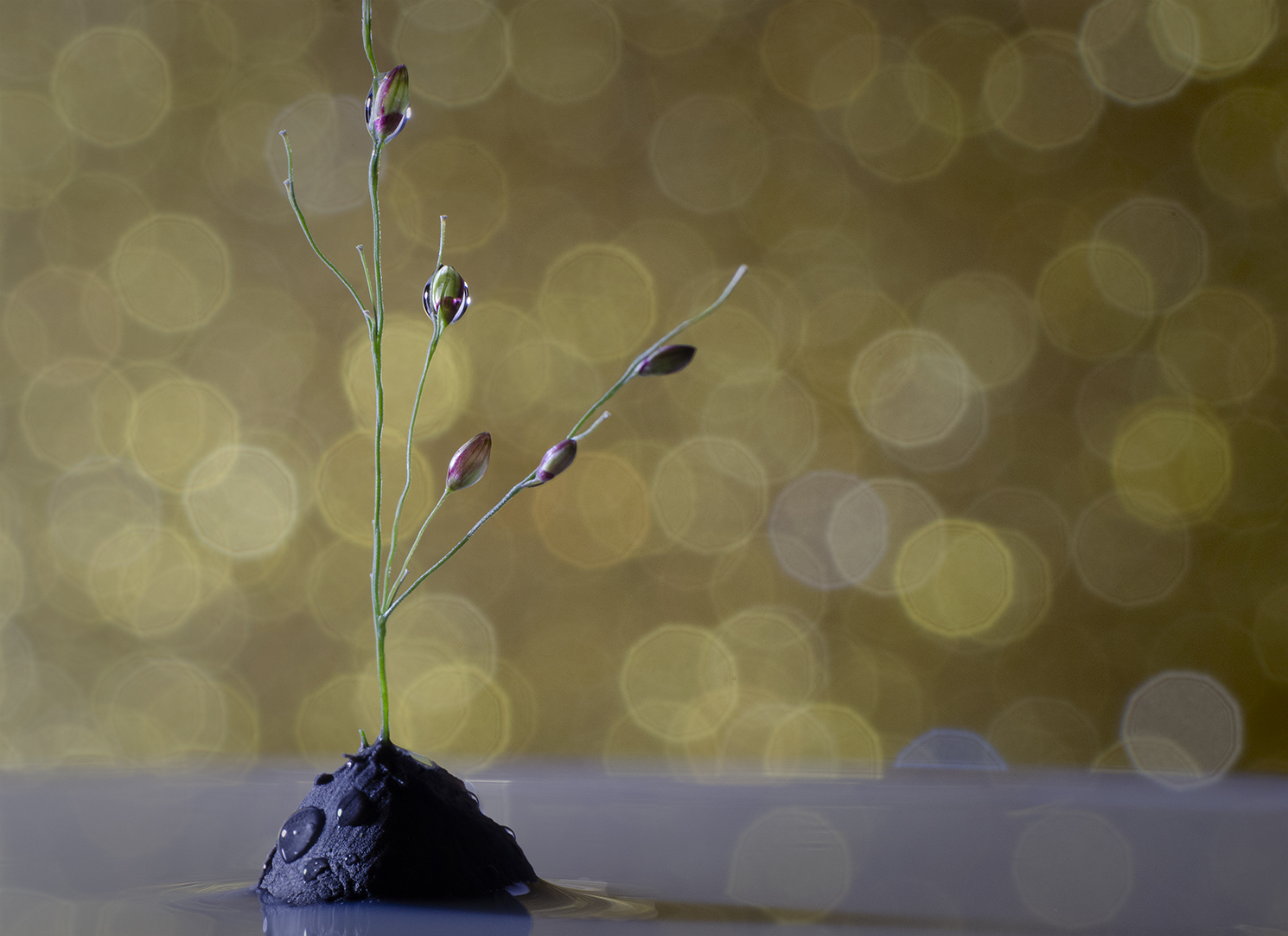
Adding a texture to the background and/or blurring some of the flowers would help here. I do believe I got lost in the bloom and therefore lost my perspective. I've been making an effort not to lose my way in post-processing as it often does more harm than good. In fact, I've started to set a timer so I stop, do something else, and come back at a later time. Sometime it's startling how differently the image portrays itself. |
Oct 23rd |
| 65 |
Oct 21 |
Comment |
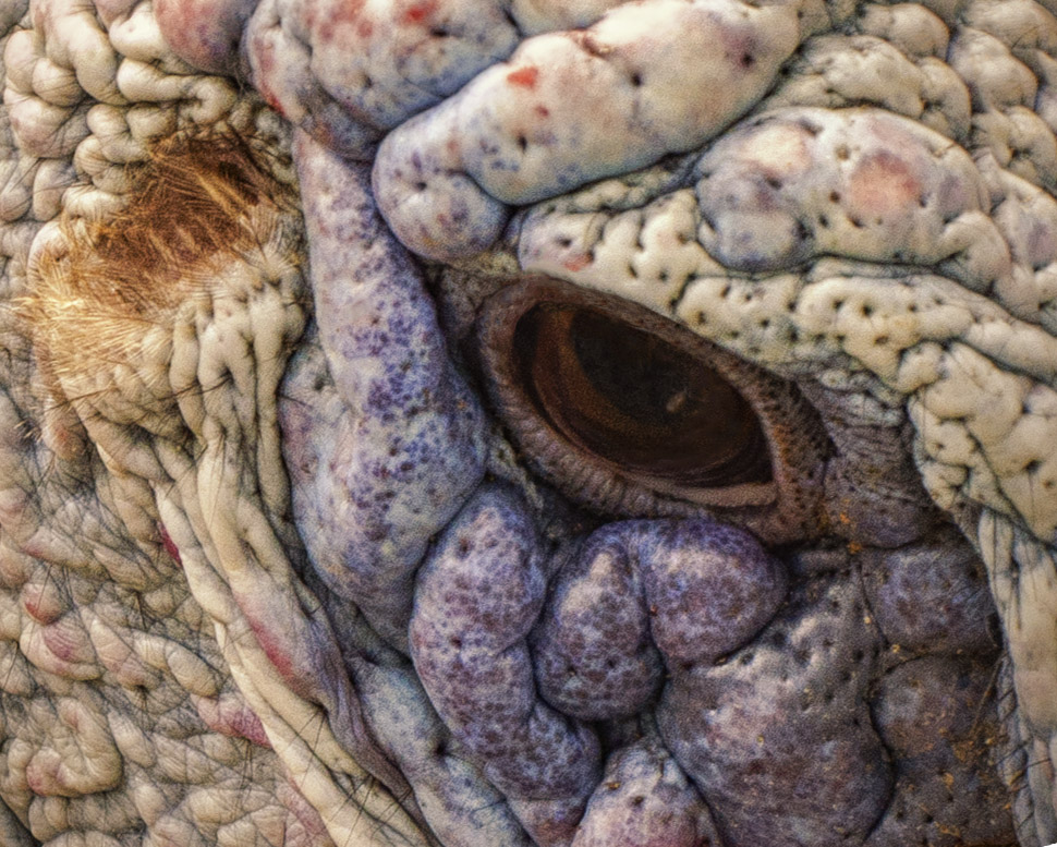
Miss Turkey must have had either a lot of attitude or didn't realize the time of year when she was out strolling. I like this image a lot. The hairs captured on her head and detail on her neck is nicely done. I agree with the comments above that it looks as though she's looking directly at us. |
Oct 18th |
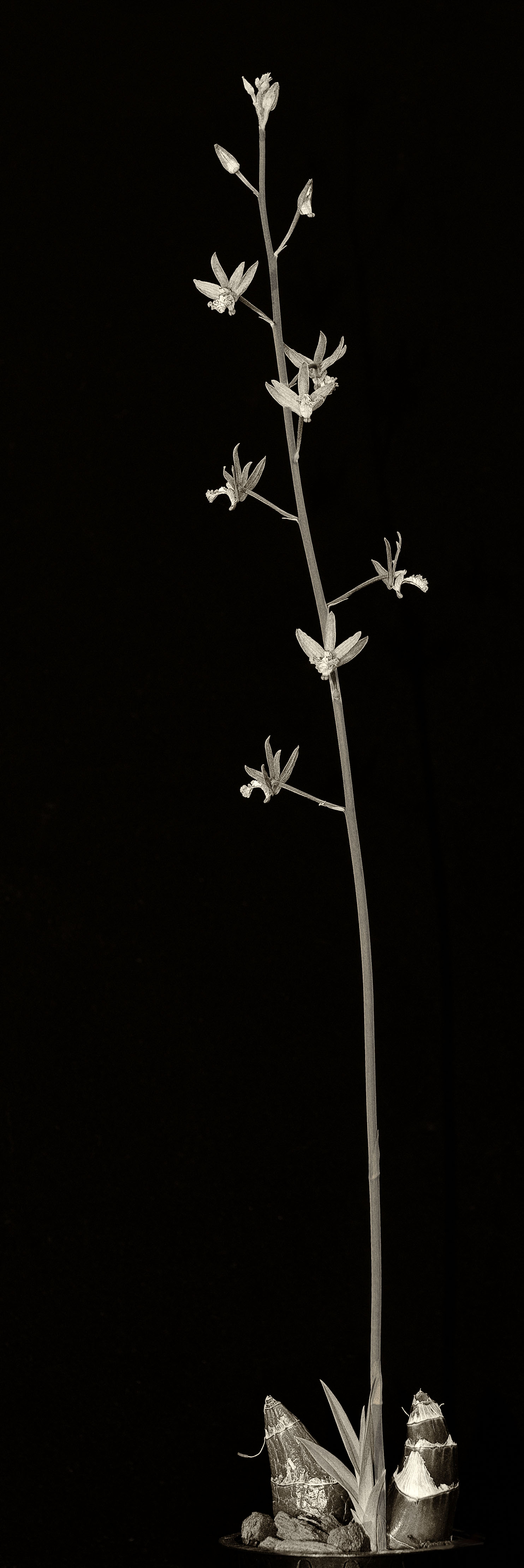
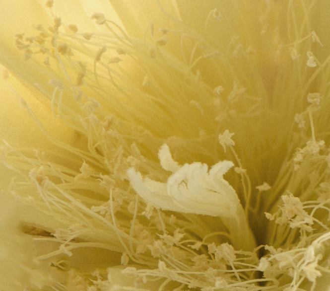
| 65 |
Oct 21 |
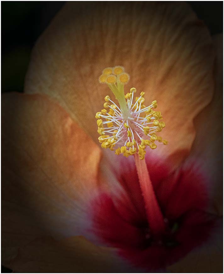
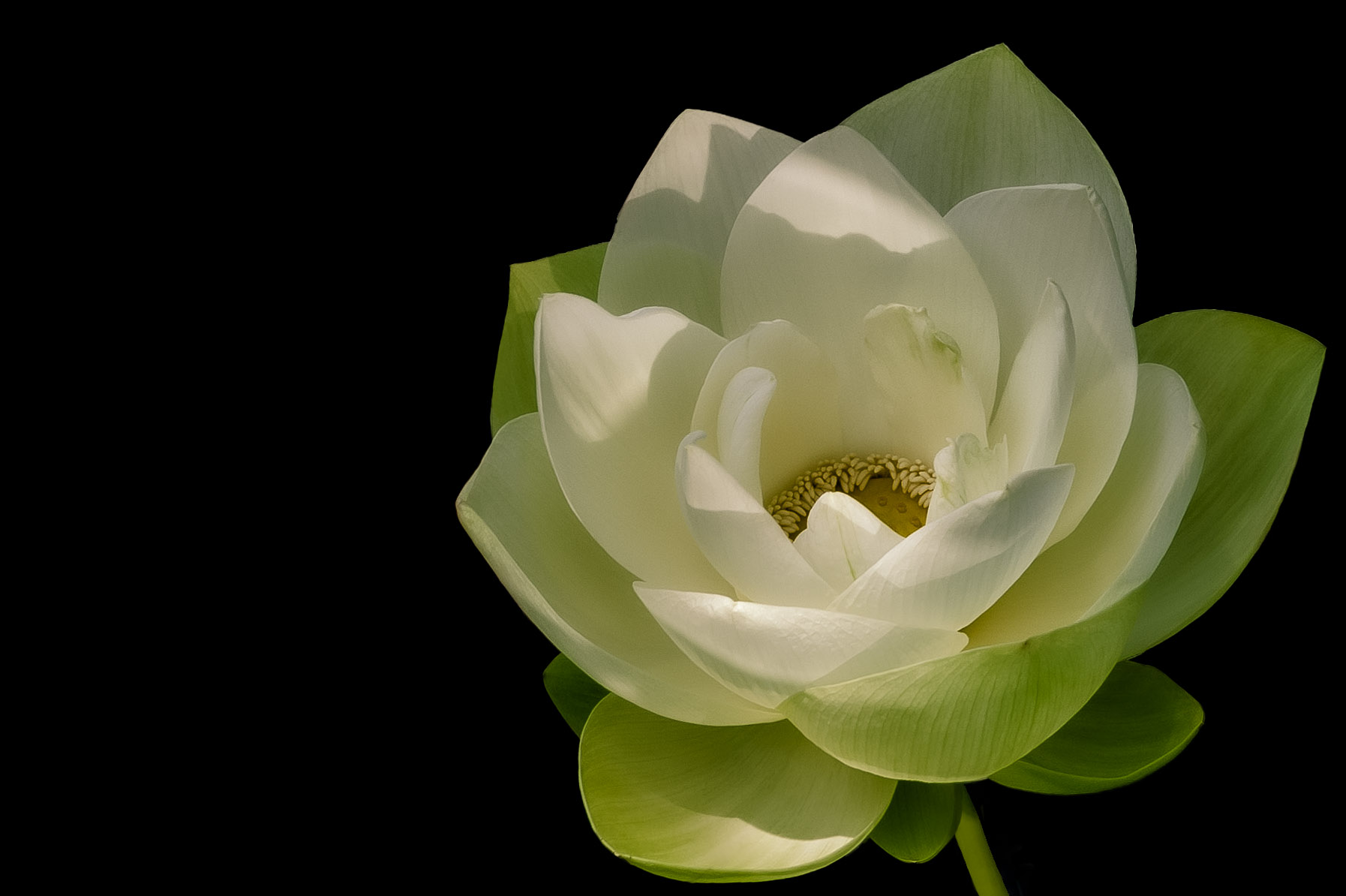
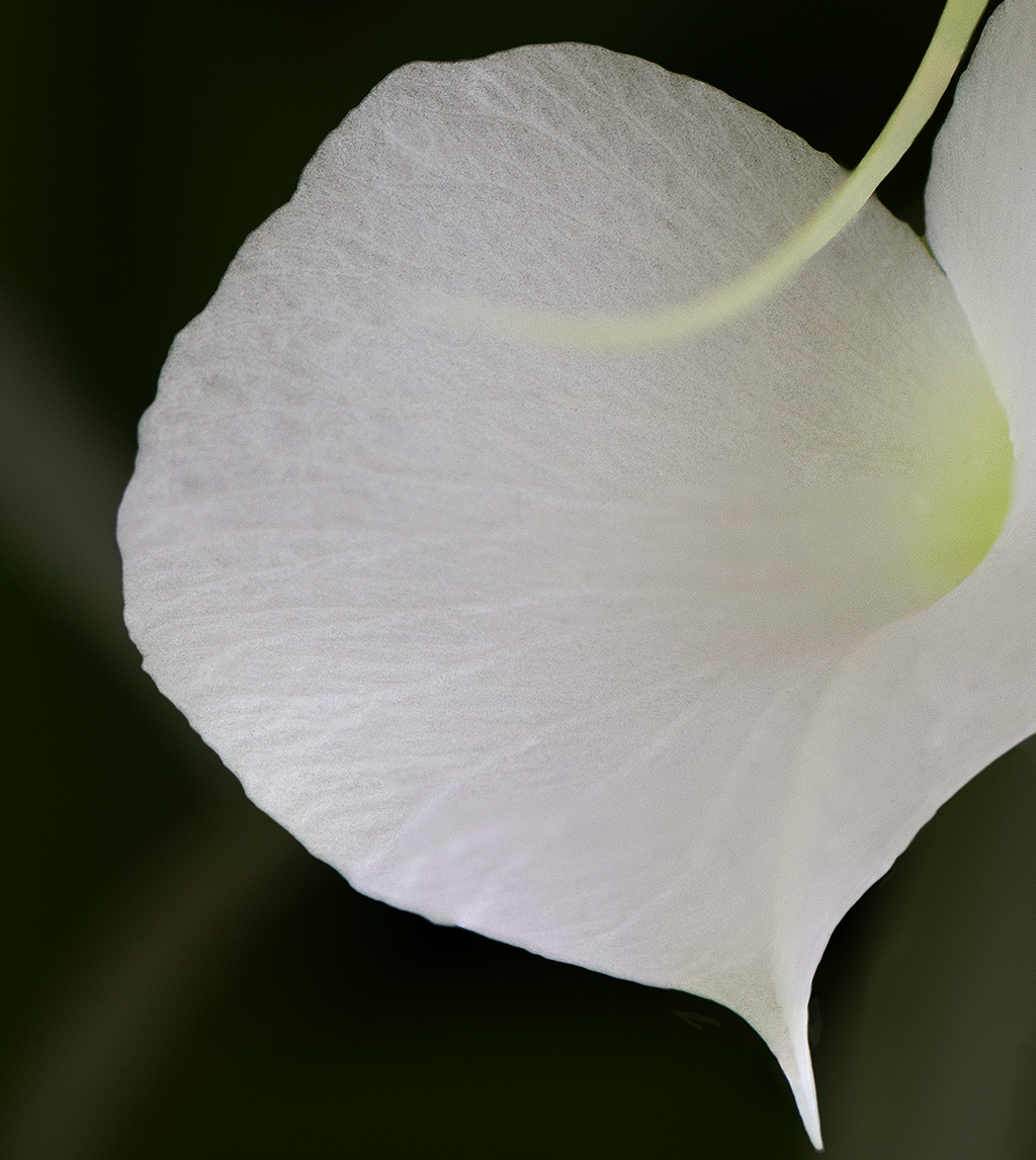
Comment |
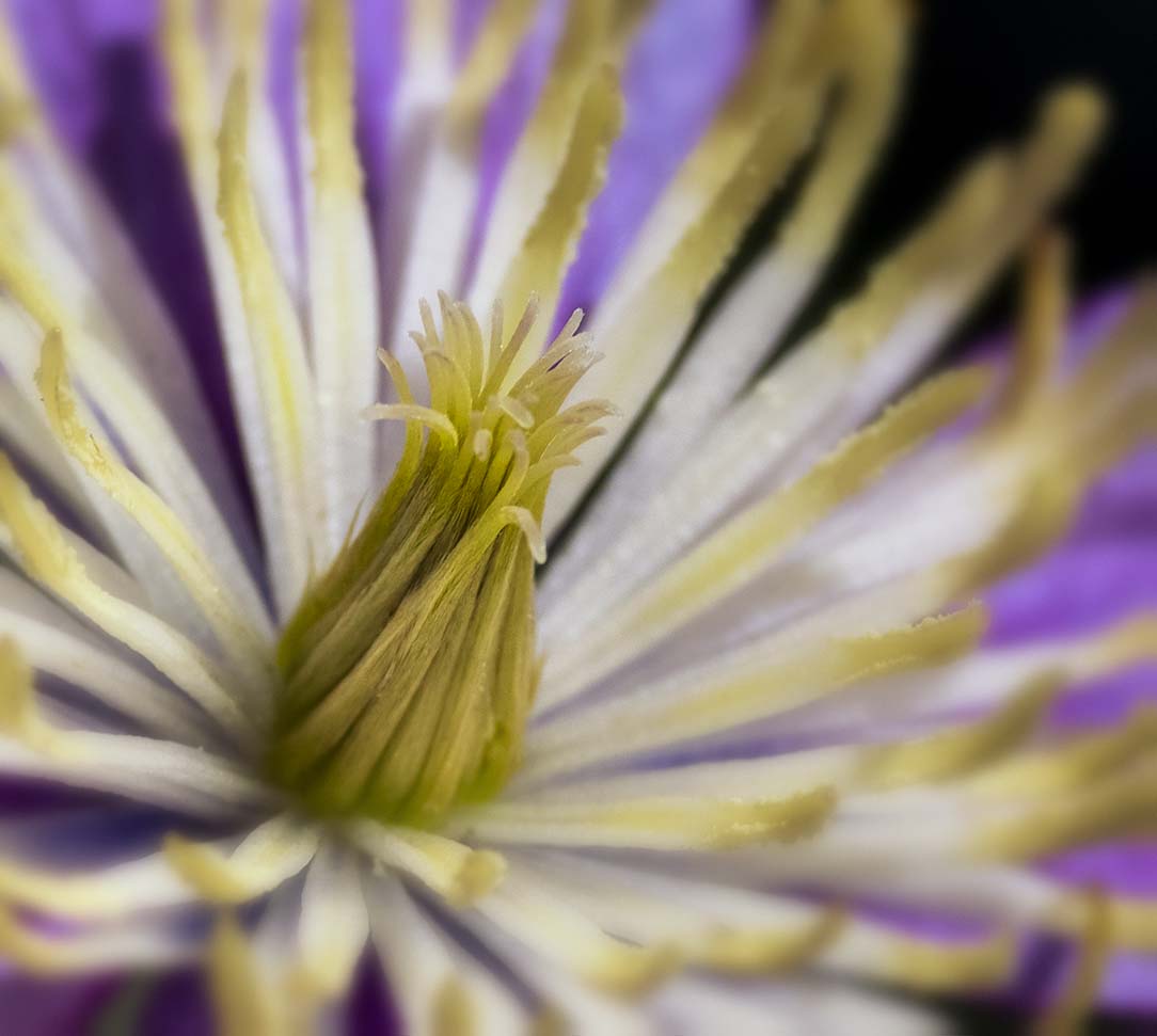
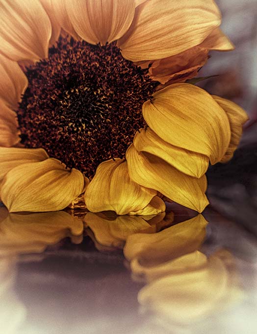
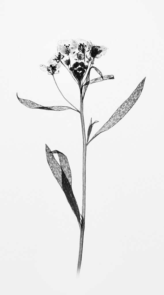
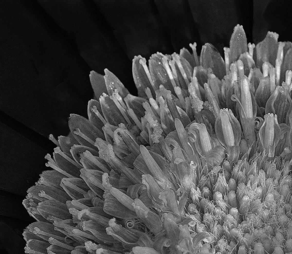
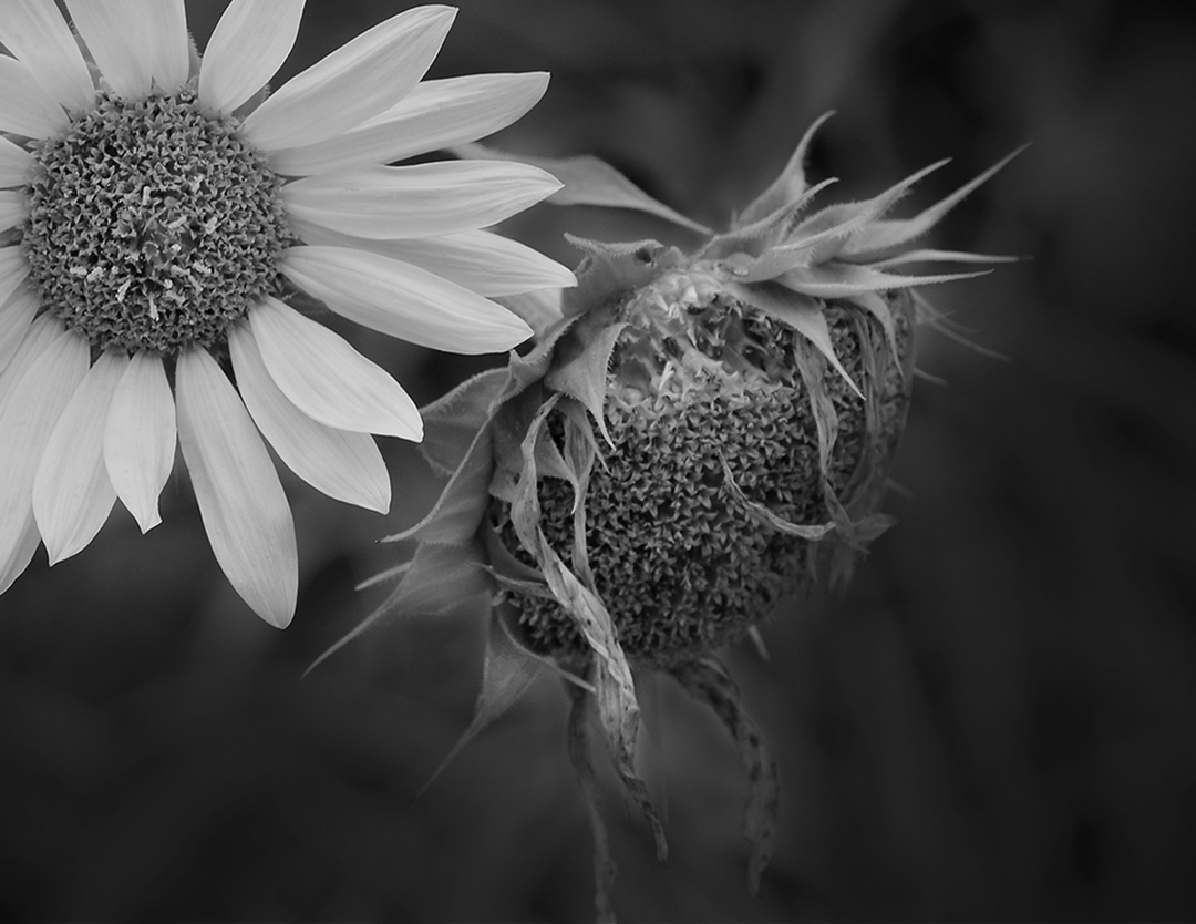
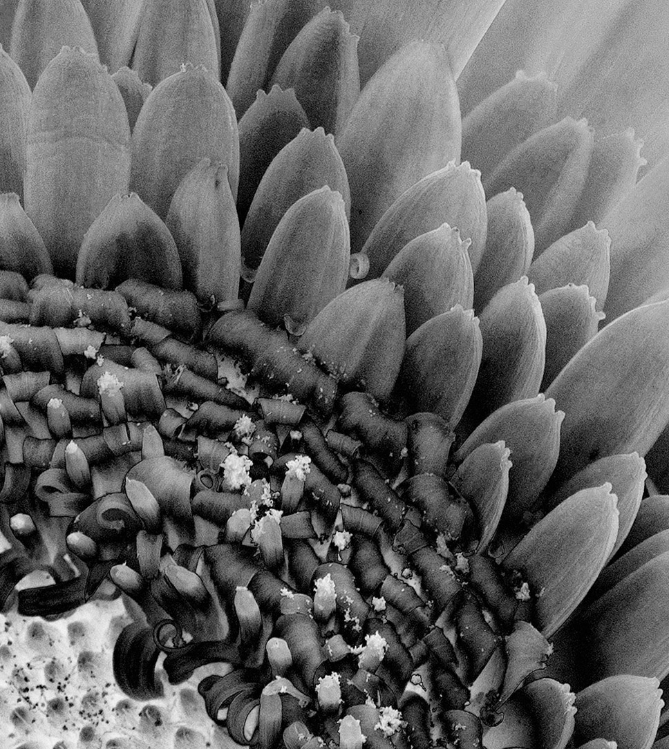
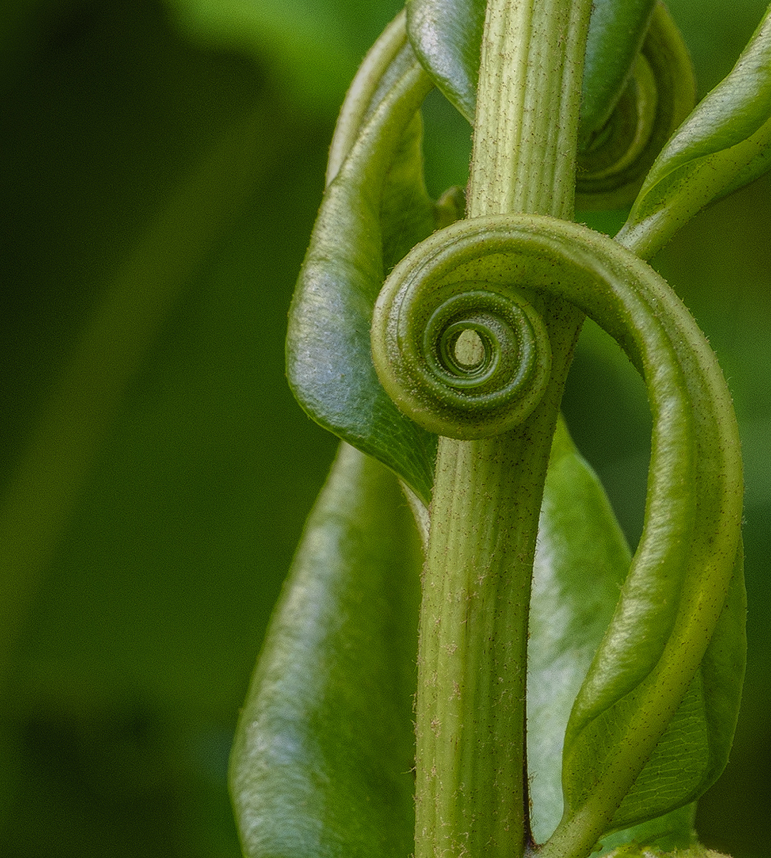
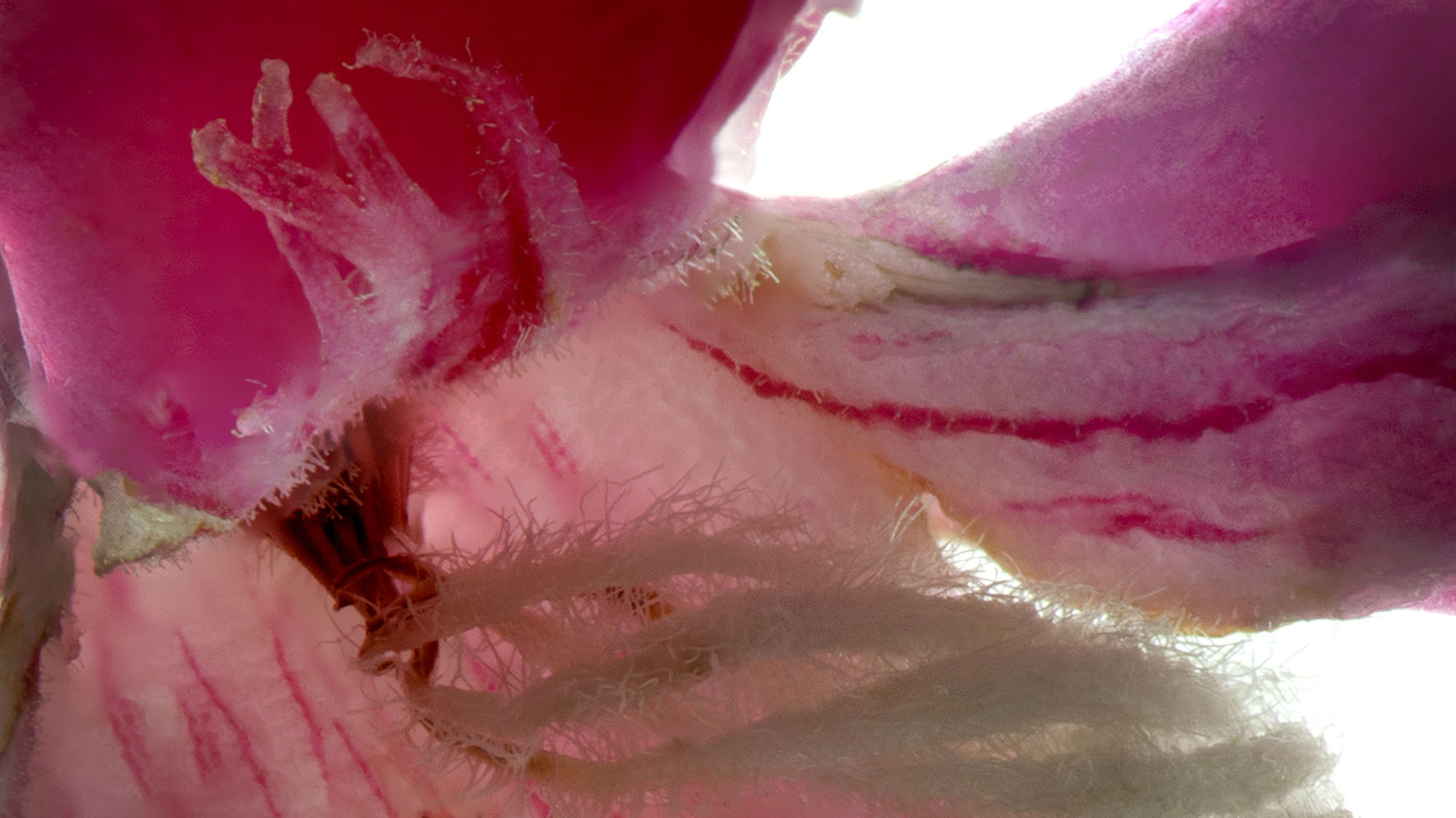
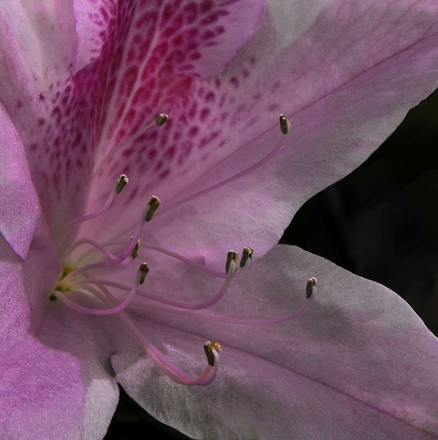
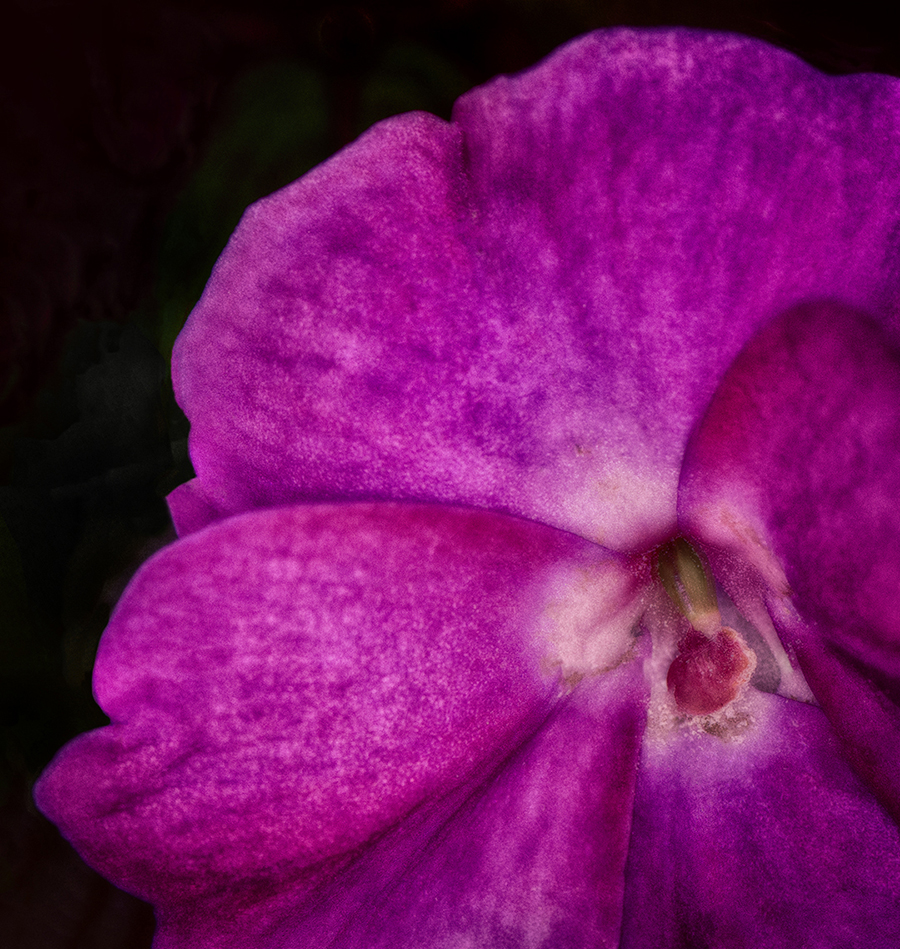
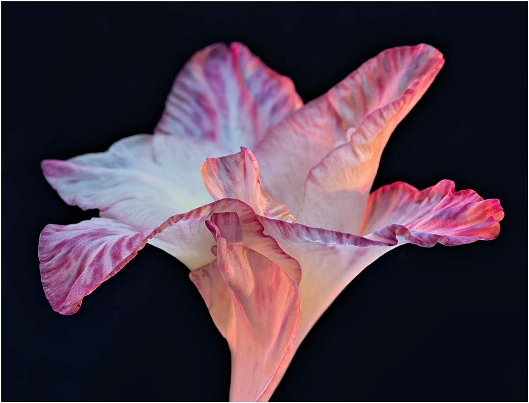
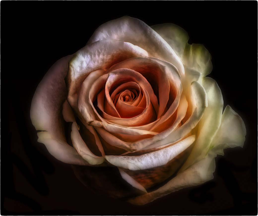
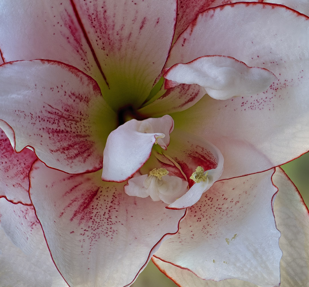
I like this image because it's bright and happy, the flower head is sharp and the composition is nicely done. Having the stem in focus is always a good thing, but I don't find it disturbing. What I am distracted with is the lower left corner. To my eye I'm drawn the the lighter, "open" area. If it were my image, I would either darken the area or add a little more blue.
As for the overall image, the depth of field is well done with the front leaf bringing me right into the flower head. That said, it's also making me crazy. I want to reach in and nudge those petals open so I can see the whole sunflower. |
Oct 18th |
| 65 |
Oct 21 |
Comment |
Welcome to the group Dee!
Your image is very nicely done and I applaud any image like this that's hand-held. I've gotten a bit too used to my tripod...
Not only is the bee's face sharp, you can see all the pollen dust he (she?) is enjoying. The tip of the right wing looks as though there may have been a stem in front of it because it looks a bit foggy, but I can't tell. Did you do any post-processing in that area?
The relative sharpness of the white flower above the bee's head and how you handled the background adds to the image. Very nice. |
Oct 18th |
| 65 |
Oct 21 |
Comment |
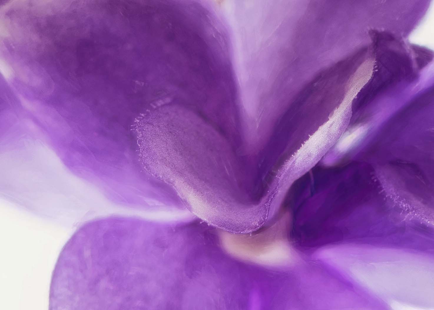
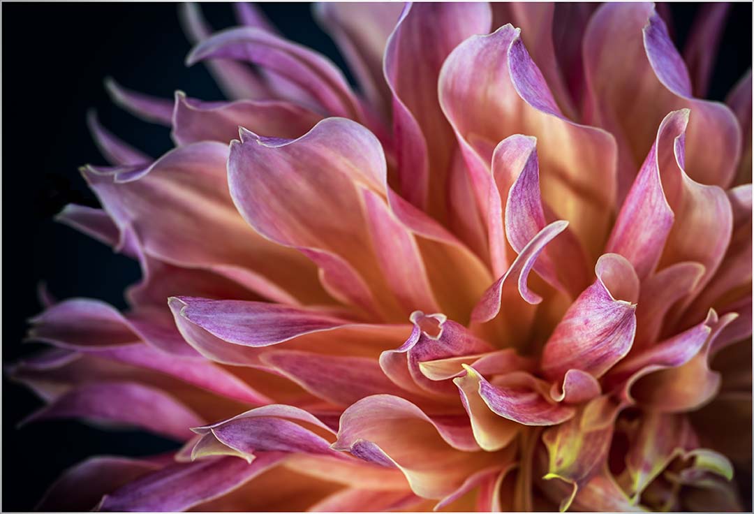
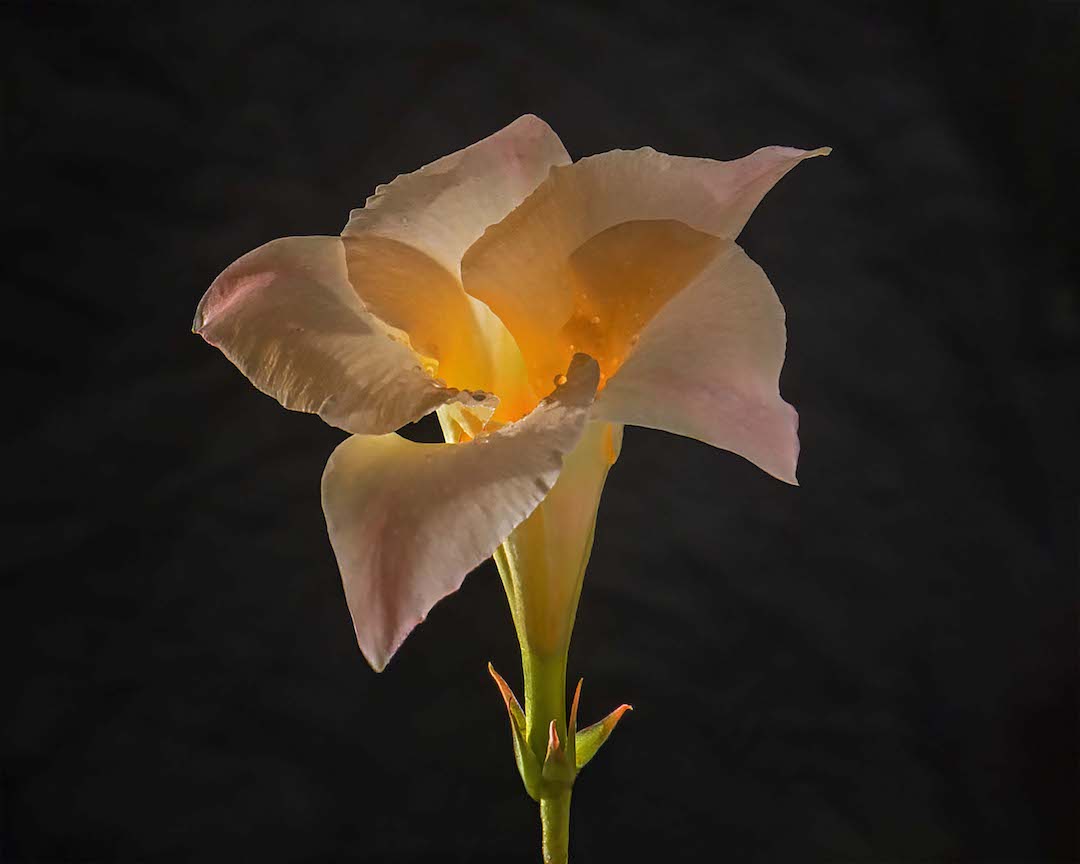
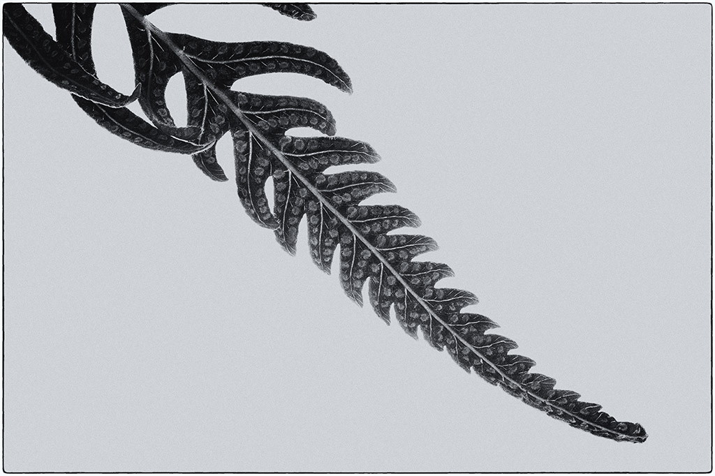
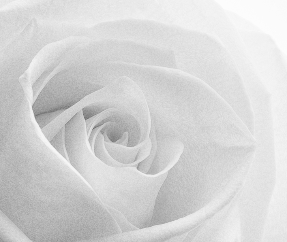
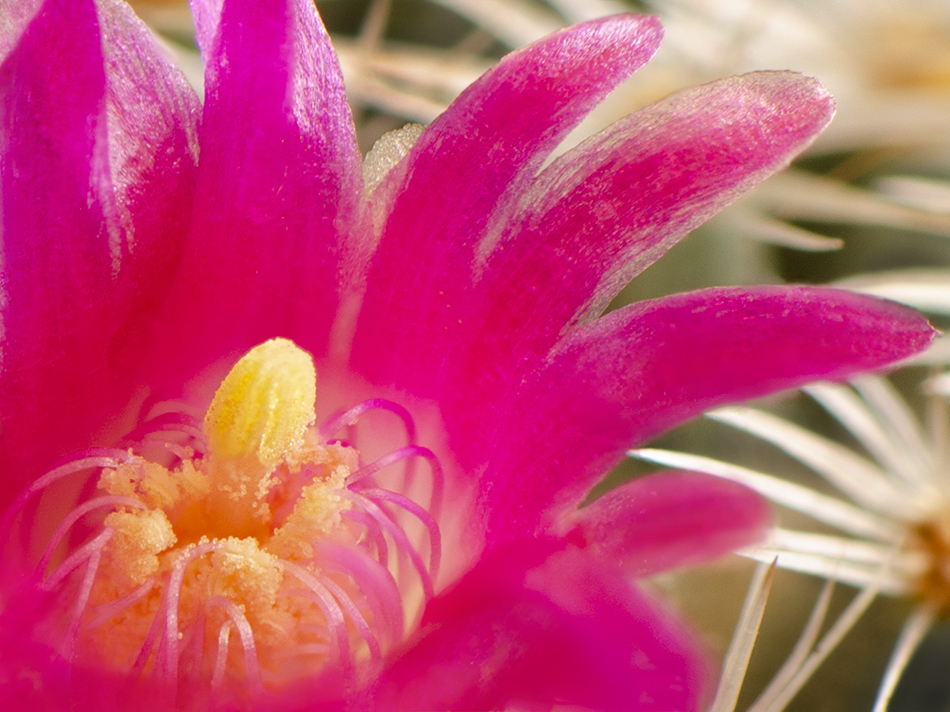
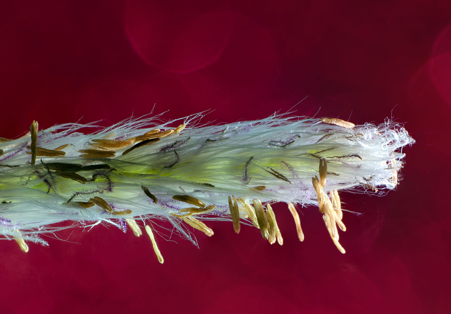
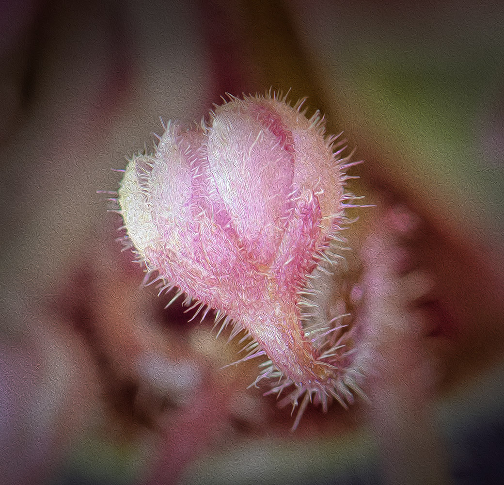
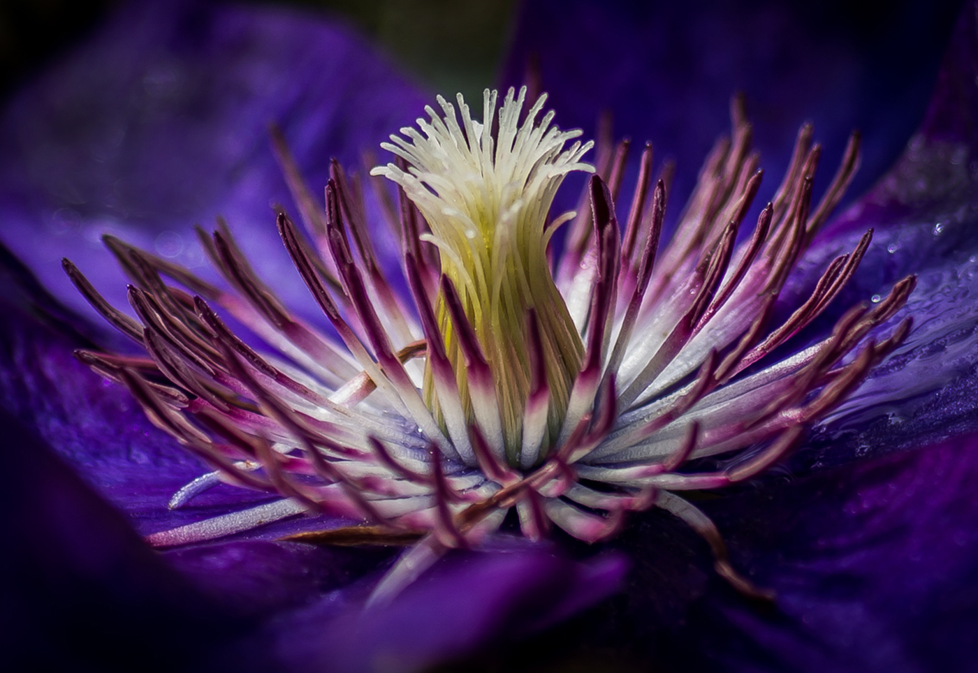
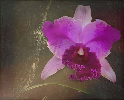
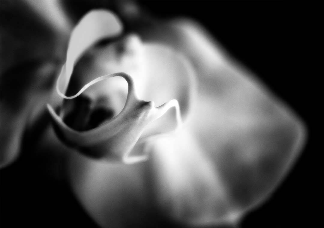
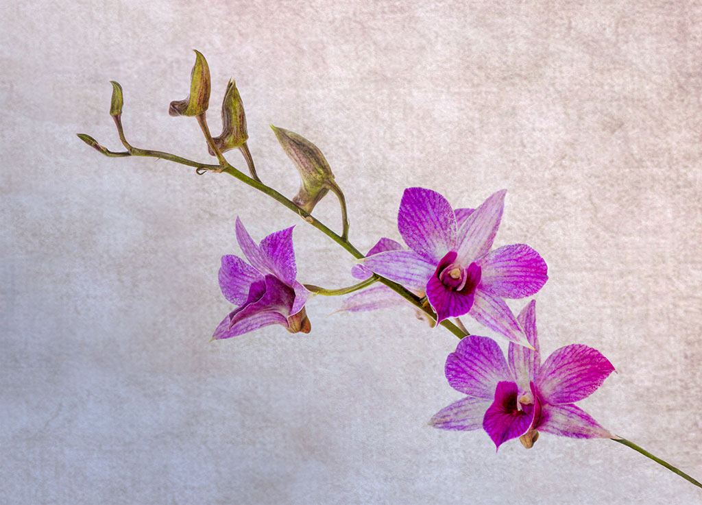
Nice image. I like the little drops on the top of the highest petal, and the composition. The way you've "entered into" the bloom really provides depth. Not sure if the line hanging down at the top of the stem and another sweeping upward at the bottom of the flower are hairs - I may have been tempted to remove them. Speaking of hairs, the representation of hairs on the stem and the leaves is great. Particularly the being able to see the little black balls on each hair. Really nicely done! |
Oct 18th |
4 comments - 1 reply for Group 65
|
10 comments - 4 replies Total
|