|
| Group |
Round |
C/R |
Comment |
Date |
Image |
| 32 |
Jun 21 |
Reply |
Love the crop and the darkening by the bun. I rarely do portraits so any feedback is appreciated! |
Jun 18th |
| 32 |
Jun 21 |
Reply |
I agree with the crop��it looks great. I can't remember which preset I chose in NIK, but I know it wasn't any of the portrait choices. I think it was the second high contrast choice, but sometimes I mess around with the sliders in the preset. |
Jun 18th |
| 32 |
Jun 21 |
Comment |
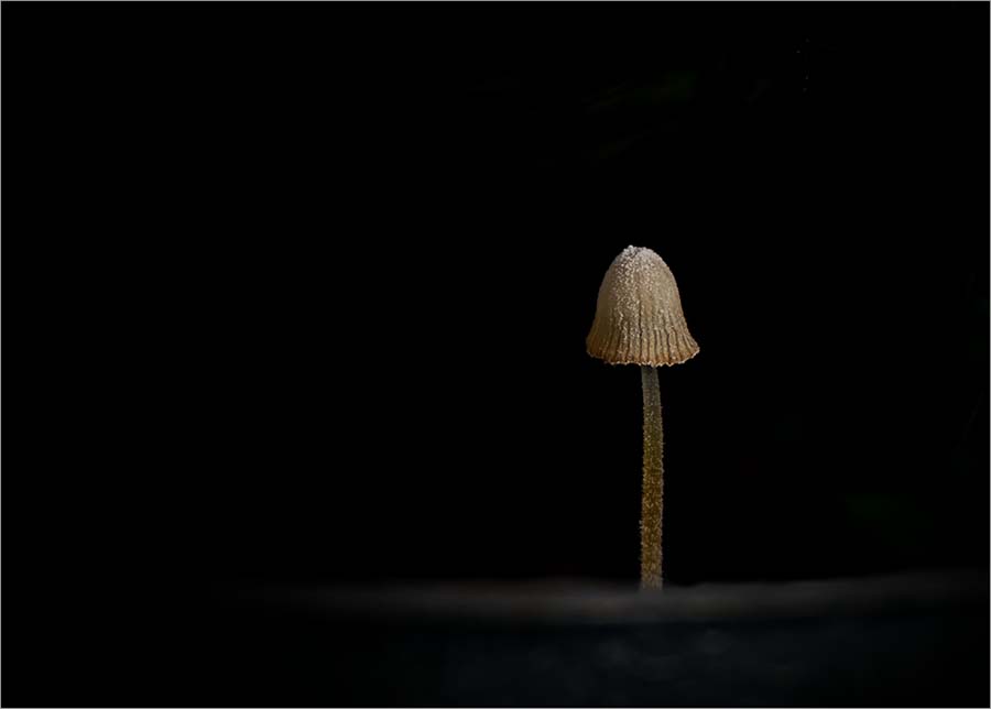
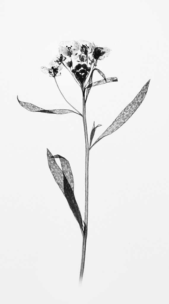
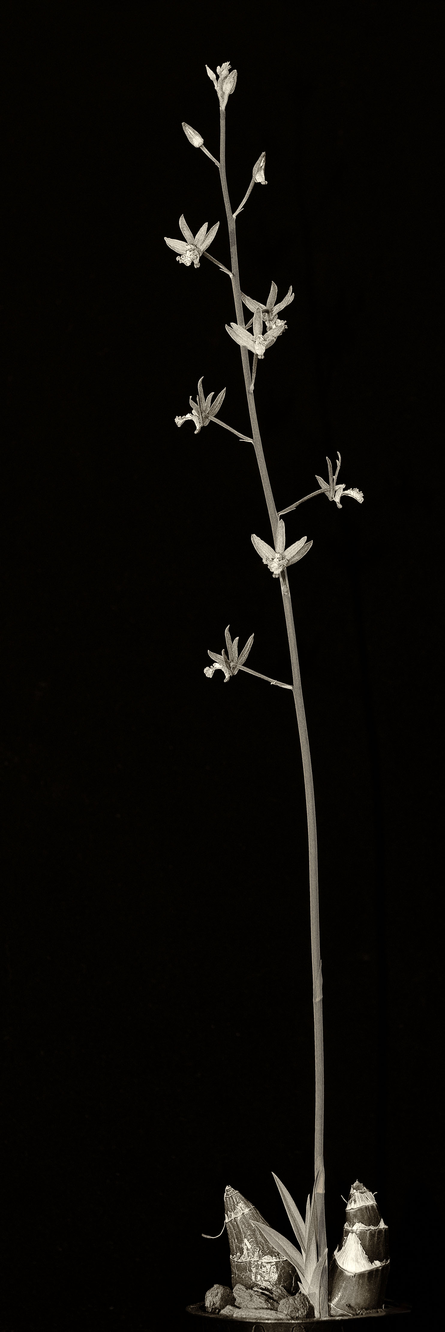
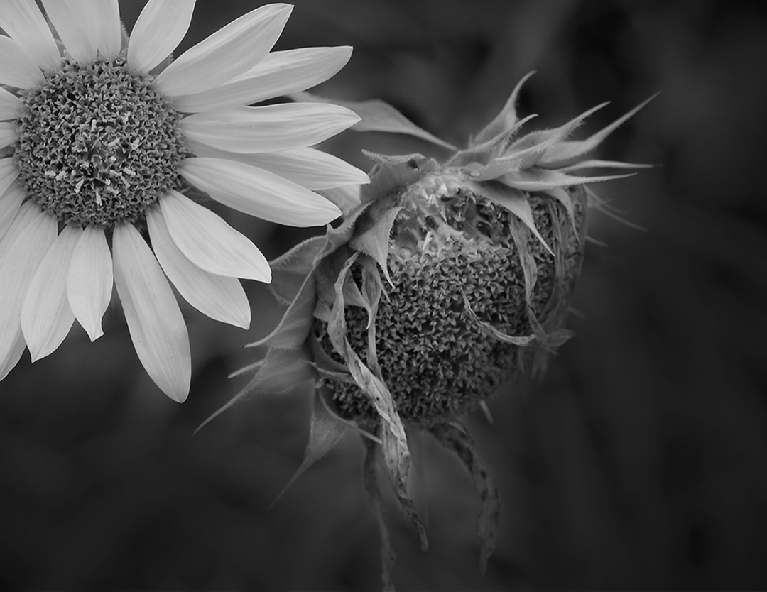
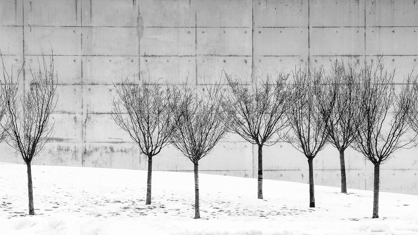
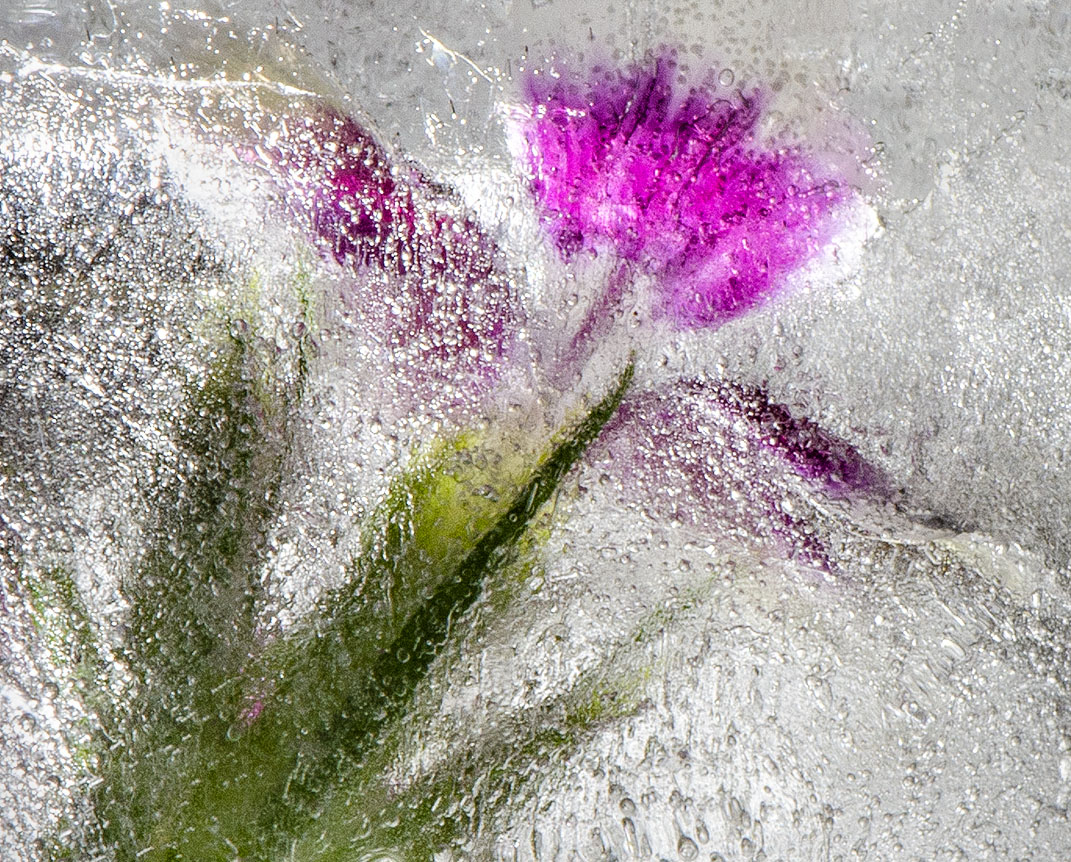
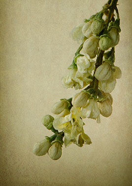
This image provides interest, but as said in prior comments it probably wouldn't stand on its own in competition. I like the detail of the snow, the stem and the leaves, and at the same time the sad, lonely feel. I'm wondering if adding space on the top would provide more breathing room. |
Jun 18th |
| 32 |
Jun 21 |
Comment |
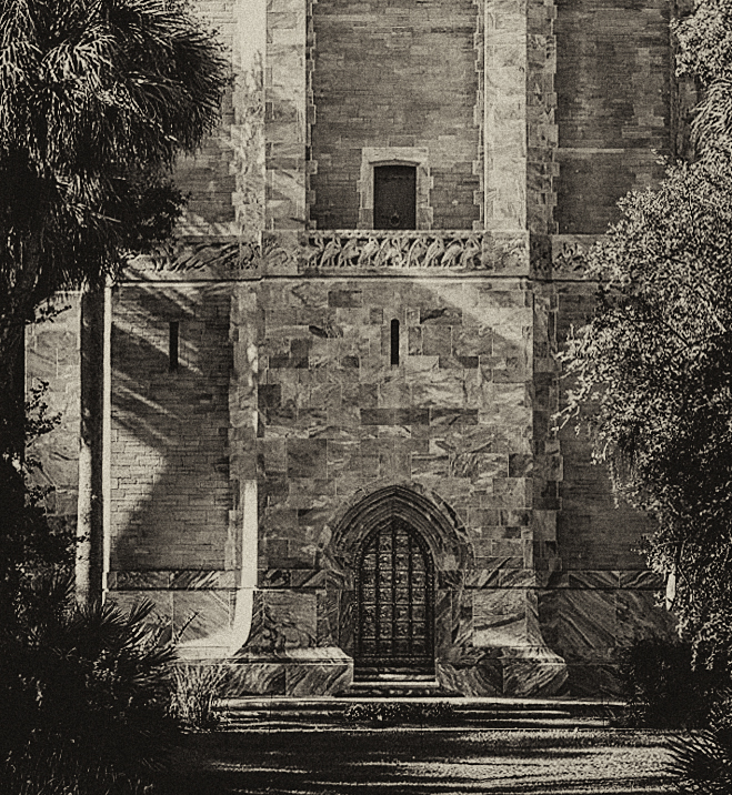
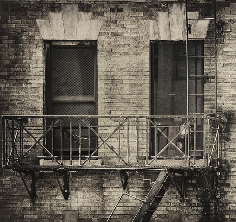
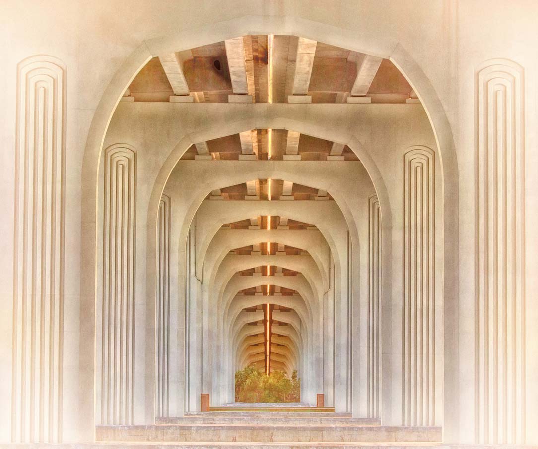
The architectural aspect of this image is impressive. The details in the roof are amazing and you captured that well. I agree with Tom though that the right upper corner is distracting, and the over image has a grayish flat tone. Diana's addition of contrast with Tom's crop, and the image pops. |
Jun 18th |
| 32 |
Jun 21 |
Comment |
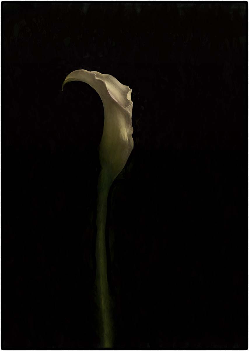
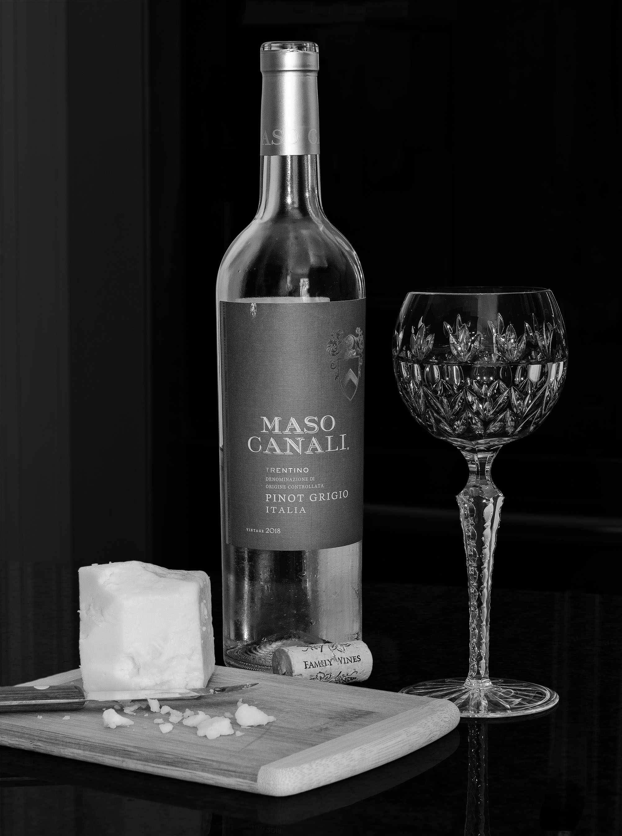
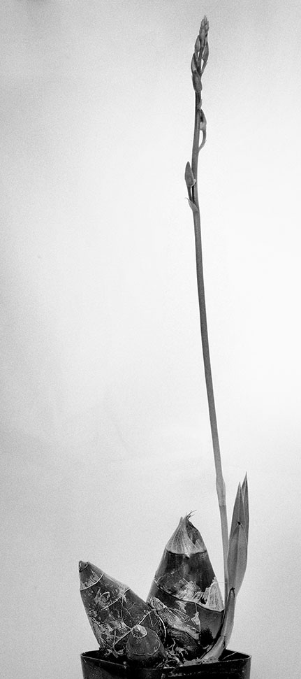
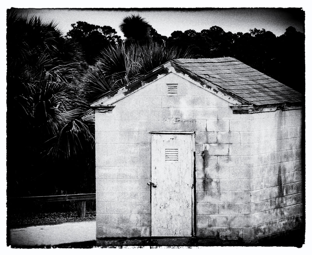
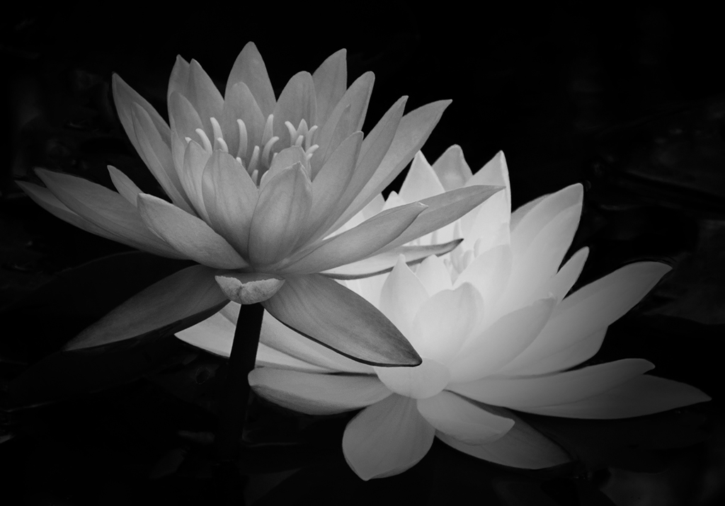
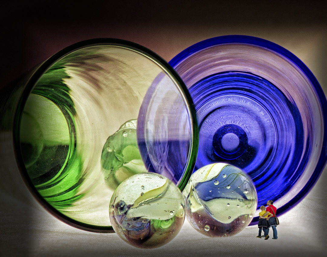
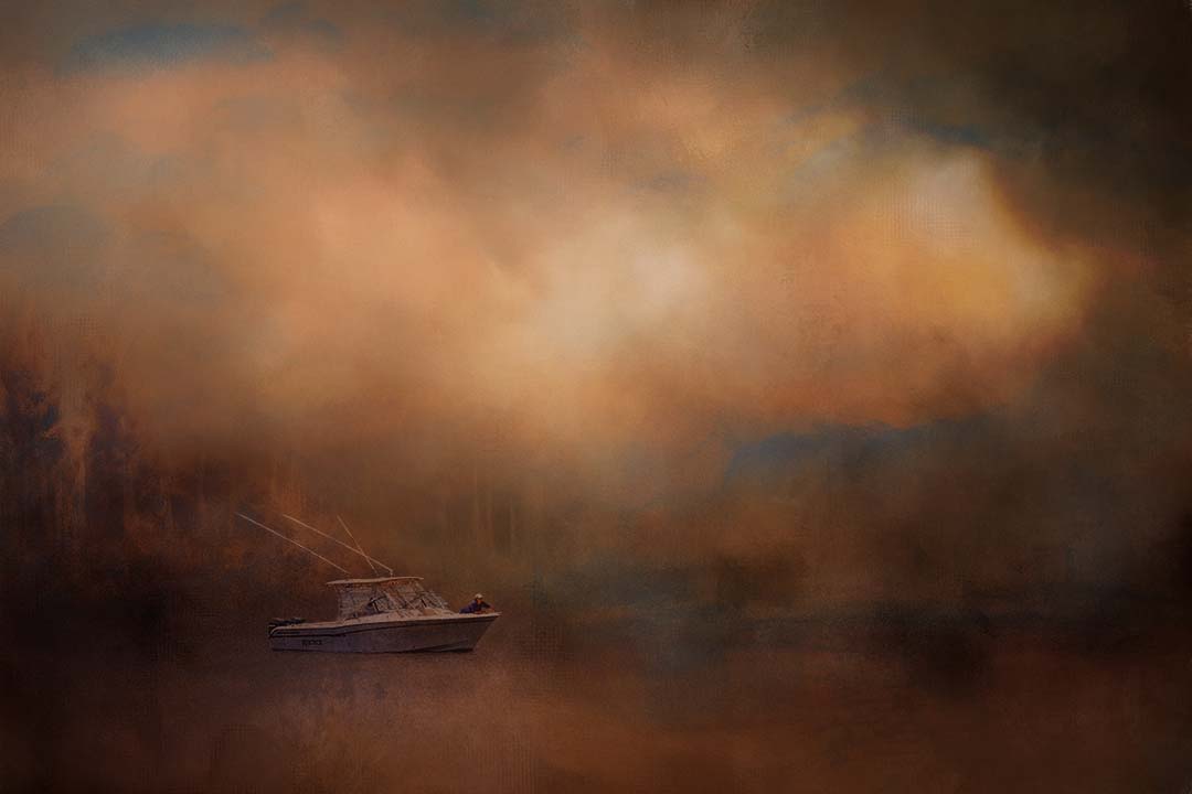
Well done. Placing the demarcation line above center makes it different. Minimalism done well is a pleasure to look at. You mention you removed the photographer to increase salability. It seems that removing the Yucca would work here too - having them both represented increases impact. Your whites are handled well. |
Jun 11th |
| 32 |
Jun 21 |
Comment |
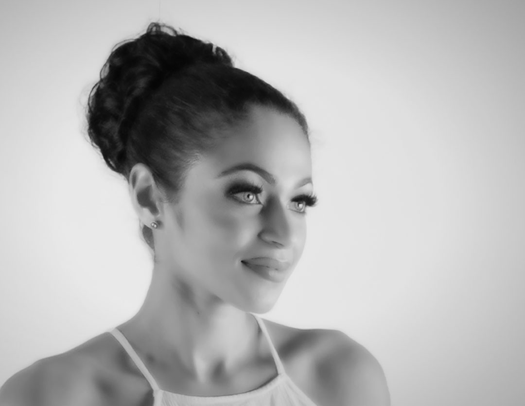
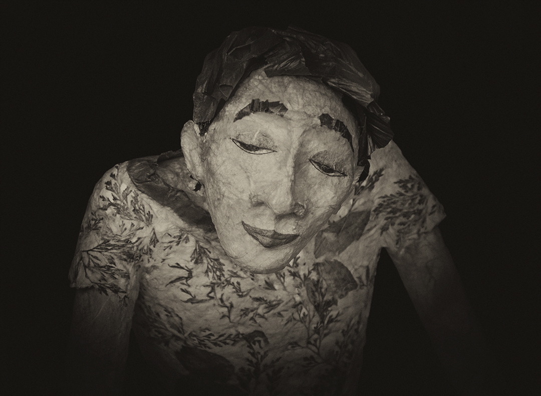
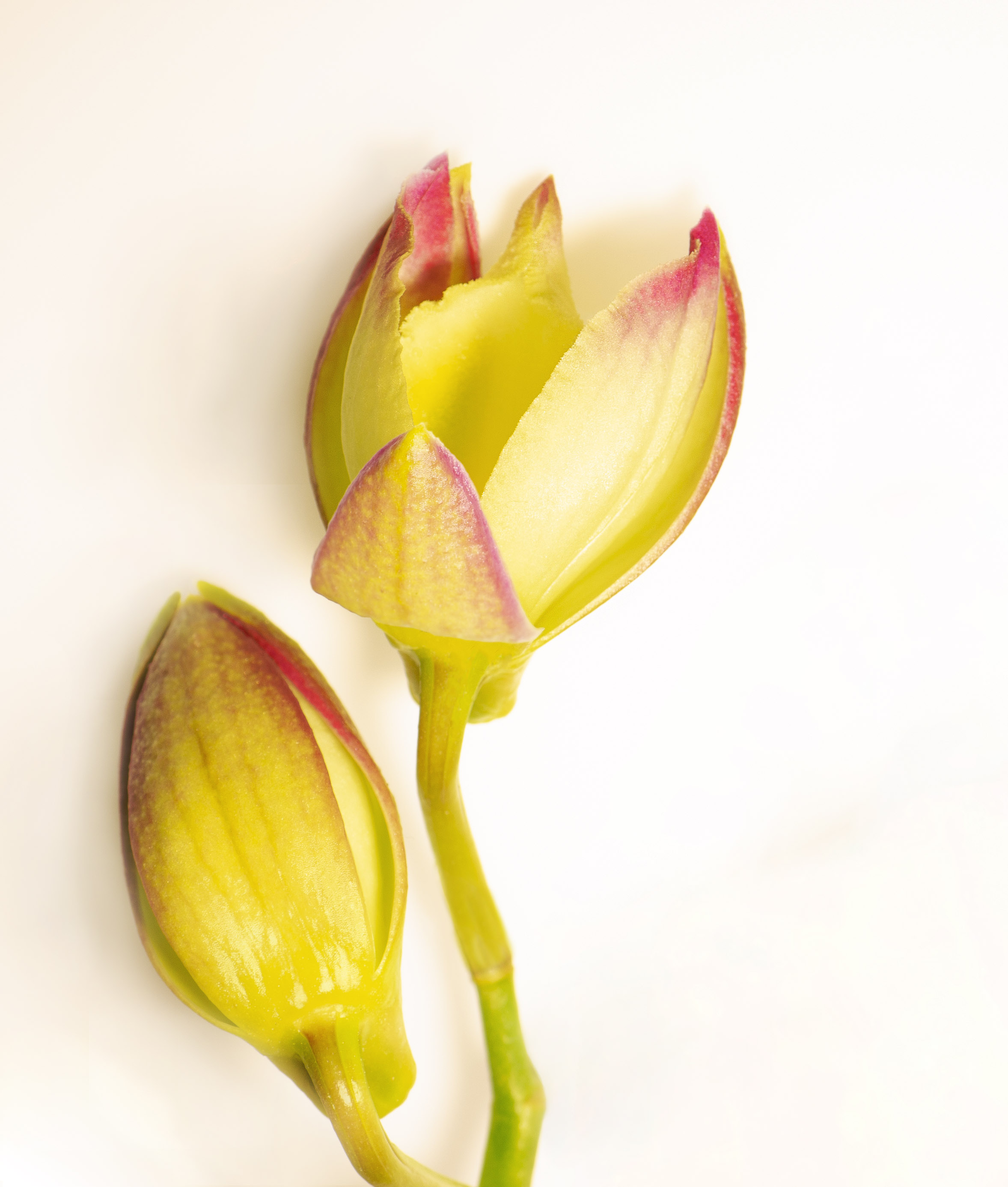
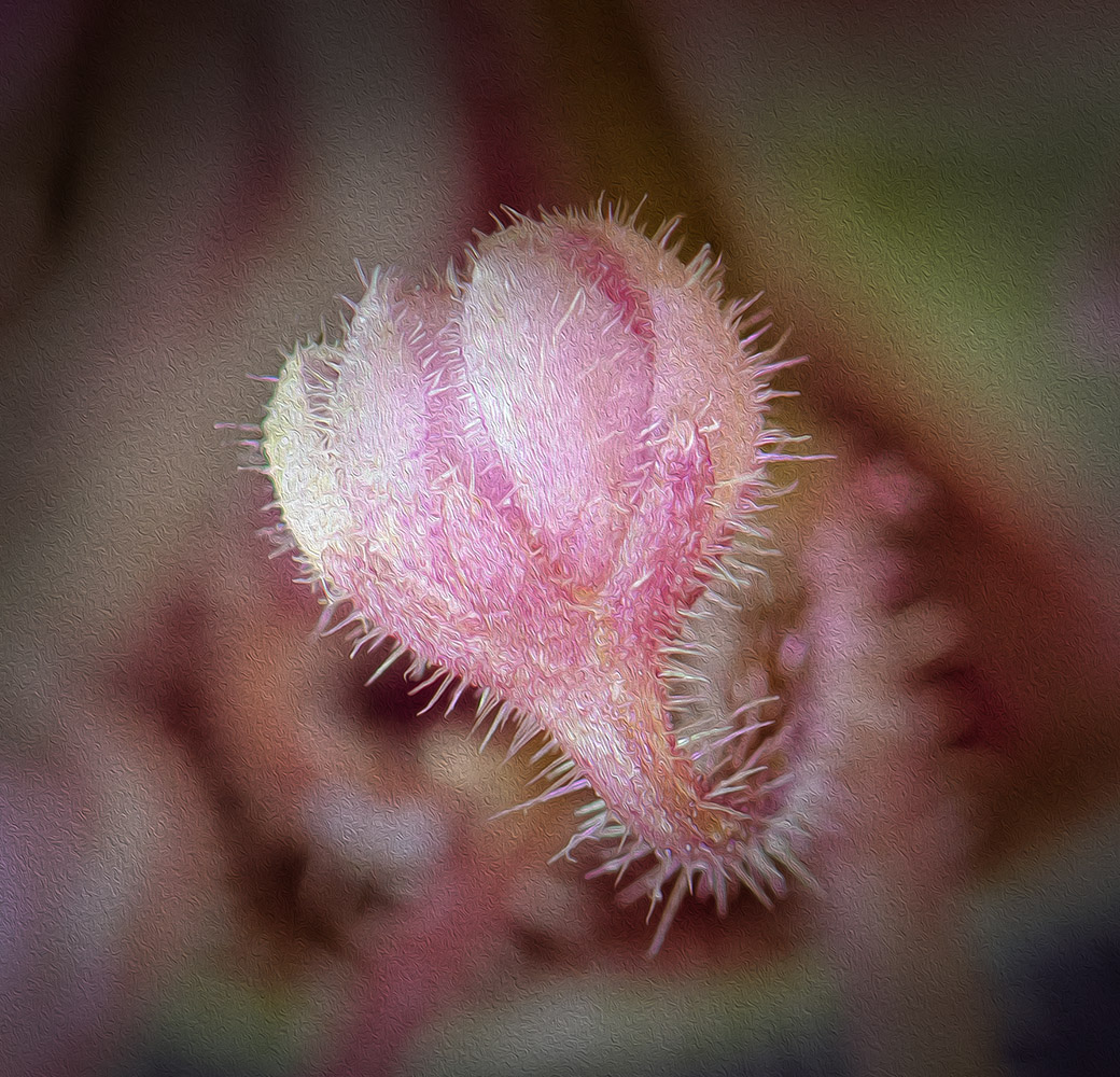
Before I read your narrative I immediately thought of fairies and fairy dust. I do like the effect and think the dust speckles on her face is good. Gives the effect of Ursula being in the fairy dust. You may want to bump up the contrast a tiny bit, but the original image is ethereal so I wouldn't expect too much contrast.
The technique you used is well done. And I love the tulip pattern. Nice job. |
Jun 11th |
| 32 |
Jun 21 |
Comment |
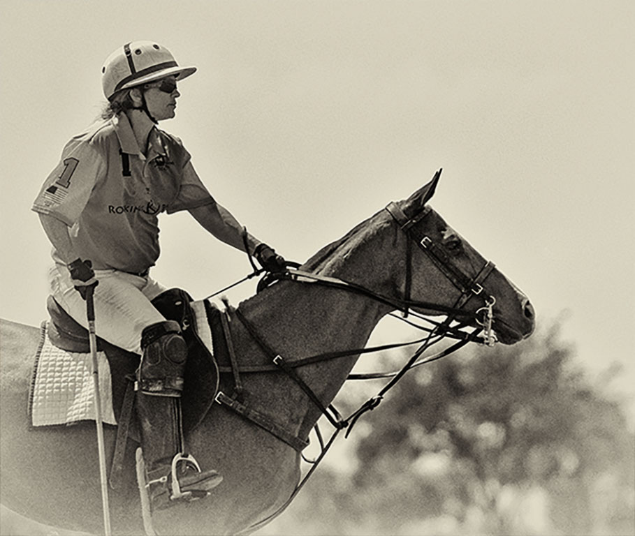
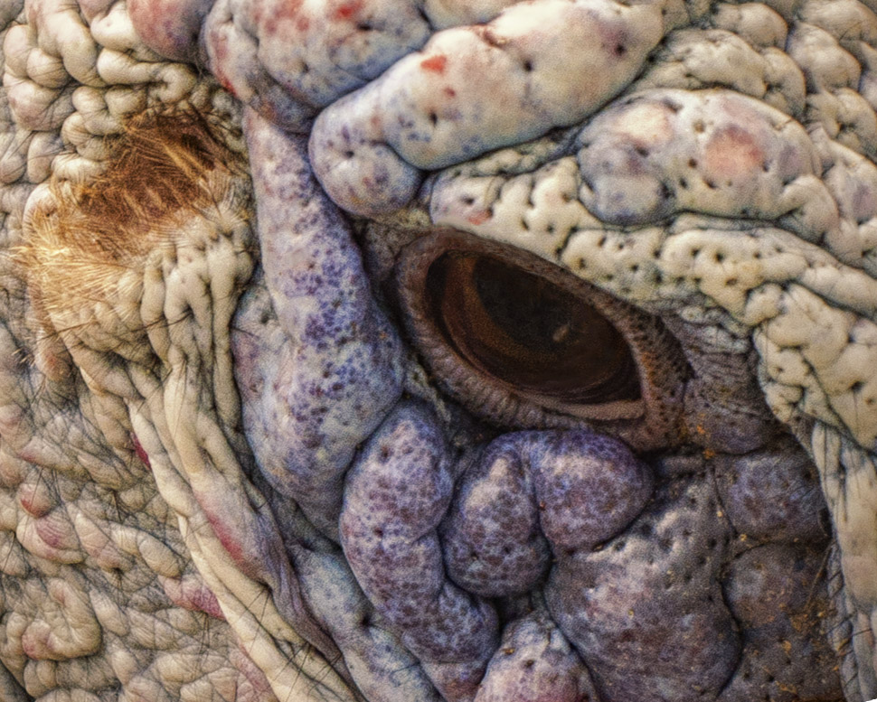
That really is a beautiful horn and it's obvious he takes good care of it. I like both versions as each has a different feel, but I like the color version best. I agree with Stephen that the composition works here, and I agree with you too�� being outside is so nice. Good image. |
Jun 11th |
5 comments - 2 replies for Group 32
|
| 65 |
Jun 21 |
Reply |
Yes it was - I couldn't help myself�� |
Jun 25th |
| 65 |
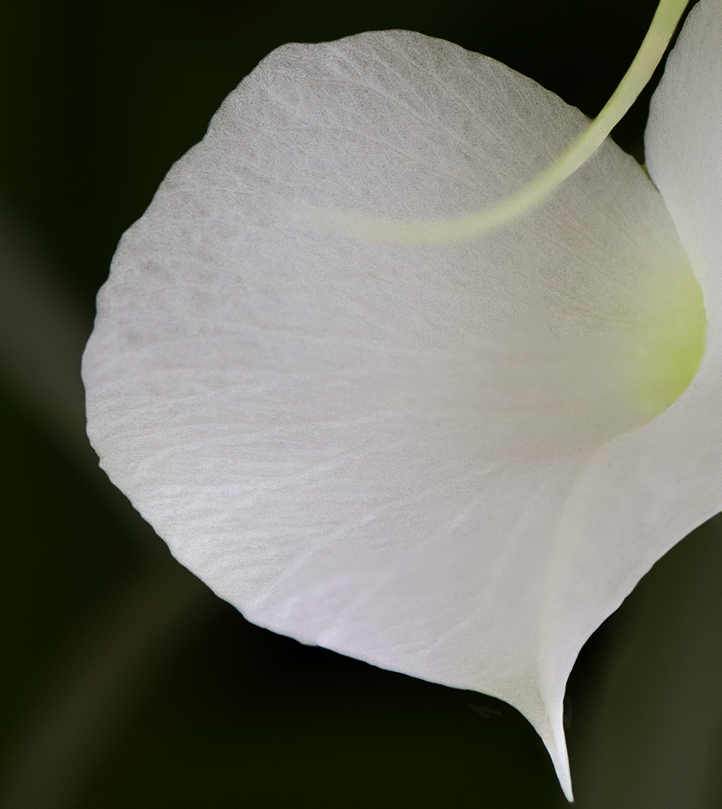
Jun 21 |
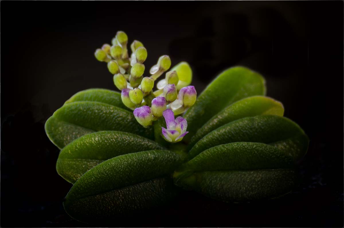
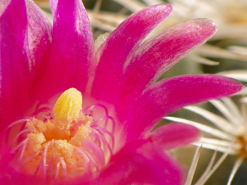
Comment |
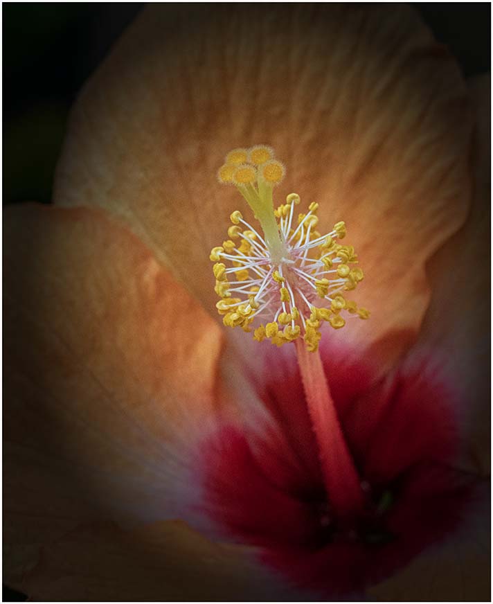
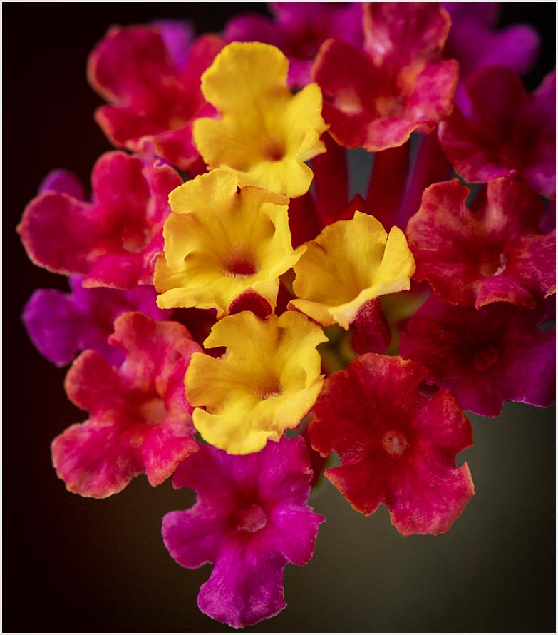
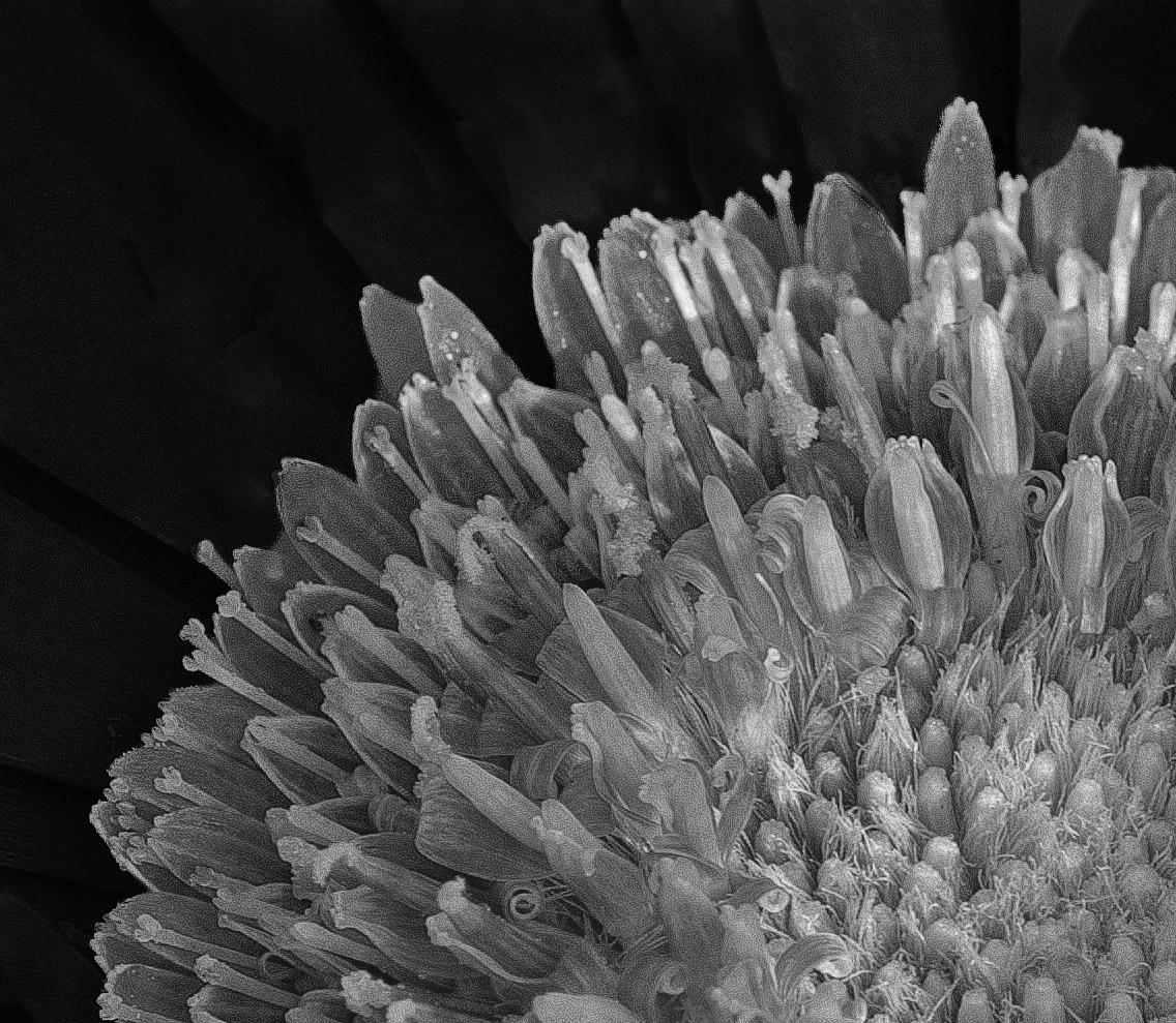
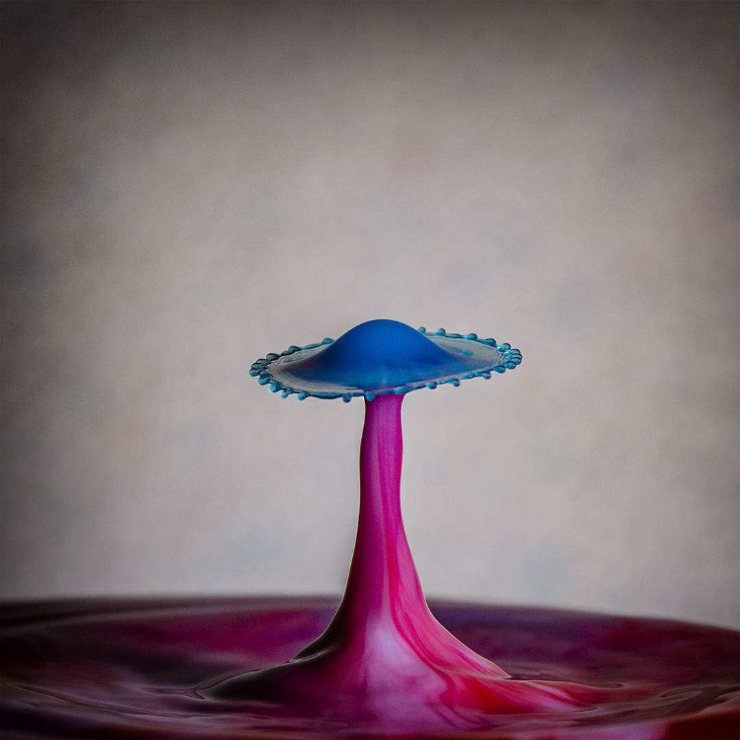
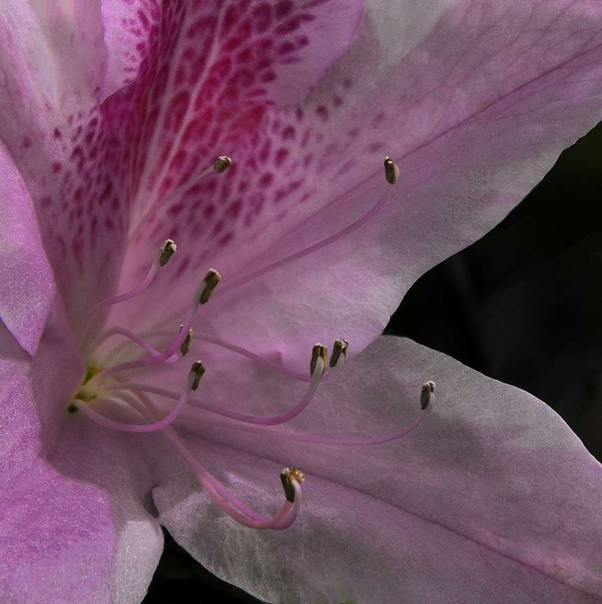
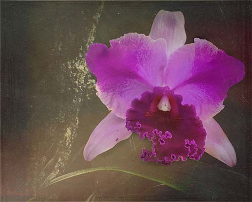
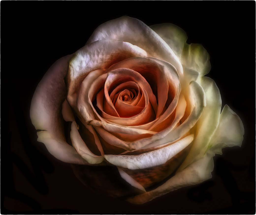
What a nice image Denise. Your capture of the double bump on the top of the blossom is great and I do like the bokeh. If it were mine I might bring down the brightness on the petals a little to try and bring out more detail to match the detail on the flower head. This is a happy flower and you captured that here. |
Jun 18th |
| 65 |
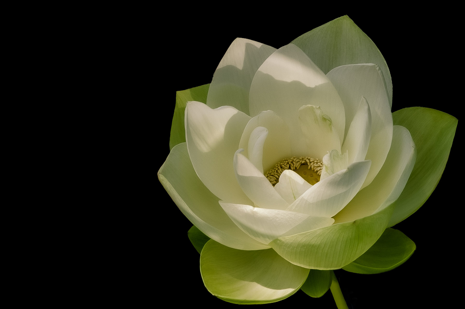
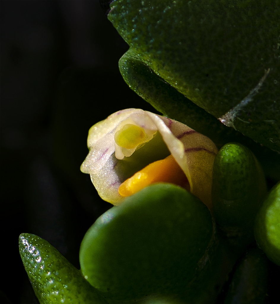
Jun 21 |
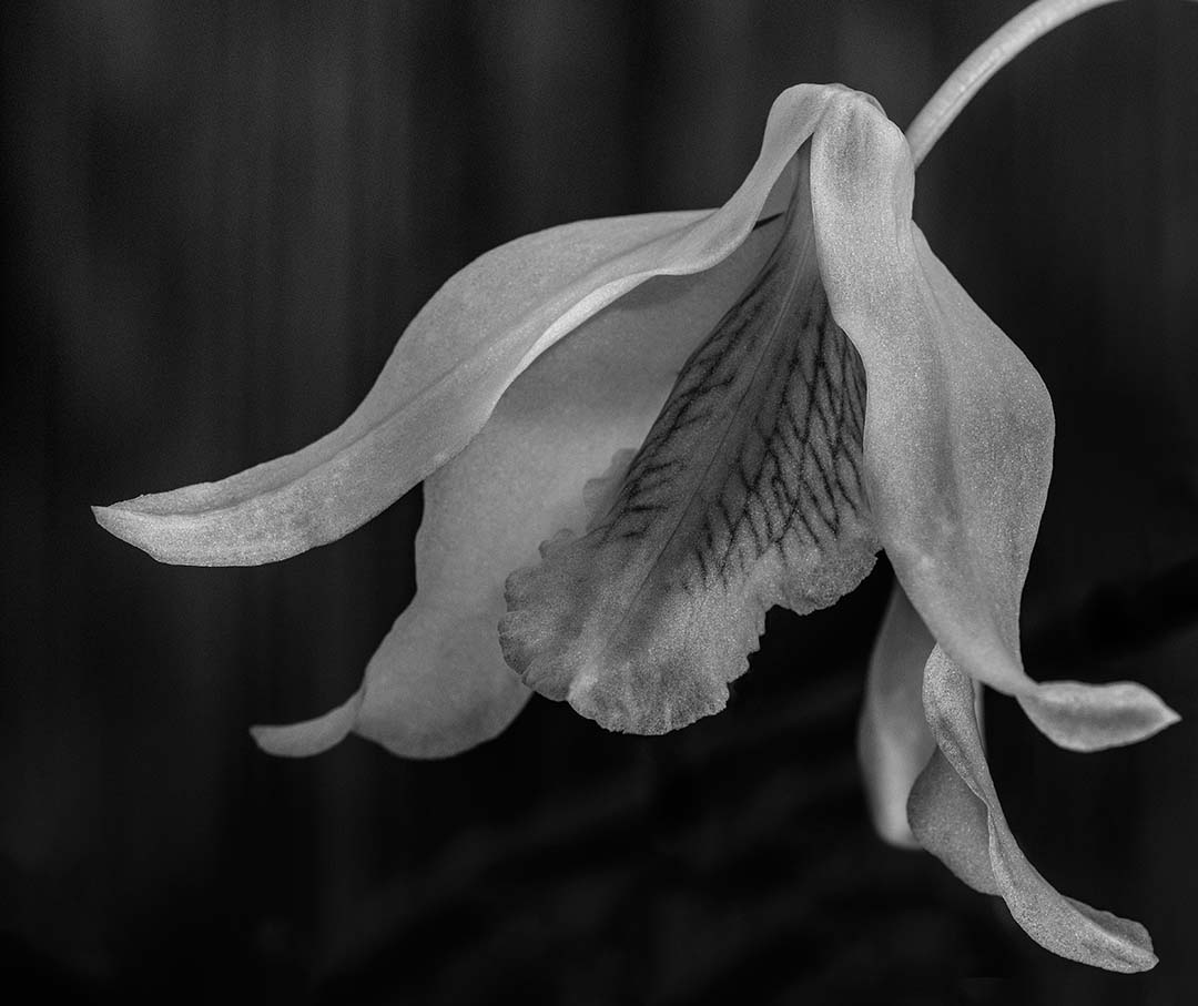
Comment |
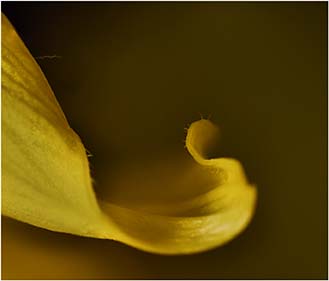
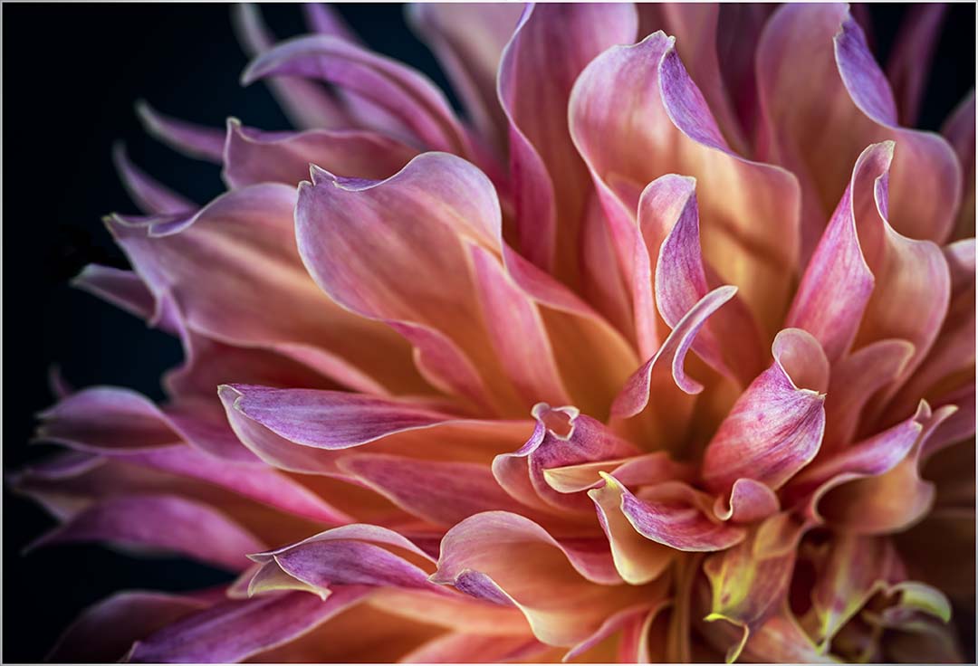
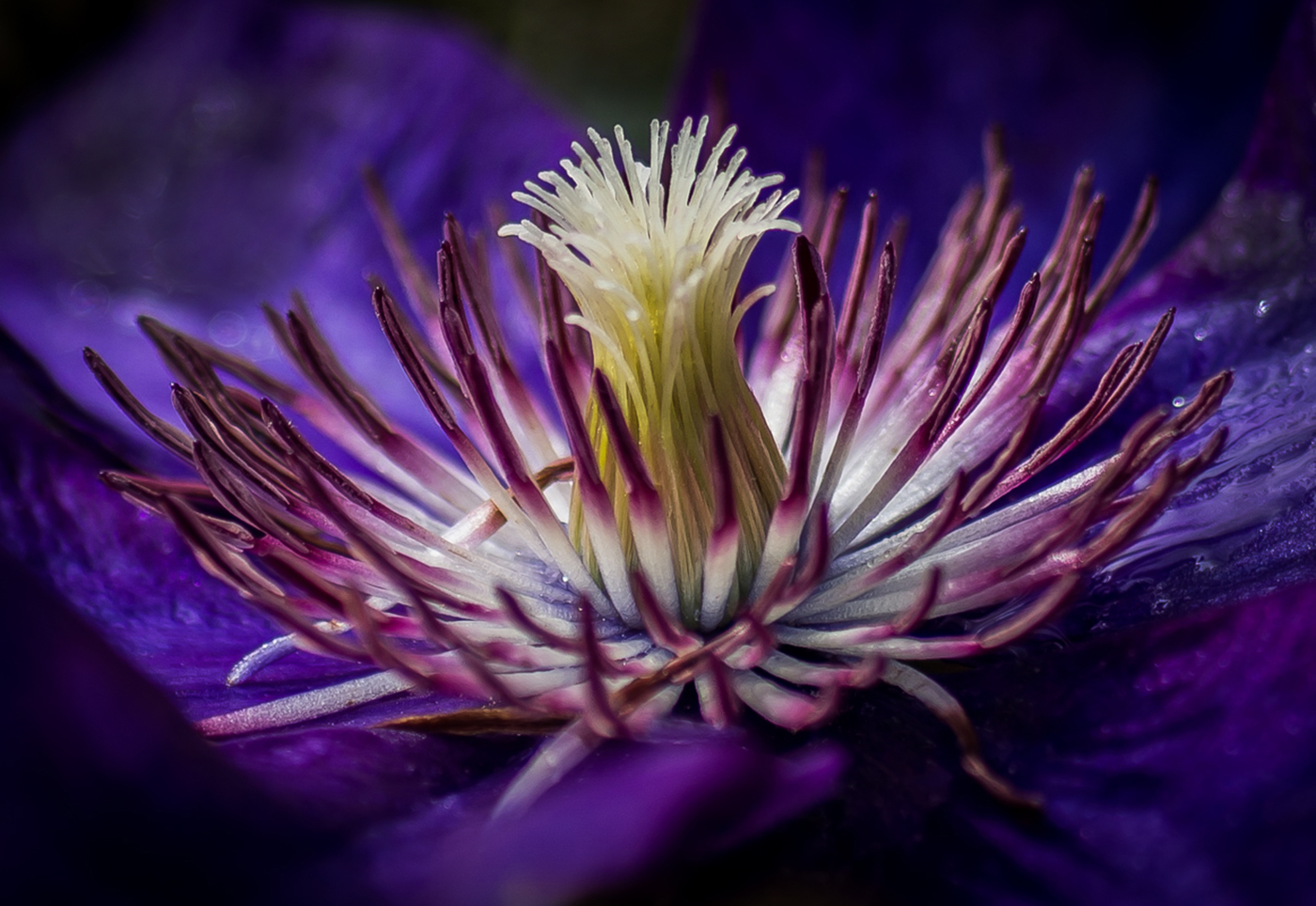
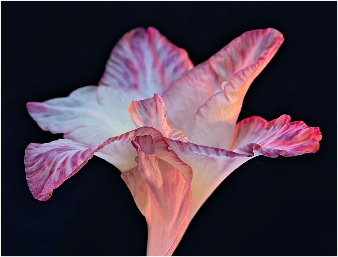
Love this image. The leaf in the back provides a balance in my opinion. Leaving the one yellow petal is the magic here, which is only enhanced by the background and the upward tilt of the flower head. Lighting is great. Wouldn't change a thing. |
Jun 18th |
| 65 |
Jun 21 |
Comment |
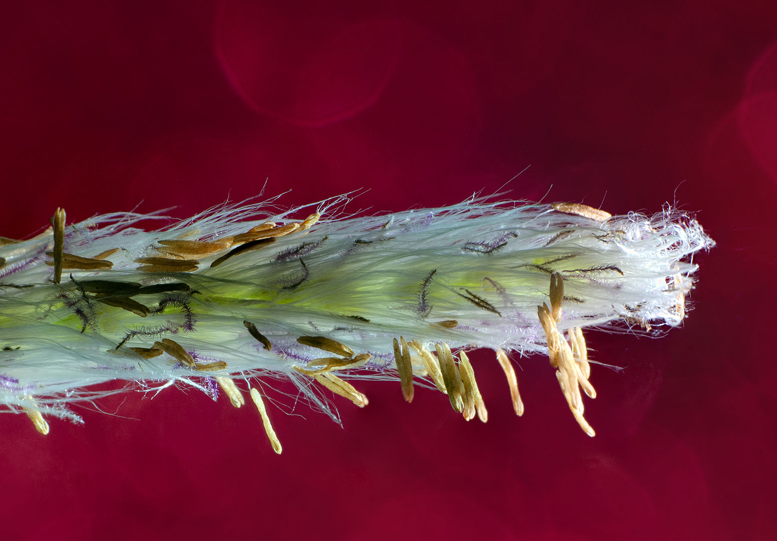
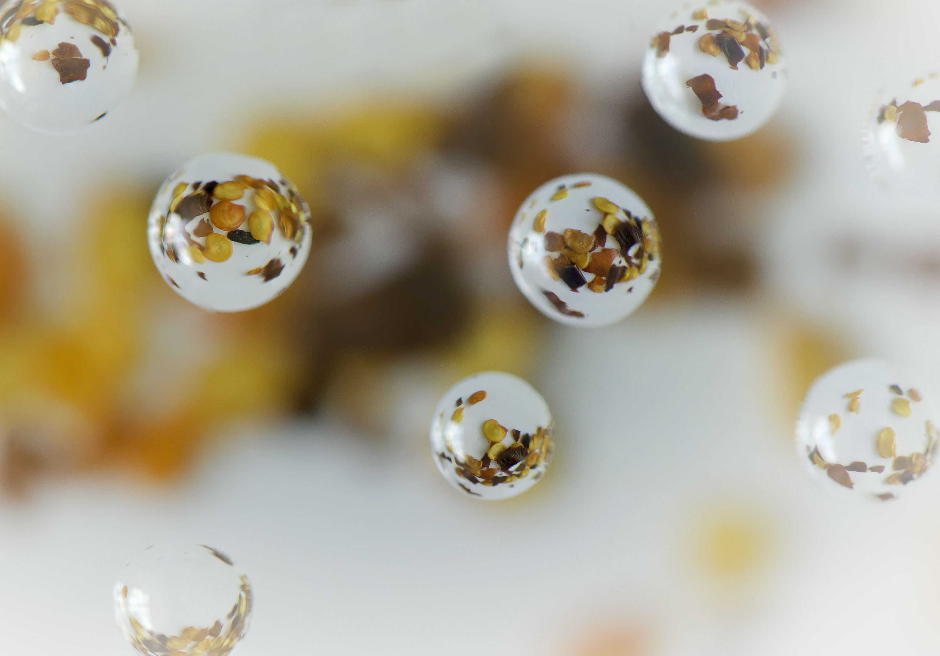
Michael - I'm impressed with your image this month, although my fascination with tiny things don't extend to this��.butterflies are my big bug adventure. The little brown hairs on its face are nice and sharp as are the front of the legs and the ?nose? I agree with increasing the DOF to capture the back of the legs, but hindsight can become quite a nag. Nice image. |
Jun 18th |
| 65 |
Jun 21 |
Comment |
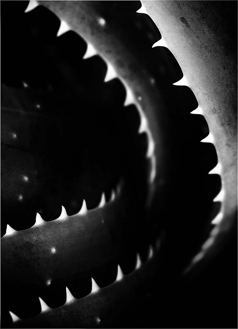
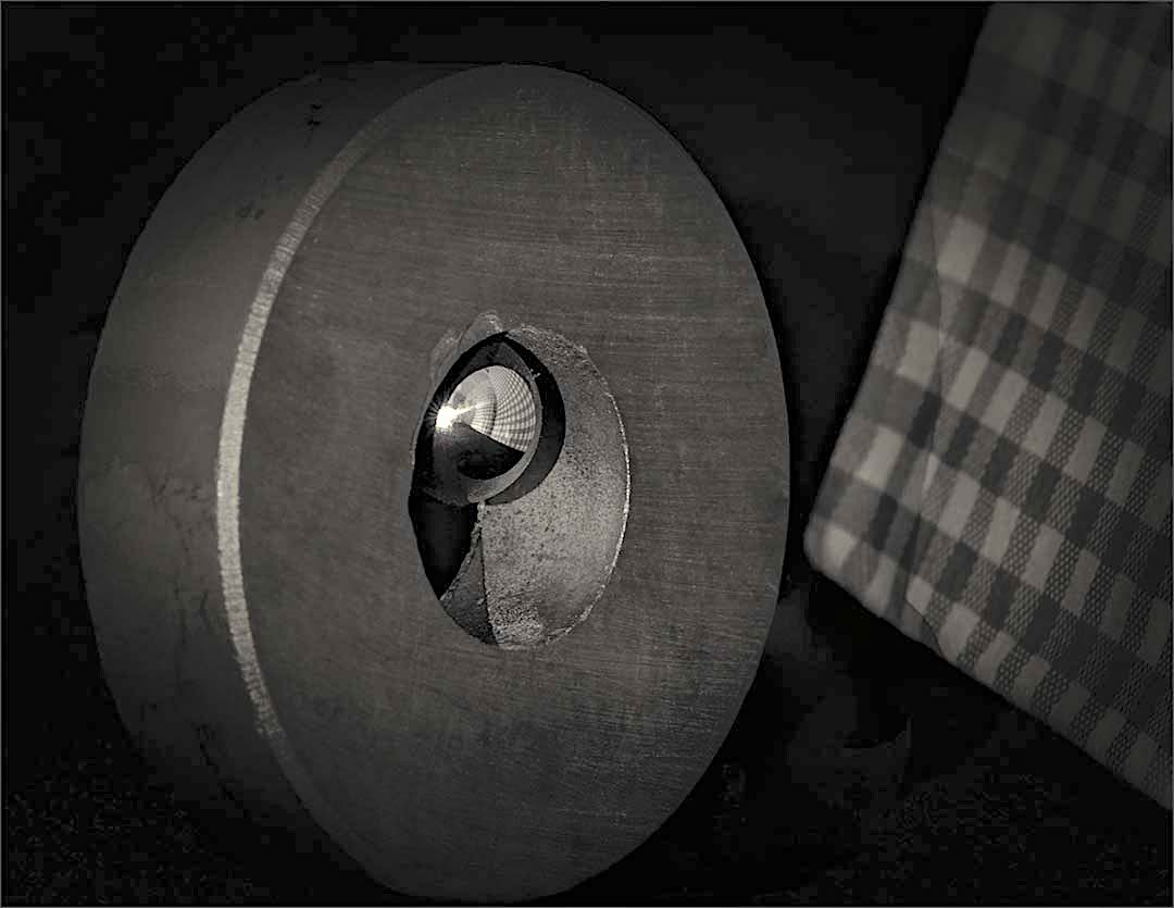
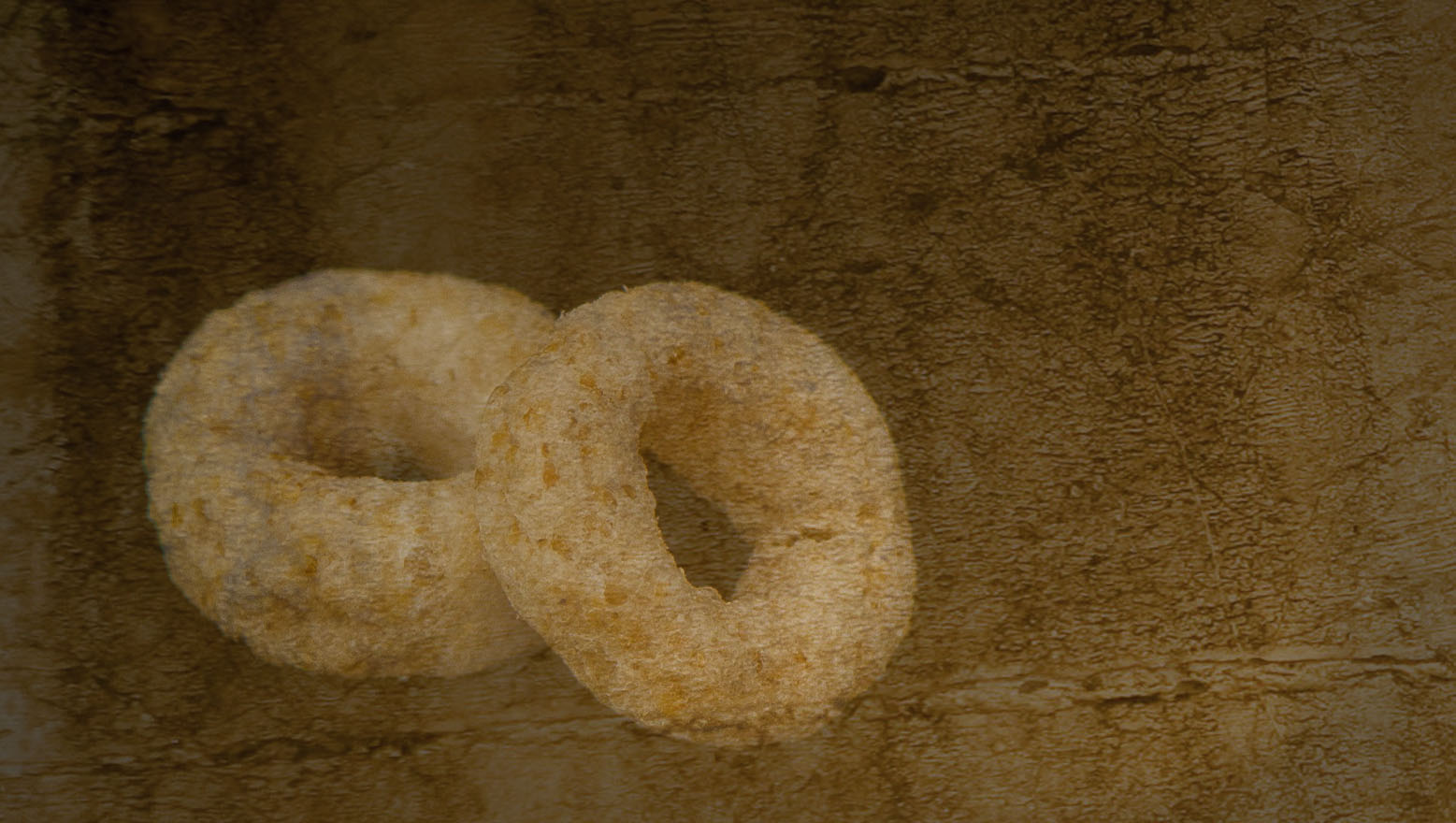
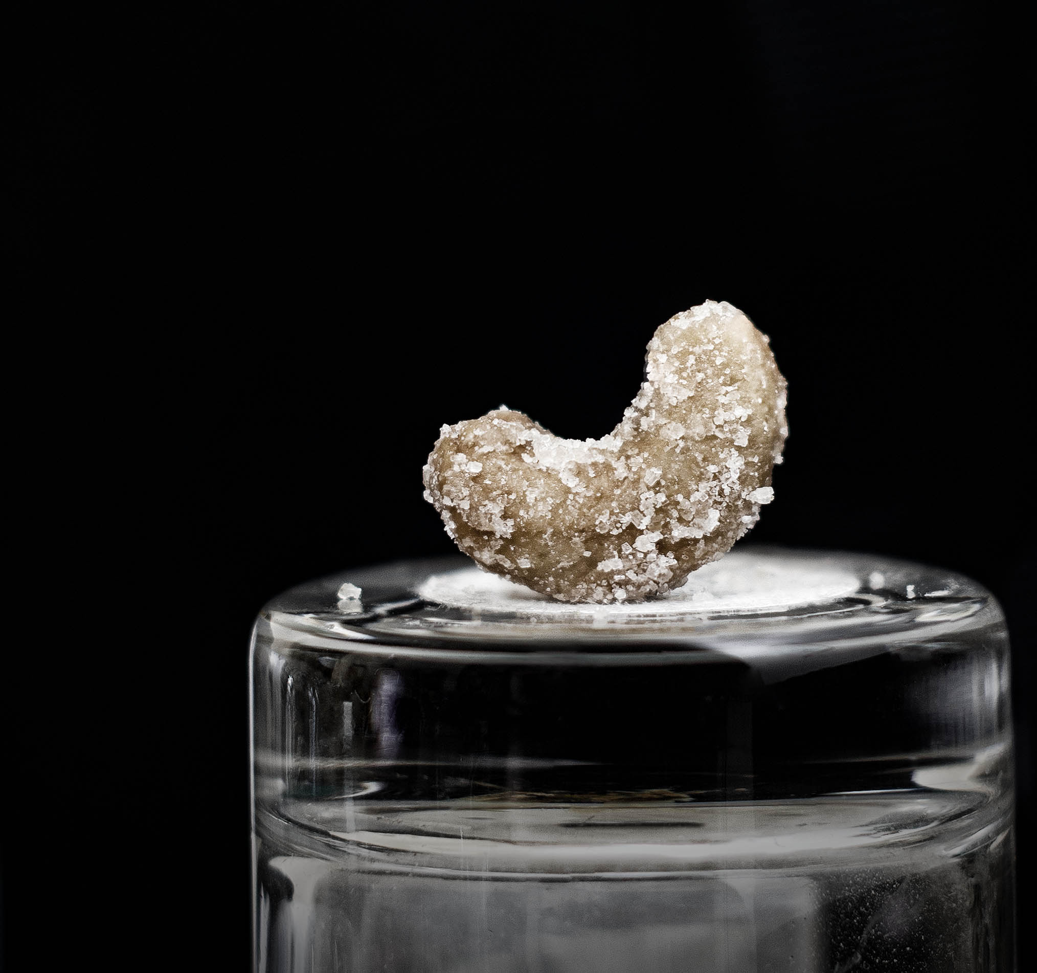
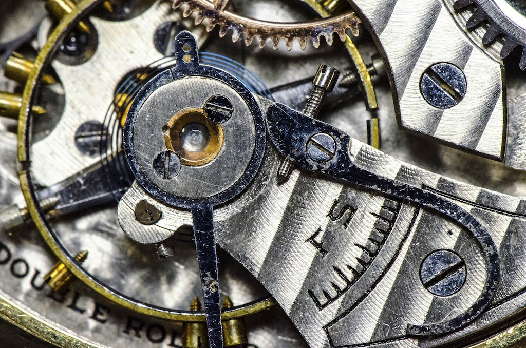
I've taken the Mike Moats macro workshop and remember all the little items he has to use for photography practice and how much fun the workshop was. It's nice to do different things now and then. This is a pleasant image and the composition is nice. I might have
put more variation in the gear colors underneath, although it might look messy with too much variation. You handled the highlights in the glass jewel nicely.
Why did you shoot with an ISO of 400? Mike moats was big on keeping his ISO at 100 so I'm curious to see if he's changed. It's interesting to me that the same set of gears and trinkets are used in all his workshops, yet each image is so different.
|
Jun 18th |
| 65 |
Jun 21 |
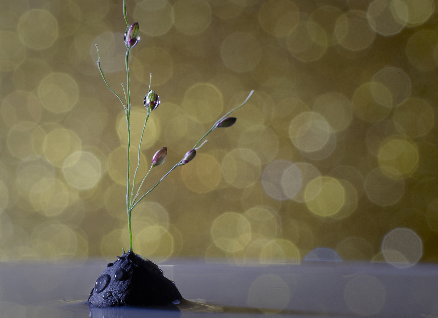
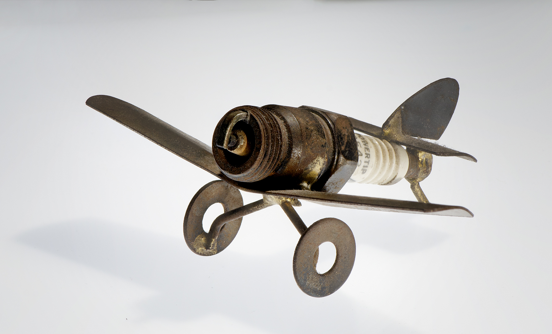
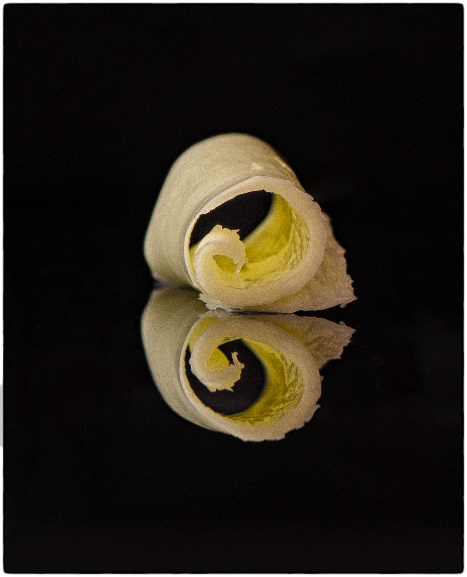
Comment |
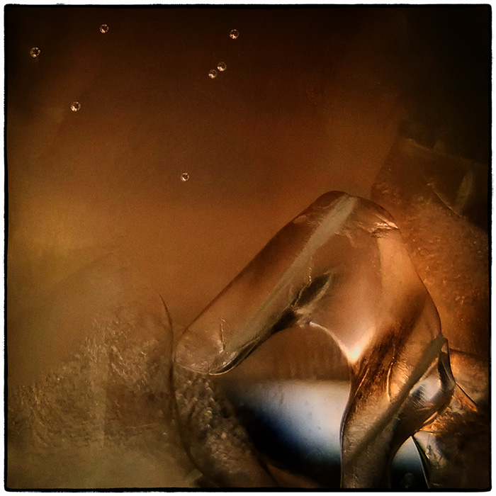
Probably every one of us who grew up with whirlybirds remembers throwing them up in the air, peeling them open, and whatever else we could think of when we played with them.
I like your composition and how the subject's curvature s into the image. The background is well suited to the overall feel of the setting and the whirlybirds are nice and sharp. Your out of focus stems wasn't a bad idea, but maybe consider having the transition from out of focus to focus a little more subtle. Overall I like your image (and the memories they bring.) |
Jun 18th |
| 65 |
Jun 21 |
Comment |
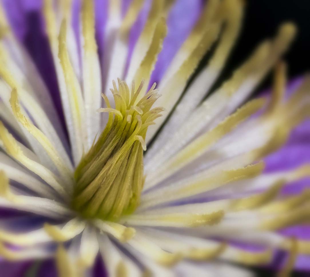
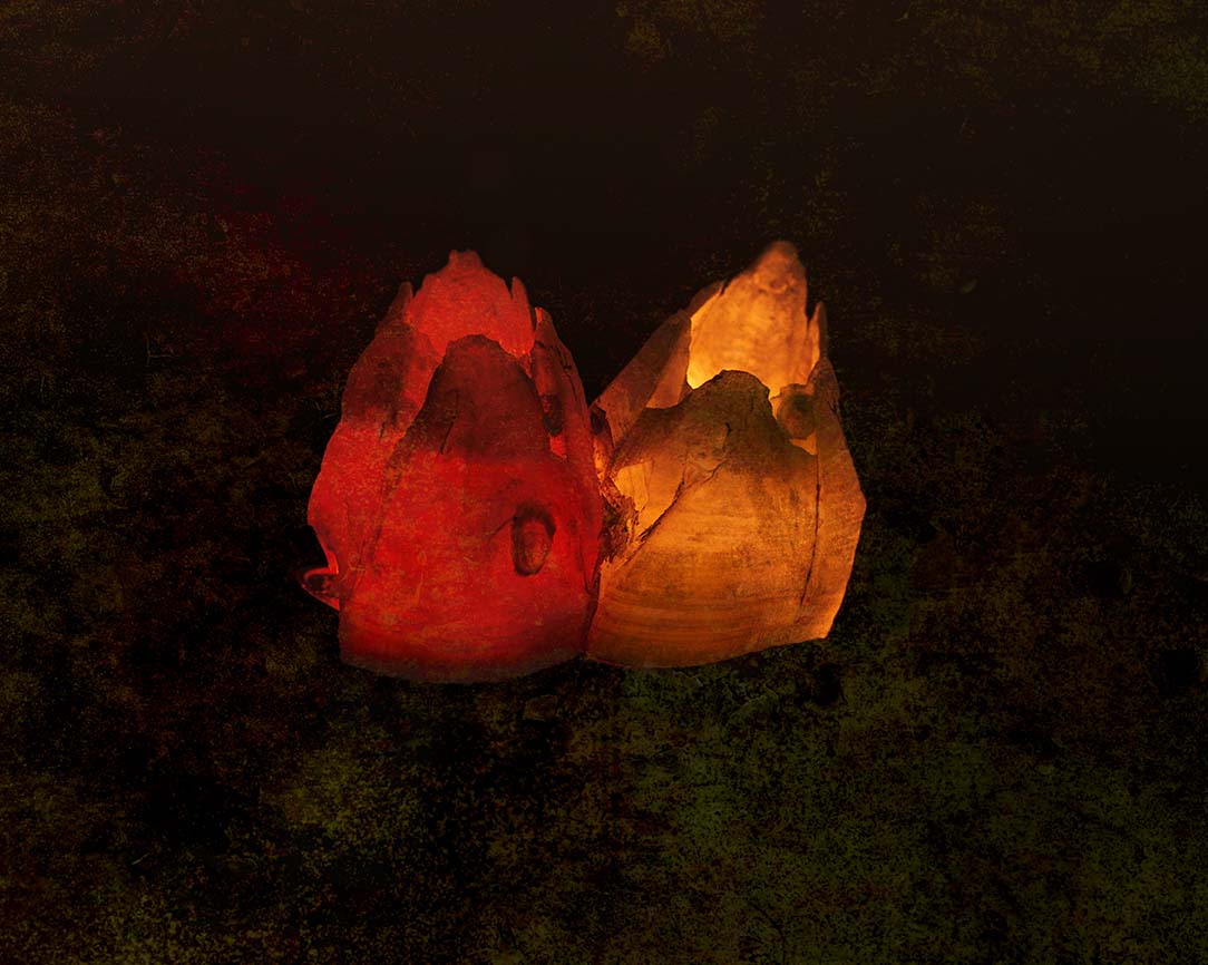
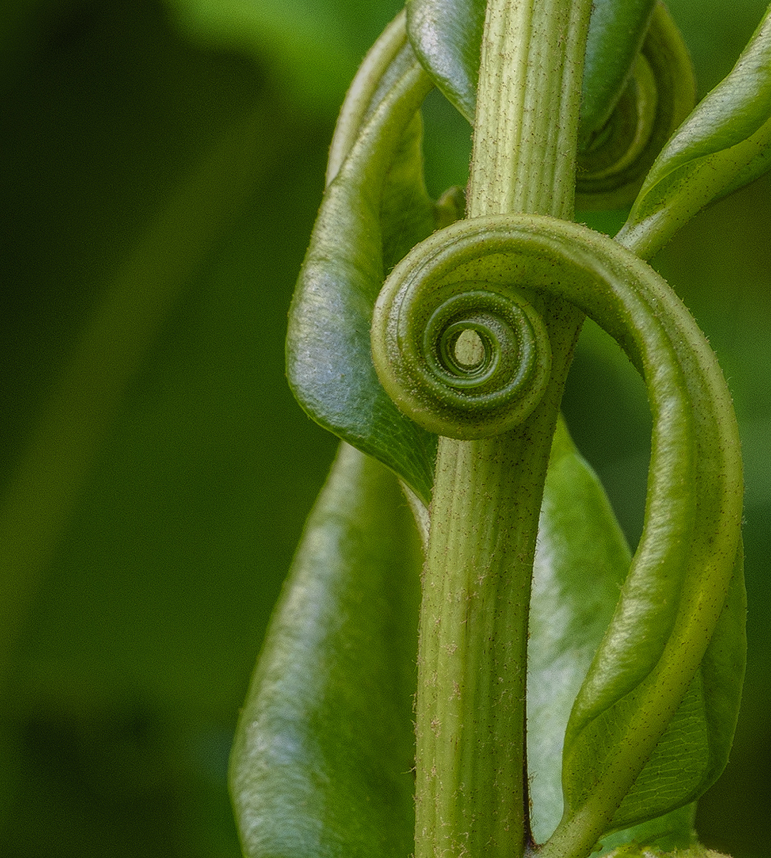
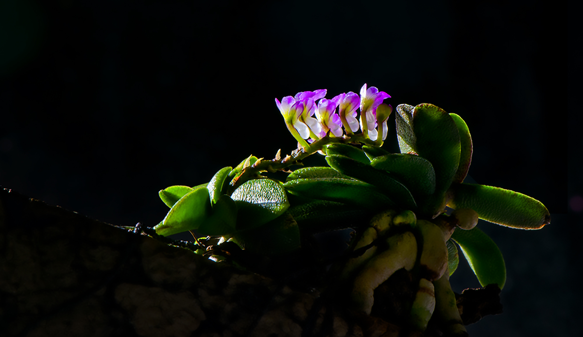
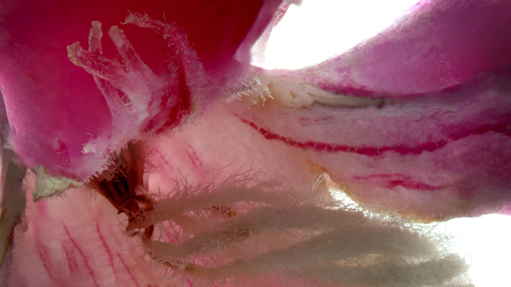
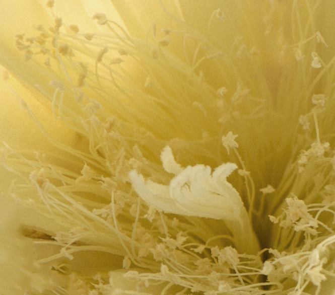
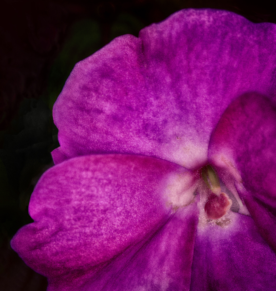
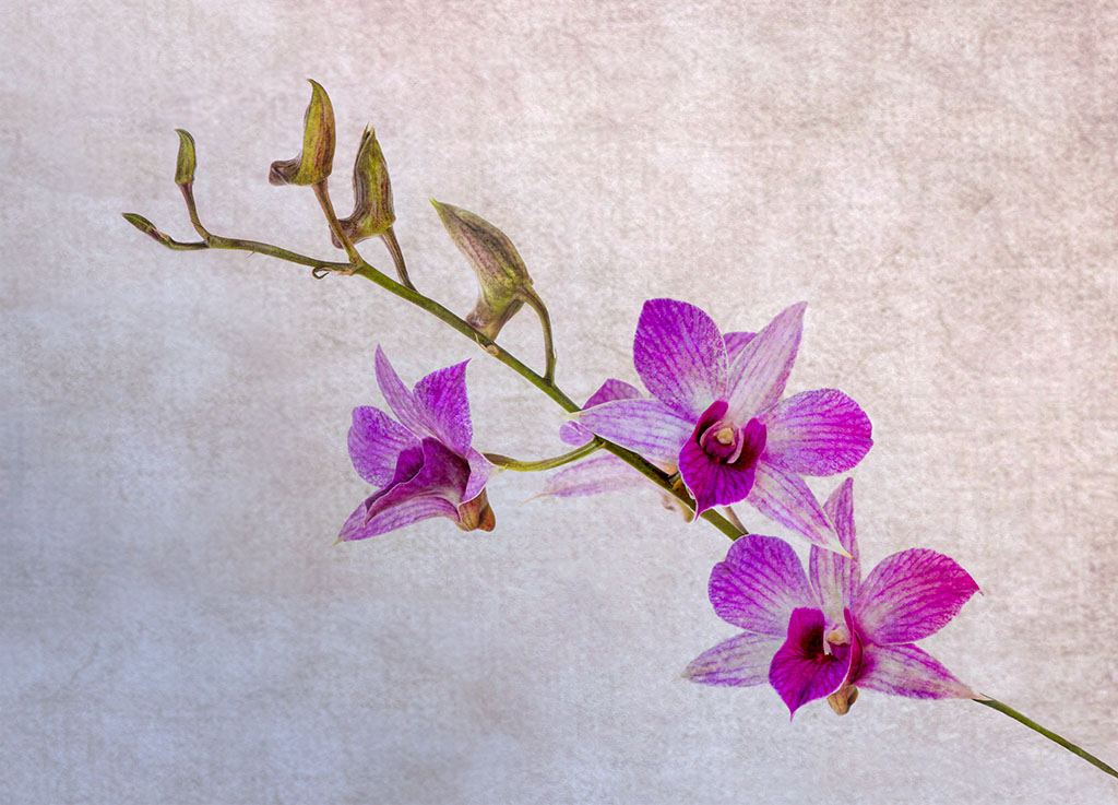
This is an interesting image to me for a few reasons. Your composition is nicely done with your subject off center a bit. Colors are bright and using the orchid as the background makes a great contract. If I were to be picky I would remove the little hairs on the left, but that's minor. At first glance it reminded me of lava. Nice job. |
Jun 18th |
6 comments - 1 reply for Group 65
|
11 comments - 3 replies Total
|