|
| Group |
Round |
C/R |
Comment |
Date |
Image |
| 32 |
Apr 21 |
Reply |
It sure is! |
Apr 17th |
 |
| 32 |
Apr 21 |
Comment |
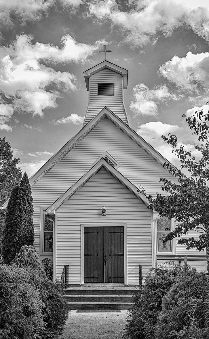
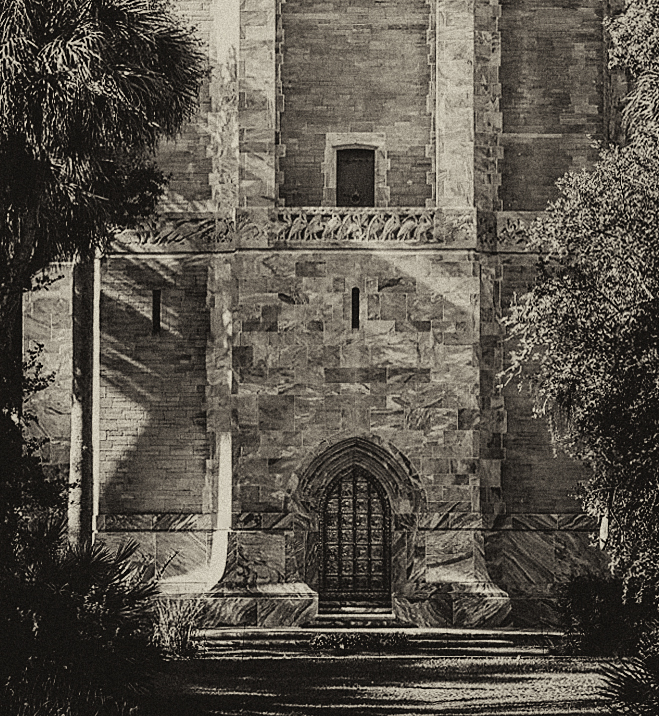
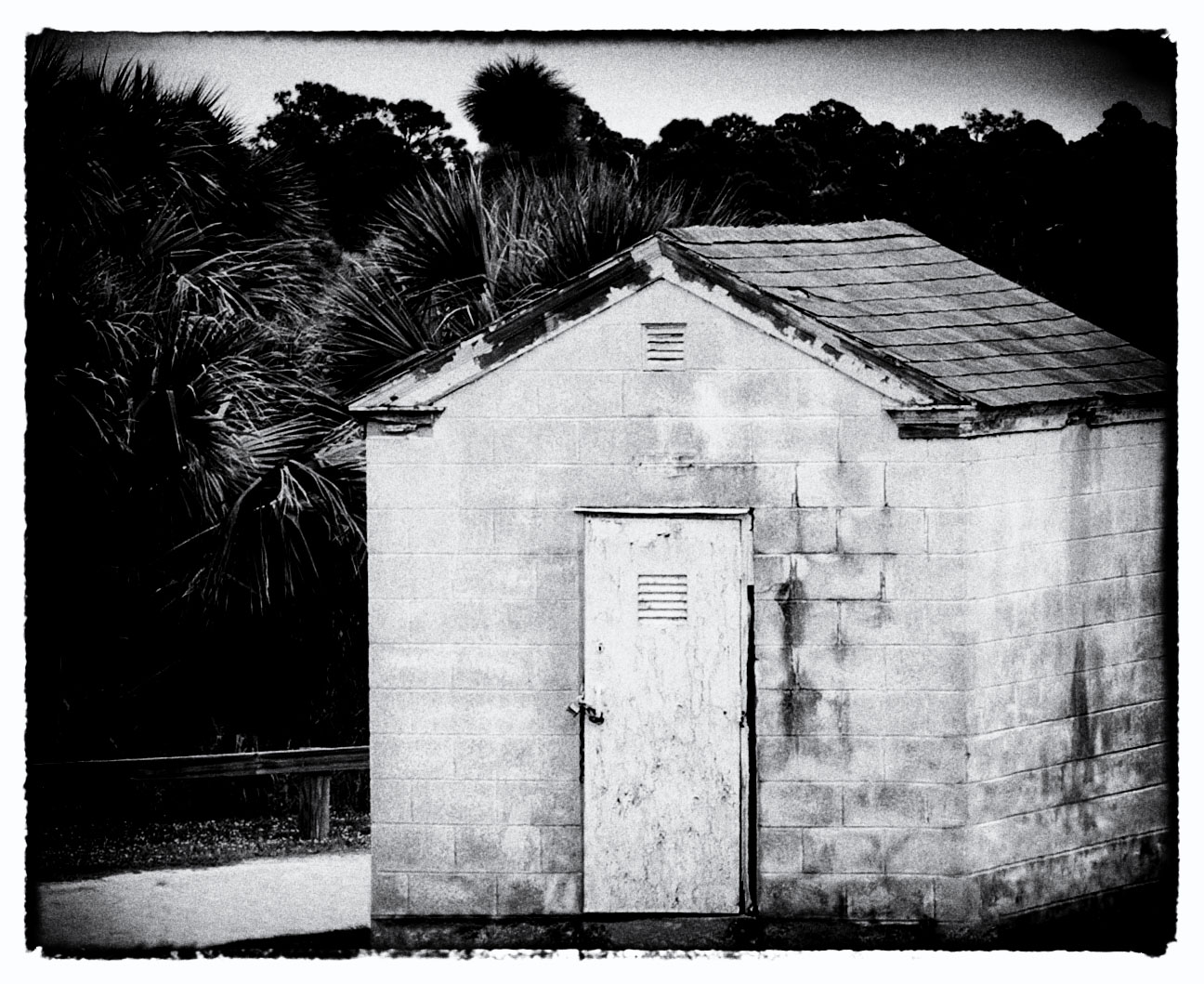
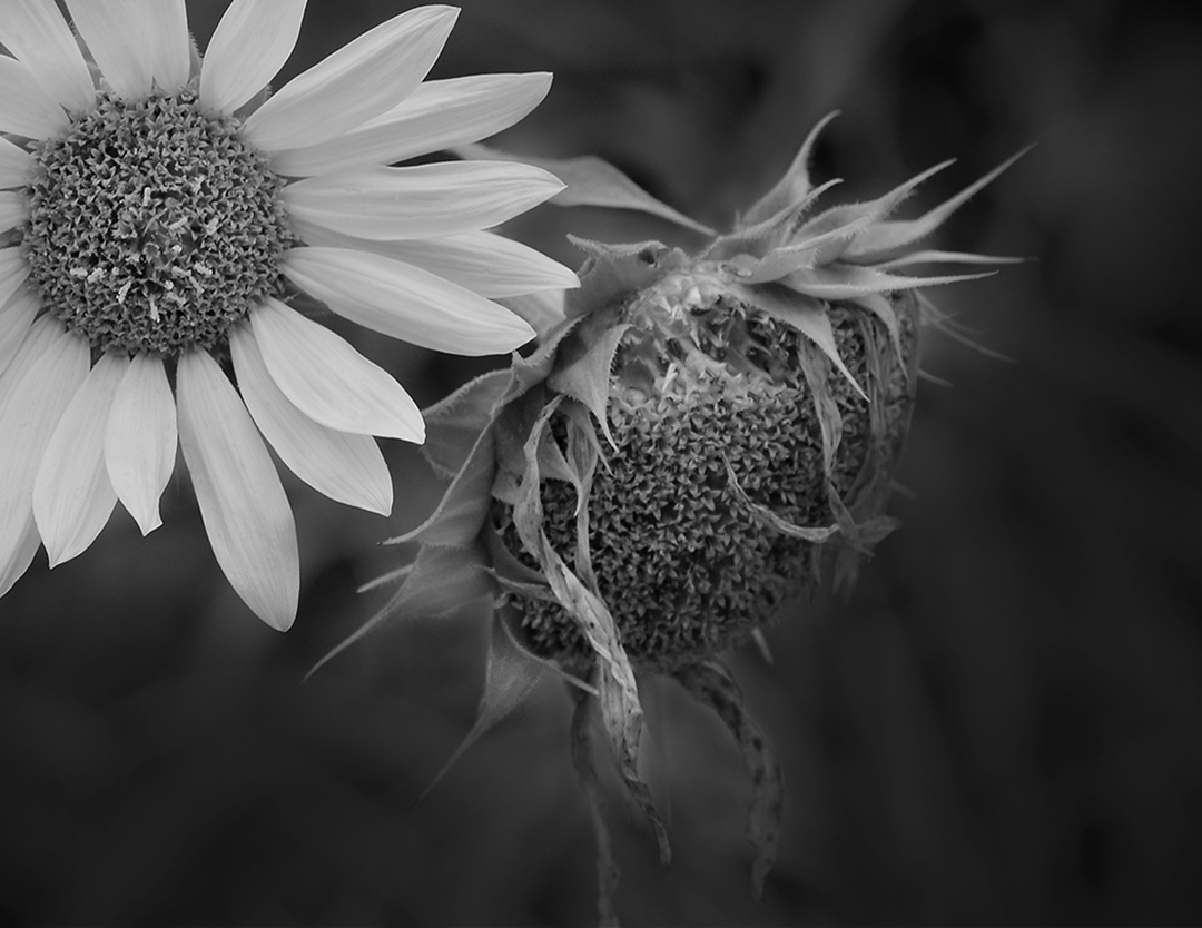
This spanish mission image is nice and remincient of a time long gone. Motivates me to consider shooting a few rolls of film again. It's encouraging that it continues to be a functioning parish for local residents. |
Apr 17th |
| 32 |
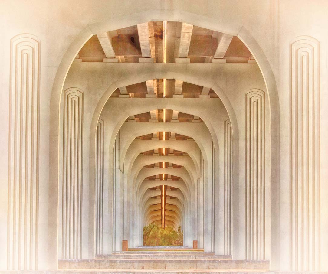
Apr 21 |
Comment |
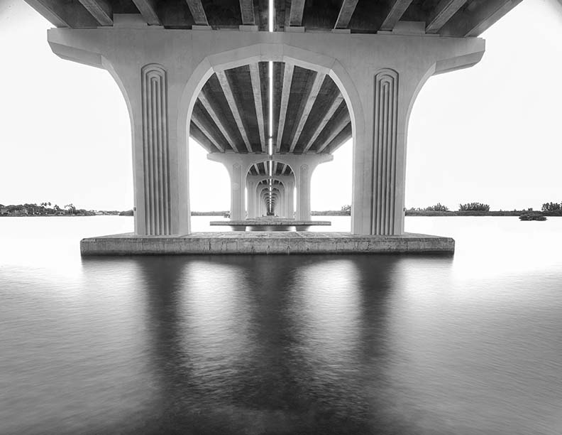
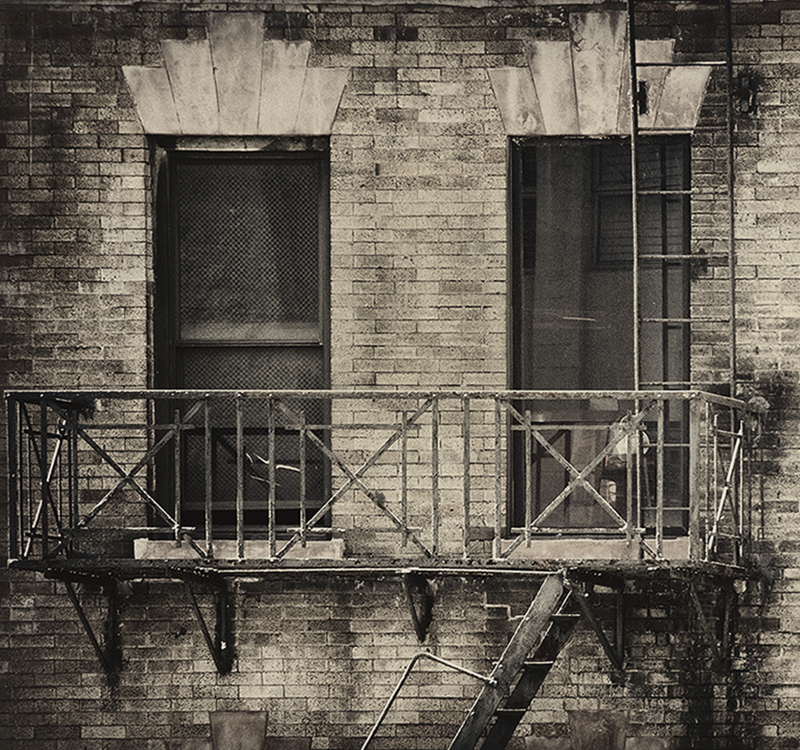
The lines, textures, contrast and shadows you captured here are really well done. I think it's a good variation on the frequent color versions we see. Diana's suggestion of darkening the floor a bit might be something to think about, but overall I do think this is a peaceful and well done image. |
Apr 17th |
| 32 |
Apr 21 |
Reply |
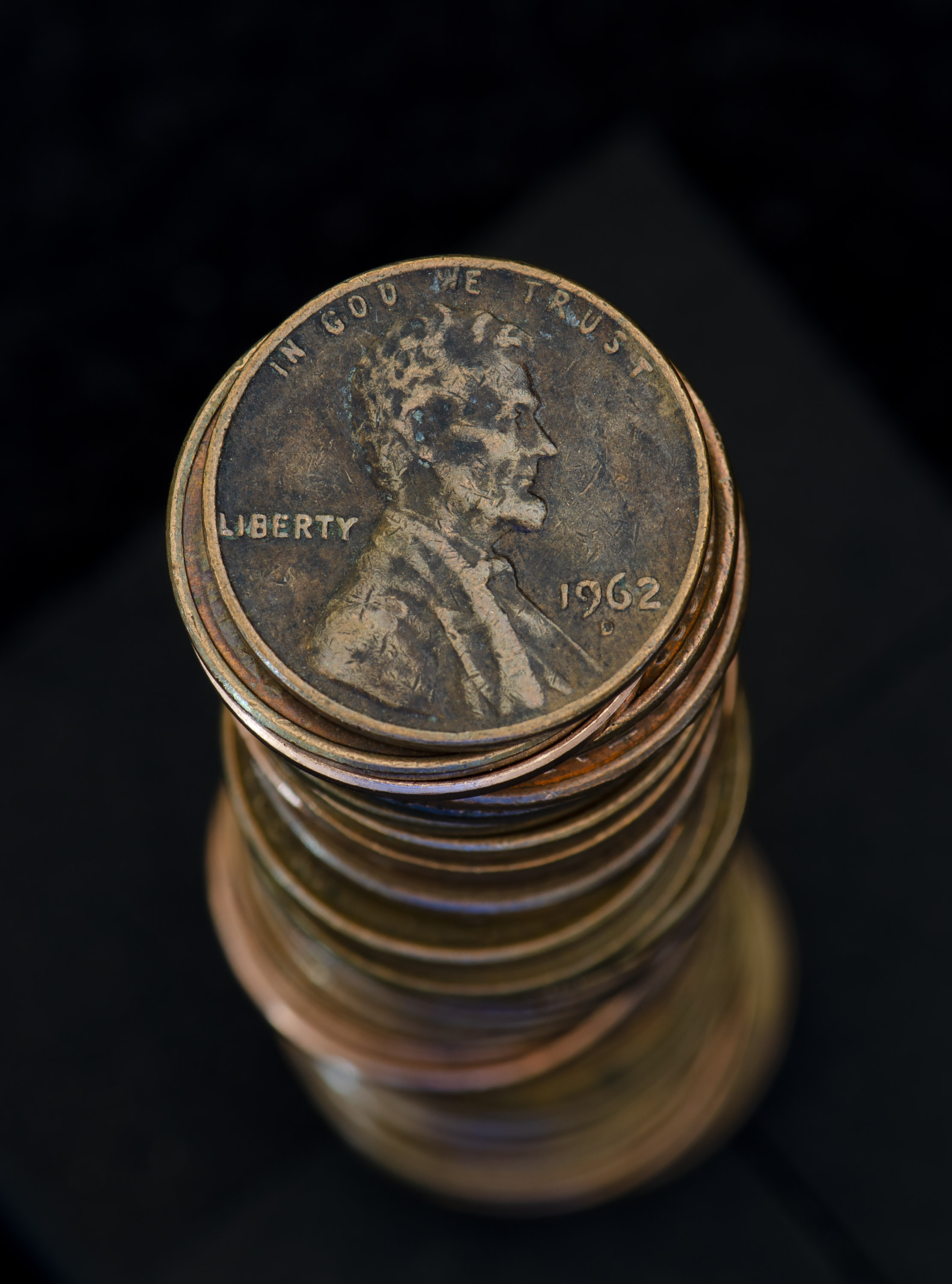
Red River Paper - love it! Great paper and good sales in December! |
Apr 17th |
| 32 |
Apr 21 |
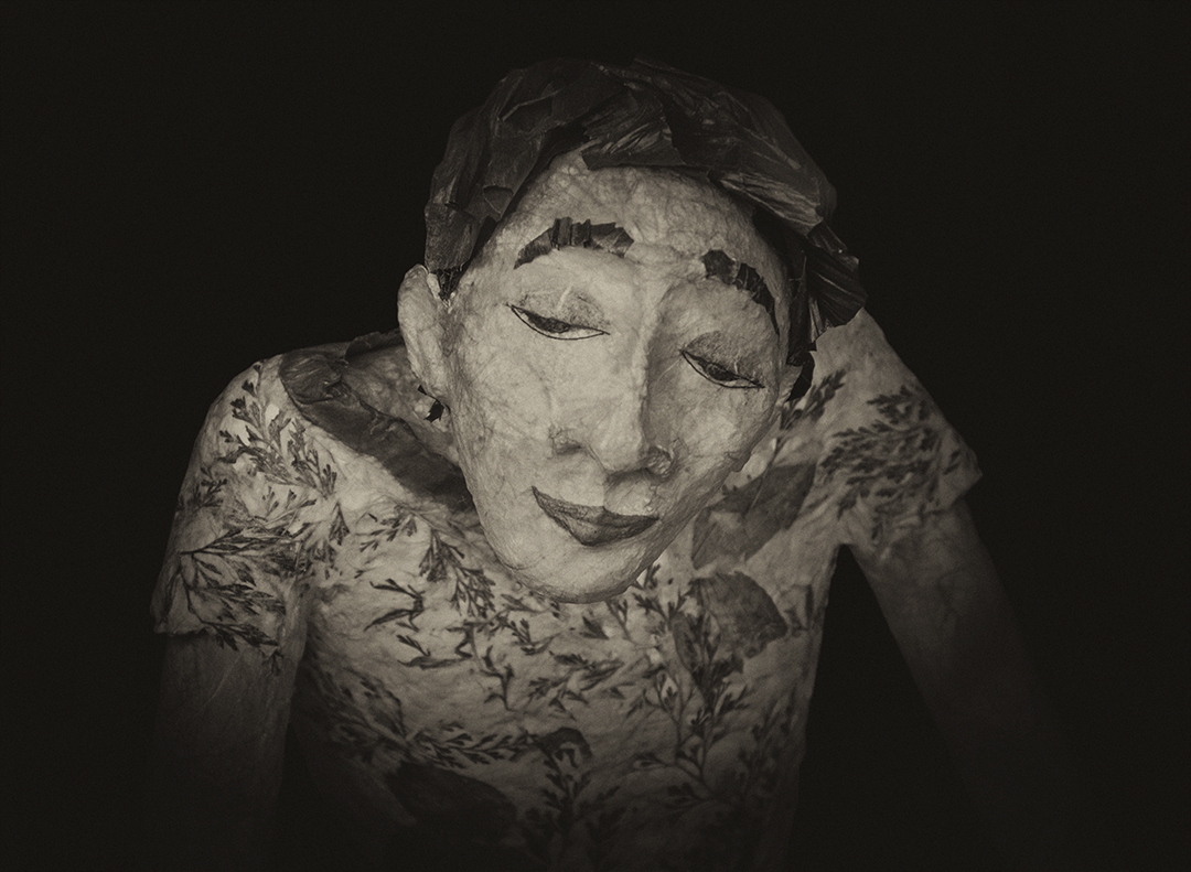
Comment |
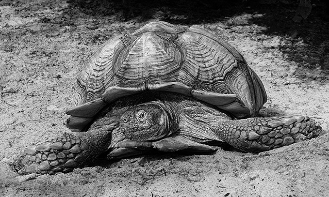
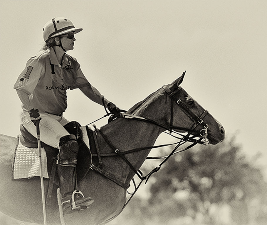
Nice image and as said, the sepia tone works well. You do very well in capturing people's faces and their expressions. The other piece is how you captured the horses. Their massive strength is portrayed very well, yet they're being managed by the man. So many of your images have this type of subtle strength to them. Nicely done. |
Apr 17th |
| 32 |
Apr 21 |
Comment |
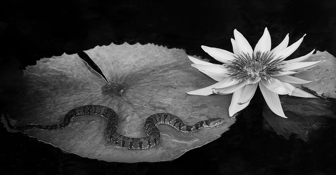
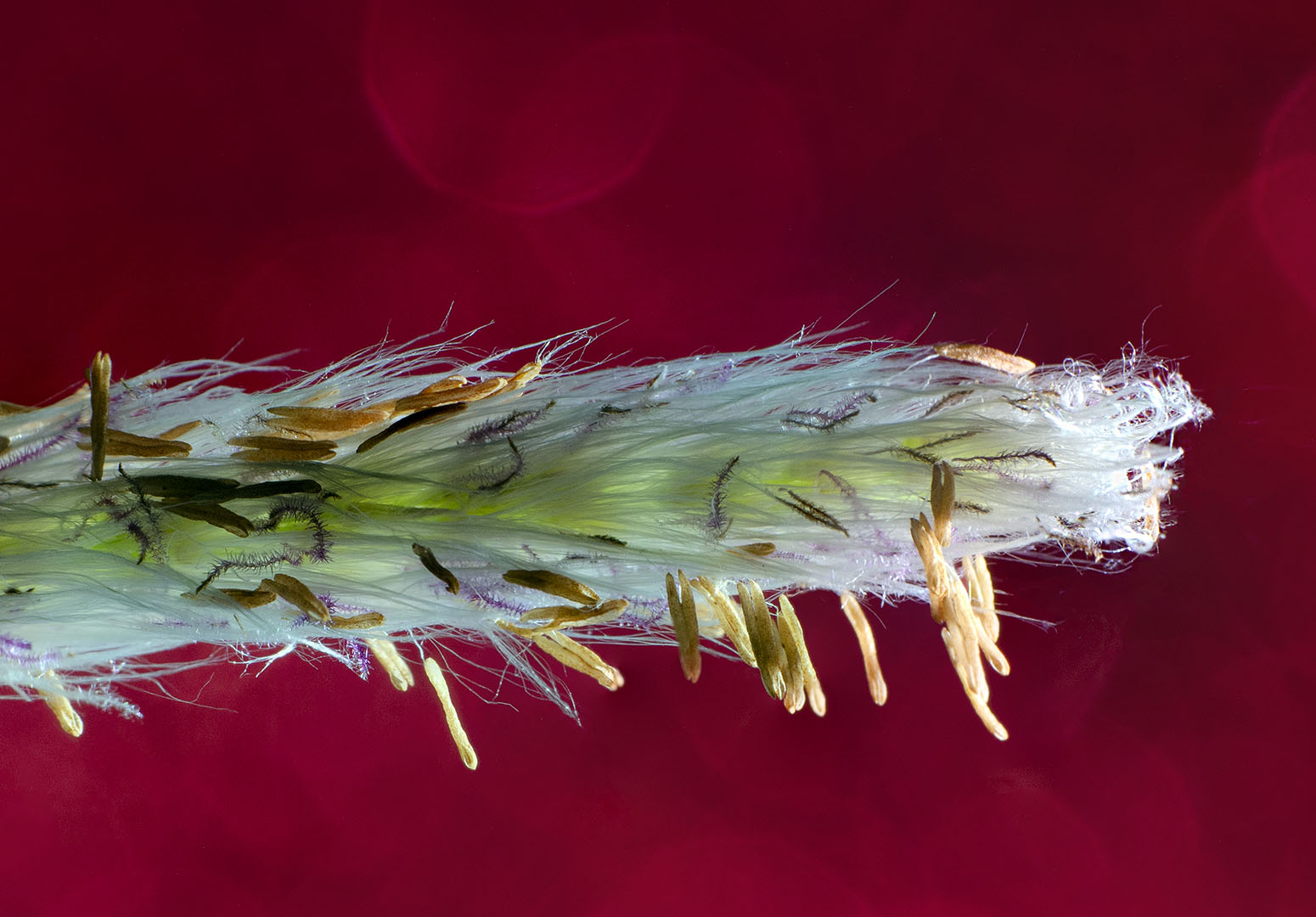
This is image facinates me and is disturbing to me at the same time. To think that the thousands of Terracotta Army sculptures have individual faces is amazing.
I do like the diagonal look, but changes the message completely. Your image provides context to the massive size and space of the sculptures. The changes Ata made helps to enhance the figures, but I'm not convinced adding more of the ceiling is a good way to go. |
Apr 17th |
| 32 |
Apr 21 |
Comment |
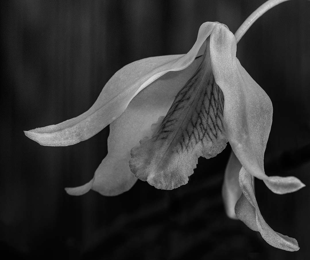
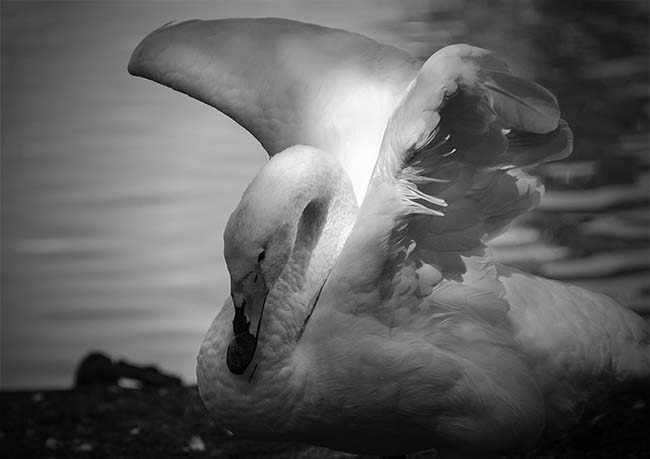
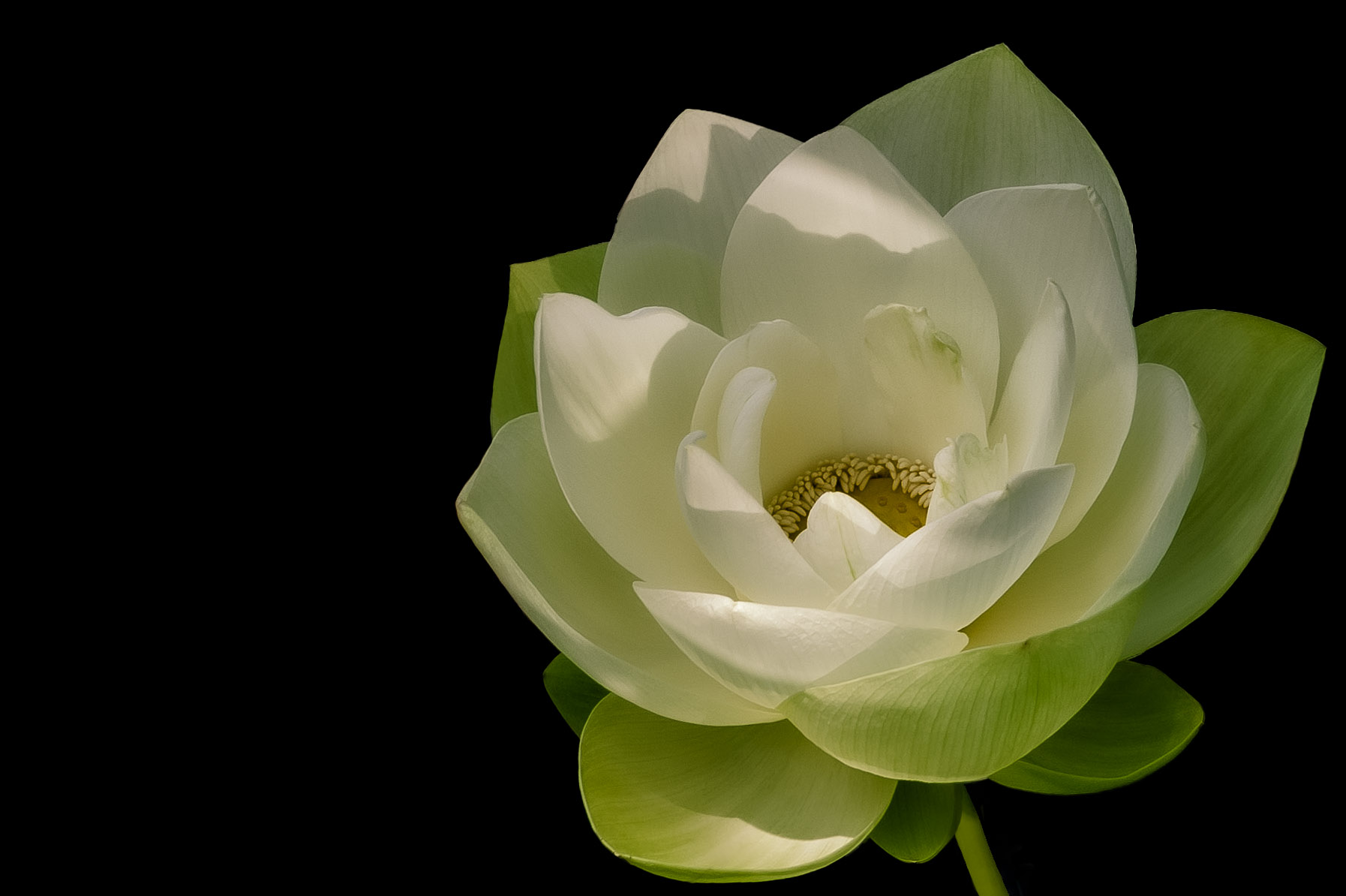
A really nice image Russ, but I must admit that the color version is my choice. The colors are great and the reflection of white captures my eye. The monochrome is nice, but the composition, colors and texture in your color version won me over. |
Apr 17th |
| 32 |
Apr 21 |
Comment |
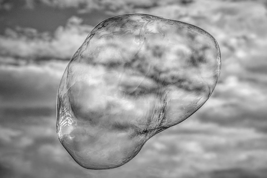
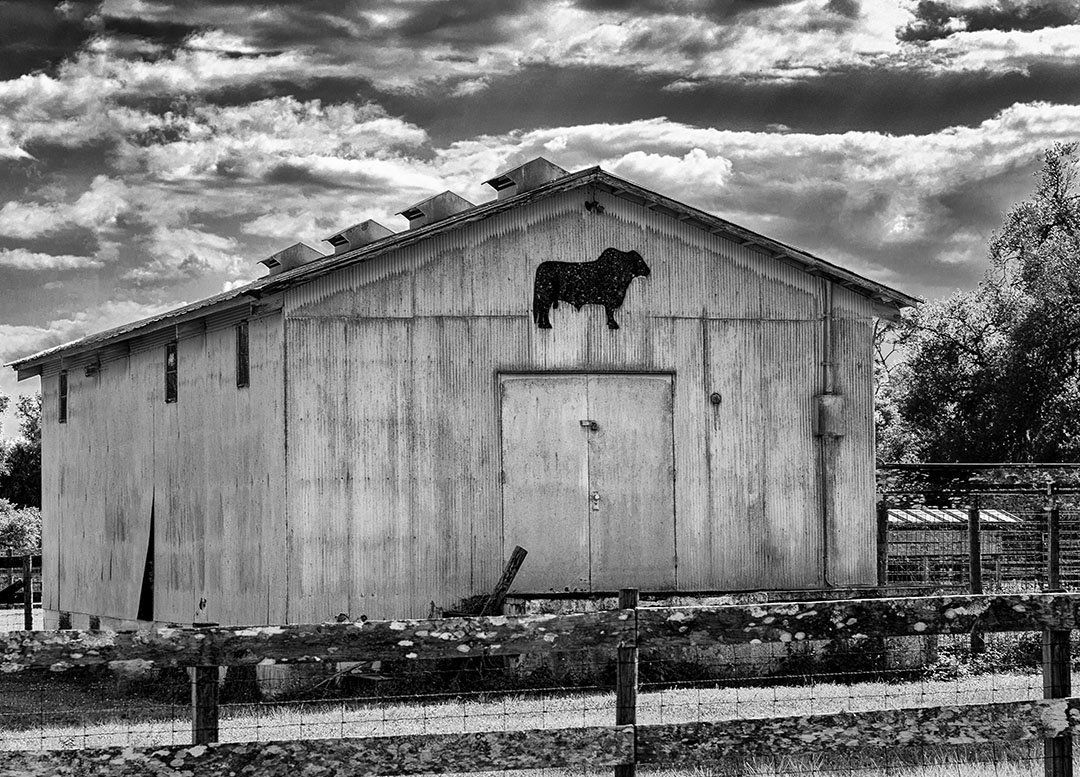
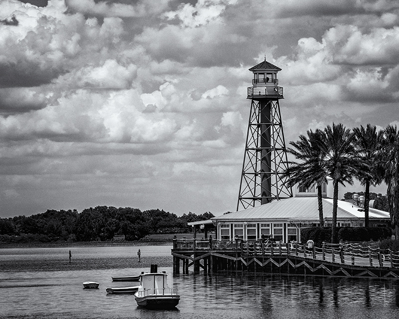
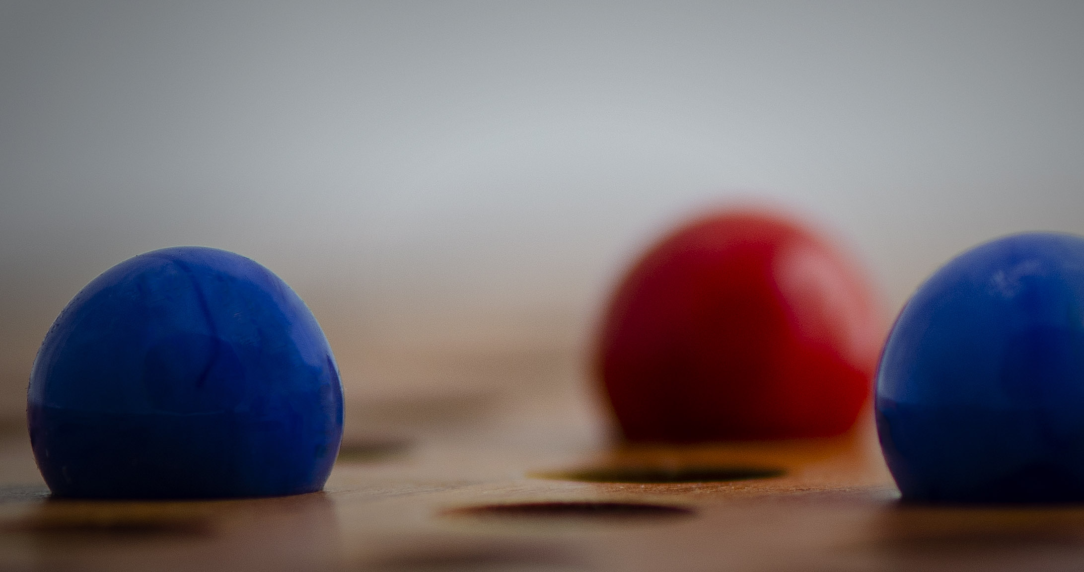
I really like the dynamic energy in your image. It's interesting to me how many different ways the image affects the group. I might consider pulling the lower right tower down a bit into the corner so the top spikes don't interfere (or pierce) the spiral. |
Apr 17th |
6 comments - 2 replies for Group 32
|
| 65 |
Apr 21 |
Reply |
I like it. Going back and looking at the "before", the changes really help the image pop. |
Apr 25th |
| 65 |
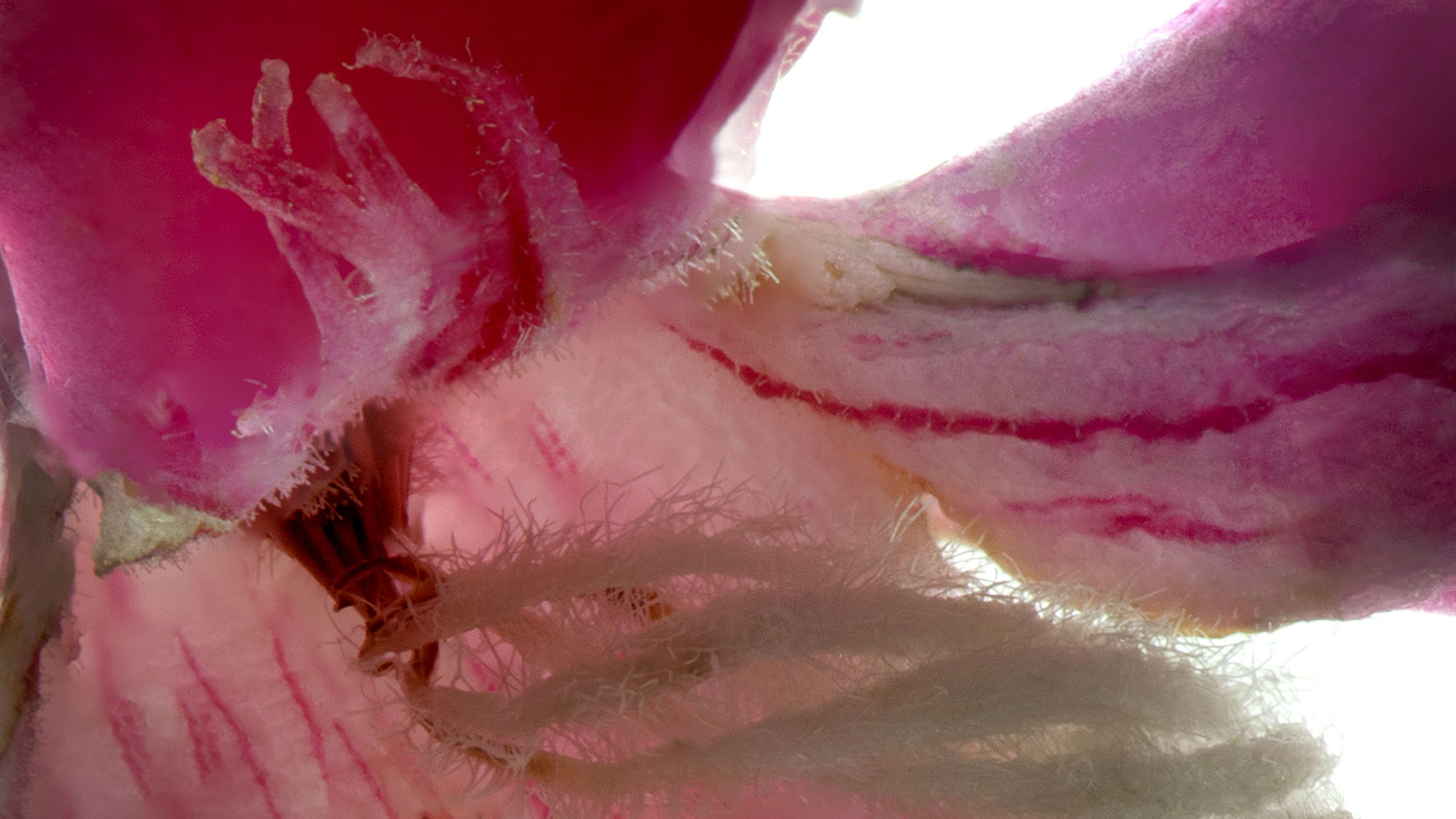
Apr 21 |
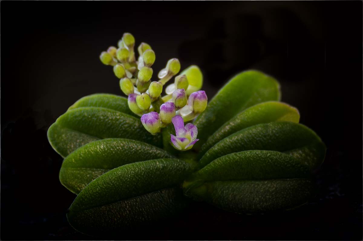
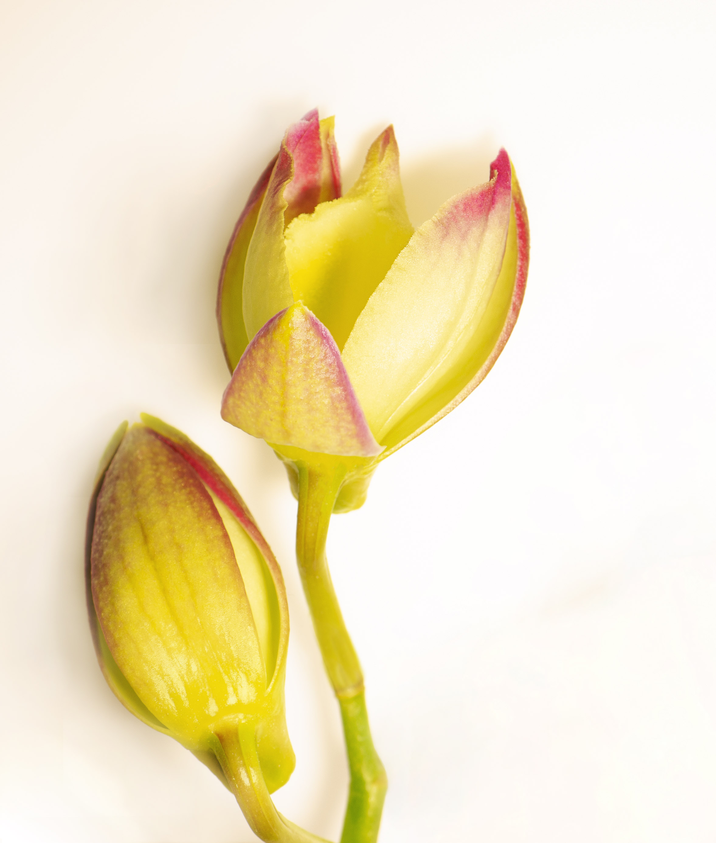
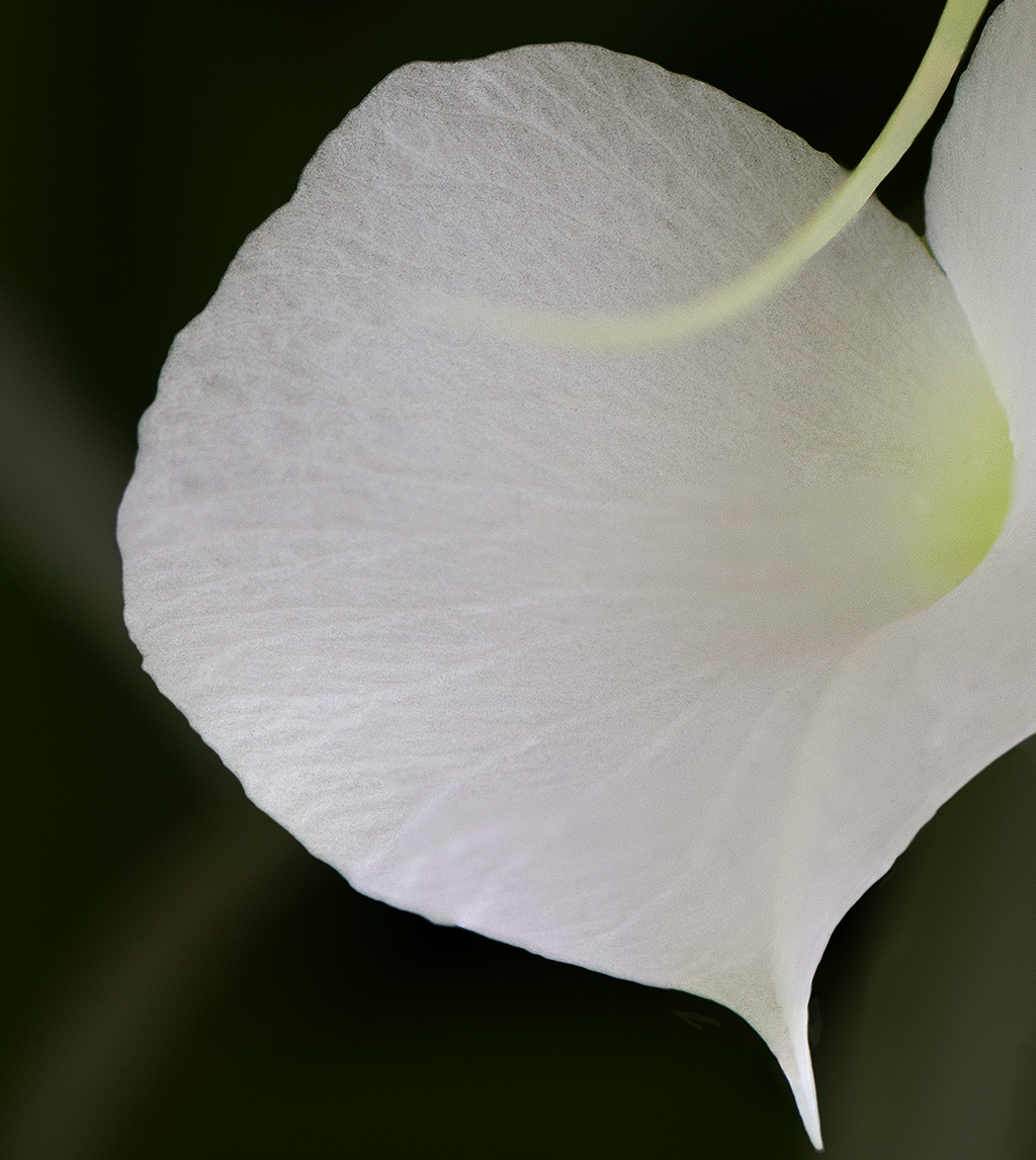
Comment |
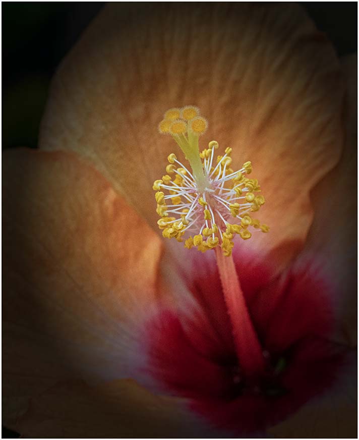
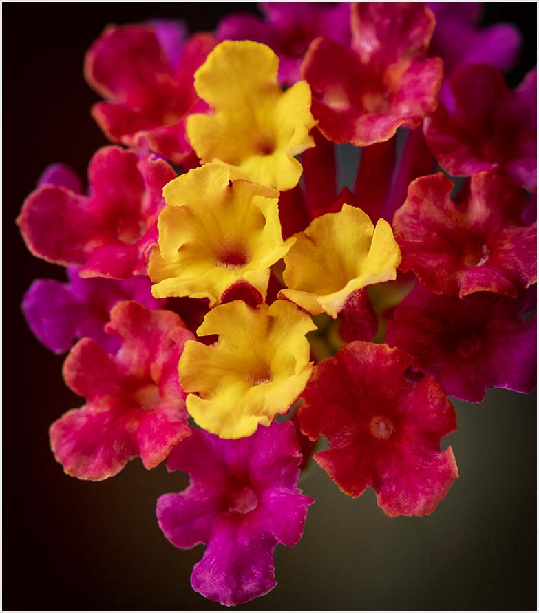
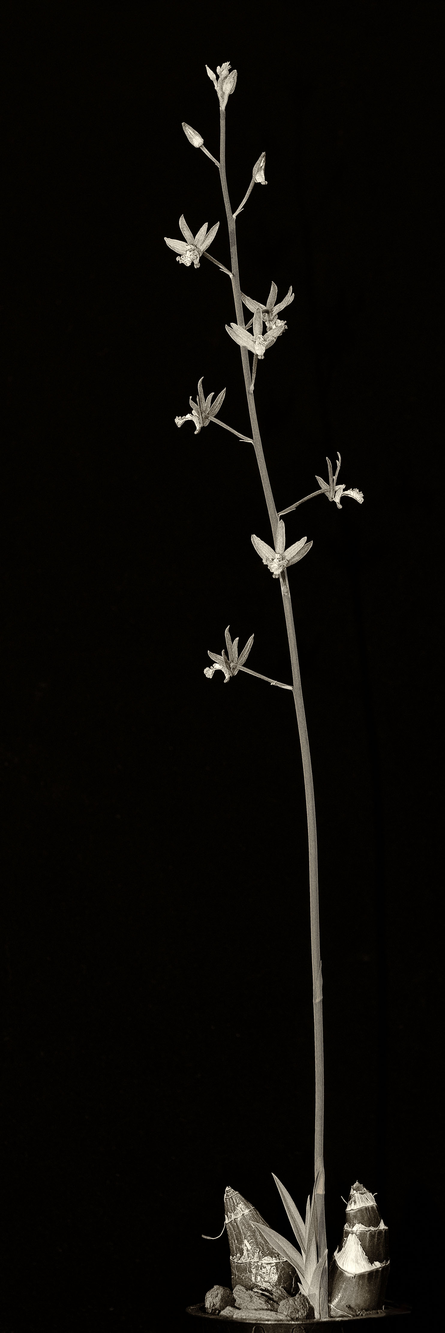
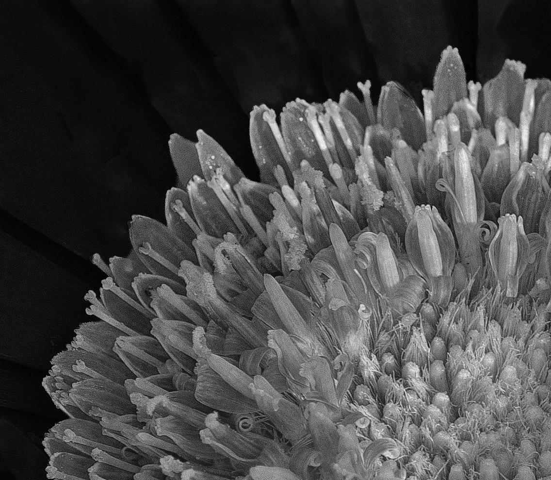
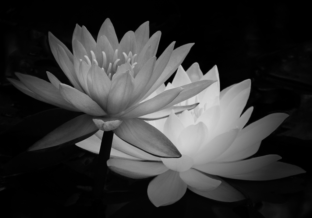
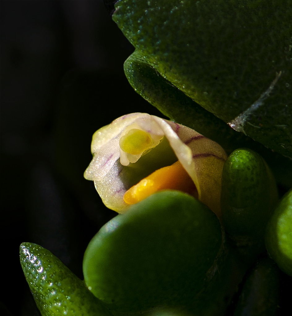
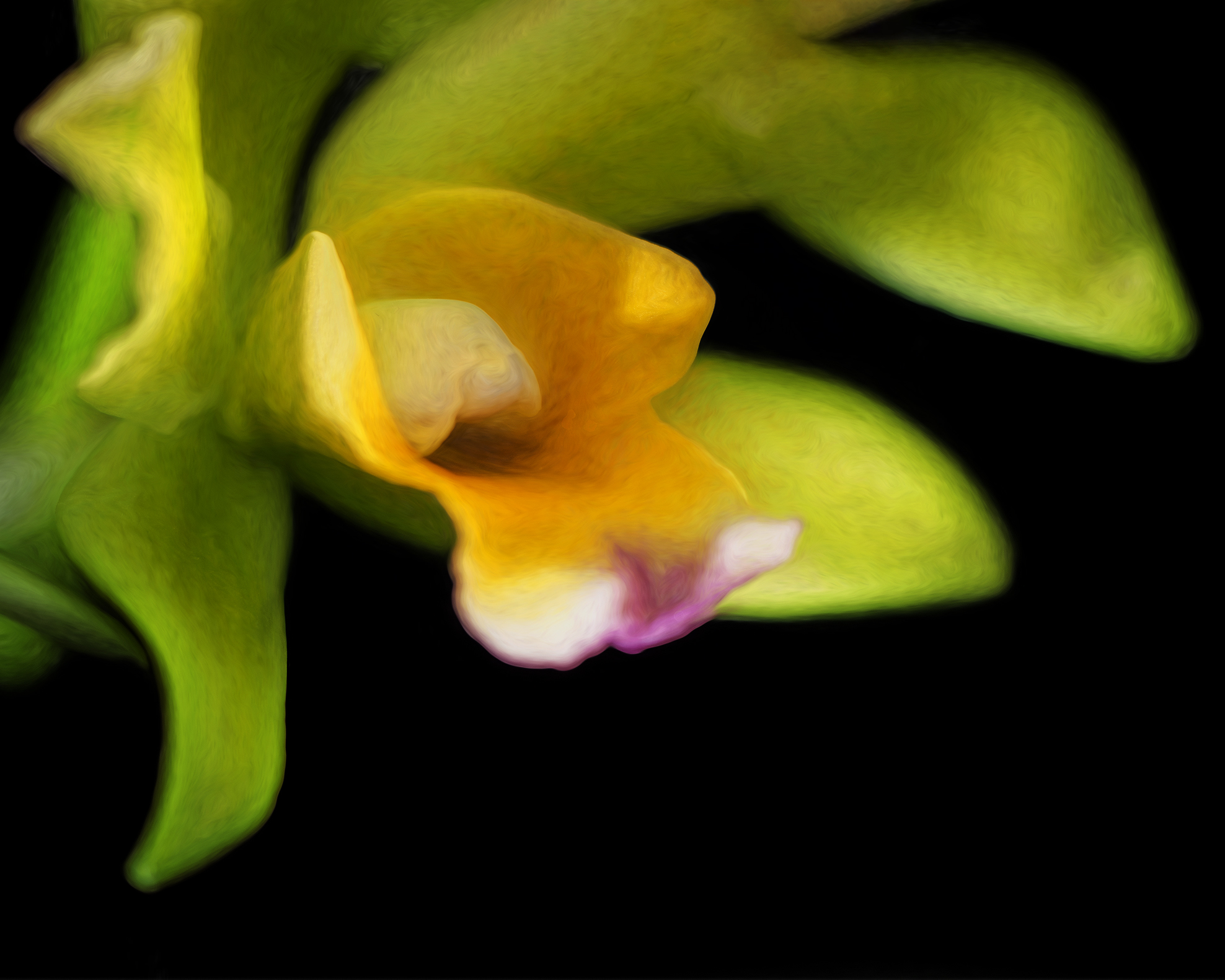
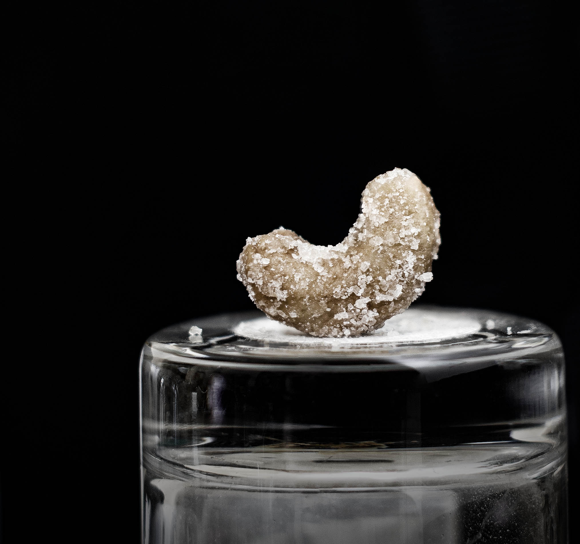
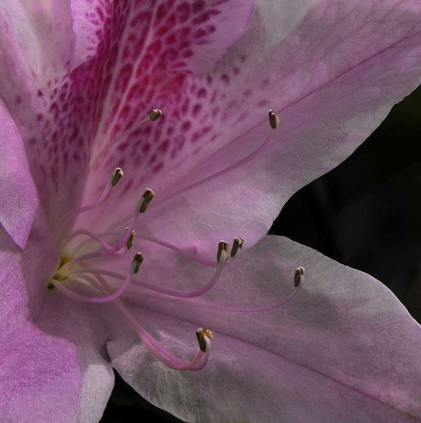
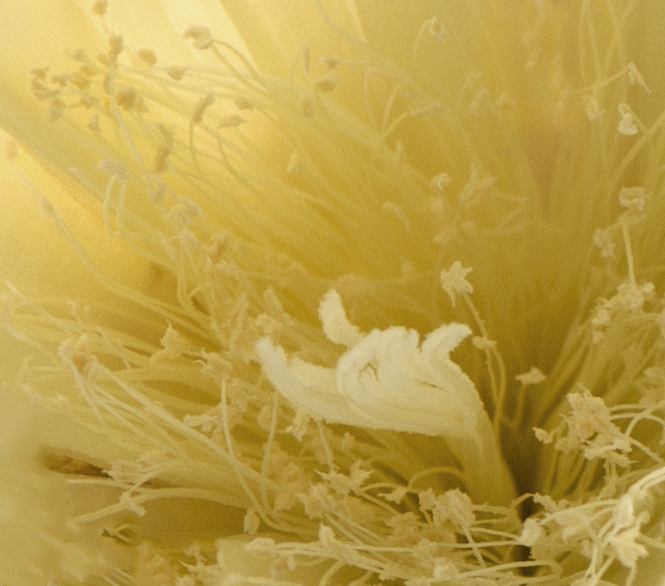
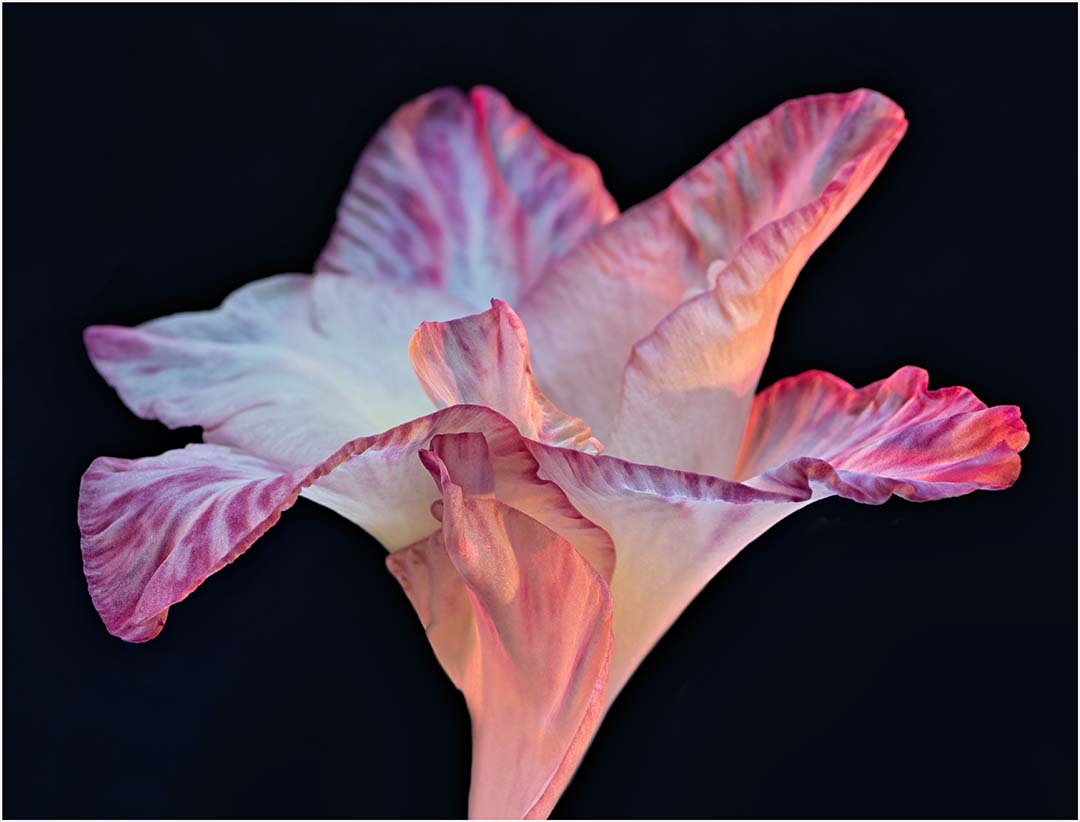
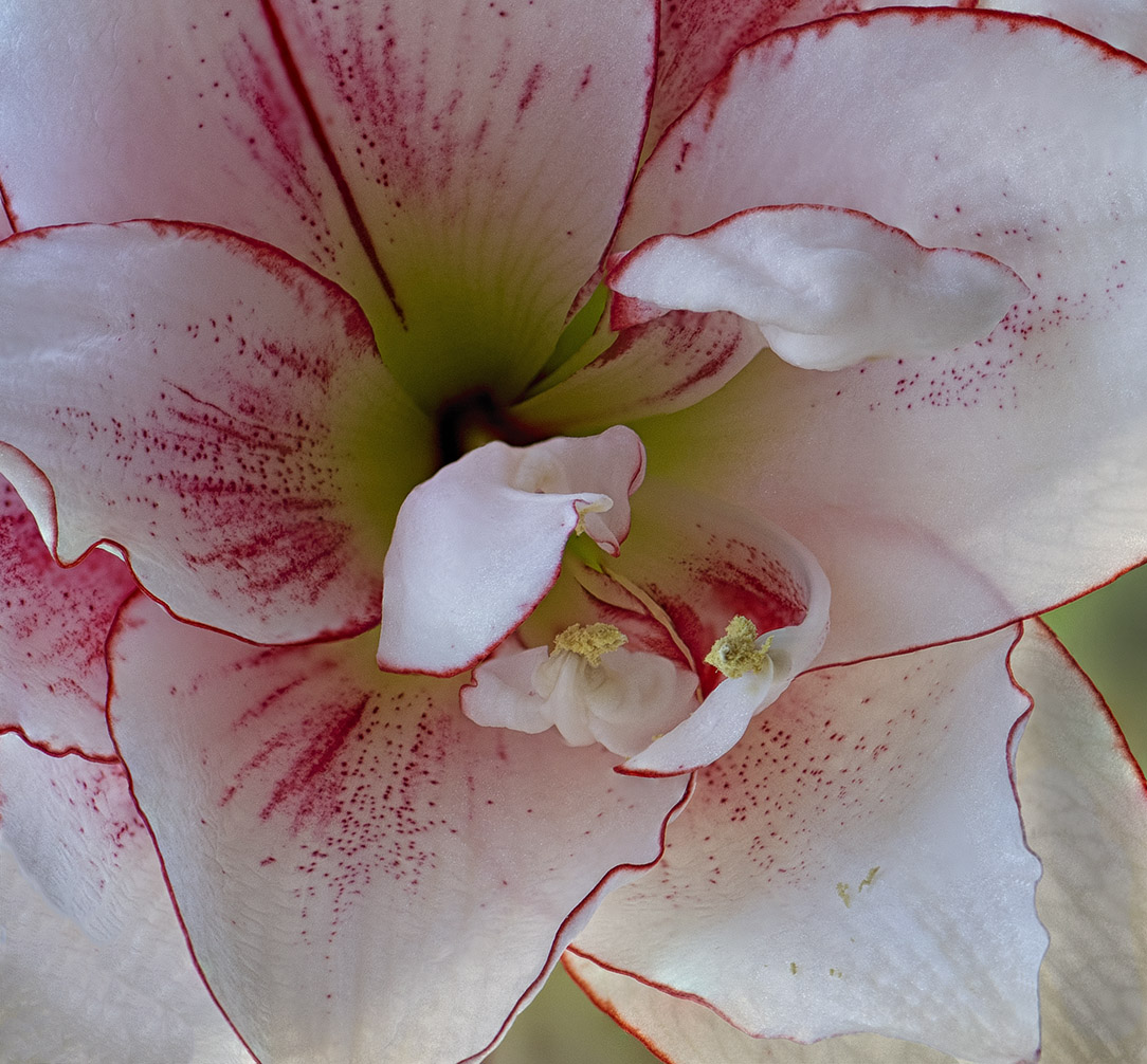
Hi Peter. I was trying to take a fuchsia bloom myself this month but I couldn't get a good composition. I like the brightness of the colors - you named the image appropriately! Your color capture is nicely done and the background is complimentary.
There are 3 minor changes i would probably make if this image were mine: remove the tiny leaf in the upper right corner, clone out the softer anthers on the right, and remove the blemishes from the flower petals. Some would argue the blemishes are true to nature, so I suppose that's subjective.
The composition you chose is spot on as it shows off the blossom to its fullest. And by the way, since you often invoke a culinary process on to your image subjects, fuchsia blossoms are edible.. |
Apr 9th |
| 65 |
Apr 21 |
Comment |
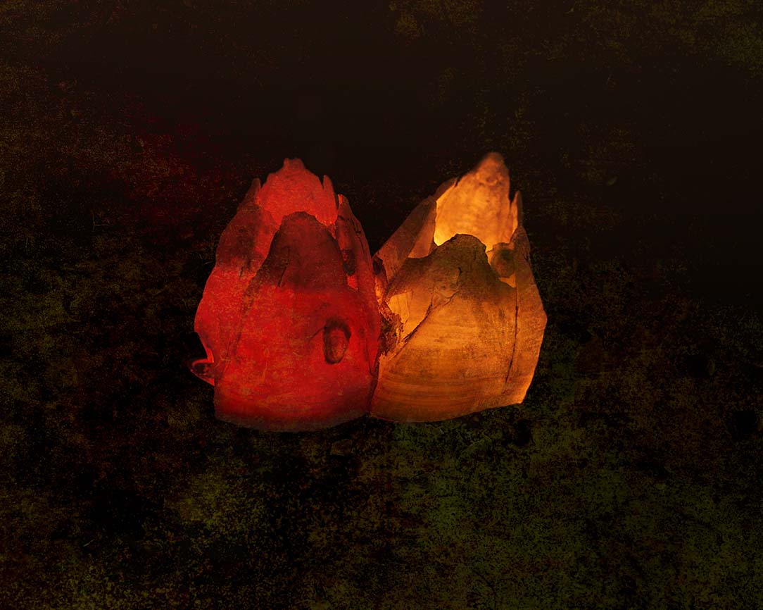
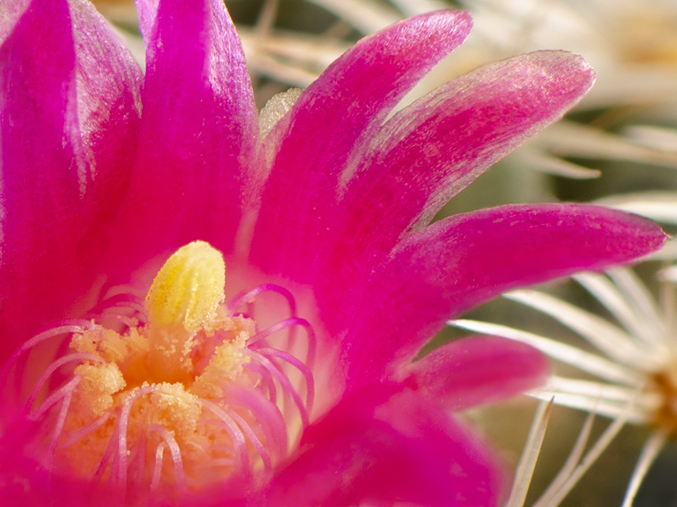
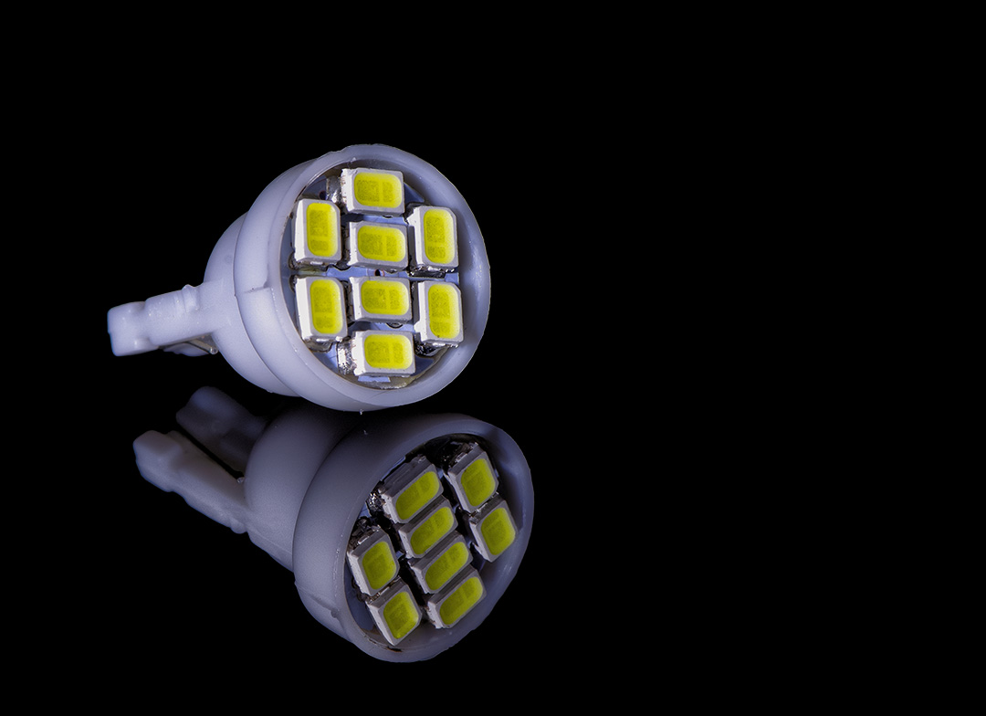
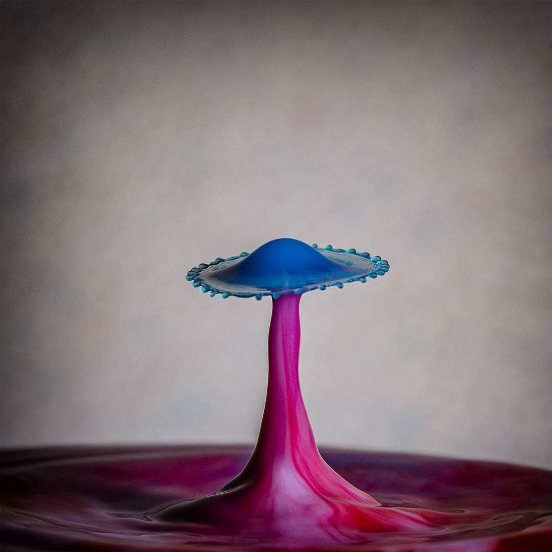
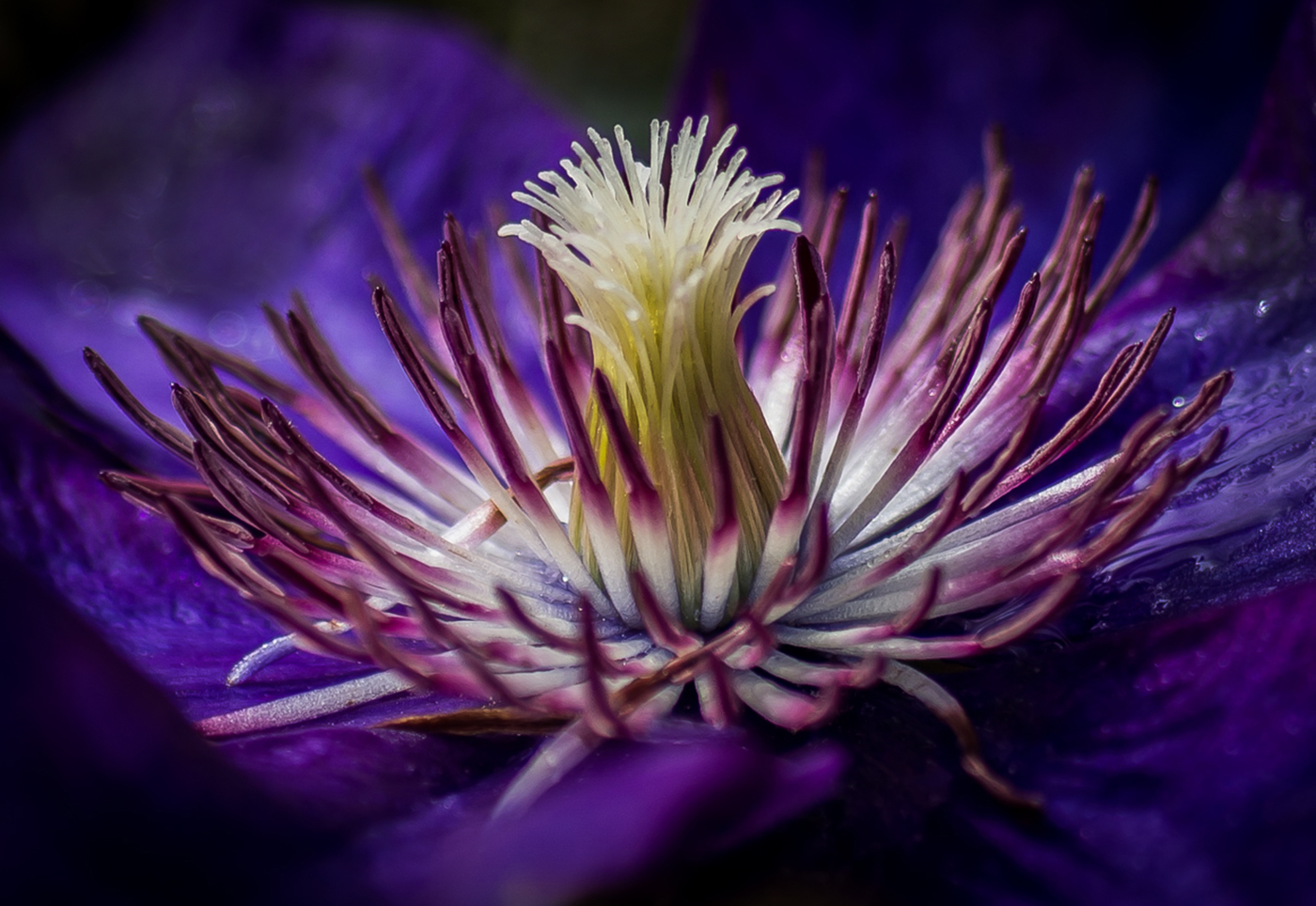
Both images you created here are pleasing, but I tend to favor the more grounded image. This to me is a very creative image largely because of the way you have controlled the lighting to achieve your result. The composition and angles are well done, but what really strikes me is how the red hits an angle, drops off to deep blue, then transitions back to red/magenta. Really nice..
As for the lights, you had mentioned the brand (maybe last year?) Would you mention the brand again? I remember they were pricey - maybe the price has gone down...I can hope anyway, |
Apr 6th |
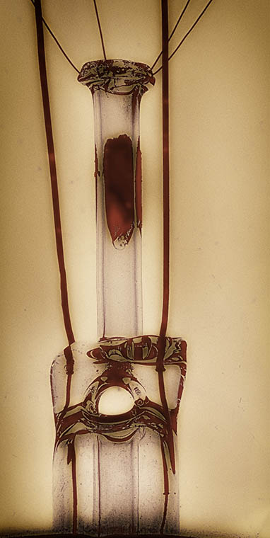
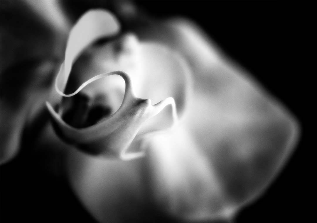
| 65 |
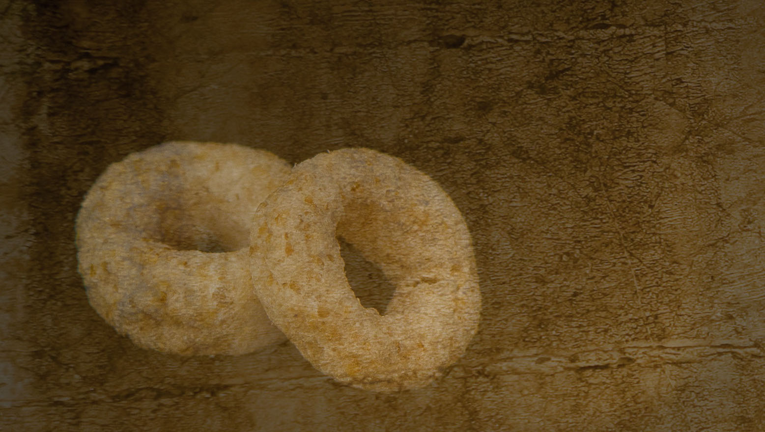
Apr 21 |
Comment |
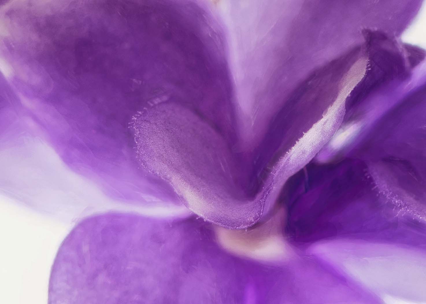
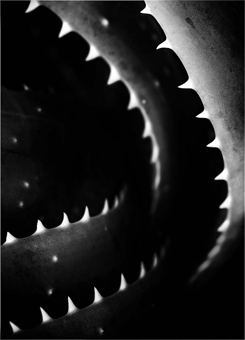
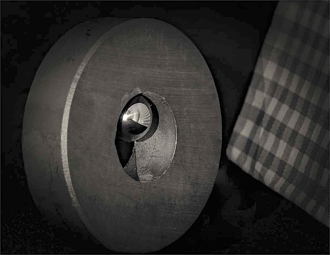
Michael - this is such an interesting image to me! Abstracts can be messy, but this is well balanced and keeps you in the image. Your choice of monochrome is a good one, although I like the original as well. One thing I would "fix" though is the upper right hand corner. Even if I didn't see the original, that area looks inconsistent with the rest of the image.
Overall, the darker shades on the lower left and to a lessor degree on the lower right keep my eyes in the center. Once there, the knots maintain my interest. Good job! |
Apr 6th |
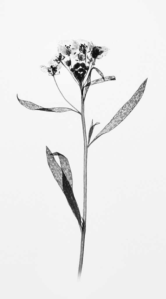
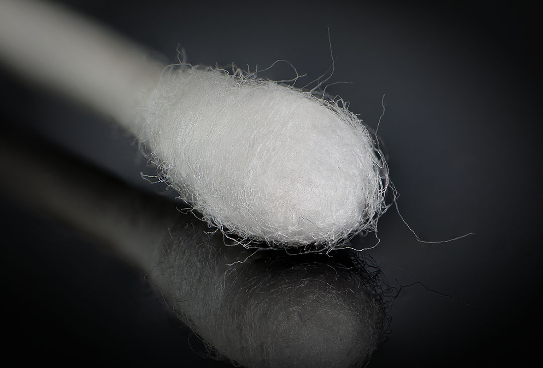
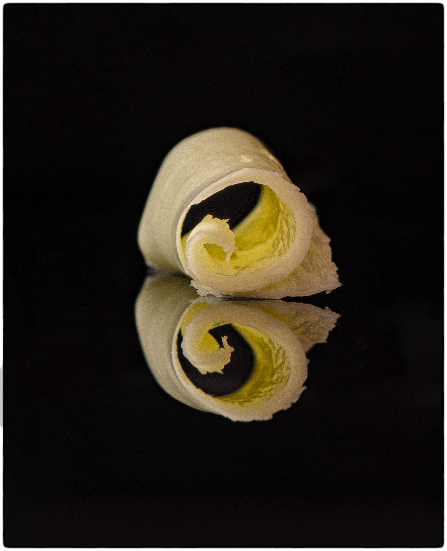
| 65 |
Apr 21 |
Comment |
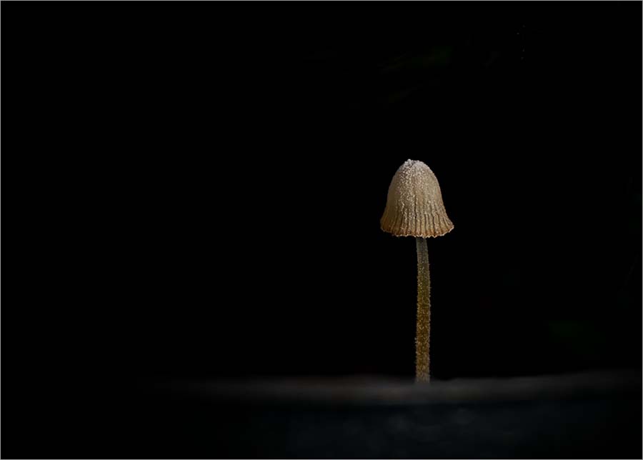
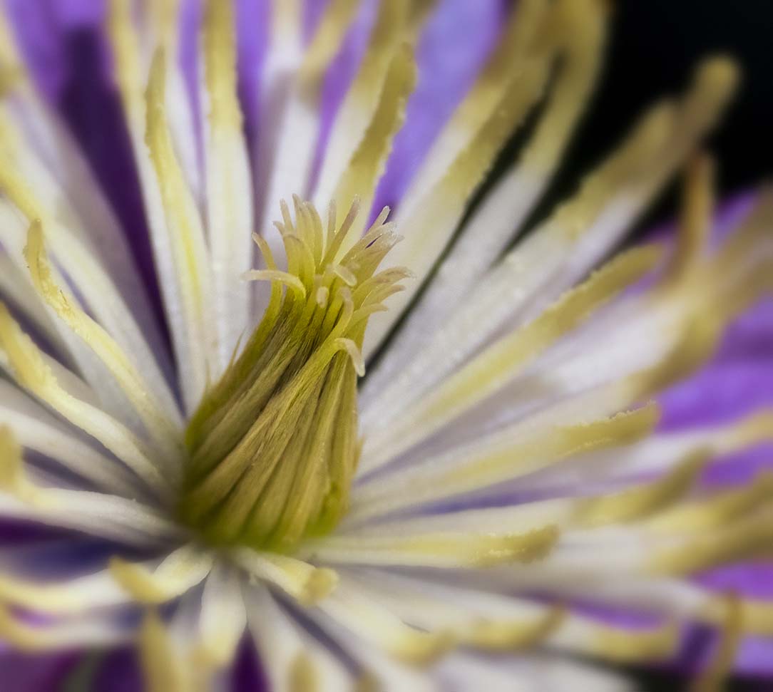
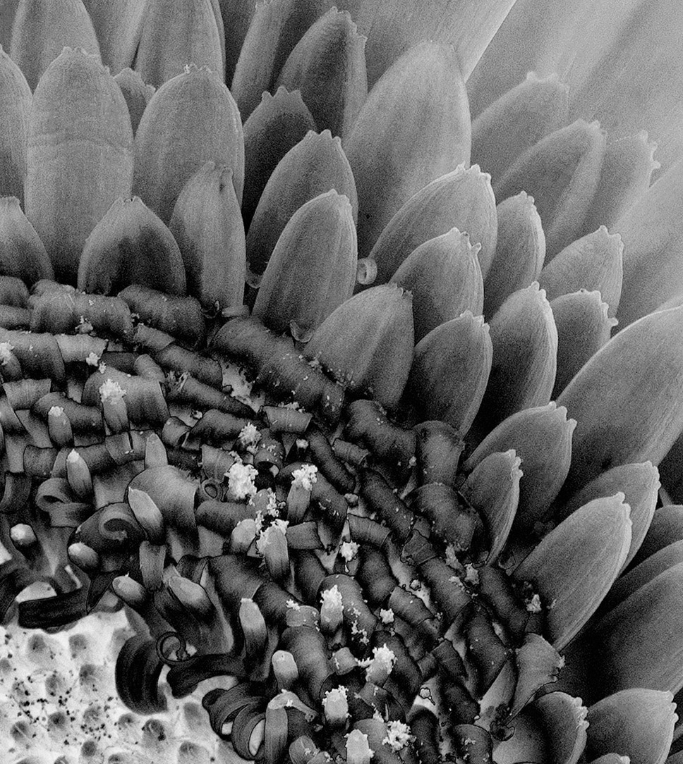
I like it! It does look like a bird's beak with fine filaments. The color scheme and background work well with the image and the vignette adds to effect. The only comment I have is that the end tips of the milkweed seem a bit soft. Overall I find this a really pleasant and fun image. |
Apr 6th |
4 comments - 1 reply for Group 65
|
10 comments - 3 replies Total
|