|
| Group |
Round |
C/R |
Comment |
Date |
Image |
| 32 |
Jun 20 |
Comment |
I apologize for the late comments...
Like the prior comments, I think the top of the image is the most interesting, but I would probably leave a little more than on Diana's image - maybe crop about 1/3rd off the bottom. The increased contrast works very well however and helps the lines pop. |
Jun 27th |
| 32 |
Jun 20 |
Comment |
This is a great shot, not because of what everyone has said here already; the expressions on the boys, the choice of sepia (great choice), but also because of the sharpness of your subject matter. Love the horse - particularly how the hooves pick up the dirt on the road. I can feel the dust and grit...!
Maybe darkening the buildings a bit would be ok, but overall this image is great. It really takes me back in time. Nice job! |
Jun 10th |
| 32 |
Jun 20 |
Reply |
When seeing a potential image, I often know it will not appeal to many and most likely never hung on a wall or sold. But in shooting simple things, sometimes the image will spark a discussion as it did here. And that is often my goal - to look beyond the object and let it lead us to where our mind goes. |
Jun 10th |
| 32 |
Jun 20 |
Reply |
Now I see what you mean...thanks for the visual - I was way off on my interpretation of what you meant. |
Jun 6th |
| 32 |
Jun 20 |
Comment |
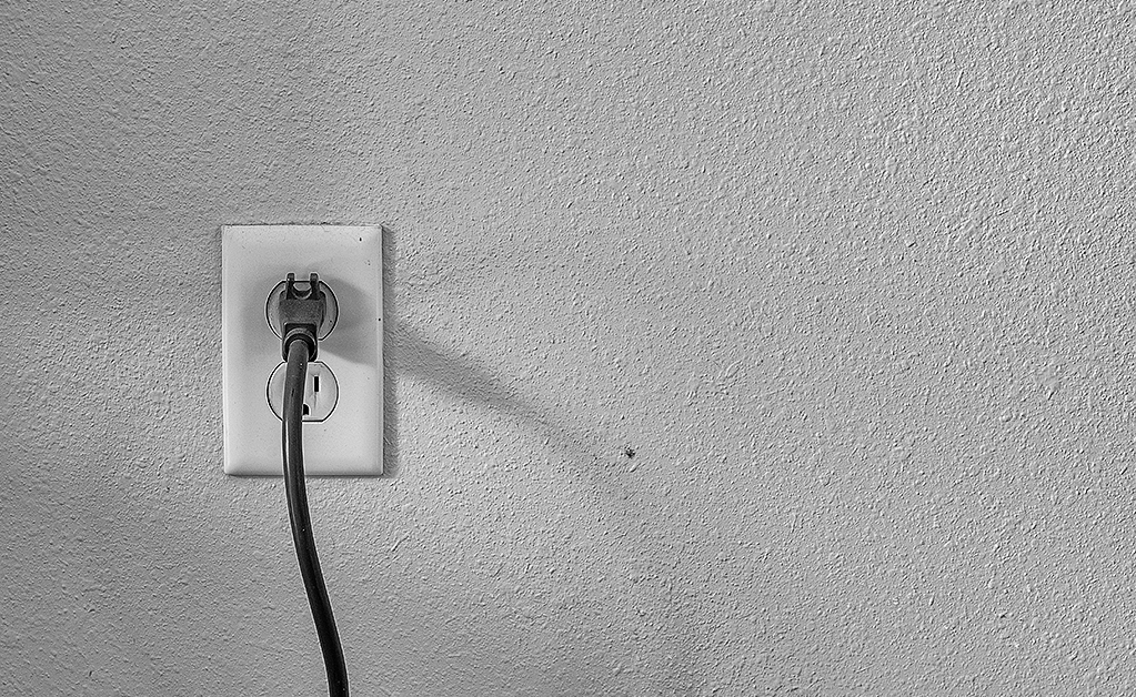
Welcome Asbj�rn. I agree with the Stephen that you've captured a nice range of tones. I knew before I read your image description that it was cold as you've captured that as well! This a lovely shot - the reflections only add to the image. It does give the impression of time past, although I imagine once in the town it becomes obvious you're in present day. It is dark in the original, so your choice of monochrome is best. |
Jun 6th |
| 32 |
Jun 20 |
Reply |
Thank you for your positive words Stephen. I reconfigured so that the socket plate corner on the upper left is on the diagonal with the corner of the frame. I'm not sure I like the result - what are your thoughts on the change? |
Jun 6th |
 |
| 32 |
Jun 20 |
Comment |
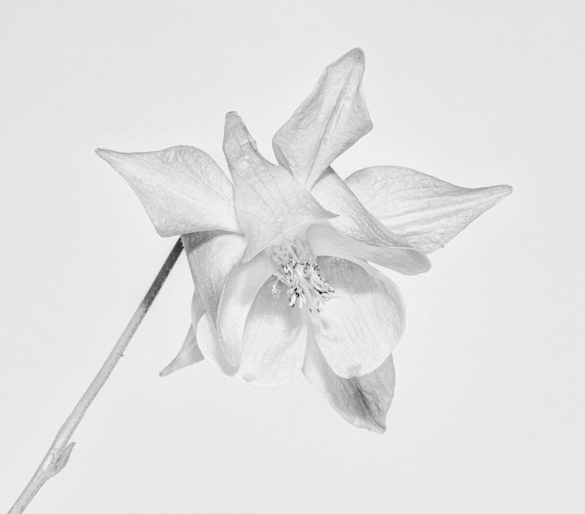
The color image provides a soft pink which is so pretty, but the monochrome provides a lot of interest as well. I'm thinking a few things when I look at this image. The first is that the stem coming straight out of the corner is not sitting well with me for this particular shot. The stark contrast of the black shadow at the top of the stem seems to keep pulling me in and the center of the flower which is interesting isn't getting quite enough attention. The translucent quality of the flower petals and the depth of field is very well done. I wanted to play with the flowers today, so I made some small adjustments. What do you think? |
Jun 6th |
 |
| 32 |
Jun 20 |
Comment |
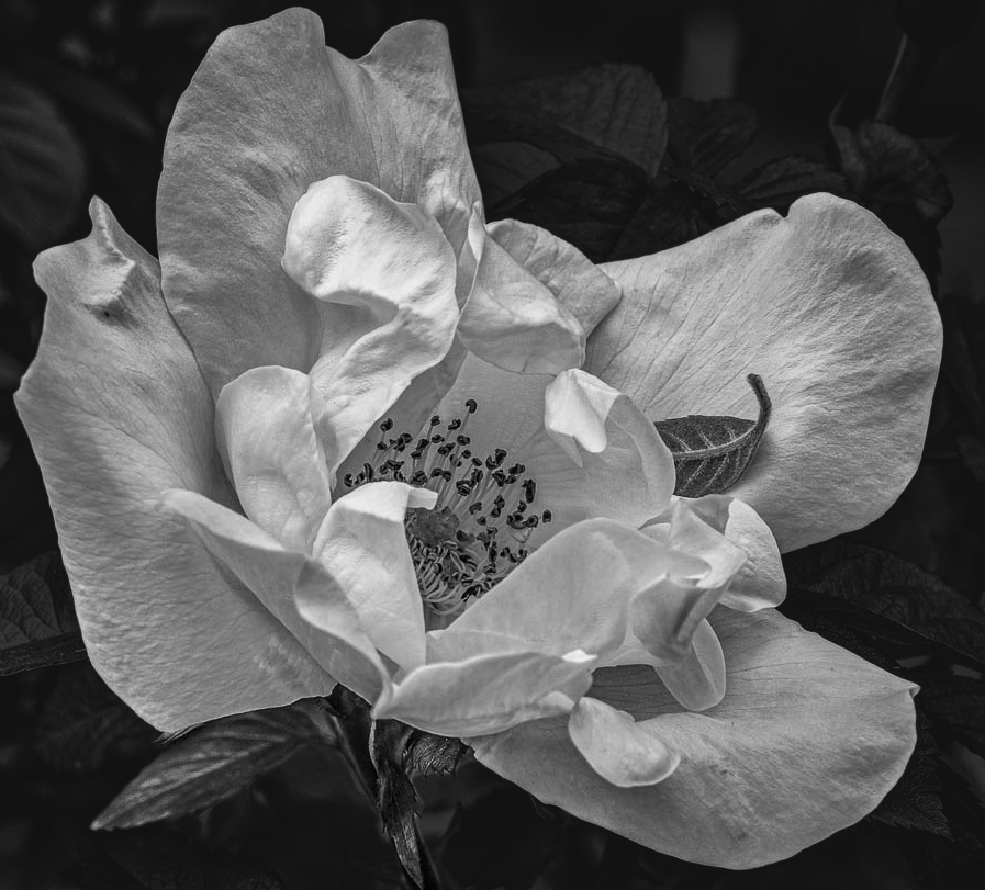
This is a nice rose shot. The petals have a translucent quality and you captured depth. Leaving the leaf on the petal was a good choice. I do find the background a distraction as it's busy. I can't help but play, so I took took your image, masked it in photoshop, and darkened the background. I also cropped a bit tighter.
|
Jun 6th |
 |
5 comments - 3 replies for Group 32
|
| 65 |
Jun 20 |
Reply |
I agree with you Angela that the tendril would add a lot, but it needs to be treated with care and be sharp! |
Jun 27th |
| 65 |
Jun 20 |
Comment |
This is a lovely image. The editing you've done is really nicely done. I've tried to take crystals before, but it didn't end well. Too many specular highlights, reflection was flat, etc. Thinking of those failed attempts makes this only more impressive. Like Angela, I'll try the polarization sheets and the "cross polarization" method. Hopefully the result will be better - if it is, you'll see it here.. |
Jun 27th |
| 65 |
Jun 20 |
Comment |
I'm not sure how I feel about this image. The tulips in their natural surroundings are so pretty, yet I can understand the need to create your own piece of art. As said before, the stem could probably be more delineated from the background.
If it were mine I think I would have chosen a background that was less grainy so as not to compete with the petals' texture.
|
Jun 27th |
| 65 |
Jun 20 |
Comment |
The way the spider is looking at you is very interesting. She's not about to let you near those eggs and shows no fear! I like the adjustments Charles made, particularly with the legs and (I assume) the of the leaf in front.
Focus stacking can be an exercise in patience. I manually move the focus point (not the camera of course) since I don't have a rail, and it's always challenging. 39 images are a lot - it's a good thing you had a spider that stayed still.
Love her eyes and triangular shaped head. |
Jun 18th |
| 65 |
Jun 20 |
Comment |
The modifications made by Charlie are good and enhance your image. The reflection is very nice and from photographing drops myself, I admire your patience in capturing this image. Aside from getting the side drops, I also would increase the contrast. And add more food coloring, or as I did, use the neon food coloring. It will produce very rich colors. |
Jun 18th |
| 65 |
Jun 20 |
Reply |
I agree with you that the flower was too cramped - your version does help it breathe a bit more. As for the tendril, the image looks much better with it gone. It's interesting to see now what I should have seen immediately - why is that I wonder. I'm tempted to photograph the flower again, with more focus stacking that used in this image. In short, I would like to see the flower as you have presented it.
And yes - love the technical terms. I knew exactly what you meant. |
Jun 18th |
4 comments - 2 replies for Group 65
|
9 comments - 5 replies Total
|