|
| Group |
Round |
C/R |
Comment |
Date |
Image |
| 32 |
Apr 20 |
Reply |
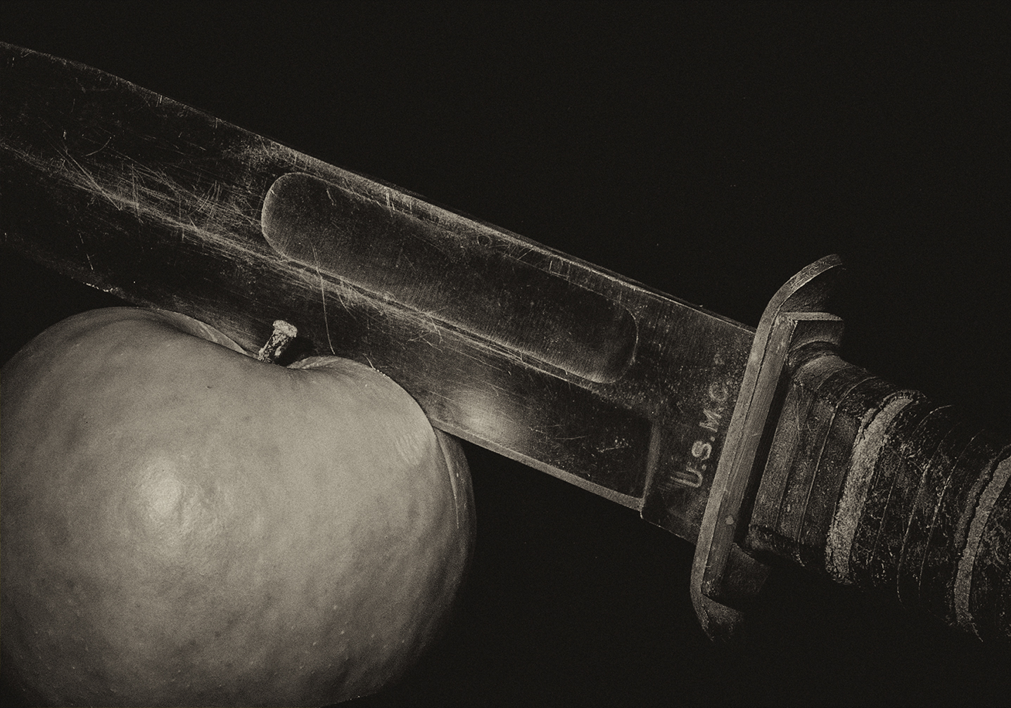
The knife probably should have been completely in the image and as Stephan mentions, perhaps the entire cutting board. |
Apr 12th |
| 32 |
Apr 20 |
Reply |
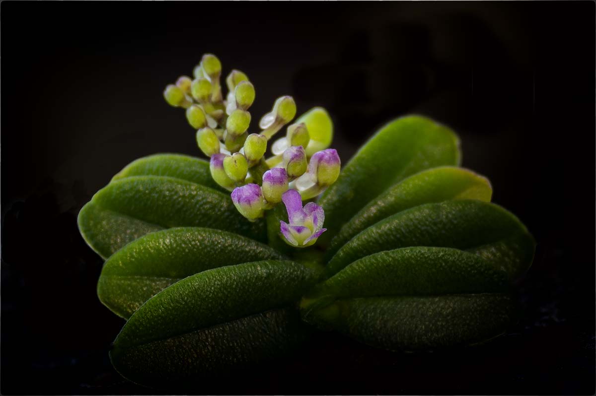
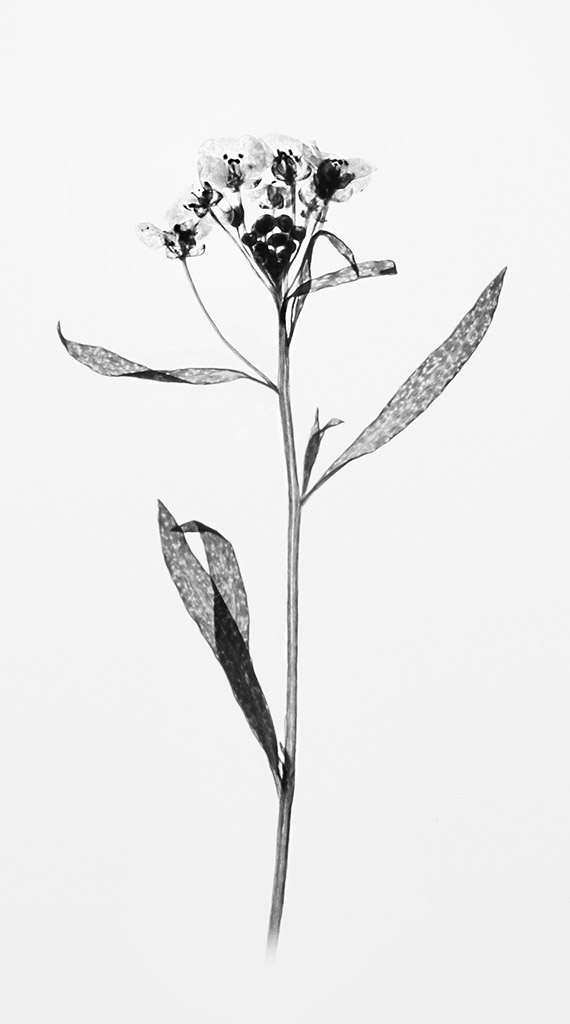
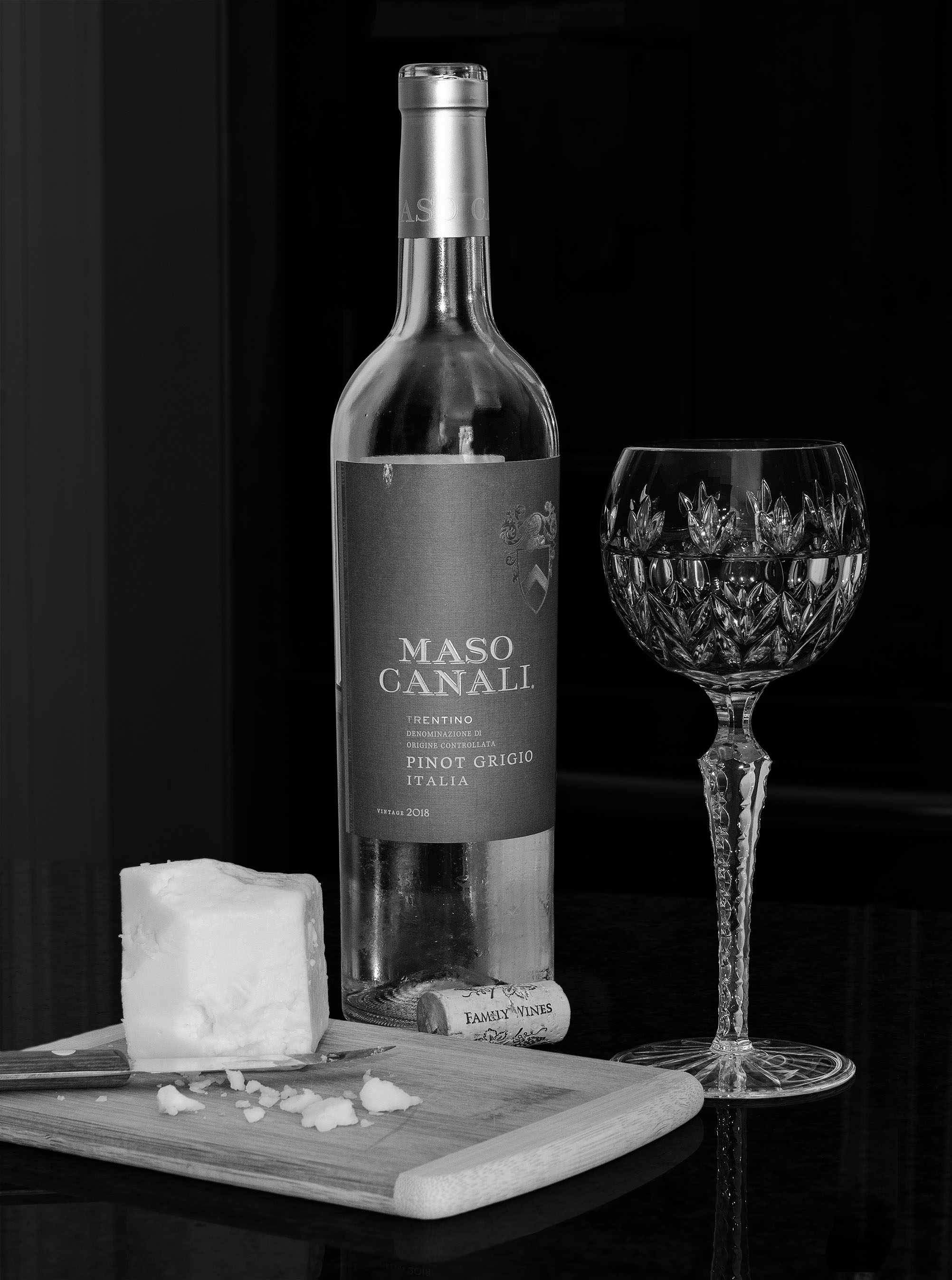
Thanks Stephen. The cheese is delicious - made by Cabot in VT. We went to Cabot years ago where we saw how they turn the cheese by hand, cut, wrap, etc. Cabot is part of a VT co-op where the cows are grass fed. We only buy the wax wrapped as the plastic seems to alter the flavor.
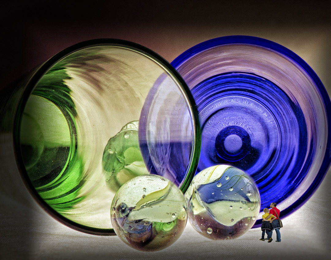
The glass is from a set of 4, on each of red, green, purple and blue. Sadly the blue one was broken and I thought perhaps the other colors would clash or if/when converted to monochrome would become too opaque. |
Apr 12th |
| 32 |
Apr 20 |
Comment |
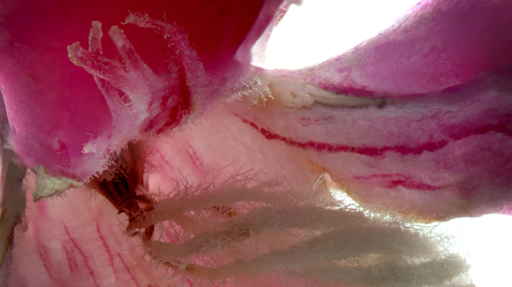
This image is frightening thinking of the meat sitting out, bugs, women with no gloves, etc. Diana's adjustments are well done and in my opinion appropriate, although losing the tile in the front is a loss here. The tile adds a gritty feel and along with the raw food, adds a sense of traditional Vietnamese culture. |
Apr 12th |
| 32 |
Apr 20 |
Comment |
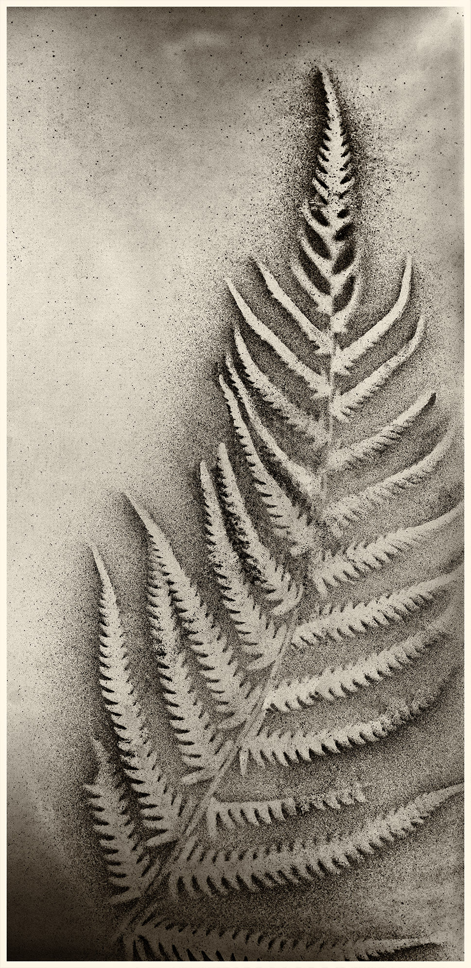
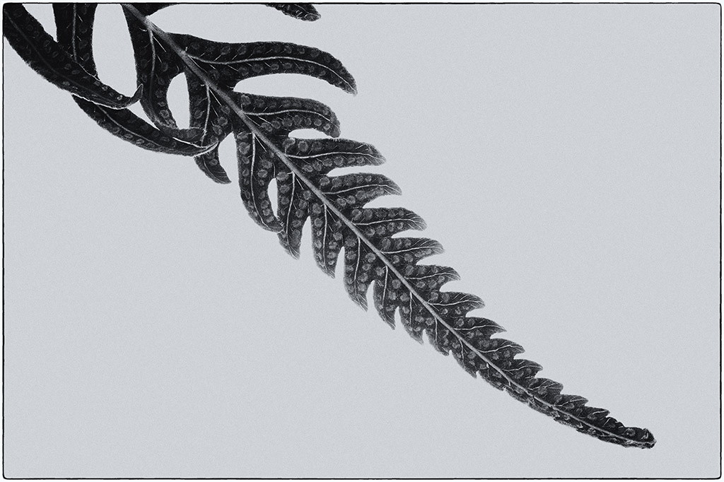
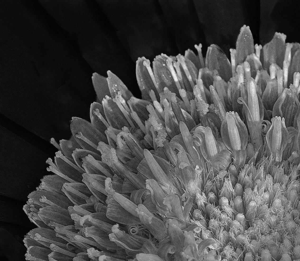
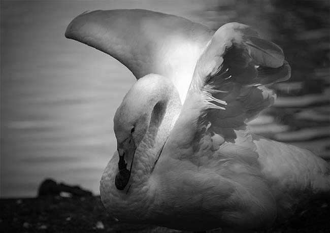
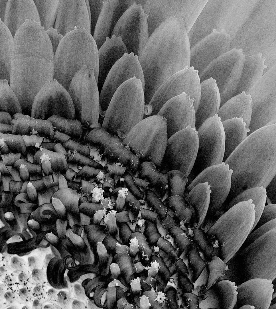
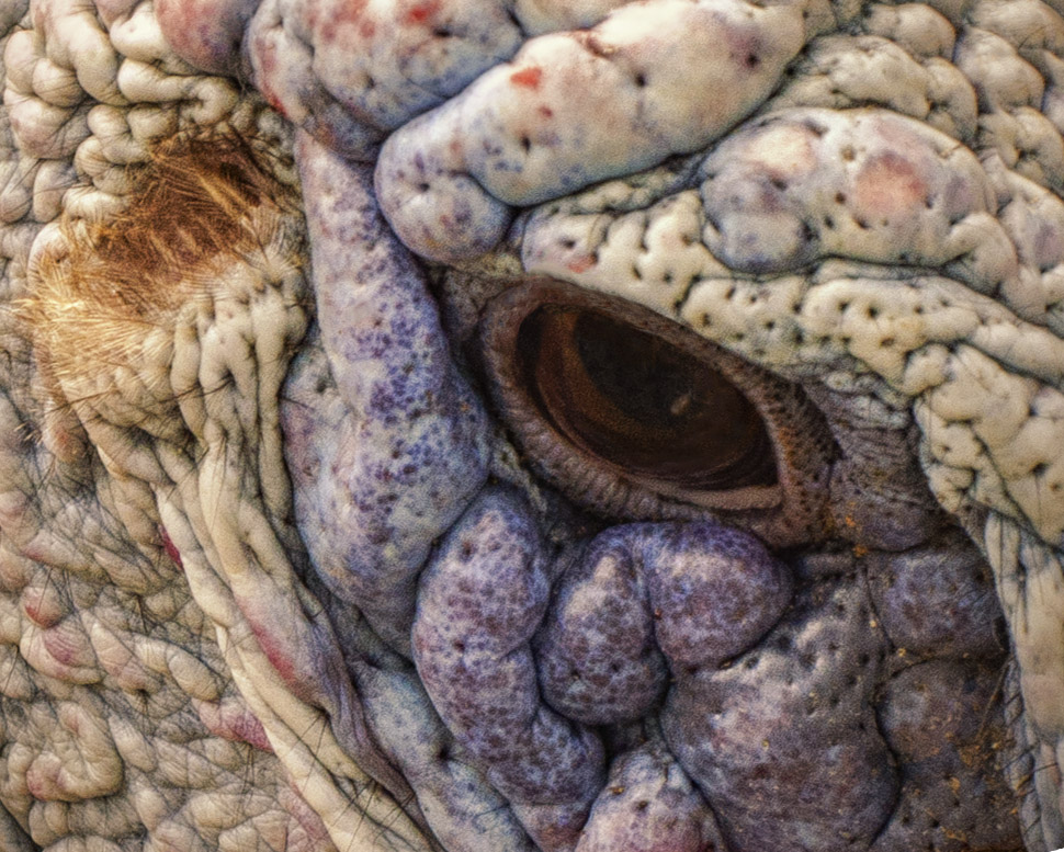
The sharpness of the feathers is nice and the contrast the way it is fine. I can see part of the legs - overall it's a nice shot. So many people are using Topaz AI to reduce the noise but keep the clarity. |
Apr 12th |
| 32 |
Apr 20 |
Comment |
The monochrome version is definitely better, and I agree with the above comments. The center window frame could be more to the right or left, but the woman just to the left of the frame seems to offset the central split. |
Apr 12th |
| 32 |
Apr 20 |
Comment |
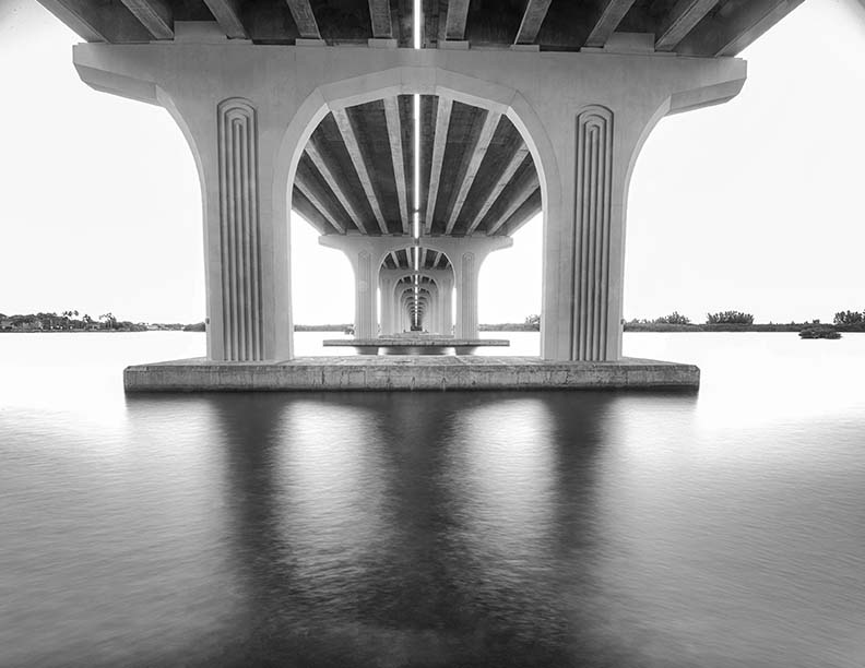
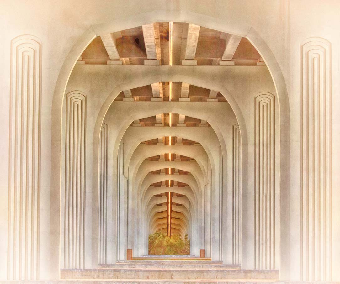
As everyone else has commented, I agree the left side should be cropped to remove the open area. Walking under the bridges here are always interesting so I understand why you enjoy being there. I used to take NJ Transit into NY and remember all the cracked, crumbling bridges we would go under. Bridges close to me here in Florida are so much newer and lack that "urban decay" feel. |
Apr 12th |
| 32 |
Apr 20 |
Comment |
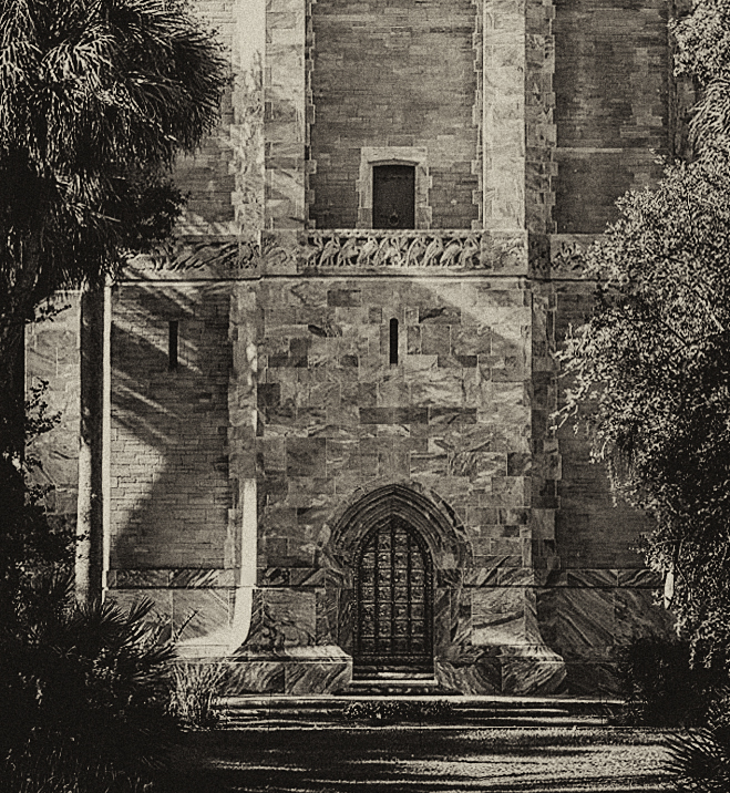
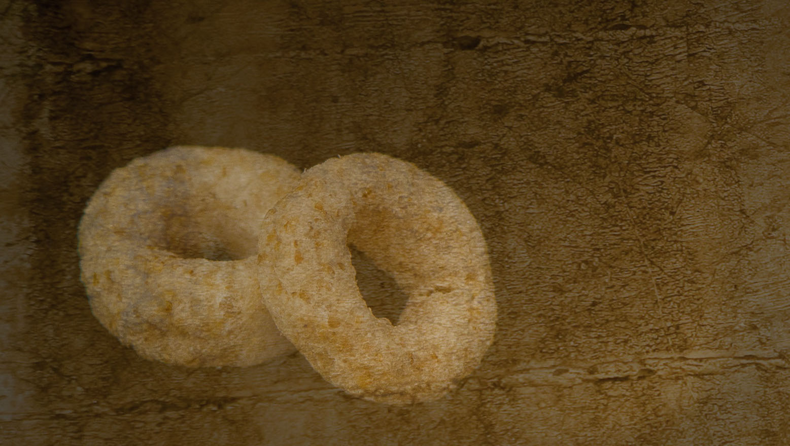
Nice image Tom. Your choice of Sepia was a good one as was leaving the silos in, although I never thought of them as being modern. When we lived in NJ, we were able to get to Lancaster easily and visited often. You've captured the feel of the area very well. |
Apr 12th |
| 32 |
Apr 20 |
Comment |
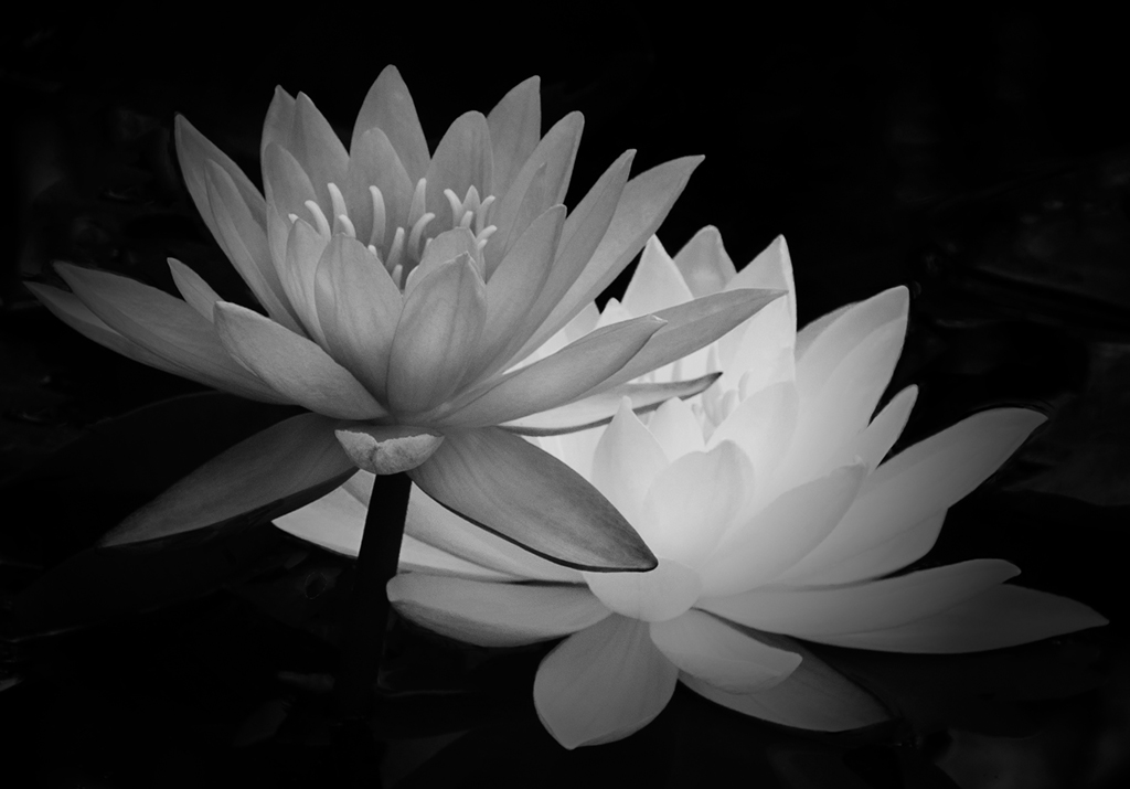
I like this image, particularly reversed. To me, the heavy white line seems to show a juxtaposition of a world full of speed and being short on time, compared with standing still and watching the world go by. The monochrome version is in my opinion more thought provoking. Adding a small amount of grain would be a good addition. |
Apr 12th |
6 comments - 2 replies for Group 32
|
| 65 |
Apr 20 |
Comment |
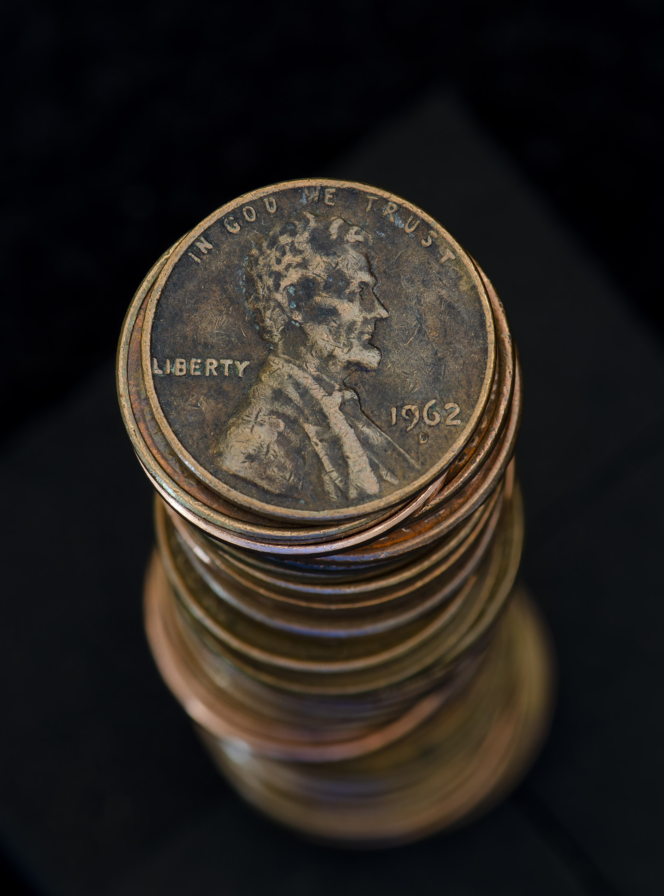
I too like the colors in this image and I agree that Topaz Gigapixel AI does an amazing job. The crop is well done. Your image prompted me to lookup and read about the Mandrill Monkey as I was curious to see how they were classified. Seems they were once classified as baboons in the genus Papio, but they now have their own genus, Mandrillus. They are also the world's largest monkeys. As you can see, your image was an inspiration beyond photography! |
Apr 19th |
| 65 |
Apr 20 |
Comment |
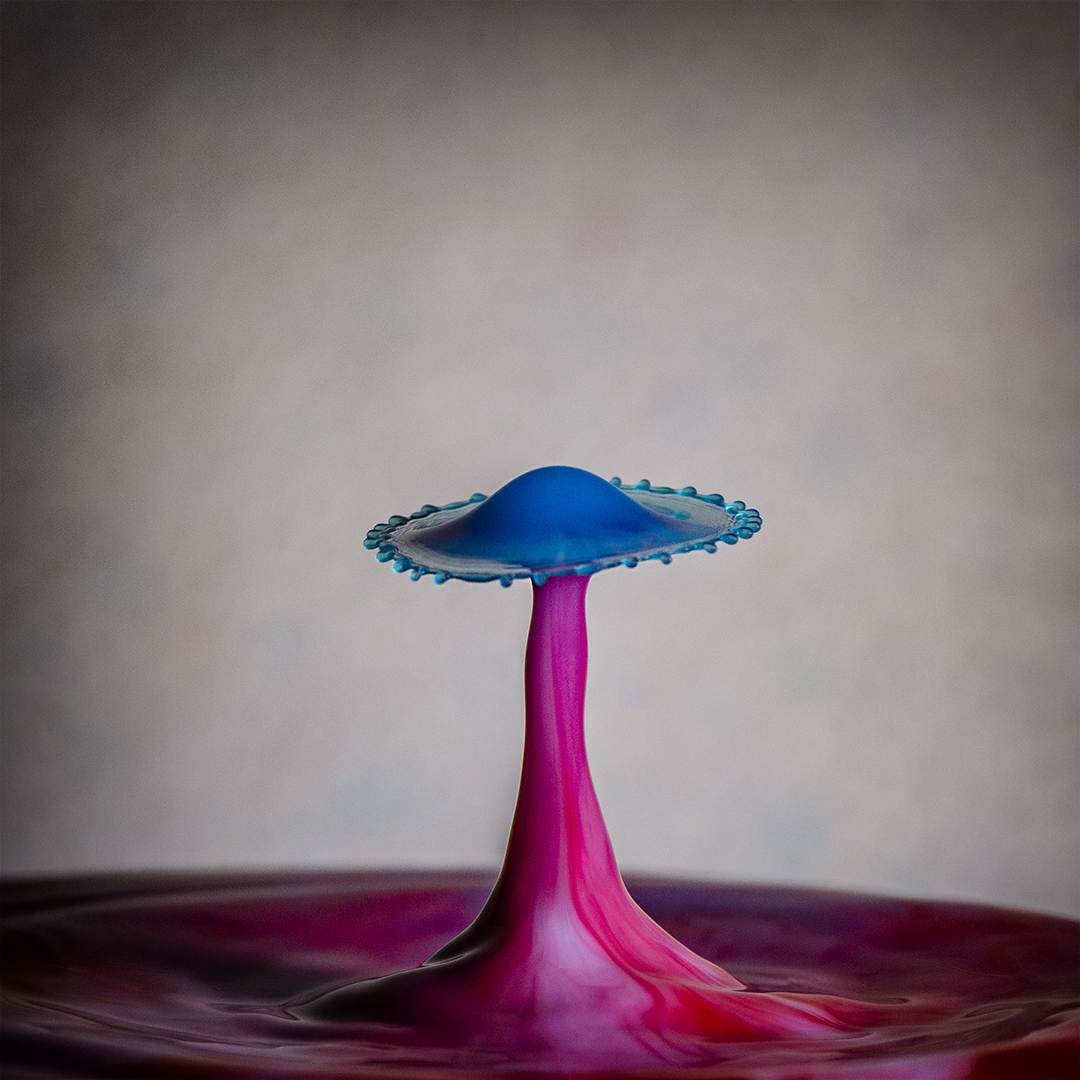
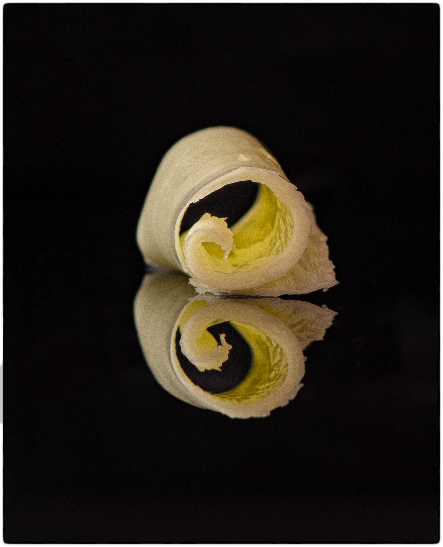
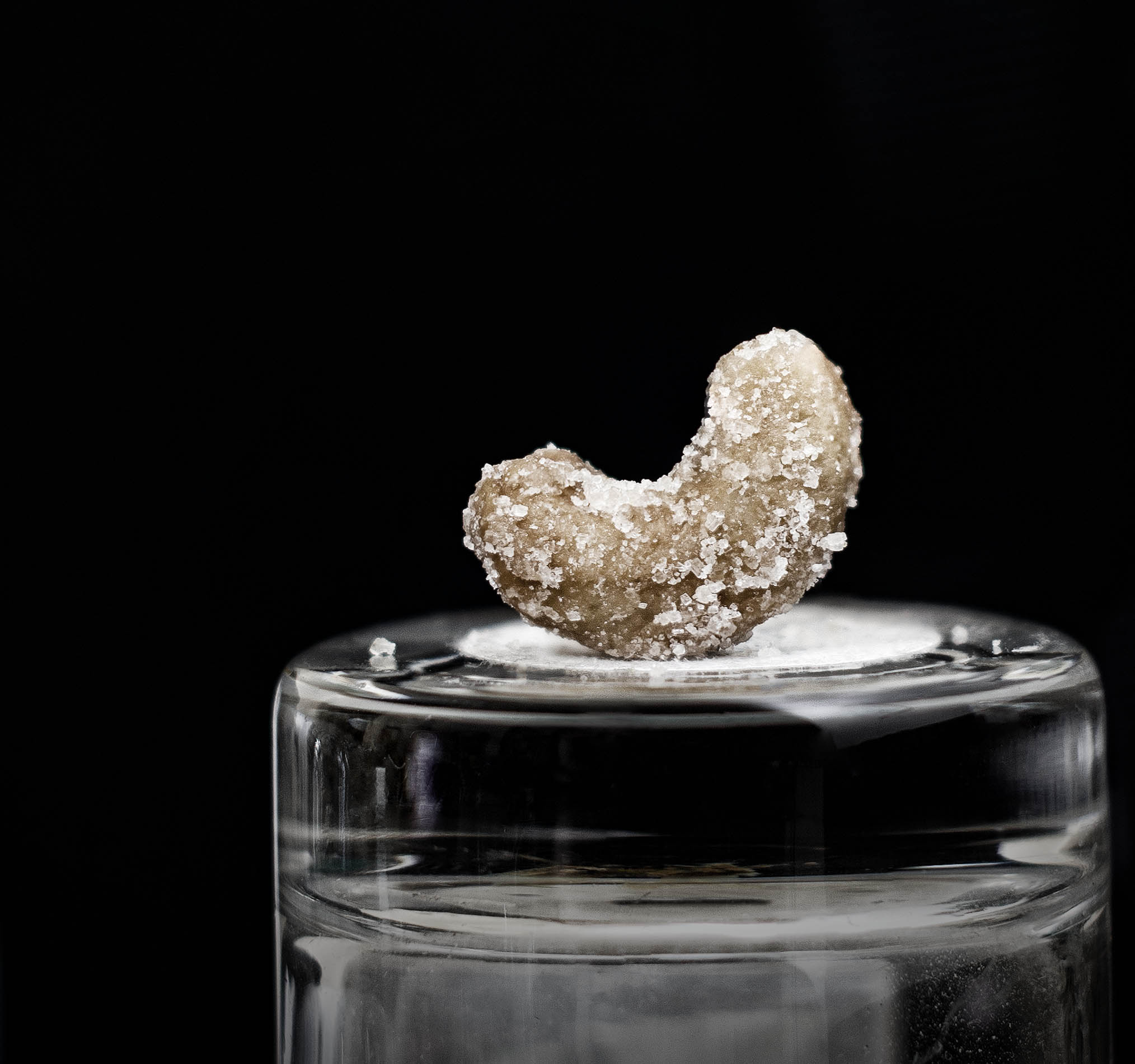
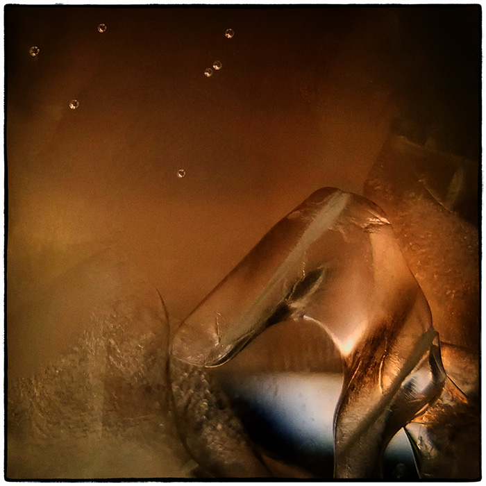
This is a nicely done drop - sharp from front to back which I know is not easy to achieve. I like the coffee color too. So now to be picky...
I would use spot healing on 3 places: the "body" of the water drop to remove the reflective white spots. There's one at the top and 3 at the bottom. The third place would be to remove the small water bead in the lower right hand corner. As you can see, very minor adjustments to an overall great image.
Seeing your drops has gotten me motivated to do my drop photography again. Now if I can just get the timing down..
|
Apr 19th |
| 65 |
Apr 20 |
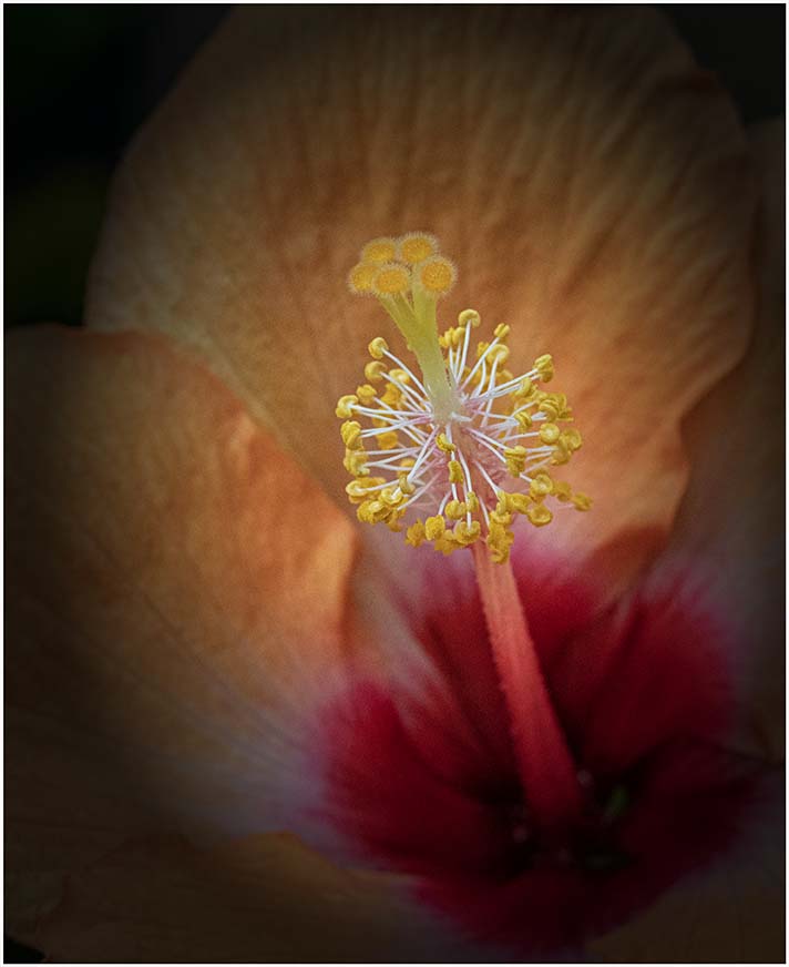
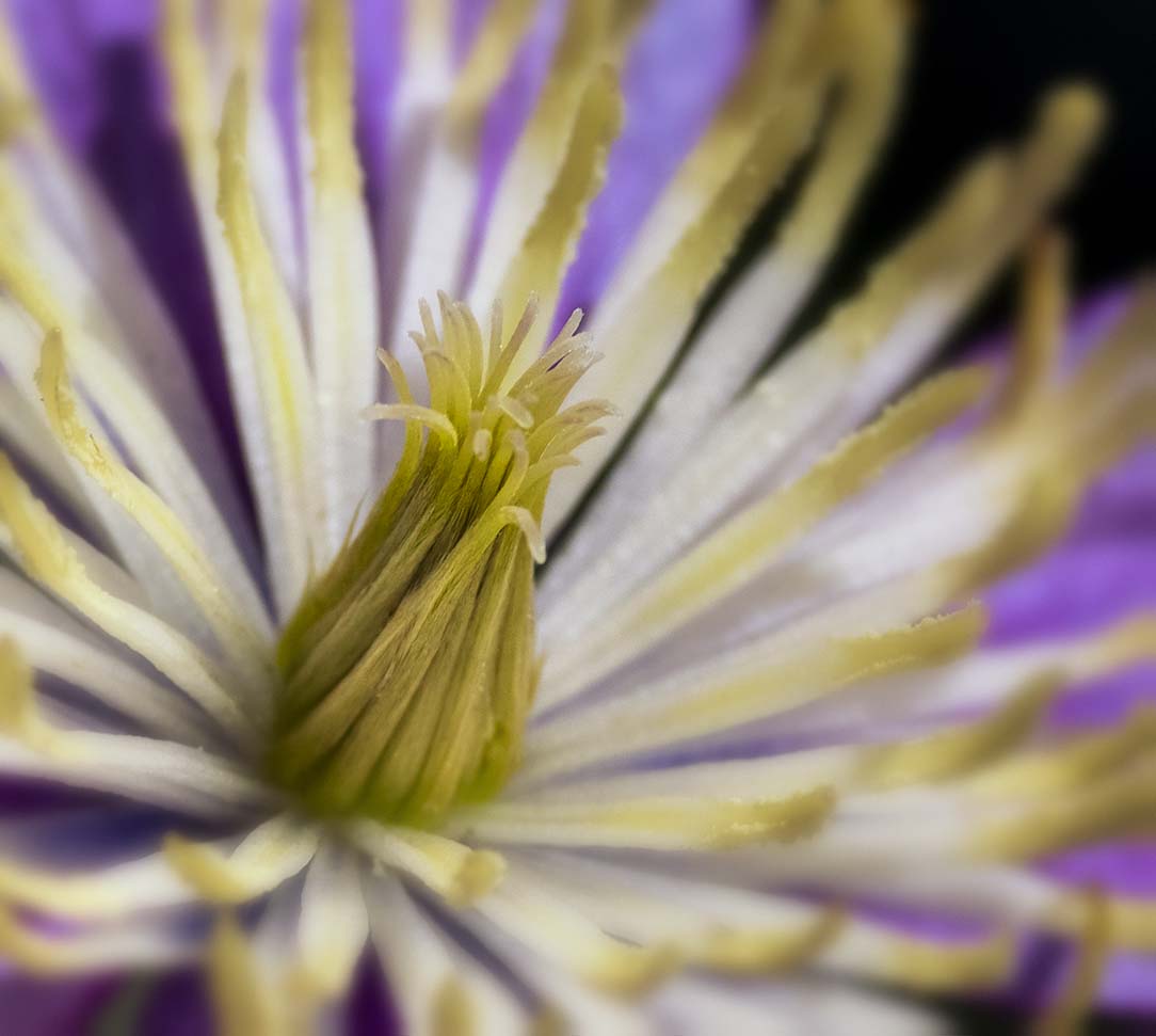
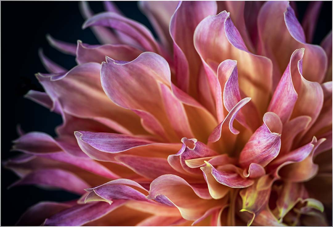
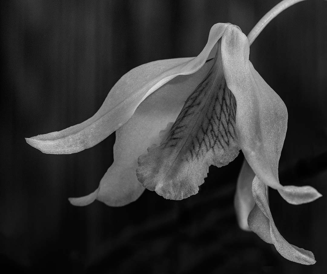
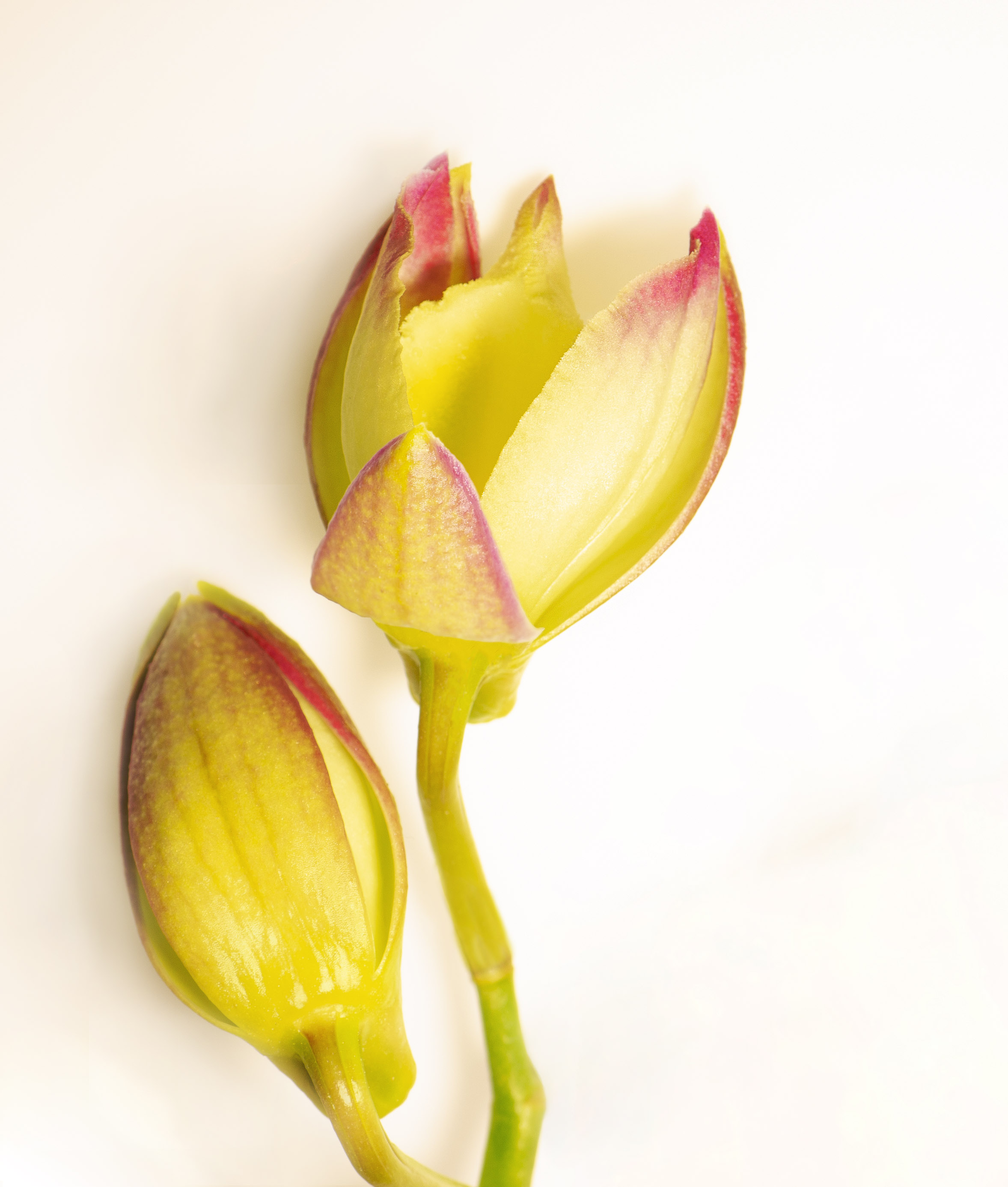
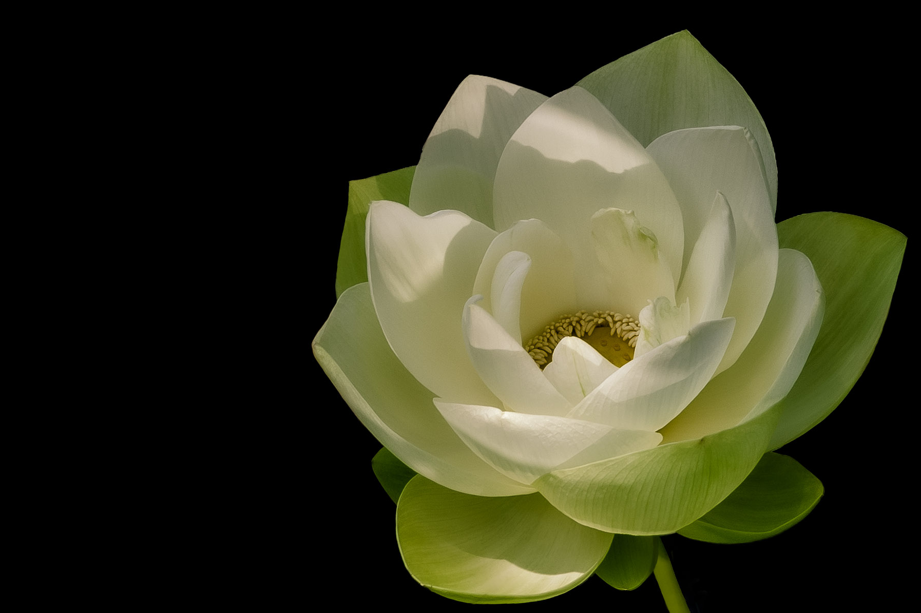
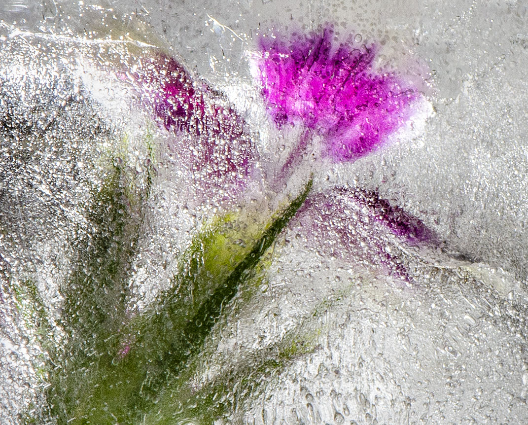
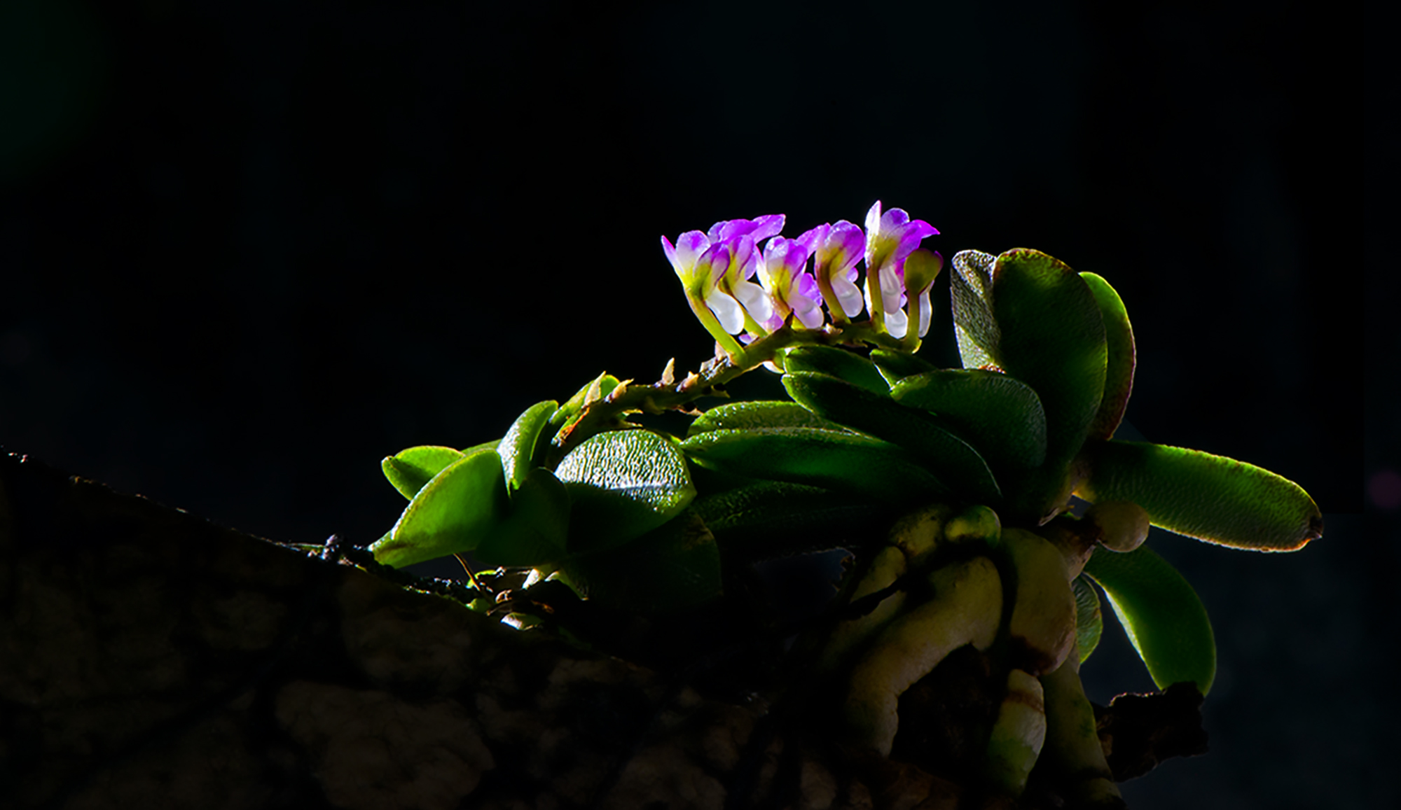
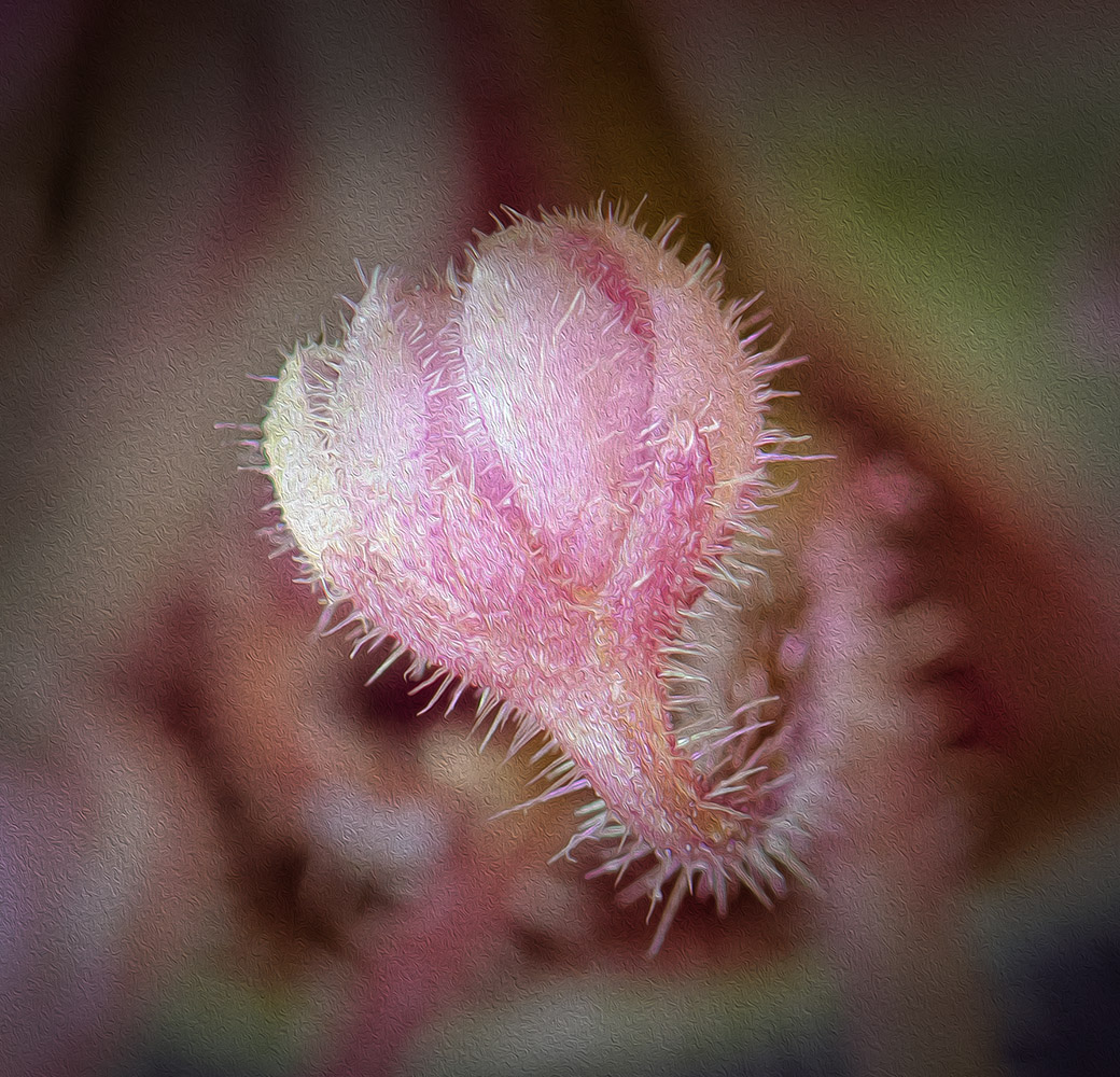
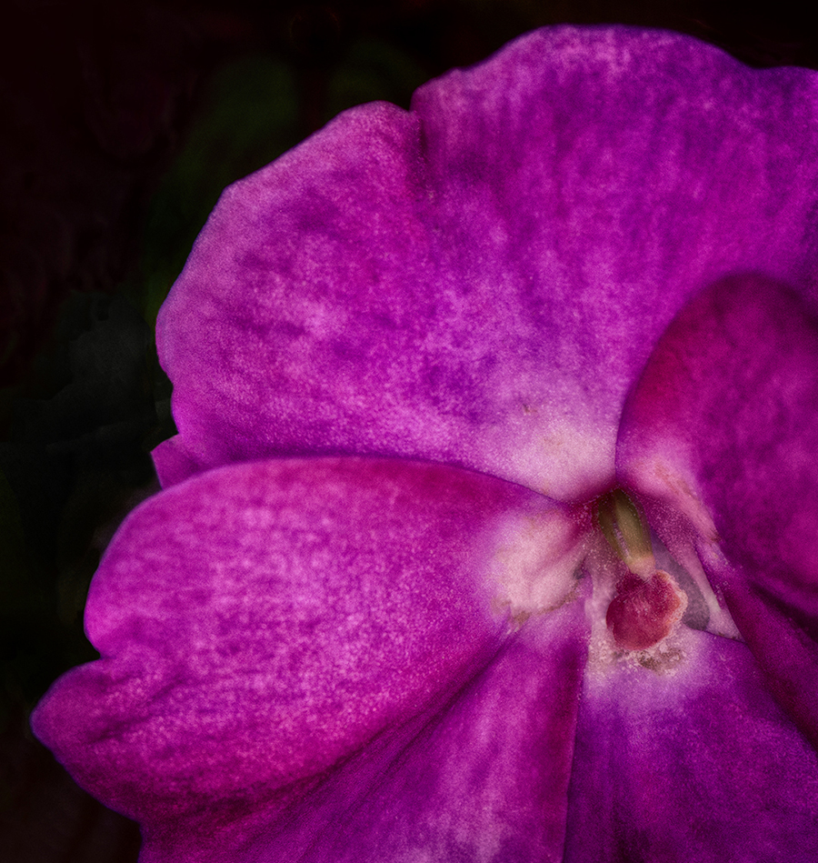
Comment |
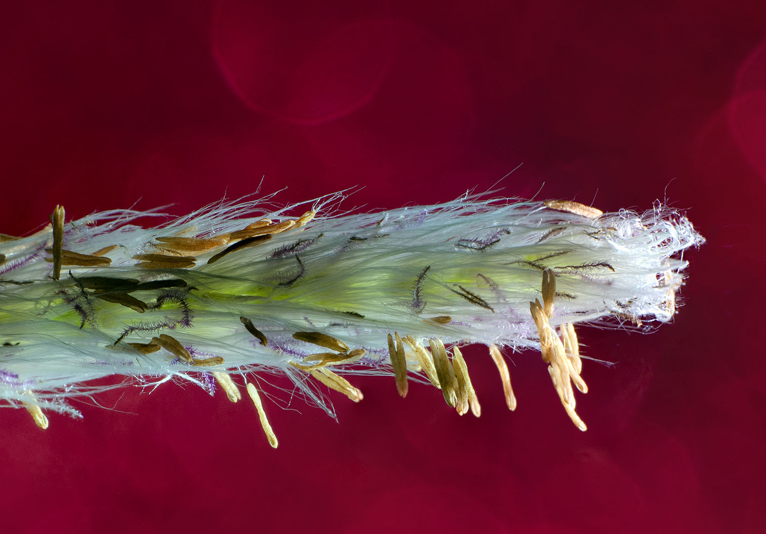
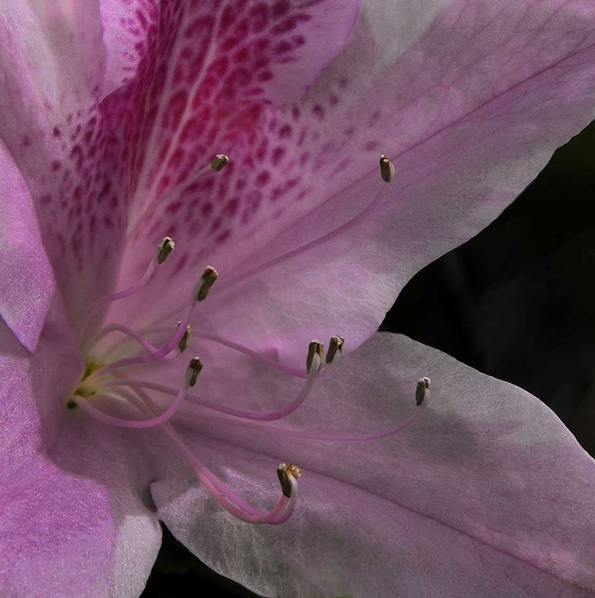
A beautiful image to be sure. Photo stacking outdoors is a brave endeavor and you did it so well here. The colors are lovely. I like the translucent quality Peter gave the flower petals, but I prefer the petals being a bit darker as in your image. The top of the back flower is a bit of a distraction for me - perhaps because it hits the upper portion of the image. I might darken the top portion a tiny bit. But that's a small component compared to how nicely this image is overall. |
Apr 19th |
| 65 |
Apr 20 |
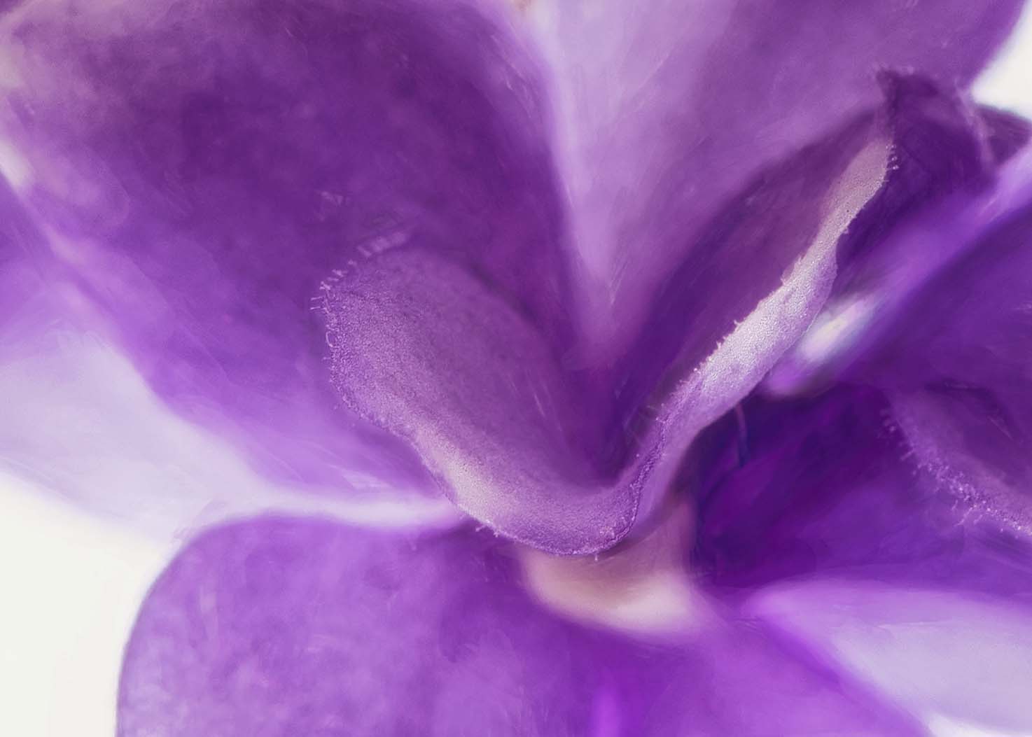
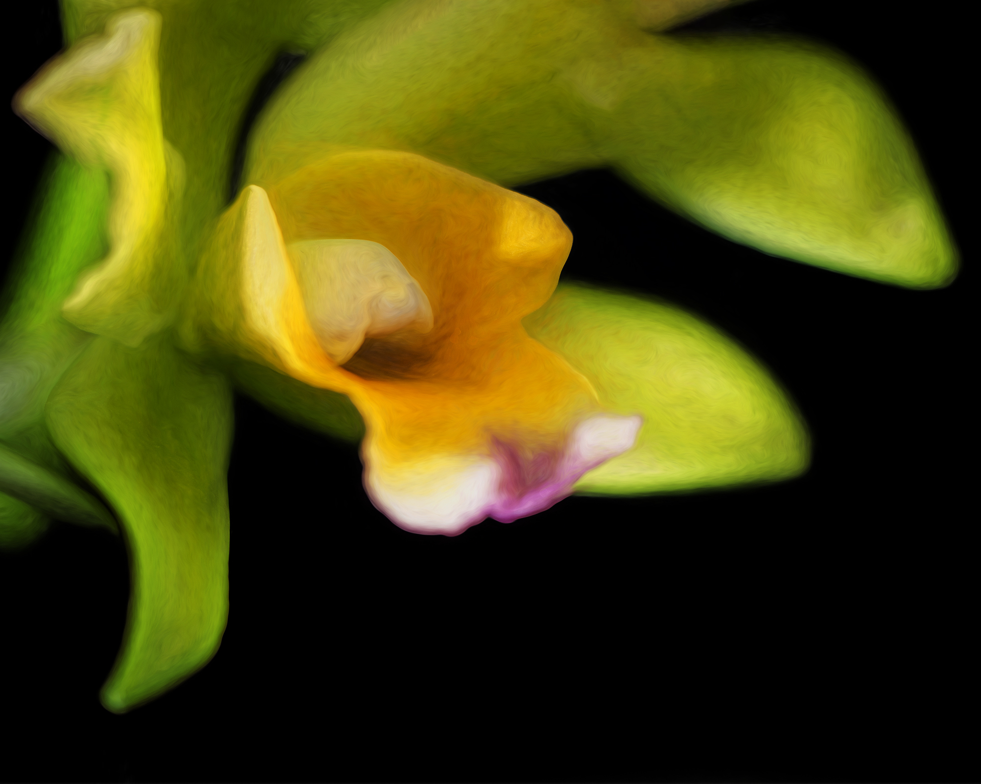
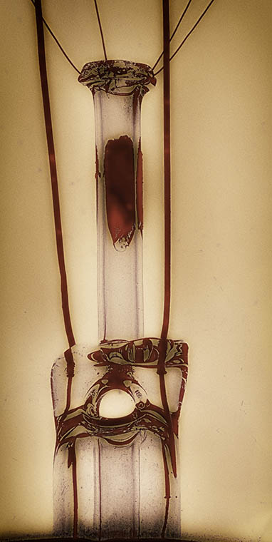
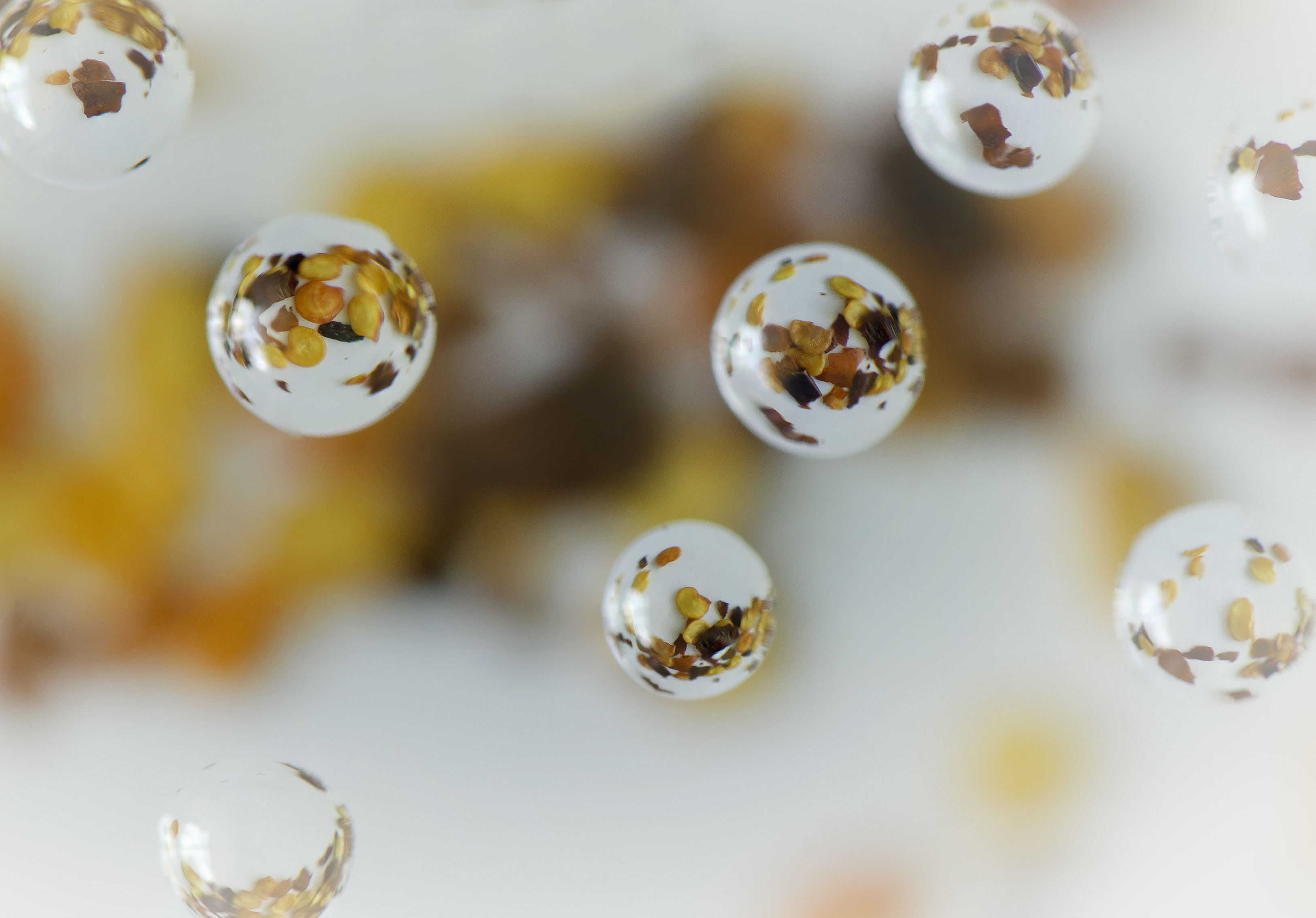
Comment |
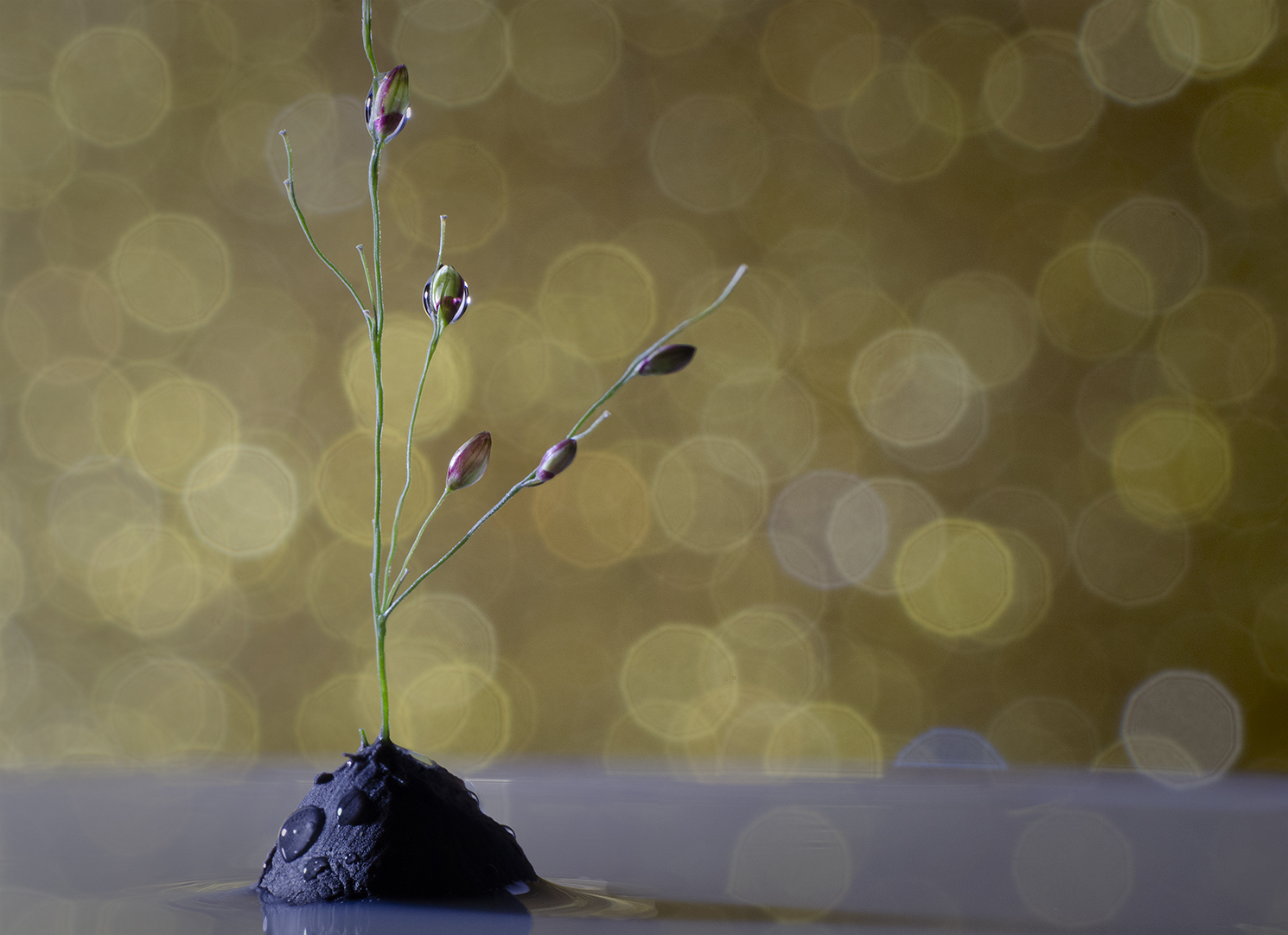
The image is really well balanced and I like the colors. It's a bit soft and I'm not sure I like the " waves" in the upper left quadrant. I have a glass paperweight with inclusions that I've tried to photograph and have had the same issues you describe. Not sure what the answer is, other than maybe choosing a small spot and creating an intentional bokeh.
|
Apr 12th |
4 comments - 0 replies for Group 65
|
10 comments - 2 replies Total
|