|
| Group |
Round |
C/R |
Comment |
Date |
Image |
| 32 |
Nov 19 |
Comment |
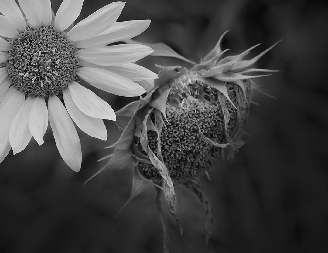
Dehazing would be my choice as well, I would up the contrast just a bit, but I wouldn't crop anything out. I agree with you the sense of place is lost with a tighter crop. The color version is lovely, but for me this image in B&W really brings out the textures. Very nice. |
Nov 17th |
| 32 |
Nov 19 |
Comment |
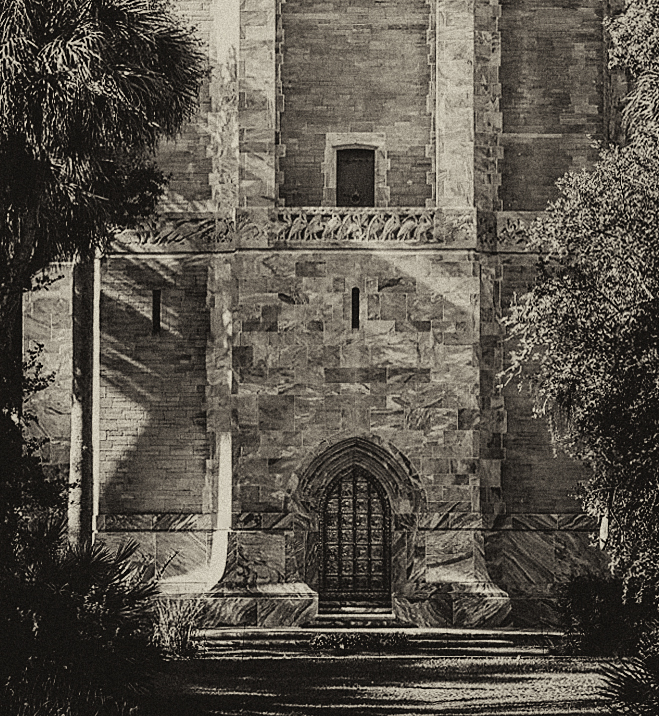
The crosses against the clouds really works well, and the texture of the mission block is very nicely shown. The image does seem as though it's leaning down & toward the right just a little so I would probably lift the right a bit. The tree on the left really frames the image and the gate open leads you back in and the exposure is perfect. Nice job! |
Nov 17th |
| 32 |
Nov 19 |
Comment |
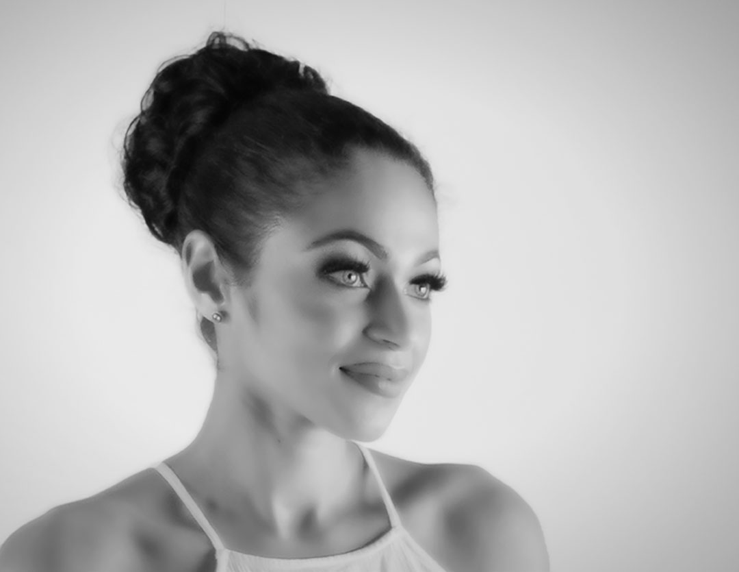
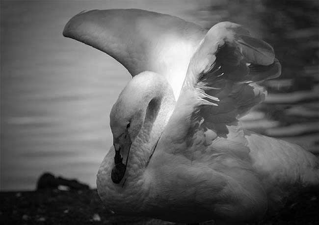
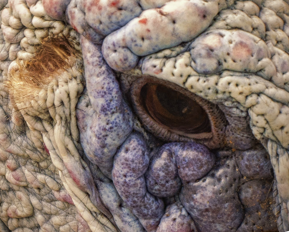
Well I'll be throwing in my jealousy hat too! I live here in Florida and I'm not very successful with bird photography. The eye here is spectacular and the composition is great. I wouldn't put any more negative space around the bird, but I wouldn't make it square either. I like both color and B&W versions, but in my opinion the B&W brings the eye out even more.
Years ago I went to a macro boot camp run by Mike Moats. I learned a lot, but the thing that stuck with me the most was when he told us (more than once) that if after a full day of shooting you get 1 or even 2 successful images, you've had a successful day. I think of that every time I discard the boatload of "almost perfect shots" - it makes me feel better. |
Nov 17th |
| 32 |
Nov 19 |
Comment |
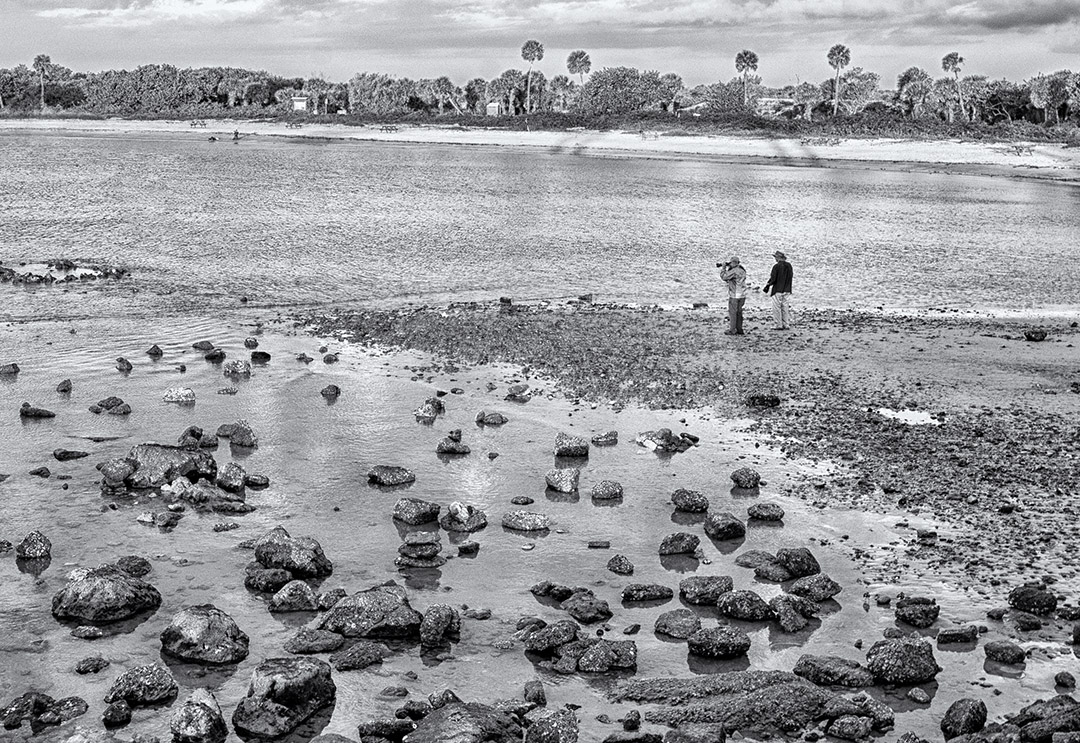
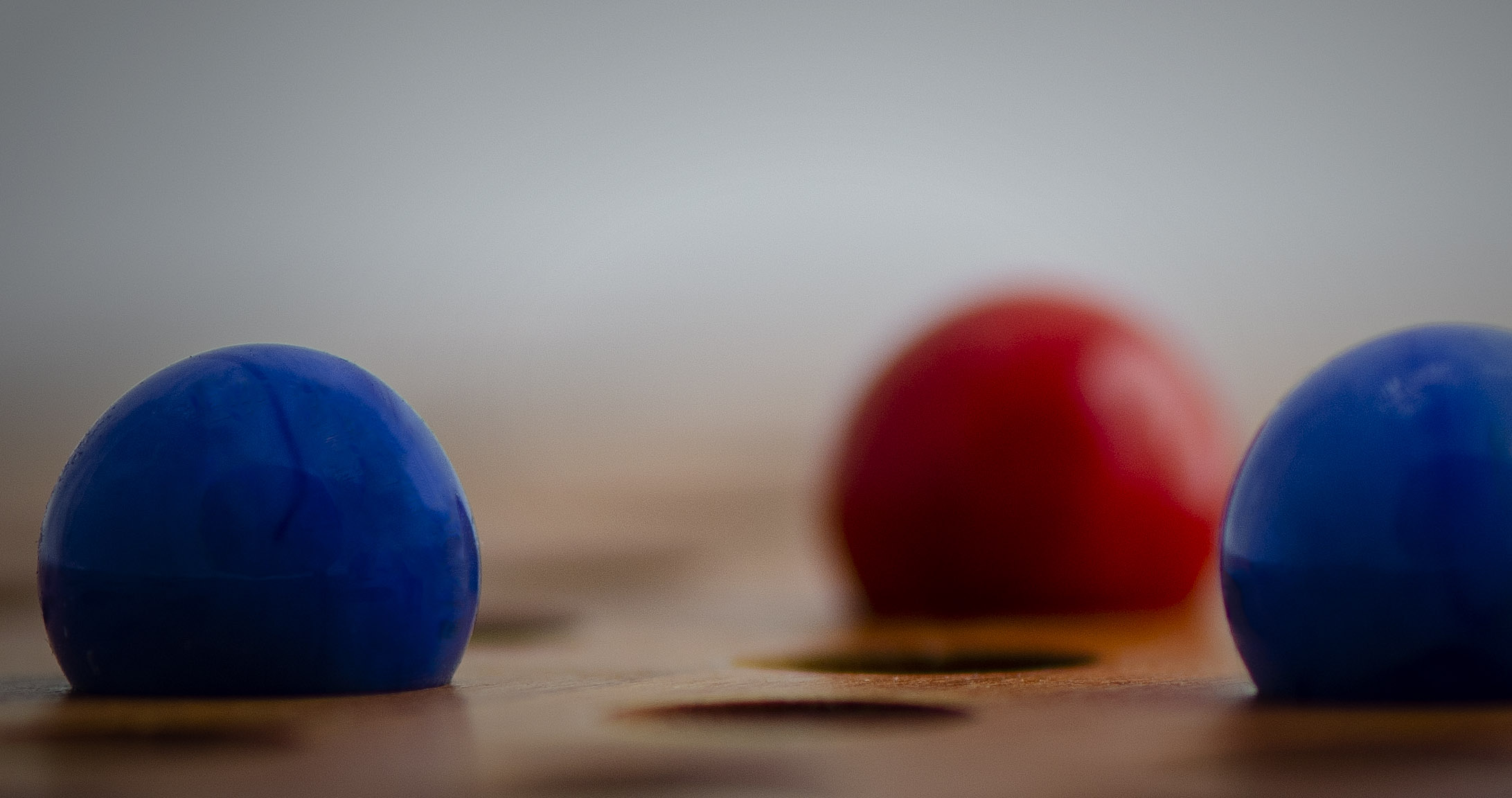
The lines do provide an interesting abstract as Gloria mentions and I think it was a good choice to leave out the sky. I have to agree with Jennifer as the road did cut the image into two and I do like her crop. I'm thinking I too would have removed the poles because I've been trained to do so :D |
Nov 17th |
| 32 |
Nov 19 |
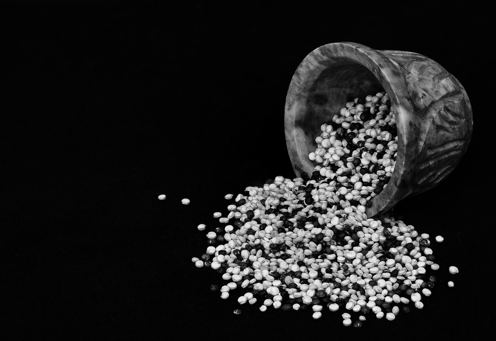
Comment |
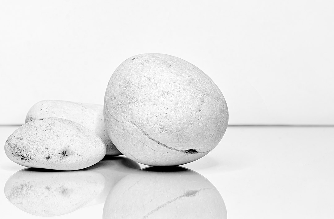
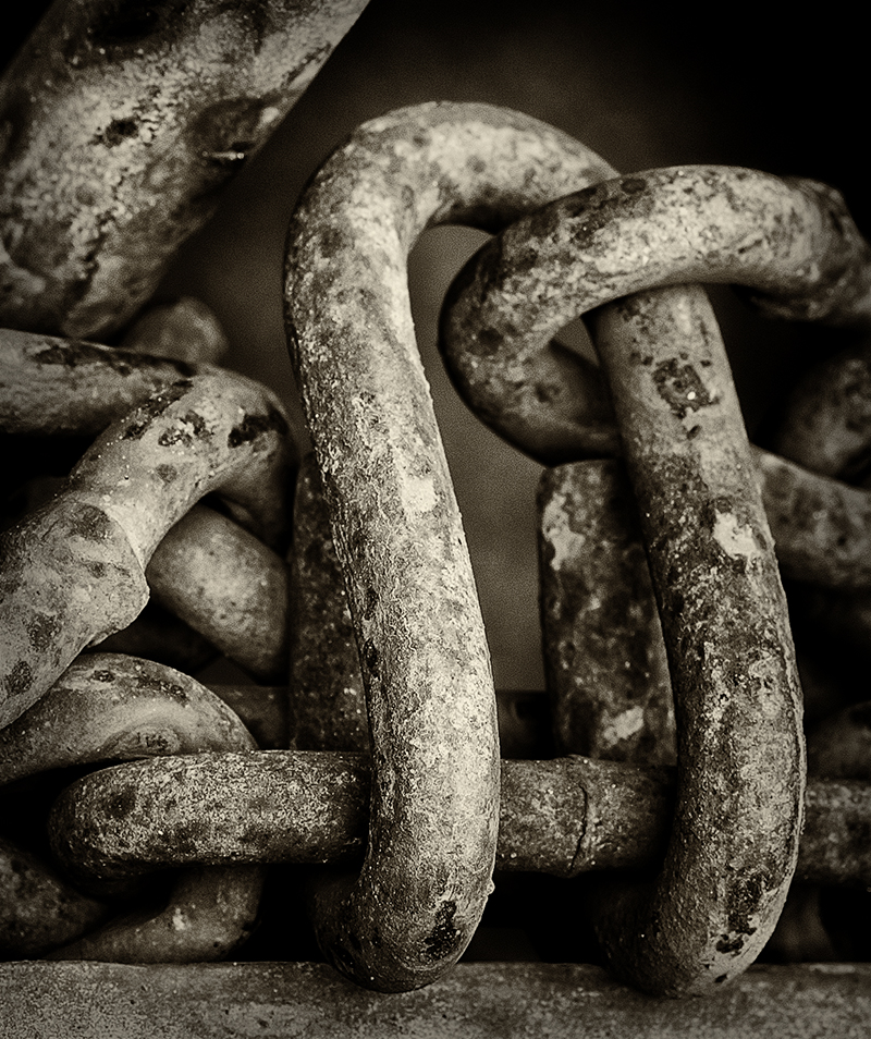
Your jumble is very nicely done and although it fills the frame it doesn't come across as too busy. If I had shot this image it would be a hodgepodge with no direction. I like Jennifer's suggestion of a very subtle vignette. |
Nov 17th |
| 32 |
Nov 19 |
Reply |
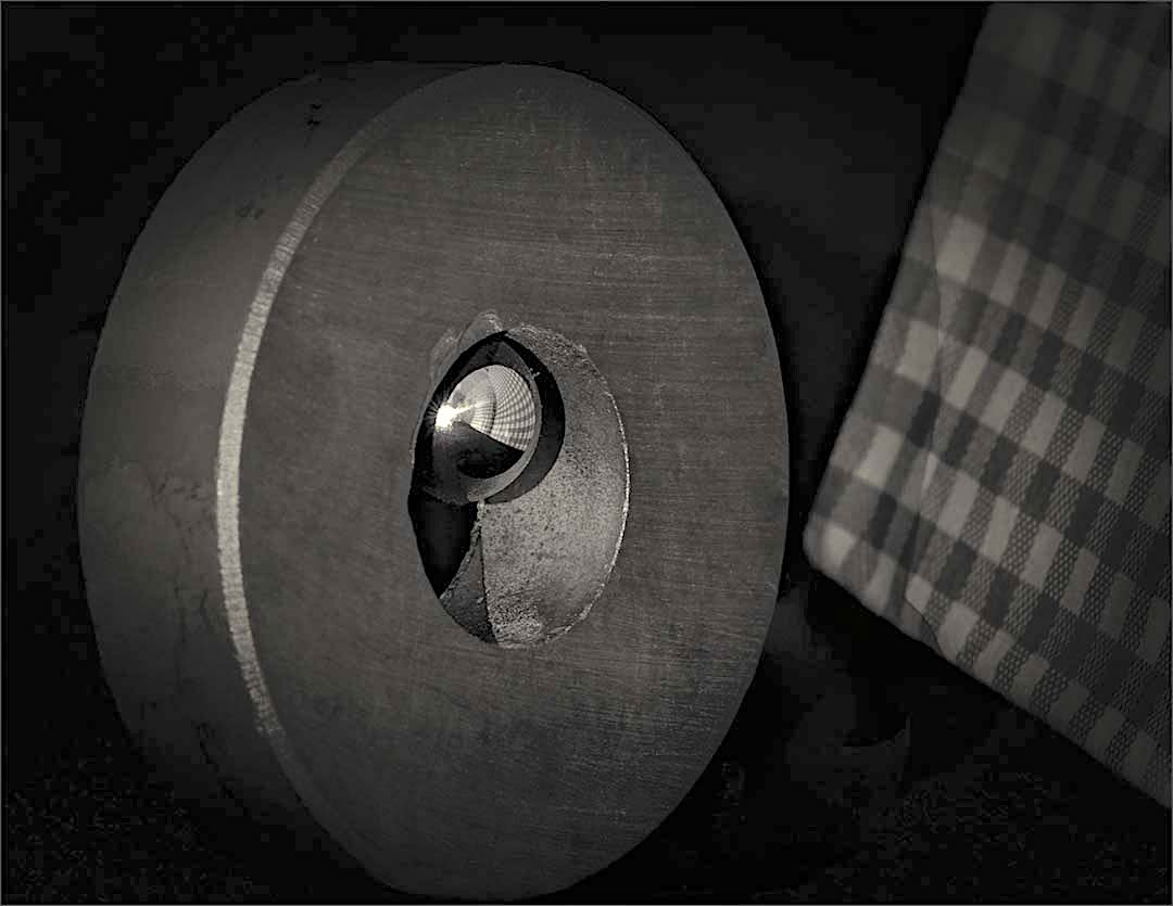
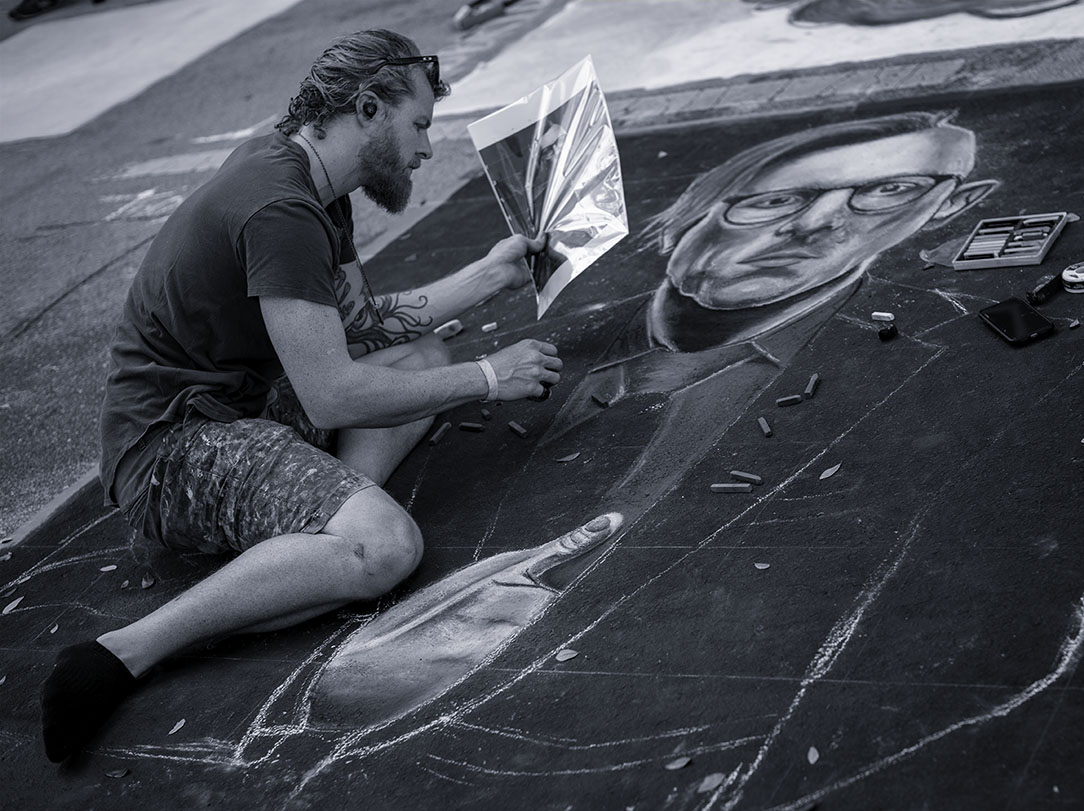
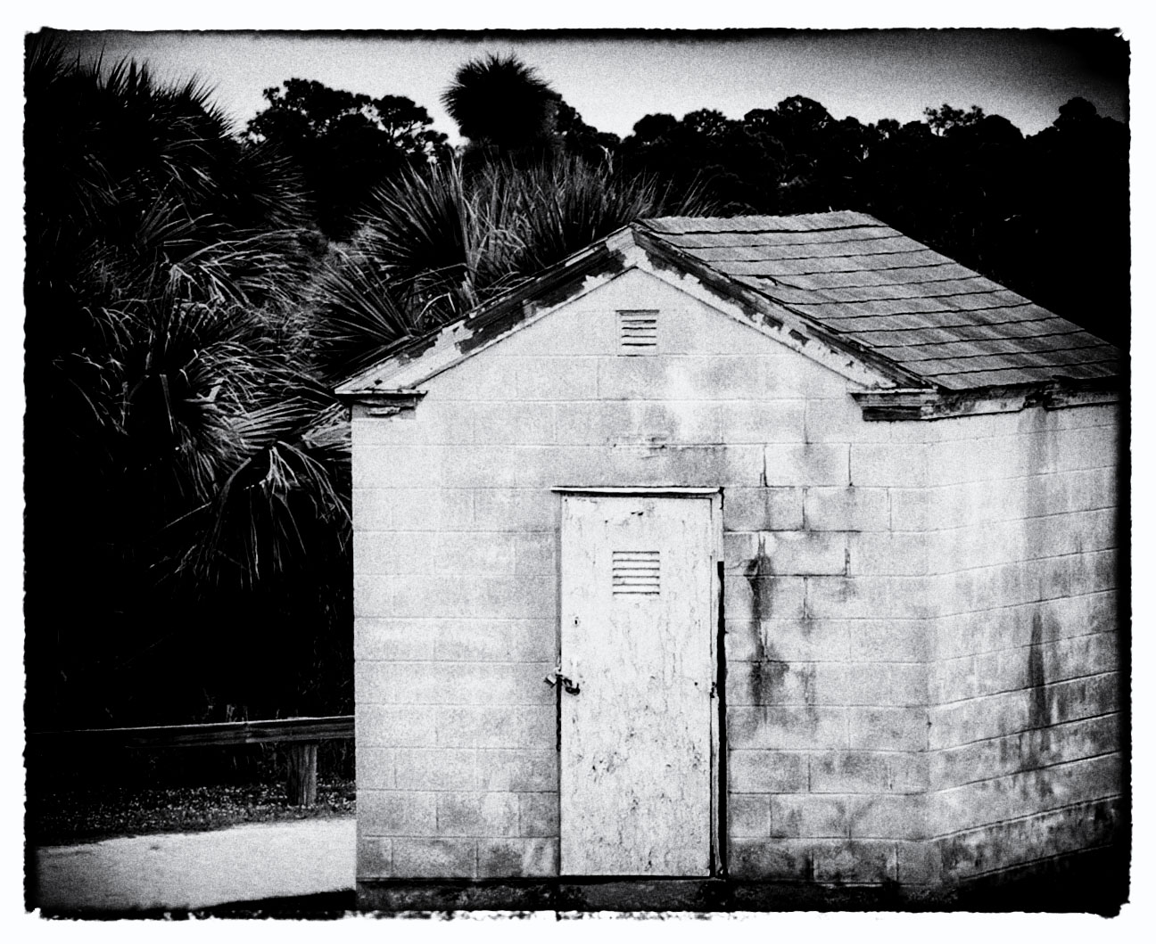
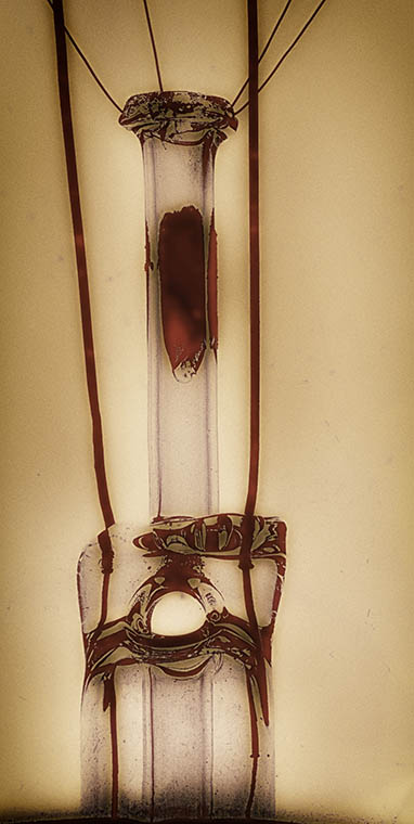
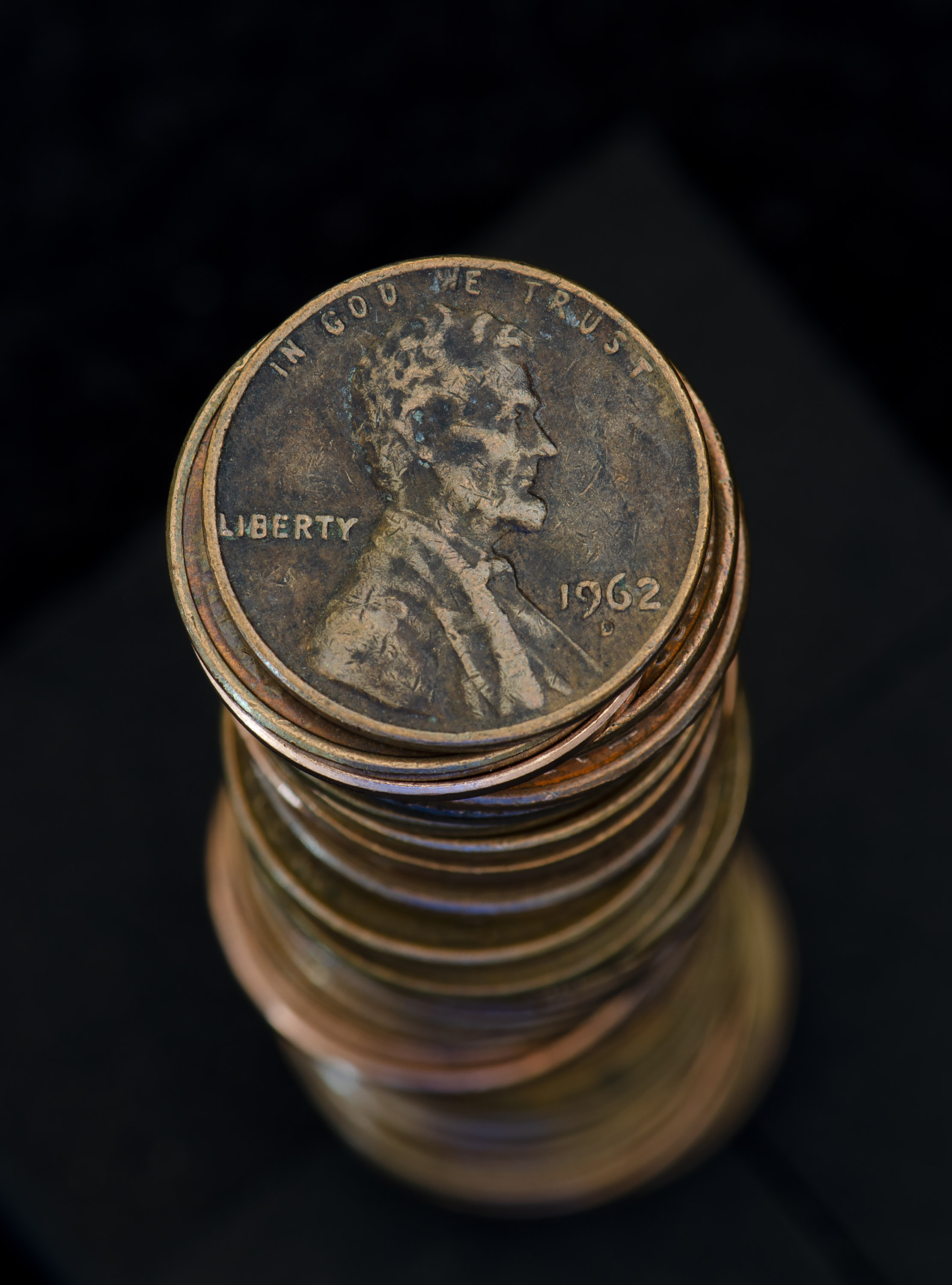
Hi Lance - thank you for your input. This is a digital image, exposure f/22, ISO 2800 when taken. In the building's natural color of faded pepto-bismol pink, the grain isn't as pronounced, but when I converted to B&W it was more evident. Then I added a bit of brightness and grain in an attempt to capture the mood of the late 40s to mid-50's. When you said film noir interpretation, it immediately put structure to my intent (if that makes sense.)
What exactly do you mean when you say "creating" using natural camera dynamics. |
Nov 17th |
| 32 |
Nov 19 |
Reply |
Hi Tom. Yes there are lines below the window - this is a cinder block building painted pepto-bismol pink. Not a good look for any building especially when it's cinder block. |
Nov 17th |
| 32 |
Nov 19 |
Reply |
You're right in not wanting to know. I did keep space open on the left side because of the sidewalk. When I reviewed the image with less on the left, it seemed to lose some of the character. Film noir a style of cinematographic film that evokes a mood of pessimism, fatalism, and a darkness which was very popular in the movies of the 40's & 50's. It's the mood I was trying to capture here as I believe this area of town was built in that period. |
Nov 17th |
| 32 |
Nov 19 |
Reply |
The patrons that frequent this site today are not looking for hair cuts, although I'm sure this was once a busy neighborhood shop. I agree that putting a human side to the image would make it much stronger. |
Nov 17th |
5 comments - 4 replies for Group 32
|
| 65 |
Nov 19 |
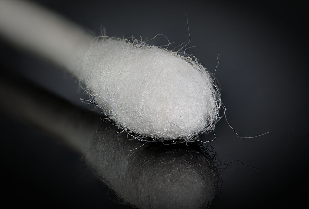
Comment |
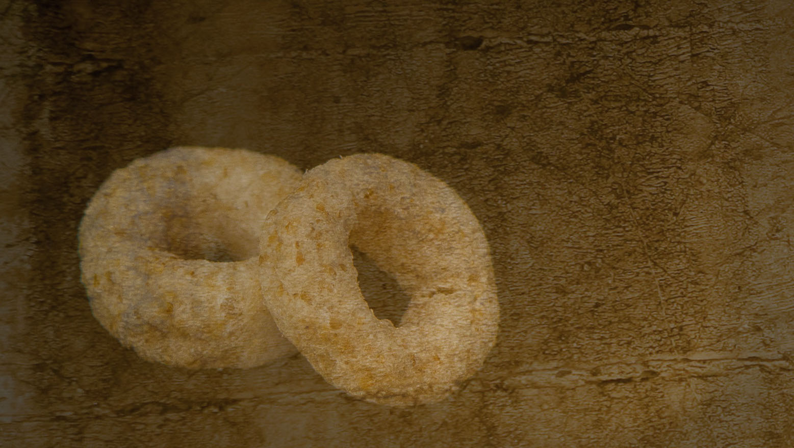
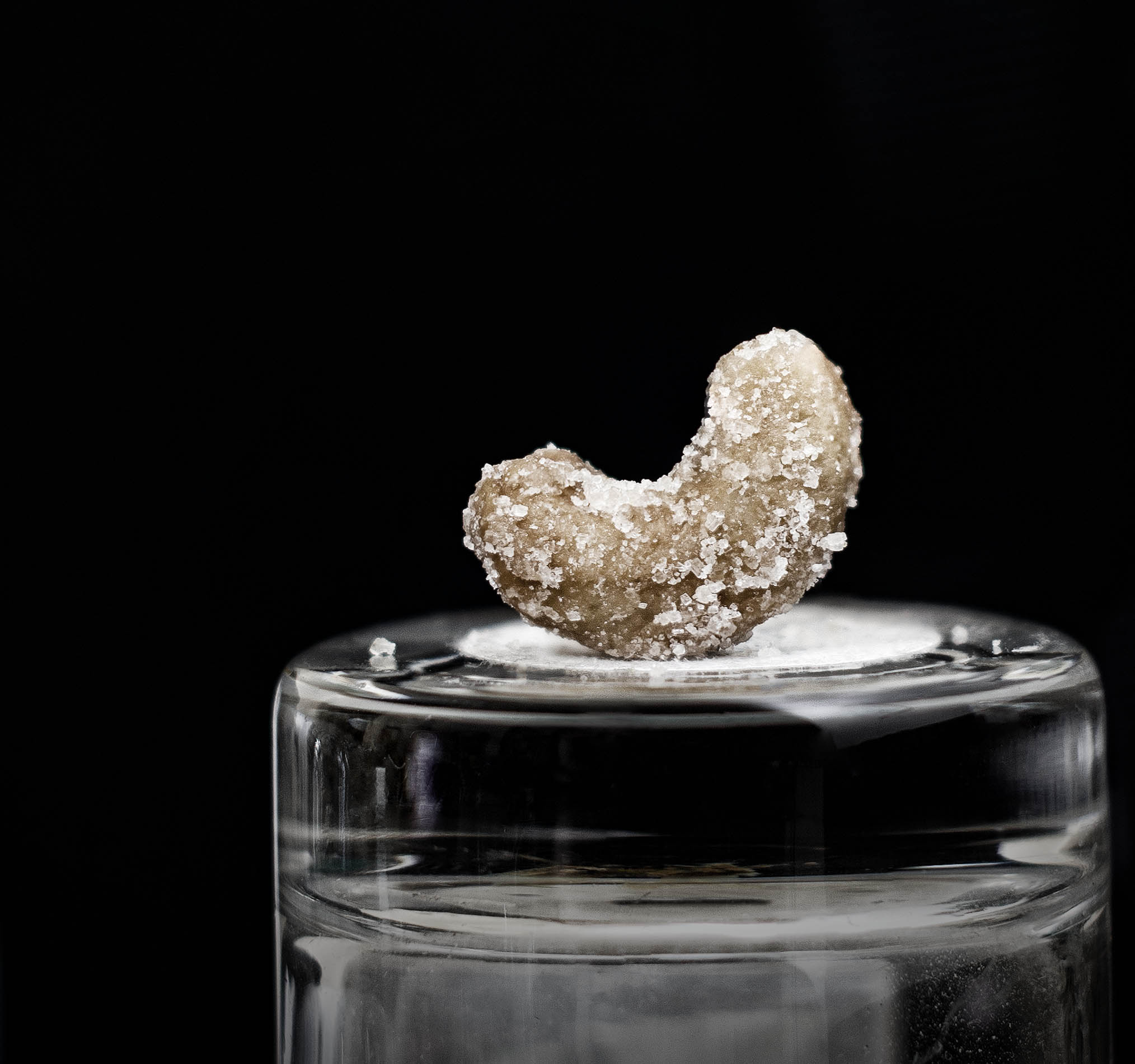
At first glance, this looked to me like eggs floating with pumpkin stickers on top of each. Why that thought came to me I have no idea...
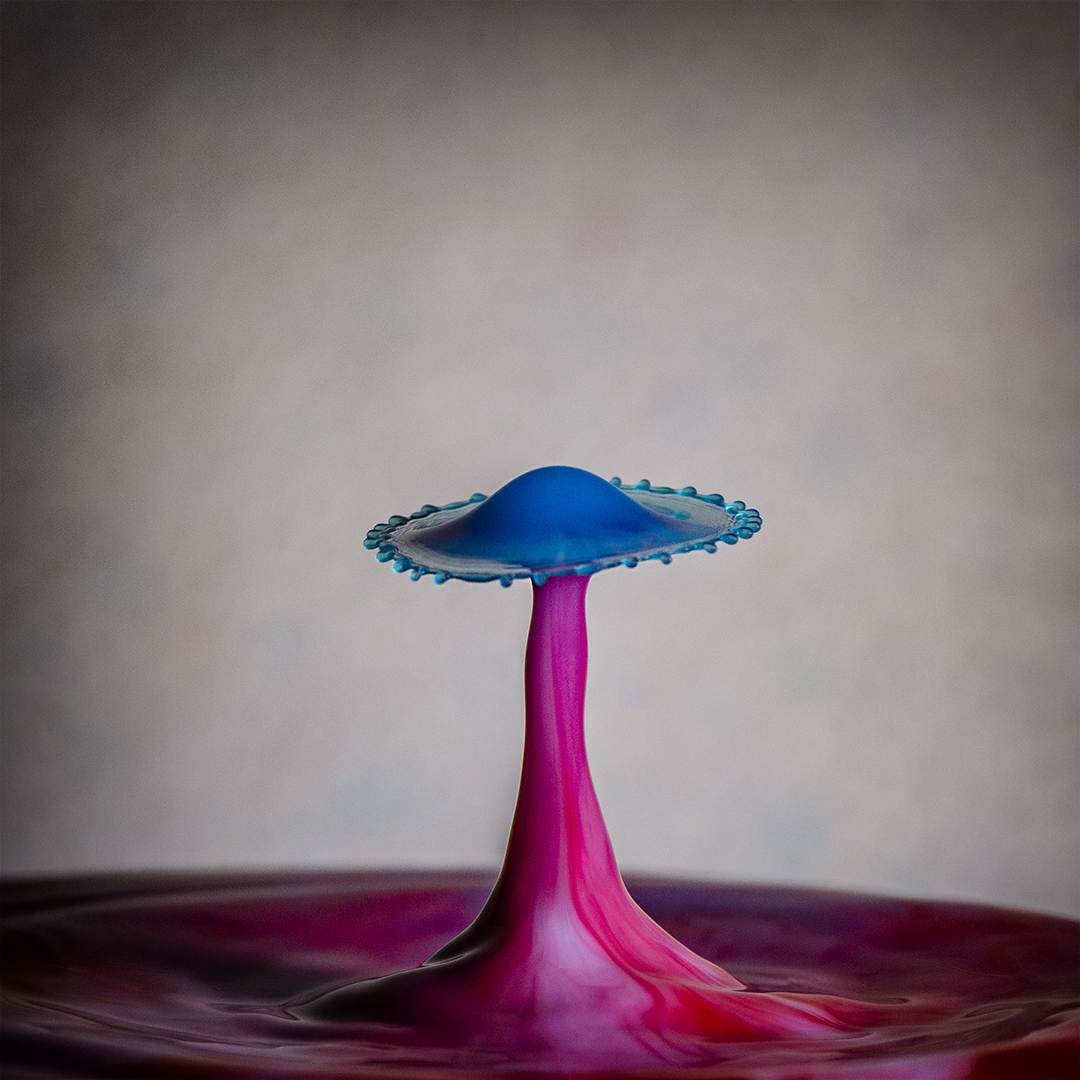
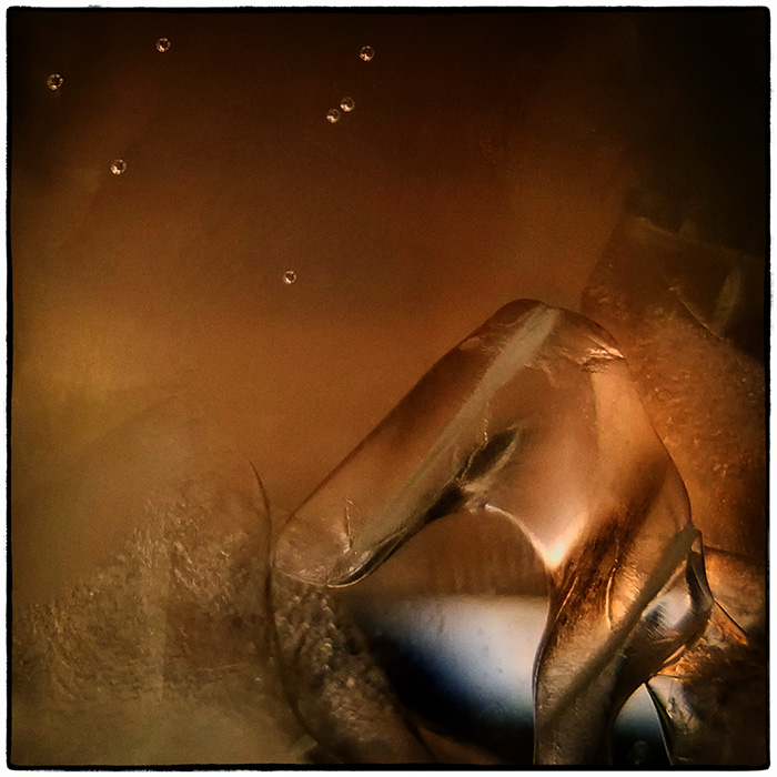
It's very impressive how your entire pumpkin top was visible. I use the Rainx technique too. As far as the grain, I always shoot in manual mode, choose my aperture depending on the shot and almost always keep the ISO at 100. One of the few times I use an ISO of 400 is when I'm photographing water drops. Congratulations on your new Miops Waterdrop system! |
Nov 17th |
| 65 |
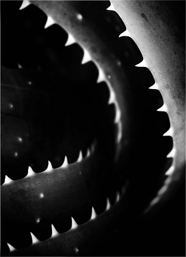
Nov 19 |
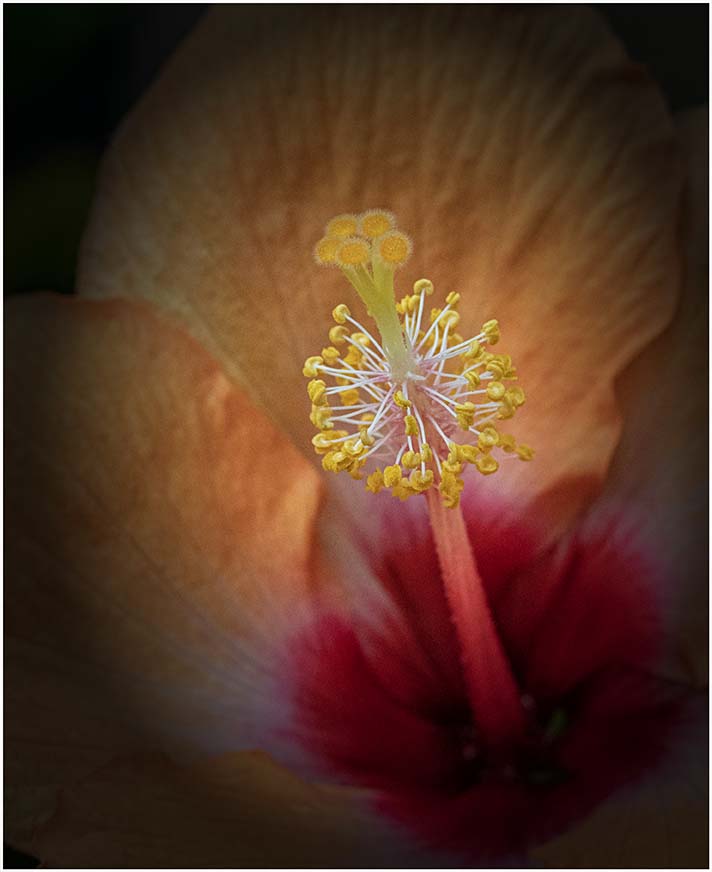
Comment |
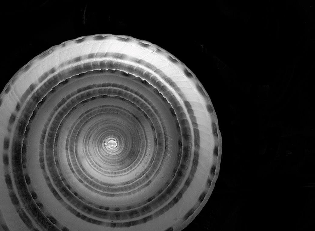
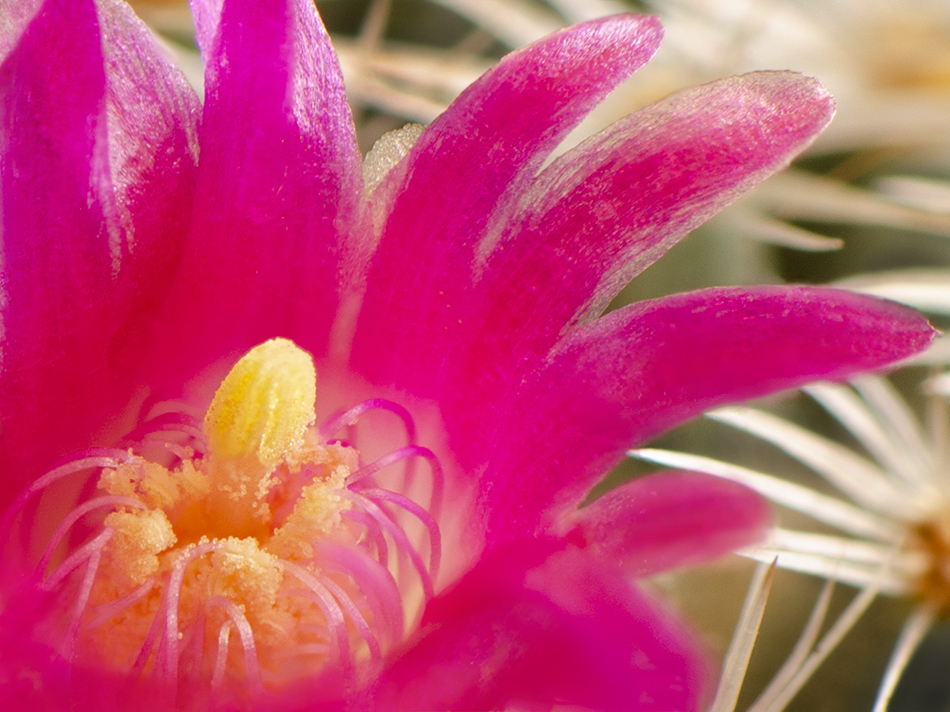
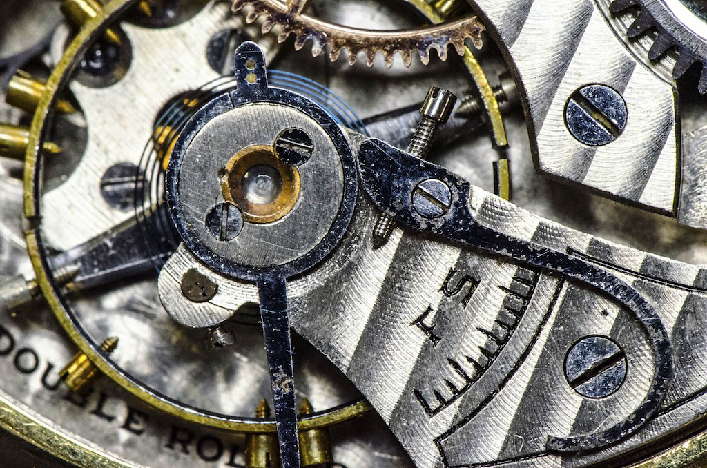
I agree with the comments above, particularly those the suggest darkening or desaturating the background in order to bring more dimension. Rusty things are one of my favorite subjects so this image is really enjoyable to me. I might crop a little off the bottom so the "horizon line" (the horizon line being the handle and dead bolt) would shift down and there would be more weight to the bottom. |
Nov 17th |
| 65 |
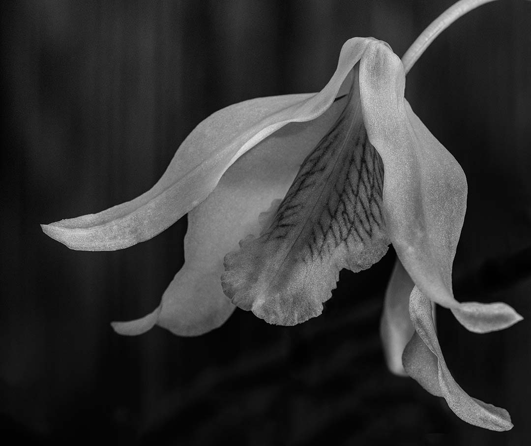
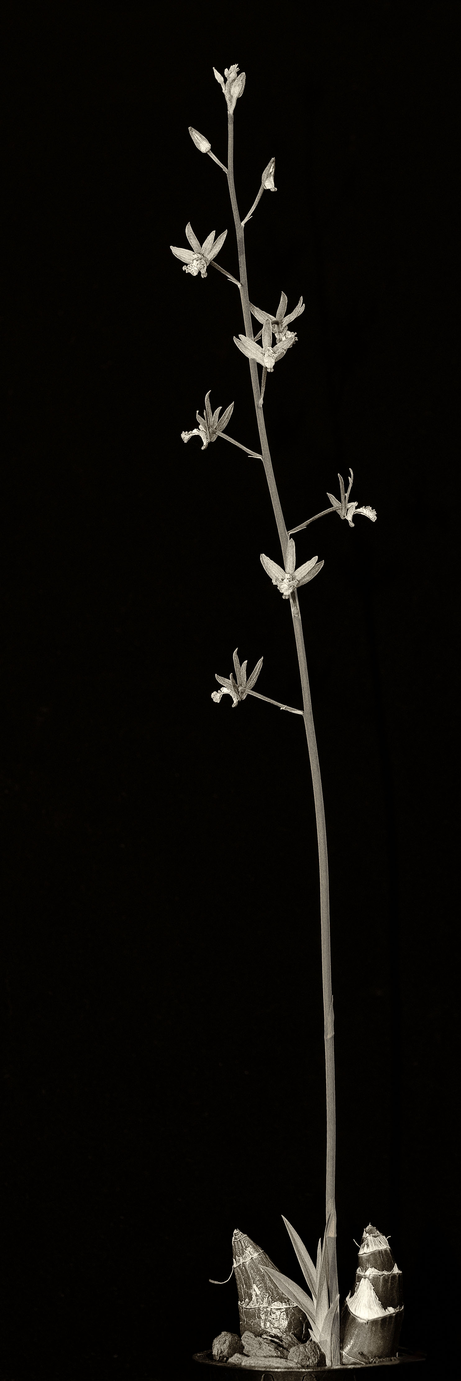
Nov 19 |
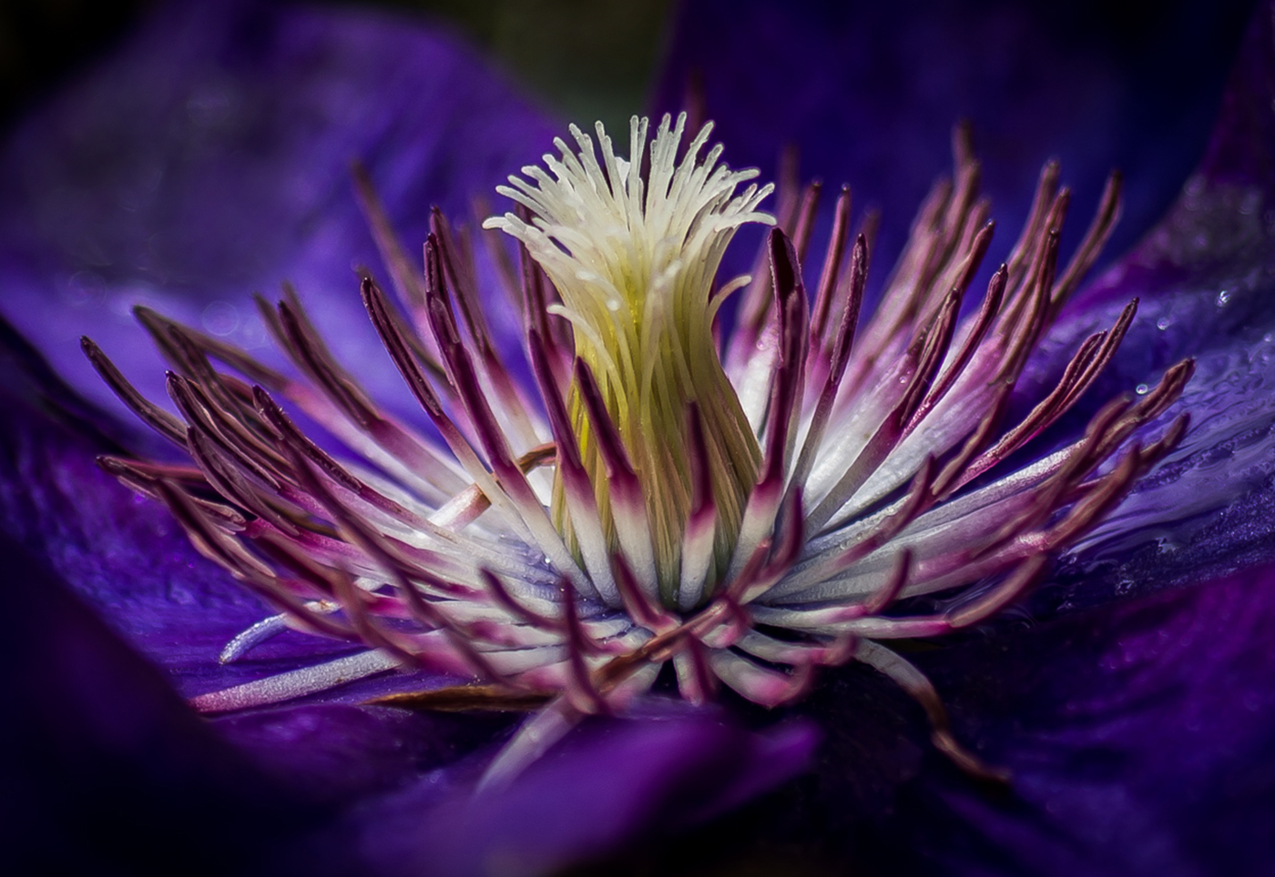
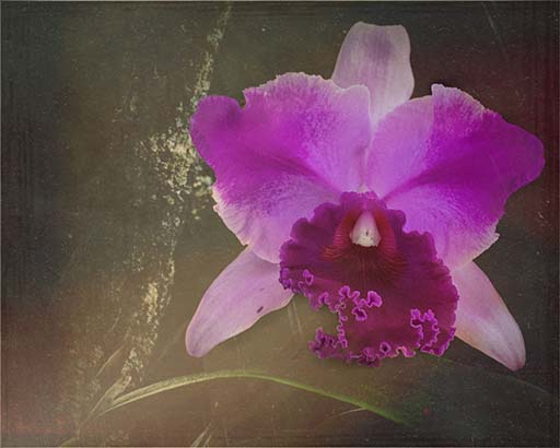
Reply |
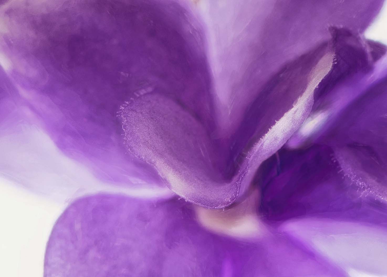
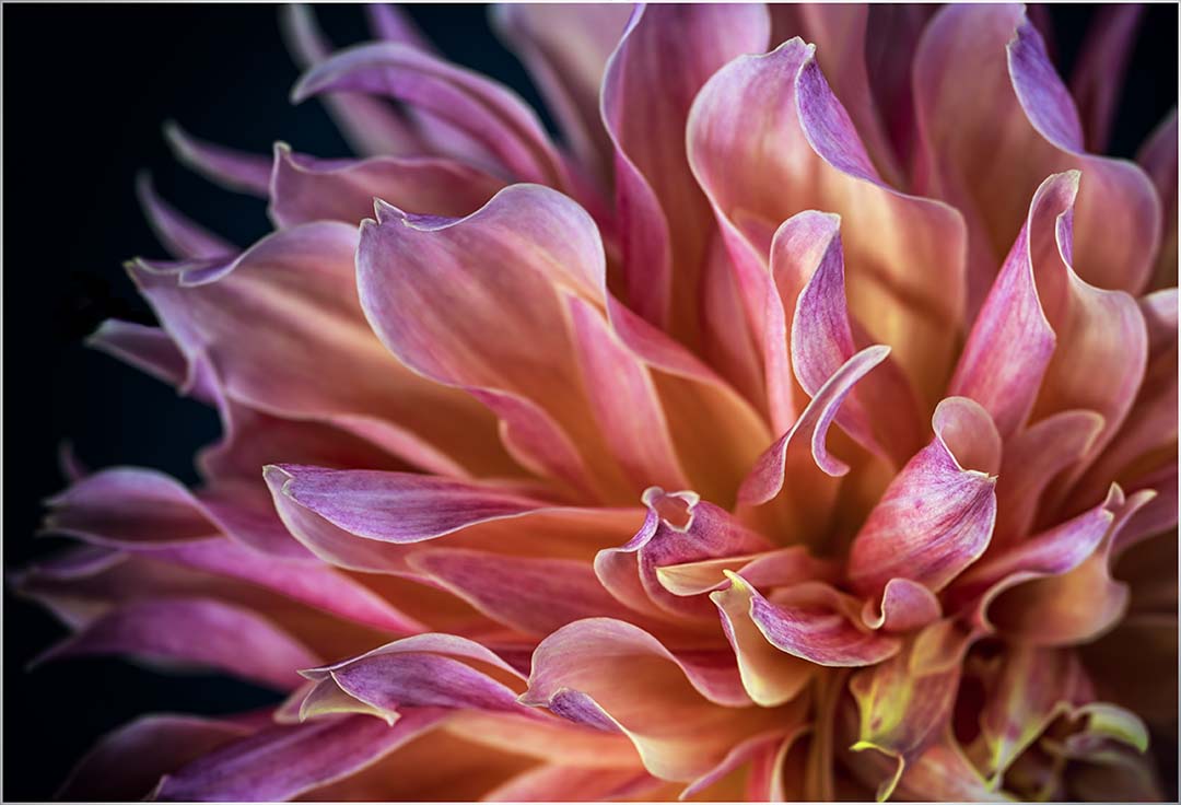
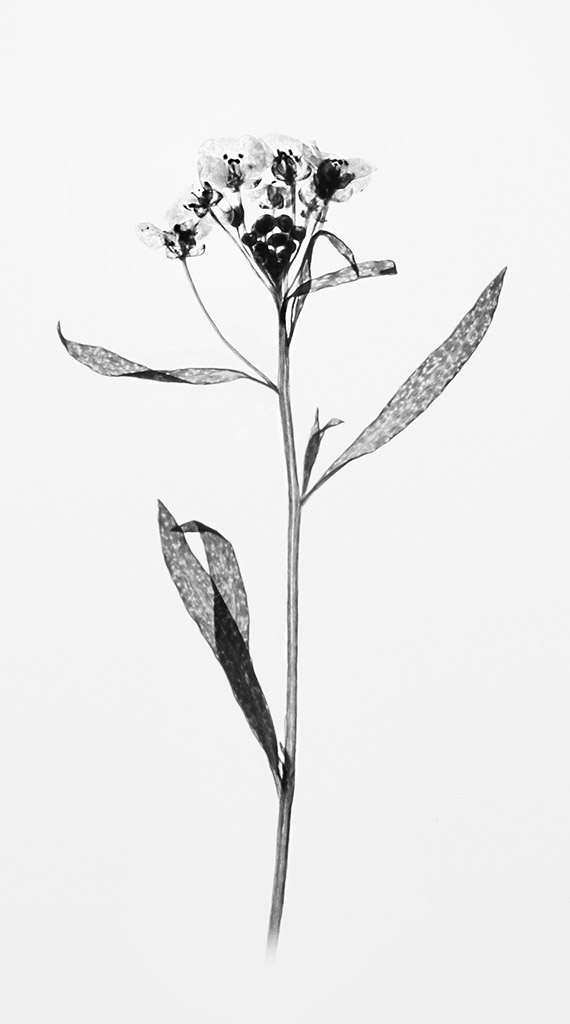
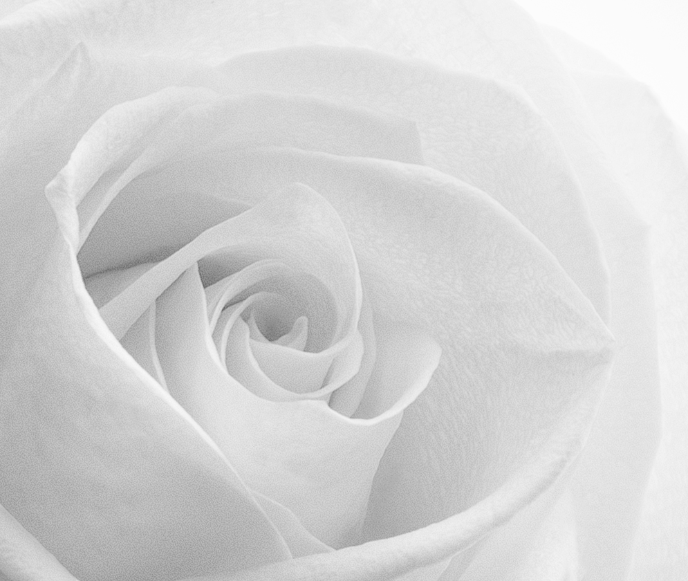
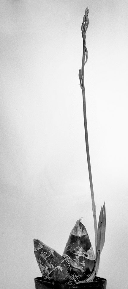
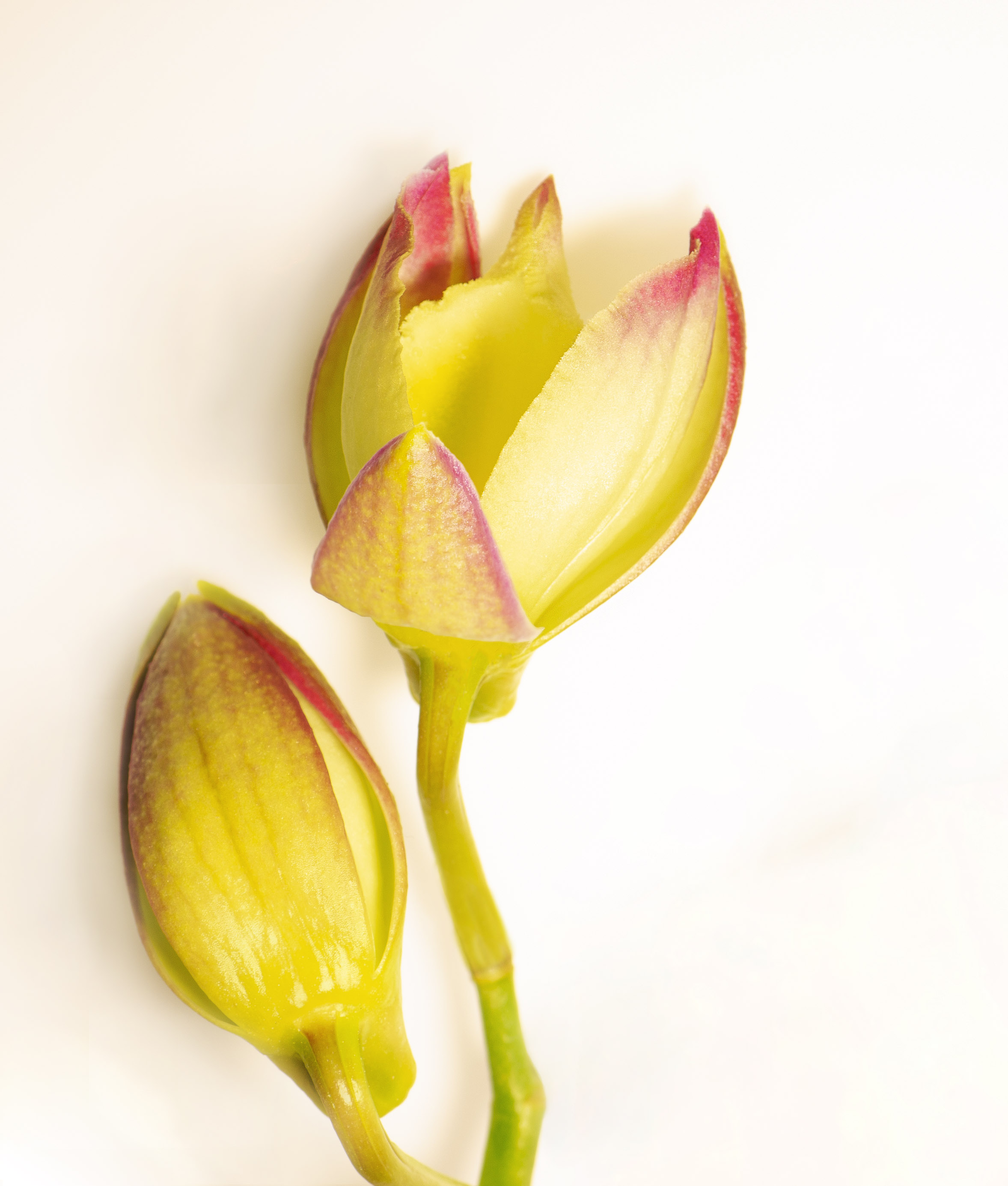
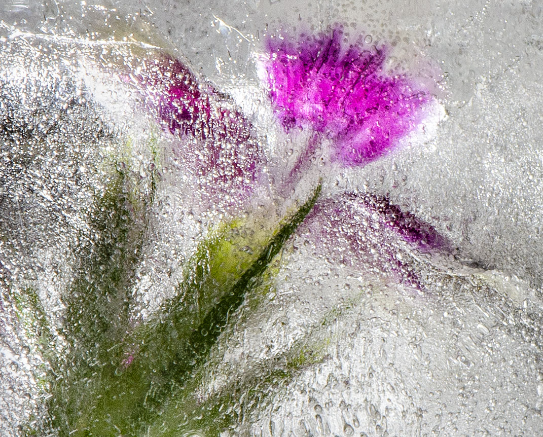
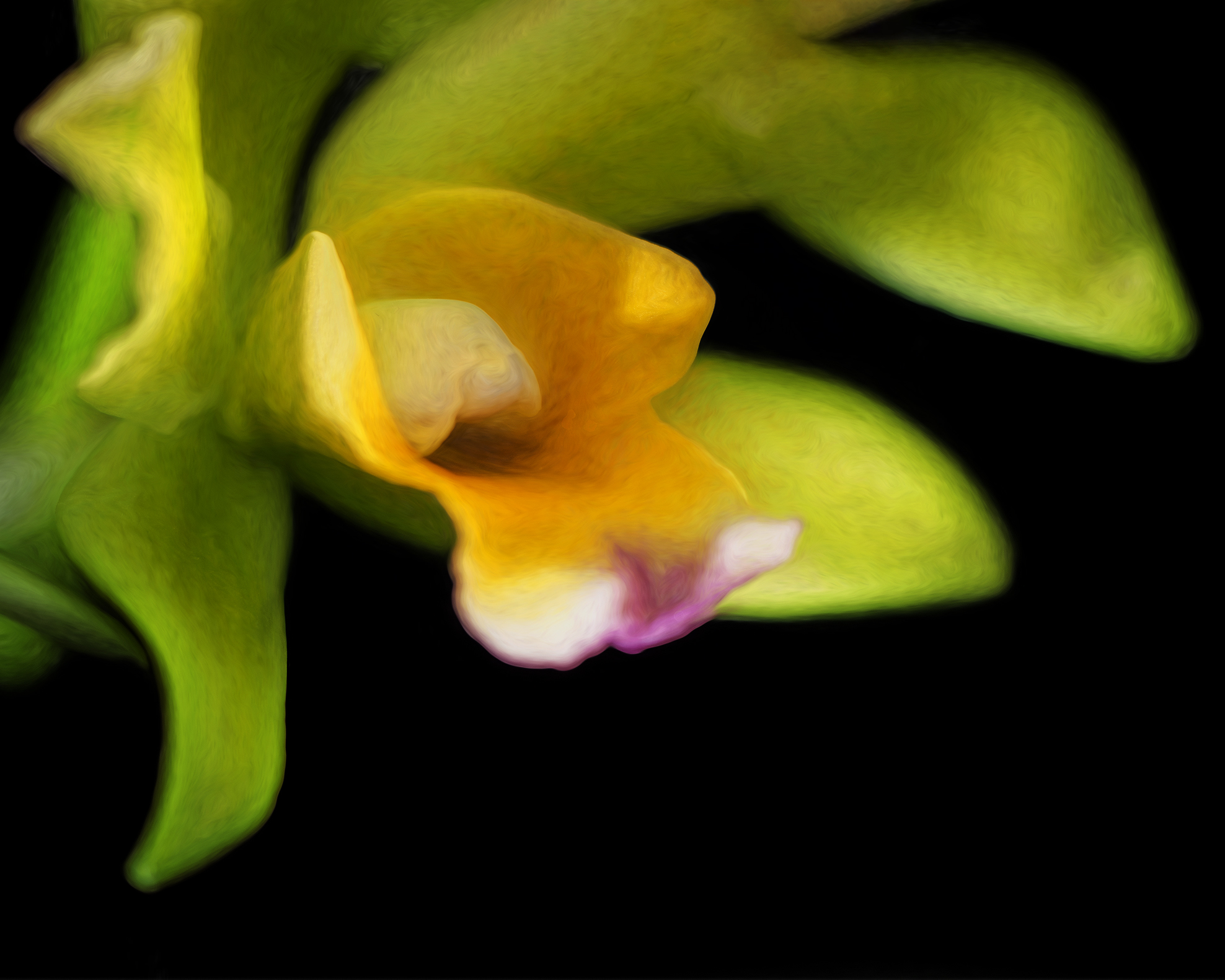
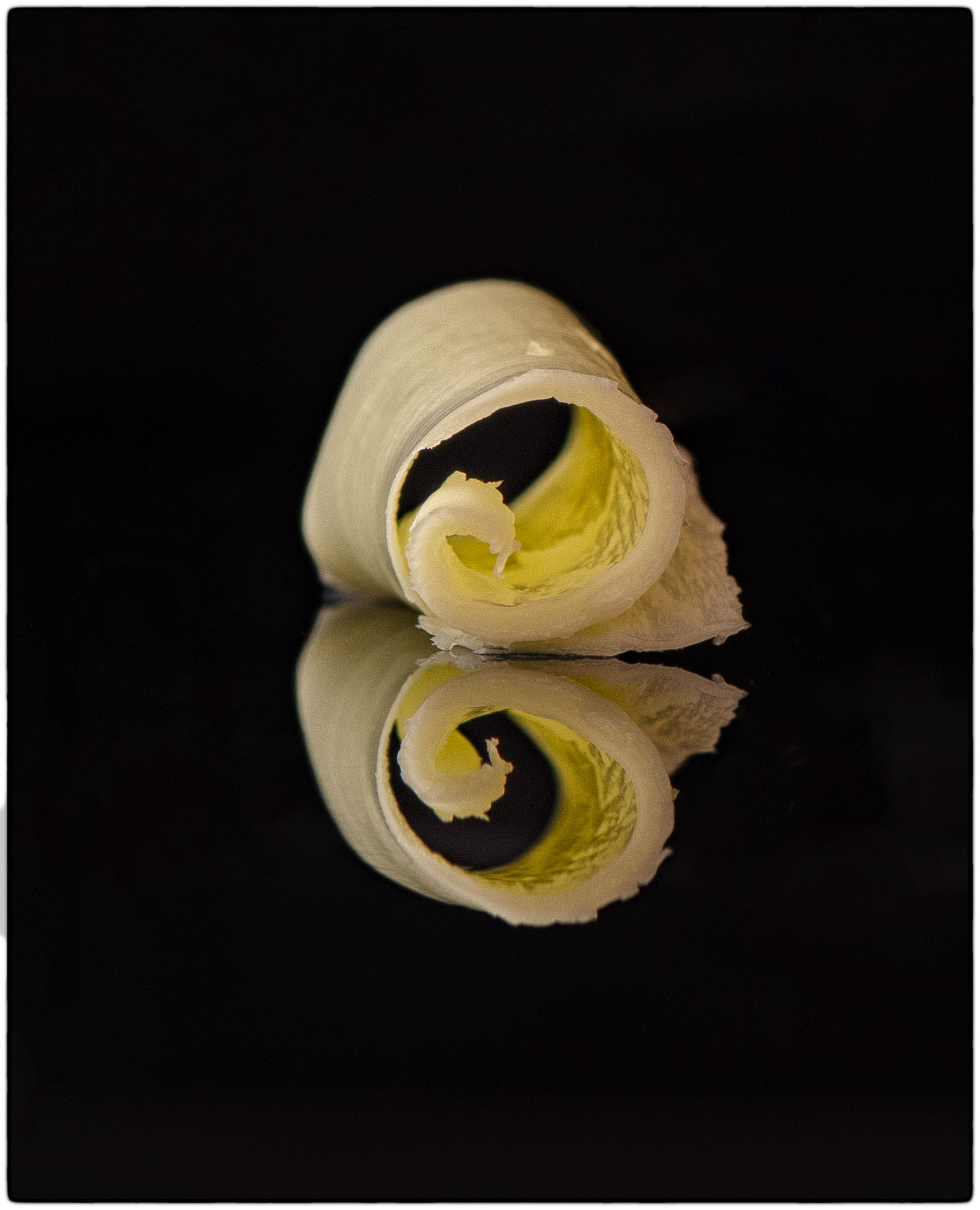
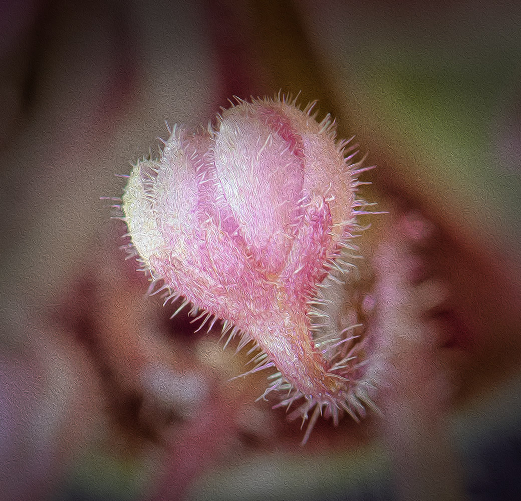
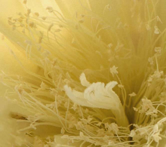
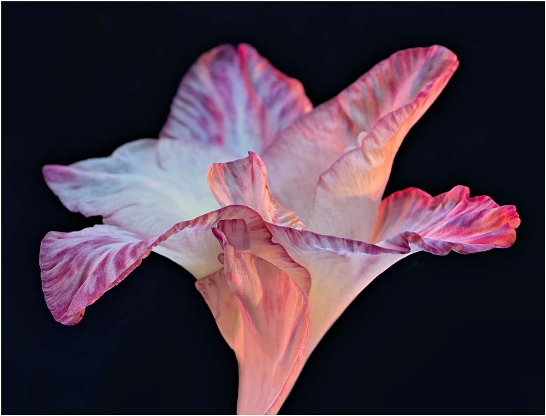
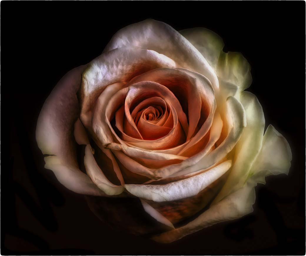
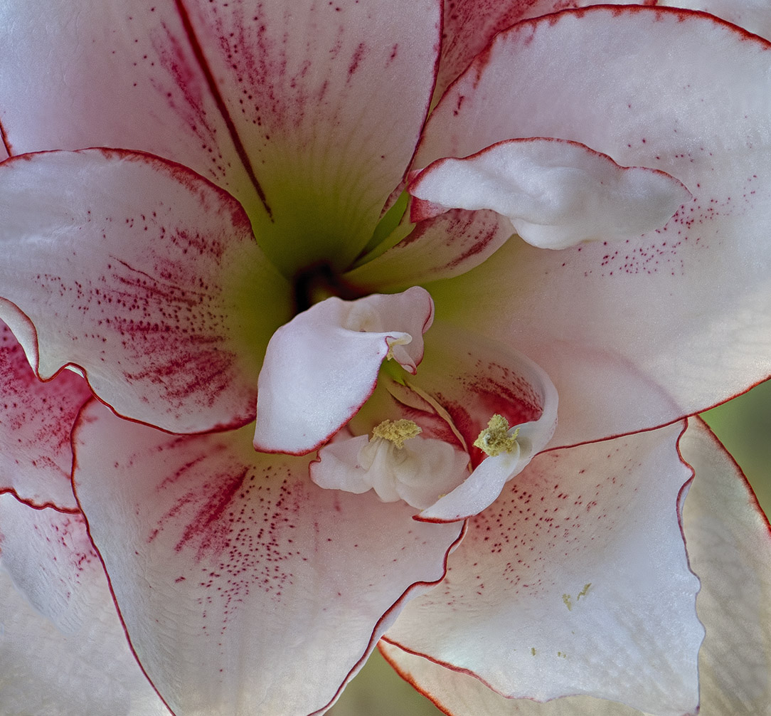
Thank you for your thoughts. I've been trying different things lately in an effort to 1. expand my creativity and 2. be more conscious that my final images portray the intended mood. It was my intention to create a soft, somewhat ethereal flower image. As I put more thought into creativity and intent it only gets more challenging. |
Nov 17th |
| 65 |
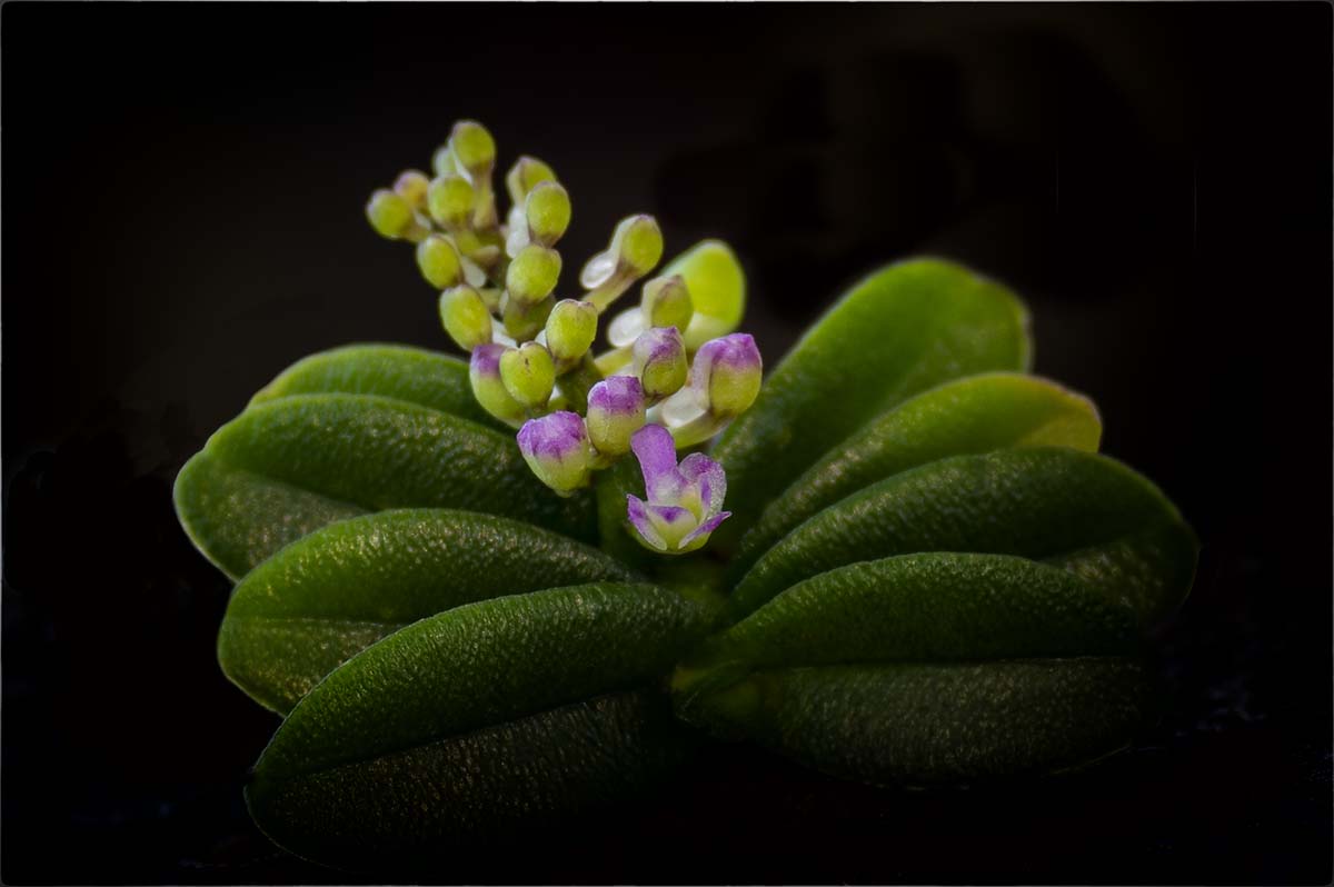
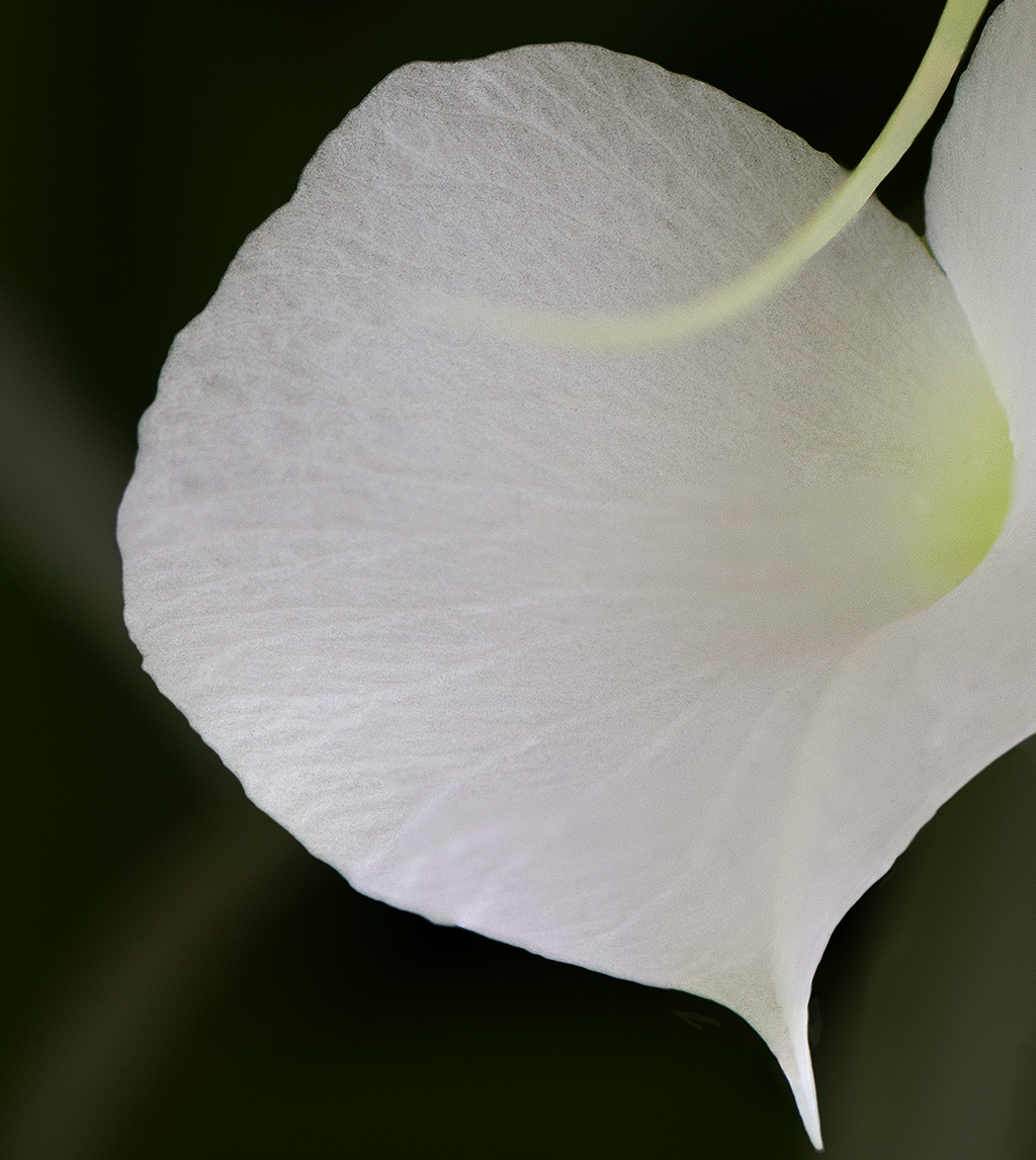
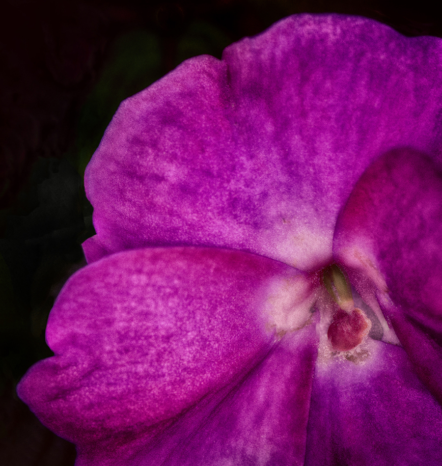
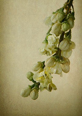
Nov 19 |
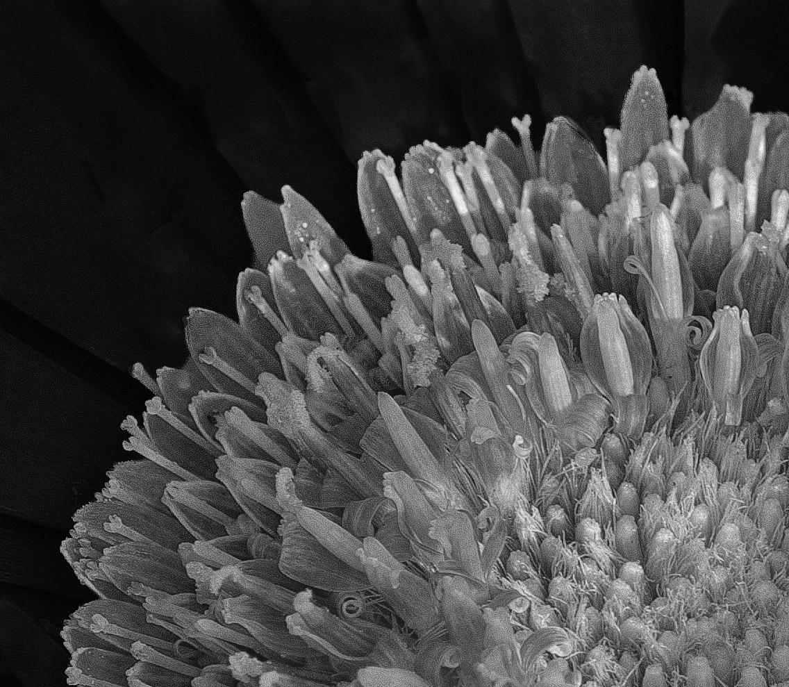
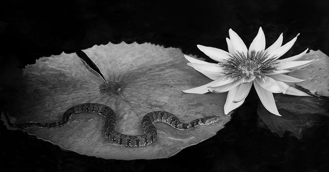
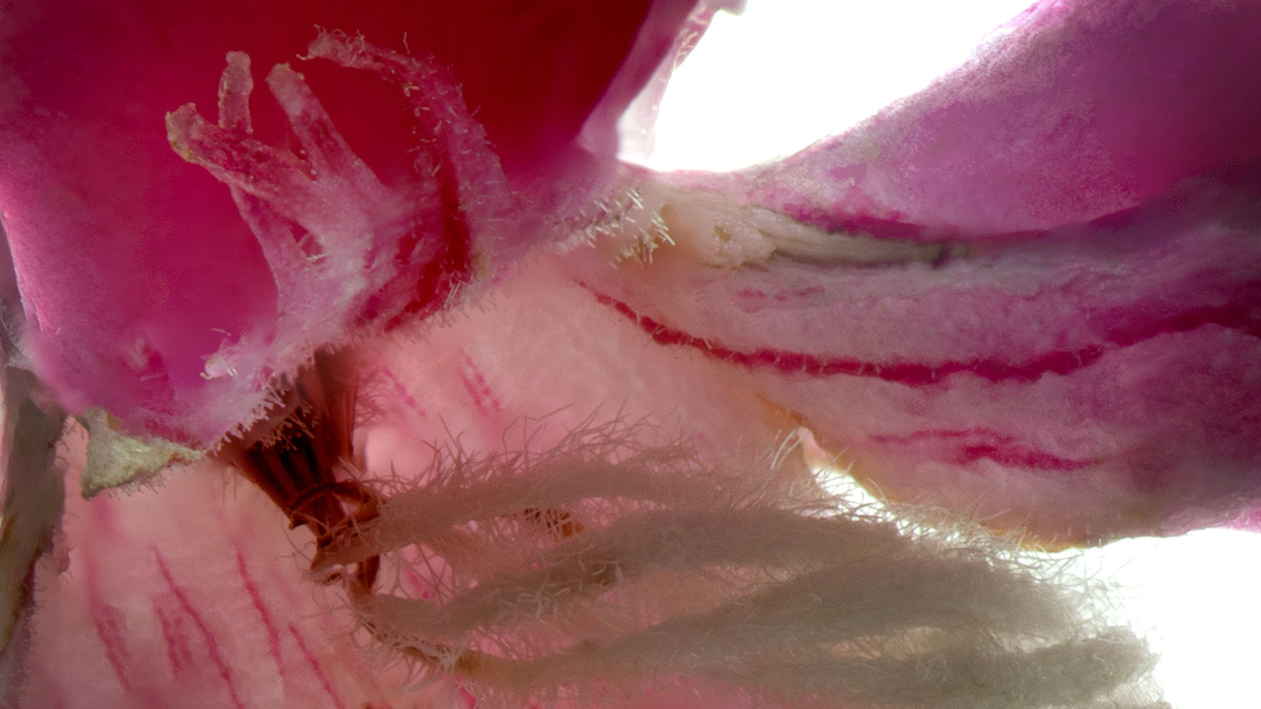
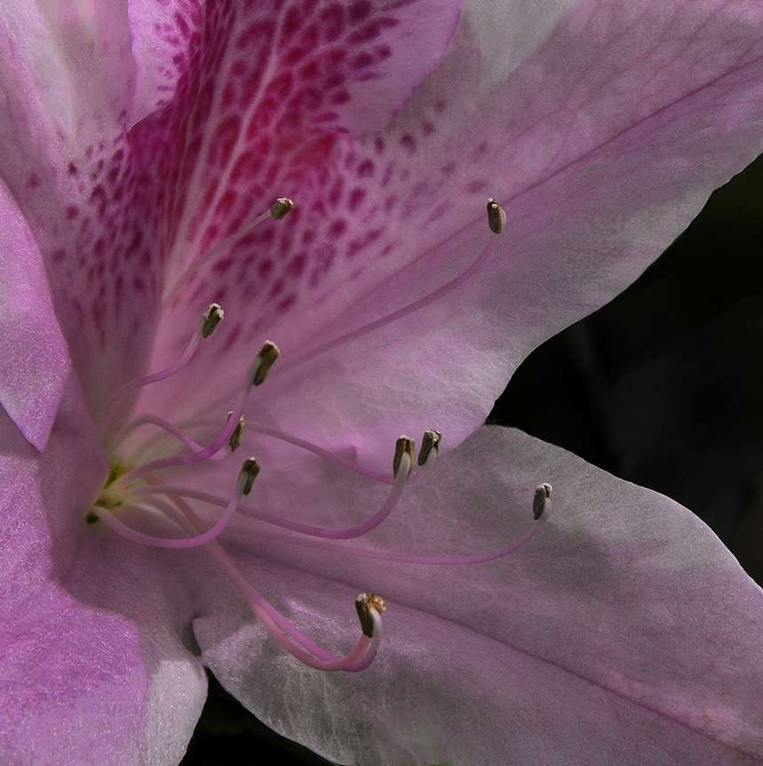
Comment |
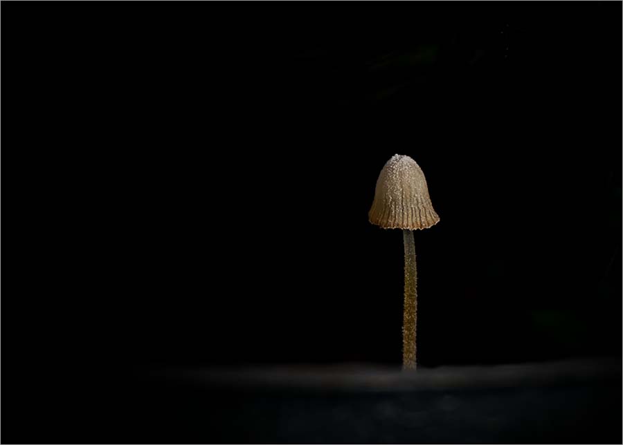
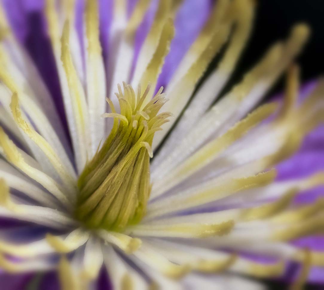
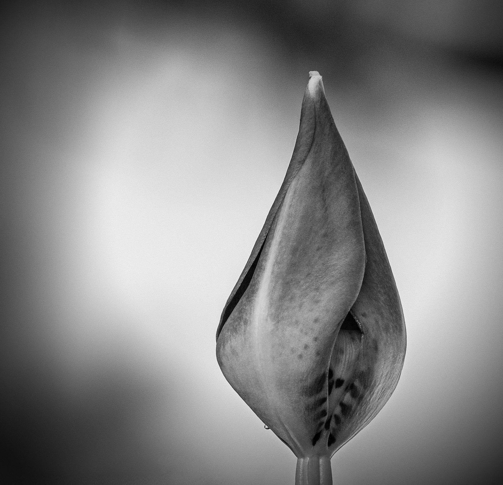
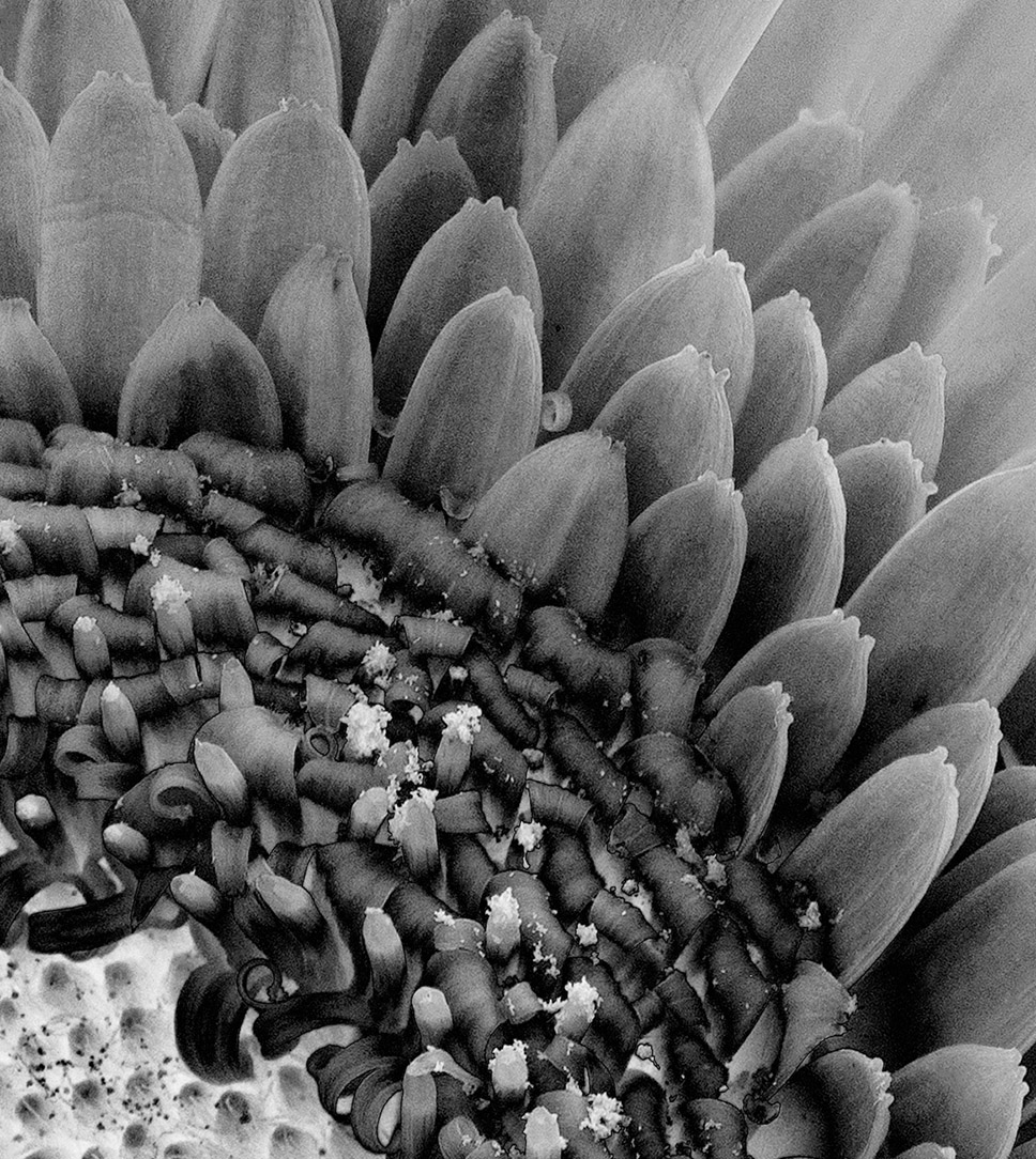
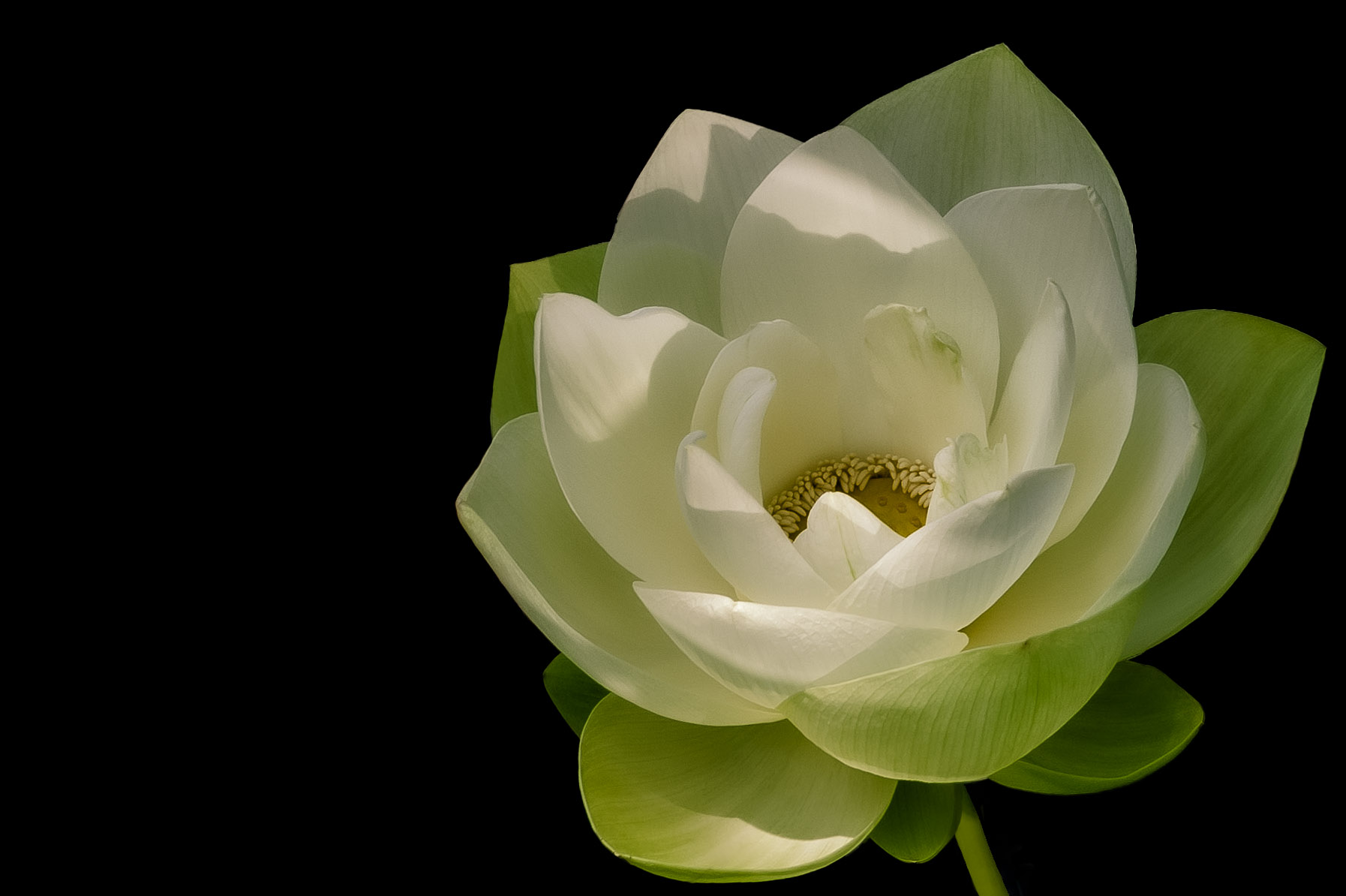
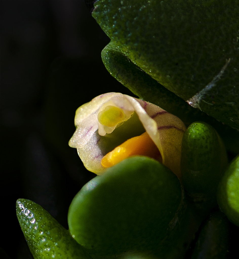
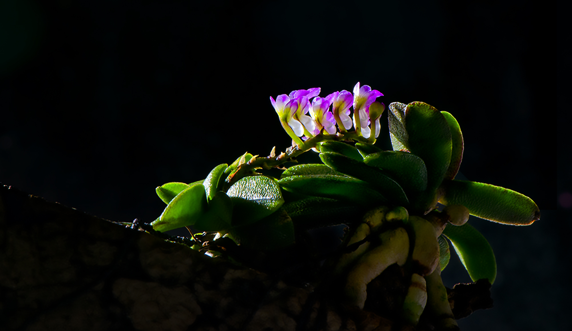
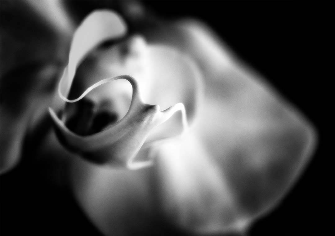
Very nice! The detail in the image is so well represented. I like what appears to be the water droplets on the bottom leaf, and the fuzzy hairs on the right side coming out from behind the petal. The lighting is perfect for the effect. Well done. |
Nov 17th |
3 comments - 1 reply for Group 65
|
8 comments - 5 replies Total
|