|
| Group |
Round |
C/R |
Comment |
Date |
Image |
| 32 |
May 19 |
Reply |
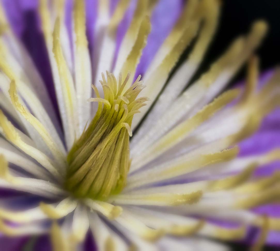
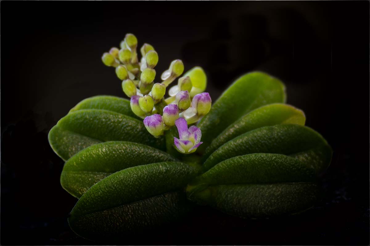
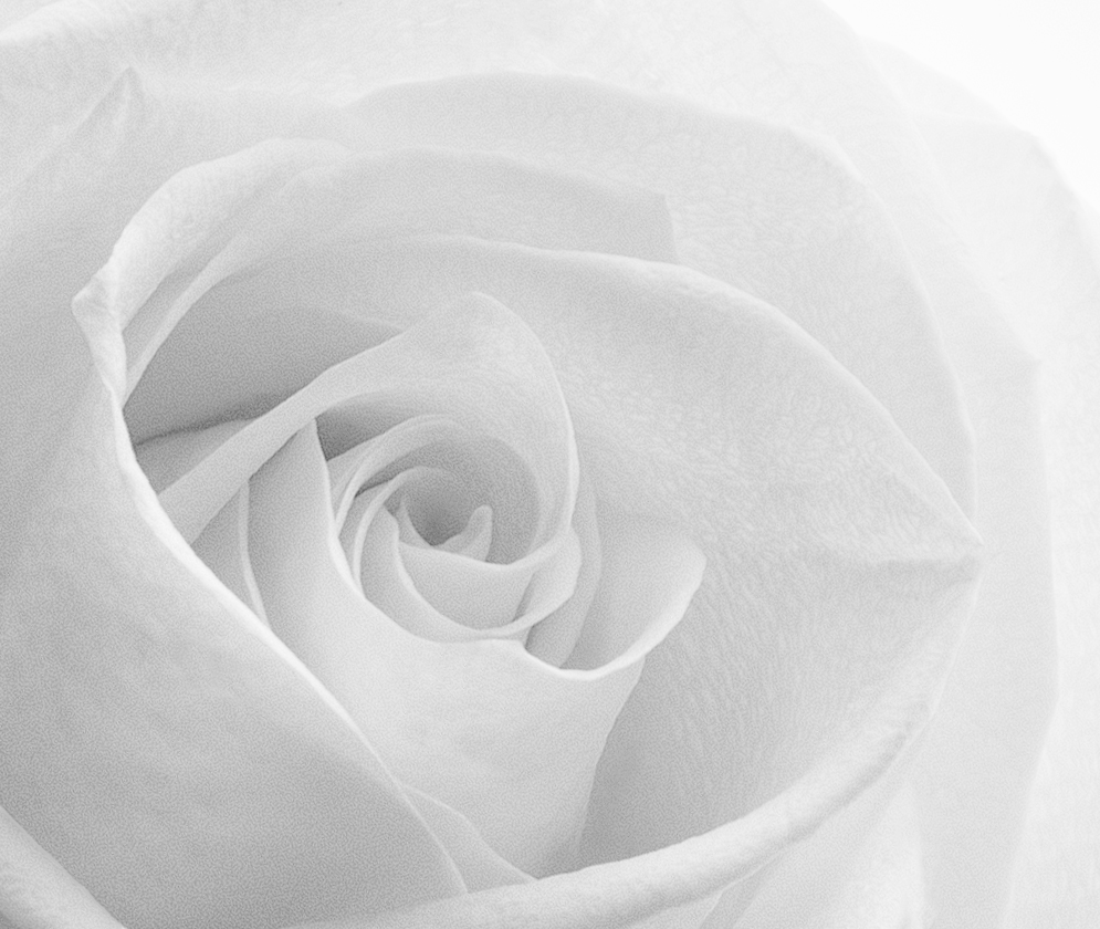
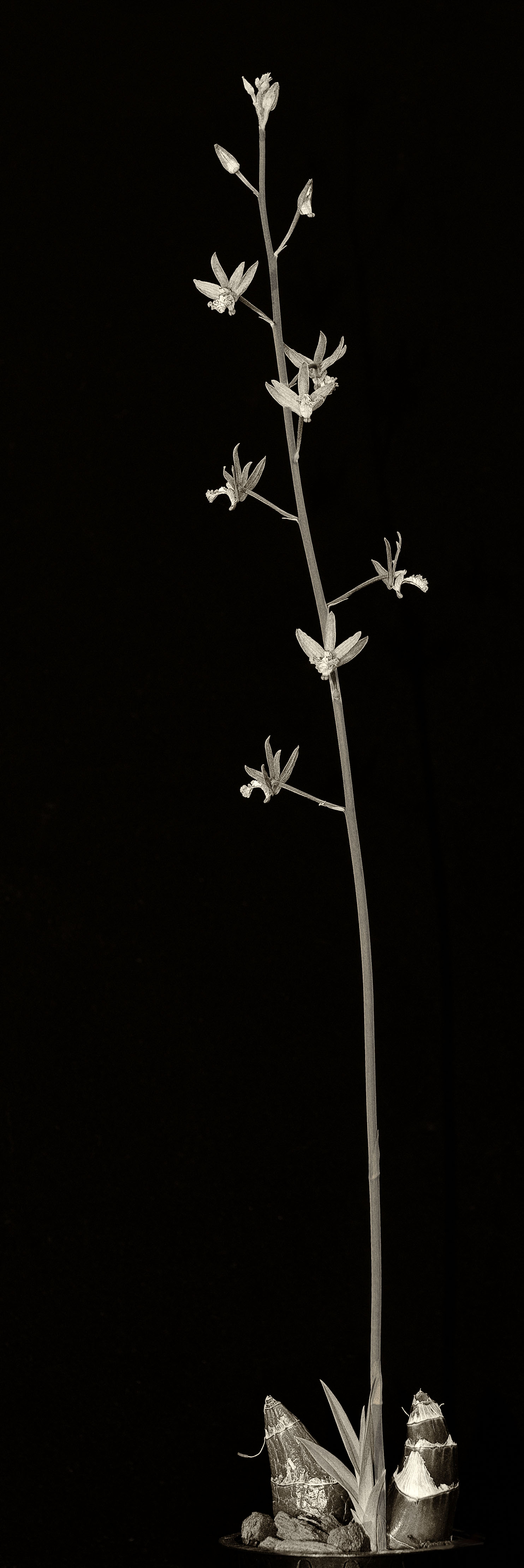
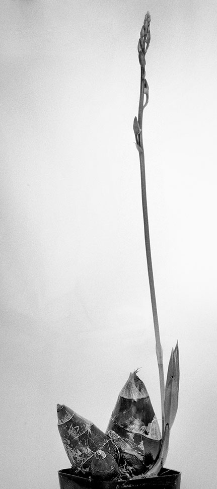
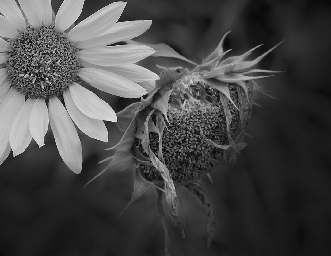
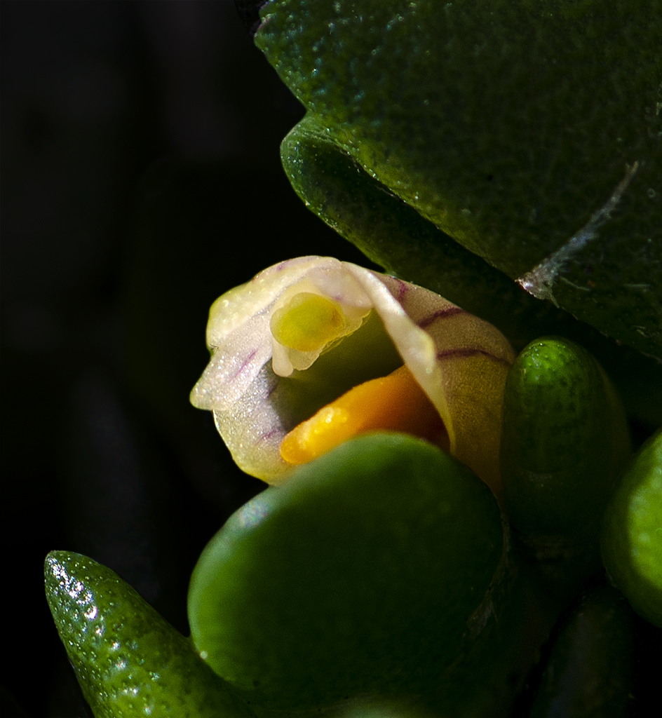
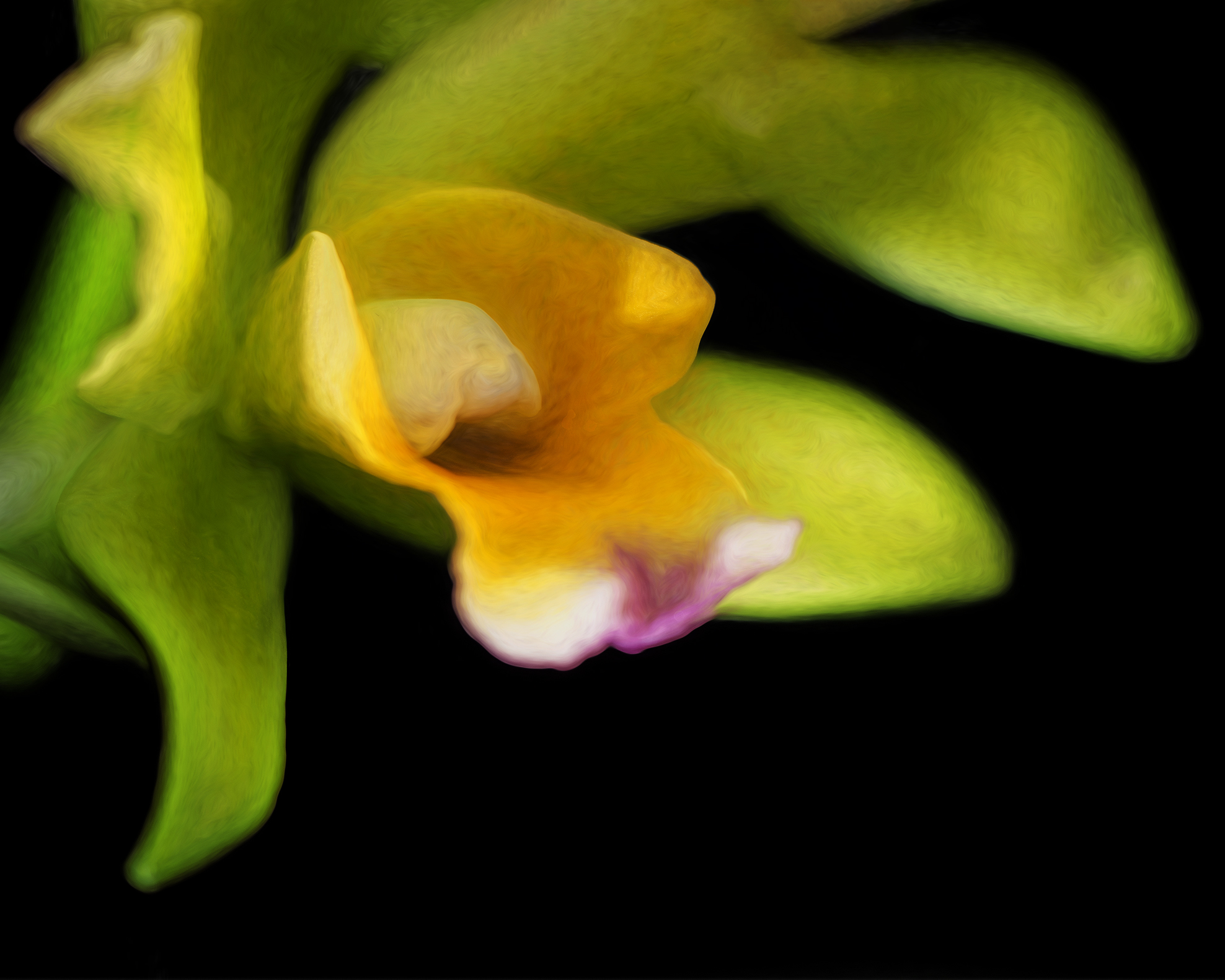
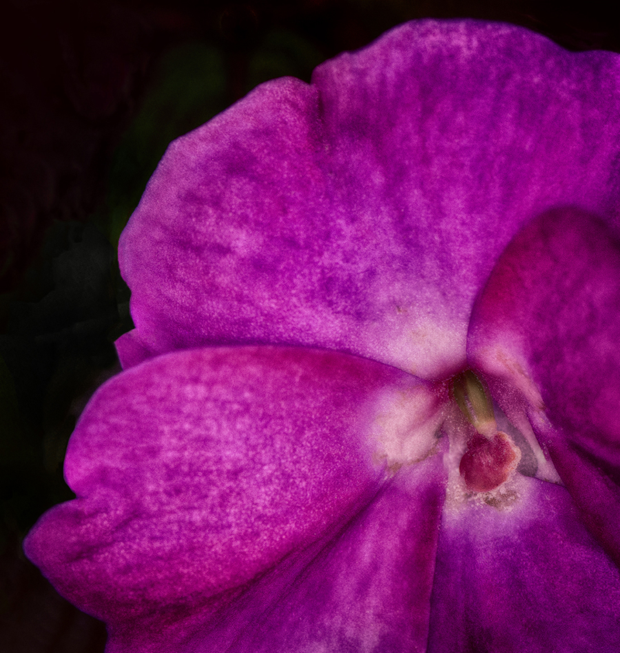
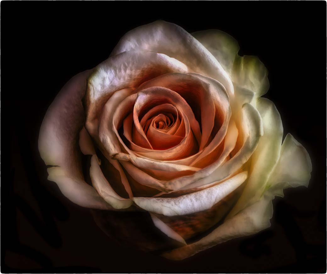
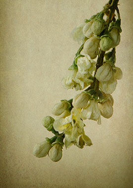
I agree that there's a bit too much negative space here. The blossoms have come out so we all know what my image will be for next month.
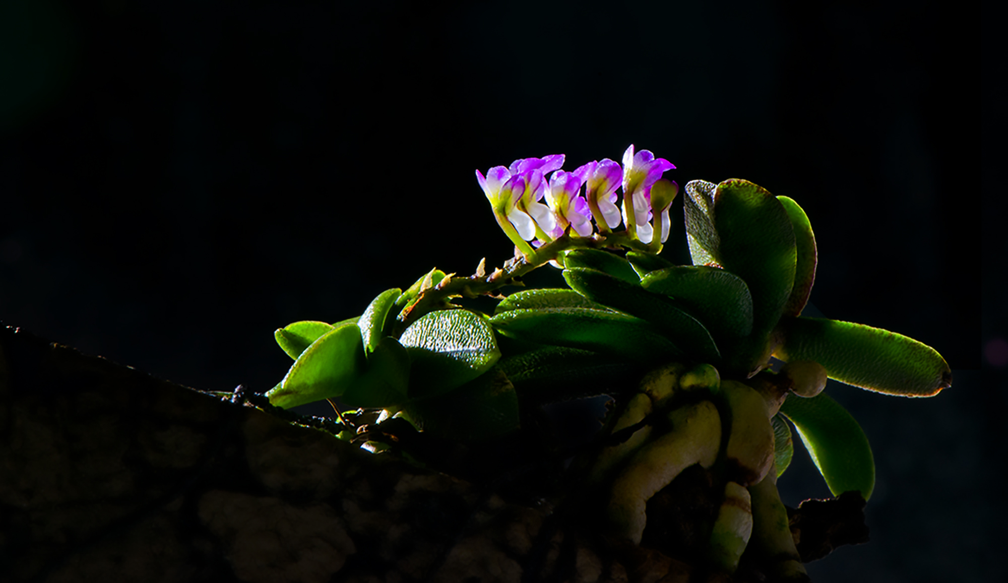
As far as rebloom, the most common problem for lack of rebloom is not enough sunlight. Orchid leaves should be light green - if they're deep and lush green there aren't getting enough sun. A routine of feeding helps too. I feed mine every other week because plants are hungry here in Florida. When I was up north in NJ I fed them once a month, had them in either an east or south window depending on the variety of orchid and most of them bloomed every year. There were some now and then that would pout, so I would move them to a different spot and that helped. |
May 20th |
| 32 |
May 19 |
Comment |
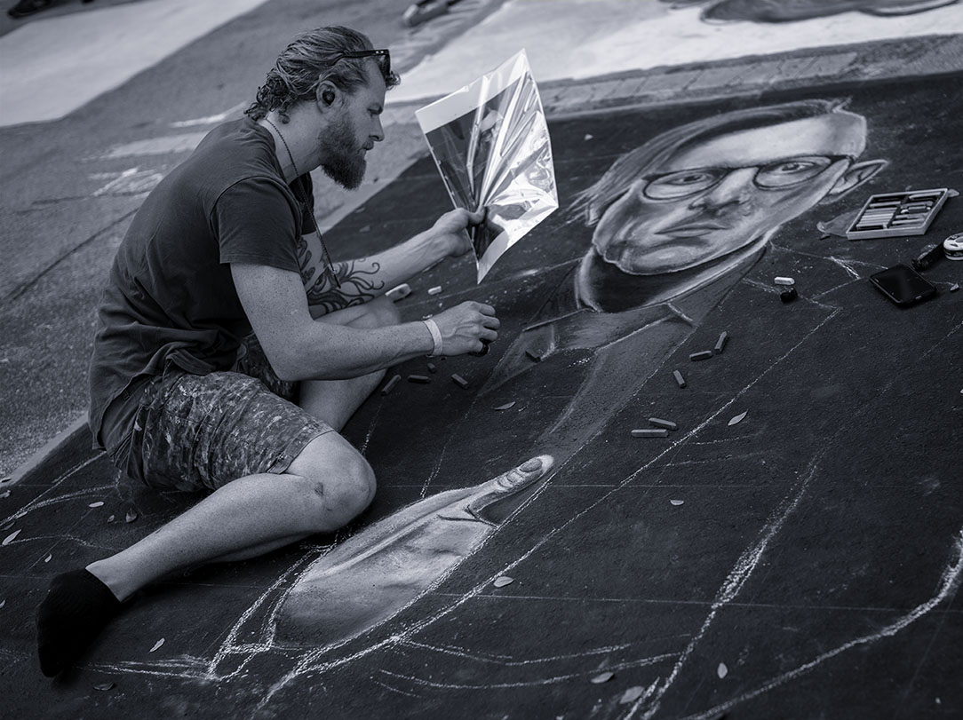
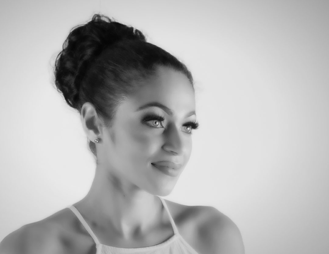
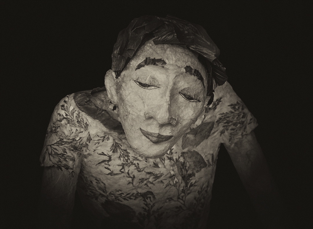
Because I don't do much portraiture, I find it more challenging to comment. The Roman head shadowing is so well done. I do think the bright spots are a bit distracting - above and below the bust's right eye, tip of the nose and bottom of the neck. |
May 12th |
| 32 |
May 19 |
Comment |
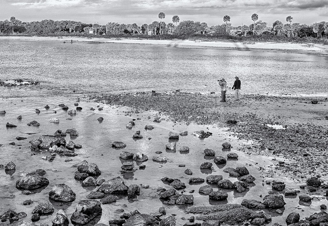
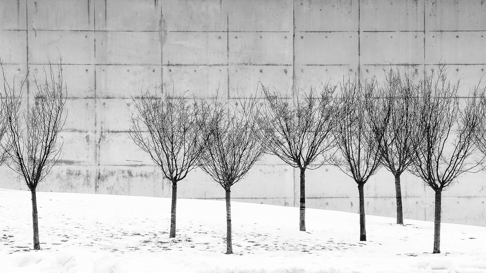
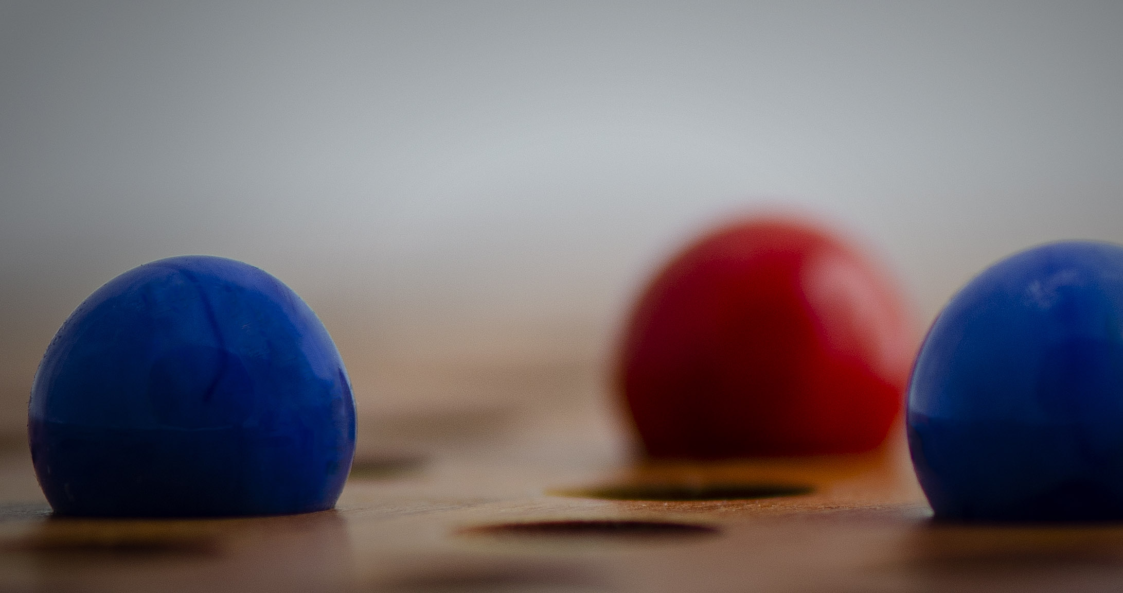
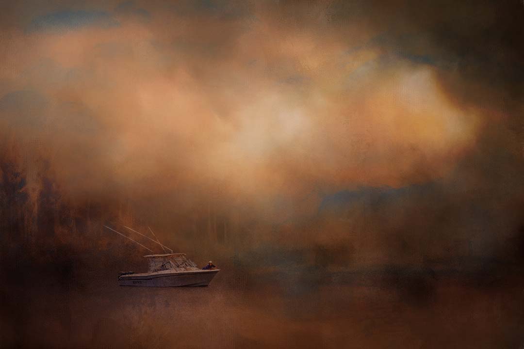
I like Stephen's composition, but I've also found trouble in getting my more square images into comp. For the reasons above is why I have such trouble with landscapes here in Florida. Thinking the palms may be a bit too dark. |
May 12th |
| 32 |
May 19 |
Comment |
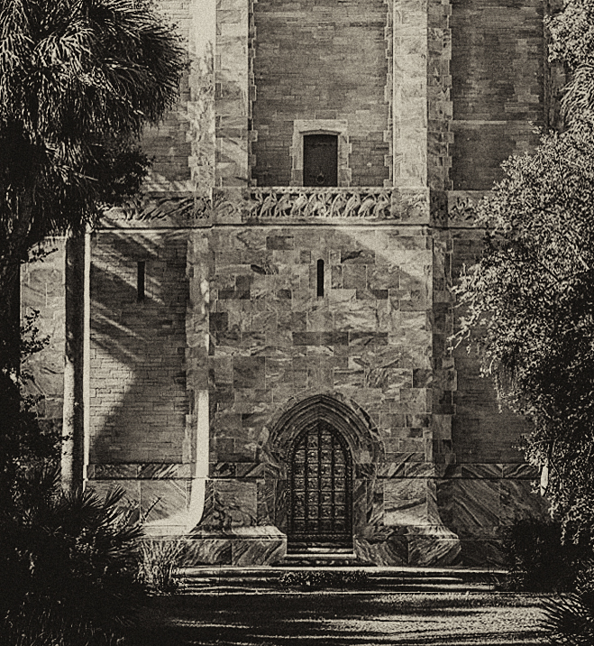
I can only imagine how cold this building must have been in the depths of winter in Wisconsin. The B&W conversion makes the image much more interesting. I might crop a bit off the bottom as well, and remove whatever that is on the left side of the chimney near the top. |
May 12th |
| 32 |
May 19 |
Comment |
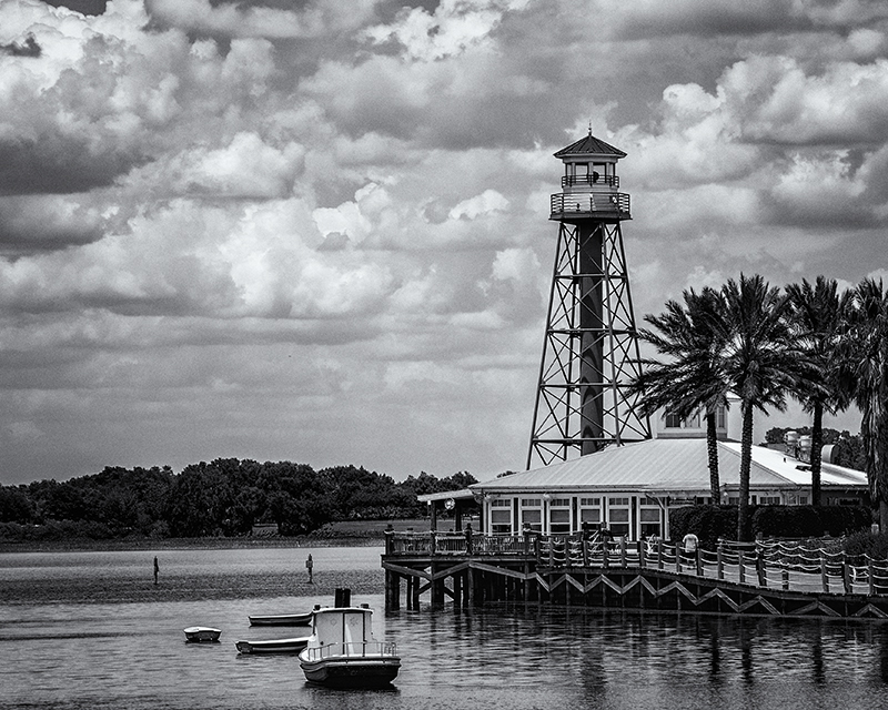
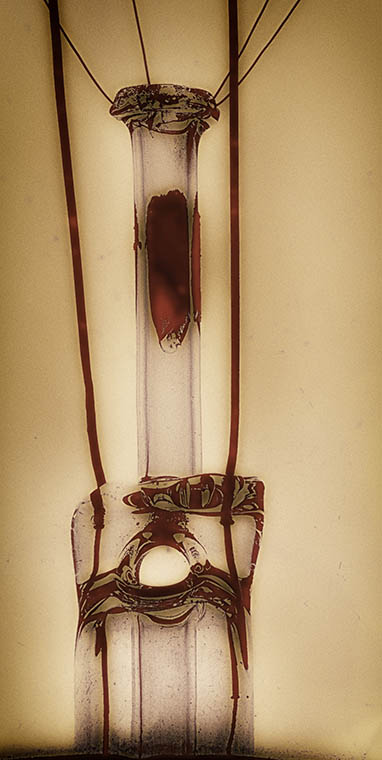
I think the straightening and sharpening Stephan provided to the image is giving the tower more depth and personality. I might have cropped more off the right to move the tower away from center. Working to enhance the sky would provide more depth, and could make the tower seem downright ominous. You have all the elements in this image, I'm thinking it just needs bit more work on the details. I had the same issue with my image in group 65. |
May 12th |
| 32 |
May 19 |
Reply |
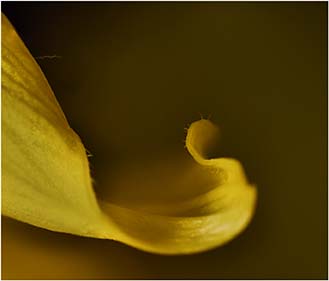
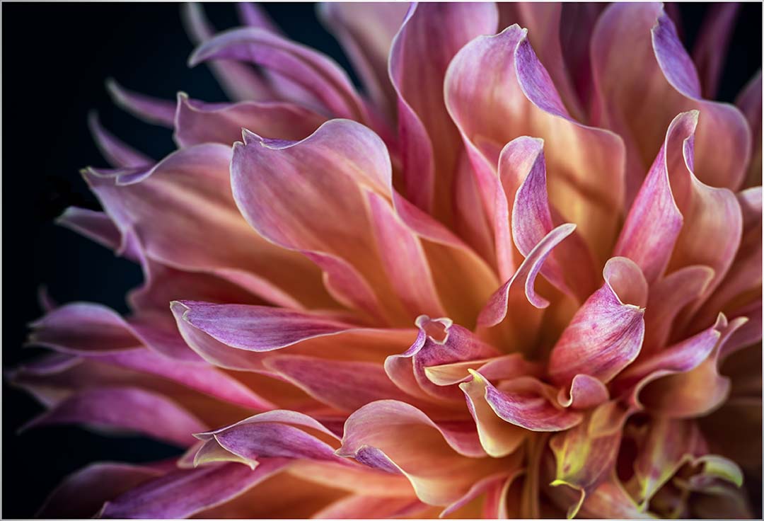
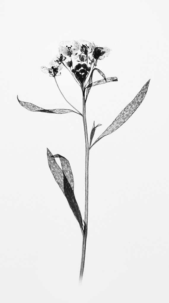
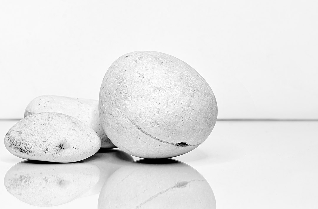
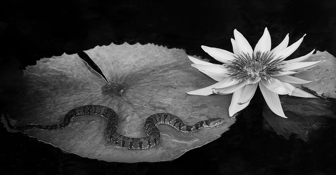
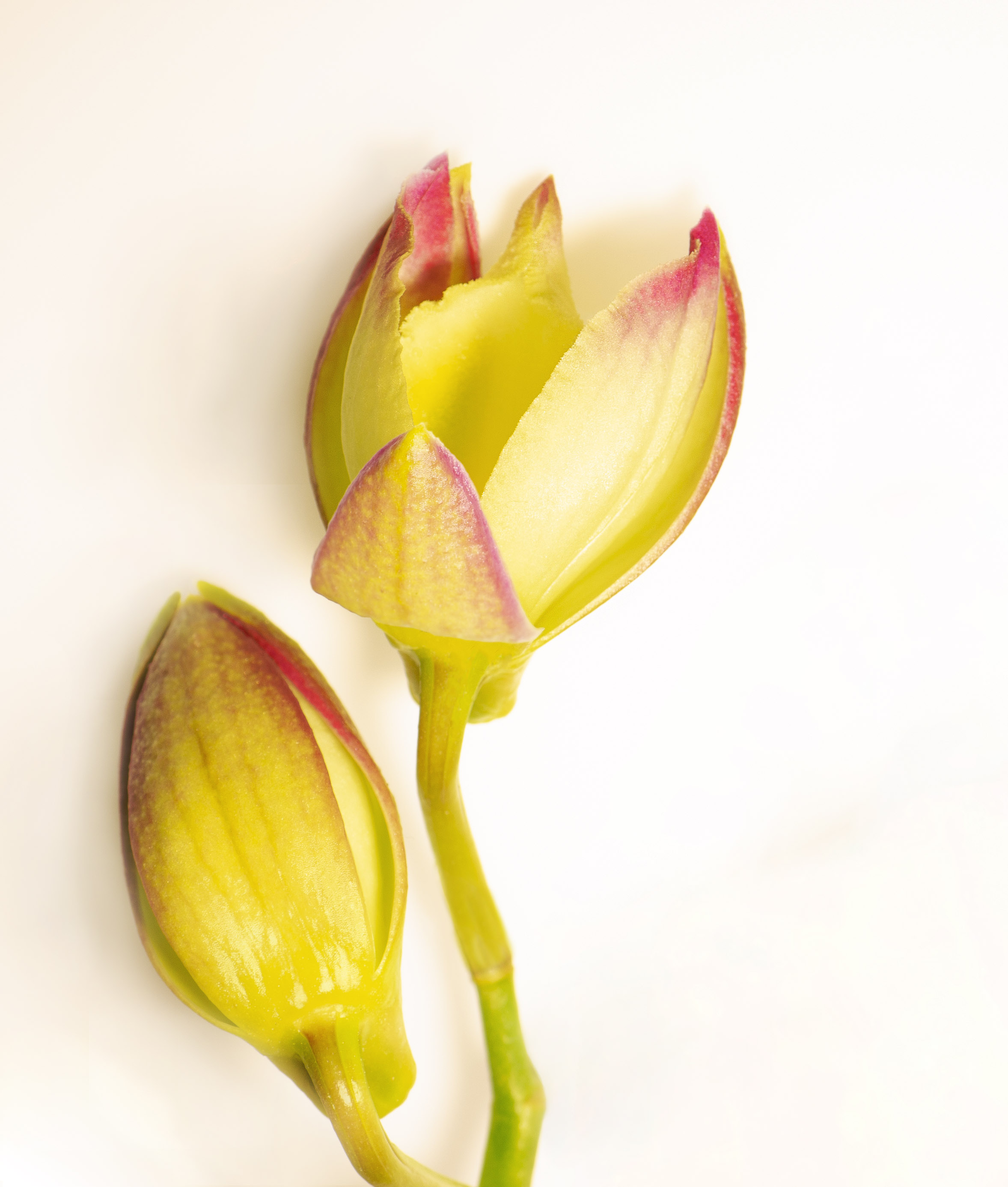
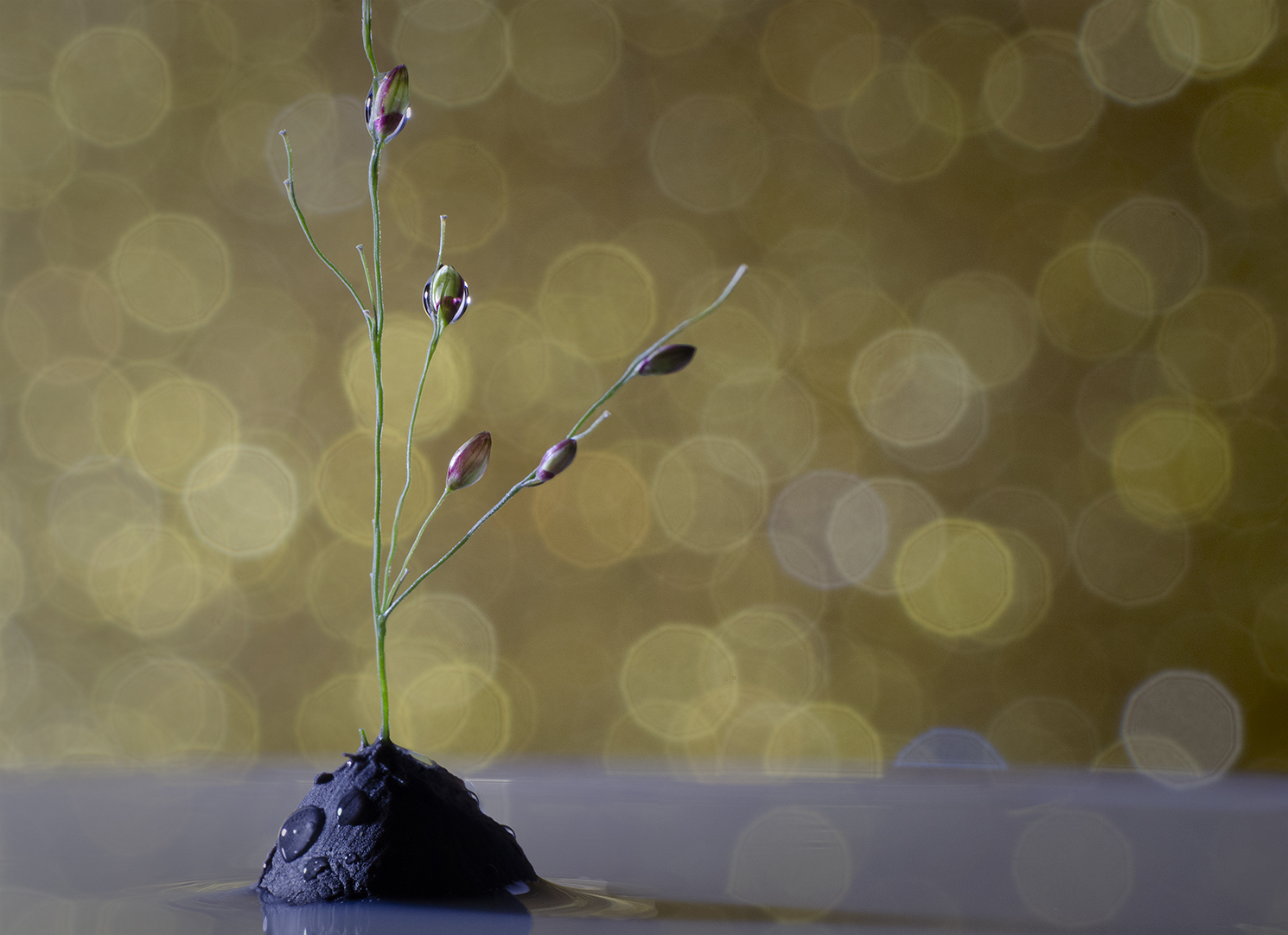
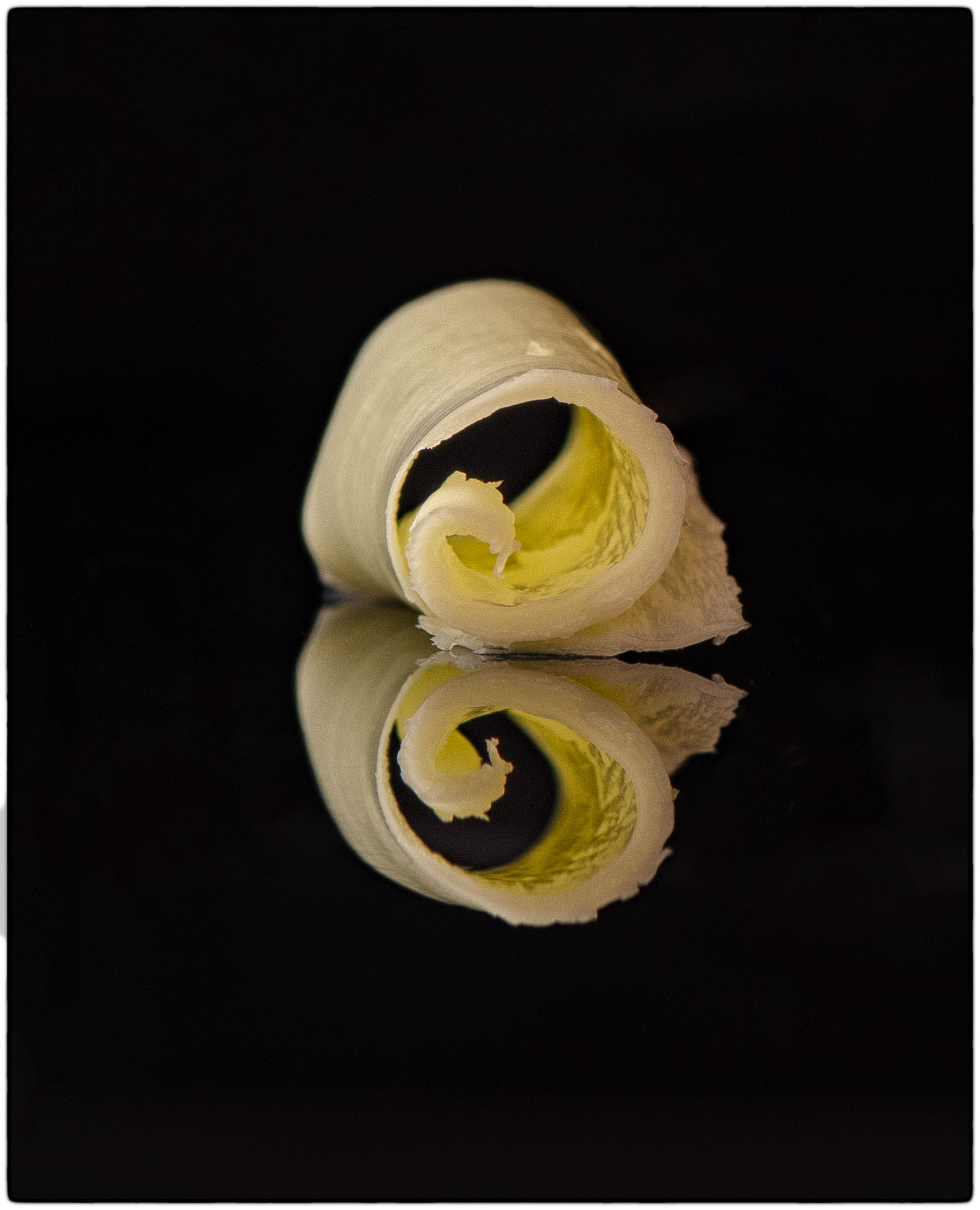
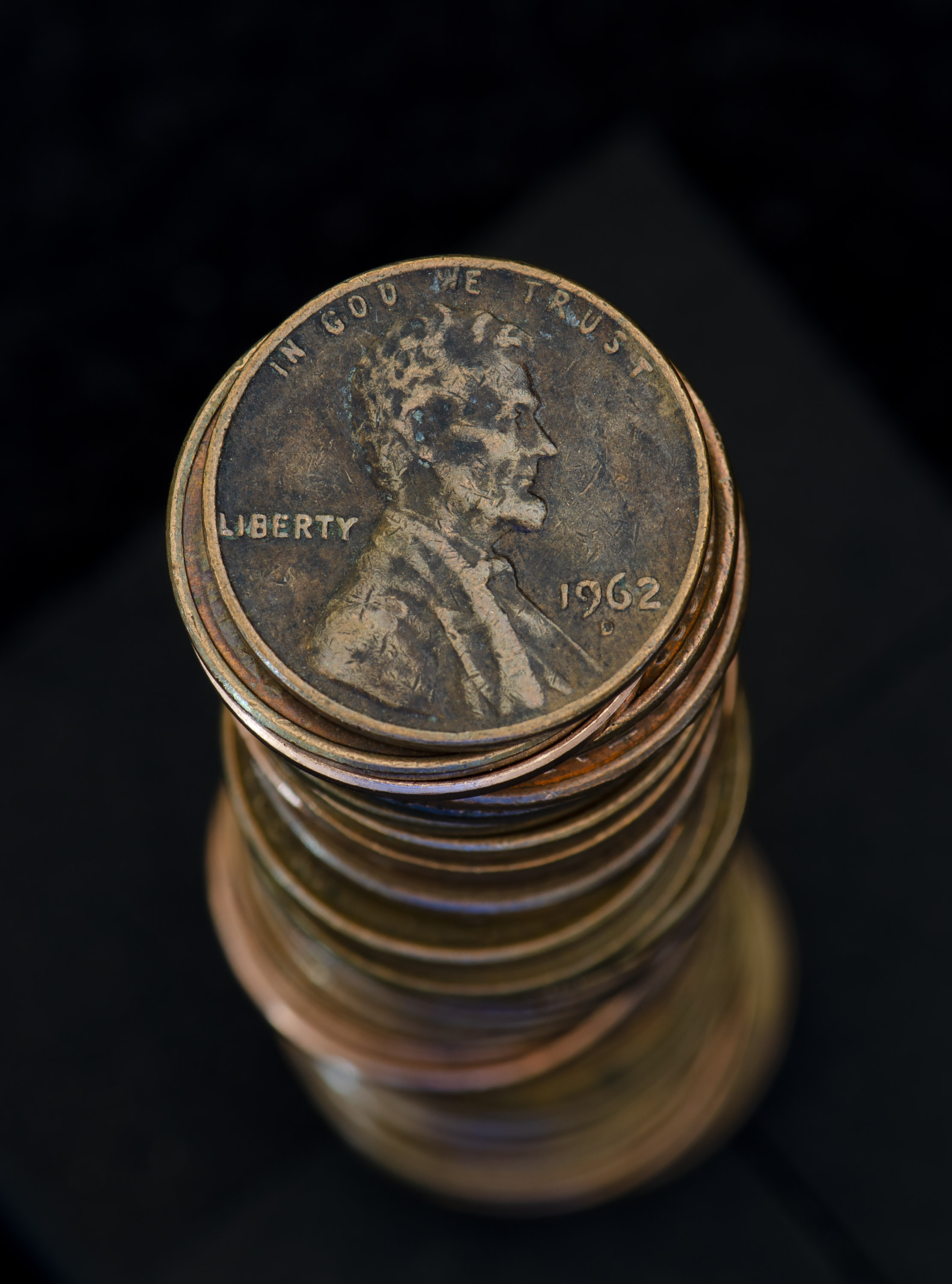
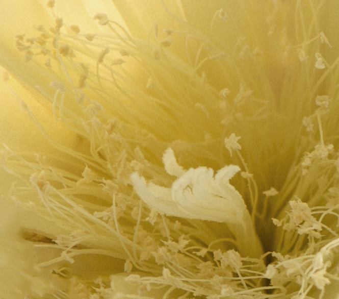
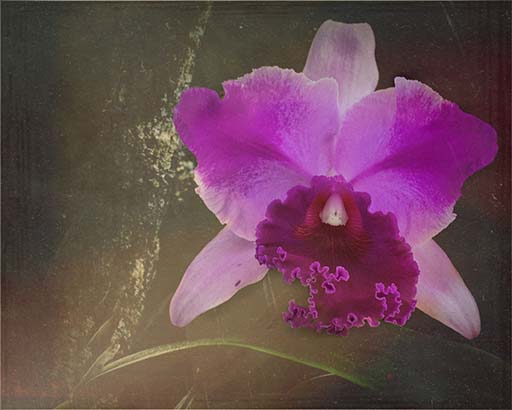
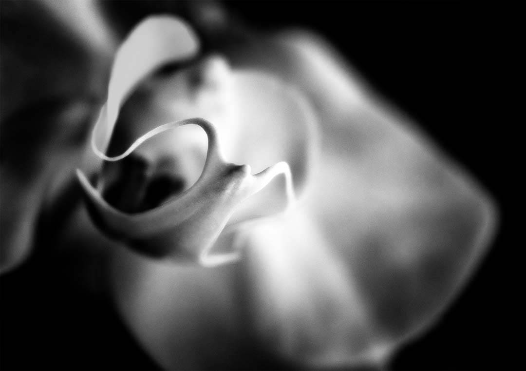
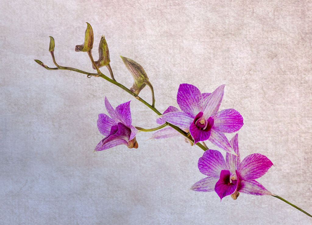
This is the perfect crop. I played with the crop but didn't push it far enough. I took it from far away, closer, just the bulbs, but I found this to be the most appealing...to me anyway. I don't know what the flower will look like, but it just might show up next month as a follow-up :D. |
May 12th |
4 comments - 2 replies for Group 32
|
| 65 |
May 19 |
Comment |
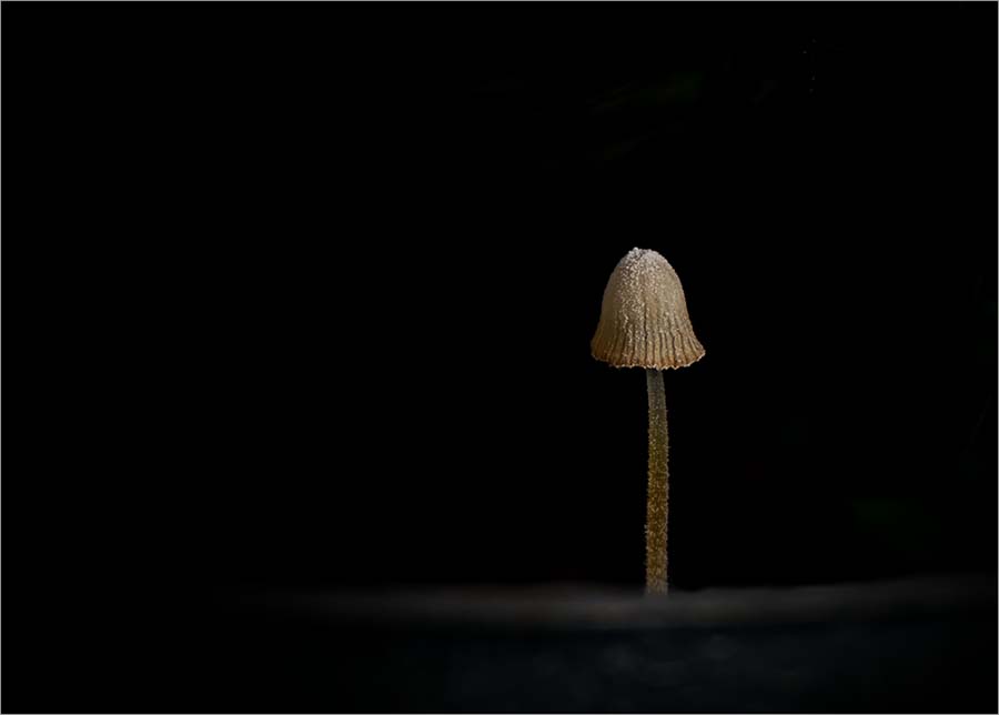
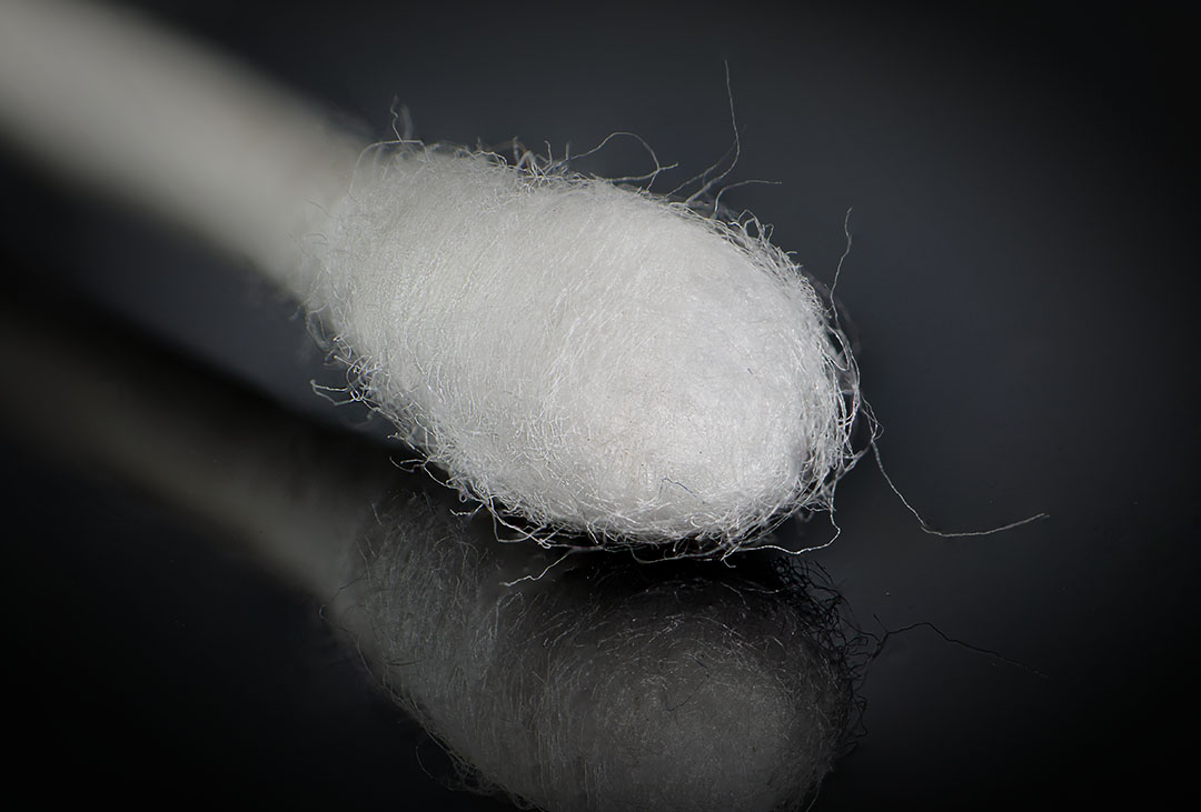
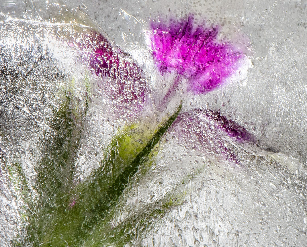
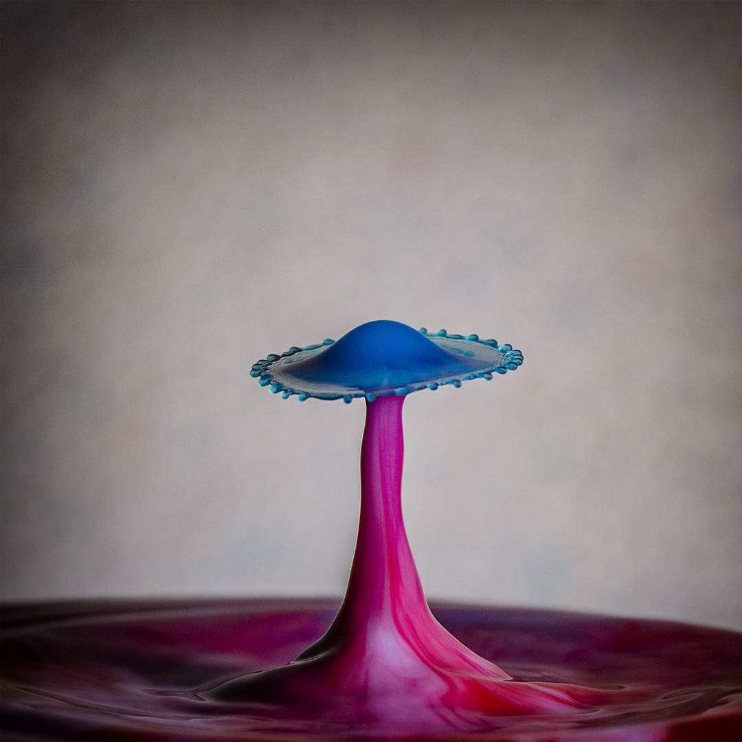
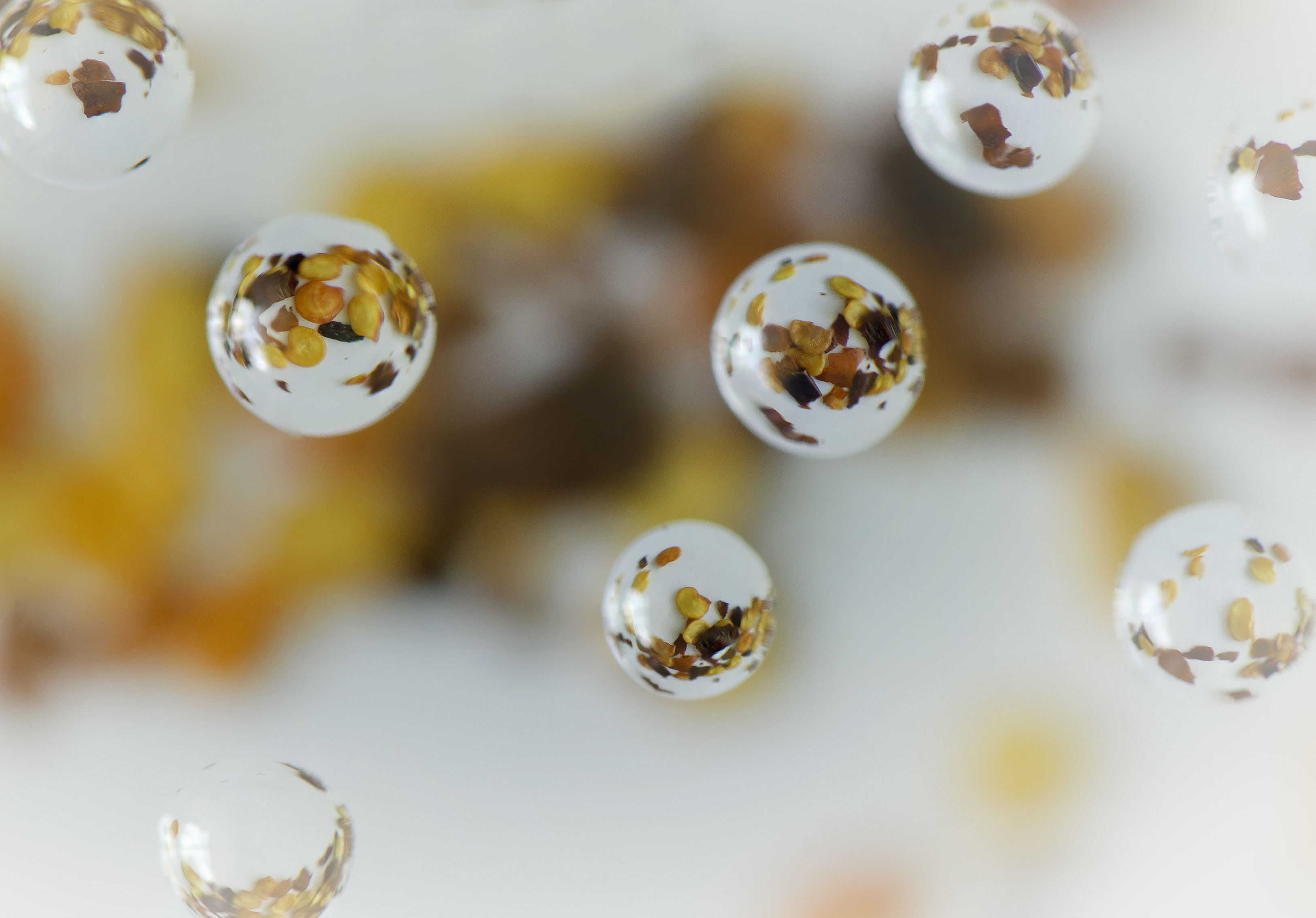
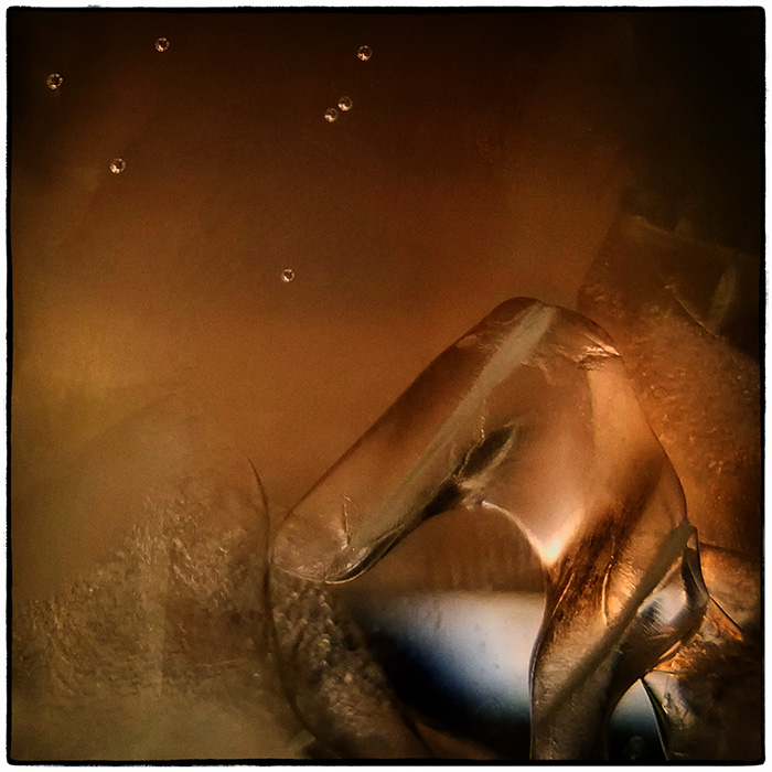
Nice image and one that I have no doubt is very difficult to take successfully. The background is very suitable for this image and the 2 tone really brings out the droplets. I'm wondering if perhaps there are too many drops making this minimalist image almost busy...? |
May 27th |
| 65 |
May 19 |
Comment |
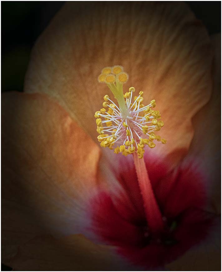
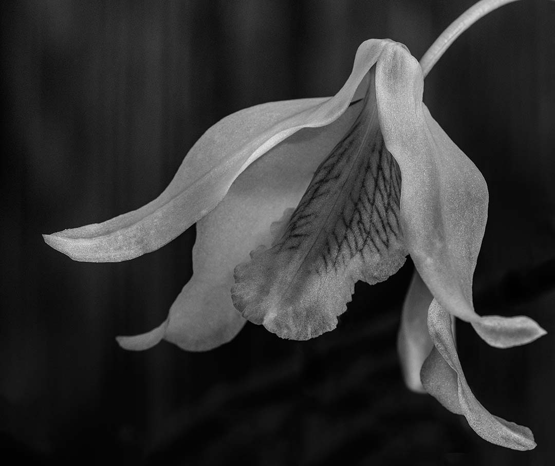
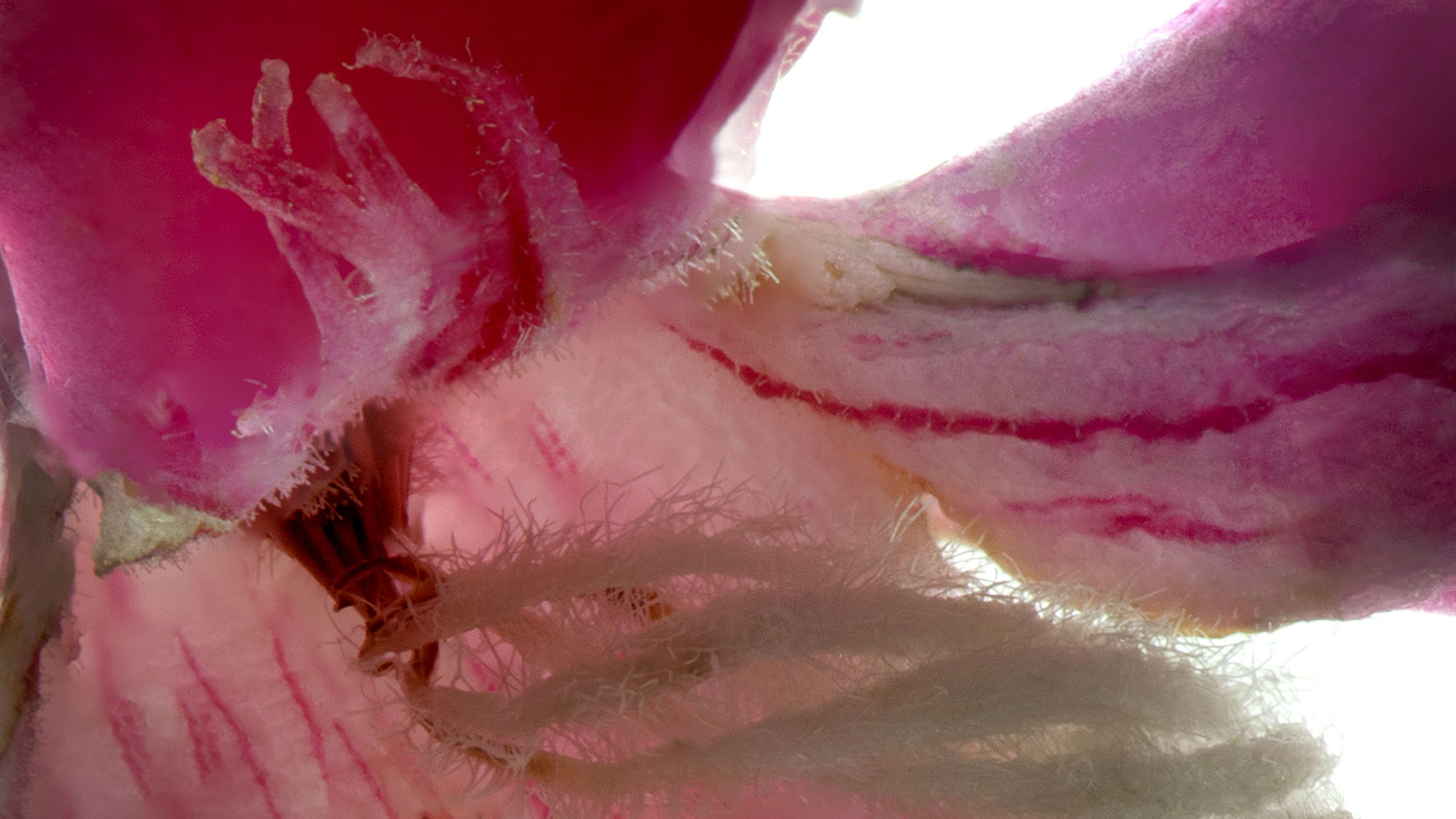
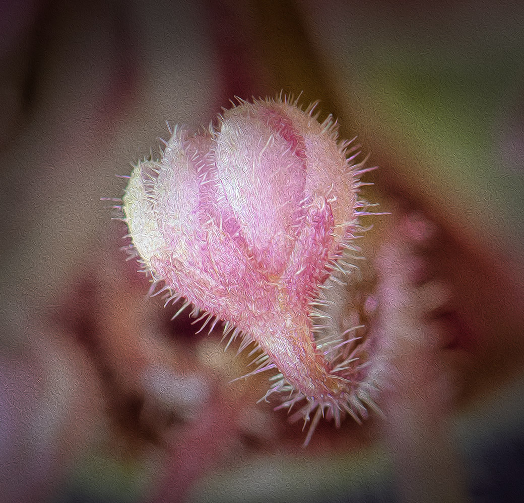
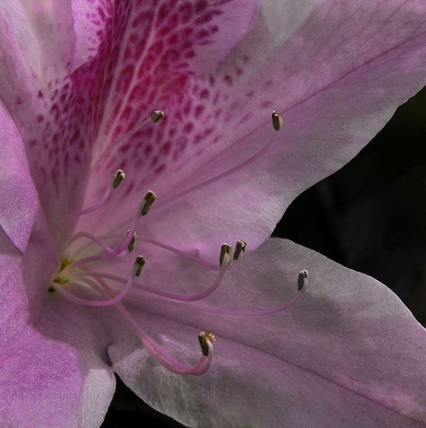
Living in Florida I miss the pink and white dogwoods in bloom, although blooming orchids outside in January has its perks. I agree with Janos regarding the pink flower in the lower left corner, but it probably should be a bit darker as not to distract.
Shake reduction is a wonderful tool for those of us that never go without a tripod and then get challenged with a hand held image. |
May 27th |
| 65 |
May 19 |
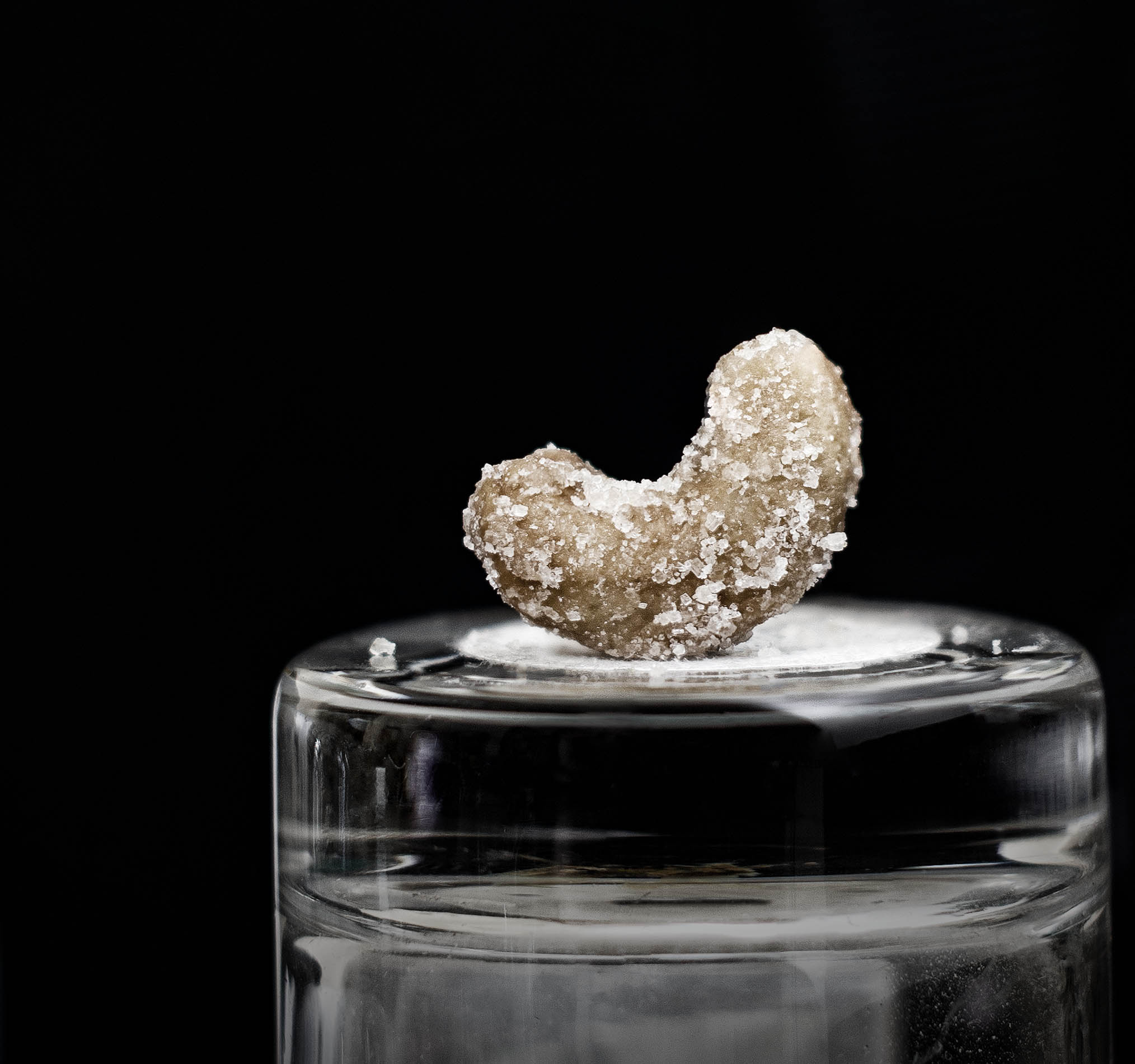
Comment |
Angela, I like the concept of a grunge strawberry although this looks pretty good compared to the ones I've found in my fridge. I agree with the comments about the bluish highlights and think they distract. Maybe use the gradient tool to darken the leaf side of the berry? |
May 27th |
| 65 |
May 19 |
Comment |
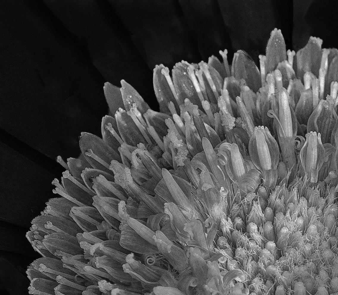
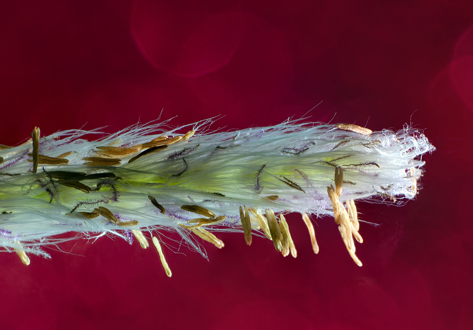
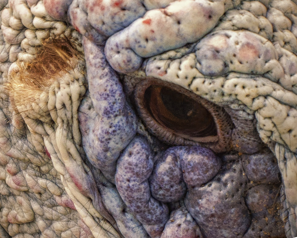
My first thought when I see your insect images is (as always), yuck. A bit too much clarity for me with these subjects, although that's what makes your image so well done. Composition is great. I agree that the symmetry is spot on in the front, but the dark shadowing in the upper left corner seems to throw off that symmetry. Maybe next month you will provide the butterfly it morphs into. Nice Shot. |
May 12th |
| 65 |
May 19 |
Comment |
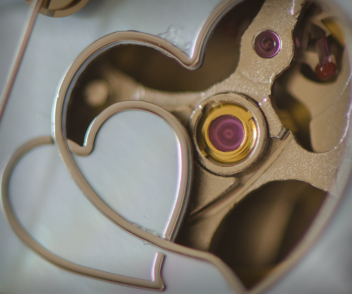
I agree with Charles that this is a really well done image. Your thoughtfulness in planning really worked in getting an image that's fun and interesting. I like how you captured depth and color and how you made the button look like a sphere. Choosing to use a background texture pushed the button to a new level. Nicely done! |
May 12th |
5 comments - 0 replies for Group 65
|
9 comments - 2 replies Total
|