|
| Group |
Round |
C/R |
Comment |
Date |
Image |
| 32 |
Apr 19 |
Comment |
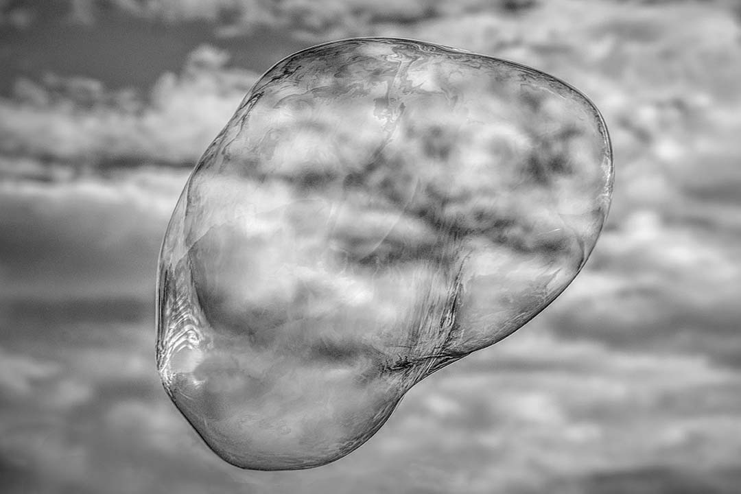
I too find the monochrome too dark particularly in contrast with the fluffy white "lighthearted" clouds. Sometimes a person in the image is helpful for sense of scale, I don't think it would fit here. Not convinced that a present day human would fit with an old viking mindset... |
Apr 29th |
| 32 |
Apr 19 |
Comment |
I'm finding because the windmills are so tightly clustered, it's difficult for me to stay focused on the front windmill. I agree the overall image is a bit too dark so the details are more difficult to see. The receding line is pleasant and the star on the front windmill is nicely captured.
I've never been to the windmill museum, but then again I don't have too many reasons to go to Oklahoma. |
Apr 29th |
| 32 |
Apr 19 |
Comment |
I absolutely love Yosemite and I agree you'[re so lucky. to be able to visit so often. Although you have a lot of elements, to me it's a bit busy. Of course that's subjective, but I'm wondering if there are too many elements. I'm not really getting a sense of scale for the rock face and falls and I know how imposing they are. All the whites are nice and white and well done. |
Apr 29th |
| 32 |
Apr 19 |
Reply |
I sure know the feeling about smoothing the wrinkles! I wouldn't mind using a photoshop skin smoothing app on mine... |
Apr 29th |
| 32 |
Apr 19 |
Comment |
This is a pleasant image with an obviously happy friend. Your choice to crop was a good one as I can see how it would get very busy with all the brickwork. If I were to make any suggestions, it would be to perhaps clone out the white paper inside the phone booth by the end of her scarf and bring down the brightness of the front portion of her pants. Overall, it's a nice image.
If/when I visit London I do not need to visit a phone booth. We have a local couple from London that had a phone booth shipped here when they came over. They keep it on their front lawn which is on a coastal road here in Florida. Of course it's very popular with the wedding photographers. |
Apr 8th |
| 32 |
Apr 19 |
Comment |
The leading lines are very well done although I'm thinking the overall image maybe a little too bright. This is very similar to a coastal town about 20 minutes south of me that holds a weekly Farmer's market. It's huge, has live music and so much fresh food. The difference in the images would be no hills on the left (just ocean), no long pants and instead of what look to be oak trees there are palms.
I found myself looking at the image quite a bit looking for both similarities and differences. Nicely done and the inclusion of people makes it very dynamic and alive. |
Apr 8th |
| 32 |
Apr 19 |
Reply |
Lately a lot of images that do well seem to me to be images we see a lot of. That's ok I guess, but so many seem as if there's a pane of glass separating the viewer from the image. sometimes it makes me wonder if it's me.
I didn't even see the lack of distinction between the nose and the cheek. I had corrected for the same issue between her cheek and the background. |
Apr 8th |
5 comments - 2 replies for Group 32
|
| 65 |
Apr 19 |
Comment |
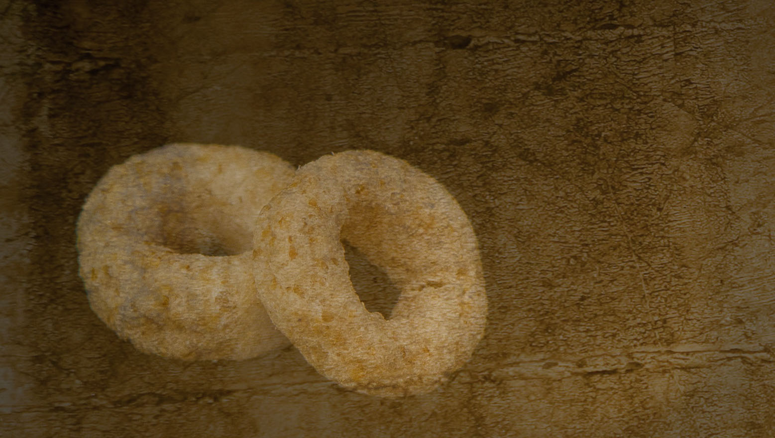
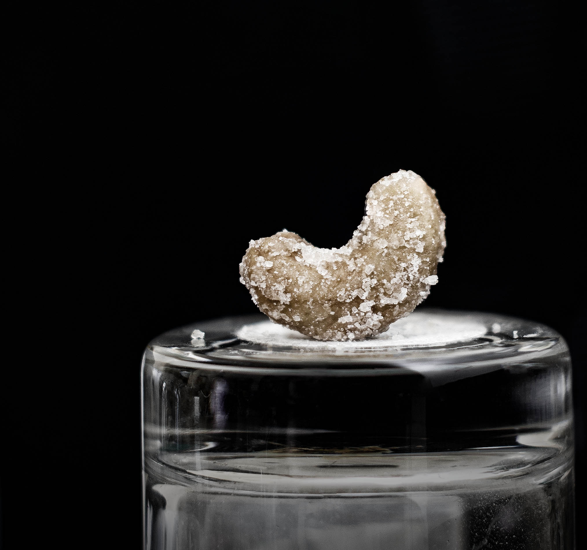
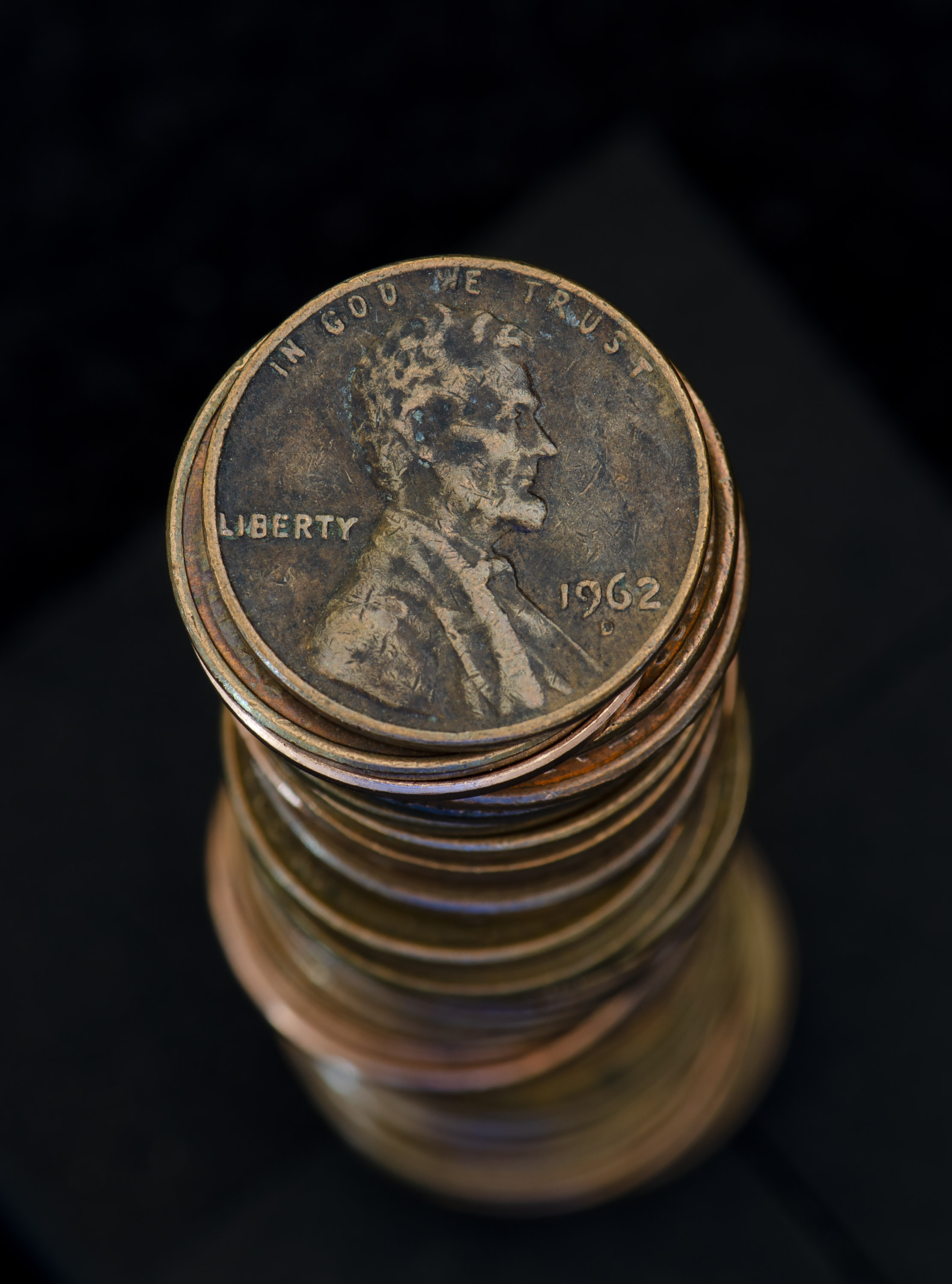
I'm like the guys - I thought these were exotic chocolates as well. I liked the variations of patterns you've chosen. The light coming from the right is a bit distracting and I'm thinking it may have been too close to the subject.
Using F/2 is difficult as the number of slices to photo stack can get pretty high. Backing up and increasing the distance between the camera and subject would help a bit. The quartz countertop was a good idea.
|
Apr 24th |
| 65 |
Apr 19 |
Comment |
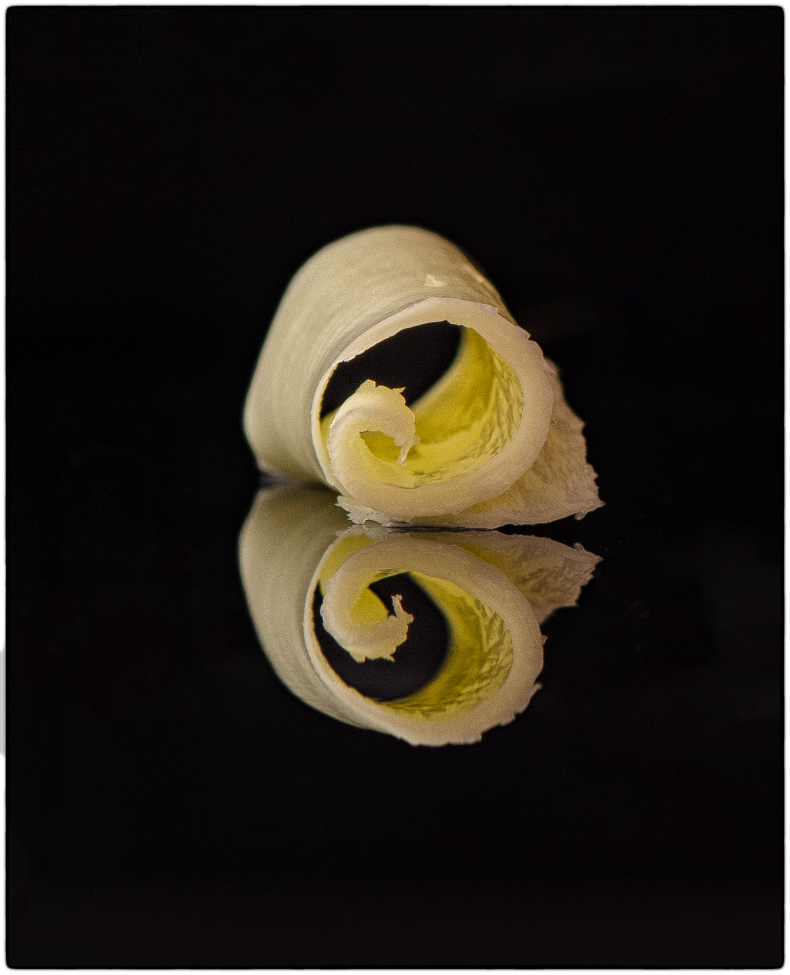
Nice job Oscar! For me, I find the balance of the curved lines very appealing and relaxing. Charlie's edits add to your image and make it stronger. So although your idea of pulling the viewer in to a specific area may not have worked quite as well as you had hoped, your "line work" is very nicely portrayed. |
Apr 24th |
| 65 |
Apr 19 |
Comment |
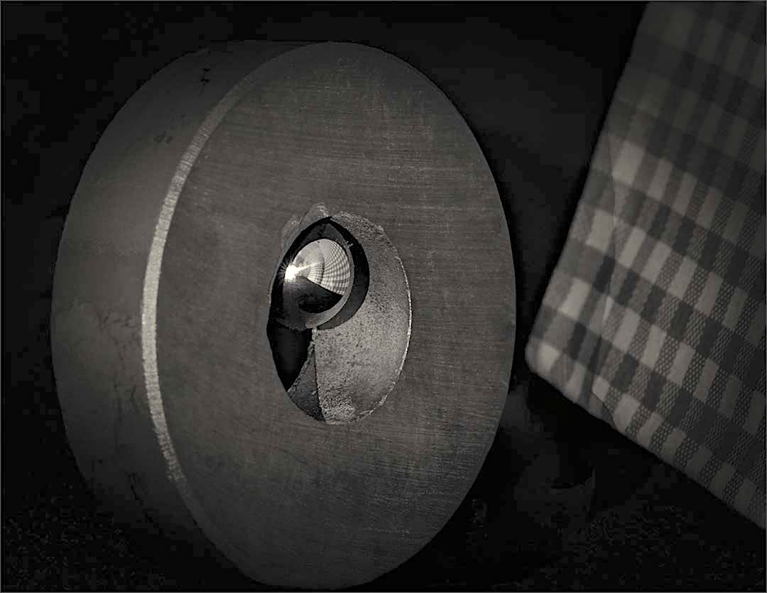
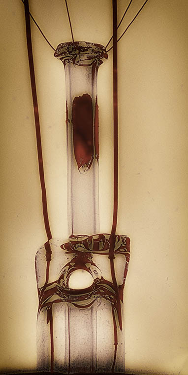
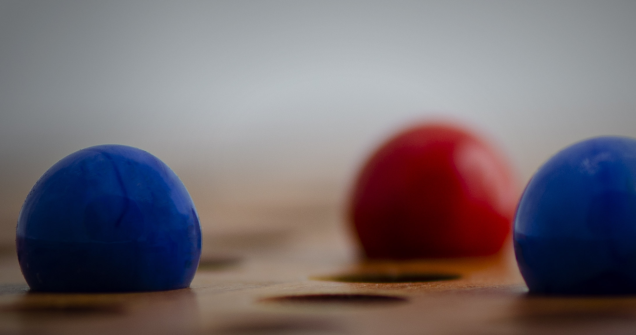
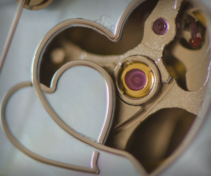
I like this image, but I'm thinking the blur in the foreground is a bit too prominent and a slight crop off the bottom may add more drama to the image. Not that a safety pin is generally dramatic, unless of course it really fights back and sticks you. The sharpness and particularly the texture in the pin head is fantastic. |
Apr 23rd |
| 65 |
Apr 19 |
Reply |
You are absolutely right - I looked at this and thought WHOA... Not sure what came over me, but this is not what I had in mind |
Apr 23rd |
| 65 |
Apr 19 |
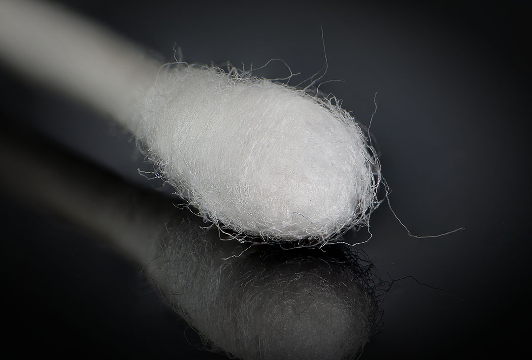
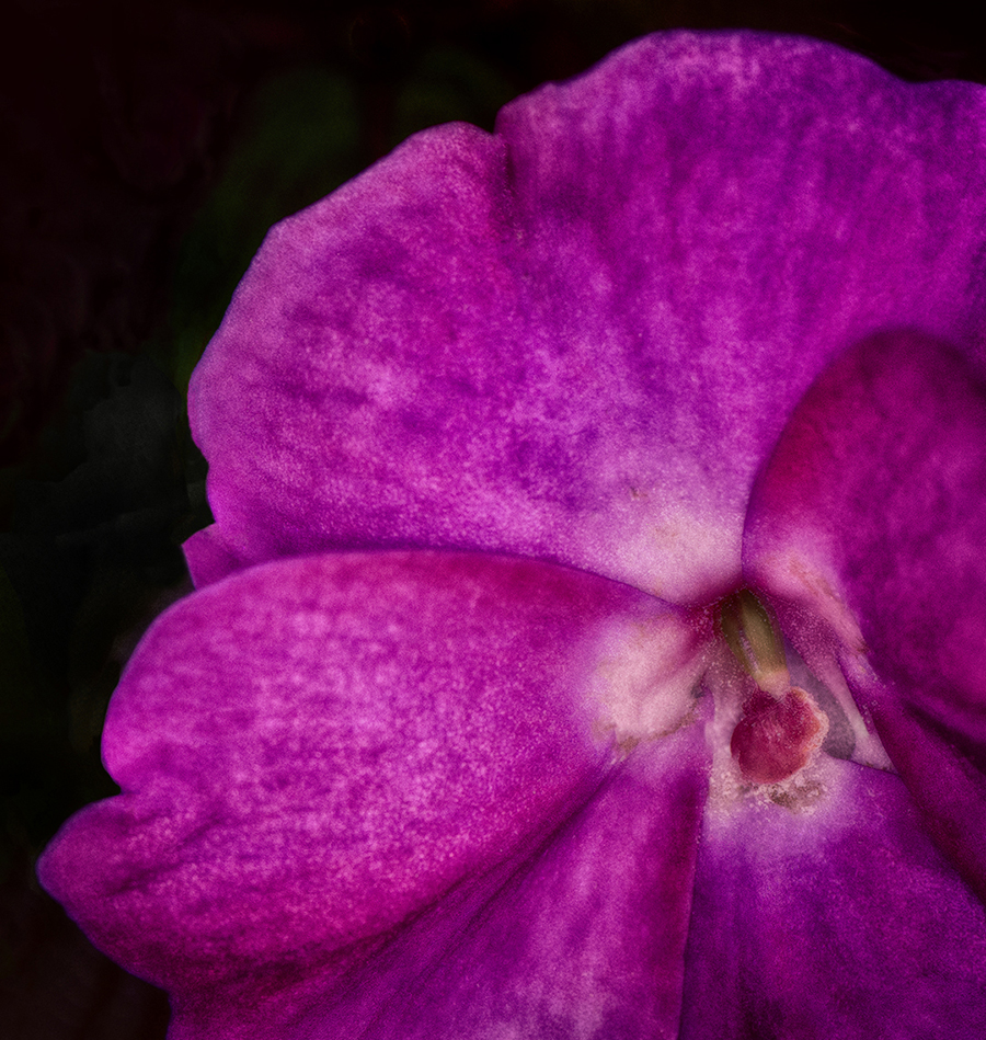
Comment |
I really like this. It's an interesting subject and the colors are great. I don't find the lint distracting and actually I think it adds to the image. The only thing I would suggest is to maybe take down the brightness a bit at the top using the gradient tool. Nice job! |
Apr 8th |
| 65 |
Apr 19 |
Comment |
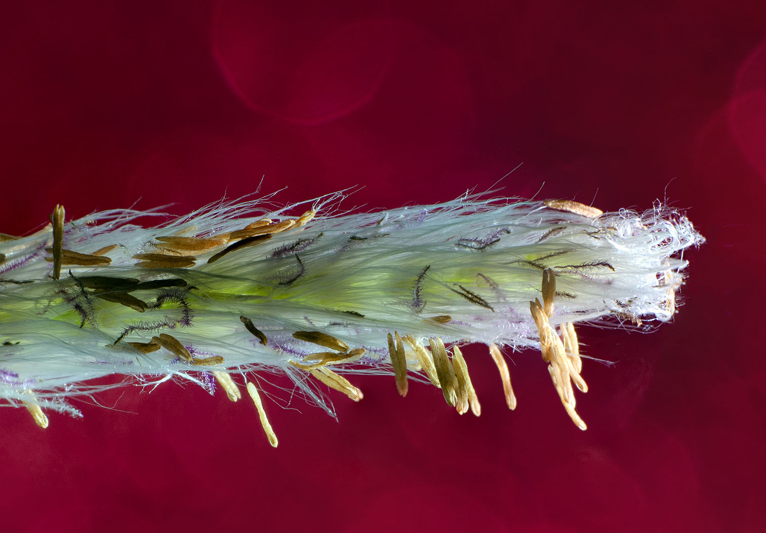
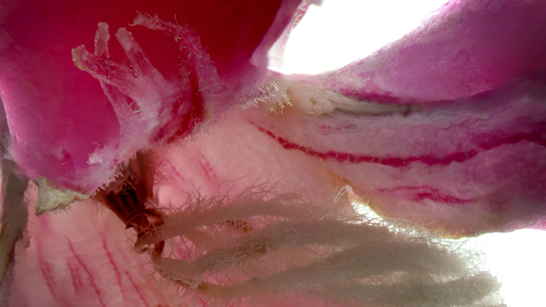
My favorite type of inspiration!
Great image Janos. I think the decision to leave the outer lines which I assume are the lines of the opener is great. I wouldn't change a thing. Except maybe if it were white. I prefer red... |
Apr 8th |
5 comments - 1 reply for Group 65
|
10 comments - 3 replies Total
|