|
| Group |
Round |
C/R |
Comment |
Date |
Image |
| 32 |
Sep 18 |
Reply |
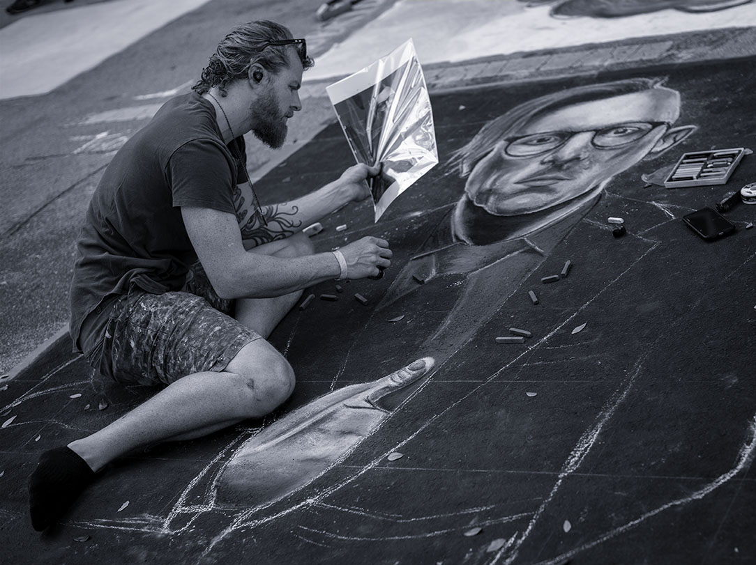
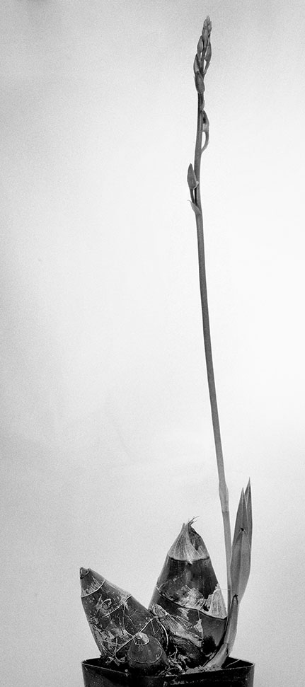
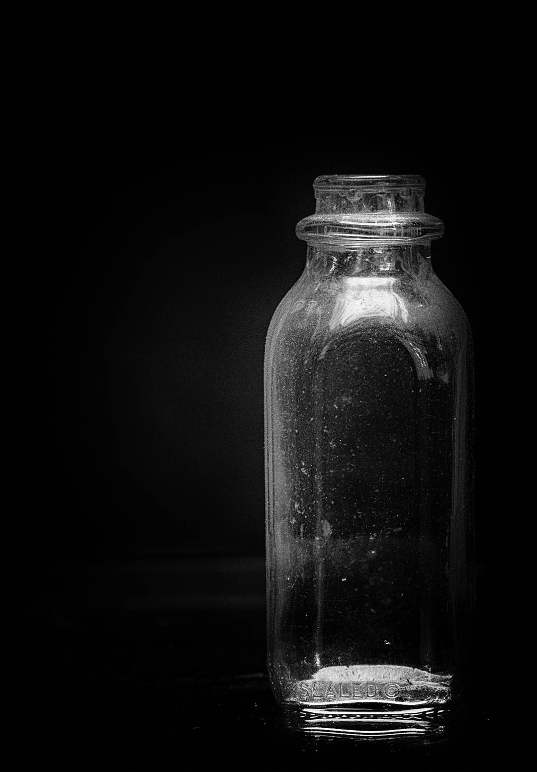
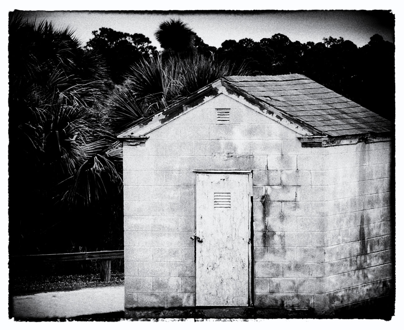
Here's the original. I always have challenges staying in standard ratios so when I print I'm always a "custom" size. |
Sep 23rd |
 |
| 32 |
Sep 18 |
Reply |
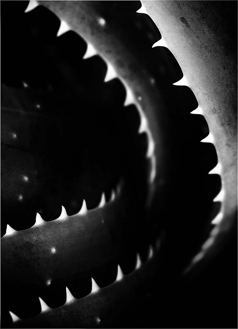
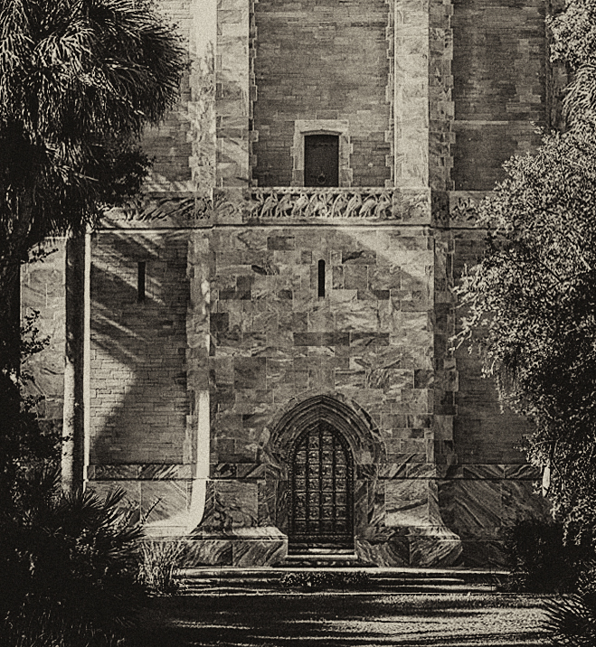
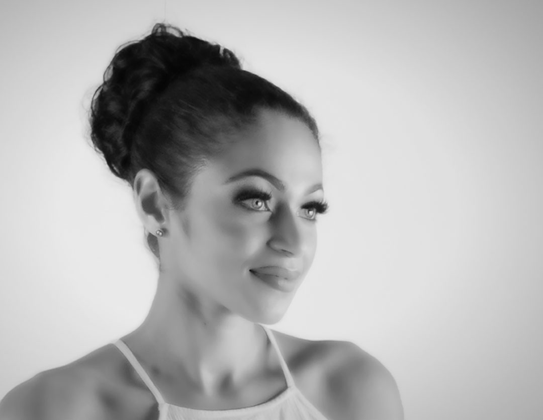
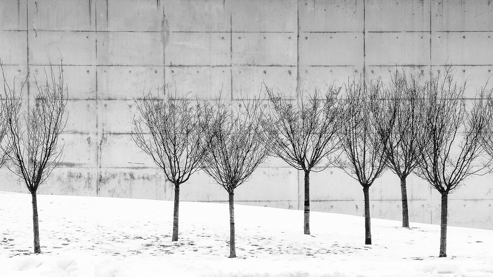
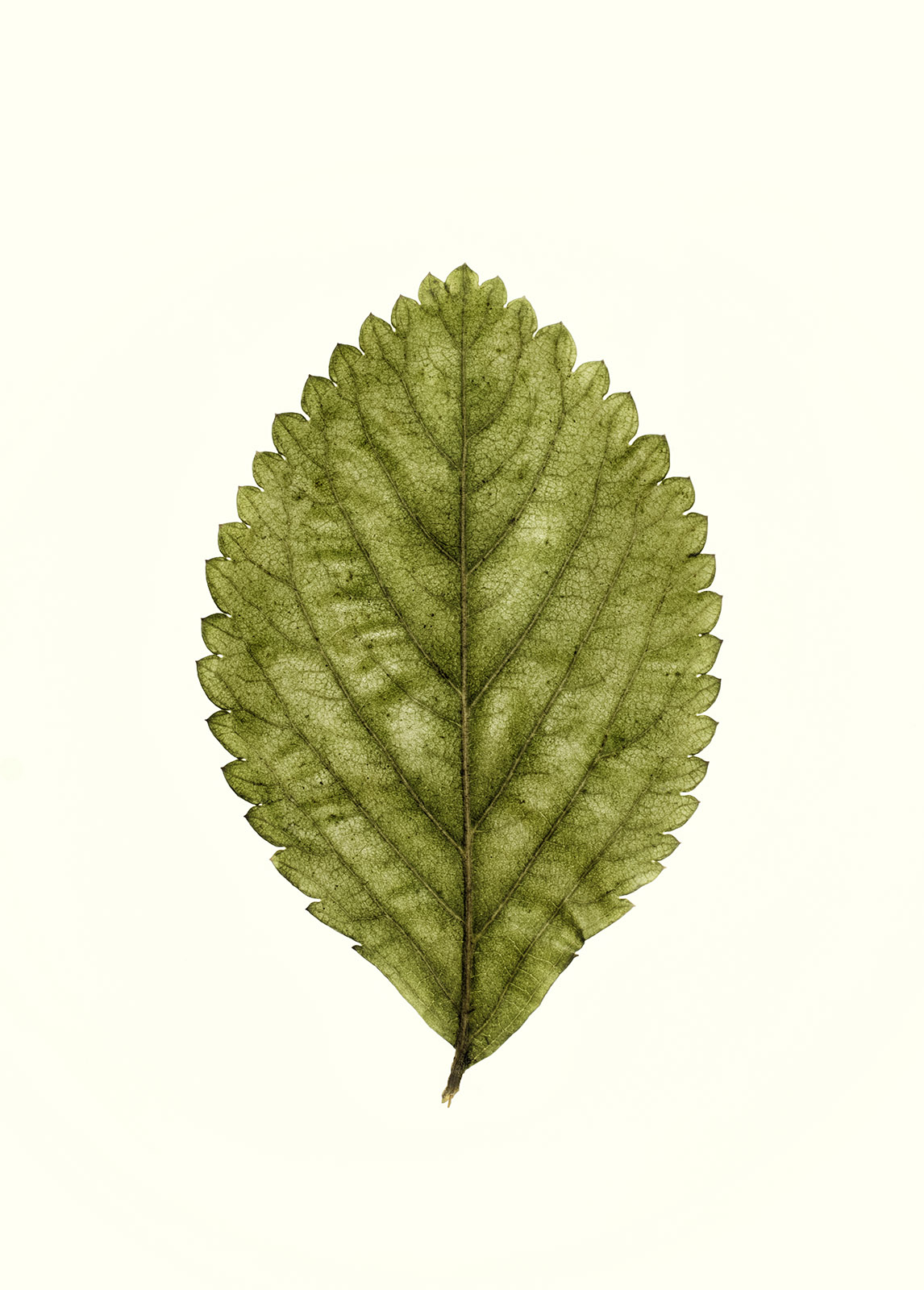
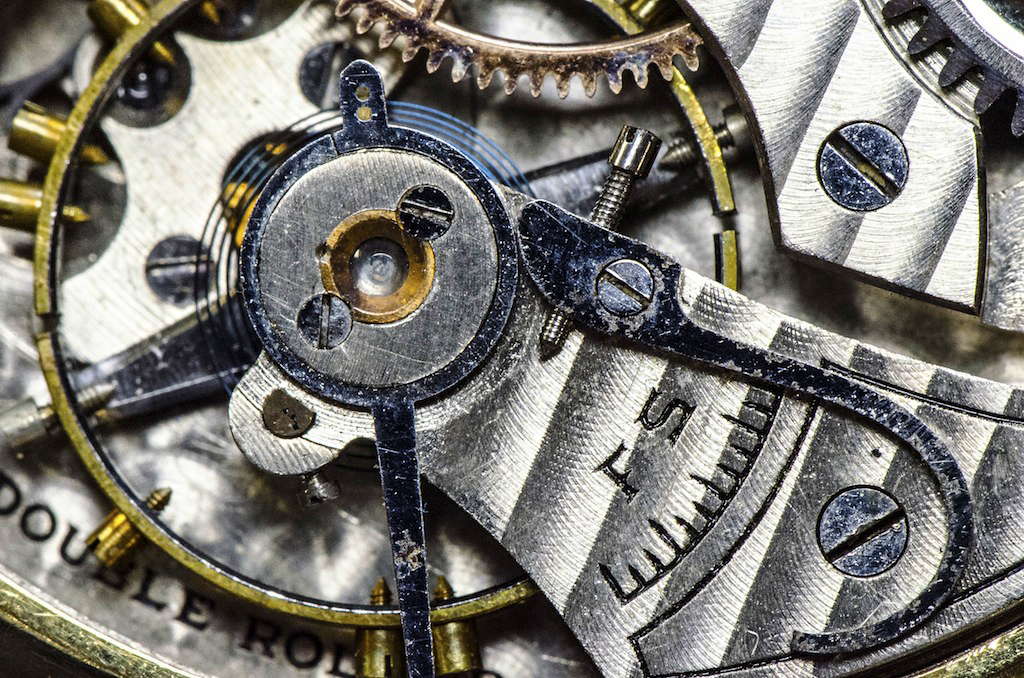
Actually I like it very much - it really does bring out the grittiness and more clearly defines the blacks & whites. Thanks Diana!
|
Sep 22nd |
| 32 |
Sep 18 |
Comment |
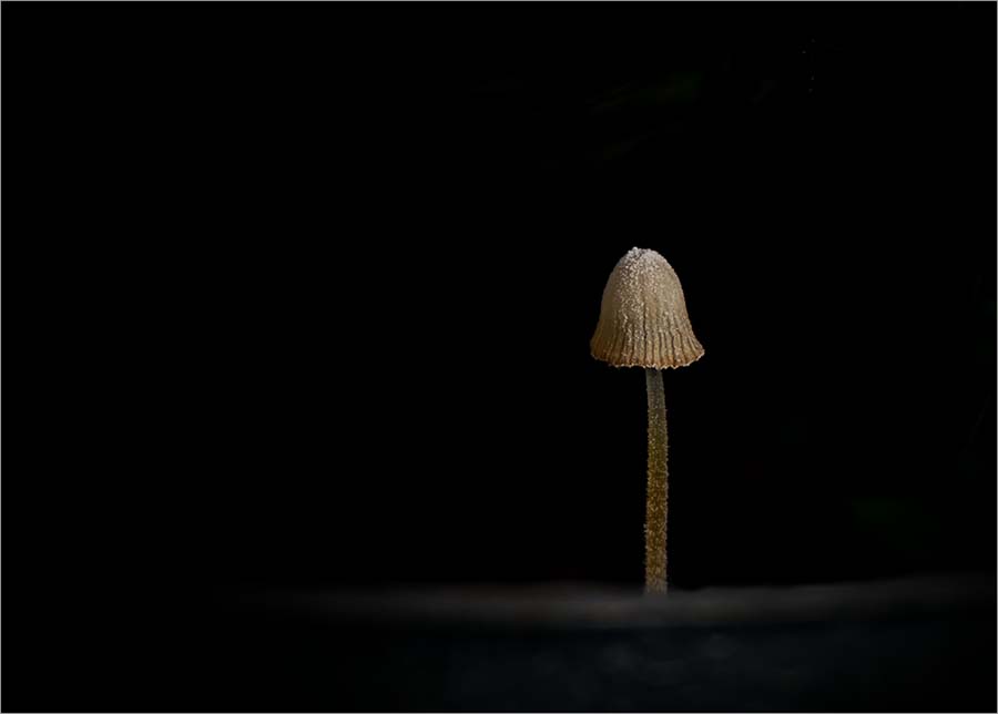
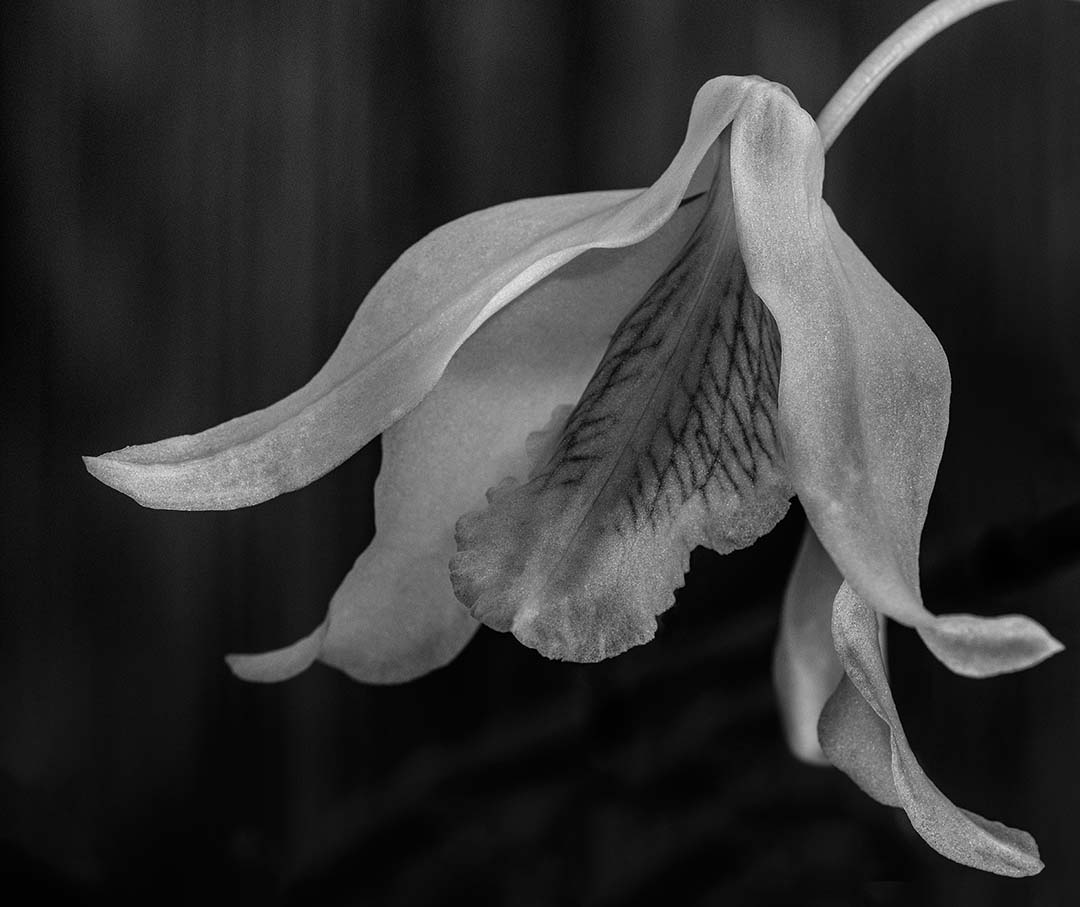
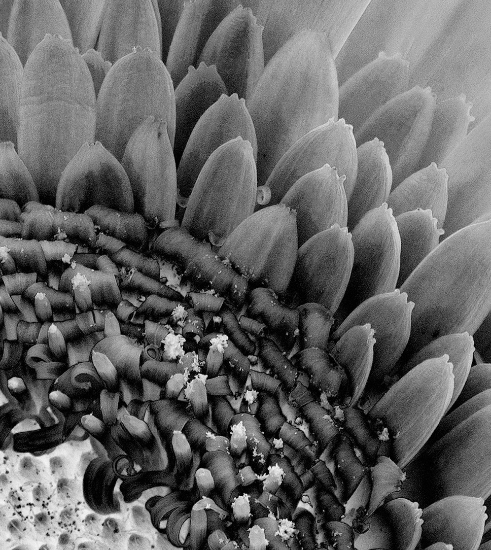
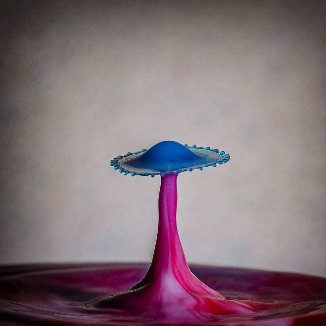
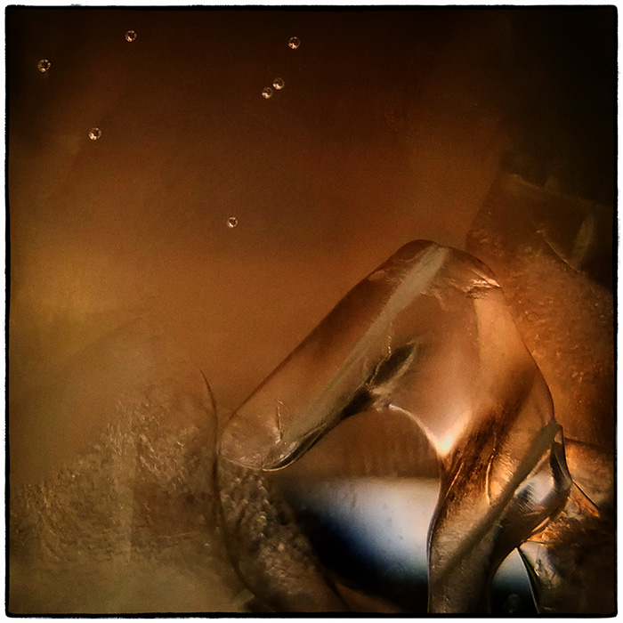
This is very nicely done. I agree with Stephen about the water droplets in the upper right. High structure smooth was a good choice and I think there's enough to maintain interest. |
Sep 19th |
| 32 |
Sep 18 |
Comment |
The image is peaceful and the fog art installation looks like it would interesting to walk through. It's ok that the image is soft - goes with the fog.
For me, fog represents a coolness. I admit it's strange that a cool feel stays with me. I live in Florida where some summer mornings the fog feels like steam. So in this image the short dress and short sleeves she's wearing is an odd combination with the fog. Maybe that's a good thing as it kept me in the image for a while. |
Sep 19th |
| 32 |
Sep 18 |
Comment |
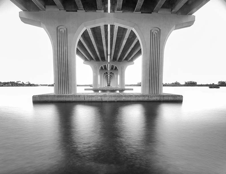
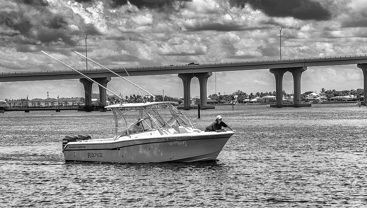
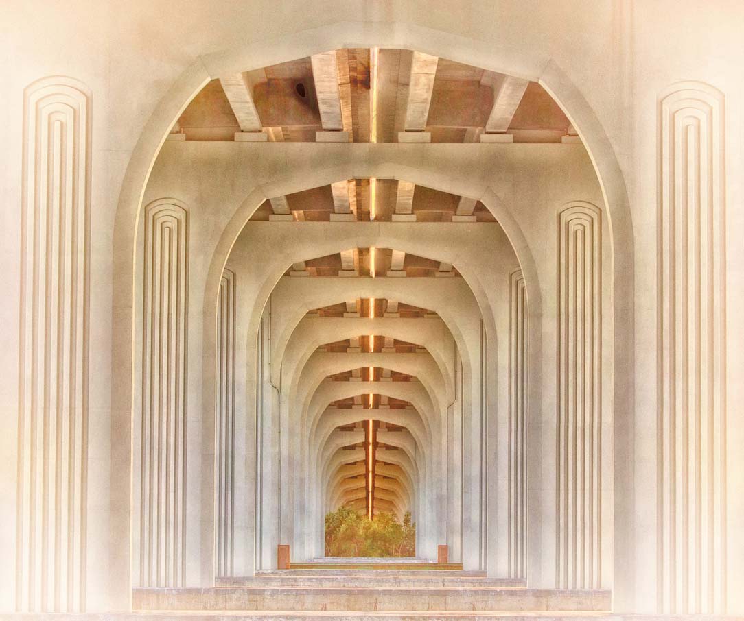
This image is interesting to me even without the description of events from that day. The shadows, leading lines and balance are so well done. There is a softness to the image that works well and counteracts the usual gritty harshness of bridges. And need I say the harshness of the ever present traffic in the DC area. |
Sep 19th |
| 32 |
Sep 18 |
Comment |
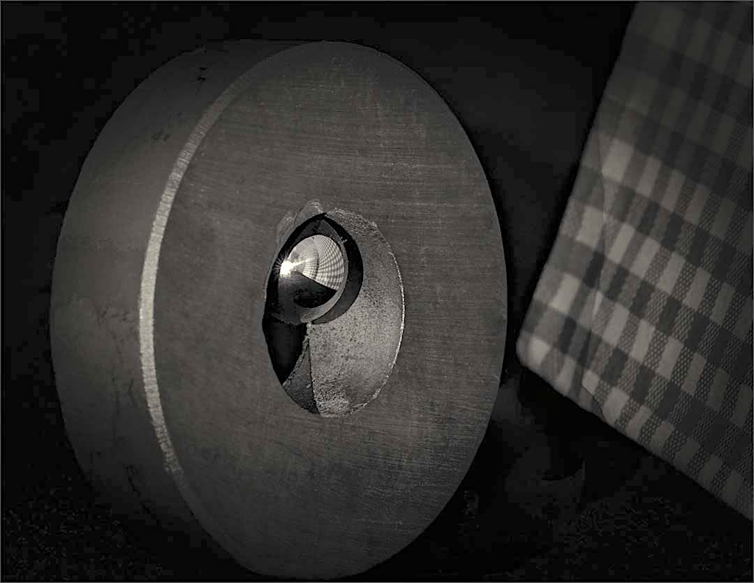
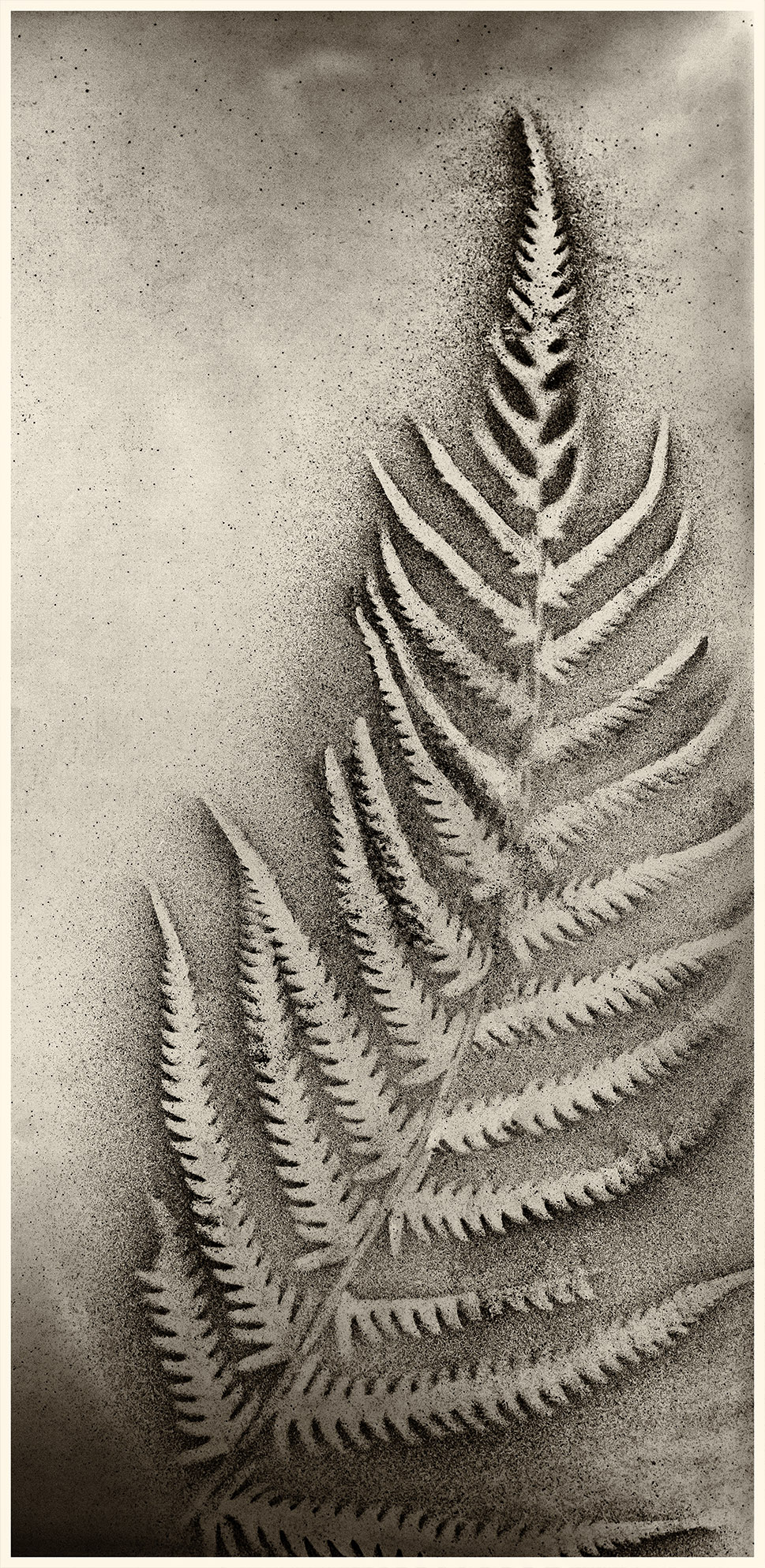
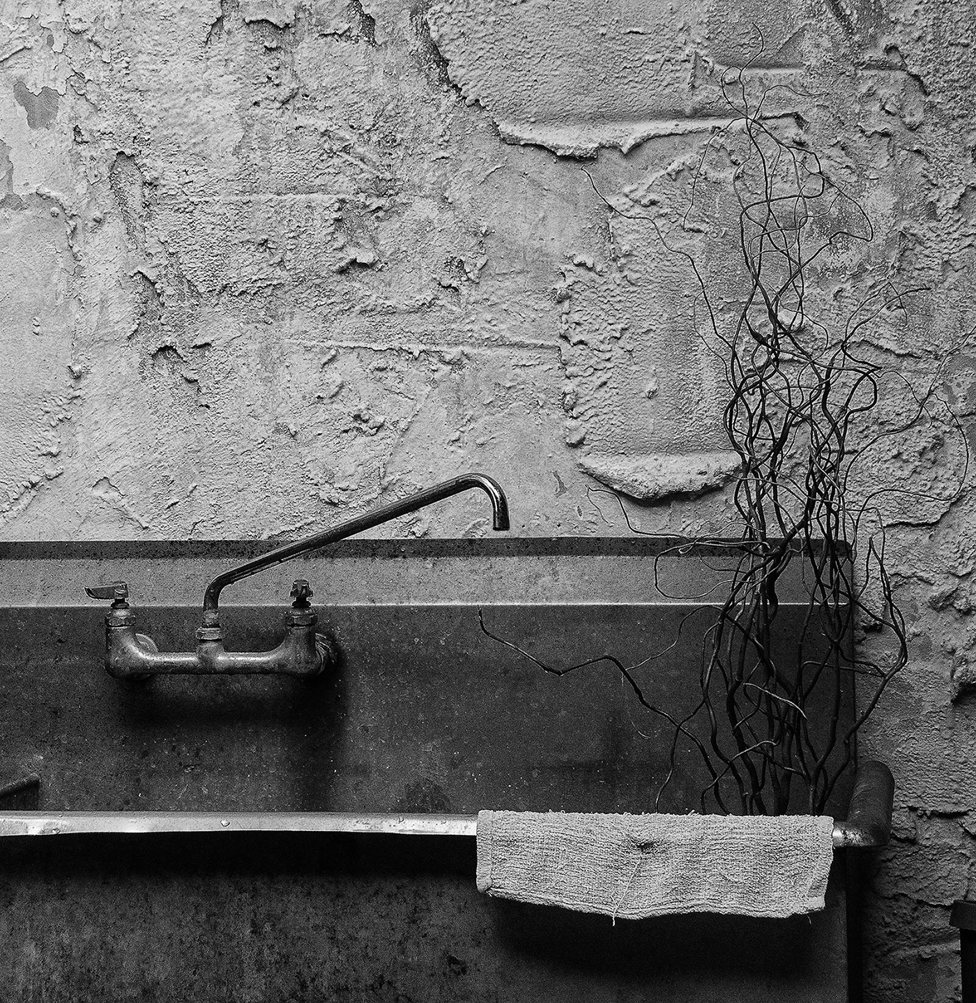
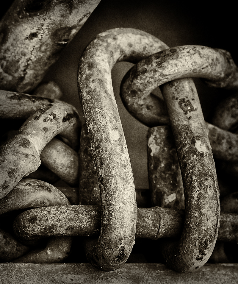
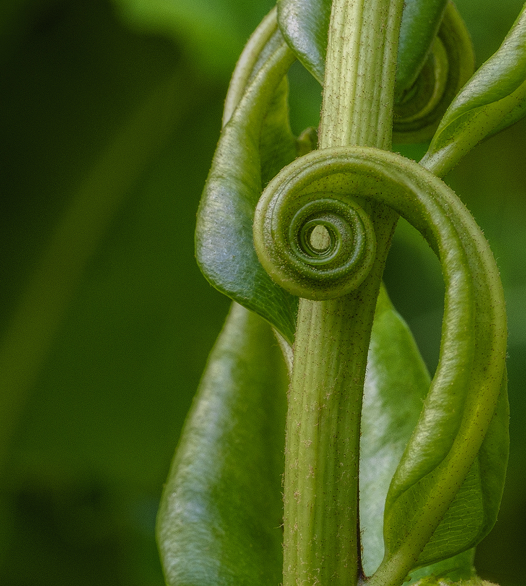
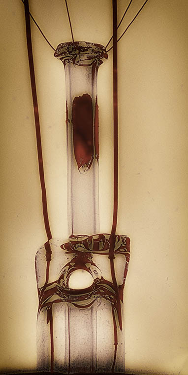
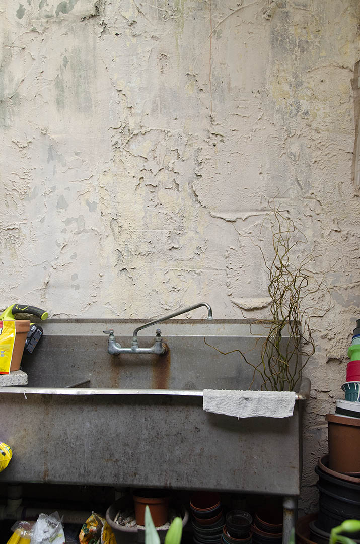
Thanks Stephen. Yes I had to move the end of the spigot up just a bit because it blended into the sink background. The textures pulled me into this image, but it also reminded me of my very first job. I was 15 and worked at a plant store where we sold huge ferns and a variety of other hanging plants. Everyone needed to be watered in the old sink in the back.
And then the memories of doing a lot of cleaning with rags that looked like this. We used old face clothes like this one - my mother never wanted to "waste the paper towels." Sometimes I think it's odd what we remember... |
Sep 19th |
4 comments - 2 replies for Group 32
|
| 65 |
Sep 18 |
Comment |
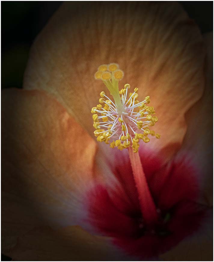
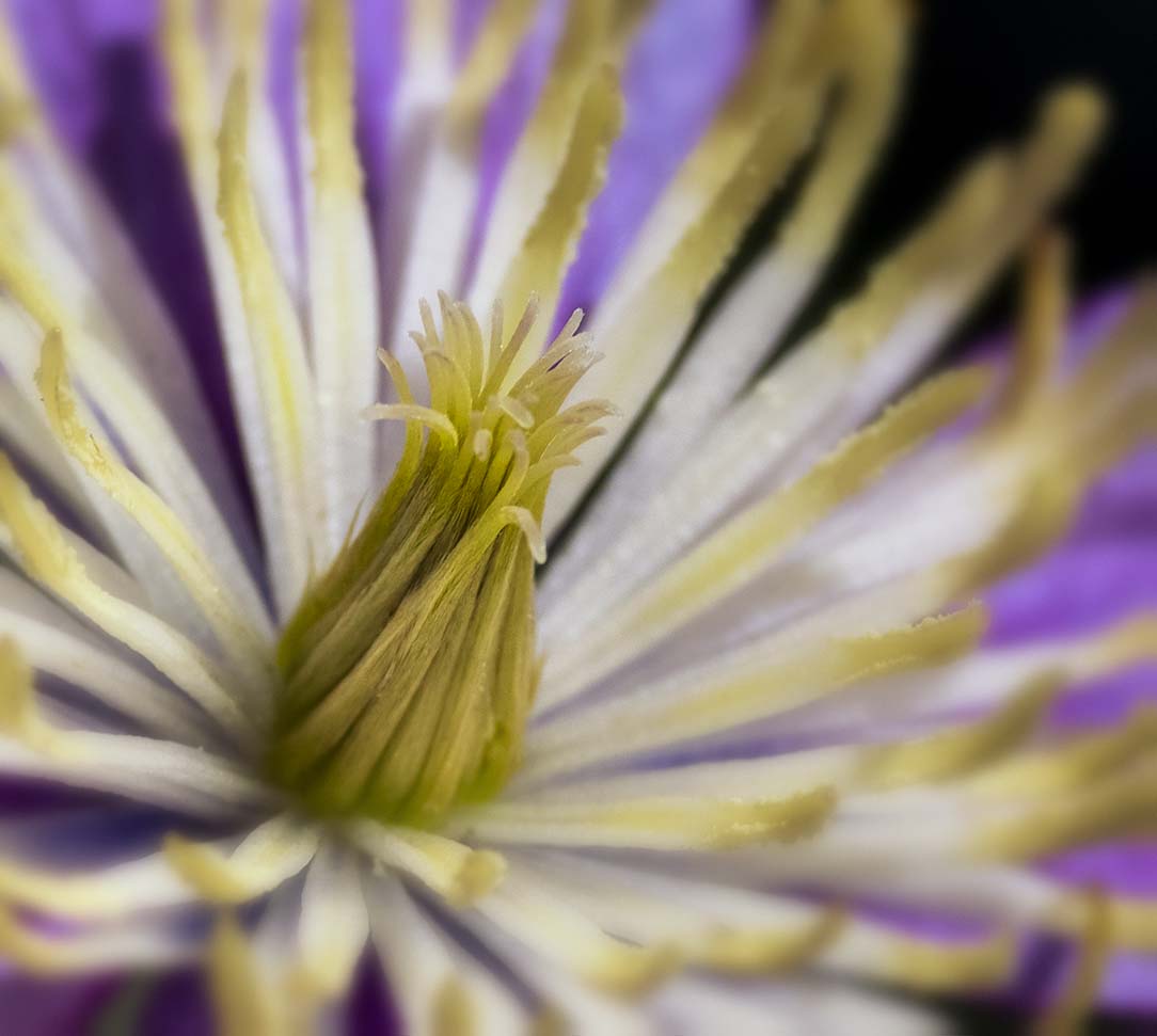
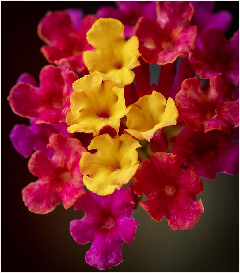
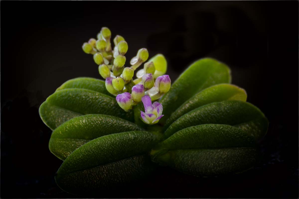
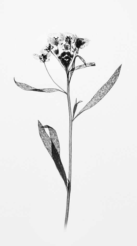
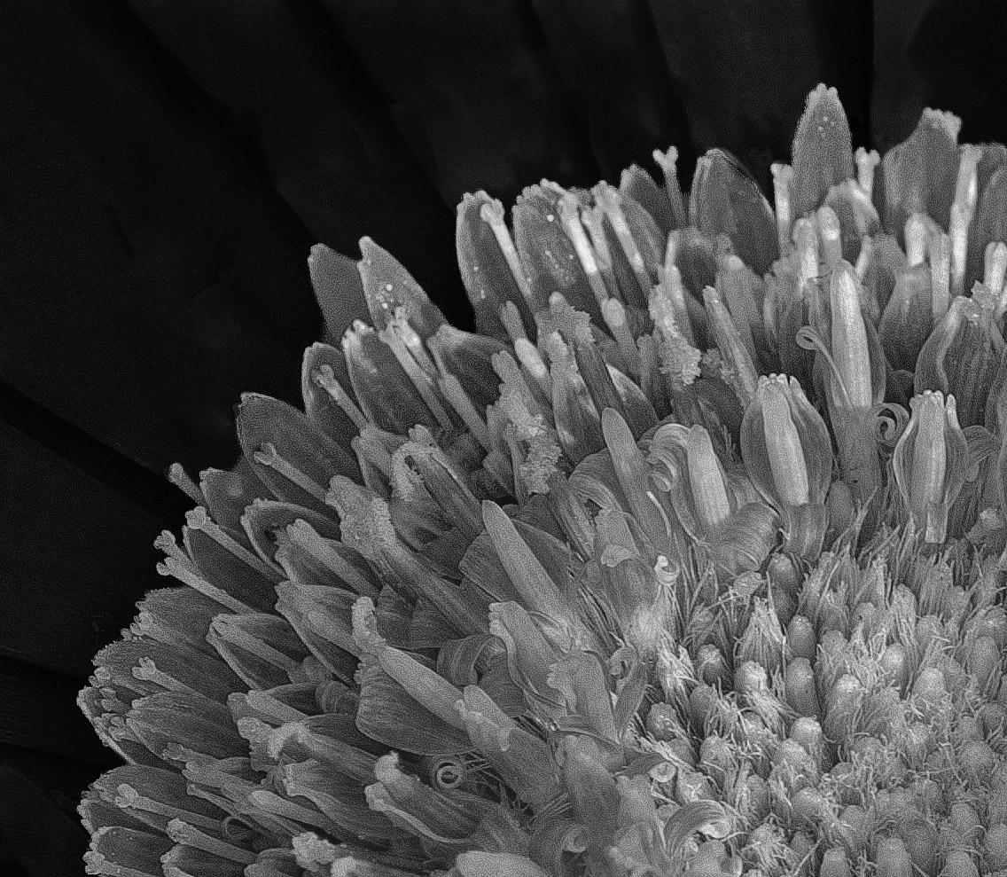
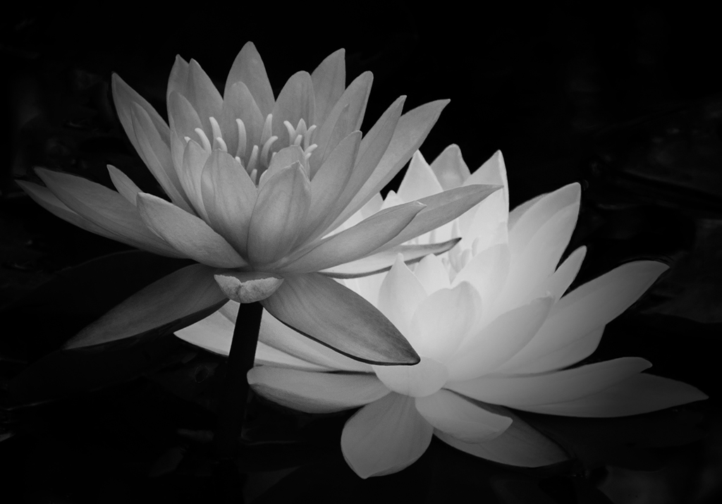
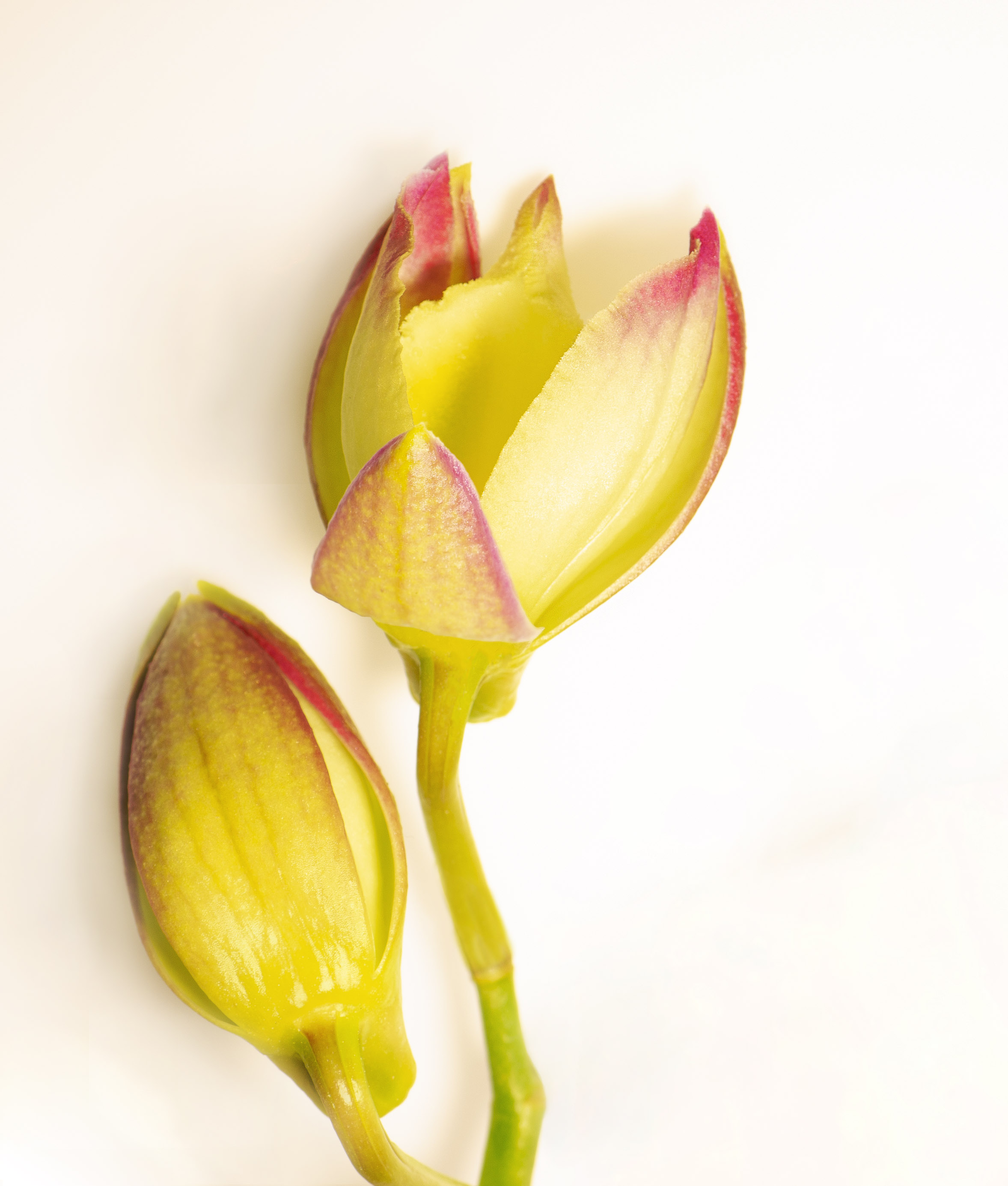
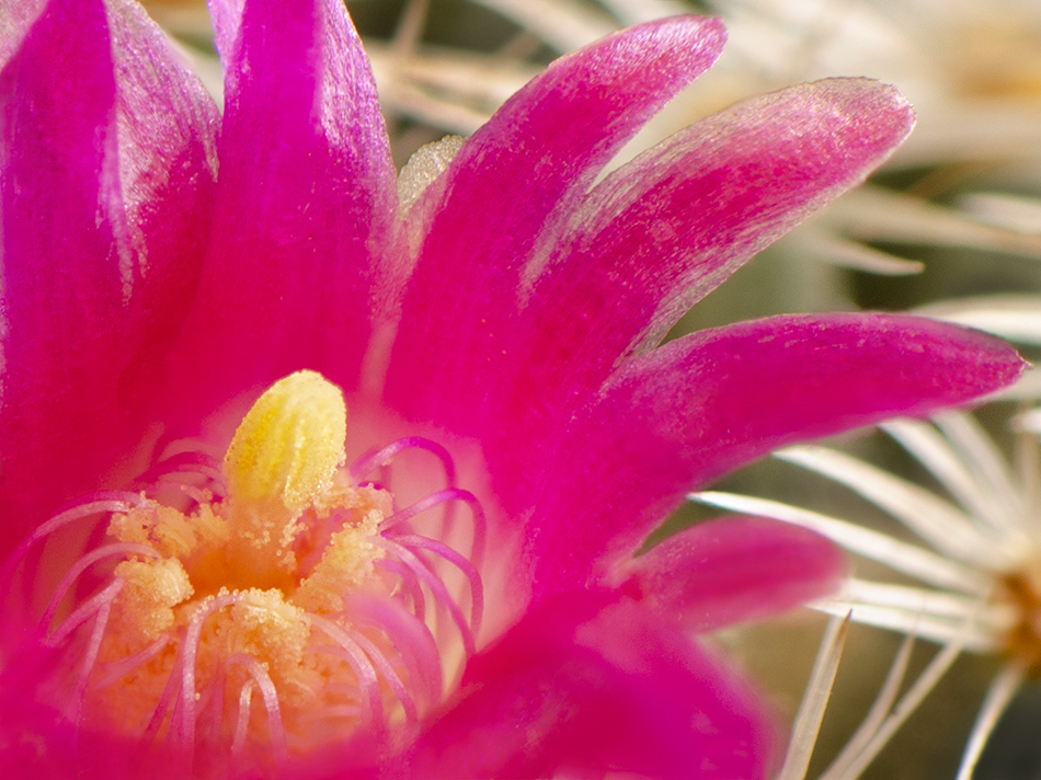
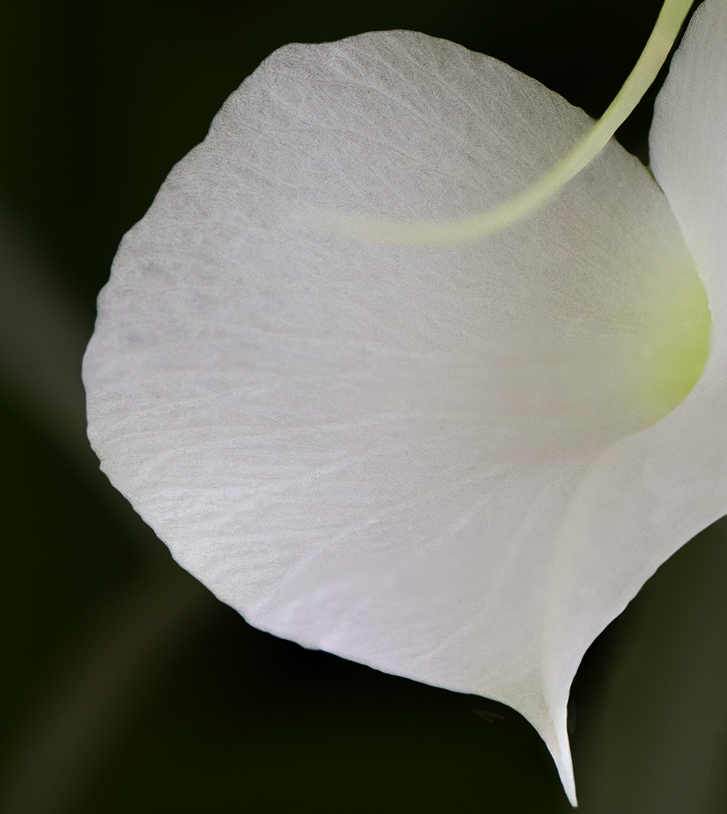
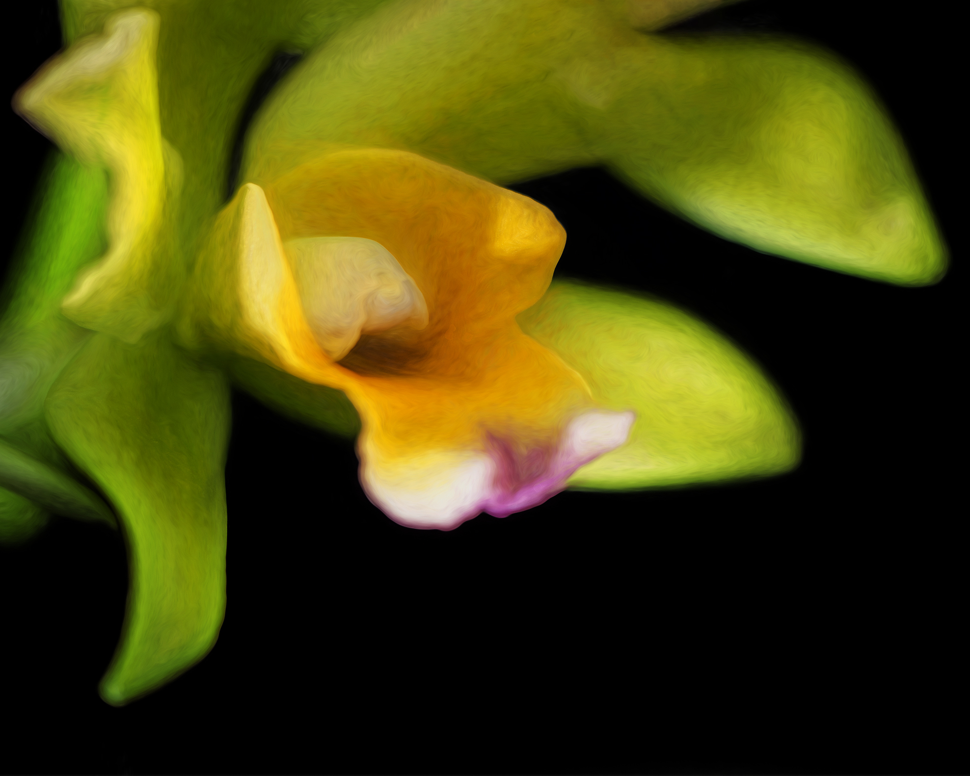
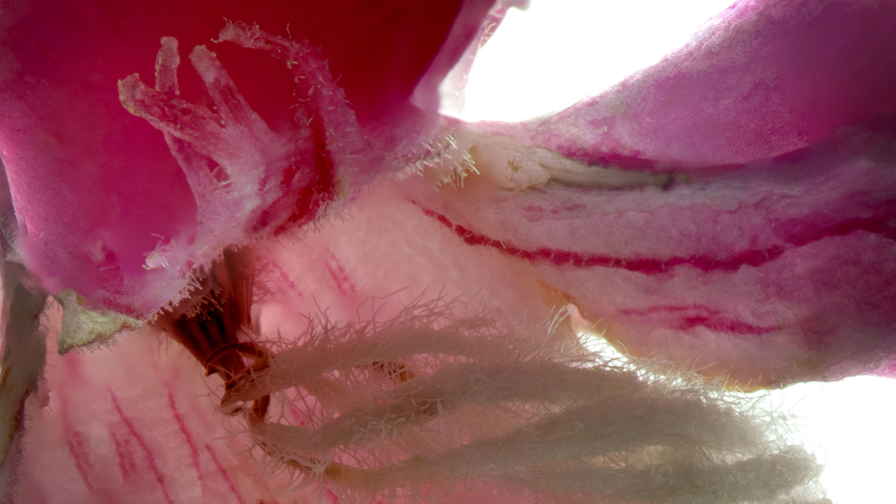
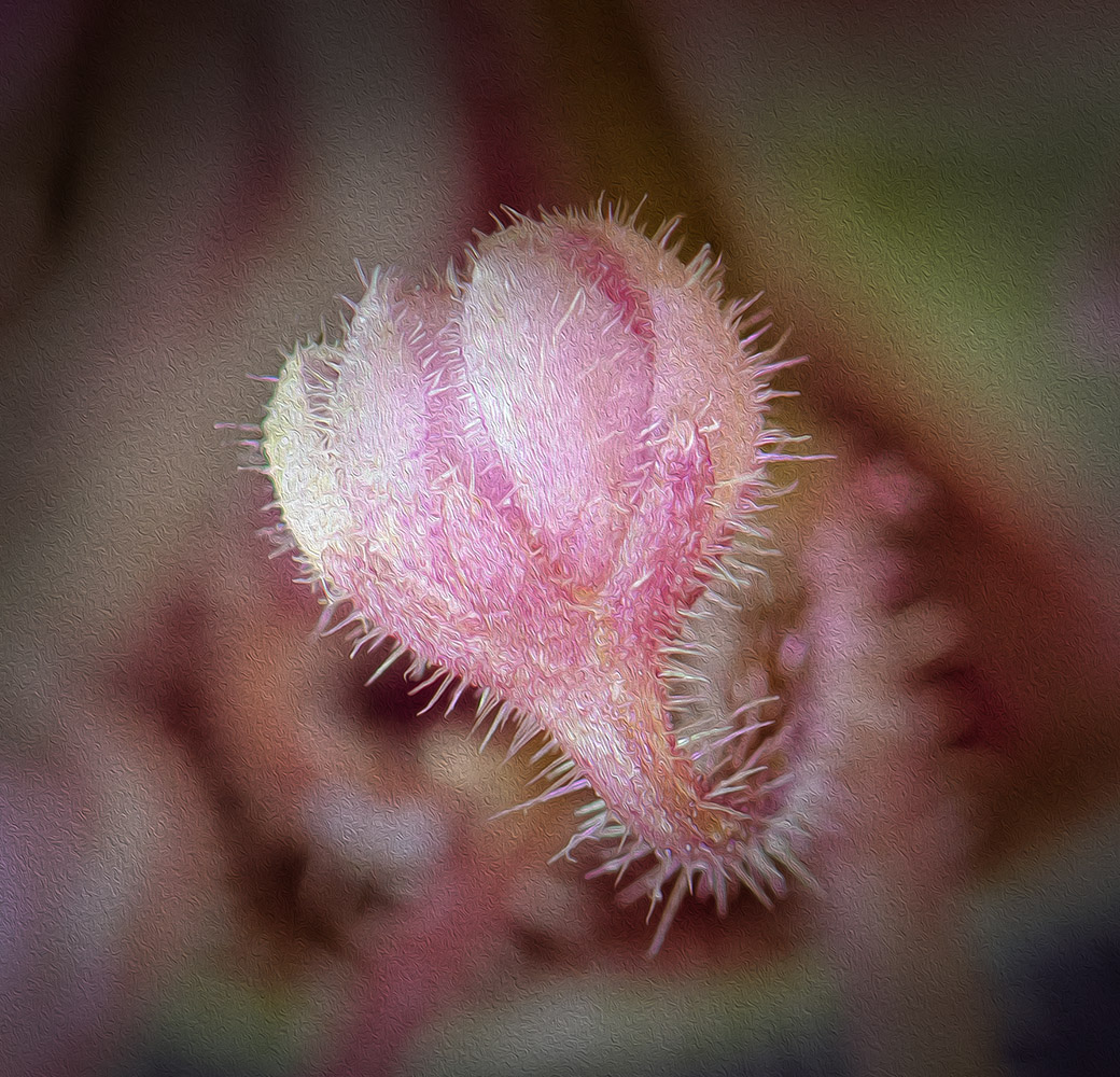
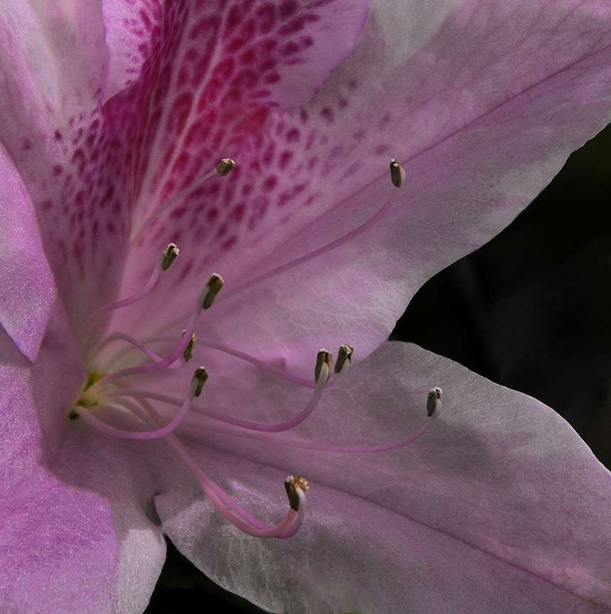
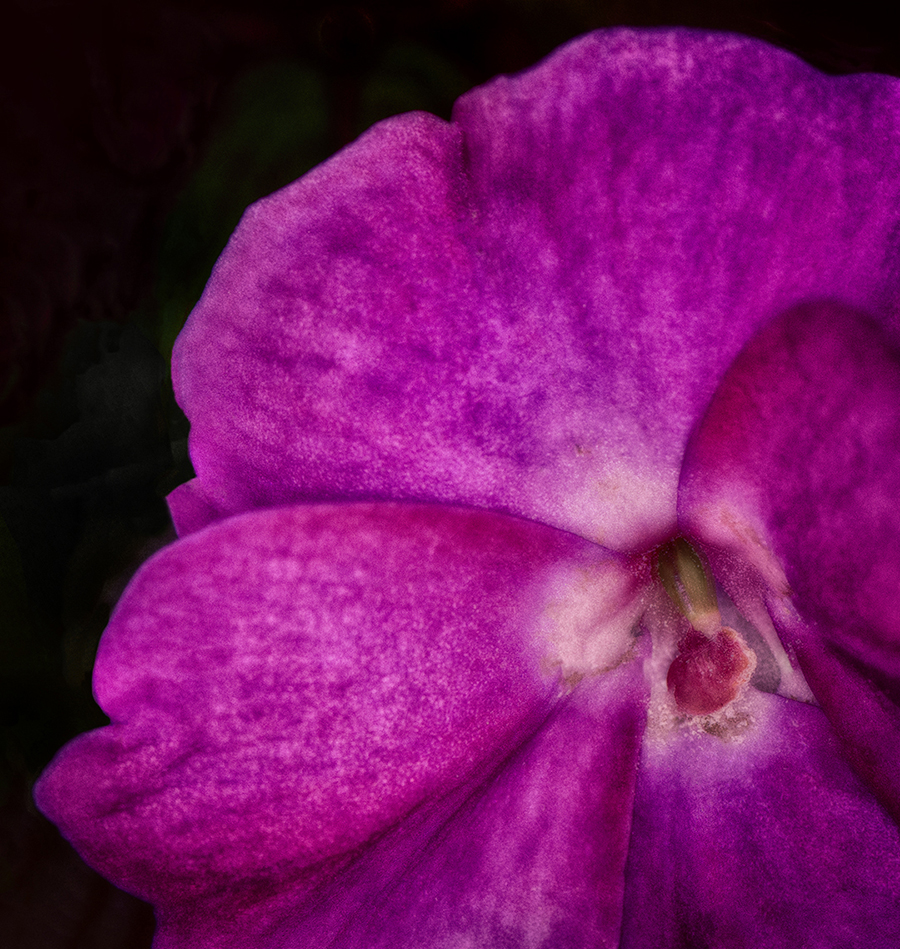
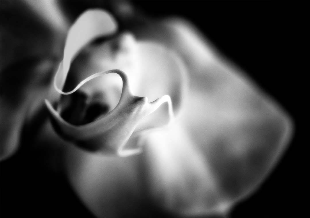
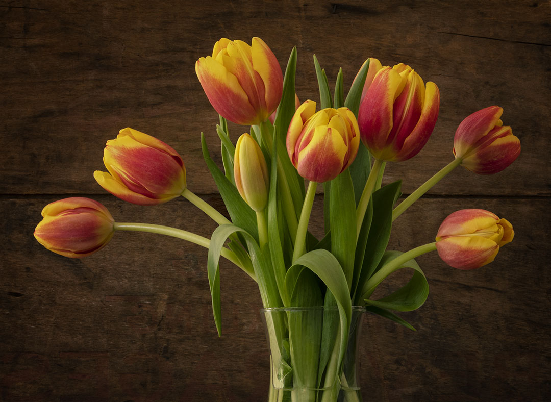
Very nice yellow color in the flower. As I look into the center it seems a bit soft although the outer aspect of the three center petals are in focus. I might have cloned out the white spot on the dark portion of the flower on the far right side.
I have the same lens - the Nikkor Micro 105mm and just can't get the desired result if hand held. So the tripod gets set up (always). I commend you for holding it, especially with a breeze!
As for some of the bright spots on the outer petals, I had a judge tell me that the bright dots are an indication that the light was too harsh. Another judge said the bright spots added sparkle and dimension which they do here. |
Sep 19th |
| 65 |
Sep 18 |
Comment |
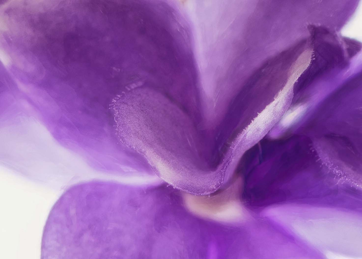
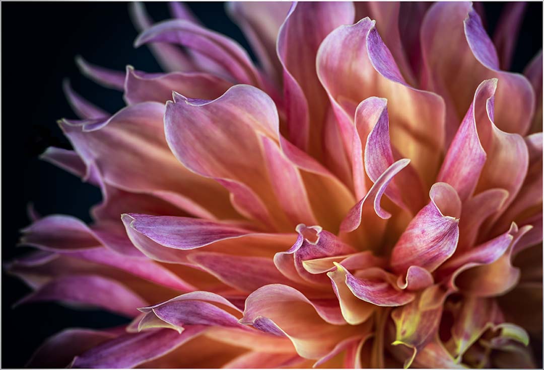
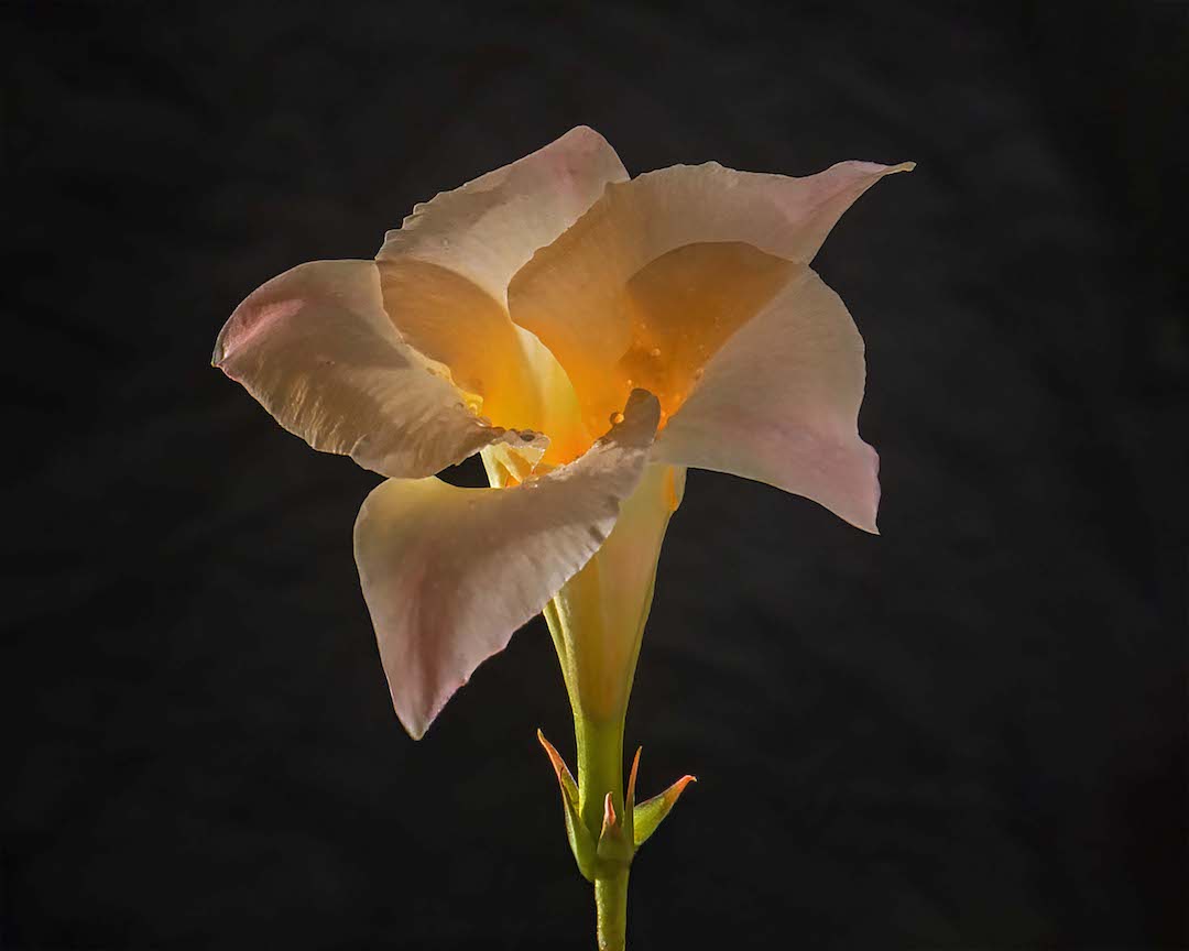
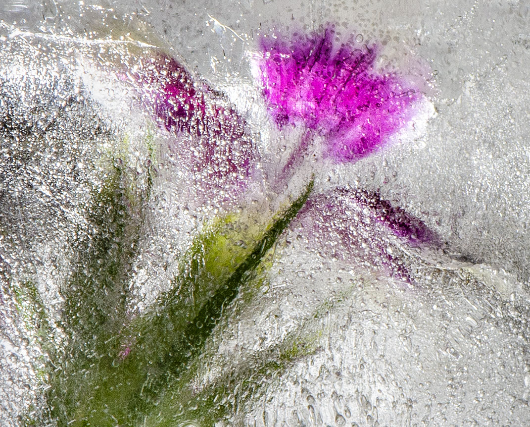
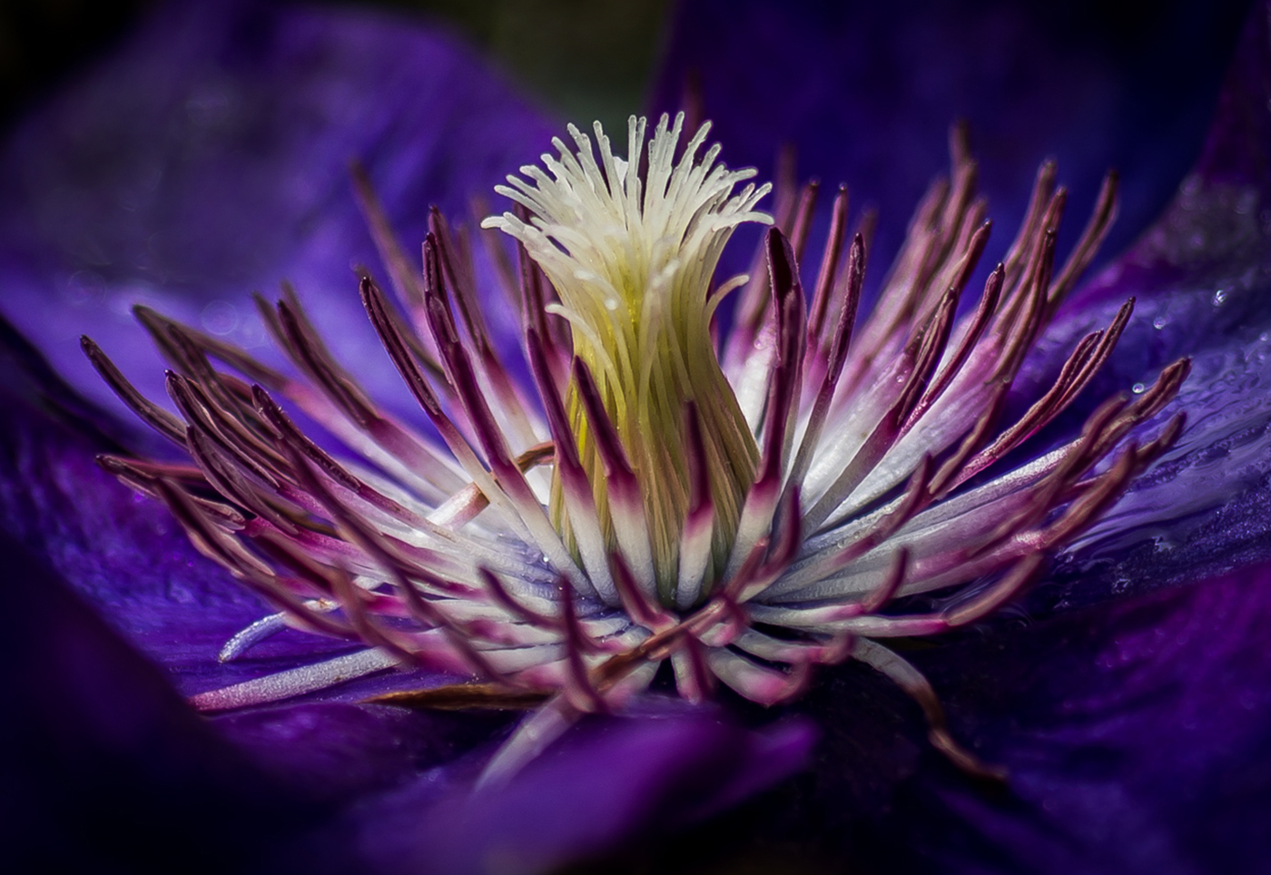
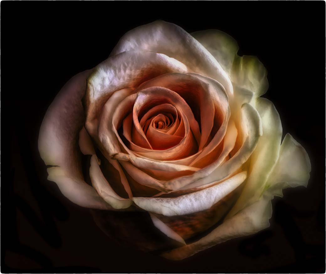
Love the image. Clean and crisp with the perfect background to enhance the flower's color. The texture was a good choice.
How did you manage the subtle shading in PS? If you used the the dodge and burn tools, perhaps you can shed a little light (yes pun intended) on technique. Whenever I use these tools, they cast an odd grey tone. I wind up having to go into NIK in order to do selective adjustments. |
Sep 19th |
| 65 |
Sep 18 |
Comment |
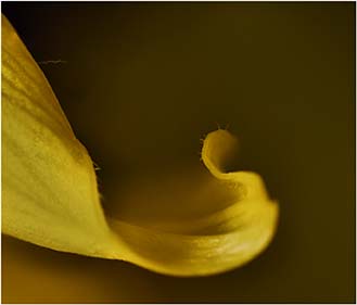
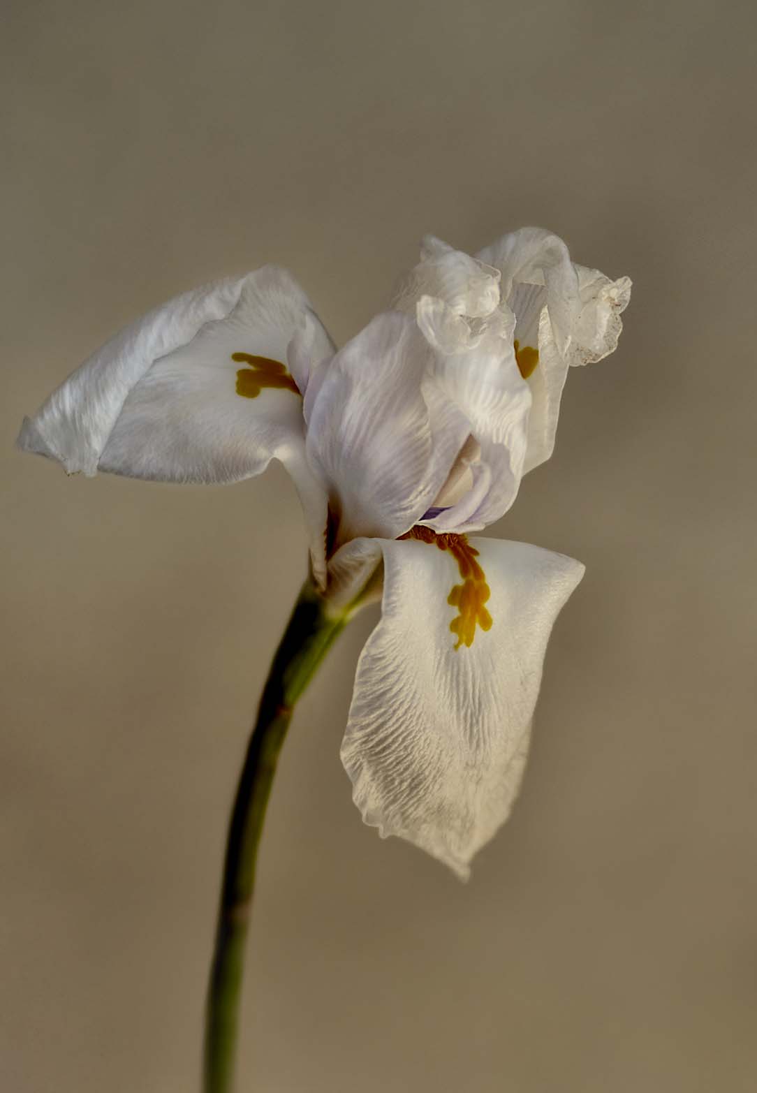
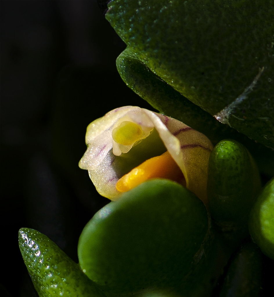
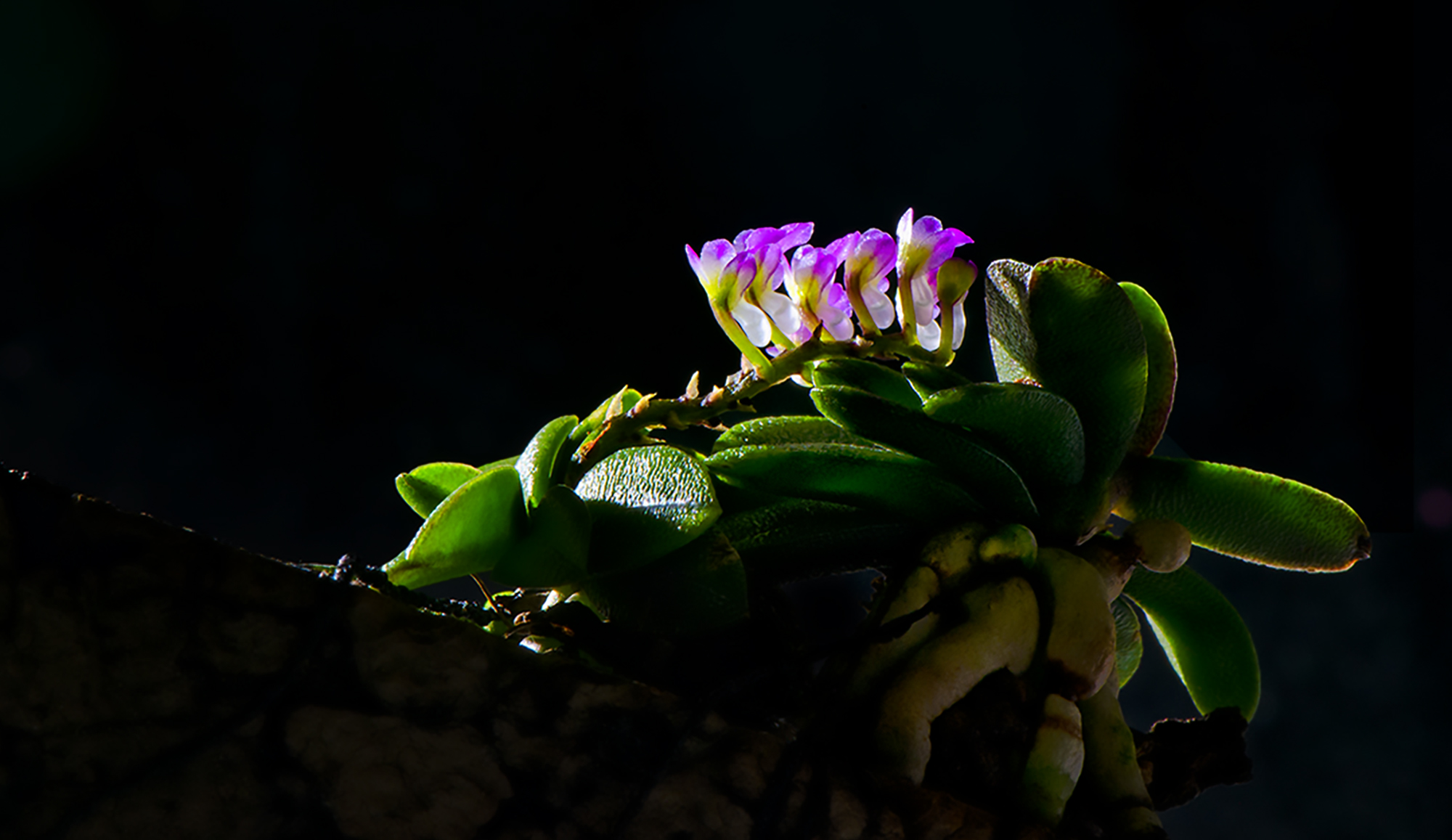
I like your subject matter and composition. I might bring down the background as it seems a bit distracting and maybe bump up the yellow/orange color just a bit. Because Im a fan of vignettes, I probably would add one to keep the eye on the center. That said, I have a distracting background myself this round.
The little ridges on the blossom are nicely defined. Although the focus tapers off as you move away from the center of the blossom, I think it really works. |
Sep 19th |
| 65 |
Sep 18 |
Comment |
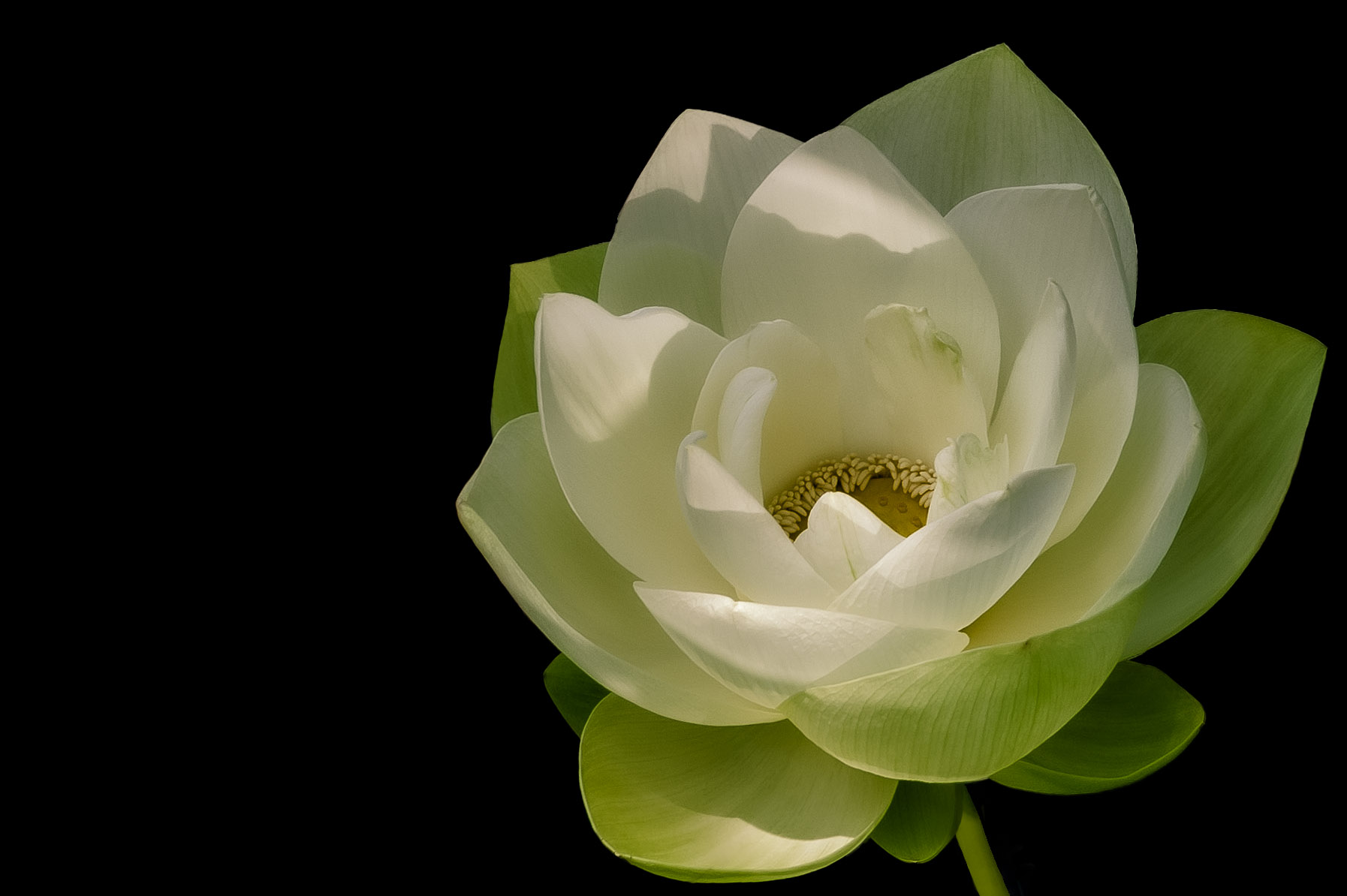
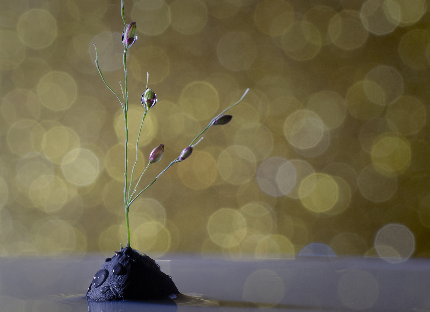
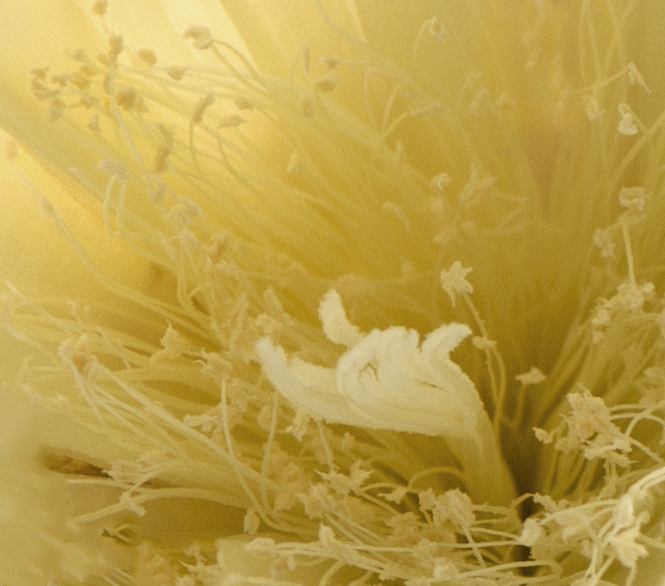
Hi Angela. I too am in group 32 with Stephen and I agree this is a really nice image. You're focus stacking is really well done and the water droplets only add to the image.
The one comment I have is this: If you were to choose to keep the mum in color I would bring down the cyan just a little as there seems to be a "blueness" to the white. Could be my monitor or my eyes so just a thought.
Love your image in group 74! |
Sep 19th |
| 65 |
Sep 18 |
Comment |
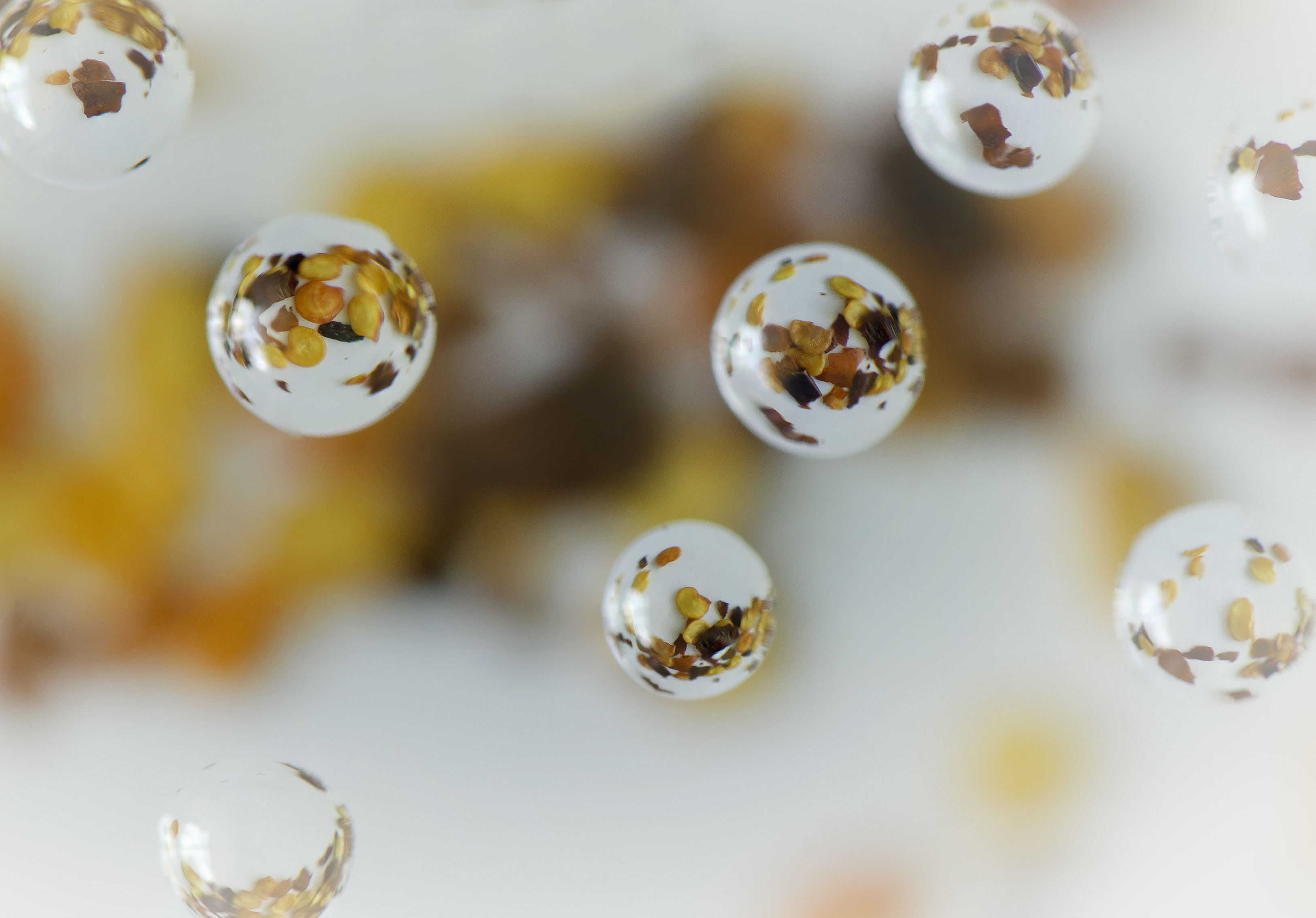
What can I say...a spider like this would never be on the other end of my lens. I just couldn't do it. Clearly you're not squeamish!
Looking at the shadows it seems Mom and her children are suspended in mid-air. How did you get that effect? |
Sep 19th |
5 comments - 0 replies for Group 65
|
9 comments - 2 replies Total
|