|
| Group |
Round |
C/R |
Comment |
Date |
Image |
| 32 |
Apr 18 |
Reply |
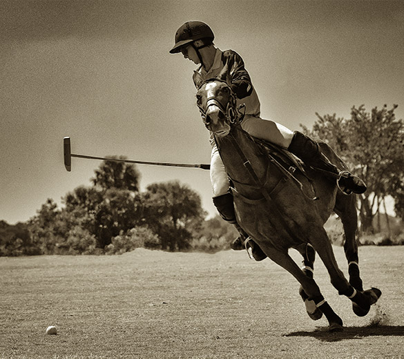
I must have taken 300 to 400 shots and I think there were only 2 or 3 that came out well enough to show. There was a 4th that showed a lot of action between 2 riders; nicely focused, swinging mallets, etc., but the vantage point was...well let's just say it was the wrong end of both the horses and riders. |
Apr 18th |
| 32 |
Apr 18 |
Reply |
I love this image! |
Apr 16th |
| 32 |
Apr 18 |
Reply |
This needs more work, but maybe this was the better choice... |
Apr 14th |
 |
| 32 |
Apr 18 |
Reply |
No no! I don't hate it - it swirls me around in different directions and reminds me of the ads for the movie "Scream". |
Apr 14th |
| 32 |
Apr 18 |
Comment |
To be able to create clean and beautiful images is is amazing in itself. But Carol would then explain her own work as well how to improve all of ours. Not only is that a talent, but demonstrates that Carol was a giving person with a willingness to give to others. |
Apr 13th |
| 32 |
Apr 18 |
Comment |
So I will just say "interesting concept". |
Apr 13th |
| 32 |
Apr 18 |
Comment |
It would be interesting to see the original. The upper left corner is fine and not distracting at all. The image does look dull and I'm thinking the same as Diana - we know Flamingoes are bright pink in color so the grey tones just don't seem right. I took your image and played with it but no matter what I did I just couldn't get it to pop. The eye is sharp and the feathers are rich in texture. |
Apr 13th |
| 32 |
Apr 18 |
Comment |
There's a real power to this image. It's strong and leads you with its' great symmetry. I agree with Diana that increasing the contrast a bit would allow more focus on the people and also help to more clearly define the harbor edge. I also agree that this image with could be a strong contender in competition.
|
Apr 13th |
| 32 |
Apr 18 |
Comment |
The subject matter is great and I knew right away where I was. I have to agree with Stephen regarding taking the image a bit lower. The Butterbeer sign in the center needs to be higher so you can see the entire word. Love the sky. A side question - did you taste the butterbeer? I never had the nerve to try. |
Apr 13th |
5 comments - 4 replies for Group 32
|
| 65 |
Apr 18 |
Reply |
Thanks Mary. Actually the white spot in the lower corner is from my rotating the image so the eye would be at a better angle. I should have tried Charles's technique to fill in the spot. |
Apr 21st |
| 65 |
Apr 18 |
Comment |
The wings on this this bee (?) are beautifully transparent. They look like stained glass - great job on the wings! I'm not sure that the green buds on the left side work very well. I'm thinking they may be too heavy for the light wing texture and the white flower. Perhaps darkening the flower's white petals and blur or remove the green buds on the left would add a lightness. I think your success of the wings justify some additional adjustments. |
Apr 16th |
| 65 |
Apr 18 |
Reply |
This is great and as I said to Mary I think the additional space really does add impact. |
Apr 13th |
| 65 |
Apr 18 |
Comment |
Mary this is a great shot! A garage series give so many options of rusty tools and images that can be created. At least in our humid garage anyway. Your choices of different textures, colors, shapes and sizes really add interest - there's just so much to look at and each piece is interesting. Charles did a great job of adding additional space and I think it adds to the composition. |
Apr 13th |
| 65 |
Apr 18 |
Comment |
Did you do any post processing on this image? I like images of old rusty hardware. The yellow tones seem strong so I might think about increasing the red tones just a bit |
Apr 13th |
3 comments - 2 replies for Group 65
|
8 comments - 6 replies Total
|