|
| Group |
Round |
C/R |
Comment |
Date |
Image |
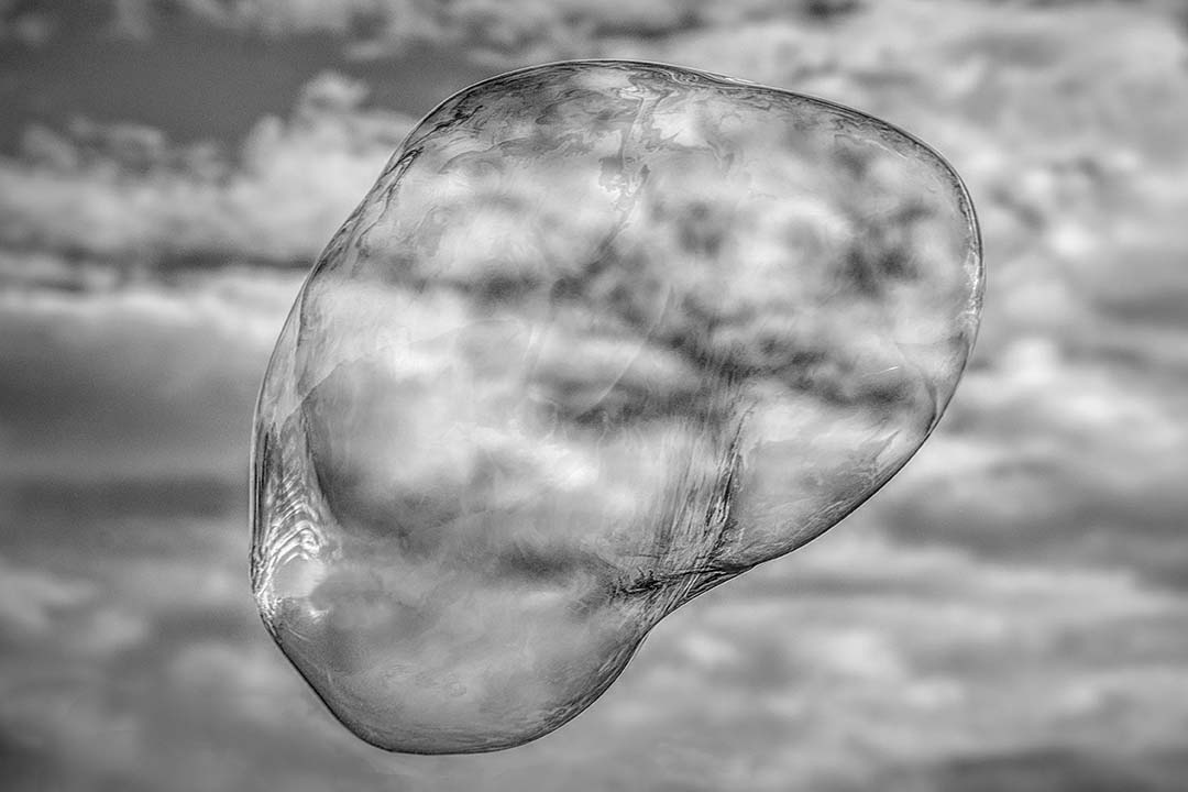
| 32 |
Dec 17 |
Comment |
The final result is great. I don't mind the snowflakes are big and spiky - it's obviously a creative image that induces smiling and still makes me a bit cold. The monochrome is definitely better here and how you created the image is always helpful and appreciated. |
Dec 27th |
| 32 |
Dec 17 |
Comment |
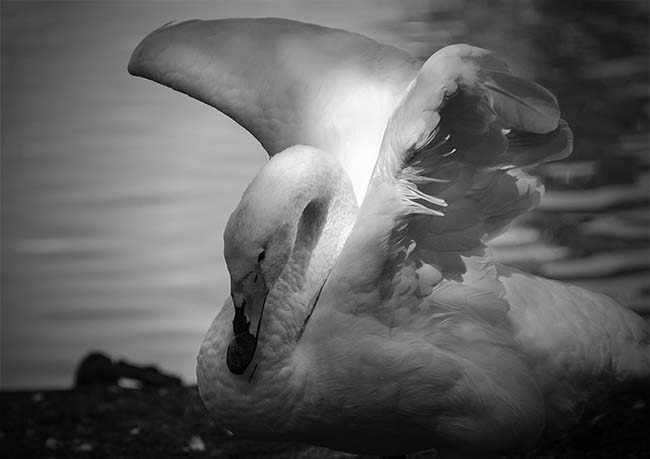
The detail in the bird is great. I agree with the comments above that a darker background help the bird stand out and provide more depth. Nice job being hand held. That's a skill I've yet to master. As for the rules of multiple entries of the same image, I would need some direction as well. |
Dec 27th |
| 32 |
Dec 17 |
Comment |
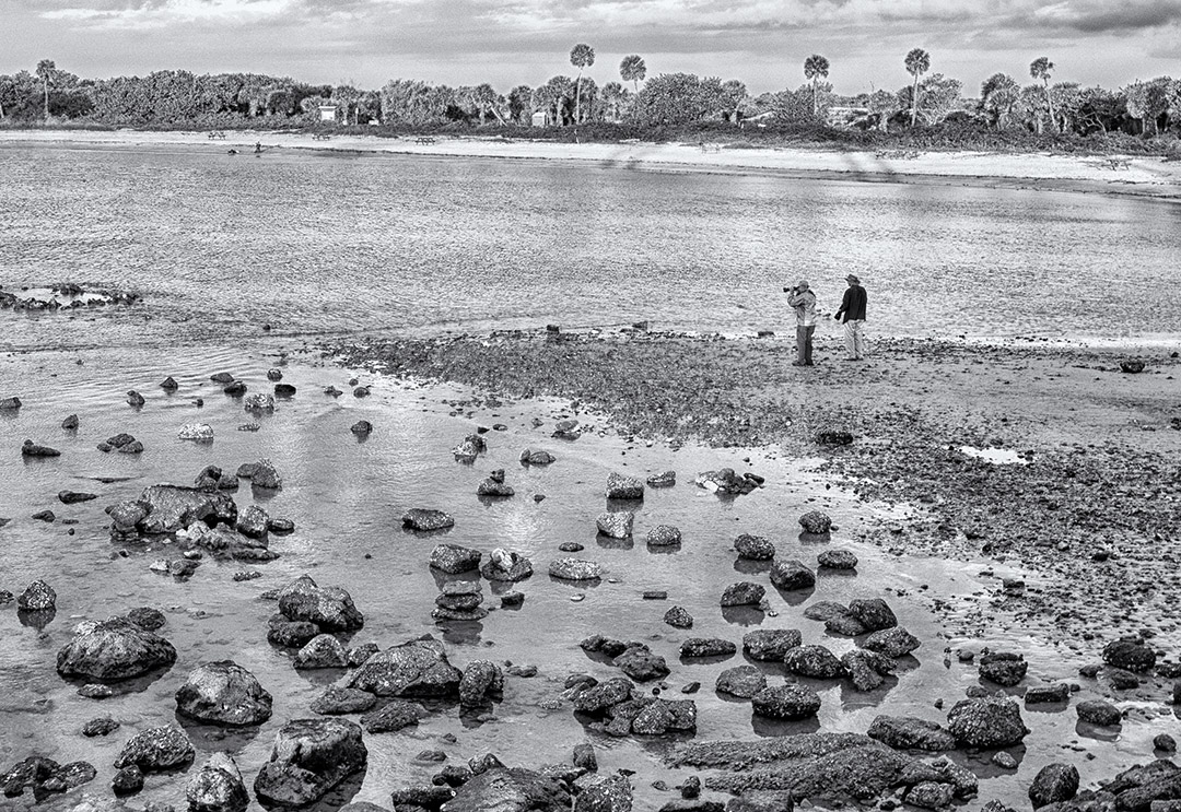
This image is interesting not only in the action that's portrayed, but how the men are at ease bathing at the river as a routine activity. Carol said it well - sometimes we need to appreciate how easy our life is in the USA. Although my grandmother had running water (they lived in a city) she still washed clothes using boiled water, lye soap and a washboard. I have the washboard now and hold it up when my family complains about doing their laundry. Good image. |
Dec 27th |
| 32 |
Dec 17 |
Comment |
A wonderful image and the way you've adjusted the leaning of the verticals is so well done. Great image. |
Dec 27th |
| 32 |
Dec 17 |
Comment |
This is my type of image. Many years ago we visited the Strasburg Railway Museum and I remember those outdoor trains. I too would have probably cropped the image, but not quite as severely on the left as Jennifer has. I'm thinking square in shape. As for monochrome vs. color, monochrome is much more expressive here, and contributes to the mood of times gone by. |
Dec 27th |
| 32 |
Dec 17 |
Comment |
Hello Michael, and welcome. Although I haven't been in this group very long, I believe you'll find it quite helpful. As mentioned prior, lightening the man's eyes may decrease the distraction of the steering wheel. The pure pleasure showing on his face is a great capture and I can see why you were drawn to it. |
Dec 27th |
| 32 |
Dec 17 |
Comment |
Thanks Carol. I'll do what you suggest. Your input gets my images to where I envision them. |
Dec 11th |
| 32 |
Dec 17 |
Reply |
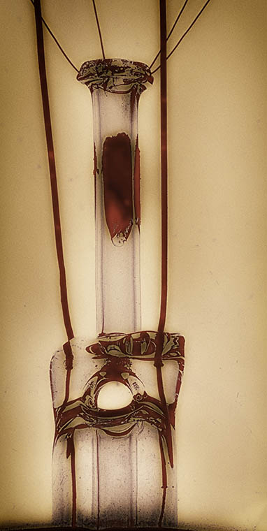
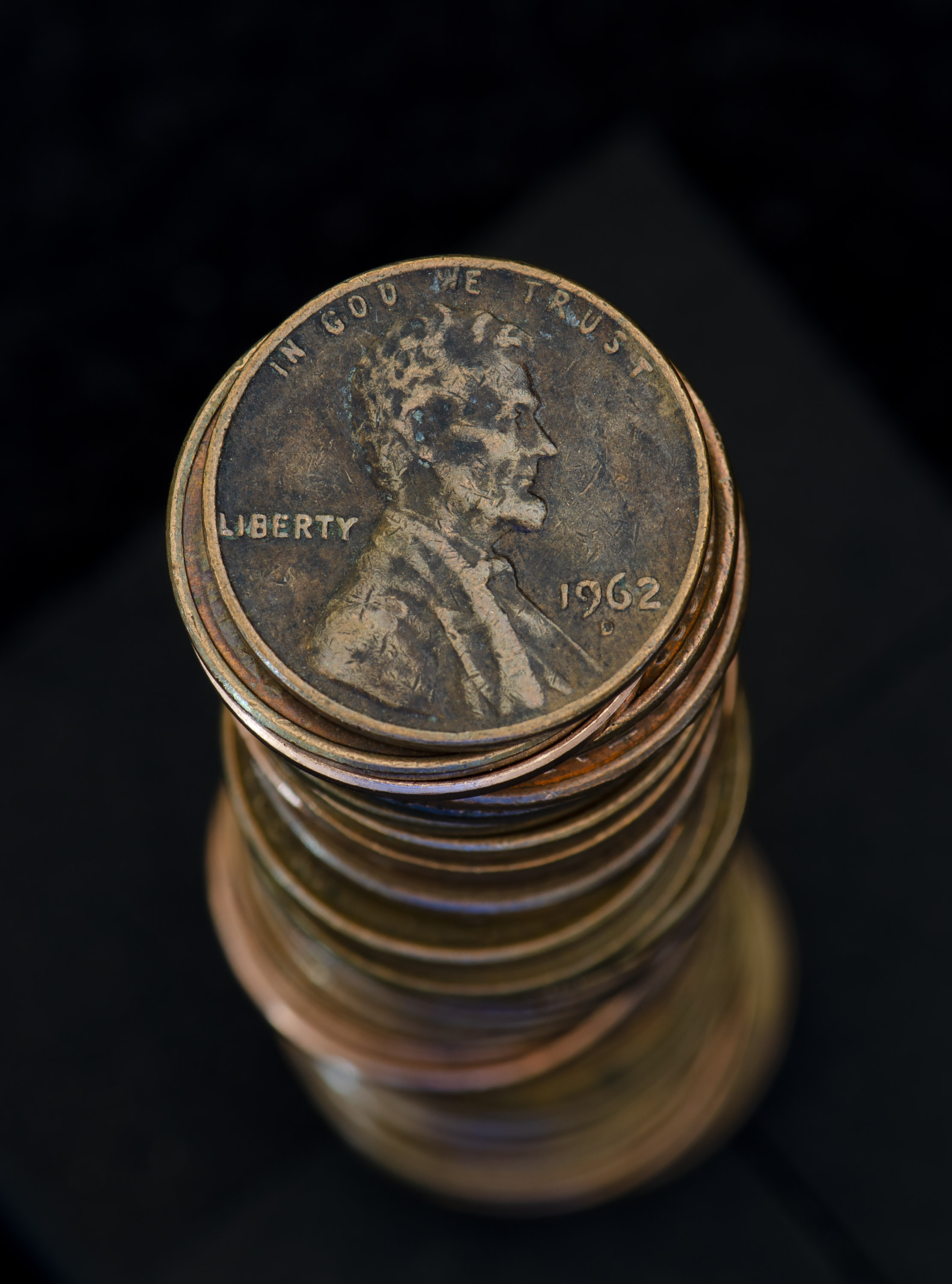
Here is the original after converted to monochrome. |
Dec 6th |
 |
7 comments - 1 reply for Group 32
|
| 65 |
Dec 17 |
Reply |
Love the border...thanks for the instruction on how to do this. |
Dec 27th |
| 65 |
Dec 17 |
Comment |
Hi Mary - love the cars. I always played with matchbox cars when I was young. Had a little town and garage, and had a great time. The background being darker would help the yellow cars stand out. the windshields being scratched isn't bothersome to me, probably because it reminds me of my own little cars. Yes. I still have them. |
Dec 27th |
| 65 |
Dec 17 |
Comment |
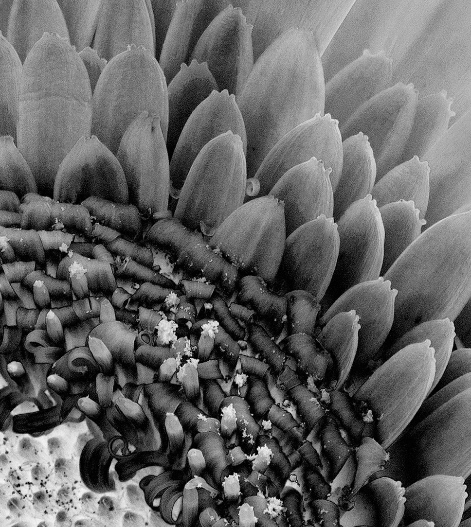
Nice shot of the bee even though macro shots of insects makes my hair stand on end. If you would like to keep the current crop, I would probably darken the bright green and perhaps added a subtle vignette. Because the left bottom corner is blurred adding the vignette would help pull the eye back to center. |
Dec 27th |
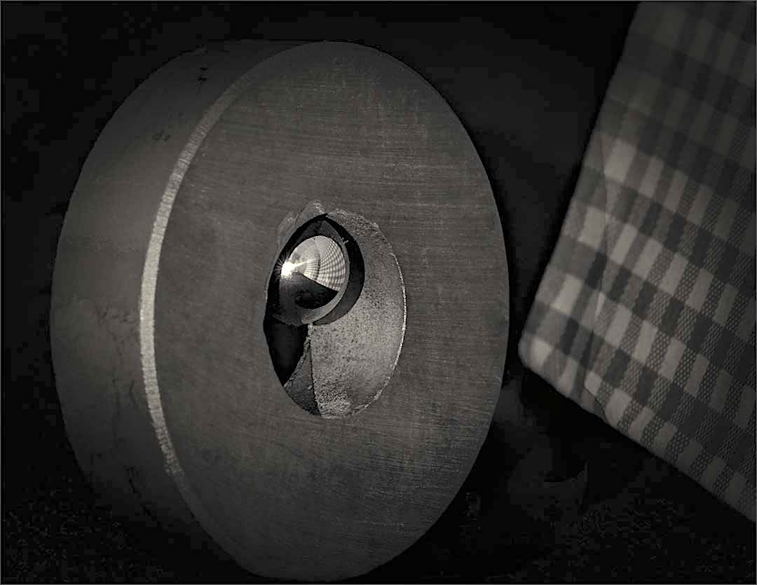
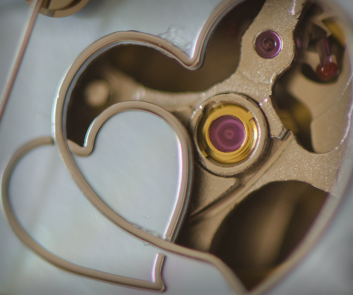
| 65 |
Dec 17 |
Comment |
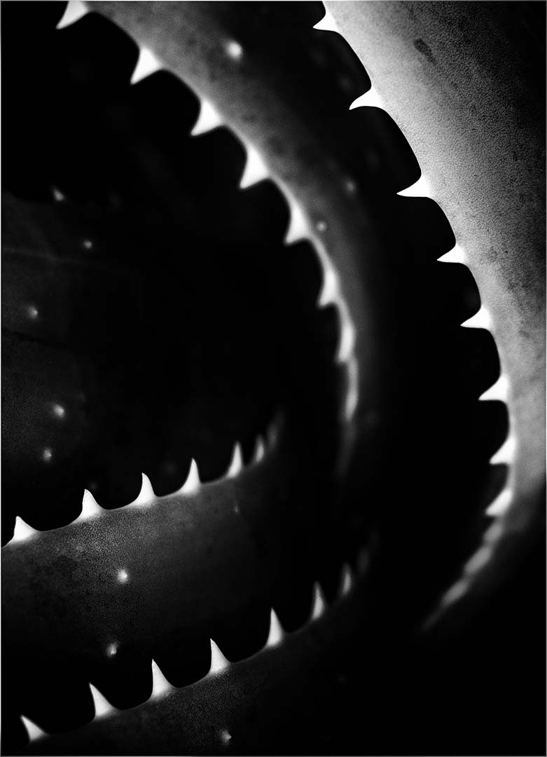
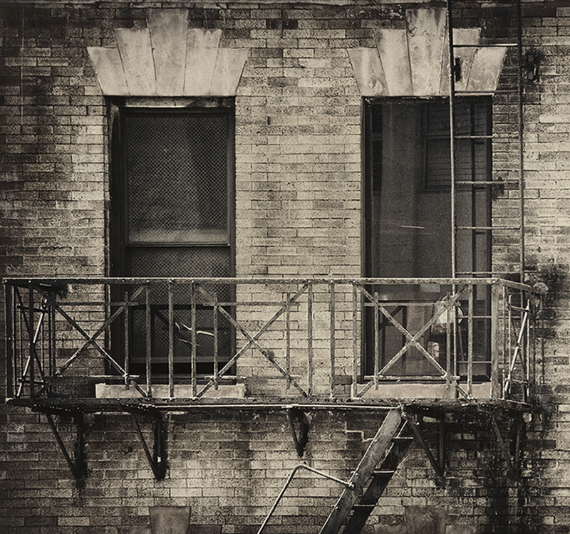
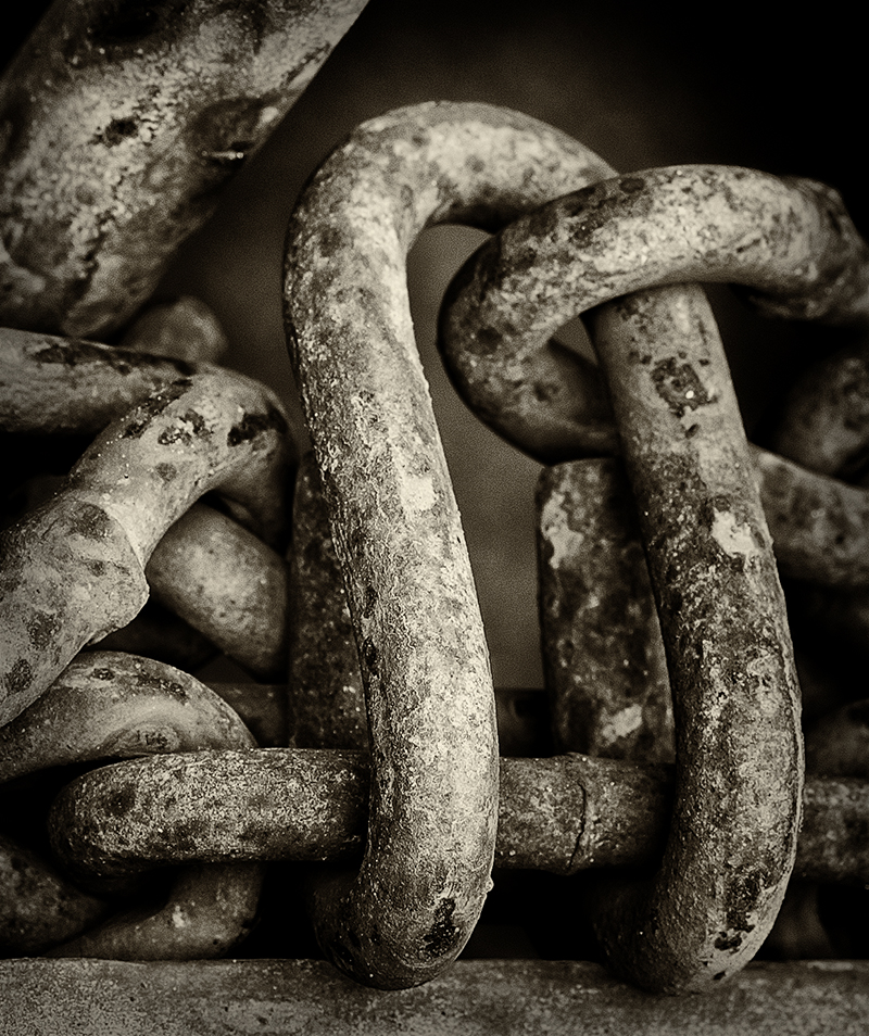
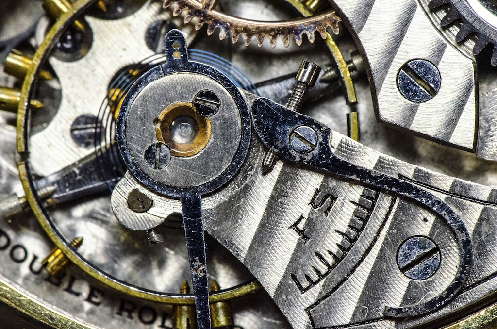
I like this image Janos. The lock shows great texture and I agree with Charles that the composition is pleasing. I'm wondering if a very thin white border would be appropriate here. I've had several judges over the years tell me that when one has an image with an all black background, a boarder should be incorporated. This will prevent "eye confusion" (yes they actually said eye confusion) which causes the viewer to fall out of the image.
Just something to think about. |
Dec 26th |
| 65 |
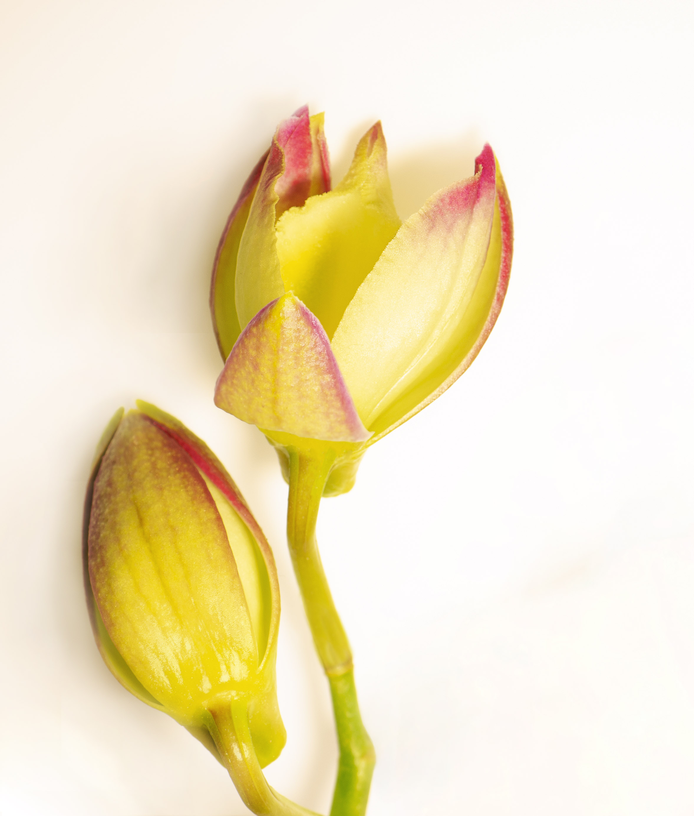
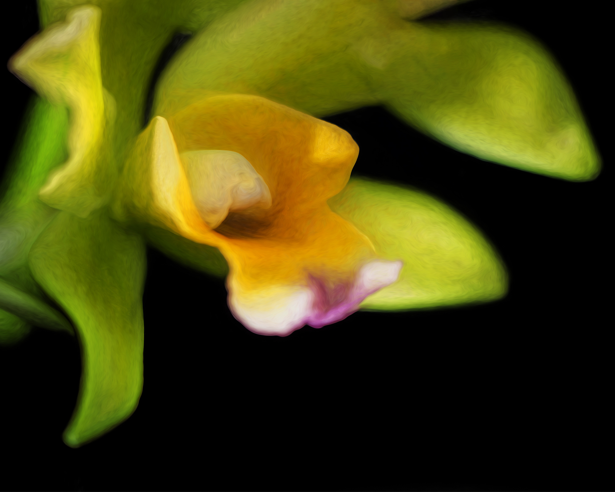
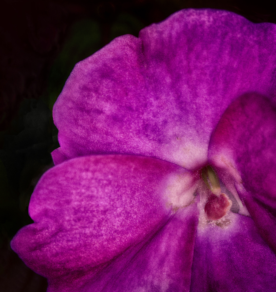
Dec 17 |
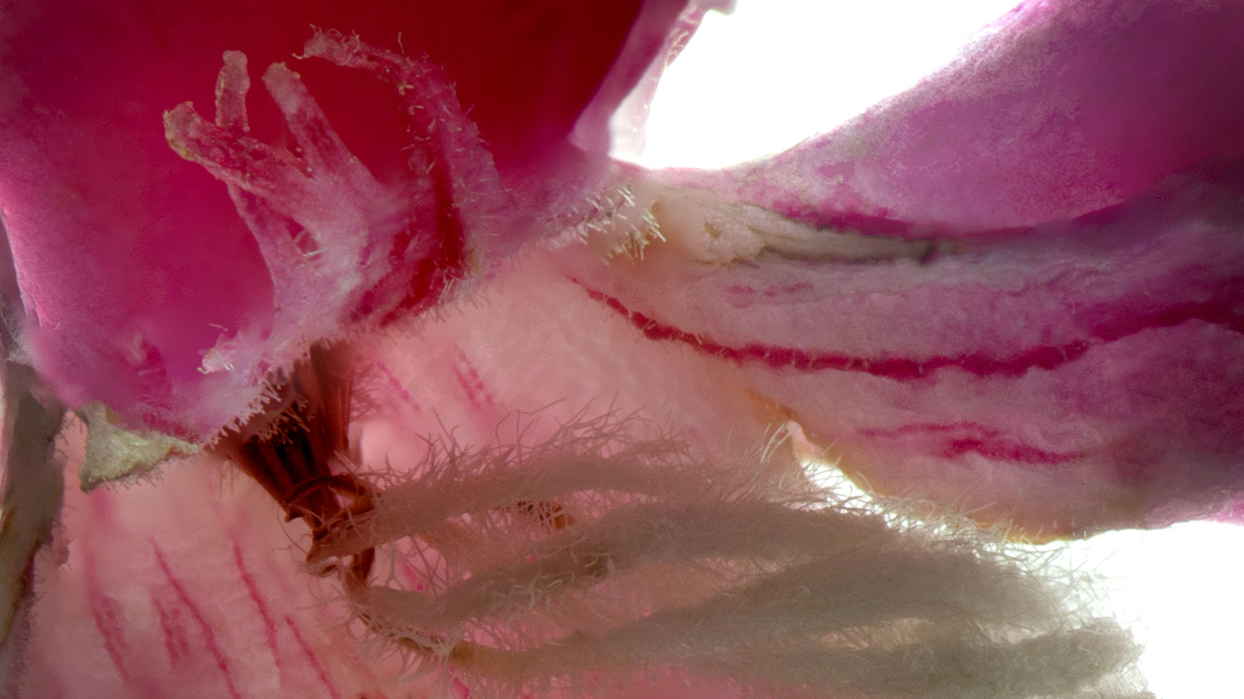
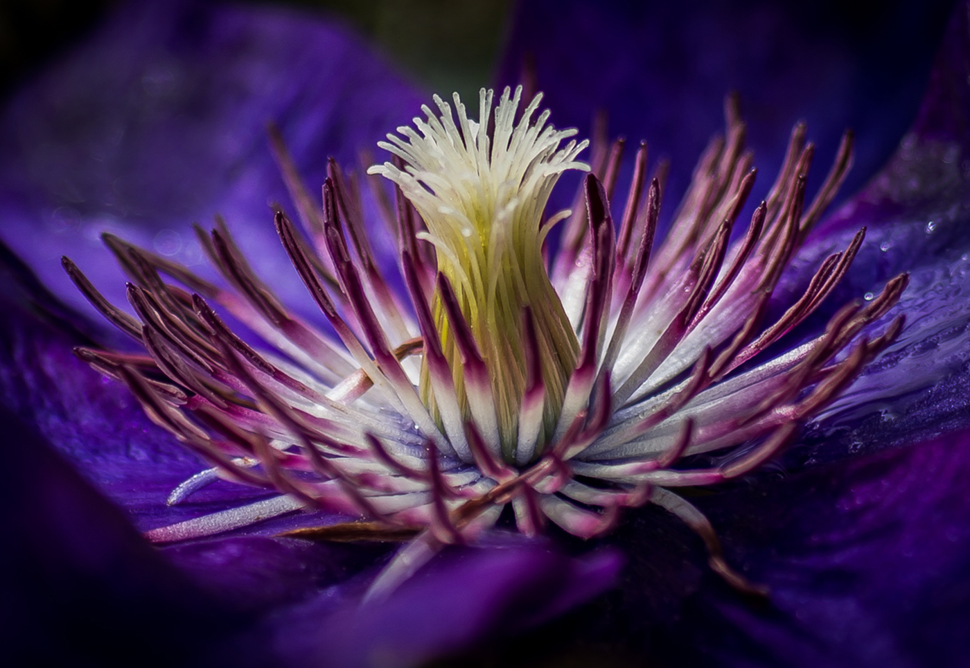
Comment |
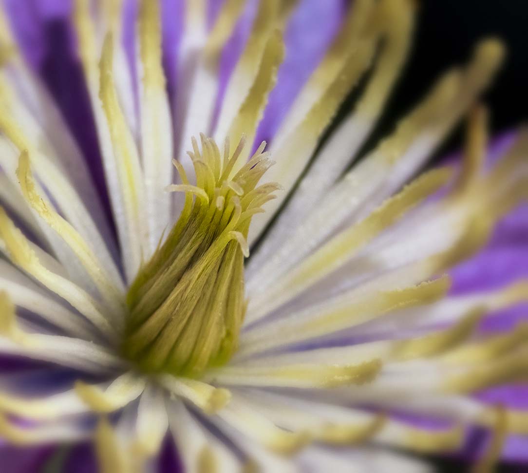
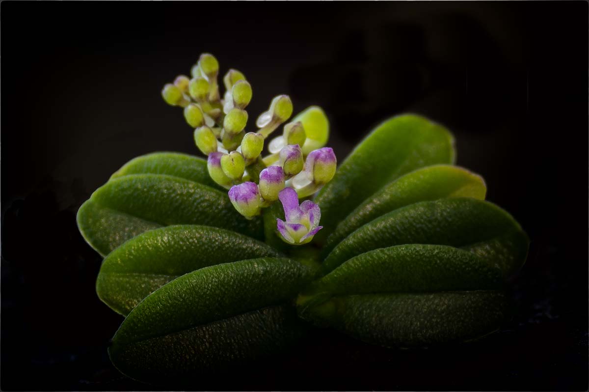
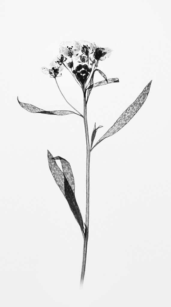
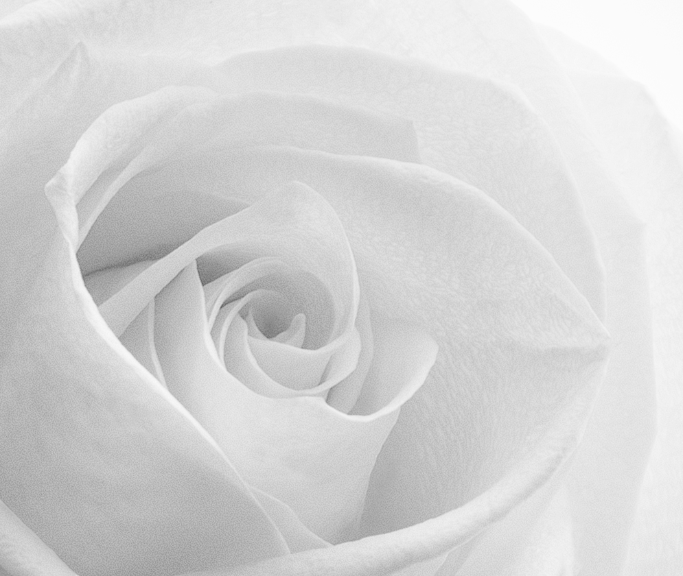
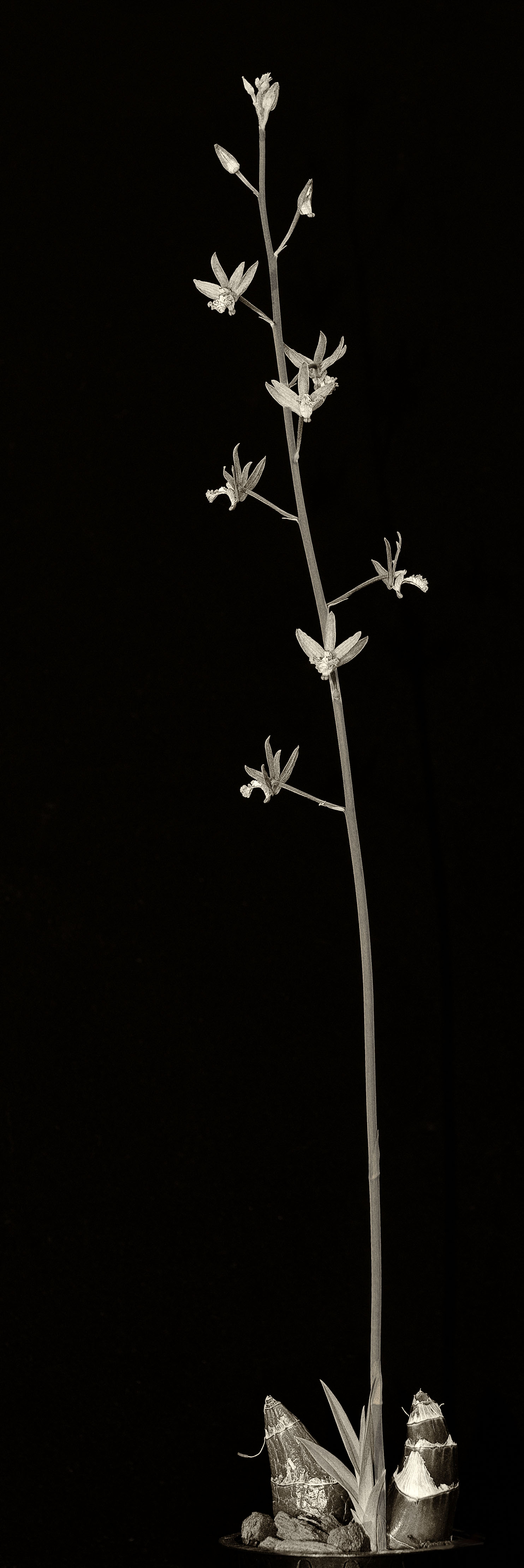
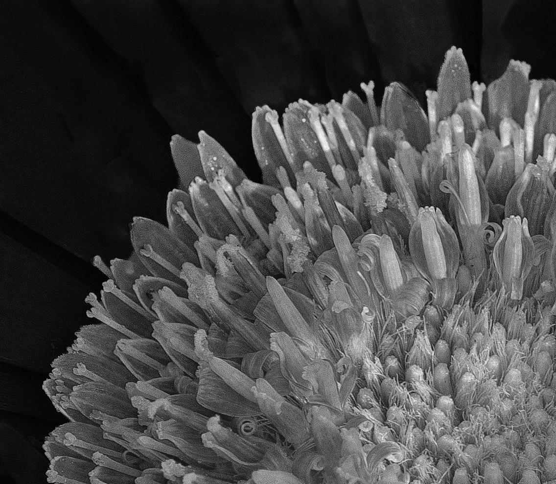
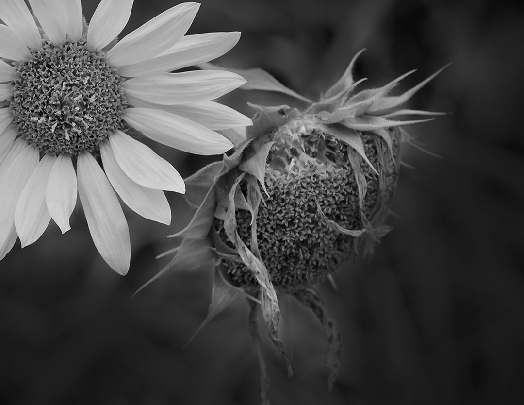
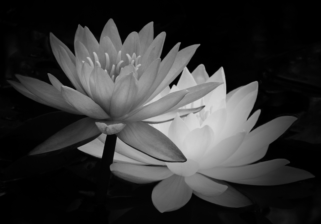
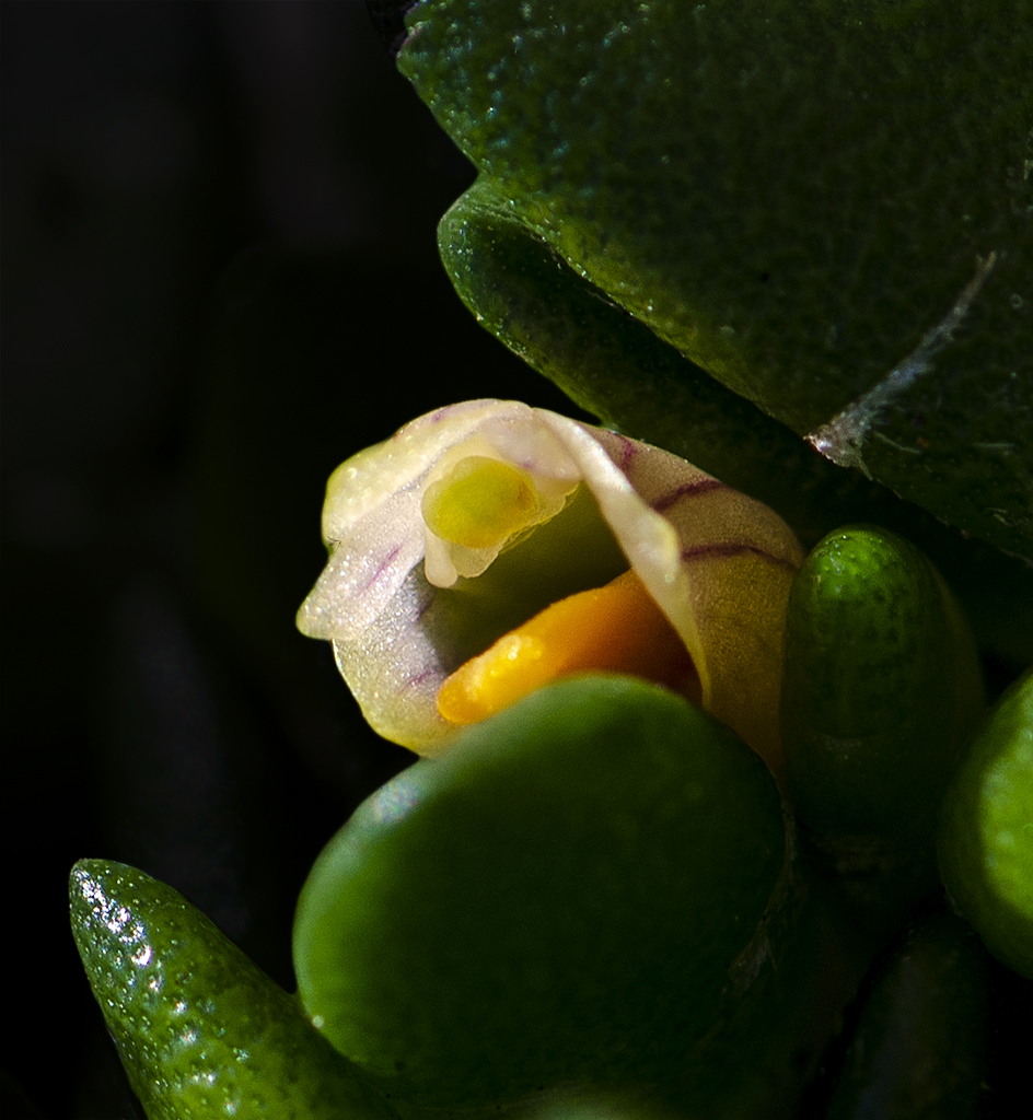
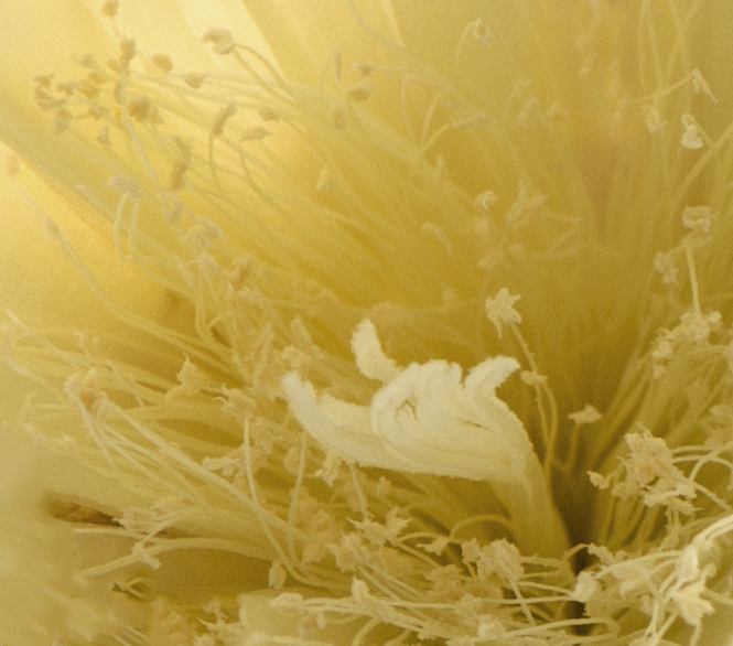
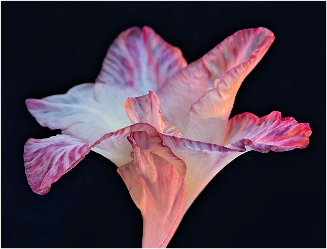
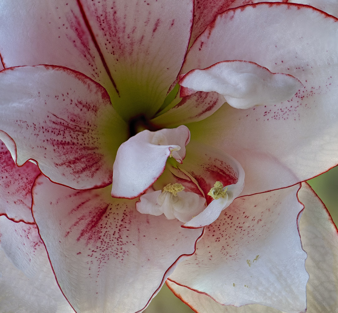
I think you captured the emerging light concept more clearly here than October's image. The outside petals are indeed reaching to the light but I just don't know if it's strong enough. I'm wondering if perhaps a slightly stronger light in the center of the petals would create a stronger sense of reaching up. Or perhaps a subtle increase in hue/saturation in the center? I'm not sure if that would "overdo" the mood you've created or enhance it. The Spooky Orange is a great choice and the black background is perfect. Love the box (just looked it up on Amazon) - did you mean 24 x 24? or do you have a 42"?
By the way I looked at your smug-mug. Some of the images wouldn't enlarge, but my personal favorite did. #25 of 114. It's as if I could feel the velvet of the leaves, the crispness of the sepals and the firm fuzzy green stem.
As for the signature, the way you've incorporated your signature is so subtle that I think it actually adds to the image.
|
Dec 26th |
| 65 |
Dec 17 |
Reply |
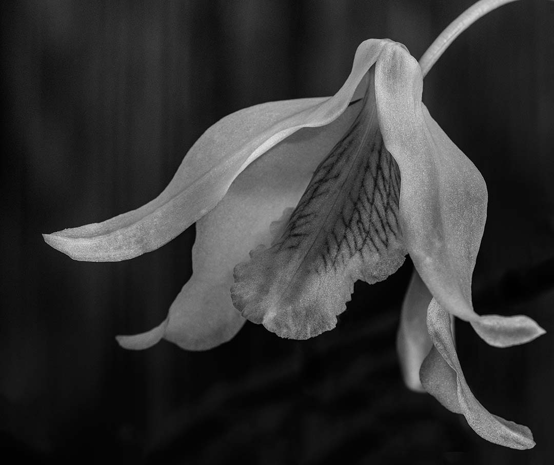
I agree with you that the macro-trap is alive and well. I've had judges say that images need to be completely in focus to "allow for full appreciation". I don't agree. There's a place for full clarity and a place for well done bokeh. As for the flower being up and in your face...well, yes you're absolutely right. Well said! Maybe that's what's giving the image the unnecessary tension I'm feeling when I look at it. |
Dec 26th |
| 65 |
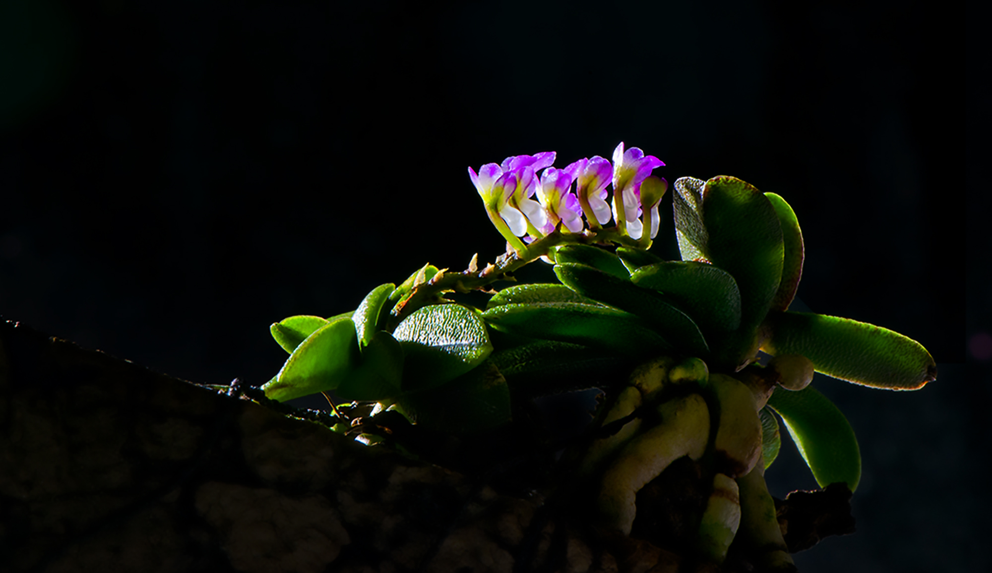
Dec 17 |
Comment |
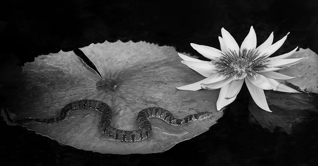
A little more detail on the image - I of course used a tripod, f/3.5, ISO 100 and my 55-200mm lens. The tripod was very low so aside from getting myself up, I needed to pull up and carry all the equipment. Photo-stacking would have helped the front focus, but between the frogs and whatever else lives in the water, it may not have helped much. |
Dec 11th |
5 comments - 2 replies for Group 65
|
12 comments - 3 replies Total
|