|
| Group |
Round |
C/R |
Comment |
Date |
Image |
| 32 |
Aug 17 |
Comment |
I don't mind the softness of your image - it reminds me of an old photograph. I agree with Carol that if possible the hair of the woman on the right could be brought out a bit more. The pipe/bar going through her neck is distracting to me and pulls me away from the women's expressions. |
Aug 19th |
| 32 |
Aug 17 |
Comment |
Although I would like to have seen a bit more of the bull on the left side and his legs, it agree that it adds more distraction. Personally I like the "original 3" color image the best. I find the color image allows my eye to break down the action into separate segments and I like the individuality it gives to each. Their interaction is clearly ending, emphasizing that the rider and the bull are two separate entities. To me, the color image depicts that more clearly.
(Sometimes I root for the bull) |
Aug 19th |
| 32 |
Aug 17 |
Comment |
Nicely done, and I like the effect of the very top of the building in the clouds. Because the bridge brings you toward the right, I might burn the far right building slightly. |
Aug 19th |
| 32 |
Aug 17 |
Comment |
The image held me for a bit as well. The patterns are interesting and with the tonality, the image is pleasing rather than harsh. I like Carol's suggestion. |
Aug 19th |
| 32 |
Aug 17 |
Comment |
Interesting putting the camera against all white. Very good for documentation. |
Aug 19th |
| 32 |
Aug 17 |
Comment |
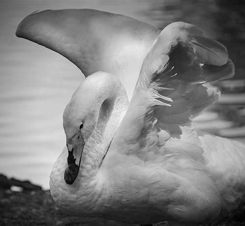
I agree with your comments so I tried a few adjustments and the image seems much better. I didn't know about white swans not being native to North America, but I do know that they're mean and bite when threatened or cornered. |
Aug 12th |
 |
6 comments - 0 replies for Group 32
|
| 65 |
Aug 17 |
Comment |
Charles, I appreciate the detailed explanation of how the image was created. I'm going to try this for the month of September and see what I can do. Since my studio is very similar to yours (kitchen table) I can only hope the result is as inNot having a focus interesting and clean as this image. The background suits the image well, although I might bring the overall brightness down a bit, and perhaps clone the upper left corner to match the rest. Overall, I think this is a really nicely composed image. |
Aug 19th |
| 65 |
Aug 17 |
Comment |
This is a fantastic image! I really like how the entire center portion of the lemon looks like melted glass. The colors are rich and warm. If I were to change anything, I might clone out some of the brighter highlights but that's nitpicking. Great image! |
Aug 19th |
2 comments - 0 replies for Group 65
|
8 comments - 0 replies Total
|