|
| Group |
Round |
C/R |
Comment |
Date |
Image |
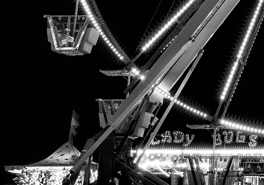
| 32 |
Jul 17 |
Comment |
Nicely done with a wide angle. I agree with the other comments that a slight darkening of the bright spots on either side of the frame would be less distracting. You've captured a real vibe with this image to the point that I feel I'm standing there, almost hearing the band's play. |
Jul 28th |
| 32 |
Jul 17 |
Comment |
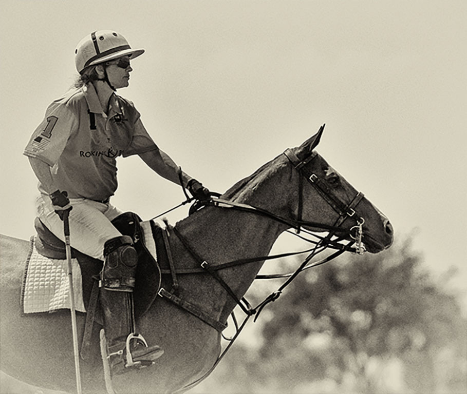
The horse and rider are in good position with the detail in both nicely done. I agree with the others regarding the post and area around it. Perhaps it's my eye, but I find the horse's right front leg doesn't blend well - maybe a little bit too bright? |
Jul 28th |
| 32 |
Jul 17 |
Reply |
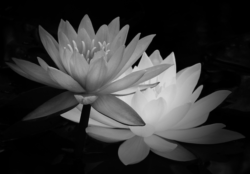
I like the darkening effect and yes - I think it does make a difference. Now that you've mentioned it, the flower on the left does look a bit flat. |
Jul 28th |
| 32 |
Jul 17 |
Comment |
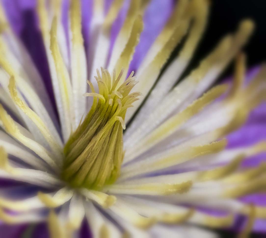
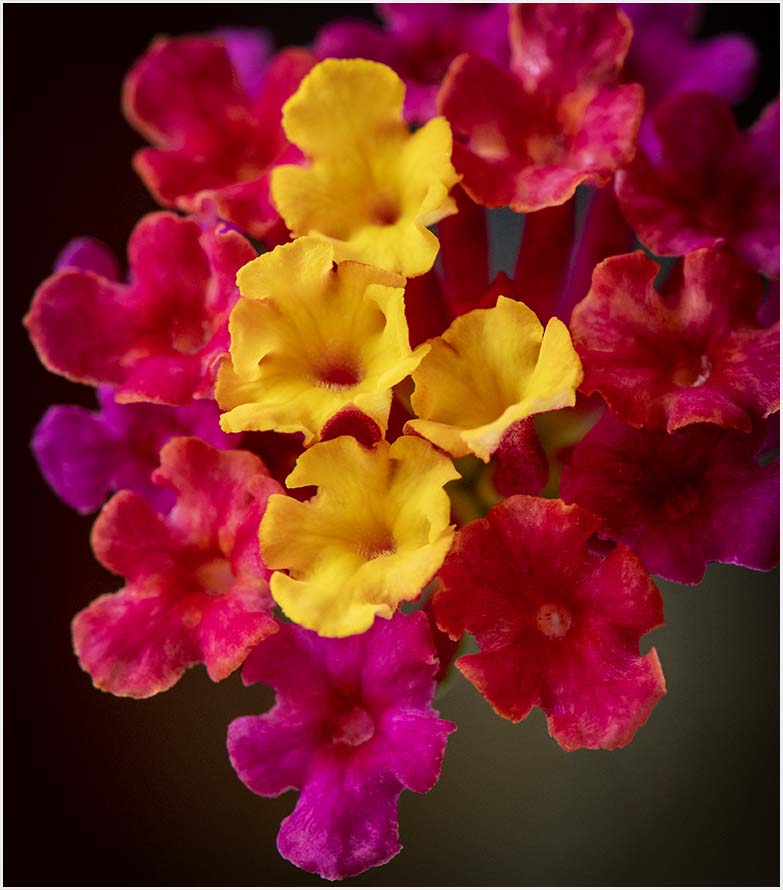
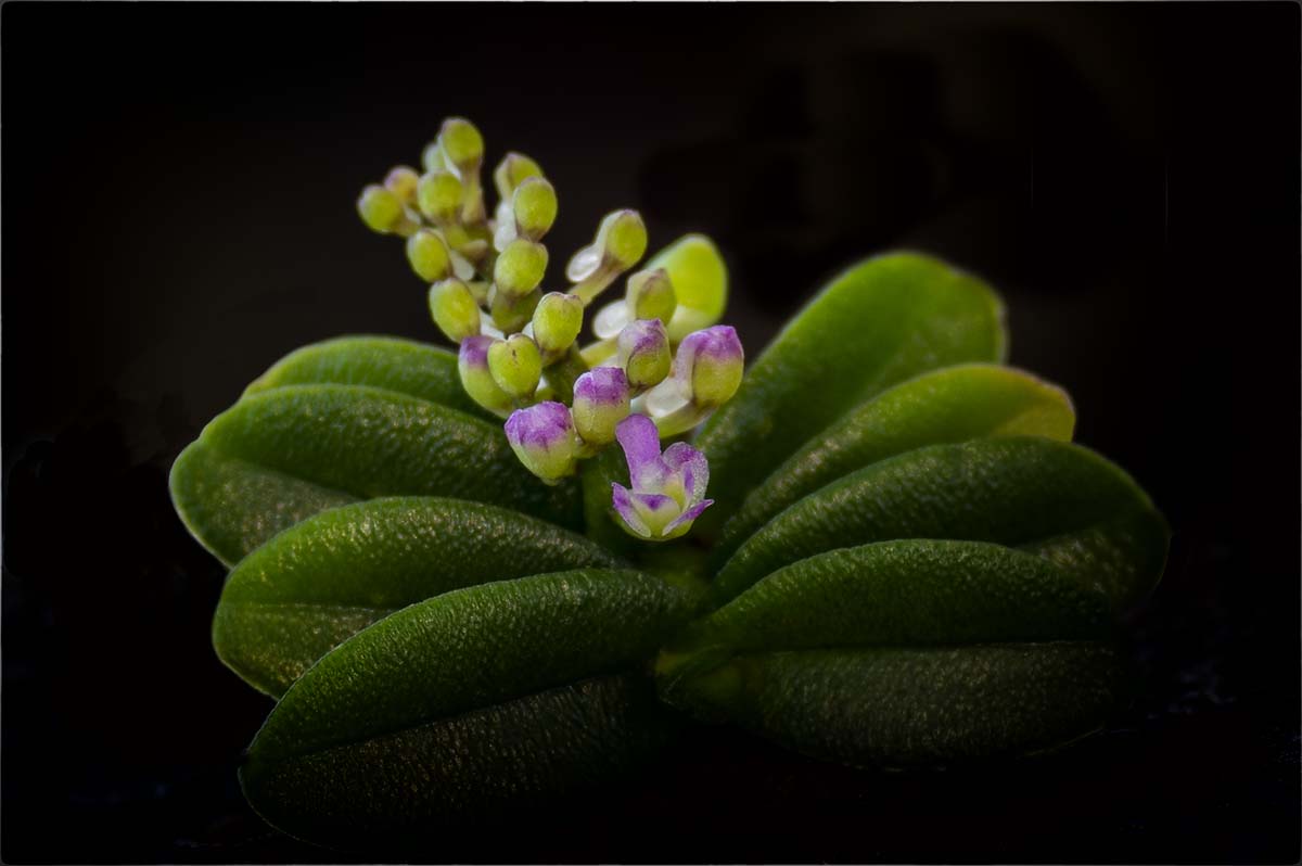
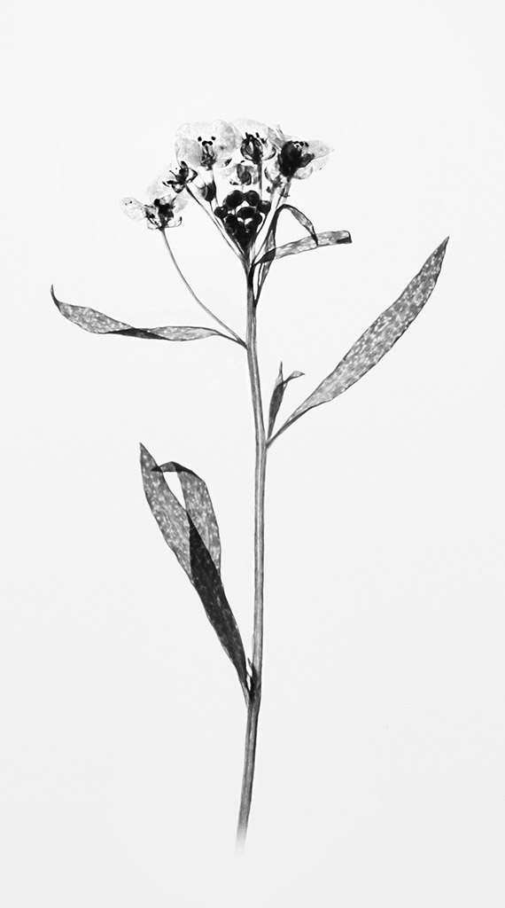
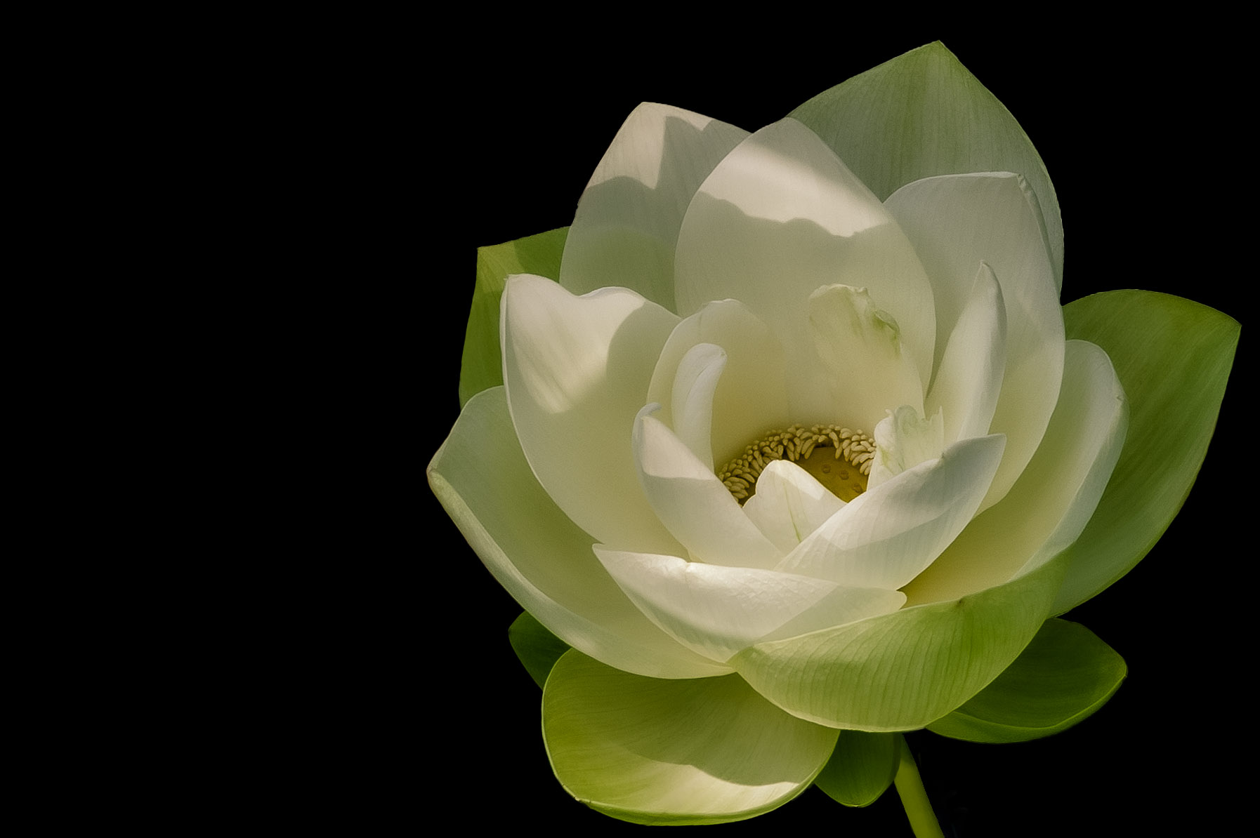
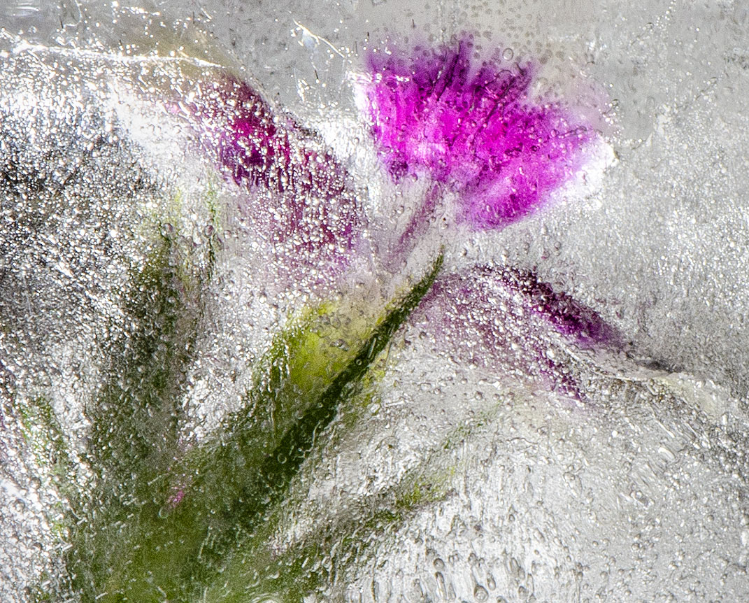
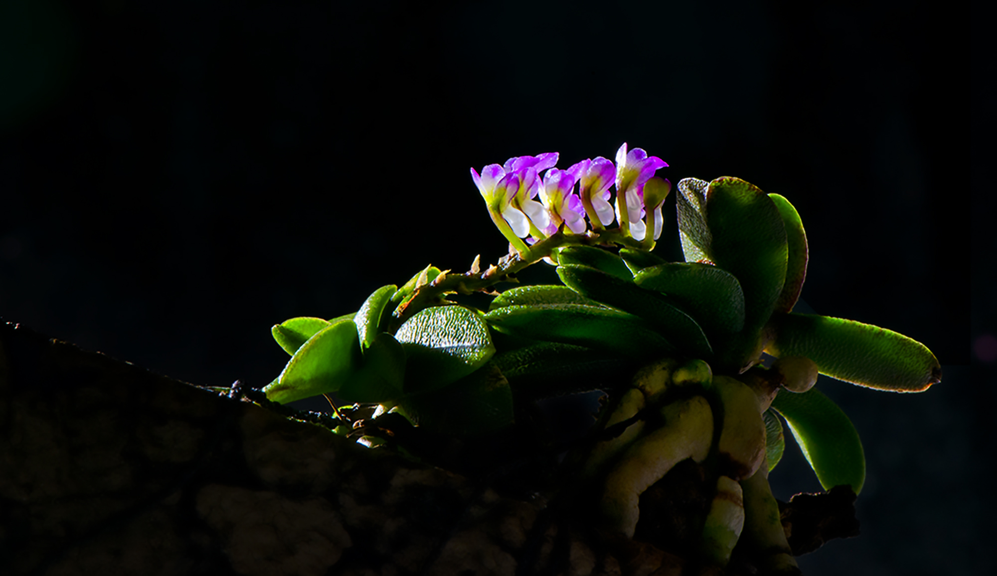
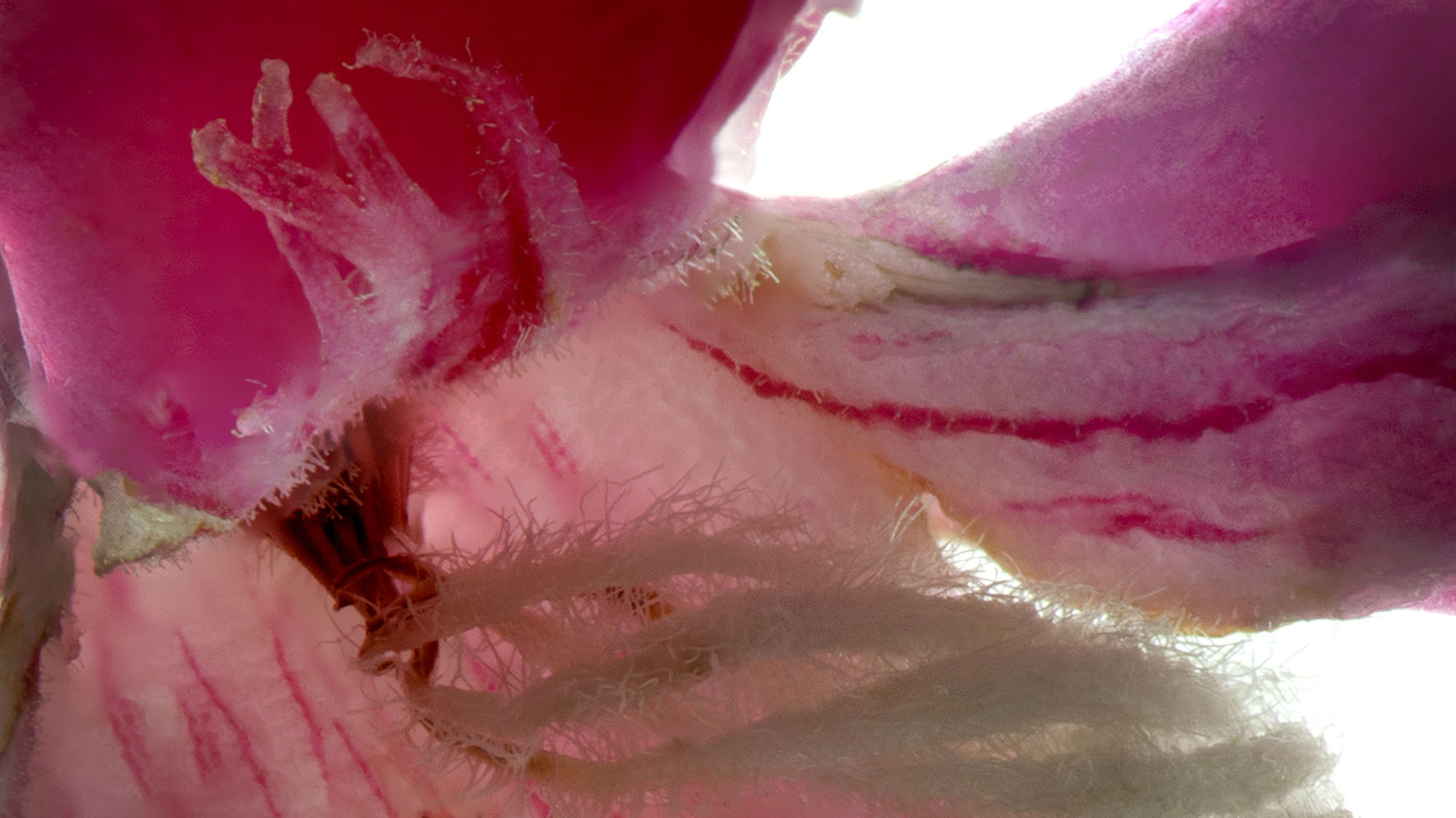
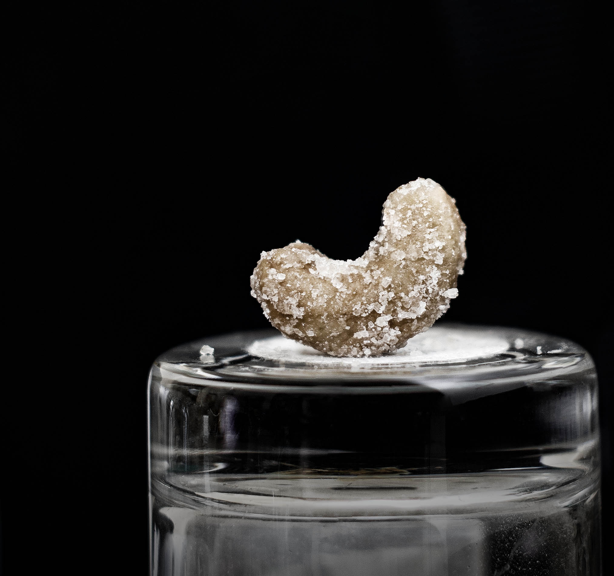
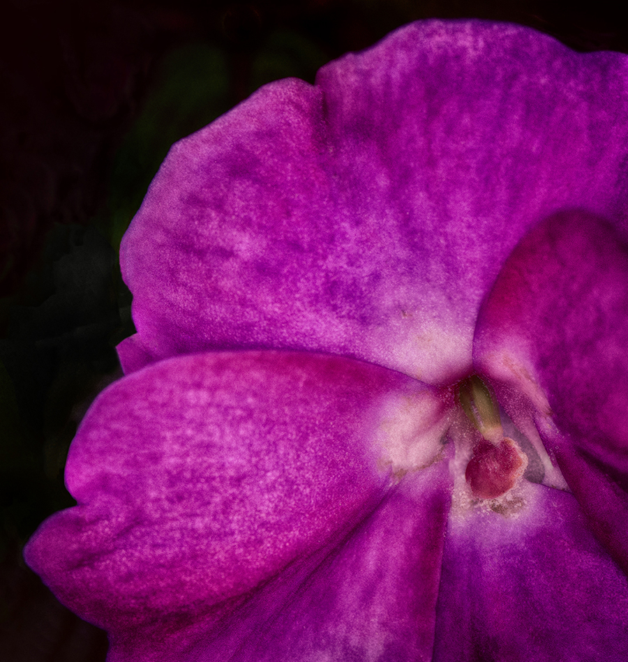
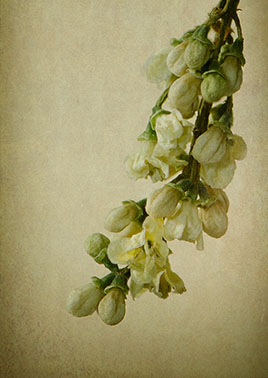
Thank you all for the feedback, and also the suggestion for printing on a textured fine art paper. The waterlily on the right is yellow in color, the one on the left is dark purple. I did a lot of playing around in nik silver effects pro with vignetting, contrast, and some content aware to darken out some background ghosts. Even though it was sunny, the flowers were in a shady section of McKee botanical garden during a bright, hot and real steamy Florida morning. |
Jul 25th |
| 32 |
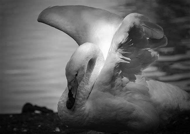
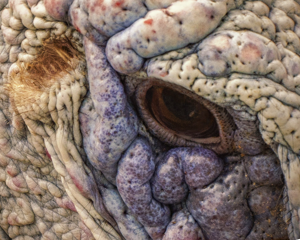
Jul 17 |
Comment |
The clarity of the bird's eye is very nicely done and the backlit wings really add to the image. I think darkening the bright spots around it's head would help to encourage focusing on the bird's head. It's interesting that the bird looks like he's complaining about having his picture taken. |
Jul 19th |
| 32 |
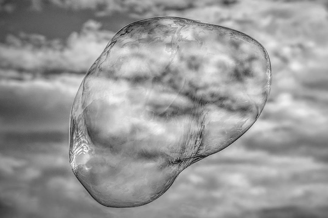
Jul 17 |
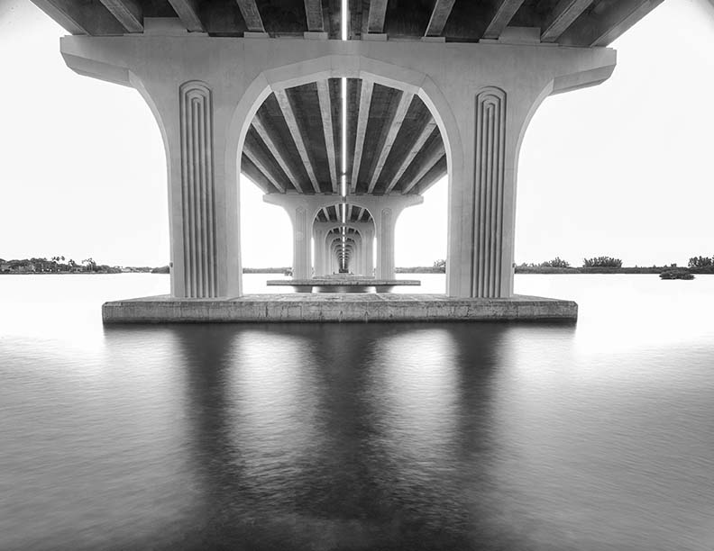
Comment |
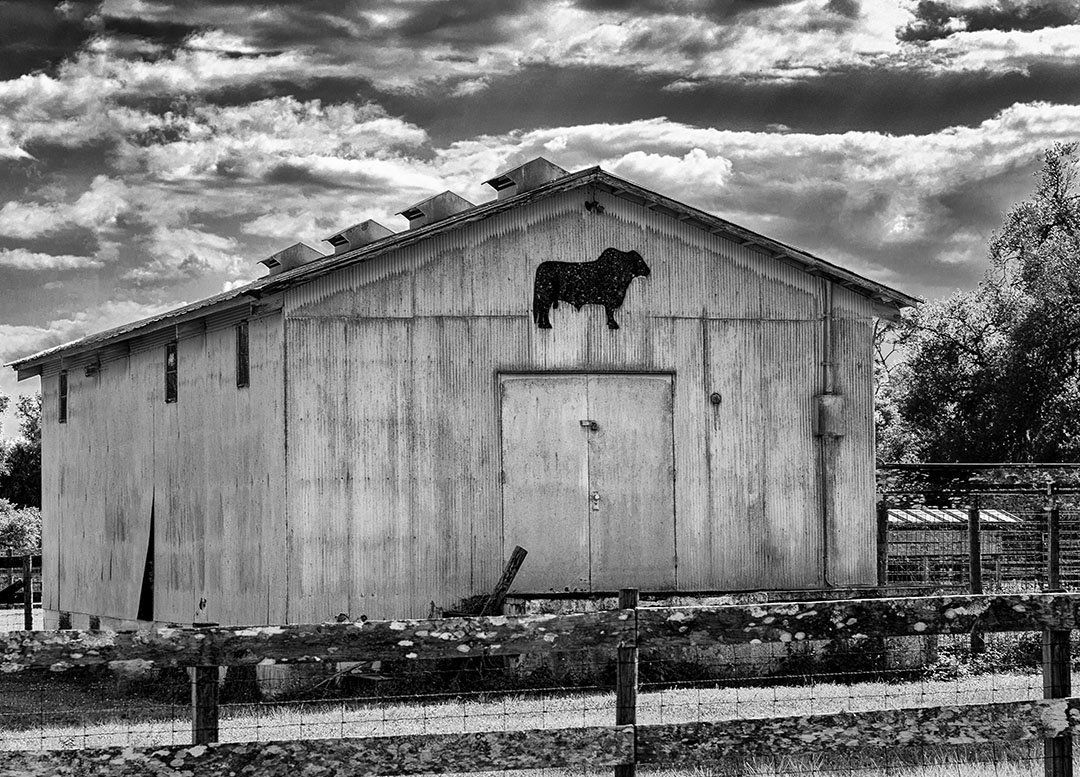
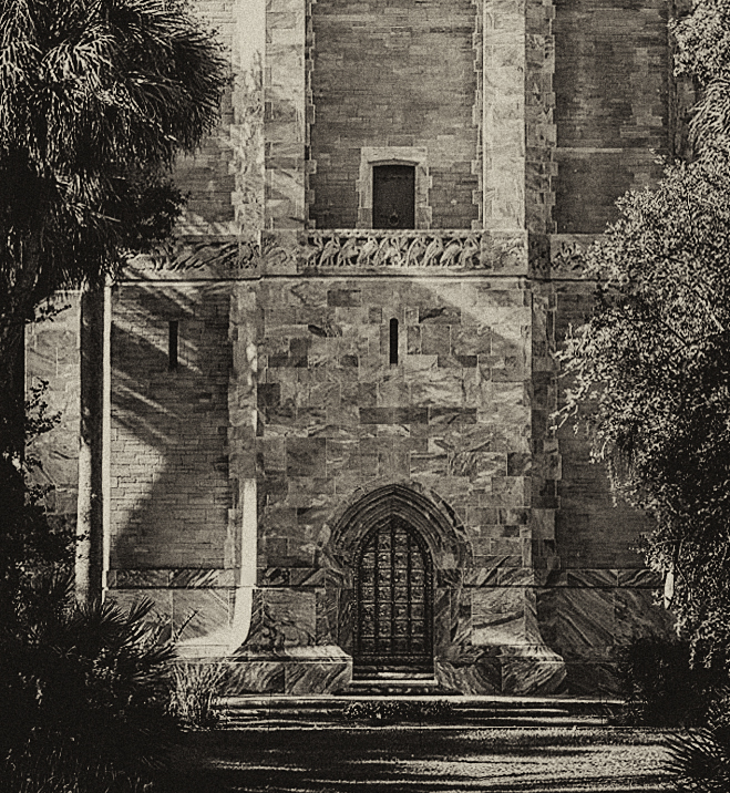
I really like this image. It's crisp and sharp and plays well off the clouds. Centering the building (in my opinion) gives it power and strength, allowing the building to become a formidable opponent to the fierce sky. |
Jul 19th |
| 32 |
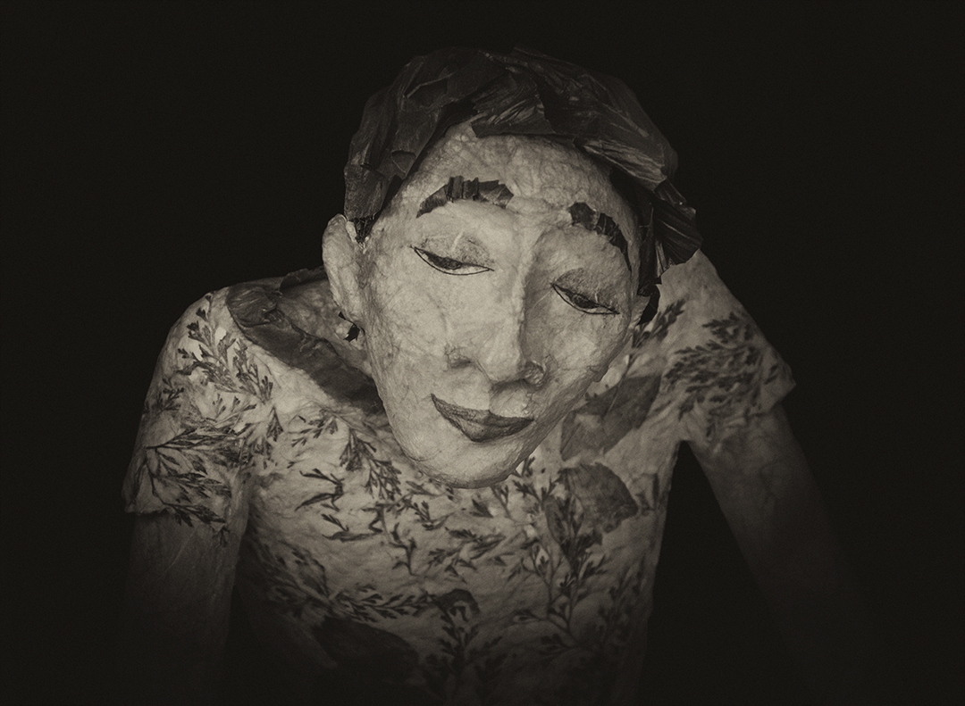
Jul 17 |
Comment |
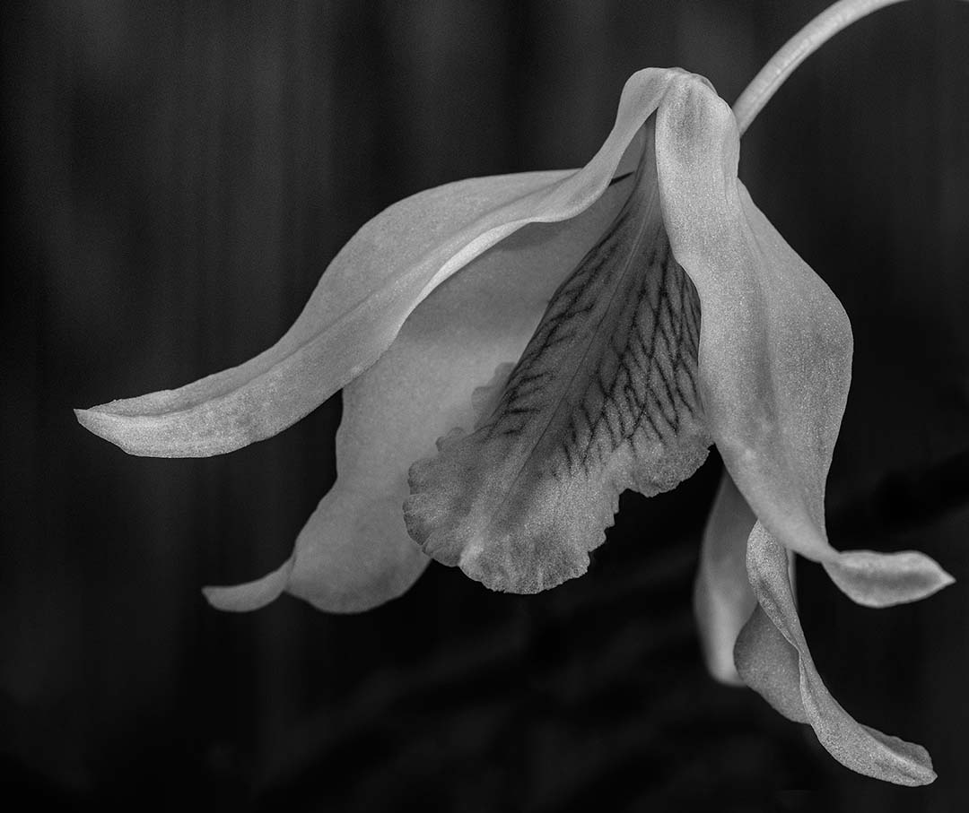
Hi Carol
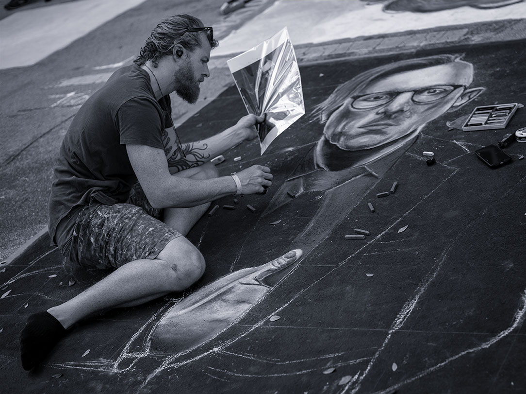
Your composition is very creative and well thought. But rather than telling a story, for me this image provides a guide that allows me to imagine my own story. As for the pen...perhaps the reader had been transcribing passages to a piece of parchment paper? As I'm not one to ever write in a book, it seems to be a very plausible explanation. Nicely done! |
Jul 16th |
| 32 |
Jul 17 |
Comment |
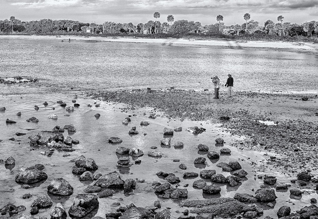
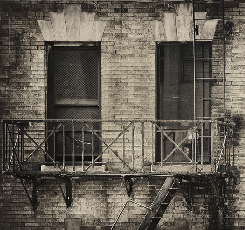
I agree with Stephen's comments about the cropping of the top and left side in order to move the brick line away from the bottom left corner. Converting this to mono and using wet rocks really serves the image well, allowing the textures to pop and providing nice depth. |
Jul 16th |
7 comments - 1 reply for Group 32
|
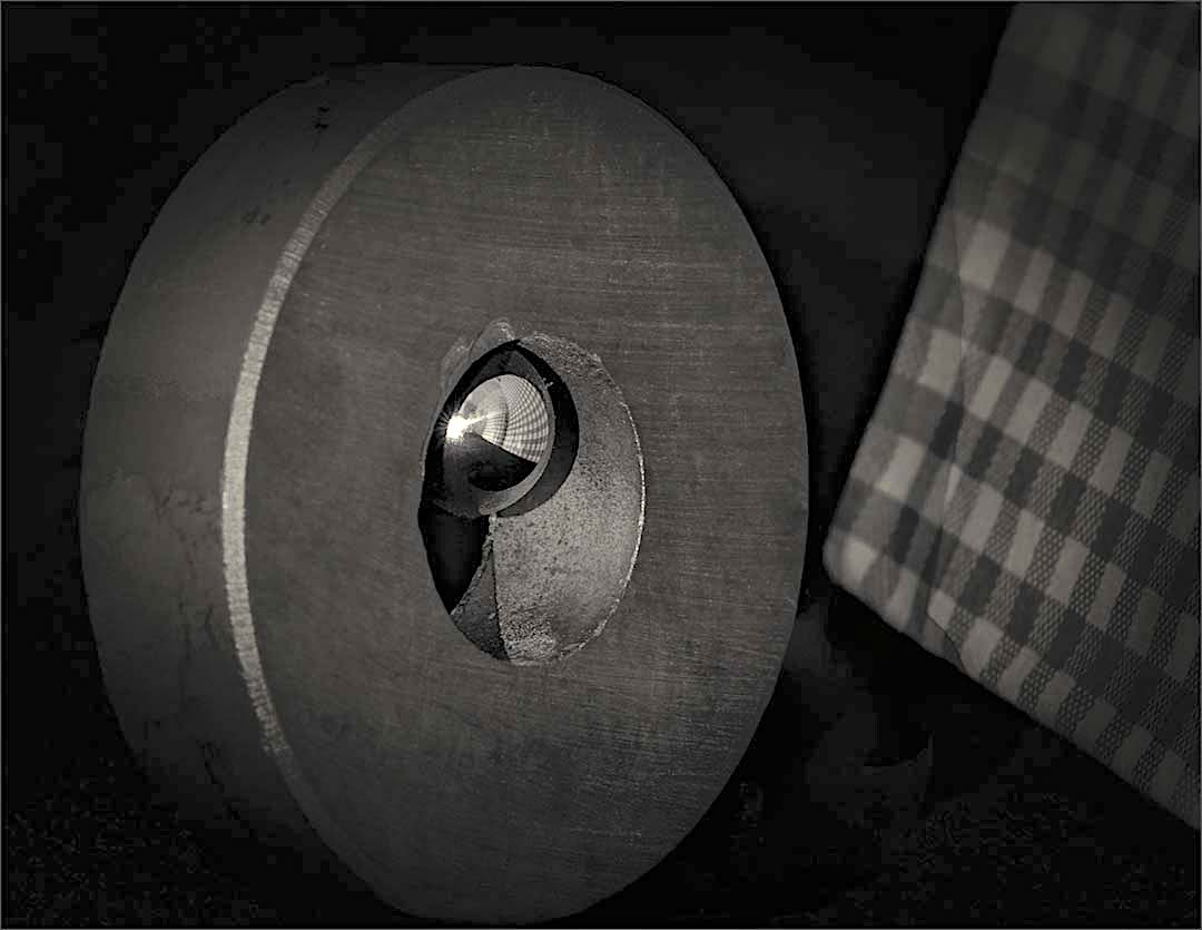
| 65 |
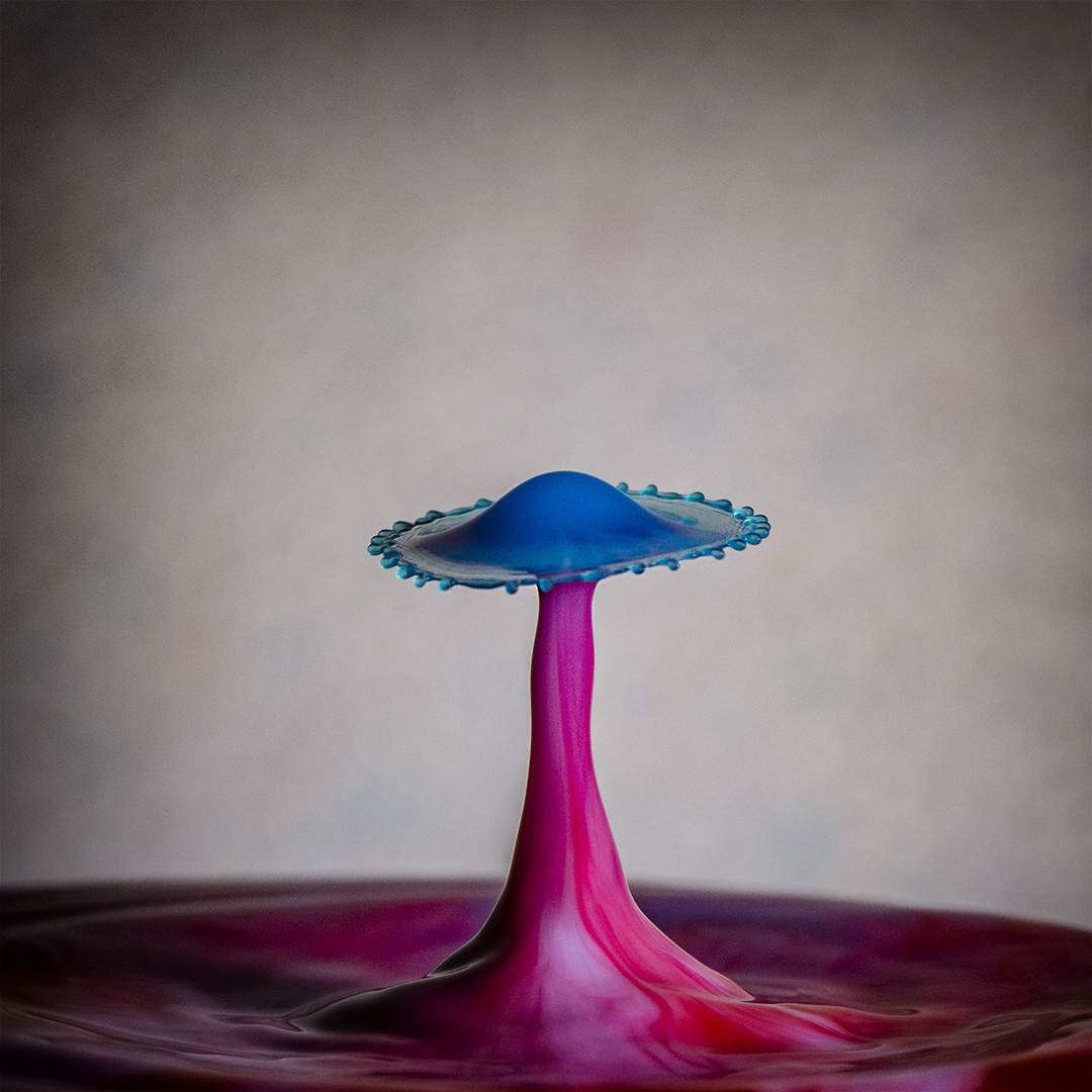
Jul 17 |
Comment |
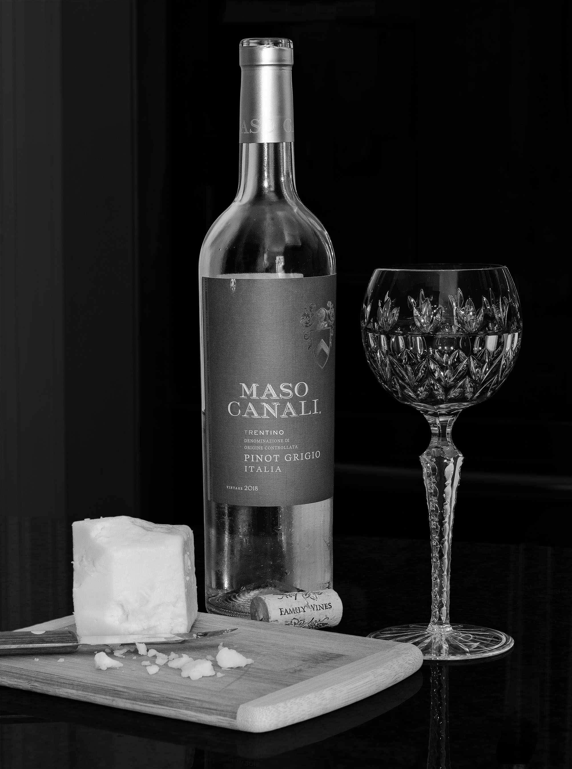
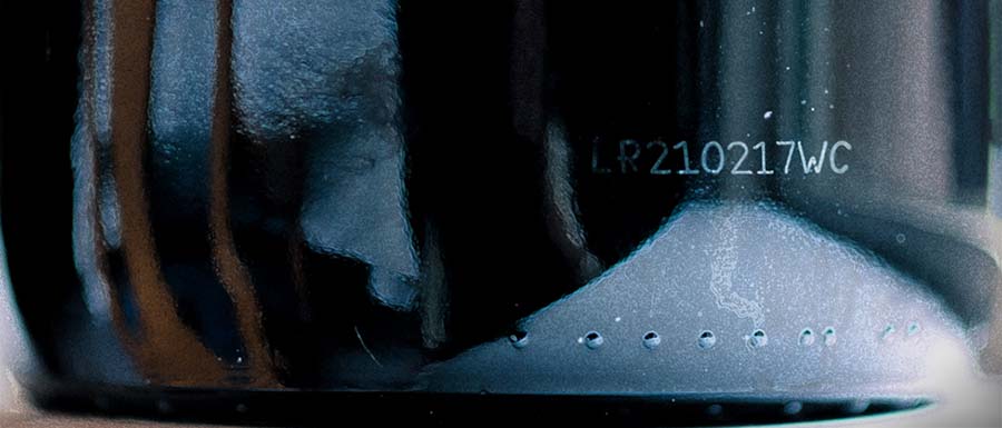
Hi Mary. The concept for this image is great. I love the blue color and of course the bumps. The number etched on the side of the bottle gives the image more interest as does the reflection of the chair and windowsill. The natural light provides nice shading. There are 3 things though that I find bit distracting. The foreground because of the brightness of the right lower corner and the brown on the left lower edge, the right side stripe of green and the optical illusion that the bottle is not horizontal. I think small tweaks - cropping the foreground more tightly, toning down the exposure just a bit and cloning the green to blue would eliminate the distractions. I played with the image just a bit - see what you think.
The color and texture you captured is rich with a lot of depth and nicely captured. |
Jul 16th |
 |
| 65 |
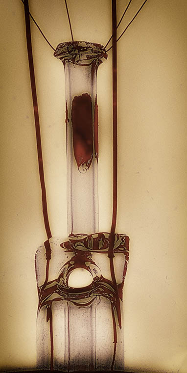
Jul 17 |
Comment |
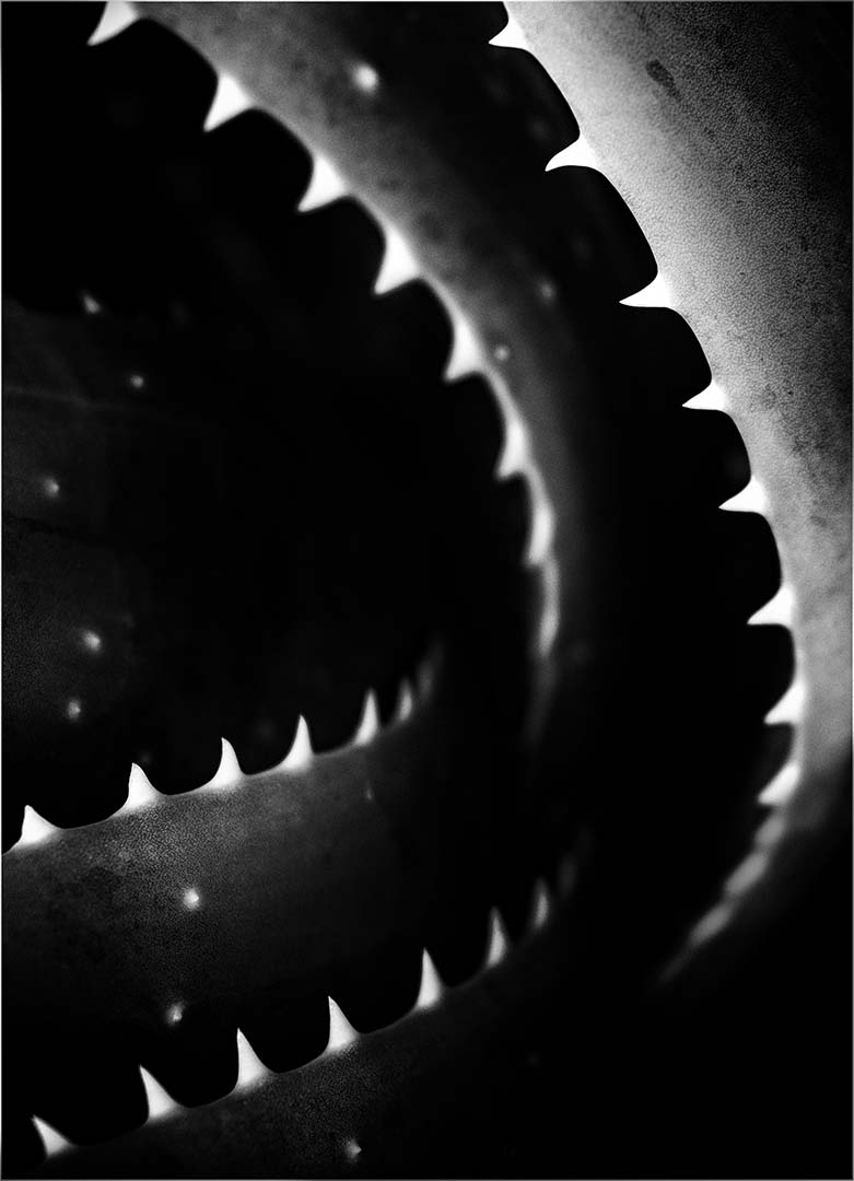
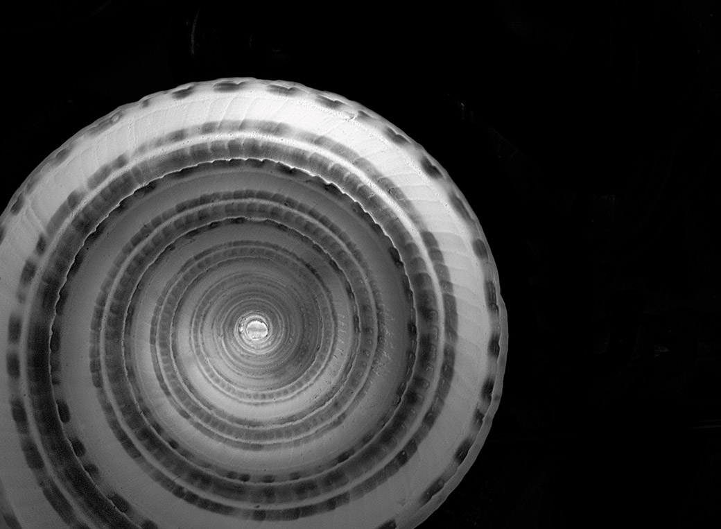
Hi Janos - I find this image very well done. This type of image is really challenging to me. I never seem to quite capture what I see. You however have really been successful here. I think the secondary circle on the lower left really anchors the image.
I would perhaps add a bit of vignetting, but like Charles I feel this is both subjective and nitpicking. Great shot! |
Jul 16th |
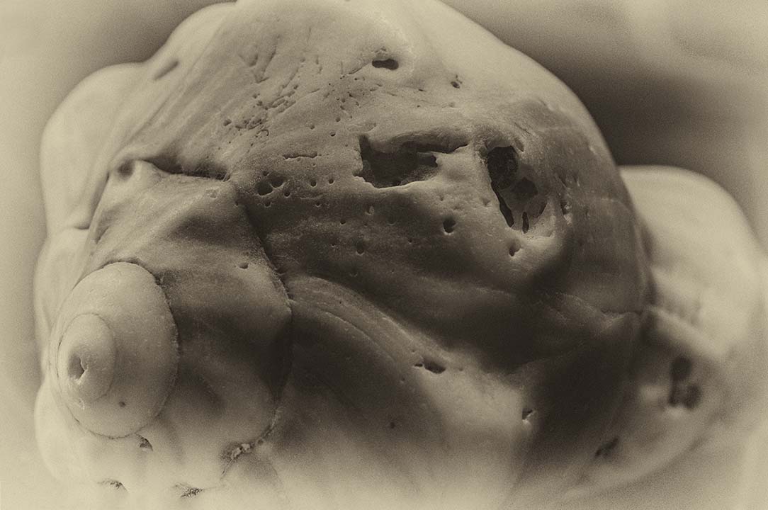
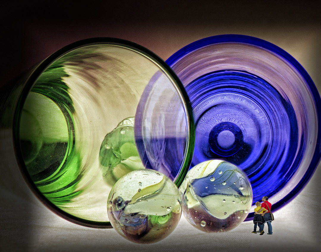
| 65 |
Jul 17 |
Comment |
Charles, this image is interesting to me. It has an HDR quality, yet it isn't HDR. The colors are deep and rich and your depth of field is really nice. It feels like if I touch the image I'll feel the textures. If I were to change anything, I might change the direction of the strawberry in the front. But that's nitpicking. The image is great - well done! |
Jul 2nd |
3 comments - 0 replies for Group 65
|
10 comments - 1 reply Total
|