|
| Group |
Round |
C/R |
Comment |
Date |
Image |
| 11 |
Apr 26 |
Comment |
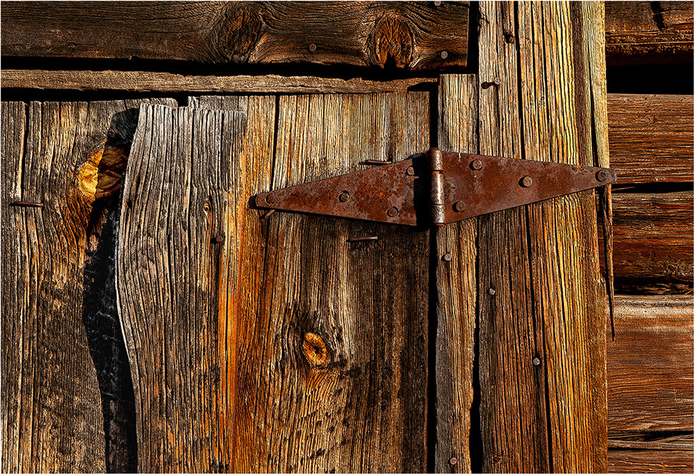
Hi Henry: The original has very high contrast lighting, in your monochrome conversion you have evened out the lighting very well, really good post processing work.
Also you have removed many distractions at the lower left to make the building more presentable. To me the buildings in the background seen between the pillars on the right bothers me more than the building at the left.
I have a lot of respect for those early craftsman that built these structures, they did not have all of the modern equipment we have today and they built some amazing cathedrals through out Europe.
|
Apr 13th |
| 11 |
Apr 26 |
Comment |
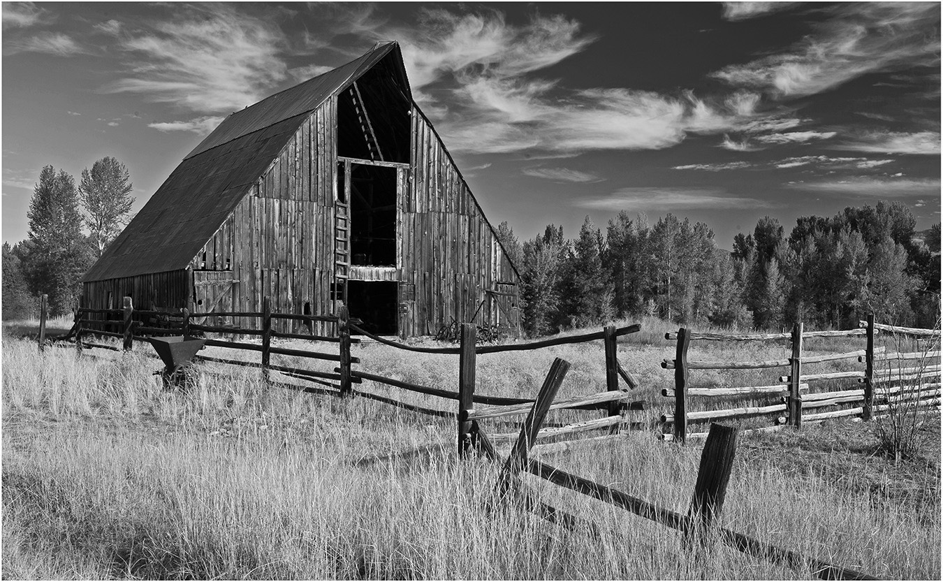
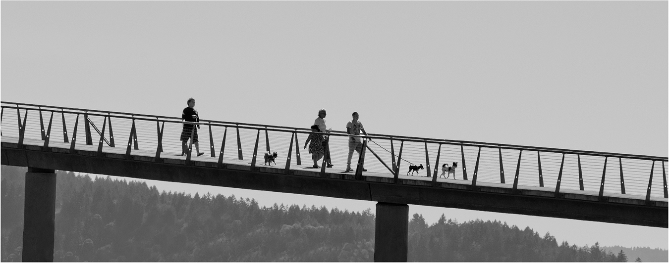
Hi Charles: The fence provides a good leading line into the entire scene, then your high impact lighting on the tree adds drama.
The foreboding sky adds that final touch to this interesting picture. Depth of field is well handled with good sharpness from the immediate foreground throughout the picture. Good Work !! |
Apr 13th |
| 11 |
Apr 26 |
Comment |
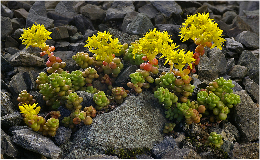
Hi Nenette: I prefer the composition in your original vs. the crop in the monochrome conversion. The 3 smaller mountains at the right in your original provide a nice balance to the two larger mountains to the left, along with more lake in the scene. I would clone out the buildings in the lower right corner.
Regarding the two cars on the left; I am kind of optional on the cars, however they provide points of interest on the road.
|
Apr 13th |
| 11 |
Apr 26 |
Comment |
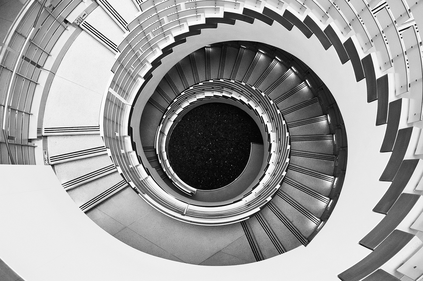
Hi Sheldon: A very impressive church which made a very interesting monochrome conversion with very strong design elements. The monochrome conversion carries a lot of impact, and I also like the muted soft tones of your original.
From a composition standpoint I feel the upper dome is a little tight in the frame at the sides, needs a little more breathing room. As I was not there I don't know what kind of photographic constraints you may have had in making this photo. |
Apr 13th |
| 11 |
Apr 26 |
Comment |
Hi Peter: Great cropping work, you have eliminated unnecessary items from the scene and focused in on the main action. You have caught the one contestant landing a punch to the head of the other contestant, perfect timing.
Very well done monochrome conversion |
Apr 12th |
| 11 |
Apr 26 |
Comment |
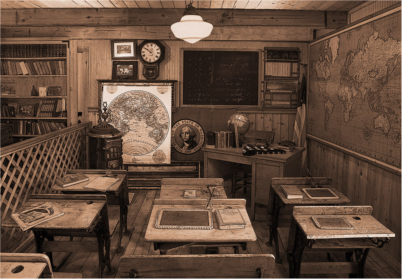
Hi Ed: Like Charles I cannot see anything to change regarding your monochrome conversion, everything is spot on.
From a composition standpoint I think you have chosen the best vantage point, the view of the countryside out of the ornate window adds another point of interest; then the lone chair adds that final finishing touch.
Your original has a lot of life with the various color tones, the rug adds a less formal feeling
|
Apr 12th |
| 11 |
Apr 26 |
Reply |
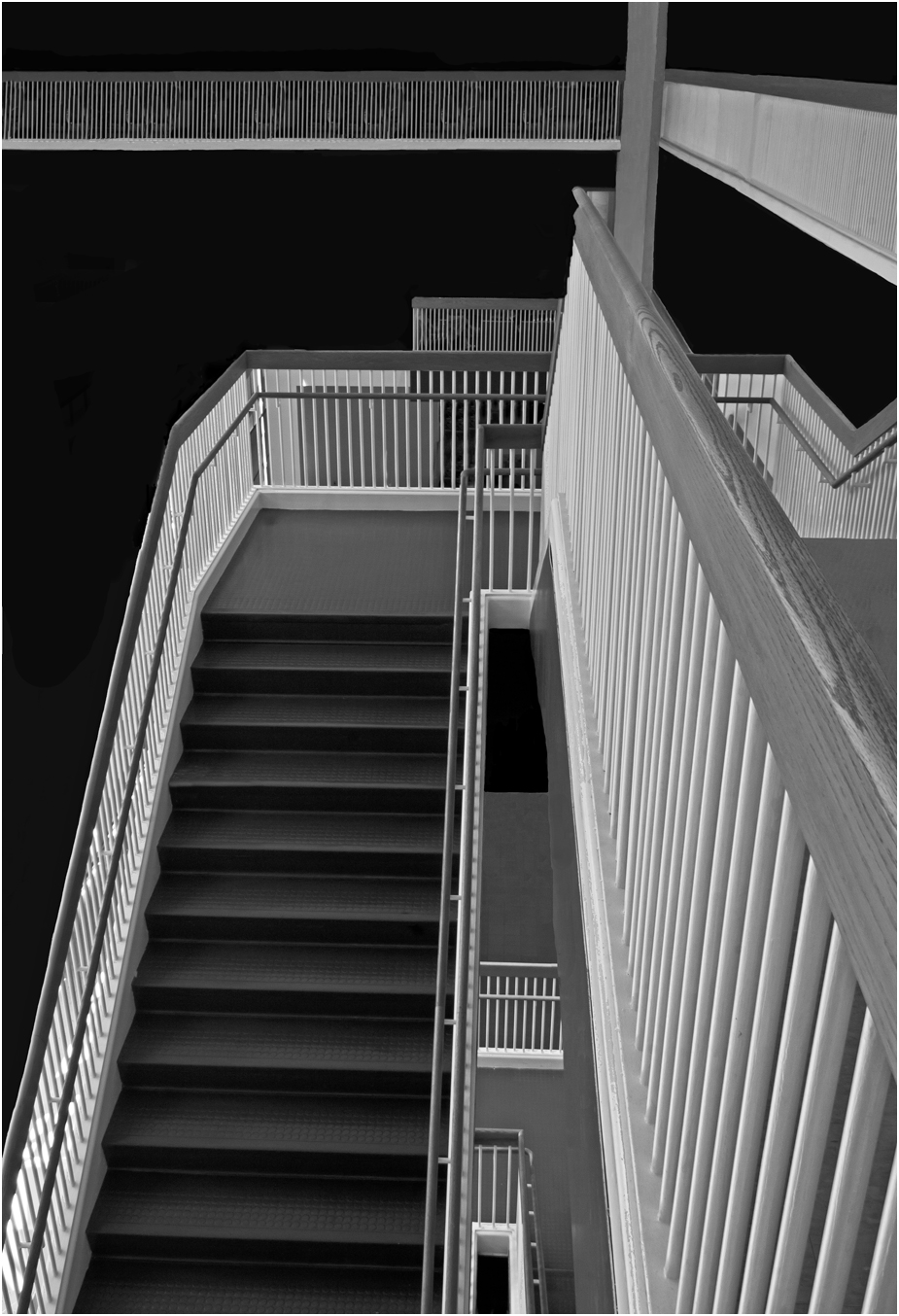
Thanks Charlie for your thoughts on horizontal vs. vertical format. I will rework this picture adding a little more contrast. |
Apr 10th |
6 comments - 1 reply for Group 11
|
| 63 |
Apr 26 |
Reply |
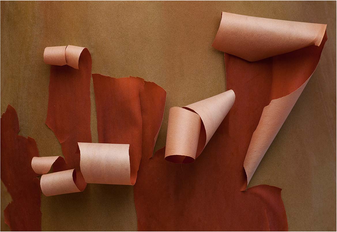
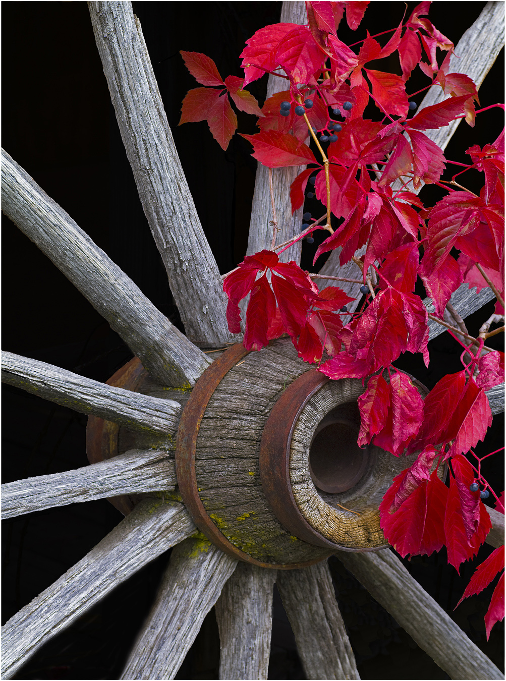
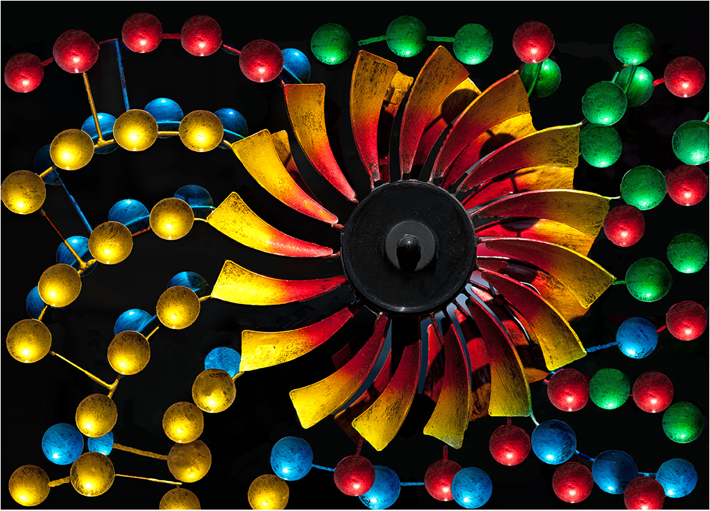
Thank you Charlie for your positive comments.
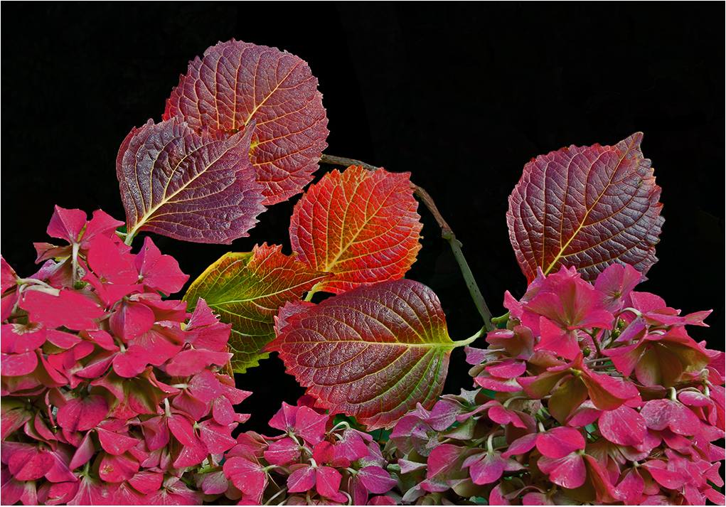
I could have cropped in somewhat from the left and bottom and just a smidge off the top to feature the hub and red leaves without so many spokes. Will experiment on that suggestion. |
Apr 10th |
| 63 |
Apr 26 |
Comment |
Hi Ruth: A strong graphic design of an everyday item we all have in our kitchens and photographed well.
Composition wise you have centered the picture pretty well from side to side. If you wanted perfection you could crop ever so little from the left so it matched the right side perfectly.
Good seeing to visualize the possibility with this kitchen item in making an interesting designed picture.
You could experiment in making this into a monochrome, I doubt it would look much different from this original version. |
Apr 9th |
| 63 |
Apr 26 |
Comment |
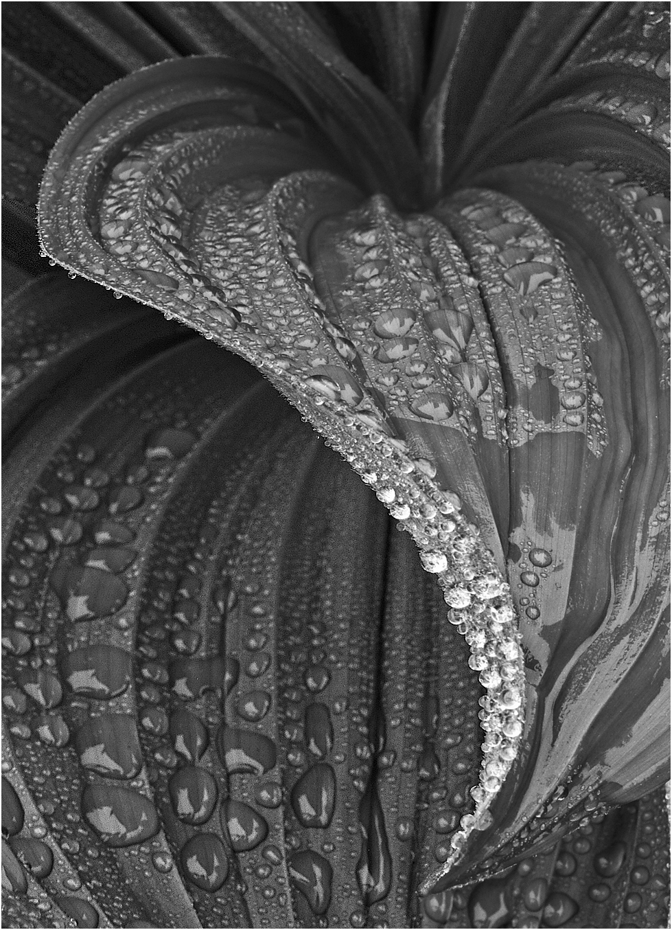
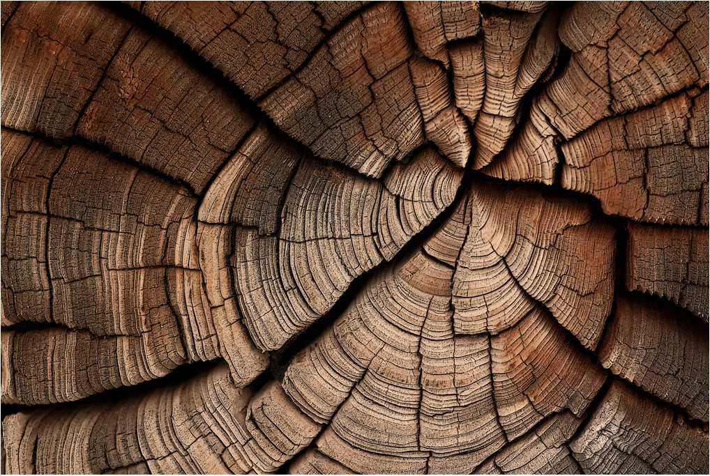
Hi Pierre; Do not use Canon so have not used this 65mm macro lens. From what I read this is a challenging lens to use successfully for several reasons and requires a lot of patience.
At 2X magnification depth of field is extremely shallow, however you have good even sharpness from side to side using f/16 and 10 slices.
It would be interesting to know the age of the piece of ceramic you found along the beach. |
Apr 9th |
| 63 |
Apr 26 |
Comment |
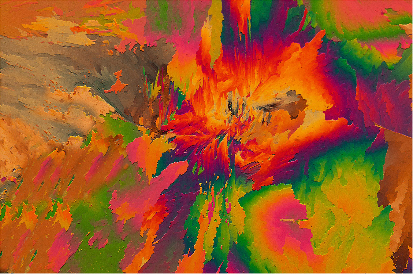
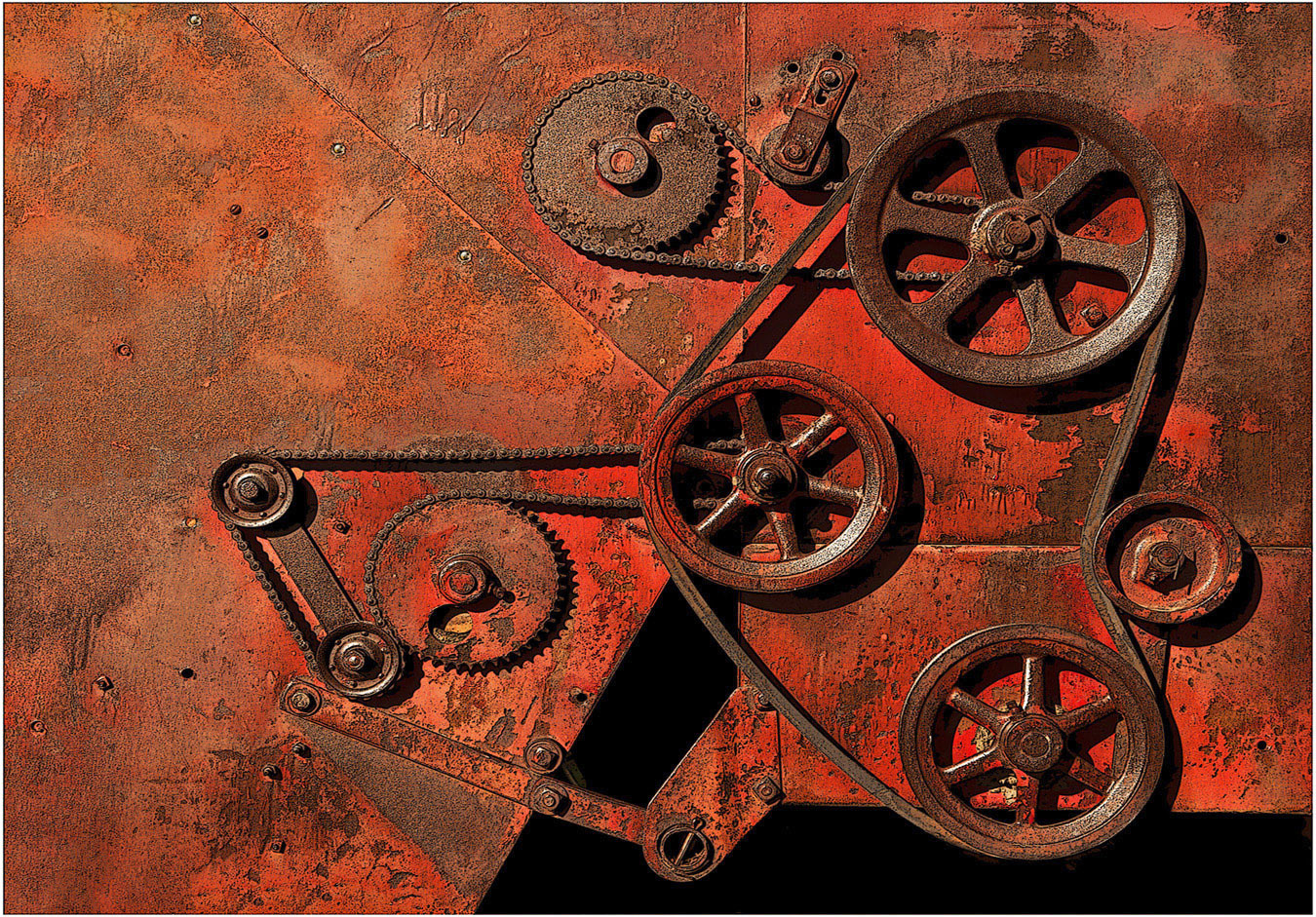
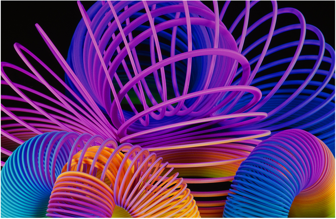
Hi Charlie: Another interesting creation from artistic mind of Charlie, and all aspects perfectly done.
The colors of the rubber bands blend well together in an interesting design. Everything in this picture is warm toned; the brown background was a good choice being a lighter shade at the bottom and darker on top.
A lot of post processing work went into the creation of this great example of creative photography. |
Apr 9th |
| 63 |
Apr 26 |
Comment |
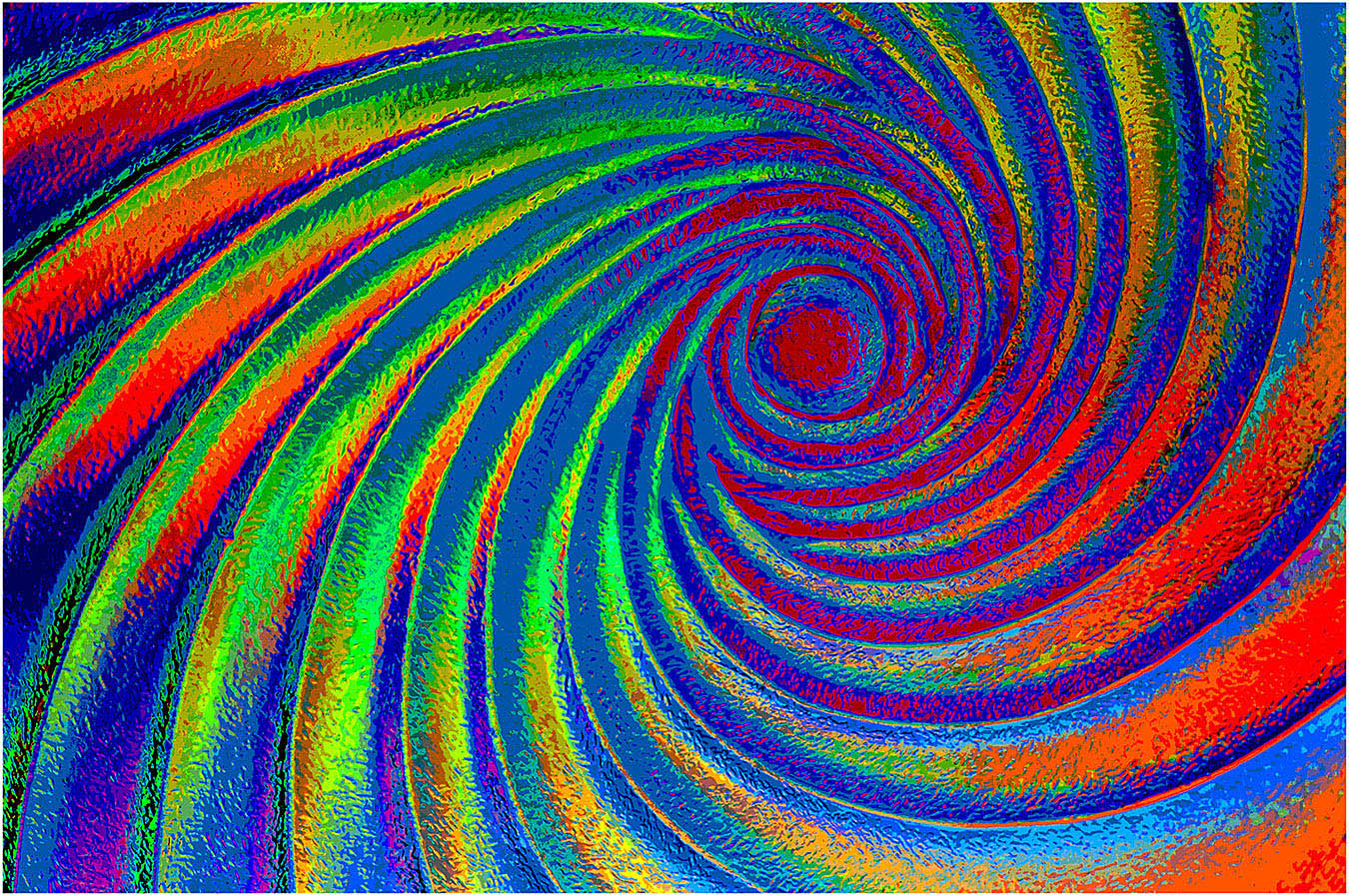
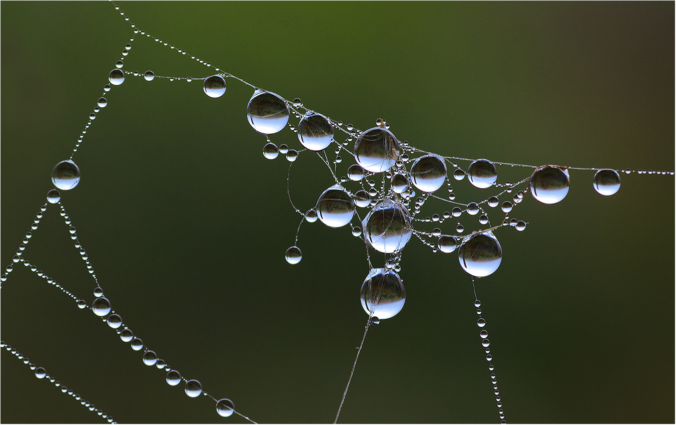
Hi Alane: A very intricate piece of art photographed well.
Hi Impact colors against a black background commands the viewers attention.
Just my own opinion here and other photographers thoughts may vary; This small piece of art seems kind of lost against our large black webpage. My suggestion here would be to add a thin white border, it would define your composition. On how you frame the picture would be entirely up to you as to how you wanted to present the picture to the viewer.
|
Apr 9th |
| 63 |
Apr 26 |
Comment |
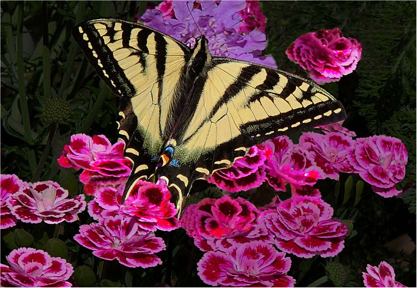
Hi Norman: It would never have occurred to me to photograph 6 forks, but you did just that.
Composition is pleasing with the subjects placed on a diagonal from lower left to upper right, and then your added colors add that extra spark and turn the picture into a creative endeavor.
I do like the addition of the thin white border as it defines your composition against the black web page of our circuit.
Good creative work !! |
Apr 9th |
5 comments - 1 reply for Group 63
|
| 75 |
Apr 26 |
Comment |
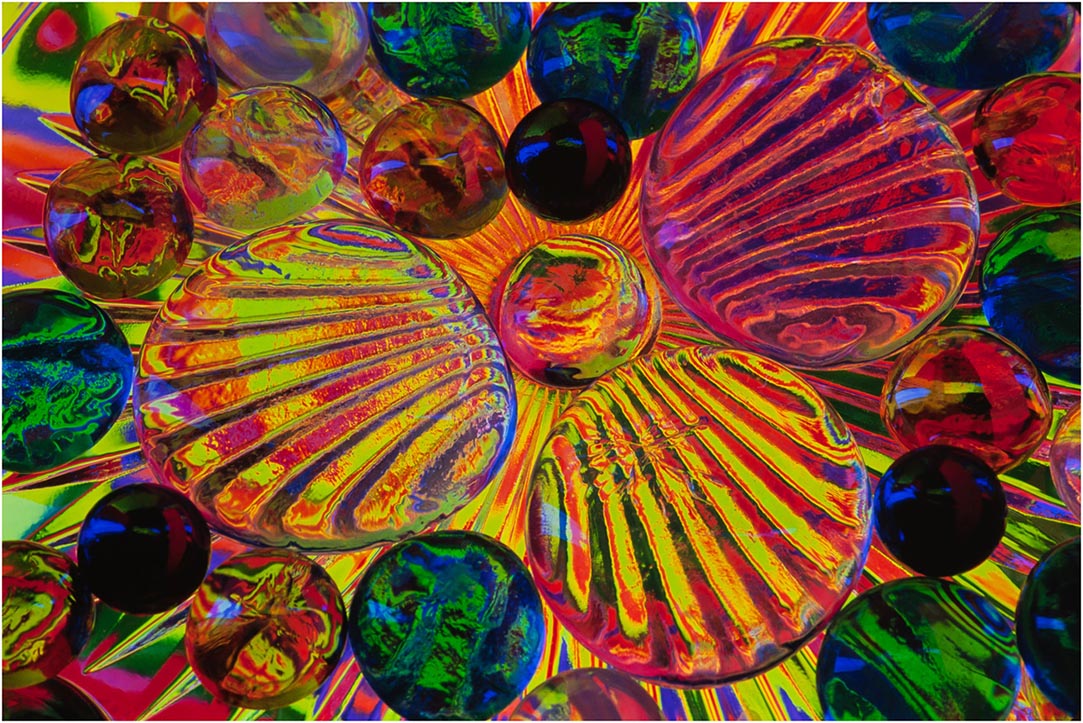
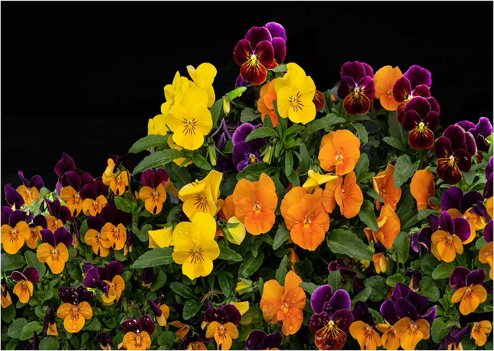
Hi Mo: This is one of the most intricately designed pictures I have seen. It is easy to see you have spent a lot of time and patience placing all of the various objects in just the right place in the frame for the best possible composition.
Then the way you have placed your flash units creates a lot of impact against your black background.
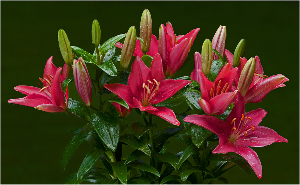
The large tall flower bouquet in the middle ties your composition together and adds that important final finishing touch. A Medal winner in any creative competition. |
Apr 9th |
| 75 |
Apr 26 |
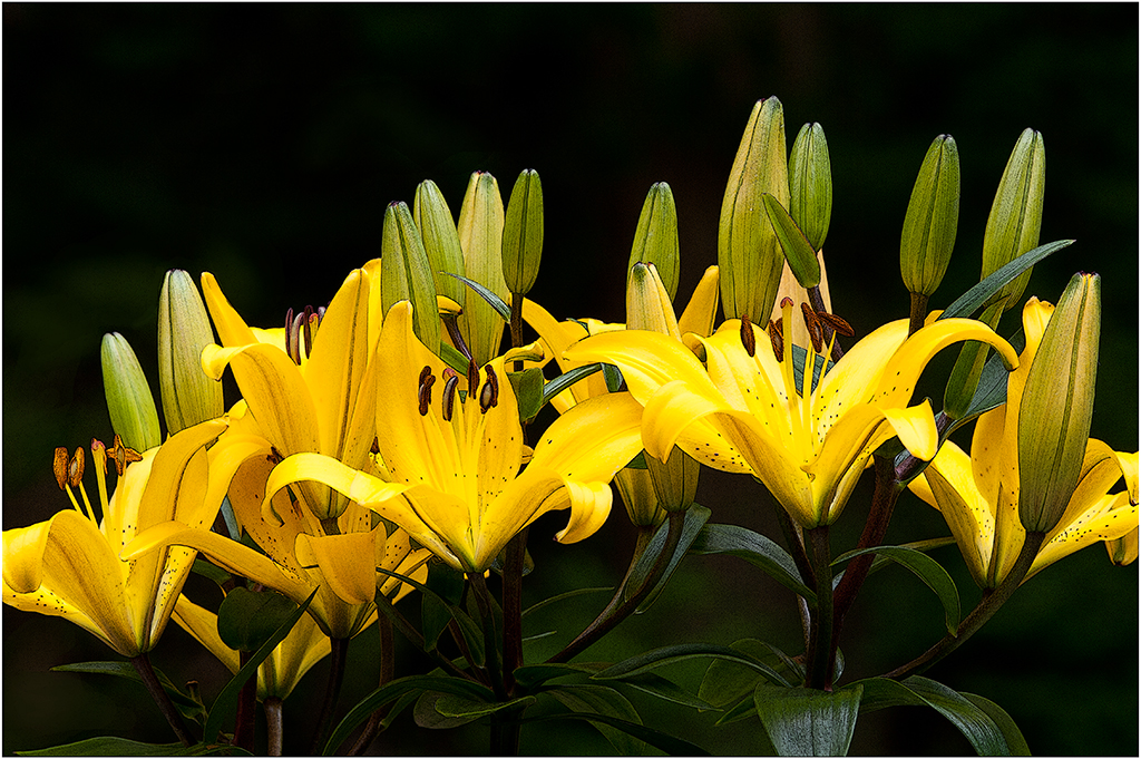
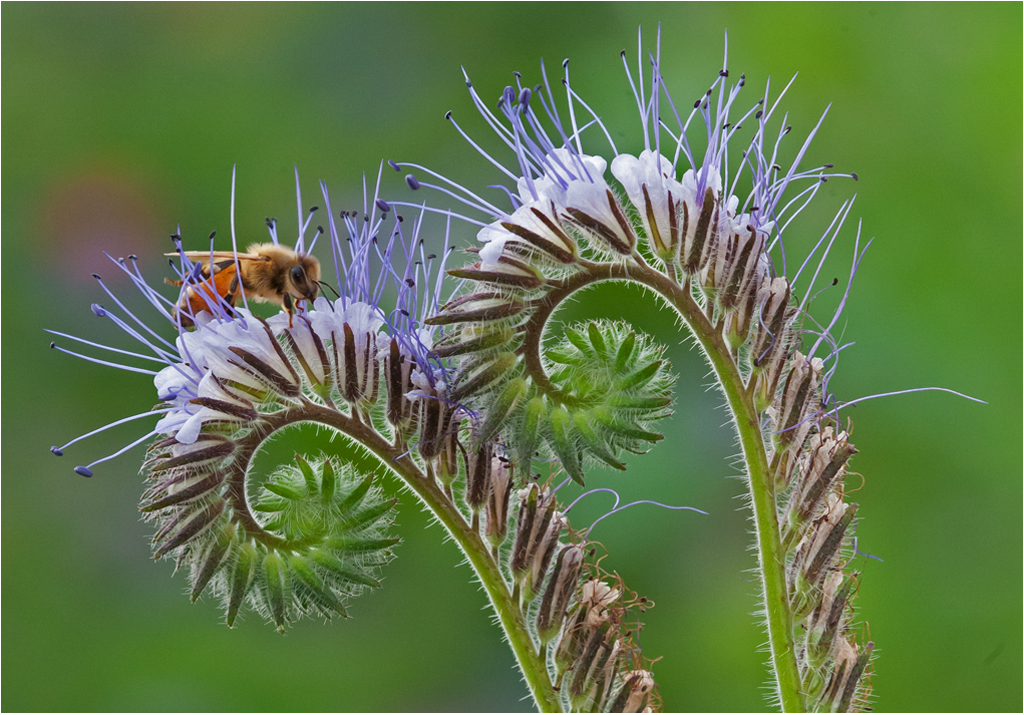
Comment |
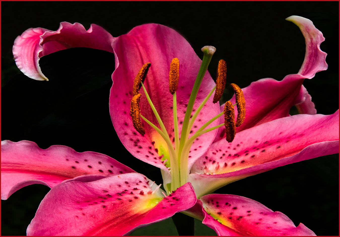
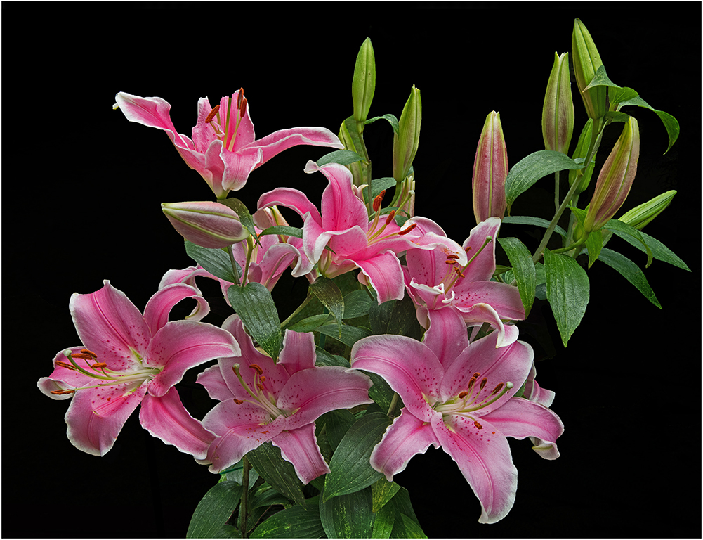
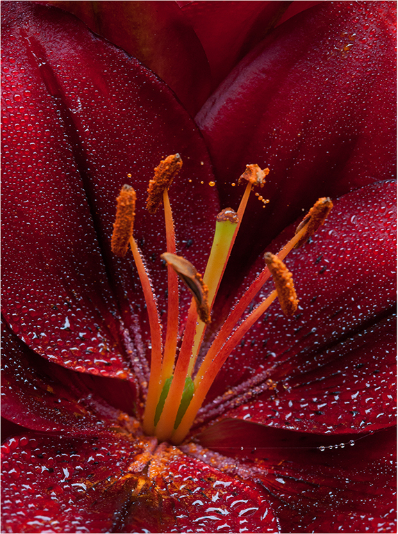
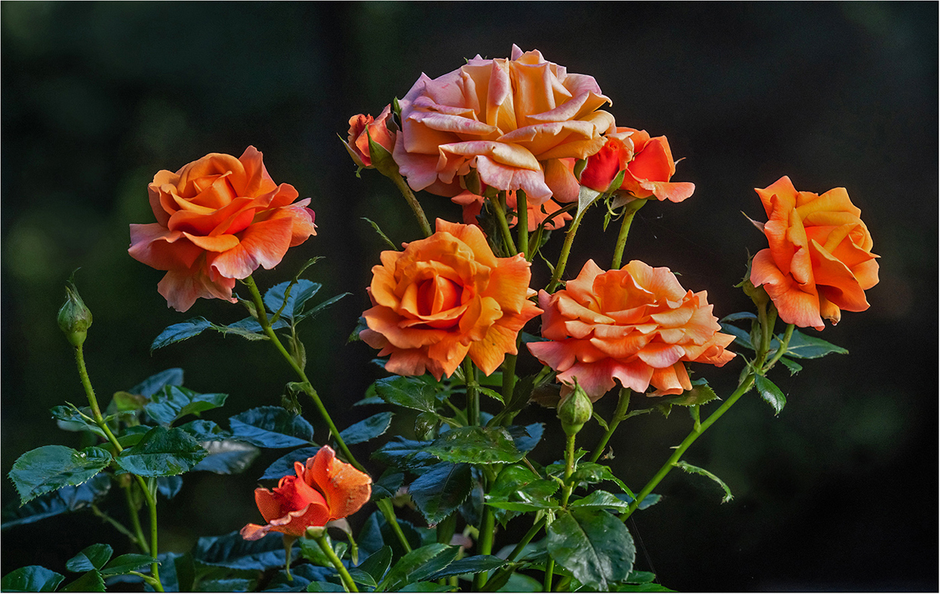
Hi Susan: The f stop of 4.5 has provided you with a really nice selective focus flower picture. Most of the picture is an out of focus blending of colors. I really like your composition where you have a group of orange tulips in the middle of the frame and then the large orange flower in the upper right corner to tie your composition together. Really good seeing to see this possibility and make it work well as you have done. Good Work --- KUDOS |
Apr 9th |
| 75 |
Apr 26 |
Comment |
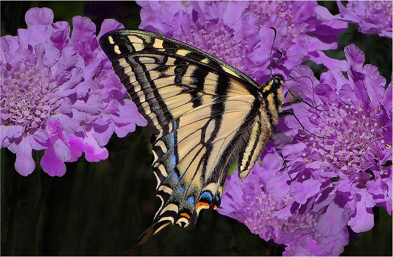
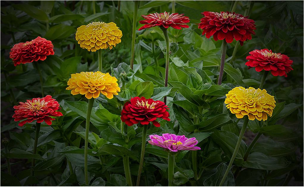
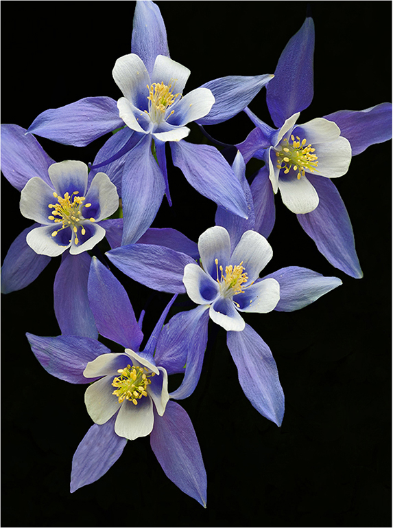
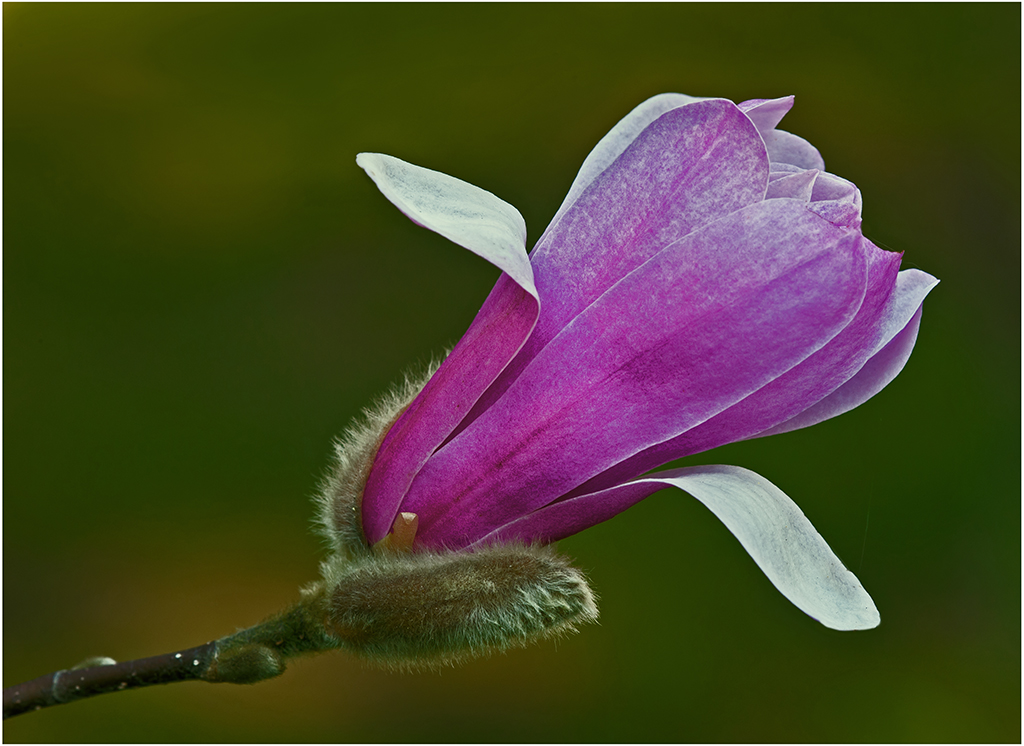
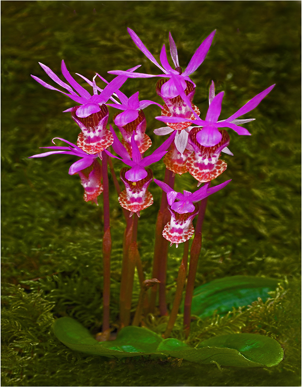
Hi Gaetan: I like your composition a lot, it has a nice pleasant design.
You have used a quite wide aperture setting at F/3.2 which will provide a softer focus which works well here and provides a pleasant soft mood.
As an alternative which would provide a different sharper look would be to use a smaller f stop like in the f/11 to f/16 range.
A good idea to use your tripod here as you have done, it will enable you to fine tune your composition. We cannot see the 4 corners of the frame as the same time. |
Apr 9th |
| 75 |
Apr 26 |
Comment |
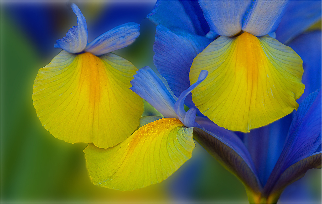
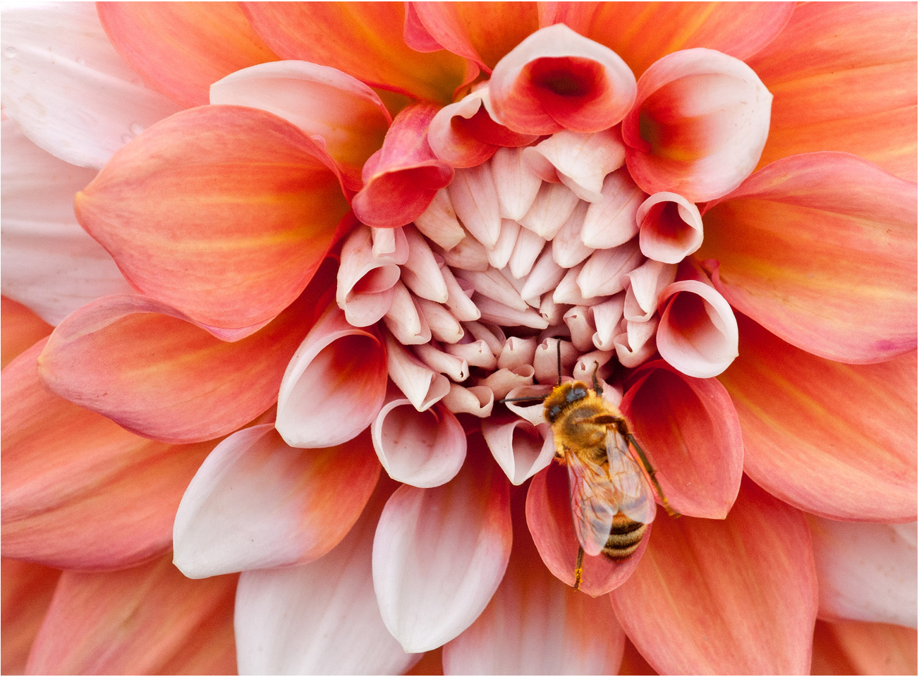
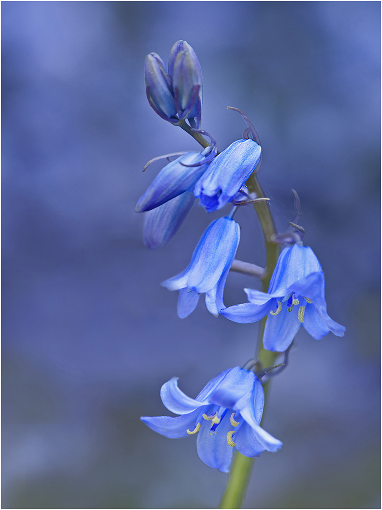
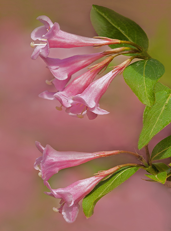
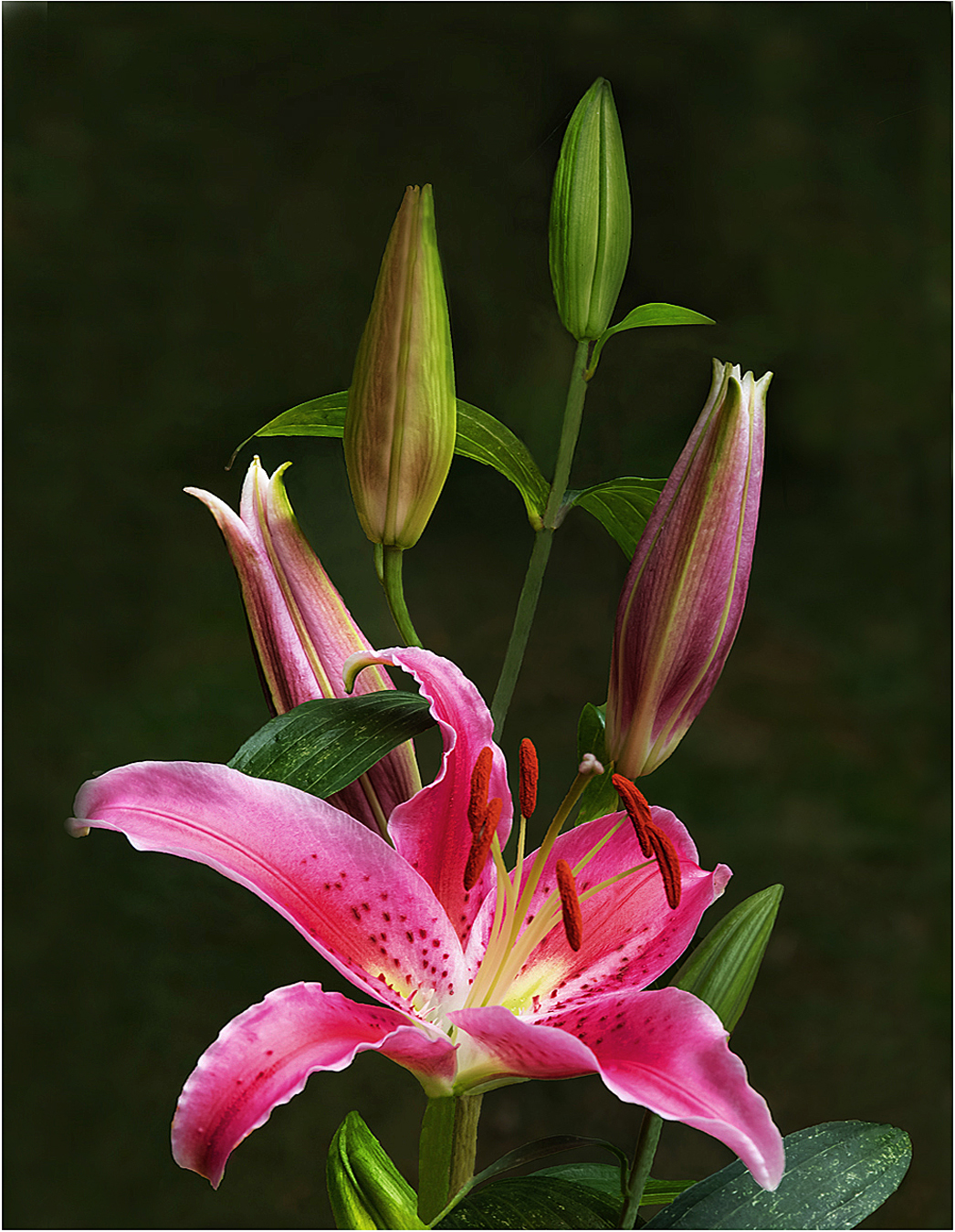
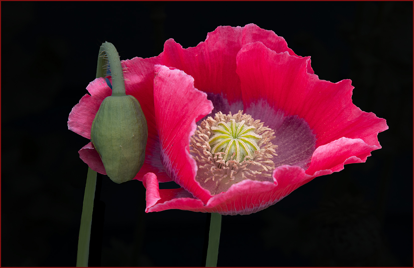
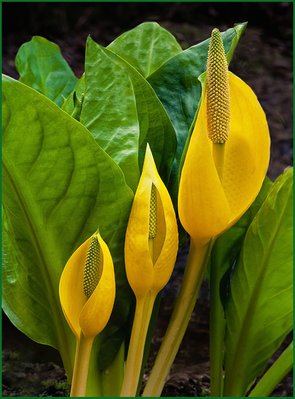
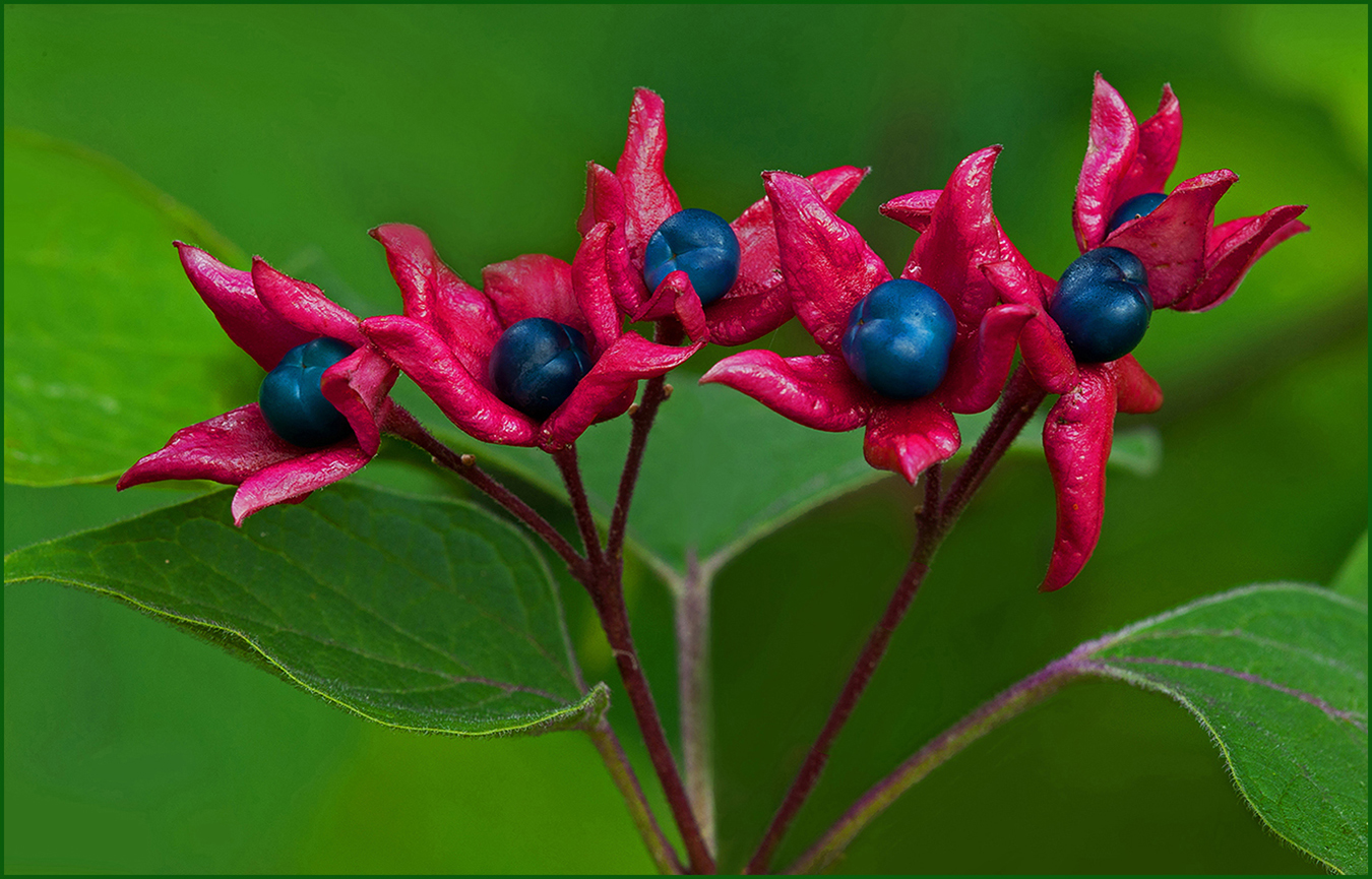
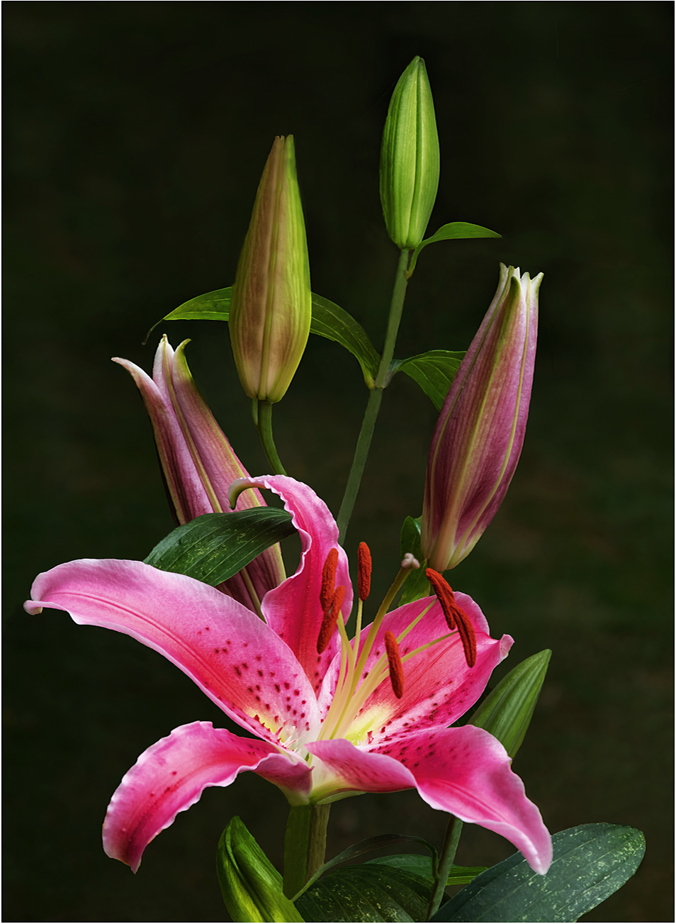
Hi Vincent: Kind of a selective focus image, the green stems are rather soft, however the yellow flower seems reasonably sharp. I think the picture would be improved if you darkened down the very light green at the top, this would make the yellow flower stand out even better. |
Apr 9th |
4 comments - 0 replies for Group 75
|
15 comments - 2 replies Total
|