|
| Group |
Round |
C/R |
Comment |
Date |
Image |
| 11 |
Mar 26 |
Comment |
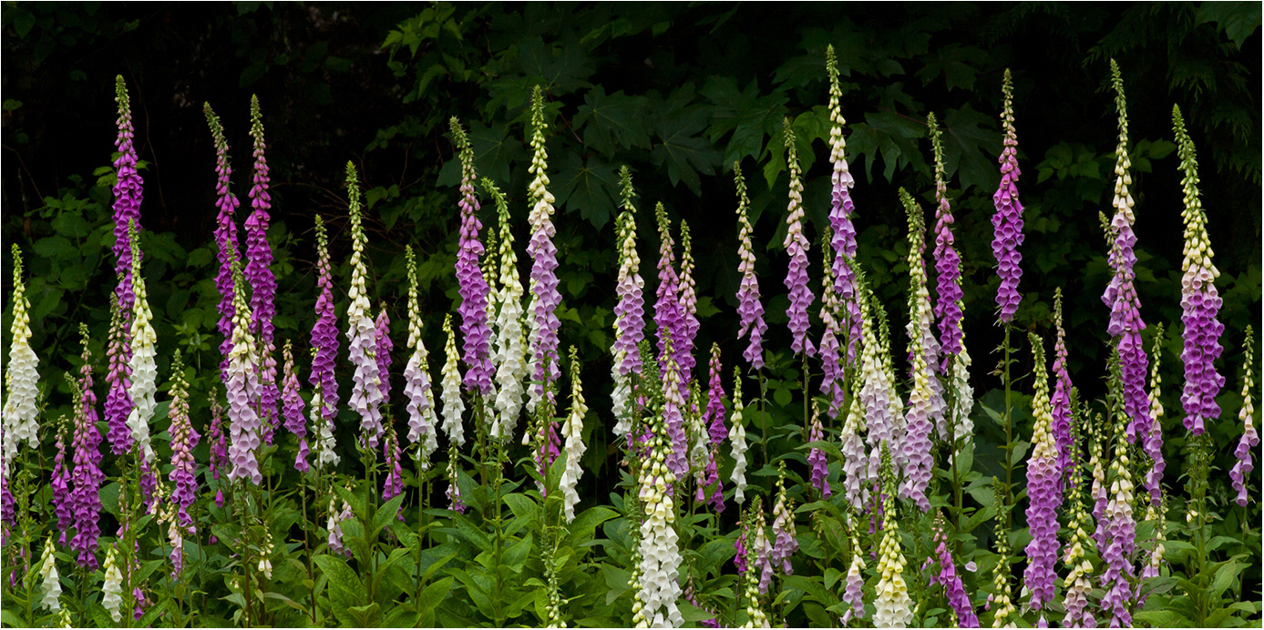
Hi Charles: Longwood Gardens is on my Life List of locations. to visit, hopefully someday
|
Mar 23rd |
| 11 |
Mar 26 |
Comment |
Hi Henry: The monochrome conversion has more impact than the original color. That cloud was definitely your friend as it completes your composition.
Regarding the monochrome conversion, I would leave as is as I think it is just right. |
Mar 17th |
| 11 |
Mar 26 |
Comment |
Hi Charles: You went through many post processing steps to achieve the vision you wanted to share with us.
You have a dramatic scene with higher contrast and very sharp details, I especially like the backlighting on the shrub rows in the foreground and the backlit trees at the top of the frame.
The landscaping in these gardens most always is impeccably kept which always adds to the total impact. |
Mar 17th |
| 11 |
Mar 26 |
Comment |
Hi Nenette: The model standing on the beach in front of the large on coming waves makes a bold statement.
It is interesting to me the monochrome conversion is quite warmer toned compared to the original which has a cool toned bias. A matter of choice in how the maker chooses to present the scene. |
Mar 17th |
| 11 |
Mar 26 |
Comment |
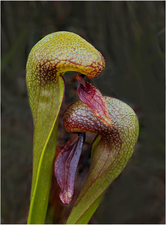
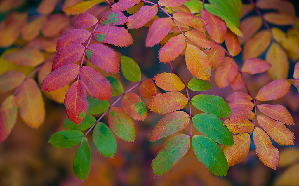
Hi Sheldon: I really like both versions of this swamp, each has its own strongpoints and come across totally differently from each other.
The monochrome comes across as almost stately with the monochrome conversion.
The original color version displays the many colors of nature; the green lily pads, the various colors of the sheen on the water, and then the orange leaves and then also the gray strands of the down ward hanging moss.
|
Mar 17th |
| 11 |
Mar 26 |
Comment |
Hi Peter: I like this wintry scene, has that cool mood I like. I like your placement of the gate in the scene, you choose not to "dead center" the gate as you have biased it slightly to the left. |
Mar 16th |
| 11 |
Mar 26 |
Comment |
Hi Ed: A lot of interesting architecture to enjoy viewing in this scene. As we all are aware of when traveling the weather conditions at the time of arrival play a large part in our photography on what works and what does not.
From a compositional standpoint you have balanced the various buildings so they works well in a group. You did well in keeping the various buildings vertically straight and not tilting in on each other as we sometimes see.
|
Mar 16th |
7 comments - 0 replies for Group 11
|
| 63 |
Mar 26 |
Comment |
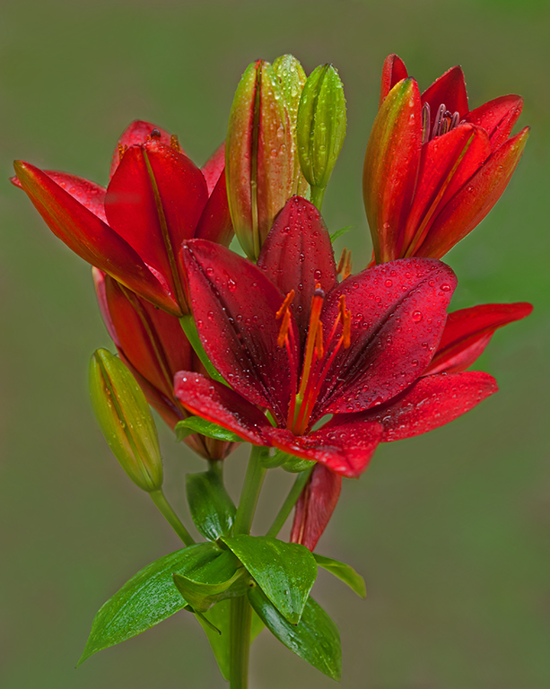
Hi Ruth: A creative and interesting experiment using the Gerber Daisy as your subject. Very strong saturated colors with high impact against a very dark green background.
Very good sharpness on the red flowers, the medium green stems do show some fuzz detail. |
Mar 16th |
| 63 |
Mar 26 |
Comment |
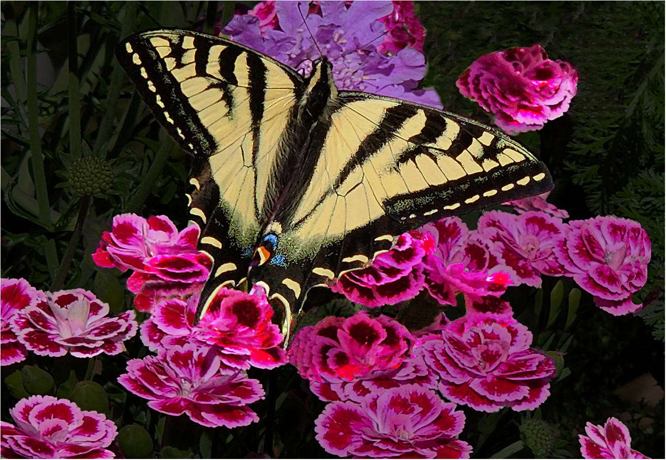
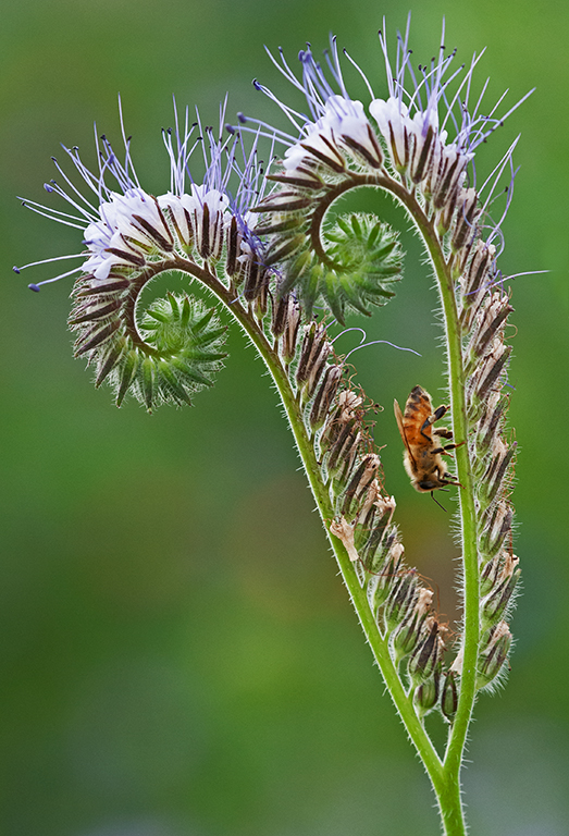
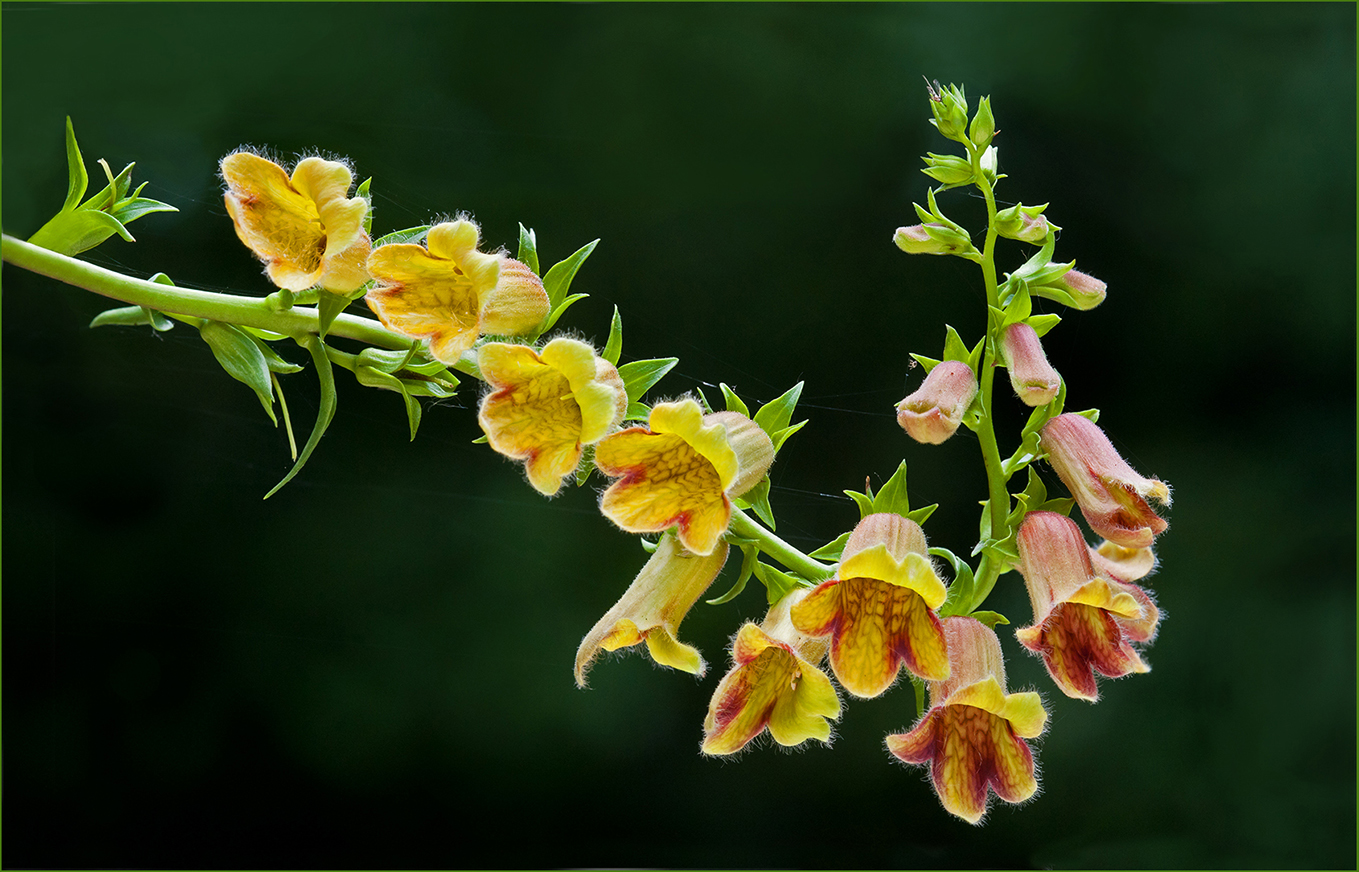
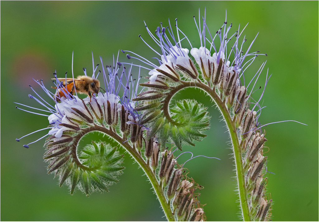
Hi Pierre: I really like the dreamy "look" of your presentation, some parts of the flower are sharp and other parts a little bit soft in detail. I think your quite light background fits the overall mood of your picture.
One aspect I would correct is to remove the out of focus branch at the right side of the frame, as it me it adds nothing to this otherwise interesting picture of the orange butterfly and small bee like insect.
Sometimes the best lens is the lens you have with you.
|
Mar 16th |
| 63 |
Mar 26 |
Comment |
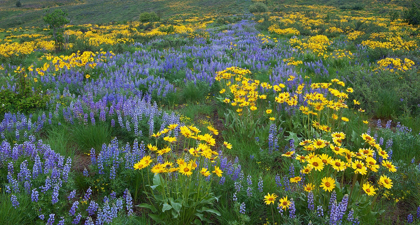
Hi Alane: To me the white flower feels very squeezed into the frame, I would have backed away somewhat to give a little more breathing room around the flower, also darkening down the greenery just a little. |
Mar 16th |
| 63 |
Mar 26 |
Comment |
Hi Norman: Not very often today do we even see a gold fountain pen, let alone a nice photograph of one.
Great choice of background colors and the thin white border adds that finishing touch to this interesting picture. |
Mar 16th |
| 63 |
Mar 26 |
Comment |
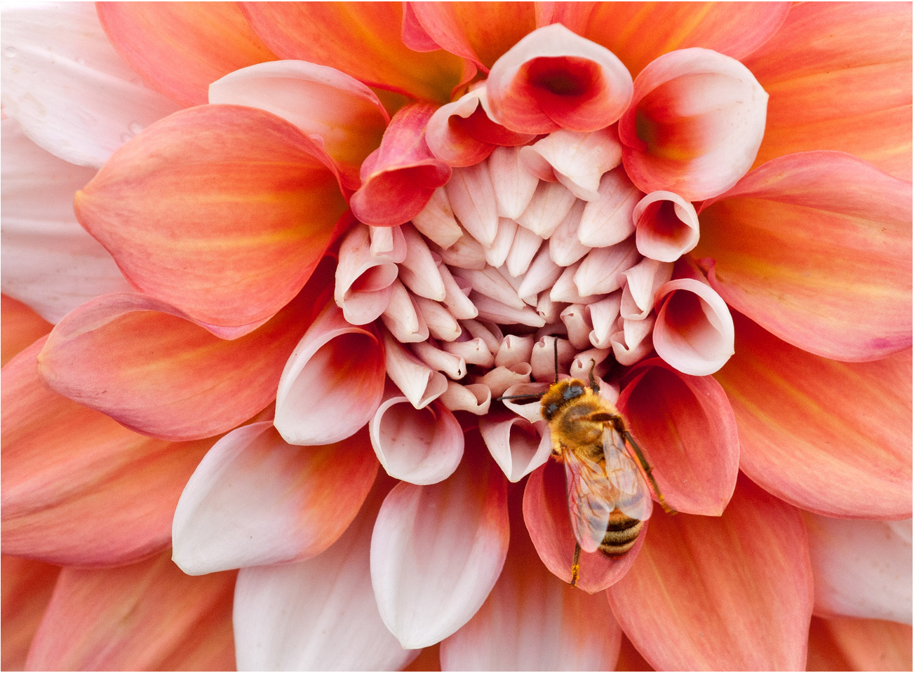
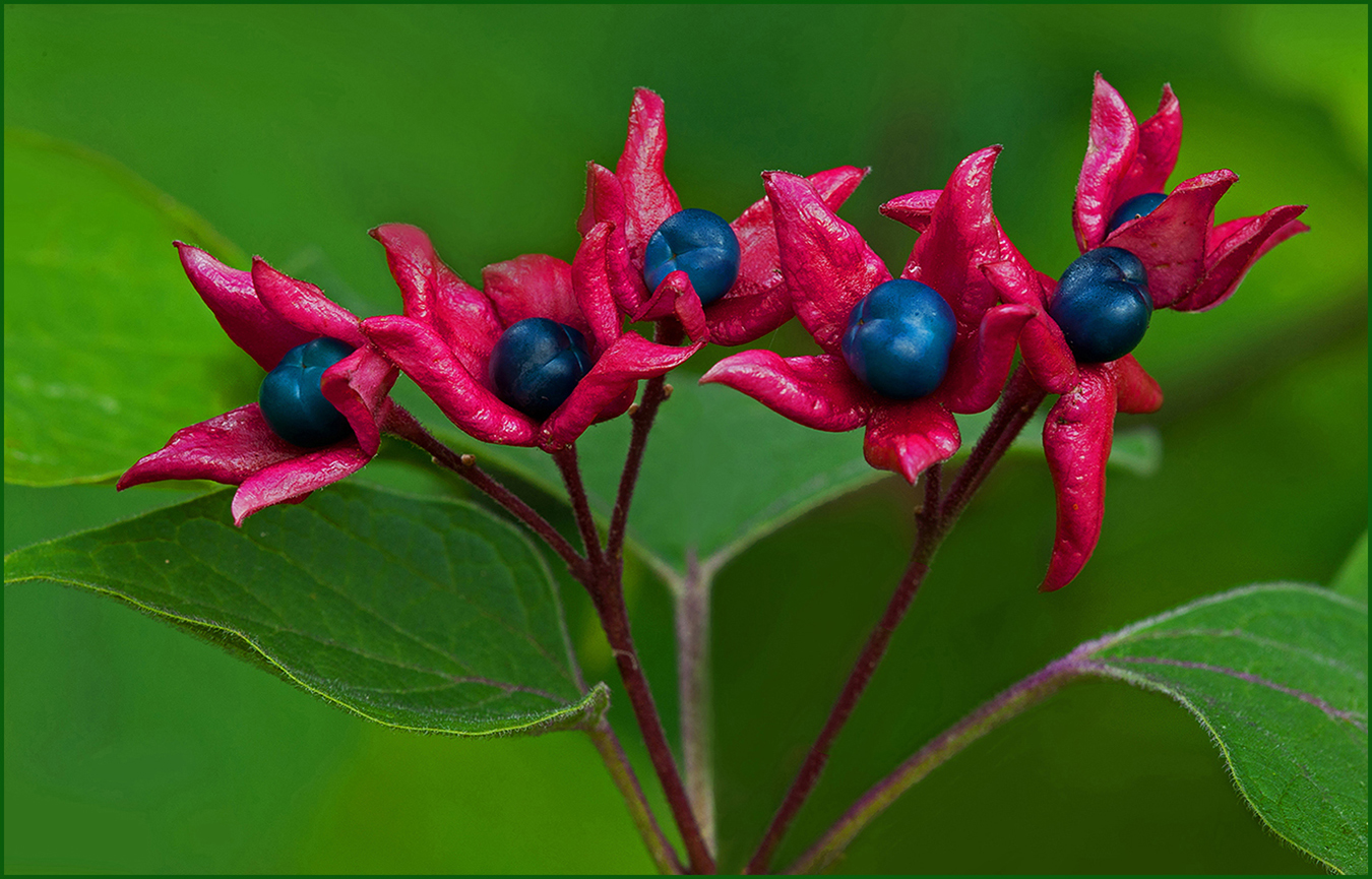
Hi Barbara: An interesting aspect here is the faint leaf shadow on the white flower petals.
I would experiment trying to lighten the very dark shadow under the bee, even just a little. |
Mar 16th |
| 63 |
Mar 26 |
Comment |
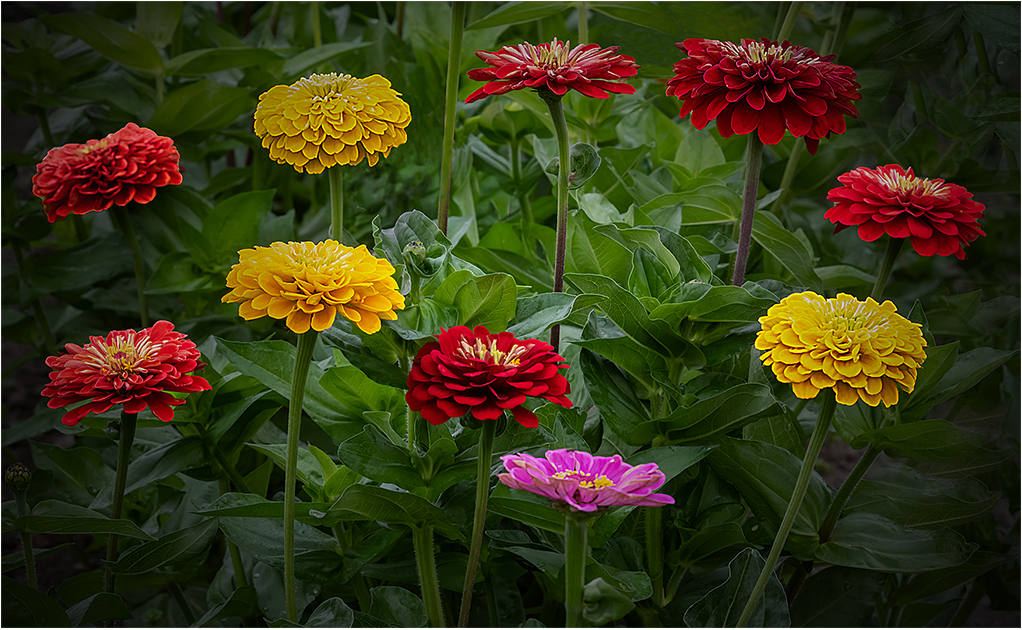
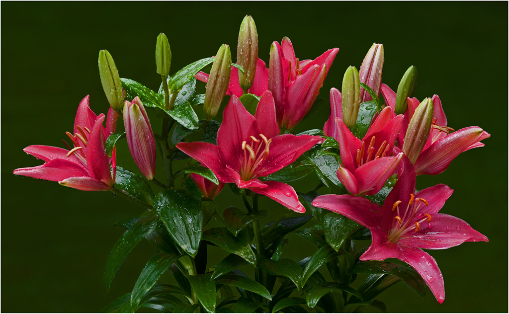
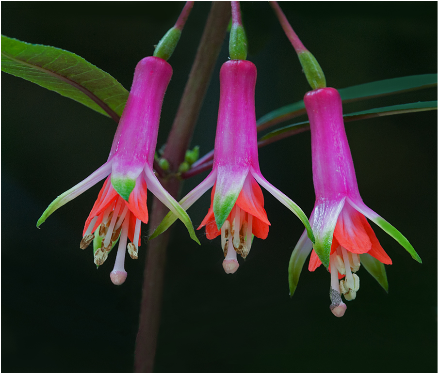
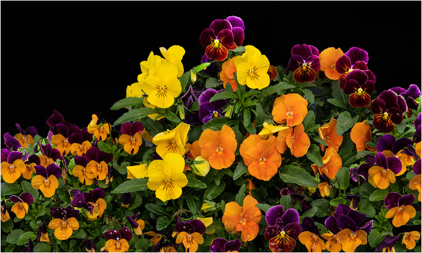
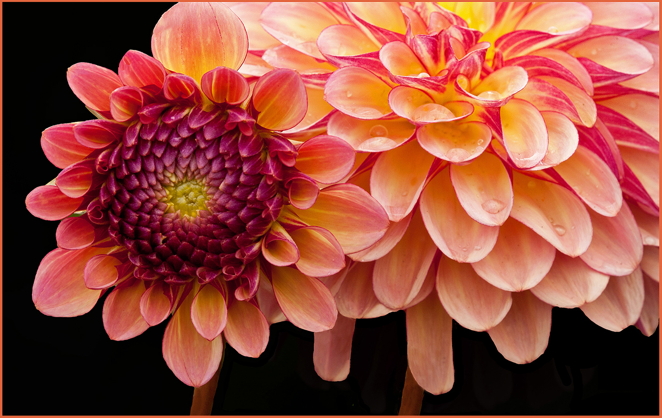
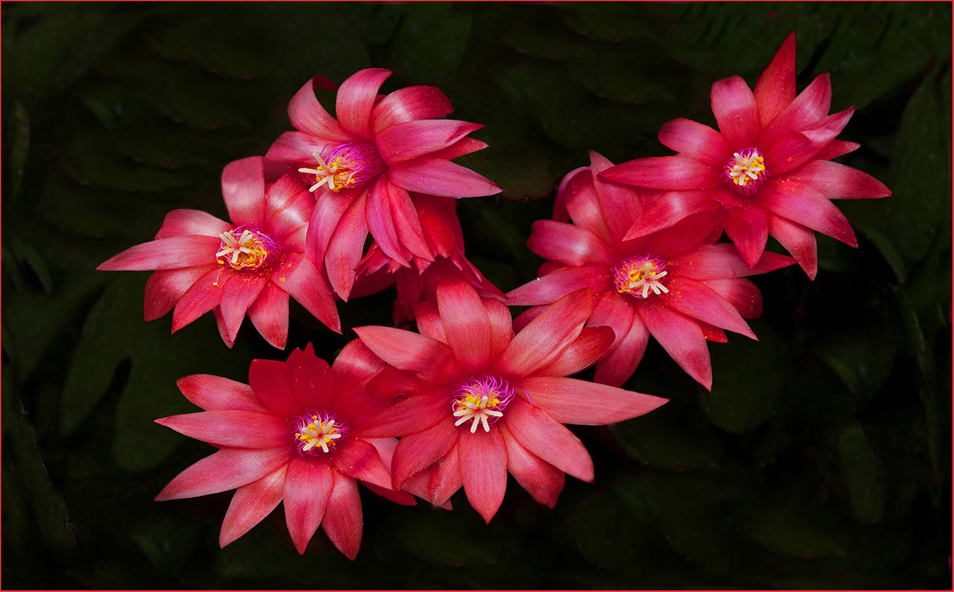
Hi Charlie: Some uninformed photographer once said we should always have an uneven number of flowers in a close in scene, Your picture blows away that comment. Your even numbered picture works great as the flowers are slightly different heights and they are on exactly the same plane with each other, so all very sharp in focus.
Choice of background color is perfect.
|
Mar 16th |
6 comments - 0 replies for Group 63
|
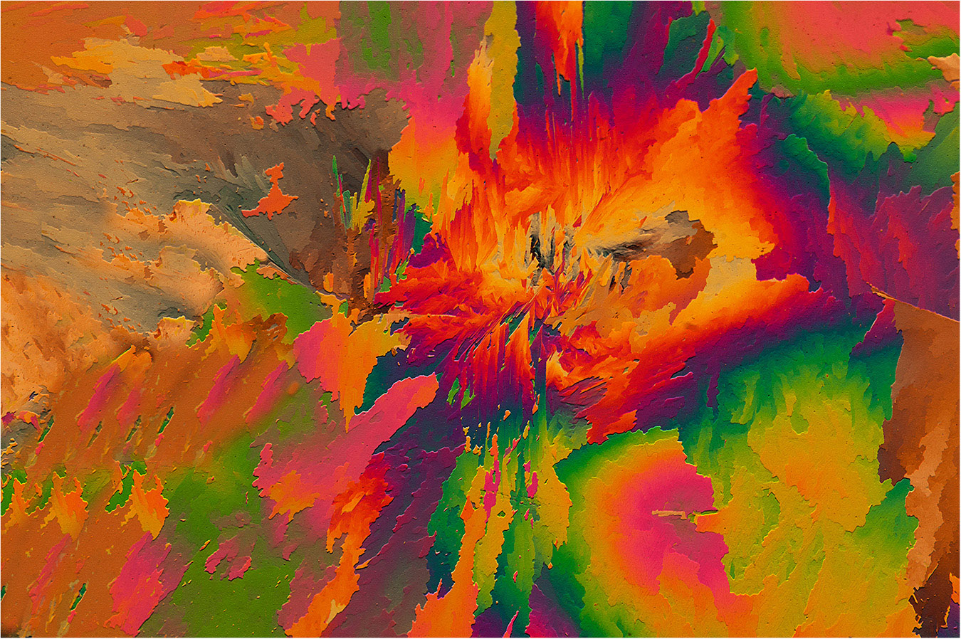
| 75 |
Mar 26 |
Comment |
Another artistic presentation from the creative mind of Mo!!
There is a lot of picture elements to look at in this picture.
It will take a lot of time and tweaking to bring this to idea to life, but if anyone can do it, Mo can... cheers. |
Mar 16th |
| 75 |
Mar 26 |
Comment |
Hi Susan: A wonderful example of selective focus flower photography done extremely well. You have checked all of the right boxes here, even the smallest of details has been well attended to. Kudos on great work in all aspects !! |
Mar 16th |
| 75 |
Mar 26 |
Comment |
Hi Gaetan: I concur with Susan regarding the overall lighting on the flower, the flash has burnt out parts of some petals with other parts being in dark shadow.
Your Nikon d750 is a splendid camera body very well able to render this flower beautifully without the use of a flash. A good solid tripod would work very well, I also use the 90mm Tamron macro lens and it is a quality piece of optics and will render fine imagery when used correctly. |
Mar 16th |
| 75 |
Mar 26 |
Comment |
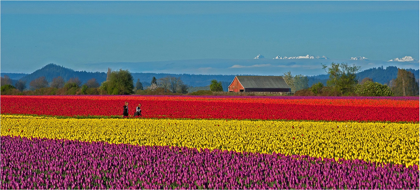
Hi Vincent: The colorations in the original seem a bit on the flat side to me. Susan has tweaked the colors to give he image more impact which I agree with. Parts of the yellow tulip are fairly sharp in detail other parts are not.
You have never mentioned shooting from a tripod, I kind of think your imagery would be sharper overall if you were to use one and shoot at f/16 aperture.
|
Mar 16th |
4 comments - 0 replies for Group 75
|
17 comments - 0 replies Total
|