|
| Group |
Round |
C/R |
Comment |
Date |
Image |
| 11 |
Feb 26 |
Comment |
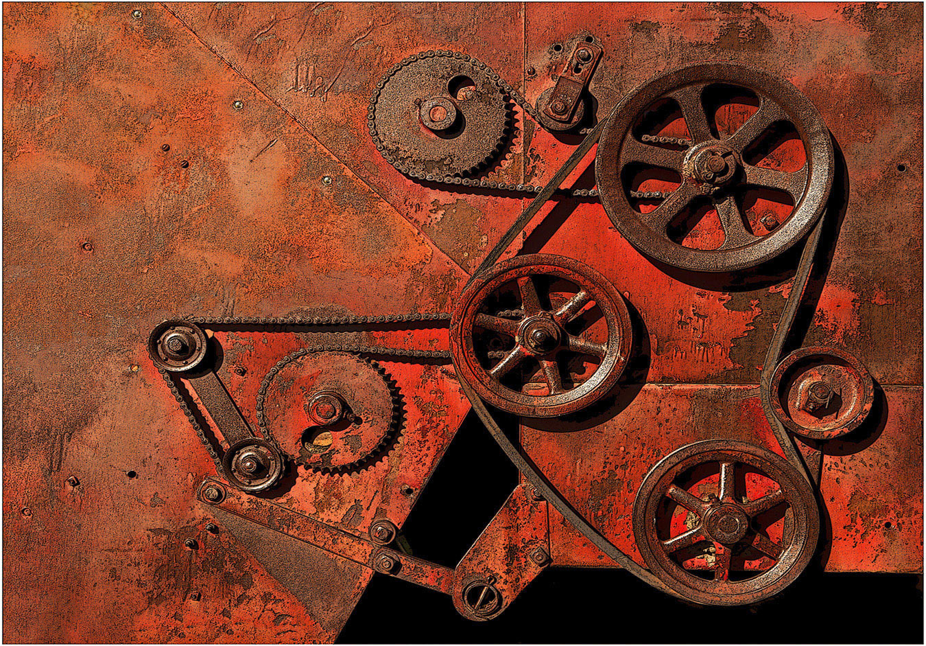
Hi Henry: Have always liked Geometric Pattern images, having spent a lifetime in construction working on angles they are kind of second nature.
It would be a challenge for me shooting hand held and pretty well straight up trying to keep my balance while arranging the various beams in my viewfinder or LCD and get all of the measurements perfect from side to side. We cannot see all 4 sides of the frame at the same time either.
To the unpracticed eye everything looks pretty good, to the trained eye there are some slight variations most people would never see.
Good job of seeing the possibilities and thanks sharing this interesting picture with us. |
Feb 12th |
| 11 |
Feb 26 |
Comment |
Hi Charles: What an intricate architecturally designed building with all of the columns on the end of the building. You have in post processing used many tools very well to arrive at the finished product which has high impact against the cloudy sky.
Regarding composition; There is another building to the right that has some kind of antennas on top, this building looks very utilitarian and is not at all in keeping with the main majestic building you featured in your picture, I would clone that building out and replace it with your interesting clouds.
There are some distracting elements on the left that to me distracts from your main building, I would also clone some clouds into that area.
Of course just my own options, other opinions may vary.
|
Feb 10th |
| 11 |
Feb 26 |
Comment |
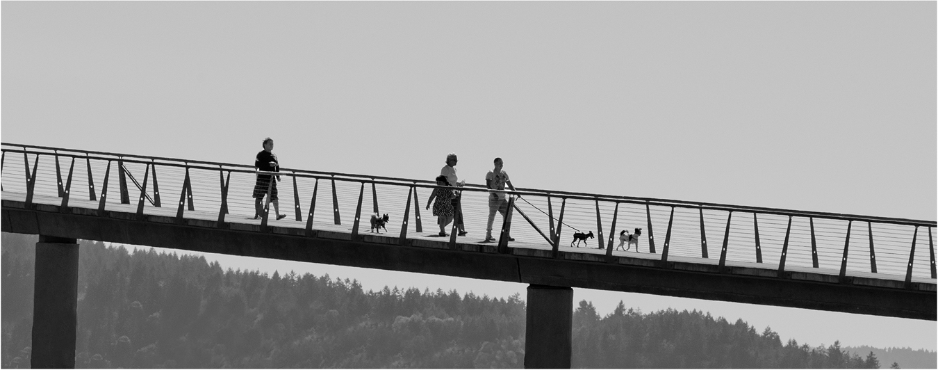
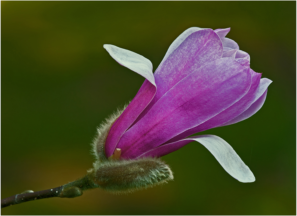
Hi Nenette: A very delicate feather image with fine detail. You were very fortunate to have afternoon sun lighting the feather as it provided a really sharp image. You do not mention what shutter speed used, but it was fast enough to stop any motion.
The monochrome version really brings the image to life, more so than the original color. |
Feb 10th |
| 11 |
Feb 26 |
Comment |
Hi Sheldon: After reading your description, and Henry's thoughts on this old prison I think you have captured the mood of this old Museum very well.
Regarding composition; you stood in exactly the right spot to capture all of the design elements therein.
Excellent tonality from the black doors through many shades of gray to very light gray.
|
Feb 10th |
| 11 |
Feb 26 |
Comment |
Hi Peter: Lovely title which fits the subject well. Wonderful soft window lighting sets a nice mood for this young lady looking out the window. Really good tonality from black to almost pure white
This picture would do very well in any portrait competition you would enter it in as it is so very pleasing to view. |
Feb 10th |
| 11 |
Feb 26 |
Comment |
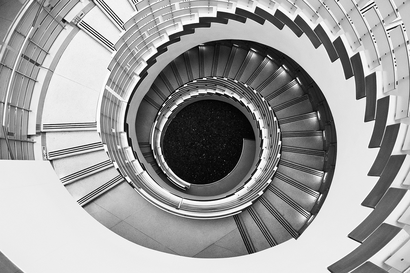
Hi Ed: An amazing architectural type of picture with many different curves. As Henry has pointed out you set your tripod in exactly the right location for the best composition. The larger curve originates from the lower left and the upper smaller curve joins in with the two smaller windows at the upper right corner as great points of interest. A lot to see in this picture.
Really good tonality from black to white and various shades of gray.
I also like your original with the various colors and a little more open composition. Good seeing eye!
|
Feb 10th |
| 11 |
Feb 26 |
Reply |
Thanks Charles for your helpful comments. Waterfalls are also a favorite subject of mine to photograph. To me the challenge is to find a falls with a pleasing composition, and then the lighting has to be conducive to have a favorable outcome. cheers. |
Feb 4th |
6 comments - 1 reply for Group 11
|
| 63 |
Feb 26 |
Reply |
Hi Pierre: Side by side photos would be interesting, a good rainy winter day project. I like abstract type images and
pleased you liked the photo... cheers. |
Feb 15th |
| 63 |
Feb 26 |
Comment |
Hi Ruth and welcome to Group #63. Looking forward to viewing more of your photography.
An interesting frost covered seed head with good exposure and with a pleasant out of focus background.
Regarding depth of field on the seed head; parts of it are tack sharp and then other parts are soft in focus. Using f/10 aperture was insufficient and using an f stop such as f/16 or even f/18 would have helped a lot, or even focus stacking.
Regarding composition; It appears like you have used the rule of thirds as the seed head is biased to the left. Some photographers think the well worn rule of thirds is the holy grail, but it is not. With this certain picture as Charlie has stated a dead centered placement of the seed head would have been ideal. |
Feb 10th |
| 63 |
Feb 26 |
Comment |
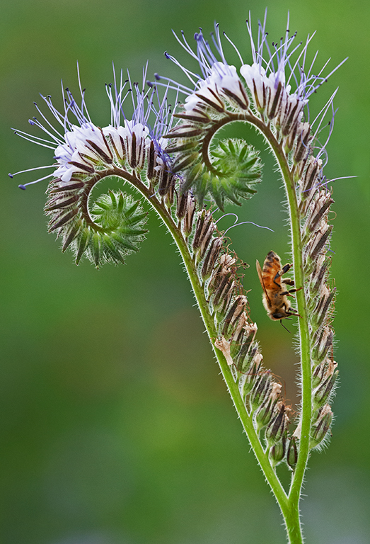
Hi Pierre: An amazing Beetle !! Amazing you can handhold 15 slices without the use of a tripod. Then there is no way you could have the beetle sharp front to back with a single image, so your photo stacking was the way to go.
Charlie has touched on technical aspects so no need for me to go there.
Purely from a aesthetic standpoint you have managed good composition with the right antennae higher than the left antennae.
Just a nit-pic; I would clone out the two pieces of dead grass protruding in from the right side of the frame. The beetle is so special you do not want any distractions intruding on this amazing scene. |
Feb 10th |
| 63 |
Feb 26 |
Comment |
Hi Charlie: Another creative very well thought out image from Charlie's studio. Keen attention to detail displayed here.
I like your arrangement choice with the smaller figure in the middle with the taller one on the right. Like the dark base becoming progressively lighter towards the top of the frame; there is a fine horizontal line in the background that separates the base from the background.
The ambient lighting from the window was the perfect lighting for these diminutive subjects. This is almost a true monochrome, however there are some very small specks of light yellow and light blue. Great Work !! |
Feb 10th |
| 63 |
Feb 26 |
Comment |
Hi Alane: An interesting 'creative' type of image. I like your idea of getting out of ones "comfort" zone and trying something different.
This item appears to be an antique scale. I like your creative touch with low contrast, the top and right side seem to be a little over exposed compared to the rest of the image. The Slim-Jim vertical format fits this subject well. |
Feb 10th |
| 63 |
Feb 26 |
Comment |
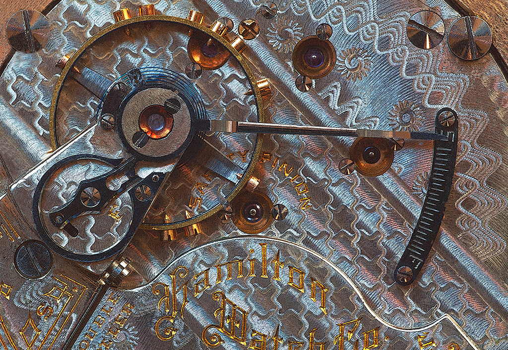
Hi Norman: A simply subject pretty well presented, I like the diagonal composition and good enough sharpness across the frame.
I cannot quite make out the brand of the watch, appears to be a stately older time piece. |
Feb 10th |
| 63 |
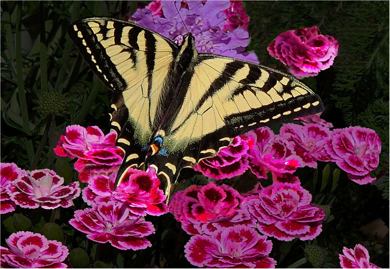
Feb 26 |
Comment |
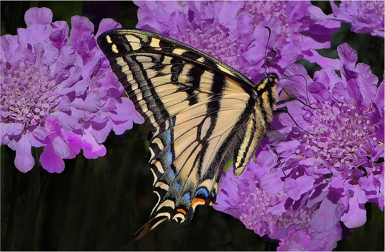
Hi Barbara: For a beginner as you mentioned at the time, you did well on this butterfly photo. Technical aspects are well handled.
If you want to 'mess' with this picture as Norman mentioned you could clone out the shadow under the right wing, then the end of the leaf above the right wing has a funny twist, you could clone this out if you wanted. All nit-pic stuff !! |
Feb 10th |
6 comments - 1 reply for Group 63
|
| 75 |
Feb 26 |
Comment |
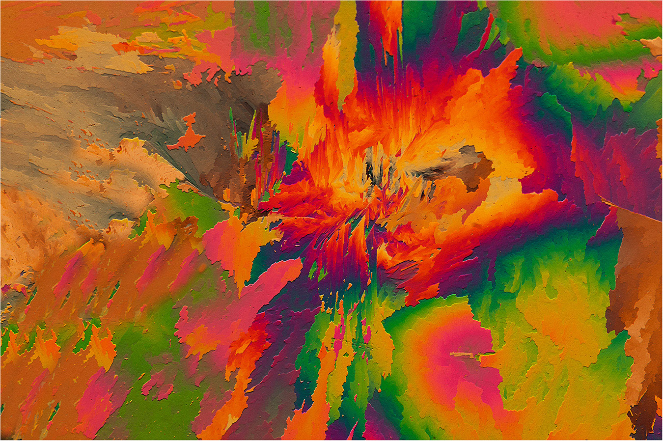
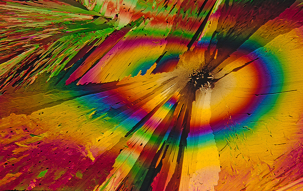
Hi Mo: This picture is very Original, I rather doubt there is another quite like this version. This is a very good experiment in trying something different. |
Feb 9th |
| 75 |
Feb 26 |
Comment |
Hi Susan: Good sharpness on just a narrow portion of the central part of the flower. The outer yellow flower petals are just a blur of out of focus yellow. A really good example of selective focus flower photography. Composition is well done with the central part of the flower biased to the upper right.
A good example of the characteristics of the Lens Baby series of macro lenses. |
Feb 9th |
| 75 |
Feb 26 |
Comment |
Hi Gaetan: Good composition and adequate sharpness across the frame. The yellow flowers seem quite under exposed, need to add a bit of light to the flower grouping.
The F stop of f/6.3 was marginal for the best depth of field, using an F stop of f/11 would have provided a sharper flower grouping.
Susan is correct regarding the bright areas in the background as they are very distracting. Very easy to clone out or tone down. |
Feb 9th |
| 75 |
Feb 26 |
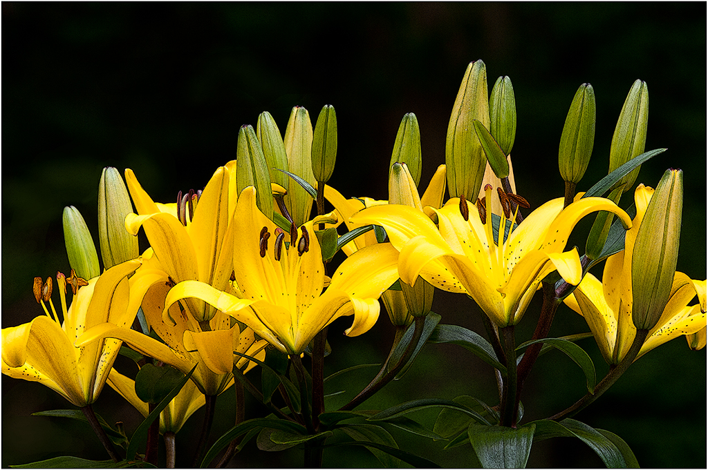
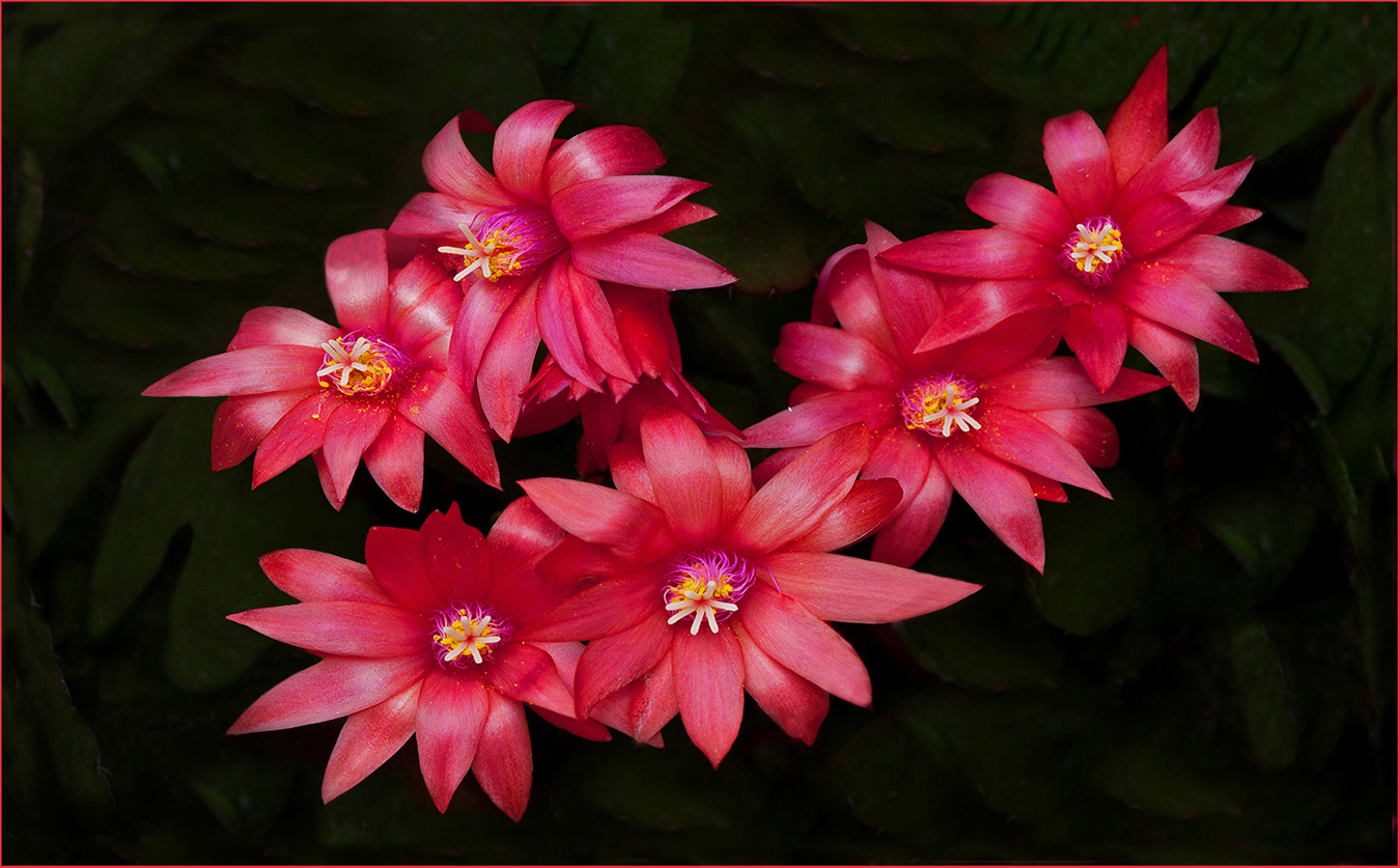
Comment |
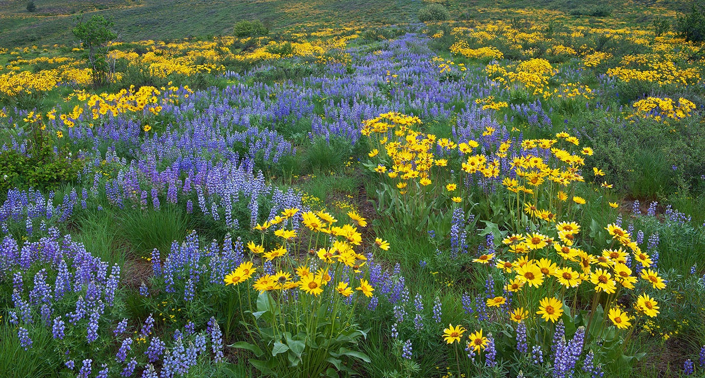
Hi John: Yellow flowers against a darkened down background as you have already done always creates impact.
May I offer a suggestion to frame your image against the dark web page of our circuit. A thin either white or a dark yellow border would help this picture, as we cannot tell where your picture area ends and the dark web page begins. |
Feb 9th |
| 75 |
Feb 26 |
Comment |
Hi Vincent: Backlighting always works on Dandelions in the seed head stage adding impact.
You have some bright distractions in the foreground and background that are distracting and take away from the value of the picture.
It would help a lot if you were to darken down these bright areas. Also a horizontal stem is protruding in from the right across the frame, I would clone out this stem. |
Feb 9th |
5 comments - 0 replies for Group 75
|
17 comments - 2 replies Total
|