|
| Group |
Round |
C/R |
Comment |
Date |
Image |
| 11 |
Jan 26 |
Reply |
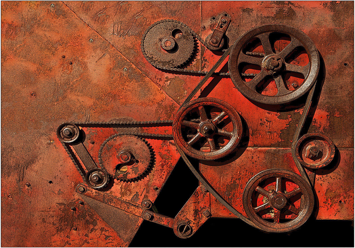
Hi Sheldon: I tried this scene in black and white first, it was just okay. Then using sepia tone brought the scene to life. Ed mentioned sepia added age to the image which it does, much more so than black and white did. |
Jan 21st |
| 11 |
Jan 26 |
Reply |
Hi Ed: Sometimes "in the moment" images can turn out to be excellent. Some folks call these "grab shots" but you did everything exactly right right to capture this amazing scene. |
Jan 21st |
| 11 |
Jan 26 |
Reply |
Hi Charles: Pleased you liked the overall picture. YES; the white globe is too light and over powering, Have gone into my files and found the picture and toned down the white globe, it looks much better now. I did not remove the white globe, just made it into a sepia tone so it blends in with the rest of the image and it does not draw attention.
It never occurred to me to tone it down to begin with, thanks so much for the advise. |
Jan 11th |
| 11 |
Jan 26 |
Comment |
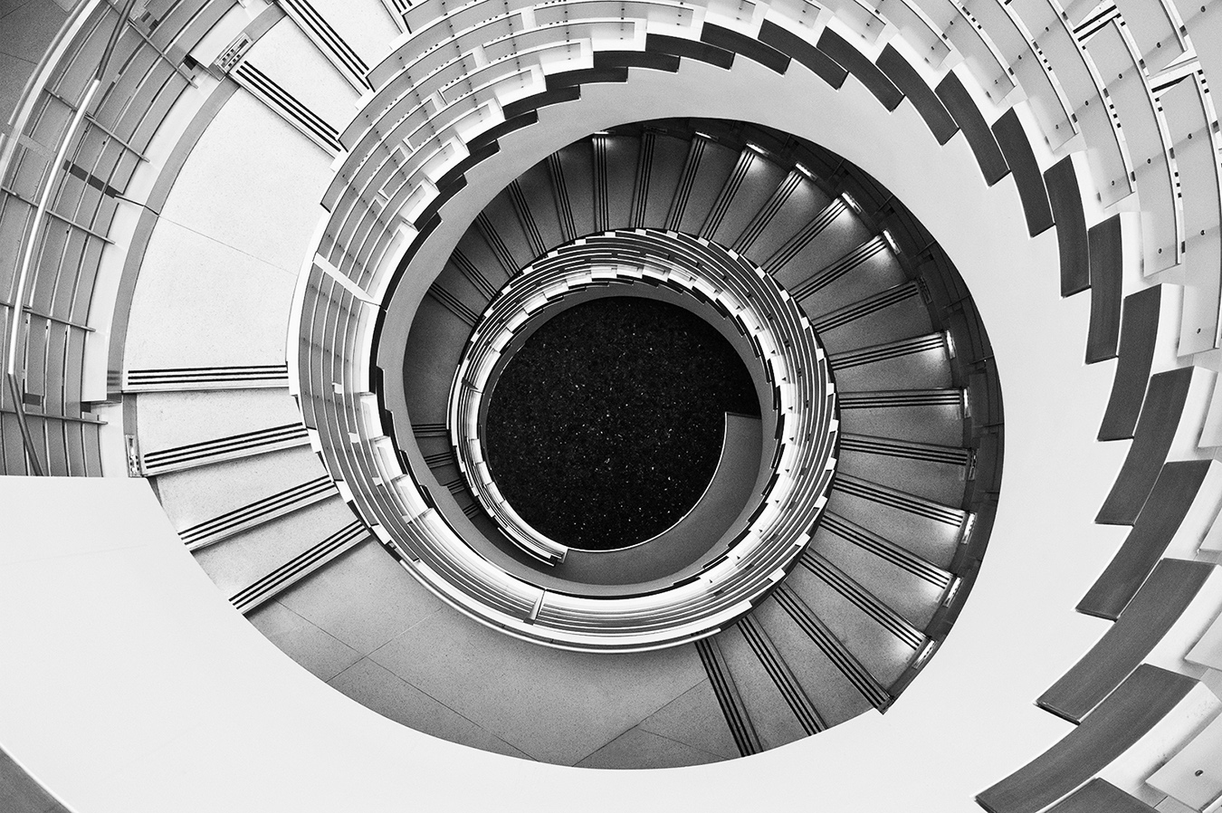
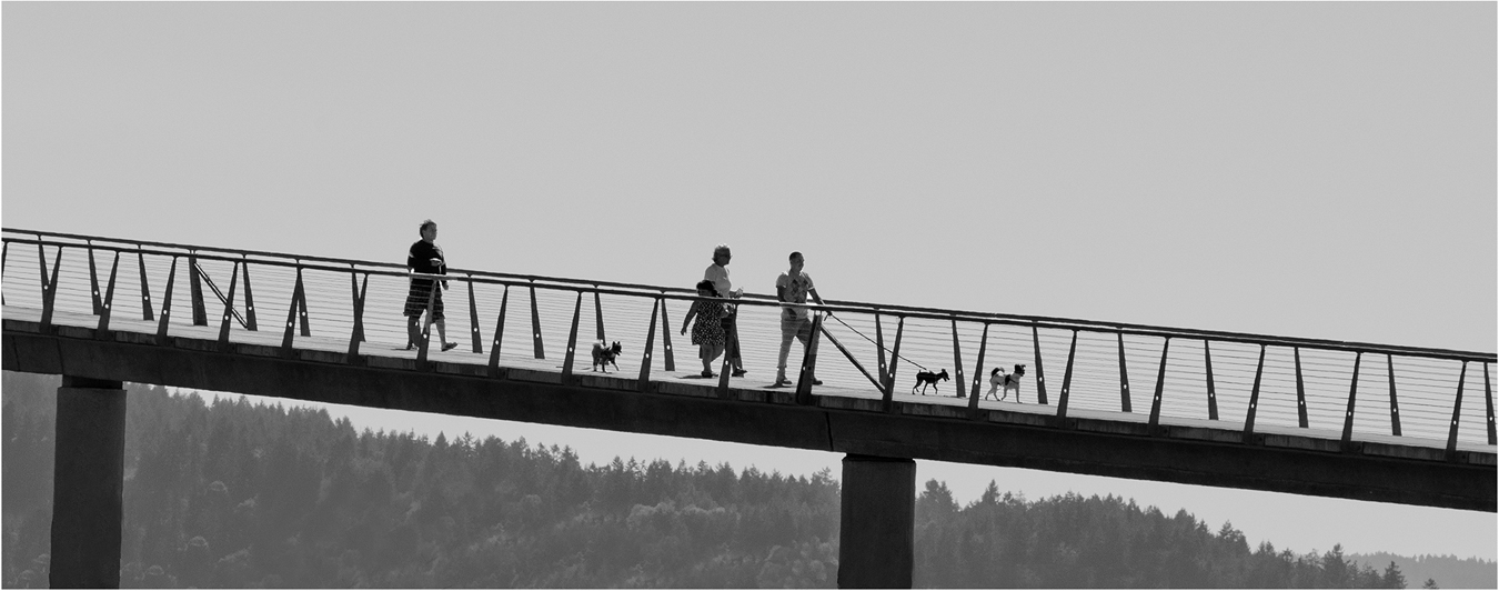
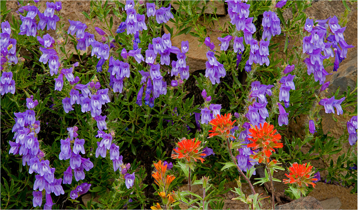
Hi Henry : This picture is a study of horizontal planes. It starts out with the water base, then the very dark band of trees followed by a dark gray cloud band; then we move up to light horizontal stripes along Mt. Rainier. We move up to the top of the frame with a lighter band of horizontal gray clouds.
The monochrome conversion shows interesting tonality from pure black to nearly pure white.
Good seeing to spot this situation and make the most of it. |
Jan 9th |
| 11 |
Jan 26 |
Comment |
Hi Charles: First of all let me thank you for the very well written article "Still Life Photography" you have had published in the January issue of the PSA Journal. Very informative text along with interesting pictures included.
Thanks for sharing.
As the east coast was settled well before the west coast I would imagine some of those old grave markers date back to the 1600 era. Around 1850 is the earliest date we can find on the west coast.
The very high contrast and super sharpness both add a high degree of impact to this scene. The original has a very bald gray sky, you have corrected this in your post processing efforts.
|
Jan 9th |
| 11 |
Jan 26 |
Comment |
Hi Sheldon: A really good higher contrast conversion, this scene lent itself very well to black and white. The clouds and darkened down sky add drama and impact to the scene. The composition of this scene is very well balanced, everything fits very well. Nice Work !! |
Jan 9th |
| 11 |
Jan 26 |
Comment |
Hi Peter: A very well done conversion, the picture looks so very authentic with spider webs all around and the general condition of the old vehicle. The DeLuxe insignia adds a great point of interest.
I also like the original with the various colors there-in.
Great Capture!
|
Jan 9th |
| 11 |
Jan 26 |
Comment |
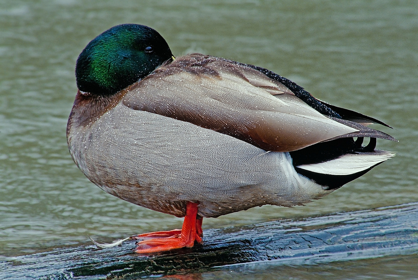
Hi Ed: Great capture of the Humpback Whale, really close in and personal. I have photographed these whales in Alaska, but we were never in this close, so I did not recognize it. The Humpback Whale is a very interesting mammal.
Really good tonality from black to white and with many shades of gray. I also like the original, the colors of the water are so very interesting against the black whale. |
Jan 9th |
5 comments - 3 replies for Group 11
|
| 63 |
Jan 26 |
Reply |
Charlie: I like original #2 and also original #3. The light rays in #3 I think add a lot of interest to the picture, #3 is my favorite. |
Jan 21st |
| 63 |
Jan 26 |
Comment |
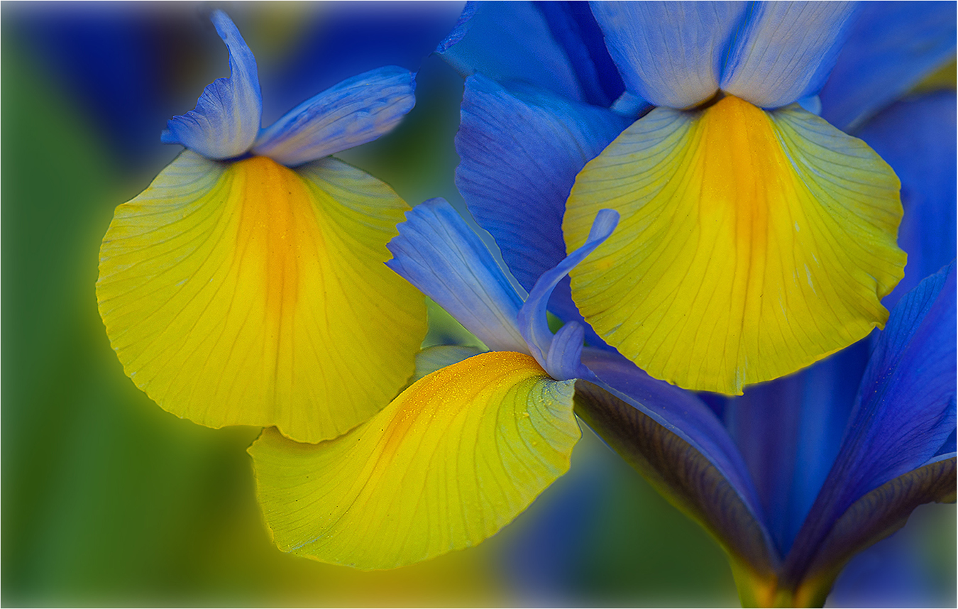
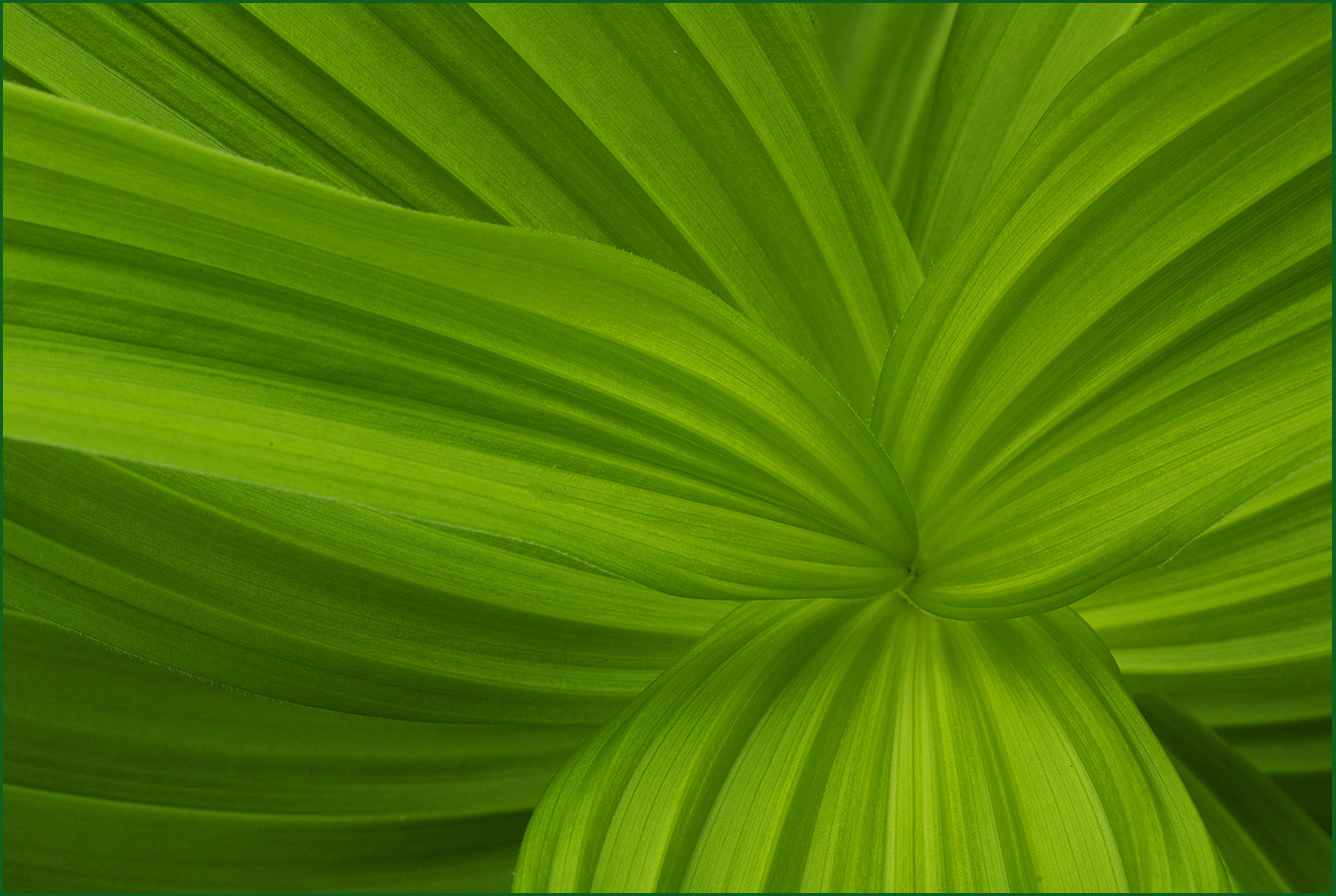
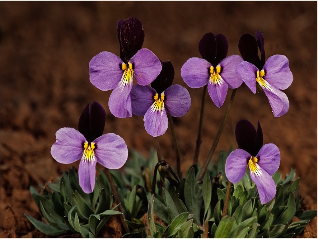
Hi Pierre: A very delicate white flower with a yellow central part. You have managed to show a bit of detail and texture on the white flower petals which in some cases is difficult to achieve on white flowers.
Aside from what Charlie has mentioned I would tone down the two bright green leaves directly behind the flower. This would make the flower stand out better. |
Jan 9th |
| 63 |
Jan 26 |
Reply |
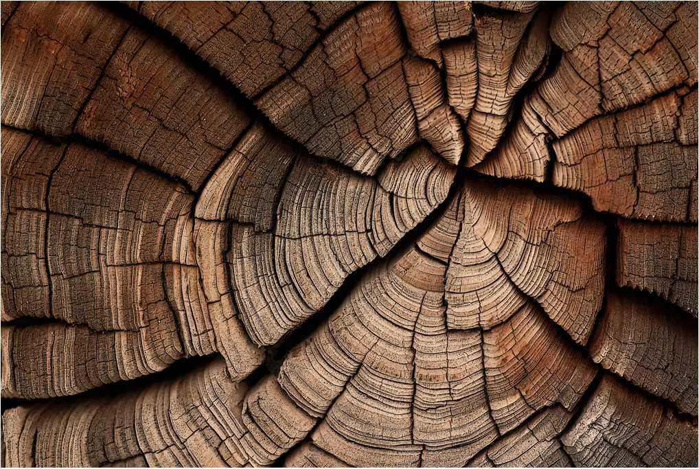
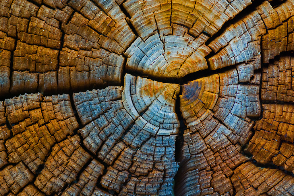
Hi Charlie: The early evening sun lit the old bleached stump a little too much. An easy fix to darken it down, and thanks for the tip. |
Jan 9th |
| 63 |
Jan 26 |
Comment |
Hi Charlie: AGAIN, a very creative colorful image creation of simple subjects from the grocery store.
All of these creative images that Charlie has shared with us are not random snapshots by any means. A lot of thought and experimentation goes into these subjects to arrive at the finished product to share with the viewer.
KUDOS ! |
Jan 9th |
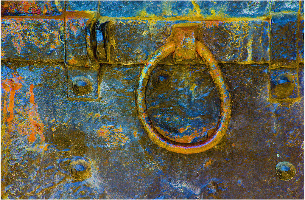
| 63 |
Jan 26 |
Comment |
Hi Alane: A very interesting subject; you have found an interesting composition in this crystal lamp base. Good job of just seeing this composition arrangement and sharing with us.
Charlie's edit is well taken, some of the busy areas have been darkened down to the point of not being very noticeable.
|
Jan 9th |
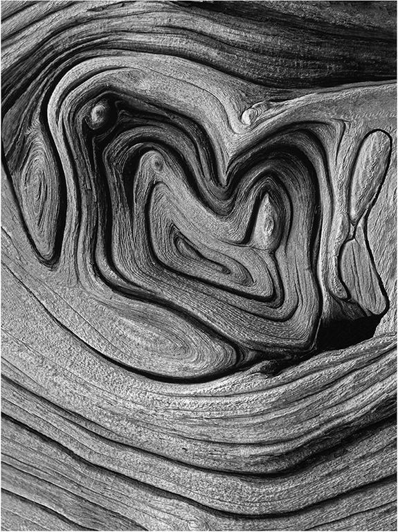
| 63 |
Jan 26 |
Comment |
Hi Norman: Kind of a grotesque type of image, it captures the viewers attention very well. The picture is composed well with a lot of detail.
Some of the older lenses like your 135mm Olympus lens that were manufactured by the main line camera companies of years past are decent lenses, even by todays standards. Some of the 3rd. party lenses of that era of time sometimes left a lot to be desired. |
Jan 9th |
| 63 |
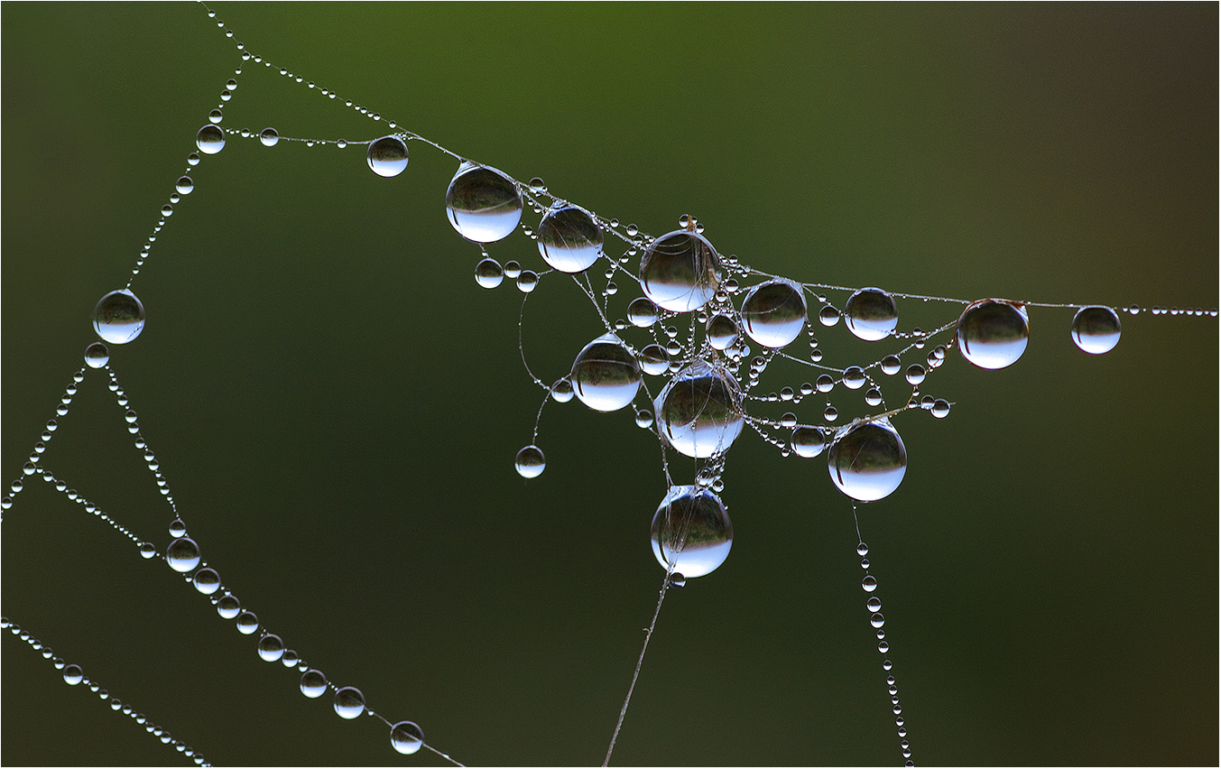
Jan 26 |
Comment |
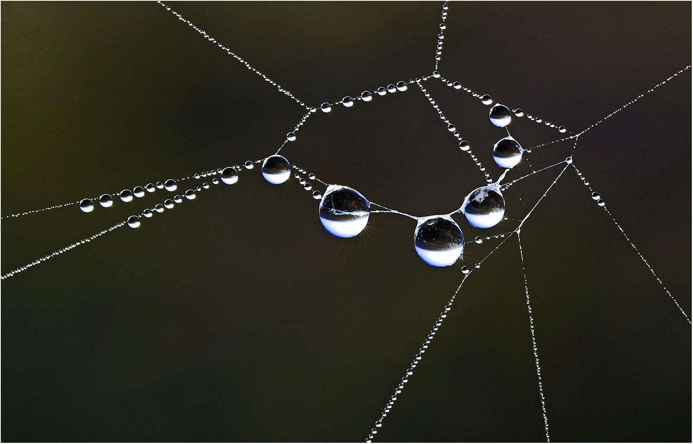
Hi Barbara: One aspect I really like is the colors of the water, on the right the color is kind of a light lavender and the water color turns gradually to red on the left. Your slower shutter speed has created a nice soft mood which fits this scene well. From a technical standpoint the picture is well done.
Just a nit-pik; to the right of the droplet there seems to be a piece of grass in one of the ripples, if you cloned this out your background would be perfect.
I like the face in the water droplet, cheers. |
Jan 9th |
5 comments - 2 replies for Group 63
|
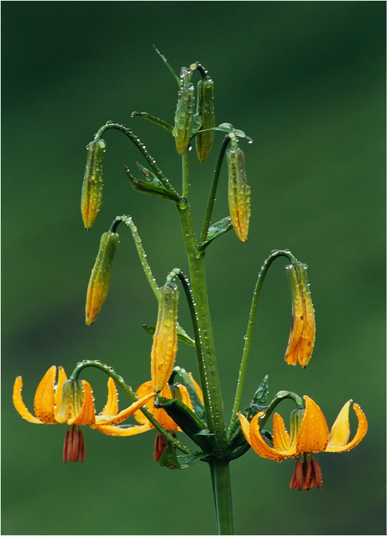
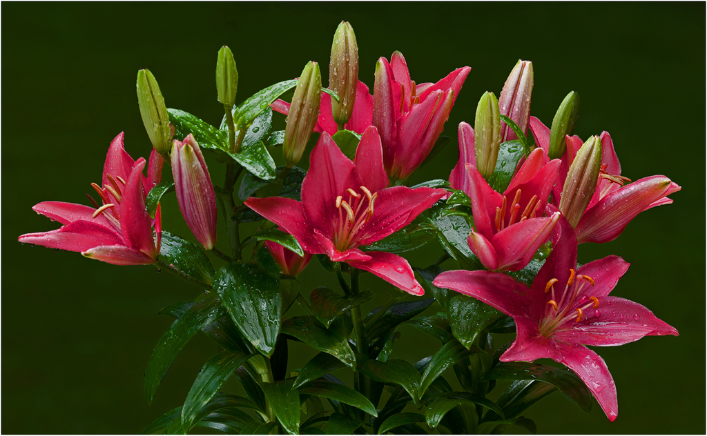
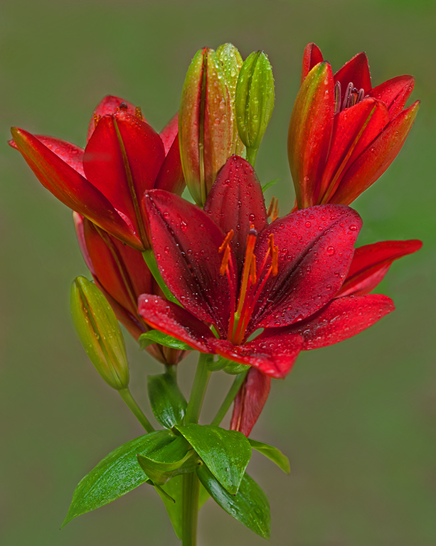
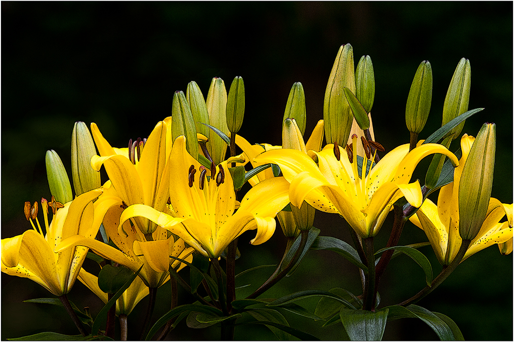
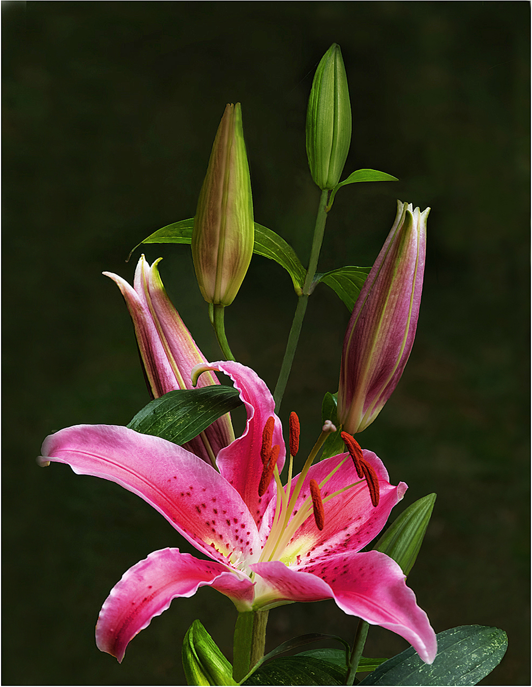
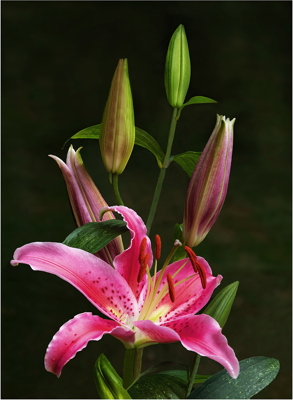
| 75 |
Jan 26 |
Reply |
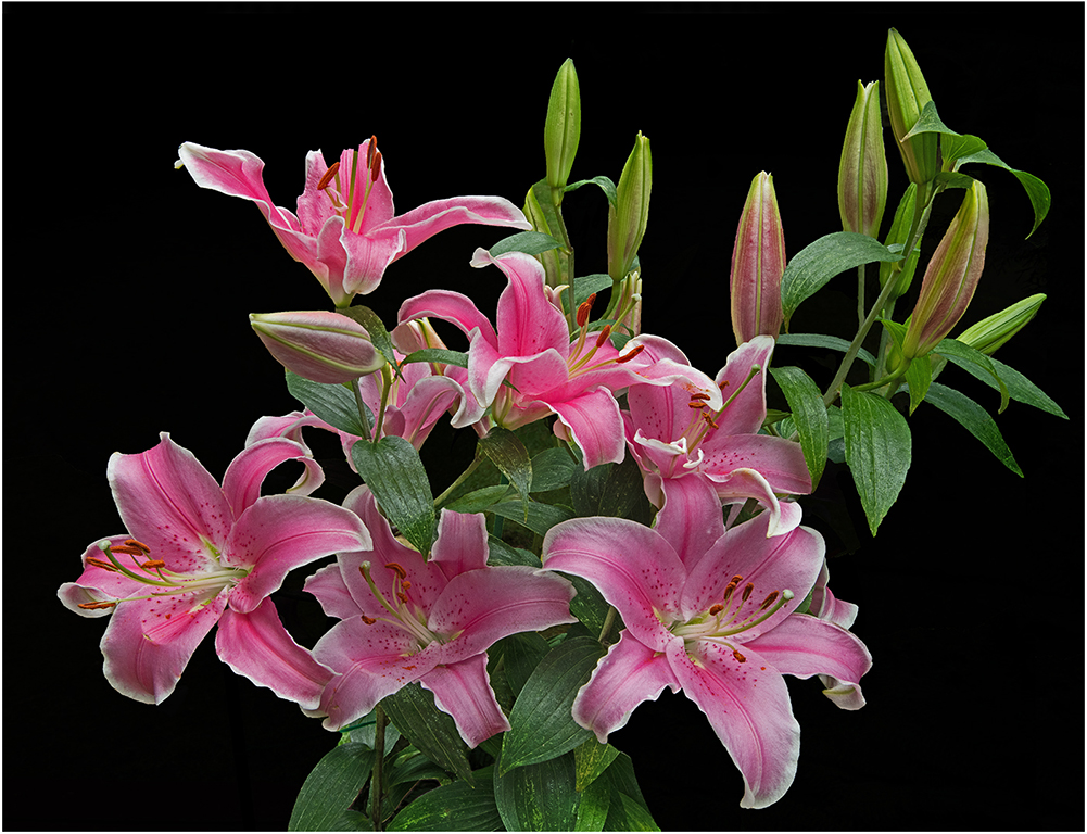
Susan: Pleased you liked the Lily picture, your kind words were much appreciated. |
Jan 29th |
| 75 |
Jan 26 |
Reply |
Hi Mo: I will look forward to your article in the PSA February Journal. Maybe I can learn a better method.
In answer to your question regarding how the Lily was photographed: It was shot outdoors on my deck in cloudy day soft lighting. I used a Photoflex soft-gold reflector to augment the lighting. |
Jan 14th |
| 75 |
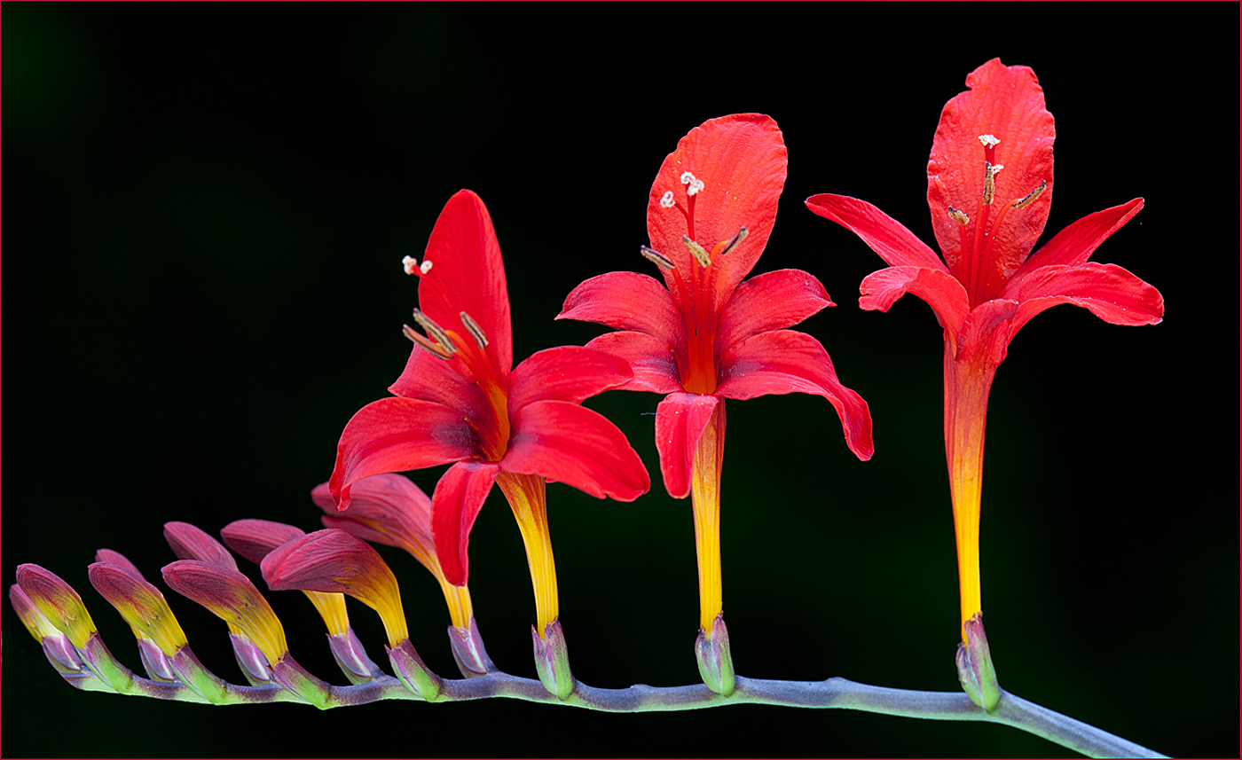
Jan 26 |
Comment |
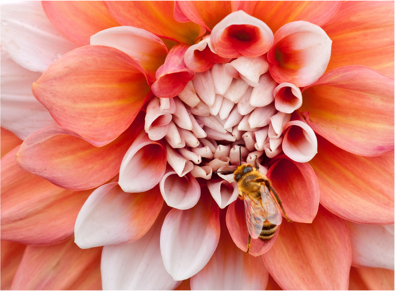
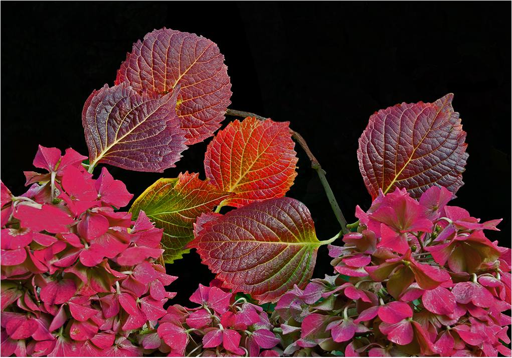
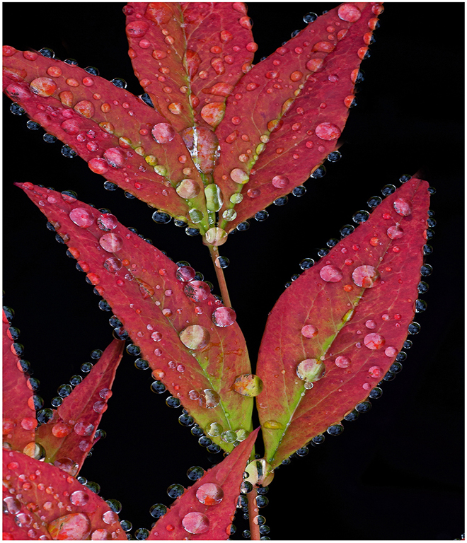
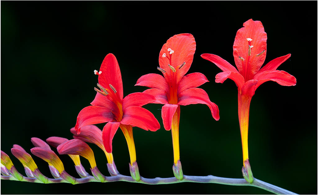
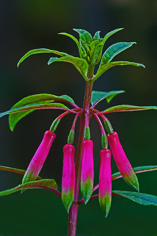
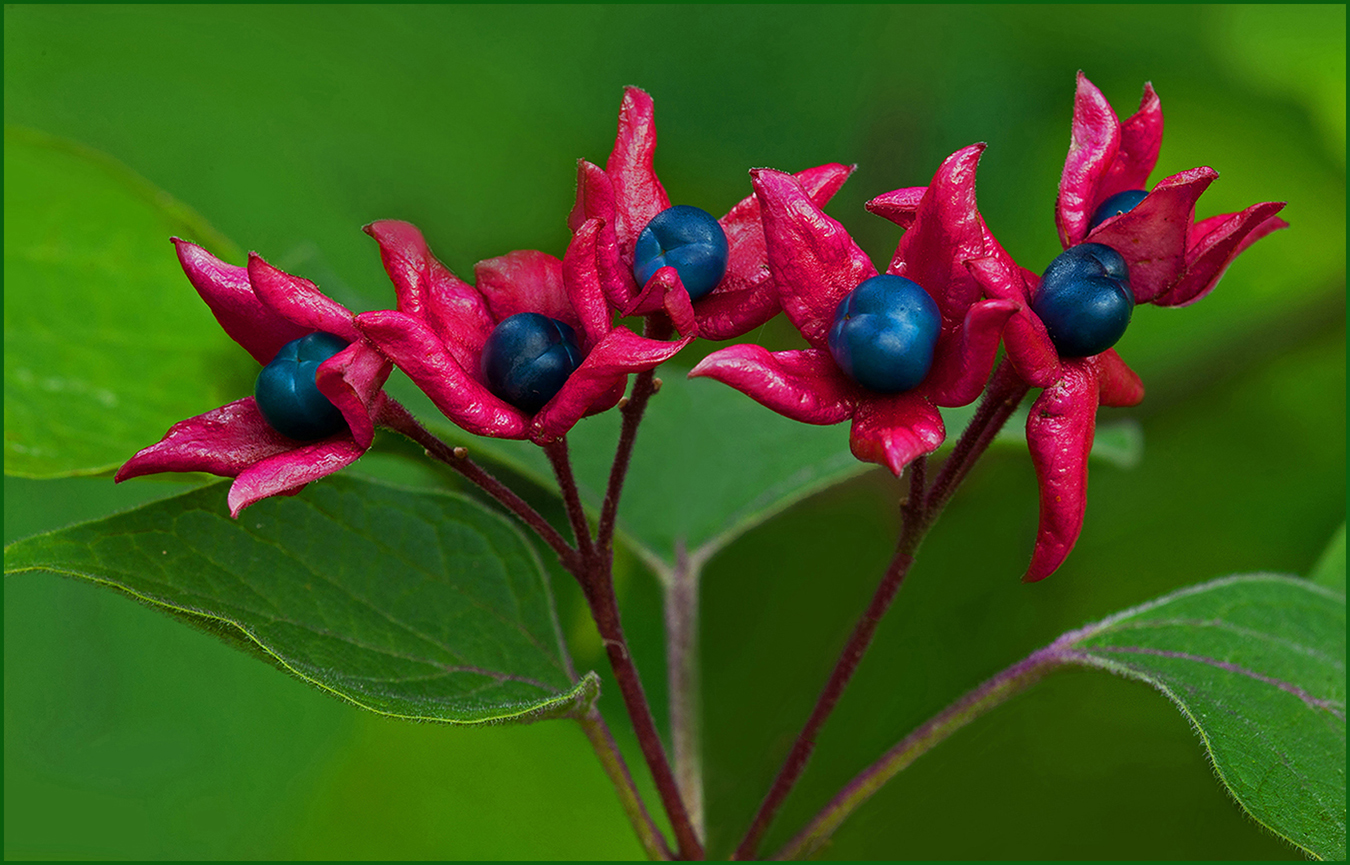
Hi Gaetan: Red flowers against a black background always creates high impact, and that is the case with your flower image.
There are different lighting methods used for flower photography, a favorite of mine is cloud cover or hazy sun, never ever mid day bright sun.
You mention photographing the flower indoors with a
LED lamp on the ceiling. This lighting condition looks very much like mid day open sun lighting, rather harsh with dark shadows on the flower petals.
To soften lighting I use an embroidery hoop with cheese cloth attached, it works great. Just place the hoop about 8" away from your flower and it will diffuse and soften harsh lighting. B&H has many diffusion screens on their website, I like the Photoflex brand. If you have further questions, please ask.
|
Jan 14th |
| 75 |
Jan 26 |
Comment |
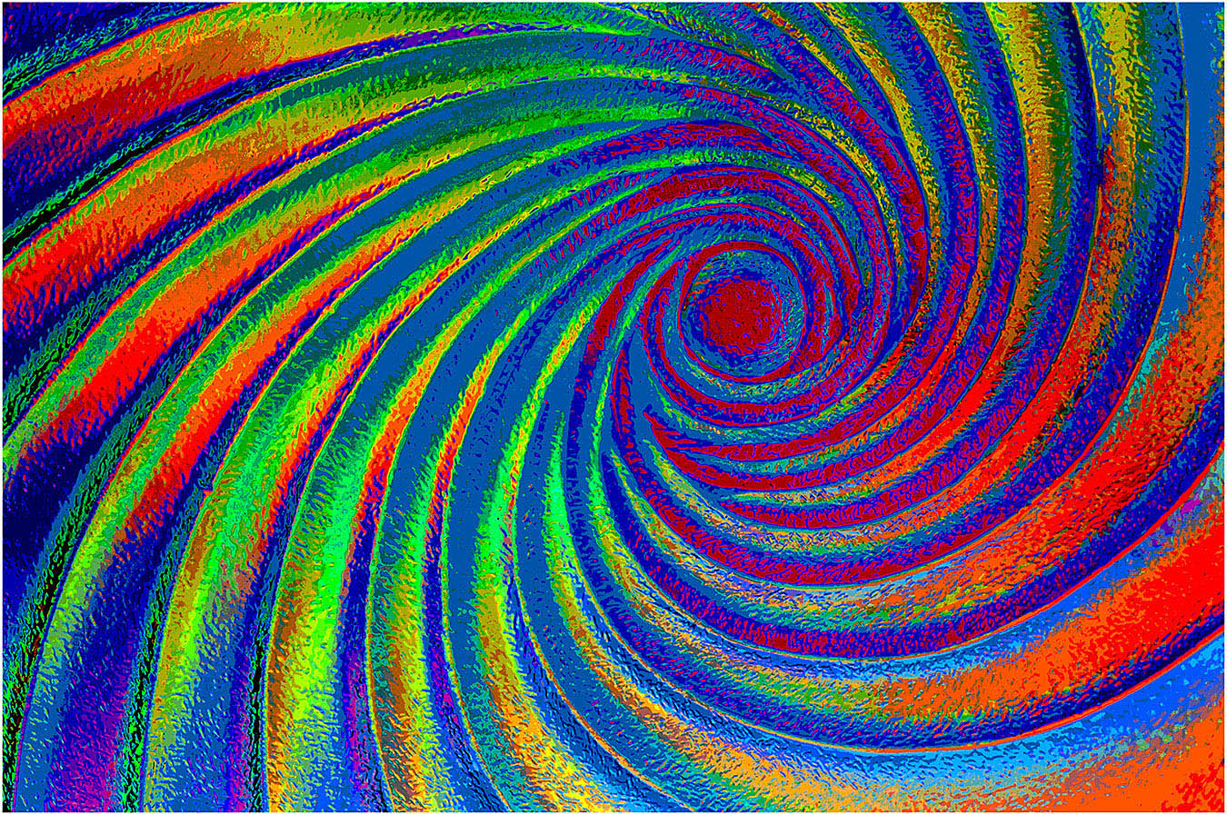
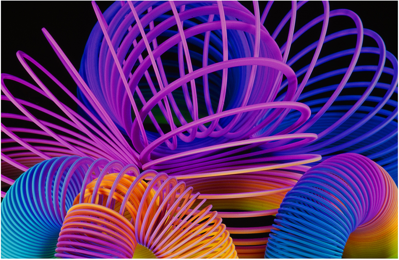
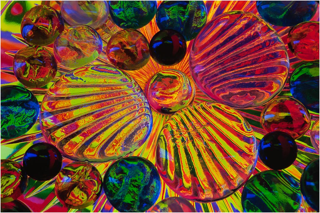
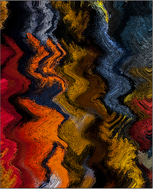
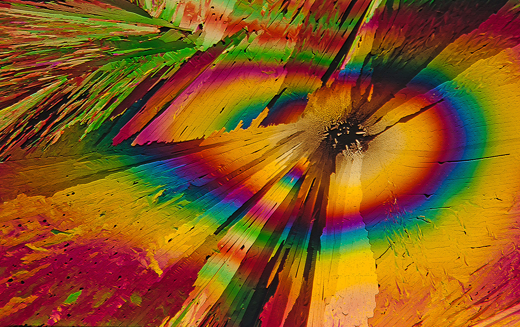
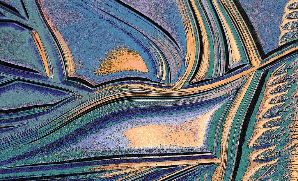
Hi Mo: A very creative abstract type of image with a myriad of colors that creates tremendous impact. There is no apparent anchor point or center of interest per say, in this particular picture there is no reason for that as there is so much detail to study to keep ones interest at a high level.
Regarding the muted red border; you chose just the right intensity of red as it frames your picture very well and does not draw the viewers attention away from the abstract picture that a bright screaming red would do.
One of the most effective abstract pictures I have seen. Just excellent work !! cheers.
|
Jan 9th |
| 75 |
Jan 26 |
Comment |
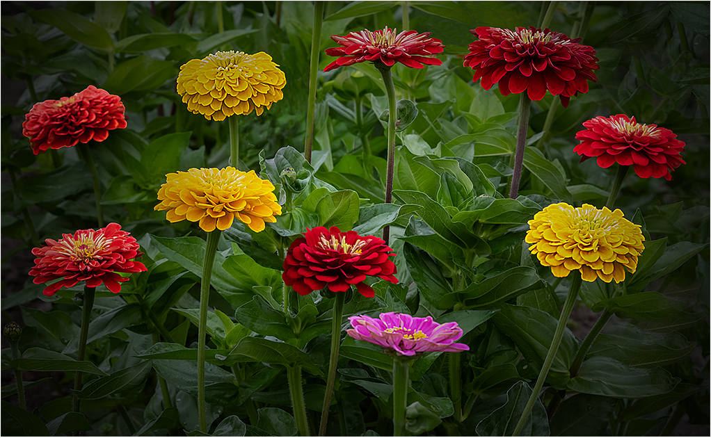
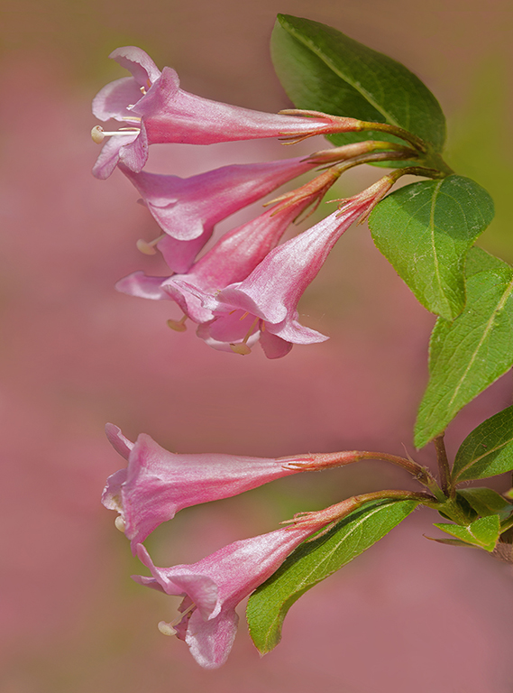
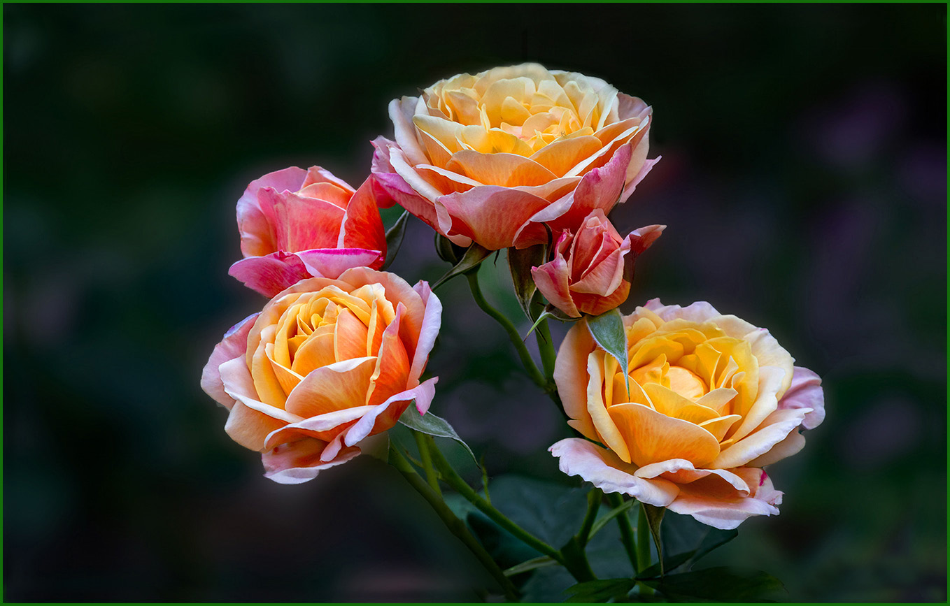
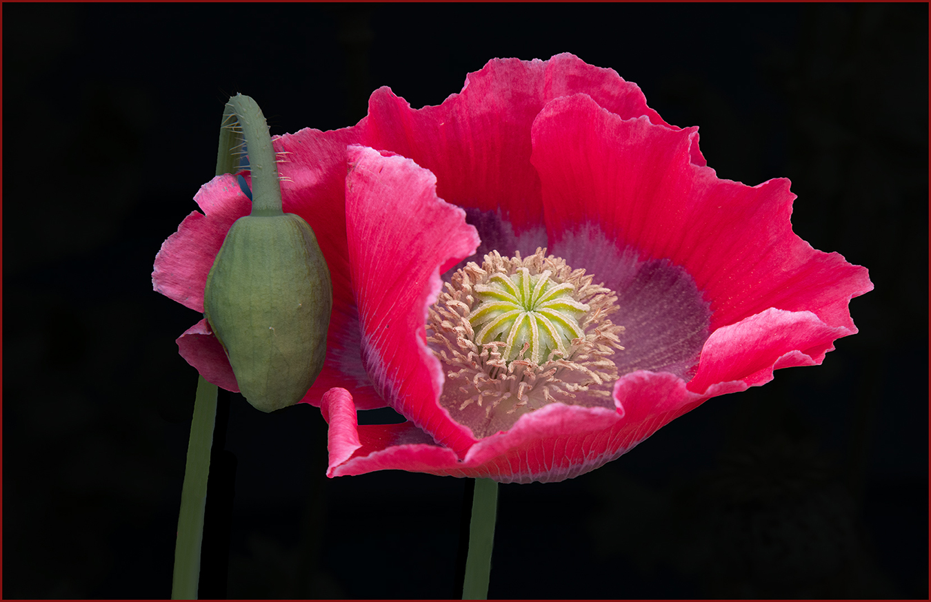
Hi John: A nice close in portrait of the red poppy flower. The dark green out of focus background supports the subject well. You did well in darkening down the light areas in the background so they are not distracting. Good Work !! |
Jan 8th |
| 75 |
Jan 26 |
Comment |
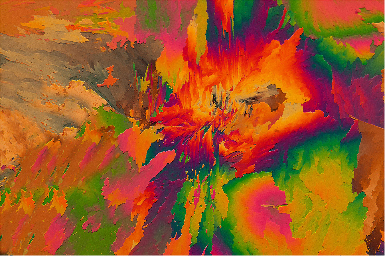
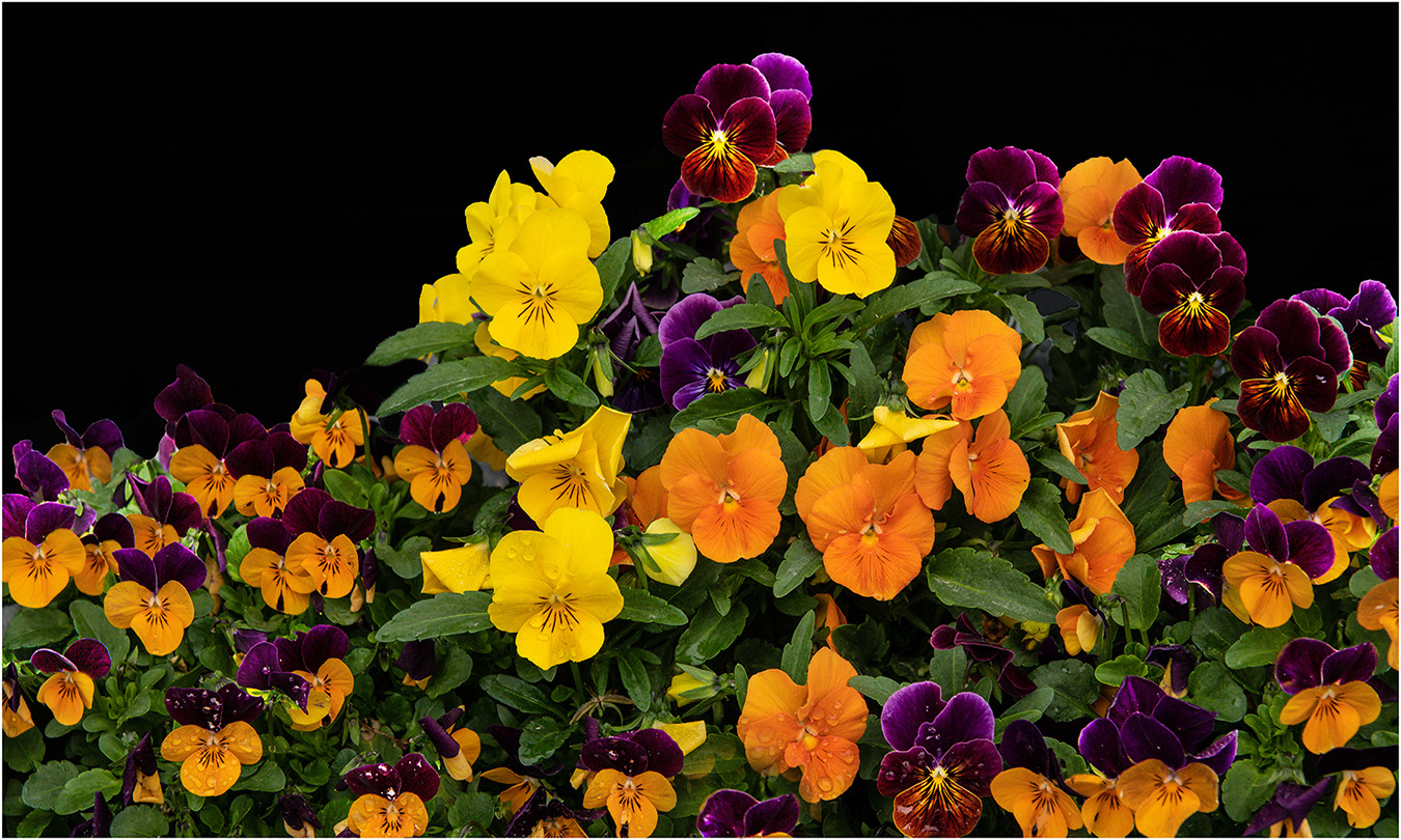
Hi Vincent: This picture is a kaleidoscope of colors. While there is no specific flower grouping, you have enough going on for the viewer to look at without an actual anchor point.
The picture appears to be photographed in soft cloudy light conditions which to me is ideal for this picture. There is no open midday sun with harsh lighting and no black shadows to spoil this soft mood type of picture. Well Done !! |
Jan 8th |
| 75 |
Jan 26 |
Reply |
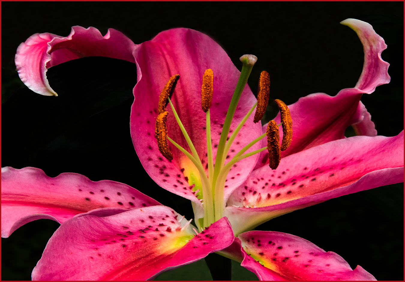
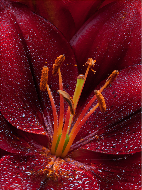
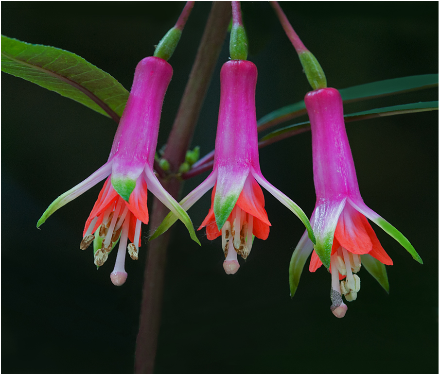
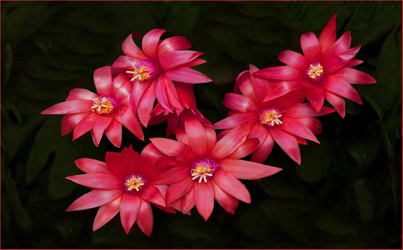
Hi Mo: Pleased you like the Stargazer Lily picture with the black background. Red flowers against a black background always creates high impact.
In answer to how I did it: The picture started out with the red lily against a dark green background. I used my quick select tool in Elements and selected out small individual sections of the frame and basically under exposed the dark green background until it was pure black. There are likely more ways to create the black background, however that method works well for me. |
Jan 8th |
4 comments - 3 replies for Group 75
|
14 comments - 8 replies Total
|