|
| Group |
Round |
C/R |
Comment |
Date |
Image |
| 11 |
Dec 25 |
Reply |
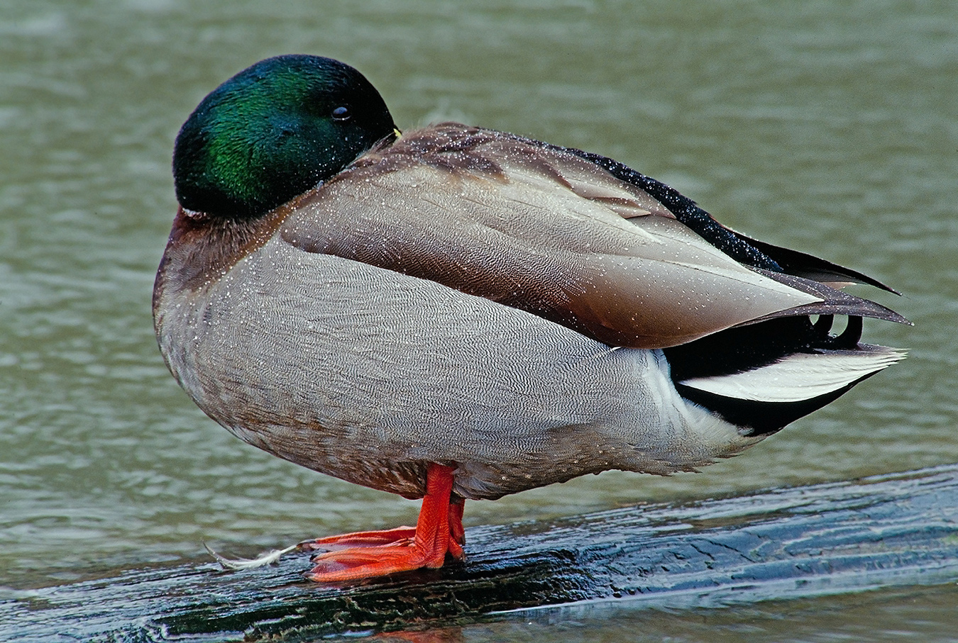
Hi Everyone: Thanks for your comments and input on the Swans picture. I enjoy other photographers input as it helps me to see things in a new and different light.
Cheers... |
Dec 26th |
| 11 |
Dec 25 |
Comment |
Hi Henry: I Googled Alhambra fortress to familiarize myself with it, a very impressive place and you were fortunate to be able to travel there.
The original color and the monochrome conversion to me each tell a different story.
As a wood craftsmen I was impressed with the hand carved door that was made 700 years ago. The original color version shows age better than the monochrome, for instance the darkened bottom of the door and the soiled floor tile.
Regarding the monochrome conversion; I would experiment by adding just a small amount of contrast to the entire scene, it may provide a little more impact. It may work or it may not. |
Dec 9th |
| 11 |
Dec 25 |
Comment |
Hi Charles: I have a great deal of respect for those who want to play Rugby. You do not see any extra padding nor helmets either.
Post processing here is of the highest order in all aspects, a little extra sharpening and contrast makes this scene come alive. The facial expressions of the ladies really tells the story in the heat of the game.
I also like the original color version, it tells a different story. We can tell the two teams apart, and then the facial complexion are slightly different between the ladies.
Great Work !! |
Dec 9th |
| 11 |
Dec 25 |
Comment |
Hi Nenette: There is a statement in photography "Less is More" and that describes this picture well.
I like the strong diagonal shadows that originate from the lower left to the upper right, they make a strong graphic statement.
You have a lot of tonality in this picture, everything from black to very very light gray in the upper left.
Henry is correct in that many photographers would walk by this scene, but you found it.
|
Dec 9th |
| 11 |
Dec 25 |
Comment |
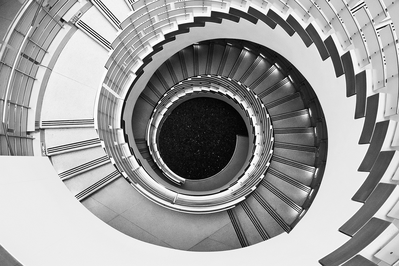
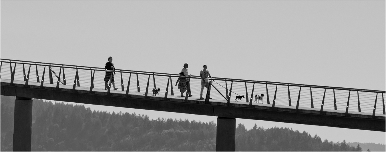
Hi Sheldon: There is a lot of look at in this image, I spent some time just studying all part of the picture. The people in the shadows on each side of escalators and then the people on the stairs add important points of interest to this picture.
You did a great post processing work in toning down those bright highlights.
Some photo judges would say this scene is too busy, I would disagree with them, I really like this scene as it tells a good story of people on the move. |
Dec 9th |
| 11 |
Dec 25 |
Comment |
Hi Peter: You have done major cropping on all sides of the image, in doing so you have eliminated large parts of buildings, then foreground and also extra people in the scene, and basically just tightened up the composition a lot.
The vendor person close in and to the right becomes the main center of interest and a good character study. Then we have a number of bicycles to the left with a few people in the distance.
The shops in the background complete the picture. A very fine street scene, and the monochrome conversion looks good to me. |
Dec 9th |
| 11 |
Dec 25 |
Comment |
Hi Ed: I like your overall composition balance, the two large land masses in the distance, then the two small gravel areas in the foreground provide depth to the scene. The outflow stream ties everything together well. Overall a very peaceful scene.
To me the original color and the monochrome conversion tell different stories. The original is more of a nature type image while the monochrome is perhaps more on the pictorial order of things. Both Henry's and Sheldon's suggestions have merit in tweaking the monochrome somewhat.
|
Dec 9th |
6 comments - 1 reply for Group 11
|
| 63 |
Dec 25 |
Reply |
Hi Everyone: Thanks for your comments on the 3 padlocks. I appreciate reading your viewpoints as they help me to see things in a new and different light. |
Dec 28th |
| 63 |
Dec 25 |
Comment |
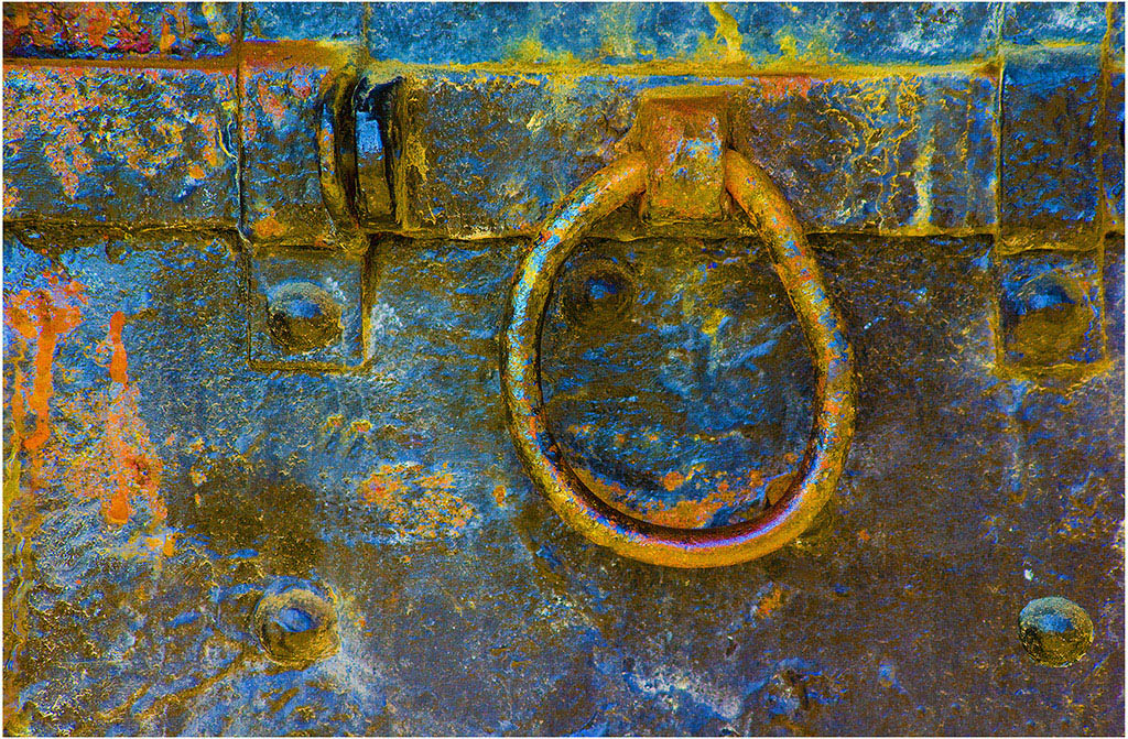
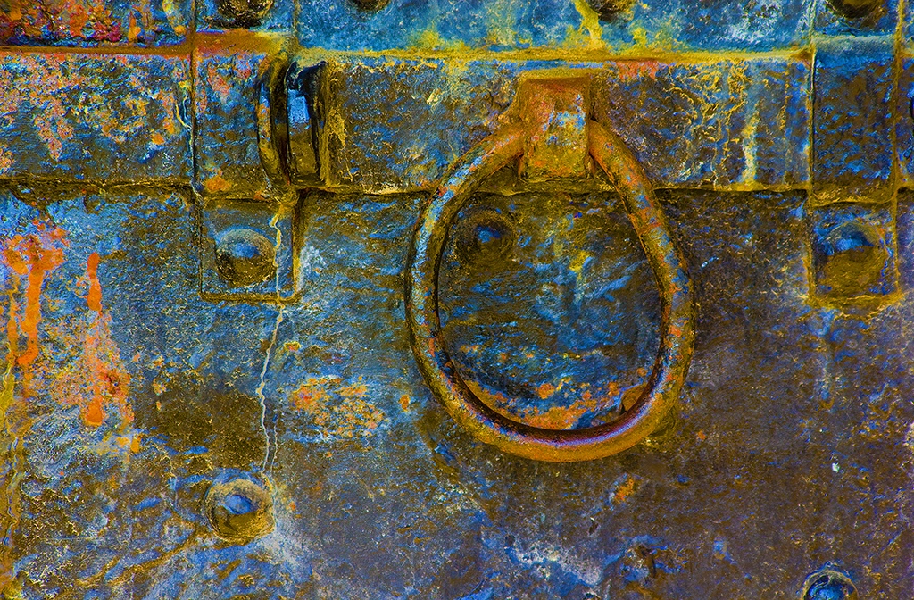
Hi Charlie and Pierre: Thanks for your comments, your feed back is always interesting to me, it helps me to see things in a different light
In the Pacific Northwest a few photo clubs are adopting a new class of competition, Altered Reality. The blue padlocks is more of an altered reality image rather than traditional.
Cheers. |
Dec 12th |
| 63 |
Dec 25 |
Comment |
Hi Pierre: A pure nature image of the bird in its native habitat. This is no set-up with a clean background that looks like "house cleaning" of distractions has been done.
Good pose, and then good sharpness on the bird. You even managed to catch a slight highlight in the upper part of the eye.
A good nature image of this small Sparrow. |
Dec 10th |
| 63 |
Dec 25 |
Comment |
Hi Charlie: Another of your very well planned aesthetic still lifes. Everything in this picture is very well thought out as to how the scene will be presented to the viewer and nothing is left to chance.
The darker color of the base with the background color a lighter shade of the base was well chosen. All of the various colors in this scene harmonize with each other and there are no color clashes.
As always technical quality is spot on, very creative work !! |
Dec 10th |
| 63 |
Dec 25 |
Comment |
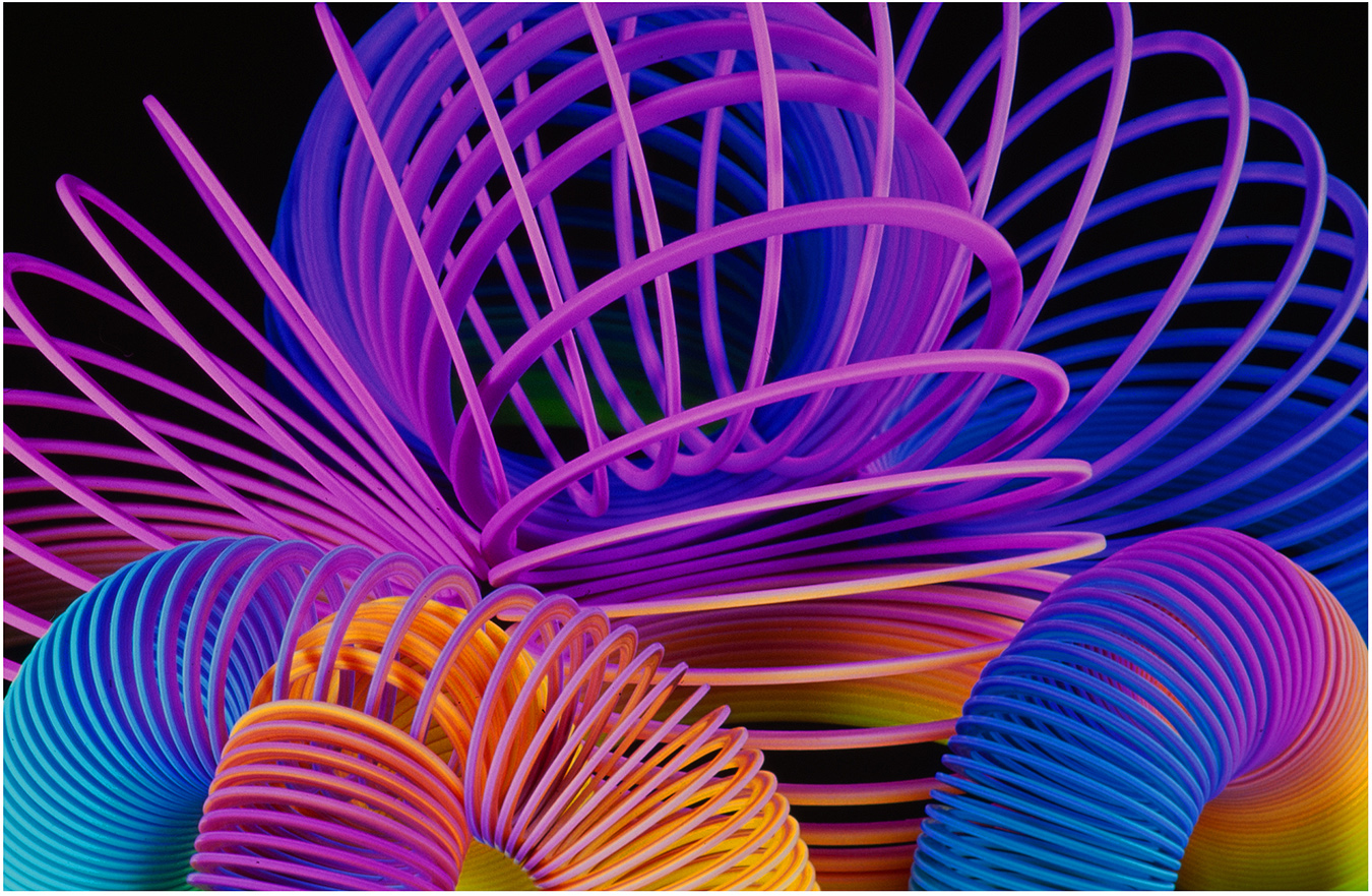
Hi Alane: Interesting subjects in a three sum. Simple yet effective composition with warm colors.
The spools seem to float in space, Charlie has darkened down the bottom of the frame to create a base for the spools to sit on, and then with a line separating the darkened base from the lighter background. I think it looks realistic in this manner instead of floating in space. |
Dec 10th |
| 63 |
Dec 25 |
Comment |
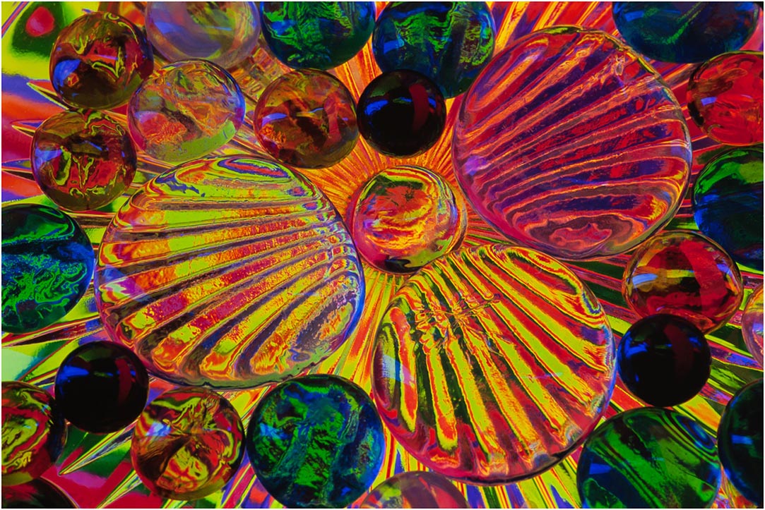
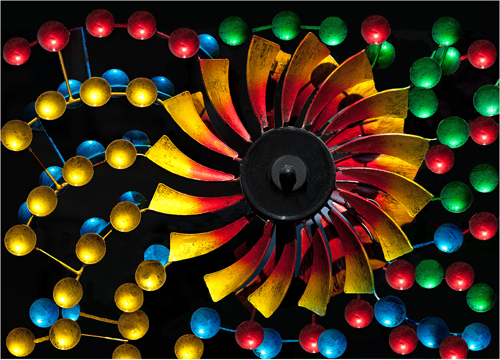
Hi Norman: The use of studio flash has created dramatic lighting on the subjects with a black background. As Charlie has eluded to the glasses seem to float in space, would like to see the base the subjects were sitting on as it would provide a good foundation for this interesting image.
|
Dec 10th |
| 63 |
Dec 25 |
Comment |
Hi Barbara: A very interesting close in picture of this cactus type plant. I like the way you have composed this plant with the leaves on diagonals, much more interesting than the leaves straight across the frame. Another interesting aspect is large leaves, medium size leaves and then smaller leaves in the center. |
Dec 10th |
| 63 |
Dec 25 |
Reply |
Hi Charlie: Thanks for your positive comments which are very much appreciated.
You are correct in that I did spend some time tweaking this picture in post processing. I started out by adding the Poster Edges filter which adds detail and texture to old wood. Then I spent some effort in selecting the border color that would blend in with the colors of the old wooden boards.
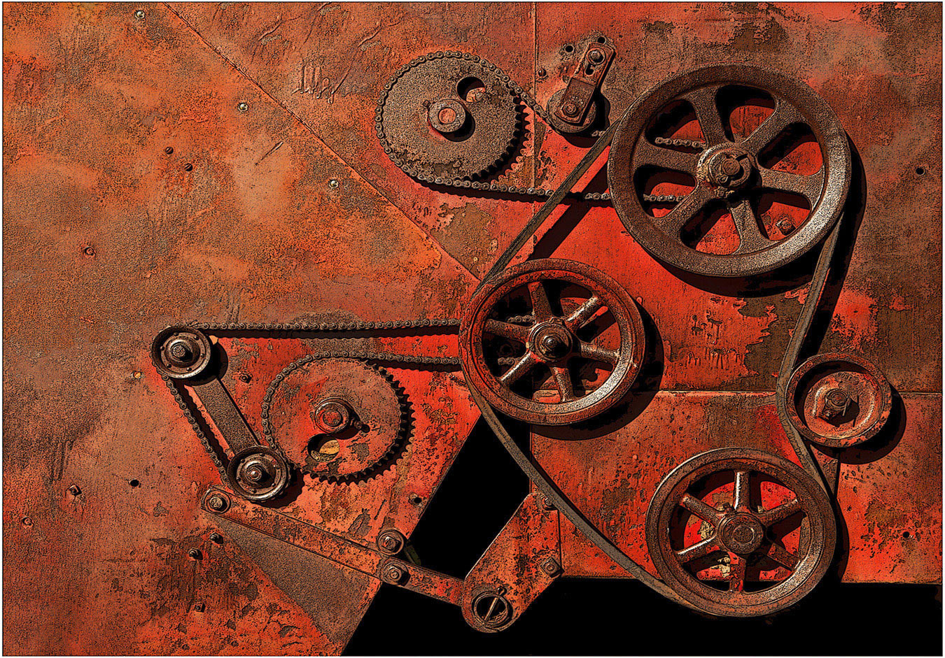
Regarding the 3 padlocks: They were very bright and shiny in the afternoon sun to the point of being a major distraction that ruined the picture. I needed to do something to tame down the brightness, so I selected out just the chain and padlocks and added a medium blue filter. |
Dec 10th |
6 comments - 2 replies for Group 63
|
| 75 |
Dec 25 |
Reply |
Hi Mo: Thanks for your thoughts, very much appreciated.
I have some pictures of this same scene shot in early morning sunlight, those pictures are full of distracting highlights to the point of not being pleasant to view.
I will experiment with adding a bit of contrast and see how that works. cheers. |
Dec 21st |
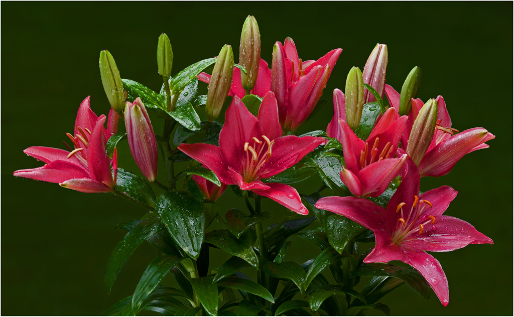
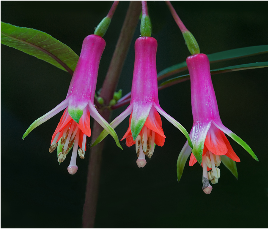
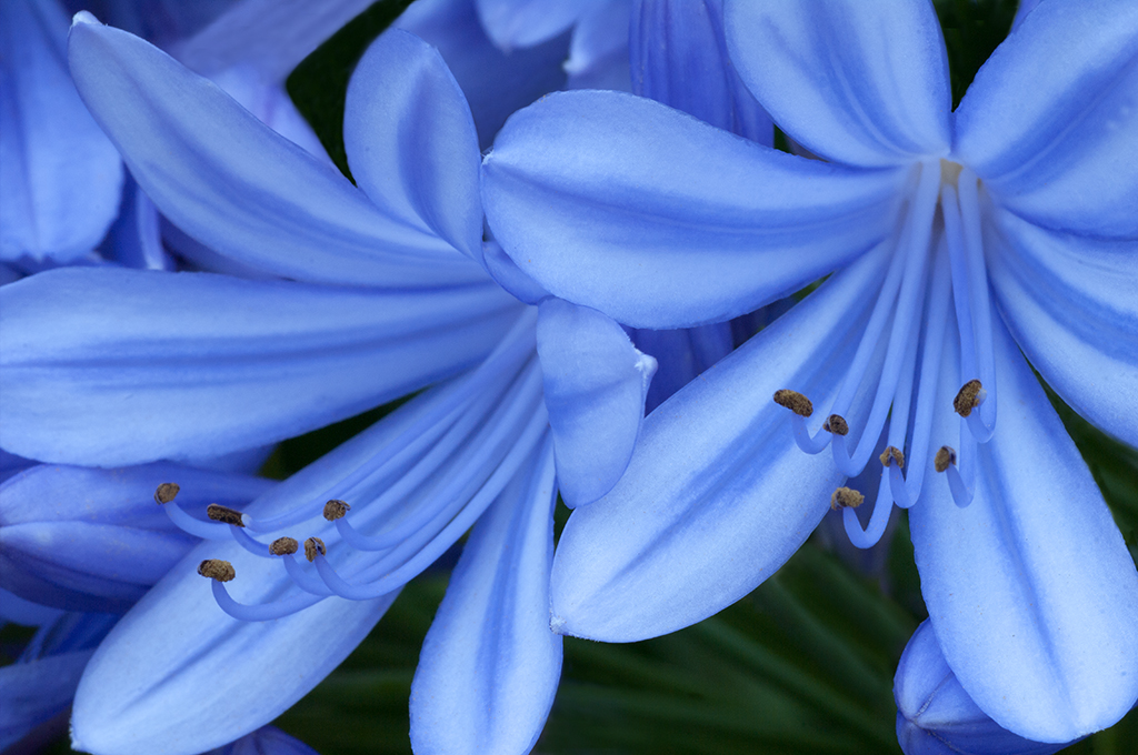
| 75 |
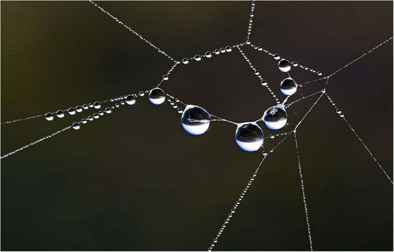
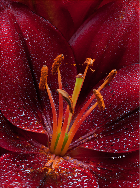
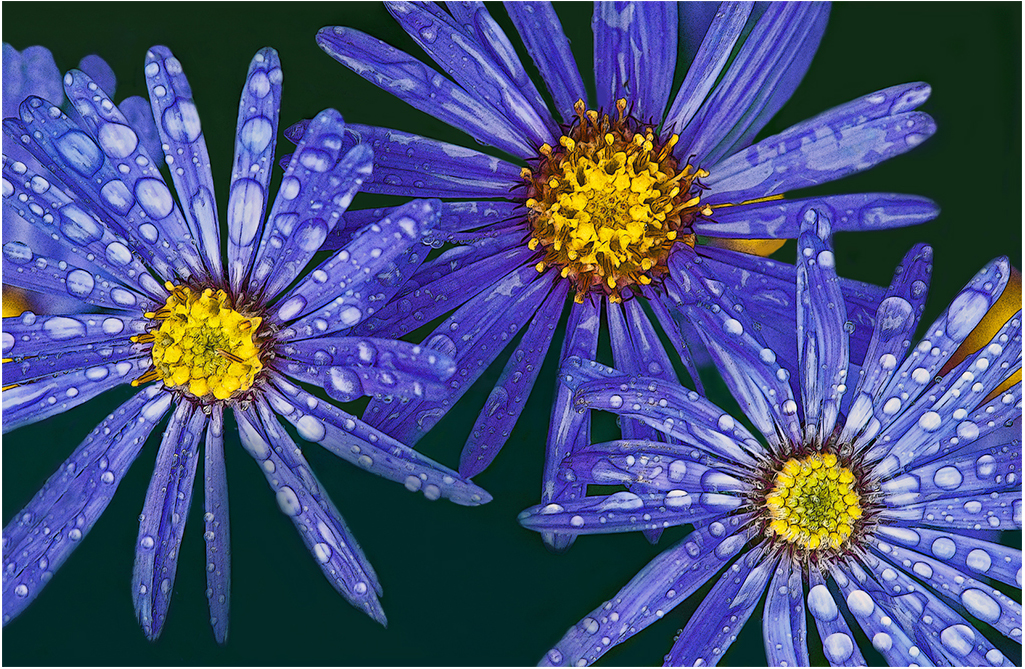
Dec 25 |
Comment |
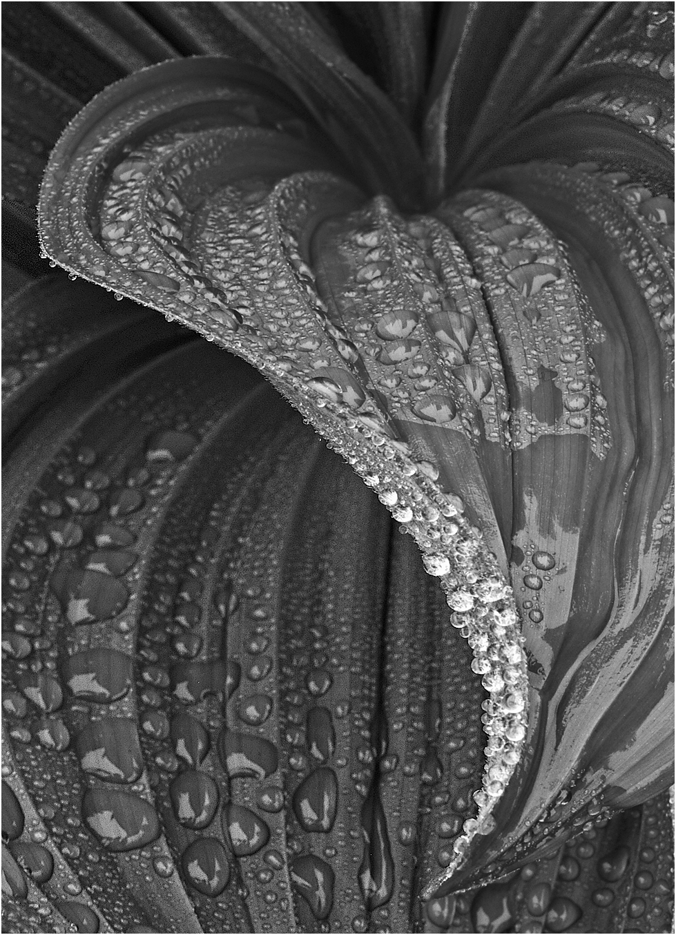
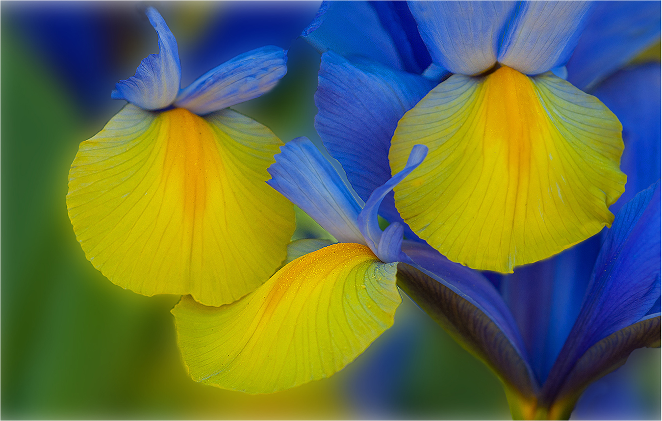
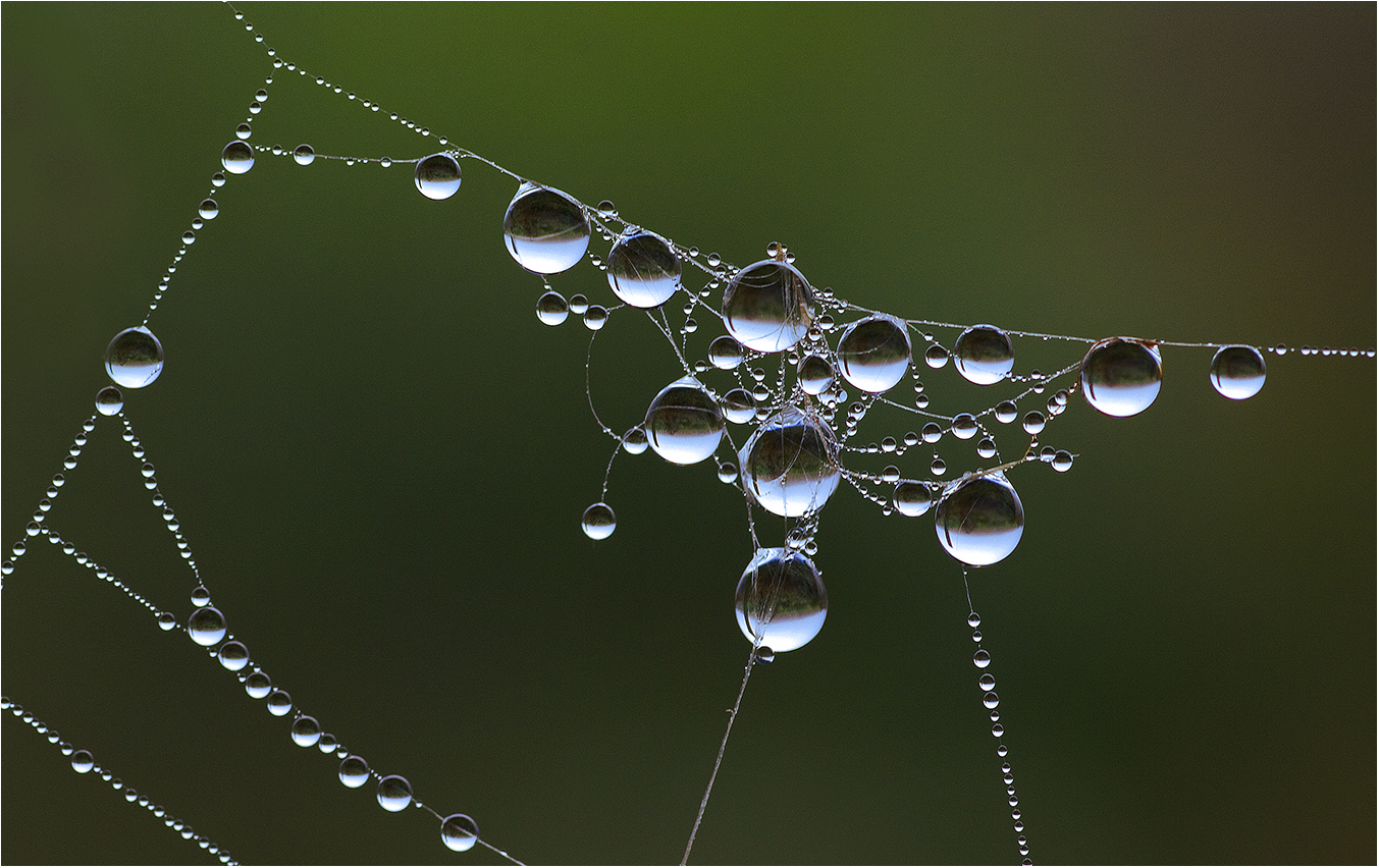
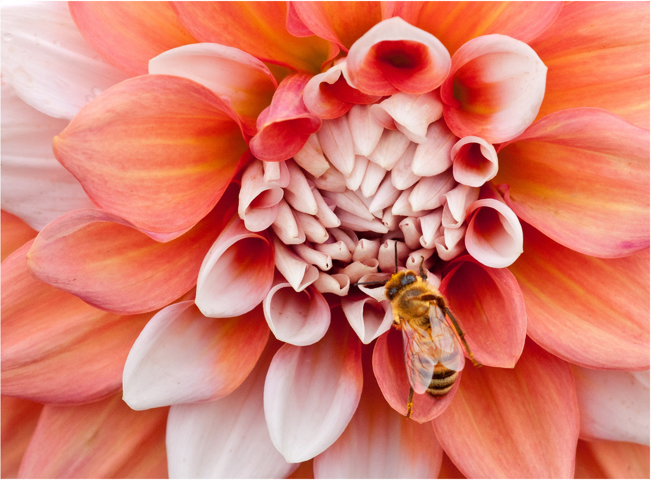
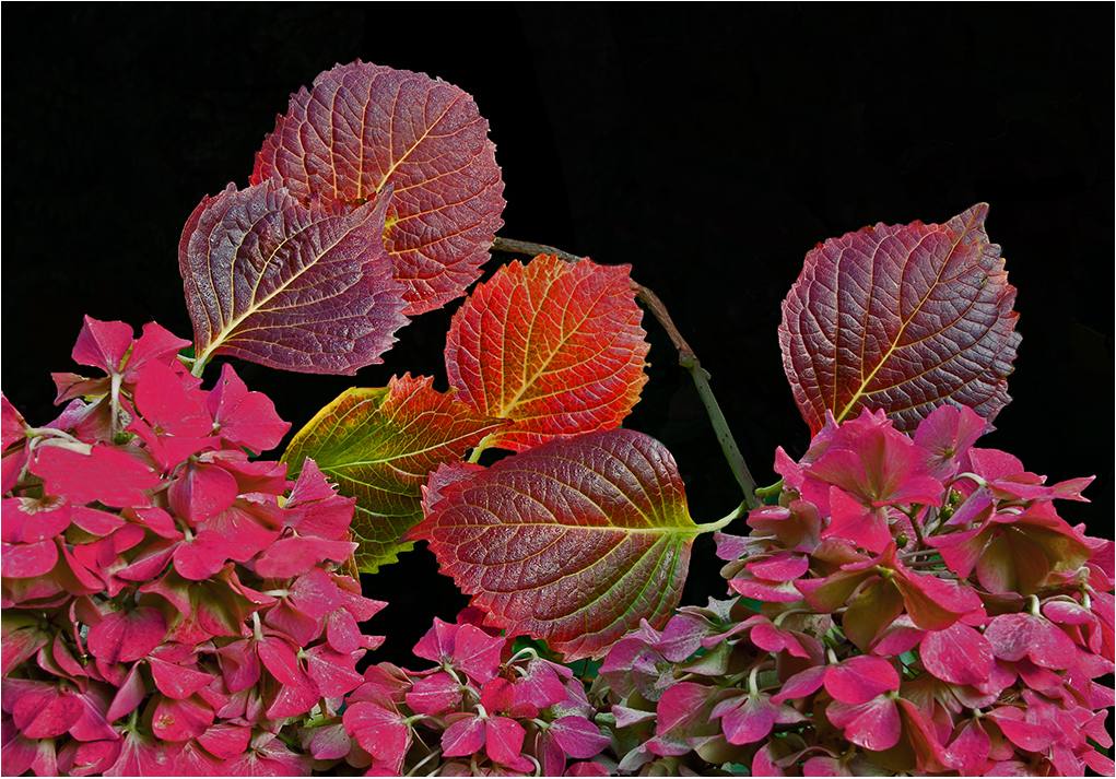
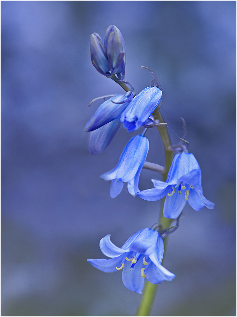
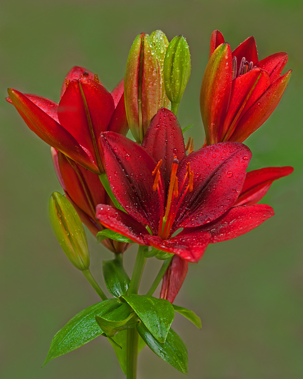
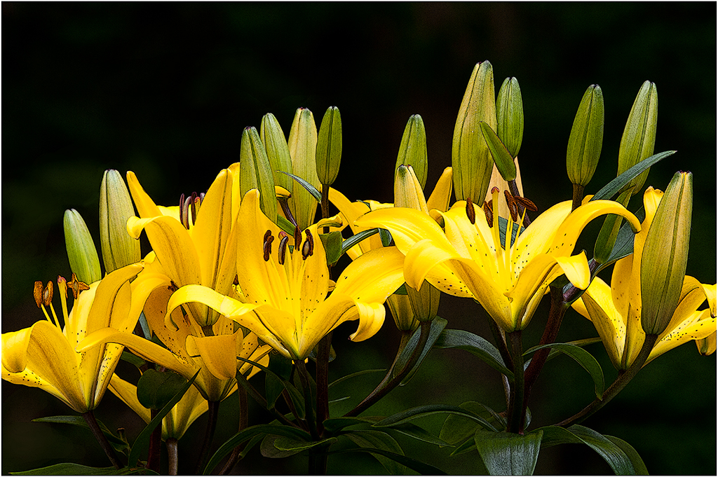
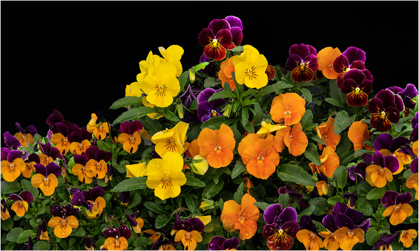
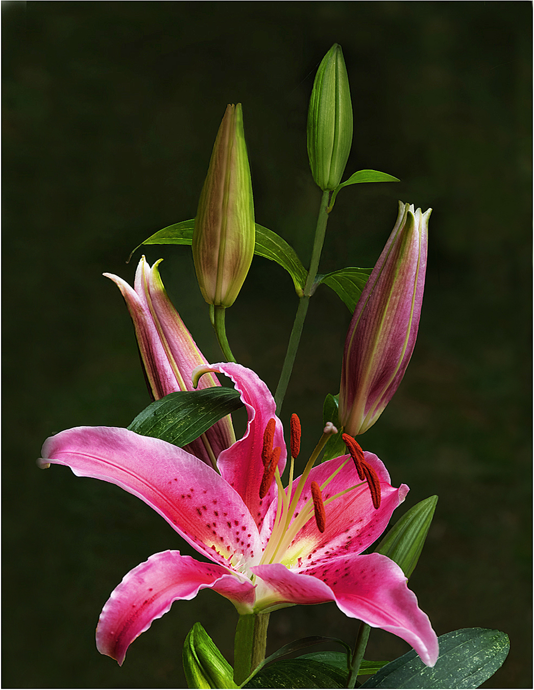
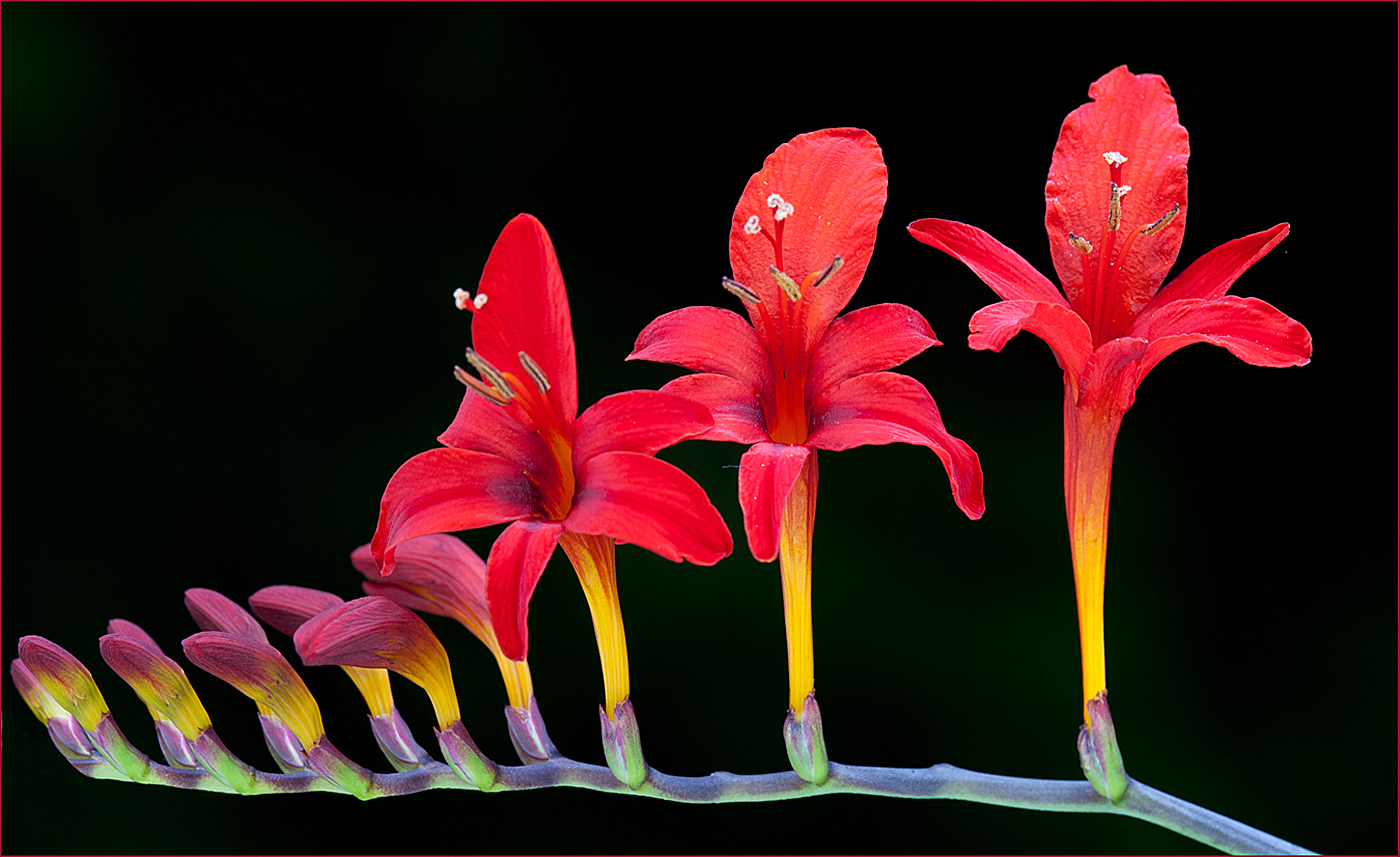
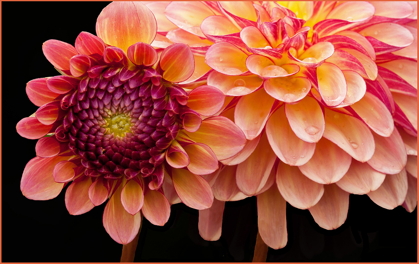
Hi Mo: A very stunning high impact picture of these flowers with white petals along with some yellow along with vertical black stripes against a black background.
Technical quality is first rate in every way, then the rain drops add a special touch.
I know you dislike borders, however the use of just the right one would add that finishing touch to this fine flower image. |
Dec 10th |
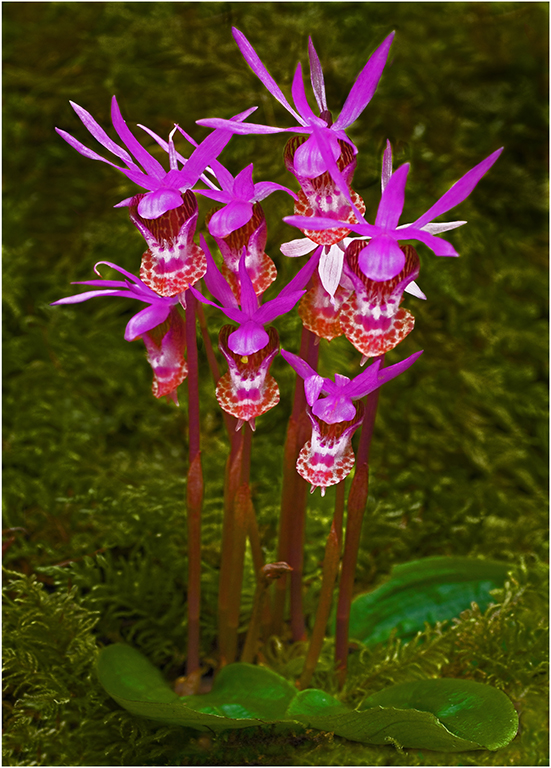
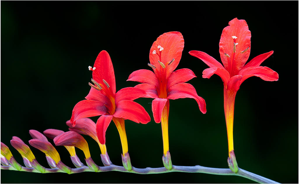
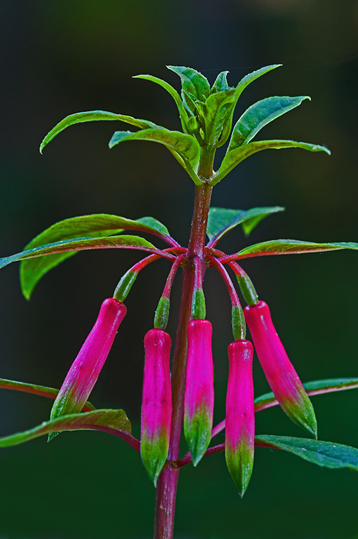
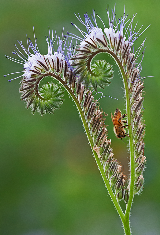
| 75 |
Dec 25 |
Comment |
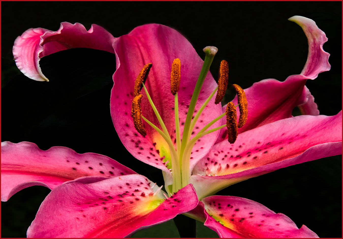
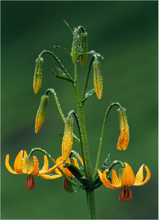
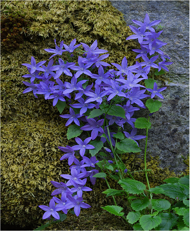
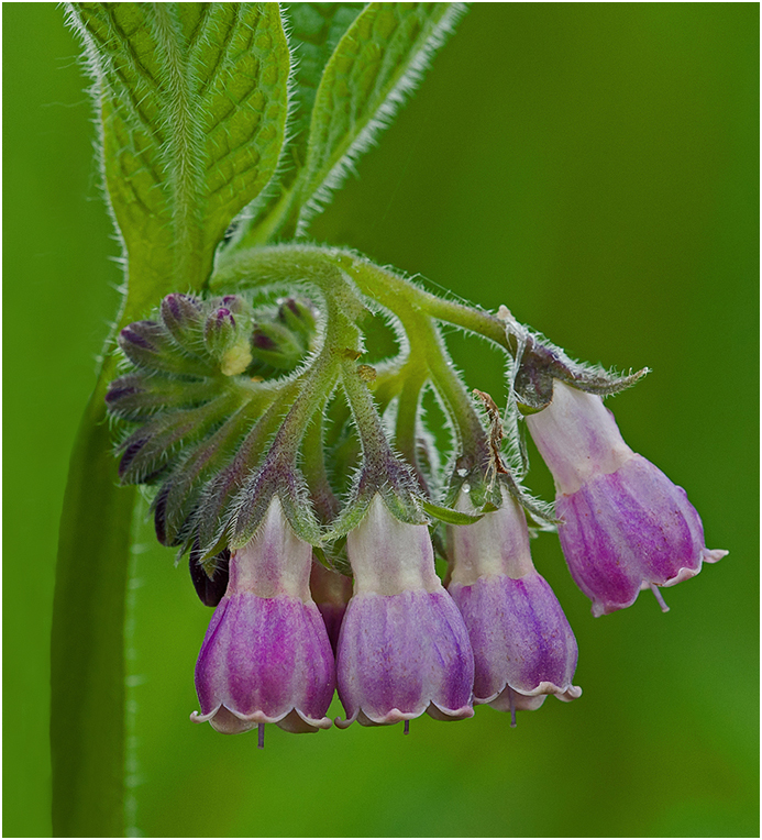
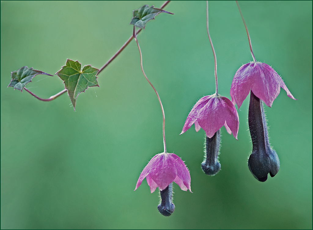
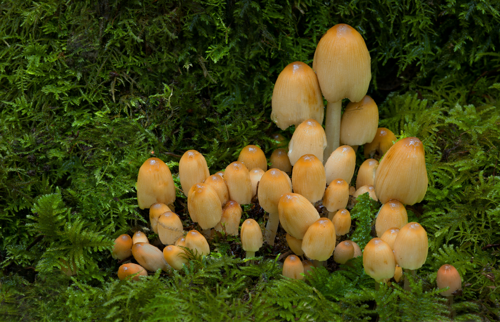
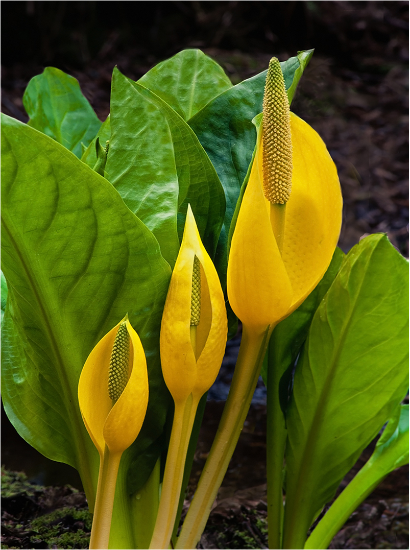
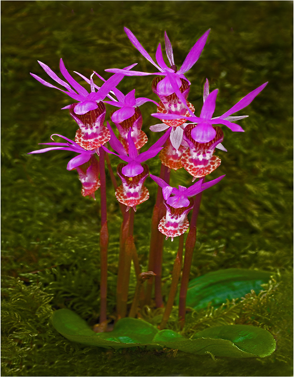
Hi Gaetan: In our area this Orchid is known as Lady Slipper. It is a native wild flower that while scarce can be found in certain areas of the Northern United States.
Even at f/16 you do not have complete sharp focus on the flower, the top petal is not quite sharp. What would really help this picture would be to darken down the green flower stalk, as it commands too much of the viewers attention.
A thin border of some type would also help frame your composition, as is the flower is lost in the large black web page. |
Dec 9th |
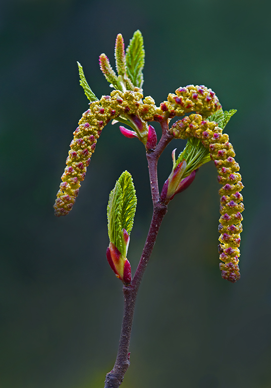
| 75 |
Dec 25 |
Comment |
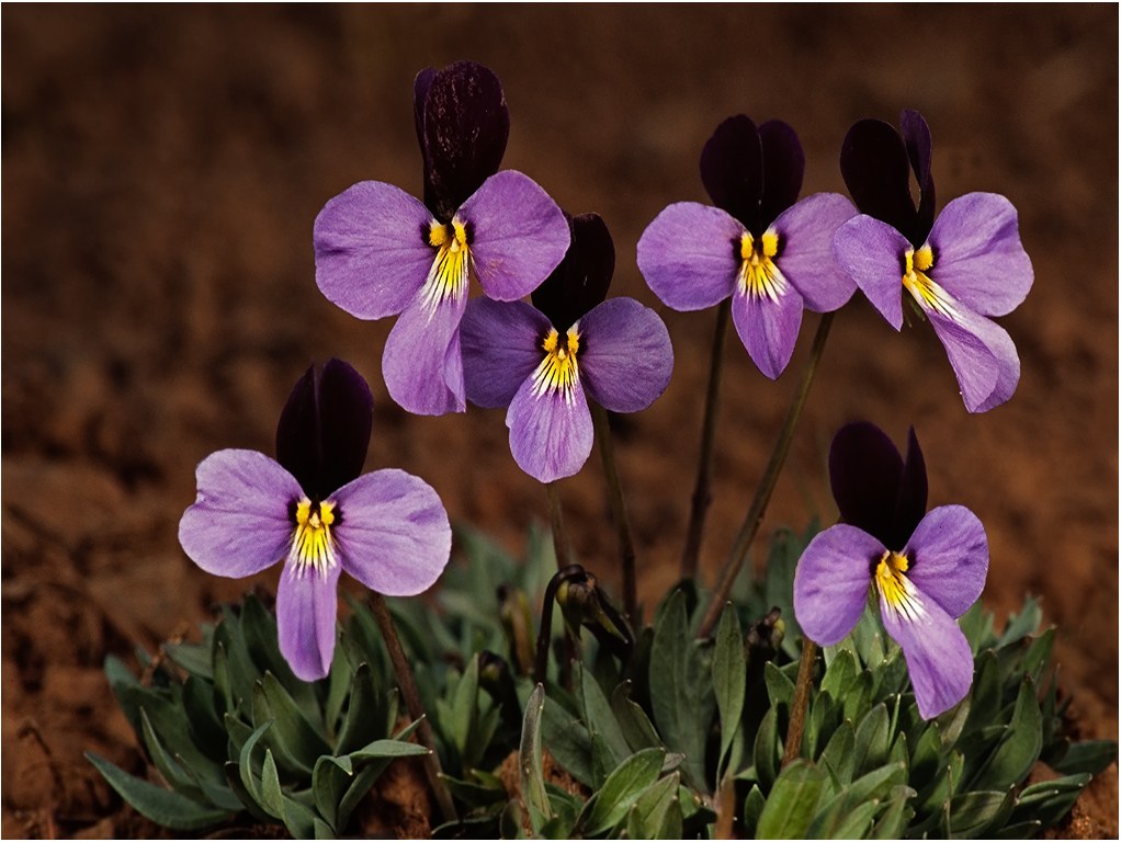
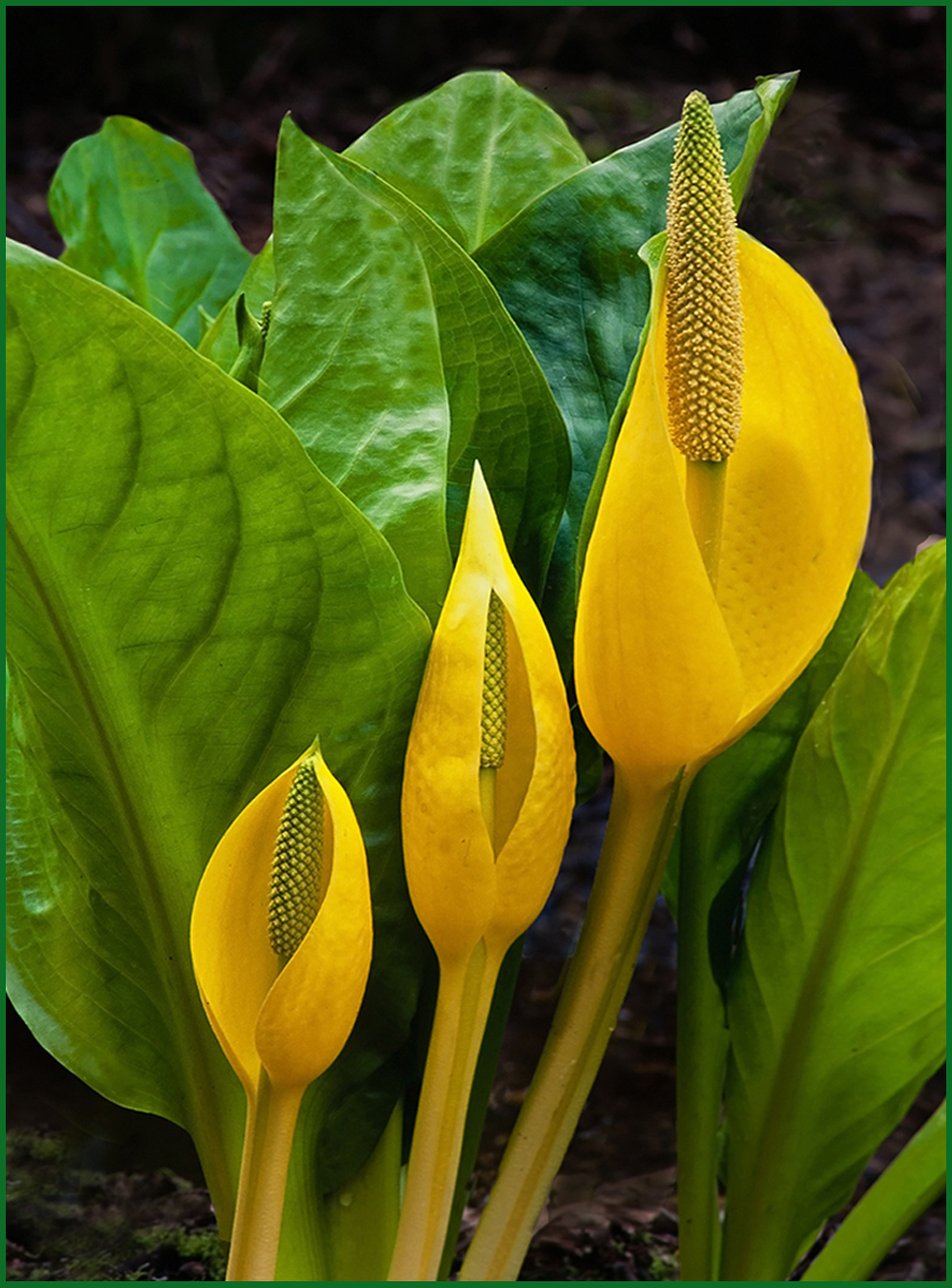
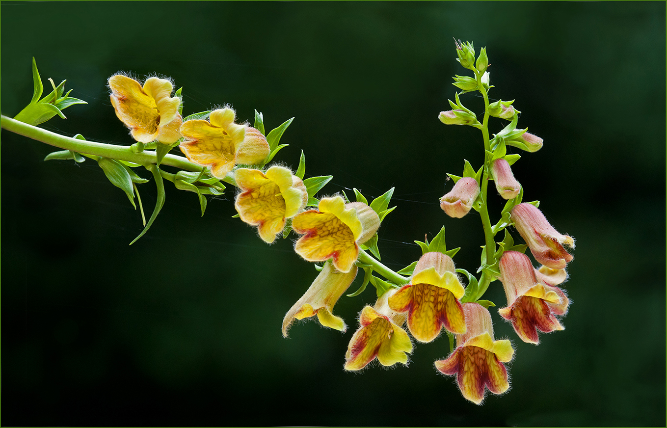
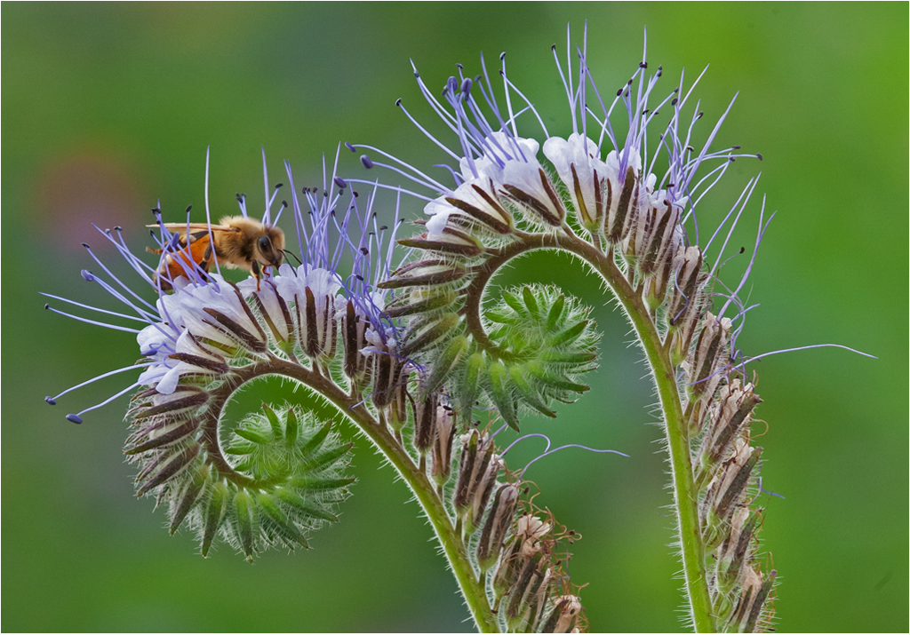
Hi John: We also have Western Pasqueflower in the Cascade Mountain range, it blooms soon after the winter snow has melted off and has a very interesting seed head, hence the name Mophead.
In this picture I see no need at all for focus stacking, as you have good sharpness on the flowers front to back, you do not want the background sharp as it would look too busy.
Composition wise with two flowers spaced wide apart I do not know which one to look at, I would make a vertical composition and just eliminate the left flower completely as it is the least interesting of the two.
Very nice lighting on the two flowers, your basic exposure on the two flowers is spot on, it is easy to loose detail in light colored flowers with over exposure. |
Dec 9th |
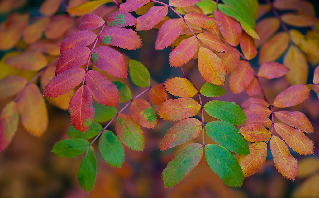
| 75 |
Dec 25 |
Comment |
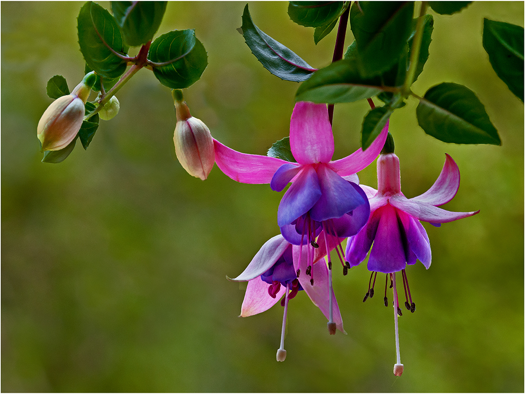
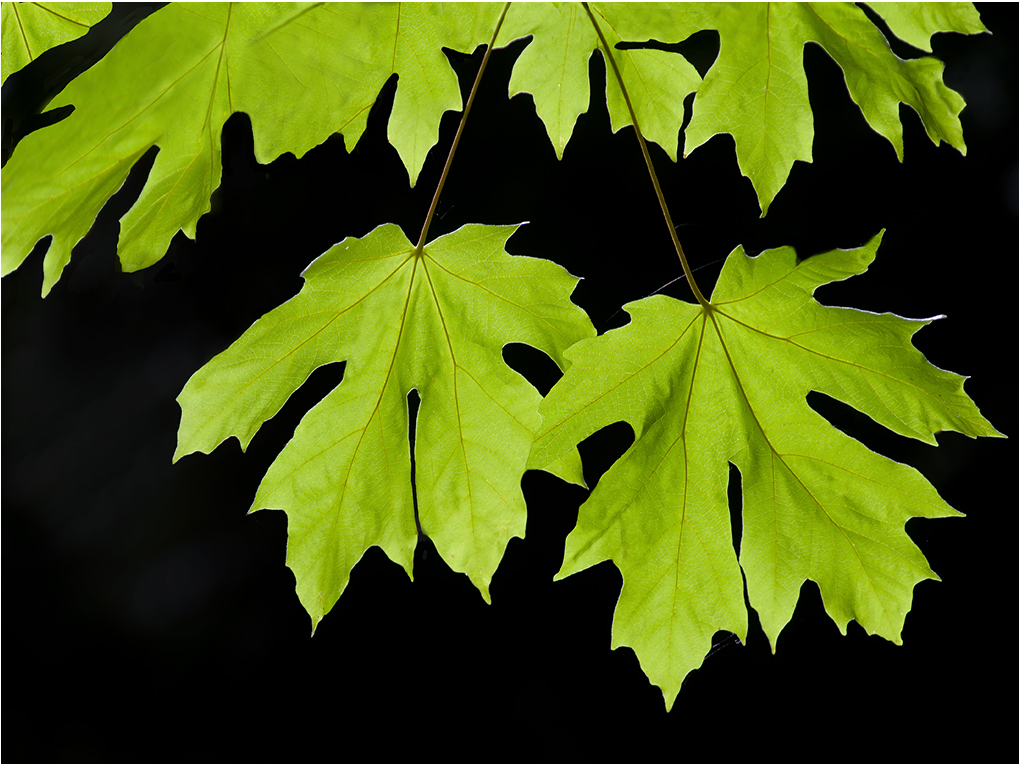
Hi Vincent: A good example of backlighting through the leaves. The dappled blue sky at the top of the frame adds another point of interest.
The overall shape of the branch is attractive, I like the overall background as there are no distractions back there. |
Dec 9th |
4 comments - 1 reply for Group 75
|
16 comments - 4 replies Total
|