|
| Group |
Round |
C/R |
Comment |
Date |
Image |
| 11 |
Nov 25 |
Comment |
Hi Everyone: Thank you for your helpful and positive comments on Model T, very much appreciated. cheers. |
Nov 26th |
| 11 |
Nov 25 |
Comment |
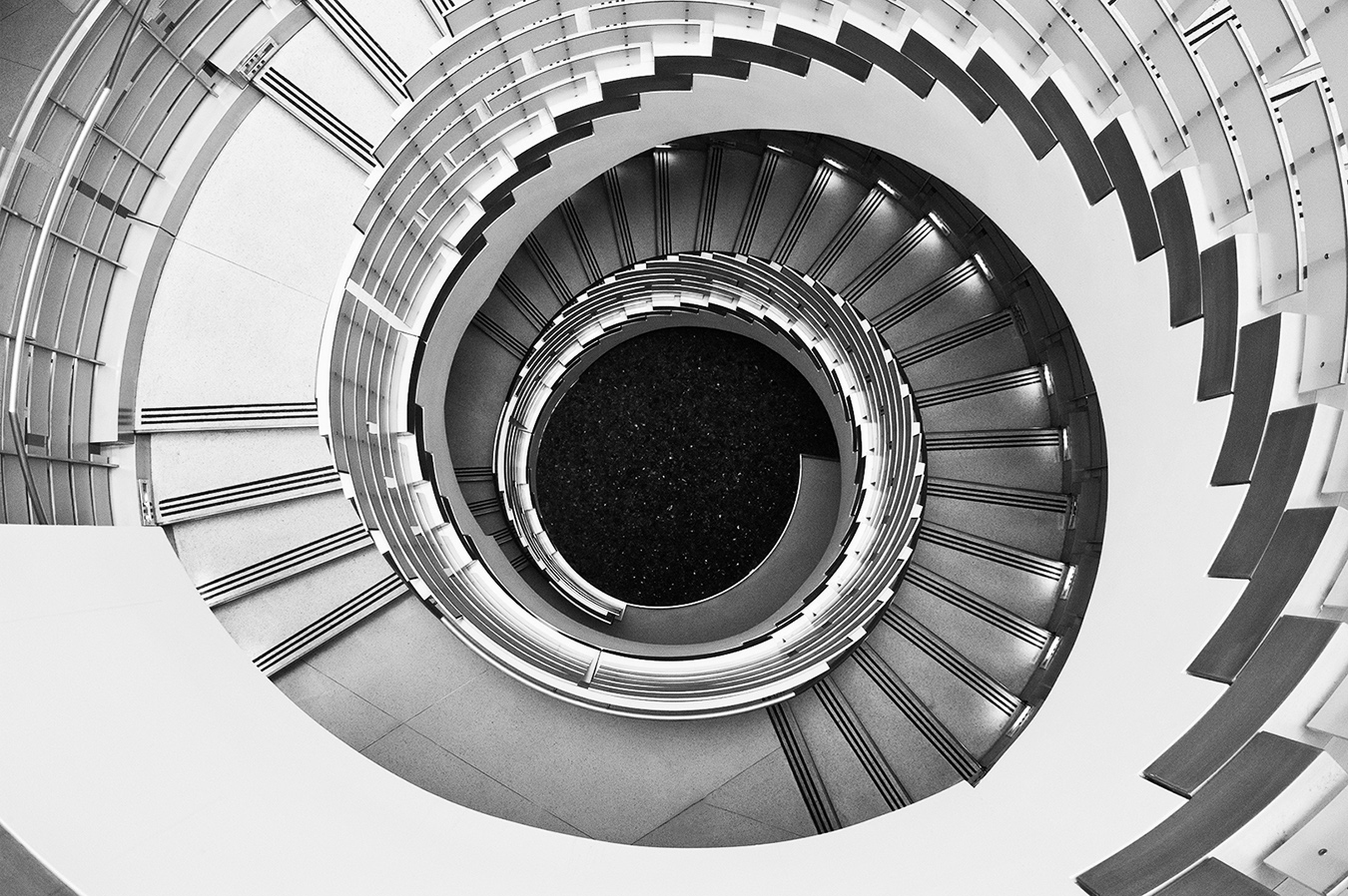
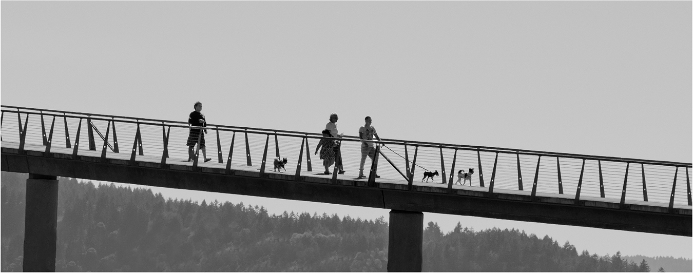
Hi Peter: First of all I would like to congratulate you on achieving the Galaxy 1 rating in the Projected Image Division Monochrome Class. That is a special achievement you can be proud of.
The spiral staircase image shows good depth looking upward, and is very well composed and also shows really good tonality. The monochrome conversion fits this scene very well. I also like the darker toned original which has a nice mood. |
Nov 19th |
| 11 |
Nov 25 |
Reply |
Hi Henry: One thing I have learned over the digital era is individual monitors may render colors a bit differently from each other even if they are calibrated. I see this variation at my own camera club.
Also I think there may be slight differences between brands of monitors also in how they render colors. Of course, just my humble opinion!
|
Nov 9th |
| 11 |
Nov 25 |
Comment |
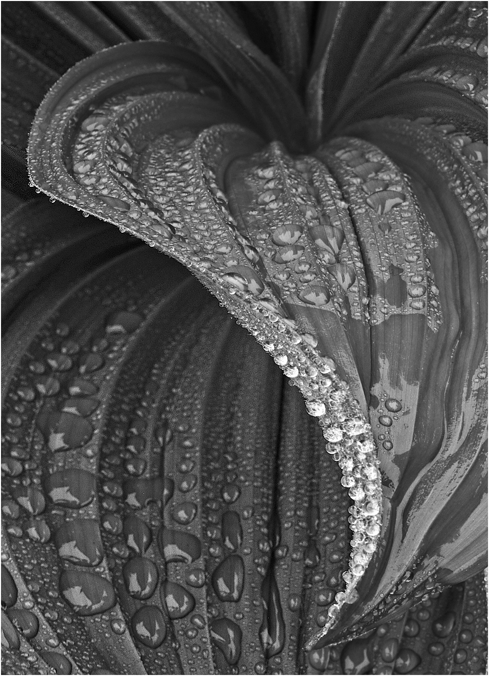
Hi Henry: You did an amazing job pulling any detail out of those black shadows. You managed pretty good tonality in a very difficult lighting situation.
The picture is well composed with the falls biased to the upper left at about the 1/3 power point area, and with the large boulders to the right. The two small falls at the upper right add points of interest.
Using your 100-400 zoom at 262mm creates a fairly shallow depth of field, The rocks at the bottom of the frame are somewhat soft in focus due to this limitation. |
Nov 5th |
| 11 |
Nov 25 |
Comment |
Hi Nenette: Both the original color and monochrome conversions are excellent human interest pictures in all ways.
ORIGINAL COLOR: The little girls face radiates happiness, then the pink dress was the perfect color for this scene.
Composition is perfect with the girl on the left side of the frame looking into the scene of bubbles. Then the soft lighting of the day along with the light muted green background and then the iridescence of the bubbles; everything works together here.
MONOCHROME: Really good monochrome conversion. Excellent tonality for this subject, lower contrast worked very well for this situation.
Both images are winners in my humble opinion. |
Nov 5th |
| 11 |
Nov 25 |
Comment |
Hi Sheldon: The overcast lighting was ideal for his particular picture, also just enough contrast to show the ripples in the sand.
From a composition standpoint this desert type picture would work very well reversed 180 degrees with the larger Yucca on the right, but nice as is.
This picture fits the description well that sometimes "Less is More". Really nice work !!
|
Nov 5th |
| 11 |
Nov 25 |
Comment |
Hi Charles: Welcome to mono group #11.
A picture of patterns and various angles. A lot to look at here; the main structure and the large container that contains a shrub. Then we have a water feature with ripples that breaks up the reflection of the main structure. The sidewalk on an angle with the patch of lawn adds another point of interest.
The monochrome conversion displays high contrast that adds impact to the scene, also the lone cloud in the sky also is quite important to this interesting design picture. |
Nov 5th |
| 11 |
Nov 25 |
Comment |
Hi Ed: Welcome to Mono Group #11.
I like both the original and the monochrome conversion, each has its own special message.
The original color version tells a good nature story of the Common Murres in their native habitat. To me the monochrome conversion becomes almost abstract as the birds blend in with the rocks so well. The overall tonality of the monochrome conversion has been handled quite well, and with good depth of field top to bottom.
A lot to look at in this picture with the large number of birds nestled among the rocks. |
Nov 5th |
7 comments - 1 reply for Group 11
|
| 63 |
Nov 25 |
Reply |
Hi Pierre: I like to experiment, sometimes a person can really help the image.
In this case I think the bright background over powers these small violet flowers. Most of the time I would prefer a darker background in order to place more emphasis on the flowers so they stand out from the background. Case in point is Charlie darkened down your light green background so your white butterfly would stand out better which it does. |
Nov 29th |
| 63 |
Nov 25 |
Reply |
Hi Barbara: Regarding the use of a thin border. I learned many years ago in general every day life is not to be adamant that "my way is the only way". Other folks have good ideas also. I have images where a thin border adds that finishing touch, and other pictures where a border does not fit well at all. |
Nov 22nd |
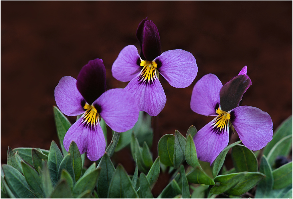
| 63 |
Nov 25 |
Reply |
Hi Charlie and Pierre: YES, the top flower petal in this violet species is a very dark maroon and hard to show detail in. I did try to lighten it as much as I could without it looking strange.
The background soil is a rich dark brown as shown.
As always I appreciate your input. cheers. |
Nov 21st |
| 63 |
Nov 25 |
Reply |
Hi Pierre: Barbara mentions using the spot healing brush. I do not think to use it instead of the cloning tool. Need to start using it and see what it will do. |
Nov 19th |
| 63 |
Nov 25 |
Reply |
Hi Barbara: Pleased you liked the Sagebrush Violet.
I looked up distribution of the Sagebrush Violet and it is not found in Texas. Texas does have similar small native Violets, mostly found in shady areas. |
Nov 19th |
| 63 |
Nov 25 |
Comment |
Hi Pierre: A really nice nature image in all ways.
You mention the blade of grass on the left wing. I would use my cloning tool with a soft brush starting out at 50% opacity for starters. Then I would enlarge the image to 200% or even more if necessary. I would clone in the same direction of the veins in the wings. Your cloning and the different settings will take some experimenting.
I have found in an image such as this if the photographer does a decent cloning job, the average person will never notice you worked on the image. Just my thoughts !! |
Nov 13th |
| 63 |
Nov 25 |
Comment |
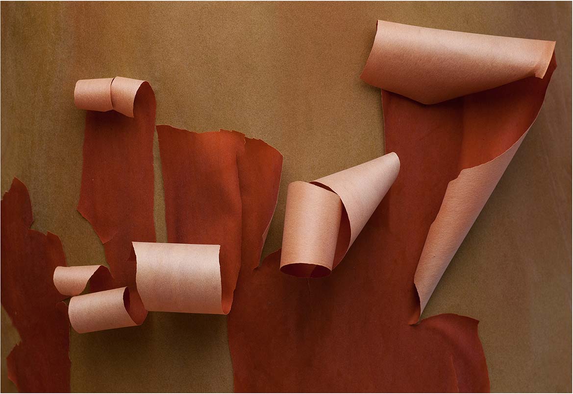
Hi Charlie: Another of your pictures that displays a high degree of post processing excellence. Like the way you have created the counter top with lines that represent old wooden boards; then the warm brown tone of the background is well thought out.
The colorful berries, the dramatic side lighting using flash really adds mood to this scene. Everything in this image is well thought out and fits together very well.
It is interesting to me you chose not to use your thin border you sometimes use, as the left side of the frame kind of disappears into our black web page.
|
Nov 13th |
| 63 |
Nov 25 |
Comment |
Hi Alane: A colorful subject placed well in the frame. Wish we had colorful flies, however the ones we have are just black and not pretty at all.
The fly itself does not seem as sharp and crisp as it could and should be, also the background is busy and could be darkened down somewhat to place more emphasis on the fly.
The background has a textured look, did you use a texture filter on this image ?? |
Nov 13th |
| 63 |
Nov 25 |
Comment |
Hi Barbara: Like the soft mood of the image created by likely overcast conditions. Just the single pink Lily flower with a light orange center supported by green leaves laying on the water. This fits the old photography saying "Less is More" very well.
All I can add and this is personal taste of the photographer, is to add a thin border to frame the subject from the black web page of our circuit. |
Nov 13th |
4 comments - 5 replies for Group 63
|
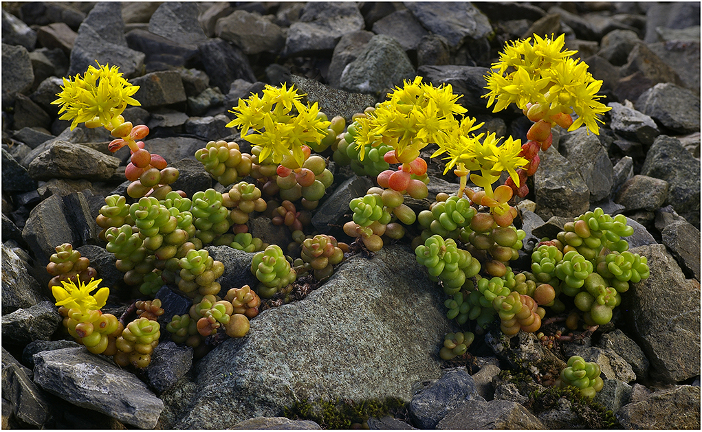
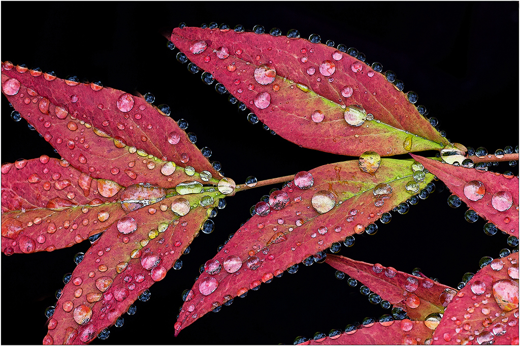
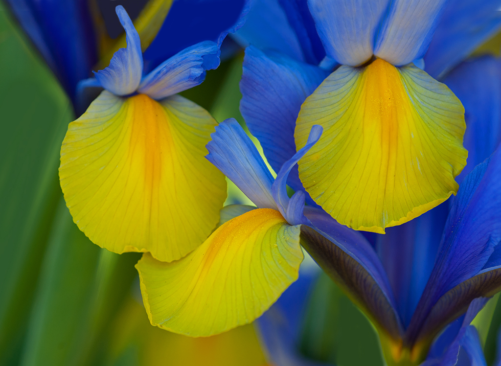
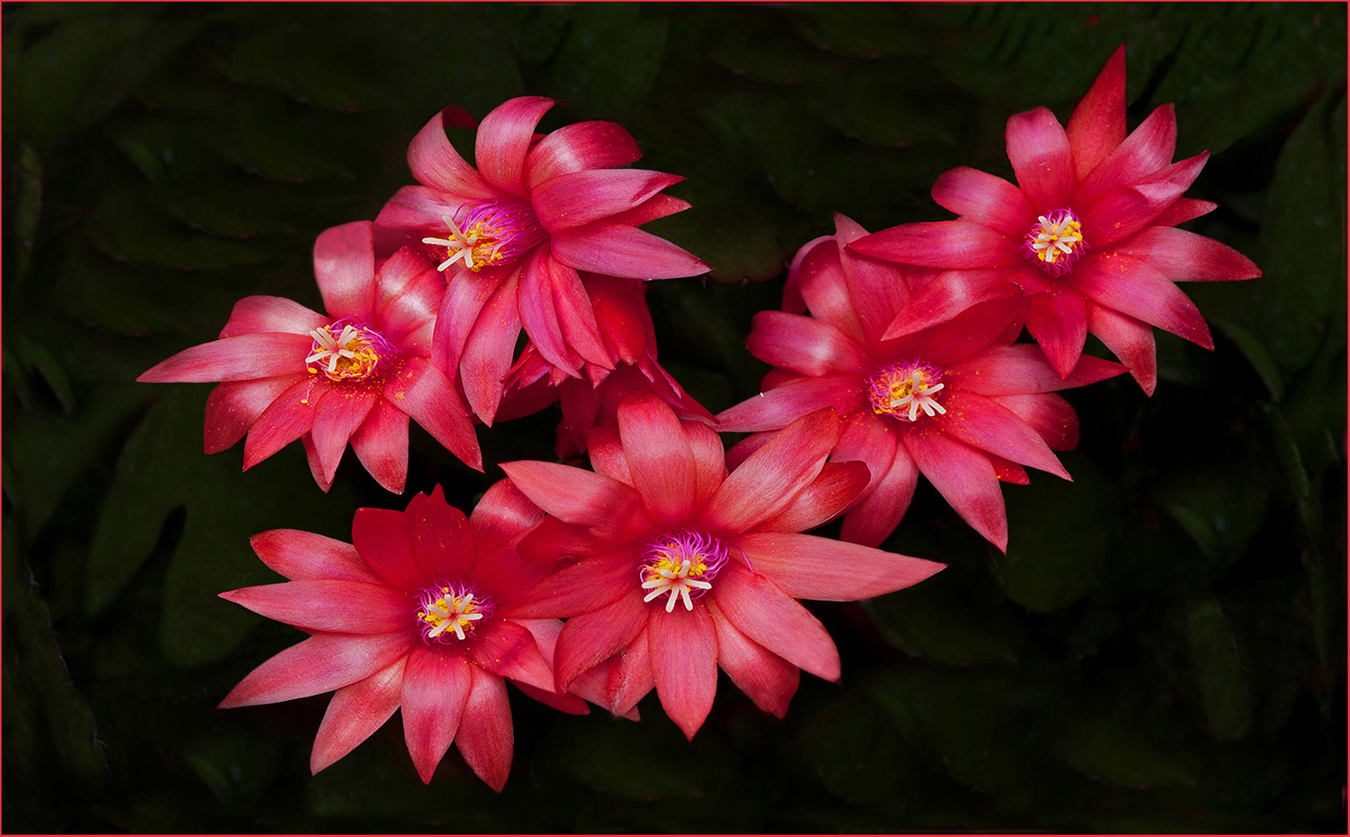
| 75 |
Nov 25 |
Reply |
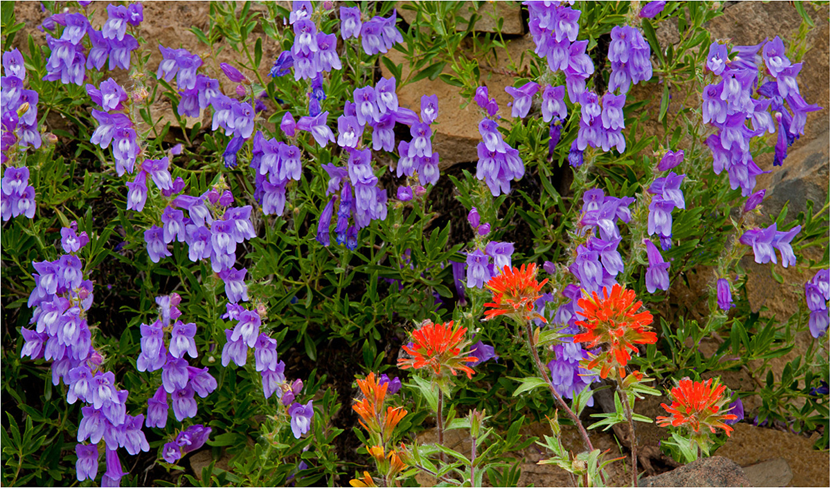
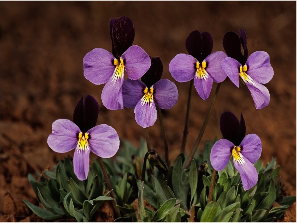
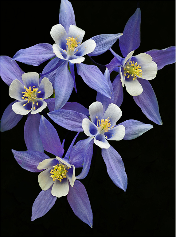
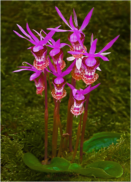
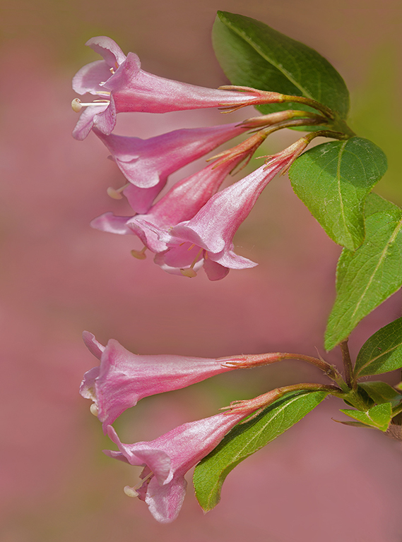
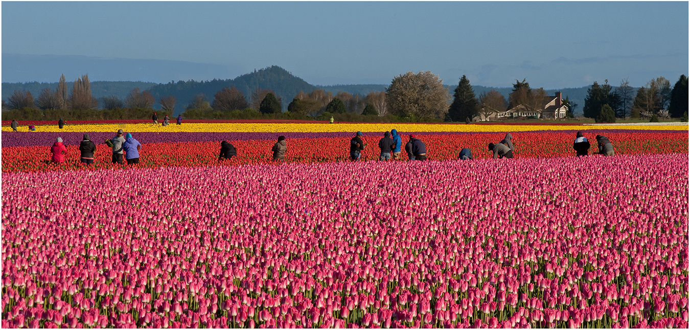
Hi Vincent: Guess I need to explain this picture a little better. This picture is a typical nature habitat shot of a grouping of small flowers growing in its natural habitat.
The 5 pink flowers are about 4" tall above the ground. The green clump at the base of the flowers are supporting leaves which I did not want in sharp focus to compete with the pink flowers for attention.
The dark out of focus brown at the top and right hand side is the soil the little flower group was growing in. This is an alpine variety growing at high elevations in mountain areas.
|
Nov 18th |
| 75 |
Nov 25 |
Comment |
Hi Gaetan: A very sharp picture of the Passion flower with a dark green background that supports the picture well.
Picture seems somewhat dark, (under exposed). This flower should jump off the screen at the viewer if exposed correctly. An easy matter to lighten the image. |
Nov 13th |
| 75 |
Nov 25 |
Comment |
Hi Mo: Another of your extremely well done frozen flower arrangements. Very artistly arranged with various shapes and sizes and colors in a grouping. The texture of the ice adds that finishing touch to this amazing flower picture.
What else can I say but excellence.
Looking forward to your astute comments on our images. |
Nov 6th |
| 75 |
Nov 25 |
Comment |
Hi John: As very interesting close in picture of the Sunflower. Very sharp detail and a rather artistic arrangement.
Another possibility from a composition viewpoint would be to back off a little and show us more of the yellow leaves. The addition of yellow leaves to the left side and also top and bottom may be a good addition to an already neat close in photo.
A good seeing eye to spot this arrangement and make the photo. |
Nov 6th |
| 75 |
Nov 25 |
Comment |
Hi Alison: Your experiment with various filters was a success and works well. The various filters you have used gives the flower kind of a iridescent and creative look which adds to the overall impact on this flower picture. The Allium flower just seems to glow against the dark background.
your choice of "dead centered" composition works well here, and the very thin white border adds that finishing touch to the picture.
|
Nov 6th |
| 75 |
Nov 25 |
Comment |
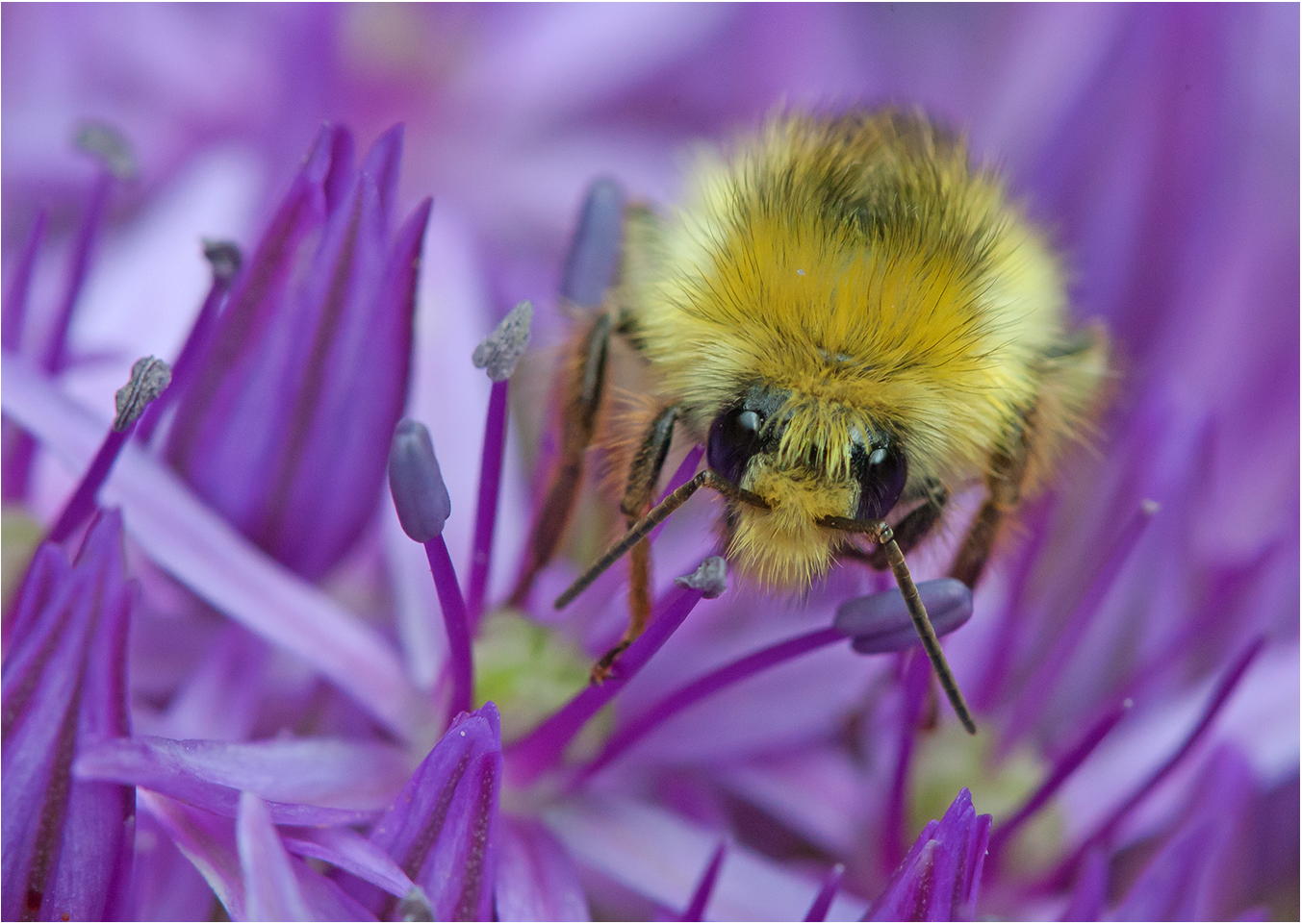
Hi Vincent: A difficult task photographing flowers at 8 PM. Sometimes a challenge is fun.
The yellow central part of the white daisy like flower is not as sharp as it could or should be. It is possible using ISO 6400 may cause this, it depends on the camera system as some do better than others at very high ISO. And also some camera lenses loose sharpness at f/22, a situation known as diffraction. Most camera lenses will be sharper at mid apertures rather than at f/22, however it depends on the optical formula of the lens as each lens is different.
The two insects add points of interest to the picture as they are quite different from each other. |
Nov 6th |
5 comments - 1 reply for Group 75
|
16 comments - 7 replies Total
|