|
| Group |
Round |
C/R |
Comment |
Date |
Image |
| 11 |
Oct 25 |
Reply |
Thank you Peter for your kind comments, very much appreciated. |
Oct 13th |
| 11 |
Oct 25 |
Comment |
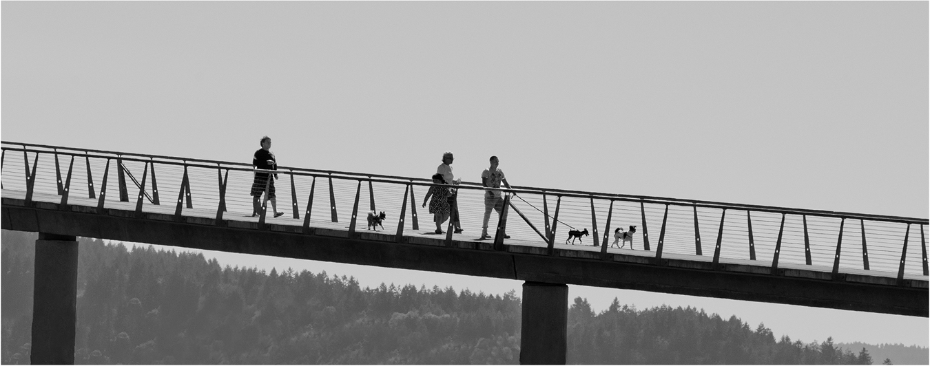
Hi Peter: A very strong graphic design picture well composed. the very well executed monochrome conversion really makes this scene pop.
You did excellent work in straightening up the tilted buildings caused by the extreme wide angle 14mm lens.
In the original color picture I find the coloration in the old bricks in the street quite interesting. |
Oct 12th |
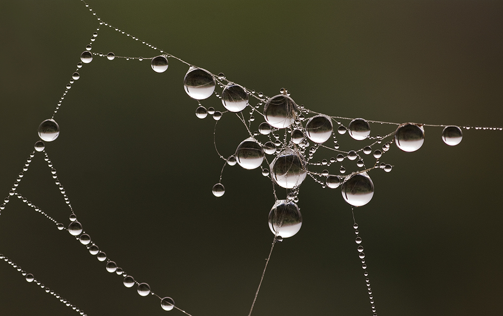
| 11 |
Oct 25 |
Comment |
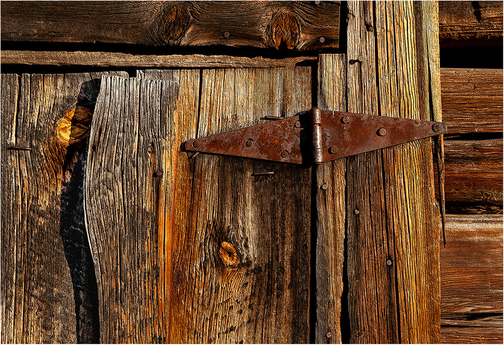
Hi Henry: You did a great job in placing the carved arch precisely in the frame. The distance on each side of carved arch is exactly the same on each side of the frame and this same distance is adhered to at the top and bottom.
The tonality is good, the bottom though quite dark still has detail in the background. Am not certain if a very thin white border would add a finishing touch to this picture or be a distraction. At the bottom it may separate the dark background a little better from the black webpage. Just a thought! |
Oct 12th |
| 11 |
Oct 25 |
Reply |
Thank you Henry for your positive comments.
To me the color version is more of a travelogue picture while the BW has more interest and impact. In the BW the old fence seems more prominent which I think adds a lot to the picture. |
Oct 12th |
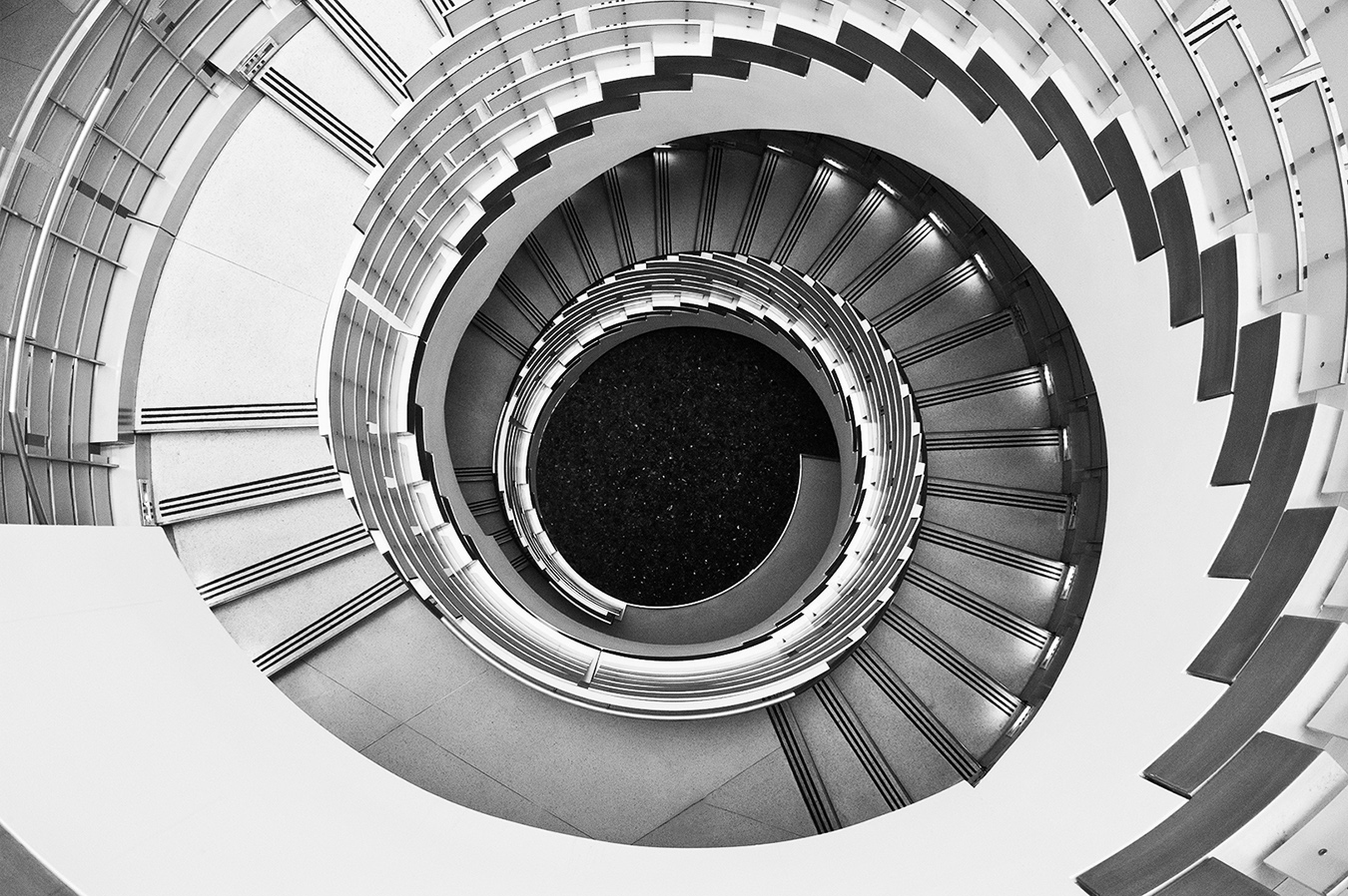
| 11 |
Oct 25 |
Comment |
Hi Nenette: A very interesting radial design picture of the dome. Your BW conversion is simply on the money, just beautifully done tonality.
The color version is also magnificent with the blending of colors in the dome. Photographed very well.
Would like to go there some day! |
Oct 12th |
| 11 |
Oct 25 |
Comment |
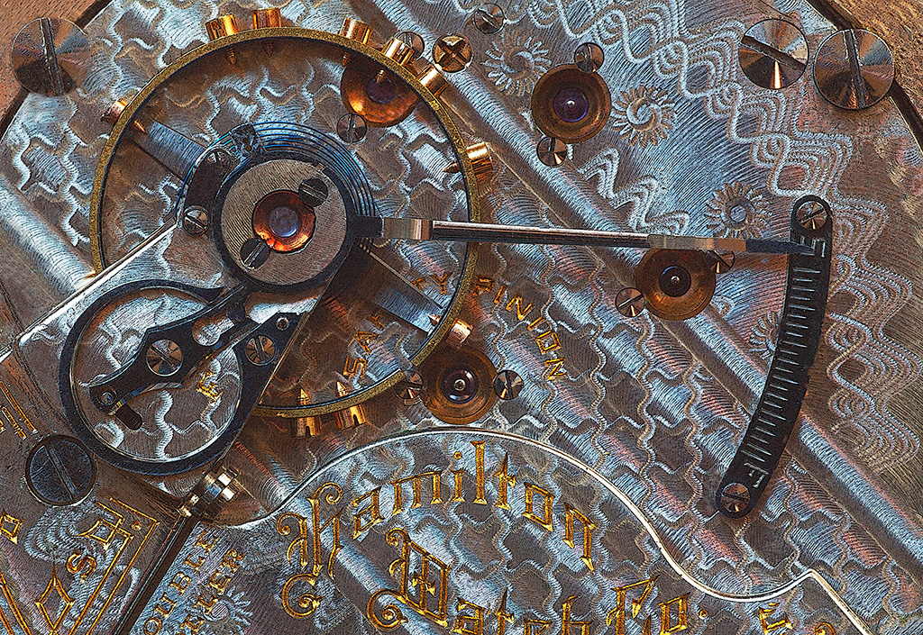
Hi Sheldon: A skillful job in post processing in recovering all of that interesting detail in the picture, there are no jet black shadows.
The original shows a water background through the window which adds some interest as to the setting.
A a really nice aesthetic 'still life' type of picture. |
Oct 12th |
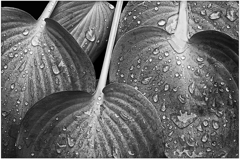
| 11 |
Oct 25 |
Comment |
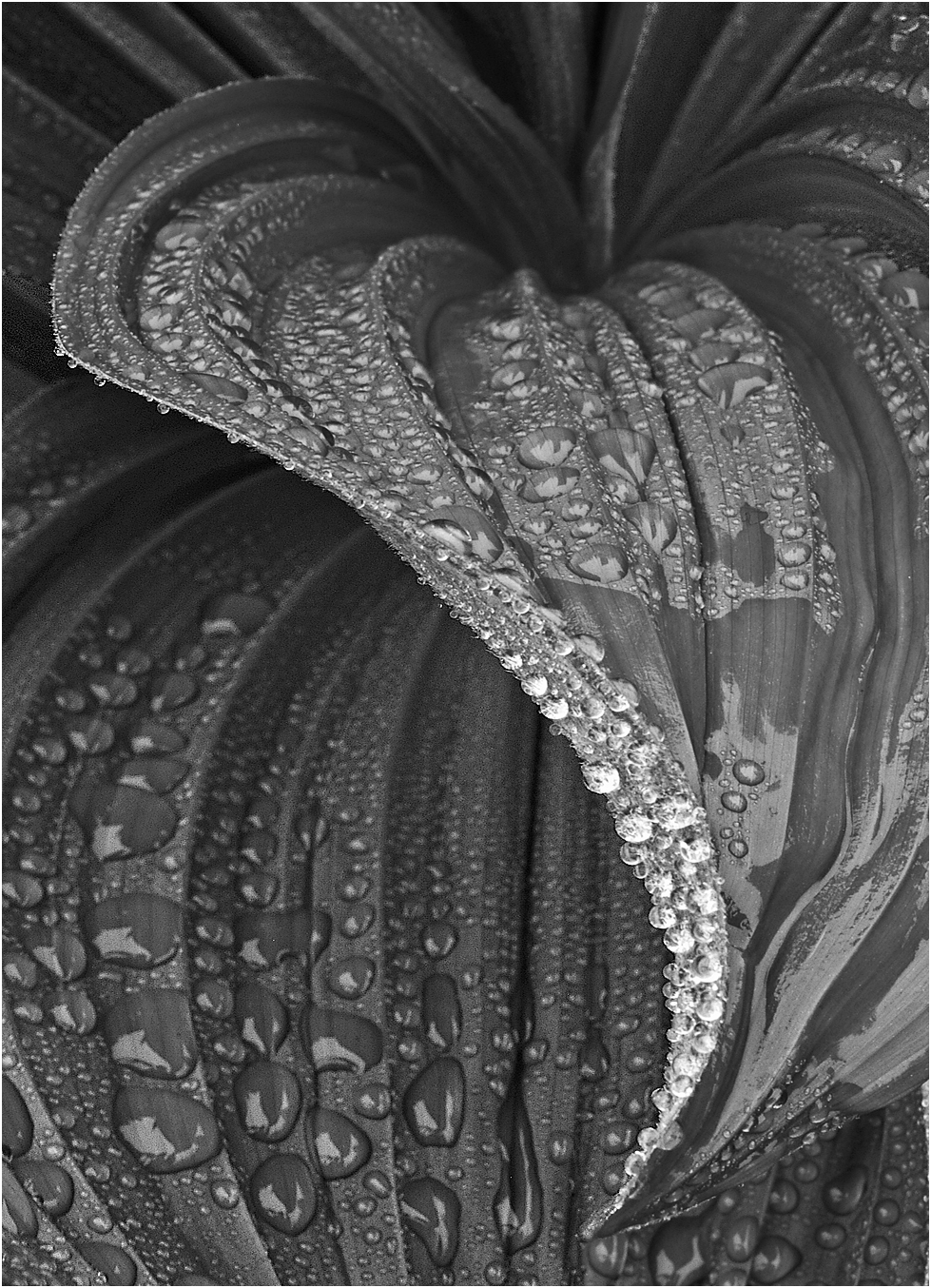
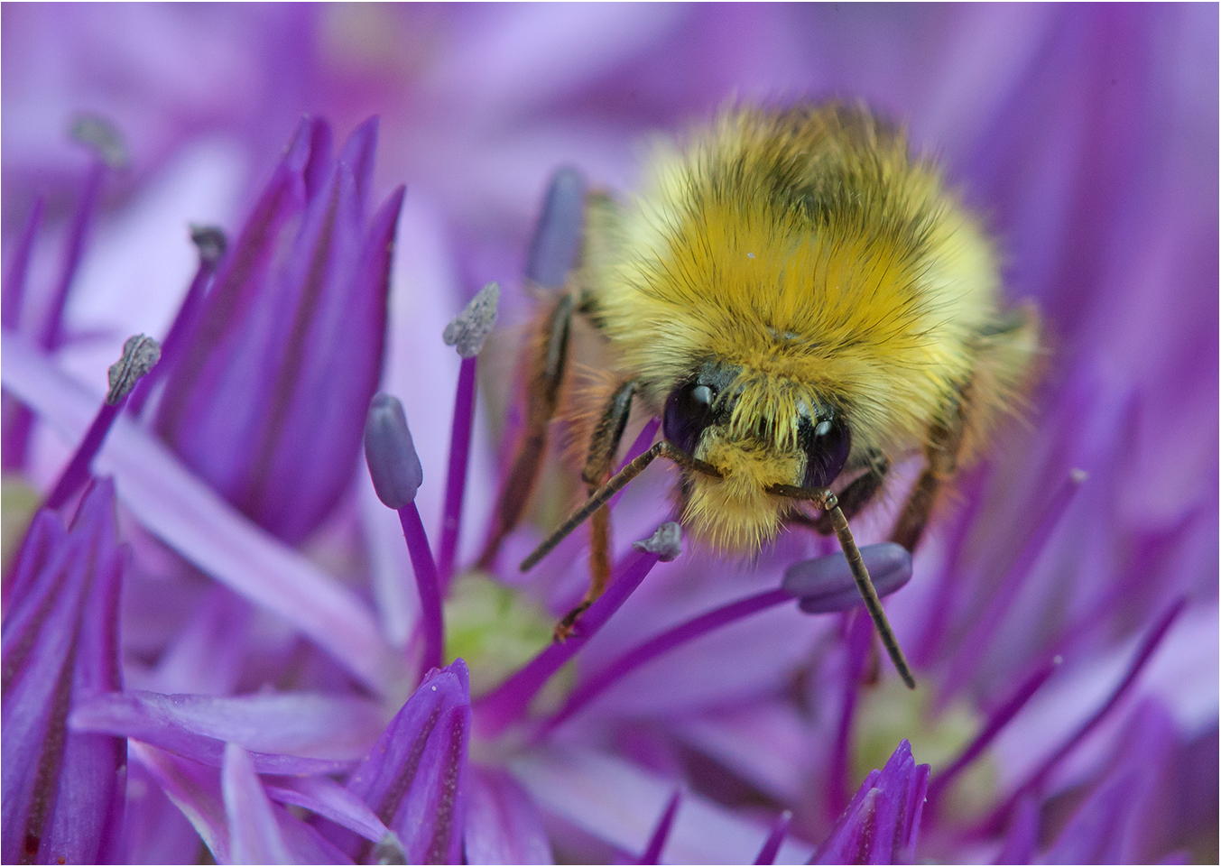
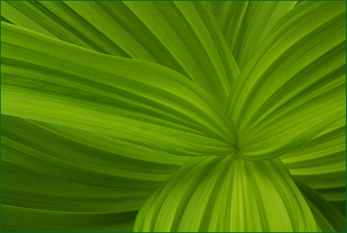
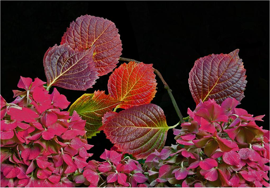
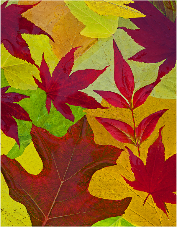
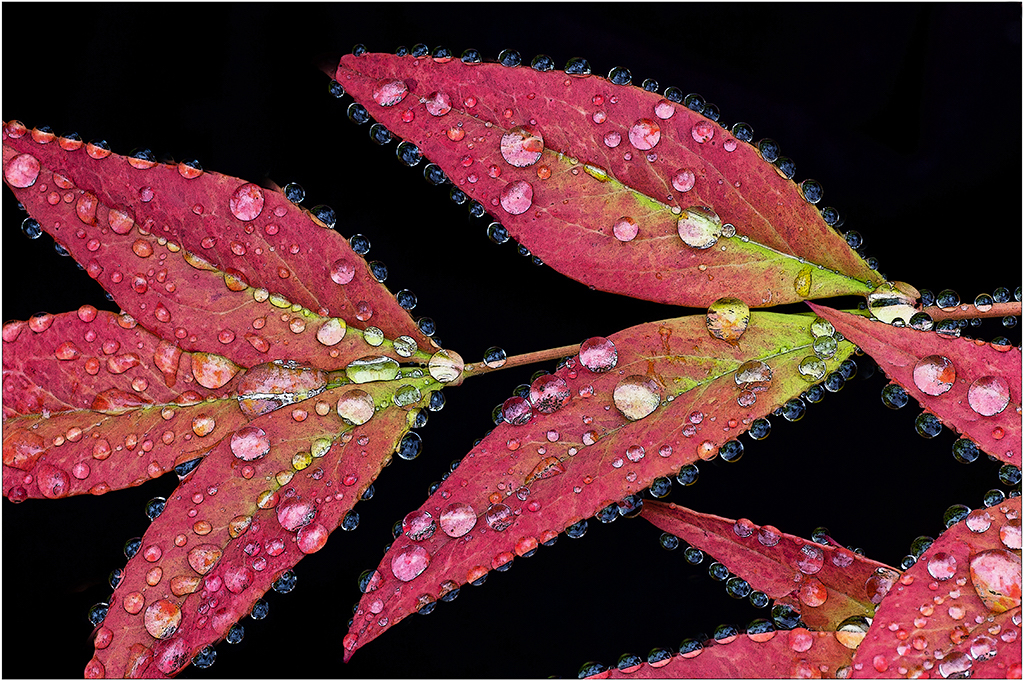
Hi Ed, welcome to monochrome group #11.
I like both images, your original color version has beautiful tonality.
The monochrome image is processed very well. Somehow the leaves seem to stand out a little more defined than in the original color.
Composition wise there is a very dark hole towards the right border, it breaks up the symmetry of the leaf patterns. This could be fixed with some very careful cloning, or as Henry has suggested cropping in and making a square format. |
Oct 12th |
5 comments - 2 replies for Group 11
|
| 63 |
Oct 25 |
Reply |
Hi Barbara, I like the nice soft mood of your flower picture in the showcase this month. The background fits well.
Congratulations!! |
Oct 23rd |
| 63 |
Oct 25 |
Reply |
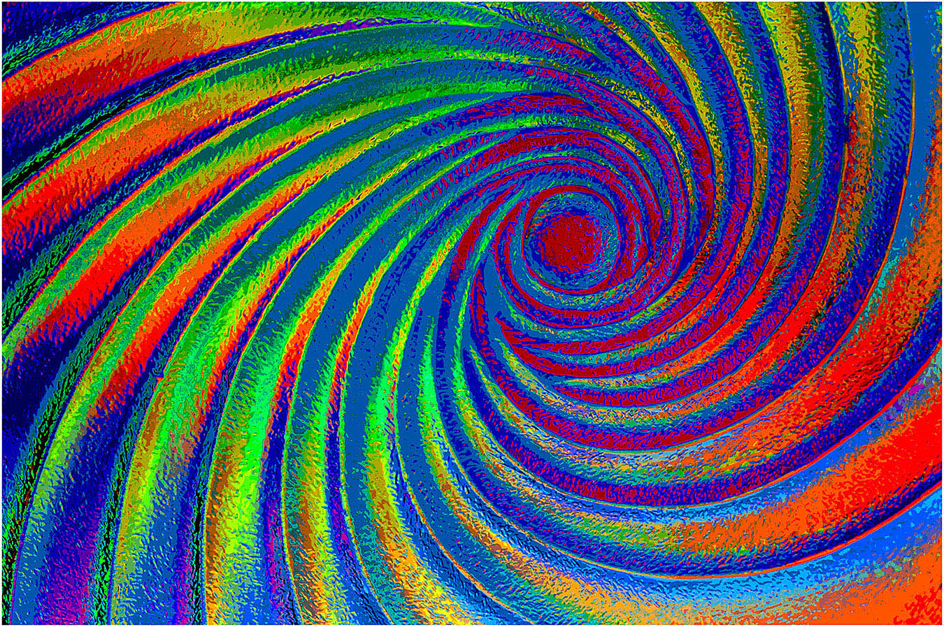
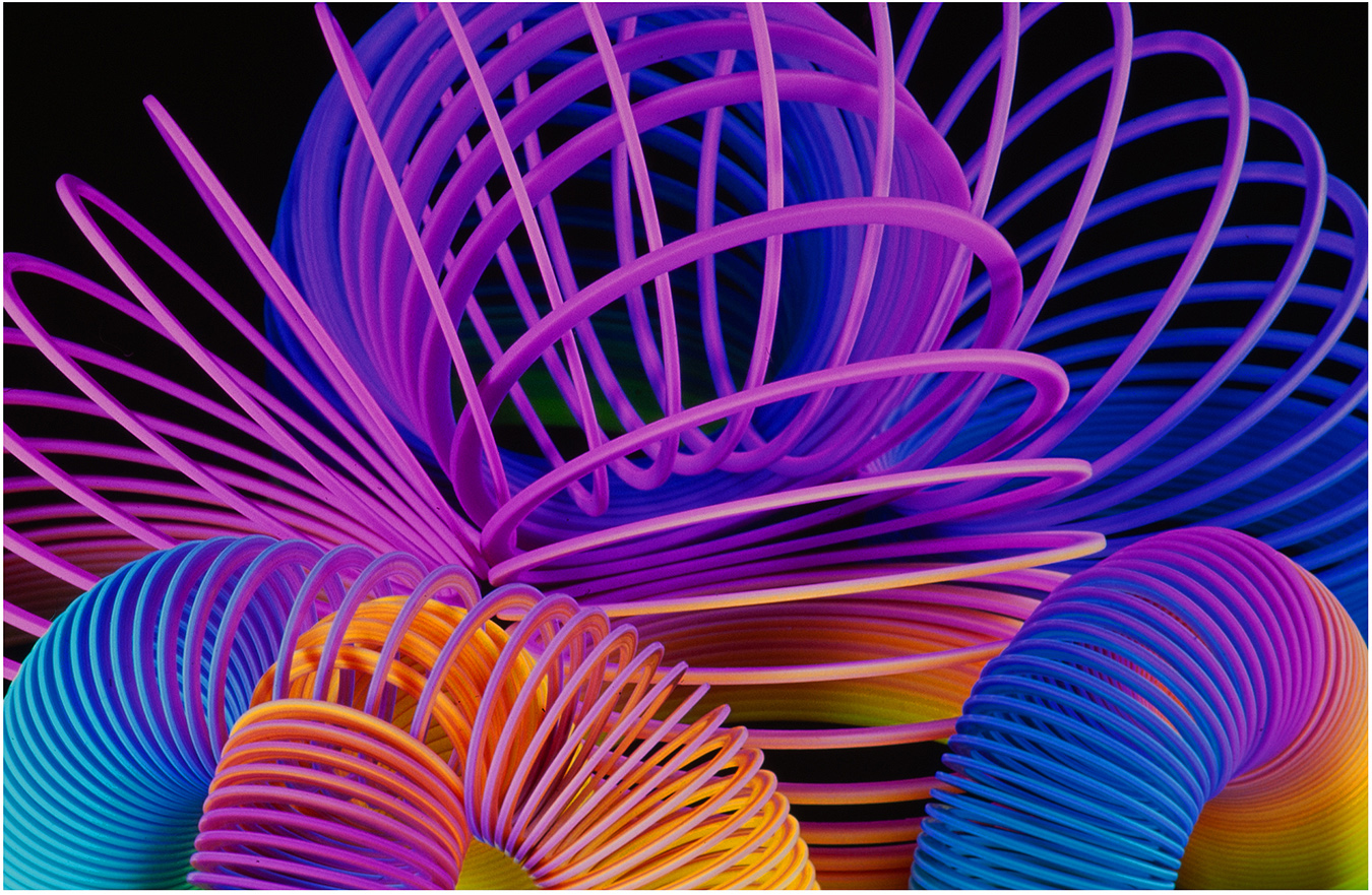
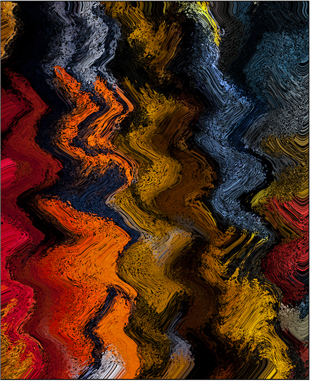
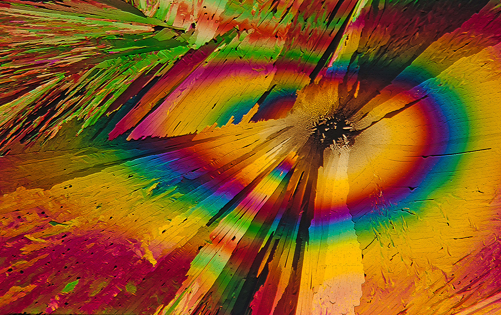
Hi Charlie: Pleased you enjoyed the colorful abstract. Your version is kind of a variation of the theme, perhaps 1/3 f stop less exposure and added contrast which changed the outer colors a little.
So far I have used moth balls and tartaric power melted into liquid form to create the vivid colors. If one Googles crystal photography there are other chemicals that can be used. This winter I plan on experimenting with some of those to see what I can come up with. |
Oct 22nd |
| 63 |
Oct 25 |
Reply |
Hi Pierre: The best lens to use is the one you have with you at the time. |
Oct 21st |
| 63 |
Oct 25 |
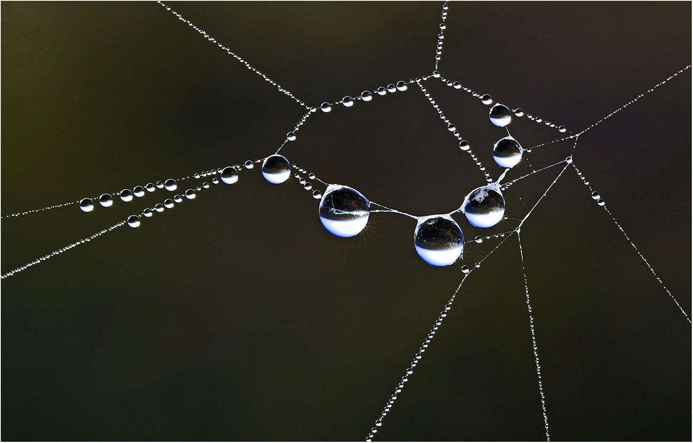
Reply |
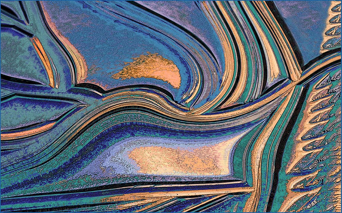
Hi Barbara: The medium used to create the Abstract Design picture was moth balls melted onto a piece of glass. When the melt dries out a design of crystals forms on the glass. You cannot see any colors until the glass is double polarized by two polarizing filters, one in front of the glass containing the crystals and another in back of the glass.
The actual process is detailed and too long to be included here. Barbara, if you or anyone in our circuit is interested in photographing crystals in this specific manner, just let me know. I would be glad to email you instructions with a few pictures of my set-up. |
Oct 21st |
| 63 |
Oct 25 |
Comment |
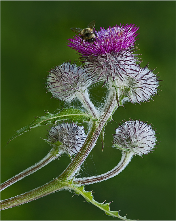
Hi Alane: First of all 'congratulations' on your success at the Nikonians competition, it does not happen like that every day!
I have always liked very well photographed nature abstracts and this one is excellent. I love the soft colors which produces a very pleasant soft mood and the Lily pads at the top complete the nature story.
Good job of seeing and creating this fine nature abstract. |
Oct 15th |
| 63 |
Oct 25 |
Comment |
Hi Barbara: Am glad you explained the situation that was happening before your eyes so we could understand and appreciate the significance. You may have photographed what I would consider as a 'Life Time' image as this exact situation may not happen again.
A couple of suggestions: I would darken down the green flower stem as it is out of focus and a little bright. In doing so it would not be so prominent in the picture and it would not call attention to itself.
Nice sharp detail on the white flower and moth, and good camera craftsmanship with the flash.
Also in this case with the black background of the main picture I would consider adding a thin white border to frame the image. Except for where the stem enters the picture area I cannot tell where your picture area ends against the black webpage of our circuit.
A special picture for your files and you were indeed fortunate to shoot this one frame before he left.
|
Oct 15th |
| 63 |
Oct 25 |
Reply |
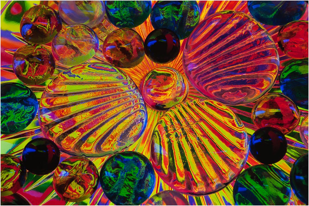
Hi Pierre: Pleased you liked the crystal abstract.
The only time I use extension tubes is when my macro lenses will not focus in close close enough to obtain the picture I want to capture. Achieving enough depth of field on some subjects such as really close in pictures of a flower is difficult unless you are using focus stacking.
The crystal picture was shot on a piece of glass so depth of field was not an issue. |
Oct 11th |
| 63 |
Oct 25 |
Comment |
Hi Pierre: Am amazed you could render detail as good as this hand holding a 200-800 zoom lens, you must have had your vibration reduction turned on. Using 800mm diffused the back ground into a sea of light green with no distractions.
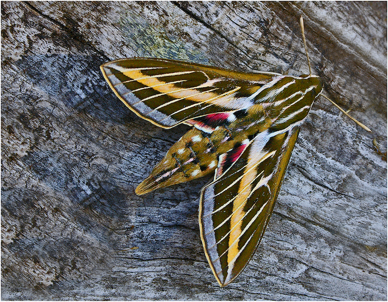
A beautiful colored butterfly with an interesting color pattern. Lucky you in finding such a wonderful subject. |
Oct 11th |
| 63 |
Oct 25 |
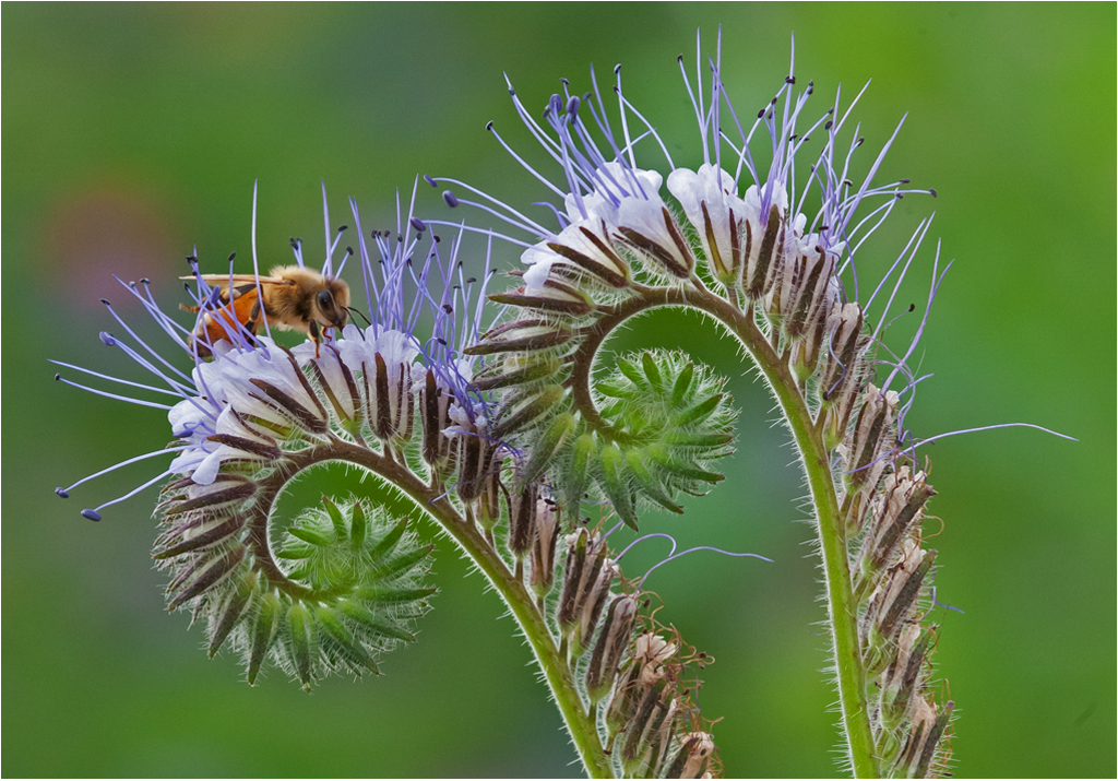
Comment |
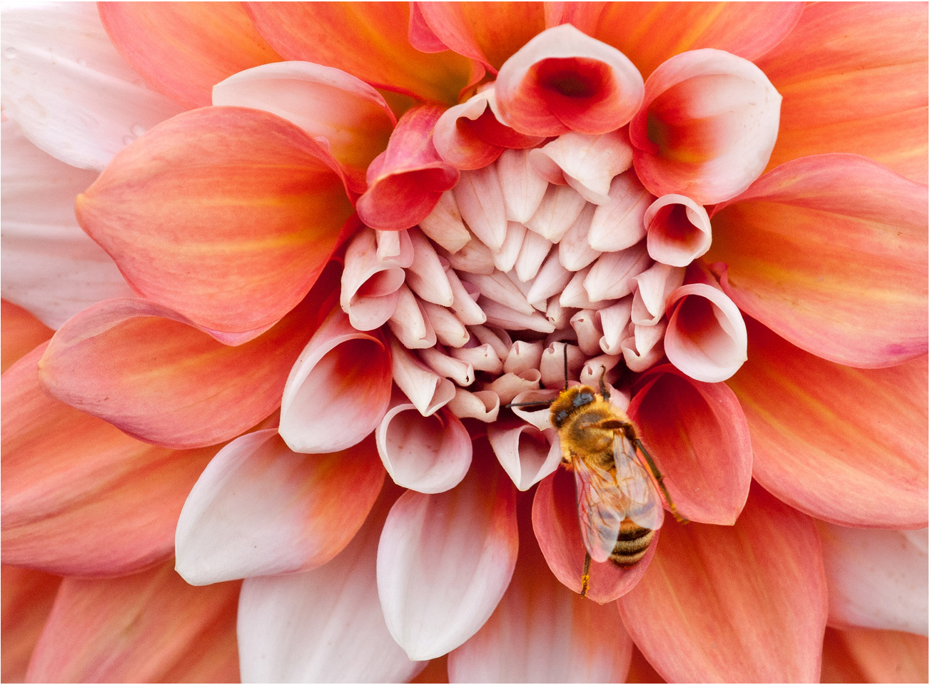
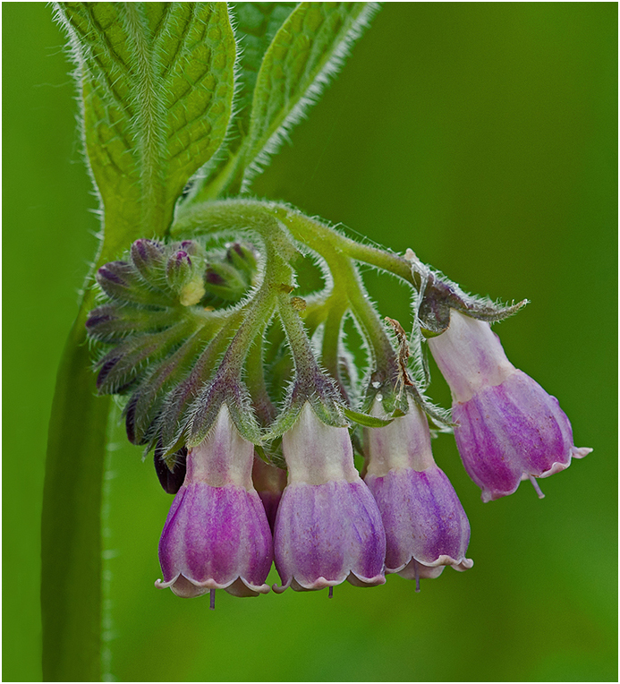
HI Charlie: A very interesting bloom with a high degree of texture and just super sharpness on the bloom.
In the original the busy background is what I would expect from a 100mm macro lens using f/11 aperture. You have diffused the background to be a very pleasant out of focus green with soft violet highlights.
At ISO 3200 many camera bodies would show some noise, however your de-noise program removed any trace of digital noise, and you have a very clean presentation.
I enjoy visiting botanical gardens as a person will see unusual plant life as you have captured here.
|
Oct 11th |
4 comments - 5 replies for Group 63
|
| 75 |
Oct 25 |
Reply |
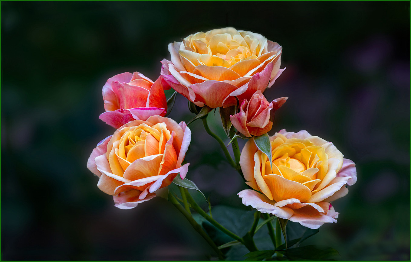
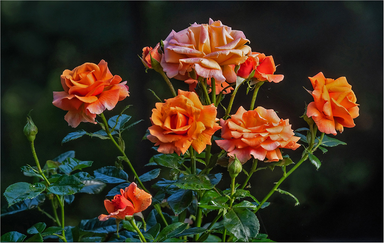
Hi Vincent: Think you are correct, just the 3 larger yellow roses would have made a "classic composition." Sometimes "less is more" and I think that phrase fits here. |
Oct 23rd |
| 75 |
Oct 25 |
Reply |
Hi Gaetan: Yes, the back of the top rose is slightly soft, missed seeing that one or I would have fixed it.
Regarding the blurry magenta spots in the background; Those are out of focus flowers in the distance, they were left on purpose to add another color compliment to the picture and to avoid just a very dark plain background. |
Oct 21st |
| 75 |
Oct 25 |
Comment |
HI again John: I forgot to welcome you into Flower Group 75, so will do so now. Have been in this group since it started out in August 2022, and have learned a lot.
Trust you will enjoy our flower study group as much as I have. |
Oct 7th |
| 75 |
Oct 25 |
Comment |
Hi Mo: First off let me say this Rose picture is a very creative "work of art". Your choice of background colors really set the stage for the mood you wanted to create.
In addition to a 38 revolver in your camera kit you must have had various colors of pressurized canned spray paint to paint the background concrete the colors you needed to add to the overall impact and mood you wanted to create.
In closing just let me say this picture is not the work of a beginner photographer, but the work of a highly talented camera craftsman.
Looking forward to your astute comments on our pictures in this round. |
Oct 6th |
| 75 |
Oct 25 |
Comment |
Hi Gaetan: Somehow you missed the focus on the Desert Rose as the flower is not at all sharp.
If you are doing focus stacking the camera must be mounted on a sturdy tripod to avoid any possible camera movement. Then shut off the auto focus and focus manually on the flower. In my experience the auto focus does not always focus exactly where I would want it to. I strictly use manual focus on this type of flower photography. You will also have better success using an f stop such as f/8 or f/11. Just my thoughts !! |
Oct 6th |
| 75 |
Oct 25 |
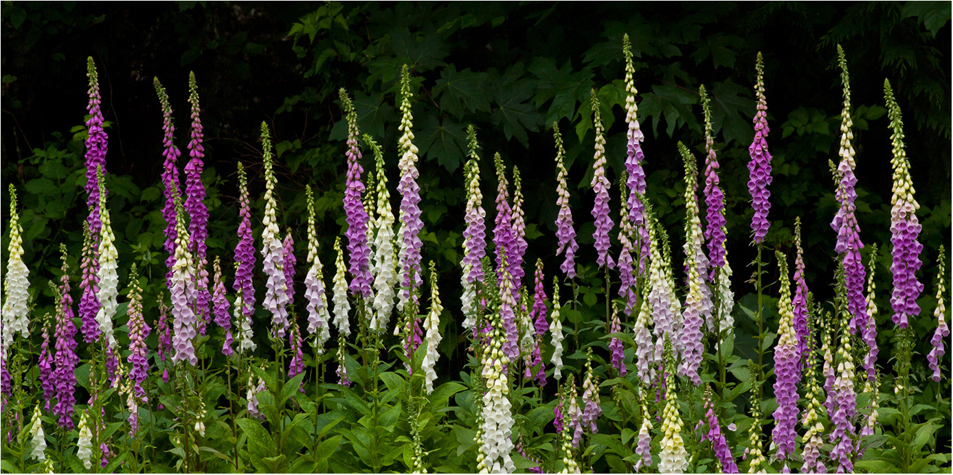
Comment |
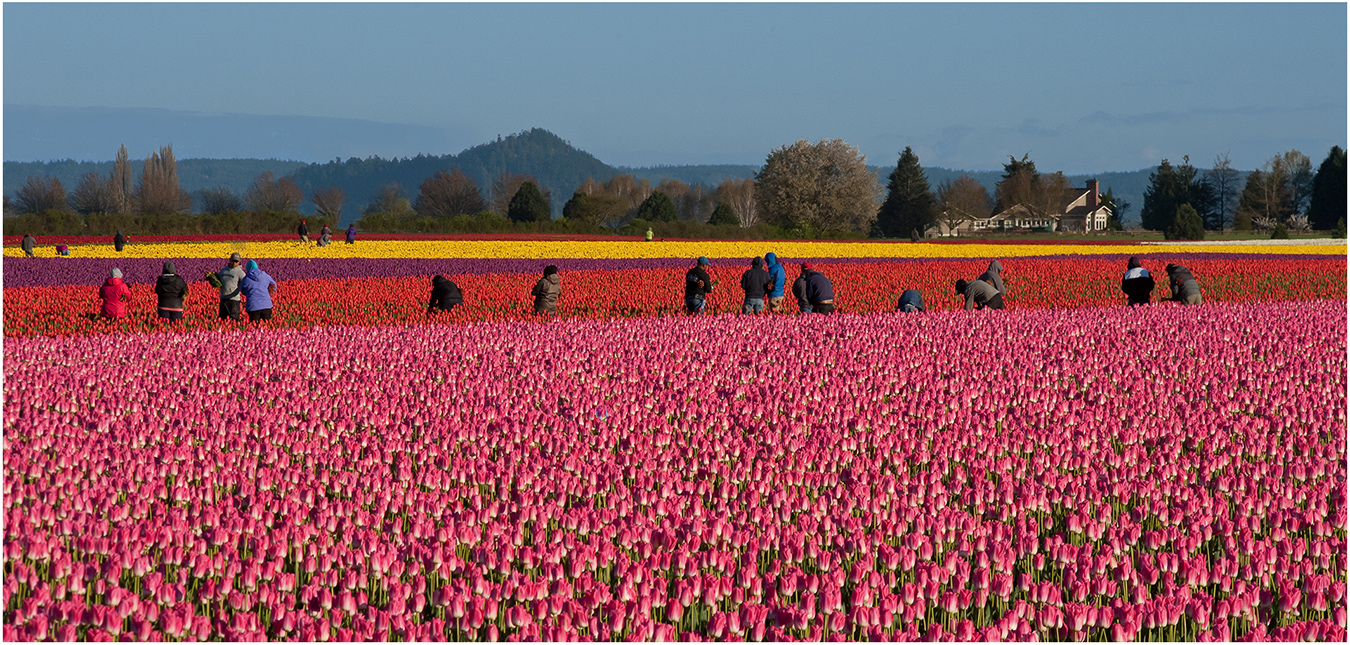
Hi John: A nice grouping of mixed color Tulips. The main issue here is the white out of focus tulips at the top of the frame which are a distraction from the main flower grouping.
I would concentrate on using a flower grouping with fewer flowers against a darker out of focus background some distance away from your flower grouping. Also you will attain better depth of field using an f stop such as f/11 or even f/16. We would appreciate more Meta Data such as camera and lens used, type of lighting at the time, if a tripod was used, and any other info. regarding the picture.
Look back at previous rounds of our group #75, you will enjoy viewing a lot of good flower photography. |
Oct 6th |
| 75 |
Oct 25 |
Comment |
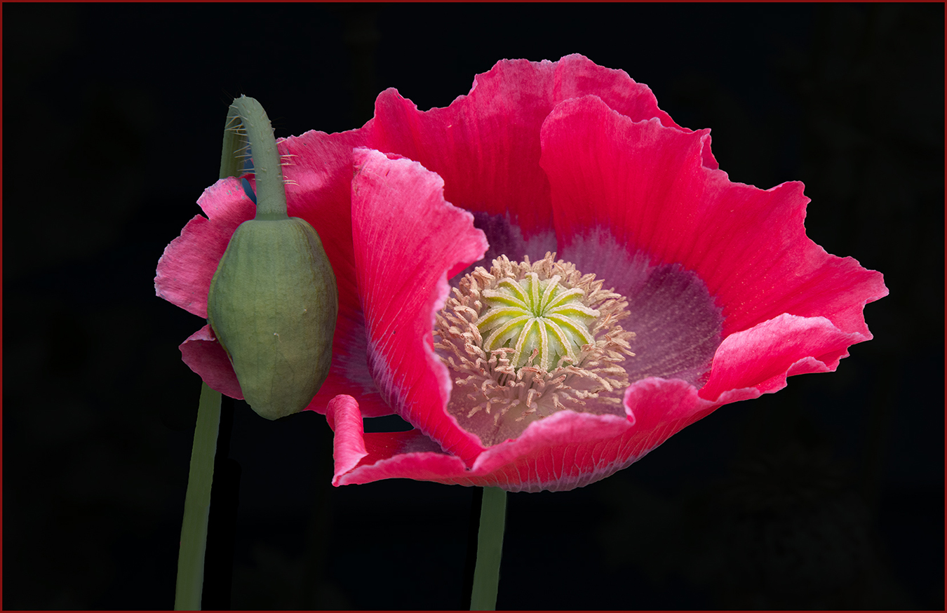
Hi Alison: A very dramatic portrait of a single Rose flower and razor sharp in detail with vivid lighting. Aside of the strong colors this rose flower has textured petals which many roses lack and I think this adds a degree of interest. You have darkened the background down somewhat which makes the flower stand out well. Then as a finishing touch you have added a very thin border to frame the picture. Very Good Work !! |
Oct 6th |
| 75 |
Oct 25 |
Comment |
Hi Vincent: A perfect Rose flower to photograph against a natural out of focus background in soft lighting. Glad you darkened down the background somewhat, I think you could even darken it down even more than you have. In doing so would make the Rose flower stand out even more than it does now. |
Oct 6th |
6 comments - 2 replies for Group 75
|
15 comments - 9 replies Total
|