|
| Group |
Round |
C/R |
Comment |
Date |
Image |
| 11 |
Jul 25 |
Comment |
Hi Nenette: Great Capture!! You were in the right place at the right time to photograph this action scene with the two boys. Opportunities like this simply do not happen every day, and you certainly made the most of this happening.
Excellent post processing work with the monochrome conversion. Being in construction work I always notice if the photographer had their camera perfectly level, or if they leveled up the image in post processing. The concrete block lines are perfectly level from side to side, you can really see this at the top of the frame. This is one aspect many photographers over look and get the building lines leaning one way or the other, however you got it just right.
KUDOS on excellent work! |
Jul 8th |
| 11 |
Jul 25 |
Comment |
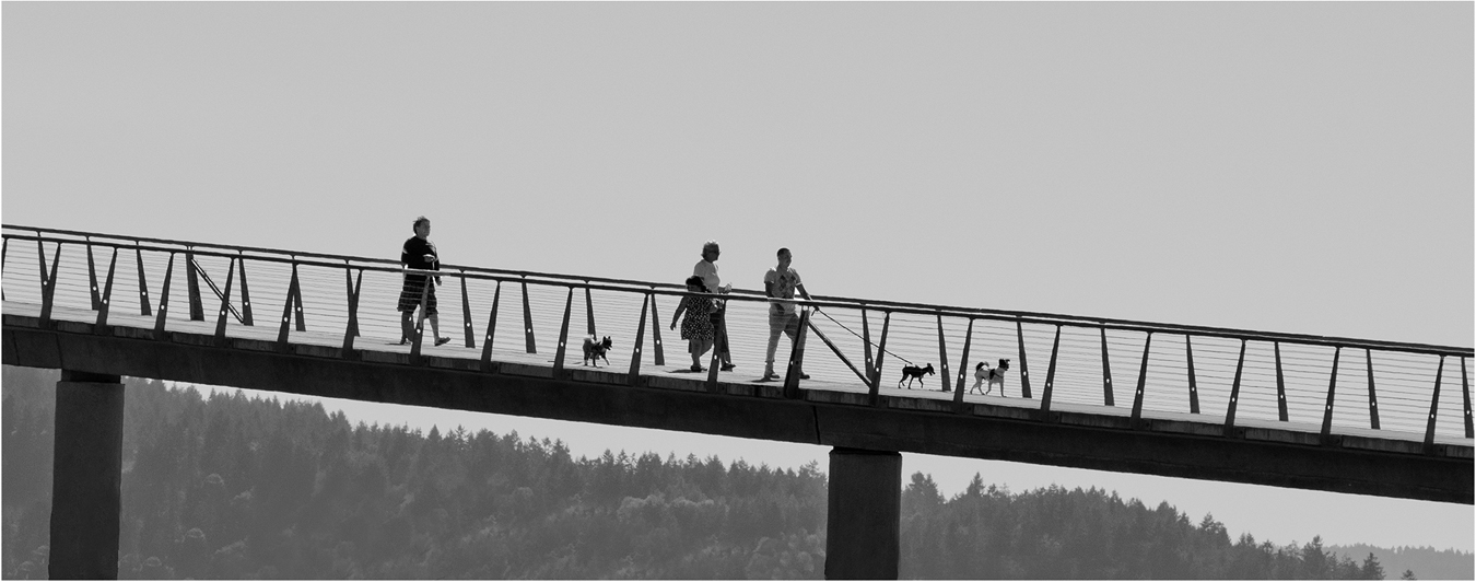
Hi Peter: A very well balanced composition; the edges of the two bridge towers are precisely the same distance from each side of the frame. I think this was planned and not an accident. A lot going on in the image with the tour boat and many people on the bridge.
I like both images, they are different in character. The original is a good travelogue image while the monochrome conversion has more drama and impact. The technical part of the monochrome conversion is excellent. I like the thin white border, it adds that finishing touch. |
Jul 6th |
| 11 |
Jul 25 |
Comment |
Hi Henry: I like both the original color version and also the monochrome for different reasons.
In the original I like the green grass on the ridgeline to the right, and then the two beach hikers near the bottom of the frame slightly to the right add scale. You can barely make them out through the morning fog.
The monochrome shows good depth from the two sea stacks at the bottom right out to the many sea stacks in the distance to the left of the frame. The morning fog through out the scene adds a lot of mood. I like the 16X9 crop as it fits this beach scene well. Good job of seeing !! |
Jul 5th |
| 11 |
Jul 25 |
Comment |
Hi Sheldon: I like both pictures for different reasons.
In this scene I prefer the original as it does a great job of showing the age of this old monument in its deteriorated condition with its rust and orange lichen patches in various places. With a little research I found this cemetery was created in 1869, I just wonder how long those old badly rusted metal benches have sat there.
The monochrome conversion probably has more drama than the original. Just my thoughts !! |
Jul 5th |
4 comments - 0 replies for Group 11
|
| 63 |
Jul 25 |
Comment |
Hi Everyone: Thanks for your positive comments on "Antique Window, they were much appreciated.
This kind of subject is becoming harder to find as time goes on due to time's many changes, feel very fortunate in finding this interesting old log cabin to enjoy making photos of. |
Jul 26th |
| 63 |
Jul 25 |
Reply |
Hi Barbara: I do agree sometimes the water in a pond depending on circumstances can become quite dark in tone. In your additional picture I can see the water lilies growing against a sidewalk with a darker green tree above the lilies. It appears the darker green leaves may be reflecting in the pond causing a very dark water tone. |
Jul 12th |
| 63 |
Jul 25 |
Comment |
Hi Xiao: A really close in study of the ant perched on a flower bud. At this very high magnification even with your macro lens set at F/16 the photographer cannot achieve total sharpness on the subject. In this kind of a nature study one needs complete sharpness on the both subjects, flower buds and ant. I doubt even at F/22 would yield total sharpness, and then at f/22 diffraction becomes an issue. Probably the only way to achieve total sharpness would be photo stacking.
I do like the revision of the composition Charlie did in eliminating some elements in the frame that were distracting. |
Jul 12th |
| 63 |
Jul 25 |
Reply |
Hi Barbara and Charlie: I appreciate your comments, thank you.
The original window was 5 feet wide with antiques lining the inside shelf which made a very impressive picture. This picture is just a small capture that I thought would fit our close in size requirements.
Barbara: I do agree I should have included part of the next window pane on the left side as this version does end quite abruptly. cheers.
Charlie: I like your enhanced version with a little more saturation and contrast added, it does have more "pop" |
Jul 11th |
| 63 |
Jul 25 |
Comment |
Hi Pierre: Nice capture of this Damselfly.
Very nicely composed with the damselfly perched near the top of the curved blade of grass, then the long body of the fly is on a diagonal pointed upward, then the blue color on top of the long body adds an element of interest.
Do not want to sound like a "nit-pic" however the green background is a shade on the light side, if you want you could experiment with darkening it down a little. Am not at all certain how doing that would even work around the fine hairs on the legs, it may not look quite right.
Regarding sharpness; the fine hairs on the subject's legs is very sharply rendered.
The wing has a lot of fine lace detail that one can see closer to the body of the fly, if there was any way to lighten the top part of wing so showed more of that fine detail it would add a nice point of interest. |
Jul 10th |
| 63 |
Jul 25 |
Comment |
Hi Charlie: This is a very colorful original picture with the various colors of sugar crystals in small containers are arranged perfectly so none of the colors clash with each other. This picture is a perfect example of the photographer spending the necessary time to shop and find all of these small containers of various colors of sugar to complete his artistic vision.
Then the time spent in setting up the display and paying very close attention to smallest details to make the photo a success.
Did I mention the time and effort to set up the camera on a tripod to make a stack of 35 images so everything is tack sharp in detail and composed perfectly.
In the finished picture the 6 lines of the various colors of sugar crystals are arranged on a diagonal spaced perfectly on large piece of black glass, then the colors blend in perfectly with each other.
KUDOS !!!
|
Jul 9th |
| 63 |
Jul 25 |
Comment |
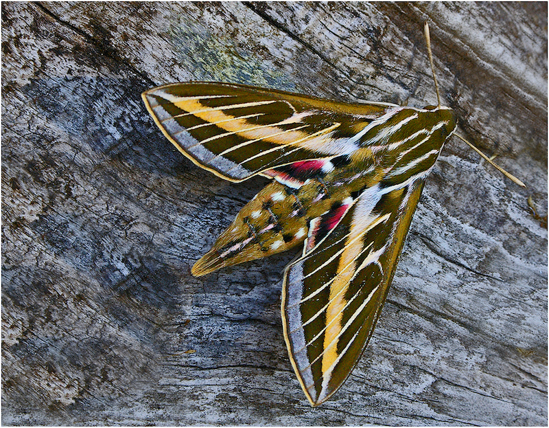
Hi Alane: Thank you for the interesting information regarding this very large moth.
Certainly a treat to be able to photograph this large and colorful moth. A special find such as this deserves to be razor sharp in detail, sad to say on my monitor the moth is simply soft in detail and not at all as tack sharp as it should be.
In looking back at your pictures from prior months I do not see any mention of you ever using a tripod which is part of my gear and used a lot. Aside for being able to obtain sharper images using a tripod helps the photographer to compose your images correctly. Case in point here is the right wing tip of the moth is almost touching the edge of the picture area. We cannot possible see all 4 corners of the frame at the same time; by using a tripod slows one down and allows the photographer to study their composition arrangement to make certain you have composed your chosen image to be the best it can be. |
Jul 9th |
| 63 |
Jul 25 |
Comment |
Hi Barbara: Certainly a pleasant image of Pink Water Lily. The overcast lighting allows for a soft lit presentation which fits this flower well. Some flowers with pink petals are hard to capture texture and detail in the petals however you have captured both.
Do not want to sound like a "nit-pic" however the green leaf at the top could be darkened down to more the tone of the other darker green leaves. I know this flower is a water lily, however in this particular picture I cannot see any water to complete the nature story.
|
Jul 9th |
6 comments - 2 replies for Group 63
|
| 75 |
Jul 25 |
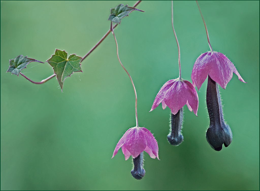
Comment |
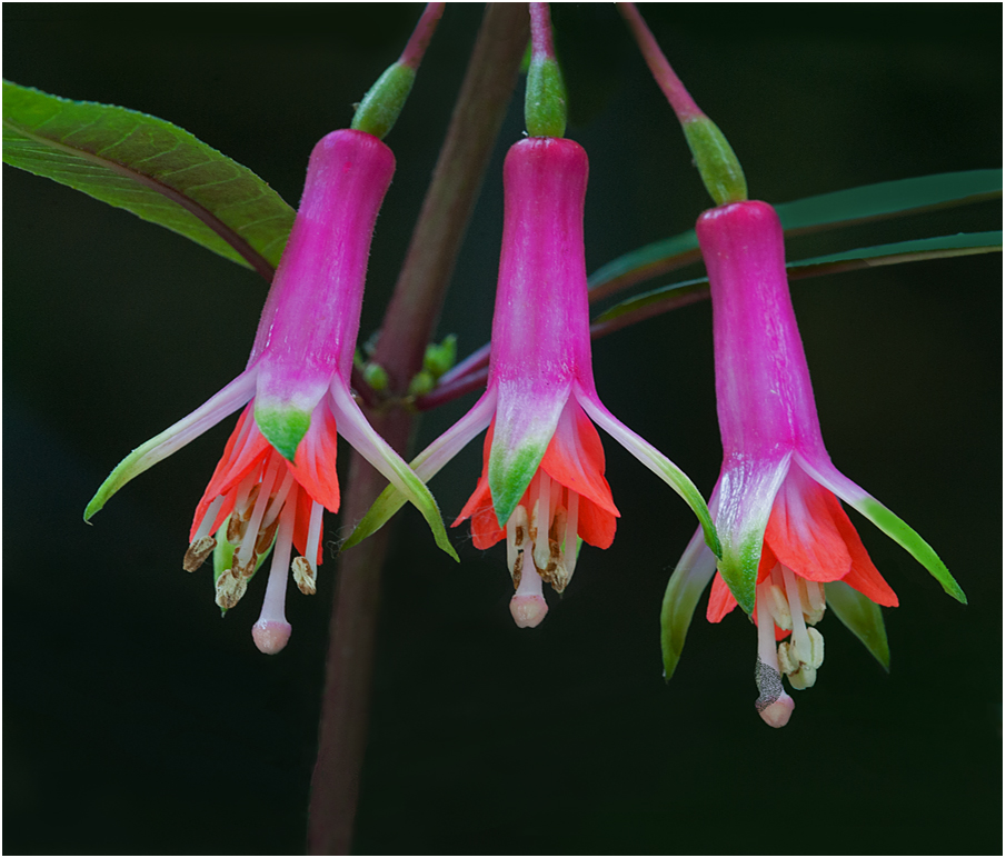
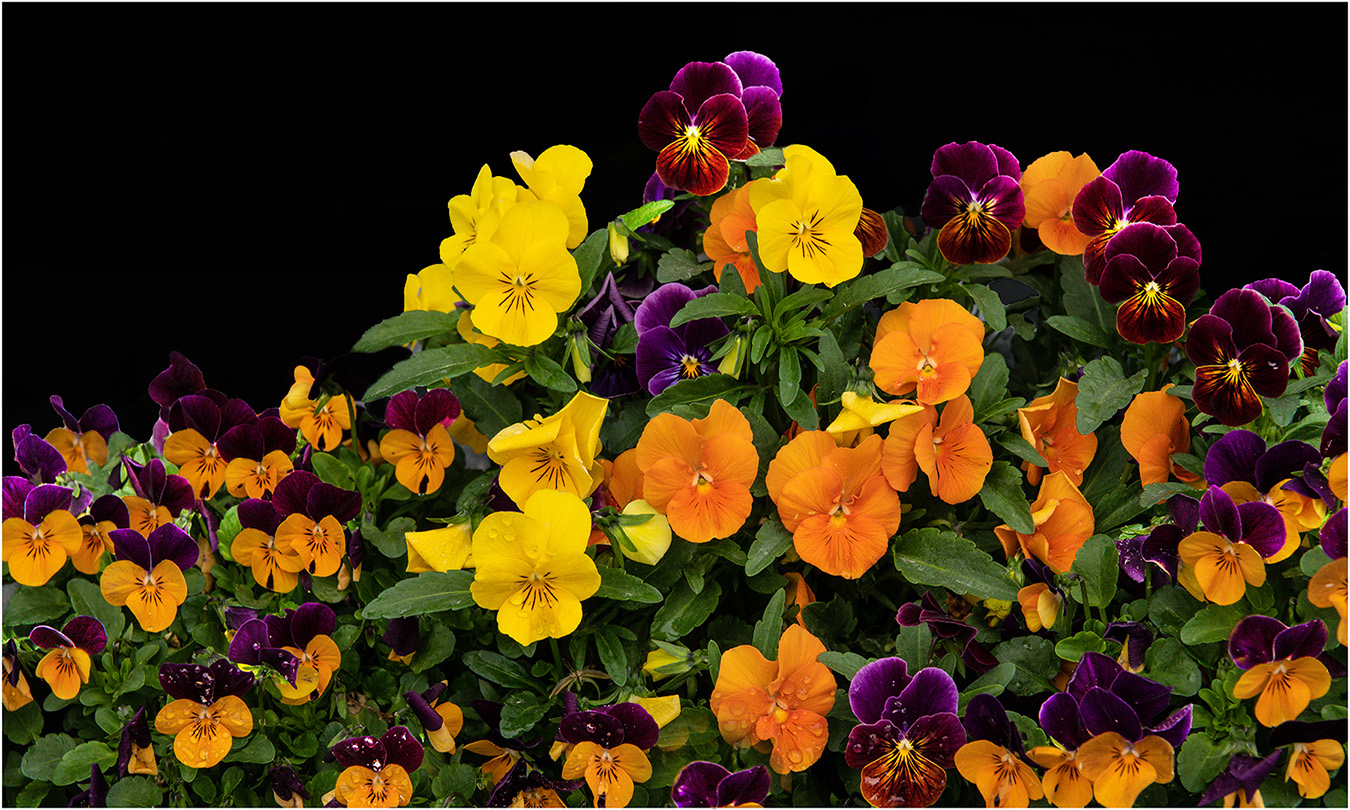
Hi Vincent: Pleased you liked the Bleeding Hearts picture. You mention using a high f number to increase depth of field.
I would like to comment on this if I may. The f number used depends A LOT on the subject you are photographing; for instance using f/16 will usually cover your flower with good sharpness front to back, also using f/16 will bring the background more into focus. If you have distractions in the background they will become quite distracting and will compete for interest with your flower subject.
My recommendation is to shoot your subject at a lower f stop like f/4, and then a medium f stop like f/8 and then using f/16. All 3 images will look completely different from each other.
The photographer can have the most beautiful flower to photograph and it can be completely ruined by distractions in the background by using f/16. That being said the photographer in post processing can diffuse many distractions in a background and have a successful image.
For the most part I simply do not photography a flower with a terrible background, this mostly eliminates the problem.
However an alternative is to totally black out the background
Let me just say photographing flowers successfully takes a lot of study and practice to do well.
Hope all of this makes sense !! cheers.
|
Jul 23rd |
| 75 |
Jul 25 |
Reply |
Hi Gaetan: Thanks for adding the vine picture, now I know what kind of a host supports this intriguing flower. |
Jul 14th |
| 75 |
Jul 25 |
Reply |
Hi Alison: Thanks for your kind critique. Bleeding Hearts are a challenge to shoot well; when I think about it most all flowers are a challenge if you want the finished post processed image to be special.
With Bleeding Hearts you need most of the wide side of the flowers facing you as in this version. |
Jul 14th |
| 75 |
Jul 25 |
Comment |
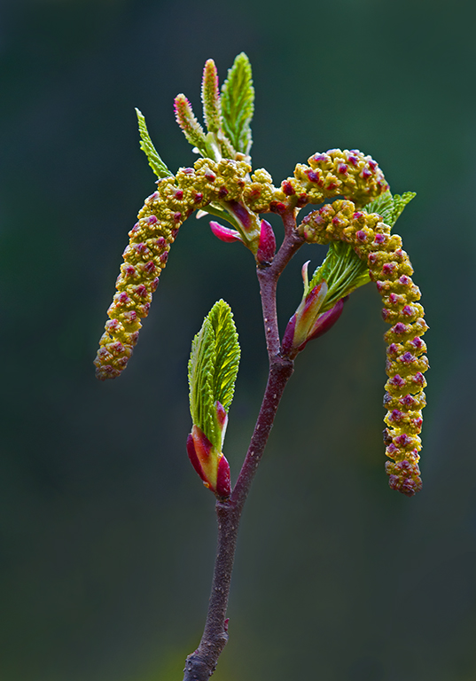
Hi Alison: This picture shows the essence of spring very well. The out of focus branches in the background complete the nature story.
Technical qualities are excellent in all ways. The thin white border adds that finishing touch to a spring mood picture. |
Jul 6th |
| 75 |
Jul 25 |
Comment |
Hi Gaetan: Nice to have you rejoin us.
The flower as presented on the white background is okay. I am curious as to what the vine, or shrub or small tree that supports the Pea Flower looks like. Would like to see more of a nature story associated with this interesting flower. |
Jul 5th |
| 75 |
Jul 25 |
Comment |
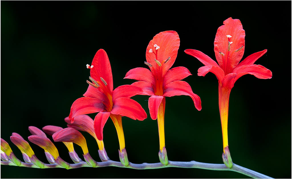
Hi Vincent: Think the name of this is Red Hot Poker, it is a common plant in landscaping. Grows in a large clump of many stalks.
Your centered composition works okay in this picture and is sharp enough. To me the background is far too bright and distracting, it would be an improvement if you were to darkened the background a lot. In doing so your featured plant would stand out much better from the too light background. |
Jul 5th |
4 comments - 2 replies for Group 75
|
14 comments - 4 replies Total
|