|
| Group |
Round |
C/R |
Comment |
Date |
Image |
| 63 |
Oct 24 |
Reply |
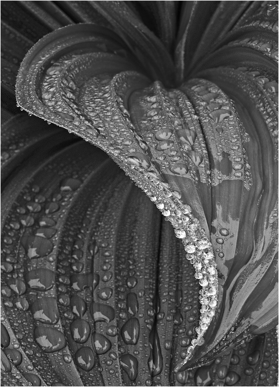
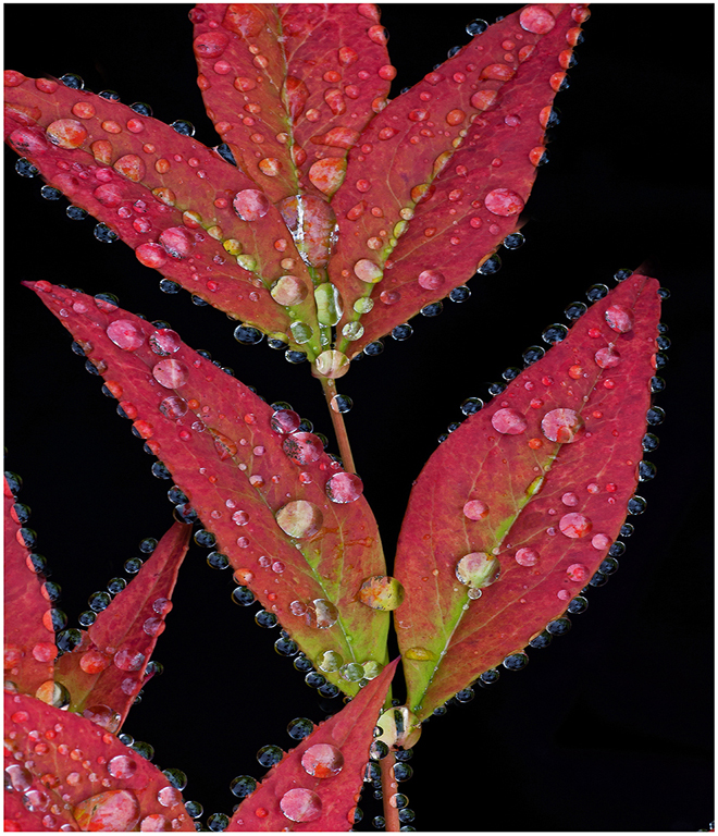
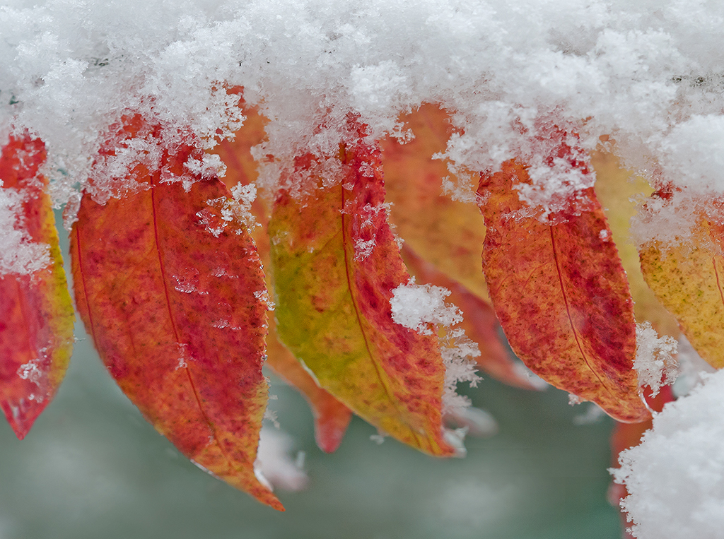
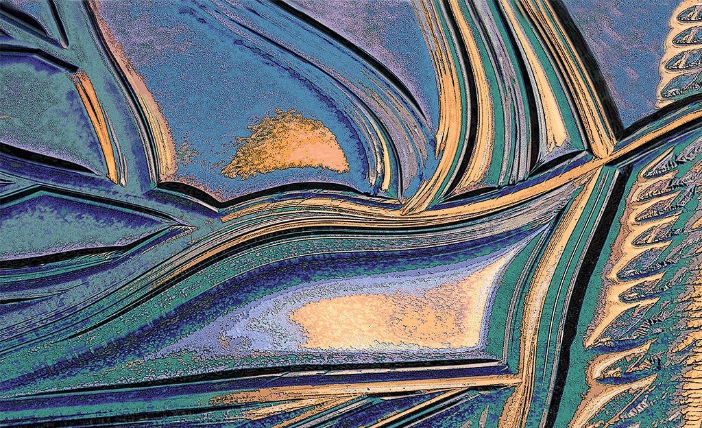
Hi Charlie: Thanks for your positive "take" on the frost crystals. If both you and Neal feel the picture would be improved with removing the dust specks I will do so.
Thanks for the tip. |
Oct 23rd |
| 63 |
Oct 24 |
Reply |
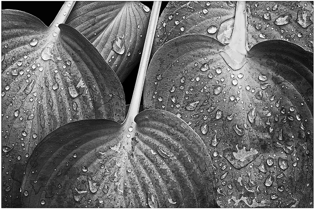
Hi Neal: If I would have known ahead of time I could have cleaned the garden shed window. Removing the dust spots would be a good rainy day project, but possible. |
Oct 13th |
| 63 |
Oct 24 |
Comment |
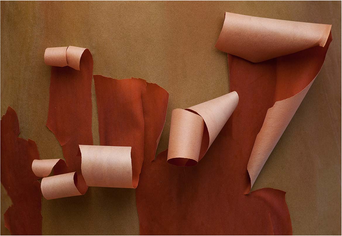
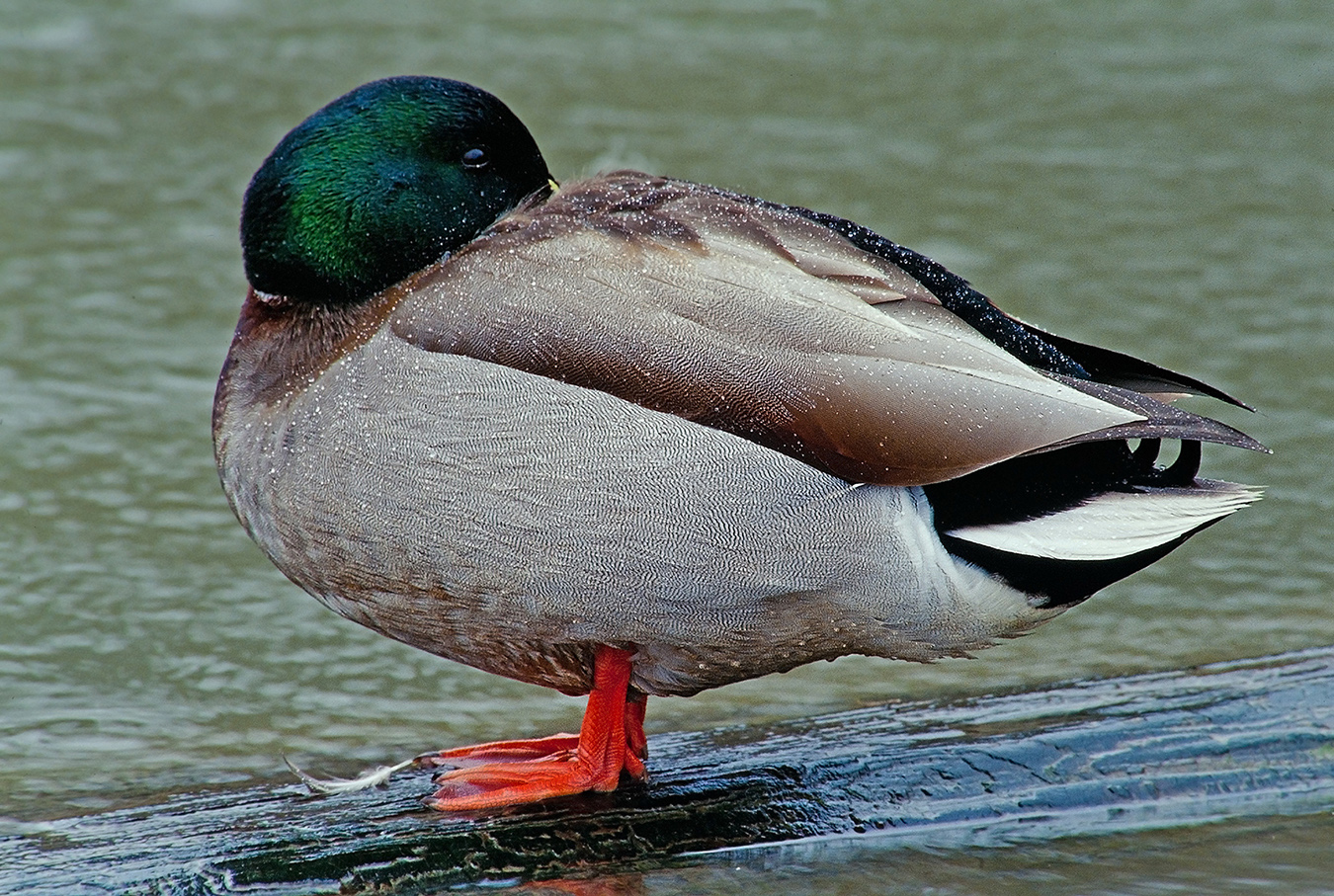
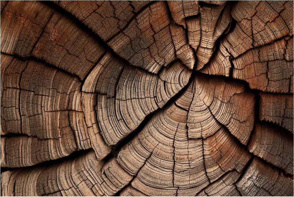
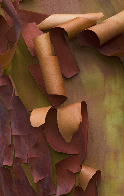
Hi Pierre: Thanks for showing us your work set-up in the original picture.
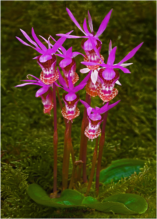
There is simply no way you could attain this amount of depth of field with just one image at 4X magnification. You might be able to stack enough extension tubes or plus lenses to reach 4X, however your depth of field would be super shallow in doing so.
In this picture with 17 images you have achieved very adequate sharpness from the bottom of the frame to near the top of the picture area.
A very interesting choice of subject matter and KUDOS on your efforts to photograph this subject at 4X magnification, and also thanks for sharing it with us. |
Oct 13th |
| 63 |
Oct 24 |
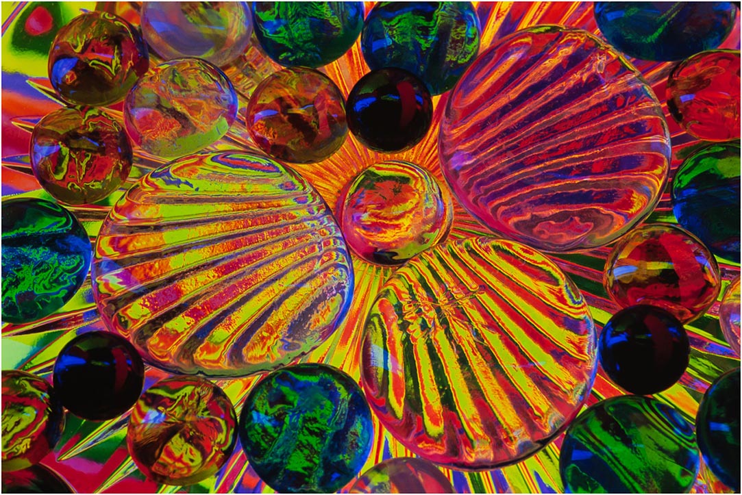
Comment |
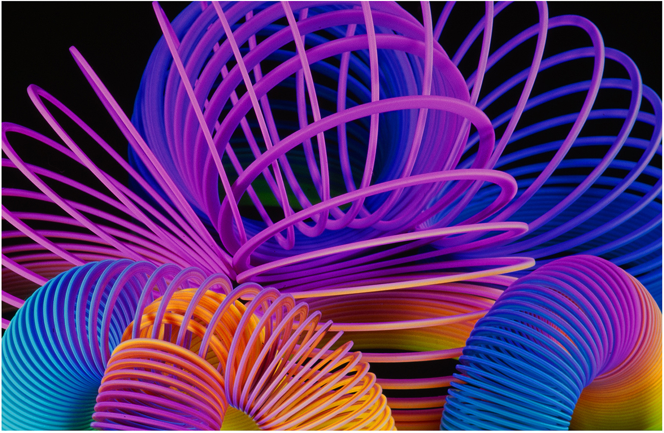
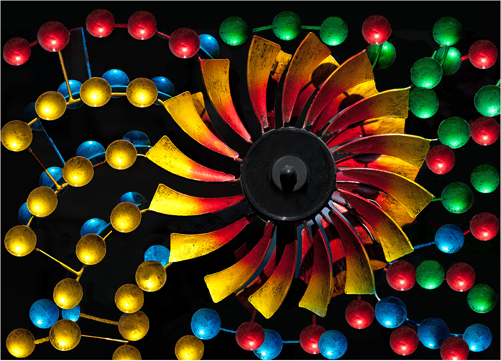
Hi Charlie: A lot of thought went into how you arranged the 4 colors of the candies into a pleasant composition. Your chosen colors in the scene all blend together very well to create a very creative table top set up.
The top part of your blue background is lighter in the middle and then darkening towards the edges, and then the reflection of the candies on the base glass is just a darker shade of the candies.
The division line that divides the background blue from the bottom glass serves to add depth to the image.
All aspects in this picture, composition, lighting, choice in the color of the candies are very well thought out so everything fits together perfectly. There are no miss matches here!
Then the thin blue border adds that finishing touch.
KUDOS.
|
Oct 13th |
| 63 |
Oct 24 |
Comment |
Hi Alane: Interesting choice of subject to place on top of a tooth pick. Good lighting on the subject.
Believe a thin border would work well here in framing your composition against the black webpage background. |
Oct 13th |
| 63 |
Oct 24 |
Comment |
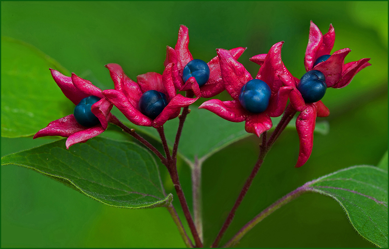
Hi Neil: Very interesting composition with the 6 acorns encased with leaves, also the lighting is rather dramatic with the dark background. The overall coloration has the feeling of autumn.
A good table top picture. |
Oct 13th |
| 63 |
Oct 24 |
Comment |
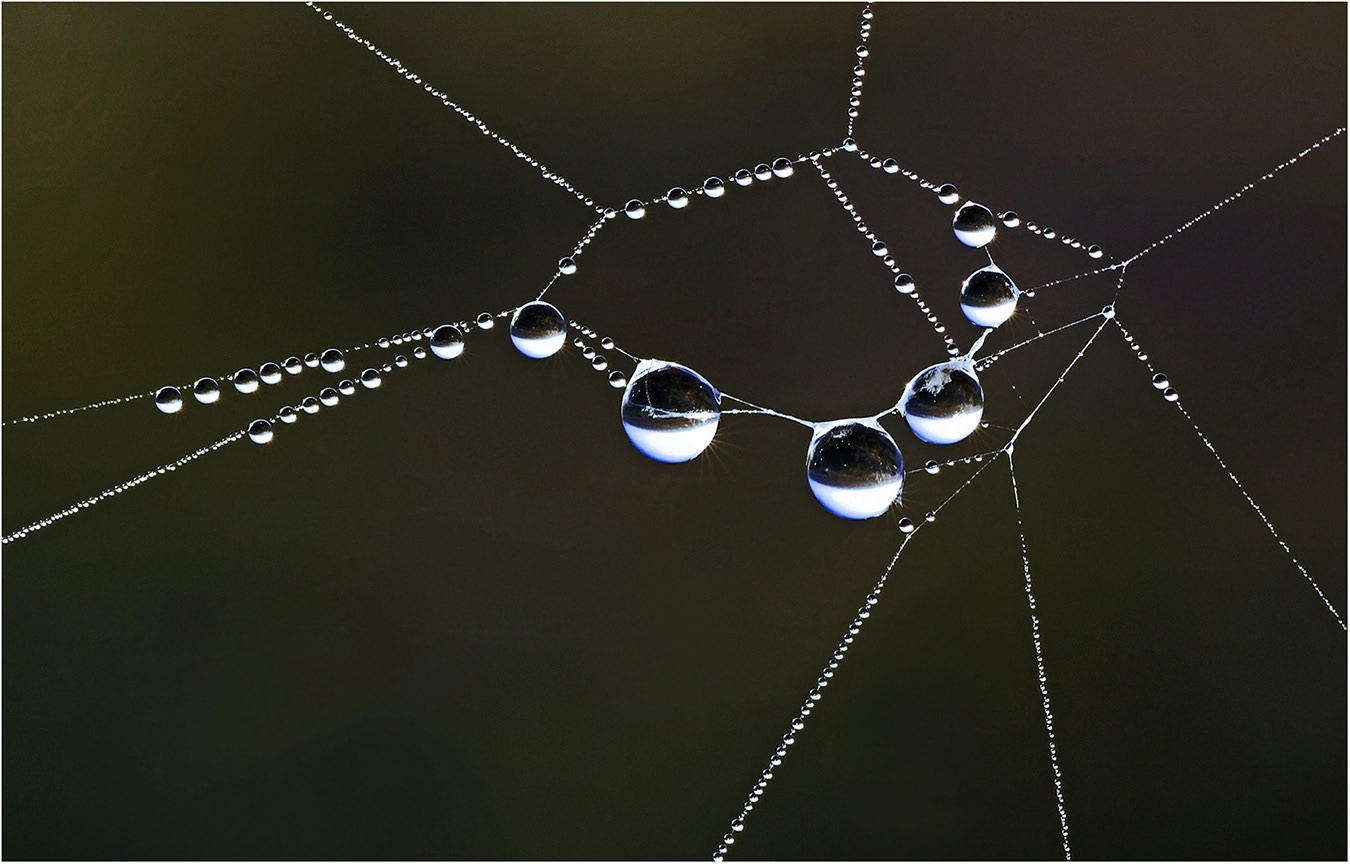
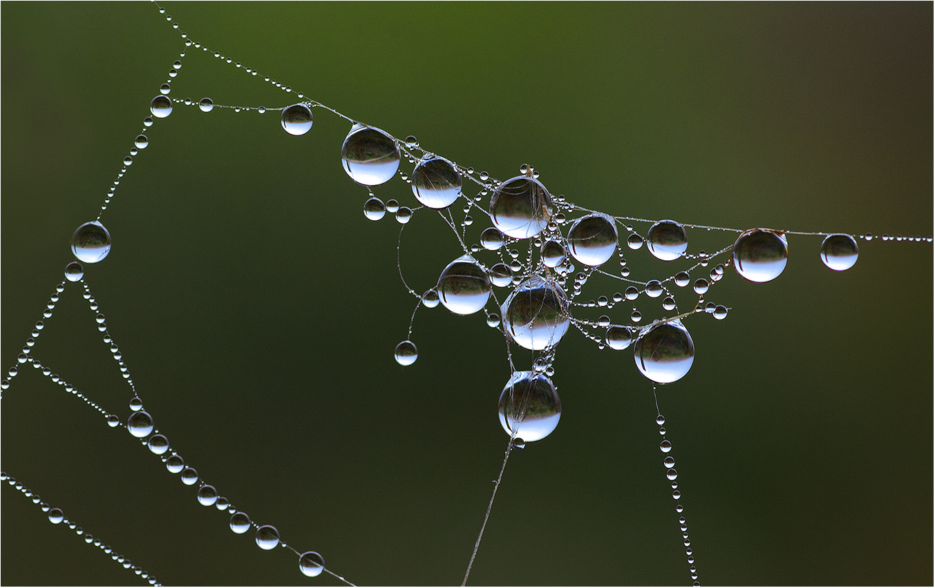
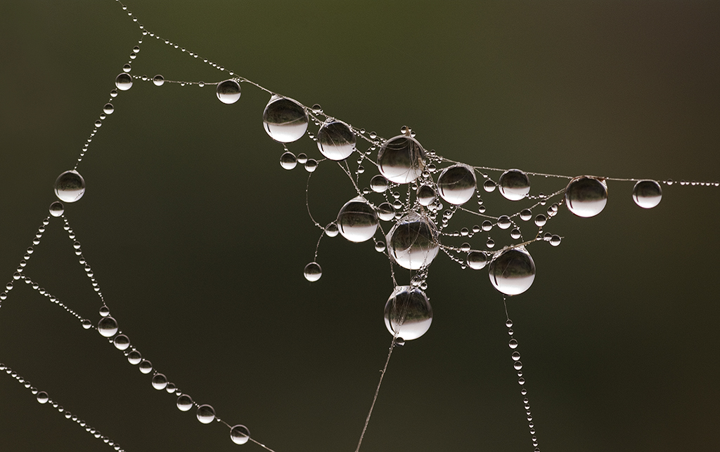
Hi Barbara: Amazing picture in how you managed to catch the one water drop in mid air directly above the bottom droplet.
The composition is very interesting.
Have never experimented with this process, it is fun to try new techniques. Sometimes you can come up with a very interesting creation like this picture.
|
Oct 13th |
5 comments - 2 replies for Group 63
|
| 75 |
Oct 24 |
Reply |
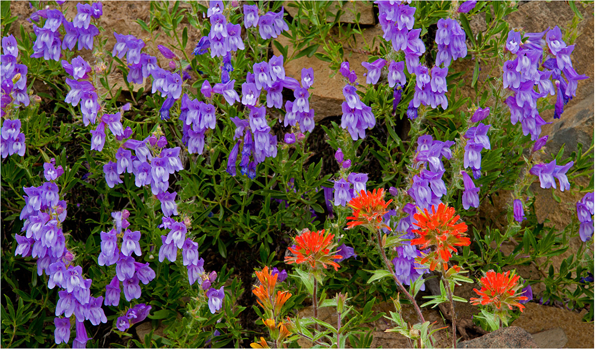
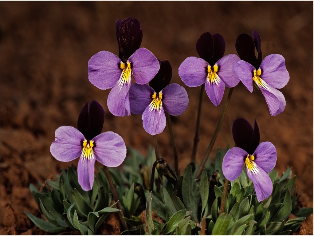
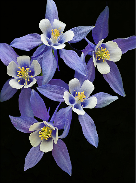
Hi Vincent: If I understand correctly you like the two red flowers at the left edge and the two yellow flowers one above the other. Then the round circle of flowers on the right half of the screen. Had never given any thought to this way of viewing which I find interesting. Thanks for your viewpoint. |
Oct 27th |
| 75 |
Oct 24 |
Comment |
Hi Vincent: In viewing the picture a second time I would reverse or flip the picture so the flower was on the right side of the frame. From a composition stand point think this would work. |
Oct 10th |
| 75 |
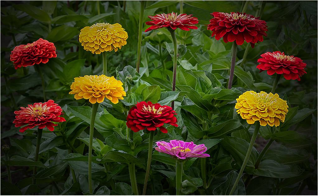
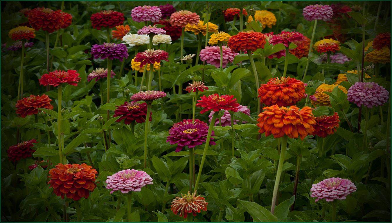
Oct 24 |
Comment |
Hi Ray: Pleased you liked the Zinnia picture. And yes, would have preferred a little more room at the top of the frame. The issue was I started to show the gray cloudy sky. I started out trying to use my 105mm macro lens, however with the wider field of view I had issues at both the top and sides with background showing. I switched to the 200mm macro lens and with the more narrow field of view that problem was eliminated. |
Oct 10th |
| 75 |
Oct 24 |
Reply |
Like I just mentioned to Ray, it is fun to experiment with new ideas and techniques, one never knows when you may hit the jackpot with a new idea. |
Oct 9th |
| 75 |
Oct 24 |
Reply |
Hi Ray: Experimenting is the only way to see if some new technique or idea works for you. Some times it works out well, other times it simply does not work well. Fun to experiment! |
Oct 9th |
| 75 |
Oct 24 |
Reply |
Hi Angela: Thank you for your kind critique. |
Oct 8th |
| 75 |
Oct 24 |
Reply |
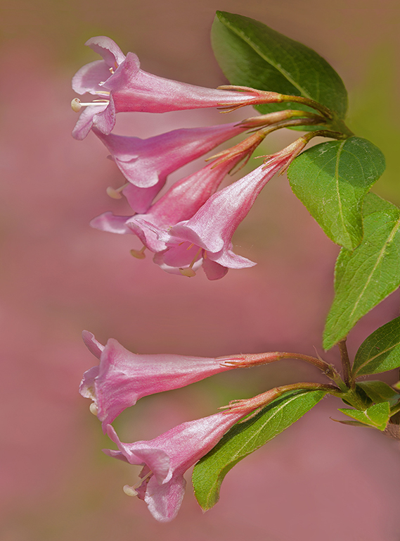
Hi Ray: Thanks for the information. I thought the dark blue For-get-me-nots growing up through the Rhody was interesting. Have never seen this happen in nature, so a novel idea. |
Oct 7th |
| 75 |
Oct 24 |
Comment |
Hi Mo: An interesting B&W conversion with some drama. As you state the vignette may be a bit on the bold side.
The container the flower is sitting on is interesting and makes a good prop. One aspect I question is the purple creep runs out of the top of the frame which to me seems kind of chopped off.
To me a very creative and novel idea... |
Oct 7th |
| 75 |
Oct 24 |
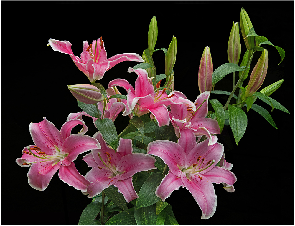
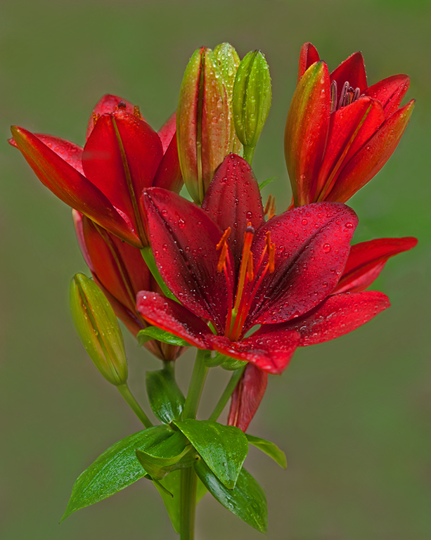
Comment |
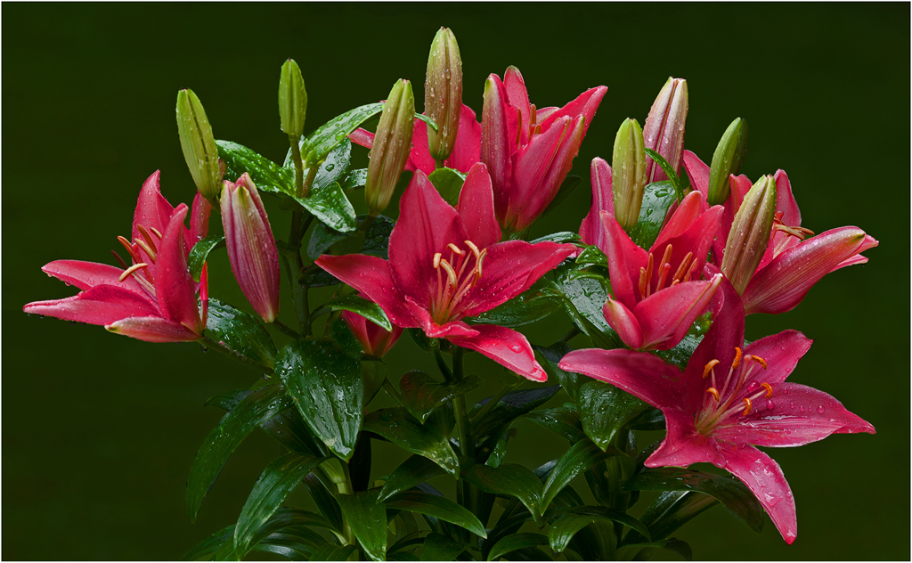
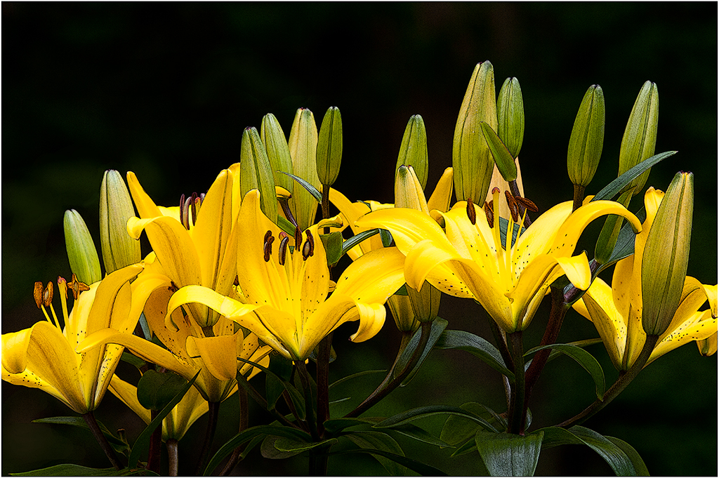
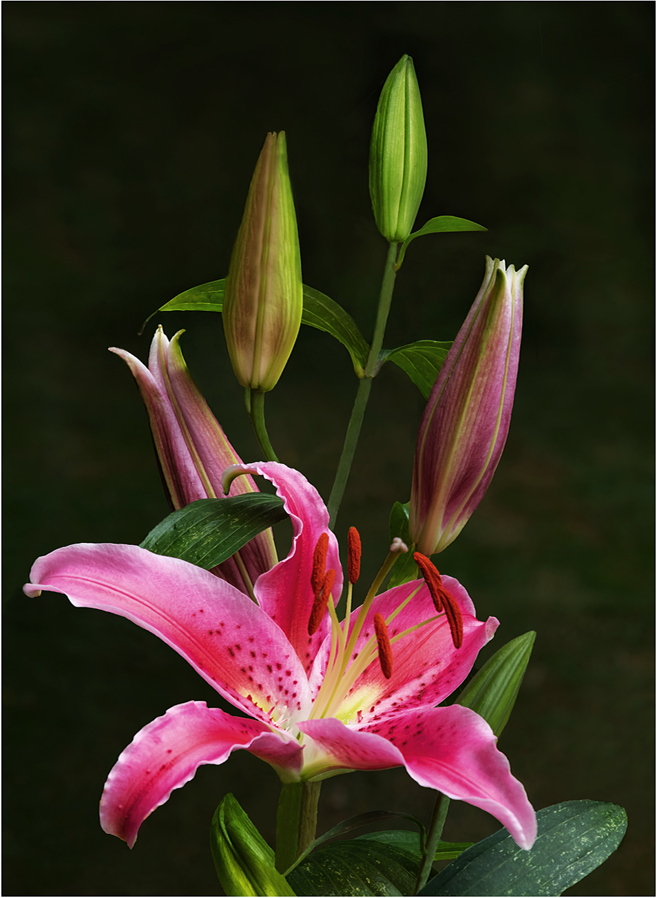
Hi Ray: I really like both versions of the Daylily. The color version has a warm radiance I really like, then the B&W version is very dramatic.
The B&W version has really good texture and lighting on the flower petals, and the black background adds drama. I like the diagonal composition with the flower placed on a 45 degree angle originating from near the bottom left corner of the frame.
The very light colored stamen tips seem to float in space as the stems are under exposed to the point we cannot see them.
Very well done B&W conversion, then the white border defines your composition and adds that finishing touch. |
Oct 7th |
| 75 |
Oct 24 |
Comment |
Hi Gaetan: nice sharp petal detail on the Hawaiian Hibiscus yellow flower petals.
To me the background is somewhat too busy with too much detail that rather distracts from the yellow flower. It would improve the picture if you were to in post processing blur out the background so it was not so prominent. |
Oct 7th |
| 75 |
Oct 24 |
Comment |
Hi Dan: Am guessing you made a picture of the pink Rhododendrons and then another picture of the dark blue Forget-me-nots and stitched them together.
The two pink Rhododendron flowers are tack sharp front to back, however not so with the blue flowers where some flowers are well out of focus. I am not certain what your goal was using 30 images stacked. Did you want all of the blue flowers tack sharp or some out of focus as shown ??
Dramatic cross lighting on the pink Rhododendron flowers, then the blue flowers are in deep shade. An interesting contrast. |
Oct 6th |
| 75 |
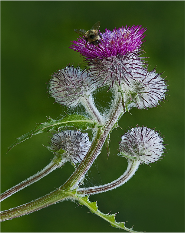
Oct 24 |
Comment |
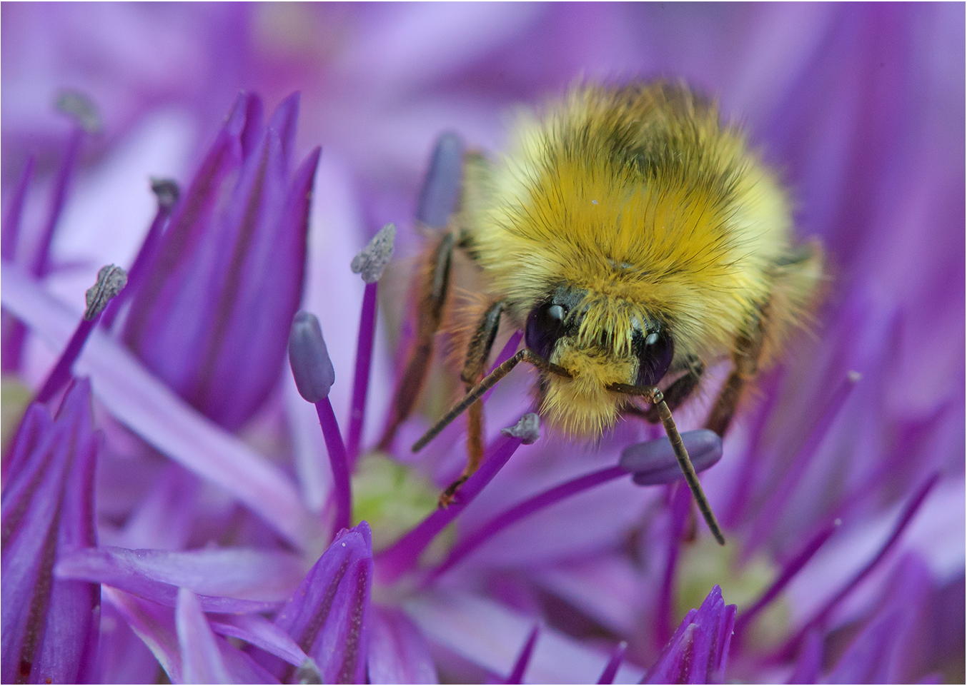
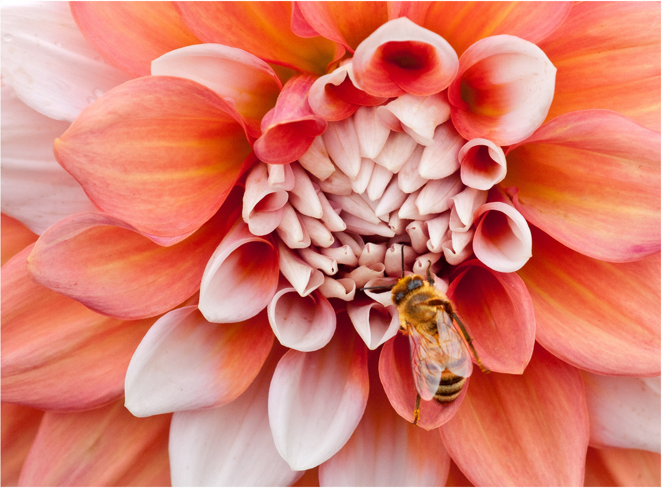
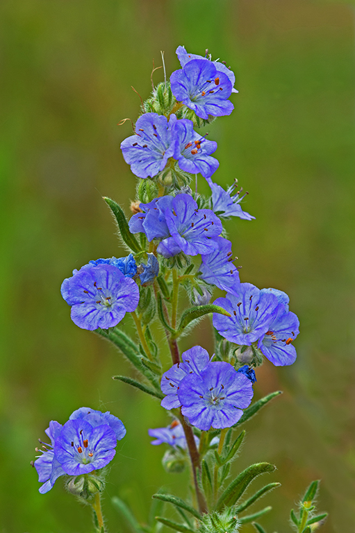
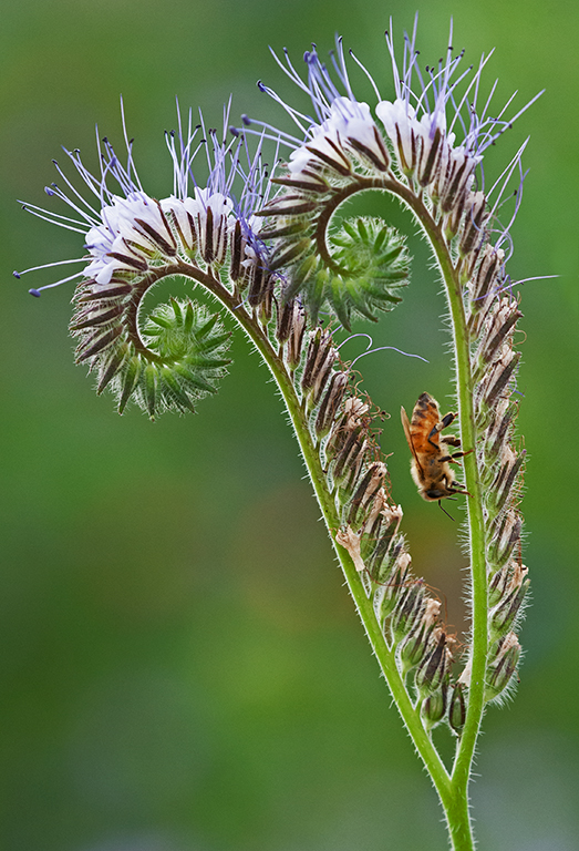
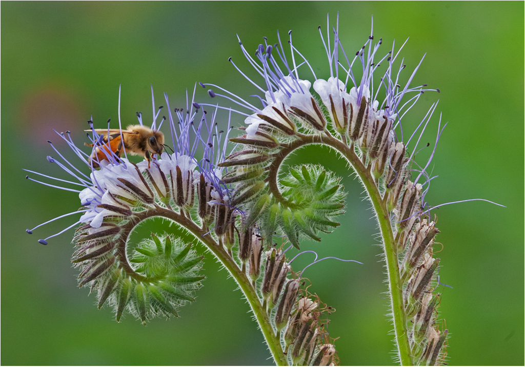
Hi Vincent: An interesting flower with the bee as another point of interest.
The cloning out of items in the scene that did not add anything made a lot of difference in the overall success of the picture.
The light green well out of focus background supports the flower well, if you wanted to experiment you could darken down the background slightly. This would be a matter of personal taste. |
Oct 6th |
7 comments - 5 replies for Group 75
|
12 comments - 7 replies Total
|