|
| Group |
Round |
C/R |
Comment |
Date |
Image |
| 63 |
Apr 24 |
Reply |
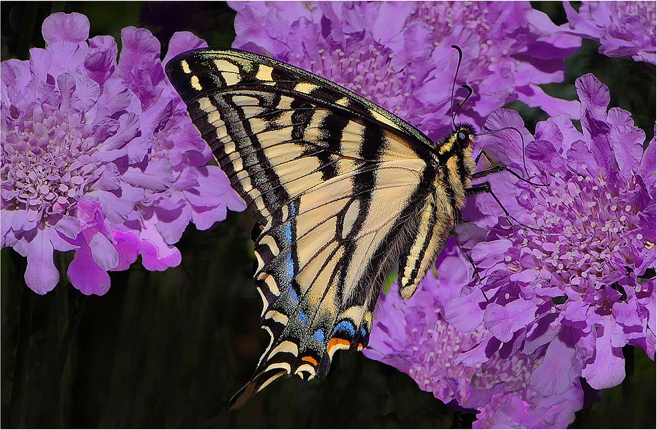
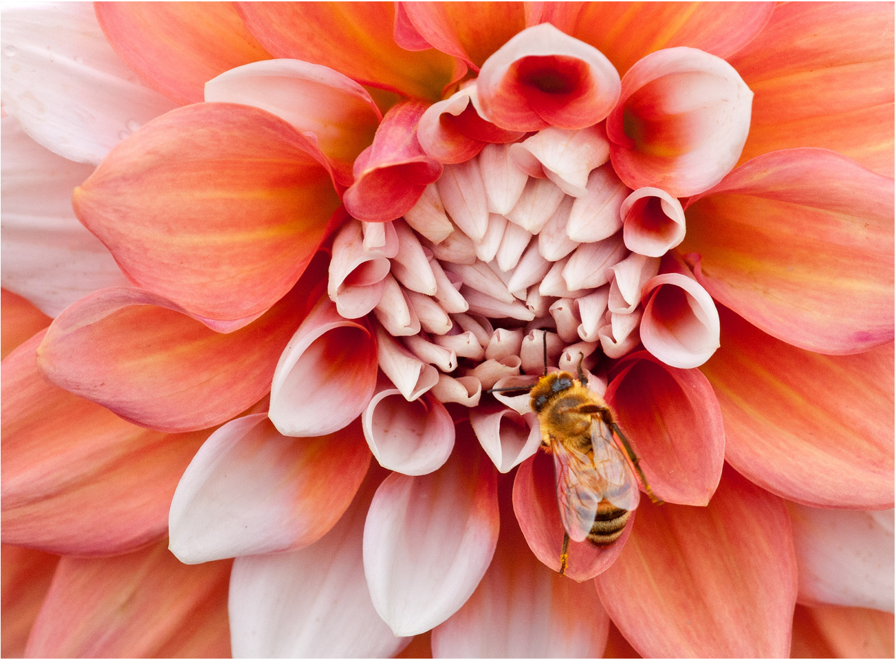
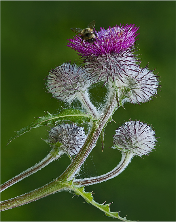
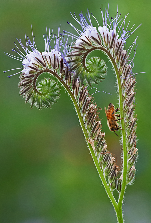
Hi Everyone: Thanks for your comments on Honey Bee.
Charlie: You are correct regarding depth of field, I shot several frames at f/22 and could not see much difference in sharpness from f/14.
If the bee was not alive and moving at all, then focus stacking would be the order of the day for some improved sharpness. |
Apr 25th |
| 63 |
Apr 24 |
Comment |
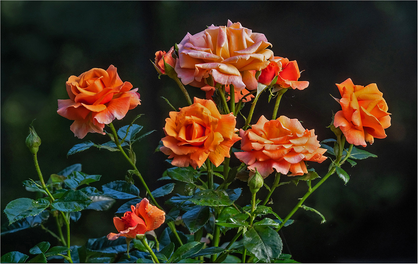
Hi Priscilla: A nice formal bouquet of flowers in an interesting vase. The small violet blue flowers add a good compliment to the larger orange flowers.
Regarding the dividing line; as it is behind the vase I think it adds depth and dimension to the scene. |
Apr 10th |
| 63 |
Apr 24 |
Comment |
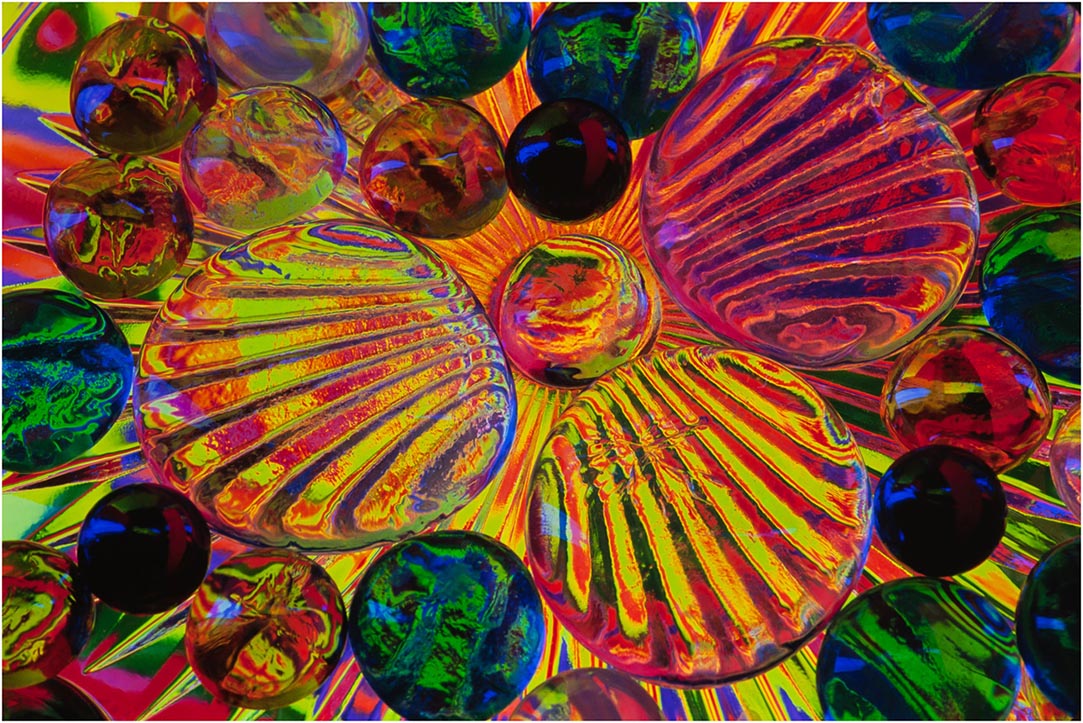
Hi Charlie: A very creative concept.
As always your technical work is spot on. Composition wise I like the triangle you have created with the 3 blue M&Ms. I think this triangle adds an interesting dimension to the image with the array of various colors. The dark gray counter top fits well, I like the way it becomes darker towards the bottom of the frame. Nice Work!! |
Apr 10th |
| 63 |
Apr 24 |
Comment |
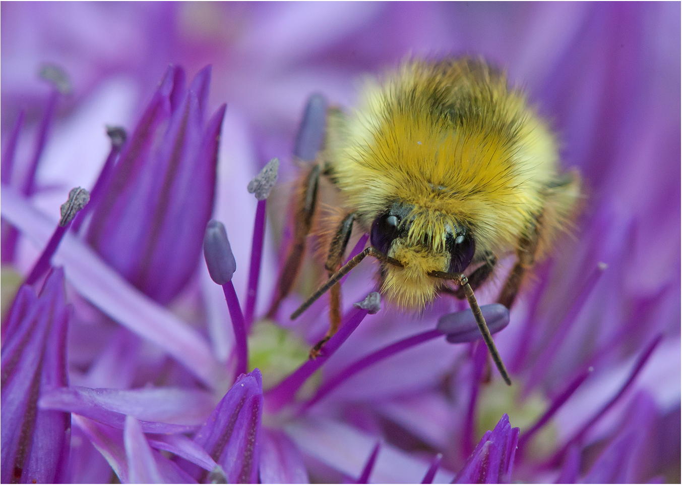
Hi Alane: Congratulations on being a Nikonian Wildlife winner. Very interesting colors on the head of the Iguana with good lighting.
The images is not as sharp as I think it should be for maximum impact. You would need to bump up your ISO much higher than 160 so you could shoot at a much faster shutter speed if you were hand holding. Then using f5.3 for your f stop will not provide you with adequate depth of field to better cover the subject. An f stop in the range of f/11 to f/16 would work well. |
Apr 10th |
| 63 |
Apr 24 |
Comment |
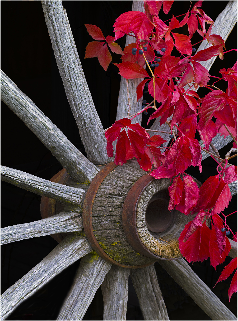
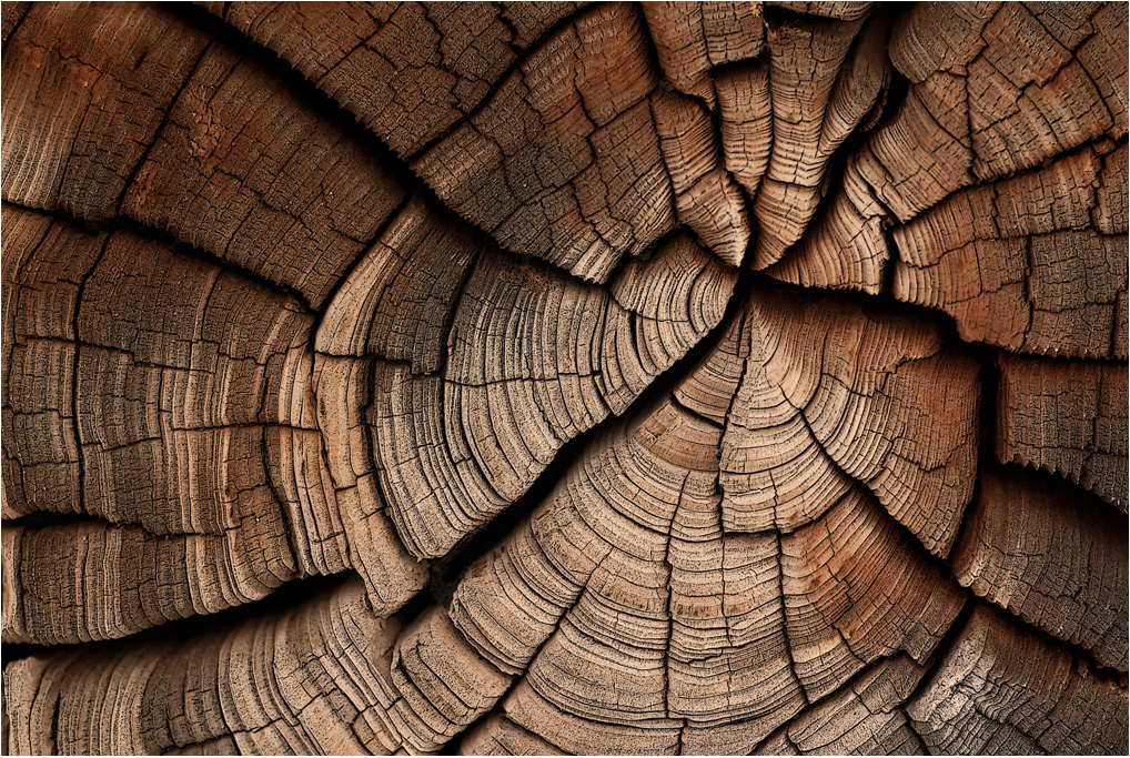
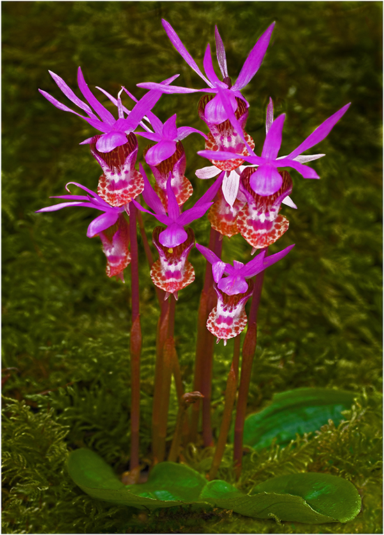
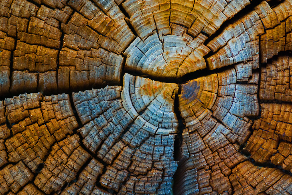
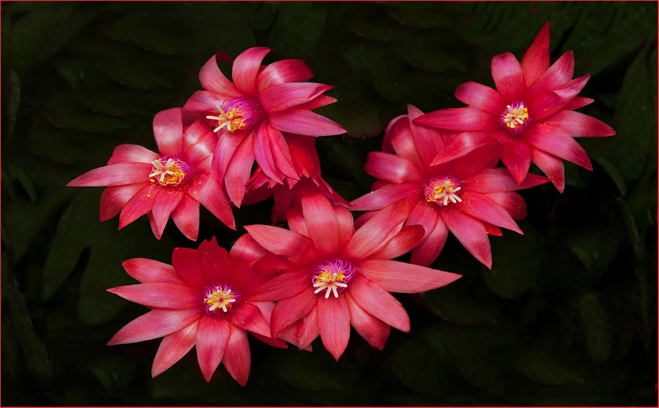
Hi Neal: You are correct regarding Kodachrome slide film and its high qualities. I have copied over 3000 slides into digital files and have found Kodachrome 25, Velvia 50 and then Ektachrome 100 Elete series copy the best into digital files than any other 35mm slide film. I do not use a film scanner, just my camera body and macro lens with the slide mounted on a daylight corrected copy box.
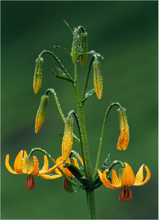
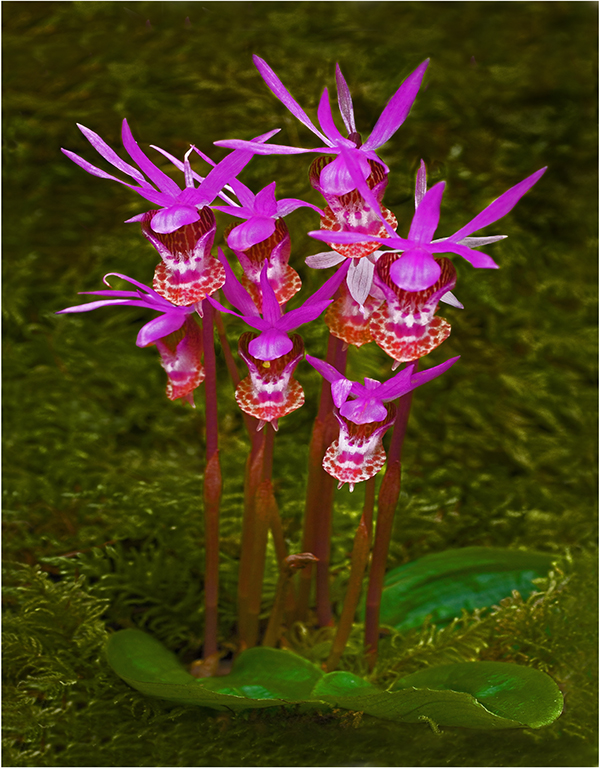
The old weathered wood makes a great prop for the Cactus with its pink flower. Well done creative set-up composed well. |
Apr 10th |
| 63 |
Apr 24 |
Comment |
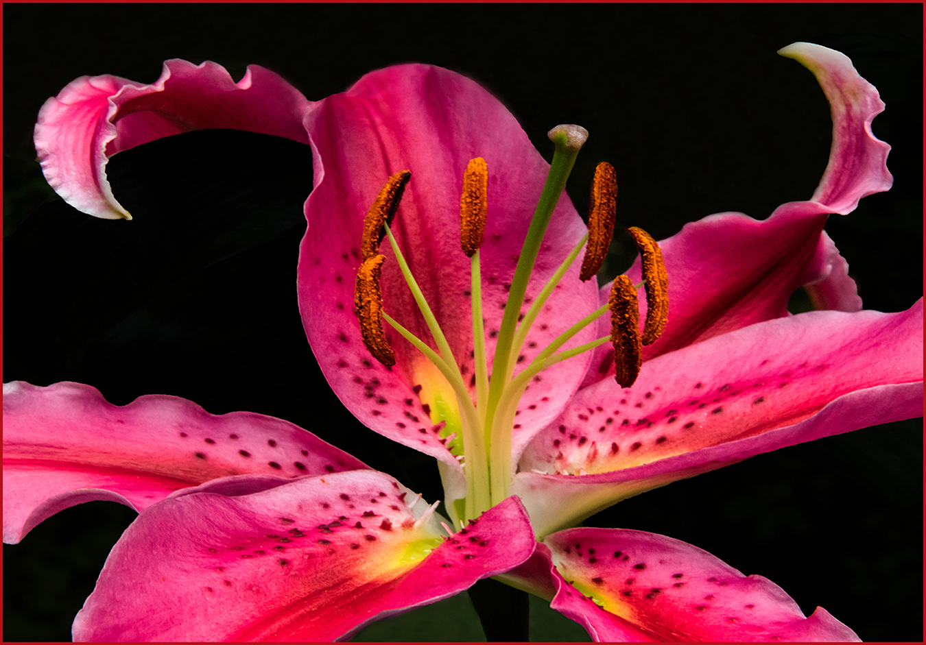
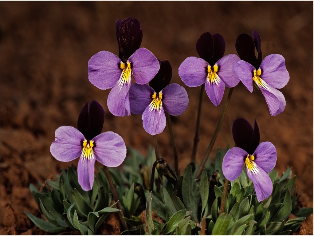
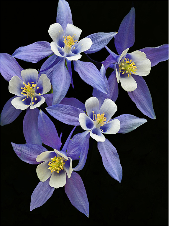
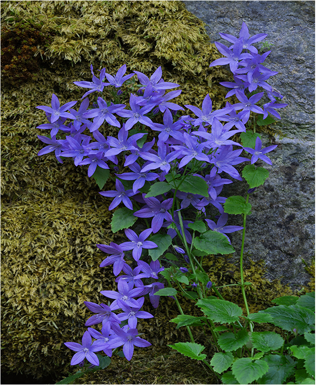
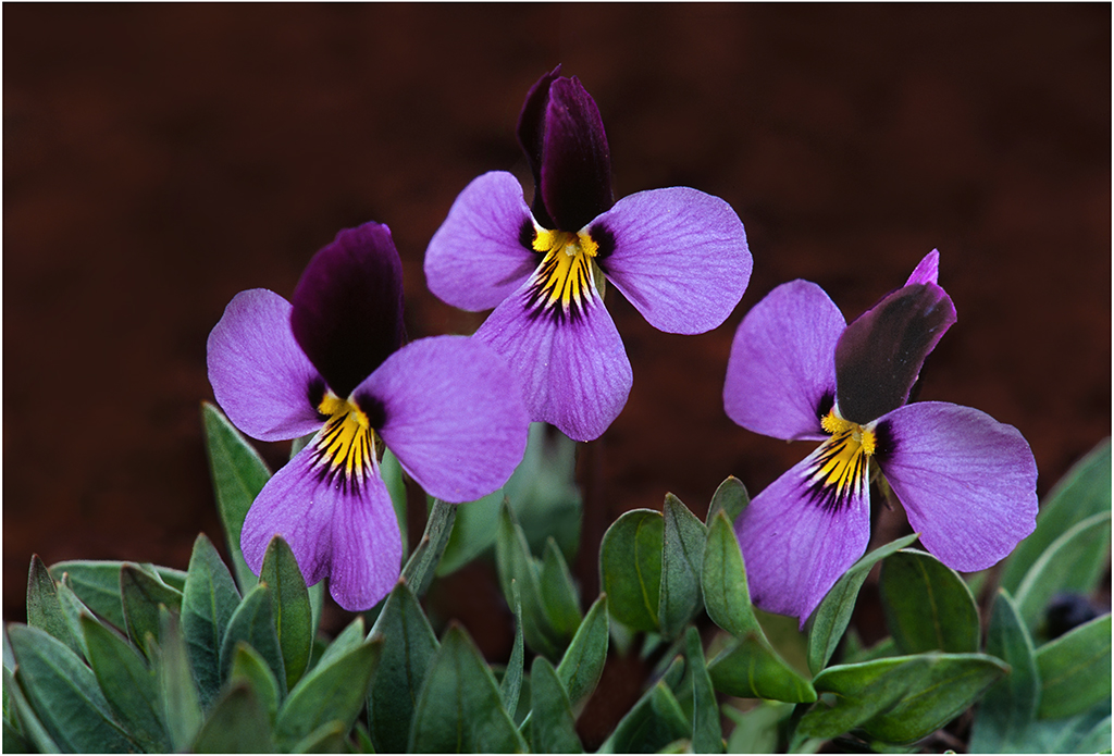
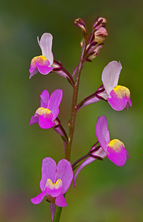
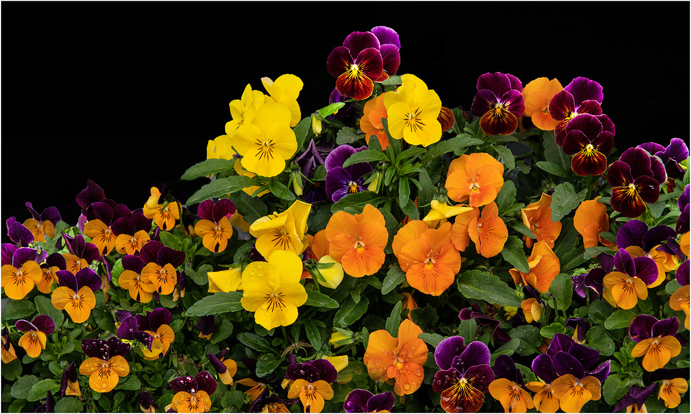
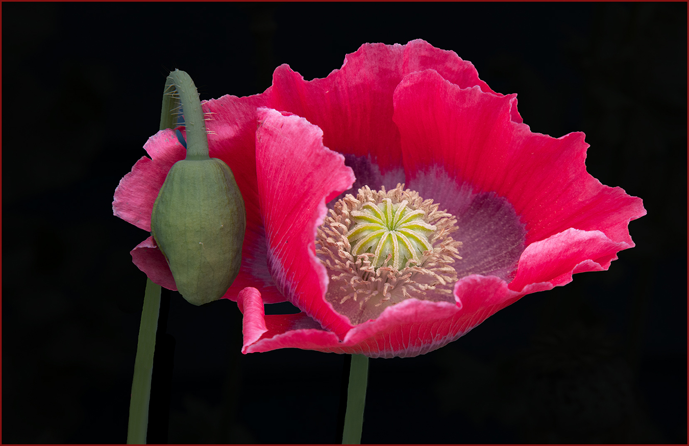
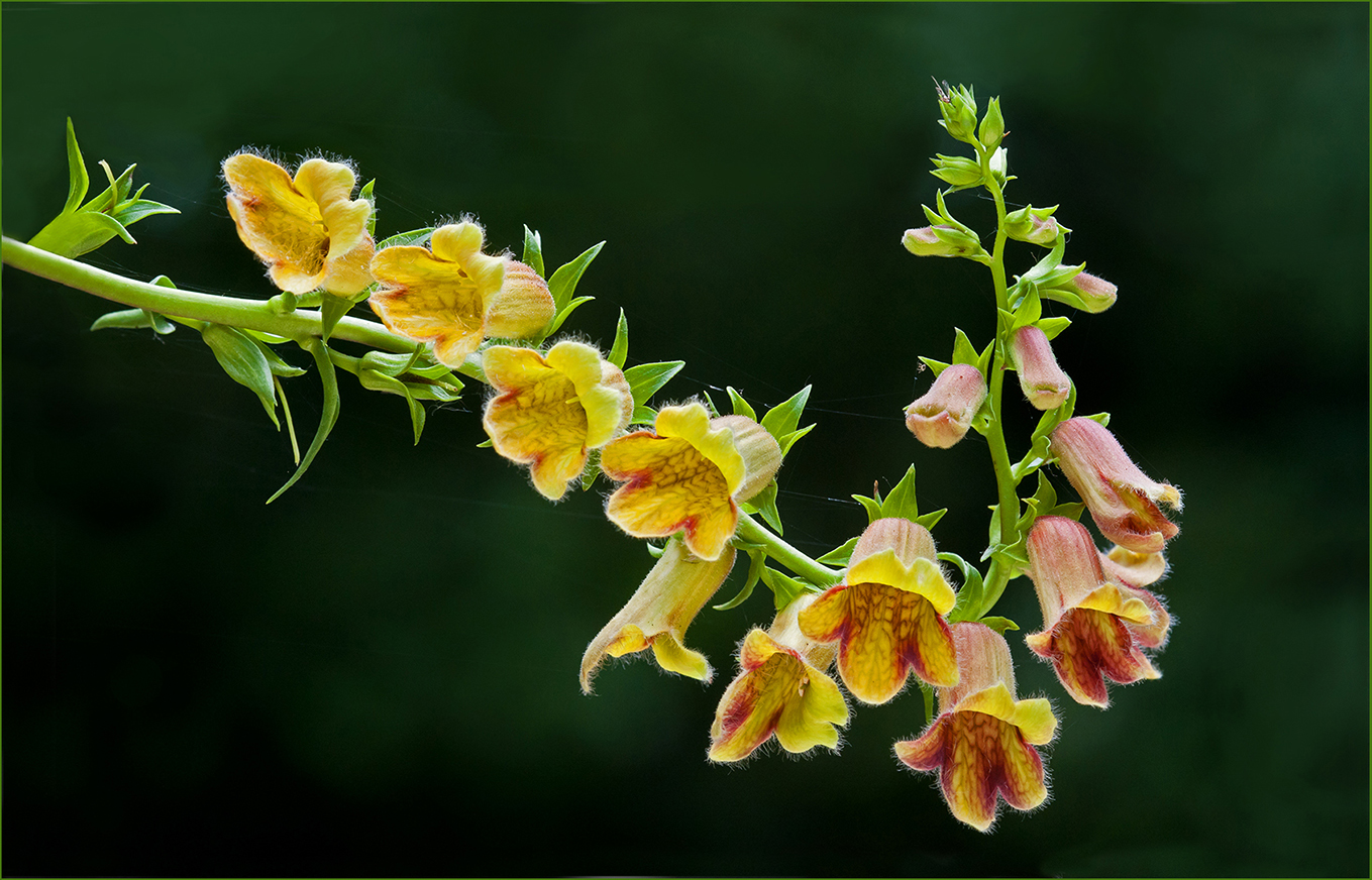
Hi Barbara: Very artistically presented from a composition standpoint. The gold and violet colors of the flower are so very pleasant and the black background adds impact to the scene.
In this case with the black background a thin white border would add that finishing touch. The use of border is strictly a personal thing; some photographers like to add them to certain types of subjects while others simply do not like borders at all. Nicely done!! |
Apr 10th |
5 comments - 1 reply for Group 63
|
| 75 |
Apr 24 |
Reply |
Hi Vincent: the quote you made "if you don't see it, it is okay, but if you have seen it, you only see that". I think that statement is very true!! cheers... |
Apr 26th |
| 75 |
Apr 24 |
Comment |
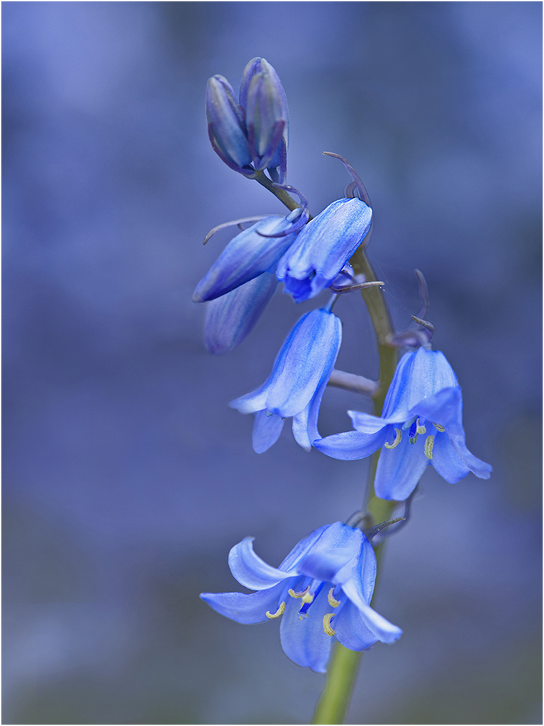
Hi Judy: A quite nice close in soft focus portrait of the hibiscus flower. The green out of focus background was a perfect backdrop for the red flower, then the thin white border adds that finishing touch. |
Apr 26th |
| 75 |
Apr 24 |
Reply |
Hi Ray: Little matter!! |
Apr 8th |
| 75 |
Apr 24 |
Reply |
Hi Dan and Ray: I had not given any thought regarding the hard diagonal line in the upper right corner, every thing else is soft curved lines. I can soften this line so it is not so noticeable. Pleased you liked the overall picture.
In my comments I forget to state the reason for using fill flash. The gray clouds above caused a gray reflection in the water and it ruined the picture, my polarizing filter had no effect. I held my flash unit at a quite low angle and it removed that gray reflection very well.
You guys have me confused with Mo, good company to be in. |
Apr 6th |
| 75 |
Apr 24 |
Comment |
Hi Mo: KUDOS for trying something totally different. Very creative idea and it worked. I like the soft out of focus background as it supports your subject well.
Mo, I know you do not like borders, however in this image I think a thin white border would better define your composition. |
Apr 6th |
| 75 |
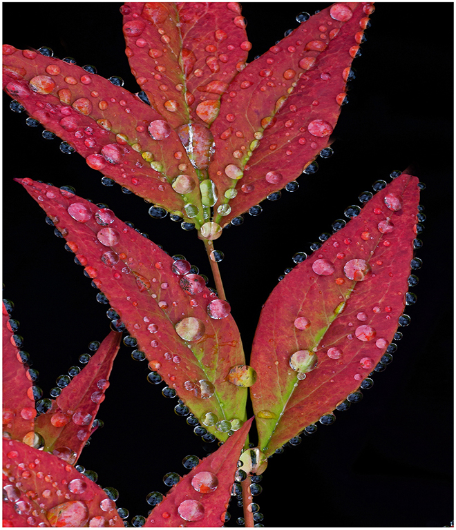
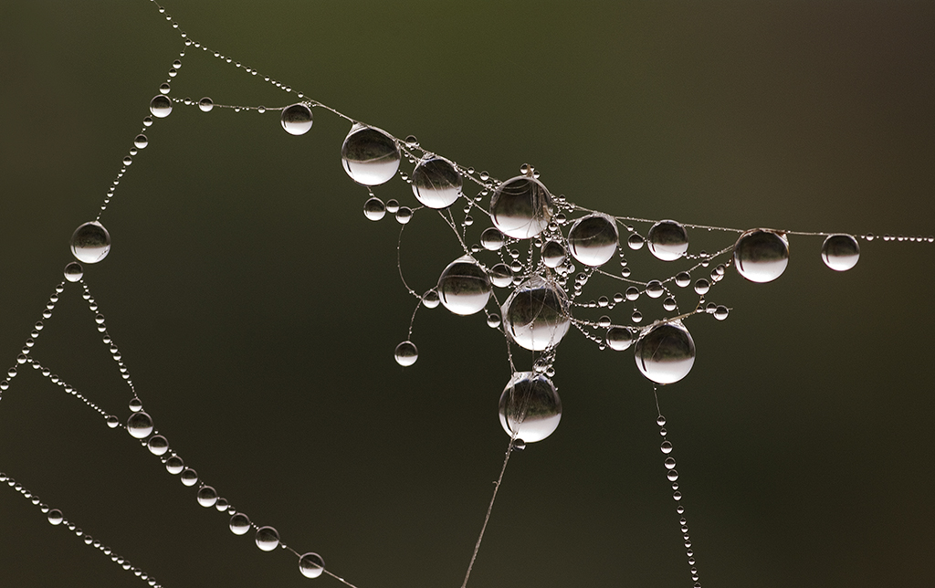
Apr 24 |
Comment |
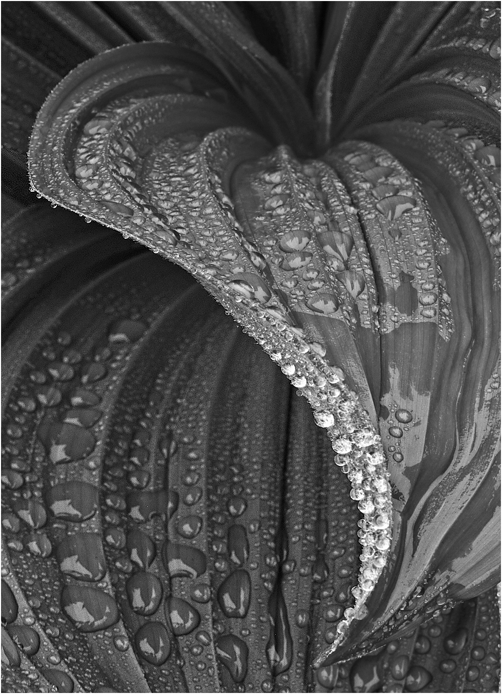
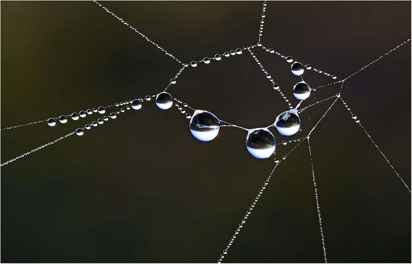
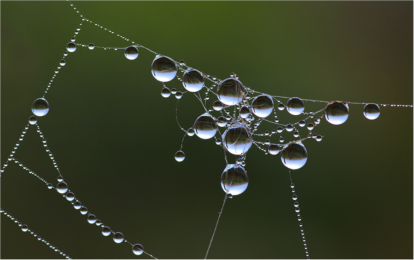
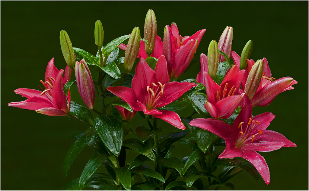
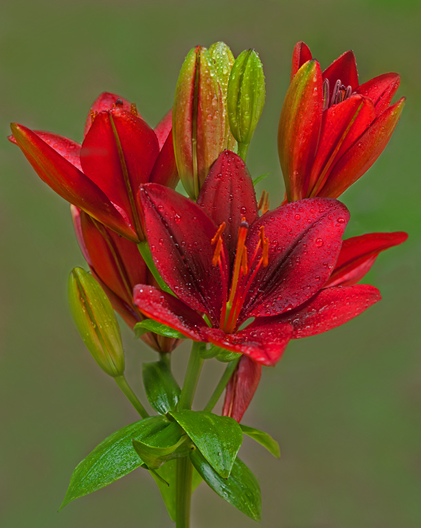
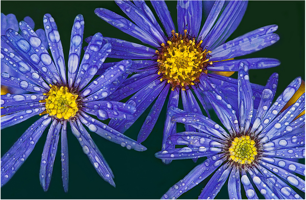
Hi Ray: I think the raindrops are the main focal point here.
The drops are all is sharp focus, not a soft one in the bunch.
It is amazing just how much the latest cell phones have improved their cameras in the past several years. The problem I have with mine is it is hard to control the background distractions as these phone cameras have so much depth of field. Thanks for sharing. |
Apr 4th |
| 75 |
Apr 24 |
Comment |
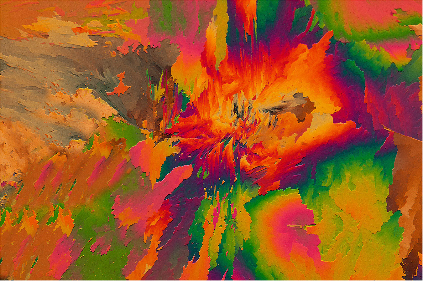
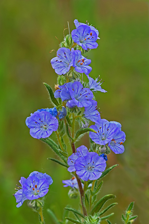
Hi Gaetan: Am not certain you met your objective here for something special. Anyway have to commend you for trying a different approach. |
Apr 4th |
| 75 |
Apr 24 |
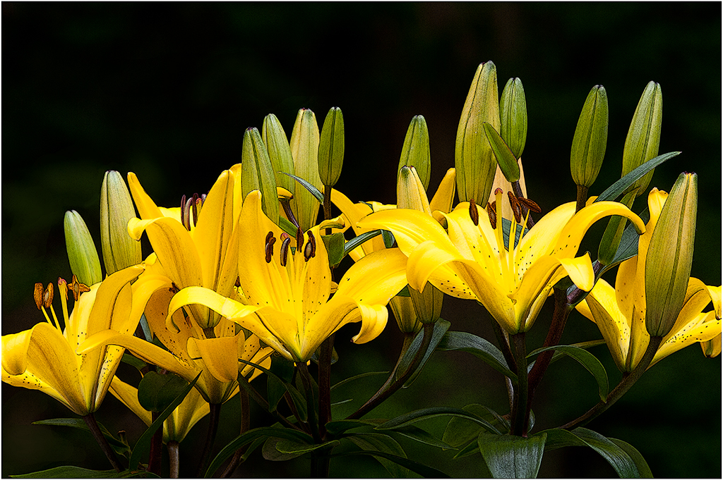
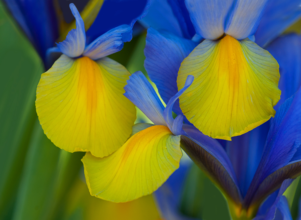
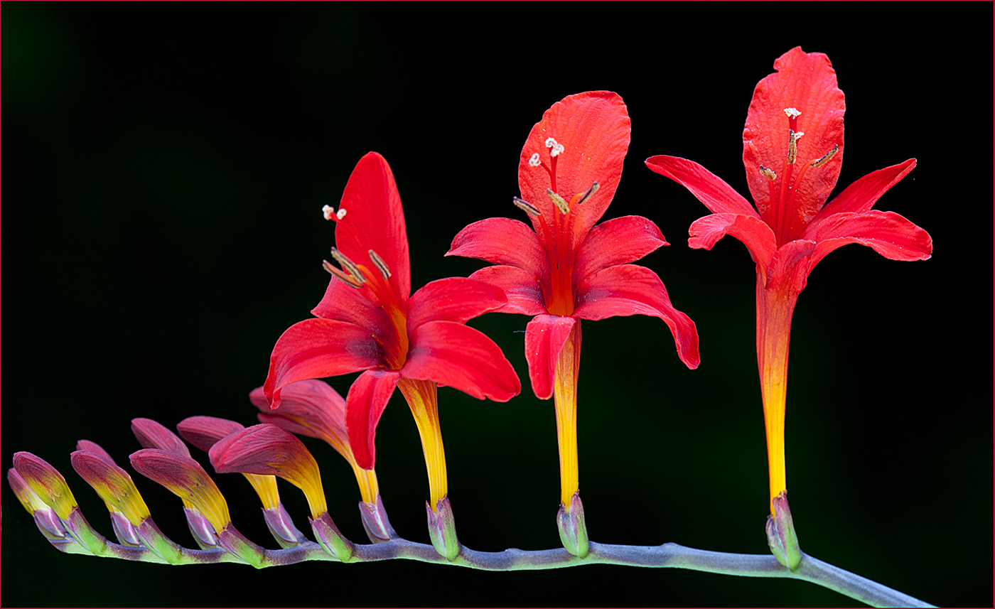
Comment |
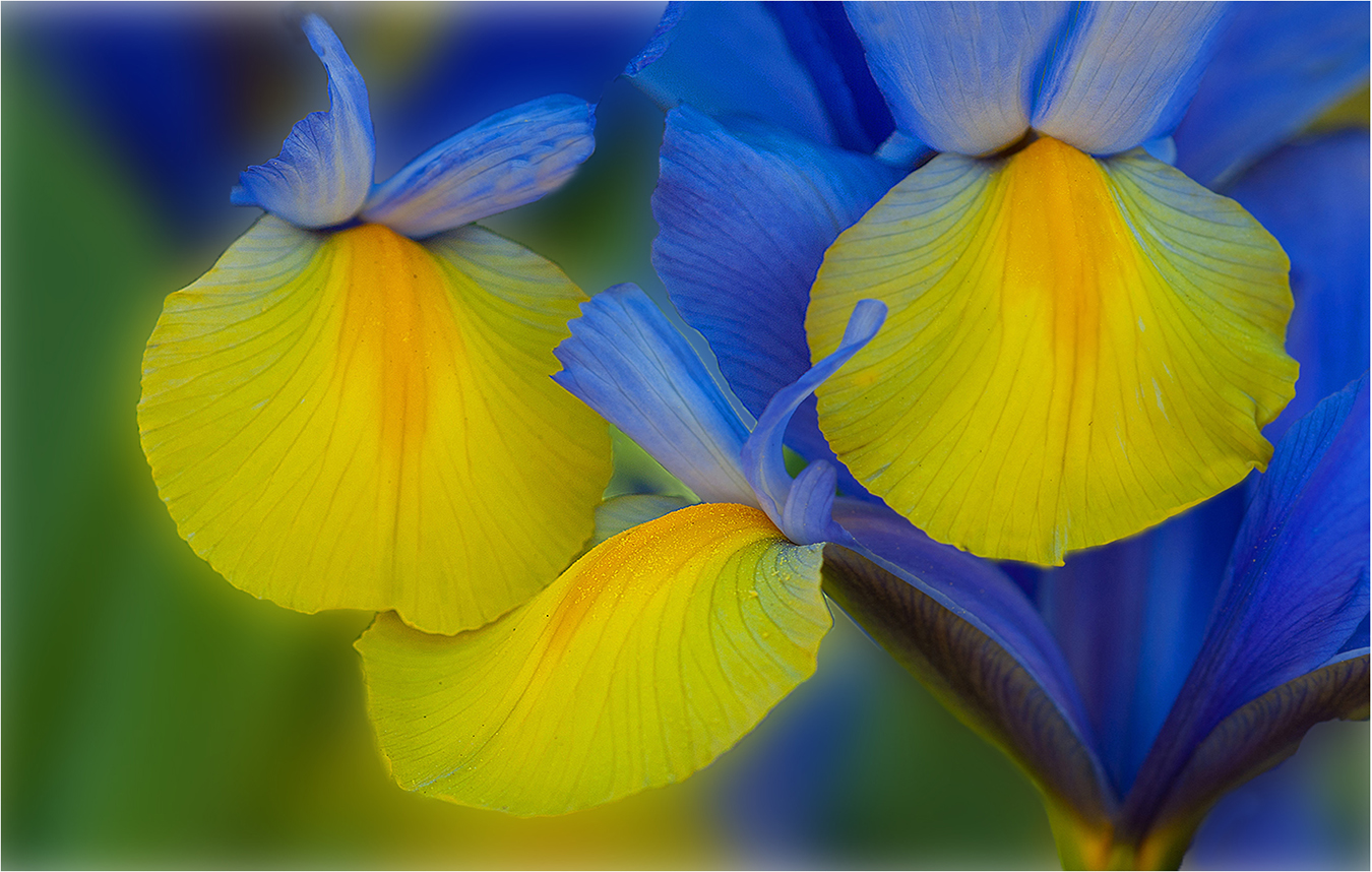
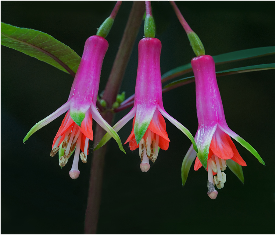
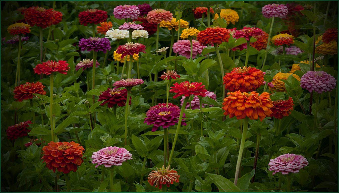
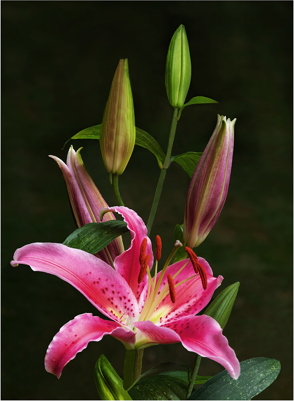
Hi Dan: The Iris spread across the frame immediately draws the viewers attention when it comes up on the monitor. The dark background adds impact to this scene. You do not mention how many focus stacks you used in this scene; there are some small soft focus areas on the front petals, however the back petals are tack sharp.
Am not certain if the small patch of snow at the bottom left adds anything or not, be interested in what our other photo friends have to say.
The thin white border adds that finishing touch. Dynamic image. |
Apr 4th |
| 75 |
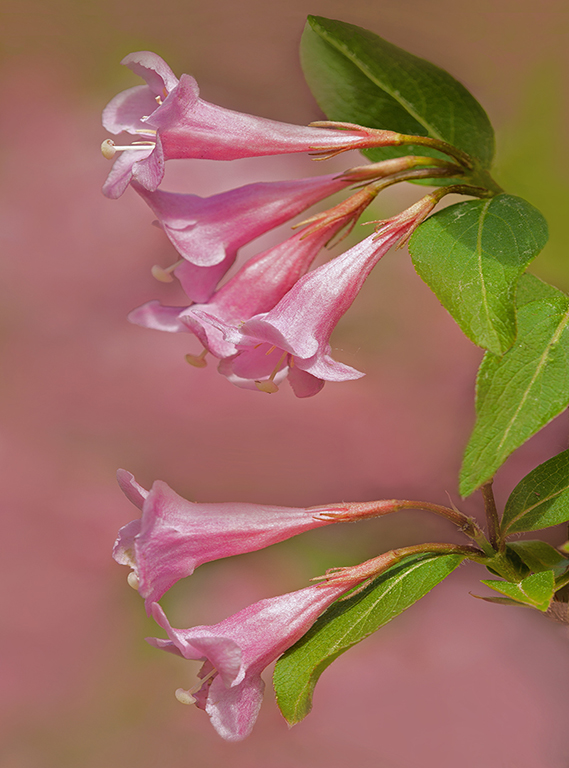
Apr 24 |
Comment |
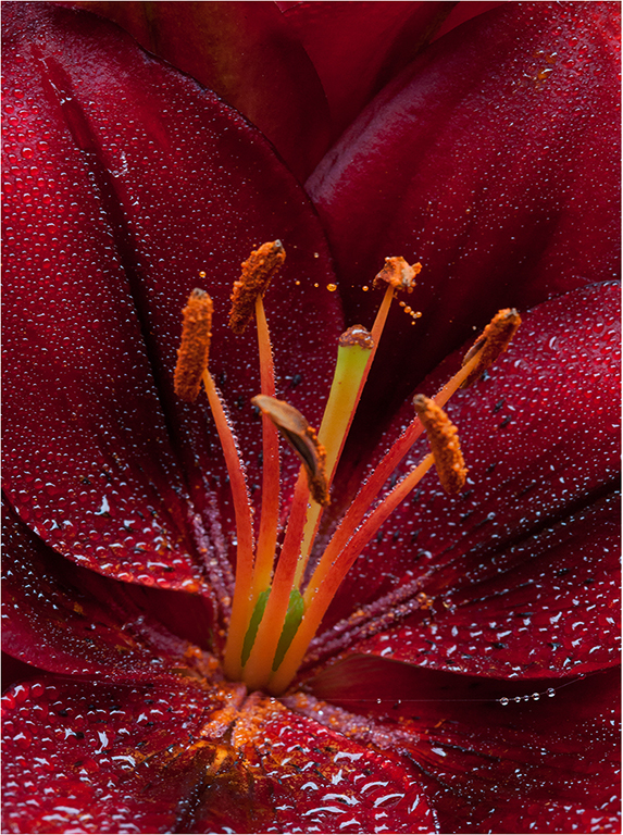
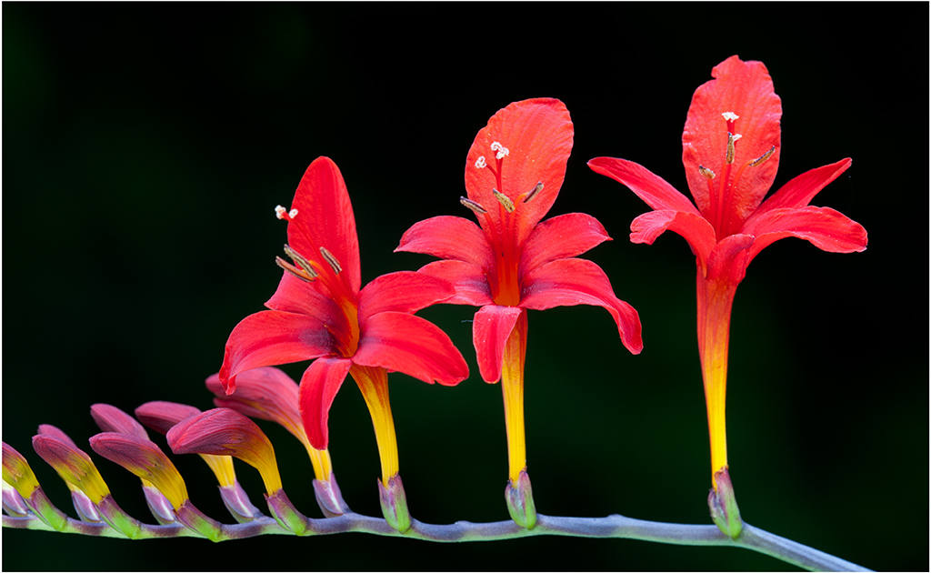
Hi Vincent: A nice close in portrait type picture of the red flower, the addition of the "bug" adds an extra point of interest. You have pleasant sunset lighting with a darker out of focus background to frame the flower nicely.
Picture is good the way it is; I do not want to sound nit-picky however the right leaf at the bottom of the flower is kinda bright, would tone it down to match the other two leaves in brightness.
Then if you want to experiment further you could tone down the leaves in the background just a small amount so they recede further off in the distance. Just my 2 cents!!
|
Apr 4th |
6 comments - 3 replies for Group 75
|
11 comments - 4 replies Total
|