|
| Group |
Round |
C/R |
Comment |
Date |
Image |
| 63 |
Dec 23 |
Reply |
Hi Charlie: I always enjoy the varied comments from our group members. Composition is probably one facet in photography where individual preferences come into play. I am not much into rules; for instance the 'rule of thirds' is over used in my humble opinion. Then some judges do not like dead centered subjects, however in some cases the picture works best that way. Guess my criteria is 'artistic balance', what ever looks the best in a given situation. Cheers. |
Dec 16th |
| 63 |
Dec 23 |
Reply |
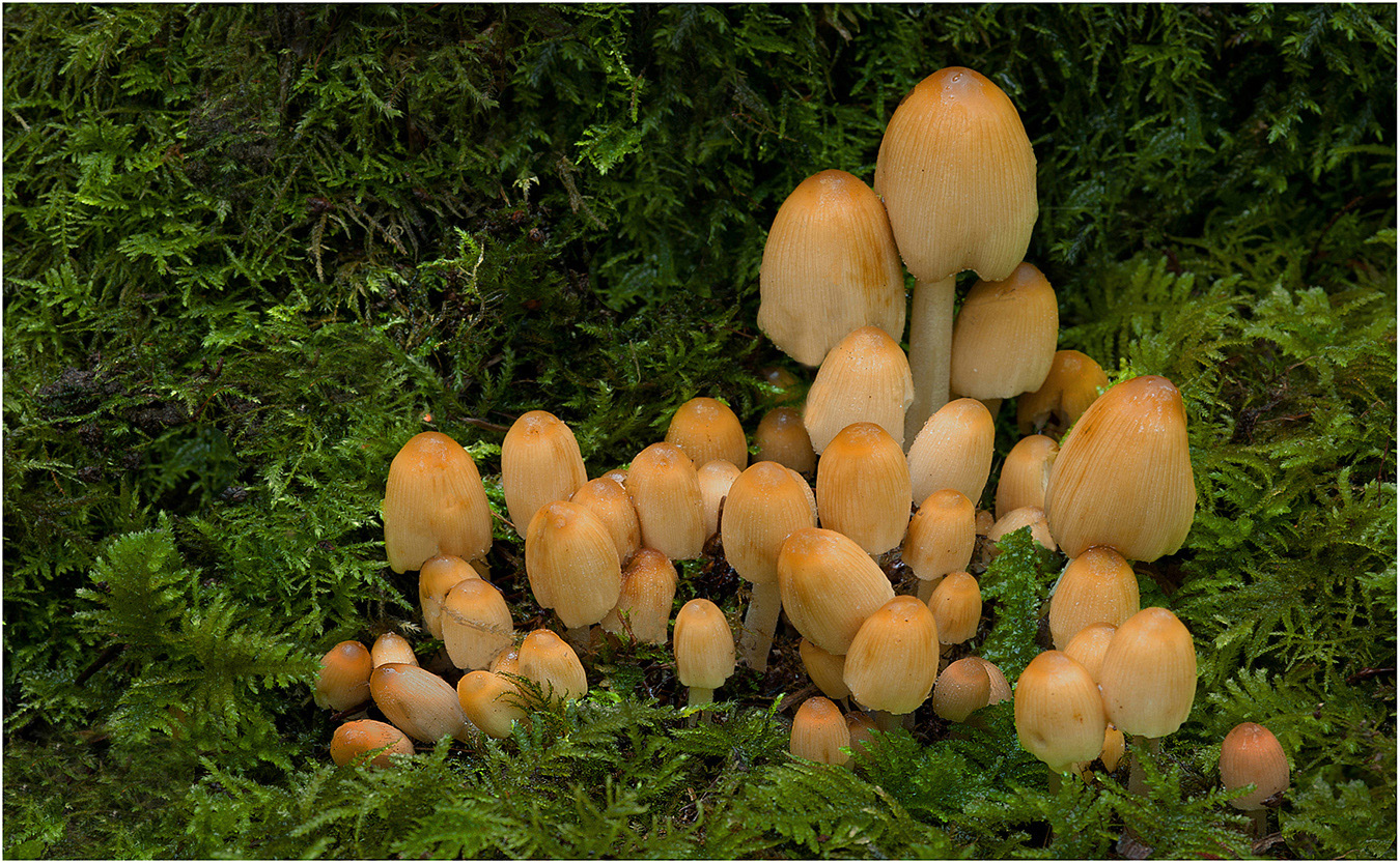
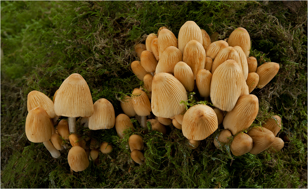
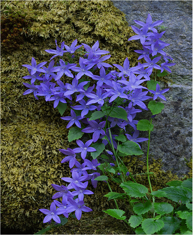
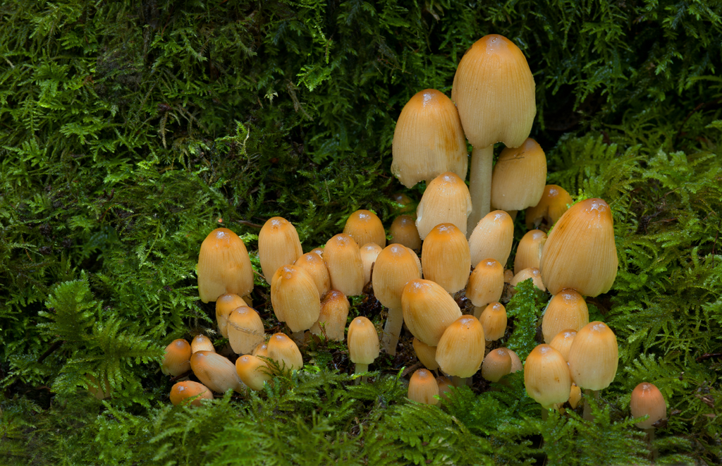
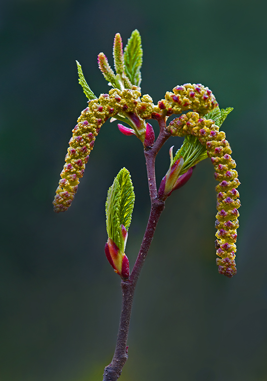
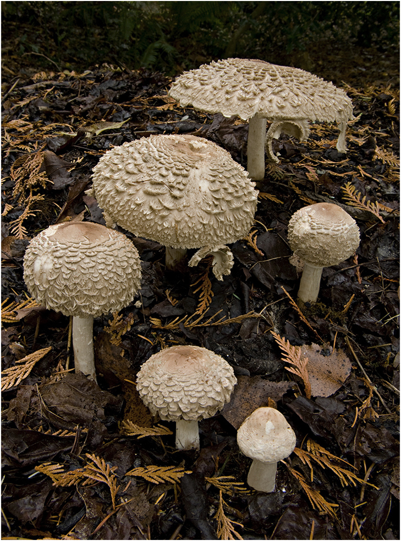
Hi Charlie and Barbara: Thank you for your helpful comments on the Mushroom Group. Regarding composition; I left twice as much room on the left side of the grouping than on the right, my thinking was I did not want the grouping to appear centered in the frame with equal distance on each side. In much of my botanical photography I follow this same train of thought so the subject does not seem centered in the frame, but biased slightly to the right. |
Dec 13th |
| 63 |
Dec 23 |
Comment |
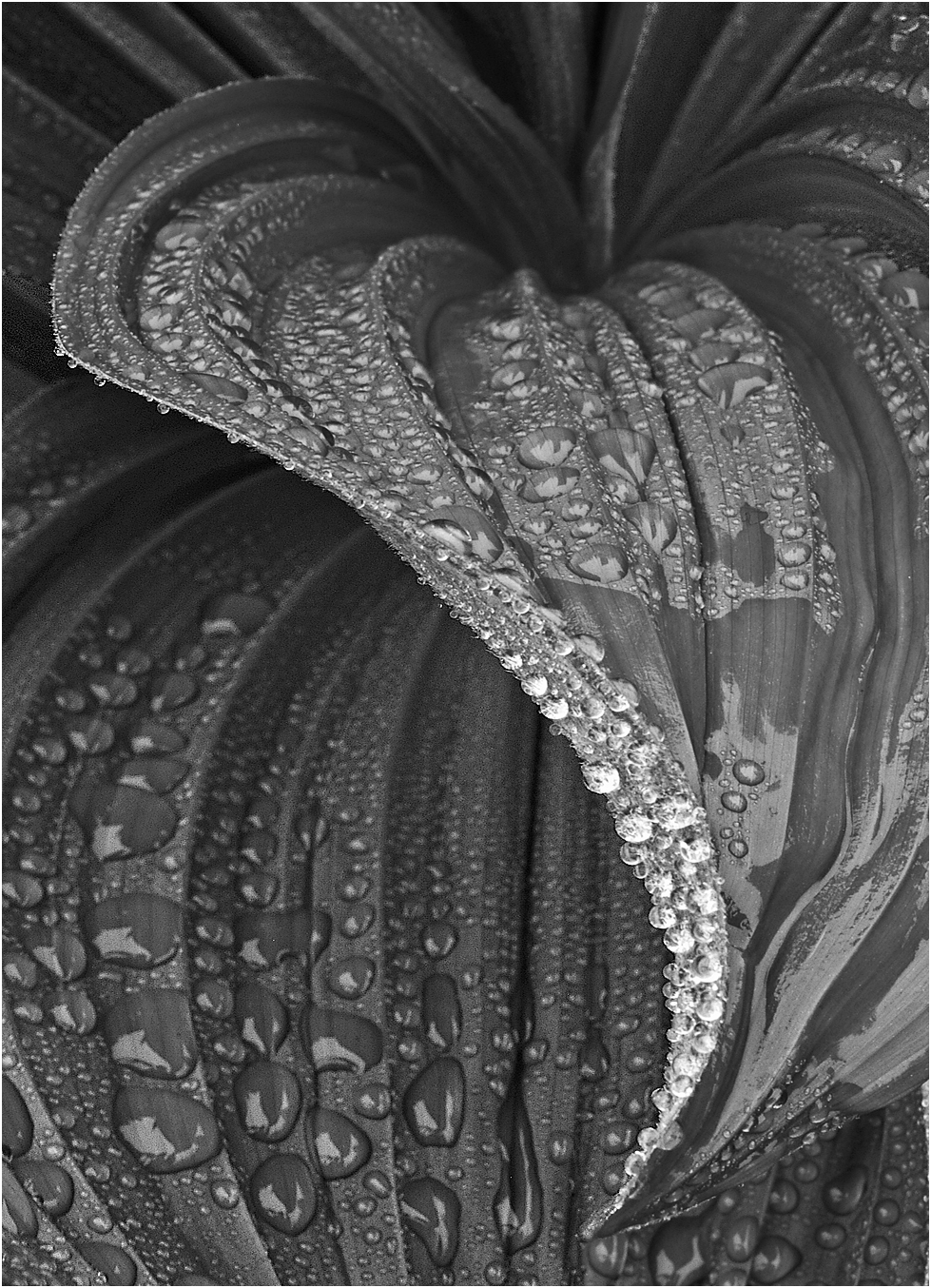
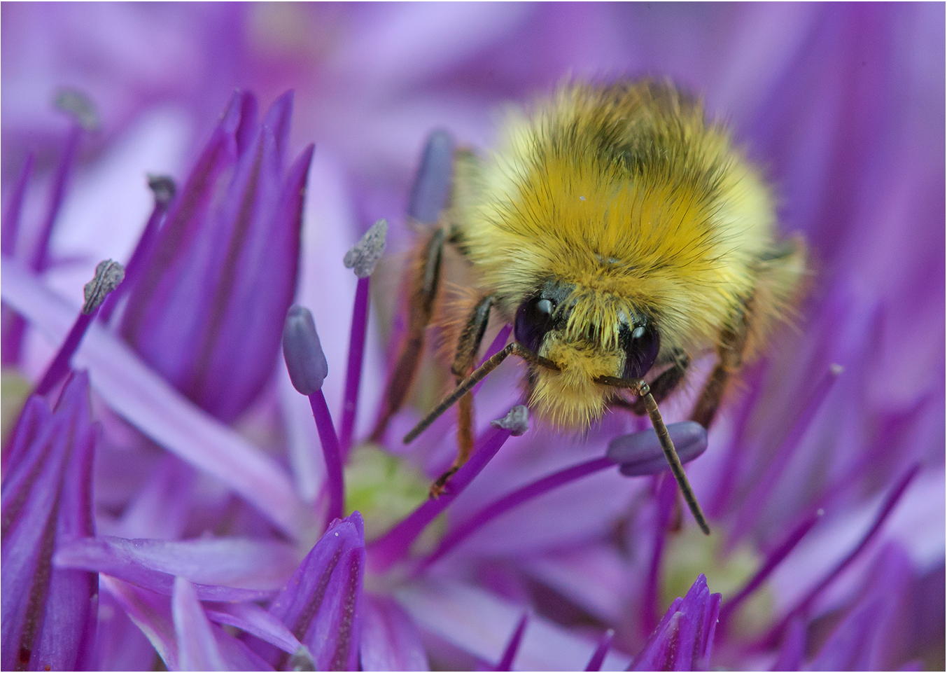
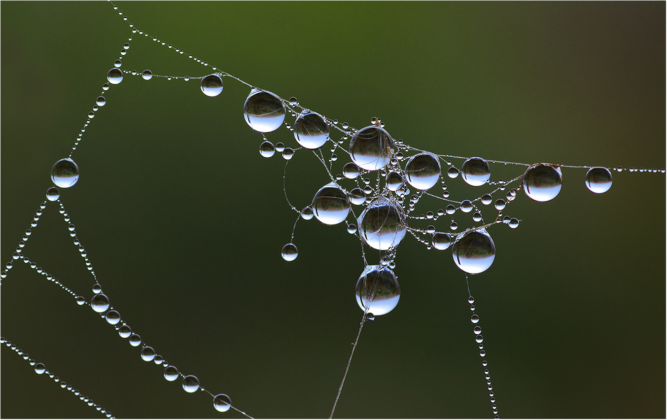
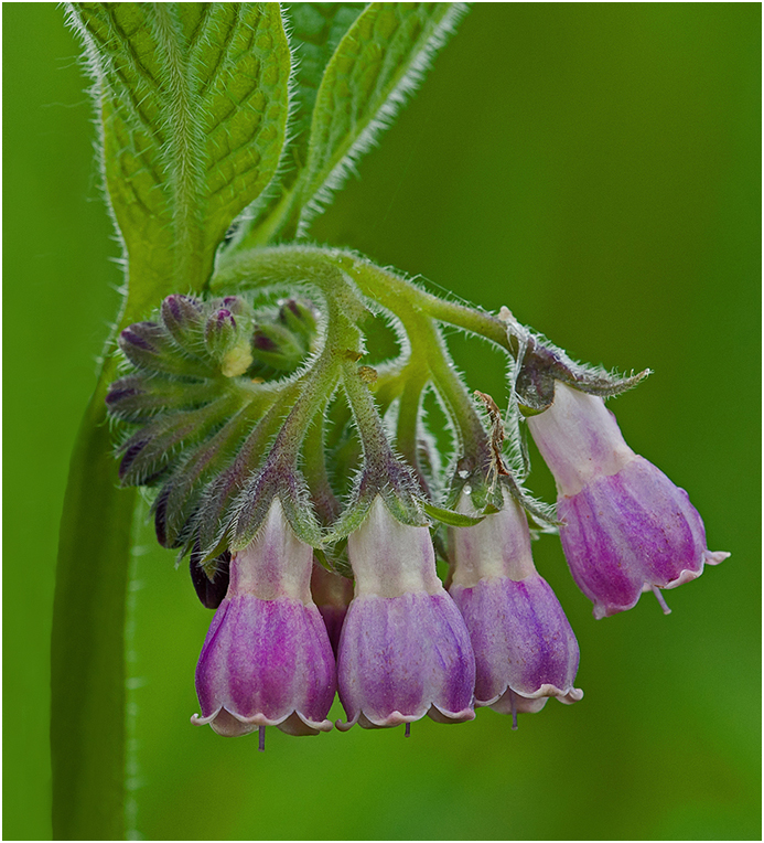
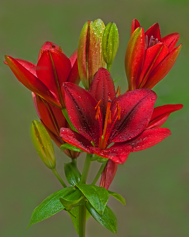
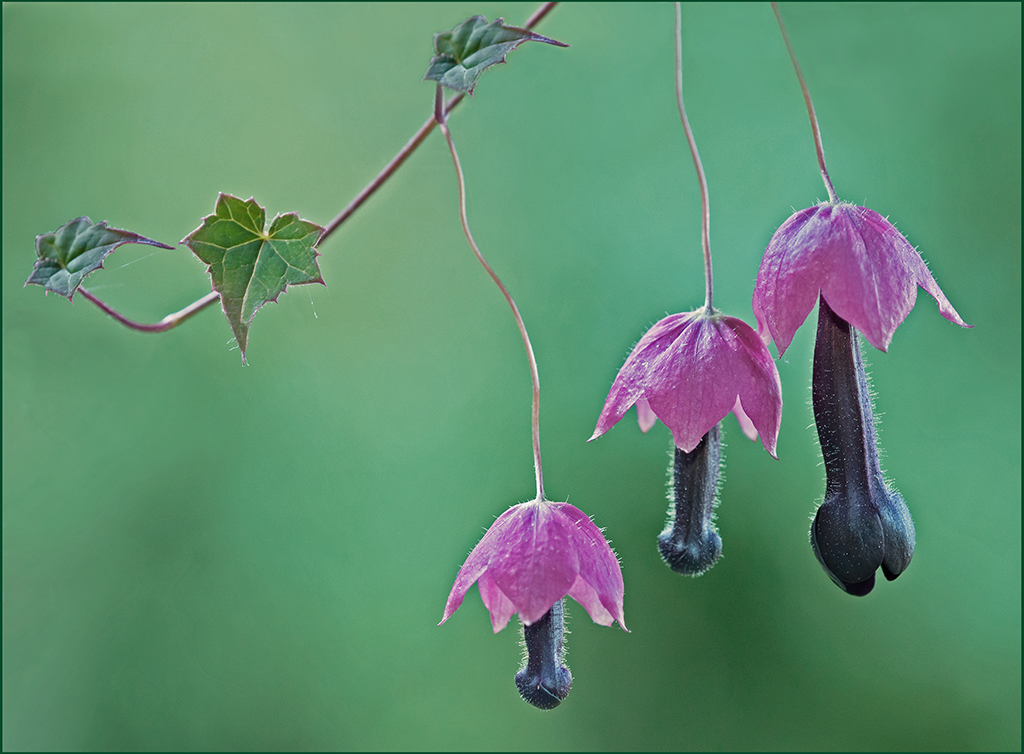
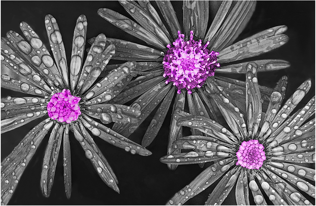
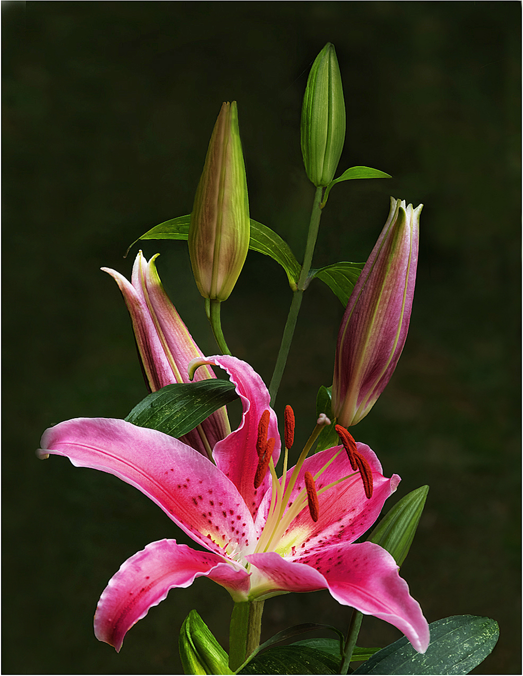
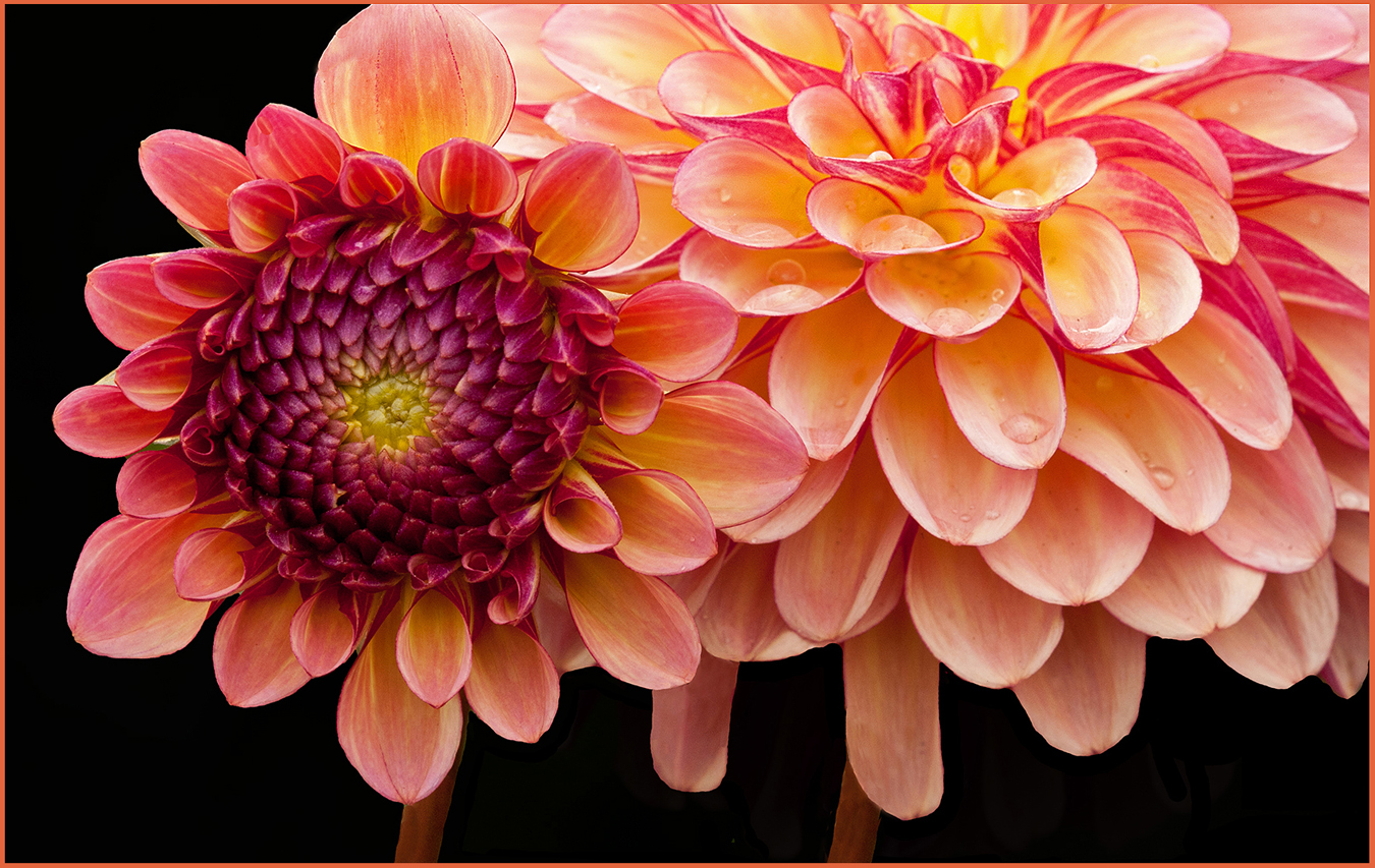
Hi Priscilla: The past several flower pictures you have shared with us all have this soft type of mood lighting I like and it always fits the scene. Kind of subtle and not in your face at all.
The soft gray background fits well here with the mood you are trying to present. There are some water drops, also some other small distractions that are present. With some careful post processing these could be smoothed out so they do not distract from this wonderful flower arrangement you have shared with us. |
Dec 13th |
| 63 |
Dec 23 |
Comment |
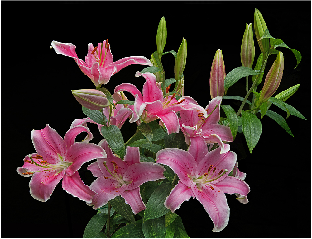
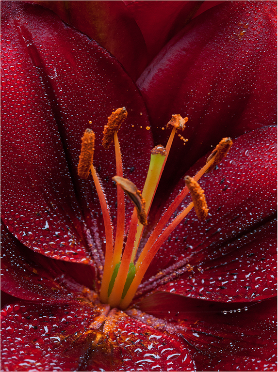
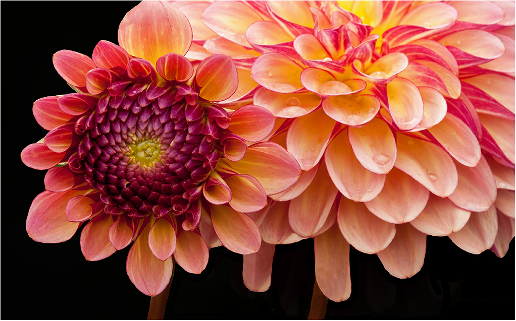
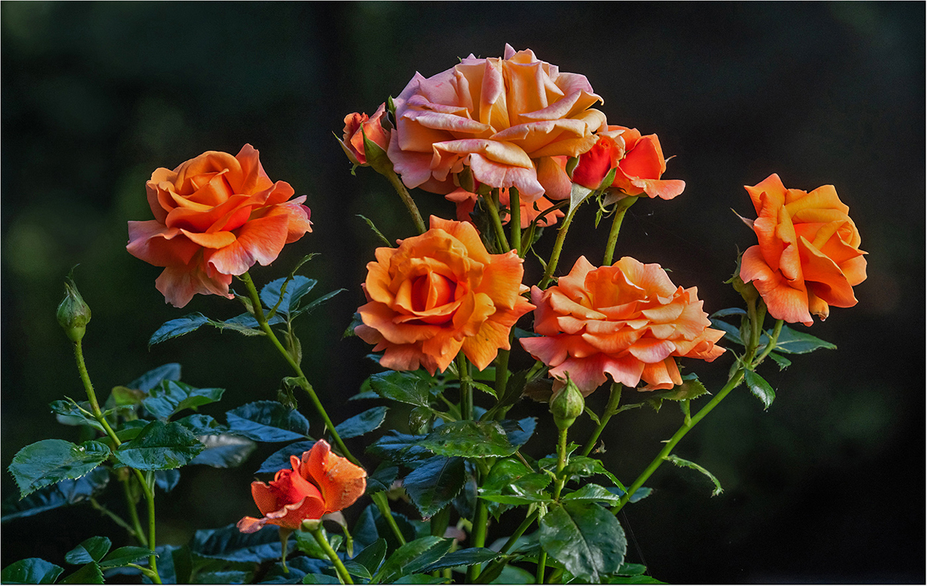
Hi Charlie: really good post processing work on the red rose. You started out with a very busy background and did wonders to diffuse all of the business. Excellent sharpness on the rose flower and the dew drop add really nice points of interest. Not to be a nit pik but I think you could take your post processing work a bit further by darkening down the background a small amount as it would make the rose flower stand out that much more. Good Work !! |
Dec 13th |
| 63 |
Dec 23 |
Comment |
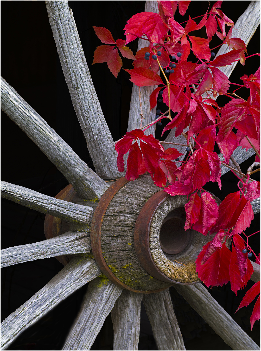
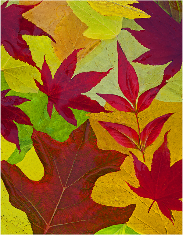
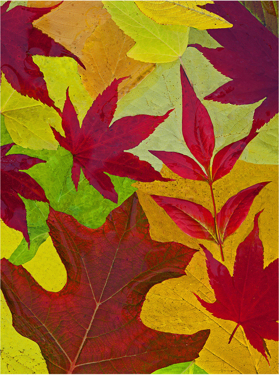
What a good seeing eye to recognize this design of cobblestones and autumn leaves. Many photographers would have walked right past this scene and not even noticed the possibilities for an artistic design in the stones and leaves.
Just wish your photo was much sharper in detail, it is quite soft. In my humble opinion this kind of a scene needs to be very sharp in detail to have the kind of impact it should have. It should jump off the monitor at the viewer, however does not come on strong enough as is.
|
Dec 11th |
| 63 |
Dec 23 |
Comment |
Hi Neal: The darkening of the foreground as suggested by Charlie really helped this picture of our Western Toad in its natural habitat. The Toad appears to have been photographed in open sun, the darkened background frames the subject very well. Depth of field wise you did as good as you could at f/22 to get the eye and head, and most of the body in good sharpness.
If you wanted to continue on in your post processing work there are some bright areas in the vegetation to the left and right in the background that could be toned down somewhat to help your presentation. A fine habitat picture. |
Dec 11th |
| 63 |
Dec 23 |
Comment |
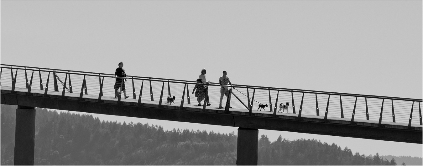
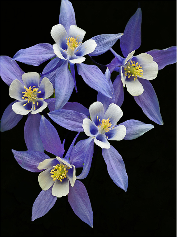
Hi Barbara: A very nice rendition of the Flamingo, a slightly different perspective and composition than we usually see of this bird. Good comments by Charlie and Neal; all I can add is I like the medium gray sky reflections in the water background, the reflections add needed depth to the image and also create separation between the background and the bird. Nicely done !! |
Dec 11th |
5 comments - 2 replies for Group 63
|
| 75 |
Dec 23 |
Reply |
Hi Ray: In some cases a well done border can put the finishing touch on an already good picture. Any border if one is even used needs to be done perfectly if it is to enhance the picture at hand and not be a distraction. I do not want to sound like a nit-pic, however your border here may be too thick and competes with your excellent image. Experiment with a thin border and see what you think. Cheers. |
Dec 20th |
| 75 |
Dec 23 |
Reply |
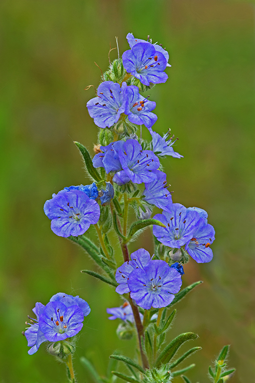
Hi Vincent: I use f/16 when I want really good sharpness on the flower at hand, and I do not have anything in the immediate background that will be a distraction by being too much in focus. My advise would be to photograph your chosen subject at various f stops from f/5.6 to f/16 and then compare the various images on your monitor. You should see some differences in how your background changes with the various f stops. It just takes a lot of practice to get everything right. |
Dec 20th |
| 75 |
Dec 23 |
Reply |
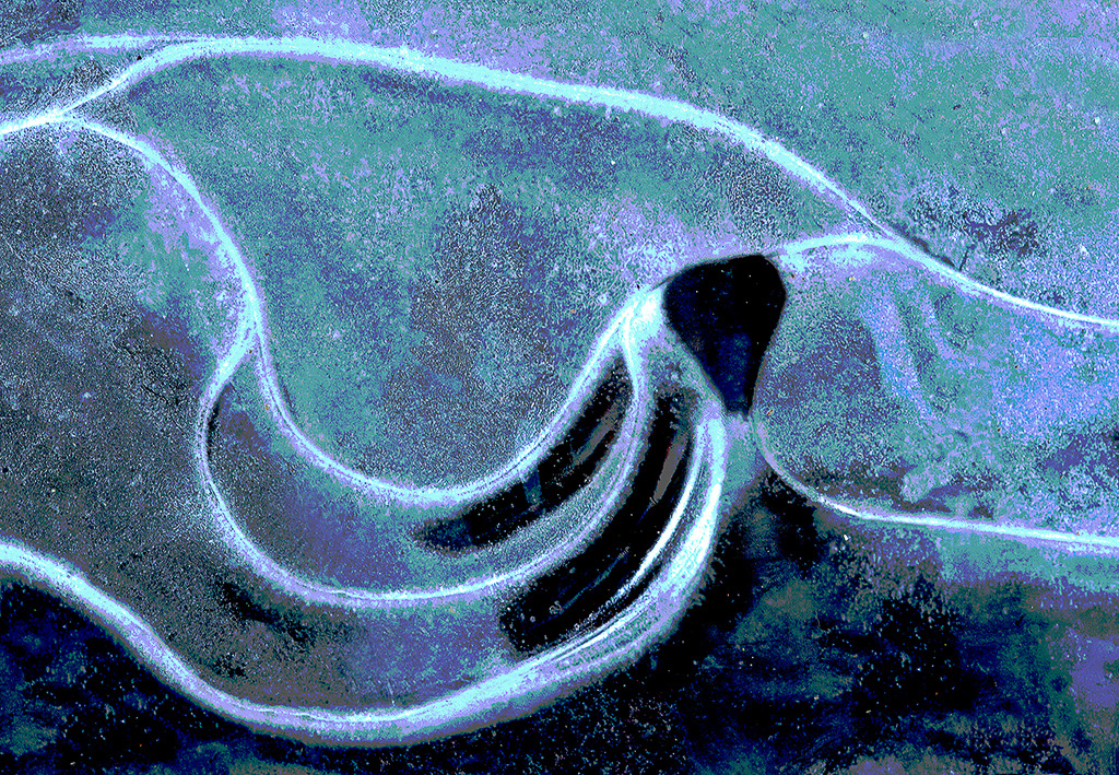
Hi Moe: Received the December PSA Journal today and found your impressive 6 page spread of your creative ice photography of flowers incased in ice. Thanks for all of the information on the techniques you use for creating these pictures. There are very few photographers doing this kind work, and very likely none using the same exact techniques you use so successfully in the creation of these pieces of art. KODOS! |
Dec 8th |
| 75 |
Dec 23 |
Reply |
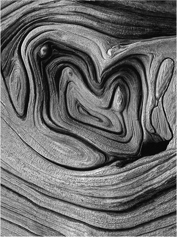
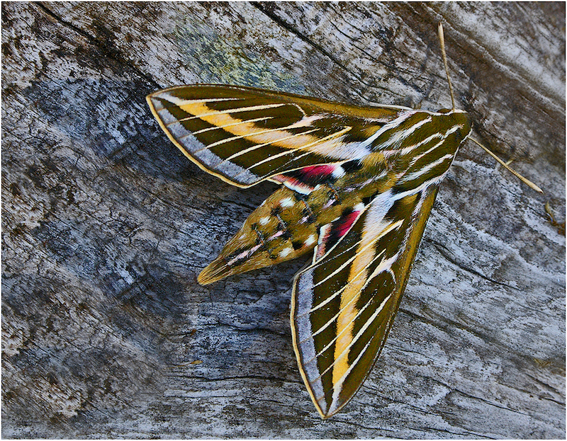
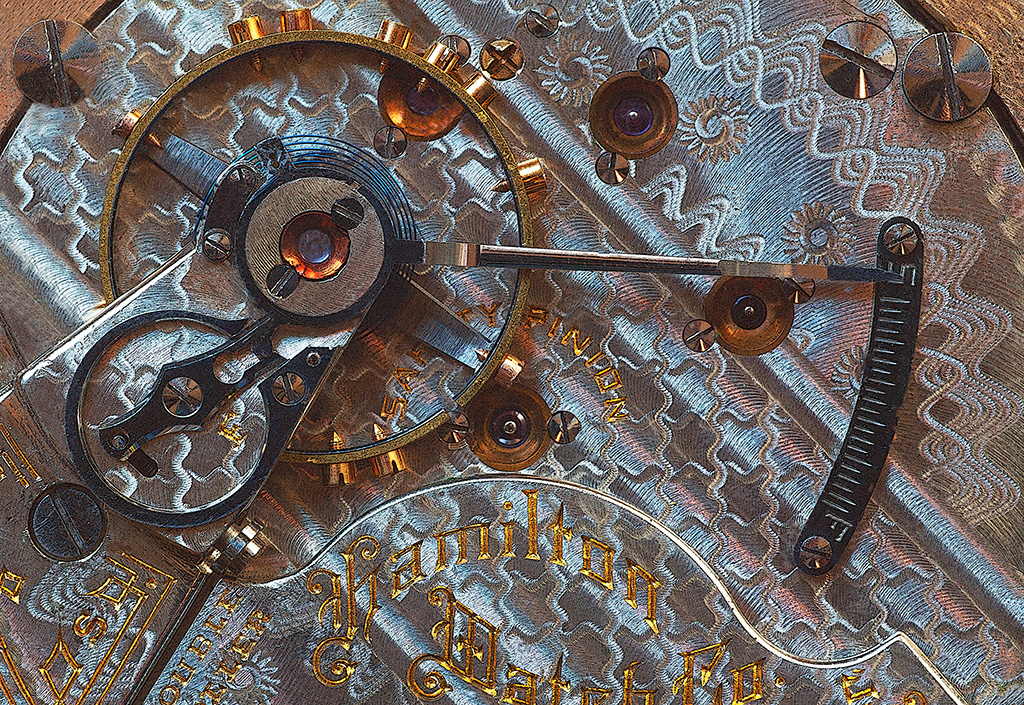
Dan: I doubt you could even come close to duplicating this picture with any computer designed lens of today. The quality of todays lenses is just so good all of the defects we see in old lenses from the 1950s era have been eliminated. Enjoy your creative endeavors using this old lens. |
Dec 6th |
| 75 |
Dec 23 |
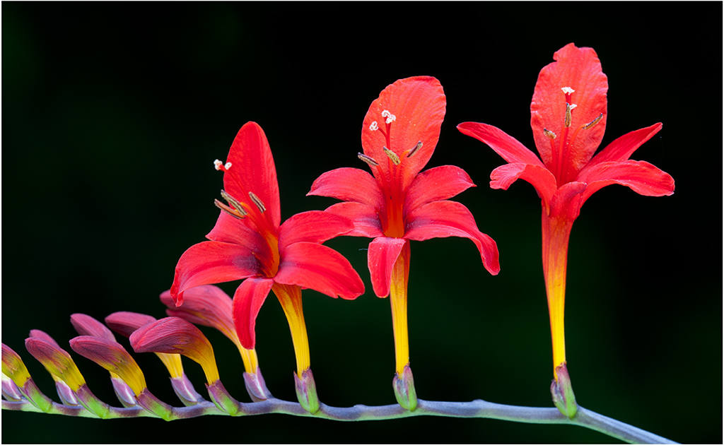
Reply |
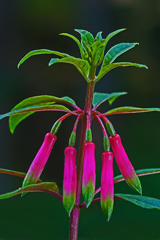
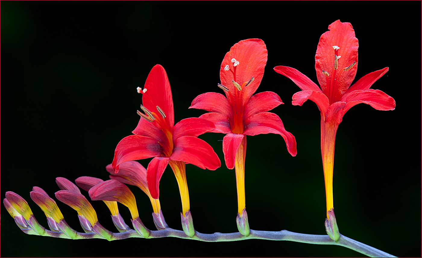
Hi Ray and Dan: Pleased you guys liked the Crocosmia picture, and thanks for the advise to add canvas on the left side. I was aware the flower was too close to the border, that is an easy fix to add canvas to the left and I will do so.
Cheers... |
Dec 6th |
| 75 |
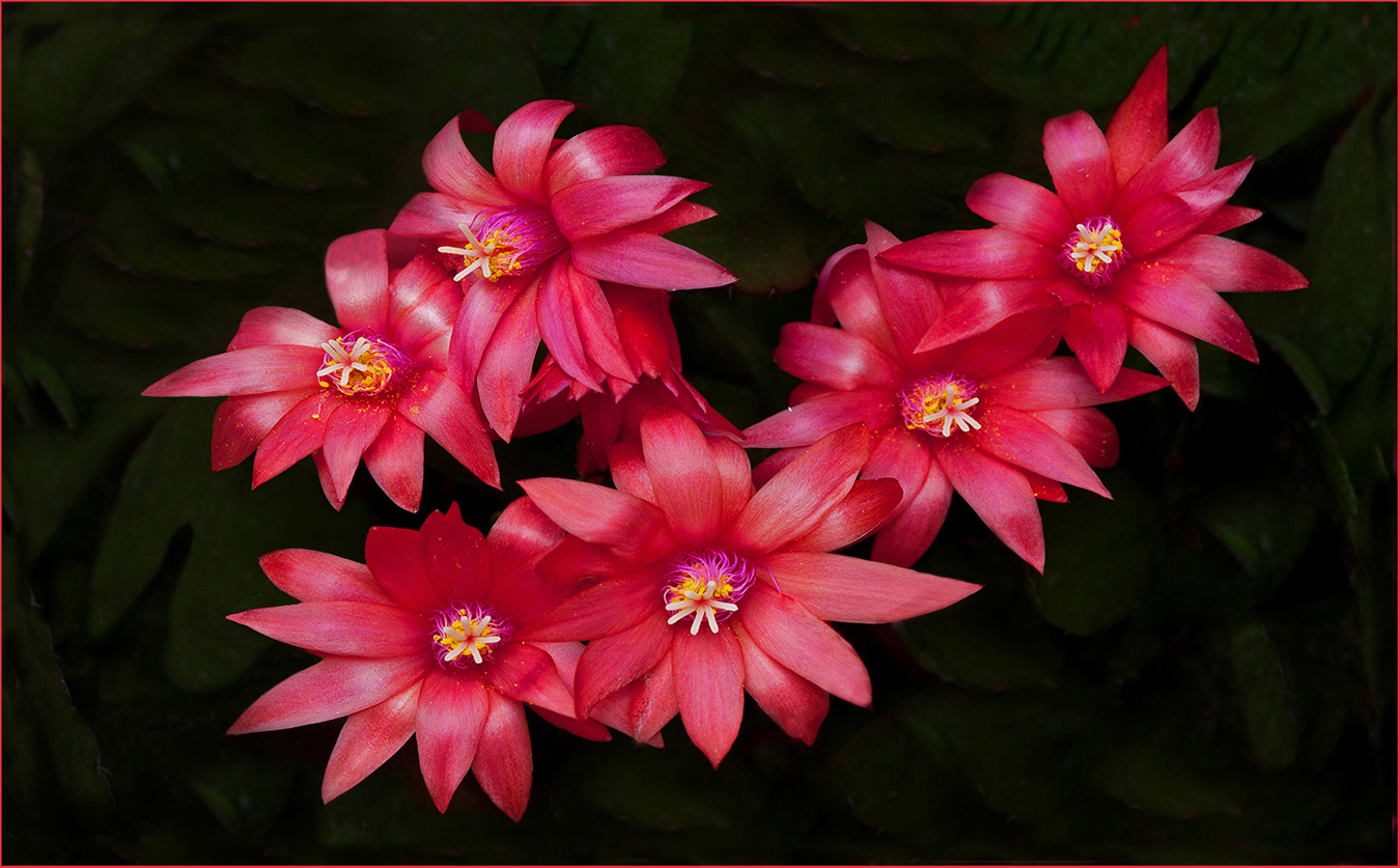
Dec 23 |
Comment |
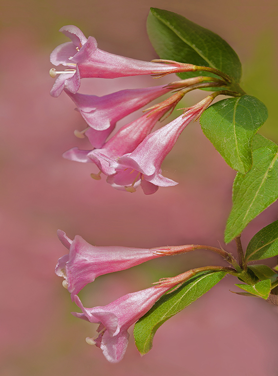
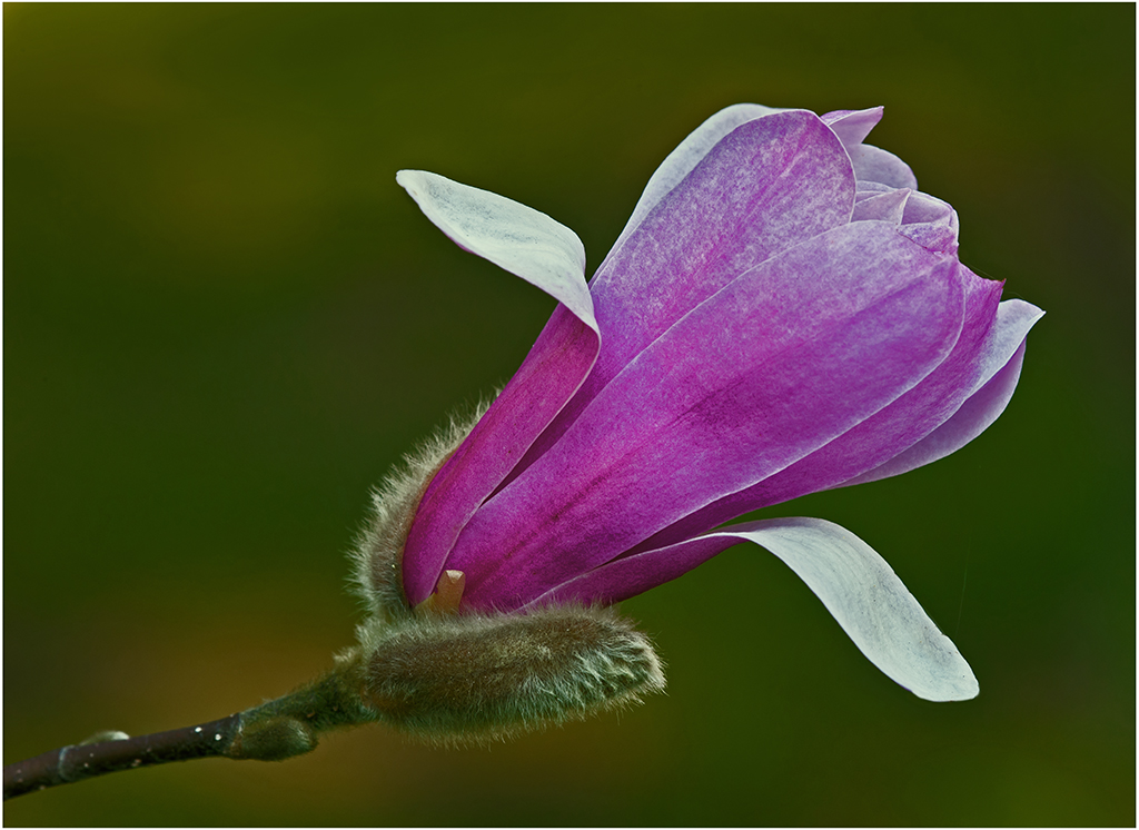
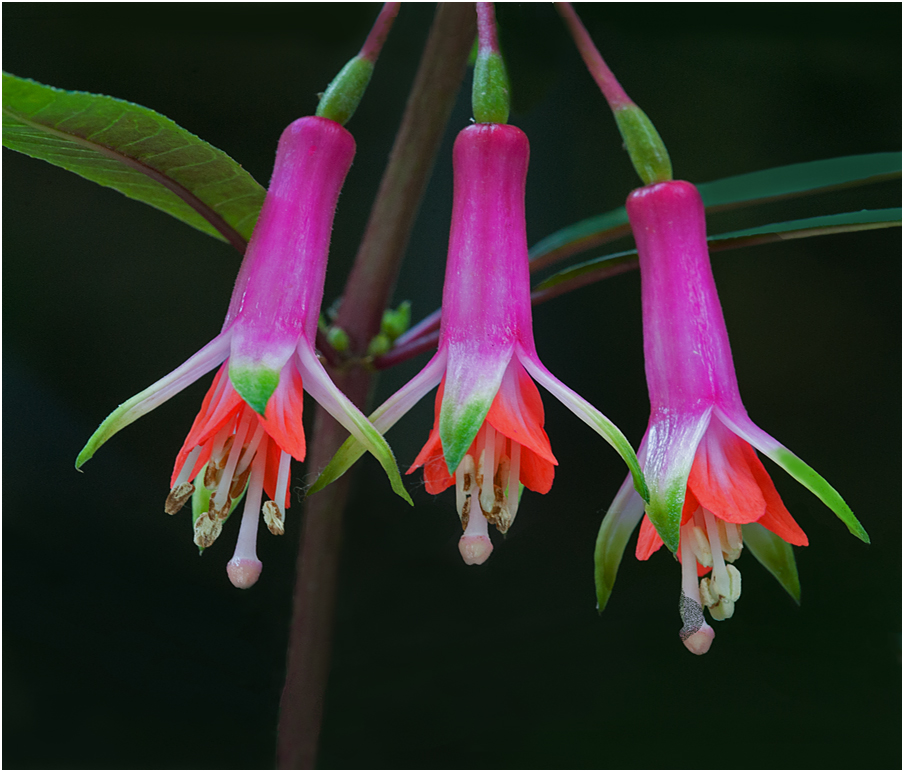
Hi Moe: Pink Mood would be another good name for this Rose of Sharon flower; to me delicate and soft mood are the name of the game for this lovely flower picture. Kind of amazing to me how sharp the central detail is shooting through ice, I would think the ice would soften the sharpness some but it does not seem to. The small yellow area in the central part of the flower adds a nice point of interest, then the light edges frame the pink flower very well. KUDOS on excellent work!
|
Dec 4th |
| 75 |
Dec 23 |
Comment |
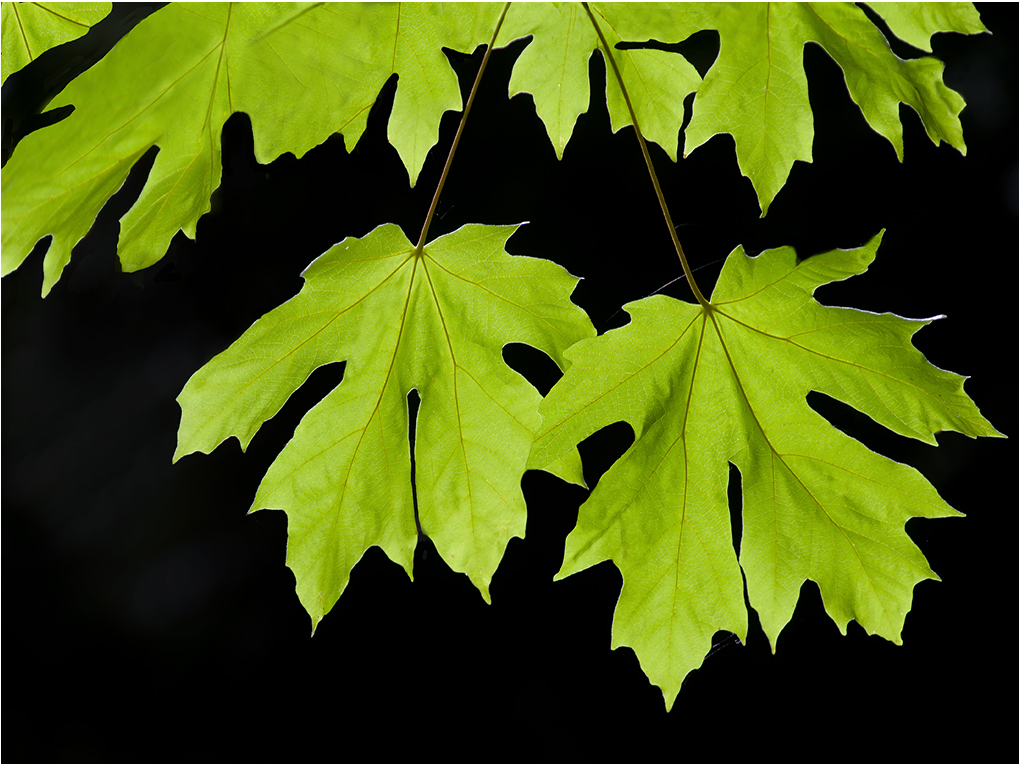
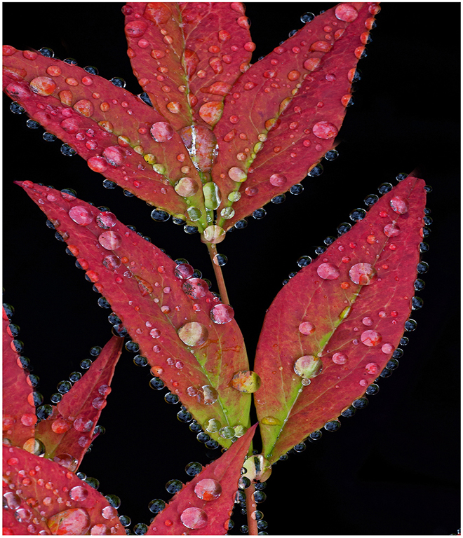
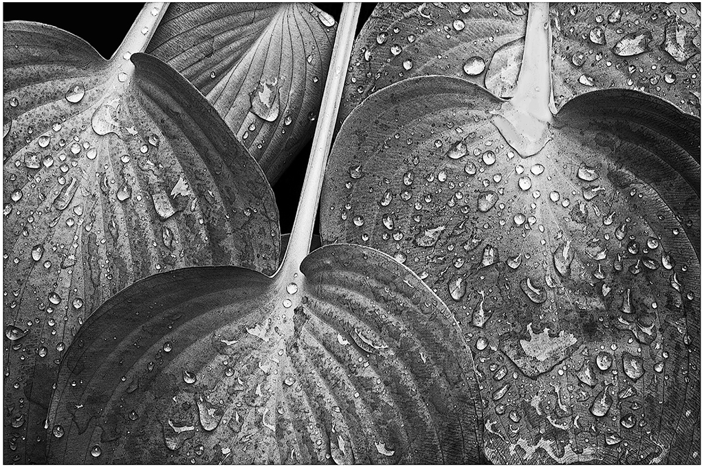
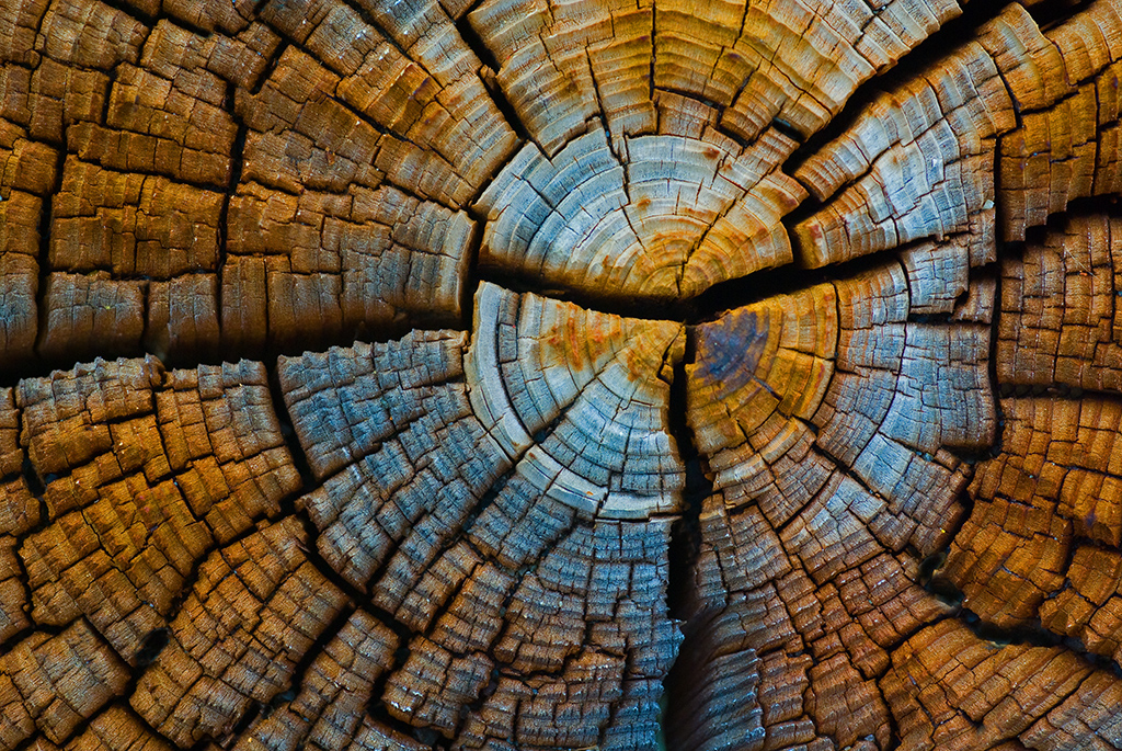
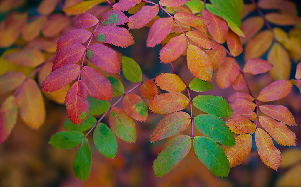
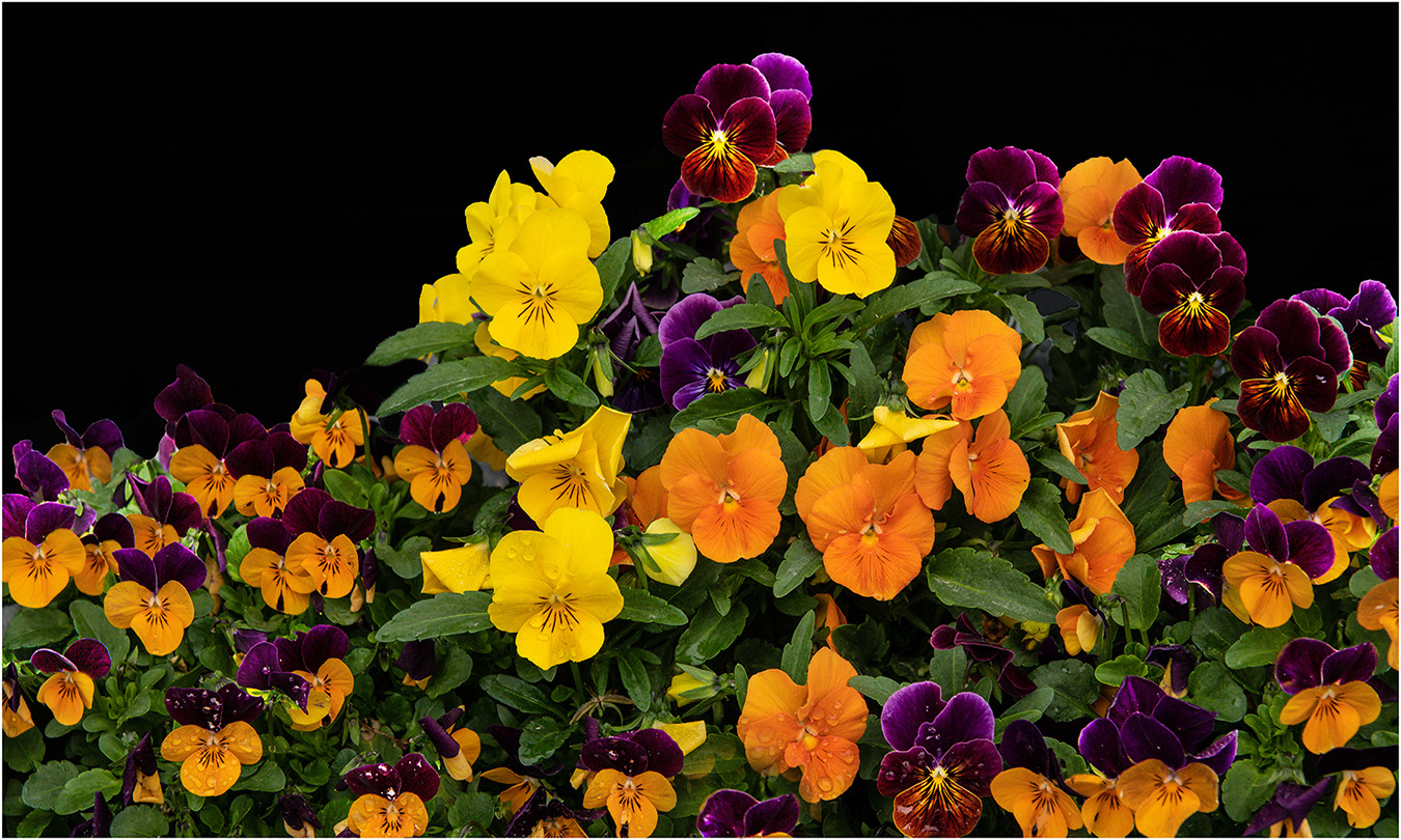
Hi Ray: What an interesting picture!! The lighting you have created in your work room is very impactful and dramatic. A tremendous range of green colors on the leaves from quite light to quite dark and all blended together so very well. Sharpness on the leaves is as good as it gets; then your choice of background color and border color was well thought out and fits perfectly. KUDOS on great work... |
Dec 4th |
| 75 |
Dec 23 |
Comment |
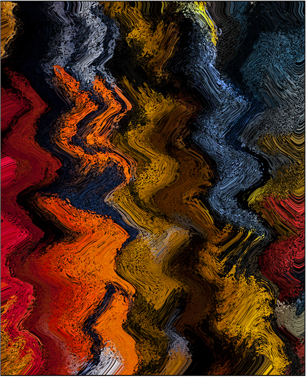
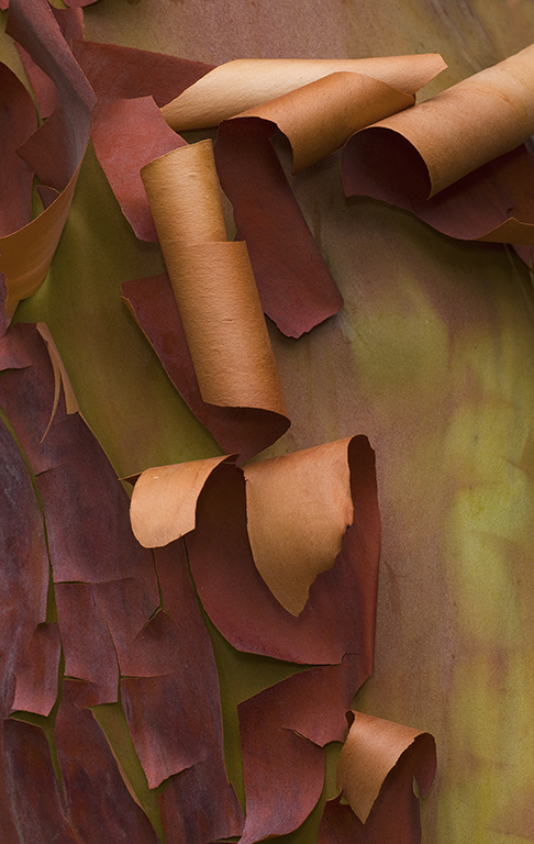
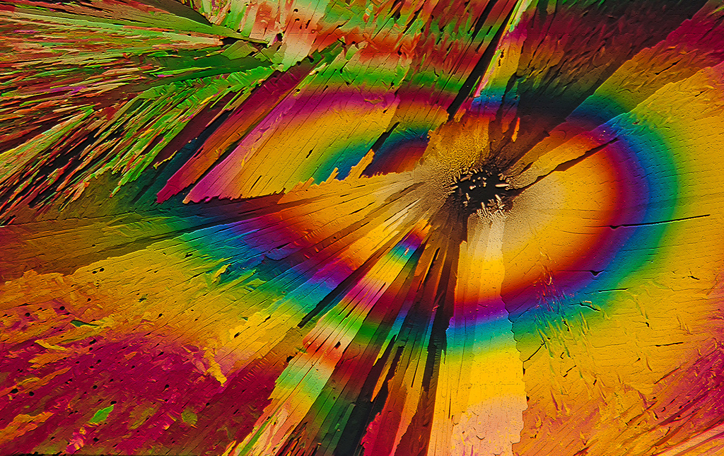
Hi Dan: Meyer Optik, a name out of the past like many others. Apparently they are under different ownership today and still producing lenses.
Your picture is very creative and interesting with that background of circles caused by optical defects of the lens. The red leaf is not as sharp as todays lenses will produce, however back then computer designed lenses were unheard of and if the lenses of that era were coated at all it was just a single coating. Neat picture and thanks for sharing.
|
Dec 4th |
| 75 |
Dec 23 |
Comment |
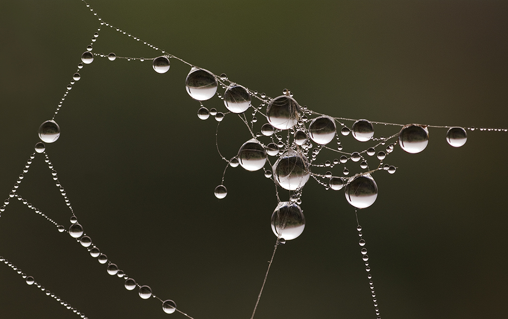
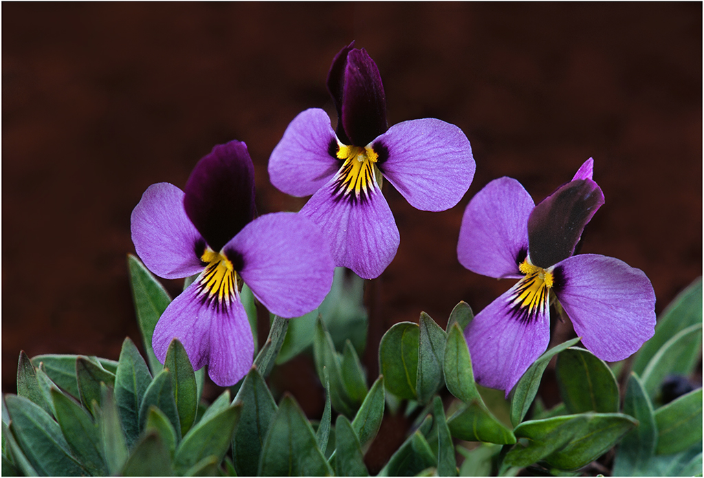
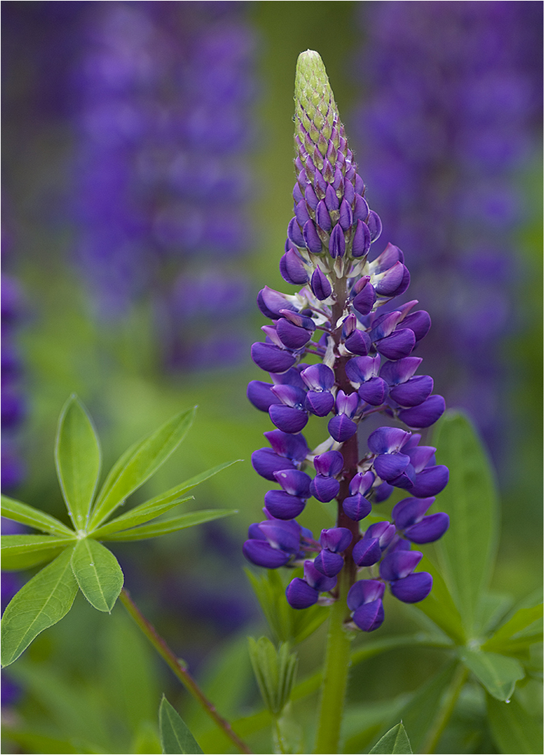
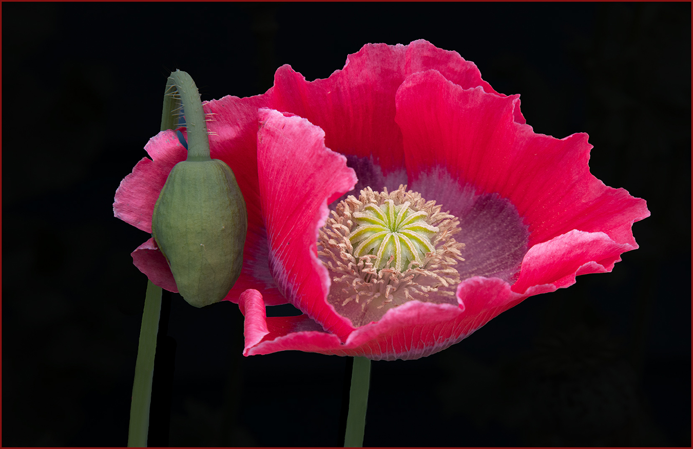
Hi Vincent: The red flower and green stem are supported well by the very dark background and has a lot of impact. I think you could sharpen the flower somewhat as detail on the petals seems slightly soft.
You do mention using a square format, however without a border to frame your picture area I cannot determine where the actual picture ends against the black web page of our circuit. |
Dec 2nd |
4 comments - 5 replies for Group 75
|
9 comments - 7 replies Total
|