|
| Group |
Round |
C/R |
Comment |
Date |
Image |
| 6 |
Aug 23 |
Comment |
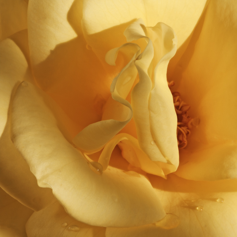
To my eye the backlighting of the petals is lovely and beautifully captured. The darkened background looks clean and makes the flower pop for me.
I wish I could see the two dimensional pattern of the sunflower seeds. |
Aug 14th |
| 6 |
Aug 23 |
Comment |
My eye is drawn to the triangles and suggestion of a hidden message. As Karen mentions, I too wonder about the possible story.
Does the text possibly refer to an event at Linden Place in Jackson Heights in Queens, NYC ?
I enjoyed exploring the various textures of the brick, ice crystals, and plastic and admiring their clarity. |
Aug 14th |
| 6 |
Aug 23 |
Comment |
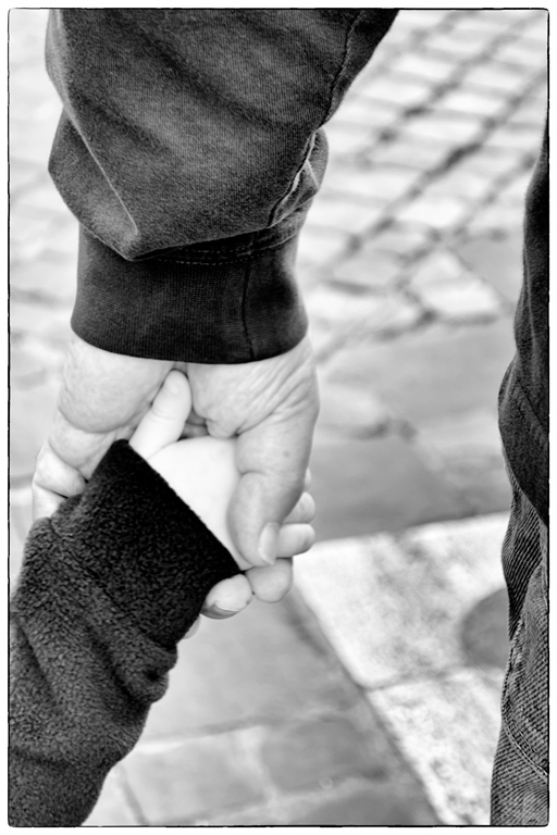
Thanks for the interesting background information! I, too, have seen "love" lockd on installations in different parts of the world signifying an indestructible bond to a lifelong commitment. Your shot brings back fond memories for me. Thanks!
Great capture with your cell phone and an appealing perspective. The left part of the photo reveals several interesting details for me.
I don't think the full view of the scene qualifies for our group's close up theme, although the capture of a single or small group of locks would. |
Aug 14th |
| 6 |
Aug 23 |
Reply |
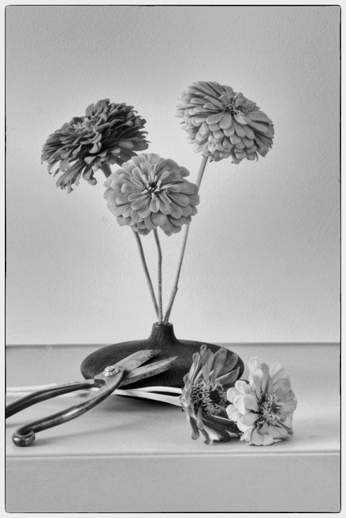
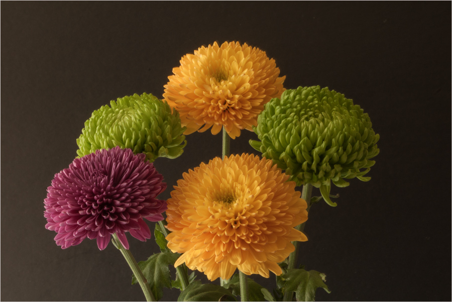
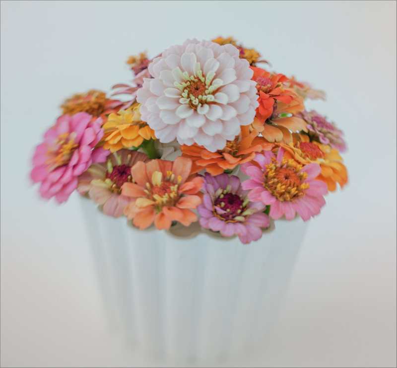
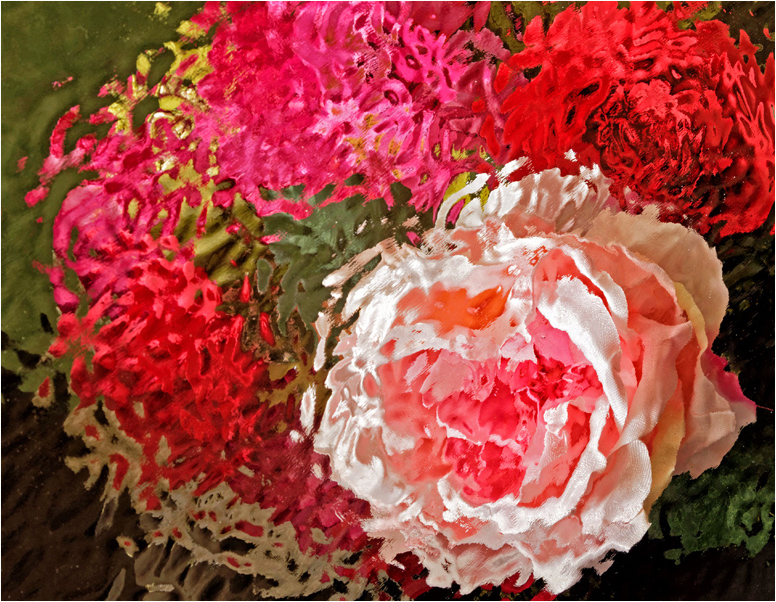
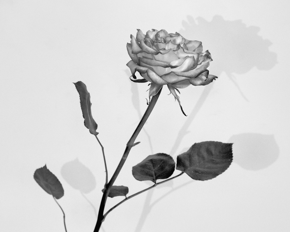
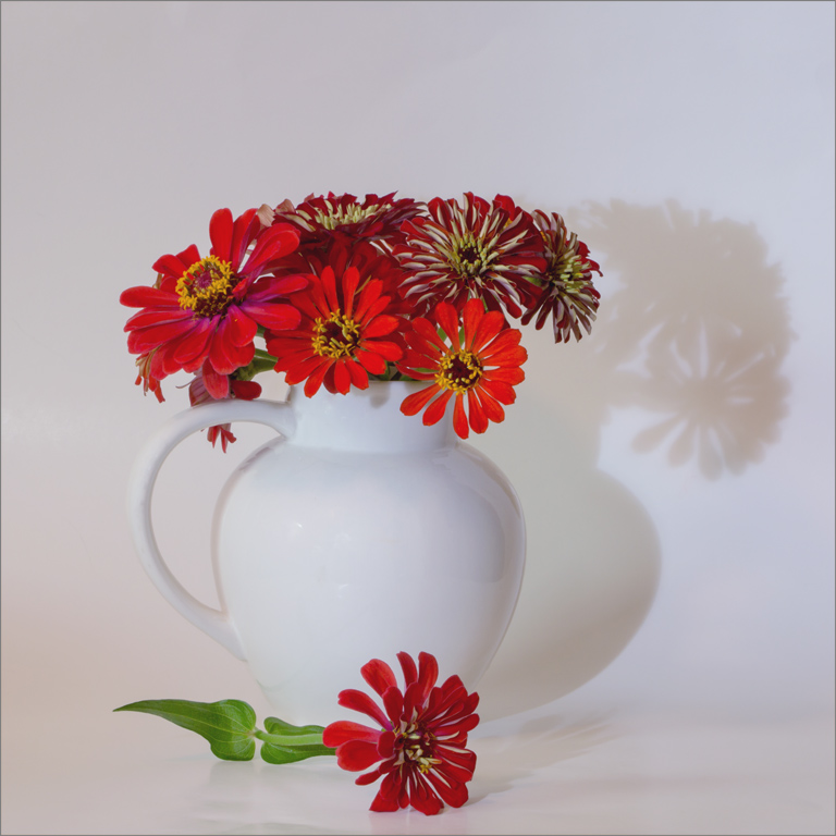
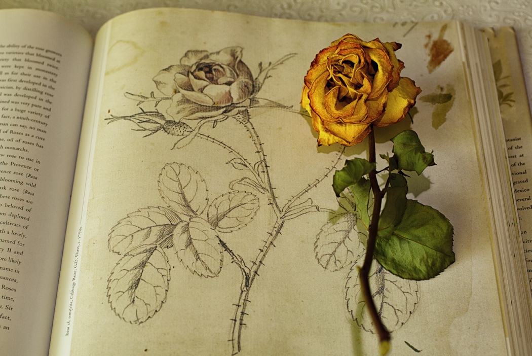
Lance, Thank you for generous and helpful comments. These flowers became part of a bouquet for a housebound neighbor, but I will work on developing another B&W interpretation of a similar still life using another set of flowers to improve my composition and produce what I think is a better image.
I did use manual focusing and spot metering directed toward the center flower, but you are correct their clarity is not what I had hoped. I should have caught this!
Originally, I tried using larger apertures but found that the foreground was too soft and distracting to my eye. Instead of selecting f/32 and inviting the challenges you mention, I think I could have solved this by manipulating not only the composition and lighting, but also my lens choice. I'm looking forward to working on this and greatly appreciate your mentorship. Many thanks! |
Aug 6th |
| 6 |
Aug 23 |
Reply |
Wonderful! I think you achieved your intention beautifully! Thank you for your response. |
Aug 6th |
| 6 |
Aug 23 |
Comment |
Hi Karen,
The golden Damselfly almost shimmers and is lovely in the vast wash of green negative space. To my eye, the background is lovely. Seeing the tiny creature against the background conveys a sense of wonder for me, but I'm not sure if this is what you hoped to convey.
Perhaps a greater depth of field to reveal more details and tighter crop might have greater impact?
|
Aug 3rd |
| 6 |
Aug 23 |
Comment |
Karen, Thank you for these excellent suggestions! |
Aug 3rd |
5 comments - 2 replies for Group 6
|
| 24 |
Aug 23 |
Reply |
Hi, Lance! Thanks for visiting and for this helpful critique. I appreciate your advice on printing and insights on the use of focus stacking. |
Aug 19th |
| 24 |
Aug 23 |
Reply |
Hi, Frank! Thank you for these helpful suggestions. Your modifications have enhanced by image. I haven't explored focus stacking but look forward to learning more about this technique. Which software do you use to get control over your images? |
Aug 19th |
| 24 |
Aug 23 |
Reply |
It is a lovely image and you are absolutely right about how making the sun move where we want it may not be possible. I think discovering this beauty at a rest stop was a great find! |
Aug 16th |
| 24 |
Aug 23 |
Comment |
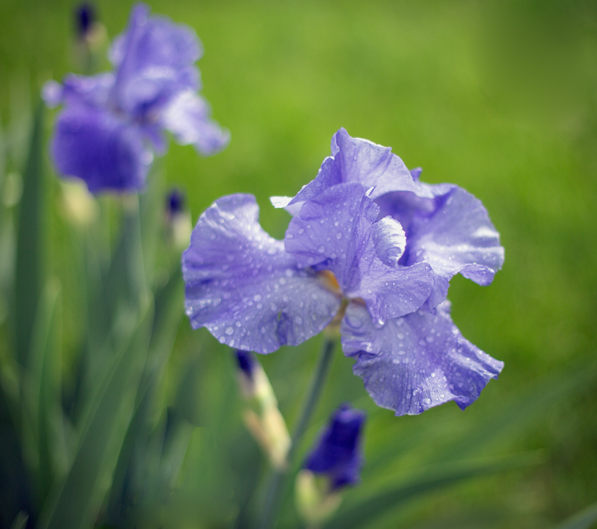
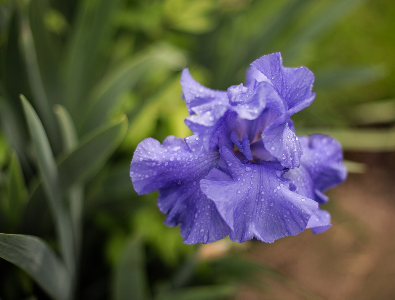
Hi, Pinaki!
Wow! Capturing these Iris blooms would be a complicated challenge for me. To my eye, the focus on the center bloom is tack sharp, and the complex patterns of petal markings, textures, and shapes in all three flowers are revealed beautifully.
As Bev mentions, darkening the background allows the flowers to pop although the background continues to feel busy to me. Initially, I also attempted to add a Gaussian blur and darken the background but this did not detract from its busy appearance. Nevertheless I'm really drawn to this image, as it makes me of think of Van Gogh's complex paintings of fields of irises and magic eye illusions. To me admiring these irises against the busy background reminds me of the vastness of nature. |
Aug 14th |
| 24 |
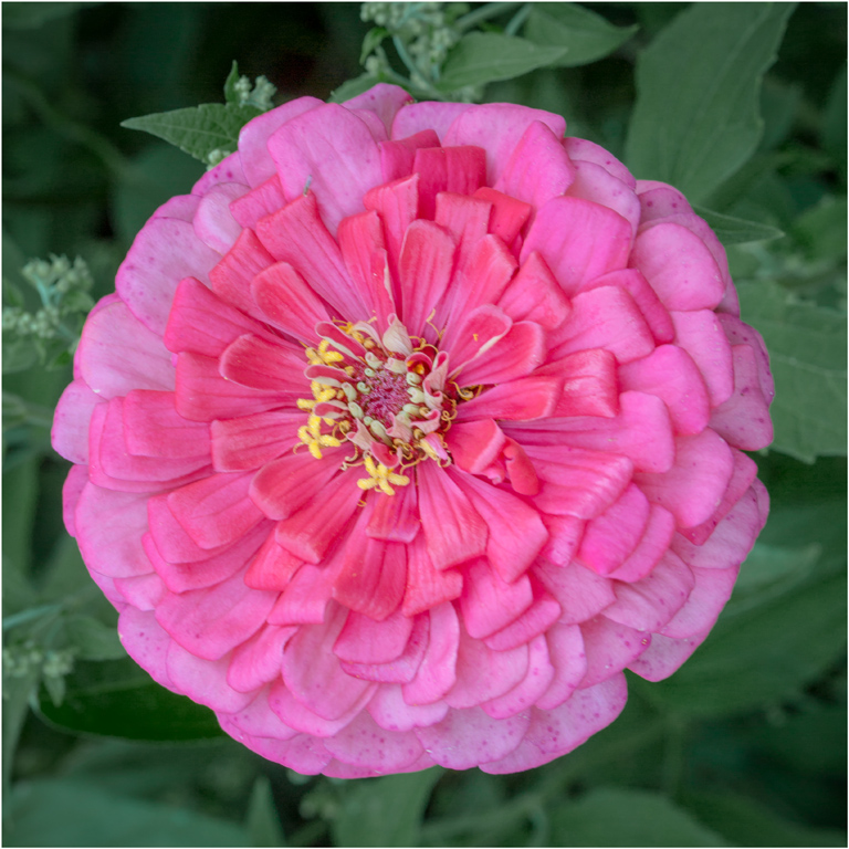
Aug 23 |
Comment |
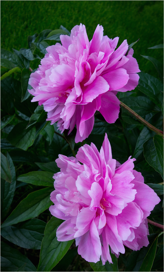
Hi, Yvonne!
The contrast of vibrant pink against the lush green background works for me. To my eye the brightness and blur of the background appear natural.
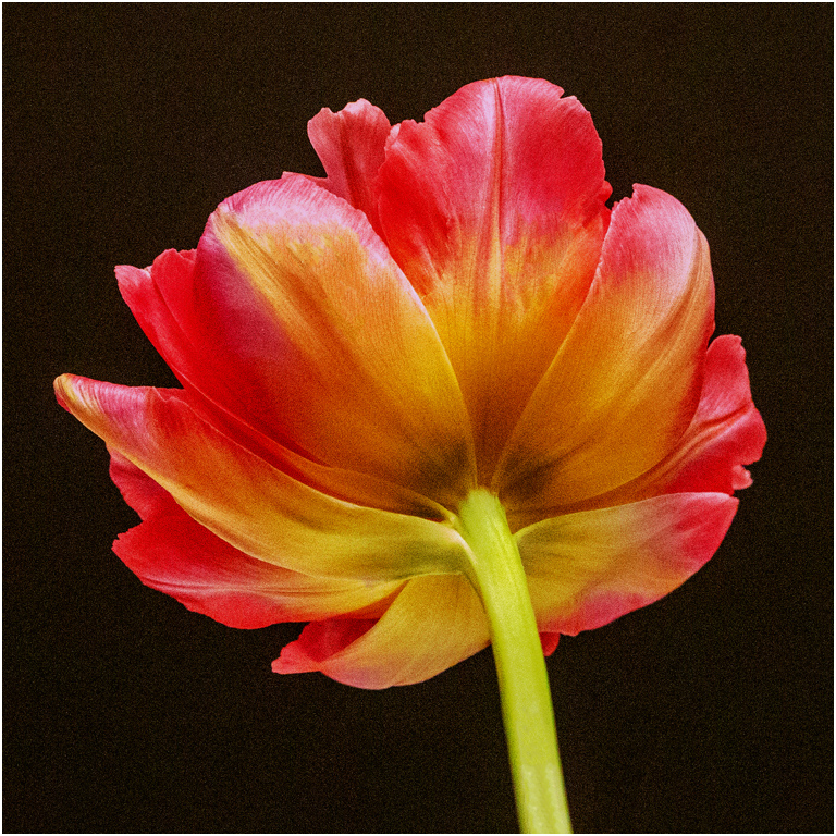
I wish there was a bit more backlighting of the petals to highlight their translucency and add more depth to this lovely image. |
Aug 14th |
| 24 |
Aug 23 |
Comment |
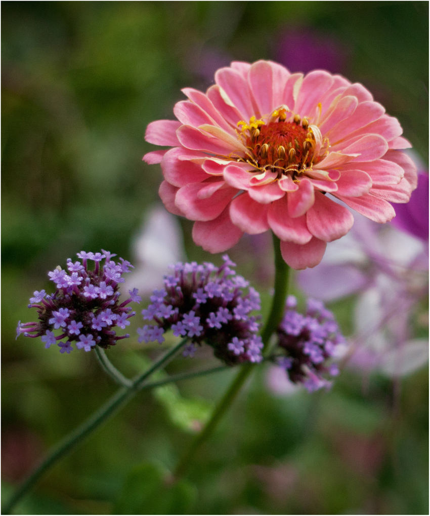
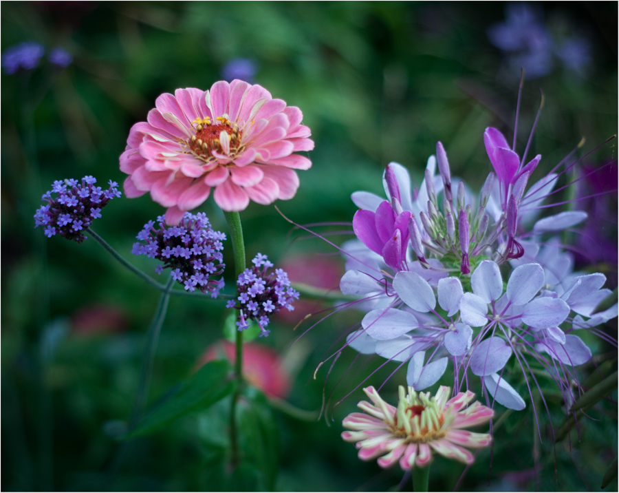
Hi, Fred!
Seeing the verbena from the lower eyelevel perspective adds interest for me and the diagonal composition seems to make the image dynamic. To my eye the painterly background softness complements the delicacy of the focused blooms.
I think the little pop of vibrancy suggested by Bev enhances your lovely image for me. |
Aug 14th |
| 24 |
Aug 23 |
Comment |
Hi, Bev!
To my eye this triplet of orange fire lilies glows! Their diagonal arrangement covey a sense of movement for me which adds interest. I like seeing the green leaves because I think they add some helpful context that grounds the blooms. |
Aug 14th |
| 24 |
Aug 23 |
Comment |
Hi, Tom!
To my eye this is a lovely capture and although I like Bev's suggested changes, I prefer the softer feel of the original with less contrast of the background against the large sunflower.
I enjoy admiring the two opposing spirals created by the arrangements of the seeds in the flower's center but wish this area had a bit less shadow. |
Aug 14th |
5 comments - 3 replies for Group 24
|
10 comments - 5 replies Total
|