|
| Group |
Round |
C/R |
Comment |
Date |
Image |
| 52 |
Aug 22 |
Reply |
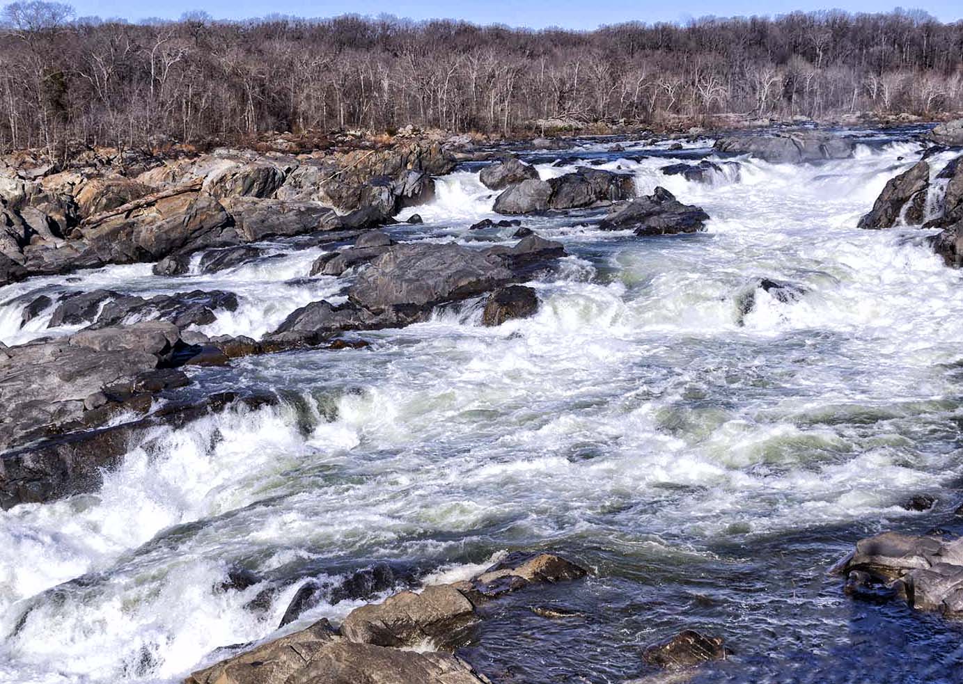
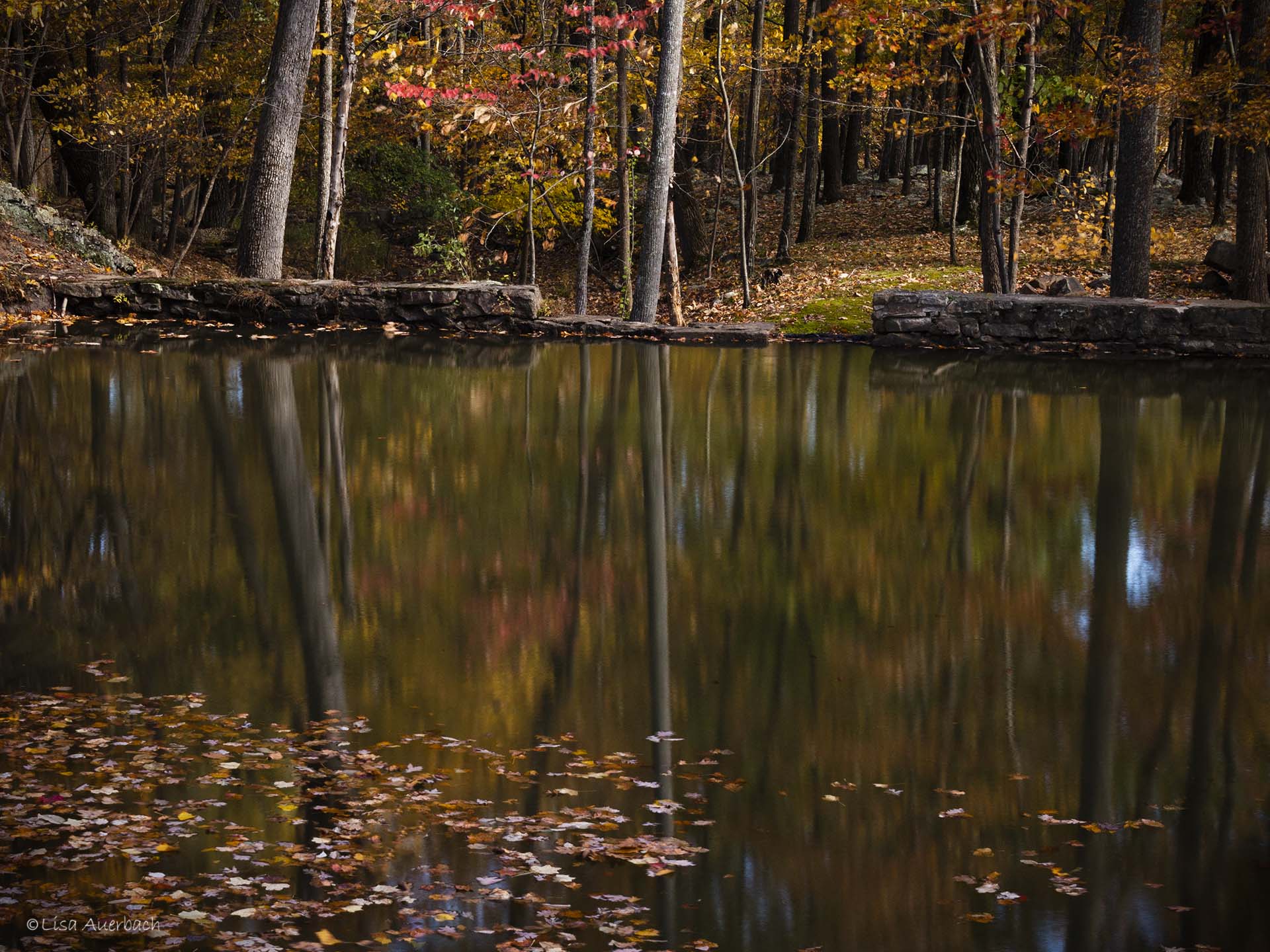
I like the crop and do agree the foreground is too much. I like a bluer green and tend not to like warm images so the answer is probably somewhere between your coloration and Mike's. I'll play with the tools you suggested to see where the right color background works for me.
Thank you all for your suggestions. |
Aug 12th |
| 52 |
Aug 22 |
Reply |
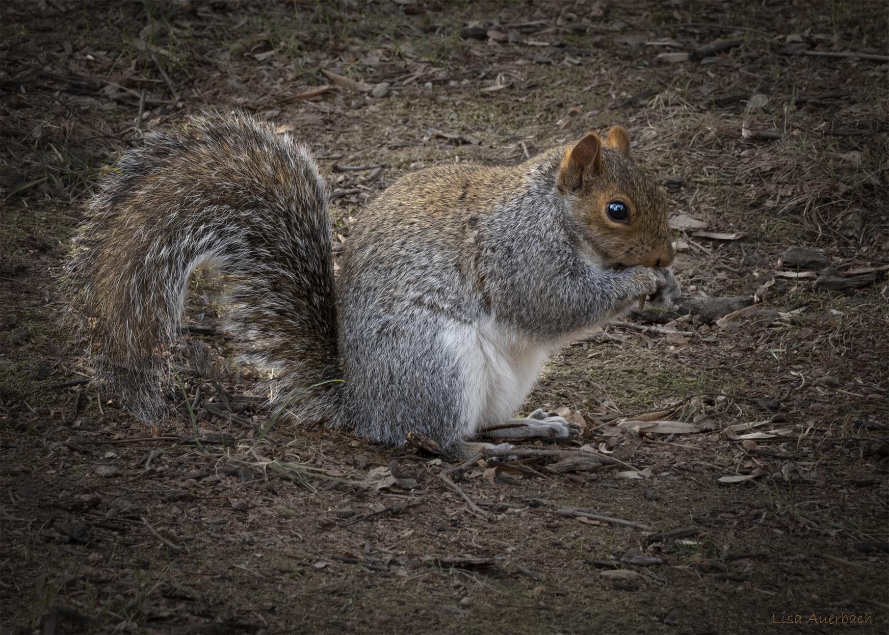
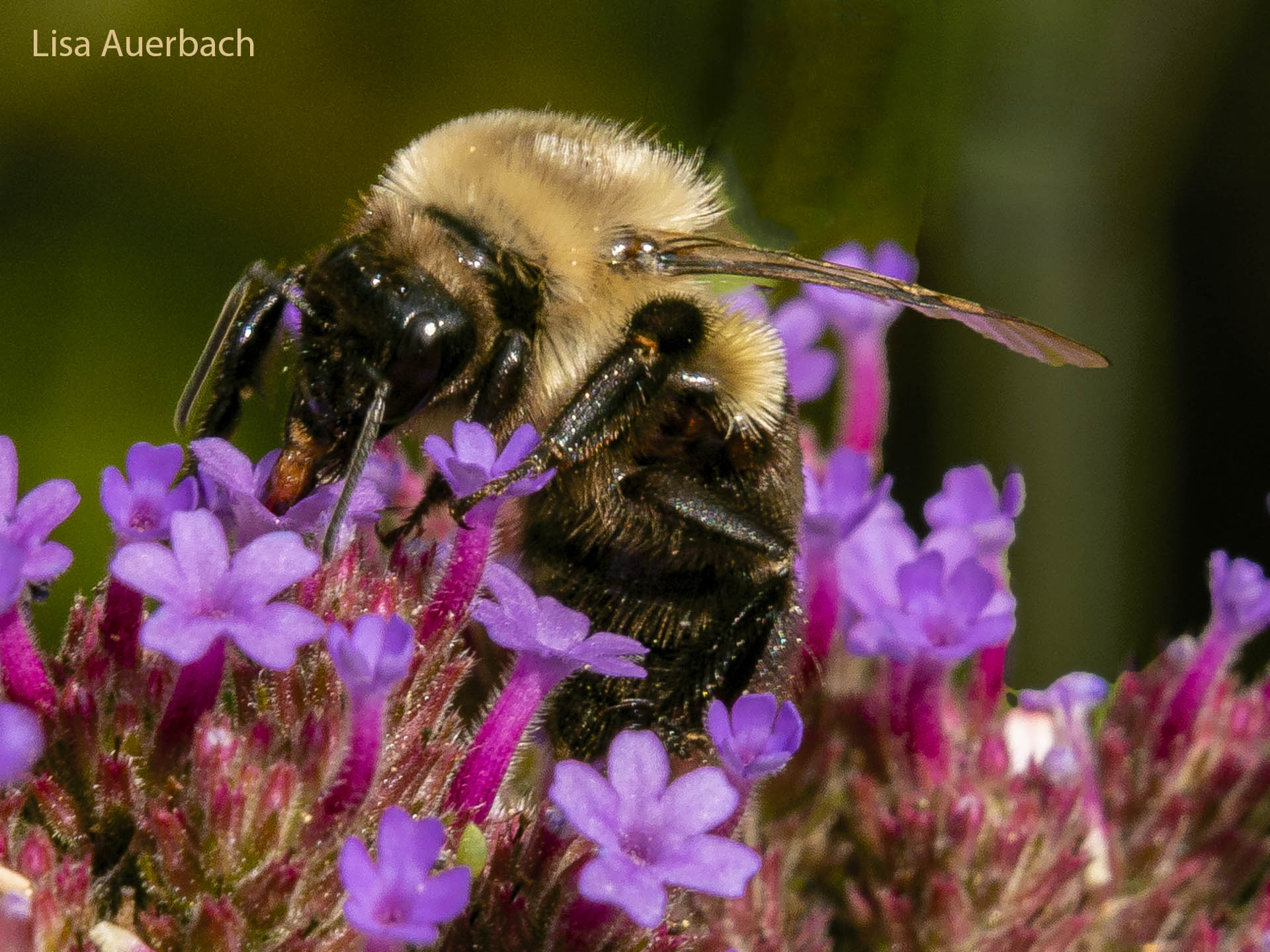
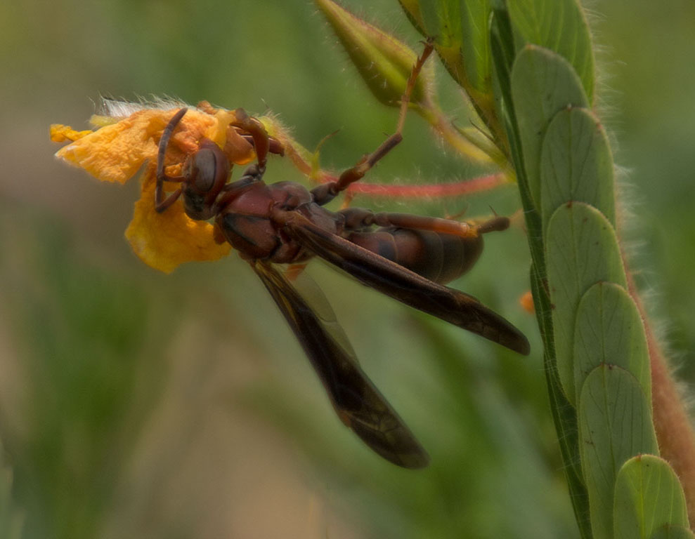
My eye travels all over the image and doesn't rest on the brown button; however I do notice it. It seems odd to me because it is the only thing that is not sharp. That was my thought when I looked at it. The rest of the image is quite sharp.
I am attaching a copy of your image and have circled the orange spot and a green spot. I think it would help to remove the two spots.vThey don't seem to be attached to something else. |
Aug 12th |
 |
| 52 |
Aug 22 |
Comment |
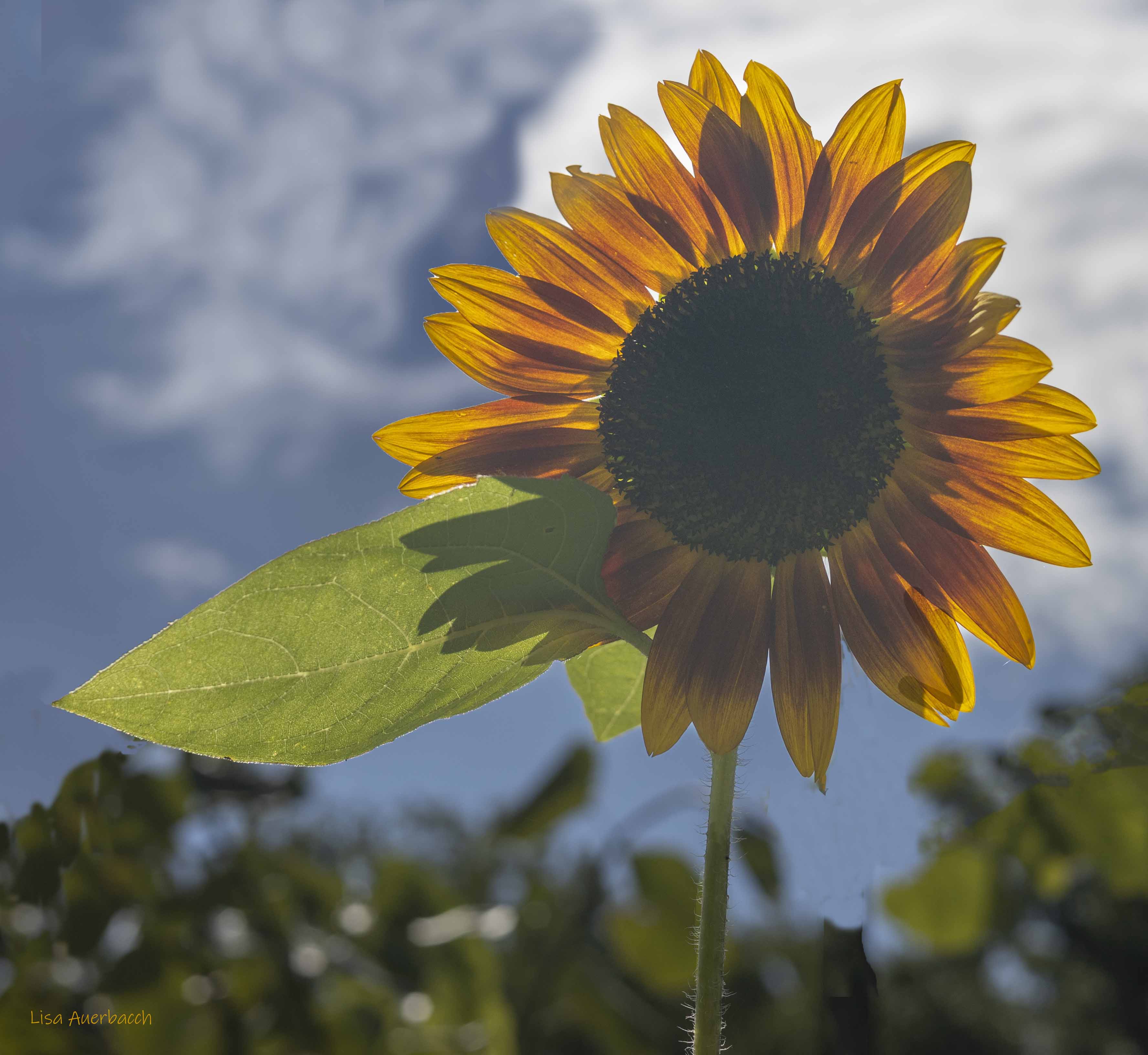
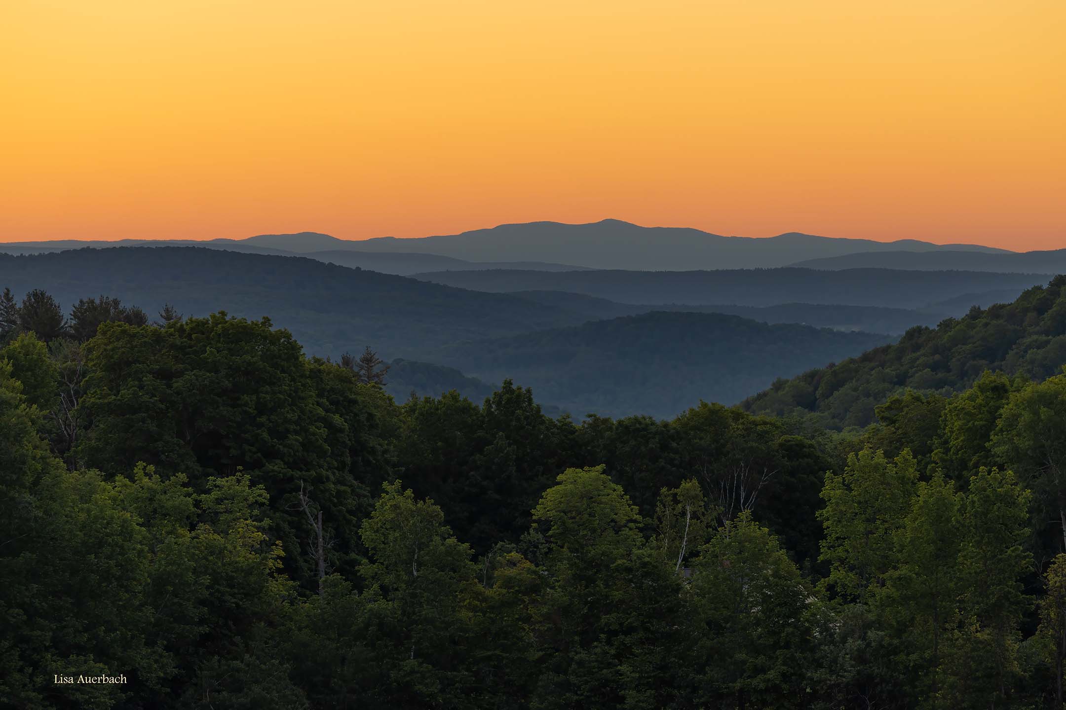
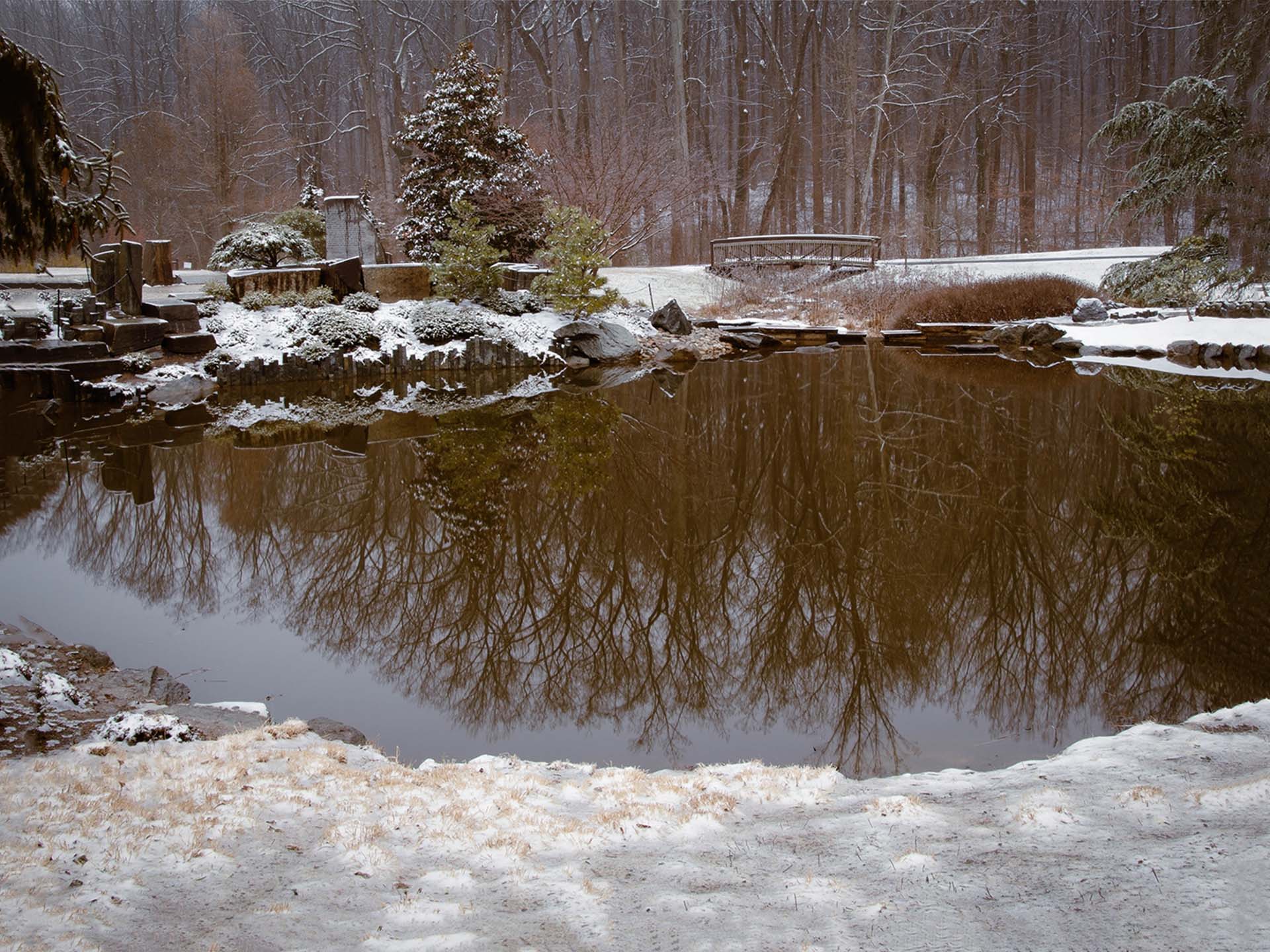
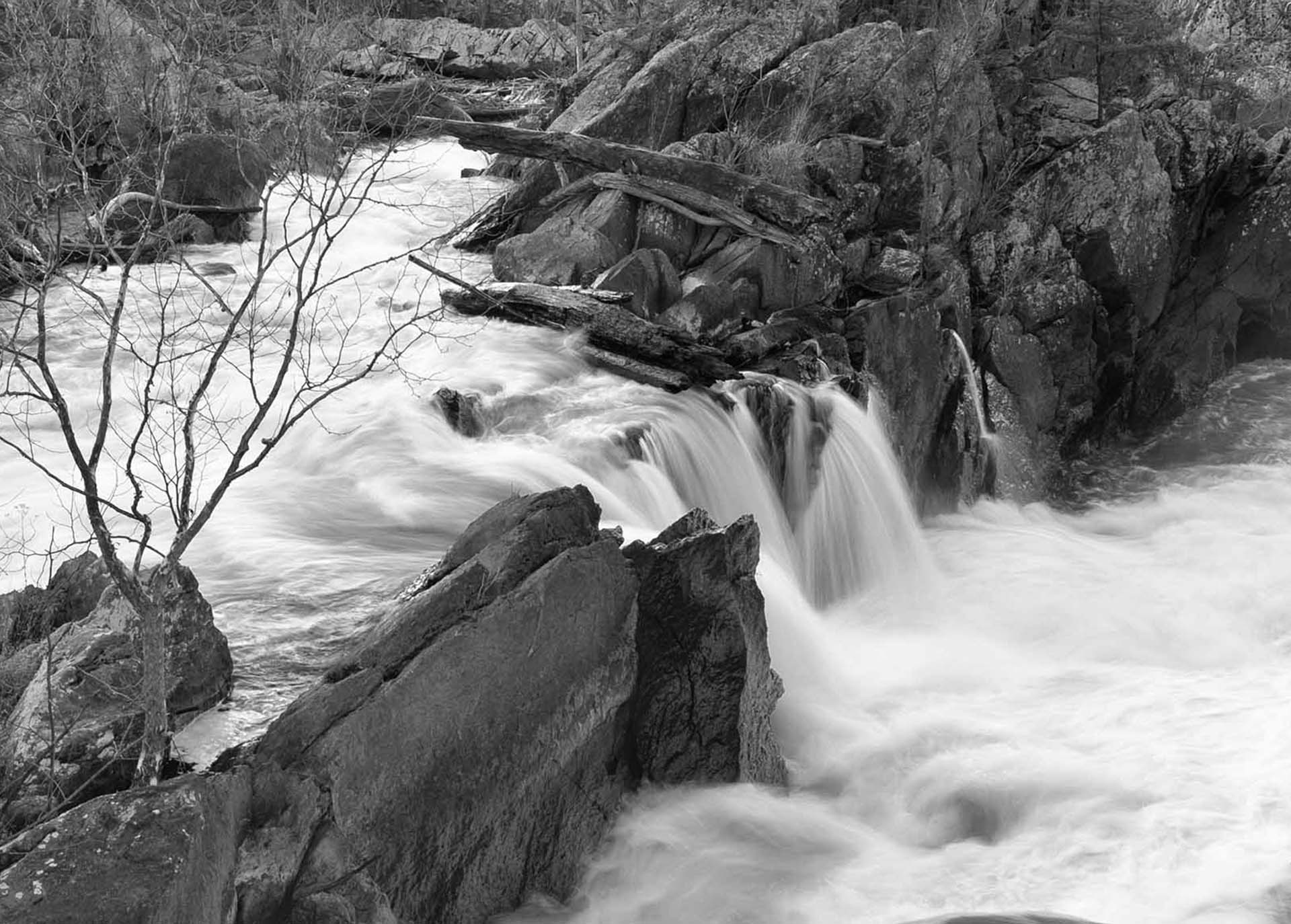
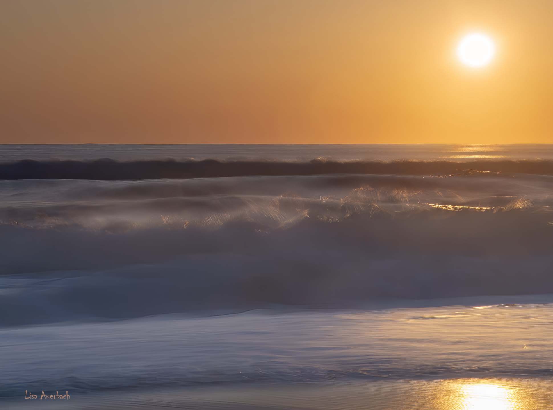
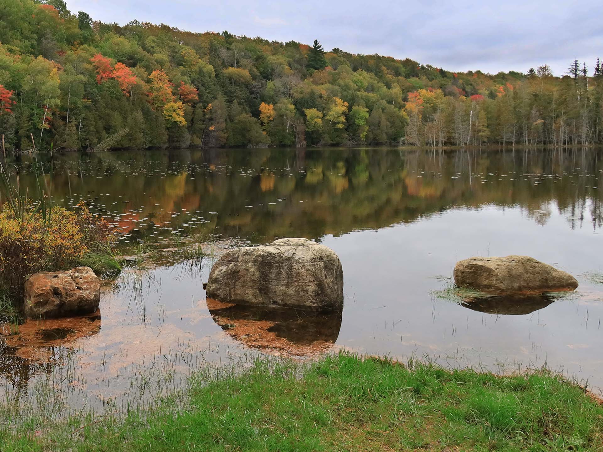
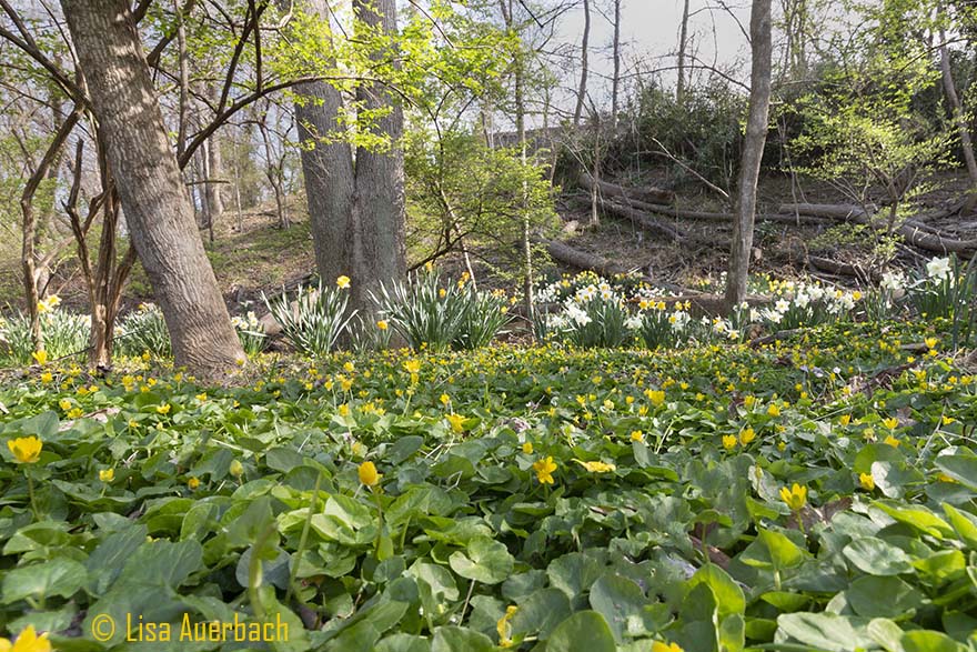
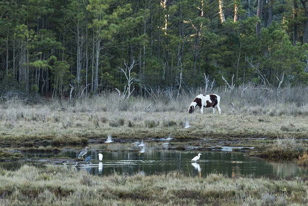
I like your treatment of sun. It catches my attention without being too bright. The clouds stand tall around it to add interest. I also like your foreground and cannot decide if the shadows could benefit from being raised. I would like to see some blue in the water. Not much at all but a little. Finally, your horizon needs a small amount of straightening.
I like the shot. |
Aug 10th |
| 52 |
Aug 22 |
Comment |
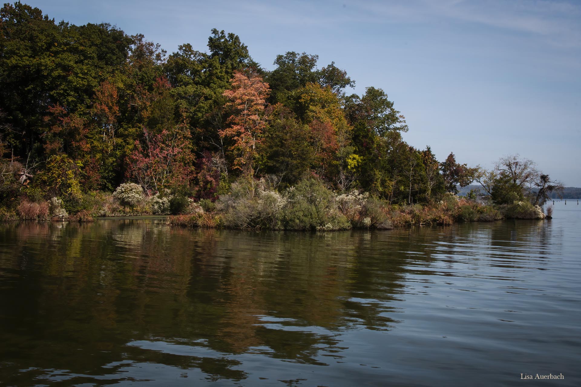
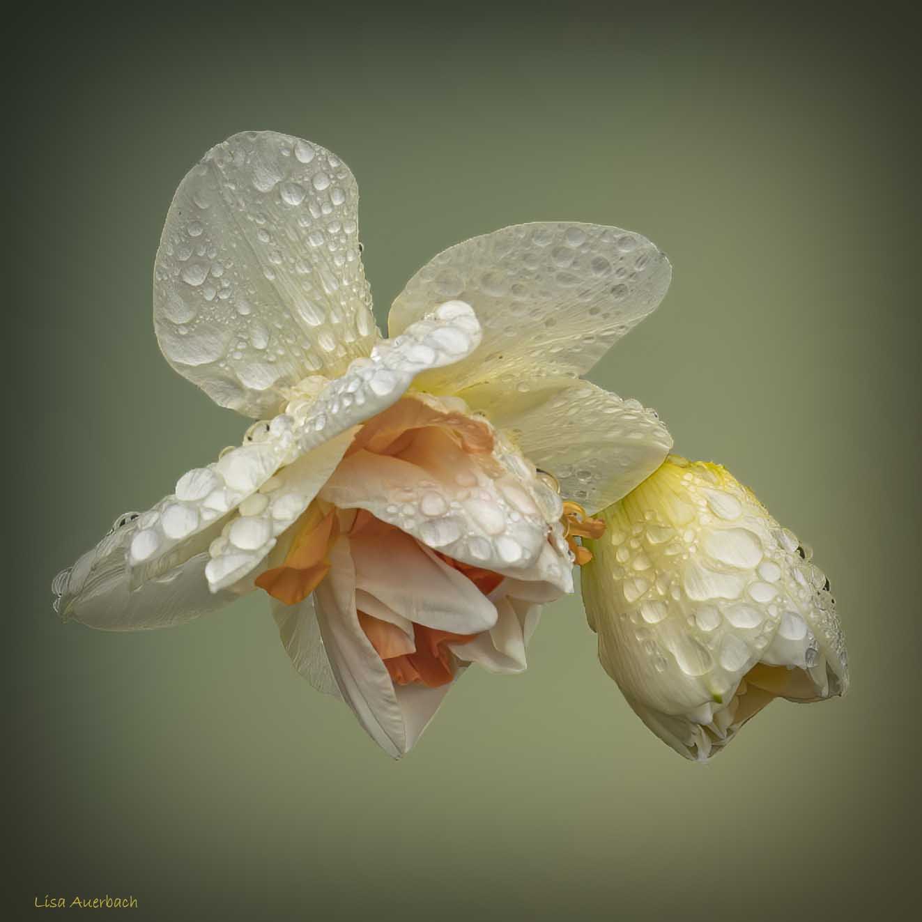
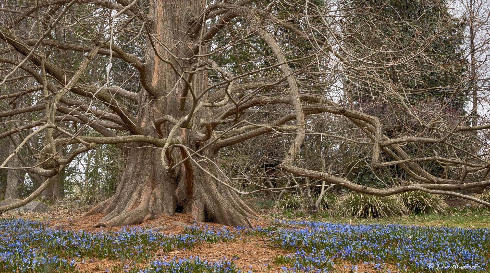
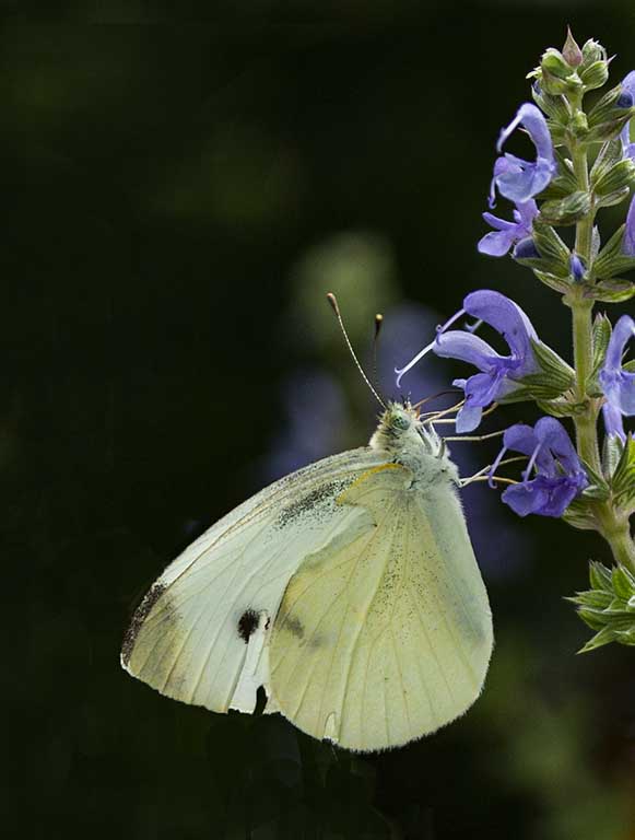
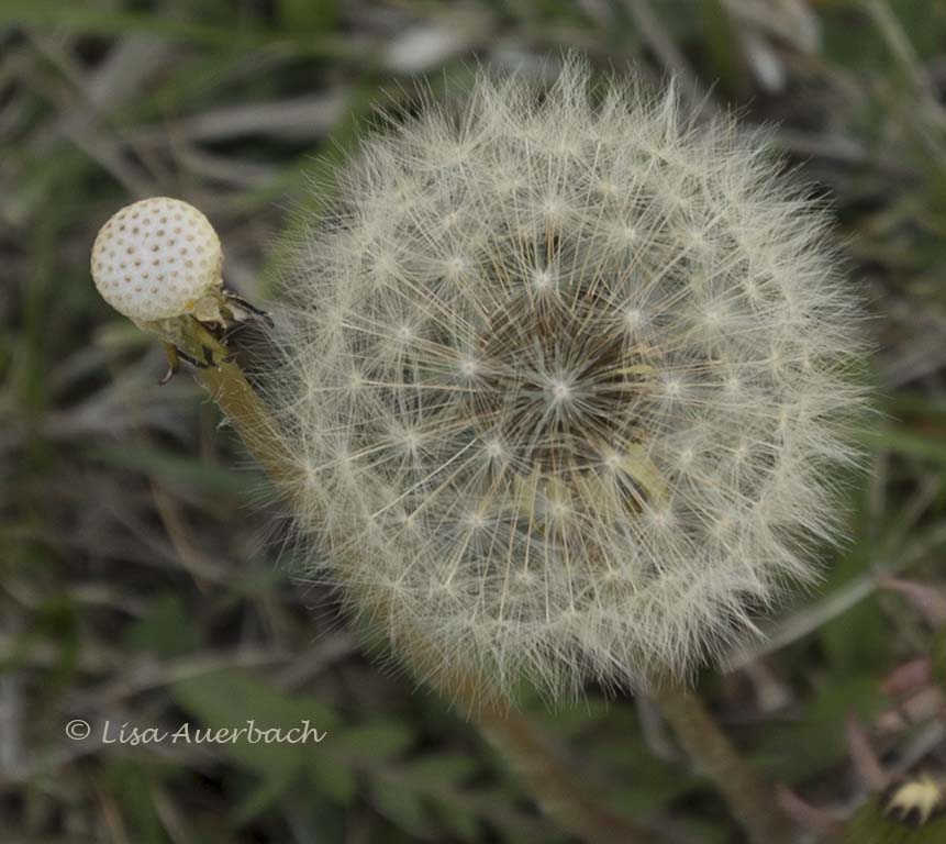
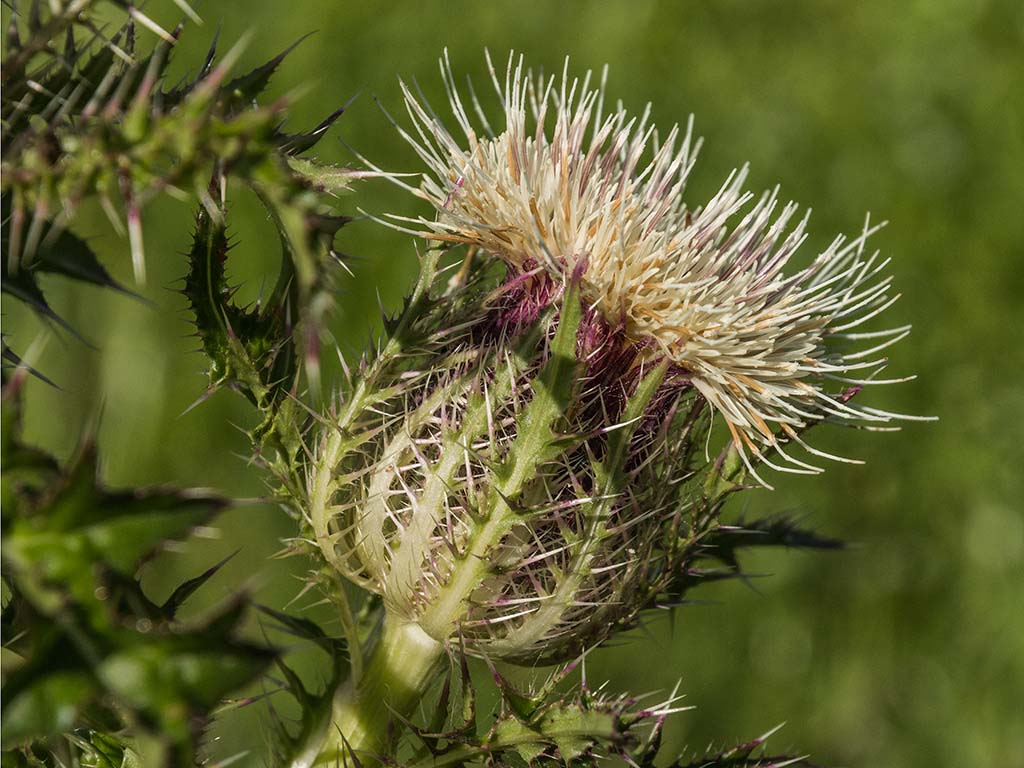
I like both the original and what you have done with it. Rotating it works as does darkening the background. The lines take me around the image as if I were following a road. I like the stems at the bottom and think it would be interesting to include more of them. |
Aug 10th |
| 52 |
Aug 22 |
Comment |
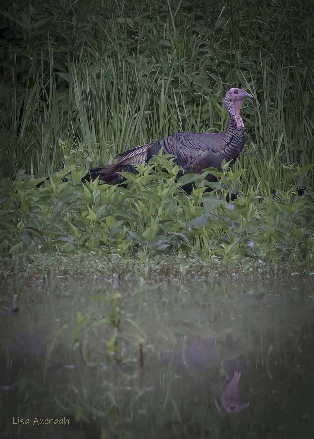
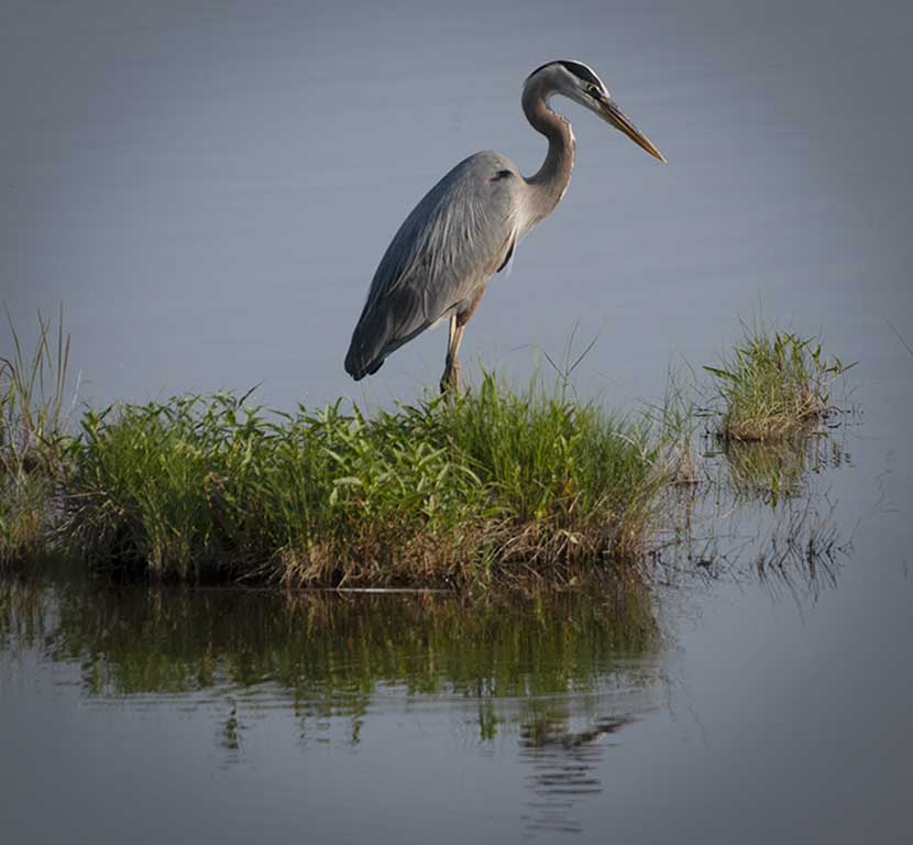
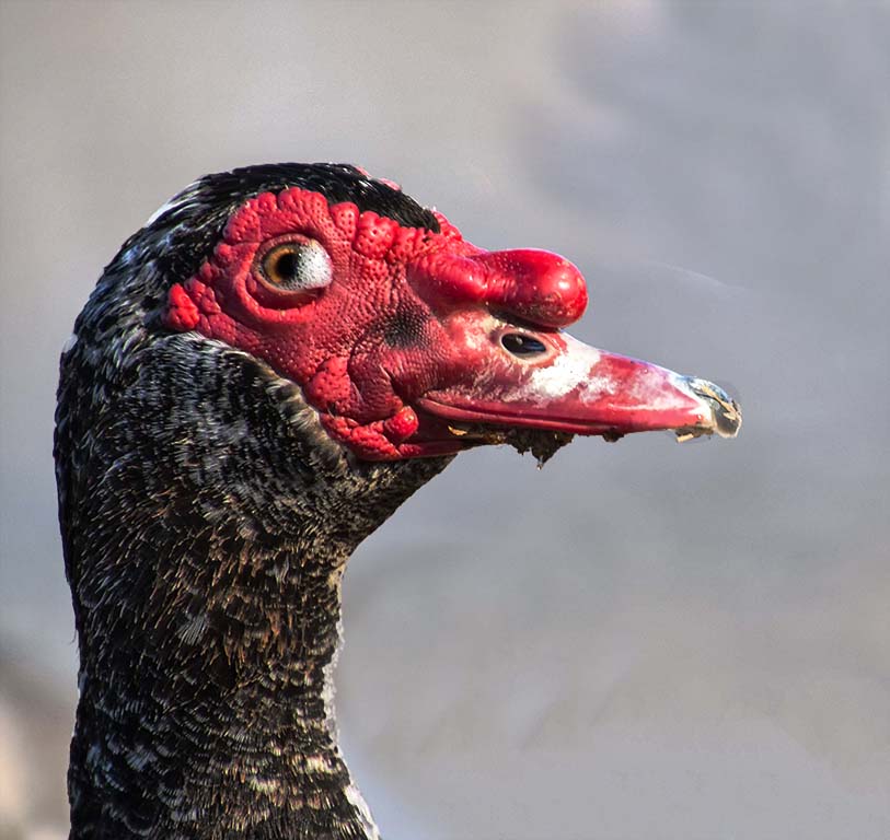
Such clear captivating eyes and feathers. You are correct to use the word, intimate. This is a grand image. |
Aug 10th |
| 52 |
Aug 22 |
Comment |
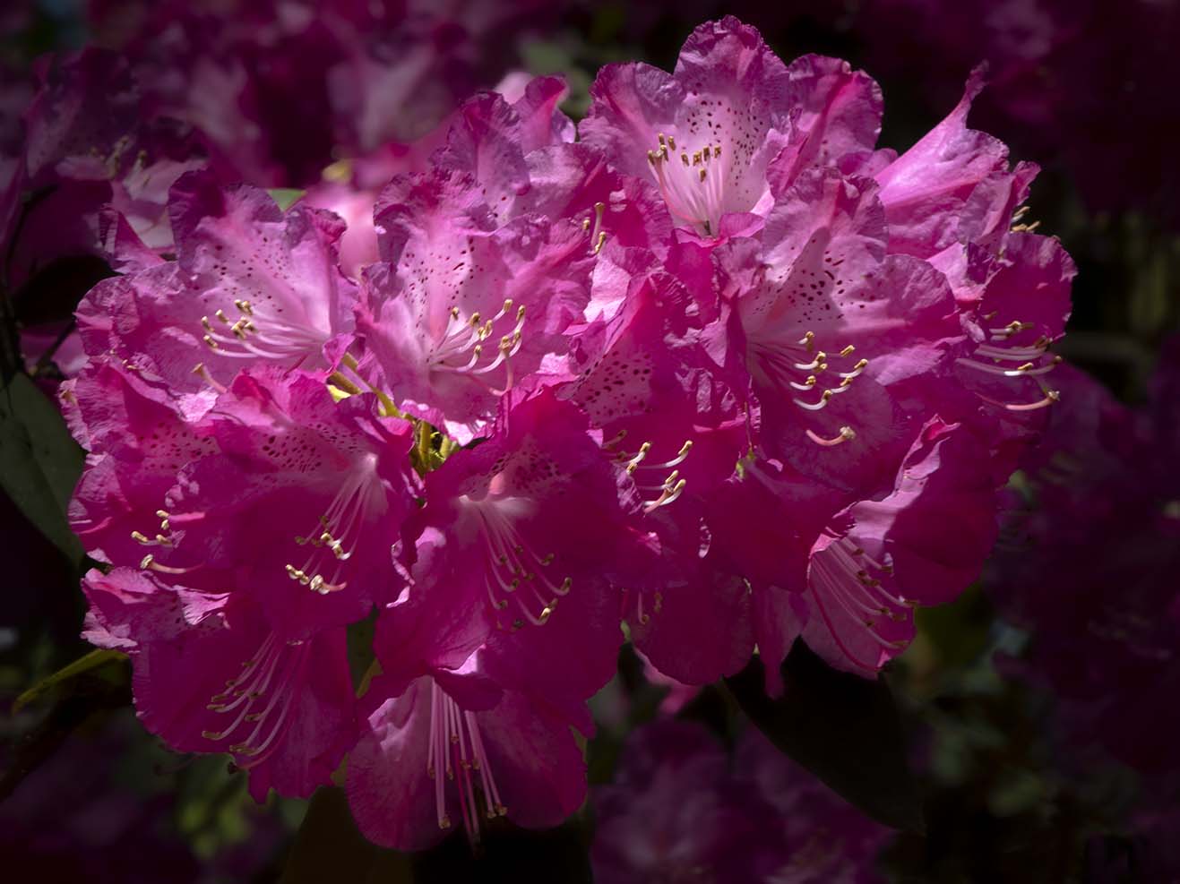
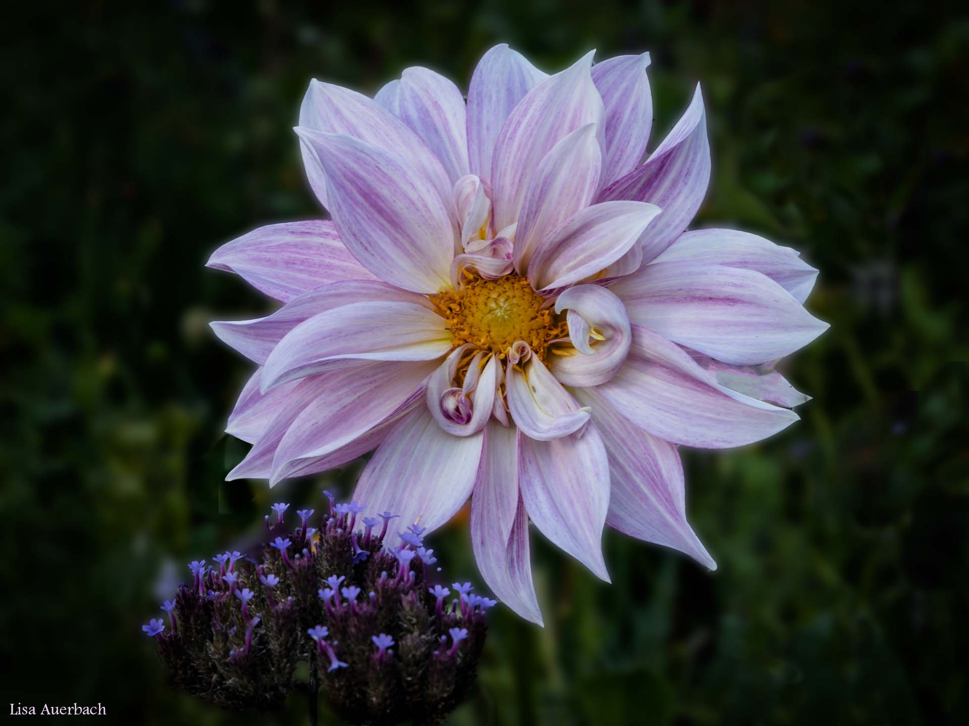
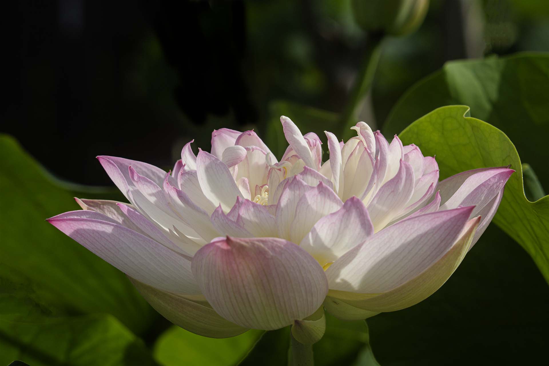
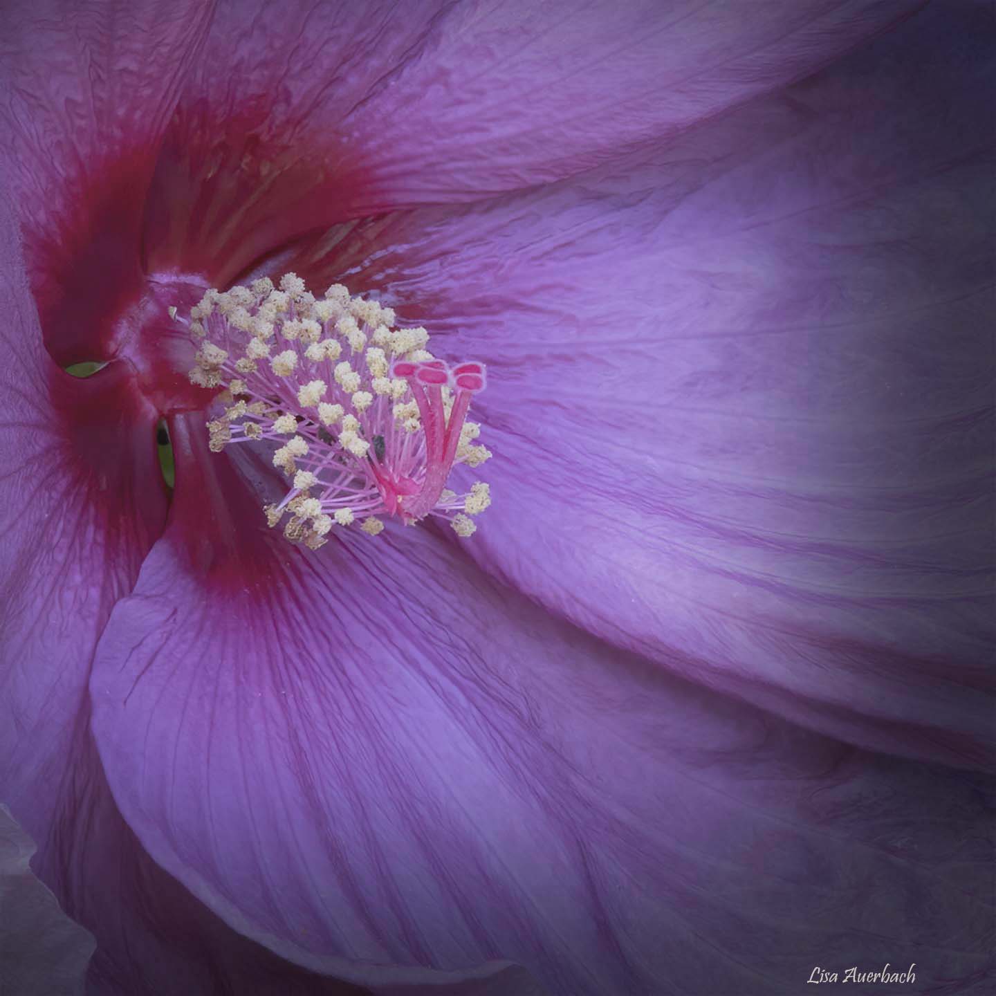
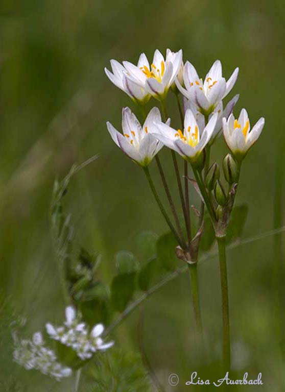
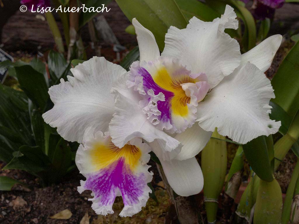
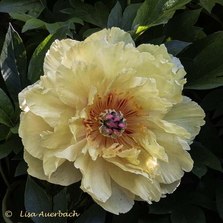
What very pretty flowers. The colors are varied and work well together. I do think darkening the background makes the other flowers more interesting and vivid. However I would not go to an extremely dark background because yours adds texture and interest to the whole. |
Aug 10th |
| 52 |
Aug 22 |
Comment |
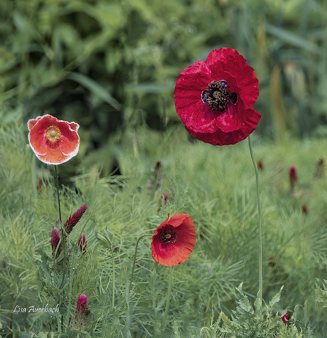
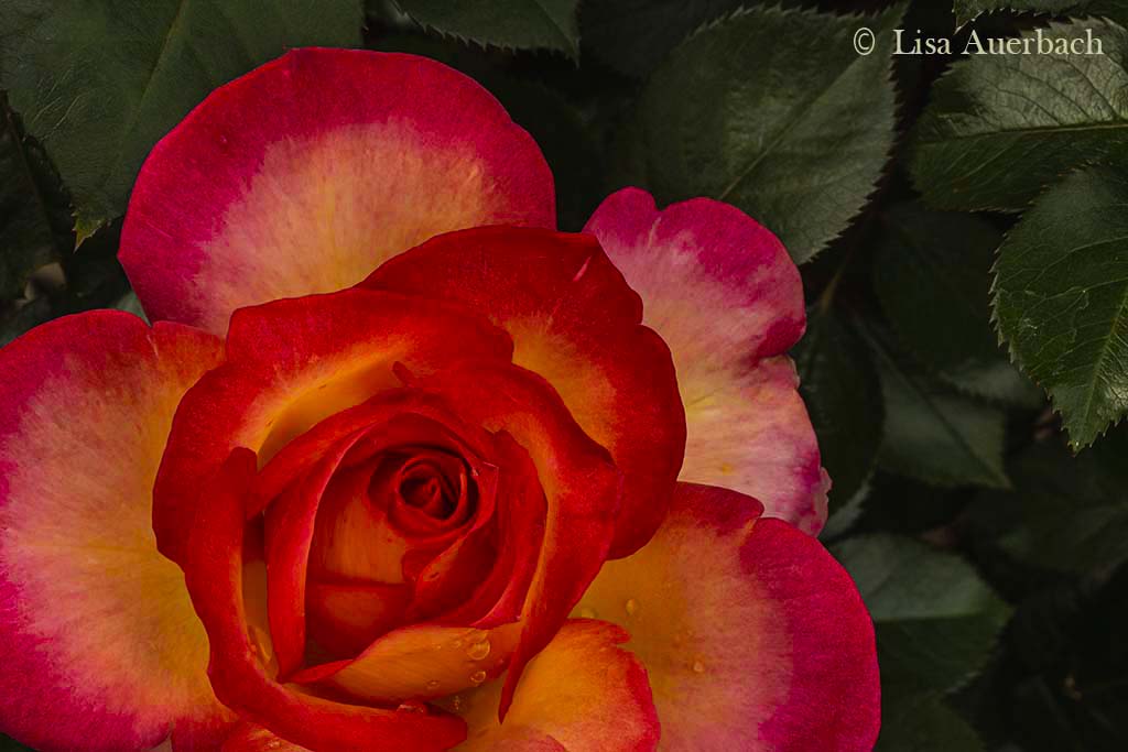
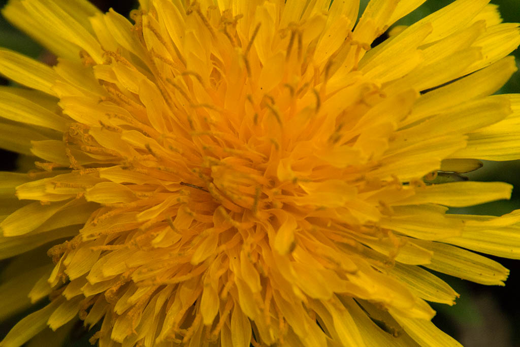
I very much like the color scheme. The green backgound sets off the flower. The orange and yellow pop. The poppy has good texture, in its petals, and rotating it worked well. I think you did a good job on your background. I see two distractions. One is the big circle left of the poppy. The other is a line of orange in the green background near the bottom curve of the left poppy petal. |
Aug 10th |
| 52 |
Aug 22 |
Comment |
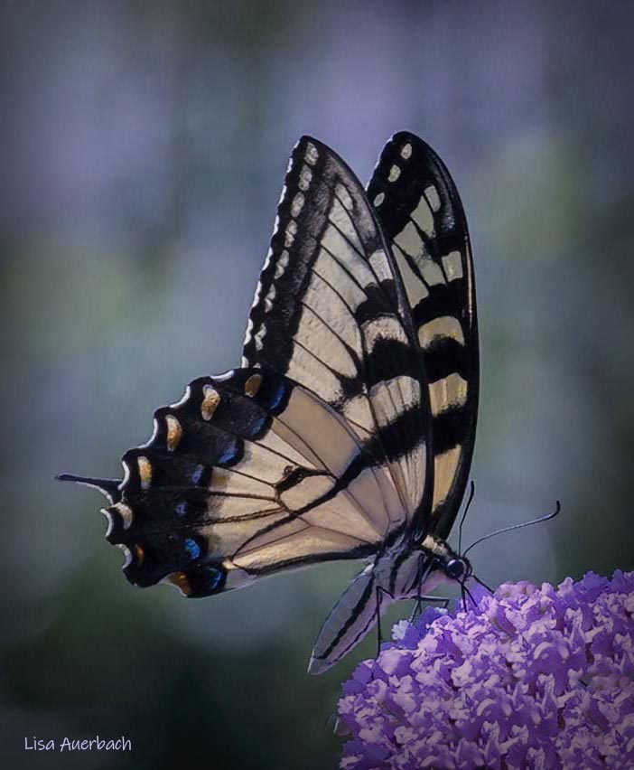
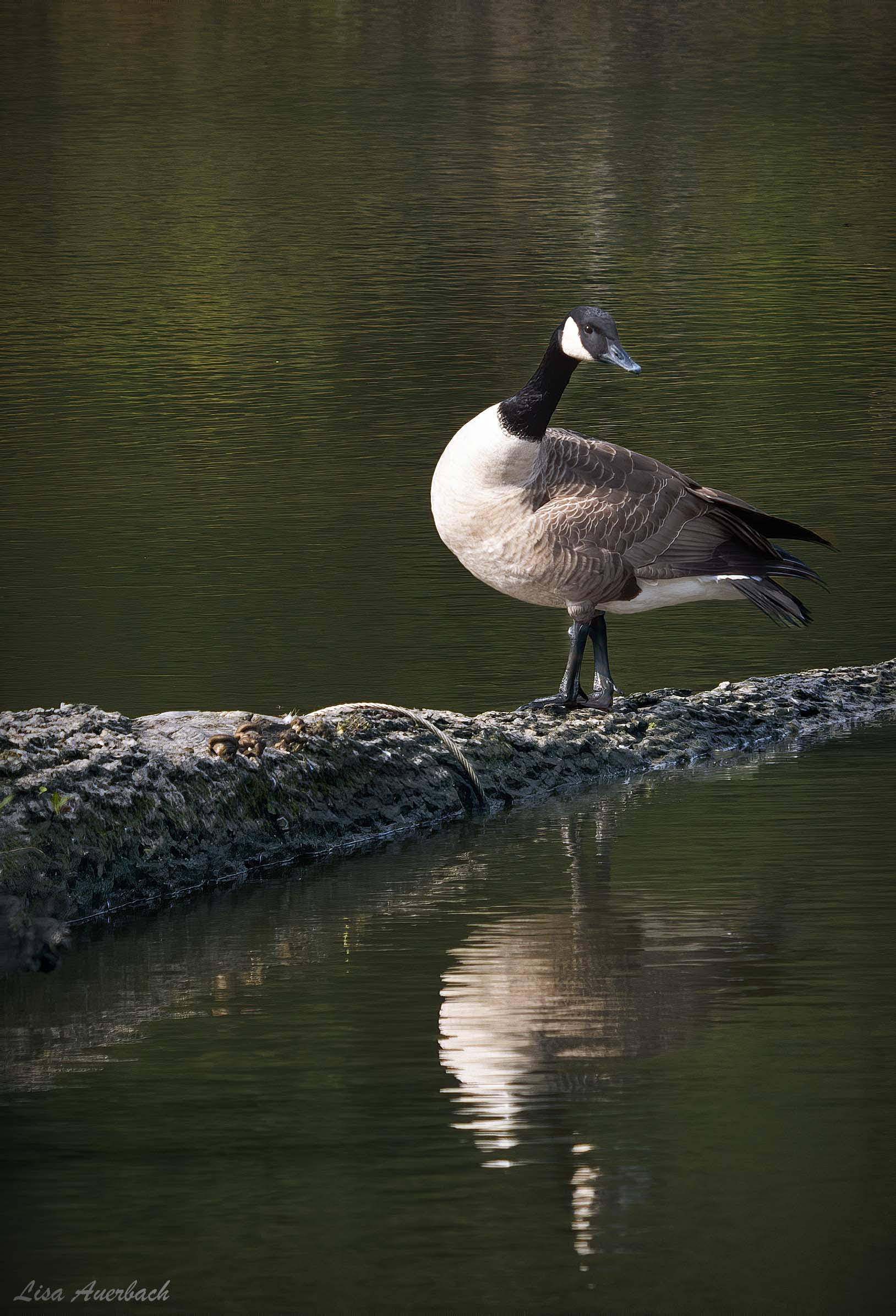
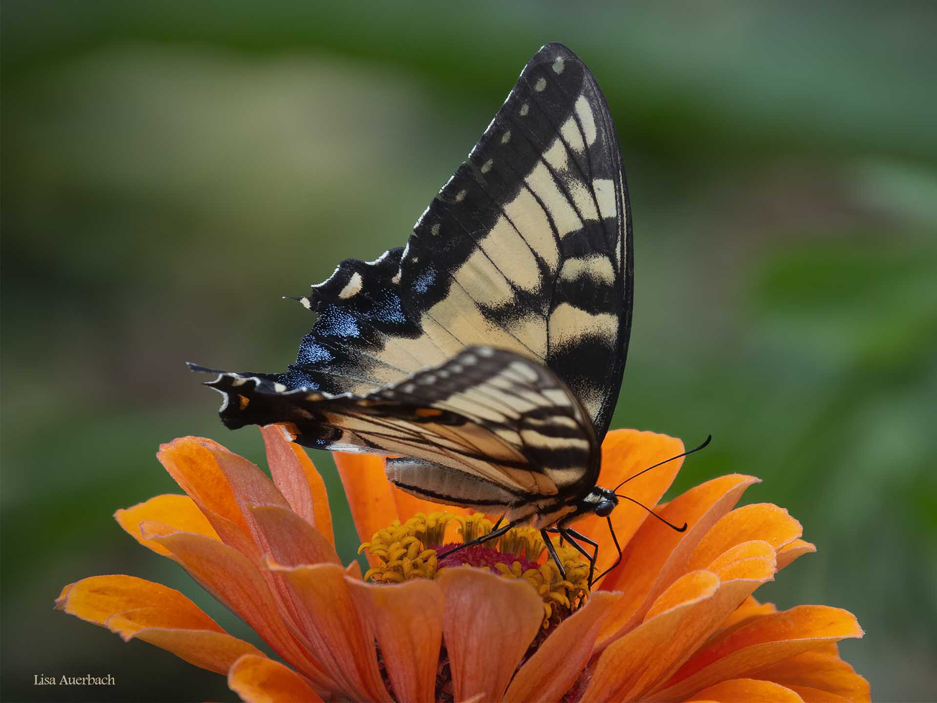
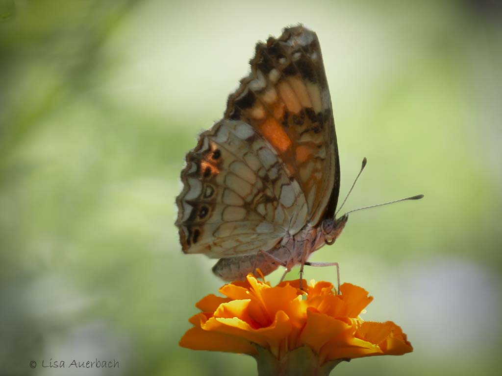
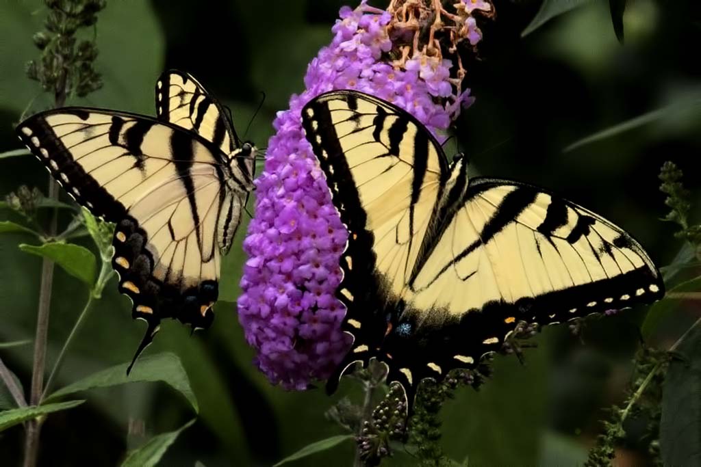
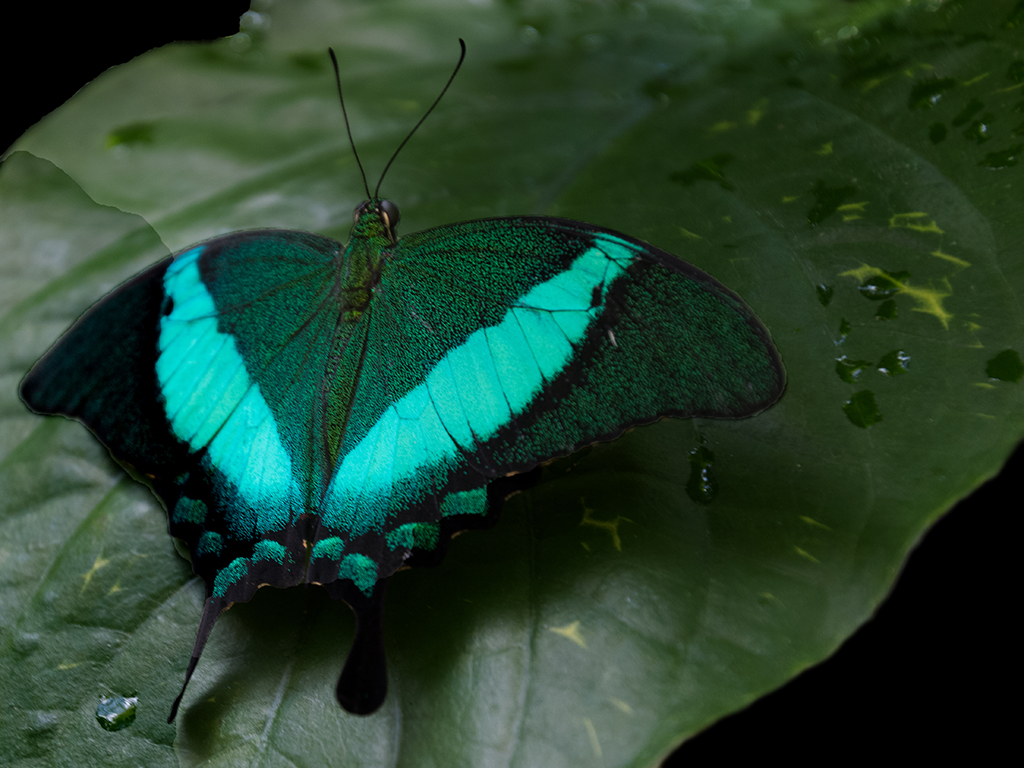
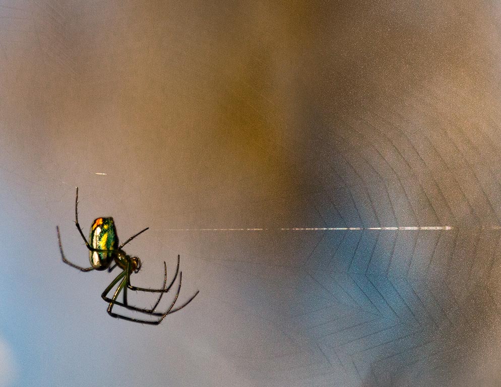
Getting both sides of left butterfly's wings adds to the shot. I have a full image of what the butterfly looks like. The button bush adds more color to the shot, and I like the color of the background. And, I am often impressed with how well you separate the subject from the background.
The brown background button on the bush is a distraction because it is dead center. I see it quite soon. At the top of that is an orange spot that is not attached to the rest of the flower. The last thing that pulls my attention is the left wing. When compared to the original, it seems too purple. I think decreasing the purple will add to the shot.
|
Aug 10th |
| 52 |
Aug 22 |
Comment |
Thank you, Mike. I like this much more except for cutting off the tail. I kept what I did because of the reflection. I like the tone of the image that you provided. I'll see what I can change for the crop and play with color. |
Aug 10th |
7 comments - 2 replies for Group 52
|
7 comments - 2 replies Total
|