|
| Group |
Round |
C/R |
Comment |
Date |
Image |
| 52 |
Jan 22 |
Comment |
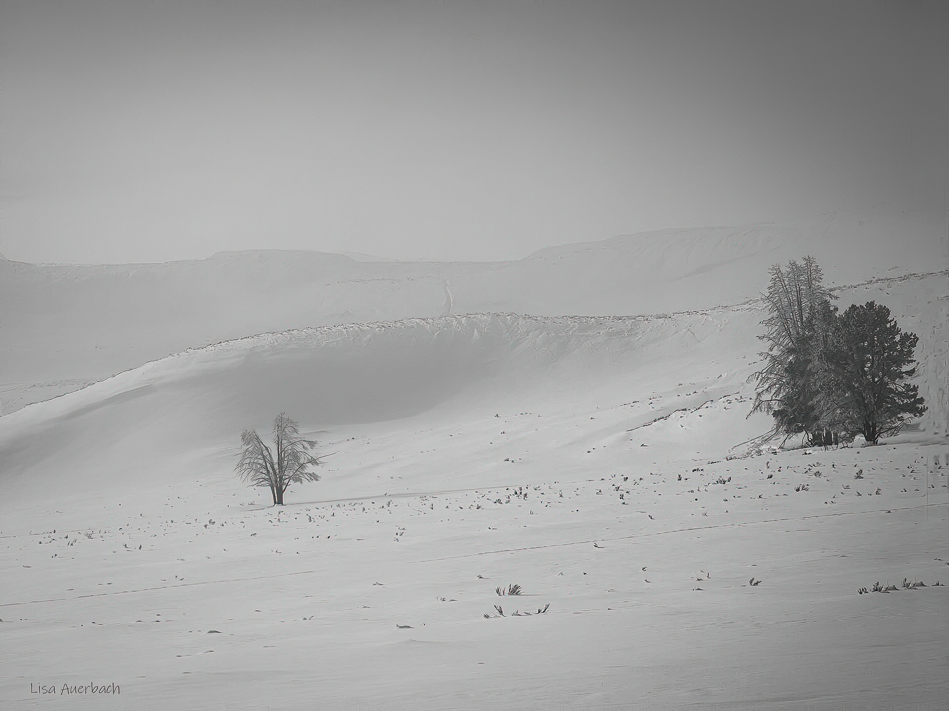
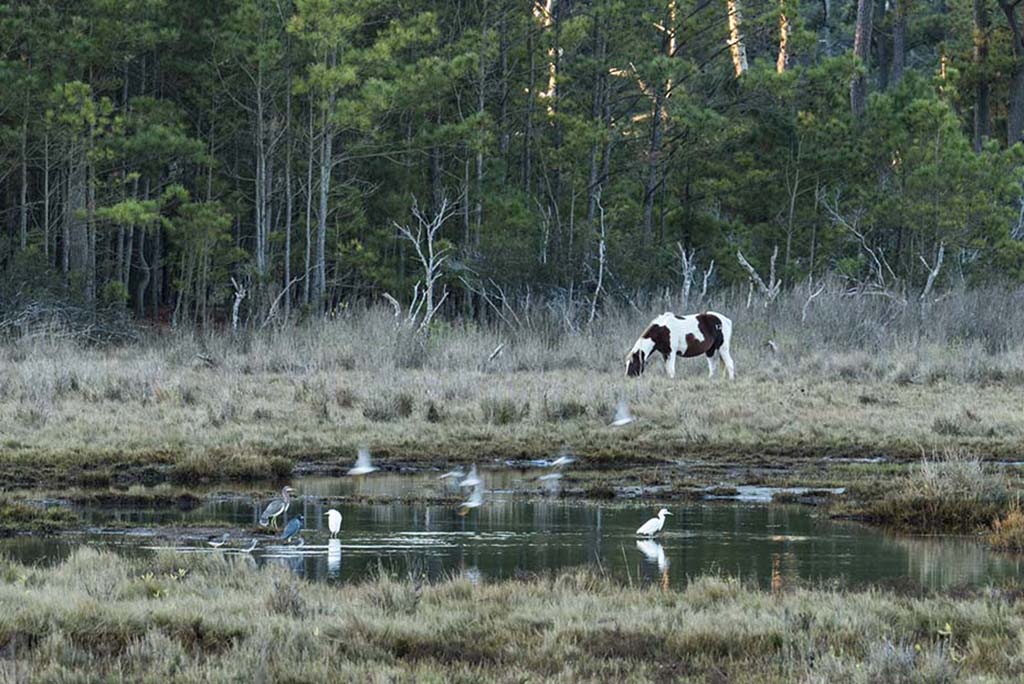
I did try working with the background and will continue. I like the suggestions and a combination of them might work, esp. the tighter crop.
Thank you |
Jan 17th |
| 52 |
Jan 22 |
Reply |
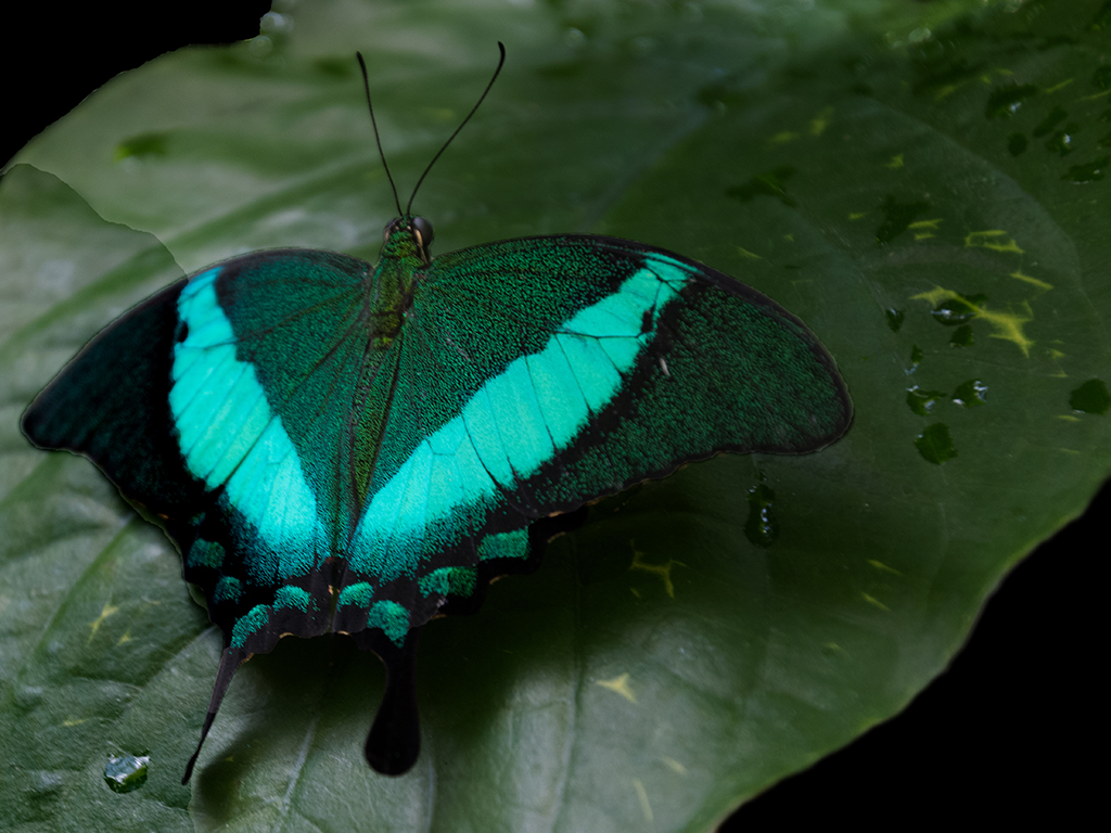
You nailed it. The colors are natural and beautiful. The sky is realistic. The scene works.
Well done. |
Jan 14th |
| 52 |
Jan 22 |
Comment |
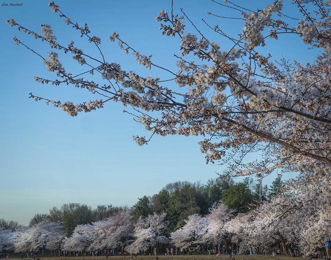
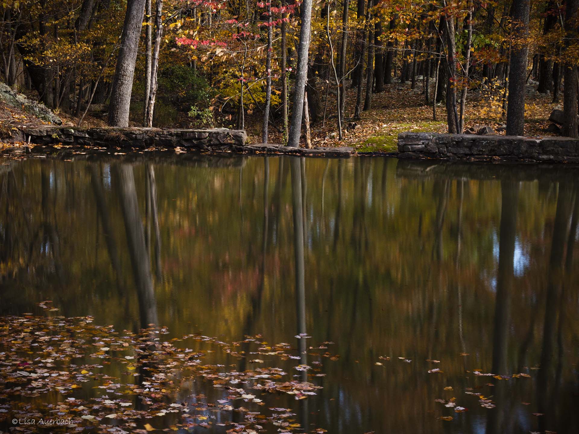
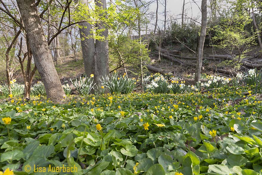
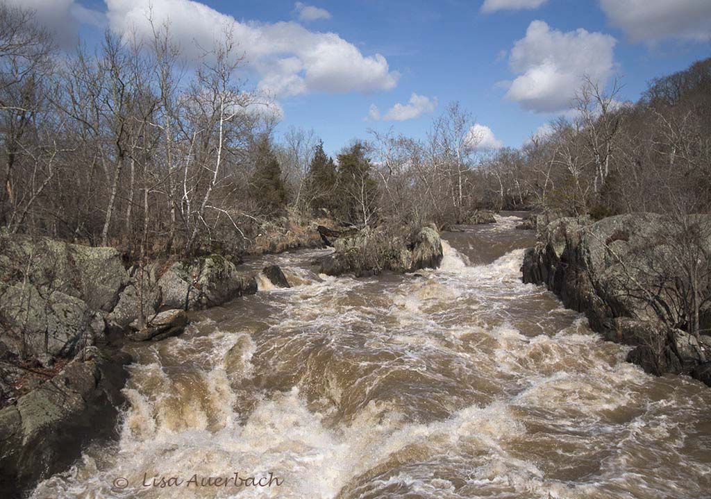
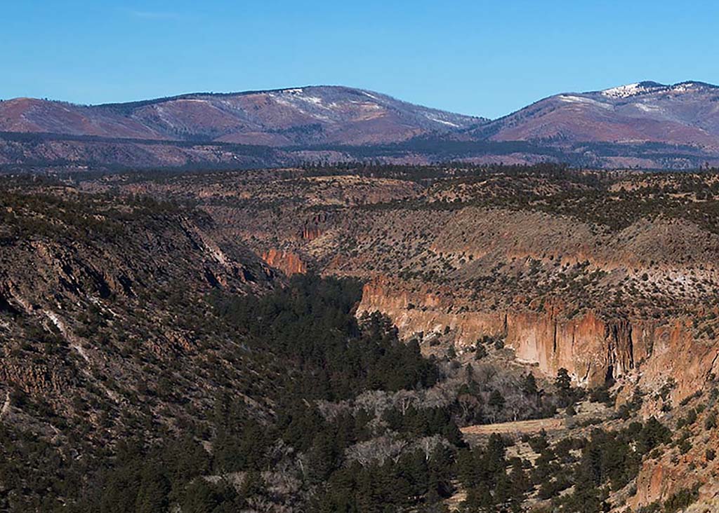
The rich texture and horizontal lines draw my interest, and I think the way you have handled colors pull these to attention. However, the sky is a bit too dark blue for my taste, and it competes with the landscape. For me the story is in the land. |
Jan 14th |
| 52 |
Jan 22 |
Comment |
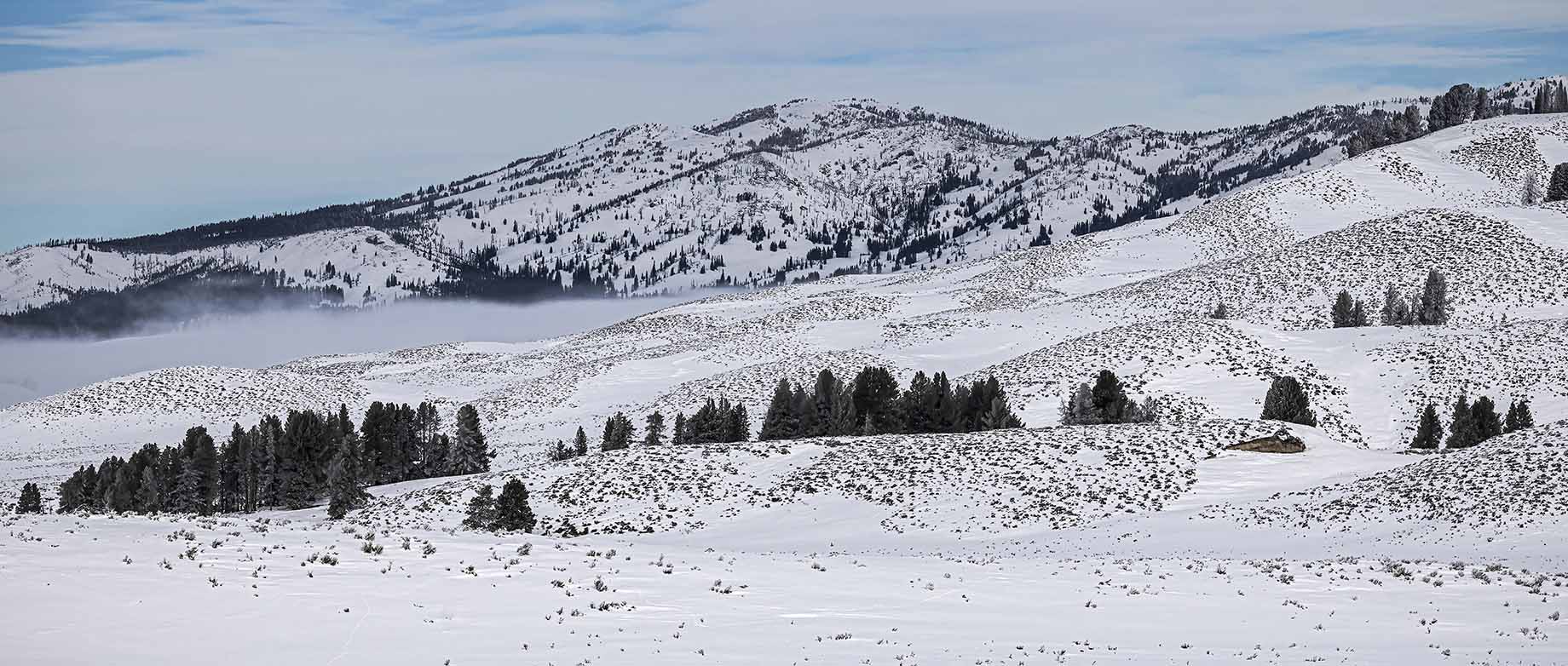
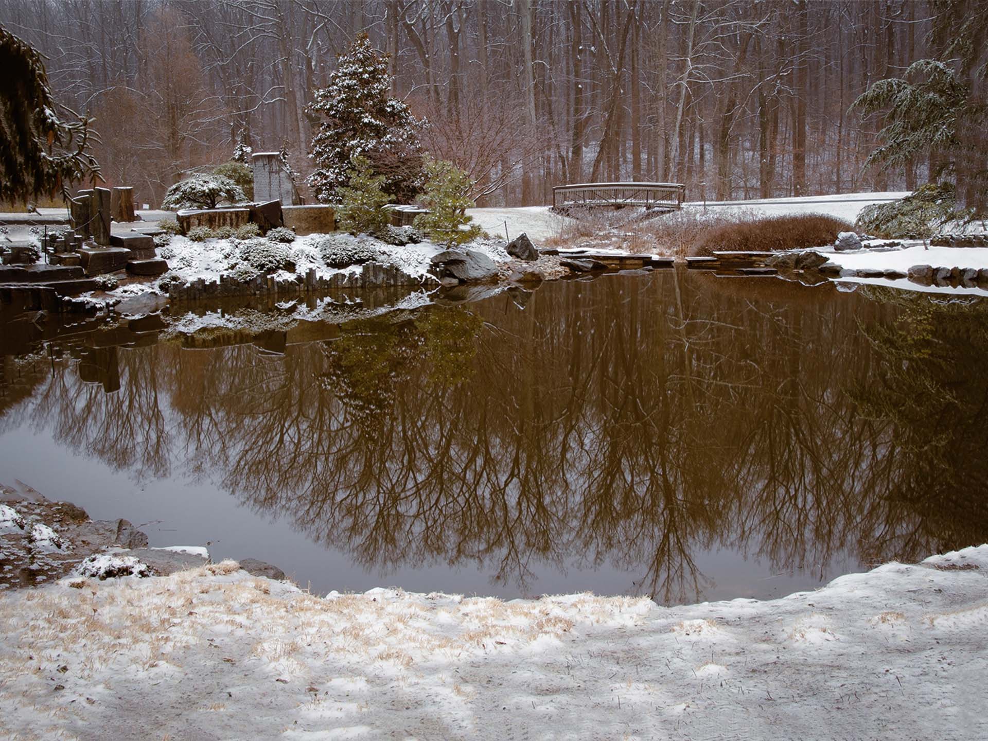
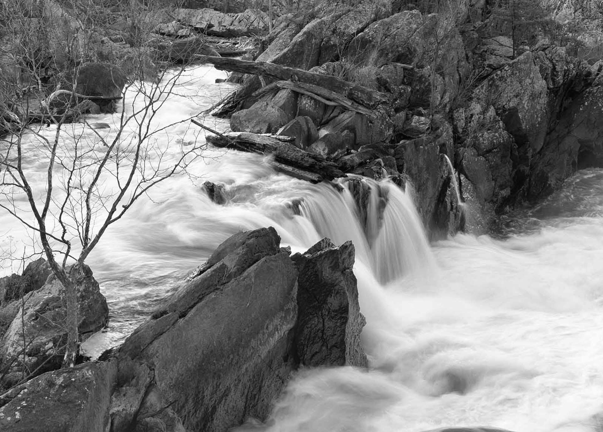
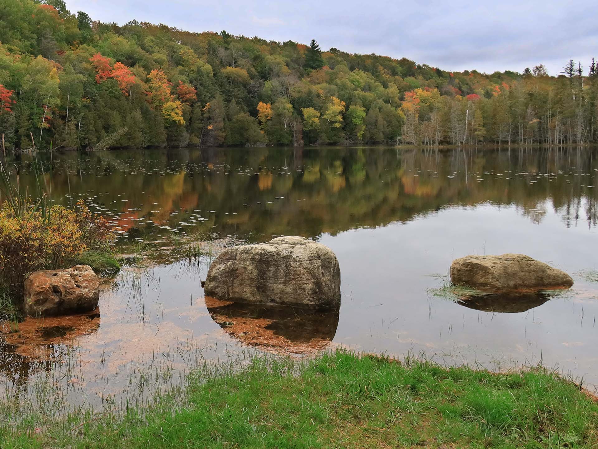
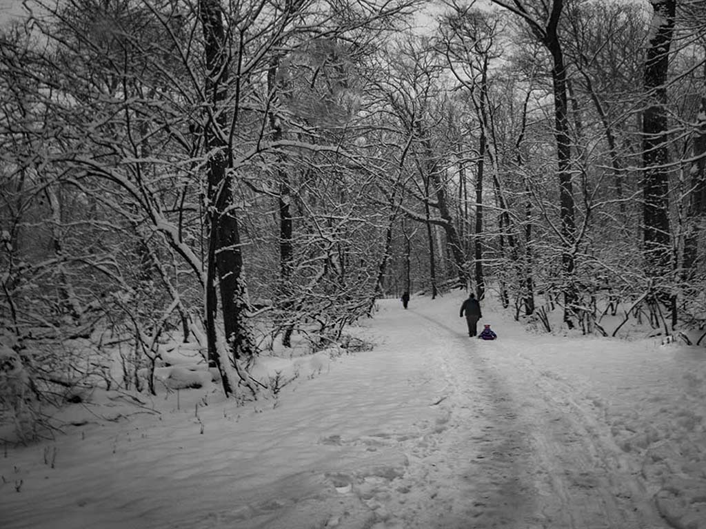
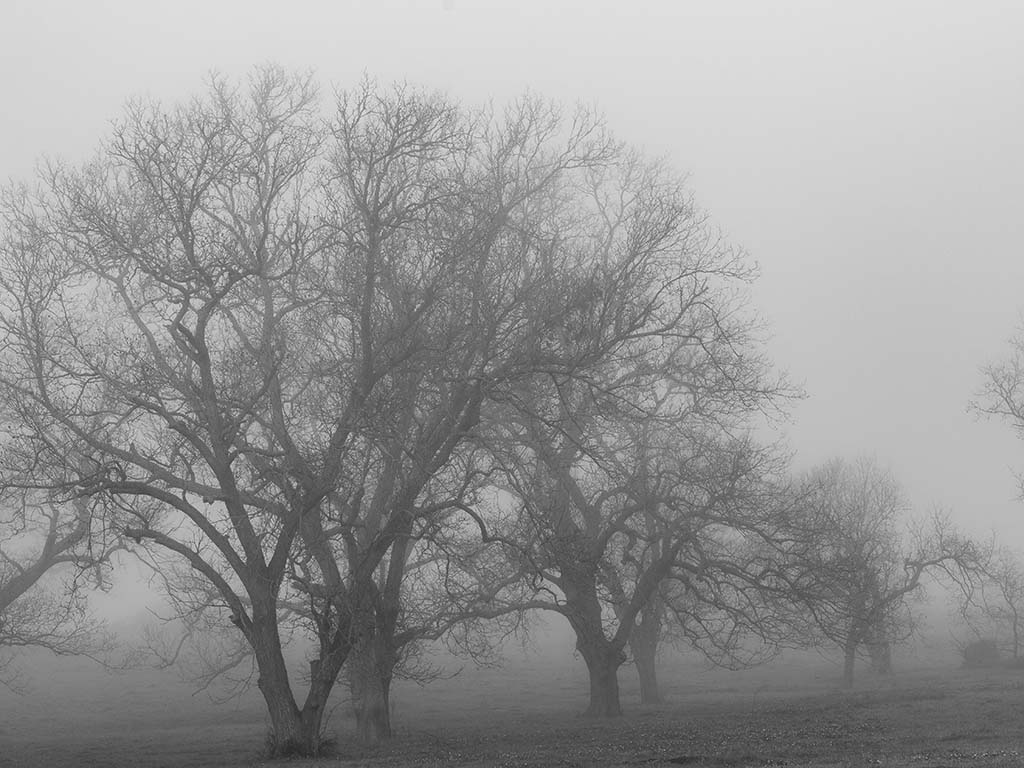
I enjoy a good snow scene. With your pulled in crop you have managed to put the focus on the tree limbs and snow on them. Well done. I find the black hole in the center of the picture to be a distraction. My eye keeps stopping there. Without that I roam through the picture. |
Jan 14th |
| 52 |
Jan 22 |
Comment |
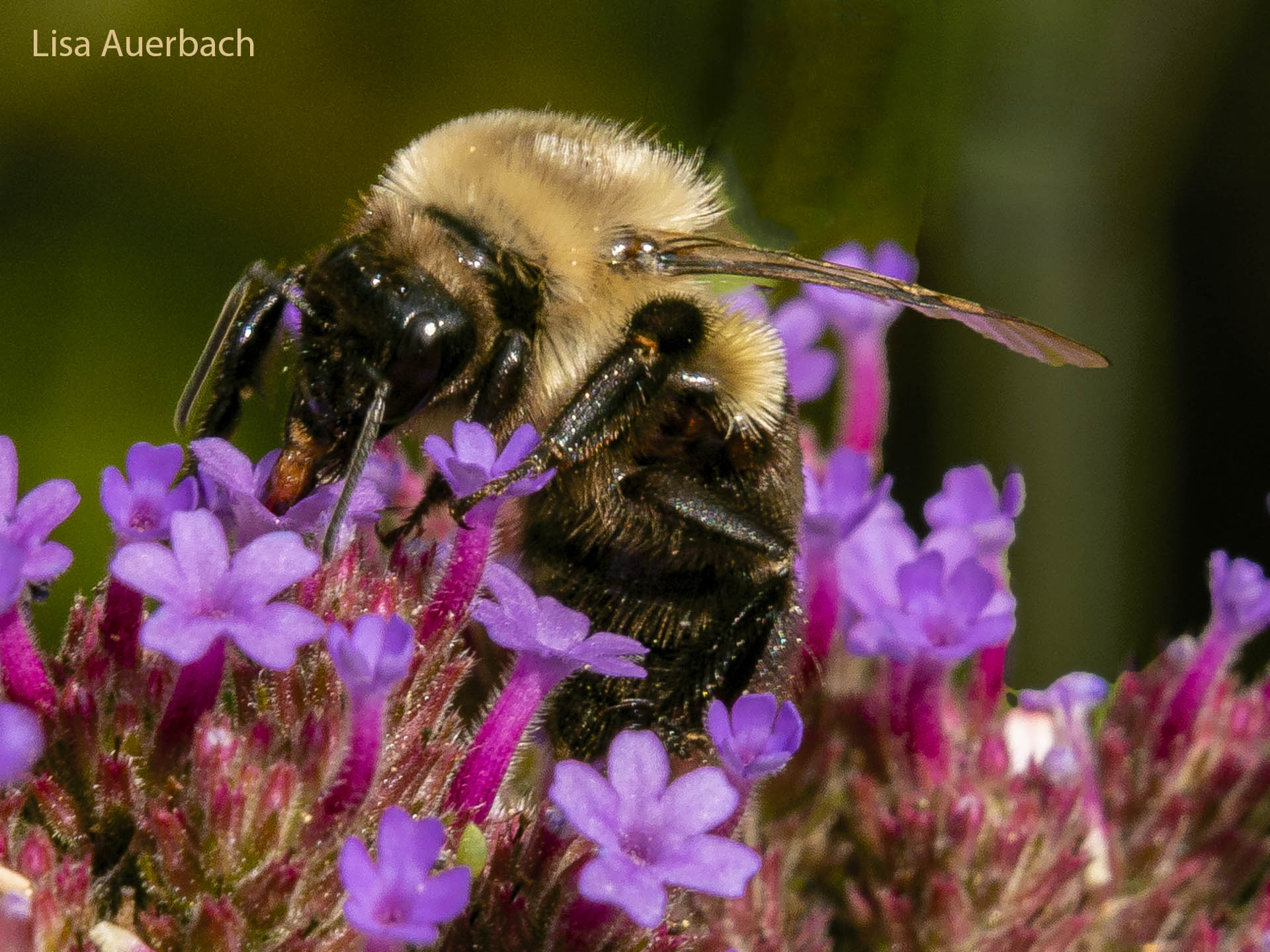
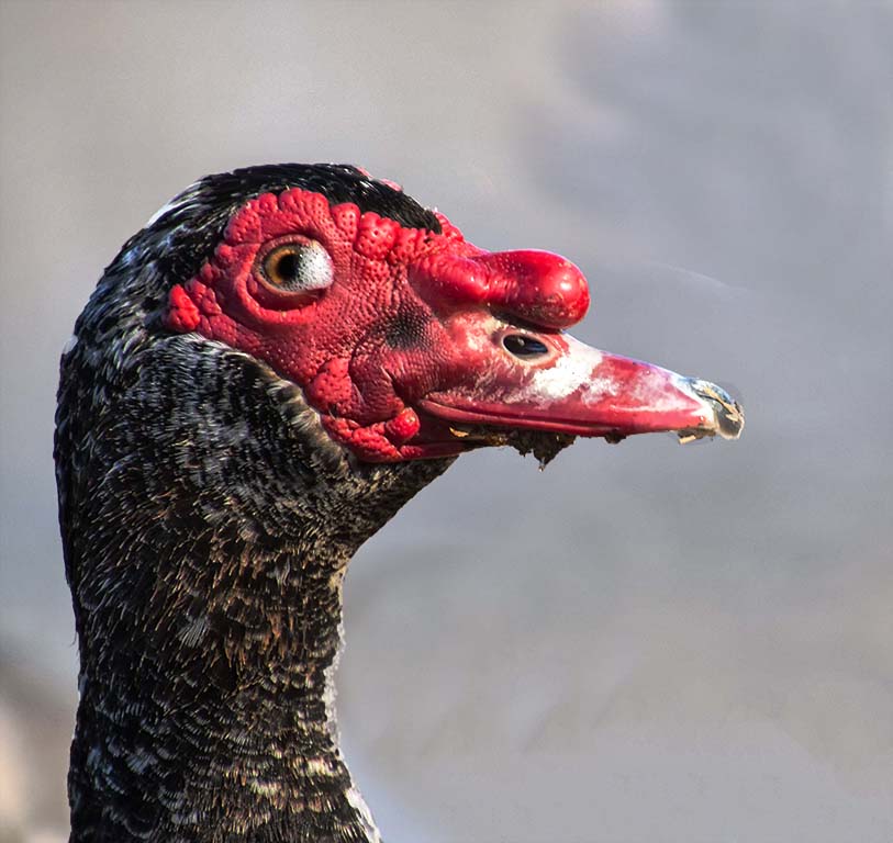
What a lovely image. The colors of the birds are engaging. I think a crop and vignette would work well as suggested. Additionally a once over dodge on the eyes would bring them out. You have a catch light in the left bird and a yellow pupil in the bird on the right. |
Jan 14th |
| 52 |
Jan 22 |
Comment |
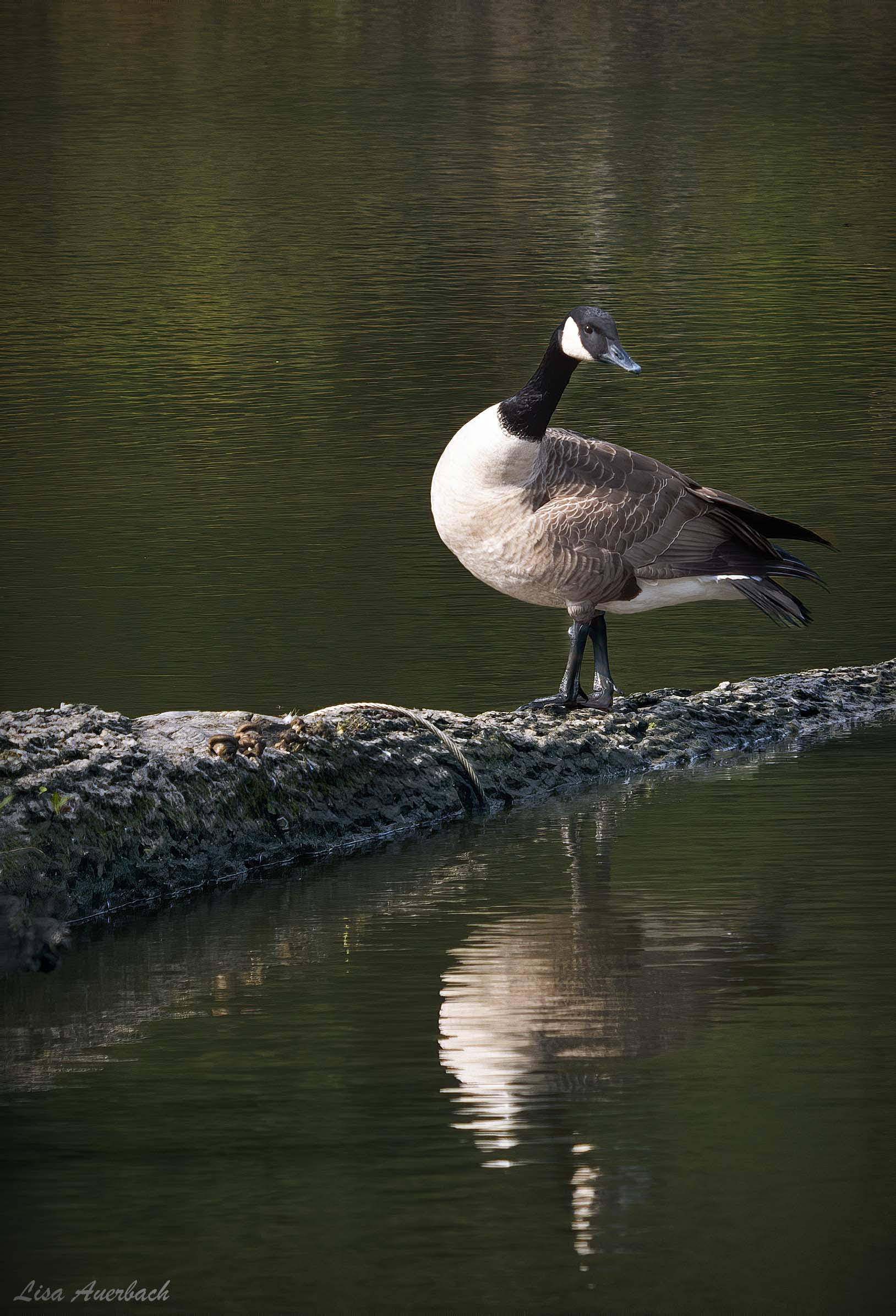
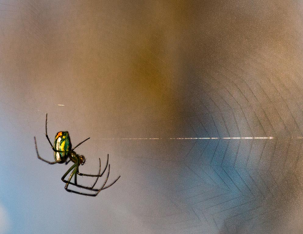
This is an interesting shot. You processed it well from the original. I think that if you separated the bird from the fence it would become better seen. I suggest darkening the background and fence, then adding a vignette to isolate your interesting subject. |
Jan 14th |
| 52 |
Jan 22 |
Comment |
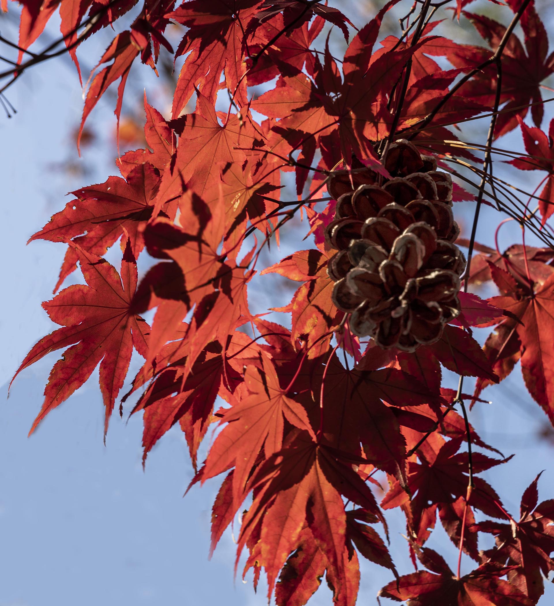
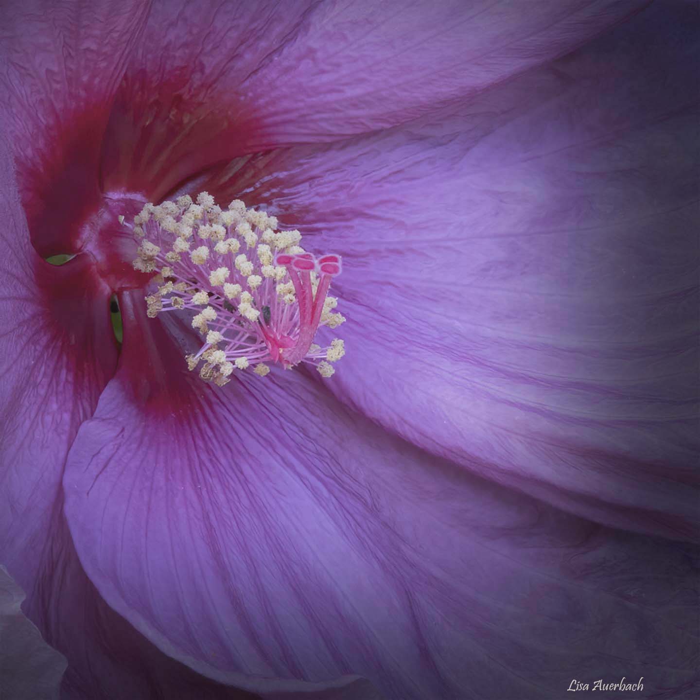
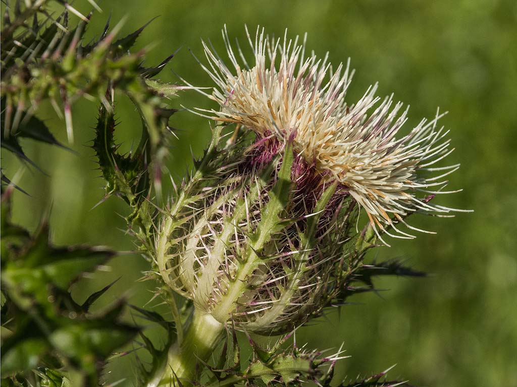
I like the colors of the image. I think the pod is the star, and if you crop vertically, the pod will be better shown. I'd suggest cloning out the green branch on the left. Let the other pretty colored leaves frame the pod, add a vignette, and enjoy a lovely pod image. |
Jan 14th |
| 52 |
Jan 22 |
Comment |
The raindrop with the dragonfly is fabulous. Your crop works and draws attention to the right elements of the image. The water drop at the top of the green leaf is distracting, and you can easily fix that. I also like the background color of the original better than the one you chose but think the best choice is somewhere in the middle of the two. Finally, a vignette would help pull attention to your story. |
Jan 14th |
7 comments - 1 reply for Group 52
|
7 comments - 1 reply Total
|