|
| Group |
Round |
C/R |
Comment |
Date |
Image |
| 52 |
Jul 21 |
Comment |
I am glad to learn about this filter although I prefer cool to warm colors. This would not be my choice of tones. |
Jul 13th |
 |
| 52 |
Jul 21 |
Reply |
It will be fun to try! |
Jul 12th |
| 52 |
Jul 21 |
Reply |
Thank you but do you mean two separate photo filters, one warm, and one cool? I have worked with photo filters and often like their use.
Or do you mean a graduated filter with warm and cool tones? I am not so comfortable with them but keep trying. To many they are easy but not so for me. |
Jul 12th |
| 52 |
Jul 21 |
Reply |
I think your edit works. It is natural and takes attention away from the leaf. |
Jul 11th |
| 52 |
Jul 21 |
Comment |
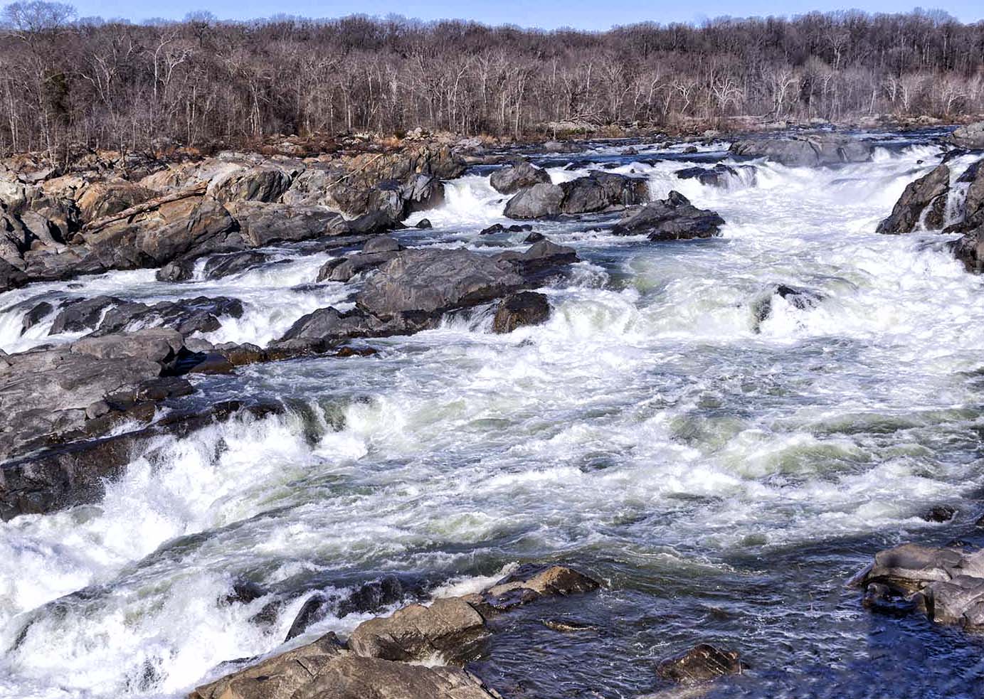
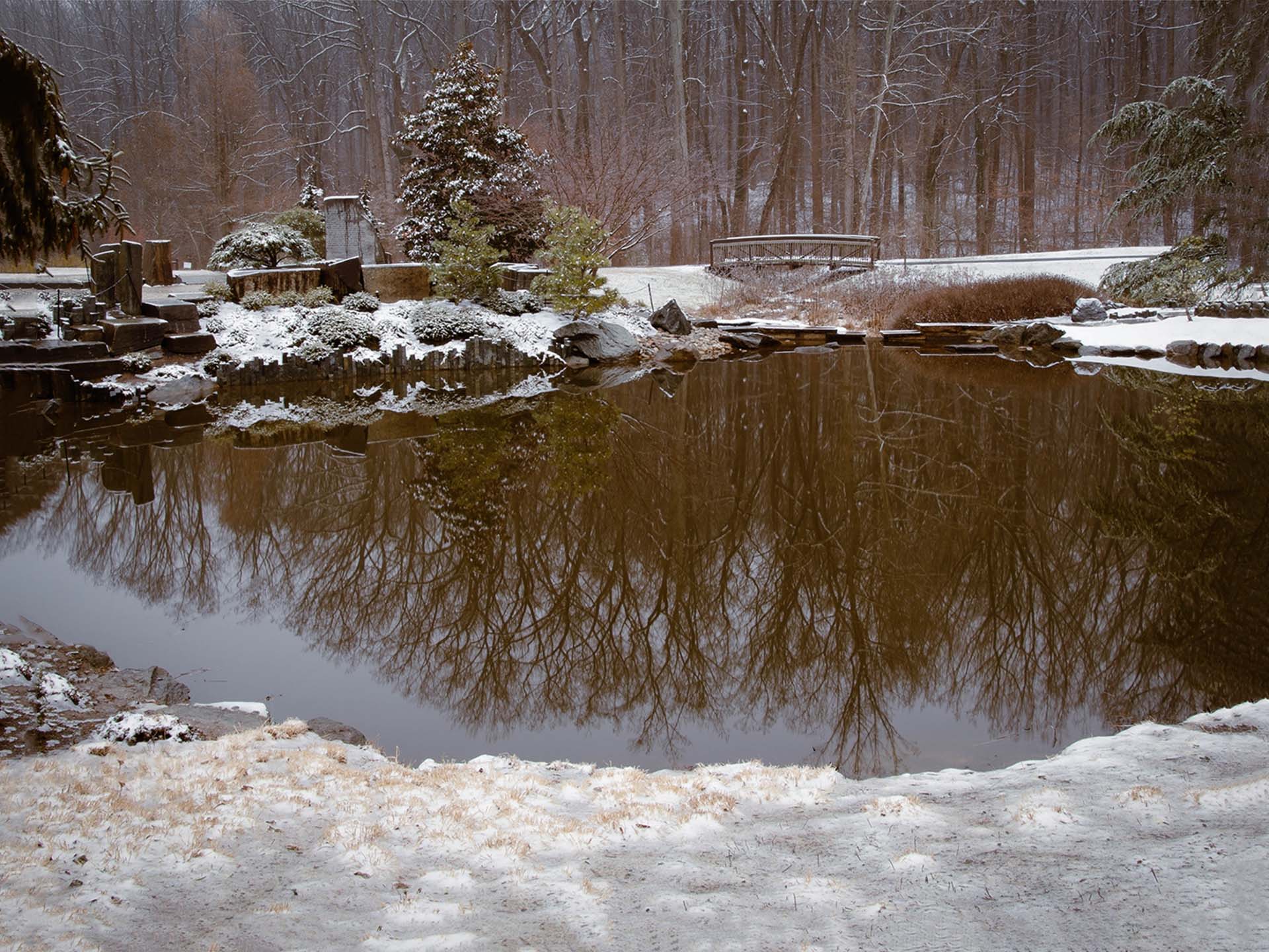
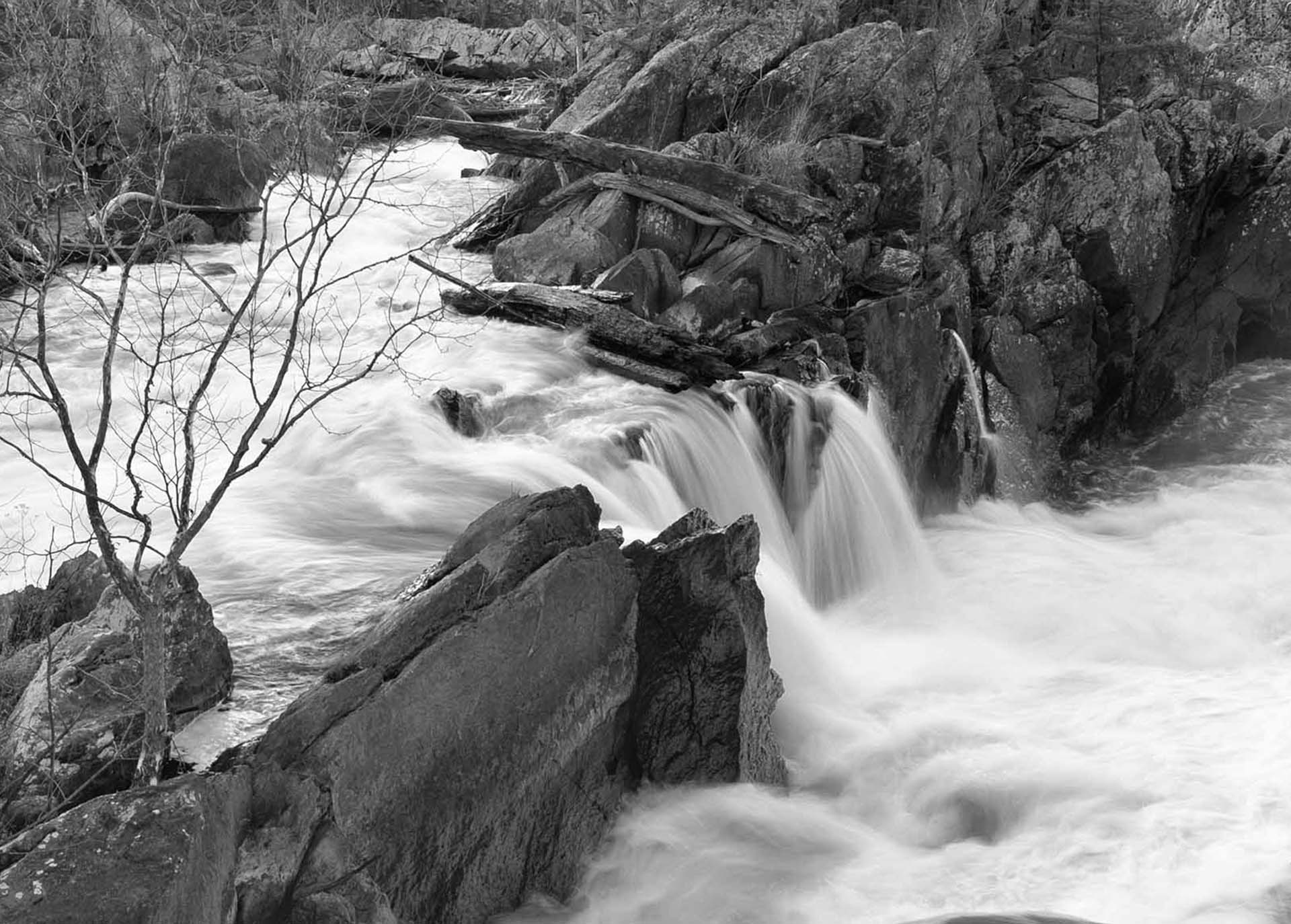
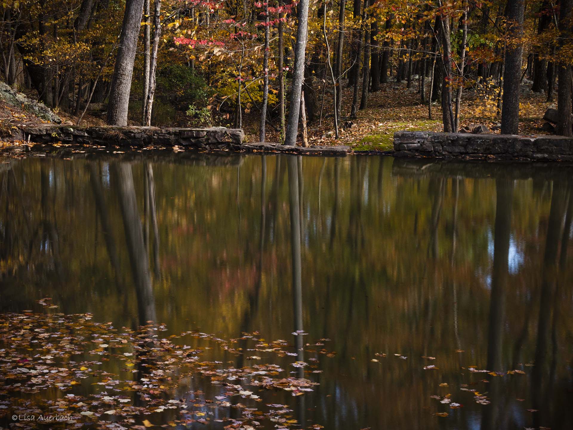
That is a mistake. I shot it f/22 focusing 1/3 into the distance. It was a lovely feel good morning. I always stop to think that as good as an image might be we cannot photograph the wonderful smells of nature. |
Jul 11th |
| 52 |
Jul 21 |
Comment |
I LIKE the image and the way you have processed it. I usually have more to add but this is it. I truly like this image and how you have processed it. I'll be curious to see what others suggest. |
Jul 9th |
| 52 |
Jul 21 |
Comment |
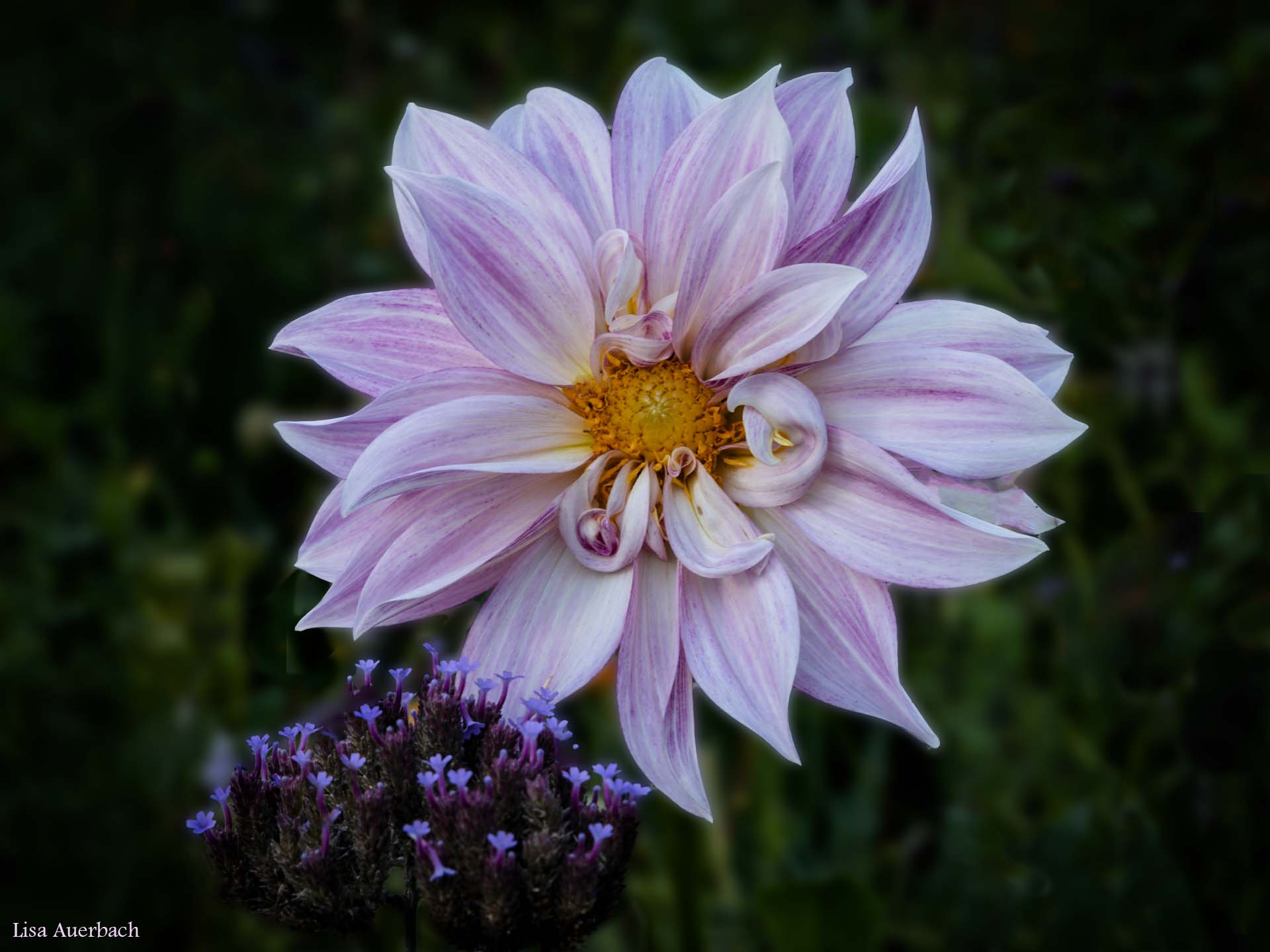
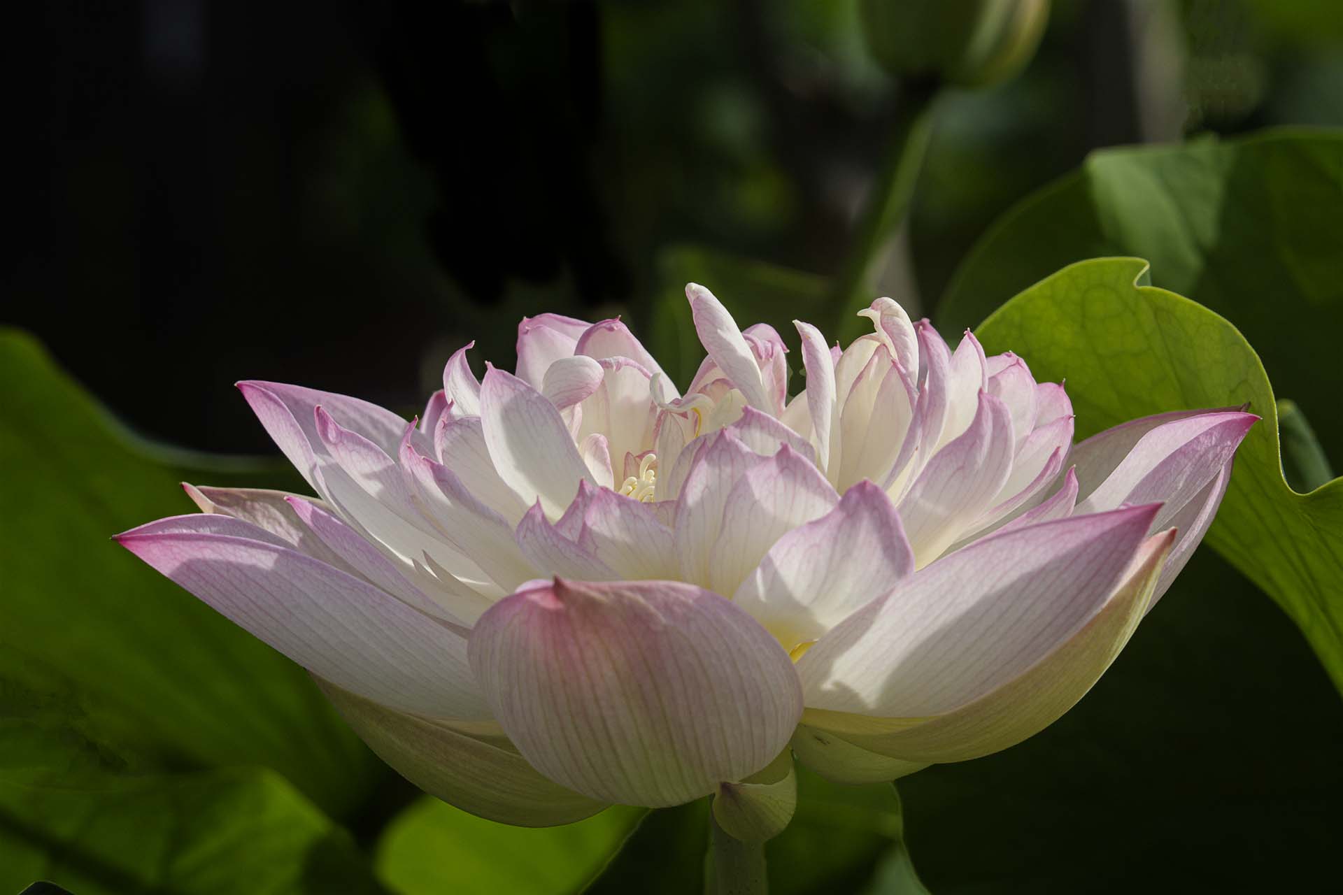
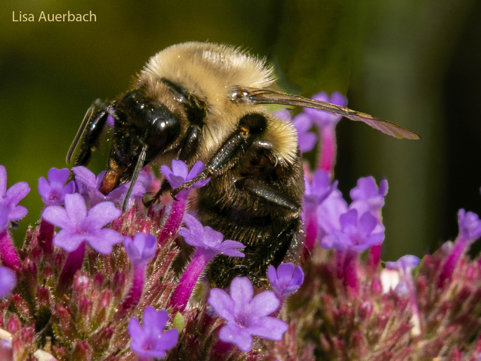
I can see how you noticed the penny; however what you showed us is the flower. There isn't enough to know it is a penny, and I think the main focus is the flower. Thus I would eliminate the strong spots of white and focus on the flower. The penney would still show however the flower would also show. |
Jul 9th |
| 52 |
Jul 21 |
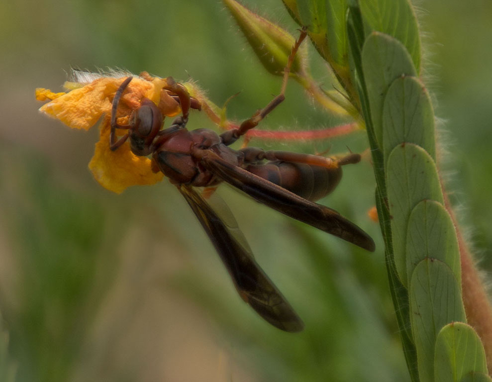
Comment |
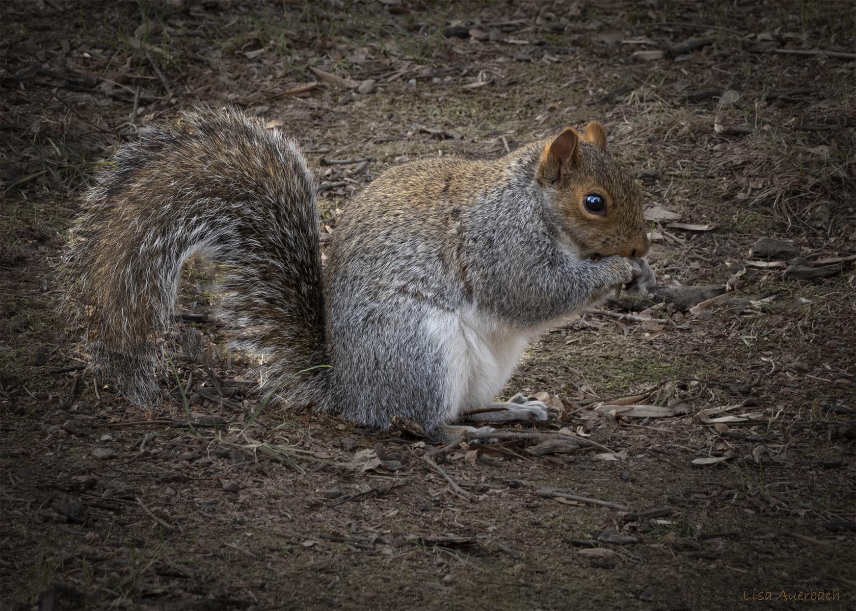
What a fun image. The squirrels are playful and sharp. In Photoshop, if you use it, I would use: Select>Subject Subject>Select and Mask>Inverse to select the background and darken it. This would isolate the squirrels and draw more attention to them. |
Jul 9th |
| 52 |
Jul 21 |
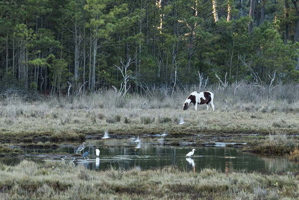
Comment |
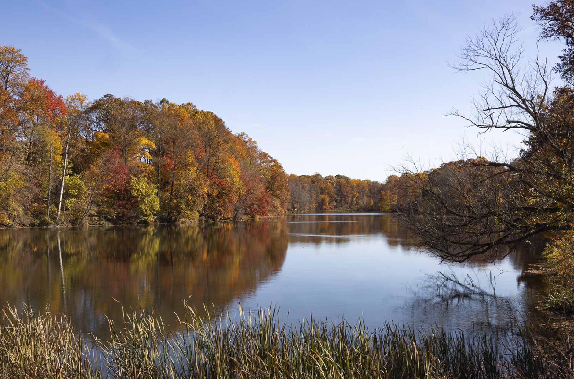
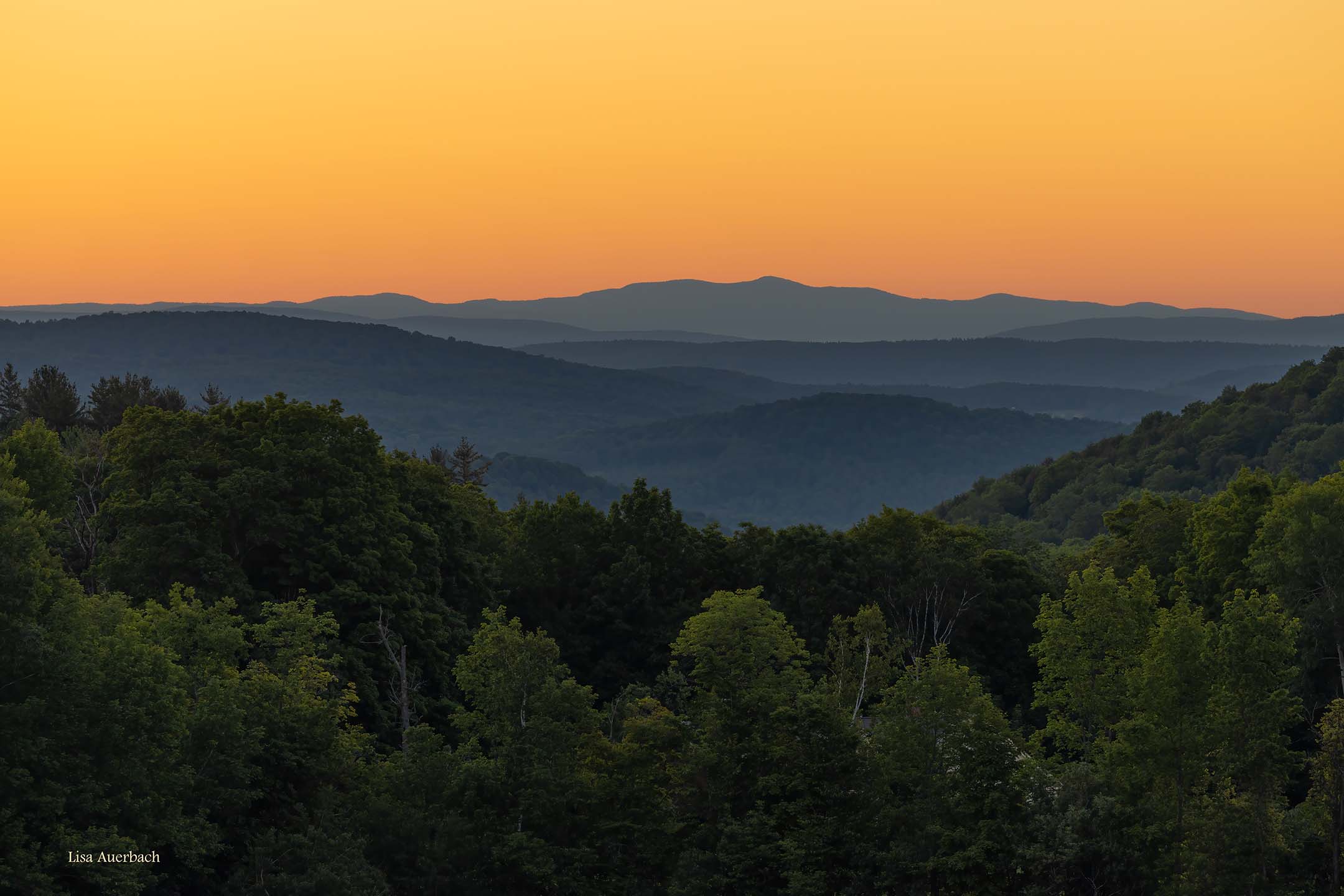
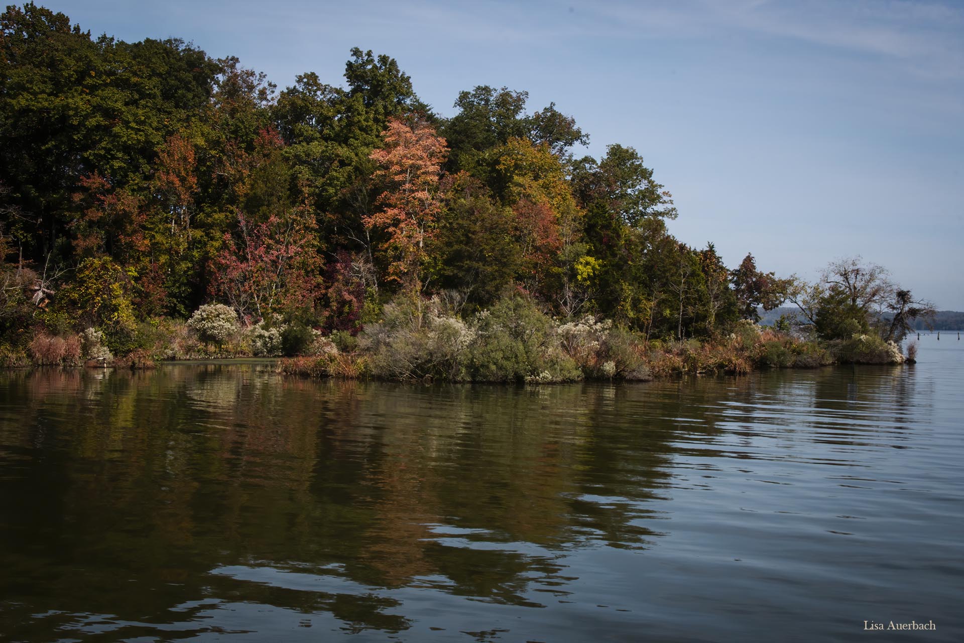
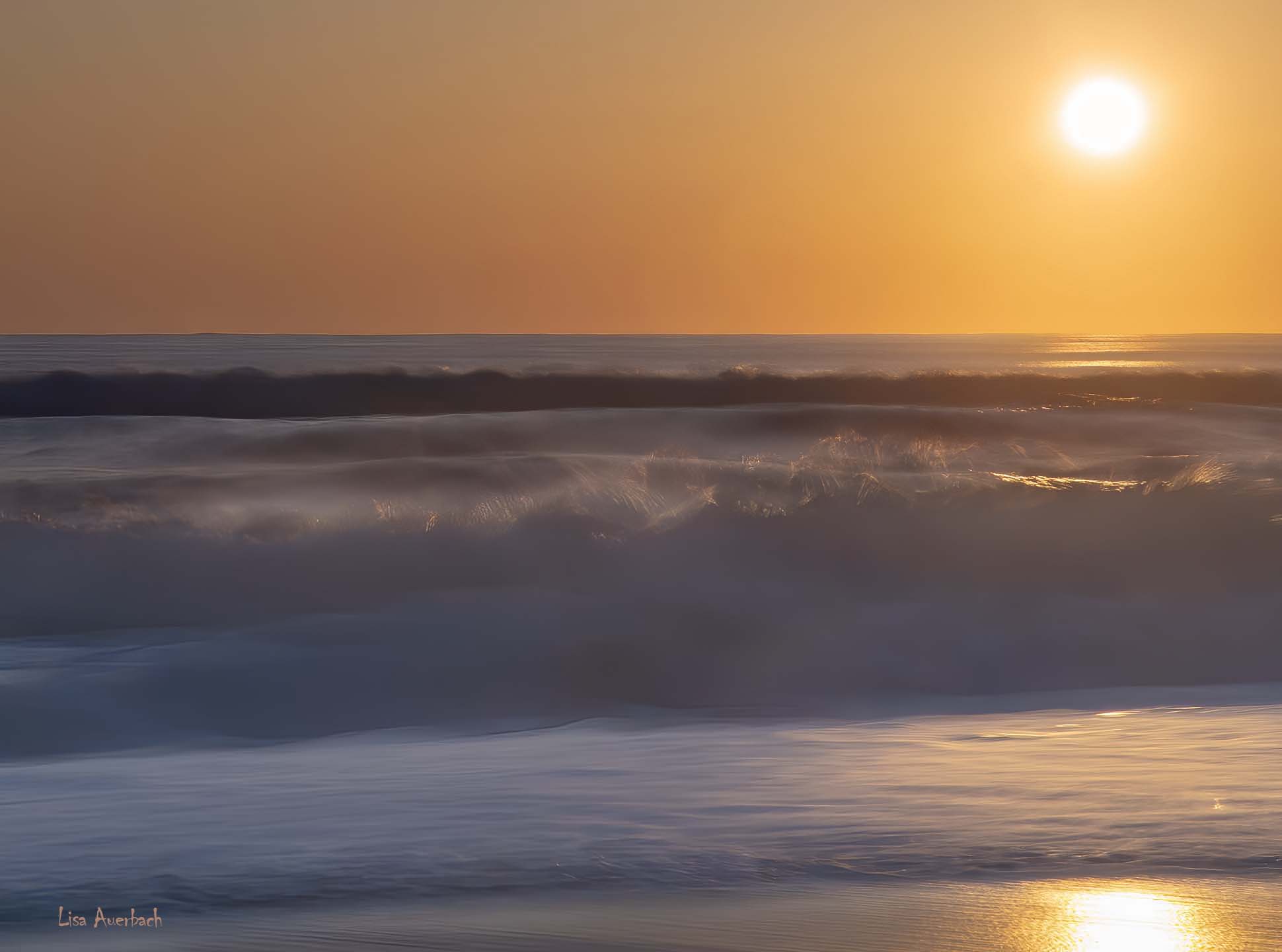
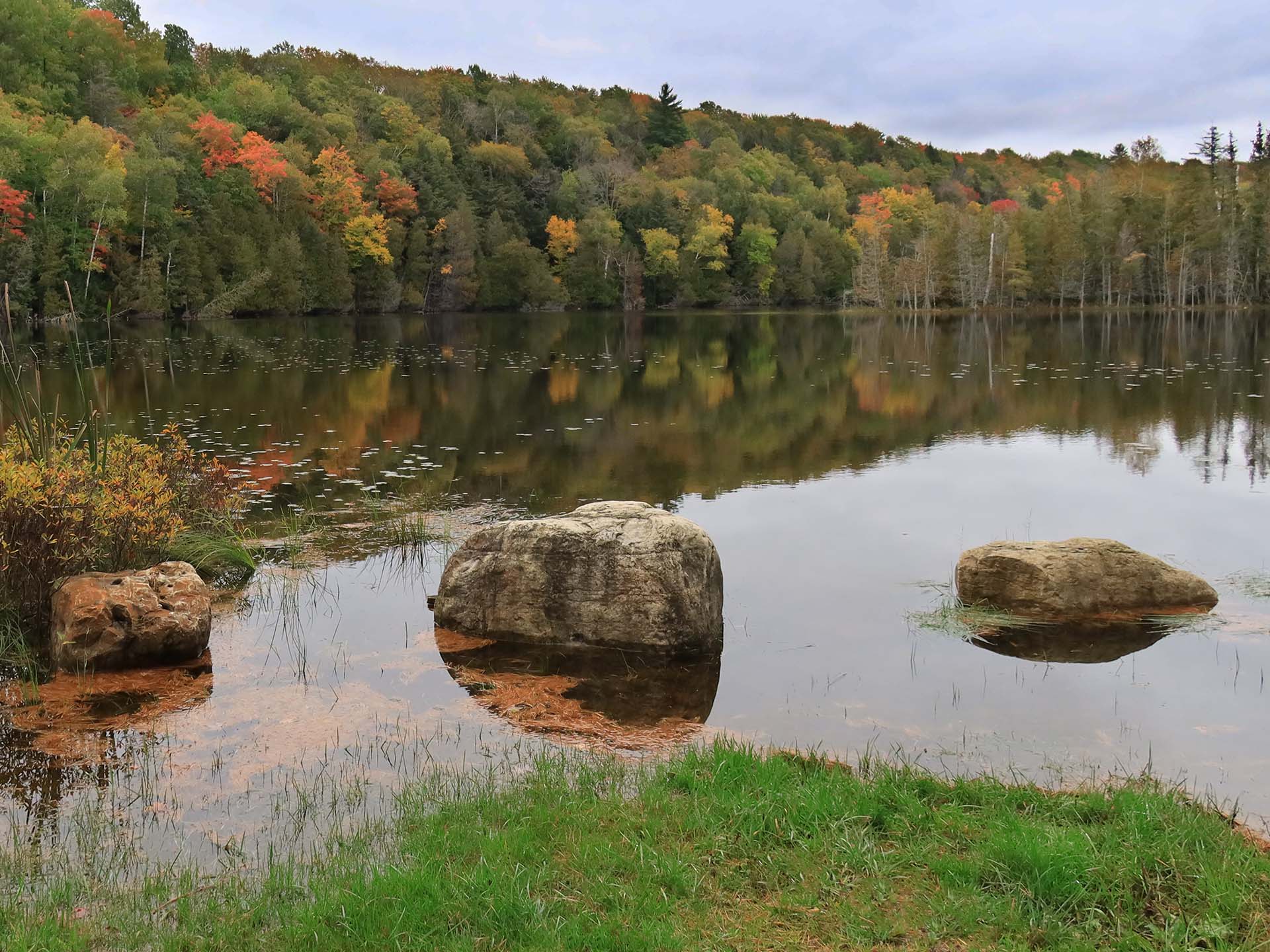
I like your crop. There is just enough water to tell the story but the main story is the sunset. The colors are lovely. I tried opening your image in Bridge and simply raised shadows. I could see your tree leaves clearly. |
Jul 9th |
| 52 |
Jul 21 |
Comment |
What I like best are 2 things. There are so many leading lines. The purple (lentil?) gives a punch of color, and the image has a purple cast to it. I like this. I opened your image in Adobe Bridge, added contrast, and I agree with Mike, that this adds to the image. |
Jul 9th |
| 52 |
Jul 21 |
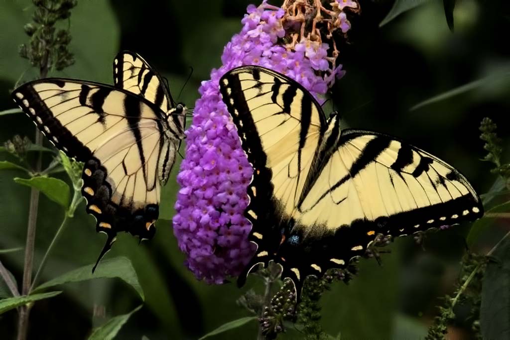
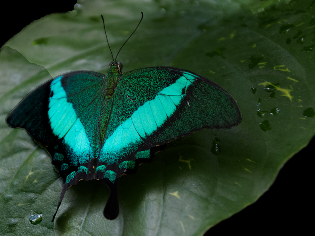
Comment |
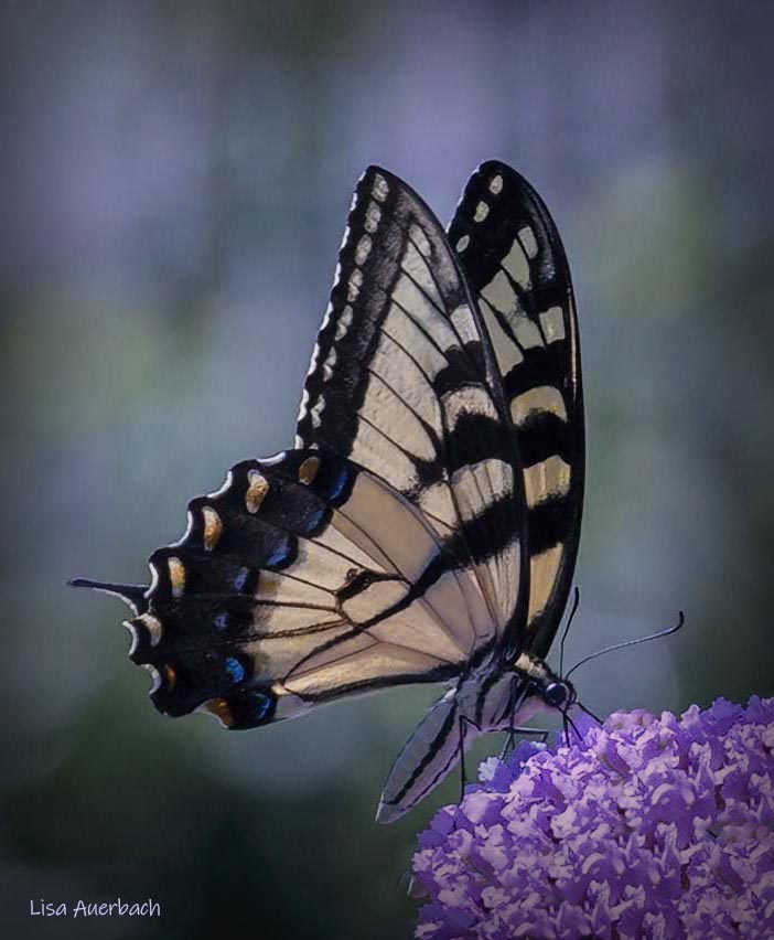
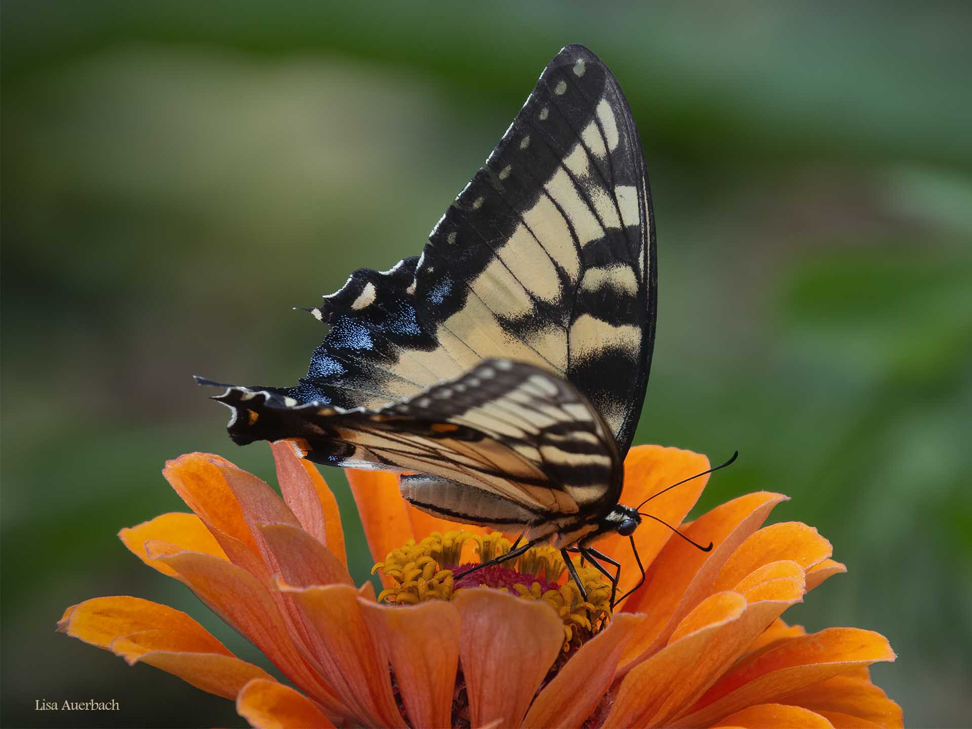
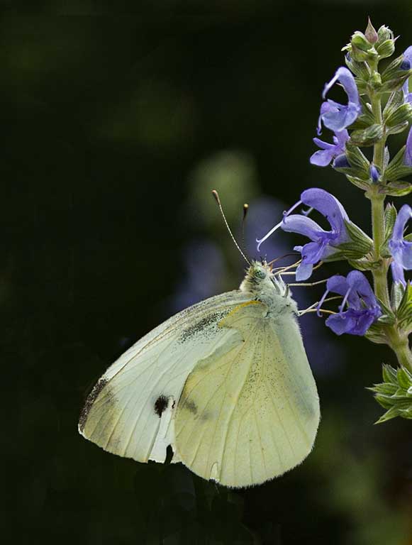
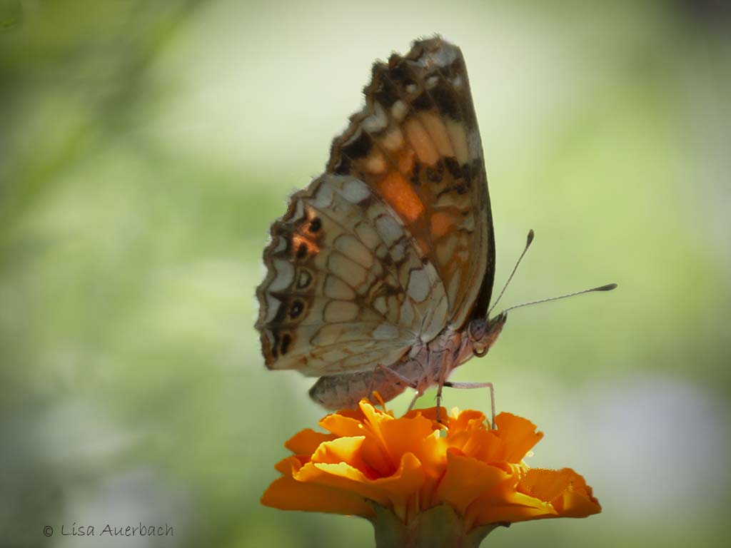
I like the pair. They are sharp, especially the bodies. The leaf over the butterfly doesn't bother me because the main one is sharp. The one thing that I notice is the bottom right leaf which is not sharp. I would suggest toning it down a bit so it is not so noticeable. |
Jul 9th |
| 52 |
Jul 21 |
Comment |
I'm not ready to critique but want to know where your travels led you. |
Jul 5th |
| 52 |
Jul 21 |
Comment |
This is actually the original. I removed the red glares and a branch. The rest is correct. |
Jul 2nd |
 |
10 comments - 3 replies for Group 52
|
10 comments - 3 replies Total
|