|
| Group |
Round |
C/R |
Comment |
Date |
Image |
| 52 |
Feb 21 |
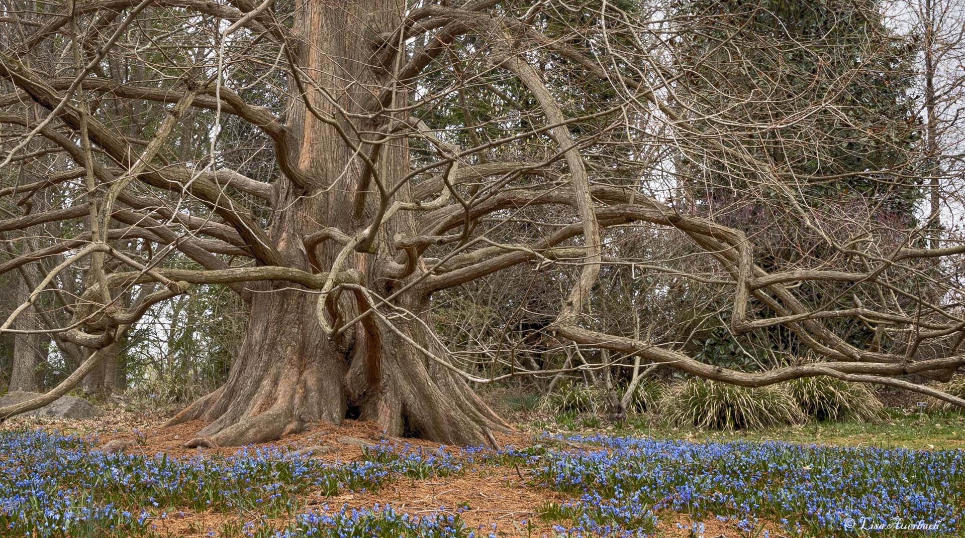
Reply |
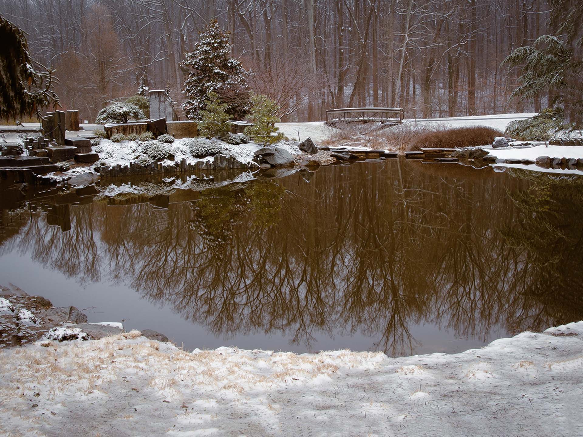
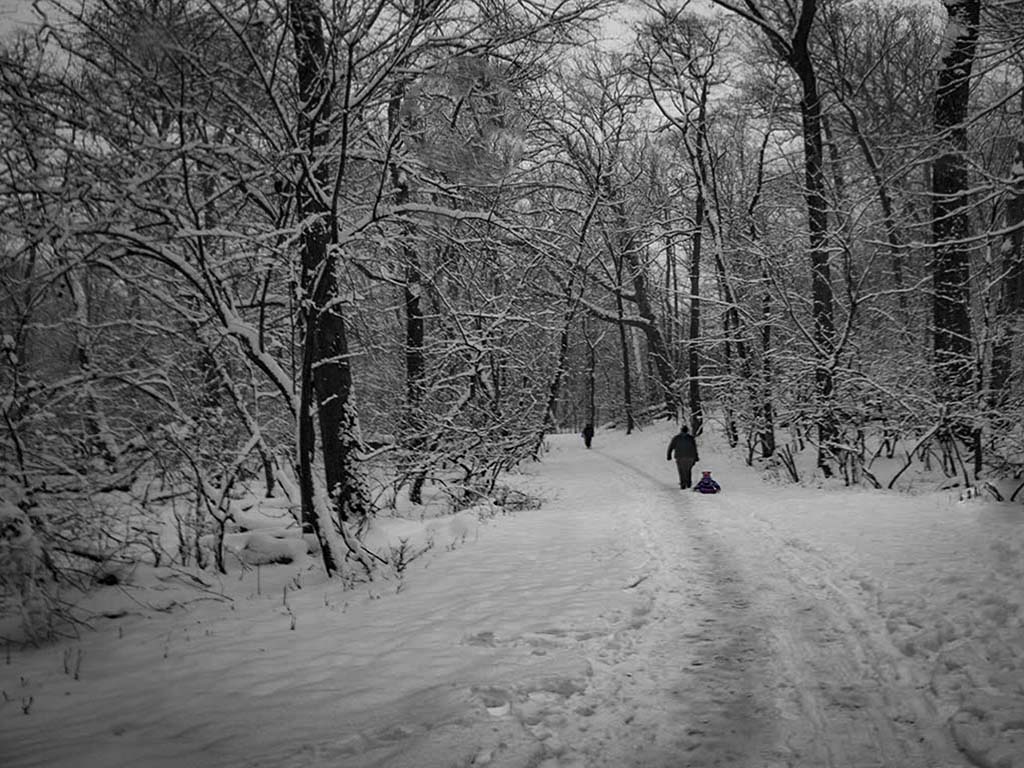
I like your crop. Enough of the left is included for what I wanted. |
Feb 13th |
| 52 |
Feb 21 |
Reply |
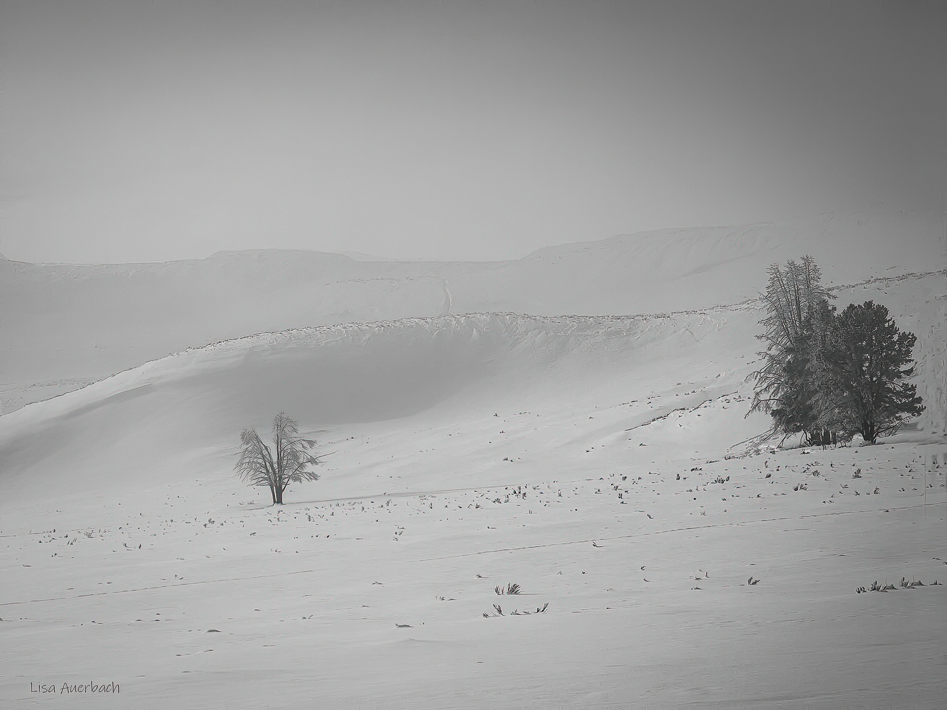
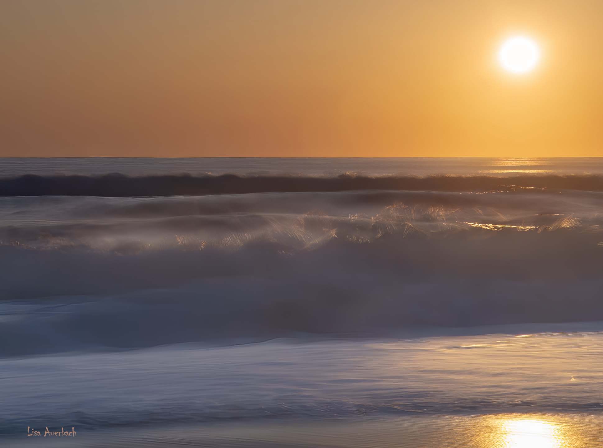
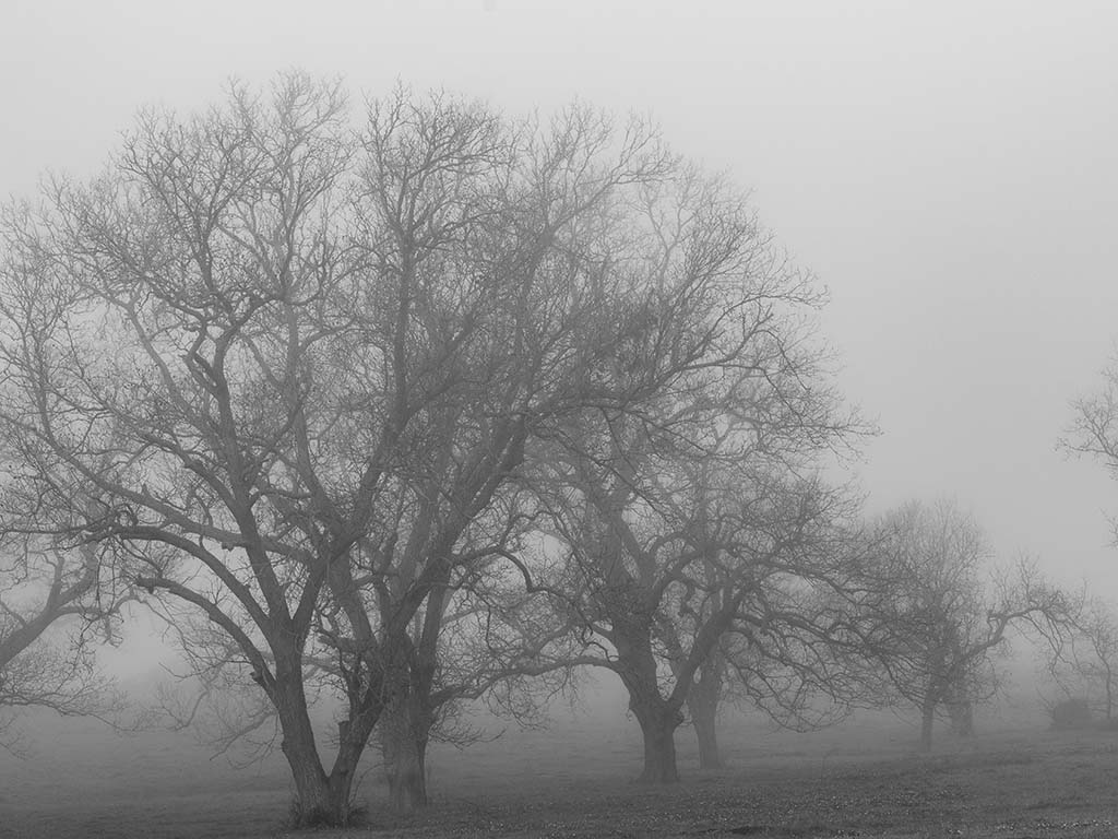
Thrilled for you to get snow. It is magical.
Actually, I worked hard to get the snow right in the camera. I was quite pleased with it. I wasn't sure about the tree on the left but I will remember your suggestion in the future. It makes sense. |
Feb 13th |
| 52 |
Feb 21 |
Comment |
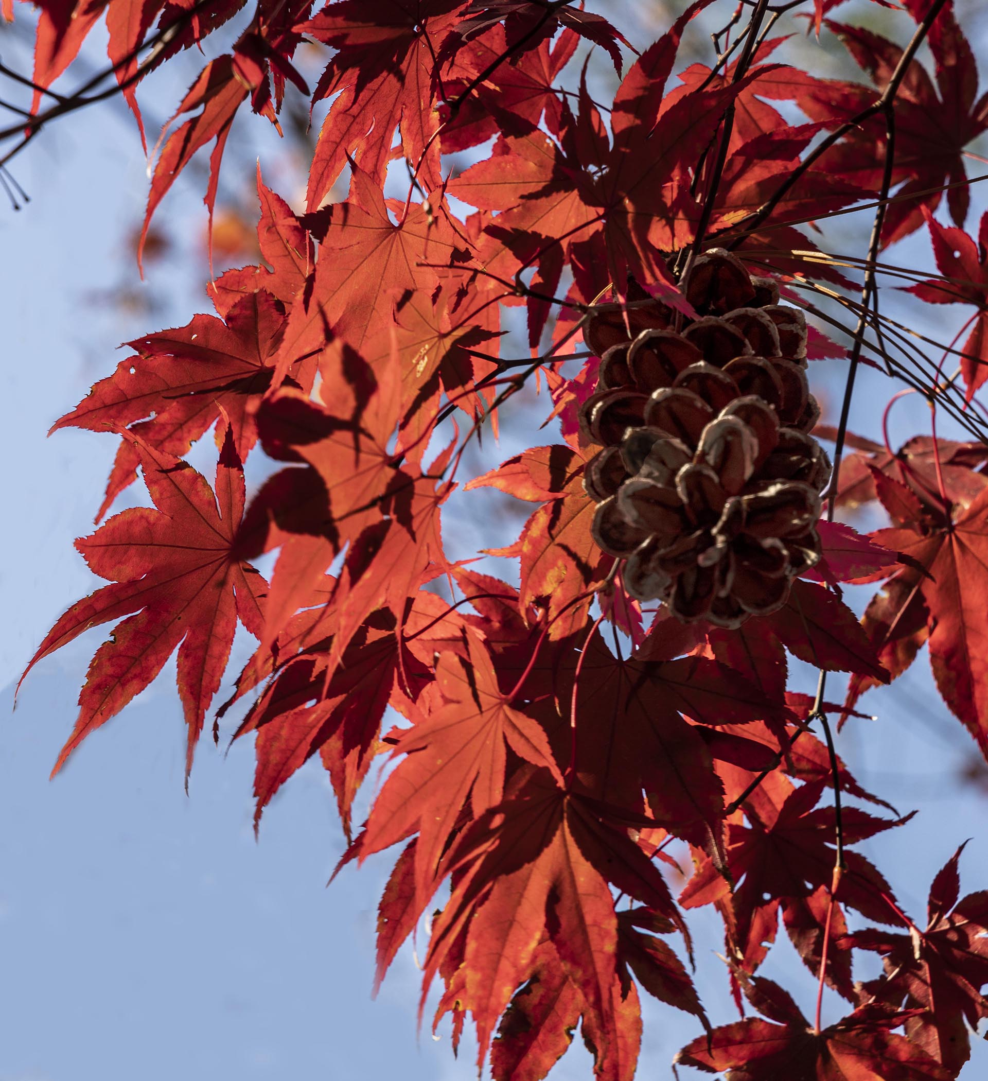
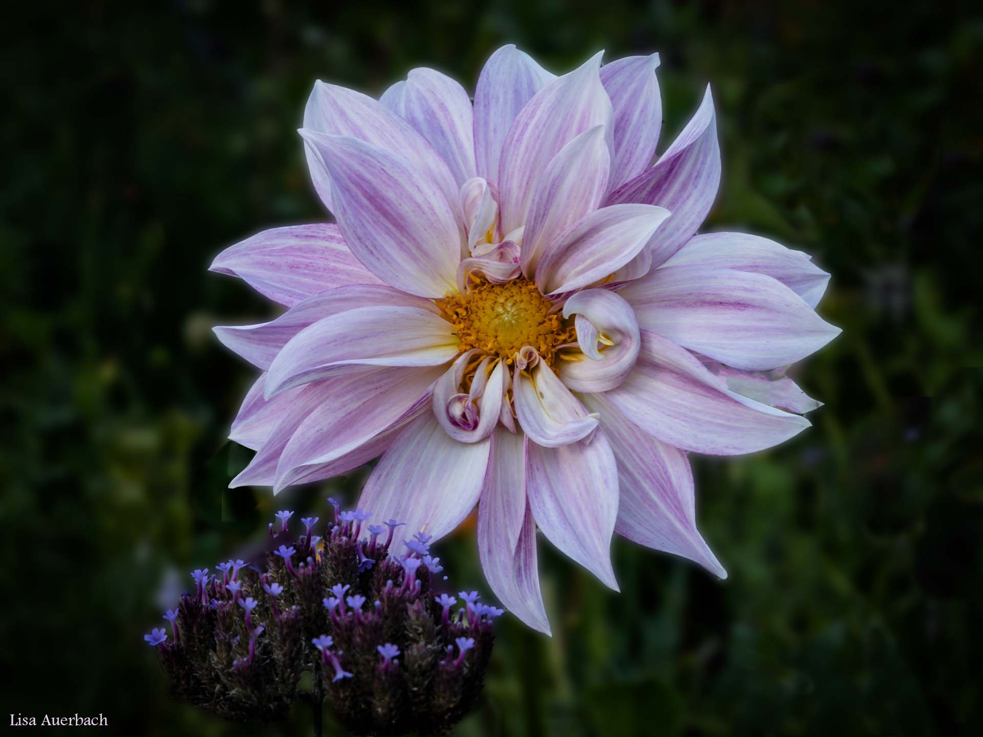
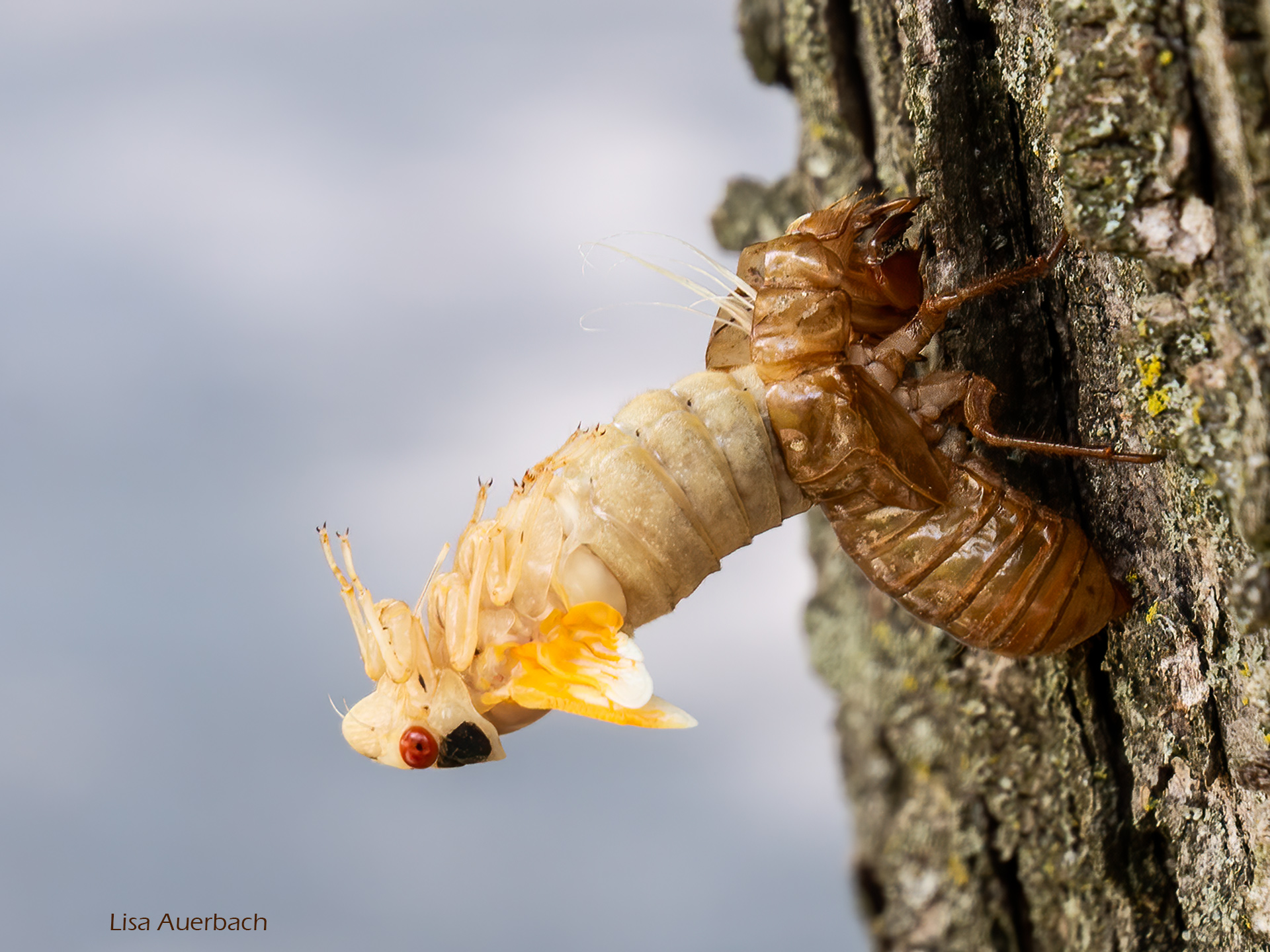
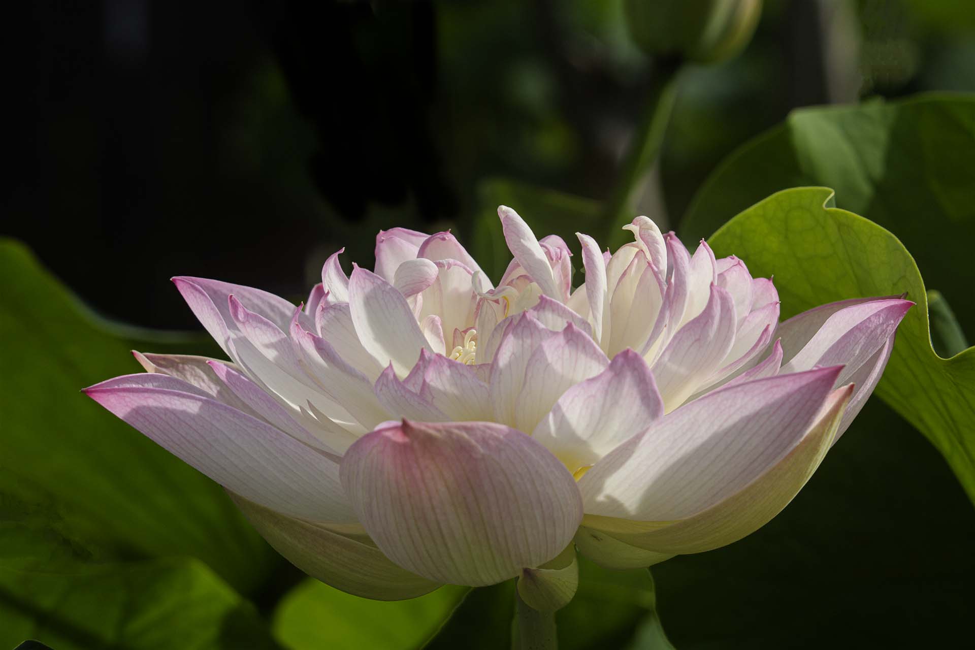
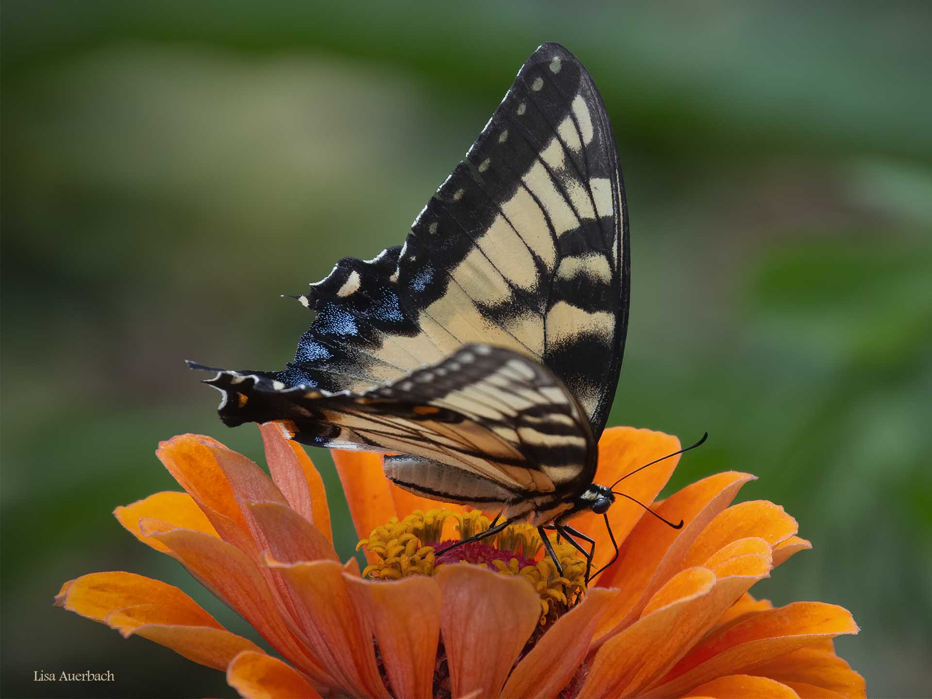
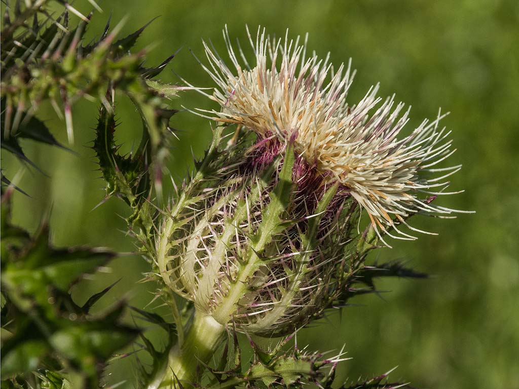
There is a great deal of interesting texture in the leaves as well as the mushroom. The image is sharp. I think it is bit bright and would add a levels curve to take the brightness down a bit. I like Pamela's crop. I hope you soon find your images.
If you converted to black and white in frustration, I do want to tell you I like the color version as well. |
Feb 13th |
| 52 |
Feb 21 |
Comment |
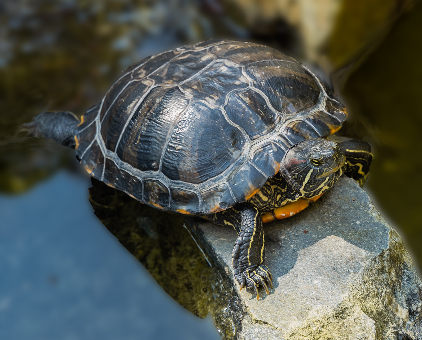
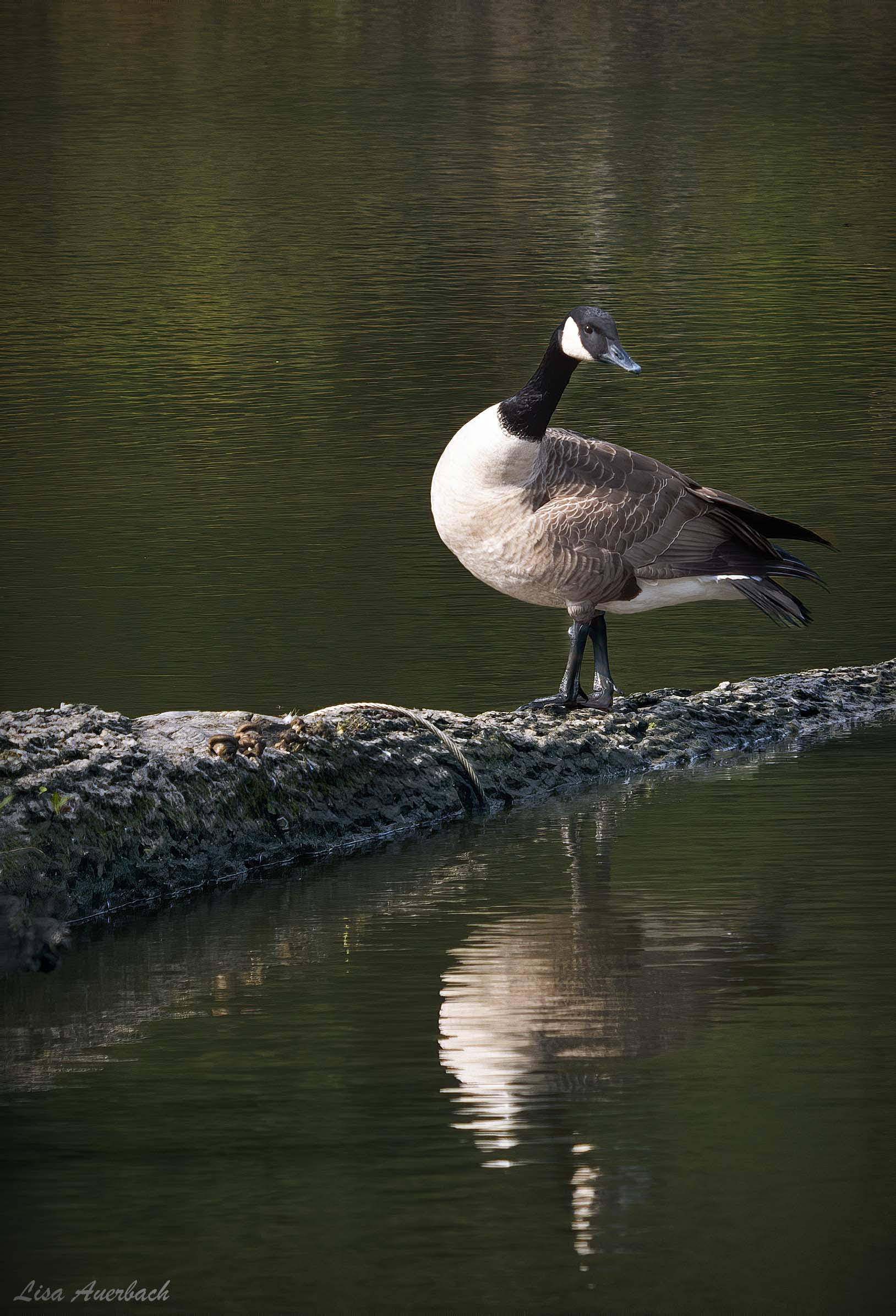
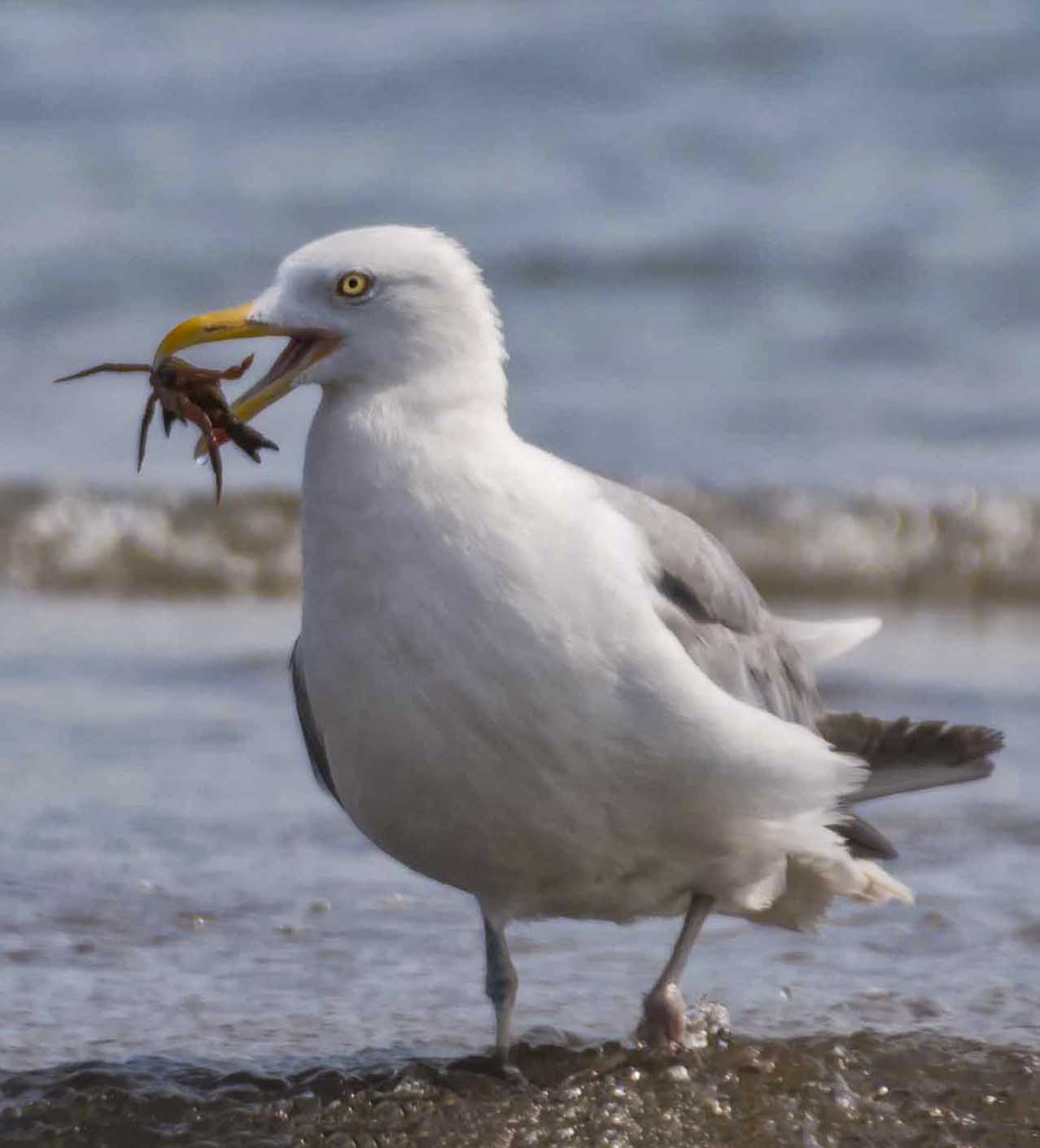
The black phoebe is sharp and has a good background. For me there is too much space around it. I would add a vignette, crop it to give more focus to the phoebe, and depending on your thoughts about cloning, I'd try to address the bright spot to the sides of the bird stand. |
Feb 13th |
| 52 |
Feb 21 |
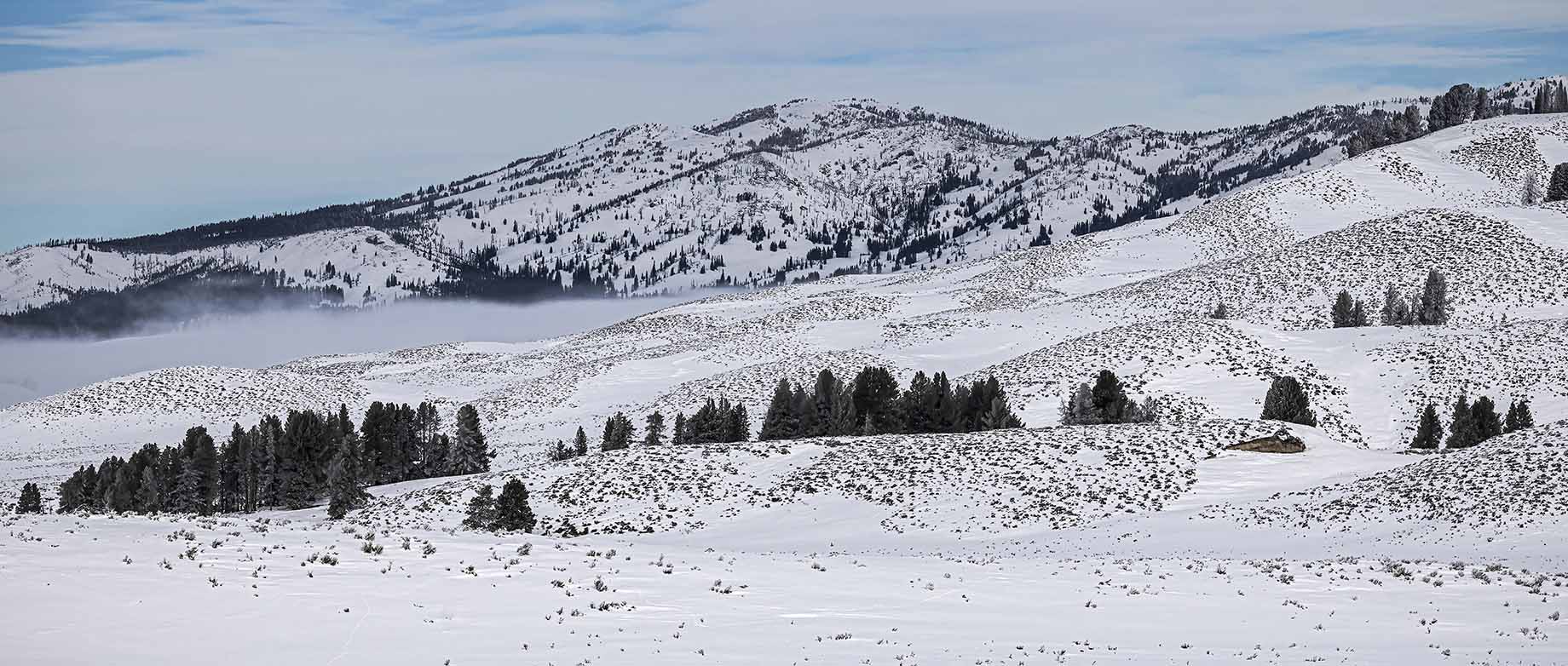
Comment |
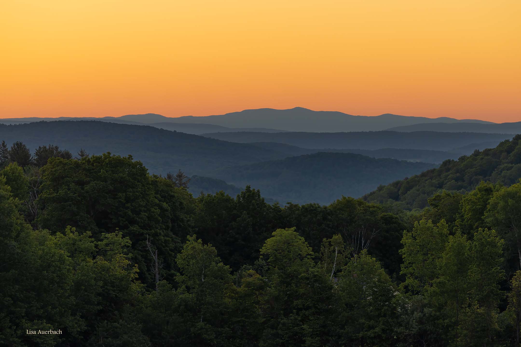
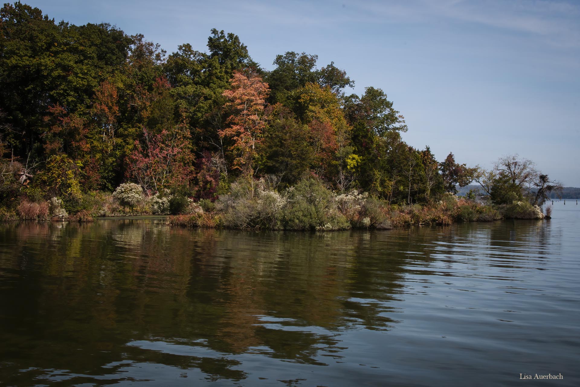
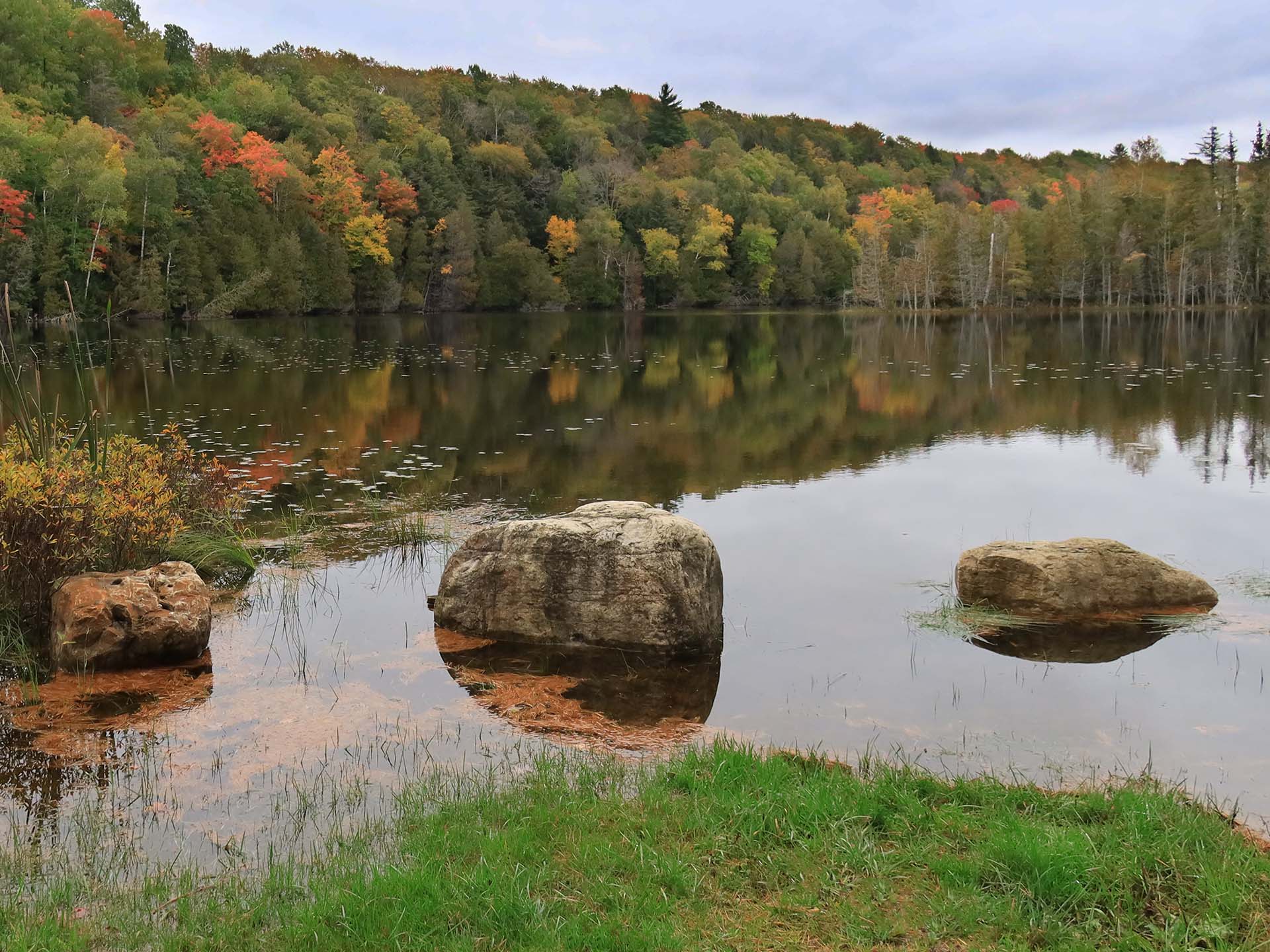
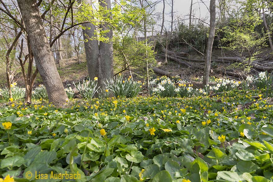
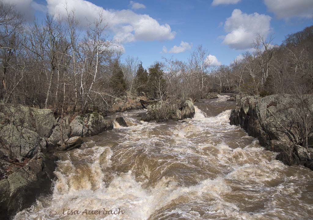
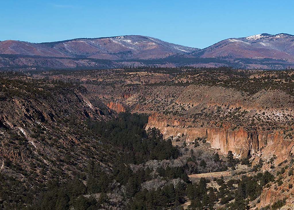
I like what you have done with the sky and the mountain. I think the trees in the original add to the total image. In your processed image they are lighter. In my opinion, the answer is somewhere in the middle. I also think a vertical crop leads your eye up the mountain. |
Feb 13th |
| 52 |
Feb 21 |
Comment |
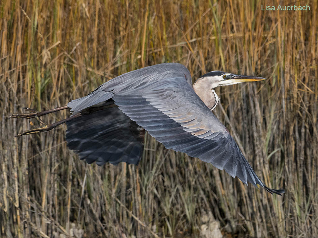
The hawk is clear and well shot. You have a good bokeh, and I am drawn into the image. I would suggest that you add a vignette to pull me in more. I also suggest that you somewhat desaturate the green in the wood post. That will keep my eye right on the well shot hawk. |
Feb 13th |
| 52 |
Feb 21 |
Comment |
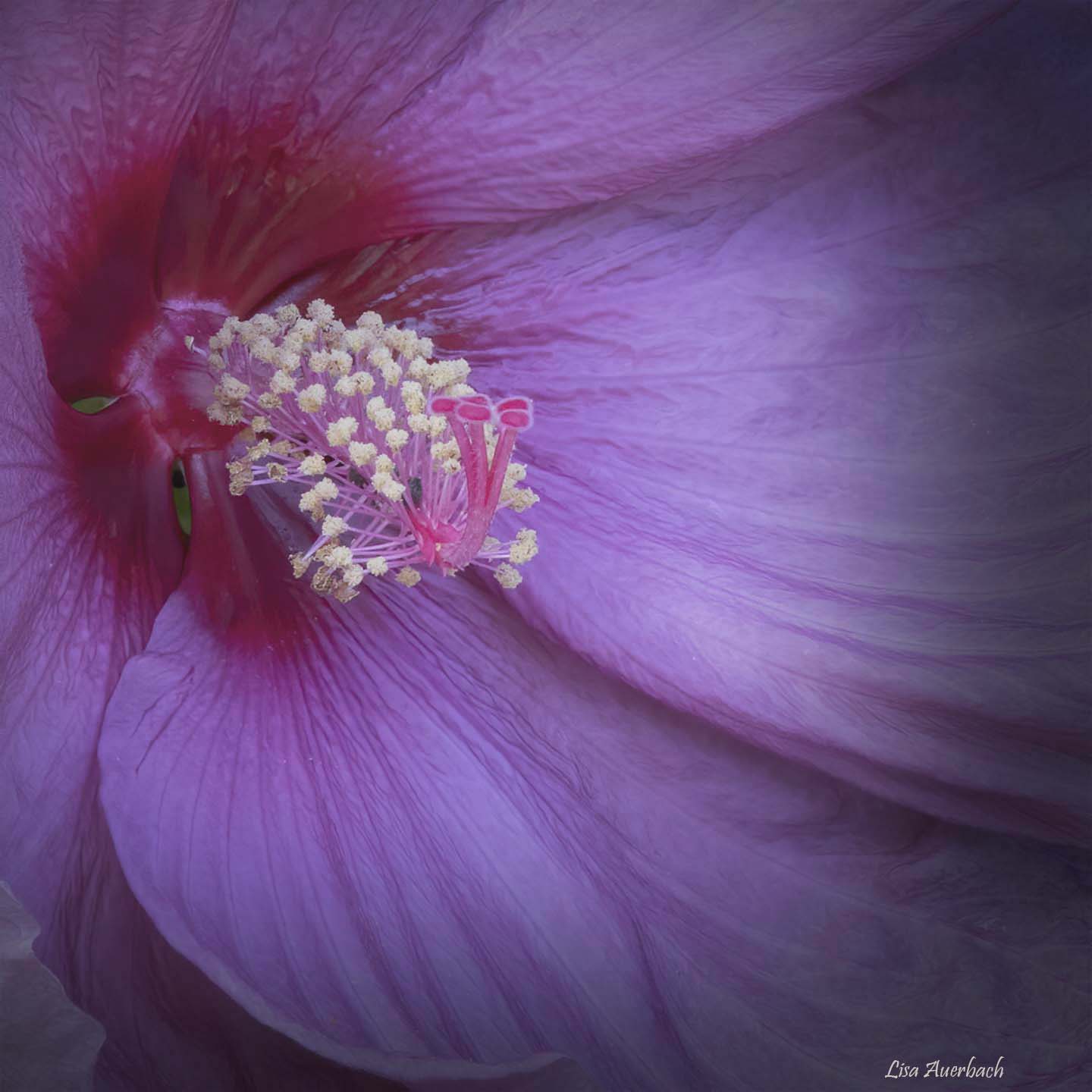
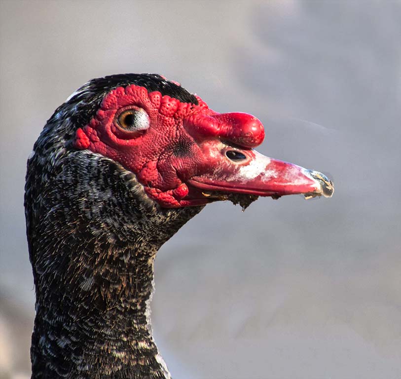
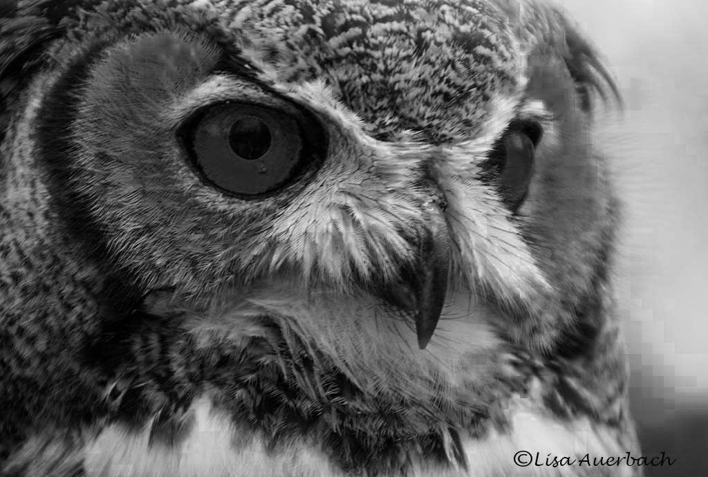
Your crop is grand. It does lead you from beak to eye, back to beak then all around. It omits parts that are unnecessary. I very much like the detail of the feathers surrounding the eye. It keeps me in the picture making me want to look even more. I like your second treatment. The feathers are a bit warmer reducing the over exposed top part of the original. |
Feb 13th |
| 52 |
Feb 21 |
Comment |
I like your crop. The colors of the original are deeper and richer rather than darker which makes me think your shadows are too high. I think your eye could be dodged and burned. Finally, with a smile on my face I tell you I think it needs a vignette. |
Feb 13th |
| 52 |
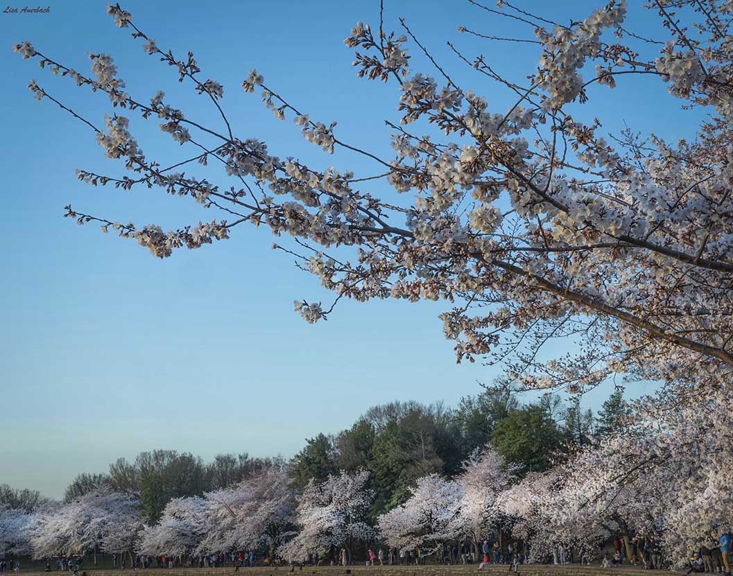
Feb 21 |
Comment |
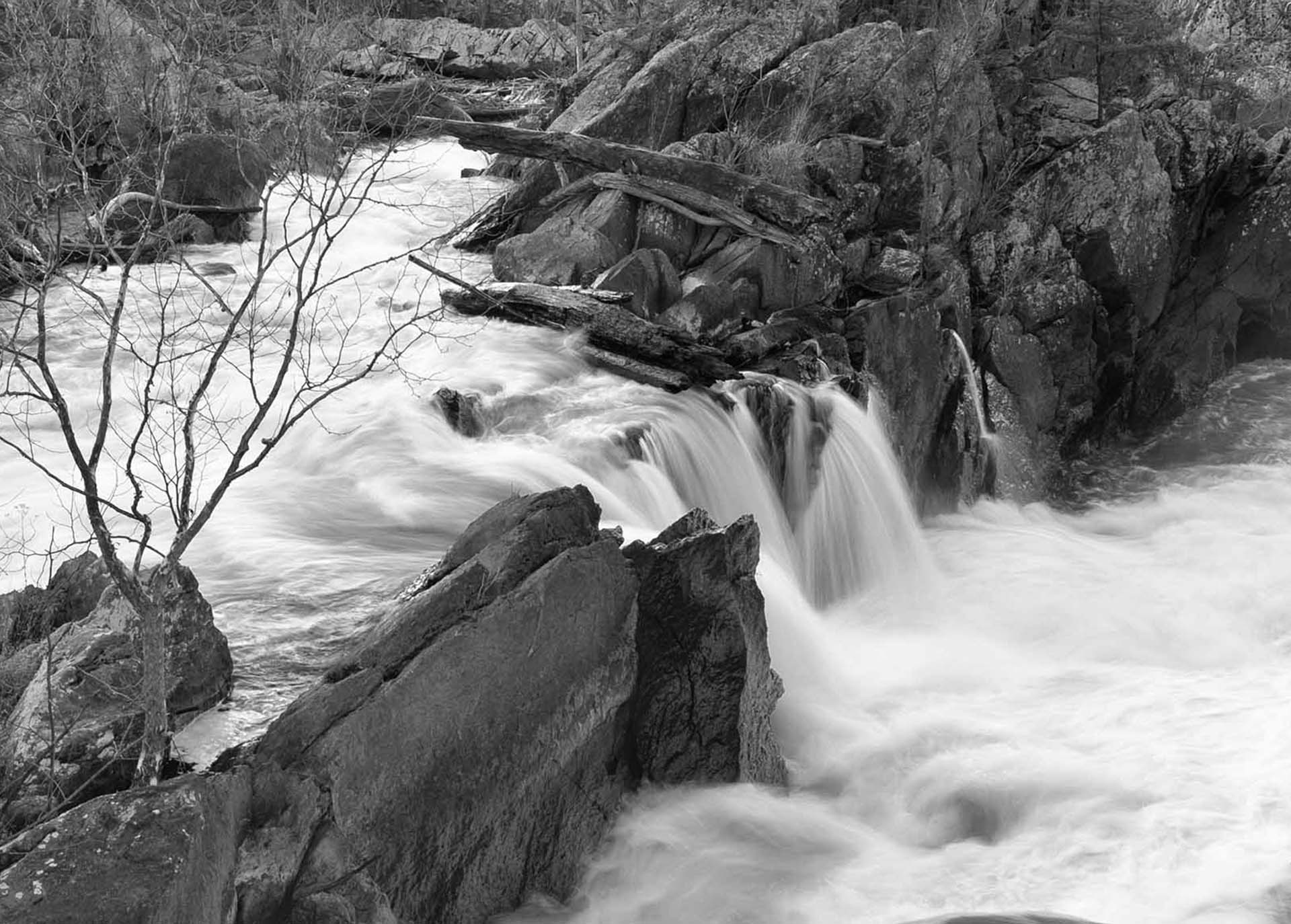
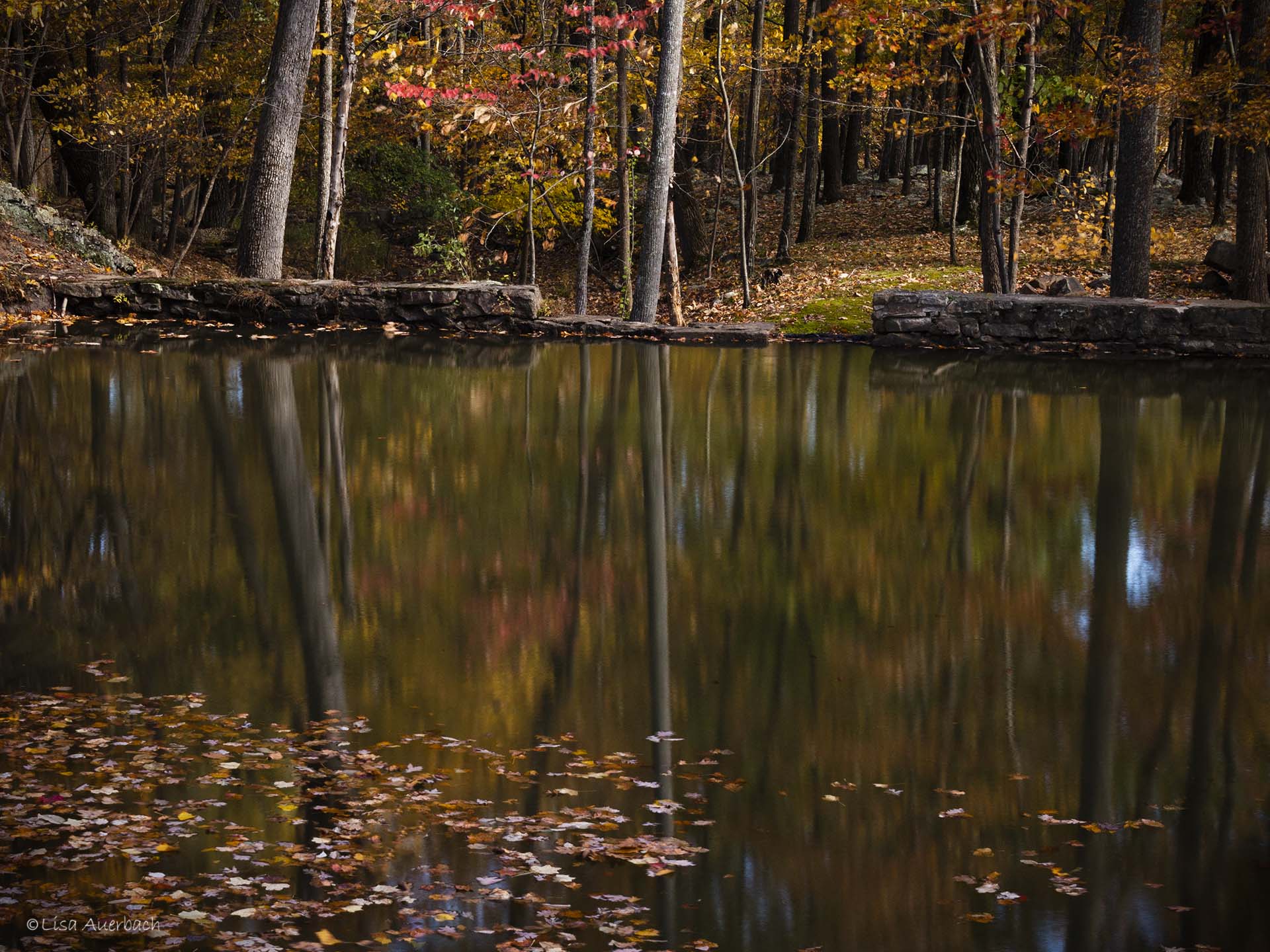
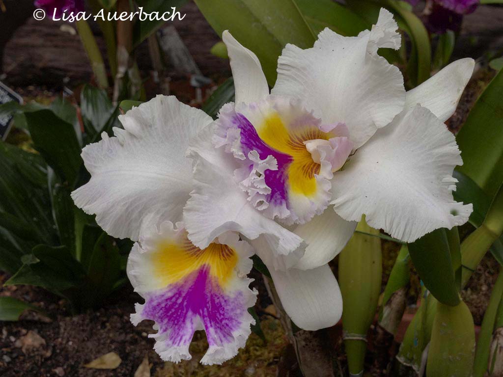
I have one image like the one you cropped. I liked both of them, and since the left is "hand of man" I considered leaving it out. However, the feeling that I got from being where I was helped me decide to include it.
Thanks, Mike. I always respect your suggestions. |
Feb 2nd |
7 comments - 2 replies for Group 52
|
7 comments - 2 replies Total
|