|
| Group |
Round |
C/R |
Comment |
Date |
Image |
| 40 |
Nov 20 |
Comment |
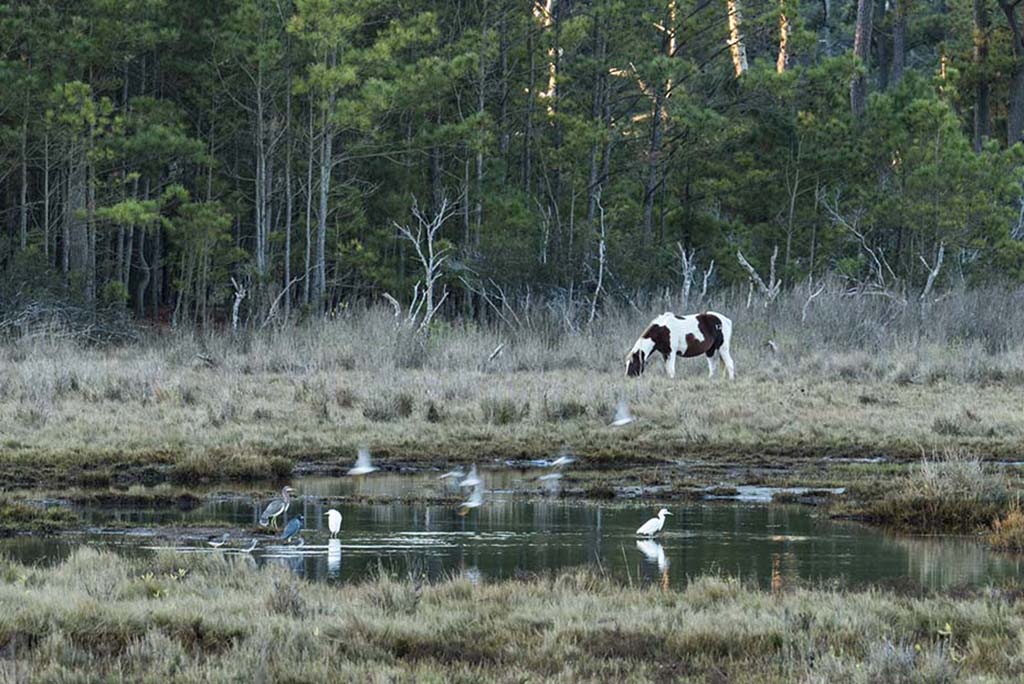
Hi, I'm Lisa from Group 52. I agree with all that Mike said. Some room on the sides would keep me from feeling penned in. I've seen a wonderful bird sanctuary in TX and know that they can be quite messy so there is little to be done about the bottom. However, the top wires, in my opinion, bring me out of the important part of the image. In the future you might try a wider aperture. You did not give your settings so I would not make a suggestion for the f/stop. The image is clear and the composition is interesting. |
Nov 10th |
1 comment - 0 replies for Group 40
|
| 52 |
Nov 20 |
Reply |
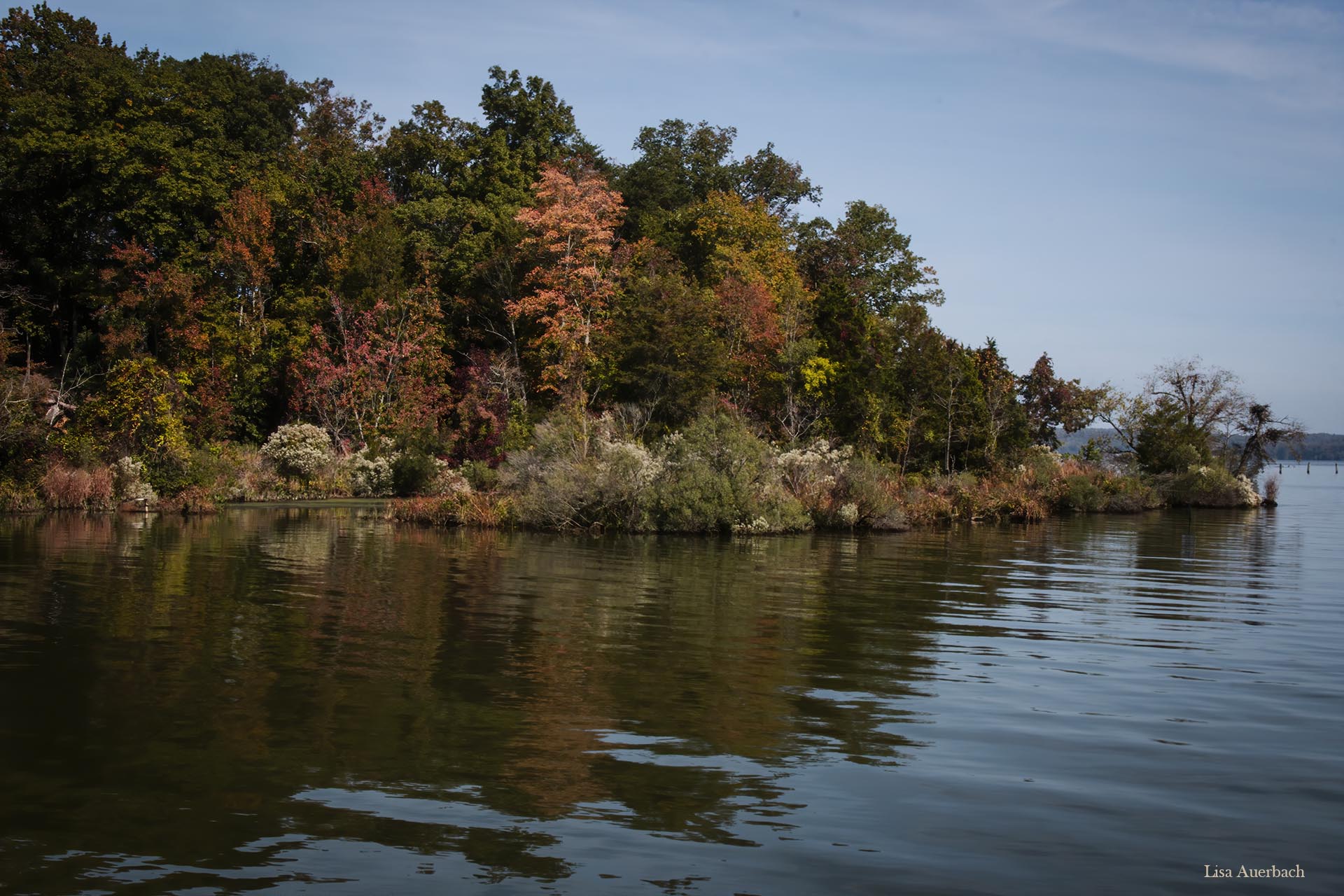
I like the water and sky but think the trees look processed. This is a problem I often have. I will work with mine before submitting it. Thank you for your, always welcome, suggestions. |
Nov 12th |
| 52 |
Nov 20 |
Reply |
Of course. As I said, the one we see is perfect, and it looks different only when I click on it to enlarge it. |
Nov 11th |
| 52 |
Nov 20 |
Comment |
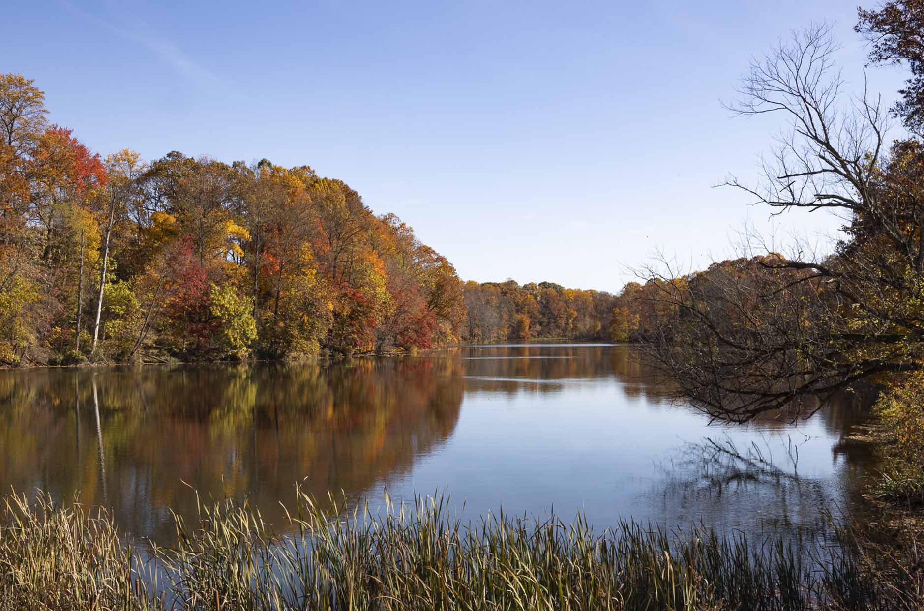
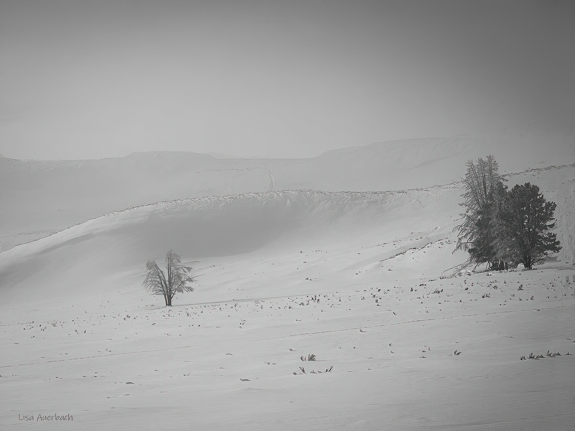
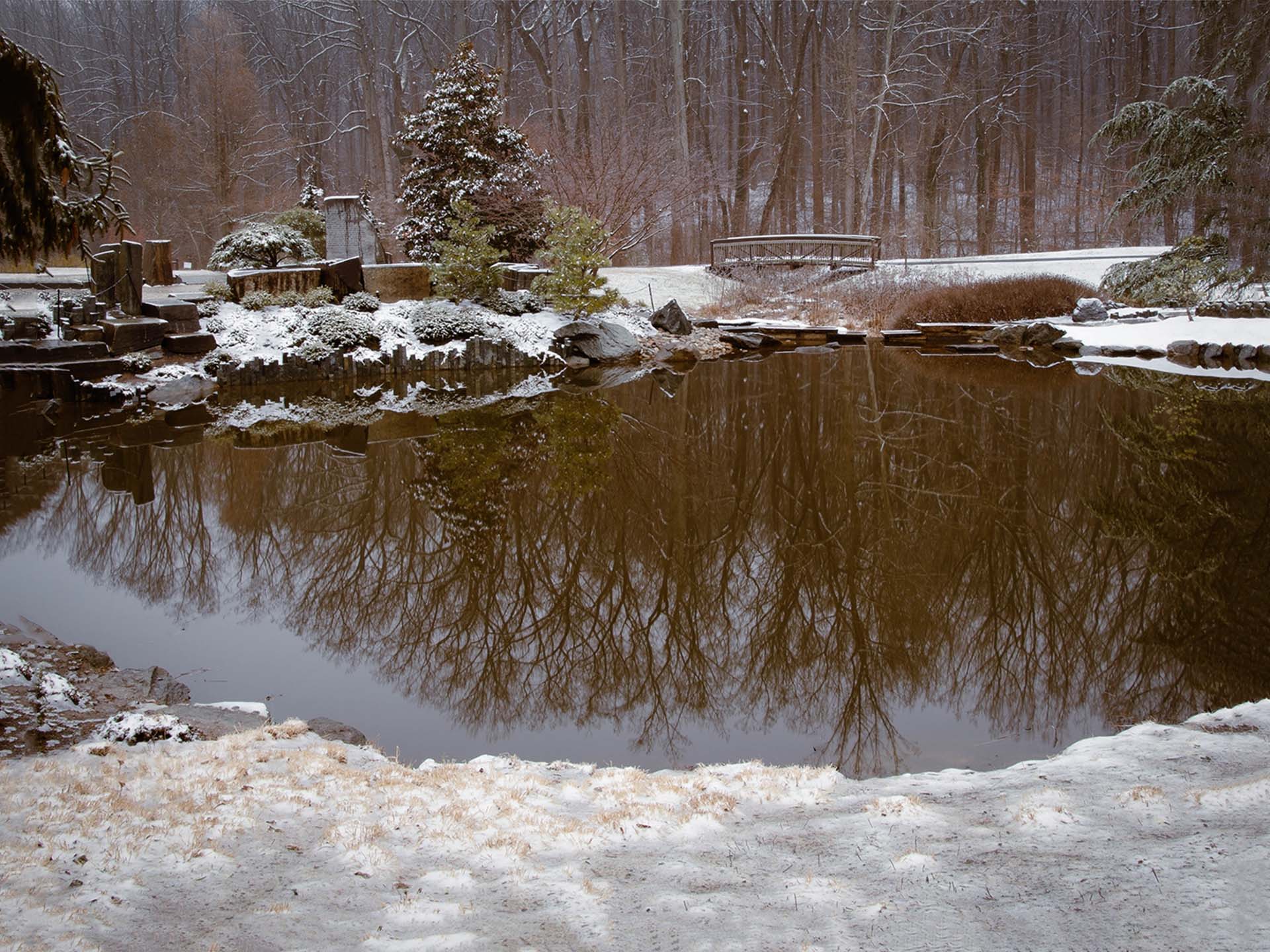
It was so dark to begin that what I did seemed right. I need to put the space of a few days between processing so that I see what all of you have noticed.
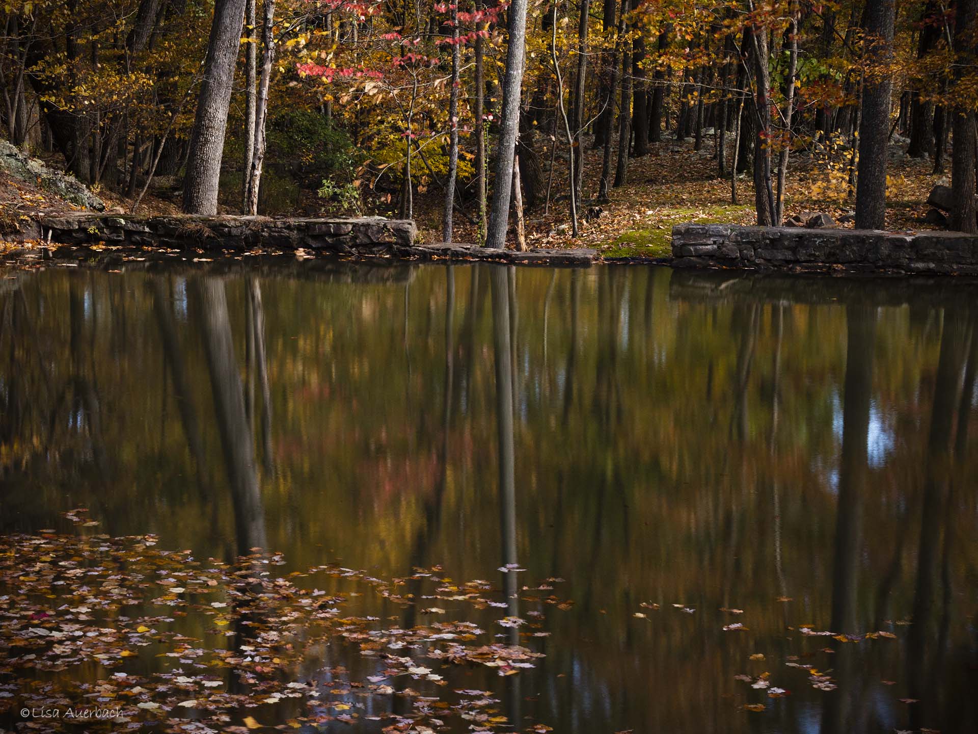
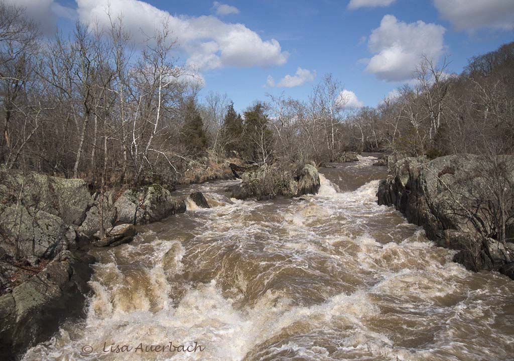
Thank you for comments, and yes, it is a simple tranquil scene with no particular focus. |
Nov 11th |
| 52 |
Nov 20 |
Reply |
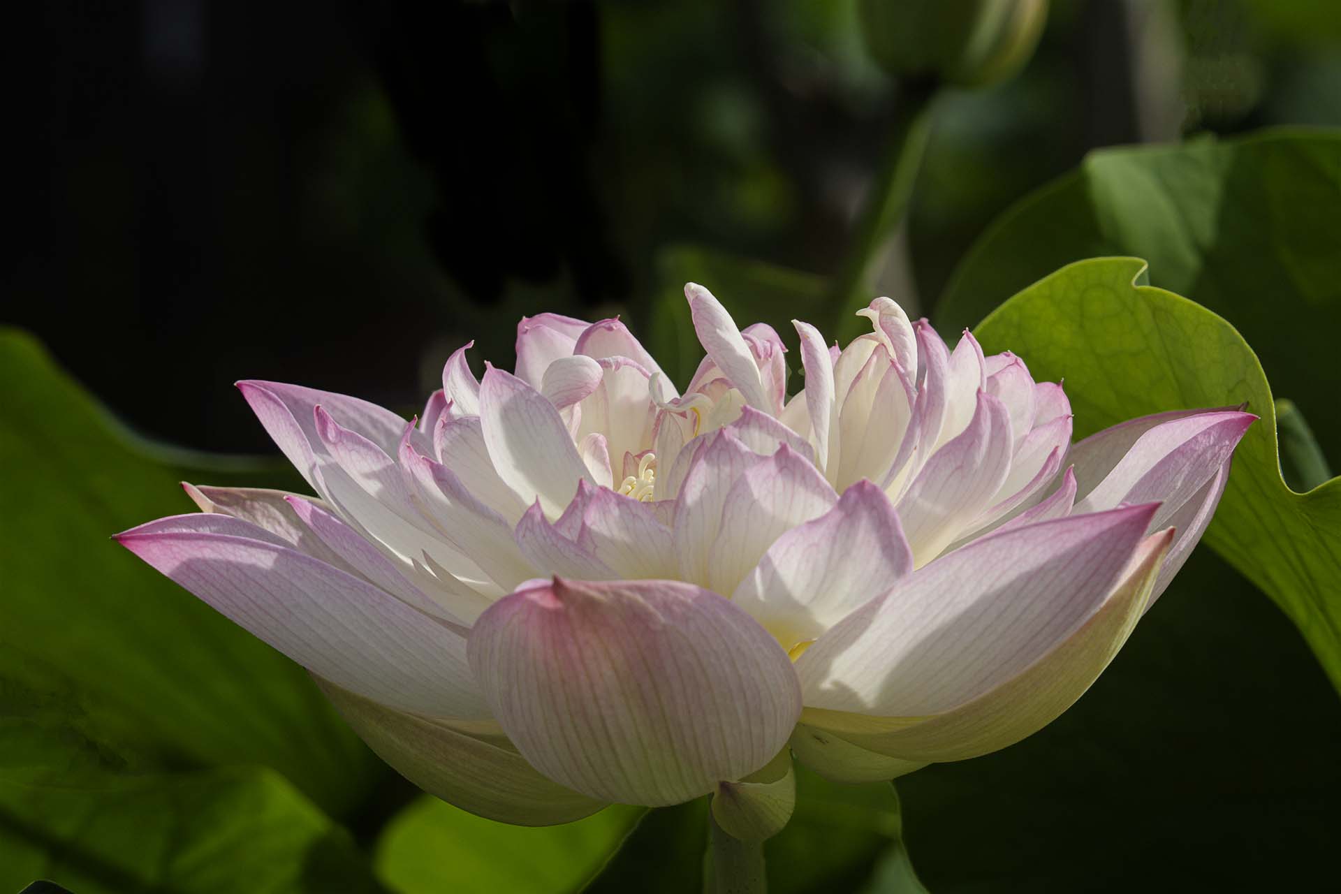
I like your treatment. I need to give several days between first and next edit. Compared to the original this looked right. Yours looked even better exposed.
Thank you. |
Nov 11th |
| 52 |
Nov 20 |
Comment |
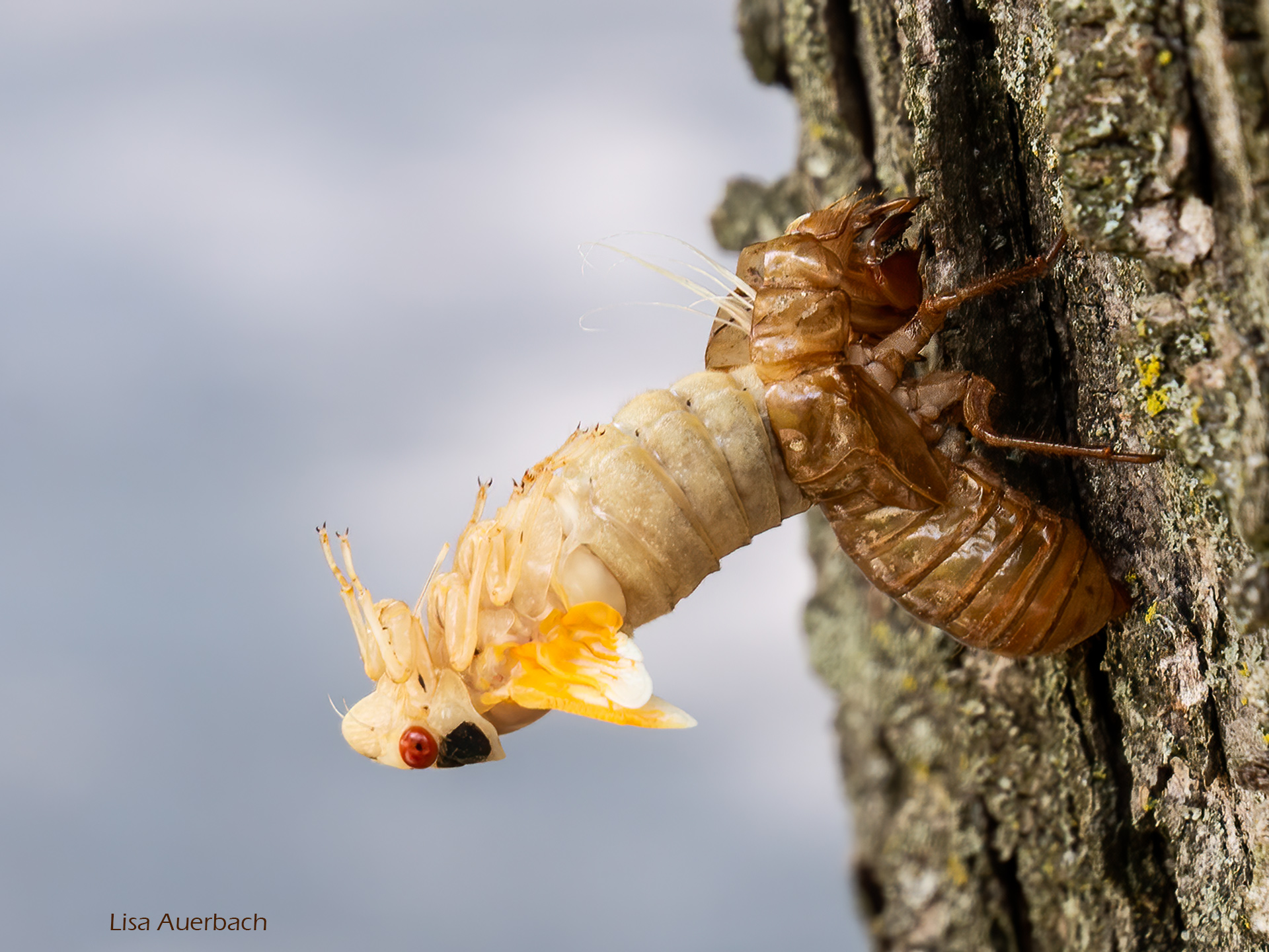
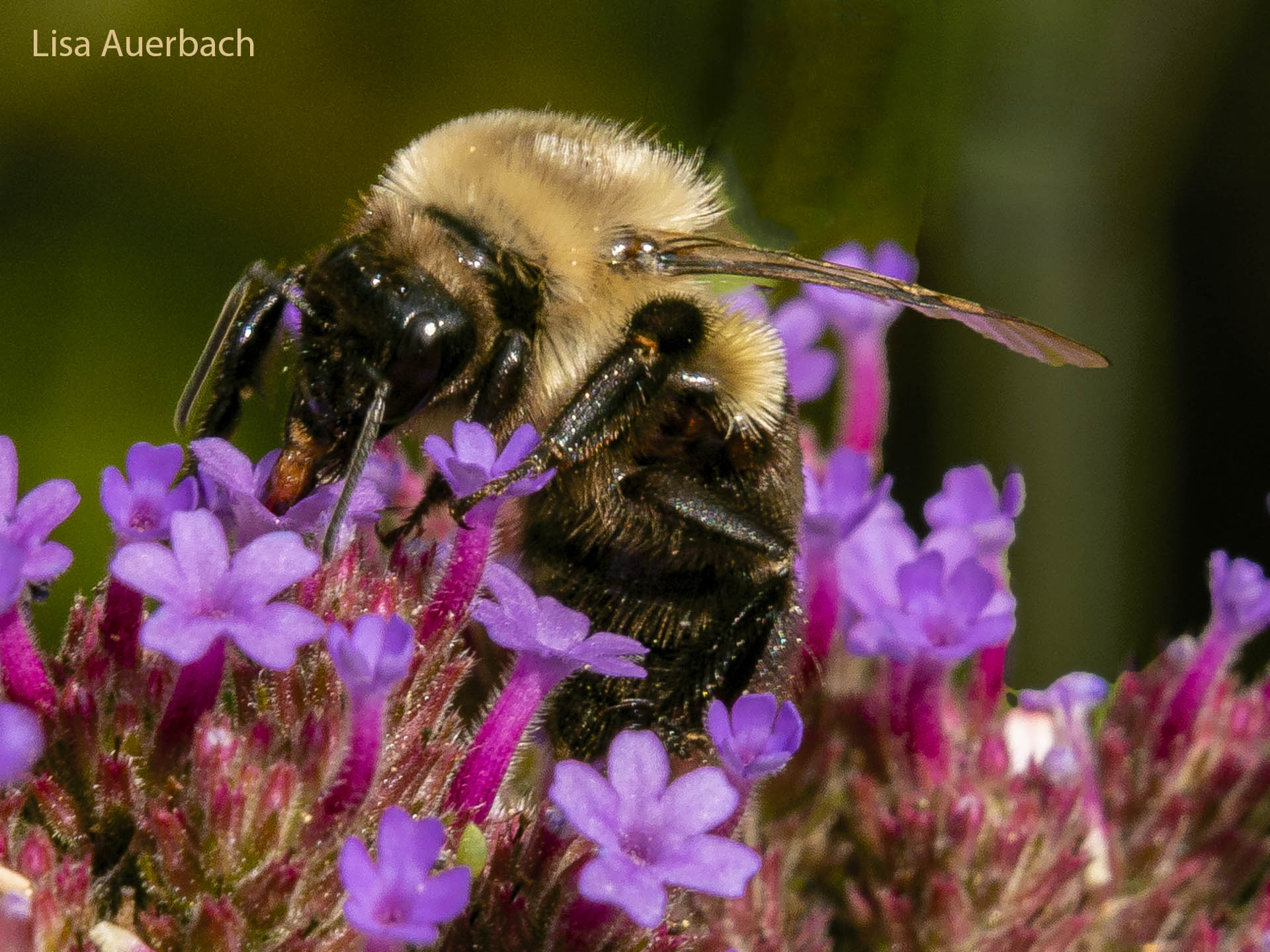
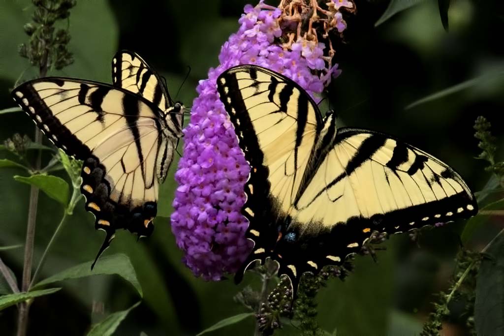
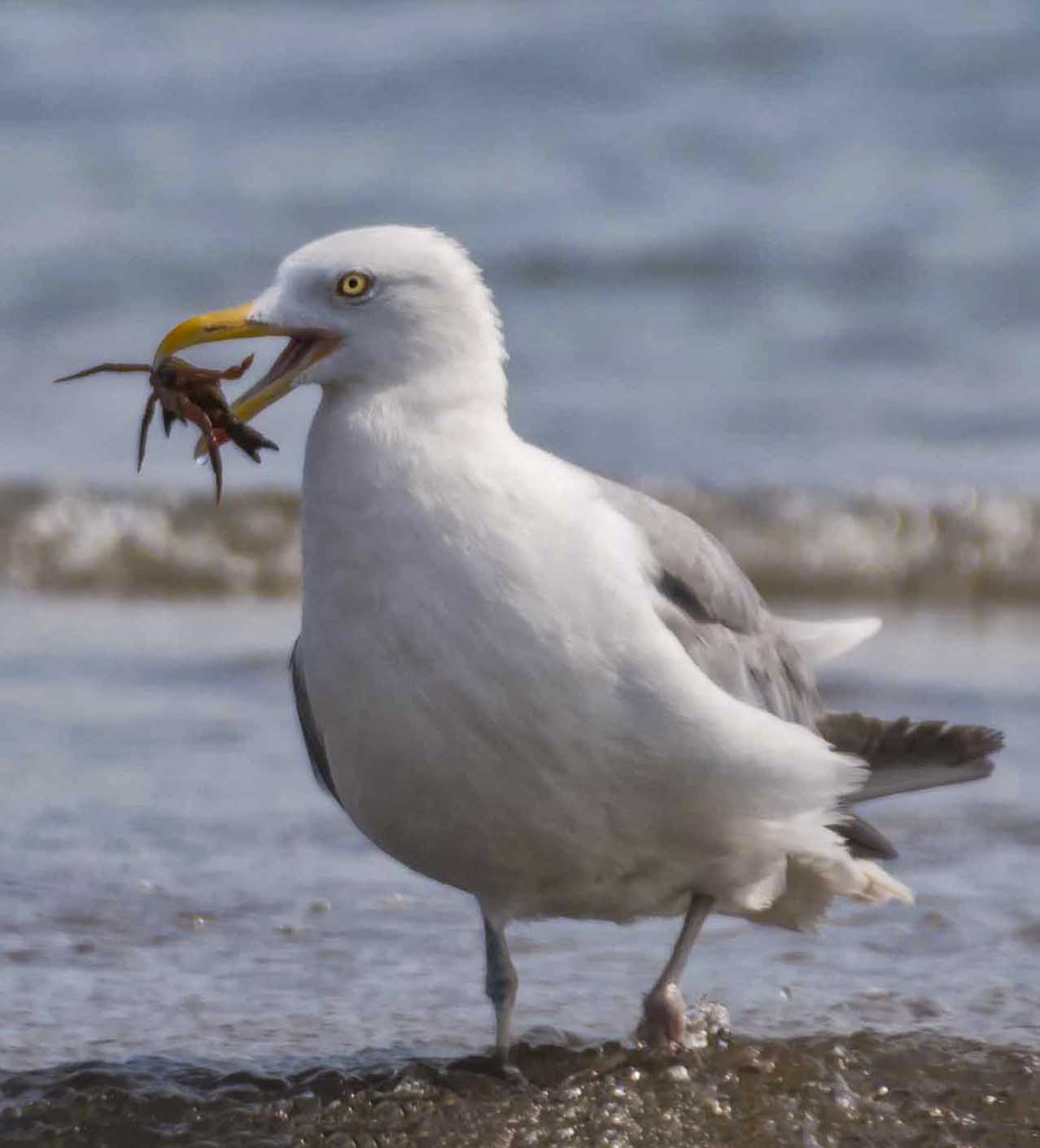
I don't see texture as a flaw. You have done well with a fast subject. You have a good crop which shows the Kingfisher well. I like it but I also like the crop suggested by LC. The colors are inviting. The background works with the colors of the bird. There is an area of the right side middle high background that could be improved with a mixer brush to smooth out . It looks like white streaks. There is a spot on the bill? It is not clear enough to show as a water droplet thus is a distraction. The other droplets are, for me, a distraction. Otherwise this is a lovely shot. |
Nov 11th |
| 52 |
Nov 20 |
Comment |
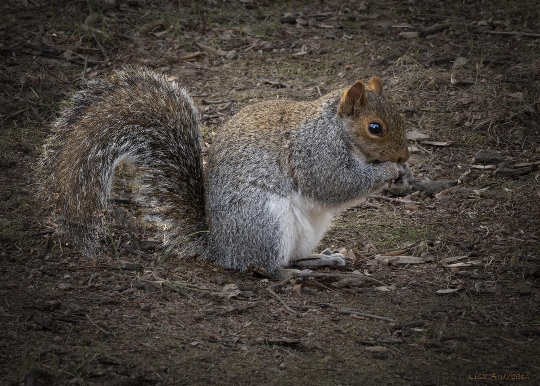
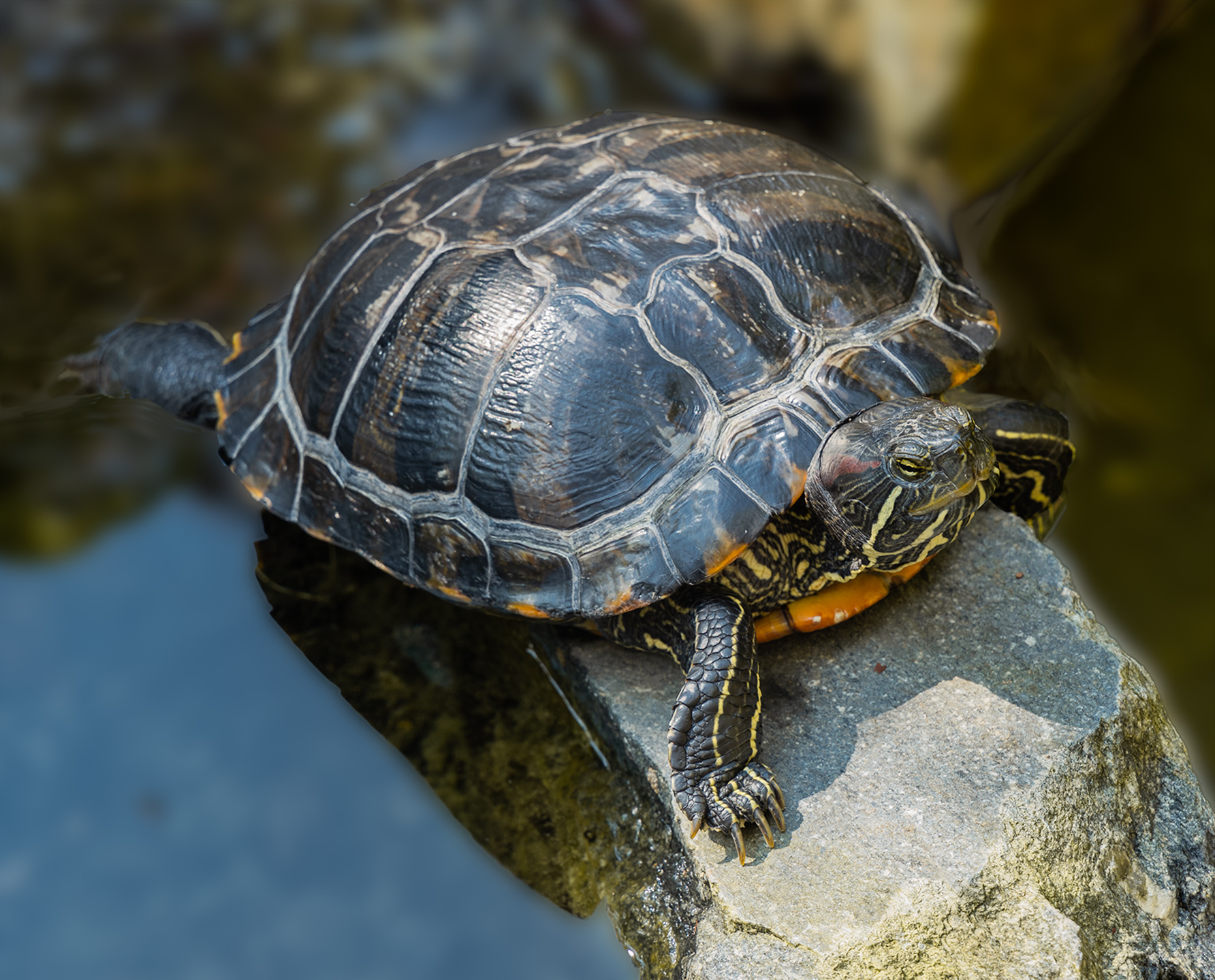
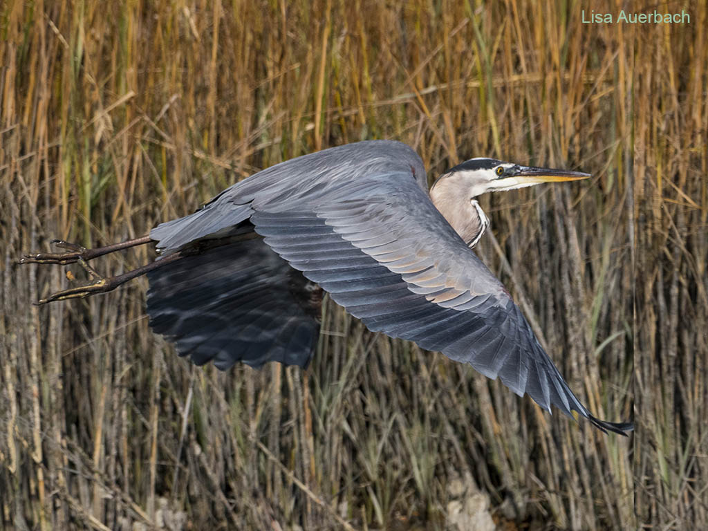
I have come to know that I need a tripod any time I shoot birds. My hands are not steady no matter how fast my shutter speed. I like the palette, finding it soothing. The branch would work if you cloned it to end at the bottom of the image. Then the viewer would know there is more but off the screen. I like the light on the bird. |
Nov 11th |
| 52 |
Nov 20 |
Comment |
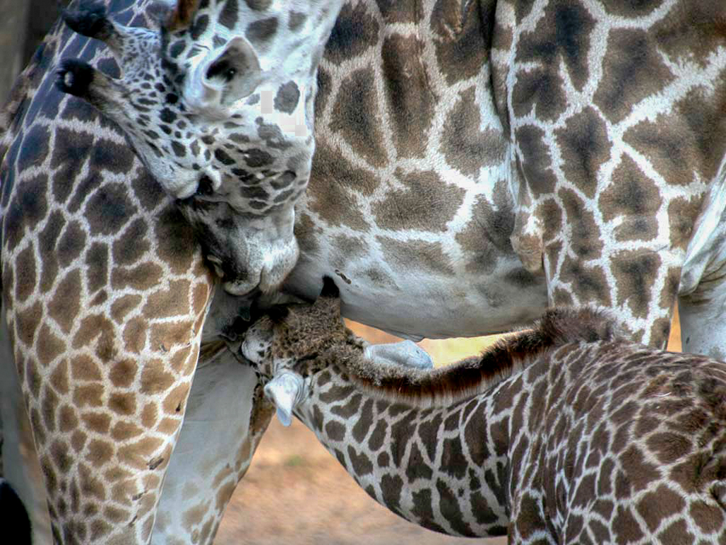
This is a fun image and good nature story. I think your work on the birds is a good beginning. I would suggest that you add a separate layer to each bird's head, then raise the levels to lighten the heads. I also suggest you do this to the right bird's raised leg. It is an interesting part of the image and can use a boost so the viewer will see it. I would add a layer to the background then work with the background to lower the glare. I used levels for all of these suggestions. Once you are in levels you can see what you like. Welcome to our group, and I look forward to more images from you. |
Nov 11th |
| 52 |
Nov 20 |
Comment |
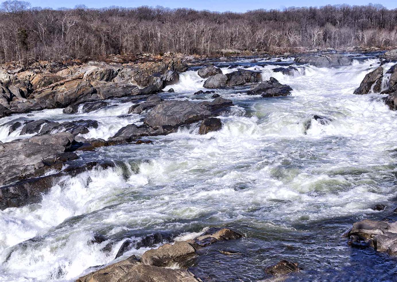
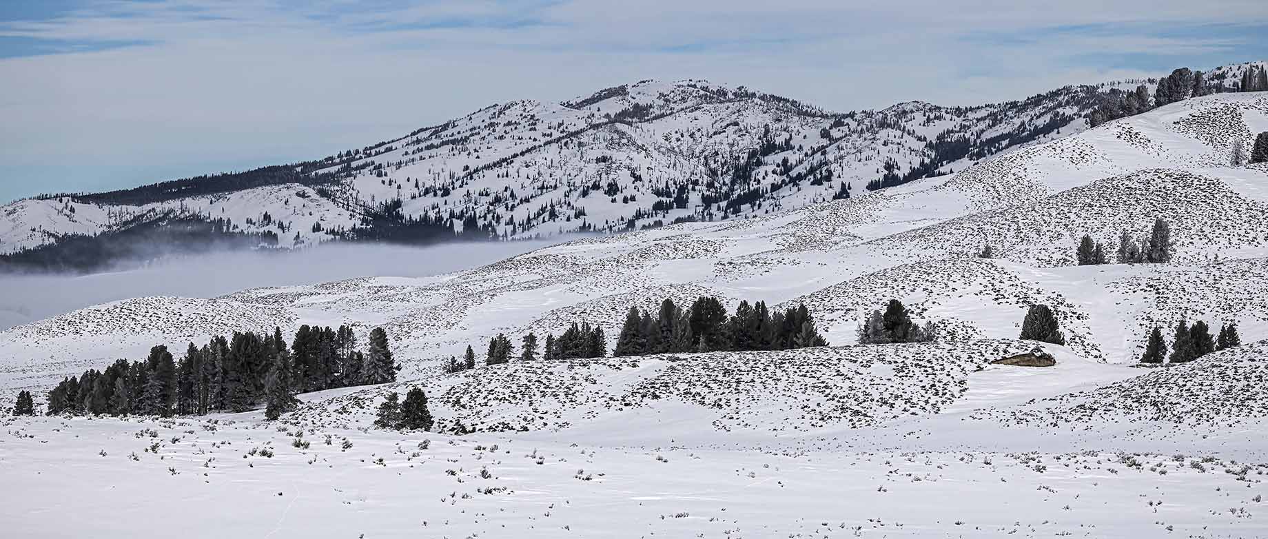
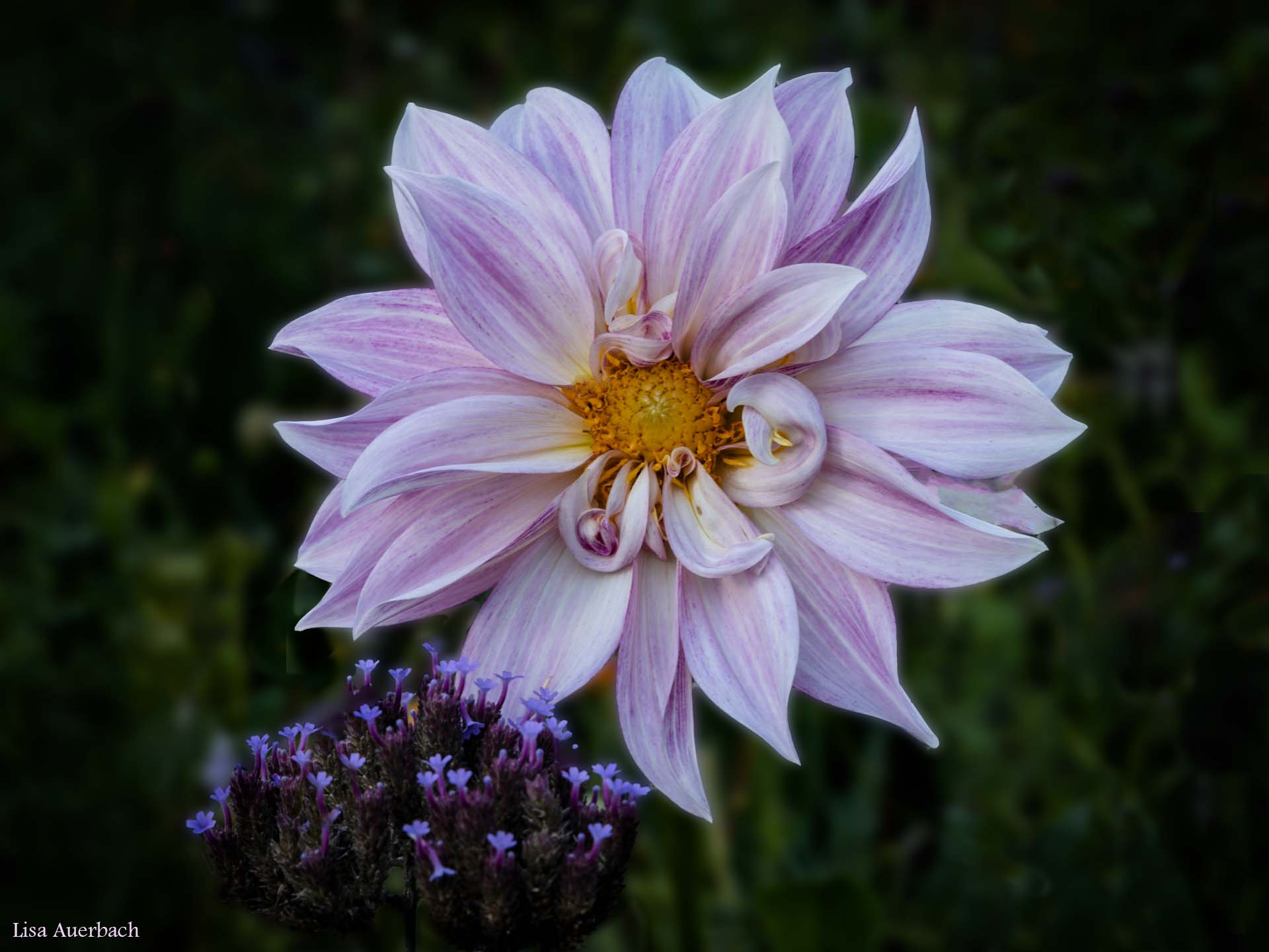
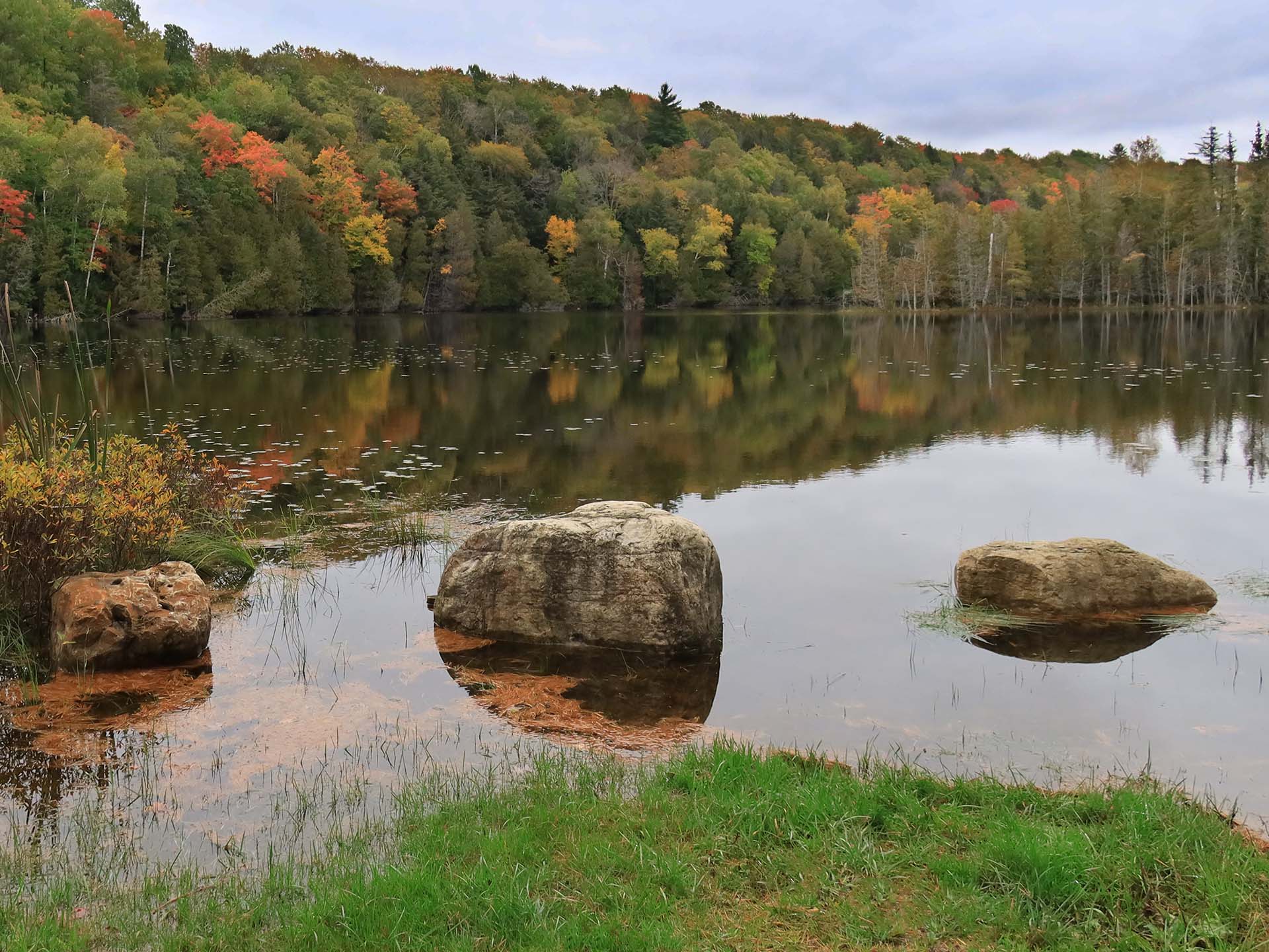
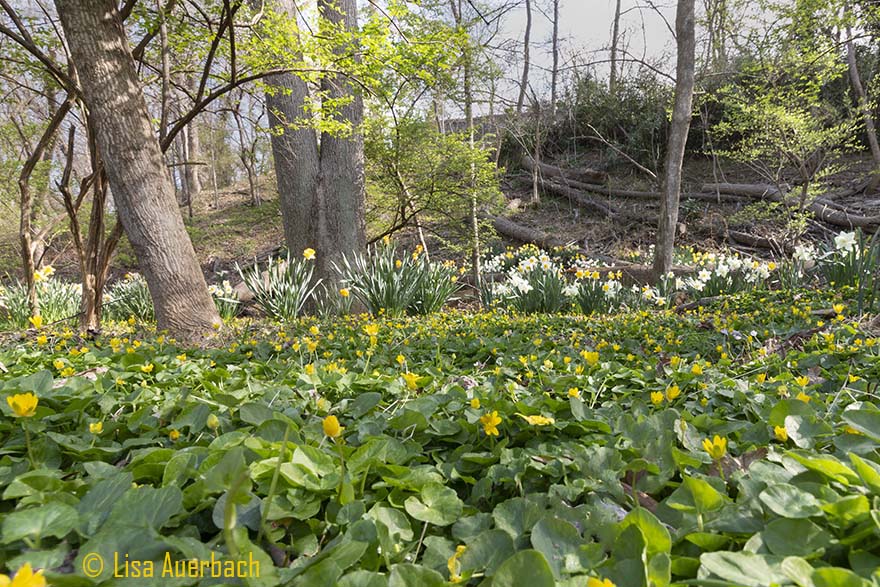
The rolling hills bring calm and interest to the image. The yellows are lovely. Your choice of settings worked well for the shot. You have clarity from fore to backgrounds. I suggest that you bring out levels of the green and especially the sky. In my opinion they could be a small bit deeper. If not the greens, especially the sky. A simple levels adjustment would bring out the blue. |
Nov 11th |
| 52 |
Nov 20 |
Comment |
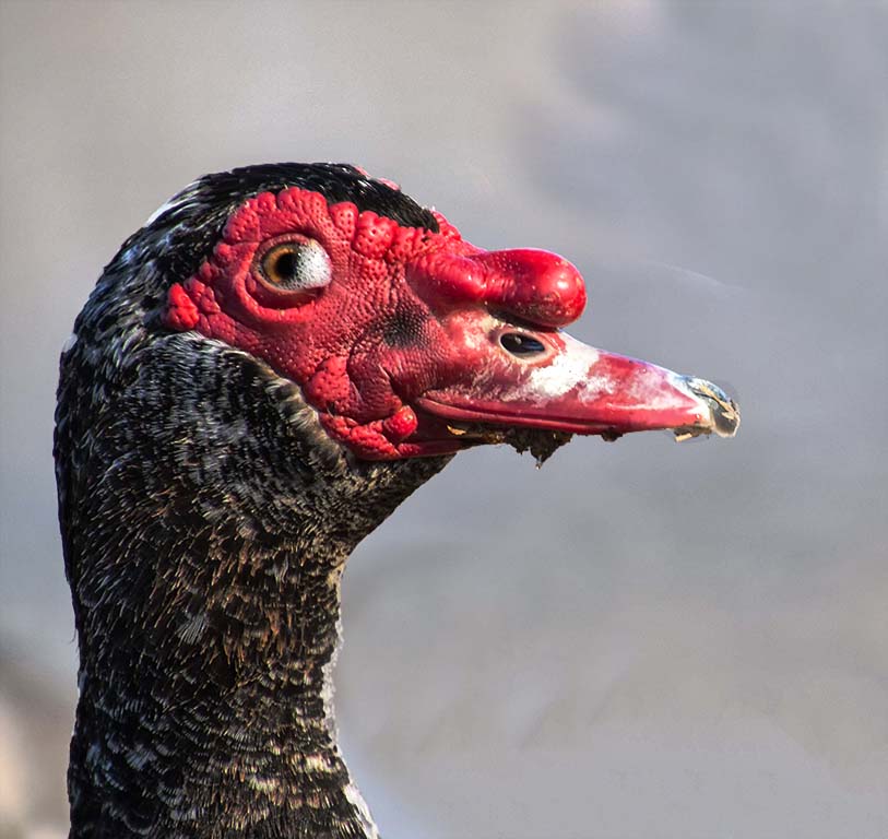
Pamela, what a grand image. The eye of the adult albatross is beautifully sharp and catching. The feathers are smooth and clear. I find the lower part of its mouth/bill interesting and had to look at it for a moment. If wish I could see to the end of the bill. The chick is well shot and completes the nature story. Your surrounding colors compliment the whole image. Well done. |
Nov 11th |
| 52 |
Nov 20 |
Comment |
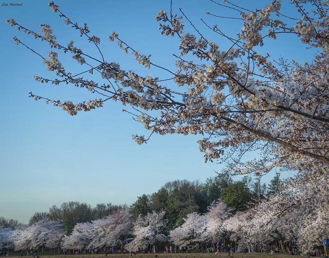
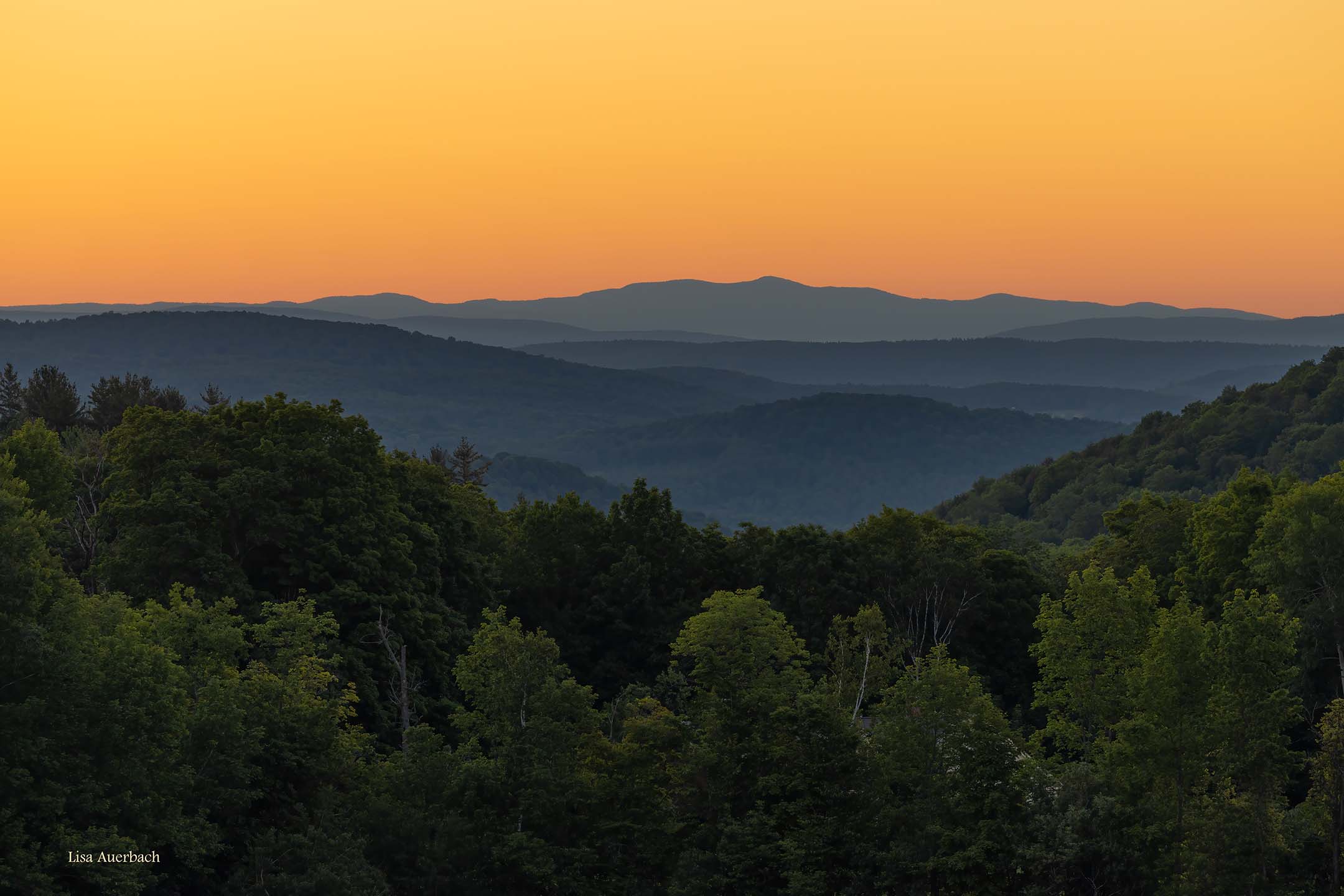
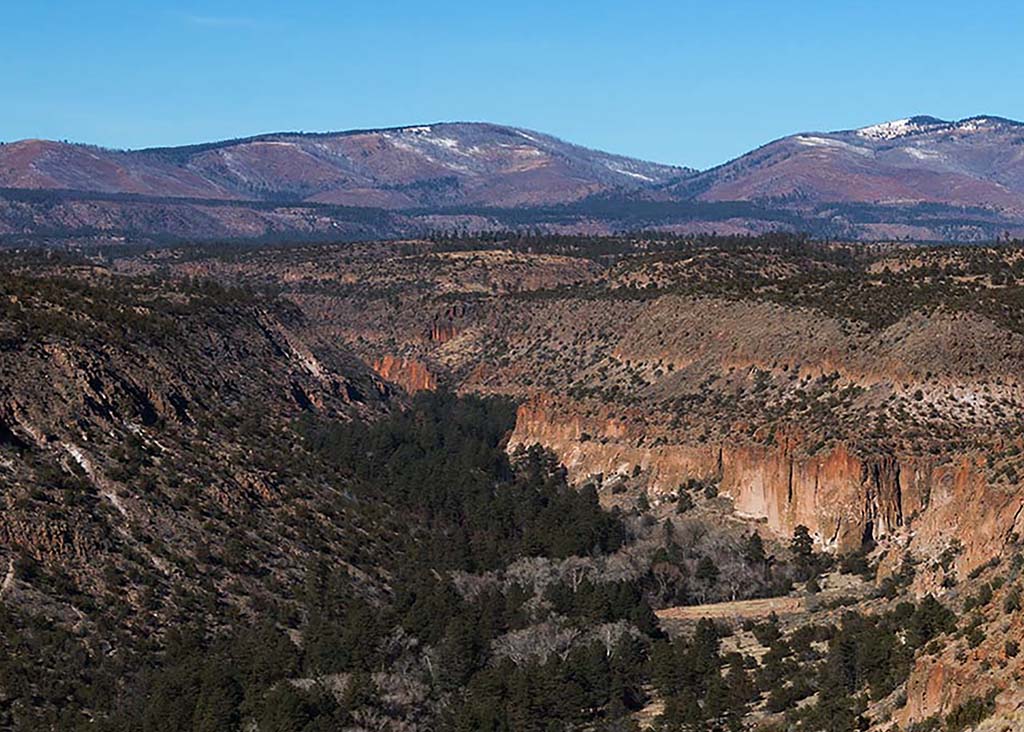
Oh my, what beautiful photography and processing. Of course, this should be entered in Nature. There are many things to notice: The composition is wonderful. The sun is in a perfect position with perfect brightness. The rays take me down to the valley and ridges. I like how the layers take me around the image to investigate history of the land. The clouds are odd but not unnatural, and the blues enhance/cool the otherwise warm valley. When I view the image presented on the screen it seems smooth. When I open it to a larger view, it seems a bit over sharpened. I am curious if it is my screen or if others see this. |
Nov 11th |
7 comments - 3 replies for Group 52
|
8 comments - 3 replies Total
|