|
| Group |
Round |
C/R |
Comment |
Date |
Image |
| 40 |
Sep 20 |
Comment |
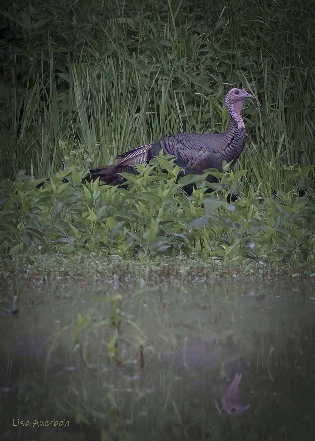
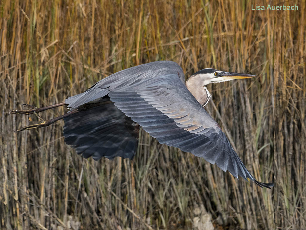
Hi Andrew,
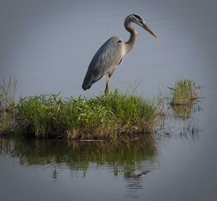
I too, consider the sky a distraction. The sky that was natural to the image compliments the heron. I have found that often the artificial skies compete with the image. I have begun to build my own personal sky library.
I think you have a strong original image. You can play with the sky with levels or filters that work for you to bring out more or less in the sky as you so choose. I suggest cropping some of the sky so more emphasis is placed on the heron. |
Sep 16th |
1 comment - 0 replies for Group 40
|
| 52 |
Sep 20 |
Reply |
Thank you, Sharon. I thought of you when I decided on the square crop. I've gotten great ideas from this group over time. |
Sep 13th |
| 52 |
Sep 20 |
Reply |
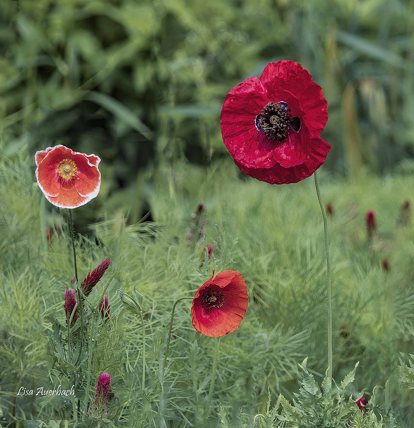
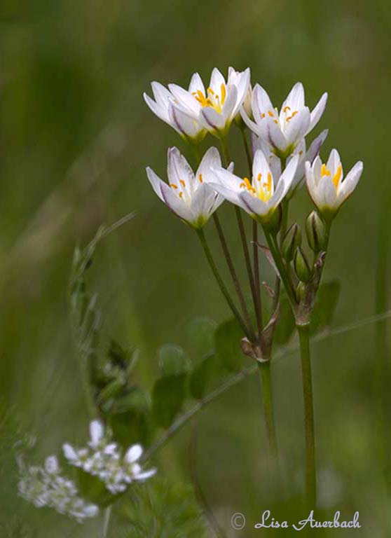
My crop put the center of the flower on a power point while giving it space on the right. I tried other crops but my focus would not have fit well. Your suggestion of more on the left is a good one although it did not work for this flower. |
Sep 10th |
| 52 |
Sep 20 |
Reply |
I tried the dodge, and I like it. Thank you for the good suggestion. This has only one pass for the dodge. |
Sep 10th |
 |
| 52 |
Sep 20 |
Comment |
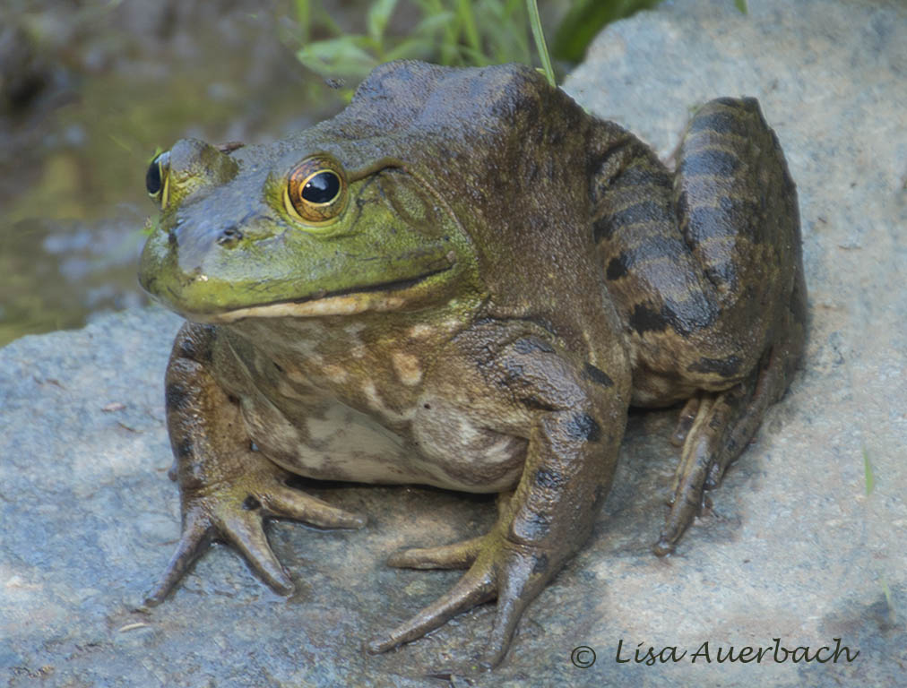
Both last month and this month, I have noticed how well you have manipulated the background. It is not blurred as in bokeh, yet is is not a distraction and does add the the whole image. You have captured the eyes beautifully which draws me right into the image. My one distraction is the arm which is too dark. I think you can bring up the shadows a bit to add to the beauty of the image. |
Sep 10th |
| 52 |
Sep 20 |
Comment |
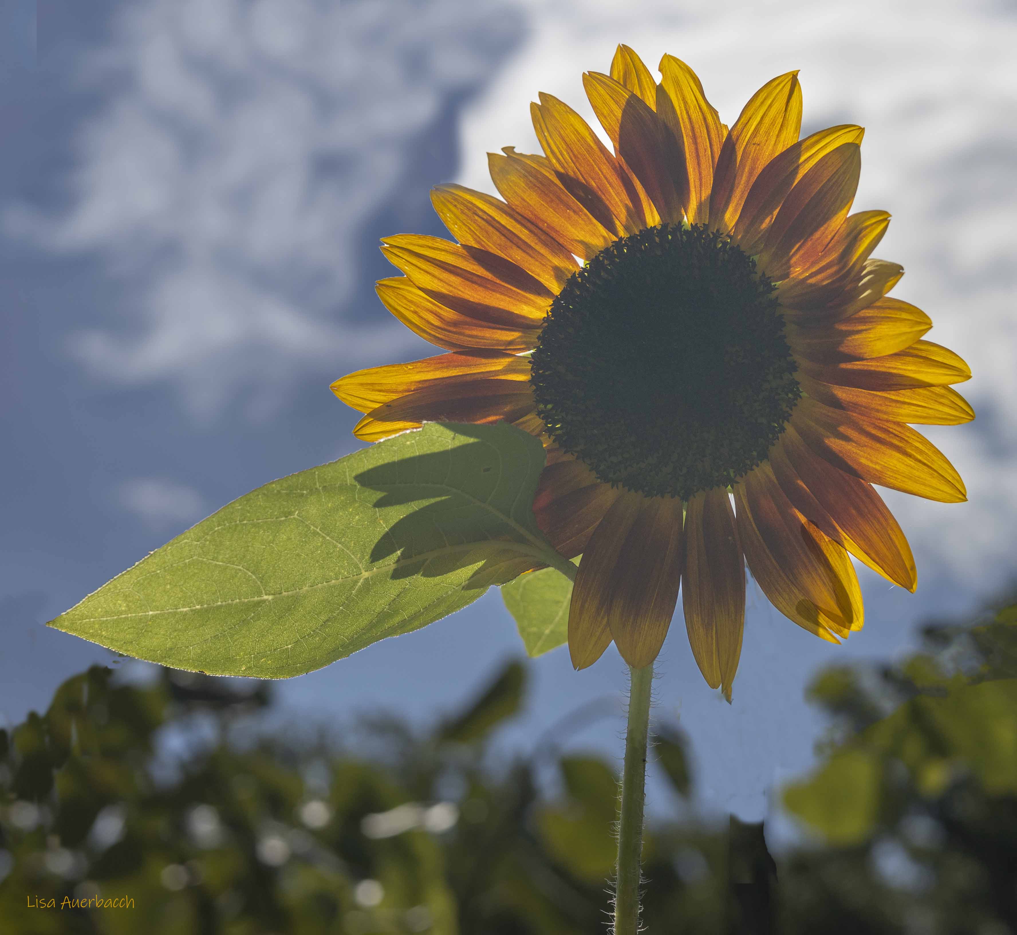
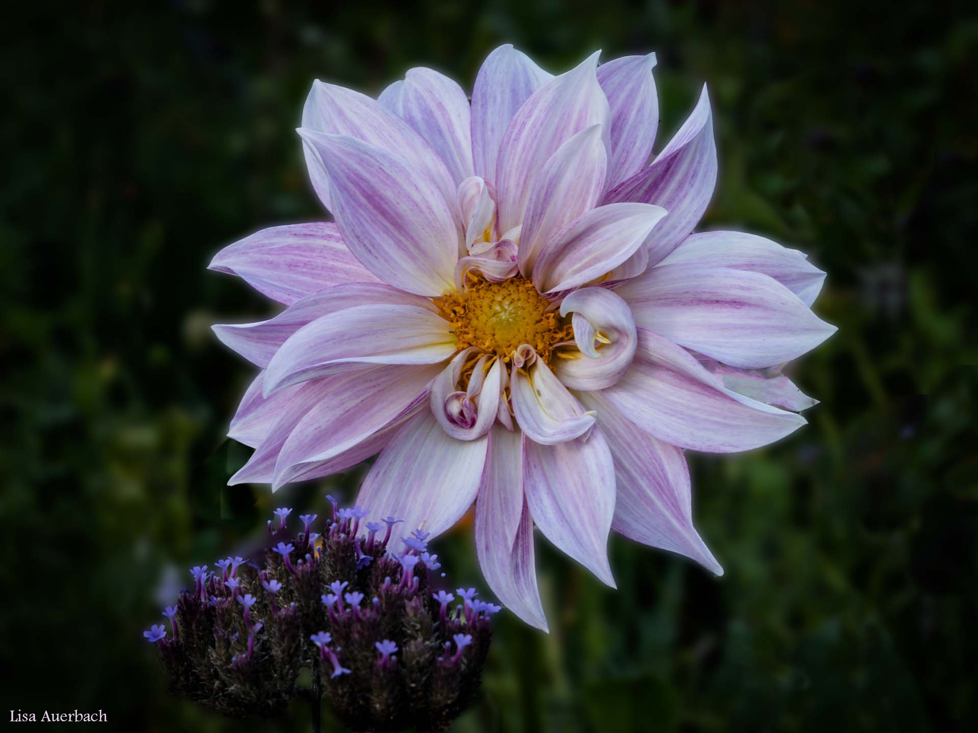
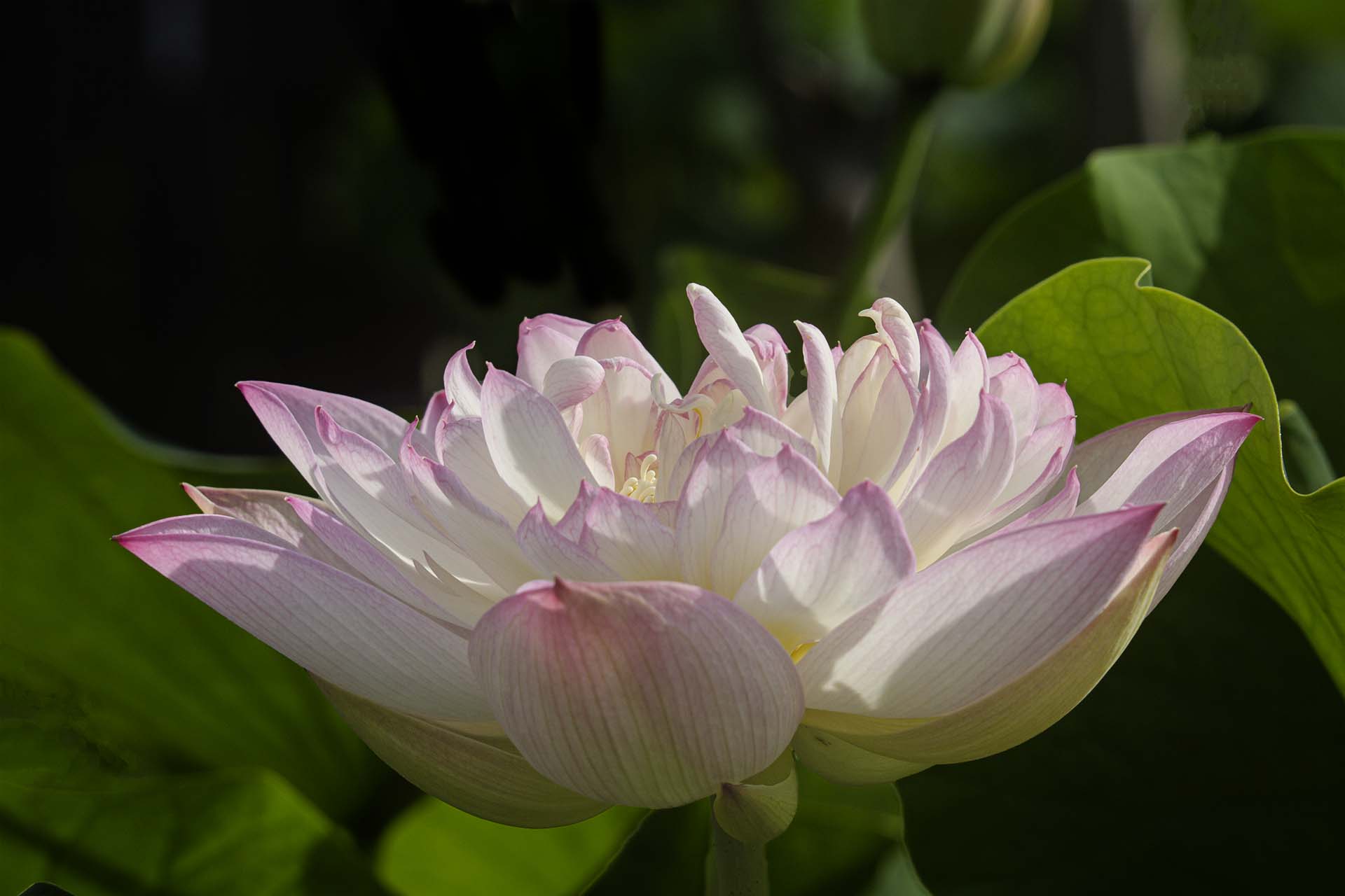
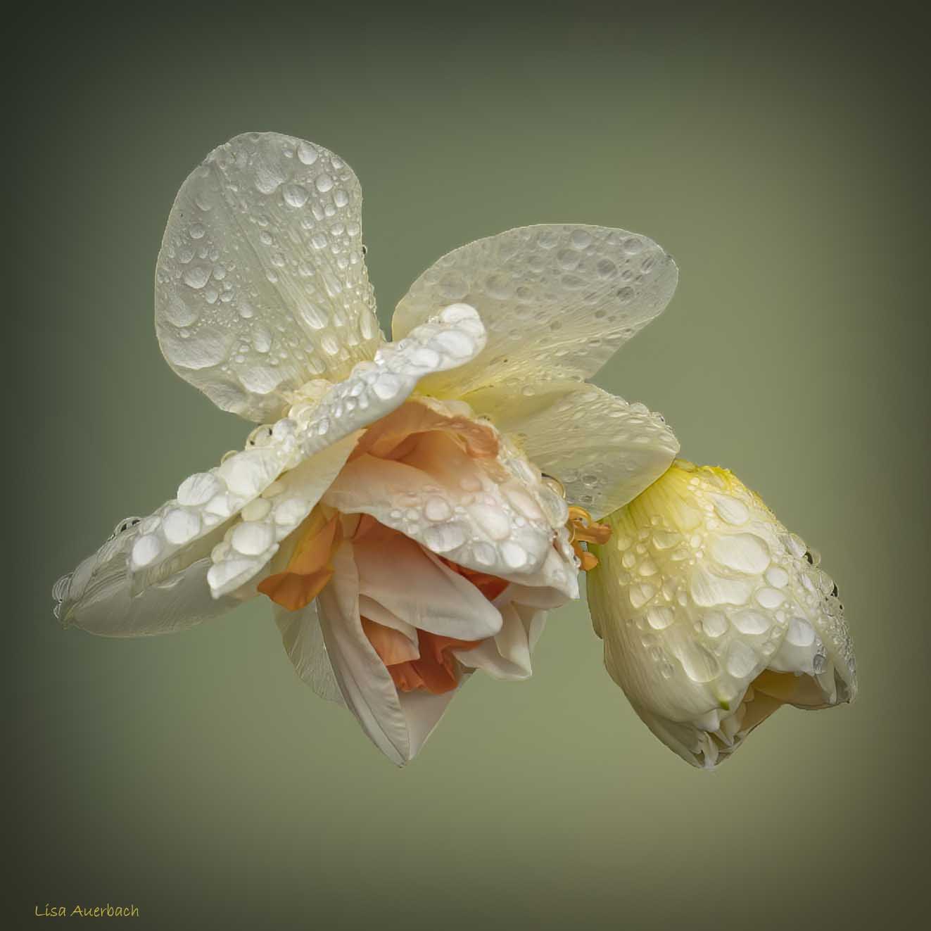
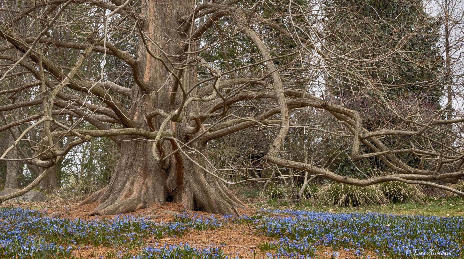
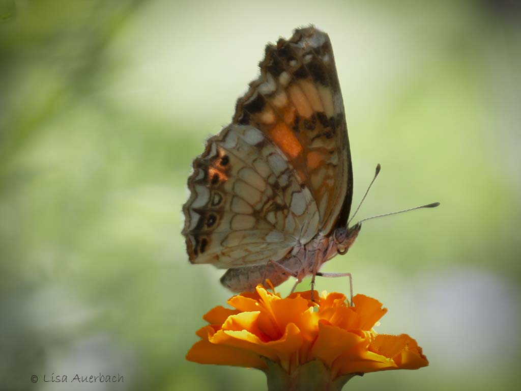
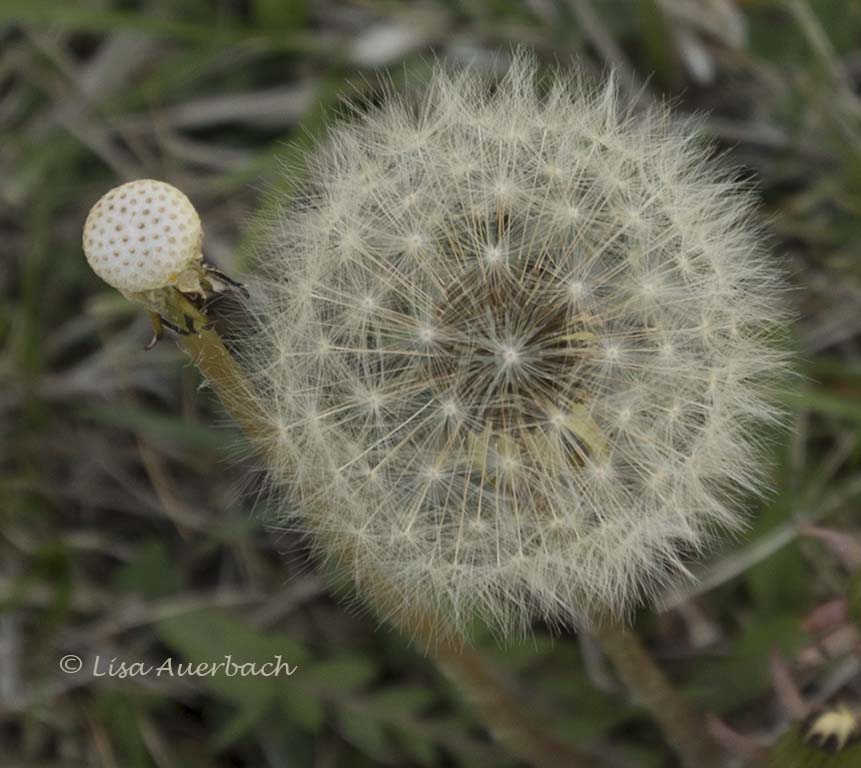
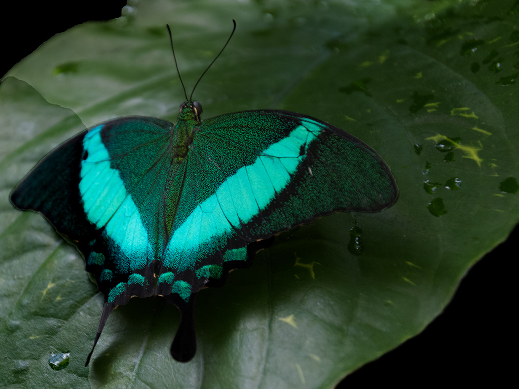
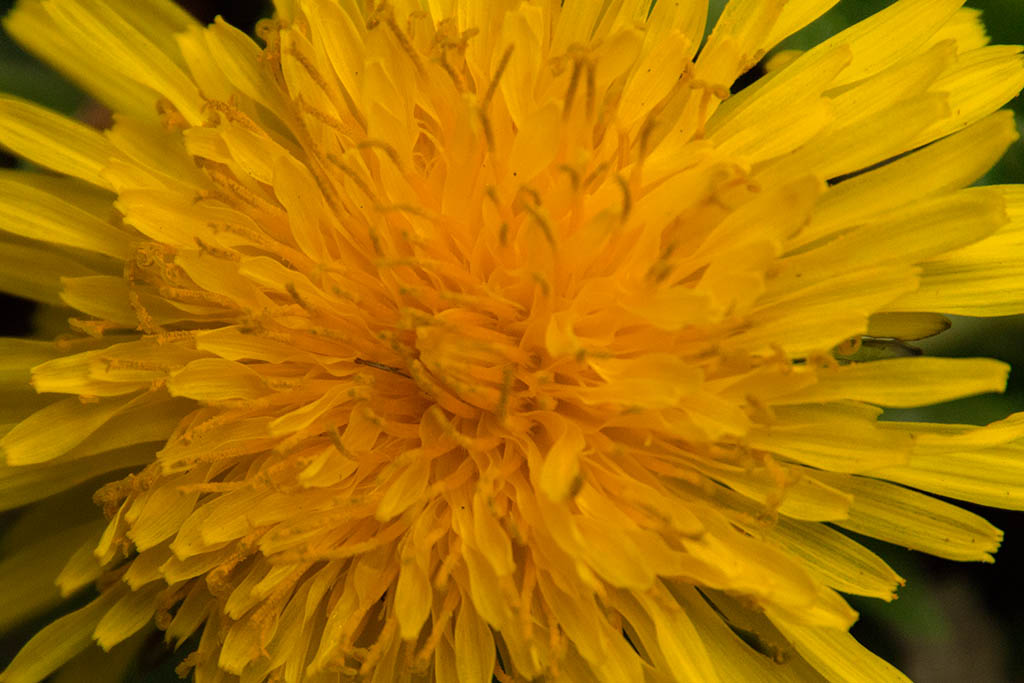
The high key and white vignette work well for this image. Stopping down your aperture to perhaps f/11 or f/16 might have given you a sharper image of the leaves on the right. Since the center leaves are the sharpest I suggest cropping so they are on a power point. In that way, the beginning group of flowers on the left would lead my eye to the sharpest point. Your colors compliment each other and are lovely. |
Sep 10th |
| 52 |
Sep 20 |
Comment |
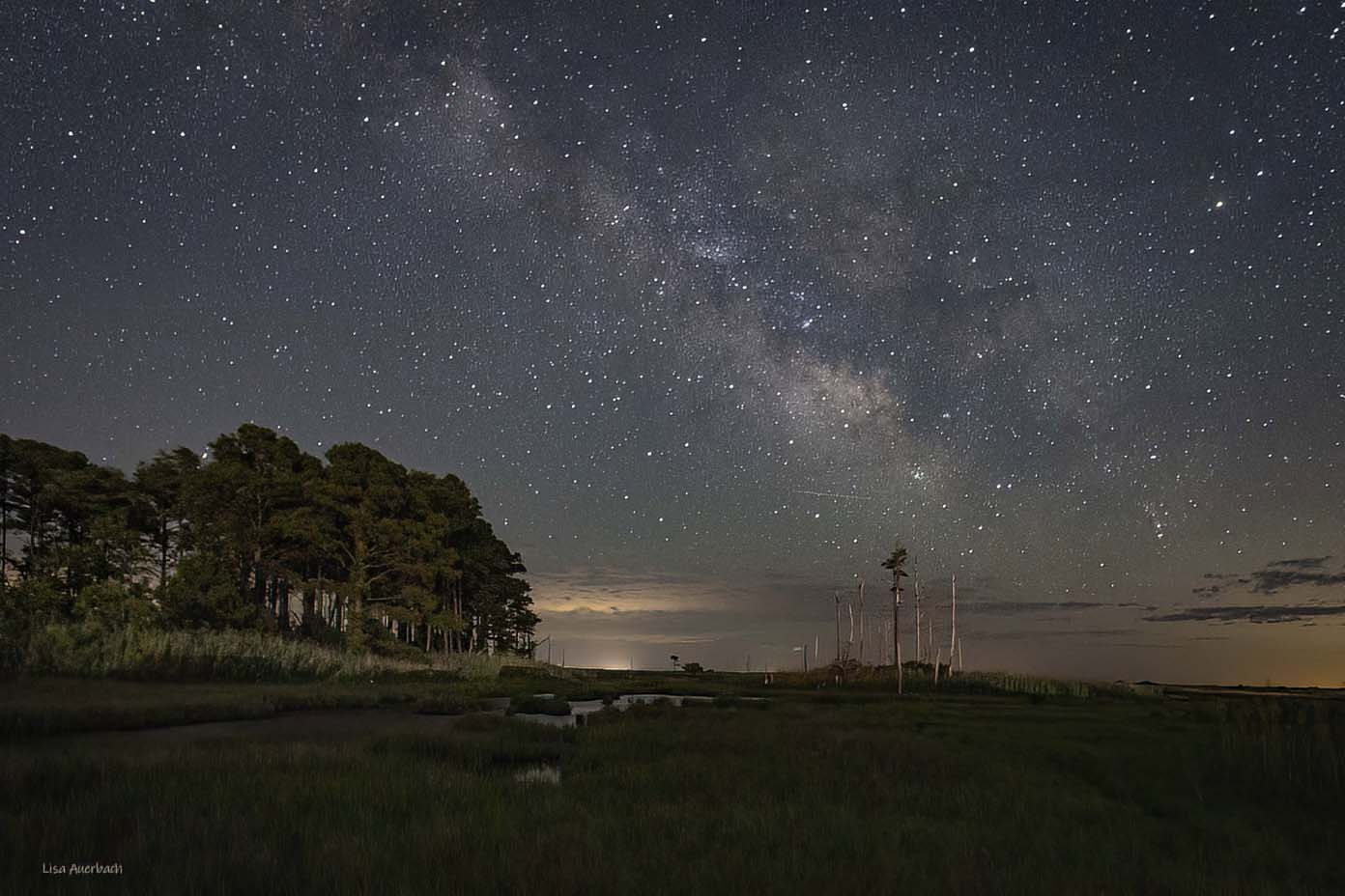
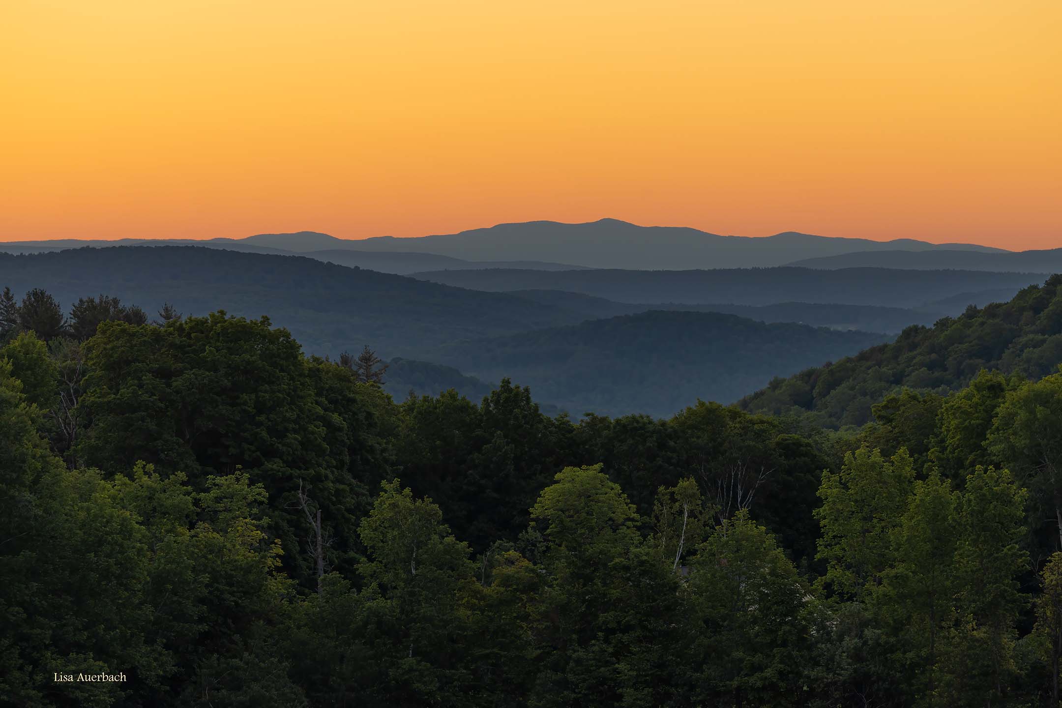
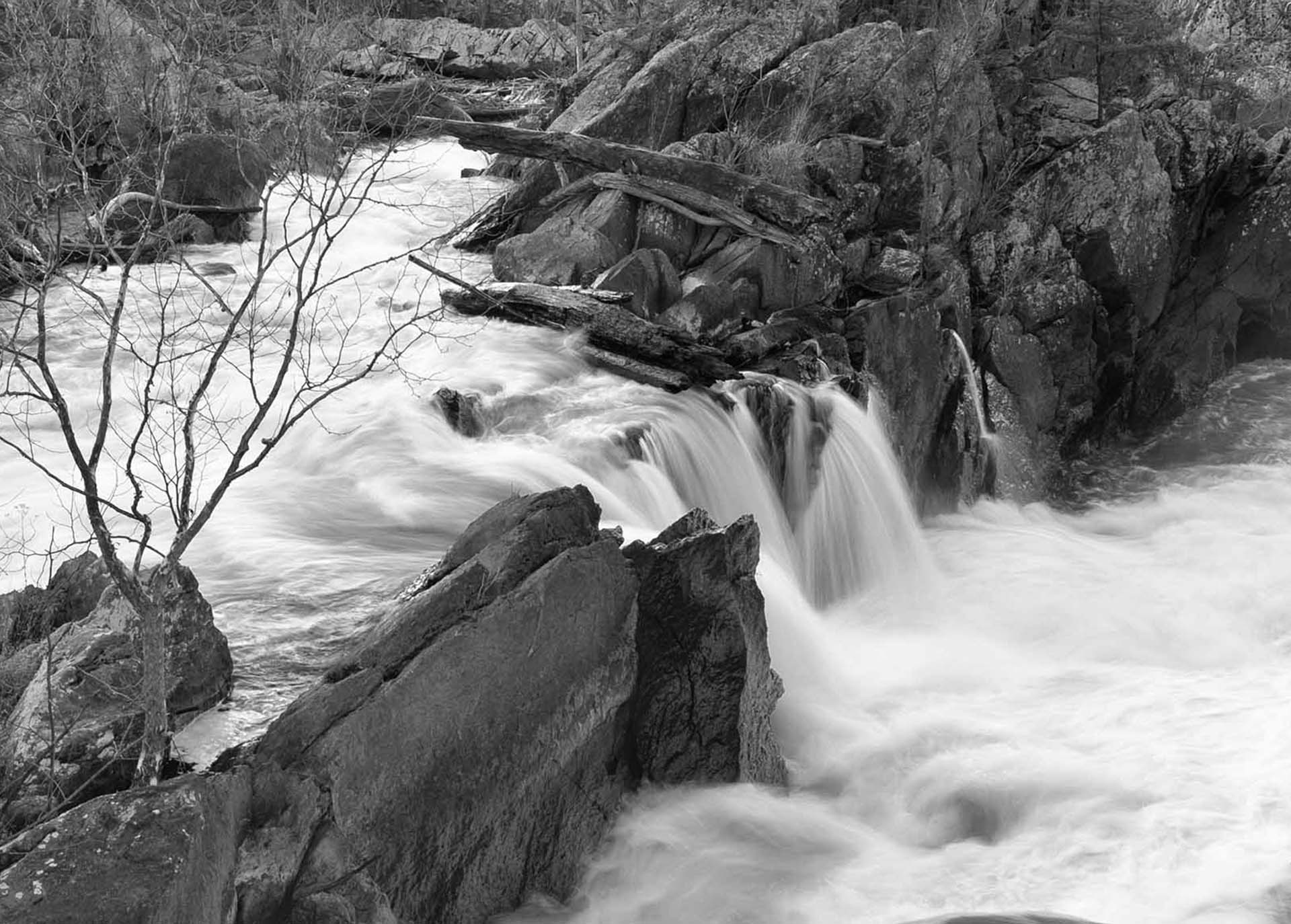
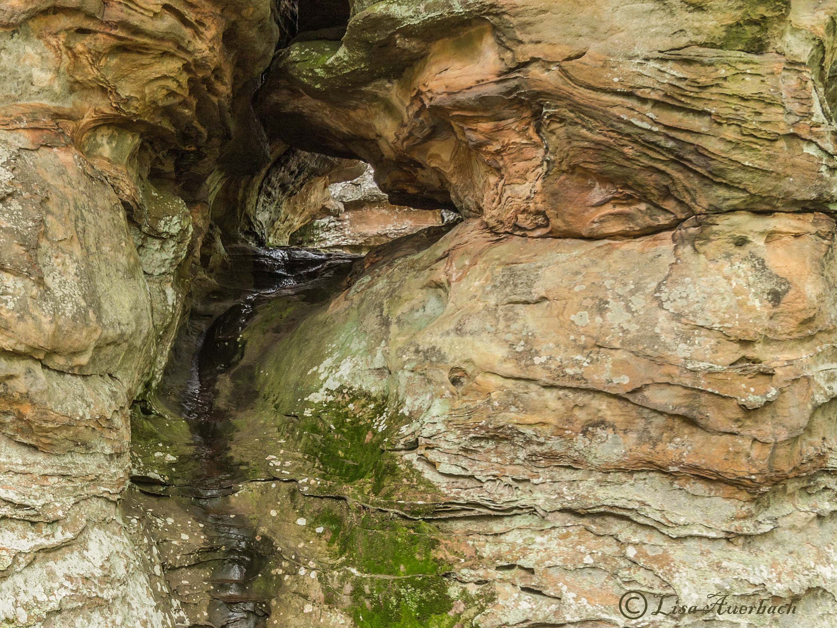
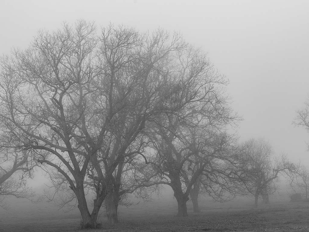
As already noted, your sky is dramatic. I agree with what has been said about the ridges. Having a degree of separation between them would benefit the whole image. I think you have a strong crop that brings attention to the sky. |
Sep 10th |
| 52 |
Sep 20 |
Comment |
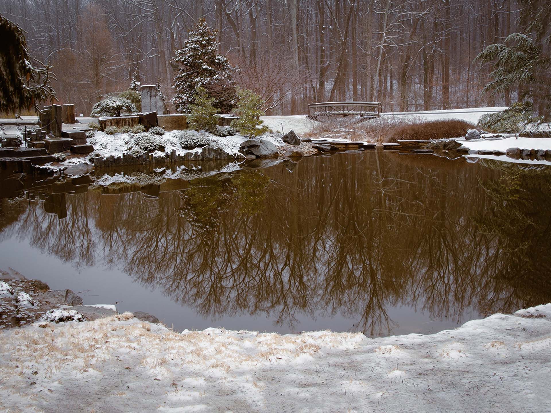
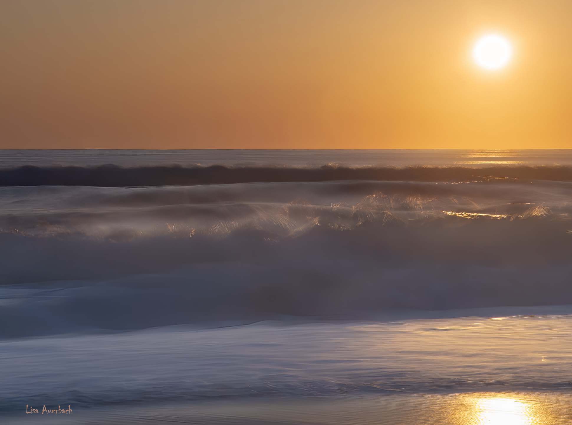
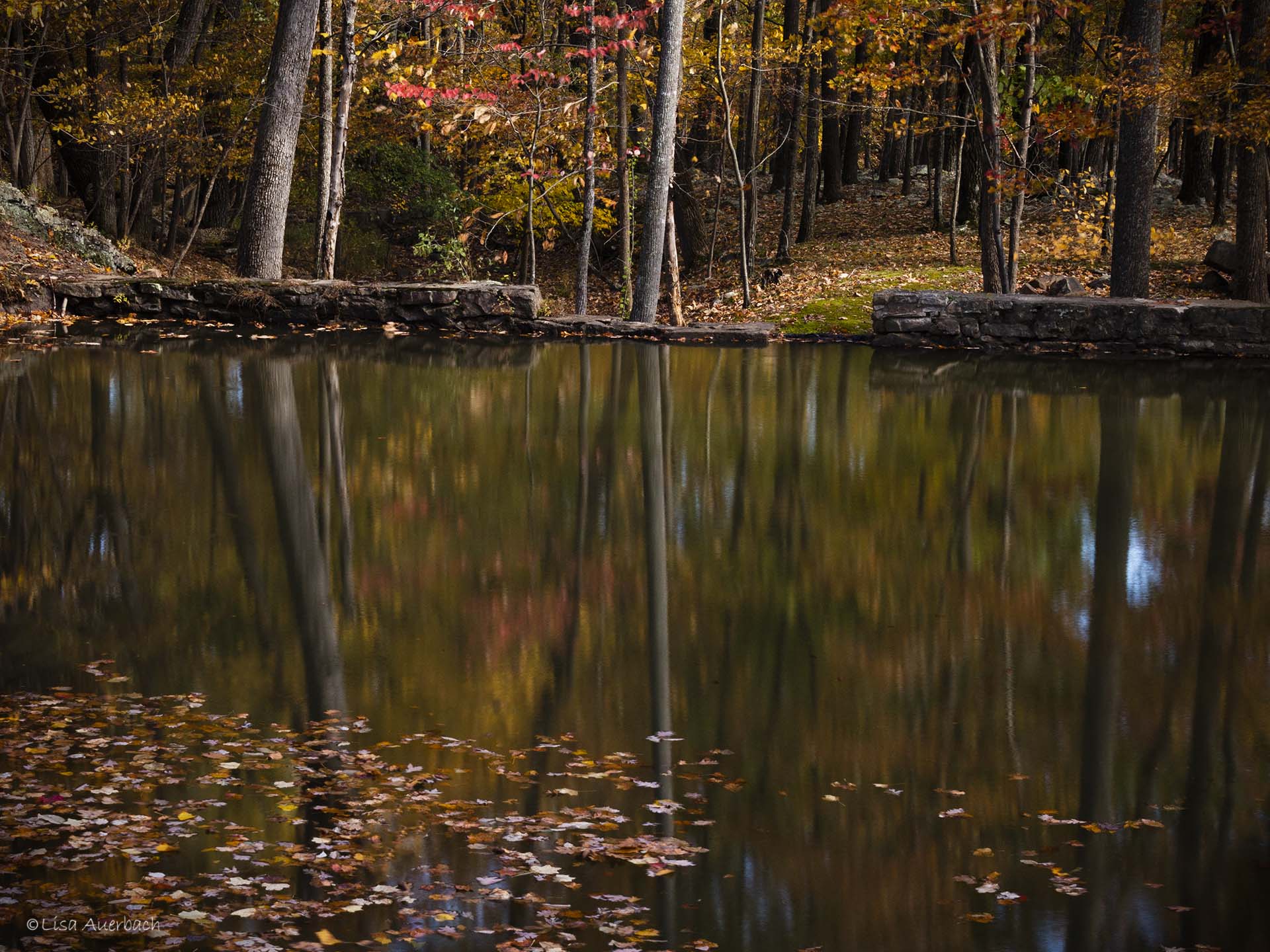
Pamela, you got the dreamy look you wanted. The colors are pretty. I would like to see more contrast in the sky and water, and for you to bring out the shadows in the land. The colors are grand, and I think this shot has great possibilities. |
Sep 10th |
| 52 |
Sep 20 |
Comment |
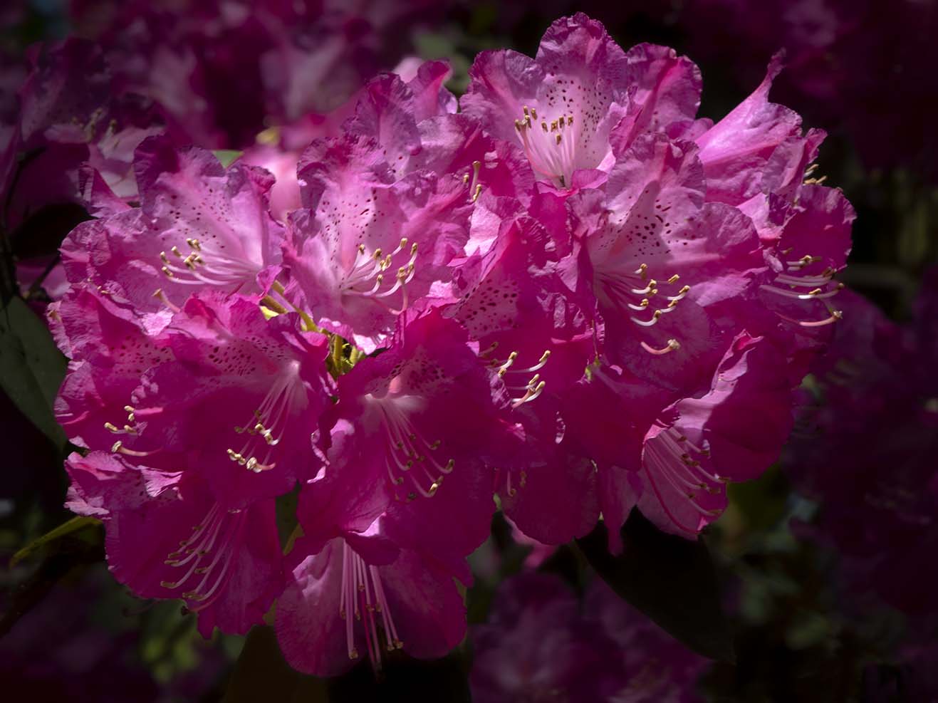
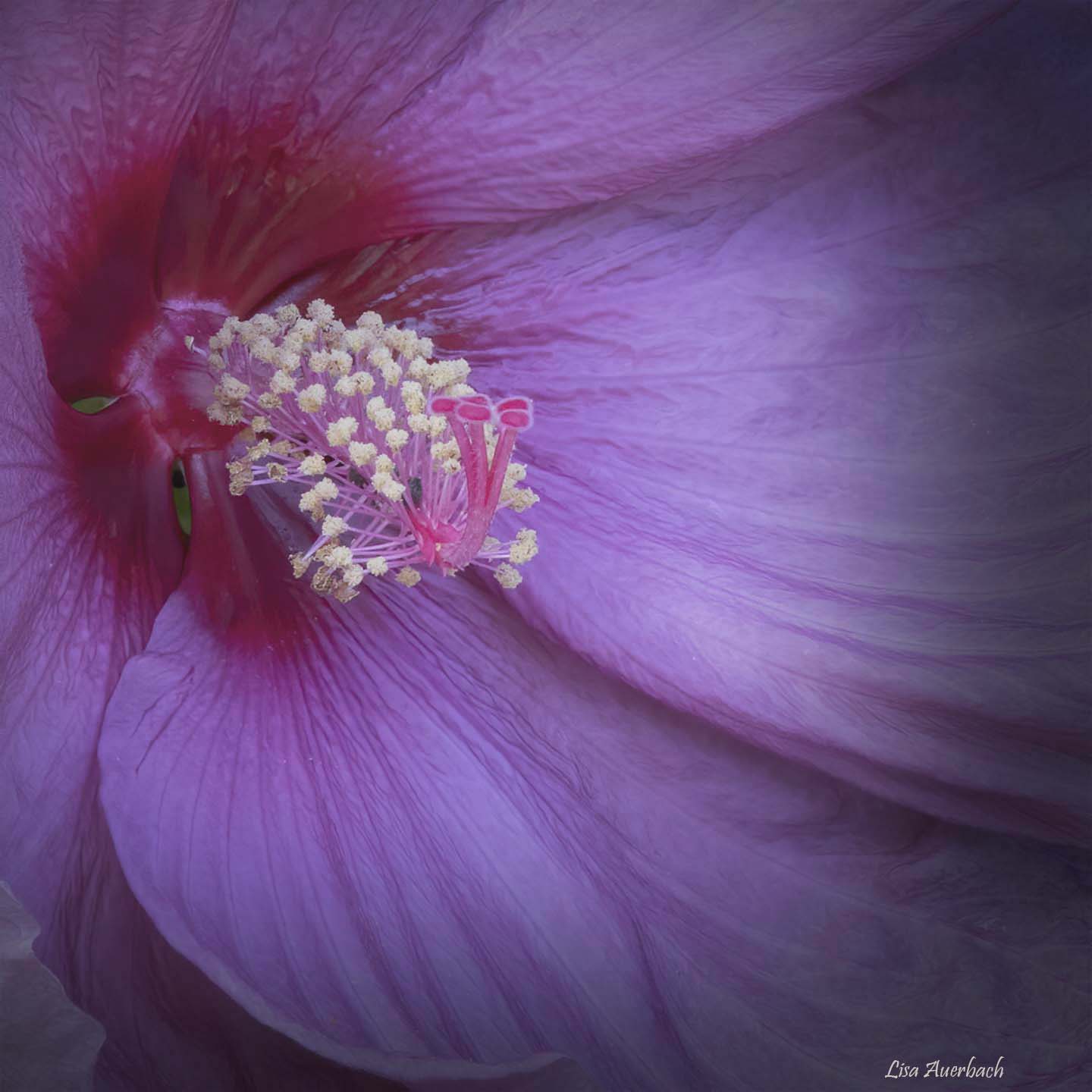
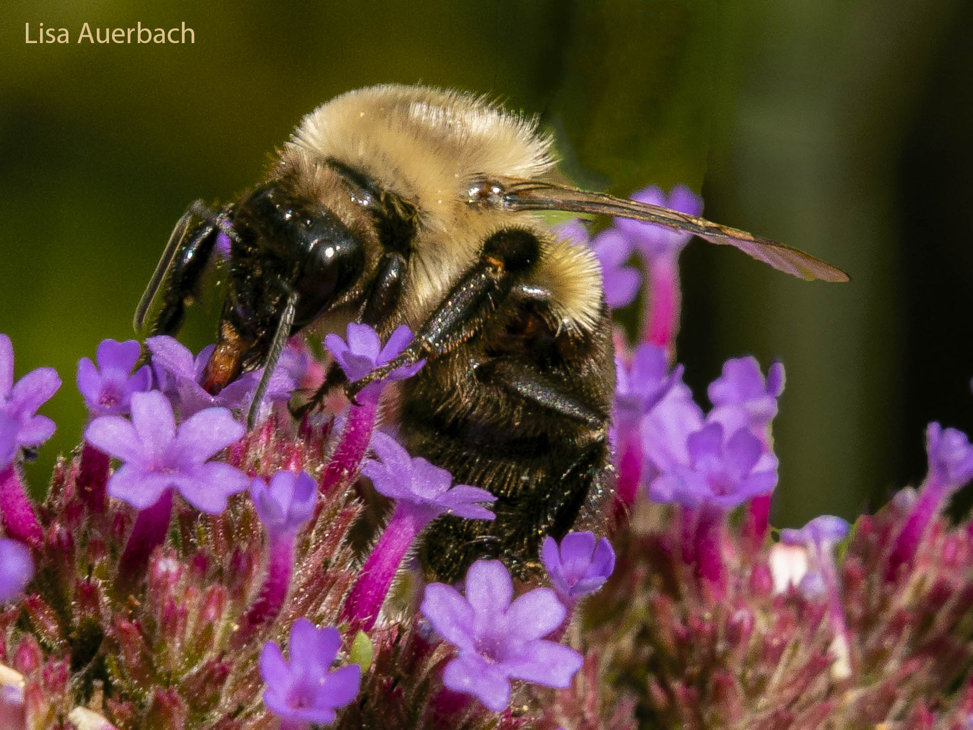
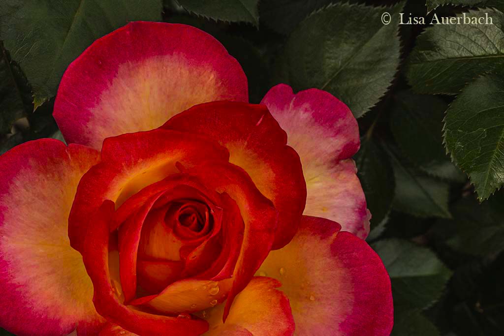
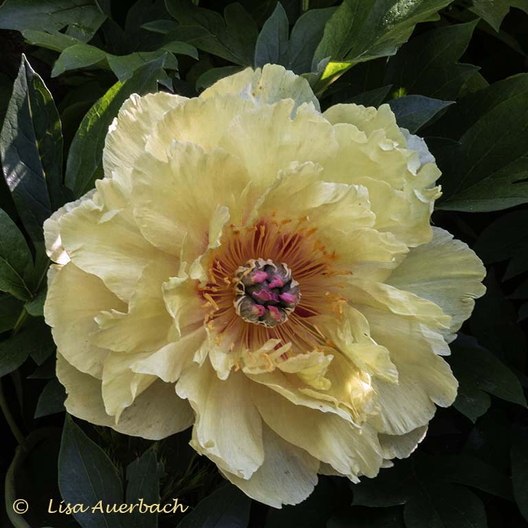
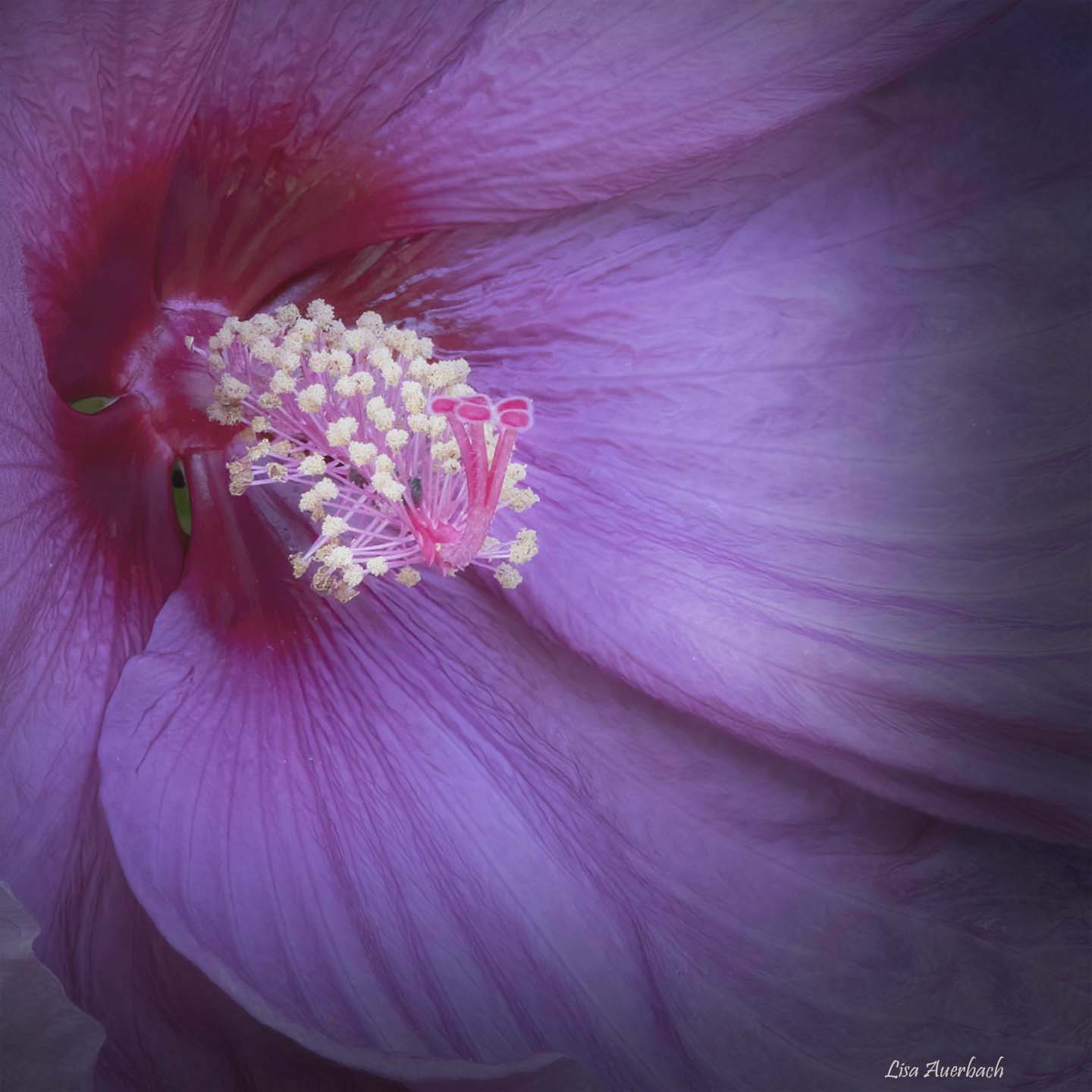
I am quite impressed with your background. It is perfectly blurred in a natural way. Of course, your flower is sharp and has good lighting. I like the shadows on the leaves. The pistons are wonderful and draw my attention. I find Mike's comment about your signature to be interesting and agree with it. |
Sep 10th |
5 comments - 3 replies for Group 52
|
6 comments - 3 replies Total
|