|
| Group |
Round |
C/R |
Comment |
Date |
Image |
| 40 |
Aug 19 |
Comment |
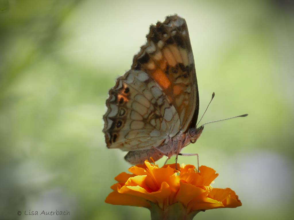
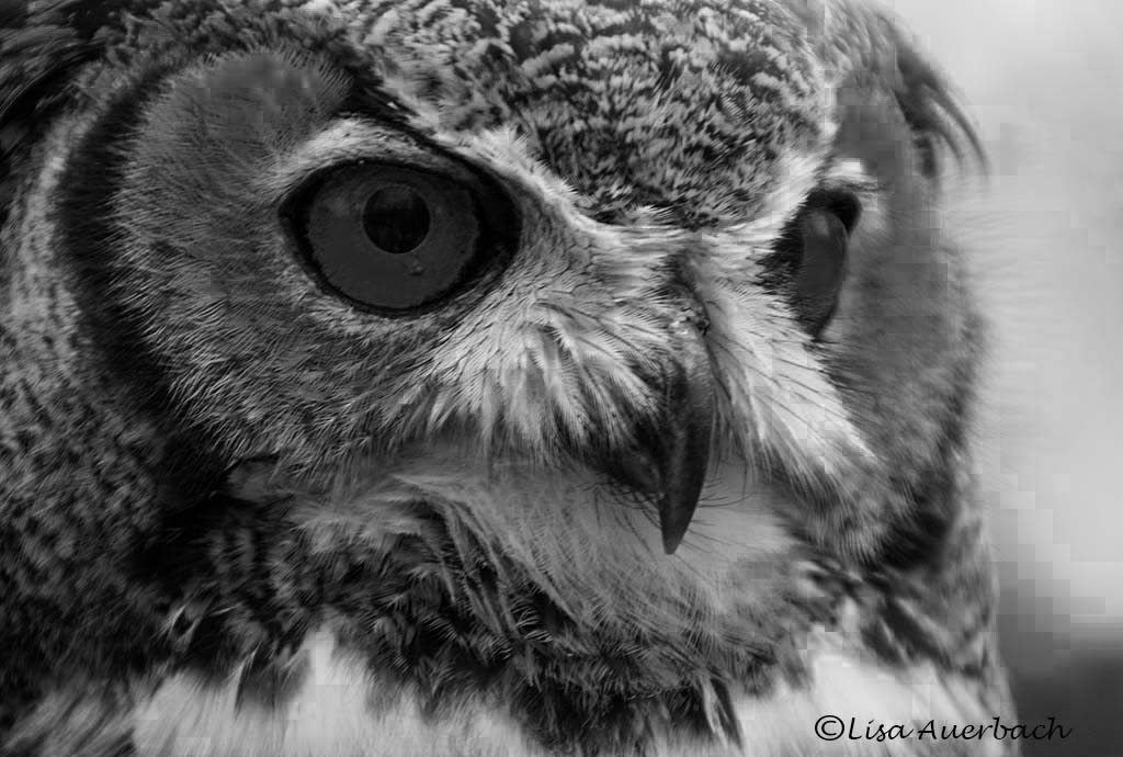
This is a great nature story. I would suggest what others have said. The first thing I noticed was that the eyes need to be lighter so they are seen first, and the grass is a bit too bright. Those are the two major distractions to an excellent composition. |
Aug 20th |
1 comment - 0 replies for Group 40
|
| 52 |
Aug 19 |
Comment |
I can see the difference especially in the eye and foreground wing. I did not know about this program but am going to look into it.
Thank all of you for your comments. You have given me ideas both in initial shooting the subject and post processing. |
Aug 20th |
| 52 |
Aug 19 |
Comment |
It does and while I've never tried it I will. I think you mean the icons of different types of shots? |
Aug 13th |
| 52 |
Aug 19 |
Reply |
Thank you for that useful information. I tend to set my speed too slow and need to remind myself of this. |
Aug 13th |
| 52 |
Aug 19 |
Reply |
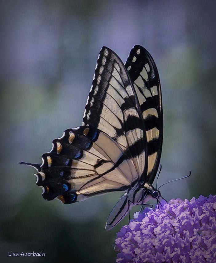
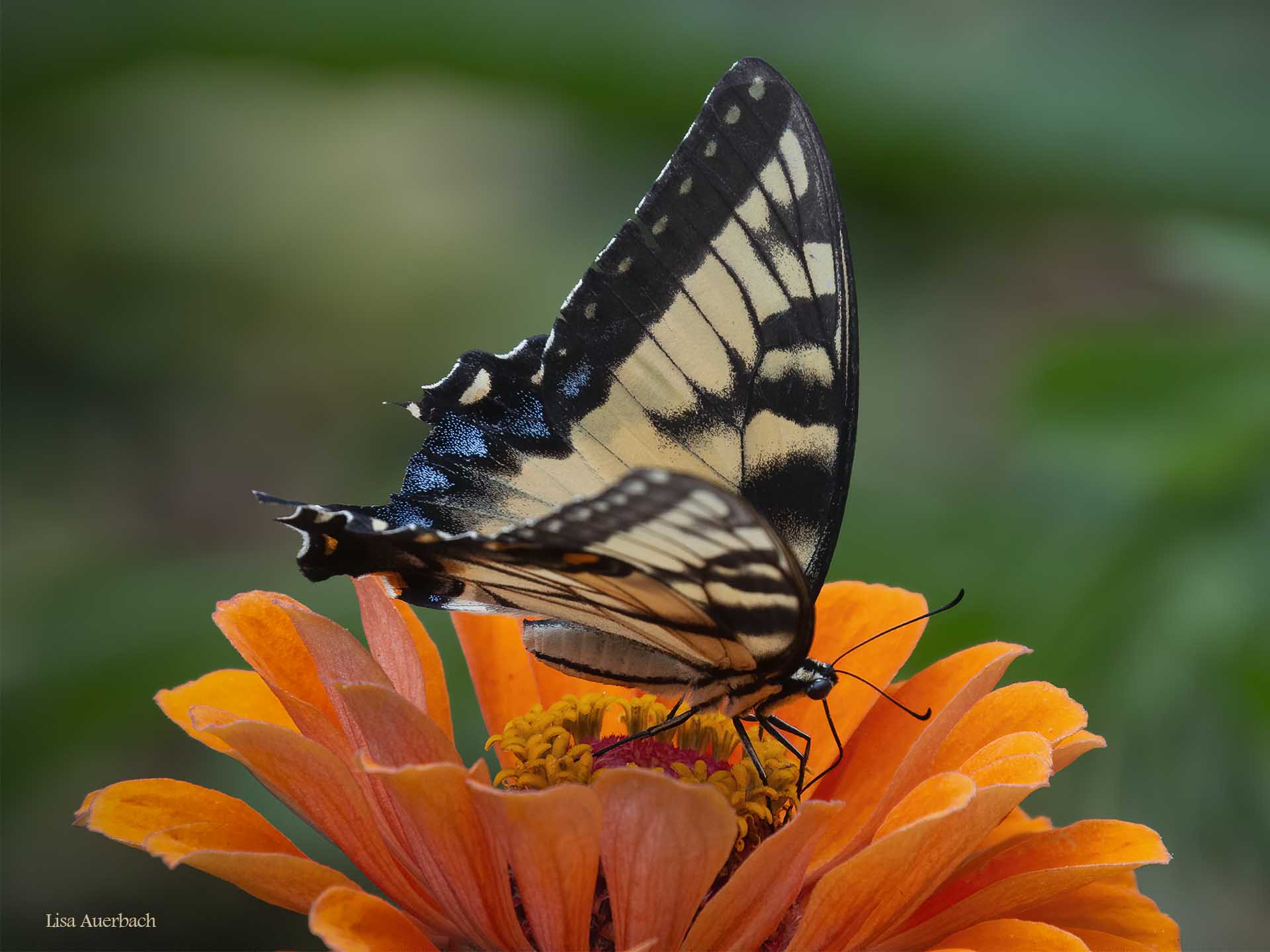
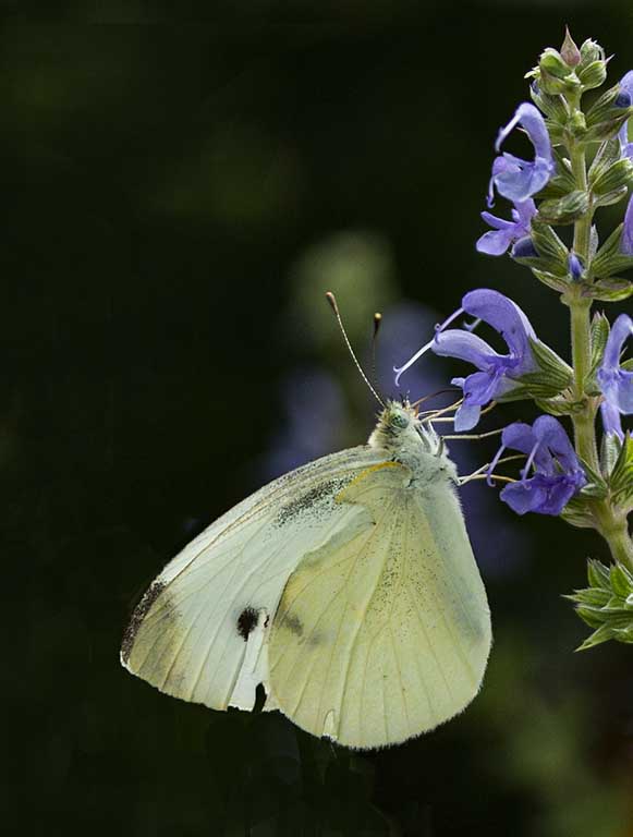
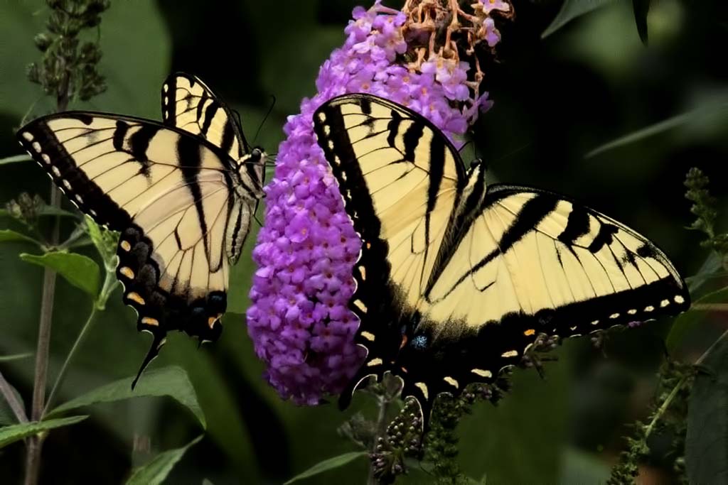
I ended up cropping with the butterfly head on a power point. I see what you suggest about having less space on the left.
|
Aug 12th |
| 52 |
Aug 19 |
Reply |
I thought about leaving in the top leaf then decided it is a distraction. I also thought about a vertical crop. In the end I decided to make the color of the leaves and butterfly command focus. I like both crops but went for simplicity this month. |
Aug 12th |
| 52 |
Aug 19 |
Comment |
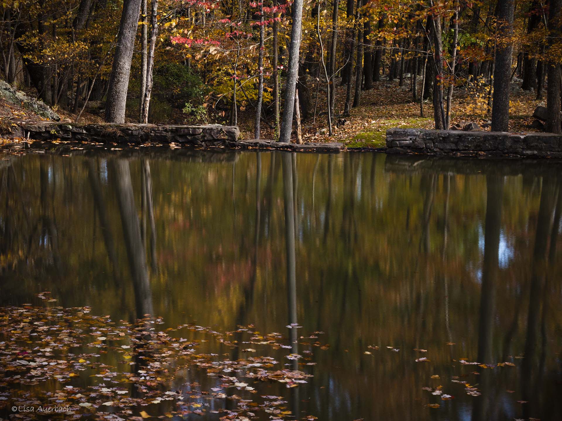
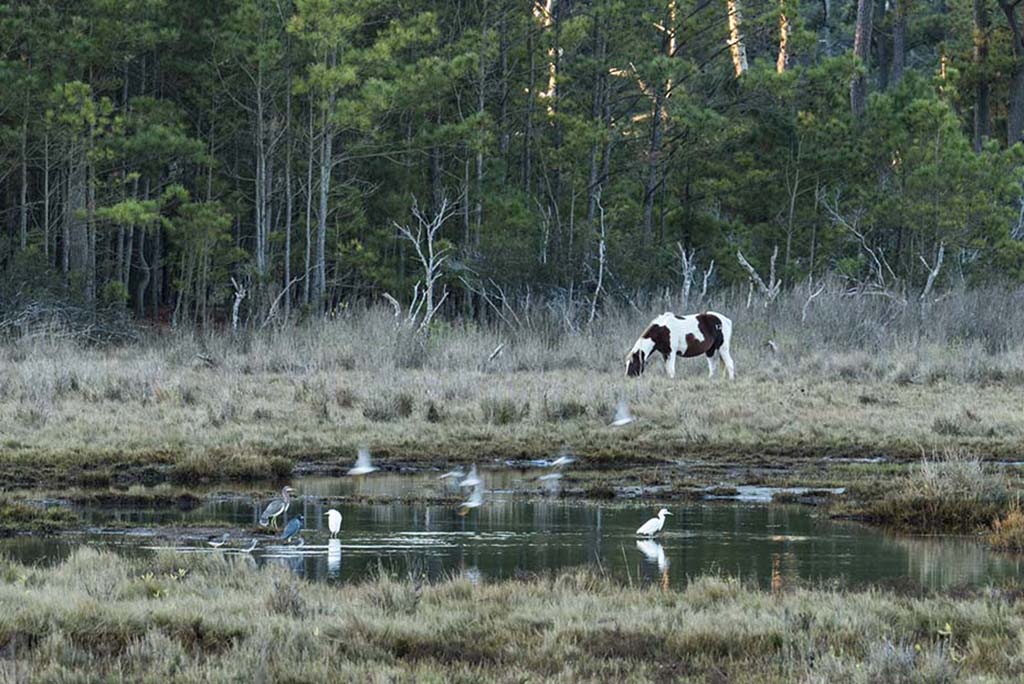
I very much like the nature story, and as you say, the congeniality of it. I like the ducks that are landing quite well. I think the birds in your original shot are more natural looking than the processed ones. I've gone back and forth and cannot tell you what it is but the original seems more natural to me. |
Aug 12th |
| 52 |
Aug 19 |
Comment |
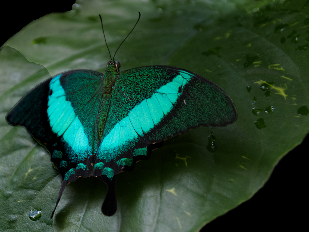
Butterflies in flight are a challenge and such a reward when we get them. I like the whimsy of your image. I agree with Mike's comments and want to add that I like the original as well. |
Aug 12th |
| 52 |
Aug 19 |
Comment |
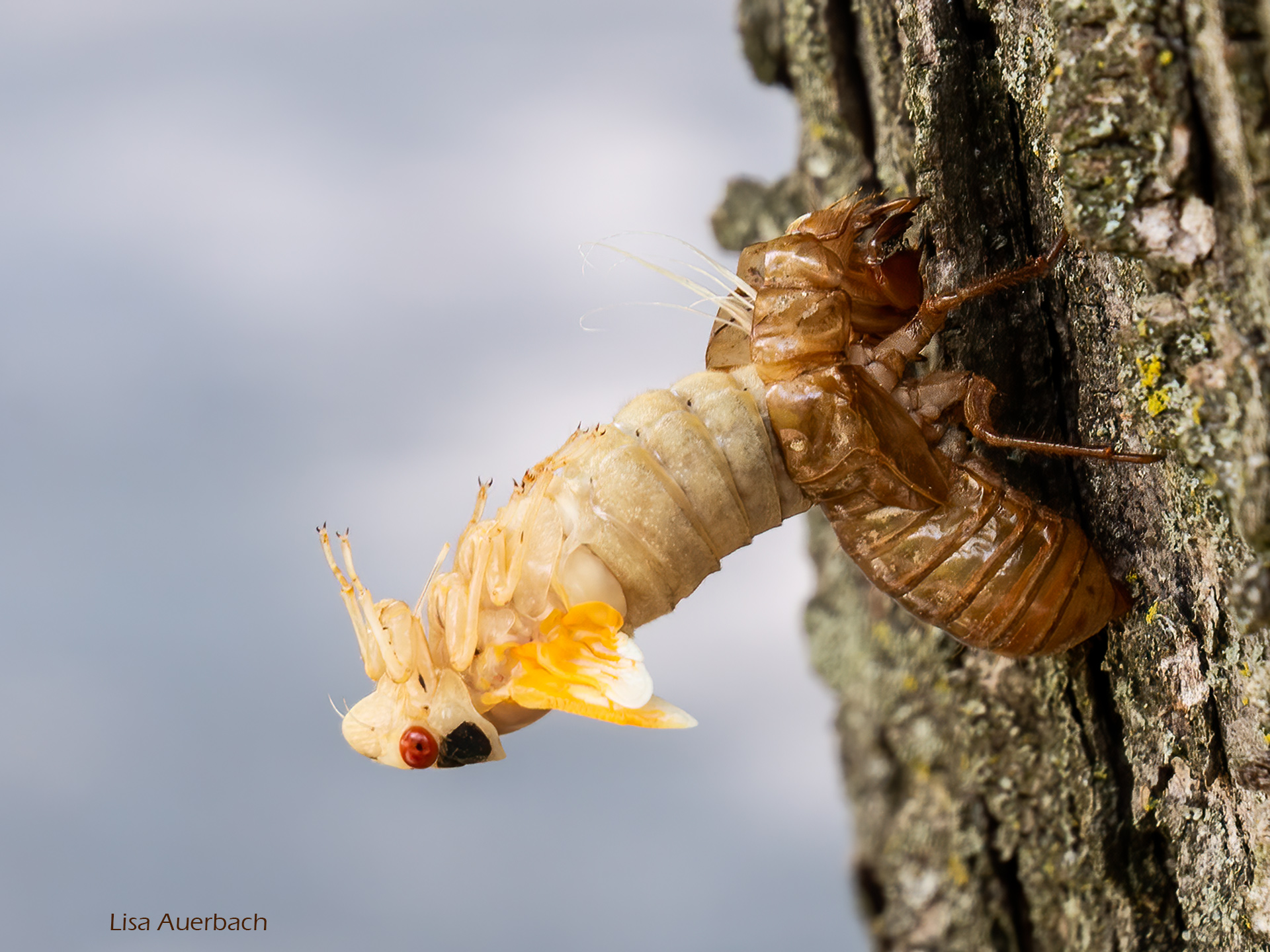
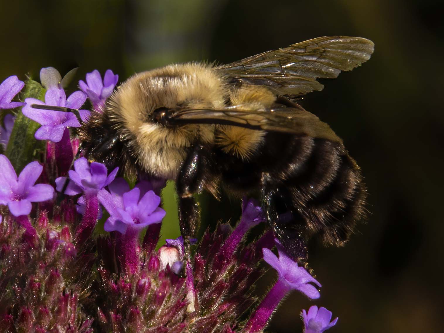
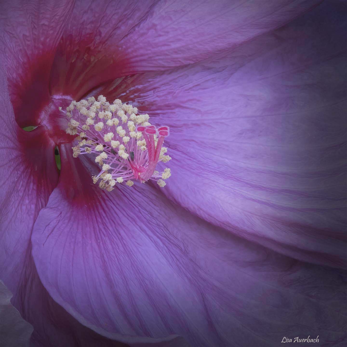
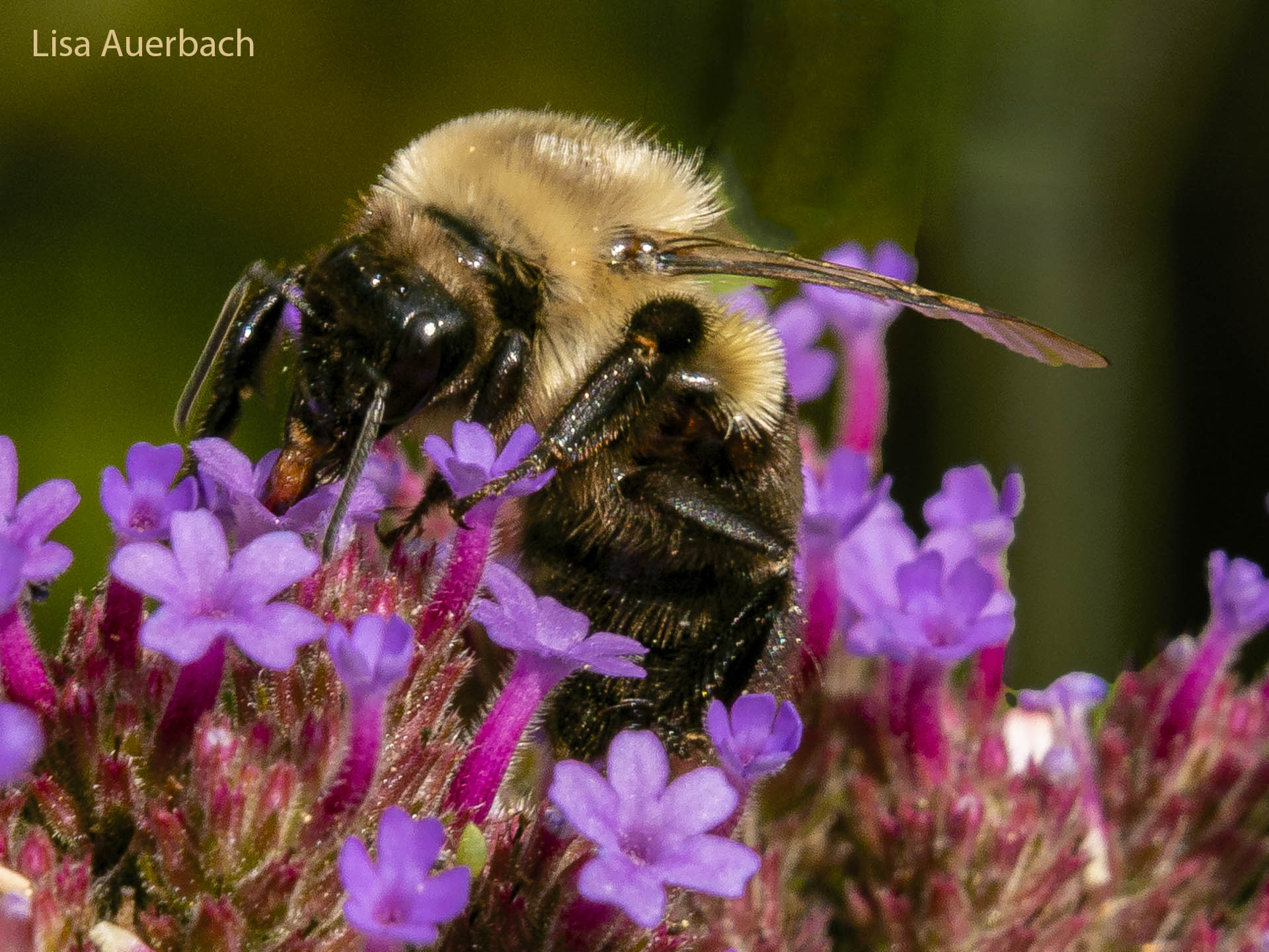
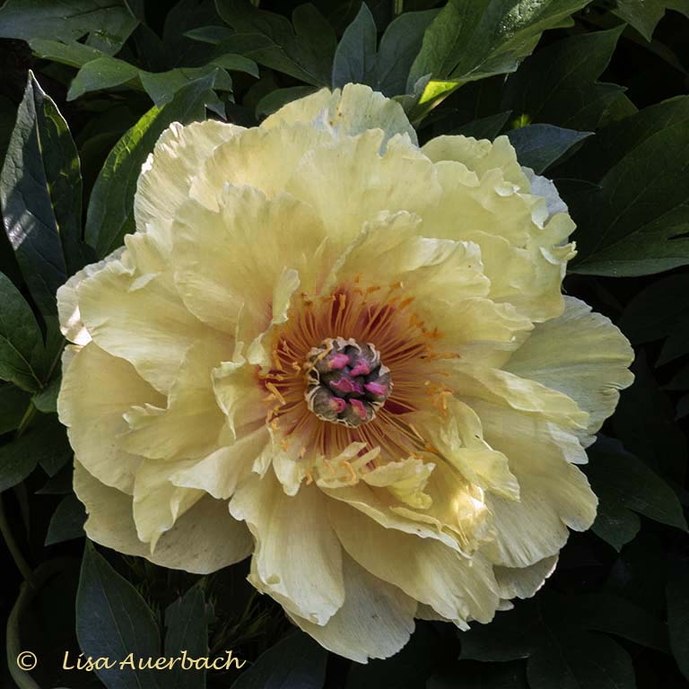
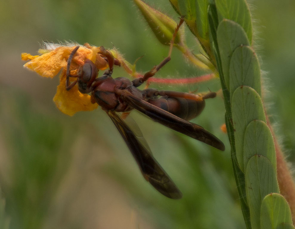
I like the idea of your image. The colors are pretty, and the bee is a nice nature addition. However, for me, the colors are too bright, the bottom green leaf is a distraction, and the bee gets lost. Perhaps a crop with a focus on the bee and pistons would tell the nature story. |
Aug 12th |
| 52 |
Aug 19 |
Comment |
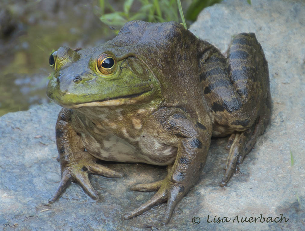
The eye catches my attention. The open mouth and wing span give interest. I also wonder if you could raise shadows in the mouth. And if there is more detail at the bottom, I'd include it. |
Aug 12th |
| 52 |
Aug 19 |
Comment |
Oh Carol, what a sharp image you have captured. The colors, the composition, and the nature story are all strong. This is a winning image and I can think of nothing to change. |
Aug 12th |
| 52 |
Aug 19 |
Comment |
I like the way light falls upon the Sage Grouse's face. I like how sharp each part is from the face and eyes to the feathers to the plants. I especially like the small sharp white leaves of the plant. For me the foreground under your name is a bit blurred and could be cropped. And in my opinion, even though they light the face, the plants at the top are slightly too light. A small amount more of contrast will help make the grouse's face more outstanding. |
Aug 12th |
8 comments - 3 replies for Group 52
|
9 comments - 3 replies Total
|