|
| Group |
Round |
C/R |
Comment |
Date |
Image |
| 52 |
Jul 19 |
Reply |
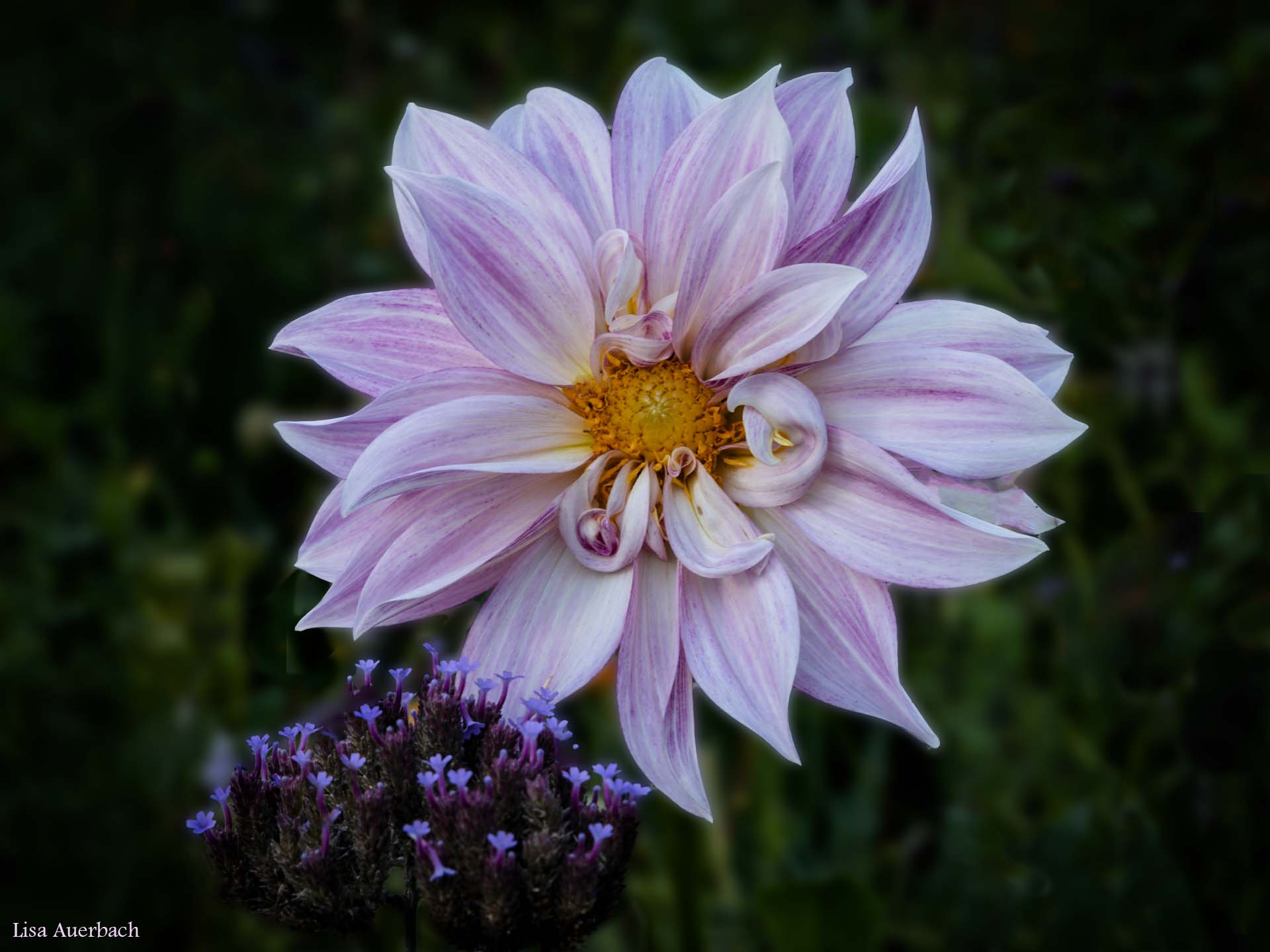
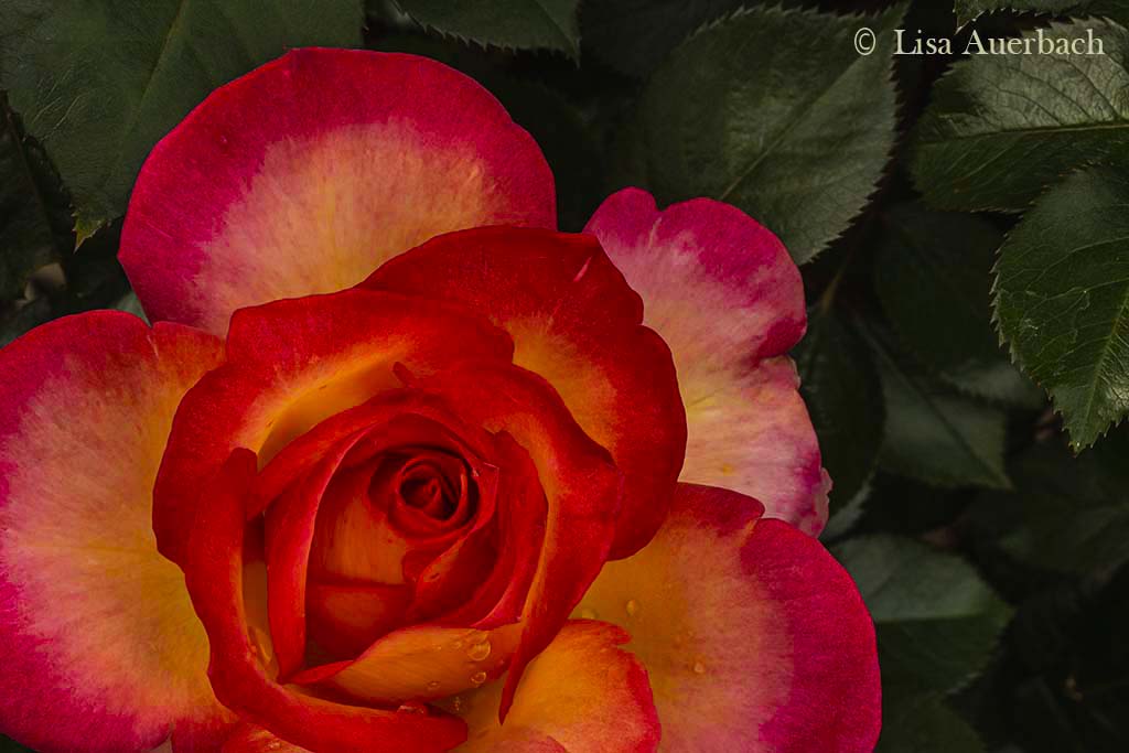
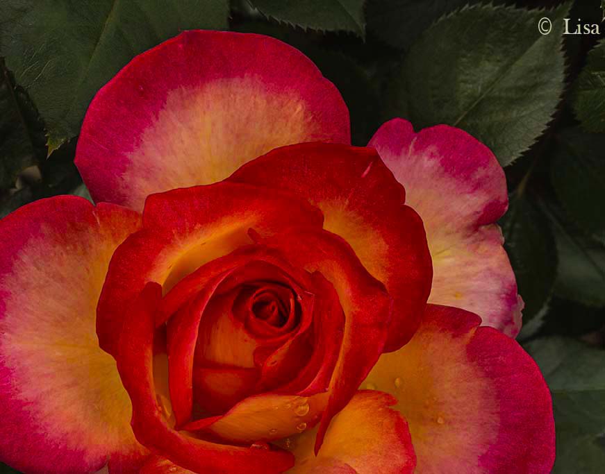
The center of the rose is on a power point which is what guided me in my original crop. However, taking your advice does not alter the end product negatively. I did raise levels in the very right bottom
I don't have a strong opinion about either because I like the contrast of green and red.
|
Jul 16th |
 |
| 52 |
Jul 19 |
Reply |
I tried it but am unsure what I think. I like the green leaves which are just dark enough to be seen but not to compete. I see your point and will look a few more times at each version. |
Jul 15th |
| 52 |
Jul 19 |
Comment |
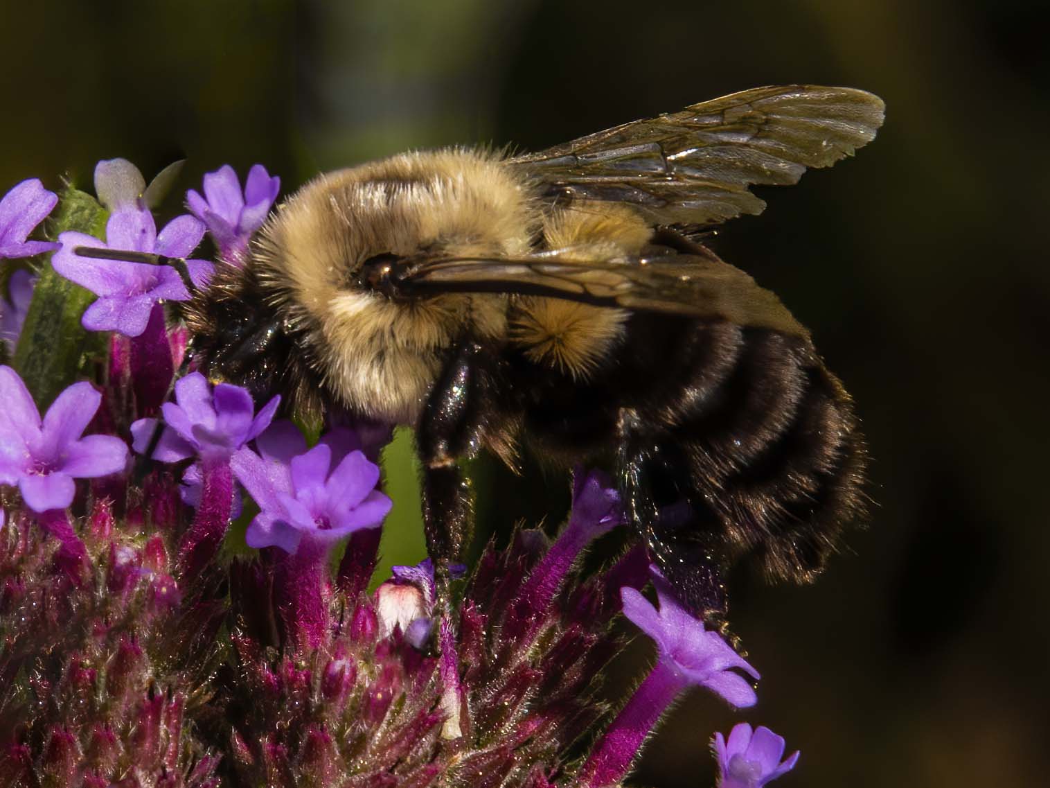
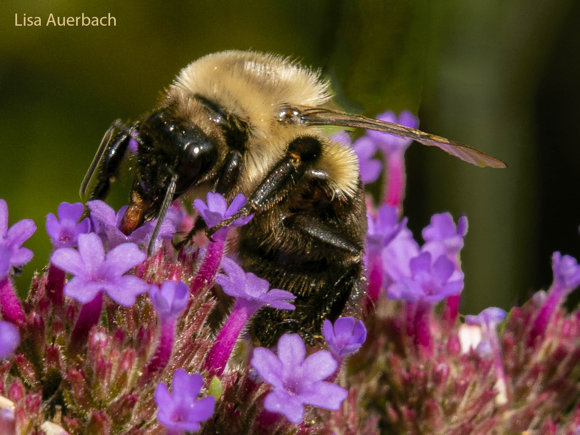
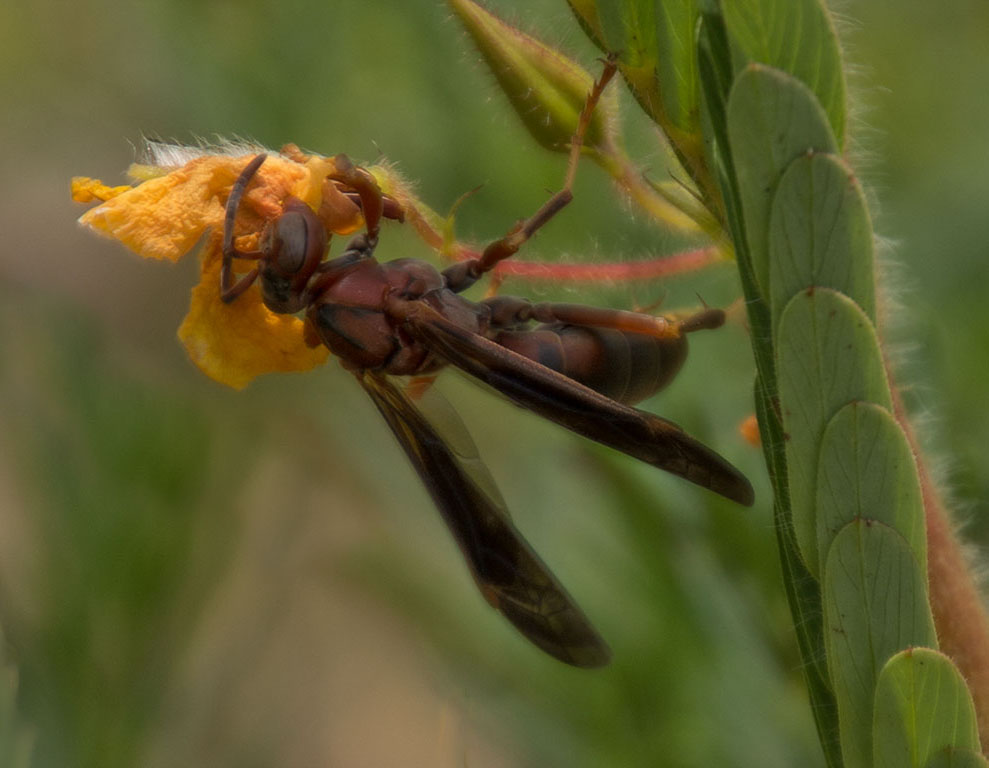
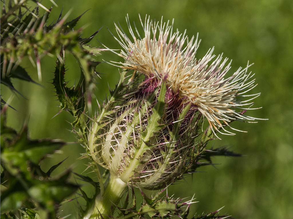
Judith, I like the bee in your image, and I especially like its shadow. You have good catch eye, and you have caught good wings. Sometimes they fade out because of movement but I can see these wings.
For me, there is a bit too much competing with those parts. I would favor a crop of the gold threads of the flower. In that crop my attention would remain closer to the bee. I am curious what was included in your original image. Instead of a vertical crop, a horizontal one might work including more soft yellow petals and excluding the golden threads.
|
Jul 11th |
| 52 |
Jul 19 |
Comment |
I like everything about this, including the water drops on some of the grass. The bunny's eyes are sharp as is its hair. With this image, you have captured the fun in nature. |
Jul 11th |
| 52 |
Jul 19 |
Comment |
John, I like your image and offer no suggestions. I like the crisp nature story that you have. I smile because my eye did not go first to the head; rather the water, the fish, then up the body.
Well done.
|
Jul 11th |
| 52 |
Jul 19 |
Comment |
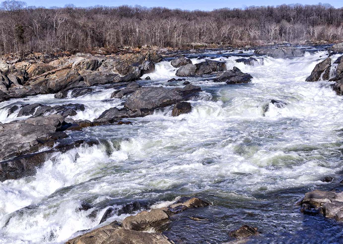
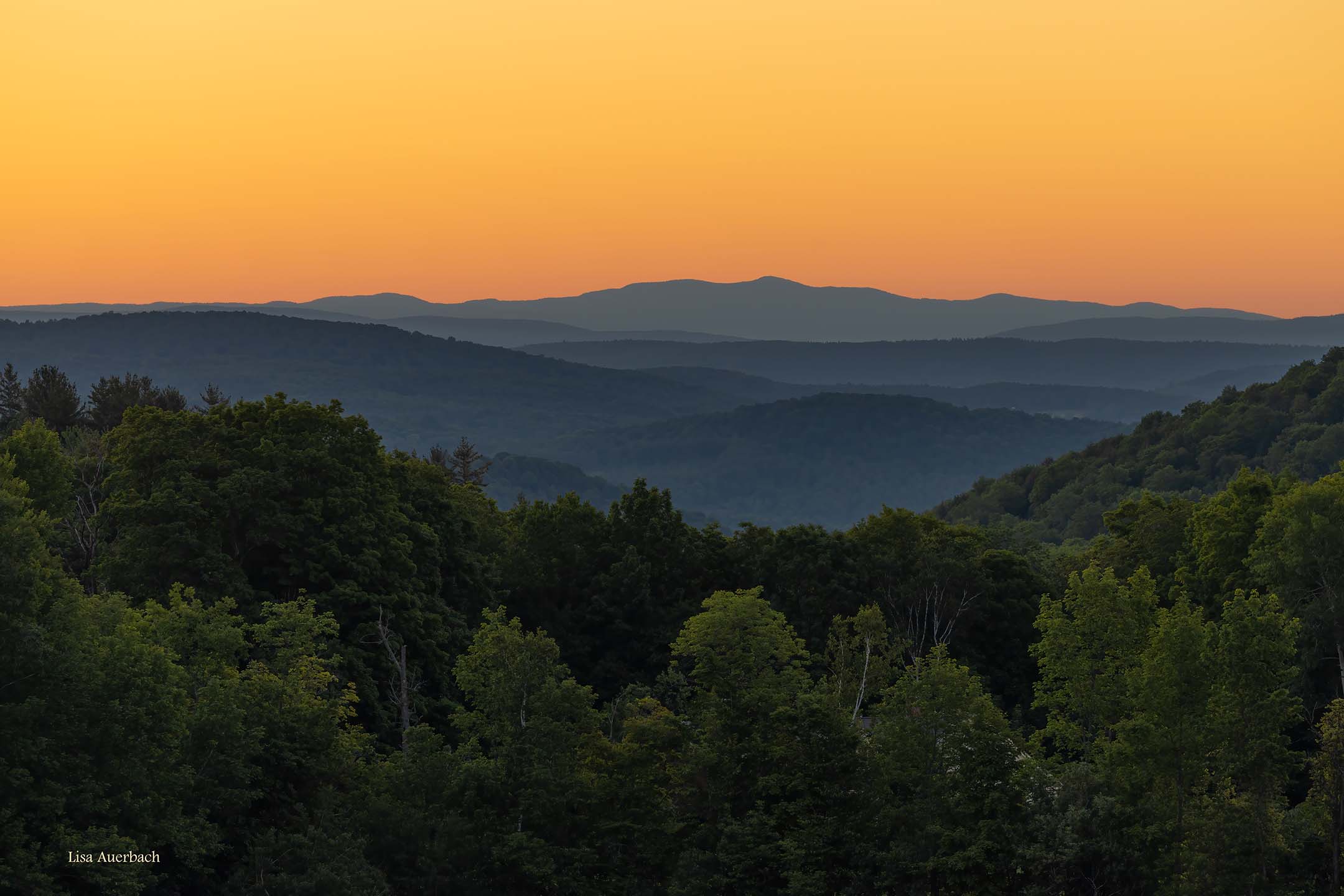
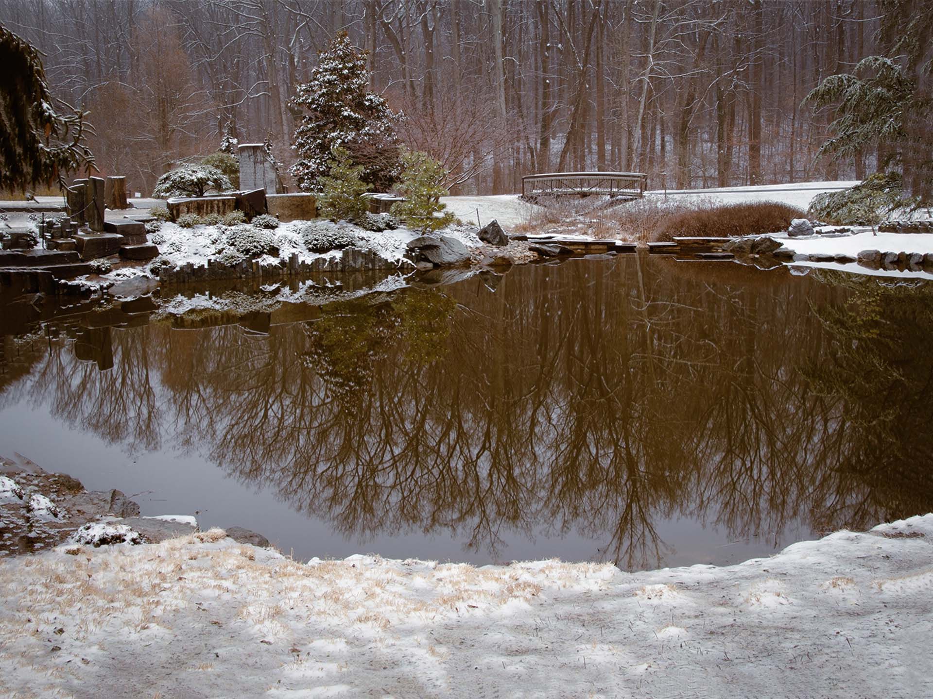
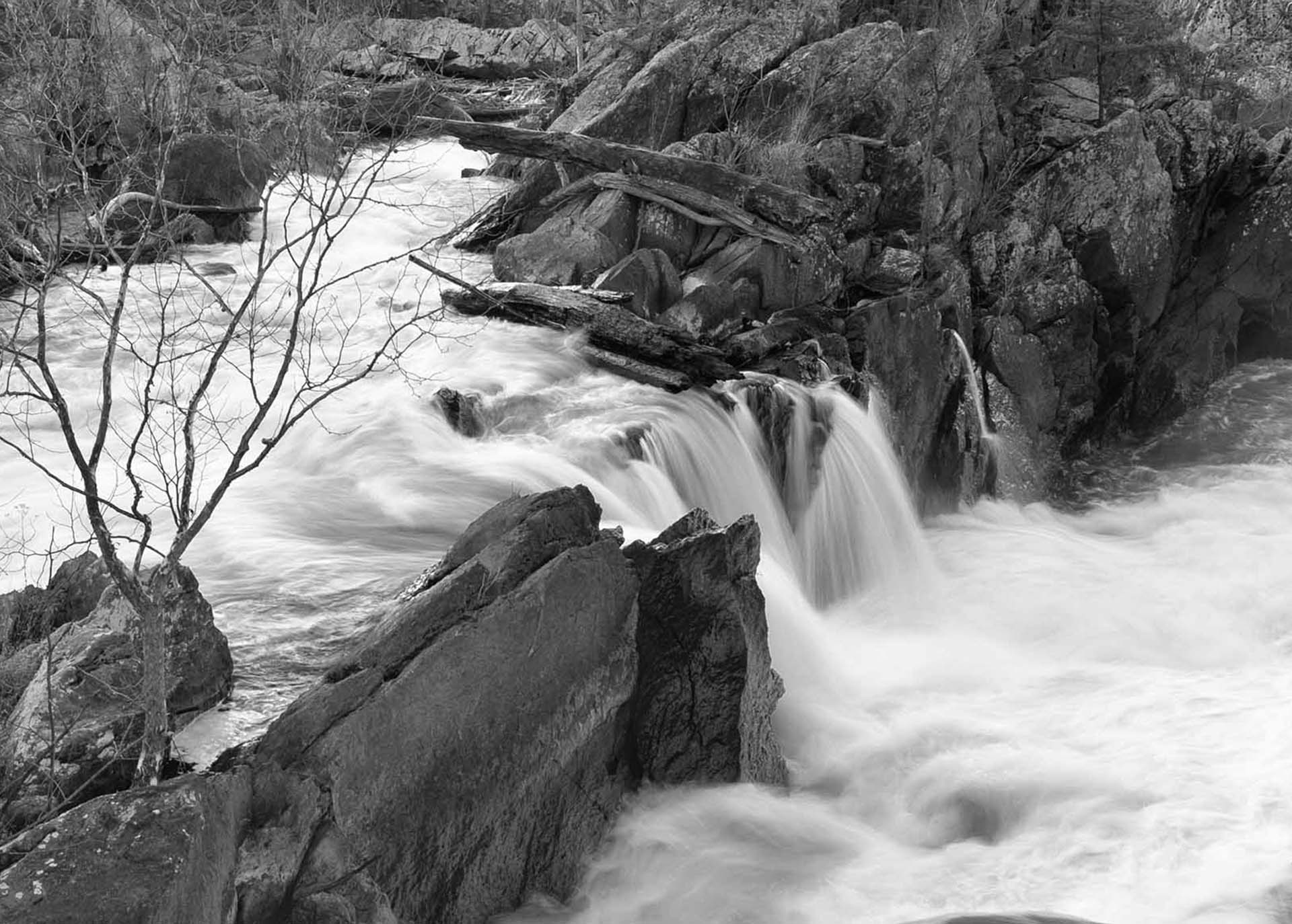
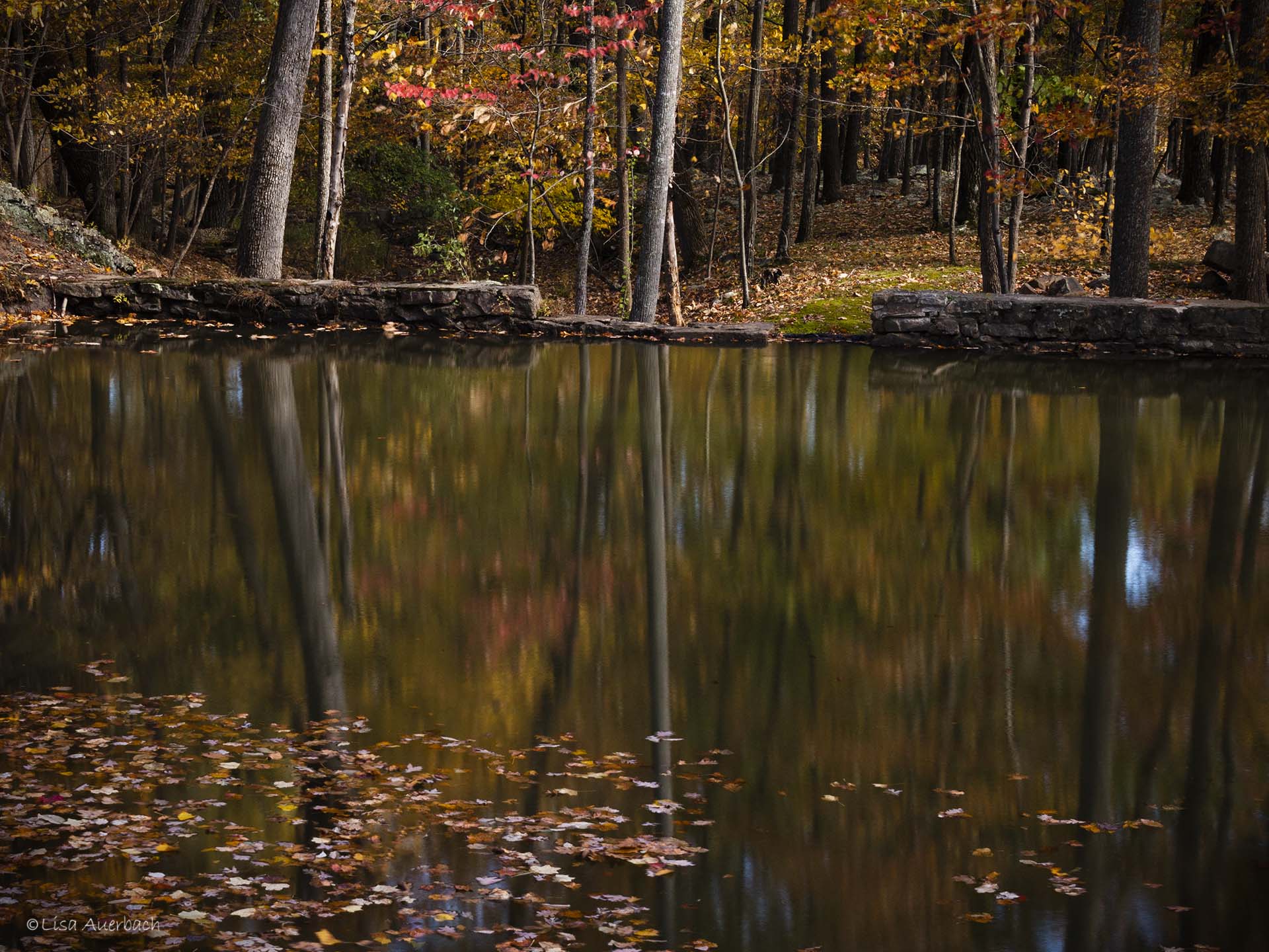
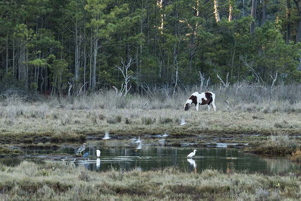
Carol, I have looked at this several times. Each time I see pictures within pictures. There is so much to see. I like how your light pulls my eye from the ground to the mountain. The clouds billow around the small amount of sky which is well lit. This is very well composed and shot.
In comparing your original and post images, I understand and appreciate your using light to lead me up to the mountain. I like that concept. However, the area around the left bottom, and all the logs are a bit too bright. I would use your preferred method to darken them a bit.
|
Jul 11th |
| 52 |
Jul 19 |
Comment |
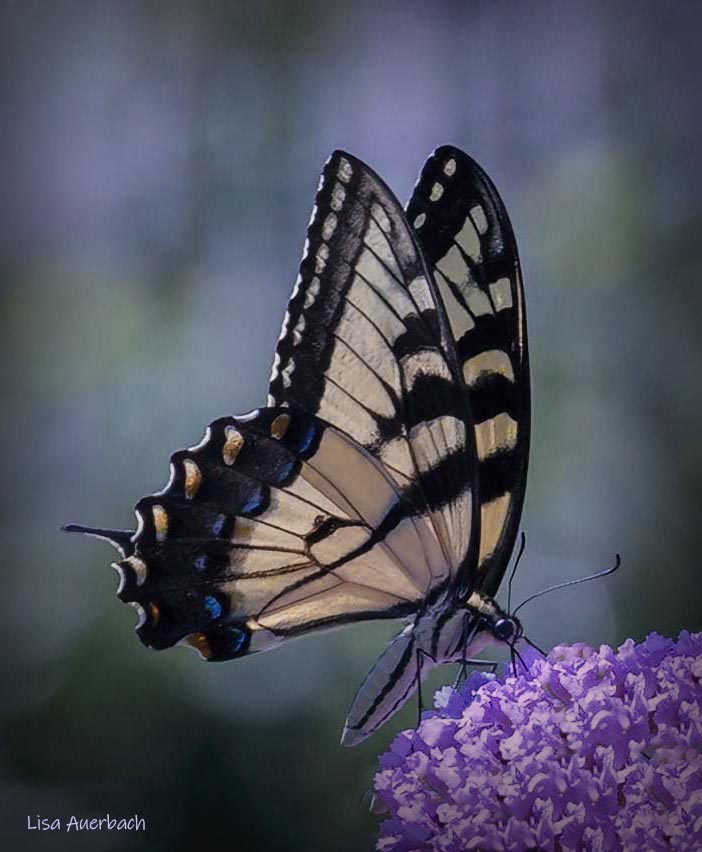
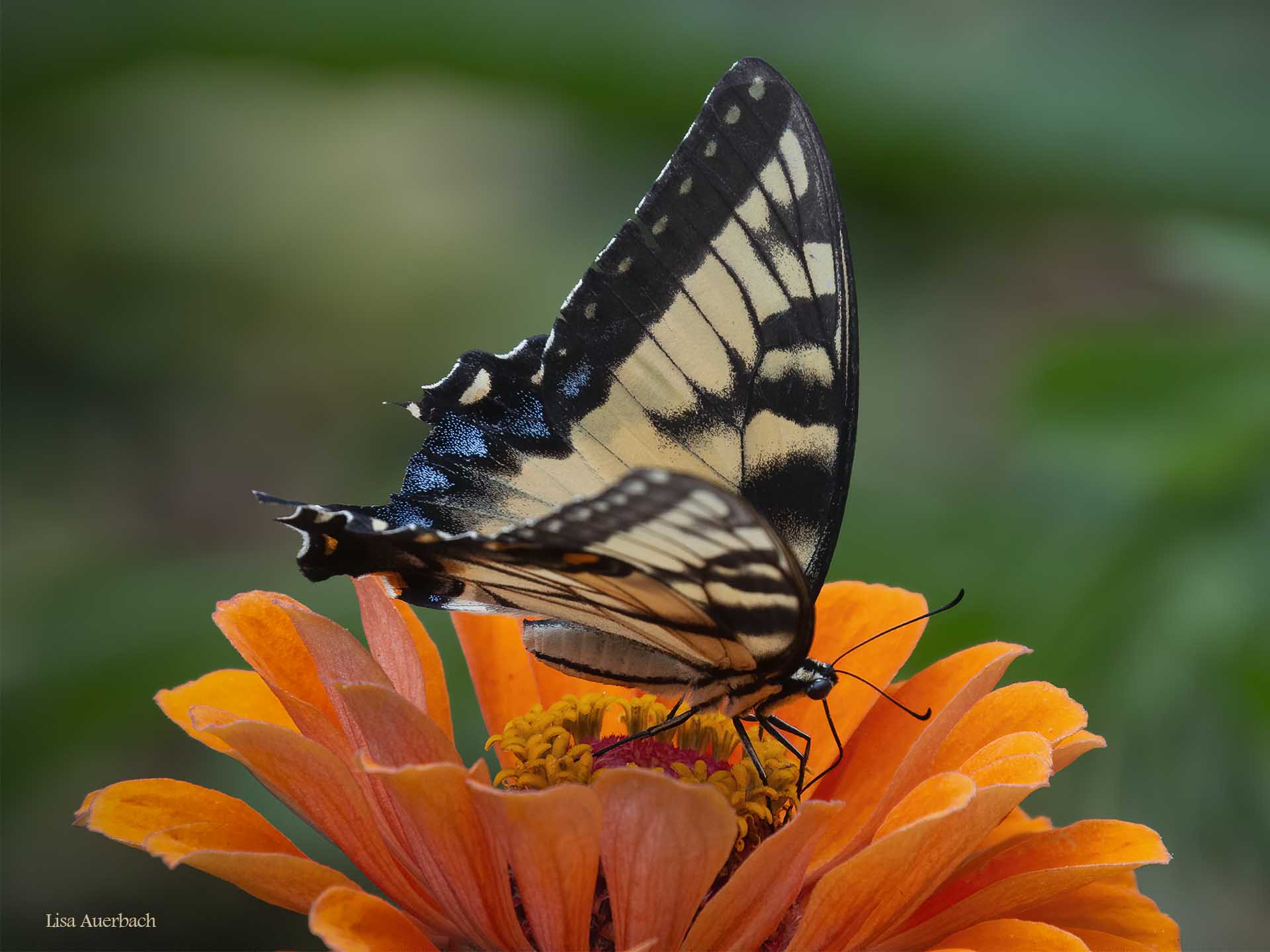
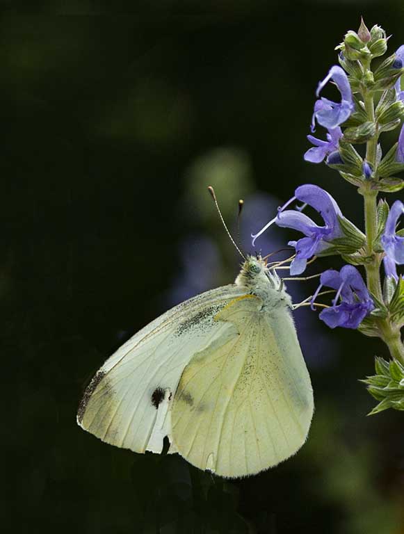
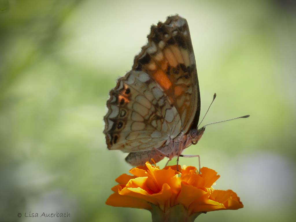
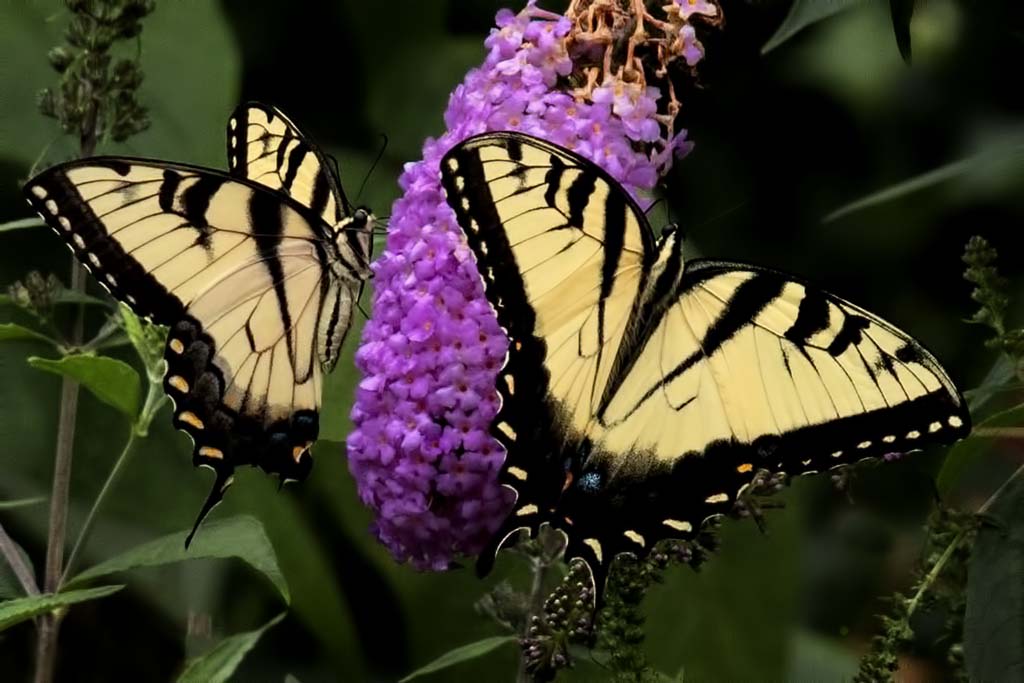
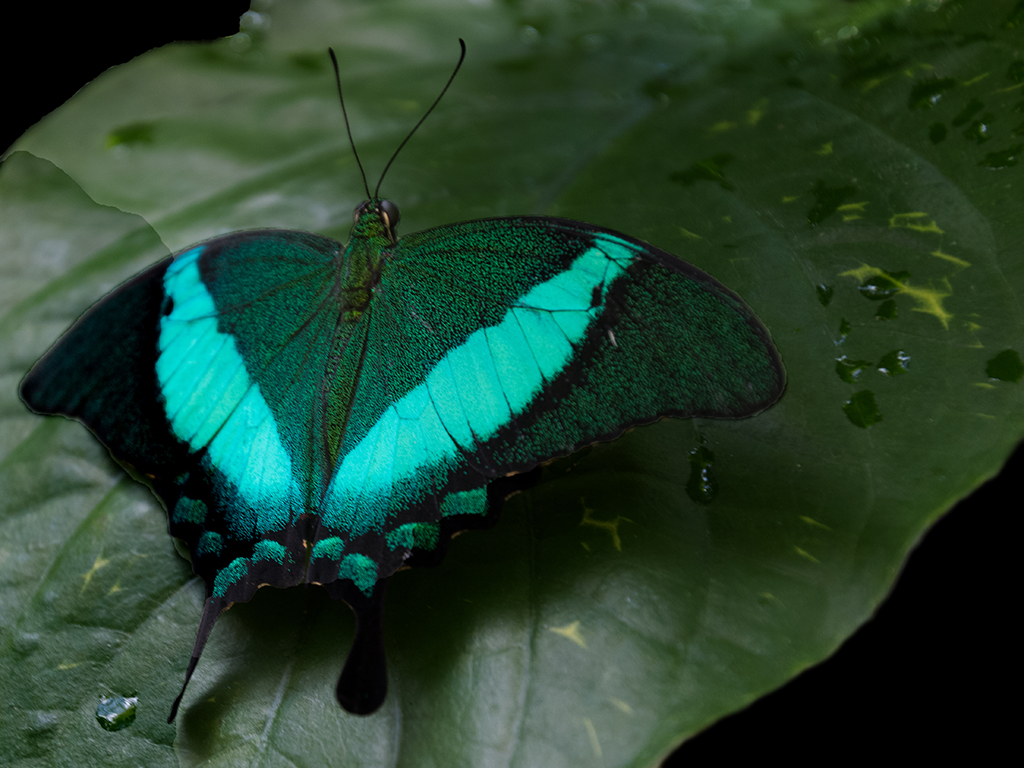
I like the sharp quality of your butterfly. The pink flowers add a degree of color to the image. However, in my opinion, there is too much going on that detracts from the butterfly. I keep looking at all three branches. It is also a bit dark to me. I tried raising the levels on the wing. I also cropped a bit from the bottom and those things pulled my attention to the butterfly. |
Jul 11th |
| 52 |
Jul 19 |
Comment |
What a grand image. When I look at the original I first focus on the long arm. Eventually my eye looks down at the face of the monkey. In your cropped version, I see the wonderfully captured eyes, and facial expression. Then I notice the long line of water falling from its mouth. You caught exactly what is best about the story. |
Jul 5th |
6 comments - 2 replies for Group 52
|
6 comments - 2 replies Total
|