|
| Group |
Round |
C/R |
Comment |
Date |
Image |
| 52 |
Sep 18 |
Reply |
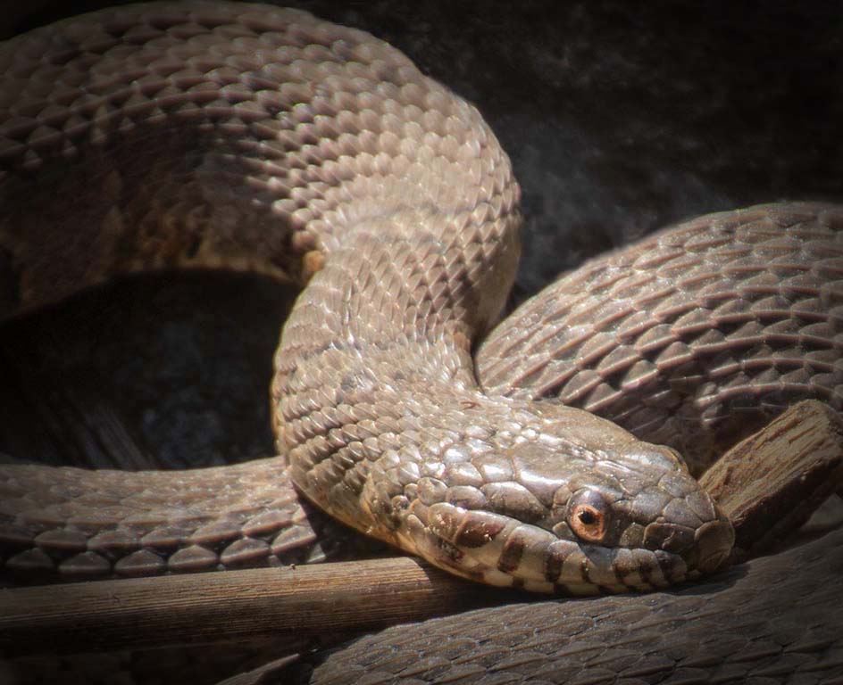
I see what you are describing, John, in the neck. I think the distraction is less in my version; however I very much like the rest of what Pete added in his version.
This snake will be back. I've seen it twice. More chances to get it better, eh? |
Sep 12th |
| 52 |
Sep 18 |
Comment |
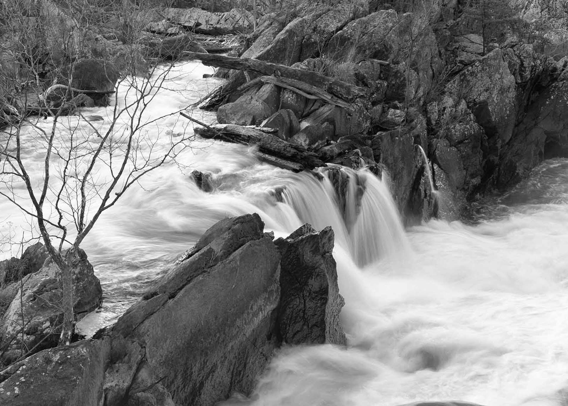
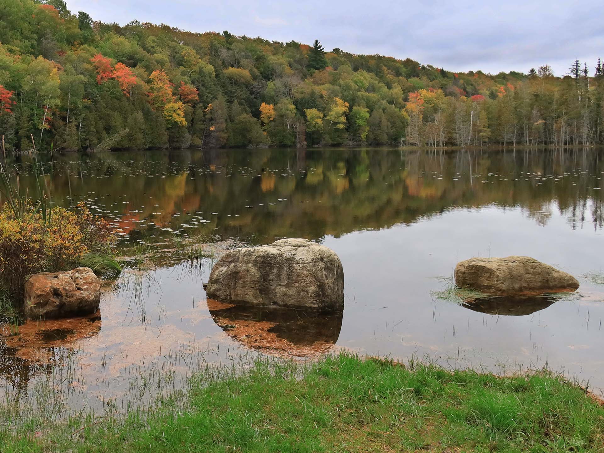
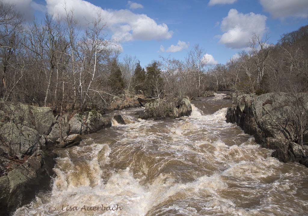
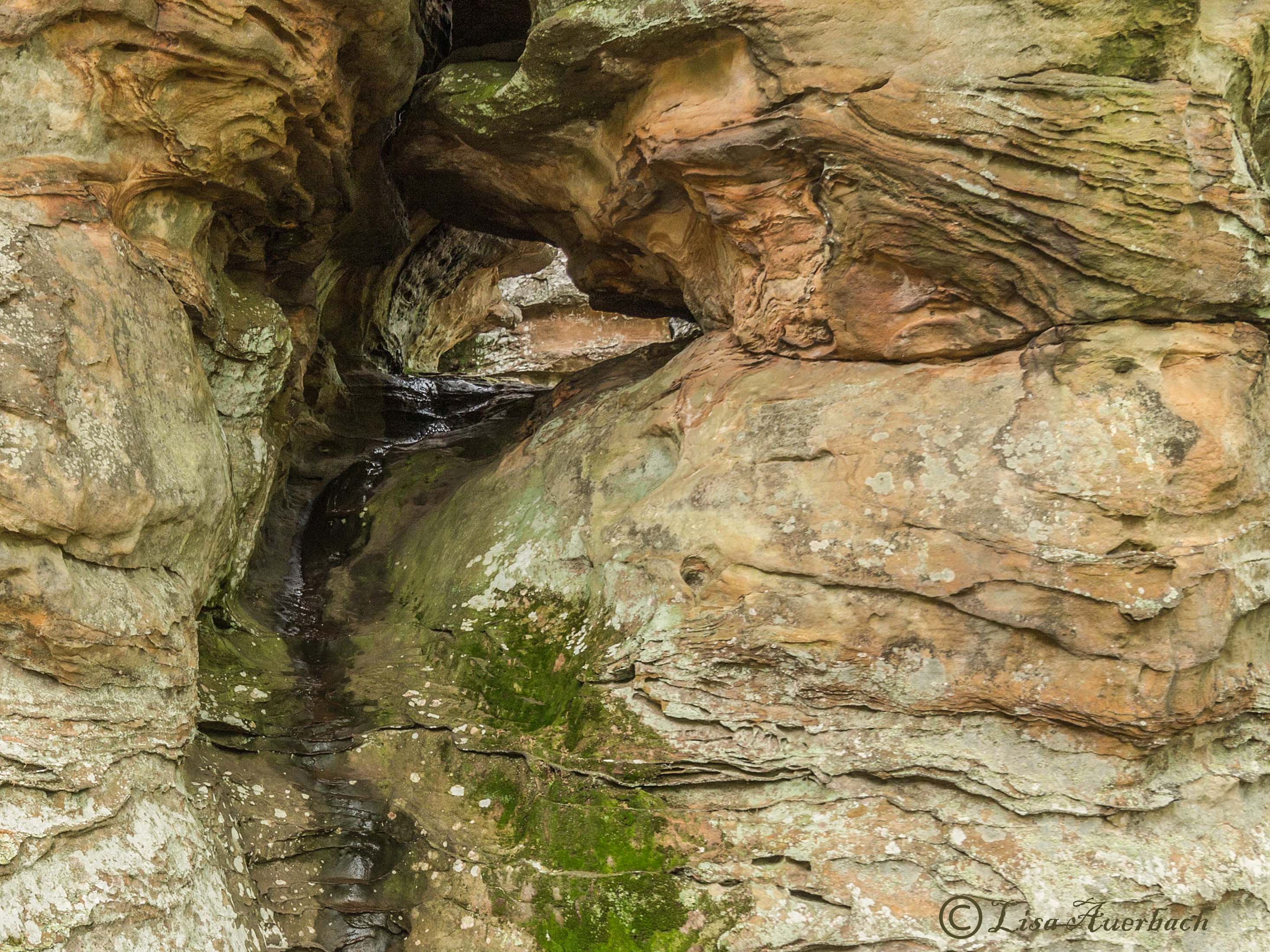
What first drew me into your image is the glow of sun rays hitting the rocks in the foreground. Next I saw the mist coming off the water. Your colors seem true to nature. I very much enjoy this image. It evokes calm and peace. Is this Richmond, Virginia? |
Sep 8th |
| 52 |
Sep 18 |
Comment |
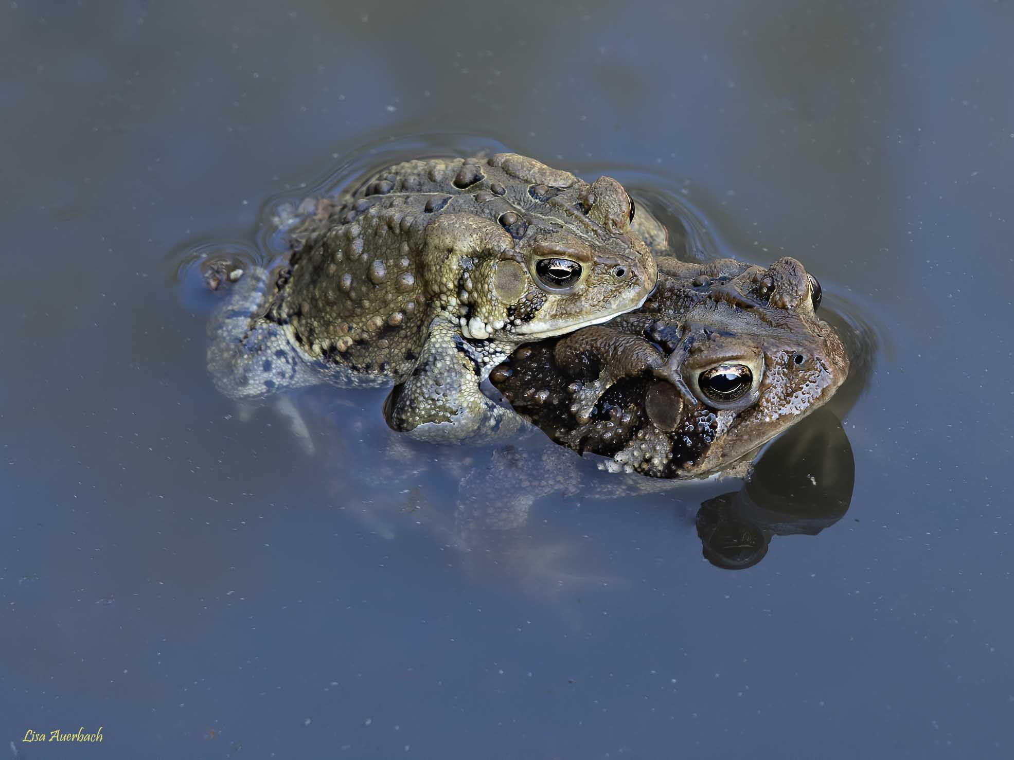
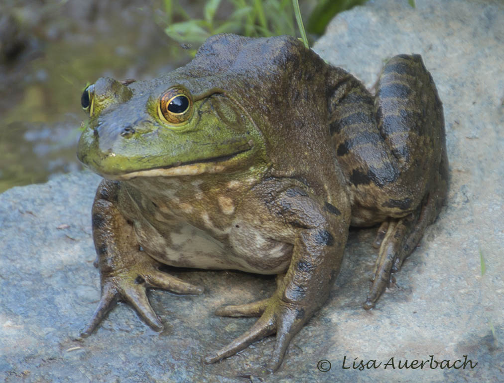
Judith, I have enjoyed the few times I've seen these frogs in a position to be photographed. Your toad placed itself perfectly. The idea of the reflection works well. I would leave all the foreground showing all of the frog's body, and I would also leave the frog's coloration closer to what you captured. I agree with Mike that a lighter vignette would bring my attention to the frog. I would add that it would highlight more of the frog, letting the viewer see that great reflection clearly. |
Sep 7th |
| 52 |
Sep 18 |
Comment |
Wow! Thank you both for the suggestions. I can see a big difference. |
Sep 7th |
| 52 |
Sep 18 |
Reply |
Perhaps I said it wrong. I don't think the colors are off; only that they are too light. Each time I've seen this bird the colors are darker. Somewhere between what you produced in the camera and what you produced in the computer would be right for my taste. |
Sep 6th |
| 52 |
Sep 18 |
Comment |
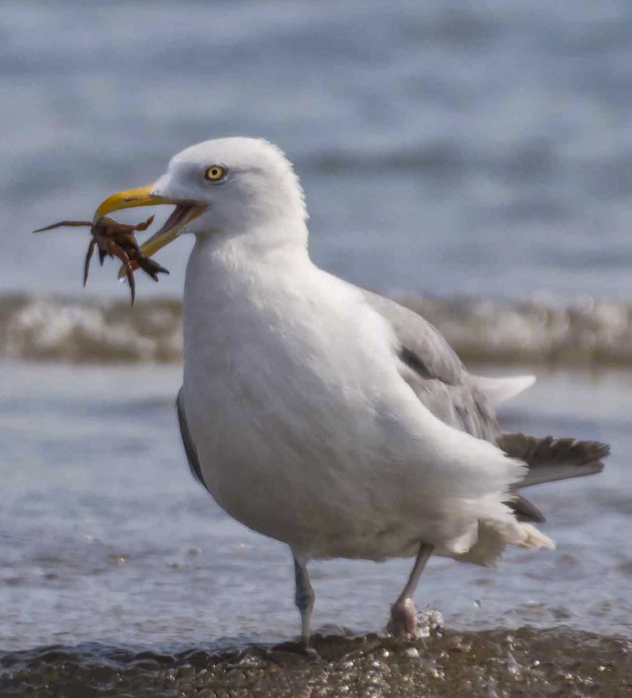
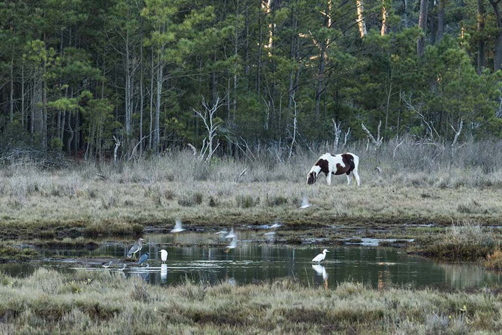
I so like a reddish egret. They dance and make merry. You have managed to bring out the merriment of this one. Each part of the image is sharp and crisp. As one who very much likes the Reddish Egret one early thought was that the color was not true to most of them I have seen. So we get into the art or science. I think I would like to see the end product a bit darker and truer to its real color YET, I like the artistic way you have treated your image. |
Sep 3rd |
| 52 |
Sep 18 |
Comment |
I am surprised that an f/14 gave such a lovely bokeh. I like the composition as a whole and especially like the glow of the fronds in the foreground. I sense movement and wind in the background, yet your foreground is clear. Very well captured. |
Sep 3rd |
| 52 |
Sep 18 |
Comment |
What fun you must have had with these kits. I like the playfulness that you have captured. The image is clear and sharp especially for being hand held. I like the flowers in the scene and the placement of each kit. I do think the background is a bit bright. I tried lowering levels only in the area of the flowers further into the background, and I think it makes the focus stronger on the kits. |
Sep 3rd |
| 52 |
Sep 18 |
Comment |
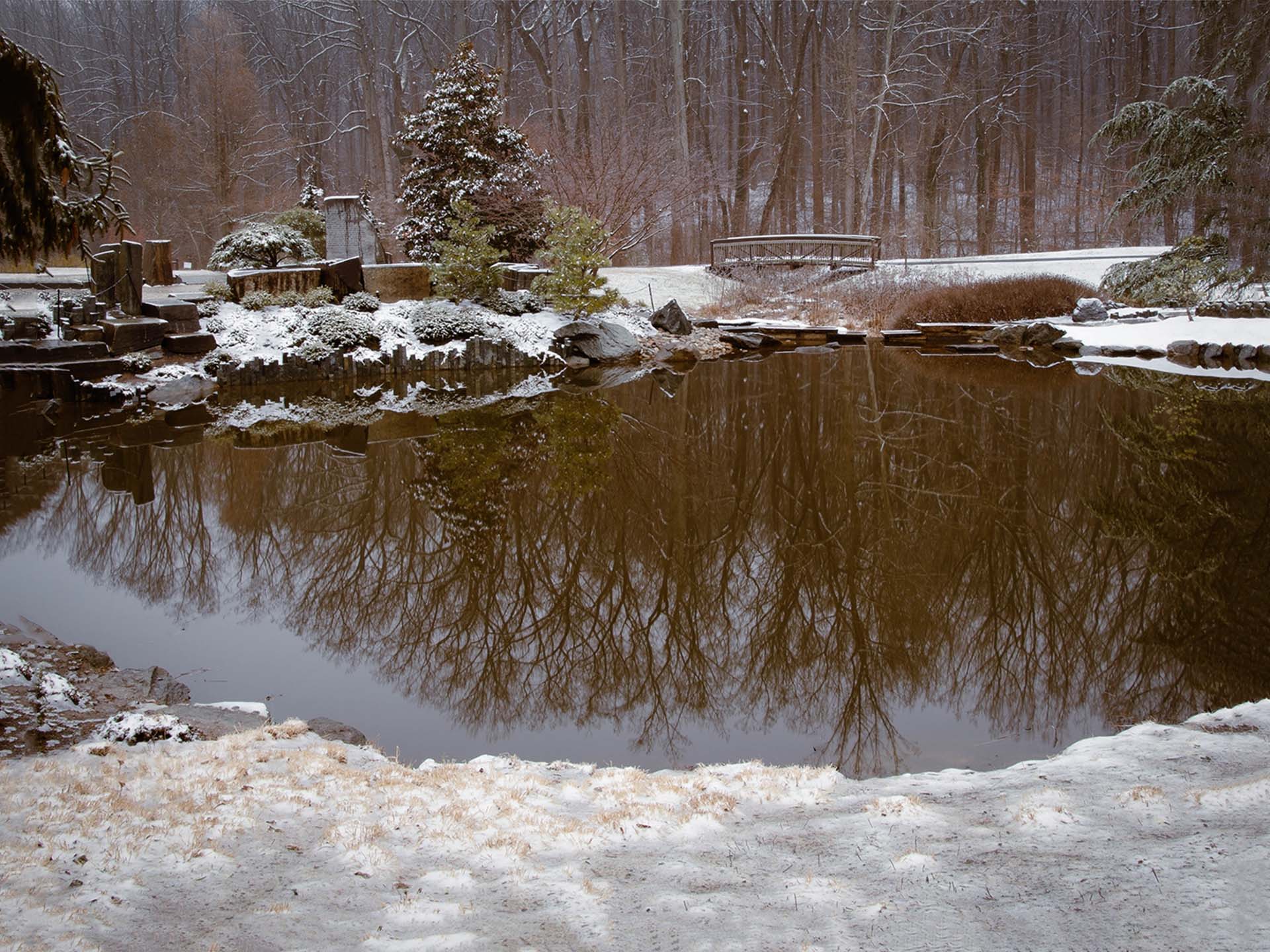
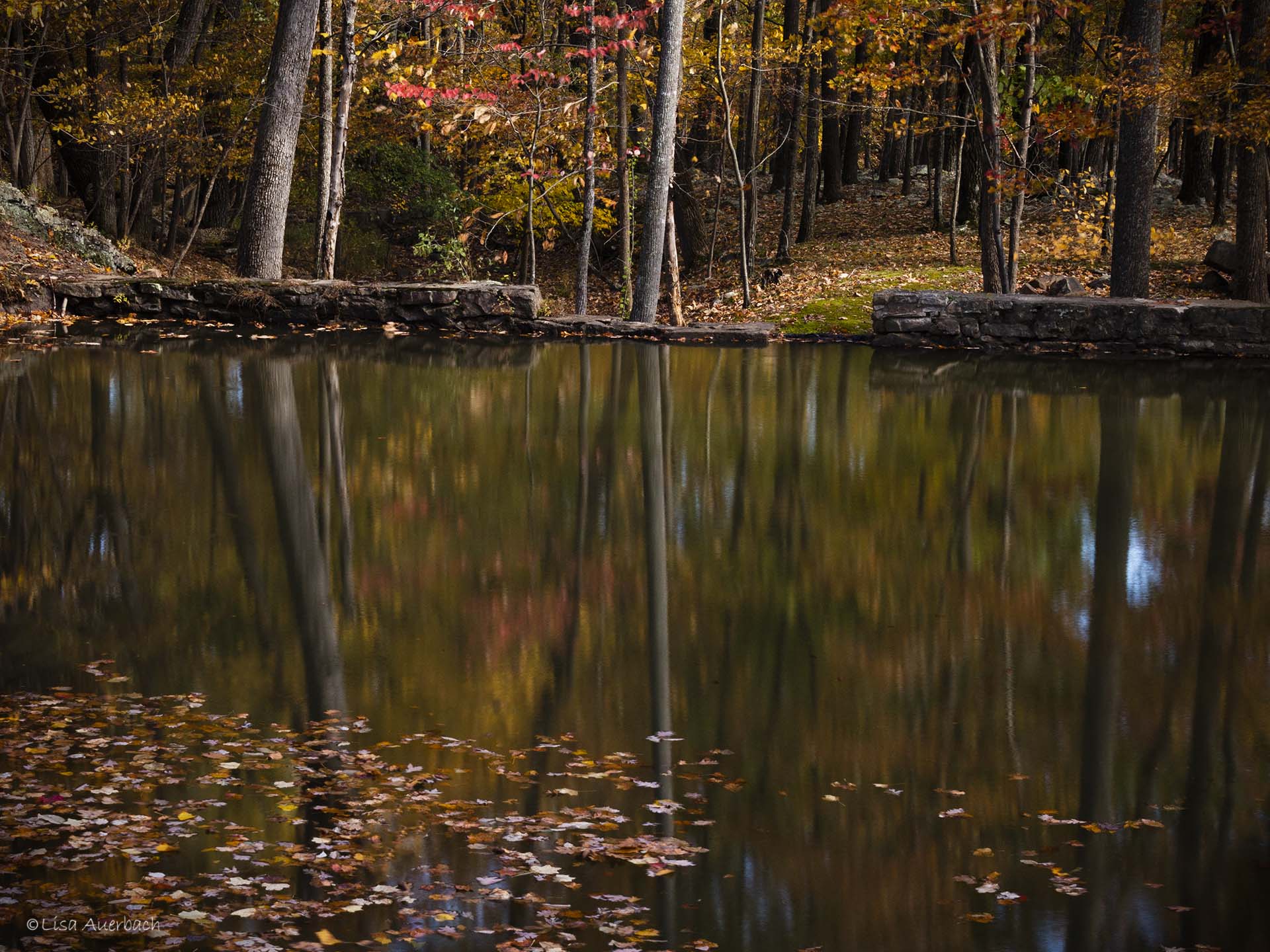
Sharon, your image is an oooh and aaaah image. I so enjoy the detail, color palette, composition��just everything about it. I enjoyed looking for the place where the trees hit the water and the reflections began. There is a silky quality to the reflections while the trees have good texture. Your settings were spot on because the end product is spot on. I am curious about the three combined images? How did the settings differ? I ask because your original and end product are not that different.
Congratulations on a beautiful image. Nothing to change.
|
Sep 3rd |
7 comments - 2 replies for Group 52
|
7 comments - 2 replies Total
|