|
| Group |
Round |
C/R |
Comment |
Date |
Image |
| 52 |
Aug 18 |
Comment |
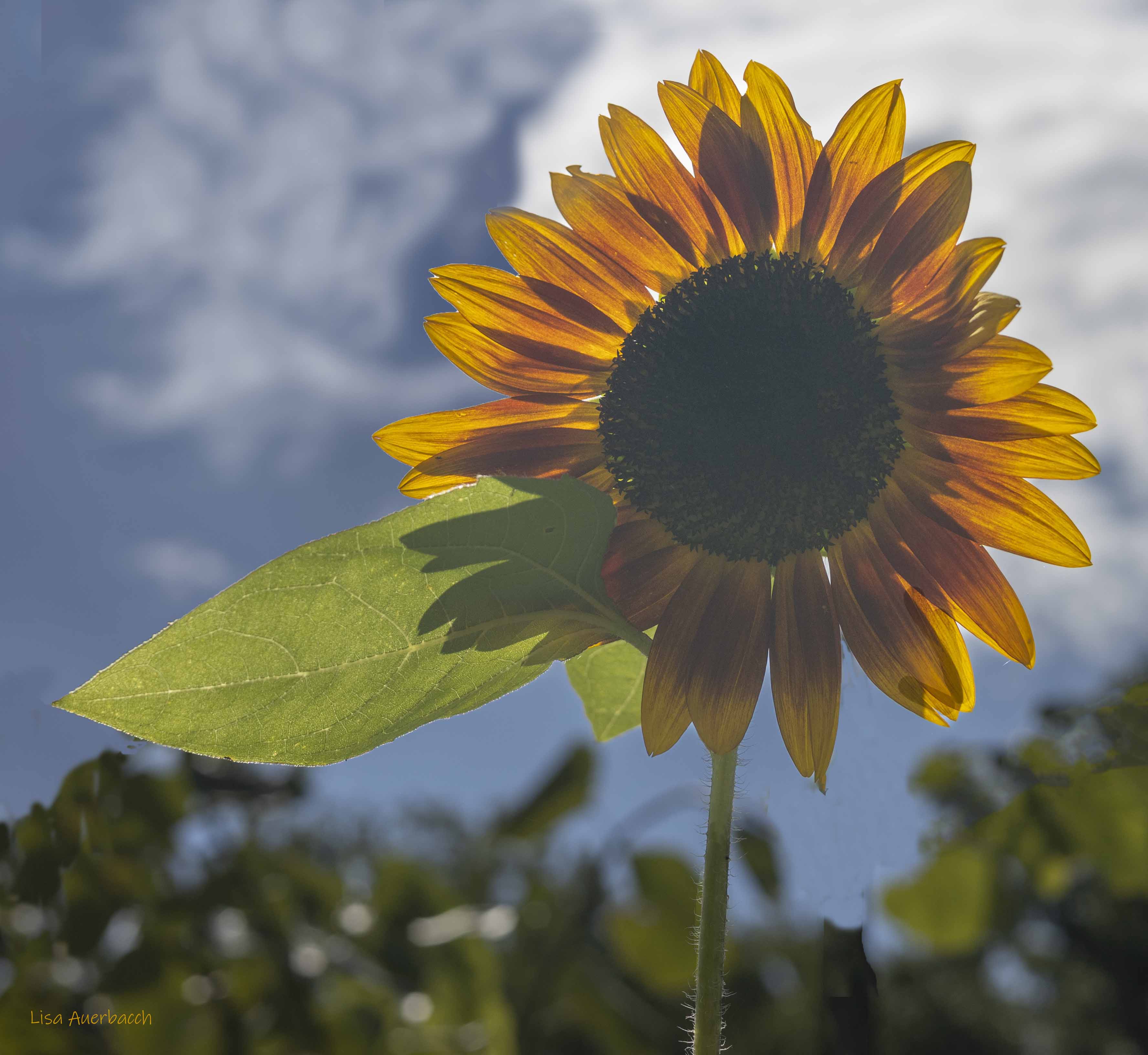
I reworked the image and am happy with the results. I'd not used Color Effects for vignettes. I liked what I got with using it. I added a levels layer to get some difficult areas; and I am happy with this second post process. |
Aug 22nd |
 |
| 52 |
Aug 18 |
Reply |
Ha! I did add a vignette but I agree that even more off one will help. I will work on the background. I'm not great at blurring backgrounds post processing. I'd like to know how some of you tackle this. |
Aug 13th |
| 52 |
Aug 18 |
Comment |
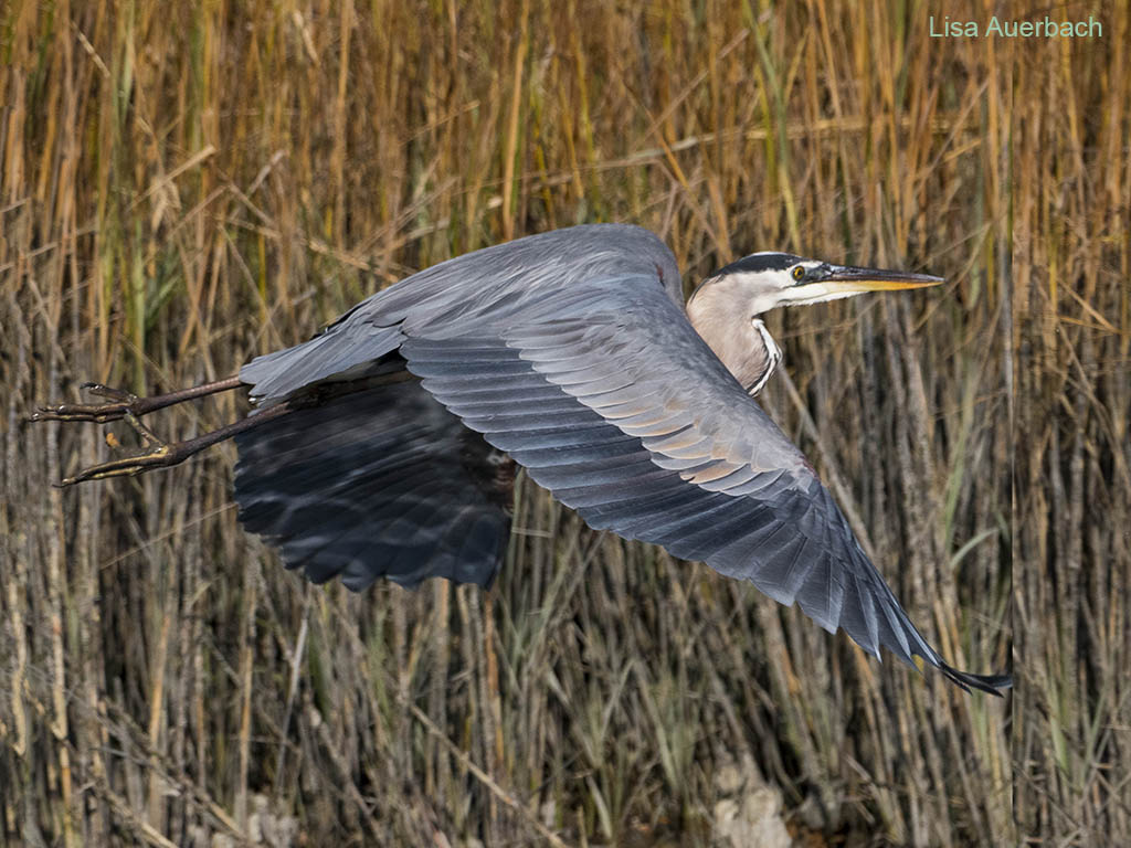
Nice shot, John. The wings of your bird are fully extended downward giving a good view of the wings. Feathers are crisp. The sky compliments the colors of the bird. I would suggest only dodging the eye to give it a small amount more pop. You could also crop tighter to make the bird larger and better seen.
When Judith mentioned the halo, I looked again and did notice the halo. I notice it around bottom beak.
|
Aug 11th |
| 52 |
Aug 18 |
Comment |
This is a fun shot, fanciful, and well executed. I have not used a fisheye and have seen it used mostly in architecture. What made you decide to use it here? |
Aug 11th |
| 52 |
Aug 18 |
Reply |
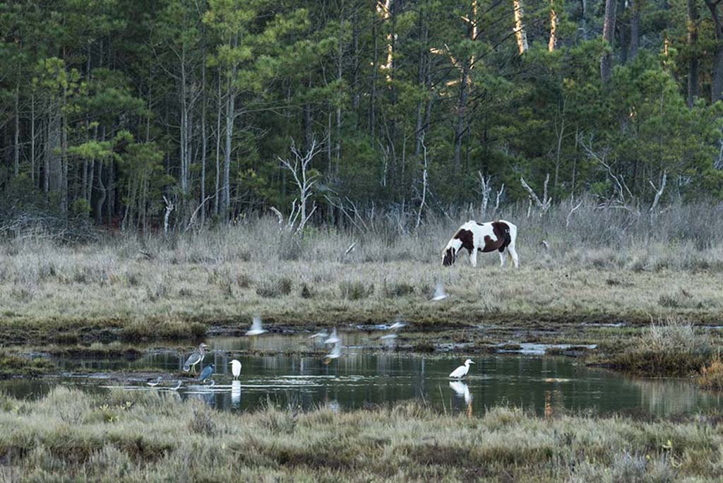
It is such fun to watch egrets dancing over the water. You have caught this one well. Wings are visible, the eye sharp and shiny. I like the water dripples falling around the egret's feet. The one thing for me is the blue water. It is a bit competitive with the egret. It is a bit too saturated. I suggest taking it back just a bit. |
Aug 11th |
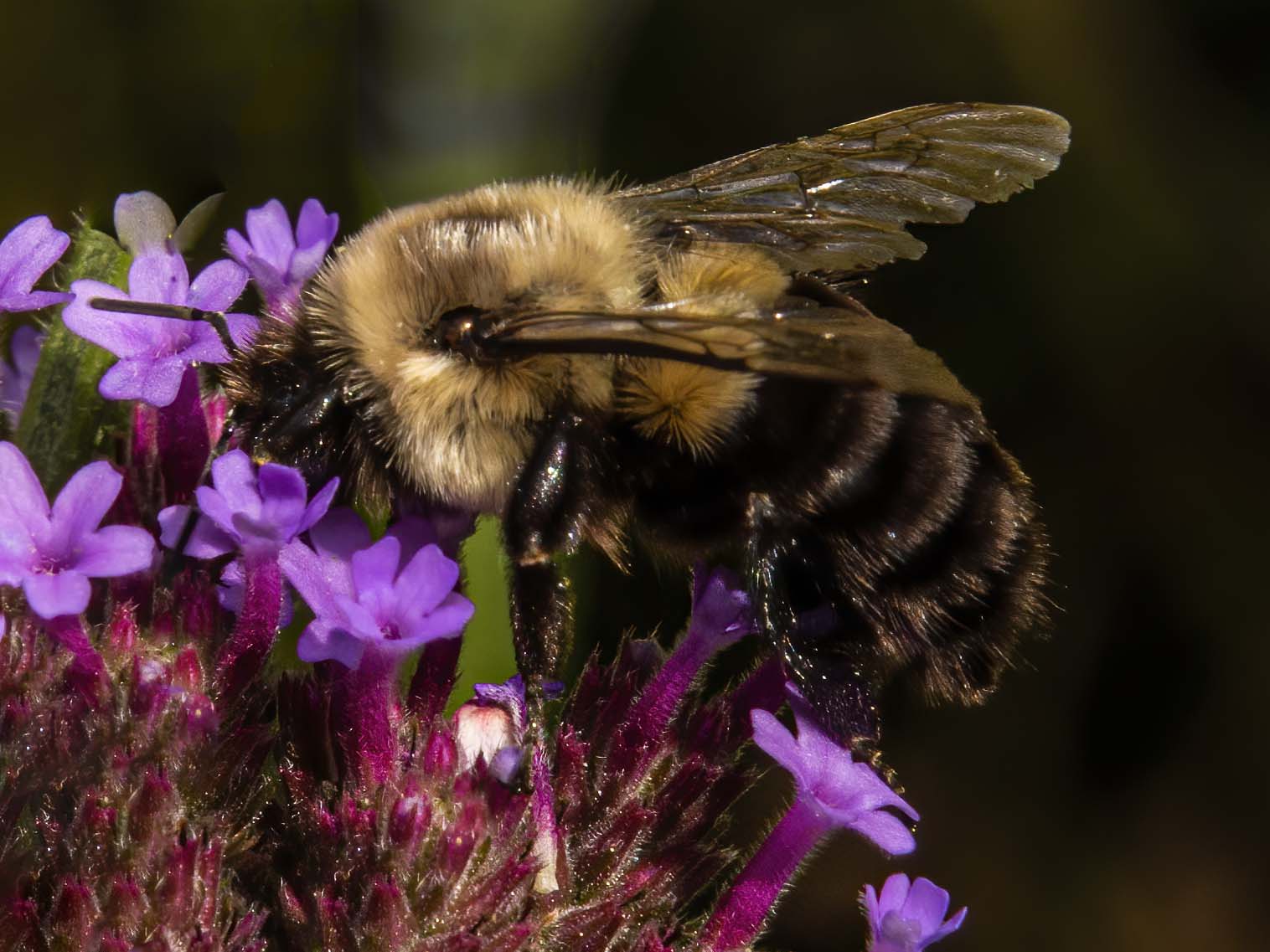
| 52 |
Aug 18 |
Comment |
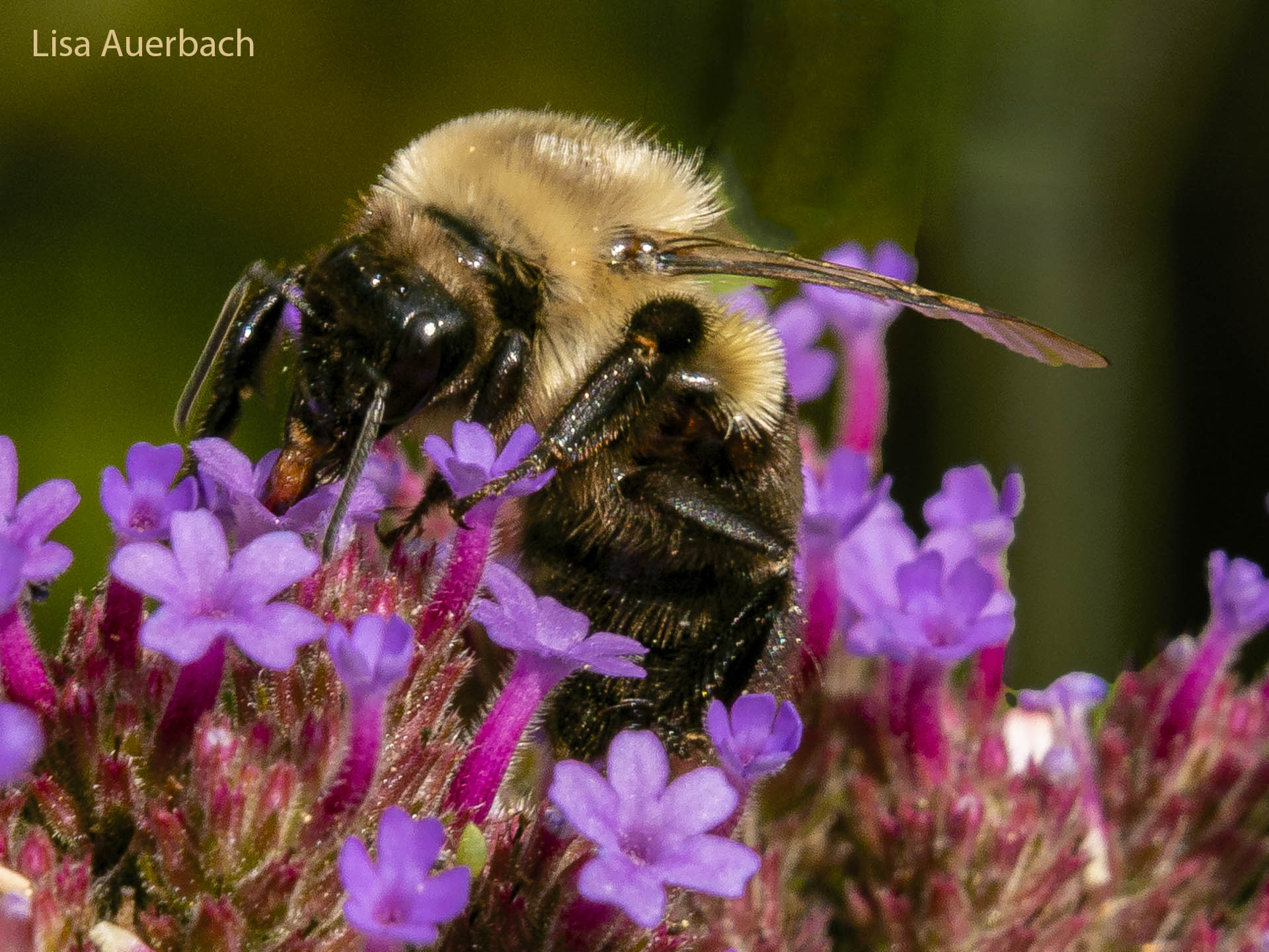
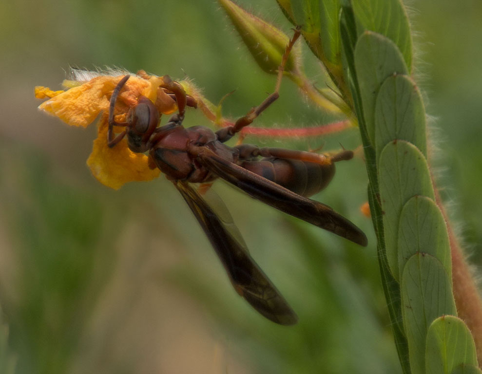
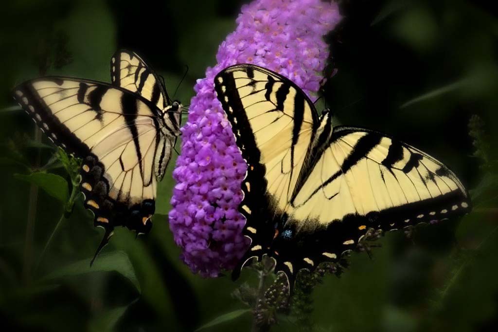
I like the reflections in the bees' eyes. I noticed them right away. The fibers of hair are sharp; the color realistic. I like your composition in that there is a diagonal across the page. I suggest a dark vignette to pull my eye to the center. I think that makes your good image even better. |
Aug 11th |
| 52 |
Aug 18 |
Comment |
Carol, what first strikes my interest is the vast color contrast of the dragonflies. The bodies are clear, and the wings have good motion to them. I also like how you have treated your background. The color you chose is neutral in a way that highlights the coloration of the dragonfly/damselfly. I think your vignette works well for the image. Kudos. |
Aug 11th |
| 52 |
Aug 18 |
Comment |
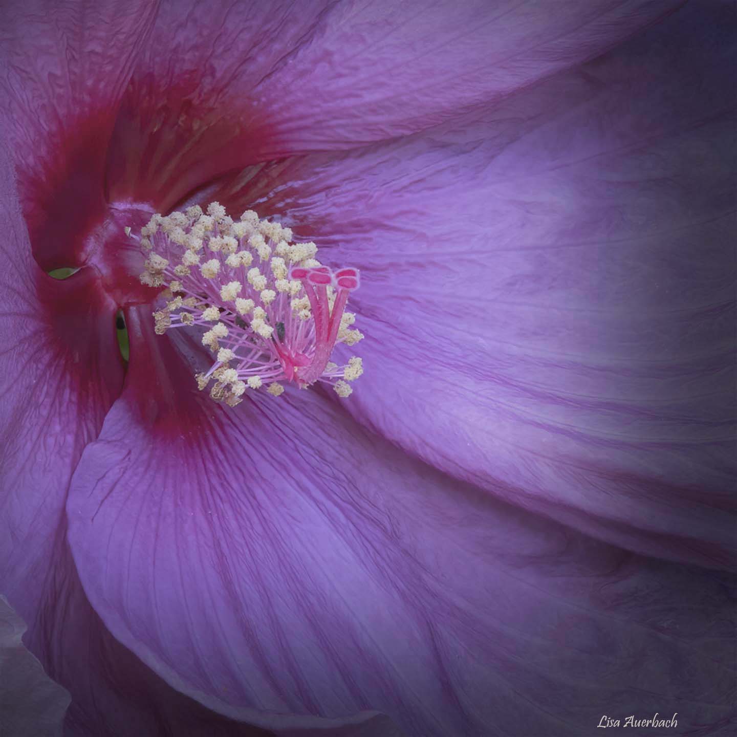
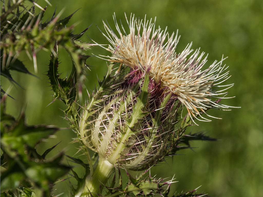
I immediately noticed your lovely flower bud. The color is rich, and the bud is sharp. The dragonfly's wings are crisp and the right wing shows a slight buzz of movement. I like the way the tip of the bud leads me to the dragonfly. What I notice but don't know what to suggest is that the left eye is less sharp. I find this in many eyes of dragonflies but don't know the reason. |
Aug 11th |
6 comments - 2 replies for Group 52
|
6 comments - 2 replies Total
|