|
| Group |
Round |
C/R |
Comment |
Date |
Image |
| 52 |
Jul 18 |
Reply |
Your re-do captures all that is needed. It pulls me right up to the bench to look at and contemplate... The water is calm and reflects a glorious sky.
Well done, Mike. |
Jul 17th |
| 52 |
Jul 18 |
Comment |
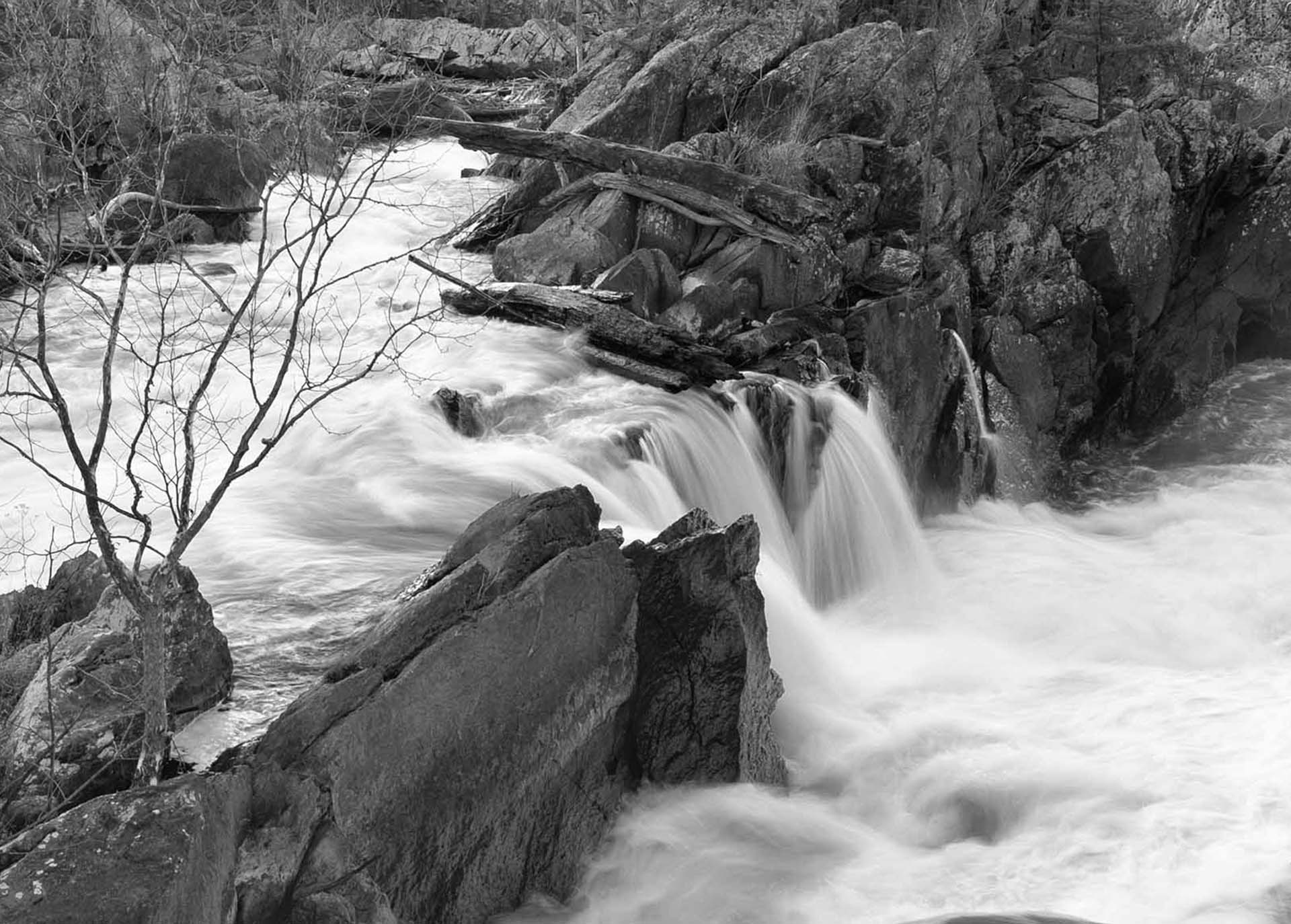
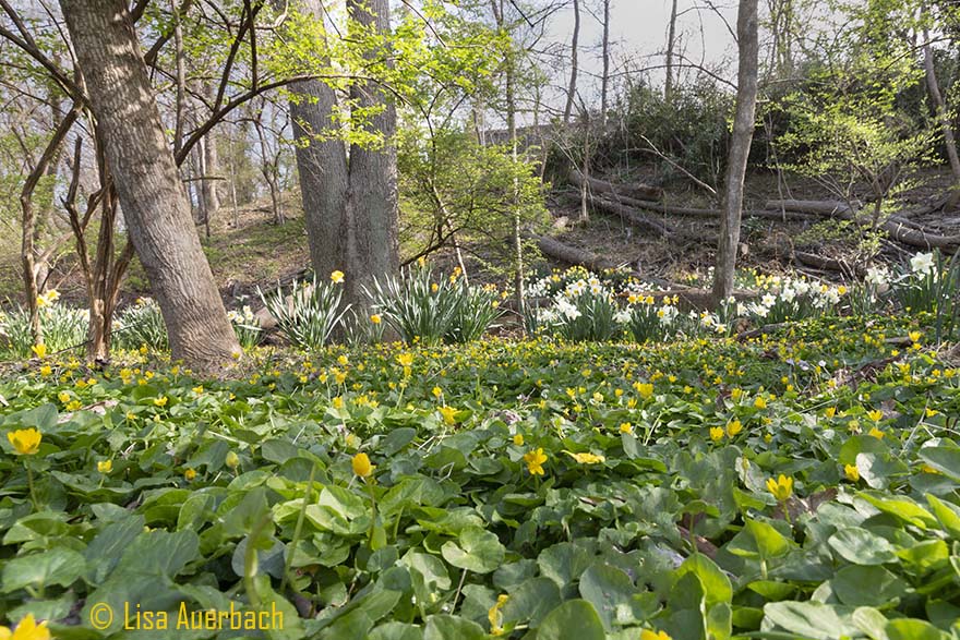
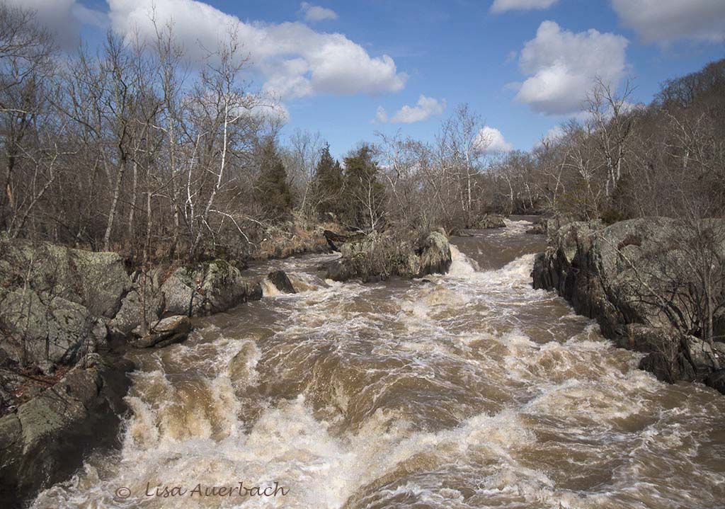
For me there is too much yellow in the trees. I actually like the original color but that is absolutely subjective.
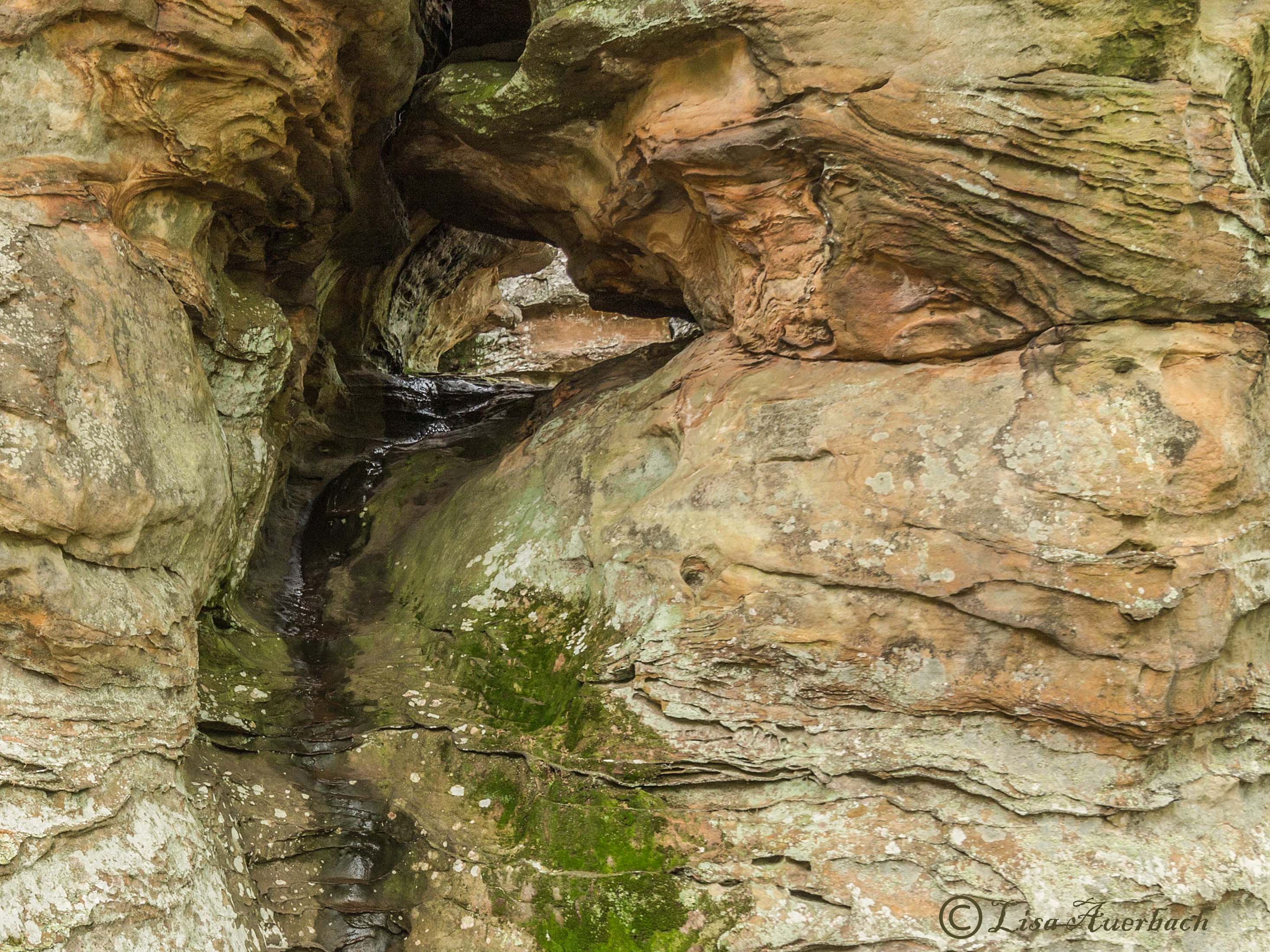
As for cropping I like the stairway waterfall and like the left rocks better than the right so might crop in this manner. |
Jul 17th |
 |
| 52 |
Jul 18 |
Reply |
I tend to like nature as it is so do not clone the spots unless they are brown and large. Perhaps it is because I am so ingrained with PSA Nature rules...
I did add texture with Viveza and like it quite well. I also tried your suggestion of lowering the green luminance but am not sure about that. I like the greenery. I am often told what is your focus. While I know the flower is, I still like the leaves with it.
|
Jul 17th |
 |
| 52 |
Jul 18 |
Reply |
Yes, most definitely with the background which I noticed more than the other comments I made. |
Jul 12th |
| 52 |
Jul 18 |
Comment |
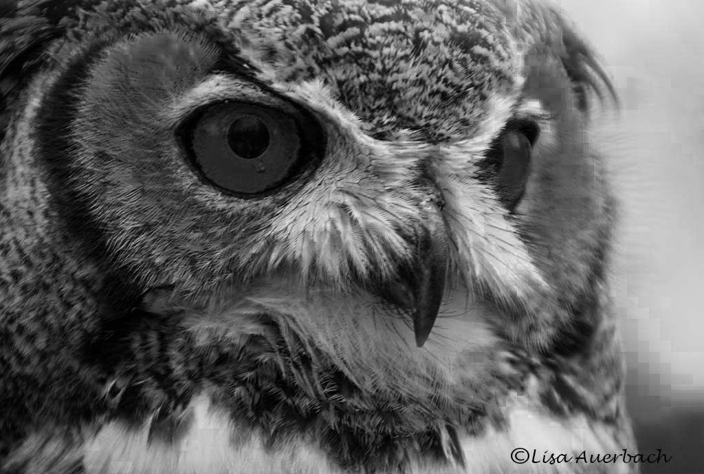
I think you achieved your goal. I like your composition. Is it possible to raise the shadows a bit while keeping the color true to the bird? The areas of the throat and neck are dark. I think you did well with the eye. I tried dodging the white around the black eye, and I think it worked. My suggestion is to add a blue filter to the background to cool it a bit. For me it is a bit too brown.
I do agree that the top of the branch needs to be included. |
Jul 12th |
| 52 |
Jul 18 |
Comment |
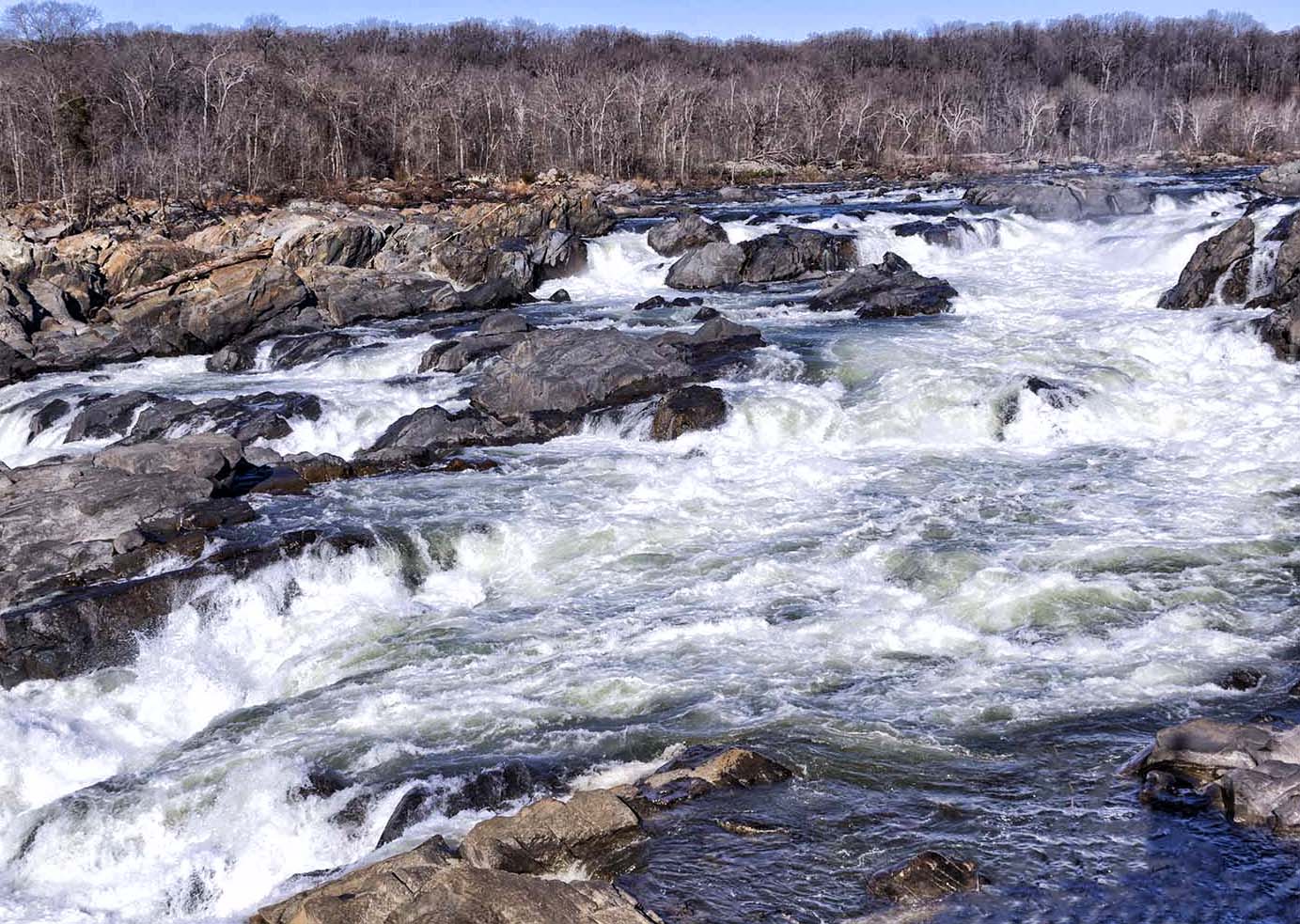
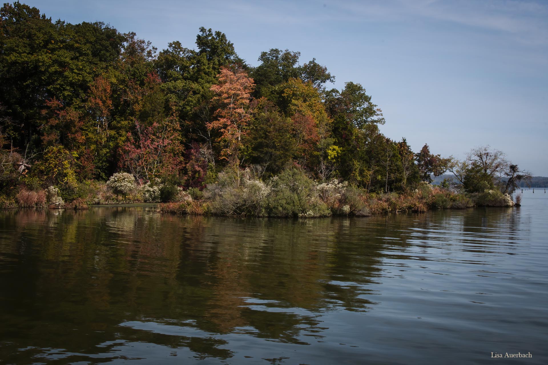
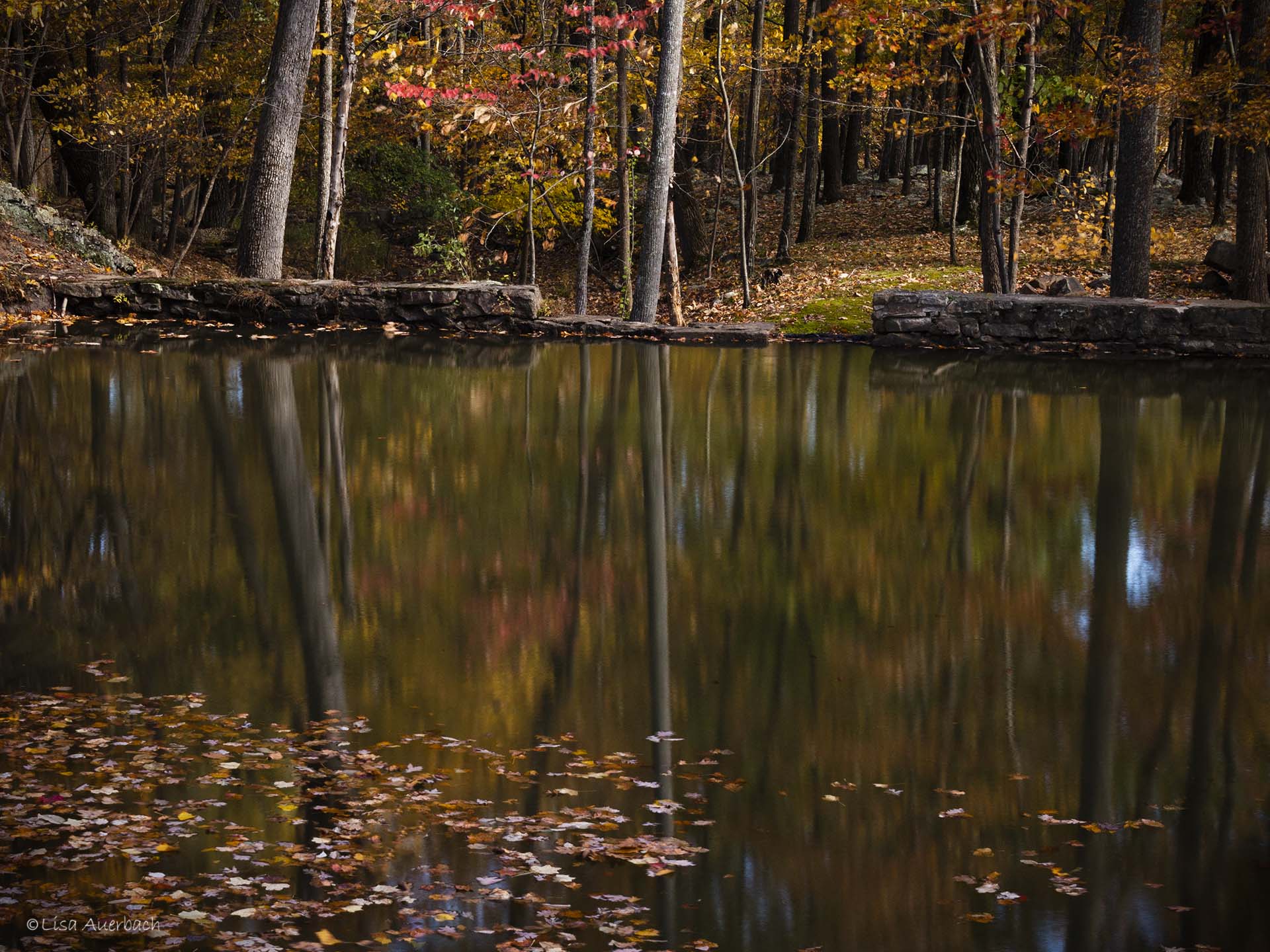
Carol, lovely image. Running water always calls my attention. I especially like the stairs of water in the center. I've looked at this several times and each time I think a crop on the right that places those stairs on a power point line, not necessarily a point, would give weight to that area. I prefer the trees in your original image. The color works well and seems truer. |
Jul 12th |
| 52 |
Jul 18 |
Comment |
John, I I think each has something to notice. The background of eagle 2 is dramatic but the detail of the eagle is not as well lit. Shadows need to be raised. The background of eagle 3 works well, but the eagle looks less sharp. Eagle 1 is sharp, and the colors look true. Your background in eagle 1 is soft and promotes the eagle.
|
Jul 12th |
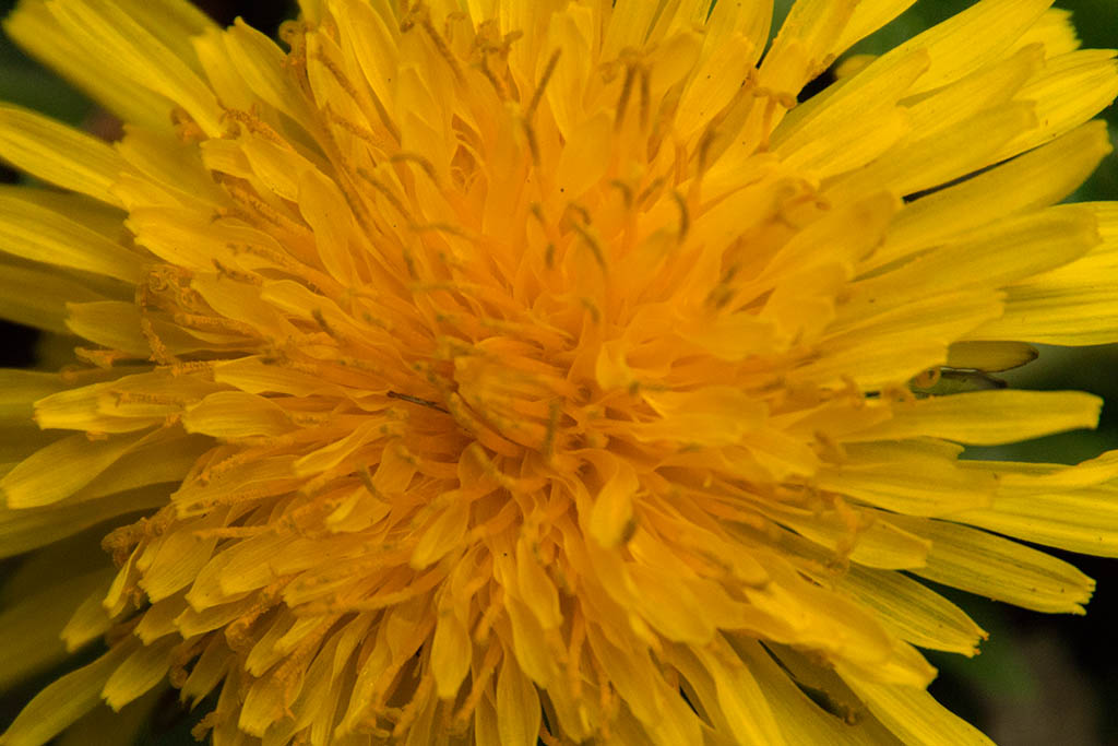
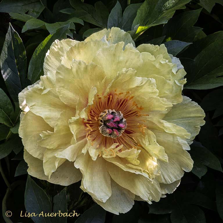
| 52 |
Jul 18 |
Comment |
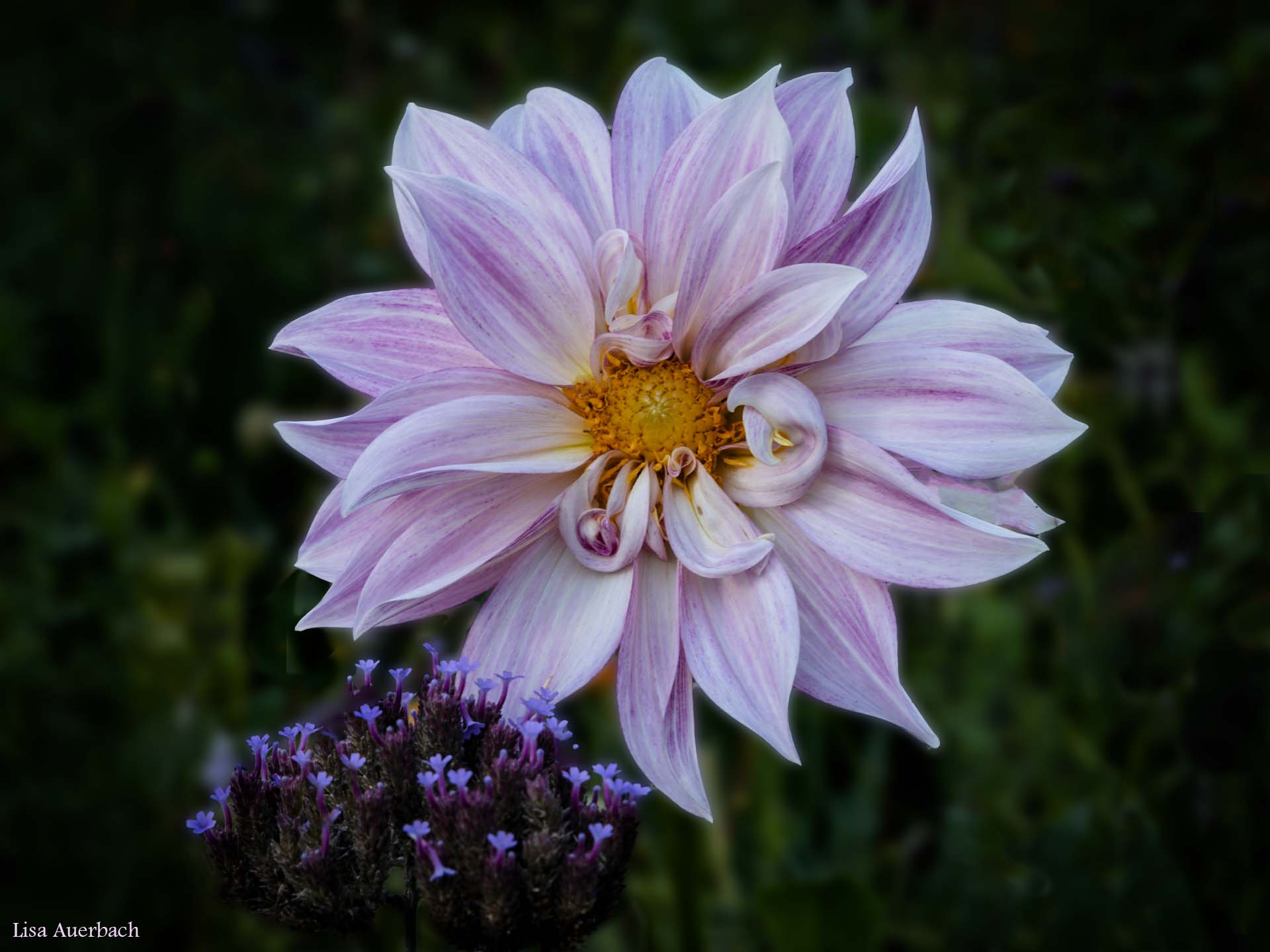
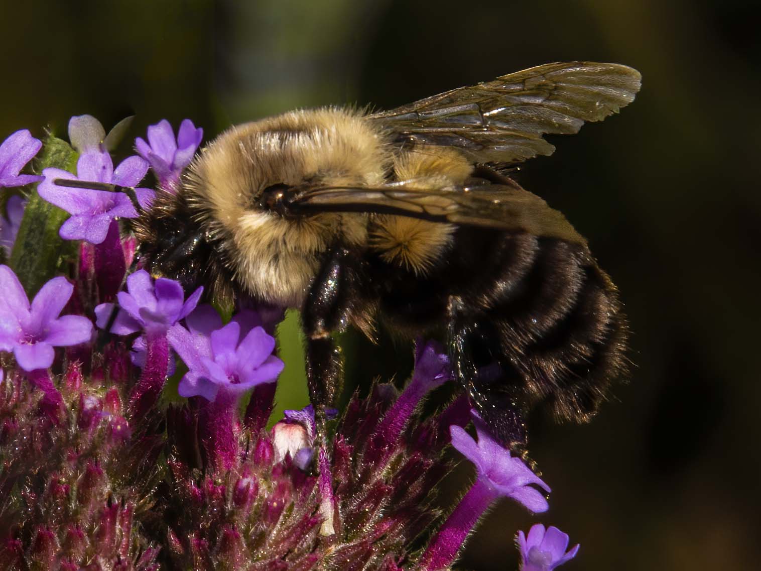
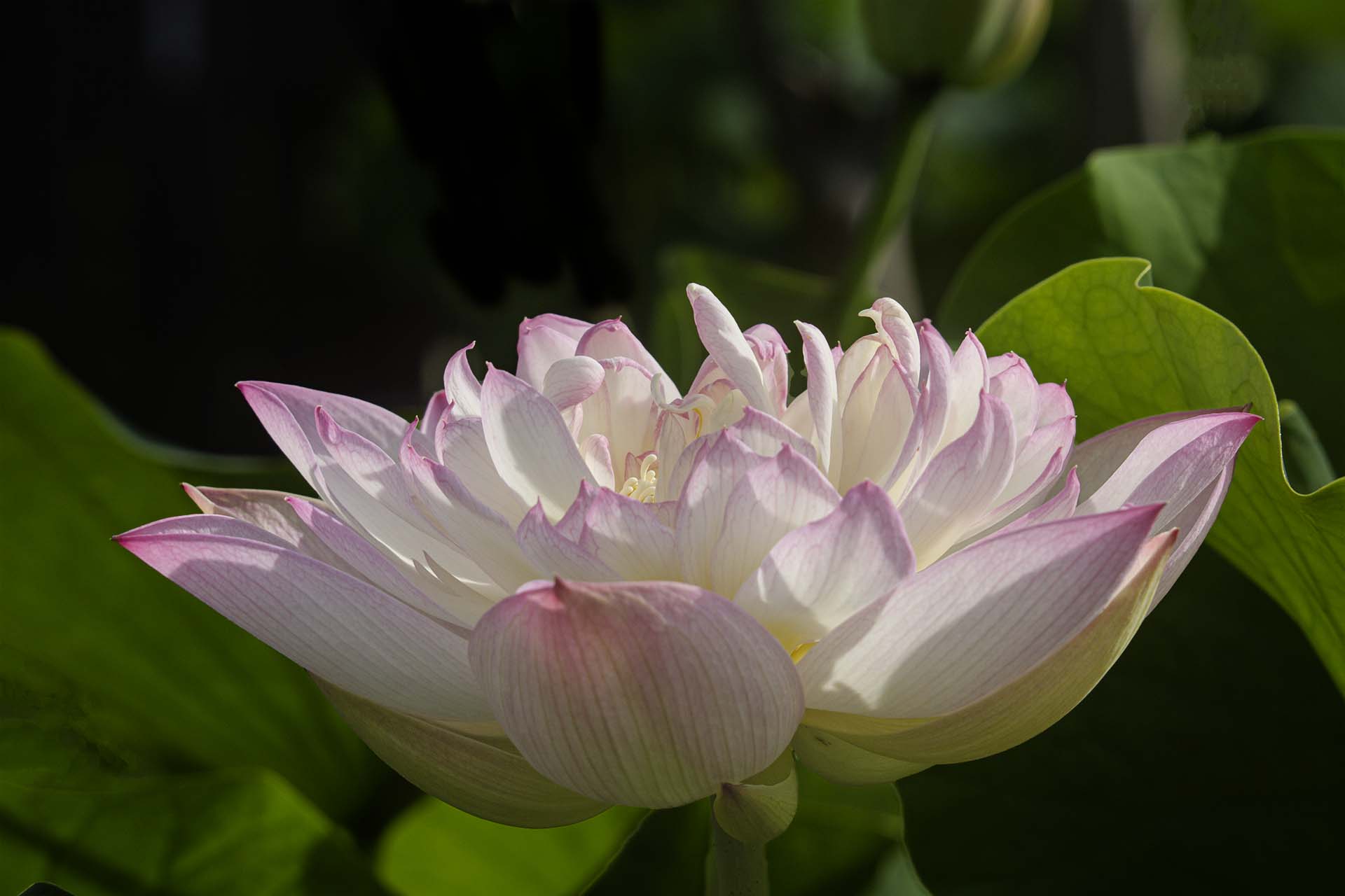
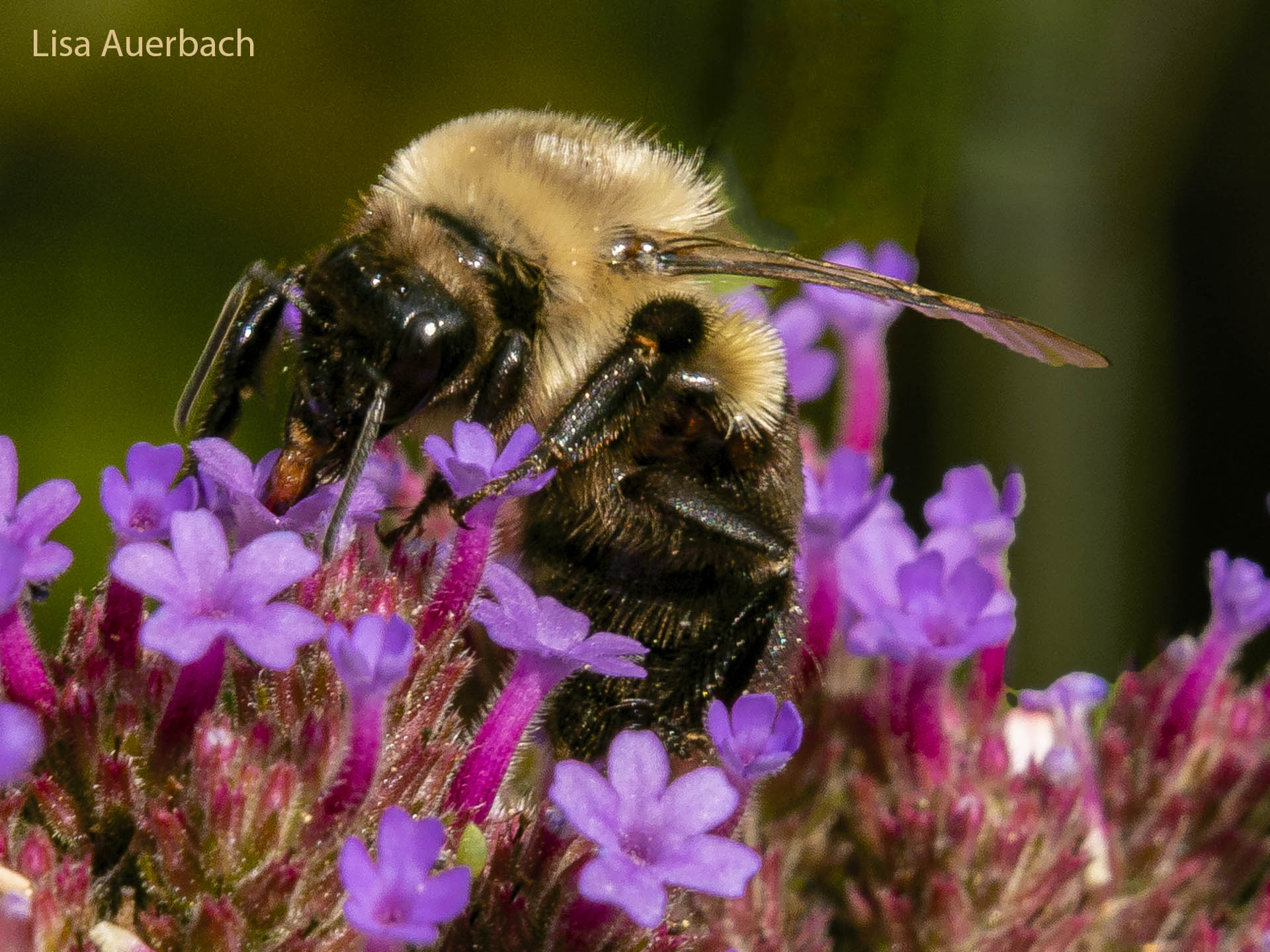
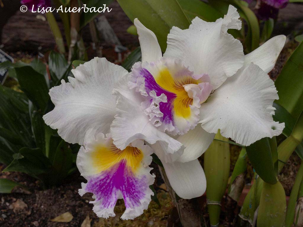
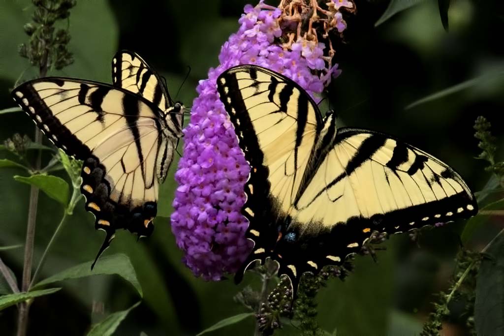
The subject is good. I like all that yellow pollen on the bee. I suggest you take the photo back to Bridge. I think you work with Photoshop. In the tab, HSL Adjustments, lower the pinks, reds, purples and greens. Your flower will become more natural. I would like to see much of the greenery cropped so that the bee and flower are what I notice. |
Jul 12th |
| 52 |
Jul 18 |
Comment |
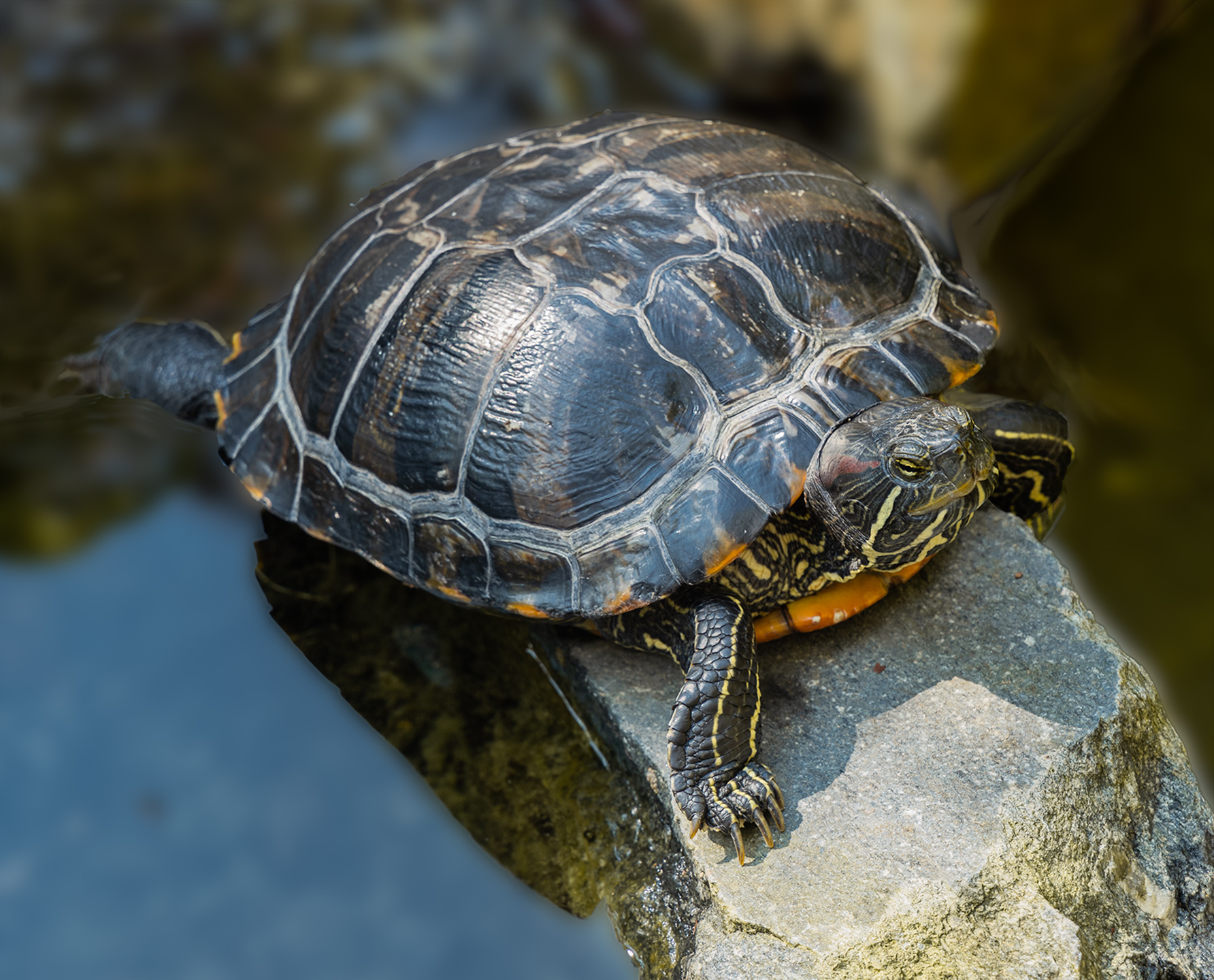
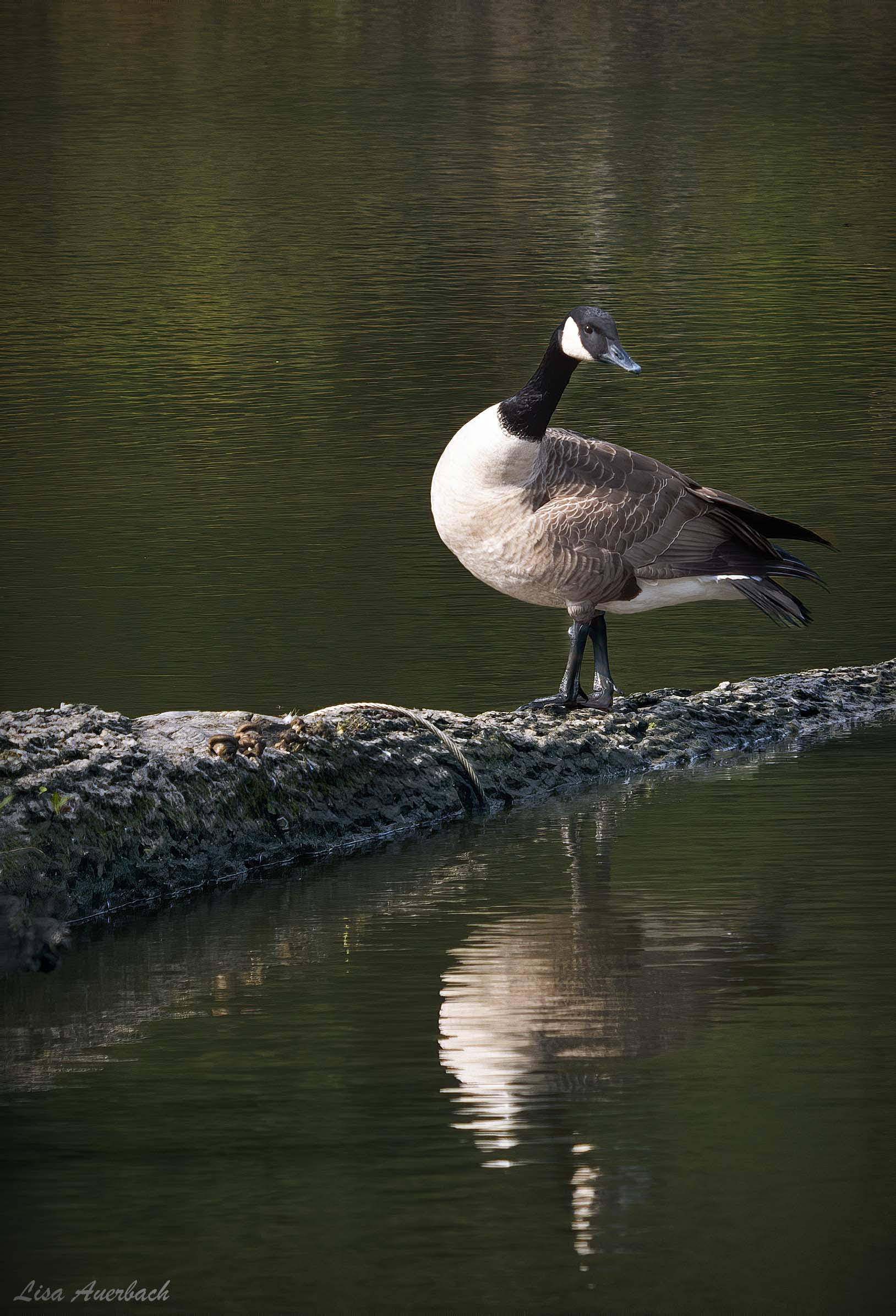
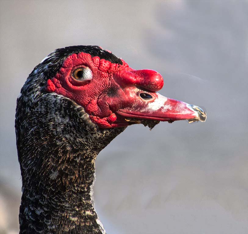
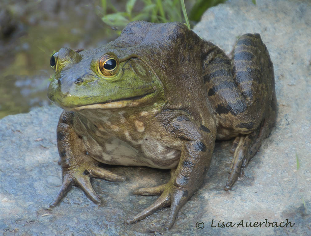
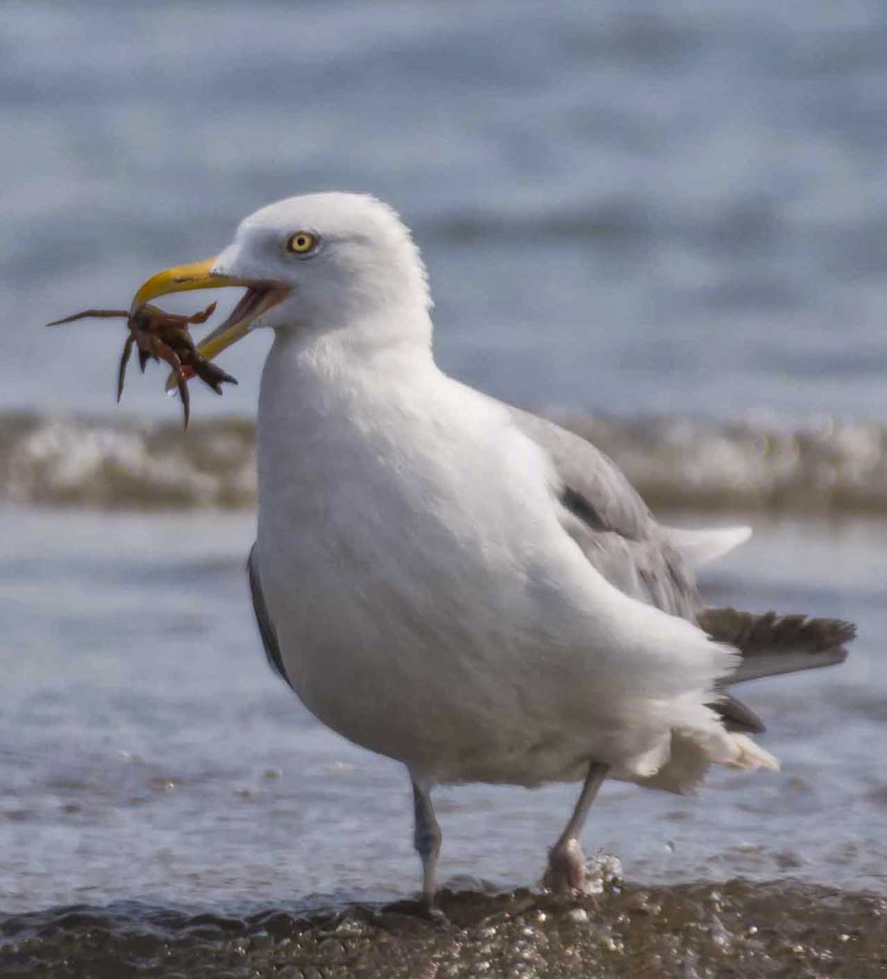
I like everything you have done with this image. I started with the eye which is quite clear and capturing and moved around. I like the bit of something in the mouth. |
Jul 12th |
| 52 |
Jul 18 |
Comment |
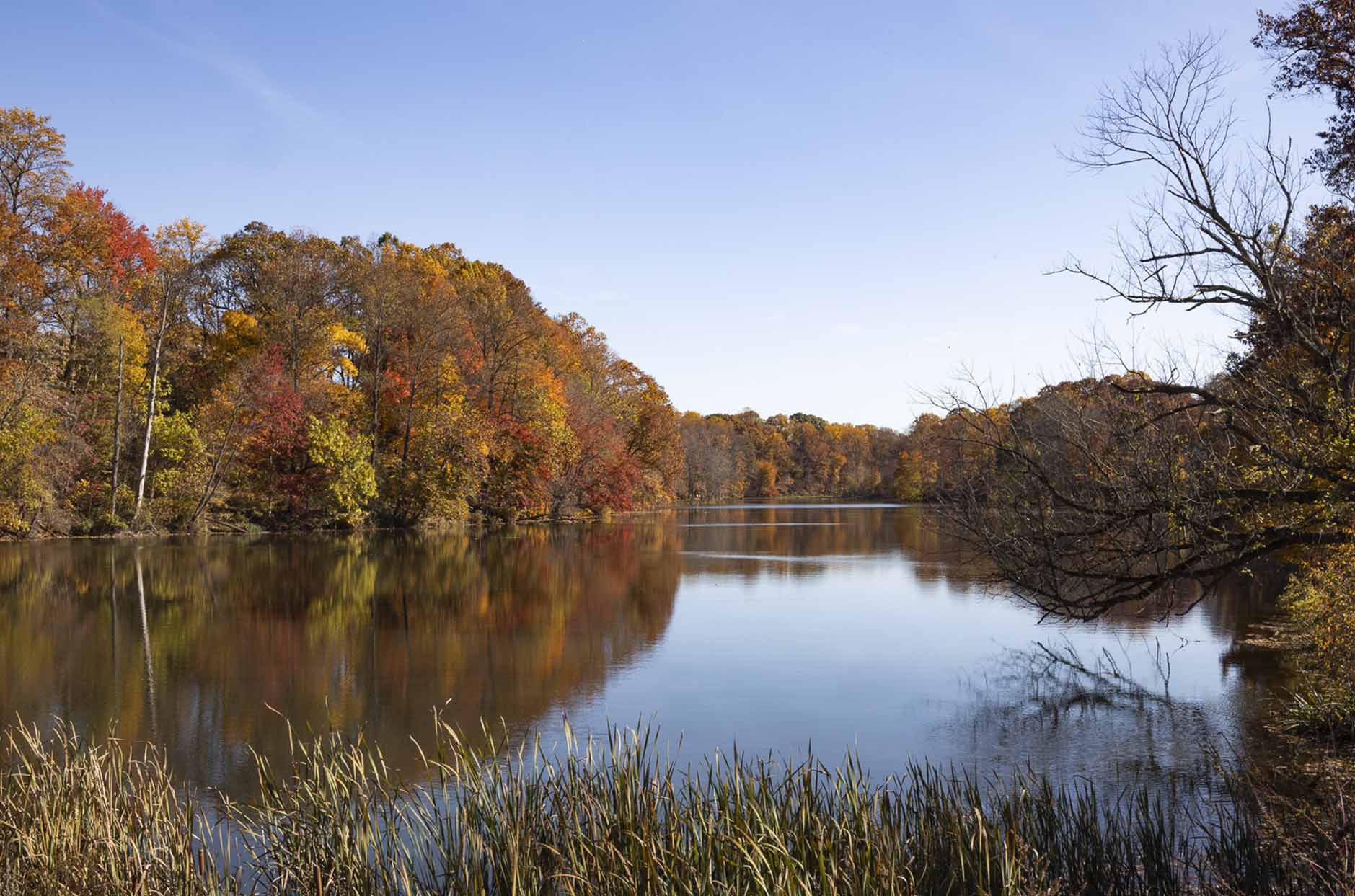
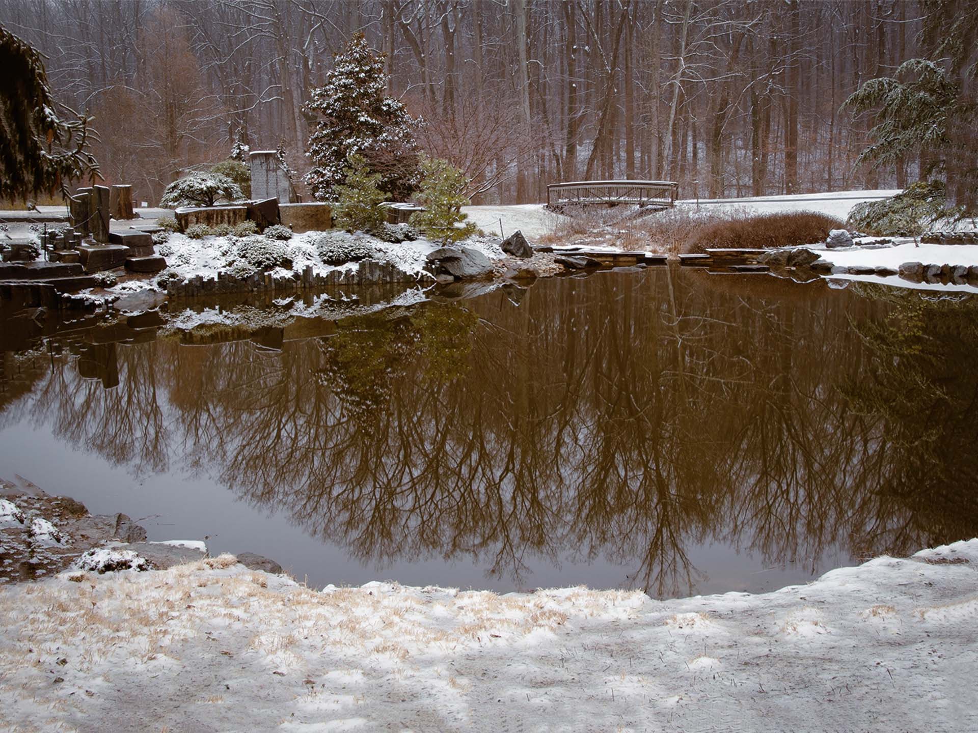
Mike, each time I have looked at this, I have felt a calm and peaceful sigh. Your sky is beautifully captured. The sun is clear but not over bright. However, what I really like is the bench inviting me to sit and breathe. Having said that, I would suggest cropping a bit of sky, then increasing shadows on the bench. When you told us you removed something in the lake I had to take a second look. At first I thought the lake was part of the sky, and your horizon was mid image. So for me there needs to be more work done to differentiate sky and lake. You have a lovely image with good potential. |
Jul 12th |
7 comments - 3 replies for Group 52
|
7 comments - 3 replies Total
|