|
| Group |
Round |
C/R |
Comment |
Date |
Image |
| 52 |
Mar 18 |
Comment |
Interesting interpretation.
Thank you. |
Mar 18th |
| 52 |
Mar 18 |
Comment |
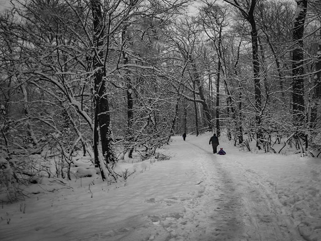
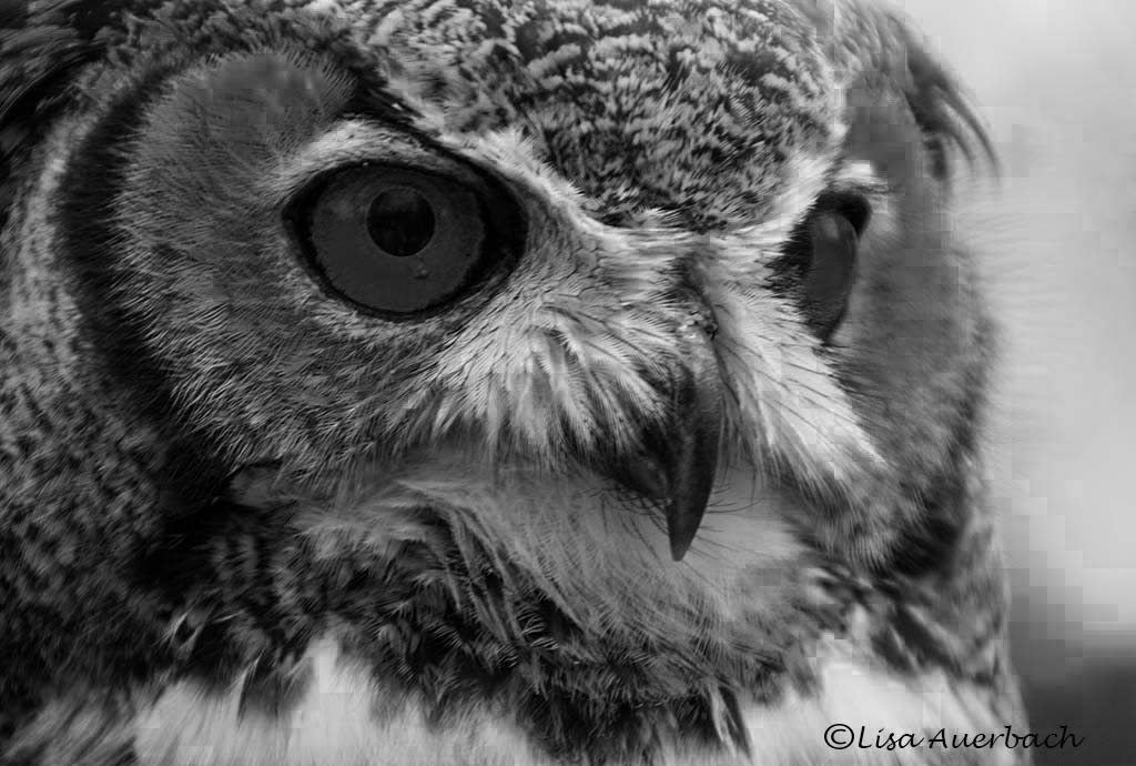
I'm not sure what you were describing, John. It does not look pixelated on my screen. I used an adjustment layer in Photoshop to convert the color image.
I am working with sharpening the eyes. That has been a running theme in this month's comments. I have a few choices before my competition. |
Mar 14th |
| 52 |
Mar 18 |
Reply |
I am working on sharpening the eyes;however I haven't gotten what I like yet.
The competition I am entering is black/white so a combo won't work.
If you don't mind, post what you did with pixelation. I've not done that type processing.
Thx |
Mar 11th |
| 52 |
Mar 18 |
Reply |
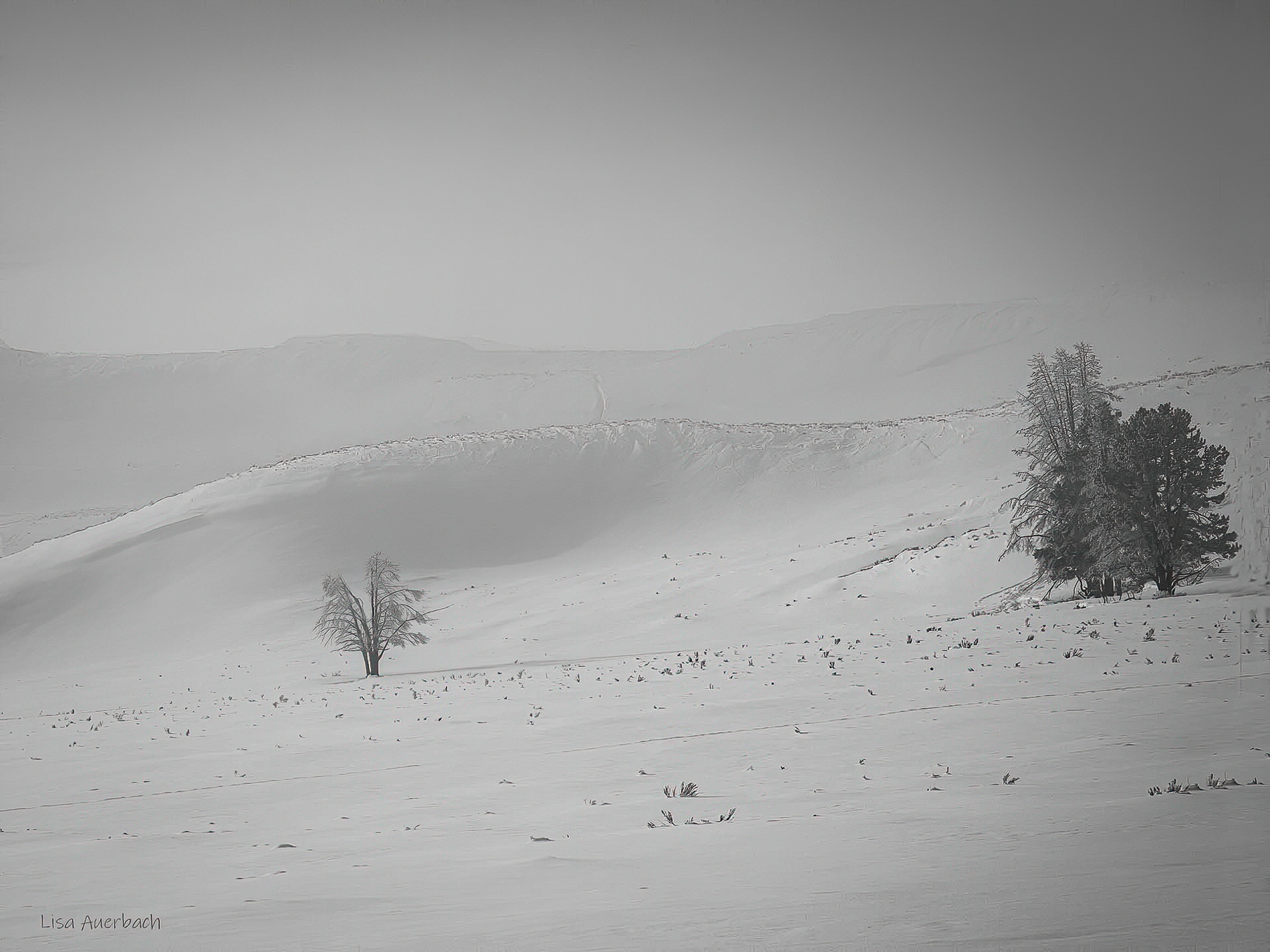
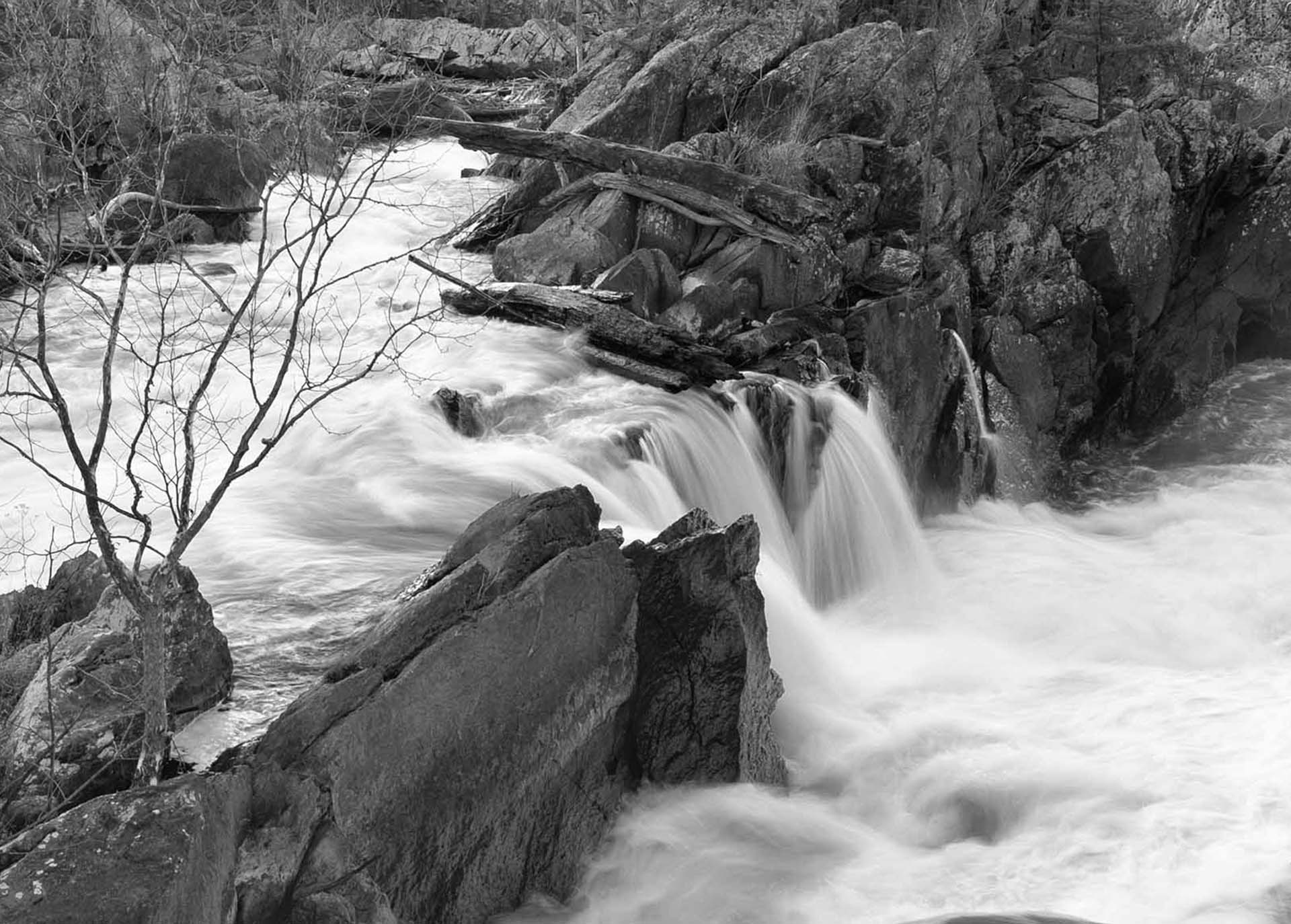
Whoa! White is hard enough to capture. You have done a grand post processing job separating the different whites of the image. |
Mar 6th |
| 52 |
Mar 18 |
Comment |
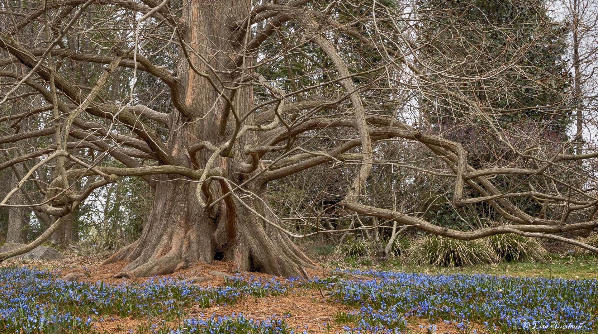
Mike, I understand adding some to the top but why do you think it should be cropped from the left? |
Mar 6th |
| 52 |
Mar 18 |
Comment |
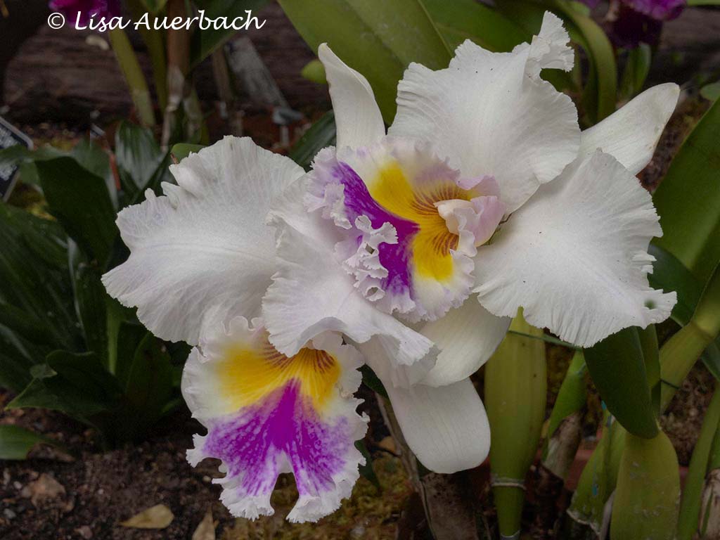
Kudos! I like the way you separated each white from the next. I'd like to see the original to see what you did there. Nothing looks blown out, and that is quite an accomplishment. What a fun shot, and what a good shot.
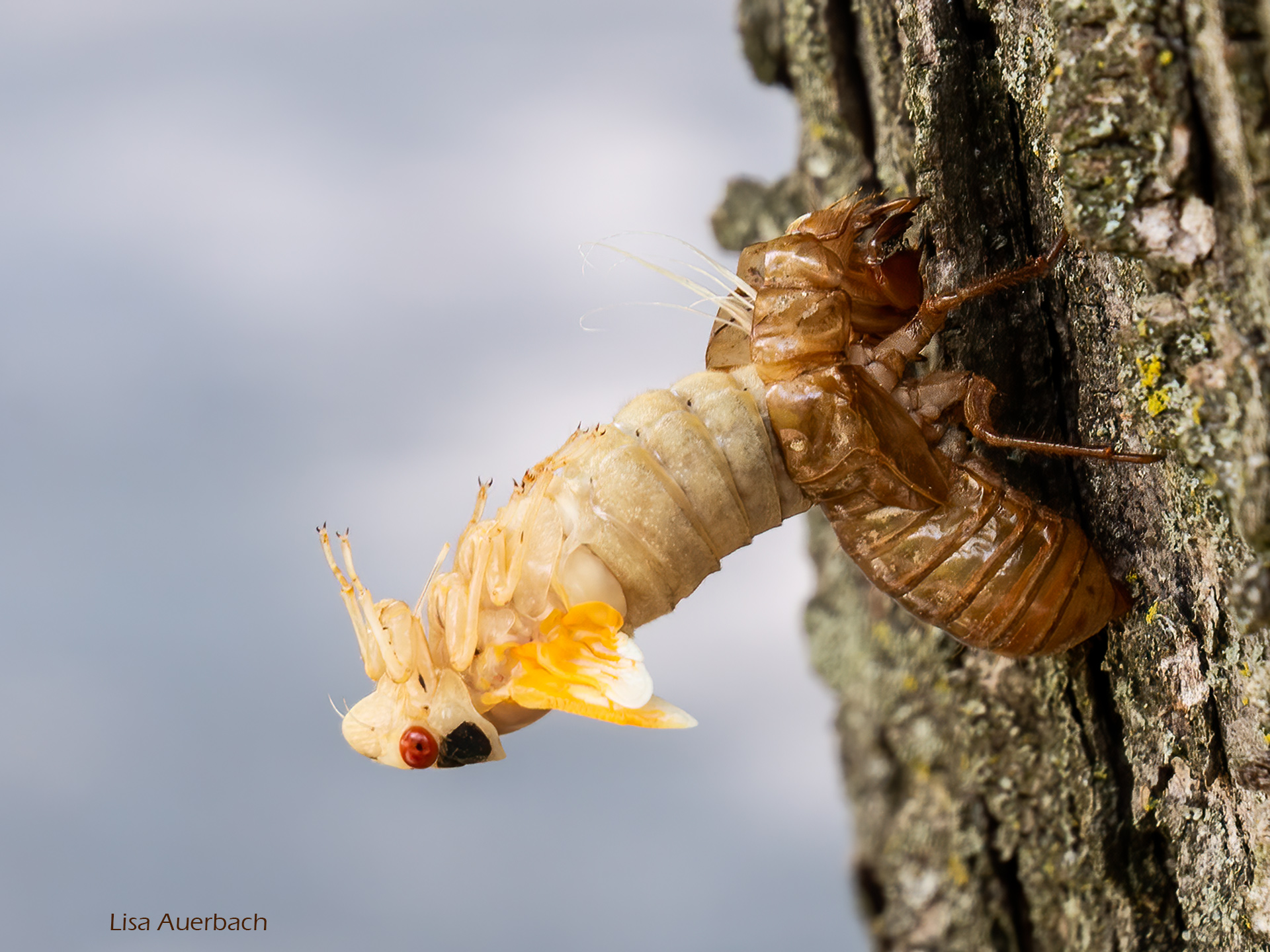
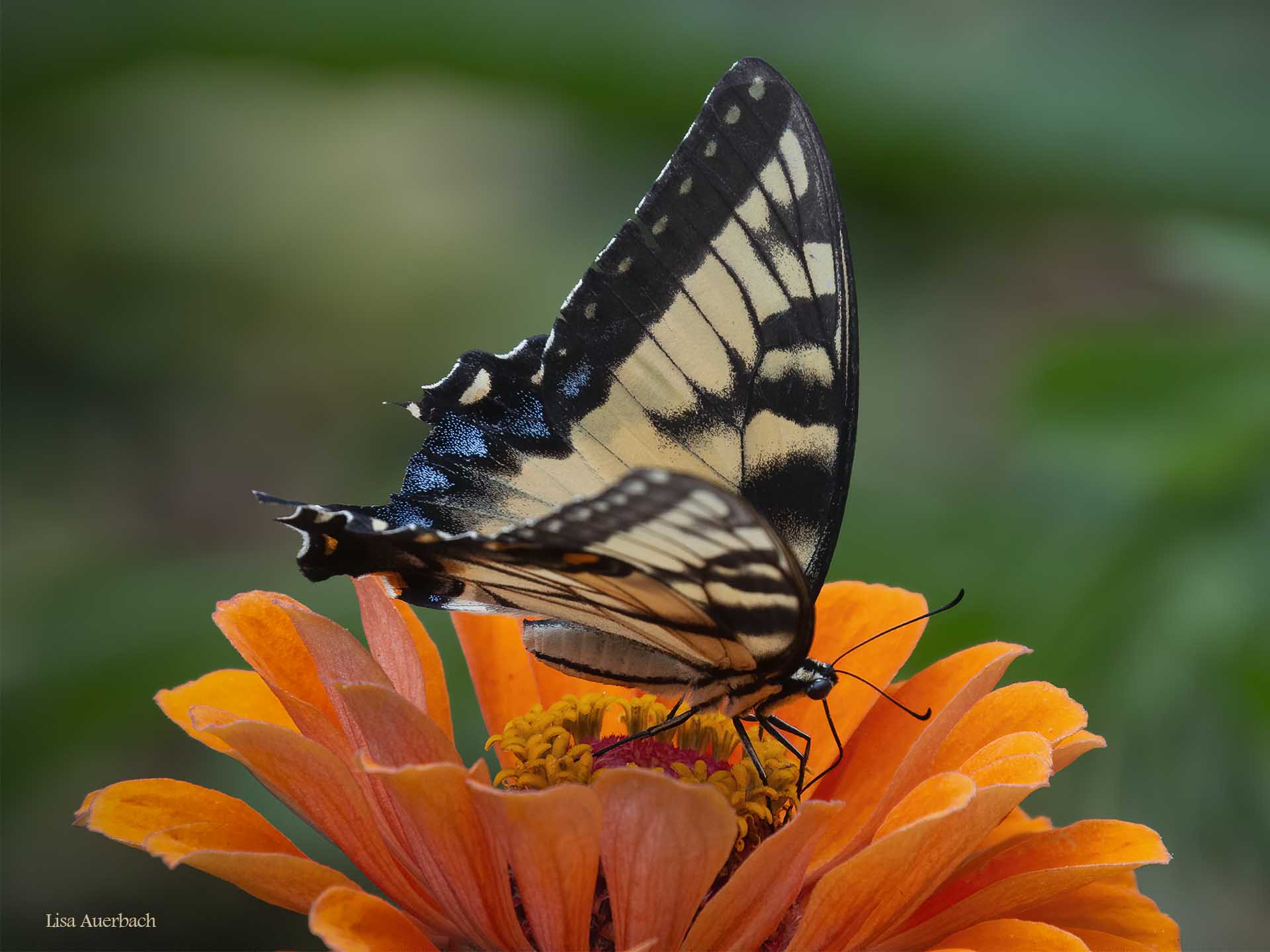
The feathers on the owl's feet seem to be the same type and texture as those on the wing yet they seem sharper. Is this part of process or of the original capture?
|
Mar 6th |
| 52 |
Mar 18 |
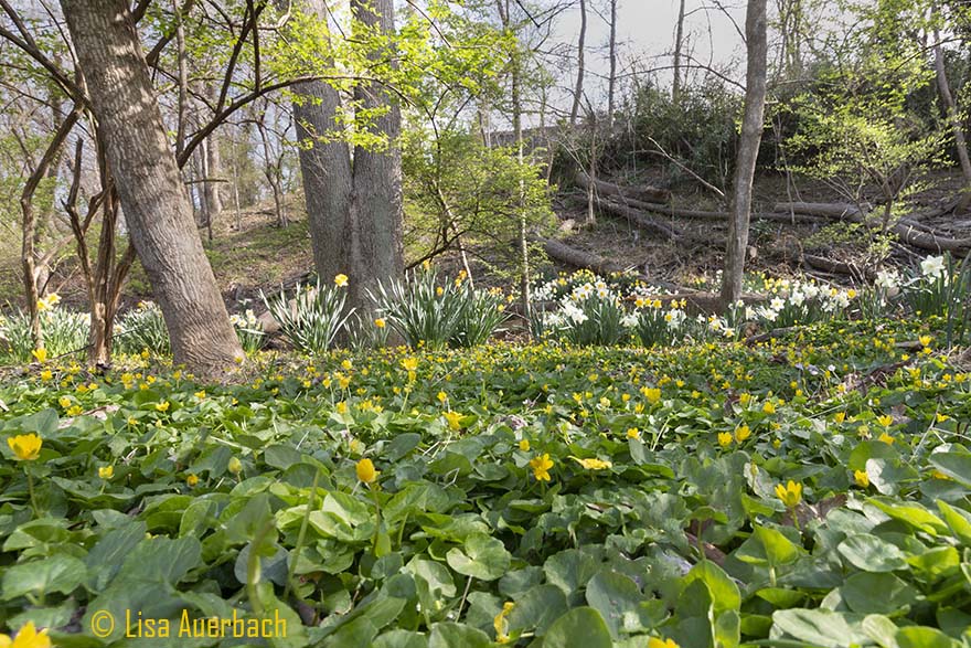
Comment |
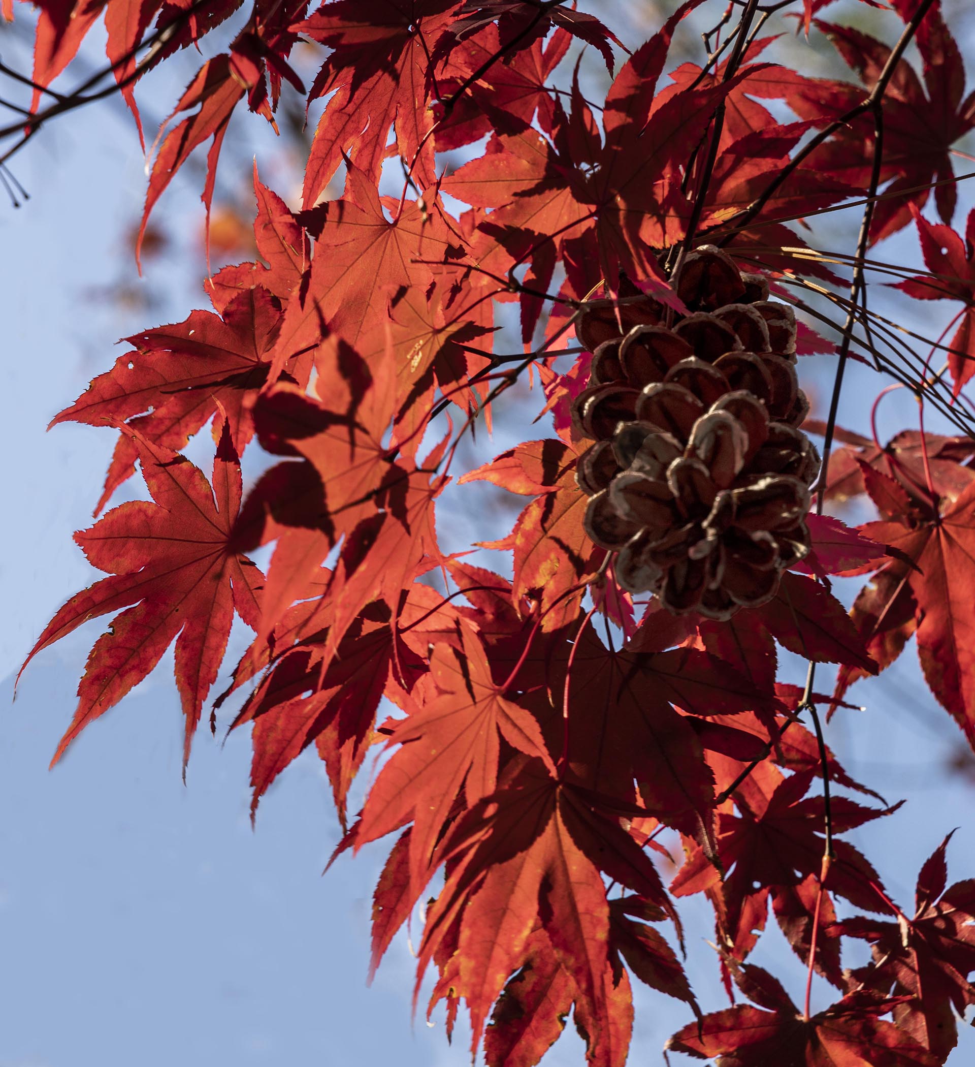
I like this whimsical image. Frost is such fun to capture, and while I tried this past November as well, I was not happy with my product. Judith, I think the right side of your image is much sharper than the left and would crop in such a way to maximize what you have there. I would definitely include the bright red leaf. |
Mar 6th |
| 52 |
Mar 18 |
Comment |
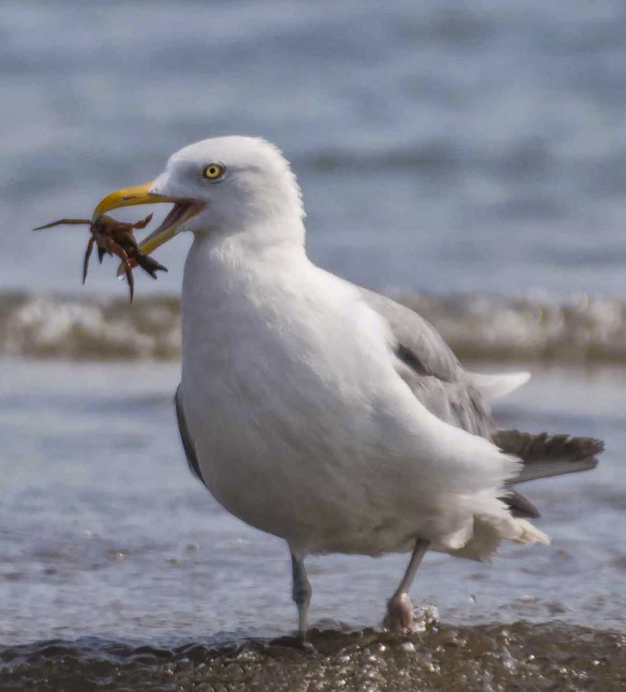
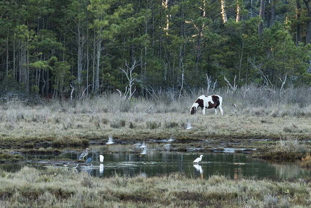
I like quite a bit about this image. Your colors are natural, and there is a big nature story. Your composition is good. I especially like the drops of water falling from the pod. |
Mar 6th |
| 52 |
Mar 18 |
Comment |
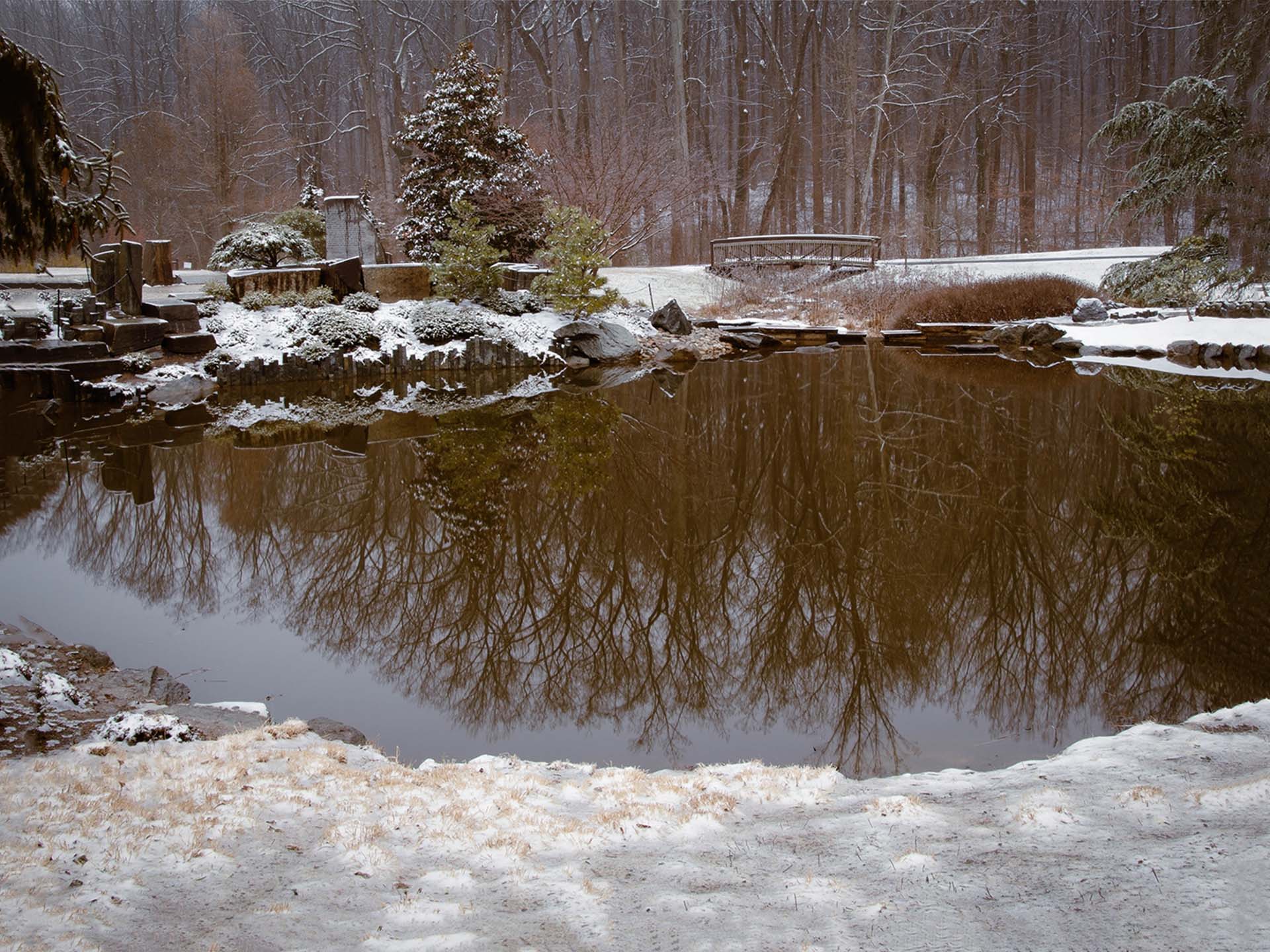
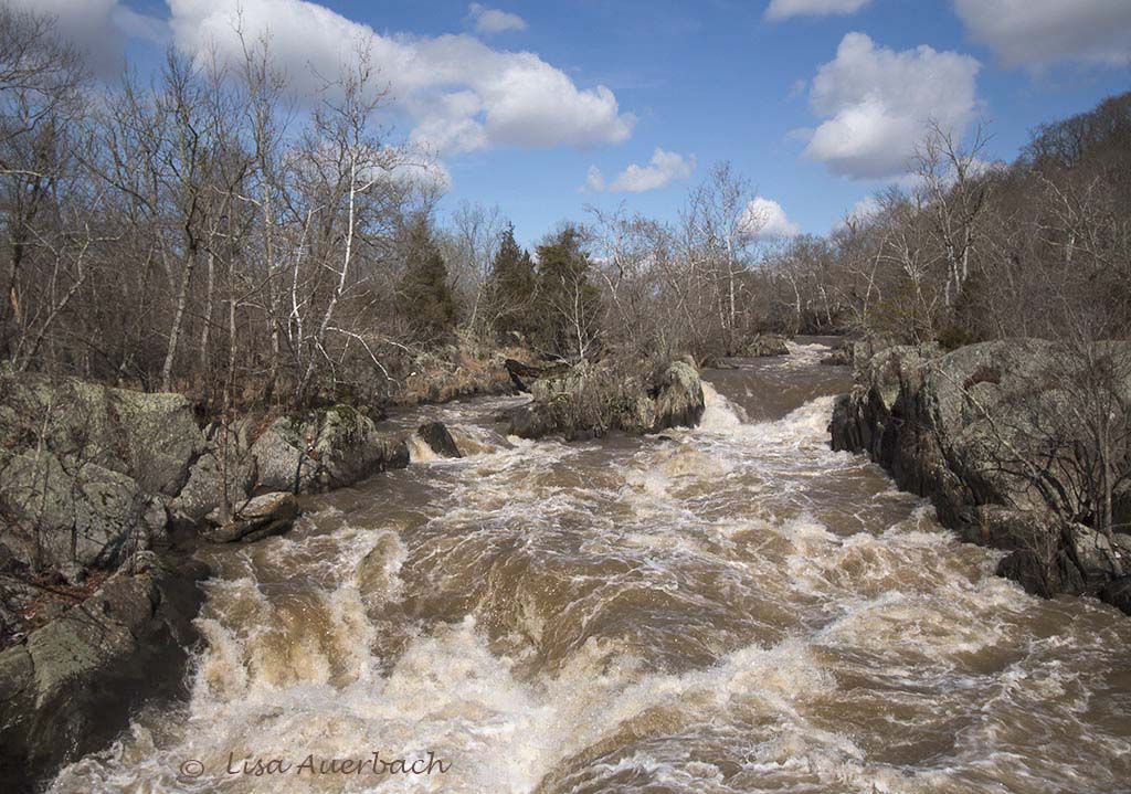
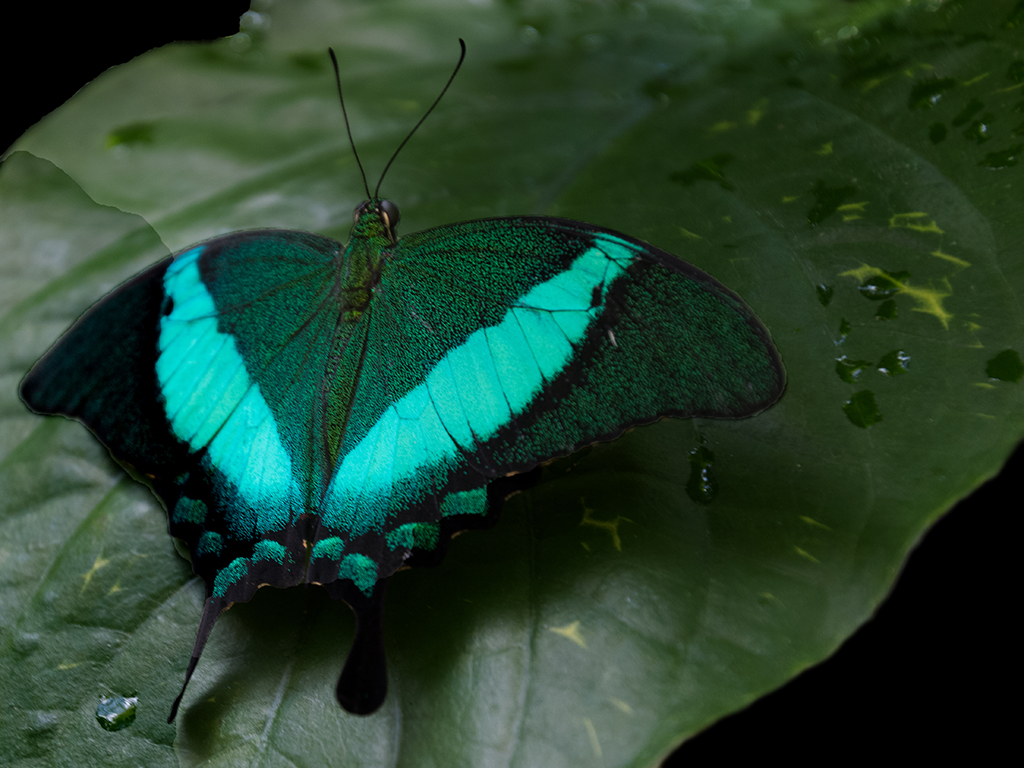
Your image is sharp and well composed. I like all the textures and the water that leads my interest in and out of the scene. I would suggest that you lessen either saturation or vibrance. In my opinion, the scene has a bit too much color to seem natural. |
Mar 6th |
| 52 |
Mar 18 |
Comment |
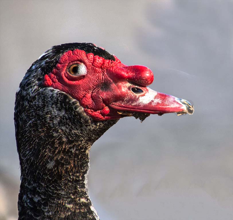
Carol, I like the way you pulled detail from the feathers in your post processing. I think you have applied a subtle change while keeping much of the original. In my opinion, the babies have too much competition from the twigs in the nest, and I suggest cropping some of the bottom out so I first see their faces. I'd leave enough twigs for the viewer to recognize the nest but no more than necessary. |
Mar 6th |
| 52 |
Mar 18 |
Comment |
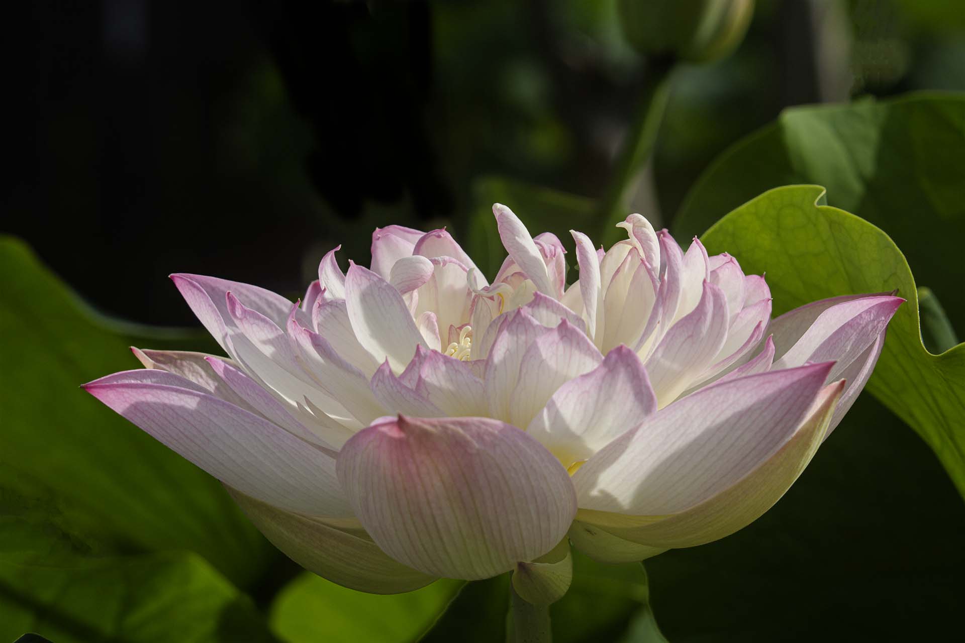
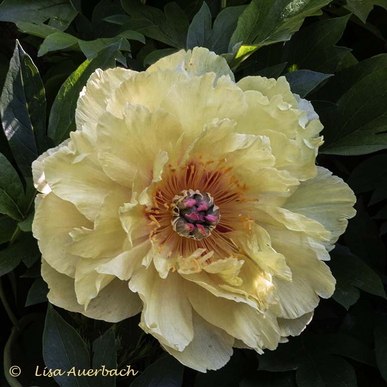
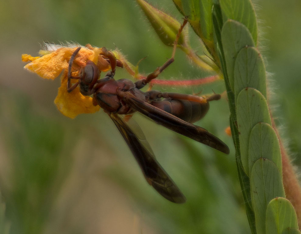
I like the composition of this image. There is calm to it yet the yellow lily gives life to it. I do think the leaves are bit too processed and would benefit from some toning down somewhere between the first and second process. The center brownish pod is a large interest yet a bit too rich for my taste. |
Mar 6th |
| 52 |
Mar 18 |
Comment |
Thanks. Good suggestions, especially about the eye. |
Mar 2nd |
10 comments - 2 replies for Group 52
|
10 comments - 2 replies Total
|