|
| Group |
Round |
C/R |
Comment |
Date |
Image |
| 52 |
Nov 17 |
Comment |
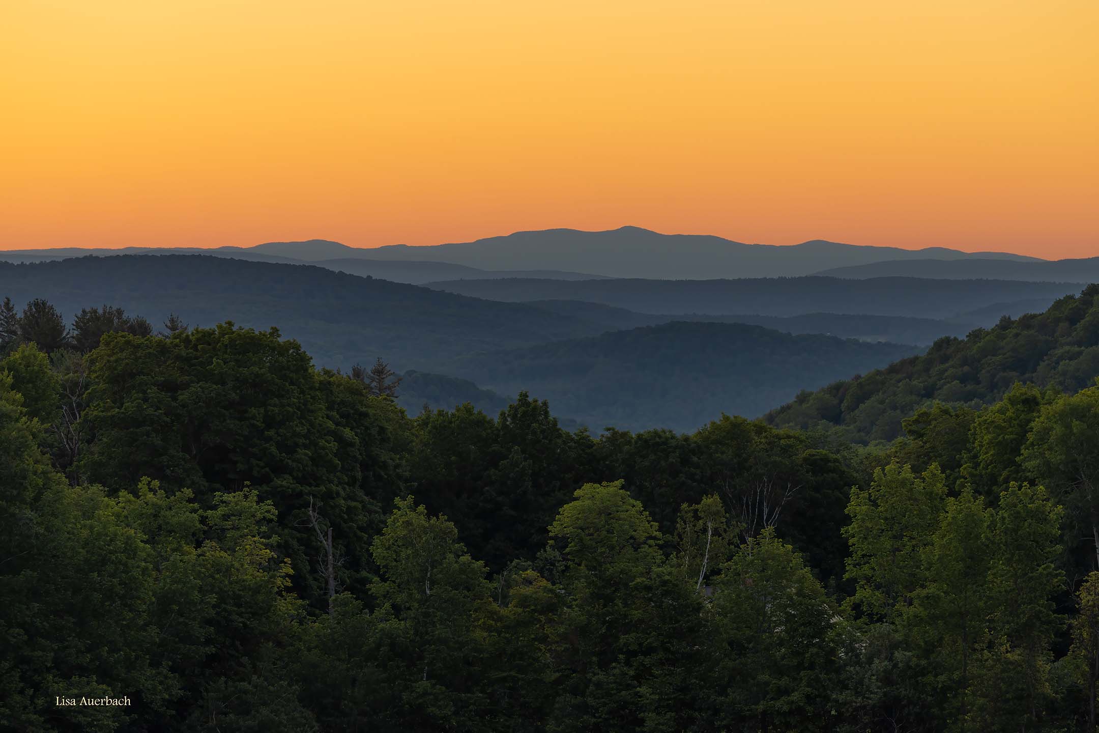
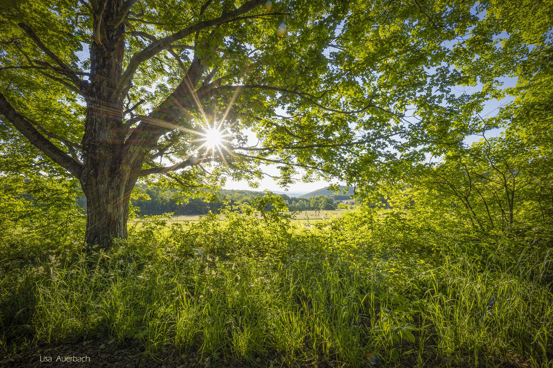
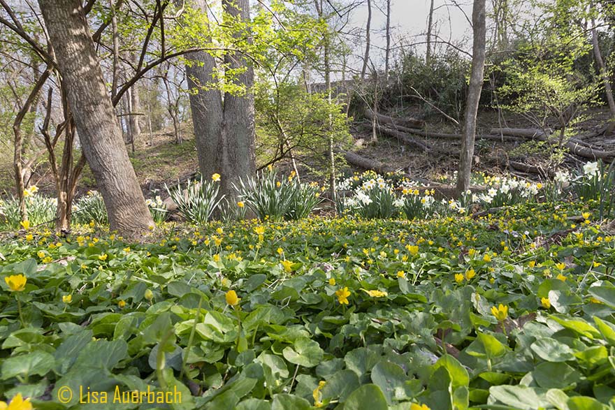
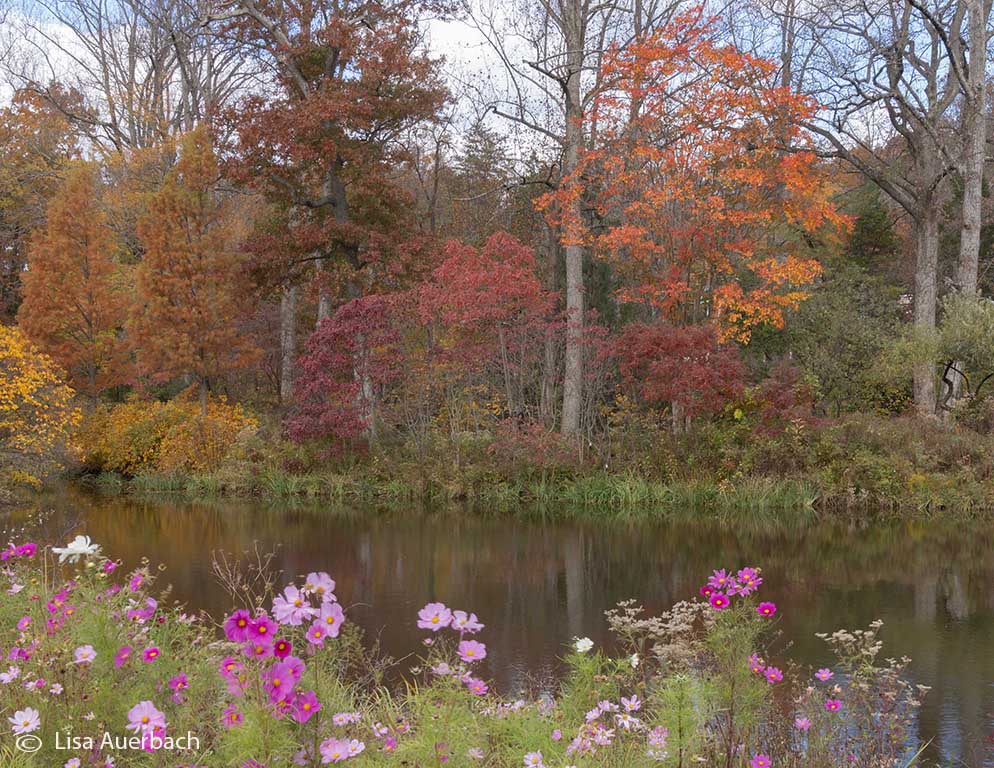
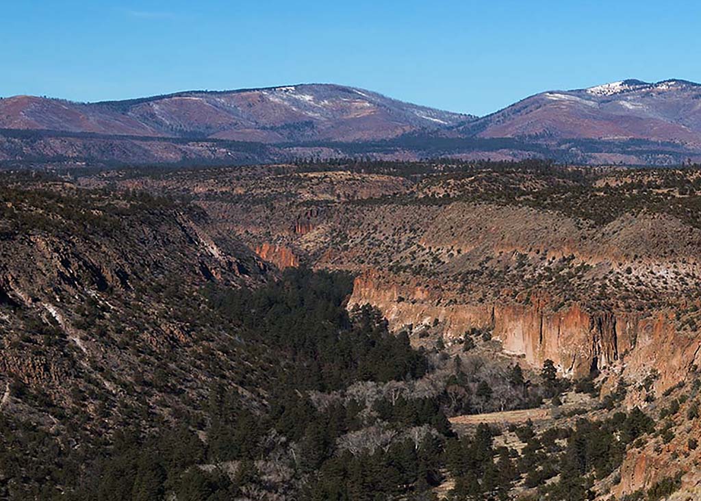
I like the composition of the scene. The bushes on the left give a foreground interest and the tree line leads me through the scene. I think the sky needs to be toned down. Additionally, if the sky were cropped more there would be a stronger focus on the color and line of the trees. |
Nov 11th |
| 52 |
Nov 17 |
Comment |
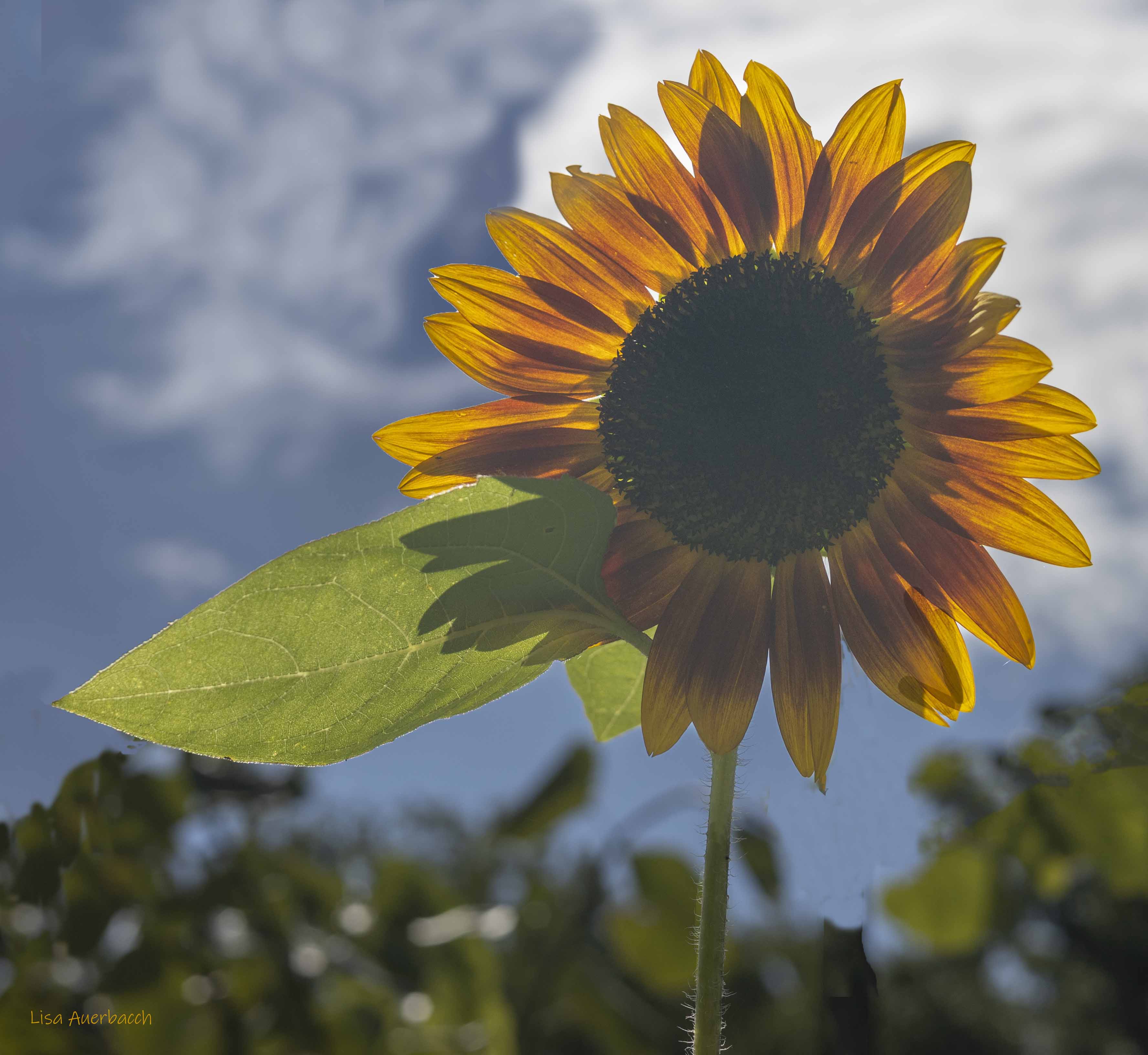
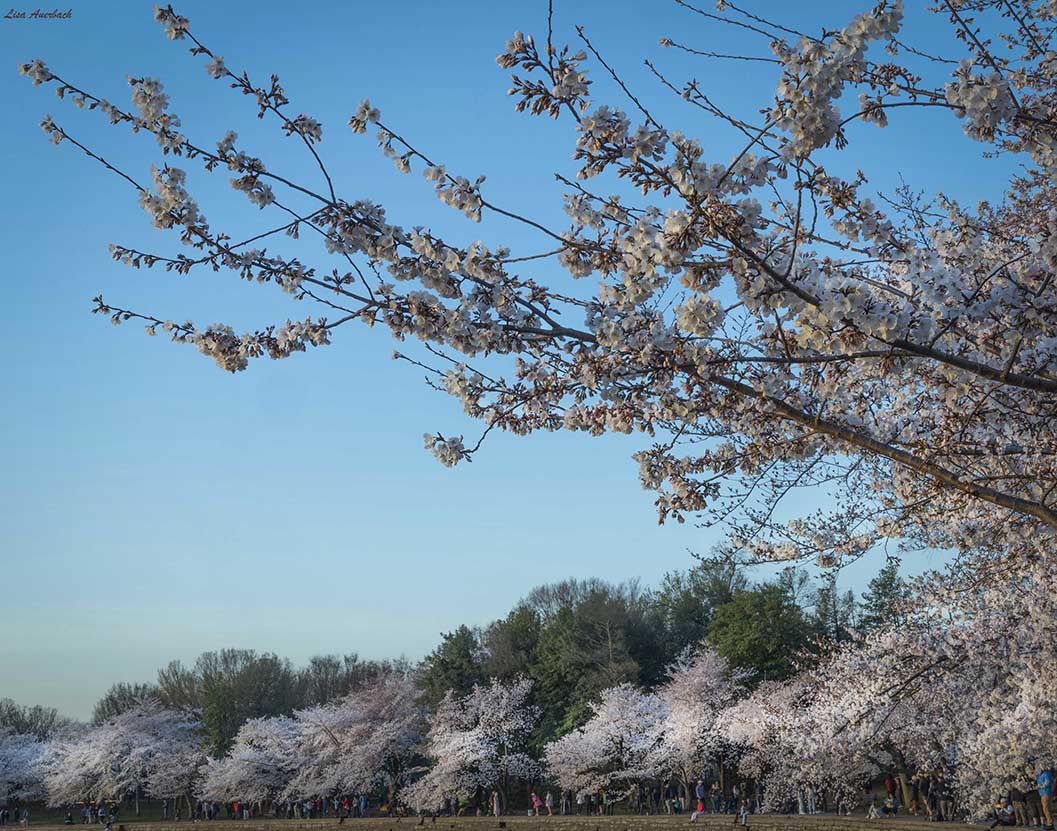
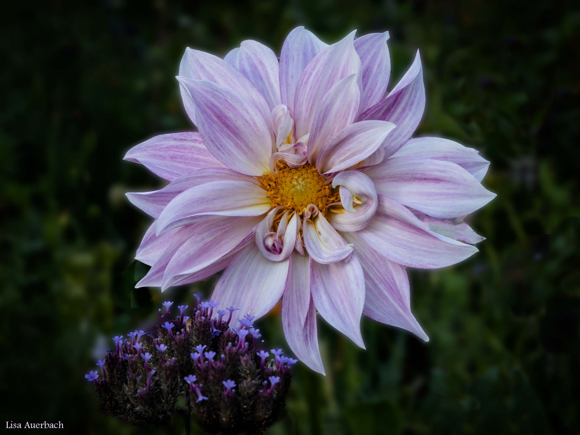
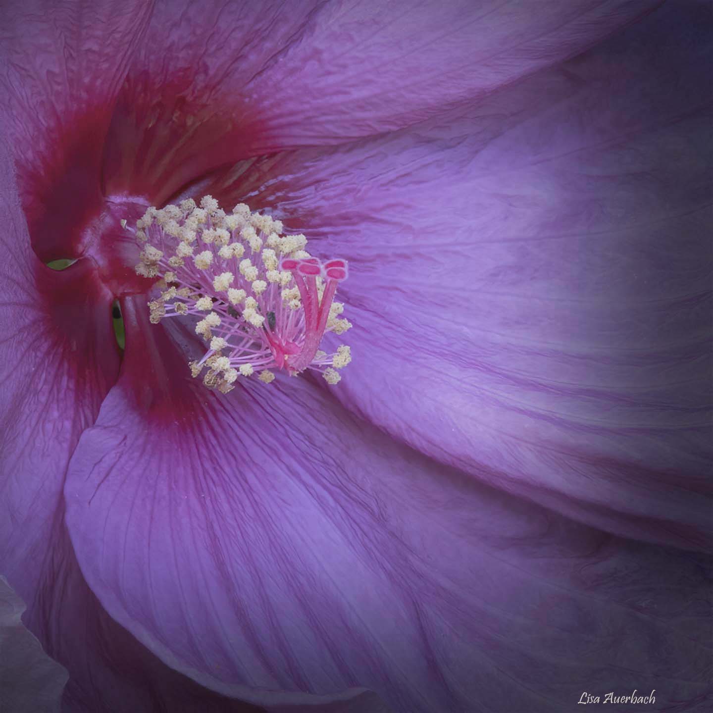
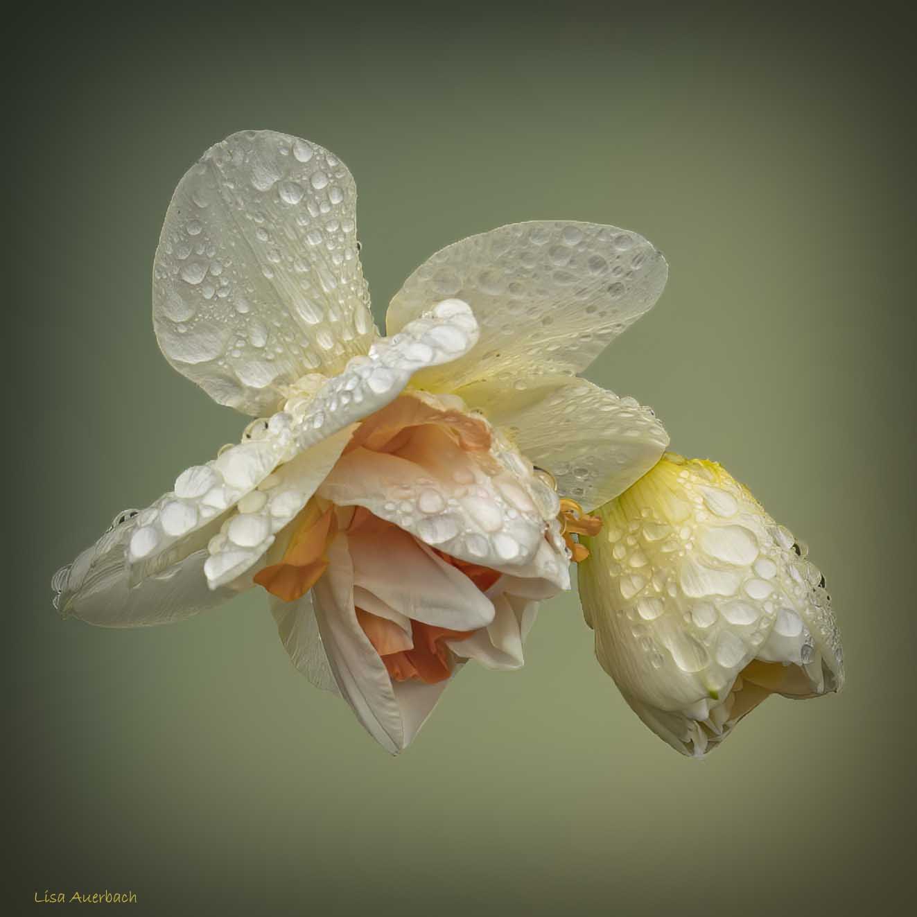
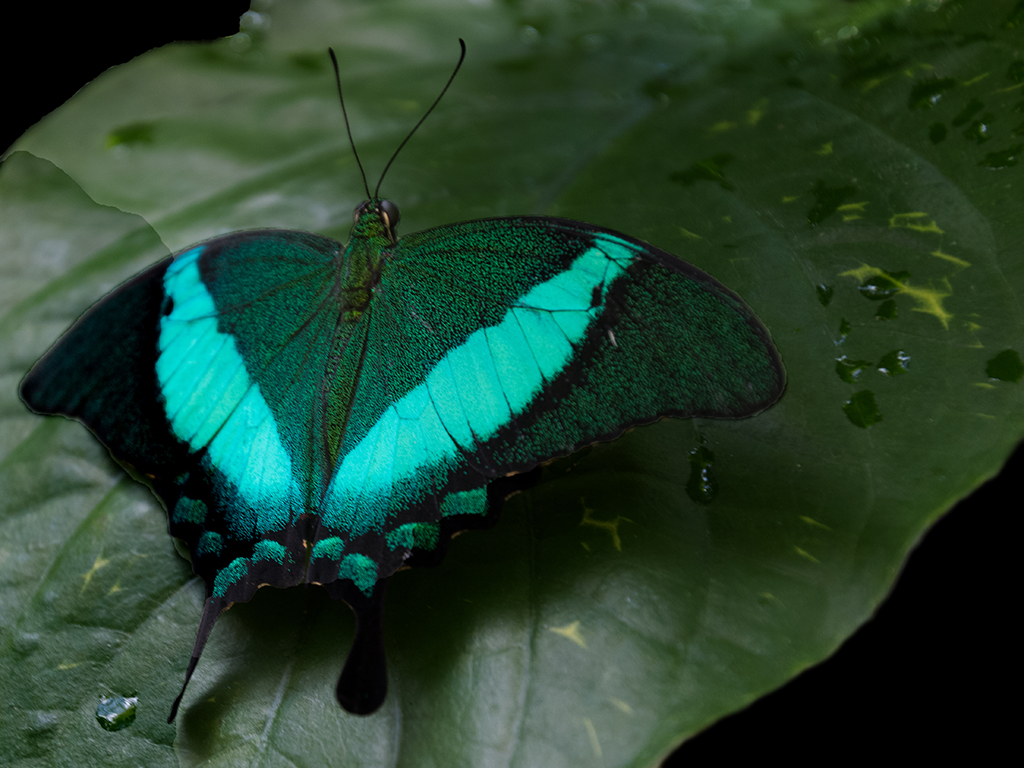
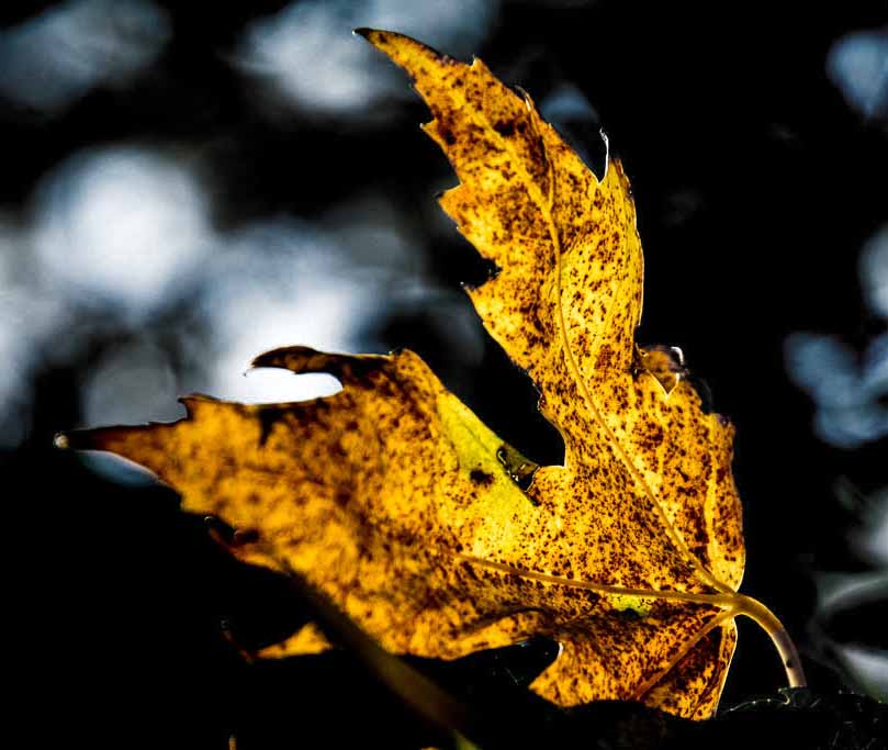
The bold yellow of the leaf makes a good contrast to the rest of the image. I like the shape of the leaf that allows the sky to come in through a triangular shape on the left. I cropped the largest left white cloud and lowered the vibrance on the others. I think it softened them, and took away the blue cast. That let me focus more on the leaf. |
Nov 11th |
 |
| 52 |
Nov 17 |
Comment |
The smaller branches don't bother me and do somewhat frame the hawk. It is that one very sharp large branch that pulls my eye away. I tried removing only that, and it seemed to help. The smaller branch seemed more part of the scene.
I like some of the elements in the image just as you are describing. |
Nov 9th |
| 52 |
Nov 17 |
Comment |
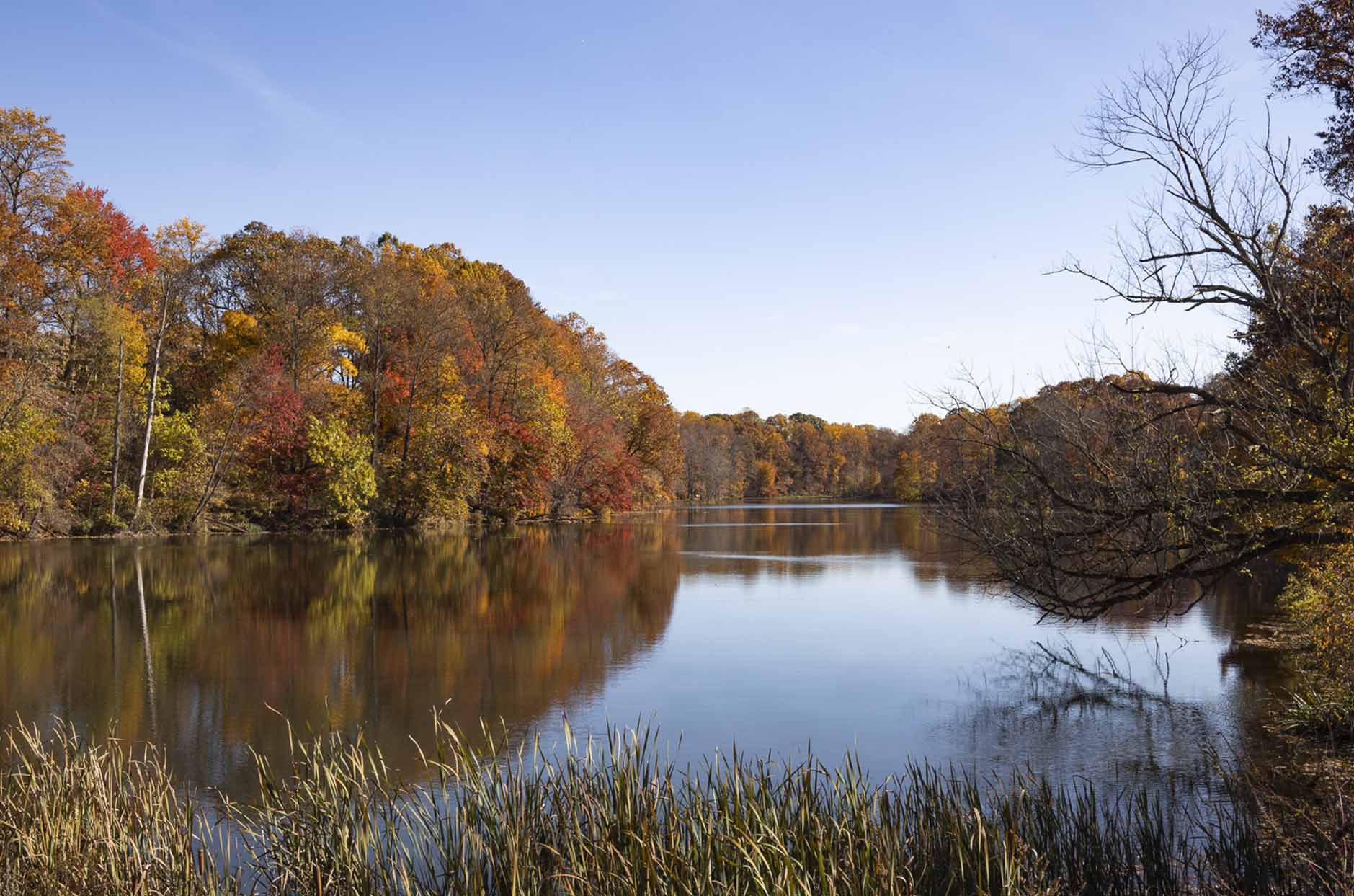
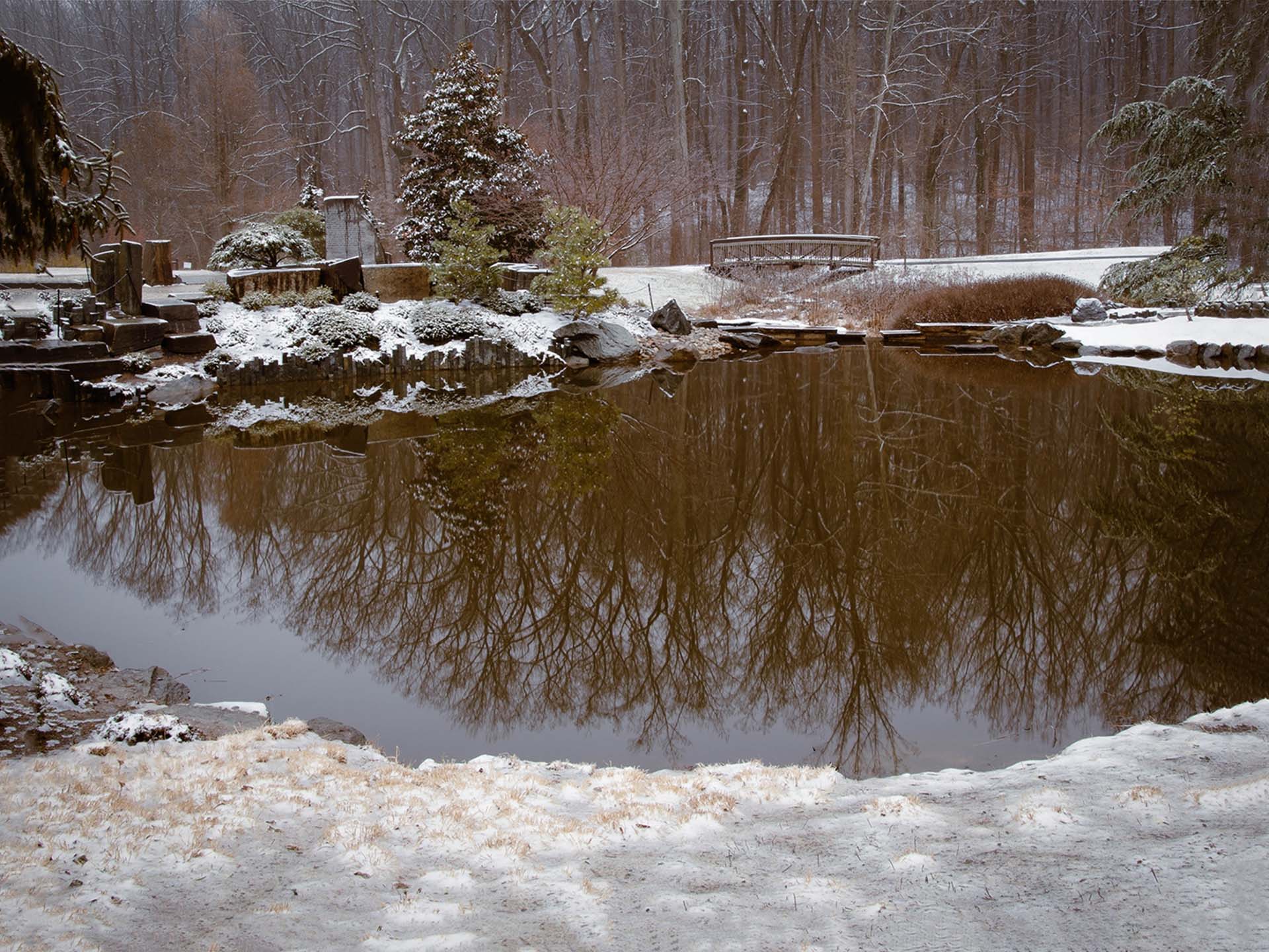
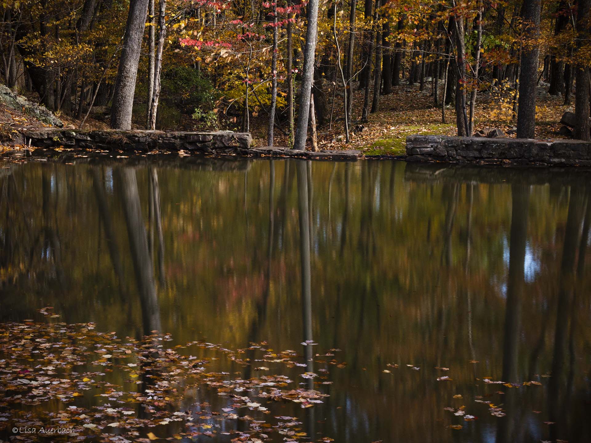
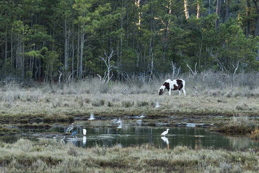
I like the still smooth water of the lake and the body of water just behind the trees. The feeling is that something is about to happen. Your colors work well together to add to this feeling. I cannot decide about the clouds. I like them but am not sure if the processing could be a bit softer. |
Nov 9th |
| 52 |
Nov 17 |
Comment |
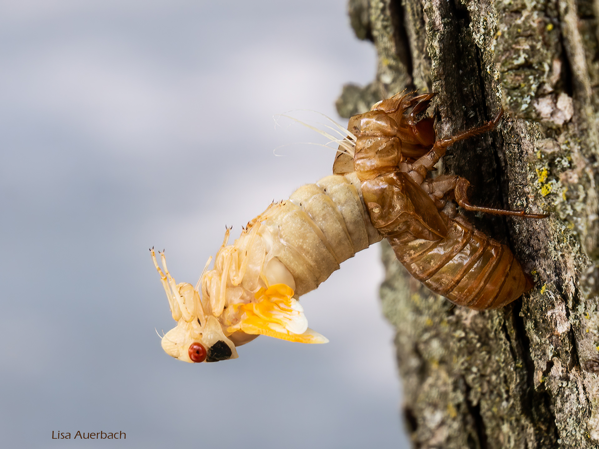
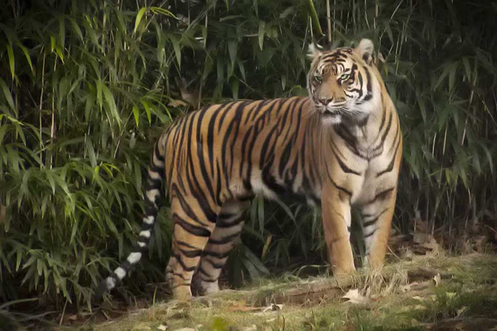
Carol, I like this image. Your eagle (?) is sharp and blends so well with the area that this is a good example of nature protecting animals. I think if you burned the eye just a bit it would grab my attention more. I like the idea of including the surroundings; however the biggest branch left of the bird with the nub competes with the bird. It is too large and too sharp. Then there is the branch just to the left of the bird. I think removing the bigger branch softens the one to the left of the bird. Then the bird is more prominent and its surroundings enhance the image. What is the exact name of the bird, please. |
Nov 9th |
| 52 |
Nov 17 |
Comment |
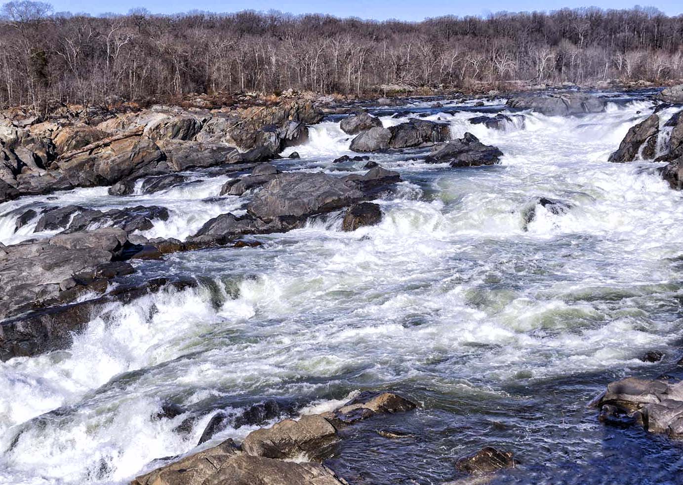
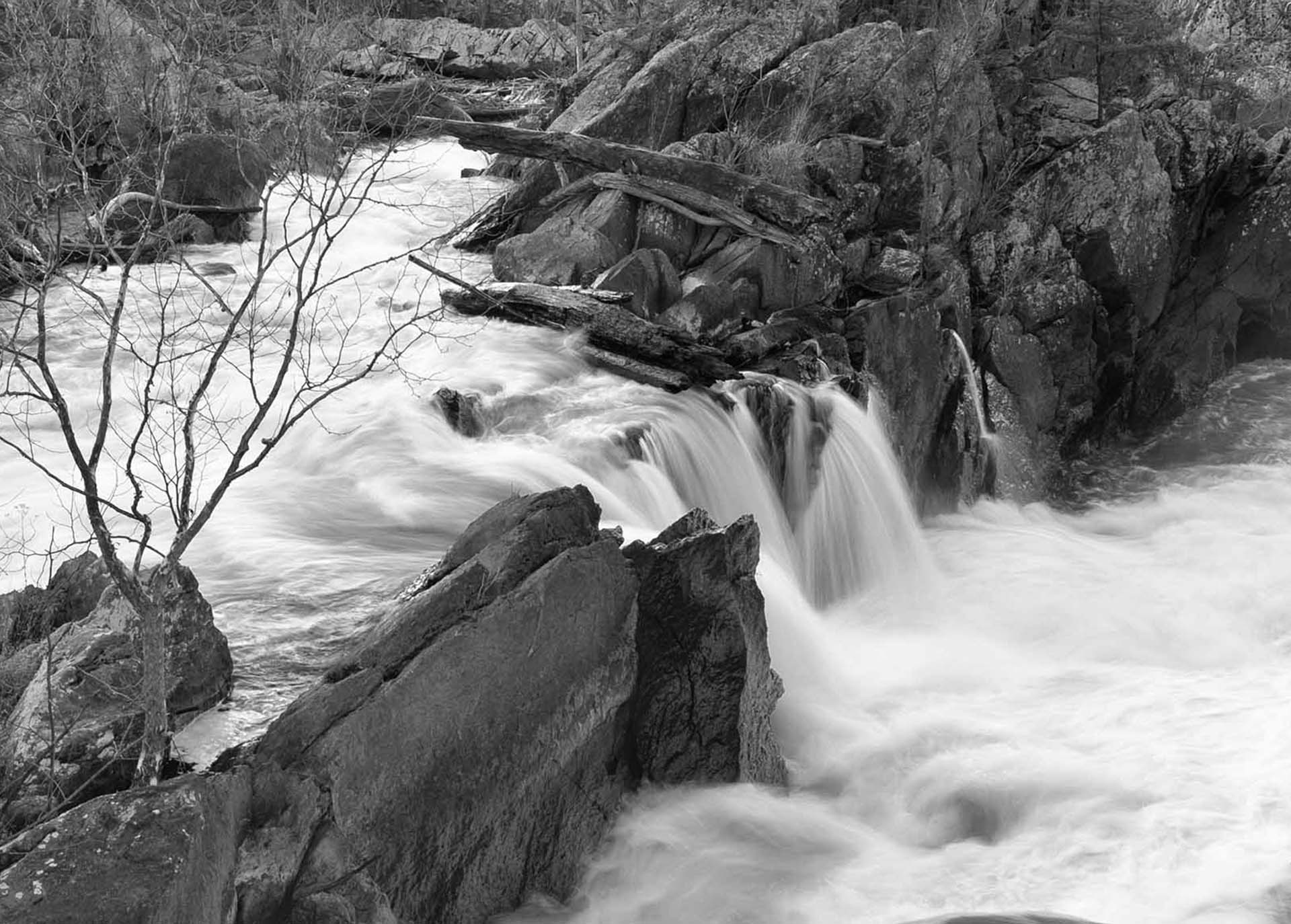
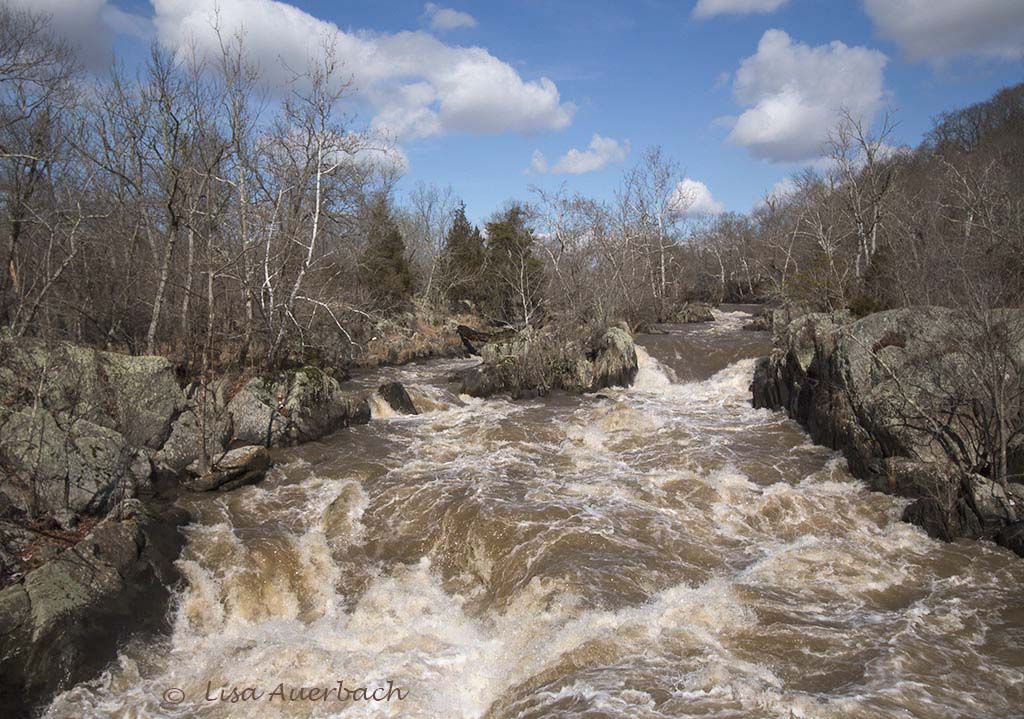
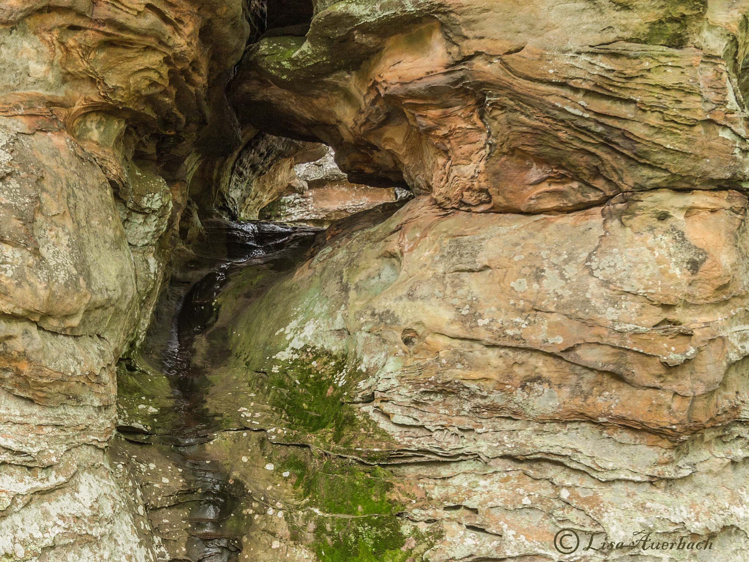
This is most definitely competitive. I had fun comparing the original to the processed versions. There are many things to notice. There is action in the foreground leading to tranquility in the background. You have several leading lines from the ledges to the water; from the water on the rocks falling to the bottom; from the layers at the shore out to the water. Your colors are harmonious. Well done, Sharon. |
Nov 9th |
| 52 |
Nov 17 |
Comment |
Mike, there are several things that I notice right away. First of all, the area below the deer's neck and above its back looks like the processing got in the way. It looks like the background blurred into the deer's back.
Overall, I think that the deer could be separated from the background with a change of levels or exposure to darken the deer.
I like the grasses and think if you took a small amount off the bottom you would still get the effect of the wild grass but the grasses would not be quite as strong. They seem blurred rather than swaying.
|
Nov 9th |
7 comments - 0 replies for Group 52
|
7 comments - 0 replies Total
|